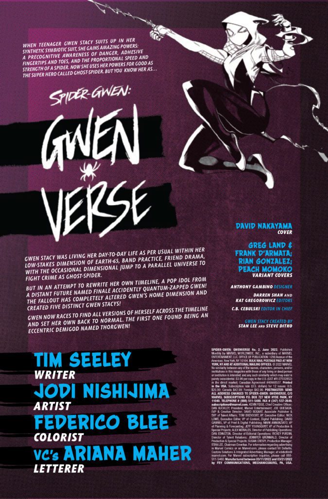
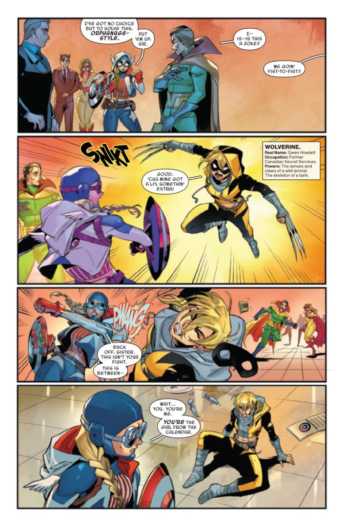
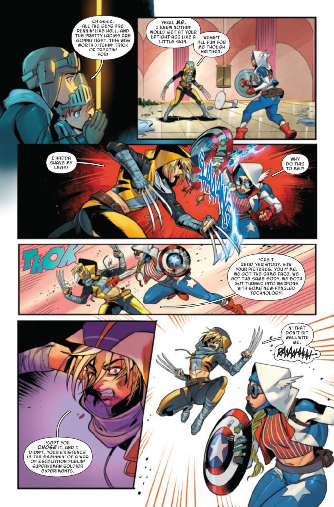
SPIDER-GWEN: GWENVERSE #2 hits your local comic book store on April 20th, but thanks to Marvel Comics, Monkeys Fighting Robots has an exclusive three-page preview for you.
About the issue: To stop another Gwen Stacy from corrupting the world, Ghost Spider must team up with Thorgwen and travel back in time! But will this new alliance be able to stand against the Super-Soldier might of Captain America Gwen? They will have to try as it looks like she’s out for revenge against ANOTHER Gwen Stacy!
The issue is by writer Tim Seeley and artist Jodi Nishijima, with colors by Federico Blee, and letters by Ariana Maher. The main cover is by David Nakayama.
Check out the SPIDER-GWEN: GWENVERSE #2 preview below:
Who is your favorite spider-person? Sound off in the comments!
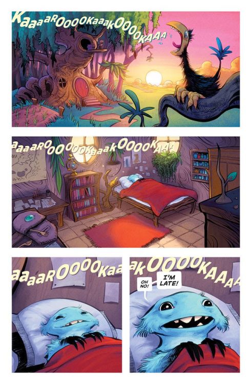
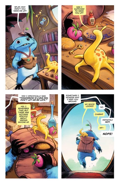
TWIG #1 from Image Comics is an epic fantasy that made me miss Jim Henson and appreciate the creativity of Skottie Young and Kyle Strahm. The book is written by Young, with art by Strahm, colors by Jean-Francois Beaulieu, and letter work by Nate Piekos.
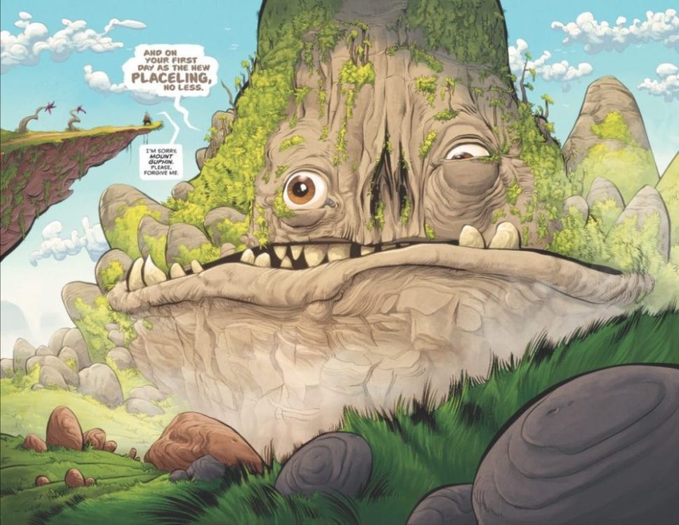
About TWIG #1: It’s the first day of Twig’s new job as a journeyer on a JEFF SMITH’s Bone-esque quest to save a The Dark Crystal/Labyrinth-style world. Join our hesitant hero for an inspiring and imaginative tale of hope, heartache, and determination to overcome insurmountable odds!
WRITING
The world-building sessions between Young and Strahm must have been spectacular, because the creatures and visuals are awe-inspiring. Young sets up the hero’s journey in the first issue, but also lets Strahm’s artwork breathe as he shows you the universe. There are five silent panels in the book that absolutely suck you into the universe of Twig and his sidekick, Splat. These panels put Twig’s world on display, and your brain can’t help but add the soundtrack to their journey. I could hear the splat of the fish as our heroes ate lunch on the river bank and feel the chill in the night air as they camped out. In addition, Young tastefully develops the character of Twig throughout the issue, dropping little nuggets here and there for you to digest. You can’t help but be drawn to Twig and Splat as the reader.
ARTWORK
Strahm knocks the character designs out of the park. The simplistic features of Twig’s big eyes and crooked teeth emphasize the childlike wonderment of the world we are about to enter. There is such a unique feel to the book. The Belly Mine creatures are brilliant and diverse. There is an homage to Henson, but the style is all Strahm. As mentioned above, Strahm puts the entire world of Twig on display, and the panel layout gives a bounce to Twigs step as your eye travels on the page. The “cinematography” of the book is beautiful. The wide shots display such detail that you search through each panel endlessly. But, when a close-up hits, you feel the moment’s emotion.
COLORS
Beaulieu’s color palette for the issue is warm and friendly. The blue of Twig and the gold of Splat work tremendously well to stand out against the spectacle of their world. Beaulieu goes the extra mile, as all the colors are rich and have a texture to them — you can feel the movement of the story. My favorite panel is of Twig and Splat sleeping out under the stars with “space turtles,” there is such a calmness to the panel because of the colors.
LETTERS
Piekos keeps it simple, and it works. The story is easy to follow, and the word balloons do not overshadow the art. Piekos adds a yellow tint to Splat’s word balloons which works well in conversations with Twig.
OVERALL
TWIG #1 is a fun book that would make Jim Henson proud. So many questions are left to be answered, and I’m excited to read the series. Young, Strahm, Beaulieu, and Piekos created an original universe full of possibilities. TWIG #1 hits your local comic book shop on May 4.
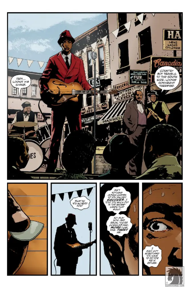
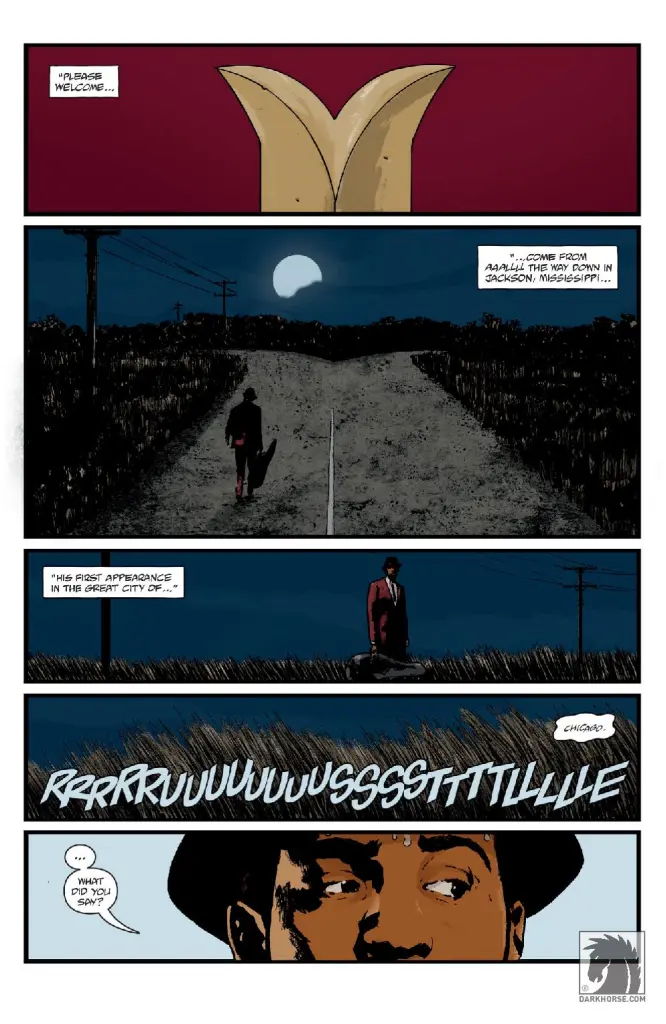
So this is how Sword of Hyperborea ends. Not with a bang or a whimper, but with a touch of the blues. The final vignette in a series of four, Sword of Hyperborea #4 eschews modern cavemen or monster hybrids for the story of a struggling blues musician. It’s not what most would expect from the climax of a story spanning generations, but being climatic isn’t what this story is really concerned with. There’s still a monster and an ancient sword, but expect a lot more café conversations and jam sessions.
WRITING
Rob Williams and Mike Mignola return to the sword one more time to tell the story of Elijah Bone, a blues musician who made a deal with a mysterious dark power for his guitar prowess. But more than just his soul, the force demands blood. Elijah begins to get cold feet, questioning how much success is worth. And of course, our old friend, the titular Sword of Hyperborea, is going to make an appearance before all is through…
Looking at the series as a whole, the Sword of Hyperborea has chosen to scale back the stakes with each successive issue. The first opened on the monster-infested end of days, shifting to cavemen fighting monsters beyond their comprehension. The second had a monster hybrid bringing down a Nazi zeppelin. The third focused on a deep sea diver getting caught in machinations of a dark brotherhood. And here we are at the end, with a character who wants nothing to do with any of this supernatural junk. Don’t expect firm answers on the spiritual forces at work, either the ones introduced in this issue or the series as a whole. Elijah himself doesn’t feel like a character that’s being set up for revisitations, either. He’s not the kind of character who you can imagine going on countless adventures outside the pages of this book. He’s someone who got a peek behind the metaphorical curtain and decided that was enough. It’s a quiet anticlimax, the kind Mignola’s storytelling uses as its stock and trade. Nice to see that after so long, the universe can still keep its sense of quiet mystery.
ART
Laurence Campbell’s paneling has been doing a lot of the heavy lifting throughout the series in giving the Sword of Hyperborea its sense of mystery, and the opening page gives a good example. It shifts from the sword, to a sword-shaped crossroads, to wind-swept grain and Elijah’s face, soaked in sweat. It immediately establishes the sword as draping a massive shadow over the rest of the issue, lingering in the mundane details of Elijah’s life and in the space between panels. His use of heavy shadows and realistic figure work also gives the issue a grounded, gritty feel that is promptly exploded in the surreal climax.
The coloring of Quinton Winter and Dave Stewart adds to the dark, brooding atmosphere by dominating the issue with cool blues and dark reds. But during that aforementioned climax, everything suddenly turns searing orange. And in the aftermath, ashen gray. It’s a color palette that really helps draw the emotion out of the simple storytelling style.
Clem Robins’ use of lettering is also displayed in that opening page, the clear, cartoony “Rrrruuusstttllleee” sound effect wobbling and wavering like the long grass it comes from. His lettering prioritizes cleanliness and clarity, but with subtle touches in his sound effects that really make them pop.
VERDICT
Sword of Hyperborea #4 brings a small-scale human story to the continuing saga of an ancient sword strapped by a caveman to a stick. On paper that shouldn’t exactly work, but it’s delivered with the cool confidence of a seasoned performer. No pacts with the devil needed. It’s out today from Dark Horse at all the usual outlets, so go ahead and pick one up!
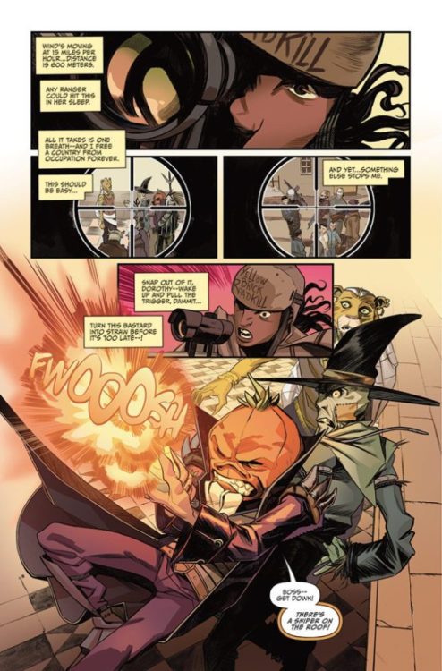
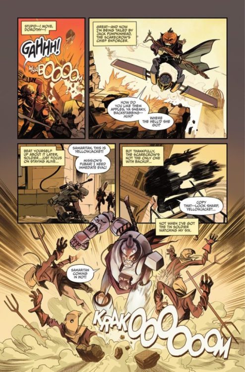
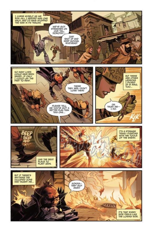
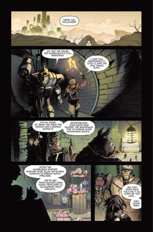
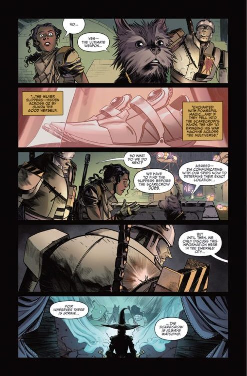
If you backed the Kickstarter campaign, the digital copy of THE O.Z. #2 (of 3) hit your inbox last week. The book is written by David Pepose, with art by Ruben Rojas, Whitney Cogar drops the color, and you will read DC Hopkins’ letter work. According to Pepose, you will be able to buy the book from davidpepose.com once the hard copies arrive from the printer.
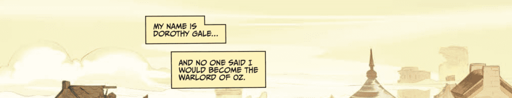
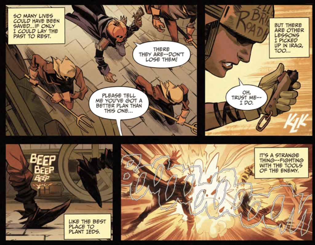
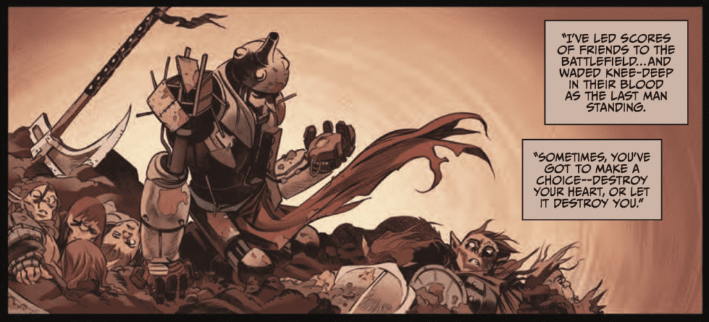
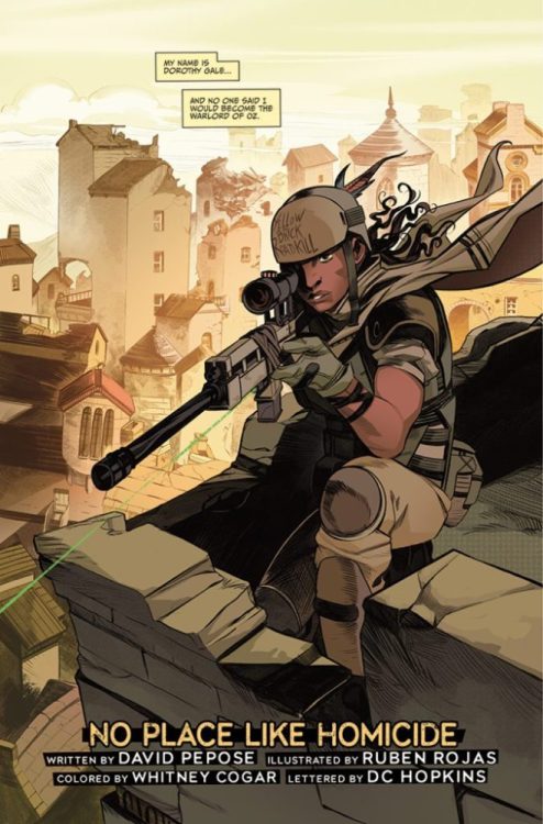
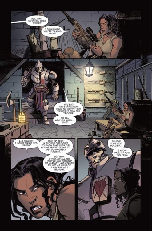
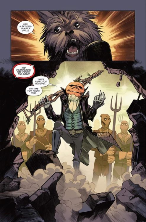
About THE O.Z.: Decades ago, when a young girl defeated the Wicked Witch of the West, she said farewell to the magical land of Oz… but unwittingly plunged the country in a vicious power vacuum leading to years of brutal civil war. But a generation later, the name of Dorothy Gale lives on in her granddaughter, an Iraq war veteran grappling with disillusionment and PTSD — yet when a tornado strikes Dorothy’s quiet Kansas town, this former soldier finds herself in the war-torn battlefield known only as The O.Z. Forced to navigate warring factions led by the Tin Soldier, the Scarecrow, and the Courageous Lion, Dorothy must come to terms with her legacy and her past if she ever hopes to bring peace to the Occupied Zone.
WRITING
The first two issues are oversized with solid breaks, which makes THE O.Z. #2 read like chapters three and four of the story. The first issue introduces all the characters and main plot points. Now, Dorothy is in the thick of the war, and the tension and stakes continue to build.
Pepose exceptionally writes the story’s pacing; as soon as you think the story starts to slow down, you get jerked in another direction. The changing of locations adds to the feverish pace, and in a world like OZ, the color palette is different every four pages. Then Pepose keeps raising the stakes of the story. It’s like a rollercoaster that continues to climb but never drops. Your heart gets tighter and tighter, desperately wanting the fall. Then you realize that this is only issue two, and the drop isn’t coming.
I can’t decide if Pepose is an amazing mixologist that takes familiar ingredients to create a new fantastic drink, or an early 90s hip-hop artist sampling all the different genres to create a unique sound and an epic album. All the concepts in this book are familiar, and we’ve seen them many times before, but THE O.Z. feels right. The land of OZ was always just a few steps away from straight-up scary. The story elements of a war-torn OZ and a broken hero’s journey work so well that I am begging for the third issue.
ART
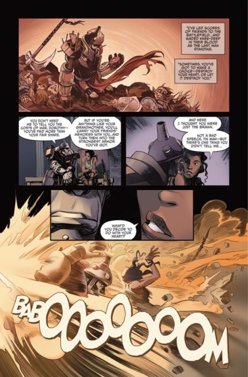
Rojas has a ginormous task at hand as the book is always moving with action, different sets, dragons, and the all-powerful OZ. Rojas’ vision for the all-powerful OZ looks beautiful and intimidating. It could be my favorite part of the issue. Also, the emotional range that Rojas draws into a dog is ridiculous. His skills are top-notch.
The panel layout and storytelling elements of Rojas’ work are next level. The book’s pace is fierce due in part because how Rojas directs your eye throughout a page. You see the emotion and the action because Rojas wants you to, and the traveling line of sight also lends to the rollercoaster feeling you have at the end of the book because he brought you on this journey.
COLORS
Cogar’s color palette is brilliant. I felt emotion, action, and desperation. The flashback sequences have a beautiful, melancholic feel to them. You instantly know it is not the present and the moment’s mood. There is a page with a bazooka, and the colors frame and highlight the action. The choice of red and yellow puts the moment right in your face. Then there is a page where the reader looks up at the sky; Cogar’s color choices and Rojas’ art create an infinite depth. The depth allows you to get lost in the book. From desert to snow, from forest to underwater, Cogar created a unique color experience for each location.
LETTERS
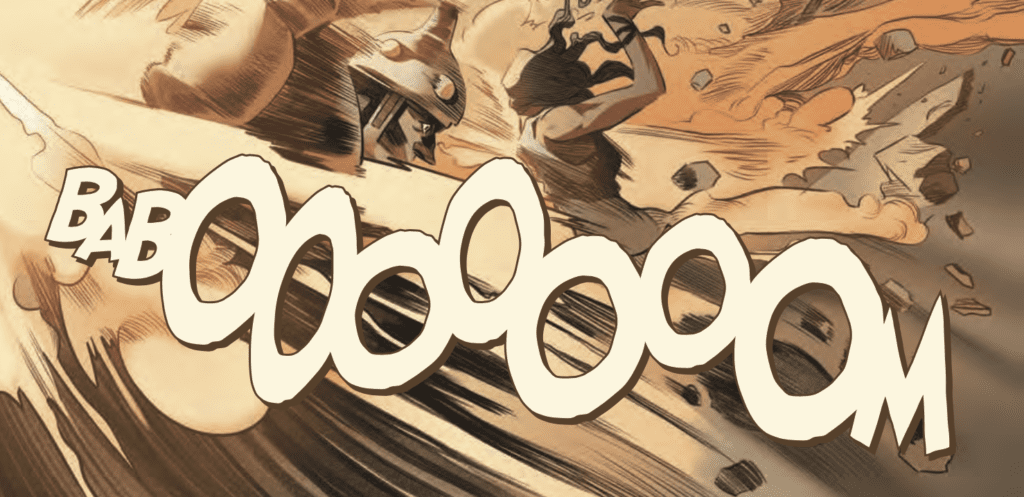
Hopkins’ letter work in this issue is prideful. The detail and the minor tweaks are all there, and it looks like he’s having fun with every explosion. The BABOOOOOOOM above displays Hopkins’ craftmanship in a nutshell. He used multiple fonts, and you feel like Hopkins laid each letter on the page until it felt right. With all the onomatopoeias in the book, and there are many, Hopkins worked well with Cogar’s color palette. The sound effects look like part of the book, not a Photoshop afterthought.
OVERALL
THE O.Z. #2 (of 3) is the sum of its parts; the writing is solid, the art is spectacular, the colors are fresh, and the lettering is epic, which translates into a must-read book. I don’t know how the creative team will close out the series, but I’m excited to read the next chapter.
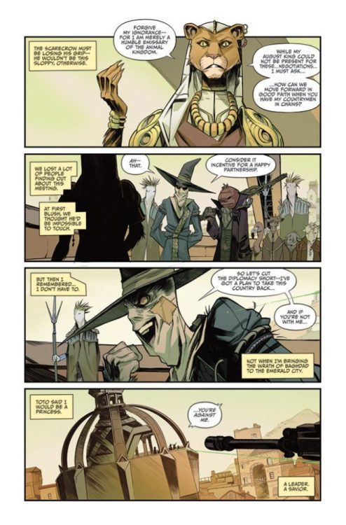
Read the first 11 pages of THE O.Z. #2 (of 3) below:
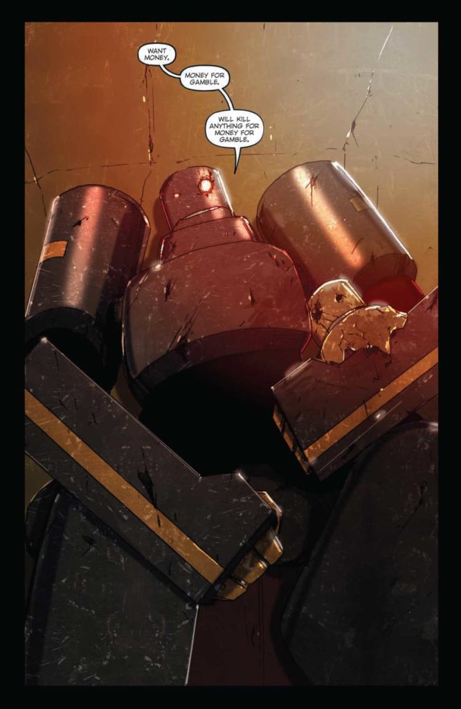
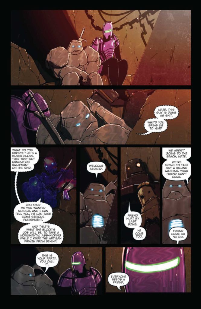
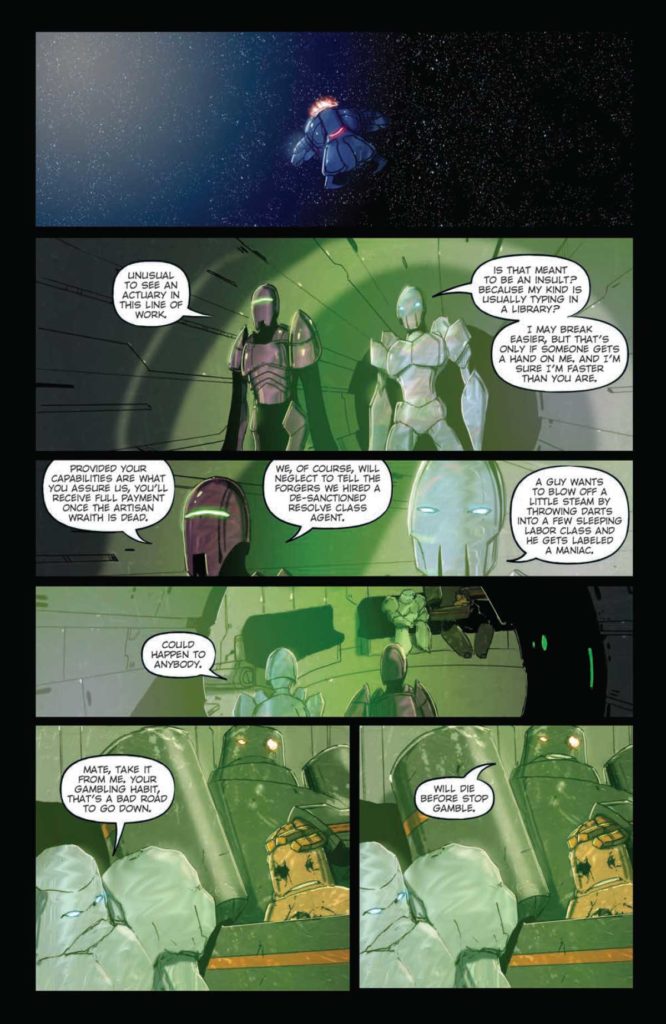
Writer & artist Livio Ramondelli returns with the second issue of his long-awaited sequel-series in The Kill Lock: The Artisan Wraith #2. With letters by Shawn Lee, this outstanding chapter is the absolutely insane return we’ve all been waiting for. With a tense, explosive story and ever-captivating visuals, this may very well be my favorite single comic of the year thus far.
“The Resolve Class: The unique class composed of bots from different backgrounds with one shared feature-a specialty in problem-solving. (Or assassination, as some prefer to call it.) And it’s up to the Resolve, the Lurk, and a small team to solve the greatest problem in the galaxy-the Artisan Wraith, an unbeatable mind in an unbreakable body, currently serving as ruler of a planet of criminals. What could go wrong?”
Writing & Plot
Livio Ramondelli reminds us with every issue just how great a storyteller he is, and his work here in The Kill Lock: The Artisan Wraith #2 is no different. We finally get to see the cast of the original Kill Lock, now presented in their titular, imposing form. The comic’s opening has an almost Suicide Squad feel to it, with the hunters from the first issue building a team to bring down the terrifyingly powerful Artisan Wraith. This builds up to an insane fight sequence and some compelling emotional storytelling near the end. Ramondelli paces this comic perfectly, with every moment feeling earned and impactful.
There’s always a slight feeling of apprehension when a comic artist also decides to write their own story. Not every artist can handle dialogue and plot the way they can handle penciling and blocking. Ramondelli though, much like Jeff Lemire or Daniel Warren Johnson, is every bit a writer as he is an artist – which is saying quite a lot. Every important character has traits and small arcs that make them stand out. The dialogue is naturalistic and sharp. Every conversation has a form of weight that makes them each memorable for different reasons. Ramondelli’s plot, structure, and dialogue sensibilities are absolutely top-notch, making this chapter a tense and exciting joy to read.
Art Direction
Most of what makes Livio Ramondelli’s work so effective in The Kill Lock: The Artisan Wraith #2 is how he utilizes his brand of visual storytelling. His stark depictions of these sentient machines in this used future sci-fi environment are striking and stunning. Breathtaking vistas and views of the galaxy are met by the rusty insides of worn ships or the stone bulwarks of ancient, abandoned moon bases. These gorgeous and haunting depictions are equaled by Ramondelli’s visual character work. I mention this in every review I’ve written for The Kill Lock and don’t think I’ll ever stop. Ramondelli’s ability to design and draw these robots with blank, unmoving faces and imbue them which such personality and emotion will forever be one of the most incredible feats of comic storytelling I’ve come across. The kinetic power and explosive force of the big fight sequence in this issue will make for no doubt one of the most memorable action scenes in comics for some time.
Much of what makes this work likely has to do with how he frames each character within the panel. He manages to layout pages and direct them in a manner that perfectly encloses and captures the tone for each scene perfectly. It’s the kind of approach that’s so effective because it disappears into the story since the reader is so invested. The lettering from Shawn Lee is consistently effective in its delivery of the reading experience. The small changes he makes in the word balloons based on who’s talking is a clever enough effect, but the real treat as always is his royal/medieval-esque font for The Wraith. Visually, this comic is as much a marvel as all the others, punctuated by an incredible action sequence and thoughtful character moments.
Verdict
The Kill Lock: The Artisan Wraith #2 is a stunning and explosive 2nd chapter to this sequel series. Livio Ramondelli’s storytelling ability both in terms of writing and visual direction is truly outstanding. His perfectly-paced plot, memorable characters, and stunning art style make this potentially the most powerful issue of the whole Kill Lock saga thus far. Be sure to grab this comic when it hits shelves on April 13th!
I’ve tried to write this review about 100 times already. The fact is, Suicide Squad: Blazeis so unlike anything else, there just aren’t words to do it any justice. At times, it’s an existential search for meaning. Other times, it’s a raunchy romp about kinky sex and metahuman boners. But, at all times, it’s a mesmerizing story that’s as beautiful as it is disgusting. Writer Simon Spurrier, artist Aaron Campbell, colorist Jordie Bellaire, and letterer Aditya Bidikar take us on a wild ride with a bunch of suicidal criminals that have the powers of gods in Suicide Squad: Blaze #2.
About Suicide Squad: Blaze #2:
The inmates who volunteered for the Blaze program are discovering fascinating things about their newfound powers-and about the best ways to torment their Suicide Squad watchdogs. Are they discovering anything about their core mission of stopping the cannibalistic metahuman who’s terrorizing the planet and who, uh…might have just defeated Superman…? Well, slightly less so. But they’re all going to be dead in three months. Or a lot less. Let them have fun, eh?
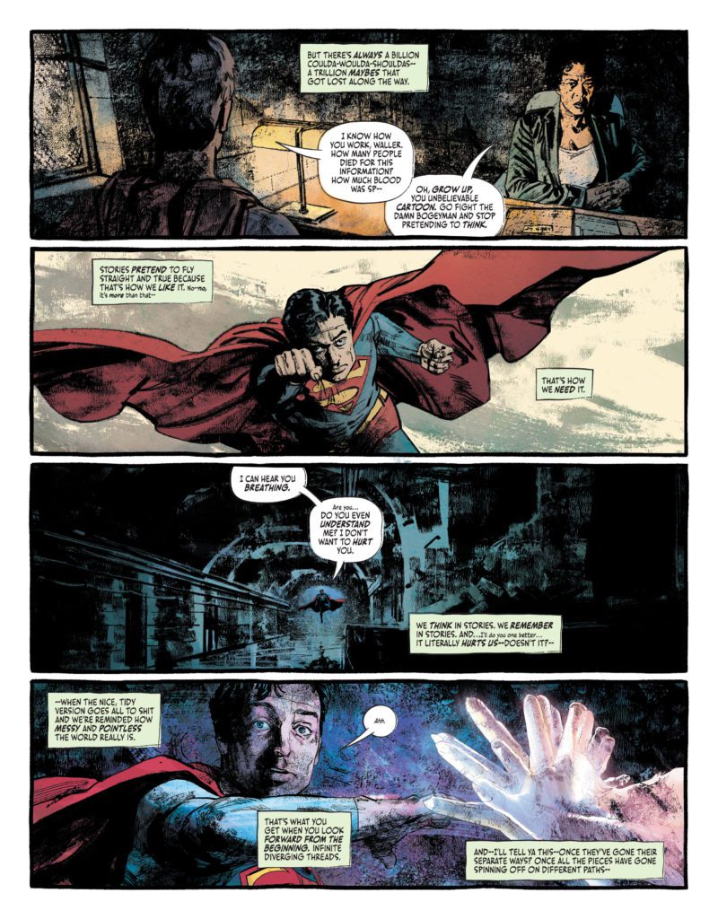
Writing
This issue begins by telling us what it’s not. The first few pages, narrated by our disillusioned protagonist, takes us through some familiar territory. We see Superman crash landing in Kansas as a baby then being raised by the Kents. Right when you think this story is taking a lighter tone, Spurrier gives us a wake up call. “Oh grow up, you unbelievable cartoon. Go fight the bogeyman and stop pretending to think,” Waller practically spits at the Man of Steel. These aren’t your mom and pop’s comics, Spurrier’s saying. The next scene, a superpowered sex scene between two terribly codependent people, is interrupted by moments of brutal yet somehow beautiful violence. Spurrier writes all of this from the perspective of Van Zandt – our protagonist who’s got the power of invisible arms. (Yes, you read that right.) Van Zandt is cynical about life, yet fascinated by it at the same time. He’s self-aware and self-destructive. With bloody action sequences, quiet quips, and lots of honest soul-searching, Spurrier presents a script that’s crackling with life.
Art
Campbell and Bellaire work so brilliantly in tandem with one another that it’s hard to see where one’s work ends and the other’s begins. Campbell’s linework seems to use bright oranges and greens just as much as it uses blacks. Bellaire’s colors bring shape to moments and characters, while also willfully obscuring details. The normal, run-of-the-mill discussions between our characters are shown with a more traditional approach. Campbell’s lines are clear and Bellaire’s colors stay relatively simple. But when the characters begin using their powers, the page becomes a mass of warring light. Campbell allows us to see small details that surface from the vibrant battles, while zeroing us in on the faces of these suicidal criminals between each bout. Bellaire pulls us right back in with sizzling greens, purples, and reds – which are all working to overcome one another. Campbell and Bellaire do a fantastic job of giving us a combination of realistic and comic book style combat. You come out the other end, unsure about what just happened and still reeling from the glory of the lightshow.
Lettering
Bidikar brings so much character to this script. For one thing, the dialogue and captions are written in one of two formats: either as your typical all-caps lettering, or in a lower case font that’s several font sizes smaller. With this, Bidikar has you hearing characters say things under their breath to each other, or even to themselves. Later, we see Captain Boomerang get more and more drunk as time goes on. His word balloons start out by having a wobbly edge to them. As he gets more intoxicated, the balloons begin to have small white dots around them too. You feel as though Boomerang’s words have begun to come out as a vapor. The white dots remind you of the spittle that’s probably spewing out of his mouth. Throughout this book, Bidikar is constantly changing things up, somehow finding ways to highlight all the most important parts of this chaotic, rollicking adventure.
Verdict
Suicide Squad: Blazeis more than just superhero satire. Sure, it spends plenty of time poking fun at the trappings of your typical comic. But it also rises above all that – and sometimes gleefully sinks below it – to really discuss what it feels like to chase relevancy. This creative team is doing something there aren’t sufficient words for. They’re here to make you laugh, cry, and maybe piss your pants. Don’t miss Suicide Squad: Blaze #2, out from DC Comics today, at a comic shop near you!
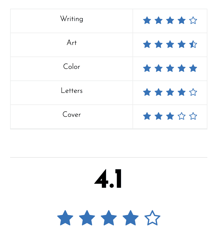
The art of reviewing a comic book is hard work, and most reviewers are not professionally trained. However, with the invention of the blog and social media — everyone can be a critic, which is amazing and god awful. Over the past seven years of running Monkeys Fighting Robots, the Editor in Chief and I have developed a five-star system for reviewing books.
5.0 = A near-perfect comic; one of the year’s best. You’ll remember this issue for a long time.
4.0–4.9 = An excellent book that’s well worth your money. It has memorable moments, stunning art, and a fundamental understanding of how comics work.
3.0–3.9 = A pretty good, middle-of-the-road comic. Maybe not worth your money unless you’re a big fan of the series/character.
2.0–2.9 = Meh, it’s okay. Below average. Not terrible, but ultimately forgettable.
1.0–1.9 = It’s bad. Maybe it has one or two redeeming qualities, but the bad outweighs the good. It’s not worth your time, let alone your money.
0.0–0.9 = A terrible, horrible, no good, very bad comic. Not worth your time, let alone your money. You probably shouldn’t bother reviewing the book if this is your score.
I would add one caveat that the rating or grade you give a review should be consistent with your previous reviews. A five-star review should mean something and not be given out at the drop of a hat. Create a list of five comics you believe are perfect, and then judge all other comics against them. But, again, reviewing comics books is an art form, so everything is fluid.
So now that you’ve established a baseline for reviewing a book make sure to review every aspect of the comic, and definitely DO NOT RECAP THE STORY. Talk about the writing and how it made you feel. Make sure to question and break down the pacing of the story. Your review is about a comic book, so the bulk of your review should be about the artwork, panel layout, colors, and letter work. The cover is an essential aspect of a comic too. Did the cover make you want to pick it up off the shelf?
Talk about your favorite page or panel to take your review to the next level. It should be easy to write about, and your reader will notice and feel your passion. Talking about your favorite page will help you focus on panel layout, colors, and how your eye led throughout the page. It should all lead to the question, what does this mean? That question will then lead you back to the book’s writing, and hopefully, you will expand on that section of your review.
A comic book is a fantastic piece of artwork that invokes an emotional response, talk about how the book made you feel! In future installments, I will talk about how to critique the specific elements of a comic book.
Writer James Tynion IV (Something Is Killing The Children, Batman Detective Comics) returns to DC and brings along artist Lisandro Estherren for a new window into an old world with The Sandman Universe: Nightmare Country #1. With guest art from Yanick Paquette, colors from Patricio Delpeche, and letters by Simon Bowland, this opening chapter is a wonderfully macabre start to this new story in the Sandman mythos. With a smart, tense, and darkly humorous script and unique standout visuals, this comic is a must for both old Sandman fans and newcomers alike.
“Sometimes, nightmares walk the Earth. Every night when you sleep, the Lord of Dreams chooses the path you’ll follow…into a sylvan Elysium, or down the hallways of your darkest fears. And sometimes, if it is Dream’s will, those nightmares escape those halls, and go out into the world. But it is not a choice he makes lightly. Today the Corinthian walks the Earth again. The most feared of all Dream’s nightmares, his ravenous mouths have made him a legend among serial killers. Letting the Corinthian out among mortals is the most dangerous thing Dream could possibly do. But he has no choice-because there is another nightmare walking the Earth, one that must be hunted…and this monster is one that Dream, lord of all nightmares, did not make.”
Writing & Plot
It’s safe to say that James Tynion IV has a signature style of horror writing. He brings that style to bear and mixes it with some old Vertigo ingredients for his script in Nightmare Country #1. His work here mixes his foreboding horror sensibilities and signature dark humor with poignant reflections on living in this timeline as a millennial – another detail he’s very good at. He then sprinkles in bits of poeticism that even Neil Gaiman himself would be proud of. This comic nails the goal of feeling like a Sandman book while also being something totally new and exciting. The way Tynion hints at coming terrors and conflicts while still always keeping the tension in the present is constantly compelling. There is an unceasing dreamlike quality to the whole comic. Every character conversation and small moment that we *know* isn’t part of a dream/nightmare still very well feels like it could be. Again, this is that Sandman quality making itself known throughout the book. Despite this the comic never feels unclear. Everything feels pointed and purposeful – and I’m sure we’ll find out why in the coming chapters. Like Si Spurrier and G. Willow Wilson in their Dreaming runs, Tynion adds his voice to Gaiman’s mythology with a comic that is totally loyal to the concept and thematic core of that original universe – but still feels wholly unique unto itself.
Art Direction
Tynion tends to get his horror scripts visually told by wonderfully unique artists, and Nightmare Country #1 is no exception. Much like Werther Dell’Edera in Something Is Killing The Children, Lisandro Estherren’s art in this comic gives this story a singular style that perfectly captures its uncanny tone. Estherren utilizes his wavering, sort of rough-hewn penciling to great effect. His characters always seem like they’re caught in a dreamy haze (which they kind of are). His visual interpretations of nightmare creatures are striking and unnerving, and are sure to stick in the reader’s mind long after they’ve closed the book. His visual approach is one that feels like it belongs among some of that old Sandman work. He fits in to a modern day camp of artists who bring the same sort of uncanny style to comics that Kelley Jones and P. Craig Russell did to classic Sandman, but here in a new light. Estherren’s direction and blocking add more to both the tense nightmarish sequences and the dreamy, uncertain pacing of the comic as a whole. Yanick Paquette’s portion as guest artist is as stunning as you’d imagine, but it also sticks out a bit much. Still, it does nothing to stop the overall stellar visual flow of the comic.
Patricio Delpeche’s colors make up much of that hazy, dreamlike-feel of this issue. His murky watercolors give off an unnerving feeling and cast the book in a dim pallor that really completes the comic’s tone. Simon Bowland returns to The Sandman Universe on letters, and unsurprisingly he’s as brilliant as ever. He utilizes numerous fonts for different characters, replicating the work of Todd Klein in the original Sandman while keeping his own style intact and fresh. Visually, this comic is a great atmospheric treat that crafts a timeless Vertigo-esque quality for the reading experience.
Verdict
The Sandman Universe: Nightmare Country #1 is a creepy and stylish new chapter in the legacy of this beloved world. James Tynion IV returns to DC to craft new nightmares in his signature brand of poignant, eerie, and darkly funny horror and he absolutely nails it. The visuals from Lisandro Estherren and Patricio Delpeche are rife with memorable visual terrors in a style that feels like it picks up where the more gruesome classic Sandman issues left off. This is a must-read for both Sandman fans and complete newcomers. Be sure to grab this comic when it hits shelves on April 12th!
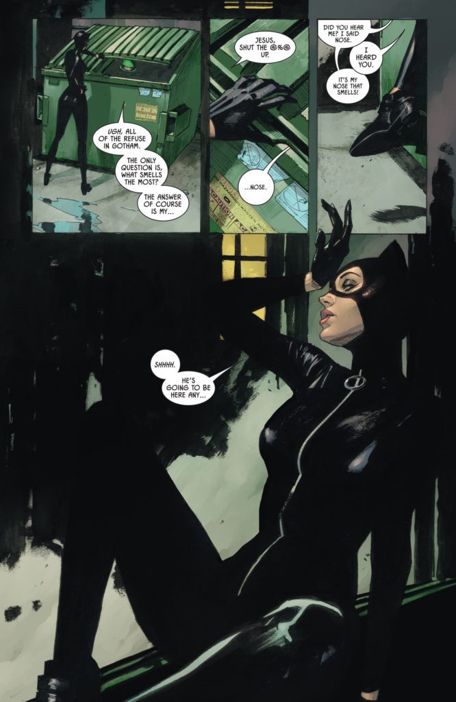
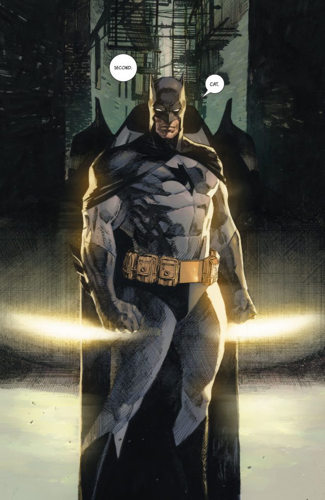
DC Comics’ Batman/Catwoman has been a complex series. The creative team — writer Tom King, artist Clay Mann, colorist Tomeu Morey, and letterer Clayton Cowles — have generally had an incredible knack for making the story (which happens over three distinct timelines) clear. WhileBatman/Catwoman #11 still manages to be clear in its storytelling, despite introducing another timeline (or two?) to the narrative, its intricacies make it hard for any of the emotional beats to land.
Writing
There’s nothing wrong with writing a complex series. King tends to be a master when it comes to making you feel for characters, even when you don’t fully understand what’s happening to them. And part of what complicates things for Batman/Catwoman has occurred outside of its own story. The series has been plagued by scheduling delays. A guest artist, the incomparable Liam Sharp, was brought in to fill in on some issues. Sharp’s visual language is quite different to Mann’s. As stunning as Sharp’s work is, it was a departure from the status quo from the series, which made some of the narrative a little harder to follow at times. Mann’s return to the story, interestingly enough, had a similar effect.
So, maybe King’s script would flow brilliantly if not for these creative speedbumps and delays. But as it stands, Batman/Catwoman #11 feels a little dry. Nearly every scene is a fight scene or a chase. These blend together and ultimately have little effect. We jump around in time so often that the reader is spending more time trying to keep track of where they are now. It’s hard to actually take in and experience any given scene. Batman/Catwoman #11, however, is a climax of sorts. All of the shit that’s gathered over the series thus far is flung at the proverbial fan. And so, maybe the chaos and confusion of the issue is deliberate. Maybe we’re supposed to be left scratching our heads when we turn the final page. As is often the case with penultimate issues, only the finale will really tell us if this issue was effective in what it was setting up. Perhaps this series will read better as a collection, where the reader can more easily keep track of each avenue this story goes down.
Art
Mann certainly knows how to set a scene. And in the chaos of this issue, he manages to make certain moments stand out as more action-packed than others. Panels teeter, looking like they’re barely holding in place. Characters fall into the gutters of the page, punched or kicked over by an adversary. Much of Mann’s work has a 3D effect in that sense. You feel like characters are about to fall into your lap, like you could reach out and catch them before they hit the ground. Some moments feel like they’re fully focused on the theatrics of the scene, rather than the emotion surrounding what’s happening. There are many pages throughout this issue that feel like they pull away from the characters. Several moments obscure characters’ faces in shadow, or show them at such a distance that it’s hard to see their expressions. When Mann focuses us in on someone’s face, he speaks volumes through subtle looks and gestures, counteracting the drama of every other scene. Unfortunately, it doesn’t feel like there’s enough of these moments to create a good balance in this issue.
Coloring
Morey’s coloring choices continue to tie the threads of this story together, color coding each timeline to give us a sense of when events are happening. There is one moment, however, that is quite distracting. The Riddler hides in a dumpster as Catwoman pulls the lid over his head. In the dumpster, as Catwoman closes it, we see Riddler’s hat standing out in brilliant green and purple. It feels like his hat should at least look a little duller due to the shadows, if not be completely invisible. Despite this moment, Morey brings plenty of cohesion to Batman/Catwoman, while also telling us something about each scene. In a Christmas themed showdown between Batman and Joker, the scene becomes gradually more and more violent. As the violence increases, so does the red glow that’s cast over events. Another rooftop scene is shown in a mix of pinks and greens. The warm pinks are slowly overpowered by the cold greens, as hope drains from one of the characters. Morey’s work isn’t just eye-catching. It also helps guide this issue through its many thematic arcs.
Lettering
The one big upside to the near constant action of Batman/Catwoman #11 shows up in Cowles’ lettering. The “BZZZPP” of a futuristic taser, Joker’s laugh trailing off far outside of its word balloon in uneven letters, the “BLAM,” “POW,” “BAM” sounds of battle… all of these moments stand out in colorful glory. The fight scenes feel fun and vibrant thanks to Cowles’ work. And then, as the issue comes to a close, he shifts his tone. A “SLLLLKKKKTTTTT” sound effect, accompanying an action that ends out this issue, is shown in scratchy red letters. Cowles doesn’t want this moment to feel lighthearted or run-of-the-mill. He makes it look desperate and brutal.
Verdict
There is a lot about Batman/Catwoman #11 that feels like it should be high stakes. But the convoluted nature of this chapter, and the art’s tendency to pull away from character faces during action sequences (which make up most of this issue) means that most of the emotional beats fall flat. Batman/Catwoman has gone through changes in its creative team and delays in its release dates, disrupting the flow of the story at times. So it’s hard to know how much of Batman/Catwoman #11 is deliberately delving into chaos and confusion, and how much of this effect is accidental. Pick up Batman/Catwoman #11, out from DC Comics April 12th, at a comic shop near you!
The Super Bowl is the second-biggest sporting event of the year behind the World Cup, and Carvana introduced that captive audience to the Oversharing Mom who loves everything about her car a little too much. Director Paul Trillo figured out the puzzle to create this popular advertisement.
It’s entirely possible that the Super Bowl is the only event where millions of people watch the commercials. In fact, studies suggest that nearly 50 percent of viewers watch solely for that reason. In the Oversharing Mom, viewers are treated to a hilarious performance from Michelle Simms, some precision editing, and slick direction. The piece comes from ArtClass, a next-gen production and post-production company founded by award-winning director Vincent Peone and veteran producer Geno Imbriale.
PopAxiom spoke with director Paul Trillo about making the shortest short films, known as commercials, and making the Oversharing Mom.
Problem Solving
Paul’s love of film began early on, when he received a video camera in middle school and began making stop-motion Star Wars toy videos. Things only progressed from there. “In high school, we’d do weird skits and Tom Green-esque kind of things. Our school had a green screen and some cameras.” By the end of high school, he was learning Premiere and After Effects.
Paul went to art school for painting, but gave that up because he kept wanting to pick up the camera. His time in film school wasn’t conventional. “It was very much an experimental, conceptual-based school. So I resisted that a little.”
“I wanted to do comedy stuff,” he explains, “while everyone else was doing their art films.” That teaching started to trickle into Paul’s work after college, despite the clash. He began doing experimental and technique-based short films and music videos.
His brand of filmmaking garnered attention on Vimeo a little over ten years ago. Eventually, after a lot of technical work around camera moves, VFX, and blocking, he started on commercial work. “The problem-solving aspect is very engaging. It gets stale after a while to have only technical work.”
About The Oversharing Mom
Things freshened up immensely when ArtClass and Carvana came calling. “I was excited about the Carvana spot. It was part of four ads, but this one was more comedy-based.”
“All four spots are so different,” he explains. “The other ones have some sort of technique or production design element. For one, we built a goldmine on a stage. Another is told in an Edgar Wright sort of style. Another is VFX heavy. They all had these different ingredients. So, they were looking for a director who could adapt and have a lot of different things that they’ve explored in their work.”
That director was Paul. “It was a competitive pitch, but I gravitated toward the Oversharing Mom. They gave me a template about a mom badgering different people with her spiel. So I found different ways to have fun with that.”
“We probably had about three weeks of pre-production and eight shooting days,” he shares. “That’s for all four. One spot was on a stage; another was in multiple locations; we had interiors, exteriors, and night exteriors. So it was a huge puzzle trying to figure out how to shoot all these ads in just a few days.”
The answer to the puzzle was planning. “We shot one vignette with the mom one day. Another day we shot on the set. So we could spread it out and shoot multiple things per day.” Filming ended in November, then there was about six weeks for post-production. “It’s been a long process, but the spot landed in the Super Bowl.”
Working With Arne
“It was bizarre and surreal,” Paul says about the Oversharing Mom ending in the Super Bowl. “I found out just at the beginning of February.” Paul spent several months with the spot close and on his screen, so he had to watch the Super Bowl at someone else’s house “to make sure it was real.”
What’s an essential part of Paul’s process? “Working with storyboard artists. Some people are comfortable without storyboards. But a lot of the stuff I do is precisely timed or has some sort of shot design to it. So nailing the storyboards and animatics is vital to make sure each shot fits. You can figure out a lot of stuff later, but you have to have the bones of it ready.”
“For this particular campaign,” he continues, “there was a lot of production design. So, working with our production designer Arne Knudsen is also super-important to get things right. The tones, paint color, where we’re putting the cameras in our 3D set design. So, it’s only little surprises when you walk on set.”
The Right Mom
“We were so lucky Michelle Simms came through,” Paul says of the star who made the whip-camera moves and to-the-second editing all the better with her performance as ‘Mom.’ “This was a non-SAG shoot, so our talent pool was reduced. The whole thing lives and dies on the mom’s performance. It made me nervous.”
Paul admits that the auditions weren’t bringing in anyone who had the right mix. “But, Michelle brought so much character to it, and she was the clear winner for all of us.”
“Michelle Simms’ strength,” he adds, “shows how she stands out against these other ads with superstars. I hope they extend her contract and do more with her. She could carry more of these ads.” Why not an ‘Oversharing Mom’ sitcom?
Wrapping Up
Paul’s a cinephile who can rattle off a long list of influences. But he narrows it down for us. “I love the Coen Brothers. Everything they do always has such a strong tone. They’re masters of tone and a huge influence on me. Early on with music videos, Michel Gondry and Spike Jones were able to do these conceptual-based music videos. I loved how what they do is very simple and very complicated. On paper, it’s simple, but to execute it is where they show their strengths.”
For the Oversharing Mom, Paul pulled creative energy from a particular place. “For this spot, I loved the work of Swedish director Roy Andersson (A Swedish Love Story, About Endlessness). He does these pathetic comedies with sad people in long takes. But it’s sad and funny and poetic.”
“I’m developing projects and taking a little break from the ad work. Last year [2021] was crazy,” he admits. “It felt like two years packed into one after the near-stoppage of production in 2020.”
One of those projects is a sci-fi documentary about a blind man who gets his vision back with the help of a device that’s providing visual information.
What did you think of the Oversharing Mom?
Thanks to Paul Trillo and Impact24 PR
for making this interview possible.


")
 LETTERS
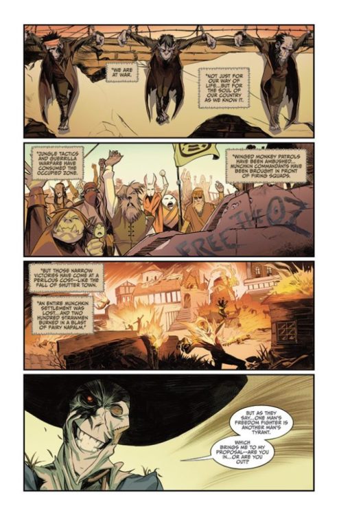


")