If you backed the Kickstarter campaign, the digital copy of THE O.Z. #2 (of 3) hit your inbox last week. The book is written by David Pepose, with art by Ruben Rojas, Whitney Cogar drops the color, and you will read DC Hopkins’ letter work. According to Pepose, you will be able to buy the book from davidpepose.com once the hard copies arrive from the printer.
About THE O.Z.:
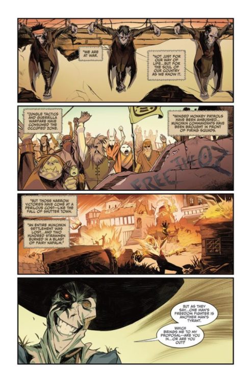
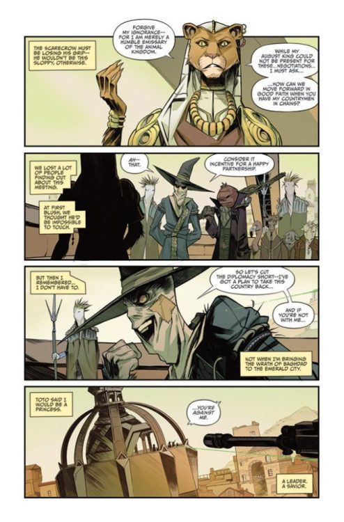
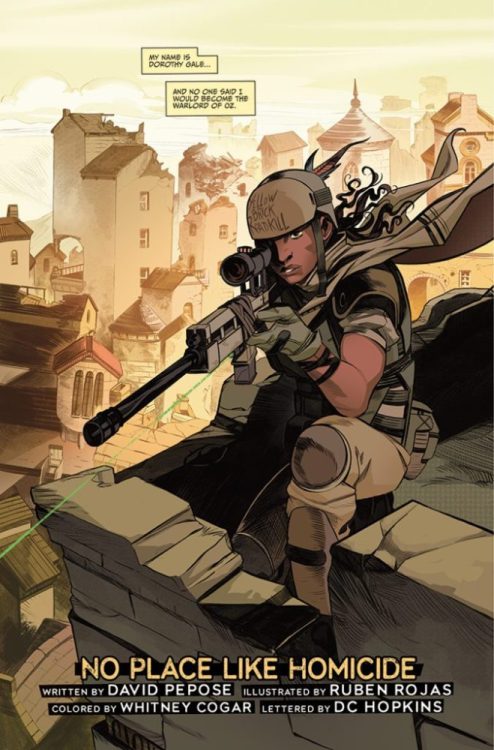
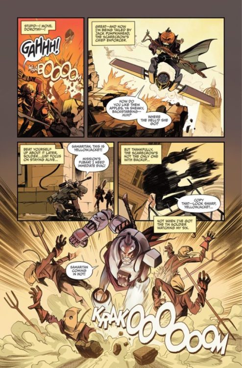
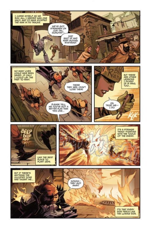
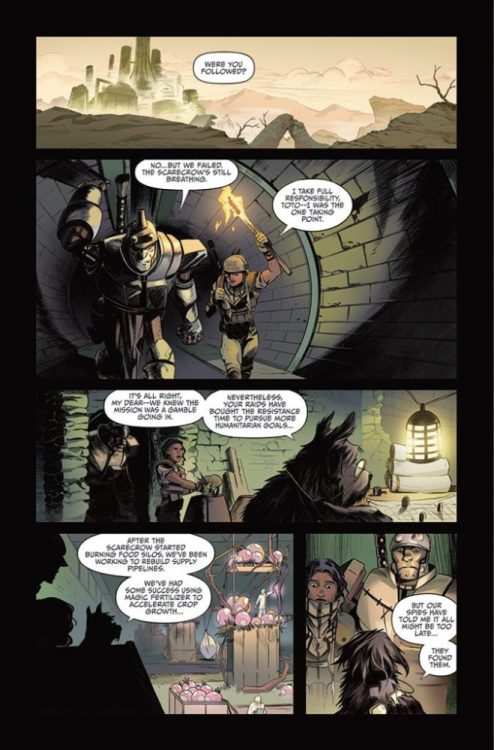
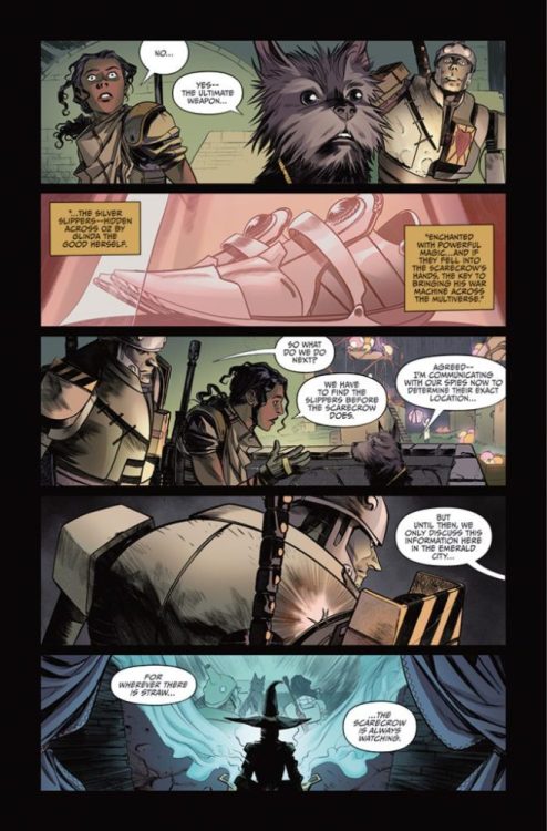
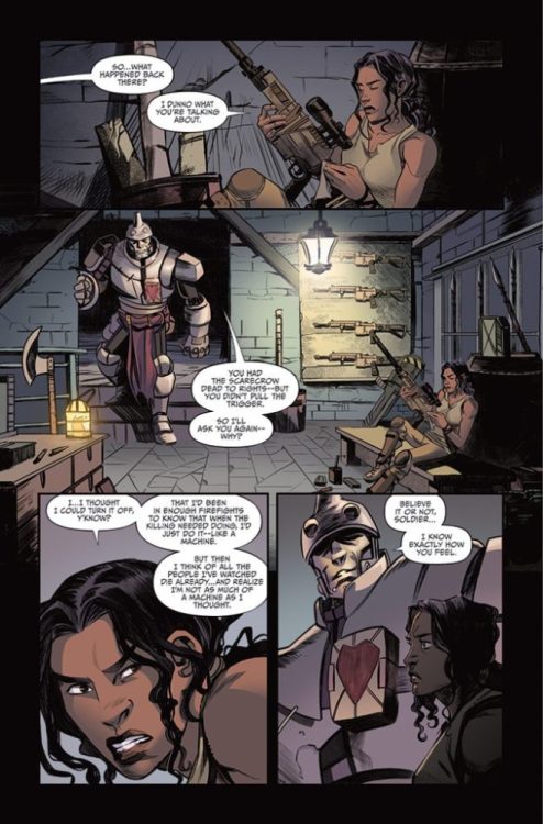
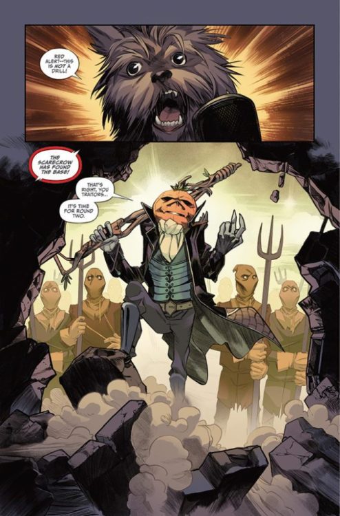
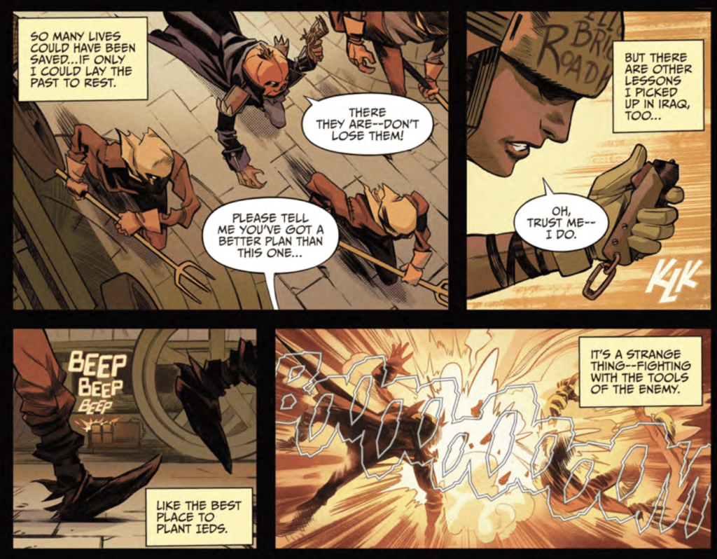
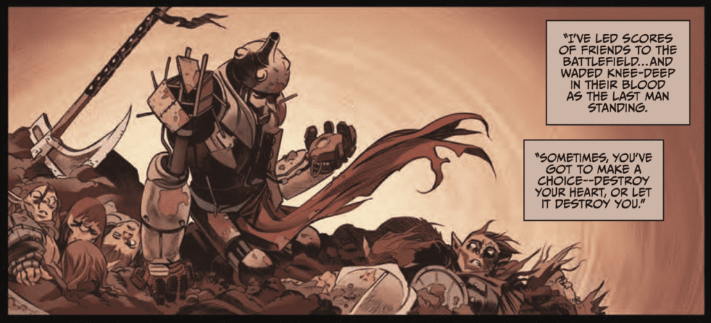
Decades ago, when a young girl defeated the Wicked Witch of the West, she said farewell to the magical land of Oz… but unwittingly plunged the country in a vicious power vacuum leading to years of brutal civil war. But a generation later, the name of Dorothy Gale lives on in her granddaughter, an Iraq war veteran grappling with disillusionment and PTSD — yet when a tornado strikes Dorothy’s quiet Kansas town, this former soldier finds herself in the war-torn battlefield known only as The O.Z. Forced to navigate warring factions led by the Tin Soldier, the Scarecrow, and the Courageous Lion, Dorothy must come to terms with her legacy and her past if she ever hopes to bring peace to the Occupied Zone.

WRITING
The first two issues are oversized with solid breaks, which makes THE O.Z. #2 read like chapters three and four of the story. The first issue introduces all the characters and main plot points. Now, Dorothy is in the thick of the war, and the tension and stakes continue to build.
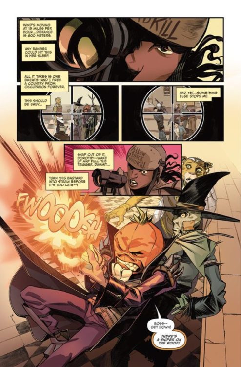
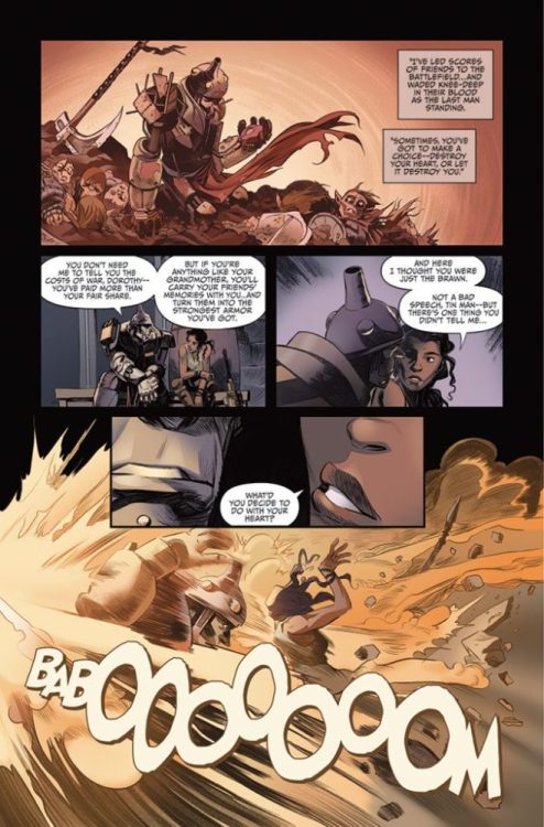
Pepose exceptionally writes the story’s pacing; as soon as you think the story starts to slow down, you get jerked in another direction. The changing of locations adds to the feverish pace, and in a world like OZ, the color palette is different every four pages. Then Pepose keeps raising the stakes of the story. It’s like a rollercoaster that continues to climb but never drops. Your heart gets tighter and tighter, desperately wanting the fall. Then you realize that this is only issue two, and the drop isn’t coming.
I can’t decide if Pepose is an amazing mixologist that takes familiar ingredients to create a new fantastic drink, or an early 90s hip-hop artist sampling all the different genres to create a unique sound and an epic album. All the concepts in this book are familiar, and we’ve seen them many times before, but THE O.Z. feels right. The land of OZ was always just a few steps away from straight-up scary. The story elements of a war-torn OZ and a broken hero’s journey work so well that I am begging for the third issue.
ART
Rojas has a ginormous task at hand as the book is always moving with action, different sets, dragons, and the all-powerful OZ. Rojas’ vision for the all-powerful OZ looks beautiful and intimidating. It could be my favorite part of the issue. Also, the emotional range that Rojas draws into a dog is ridiculous. His skills are top-notch.
The panel layout and storytelling elements of Rojas’ work are next level. The book’s pace is fierce due in part because how Rojas directs your eye throughout a page. You see the emotion and the action because Rojas wants you to, and the traveling line of sight also lends to the rollercoaster feeling you have at the end of the book because he brought you on this journey.
COLORS
Cogar’s color palette is brilliant. I felt emotion, action, and desperation. The flashback sequences have a beautiful, melancholic feel to them. You instantly know it is not the present and the moment’s mood. There is a page with a bazooka, and the colors frame and highlight the action. The choice of red and yellow puts the moment right in your face. Then there is a page where the reader looks up at the sky; Cogar’s color choices and Rojas’ art create an infinite depth. The depth allows you to get lost in the book. From desert to snow, from forest to underwater, Cogar created a unique color experience for each location.
 LETTERS
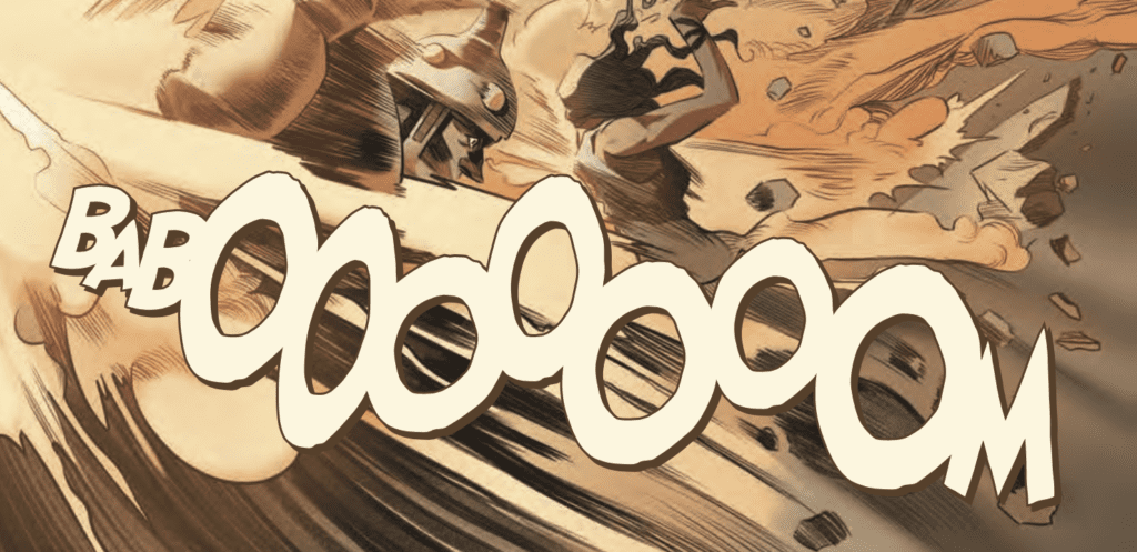
Hopkins’ letter work in this issue is prideful. The detail and the minor tweaks are all there, and it looks like he’s having fun with every explosion. The BABOOOOOOOM above displays Hopkins’ craftmanship in a nutshell. He used multiple fonts, and you feel like Hopkins laid each letter on the page until it felt right. With all the onomatopoeias in the book, and there are many, Hopkins worked well with Cogar’s color palette. The sound effects look like part of the book, not a Photoshop afterthought.
OVERALL
THE O.Z. #2 (of 3) is the sum of its parts; the writing is solid, the art is spectacular, the colors are fresh, and the lettering is epic, which translates into a must-read book. I don’t know how the creative team will close out the series, but I’m excited to read the next chapter.
Read the first 11 pages of THE O.Z. #2 (of 3) below: