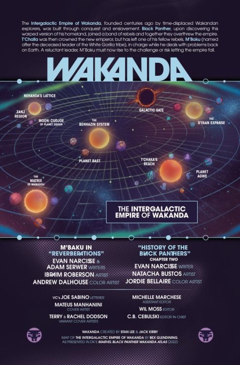
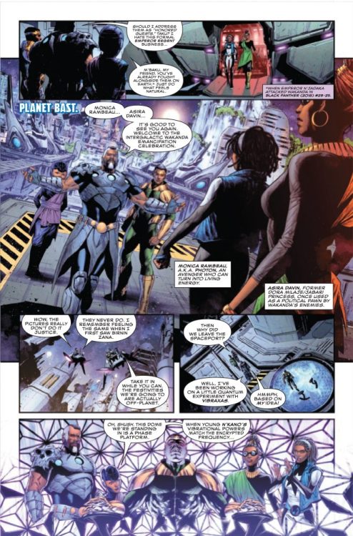
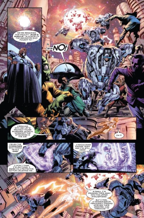
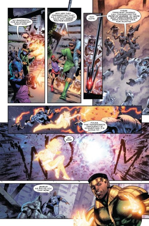
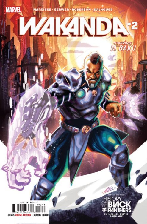
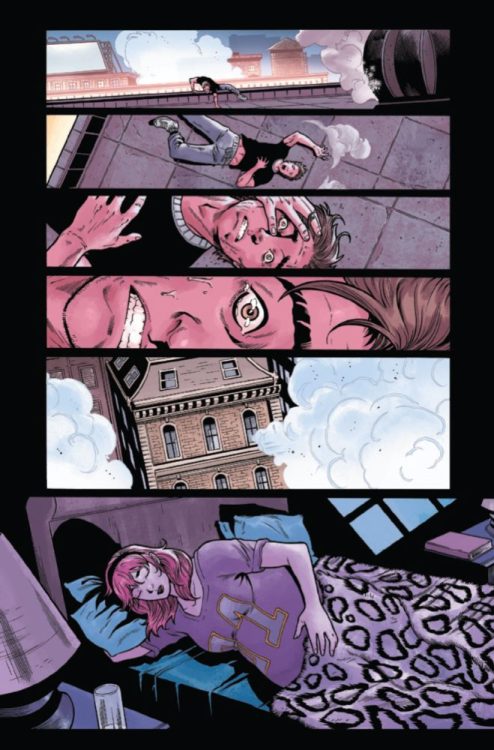
WAKANDA #2 hits your local comic book store on November 16th, but thanks to Marvel Comics, Monkeys Fighting Robots has an exclusive four-page preview for you!
About the issue: M’Baku proves his worth! While T’Challa has been handling situations on Earth, M’Baku has acted as regent over the Intergalactic Empire. And when a foe from Wakanda’s past threatens to destroy its future, M’Baku will prove why the cosmos were entrusted to him. Plus, Evan Narcisse and Natacha Bustos’s definitive History Of The Black Panthers continues!
The issue features two stories: “Reverberations” is by writers Evan Narcisse & Adam Serwer and artist Ibraim Roberson, with colors by Andrew Dalhouse; “History of the Black Panthers” continues from WAKANDA #1, and is also written by Narcisse, with art by Natacha Bustos, and colors by Jordie Bellaire. Joe Sabino letters both stories, and the main cover is by Mateus Manhanini.
Marvel Studios’ Black Panther: Wakanda Forever hits theaters this weekend on November 11th.
Check out the WAKANDA #2 preview below:
Are you seeing Black Panther: Wakanda Forever this weekend? Sound off in the comments!
From rising comics talent Zoe Thorogood (The Impending Blindness of Billie Scott, Rain) comes her deeply personal and impossibly creative autobiographical graphic novel creation in It’s Lonely at the Centre of the Earth. Running the gamut of human emotion with her narrative and reflecting upon Thorogood’s life via hyper-imaginative visuals, Center of the Earth feels like something we shouldn’t be allowed to read – but will come away thankful that we can.
“Cartoonist ZOE THOROGOOD records six months of her own life as it falls apart in a desperate attempt to put it back together again in the only way she knows how. IT’S LONELY AT THE CENTRE OF THE EARTH is an intimate metanarrative that looks into the life of a selfish artist who must create for her own survival.”
The Thorogood Method
So, normally I structure reviews by discussing the writing and visual elements of a comic separately and on their own merits, and how they interact with one another. That approach doesn’t work with It’s Lonely at the Centre of the Earth. Thorogood’s writing is so intertwined with her visual approach that the two are completely inseparable.
It’s Lonely at the Centre of the Earth is a tough book to talk about in terms of its storytelling approach because it doesn’t really have a structure. Thorogood covers this six-month span of her life while spinning into hyper-imaginative asides and flashbacks that give context to her thought process. This graphic novel’s intimate account of very personal experiences is another thing that makes the story tough to critique because it’s so, well, personal. Thorogood allows readers a first-hand look at her depression, past traumas, and intimate life interactions. There’s an inescapable feeling while reading Centre of the Earth that we shouldn’t be seeing this – like we’re opening Thorogood’s sock drawer and reading her diary. Similar to Marjane Satrapi’s Persepolis, Thorogood illustrates her lowest moments alongside her greatest feats with seemingly no fear. This work’s greatest strength is how it balances levity and absurdity alongside the doldrums of normalcy – and the trenches of crippling depression. Thorogood’s choice to anthropomorphize the people she encounters in her life is very clever, and adds whimsy to some of the comic’s more delightful scenes. The humor – which always hits – feels that much better coming out of the bird-version of Thorogood’s best friend. One of my favorite scenes involves a convention and a little frog guy cackling like a goblin after Zoe draws him a picture. Most surprising though is just how much emotion she is able to wring out of these anthropomorphized figures. In true Bojack Horseman fashion, a boy with a cat’s head breaking off any possibility of romance somehow manages to be emotionally difficult to watch.
All of this is really just scratching the surface of what this graphic novel accomplishes – and just how deeply it delves into Thorogood’s personal life. Centre of the Earth is not a light read. As funny as this book often is, it’s matched by a very real bleakness due to Thorogood’s exploration of her own depression. For every belly laugh, there’s a heartbreak. While this is a warning about what readers will be getting into, it’s also an enthusiastic endorsement of how she discusses these complex issues. Her dialogue sensibilities and timing are stellar, feeling naturalistic while fitting into her dreamlike visualizations. Thorogood interweaves interaction and thought with her page structure to craft a reading experience that is both smooth and enrapturing. Her weakest moments are presented with a feeling of cold isolation, with dull grey colors and typically a plainer sequential style that slows down the reading pace. When Zoe dives deep into her own head is where the book – and her visual style – get immensely more creative. Any sort of panel and sequential structure is eschewed in favor of sheer imaginative depth. Thorogood blends so many artistic styles together – from her typical style to hyperrealism to simplified pencil sketches – to create something that is so uniquely hers. There are a couple moments where she actually incorporates photos into the book. This could easily be seen as overkill bordering on pretentiousness from other creators, but with this graphic novel’s tone and thematic feel, it’s a move that really works. Thorogood’s work here is the best example of a creation of something that is so wholly comics this year.
Zoe Thorogood’s It’s Lonely at the Centre of the Earth is a wondrous achievement as both an autobiographical discussion and as a piece of the comics medium. The skill and ingenuity of her visual storytelling approach is staggering and awe-inspiring. Thorogood’s courageous honesty is supported by her hilarious deadpan humor and then tied all together by her absolutely insane artistic vision. Centre of the Earth is an important work as a discussion of trauma, depression, and the hope that can keep one moving forward. This is an absolute must-read, and without a doubt one of the best comic creations of recent years.
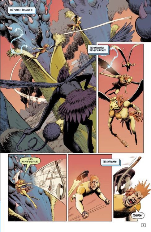
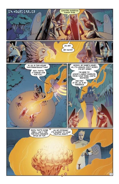
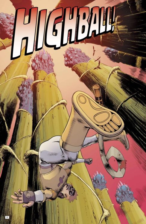
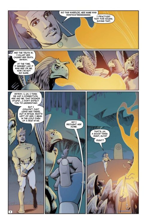
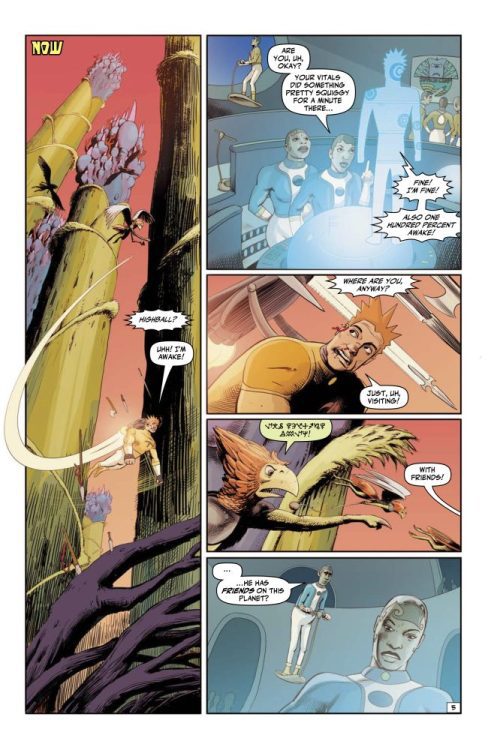
HIGHBALL #3 hits your local comic book store on November 16, but thanks to AHOY Comics, Monkeys Fighting Robots has an exclusive five-page preview for our readers. The book is written by Stuart Moore, with art by Fred Harper, Lee Loughridge drops the colors, and you will read Rob Steen’s letter work.
About the book: It’s a “Battle in the F***ing Trees” when Highball tries to return the remains of a dead bird-warrior to her home planet. Featuring more action, more angst, more alcohol, and more very, very bad decisions!
WILDC.A.T.S #1 from DC Comics hit your local comic book shop Tuesday; we take a look at the colors, letter work, and our favorite panel of the issue on this week’s episode of the Panel Breakdown.
WILDC.A.T.S #1 is written by Matthew Rosenberg, with art by Stephen Segovia, Elmer Santos drops the colors, and you will read Ferran Delgado’s letter work.
About WILDC.A.T.S #1: Spinning from the pages of Batman comes the senses-shattering new series! The HALO Corporation has gathered a motley crew of operatives, led by Cole “Grifter” Cash, who are going to make the world a better place…no matter who they have to kill! Working in the shadows of the DC Universe, this new covert team has been tasked with gathering an elite group of scientists for the first phase of their plan…but the ‘Cats mysterious leader, Void, might have other plans!
Judgement Day has come and gone, and the world is still standing. There will be no rest for the X-Men, though, as there is always another threat waiting to attack. X-Men Red #8 hit shelves this week, and Al Ewing has another problem for our mutants to handle. Madibek Musabekov on pencils, Federico Blee on colors, and Ariana Maher on letters are joining Ewing on this issue.
WRITING
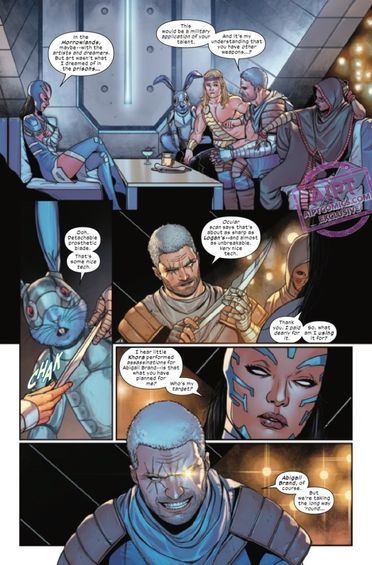
X-Men Red is considered one of the best X-books on the shelves. Al Ewing is a big reason for the praise of this title. His writing resonates with readers, and he takes the necessary time to build up a story arc. This latest issue feels like a continuation of his S.W.O.R.D. series. Ewing uses many of the same characters, Cable, Manifold, and Brand, and the story has a similar tone. I love that Ewing is utilizing Frenzy in this issue. He also brings up her crush on Scott Summers, a call back to Mike Carey’s Age of X story. Ewing does a great job of showing what a tactical mastermind Abigail Brand is. She’s been playing mutants from the beginning and has made some nasty alliances. Ewing will likely delve more into this as the story arc progresses, but he has set up an exciting start with this issue. If there is one thing we can count on when we pick up an issue of X-Men Red, it’s that Al Ewing is a great writer and will always do right by the fans and characters. This continues to be one of the best titles Marvel put out.
ART
Madibek Musabekov handles the pencils. Having never heard of Musabekov before reading this issue, I thought he was a fantastic artist. The pencils for this issue are clean and clear. It’s easy to go from panel to panel and admire the talent that Musabekov has. It’s great to see Brand sitting with a stern look as she watches the events play out between the Kree and the Shi’ar. While this isn’t an action-packed issue, Musabekov does draw great group pages. As Manifold teleports the team, Musabekov uses different panel layouts. One is a close-up of the team. When they arrive, he uses a shot from above to establish some layout of the new and mysterious location. Musabekov’s work on this issue is outstanding and gives readers beautiful visuals as they read Ewing’s script. The art team on this book crushed it this week, and Musabekov’s pencils paved the way.
The colors by Federico Blee are as good as they usually are. Blee has a high standard for his work, and this issue highlights his talents. Blee uses a vibrant yellow and gold as the team transports. This is simply eye-catching and impossible not to look at. As the X-Men travel on their ship, Blee uses bright blues to symbolize coldness. This is contrasted by the bright gold on Manifold’s uniform, who is a key contributor to the mission. The thing that works the best for this issue color-wise is the fact that Blee allows certain things to pop into the issue. Abigail Brand’s green lips and hair stand out. Deathbird’s purple uniform. All of these are strategic moves made by Blee, and they work exceptionally well.
The letters by Ariana Maher complement the art that is on the page. My biggest gripe with the lettering is that there aren’t enough sound effects. Maher gives us a “SNIKT” as Cable unsheathes techno-organic claws, but that is nearly it. Maher’s word placement is top-notch, though. She never allows anything to be covered up by word balloons and enables her placement to show off the art. An overall good issue from Maher, but more sound effects are always welcome.
CONCLUSION
X-Men Red #8 is starting this story arc the right way. Al Ewing brings back fan-favorite characters and uses them. The art is excellent for this issue and may not be topped by another book out this week. X-Men Red is out at a comic shop near you!
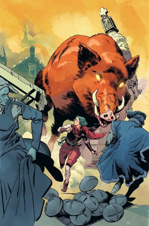
From acclaimed comics creator Will Morris (The Silver Darlings) comes a fascinating and endearing piece of historical fantasy in Gospel #1. Smart, witty, and beautifully constructed, Gospel is a style of comic that is seldom seen in the medium — one planted in reality while dabbing its toes in the fantastical, all the while asking the reader to keep up.
About Gospel:
When opportunity refuses to knock for restless hero Matilde, the devil comes knocking. Inspired by the work of Hayao Miyazaki and set in the chaos of King Henry VIII’s reign, Gospel is a thrilling fantasy adventure that questions the truth behind the stories we tell. Thrust into action by a hellish arrival, Matilde and storyteller Pitt will quest for answers that threaten to tear them apart and trigger the toughest question of all: “who am I?”
Writing & Plot
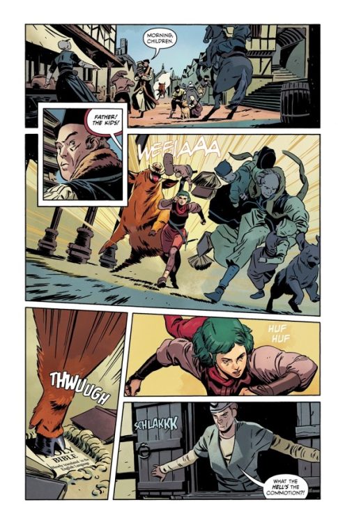
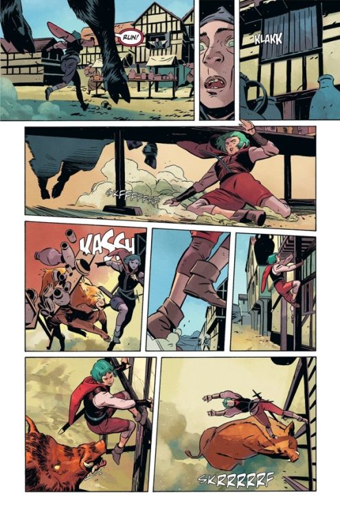
Gospel #1 cements its fictional identity with Morris’s clever historical fantasy style. A masterful work of tone, this comic stays on the serious side with its subject matter, but is somehow also immensely fun. The reformation of the Catholic church under Henry VIII was, as we could gather, a historically turbulent and brutal time. However, with this period being so long past and with the fantasy possibilities tied to post-renaissance storytelling, Morris jumps at the opportunity to create something both joyfully endearing and insightful. The core plot is relatively simple: Matilde is a parish defender of the faith trying to do good deeds and earn a reputation as a sort of religious hero. Her problem is that, with all this upheaval and chaos in the wake of the Church’s reforming, it’s very difficult to find anything of note to even do. This is where Pitt the storyteller comes in, as he agrees to embellish tales of her heroics. Of course, the inner details of the characters’ lives — as well as the appearance of a possibly truly formidable foe — add complications to the plot that will no doubt make this story all the more intriguing as it continues.
Morris’s dialogue sensibilities do a great job of instilling a sense of place as the reader spends time with the cast. He uses a sort of modernized period-speak to maintain the blend of history and fantasy, even through the characters’ own words. There’s a great moment midway through the issue where the fantastical period speak and more plain, modern dialogue directly clash in one of the comic’s most memorable (and a touch confusing) scenes. Morris has created a brilliantly interesting first chapter that may be a bit dense for some, but is a sheer delight for those looking for something as whimsical as it is complex.
Art Direction
Will Morris is an even more impressive artist than he is a writer, which makes Gospel #1 an even more insane achievement. His densely detailed environments and beautifully animated characters pull readers into the story with ease. His Miyazaki-inspired historical-fantasy direction is remarkable to experience, with Morris crafting one of the most memorable settings in comics this year. His sequential direction stays busy as well, with pages being filled with numerous panels that carry both action and quieter moments along with a perfect sense of pace. The visual experience is rounded out by Morris’s vivid and varied color palette, which is some of the most stunning work I’ve seen in a comic this year. His work here is very similar to Mat Lopes’s work in comics like The Dreaming, with a style that retains a sort of familiar realism while being airy enough to pass off as fantasy. This is a visually stunning comic, and I can’t wait to see how Morris presents it as the plot thickens.
Verdict
Gospel #1 is a brilliant and unique opening chapter of historical fantasy. Will Morris’ storytelling is complex, clever, and constantly fun, making for a wildly engaging read. His visual work is among the best in comics this year, with excellent detail, animations, sequencing, and staggering color work. Be sure to grab this opening issue when it hits shelves on November 9th!
The Fifth Force Cover art Credit: Heavy Metal Entertainment
Based on real world science and current conversations around the switch to renewable energy, The Fifth Force is an original Graphic Novel from the Hero Projects, and published by Heavy Metal Entertainment, that mixes fact and fiction. Focusing on decisions made in the past and the potential to change these, the comic focuses on the “what if..?” inherent in all time travel stories. Created by Catherine Loubier as a way to raise awareness in younger generations about the transition to clean energy and the potential impact on our lives, the writers and artists have turned the real world problems into a time bending, political science fiction story.
Earth is on the brink of destruction due to poor decisions made in the past. The world is choking on history’s mistakes and only the TFA, a special Canada-based agency, have a chance of saving it. They have made a revolutionary discovery which has led to the construction of a time machine. Time is running out and the TFA team only have a few jumps to put history back on the right course. Will the future scientists manage to convince the past that Humanity has to change its way?
The Fifth Force Credit: Heavy Metal Entertainment
Time Jumps and temporal slips
The premise of The Fifth Force is straight forward: it is a simple time travel story with an ecological bent. It’s the 1990s television series Slidersbut with eco-warriors. Following three central characters as they travel into the past in order to save the future isn’t really new territory, but the standout factor for The Fifth Force is the motivation behind the travelers, and indeed the book itself: Climate Change. Within most mainstream comic books, any commentary about world politics is background noise to the main drama unfolding in the narrative, whereas Loubier’s creation is the reverse. Throughout the book, the driving force of the narrative is the science and the geo-political discourse across decades of the 20th and 21st centuries.
The script, written by Mathew Medney and Morgan Rosenblum, is exposition heavy as the details of the story are merged with informative details of political and cultural landscapes. The crux of the narrative is that the TFA are attempting to change the world’s reliance on fossil fuels, and the script uses this to educate the reader in all of the elements of the discussion around Clean Energy. The pros and cons are discussed as part of the larger story with potential risks playing out through the narrative, highlighting dangers, but also demonstrating the potential rewards for the planet and Humanity.
This type of narrative can become very preachy, spending more time on the message and not enough on the story. Medney and Rosenblum are able, for the most part, to integrate both aspects into a science fiction adventure story with a surprising pace, packed with twists and turns that will keep the reader turning the pages. It is true that many of the twists and turns won’t be shocking to aficionado’s of time travel adventures but a newer, younger audience will be swept up by these changes in narrative direction. Even though the inclusion of climate change as a narrative driving force has been used before — such as in the movie Millennium from 1989 which used pollution as the reason for the time travelers jaunts into the past, and in the novel Superseeds by Geoffrey Beevers — in this instance, the message is also the story. In Superseeds, Beevers uses a time travel element to enable the leading scientist to stop world famine, but the heart of the story is a beautiful yet tragic love story, whereas The Fifth Force wants Climate Change to be the leading element and the characters to play second fiddle. The three central agents have moments of character, but these are often lost or forgotten as the story traverses forward. For brief moments, you get to see behind Martina Silas’ brash exterior, and then you wait for this element of the character to be explored, but it never comes to fruition. Perhaps a follow-up series could expand on the characters and the world they inhabit, acting as a companion piece to this original graphic novel.
The Fifth Force Credit: Heavy Metal Entertainment
Art and design
One of the greatest challenges for new comics is getting the world design to fit the narrative. Visual tone and atmosphere is everything in order for a book like this to work. The main focus of The Fifth Force is to engage younger generations, some who may not be avid, or even casual, comic readers. With this aim, Adriano Vicente does an excellent job of creating visuals that are both futuristic but also recognizable. At no point does the future world become something that isn’t accessible. This isn’t about breaking boundaries design-wise; the aim is to engage through recognition and to facilitate understanding and learning. Vicente has designed the characters and locations to do just this. It’s not fancy, out-of-this-world vistas as you might expect from Moebius’ work or other contributors to Heavy Metal magazine. This is mainstream television level visuals, not an art house French movie.
The characters are individual, easily recognizable from panel to panel, and emote well on the page. Vicente has a good flair for dramatic poses and shifts the viewing angles across the page to draw the reader into the story and punctuates various narrative points. Occasionally, the panel layouts are confusing and difficult to read. The expected reading order of the panels on some pages have been altered, which could cause new comic readers to lose their place and potentially push them out of the story. There are several pages that would have Neil Cohn scratching at his head, but as a general rule, the construction of this book is straight forward and easy to read.
The color work is exciting and bright, again leaning into the audience it is aimed at. Despite the End of the World narrative, the coloring is almost fun, allowing characters and locations to pop from the page. There is an overpowering sense of the dramatic built into The Fifth Force, something that colorist Thiago Ribiro, and later on William Soares and Flavio Silva, picks up on. “Keep it clean and keep it entertaining” appears to have been their brief, one that they adhere to on every page.
Similarly, the lettering, also by Flavio Silva with Mohamed Samah, ticks all the right boxes. There is nothing experimental or groundbreaking, but that’s not what is required in this book. There is a mission behind The Fifth Force and the artists are there to help promote that, not bedazzle the reader with expressive art. Although, for those readers who are looking, there are a number of wonderful nods to other great works of science fiction and time travel. Images that reference Planet of the Apes, designs reminiscent of Squid Game, and sequences straight out of a H. G. Wells novel.
The Fifth Force Credit: Heavy Metal Entertainment
Conclusion
The Fifth Force has an agenda, conceived by Catherine Loubier and propagated by the artists. It is a worthy cause and the intentions behind producing this graphic novel, to reach younger generations, have shaped the way this book has been produced and laid out. It should have a place on the shelves of any school library and in the classrooms and lecture halls of all educational establishments. From a purely comics point of view, it toes the line of standard comic book conventions without challenging any of these concepts. The narrative has been delicately constructed but nothing within the story is particularly new or exciting.
Although there are other comics available with a similar concept, The Fifth Force has an emphasis on its message and is aimed, primarily, at a different audience to most mainstream comics. This isn’t the X-Men fighting for survival in Days Of Futures Past or the DC superheroes trying to unravel the goings on in Zero Hour; The Fifth Force is rooted in real world science with a real world goal. If some of the plot had been tighter and the layouts were more challenging, this book may have a greater appeal, however, for the intended audience and purpose, The Fifth Force is a clever, educational read and will be the perfect book to study in either science or art classes.
BATMAN & THE JOKER: THE DEADLY DUO #1 from DC Comics hit your local bookstore this week. We are going to take a look at four different aspects of the book and why they worked so well in this week’s episode of the Panel Breakdown.
The first issue is written by Marc Silvestri, with colors from Arif Prianto, and you will read Troy Peteri’s letter work.
CHAPTER ONE: THE ENEMY OF MY ENEMY The Joker will go to any lengths to get Harley Quinn back after she is abducted by a strange culprit. But who? Mysterious, Joker-like monsters are stalking the streets of Gotham, collecting severed heads. But why? Jim Gordon is missing, and after receiving a package containing a bloody piece of Gotham’s commissioner, Batman knows he must be willing to do anything to save him. But how? When The Joker proposes an uneasy alliance with Batman, the answers to those questions begin to become clear— and they will shake Gotham City and the Bat-Family to their core. This meticulously crafted tale of the Dark Knight’s deadliest team-up will introduce you to a grim and gritty Gotham that only Marc Silvestri could bring you.
Did you pick up BATMAN & THE JOKER: THE DEADLY DUO #1?
From writer Tate Brombal (Barbalien: Red Planet; House of Slaughter) and artist Nick Robles (The Dreaming: The Waking Hours) comes a tale of biblical apocalypse and coping with longstanding trauma in Behold, Behemoth #1. Featuring lettering by Andworld Design, this opening chapter spills a box of puzzles pieces and only begins to put some together, all while miring most of this unsettling story in a dark mystery. With a tight, unnerving script and brilliant atmospheric art, this is one of the most engaging first issues of 2022.
“Greyson’s world is crumbling following his brother’s sudden and mysterious death. His sleepless nights are haunted by vivid nightmares of a terrifying monster, pushing him to the brink of losing both his sanity and his job as a social worker. But he’s truly shaken to the core when his newest case—a young orphaned girl named Wren—is found at the scene of a brutal murder, just hours after first meeting Greyson. The line between nightmare and waking life blurs as Greyson soon discovers that the monster from his dreams might just be real—a mythical, ancient beast that is bringing about the end of the world, with shocking connections to both him and Wren…”
Writing & Plot
Tate Brombal crafts a script with a special kind of horror mystery in Behold, Behemoth #1. Like a biblical mixture of Jacob’s Ladder and any sort of amnesia-murder story, this issue posits that the reality being seen can’t really be trusted – and that someone and something is causing this series of mass murder. All of these roads lead to the building apocalypse in the story’s background. Greyson, our main protagonist, is haunted by the death of his brother and plagued by nightmare visions and bouts of amnesia. The trajectory of his already disparate existence is altered even more drastically when he meets a young girl named Wren, who is directly tied to Greyson’s psychosis, a series of grisly mass murders, and this comic’s ever-encroaching apocalypse. Brombal sews together these enticing plot elements to create a chilling and fascinating tapestry of horror/mystery that presents more questions than answers. Brombal’s layering of religious life experience with the early life trauma is deeply poignant, and makes for a compelling anchor for fantastical elements. This comic’s biblical apocalypse approaches with a frightening relevance; exasperated news anchors describe nigh-impossible disasters with increasing amounts of disbelief. Their broadcasts are intercut with megachurch “fire and brimstone” sermons warning of the coming storm. Brombal’s deliberate pacing gives this comic the feel of a supernatural drama rather than an outright horror story, and allows for the story’s individual moments to leave a more lasting impression on the reader. Behemoth is off to a brilliant start thanks to Brombal’s writing chops alone, and the wait for the next chapter is going to be a long one.
Art Direction
Just as impressive – if not even more so – as Brombal’s script is Nick Robles’s visual work in Behold, Behemoth #1. One of the most recognizable artists working in the industry today, Robles brings his heavy lines and detailed animations to work in this atmospheric supernatural thriller. He effortlessly cuts from the more realistic scenery to the nightmare sequences with a consistent feel, mainly due to the aesthetic he crafts for this comic. While his character designs, sets, and penciling overall is highly impressive, it’s his color work here that really pulls the whole atmospheric experience together. Every page has a sense of gloom about it due to Robles’s unique coloring and use of lighting. Daylight scenes are presented in a sort of unsettling yellow, as if cast by an ill sun. Most of the scenes in the comic take place in the dark, and as such are lit by pale moonlight and television screens. This comic feels like walking through a night terror, and it’s the perfect visual experience that could be rendered from Brombal’s script. Robles’s panel and page sequencing is also outstanding. He constantly bends and breaks the standards for what readers would expect from comic direction, with panel lines that bleed and disappear but still retain a semblance of structure. The sequences where reality breaks off into Greyson’s realm of nightmares are brilliant, and show off Robles’s skill as an artist of the imagination. The lettering from Andworld Design is dynamic and unique, with hazy word balloons and SFX work that blends into the overall artwork while adding more texture to the reading experience. Overall, Behemoth is graced with brilliant atmospheric and imaginative visuals from one of the most talented artists in the business.
Verdict
Behold, Behemoth #1 is a complex and deeply intriguing start to this new supernatural thriller. Tate Brombal’s script evokes hints of films like Jacob’s Ladder and Stigmata, all while being utterly unique in its form. Insightful and tense, Brombal pens a first chapter that poses a lot of questions that will no doubt be fascinating to watch be answered. Nick Robles’s art is a brilliant combination of his usual outstanding animation with his eye for nightmarish sequences and unique direction. Be sure to grab this debut issue when it hits shelves on November 2nd!
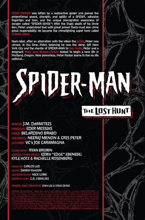
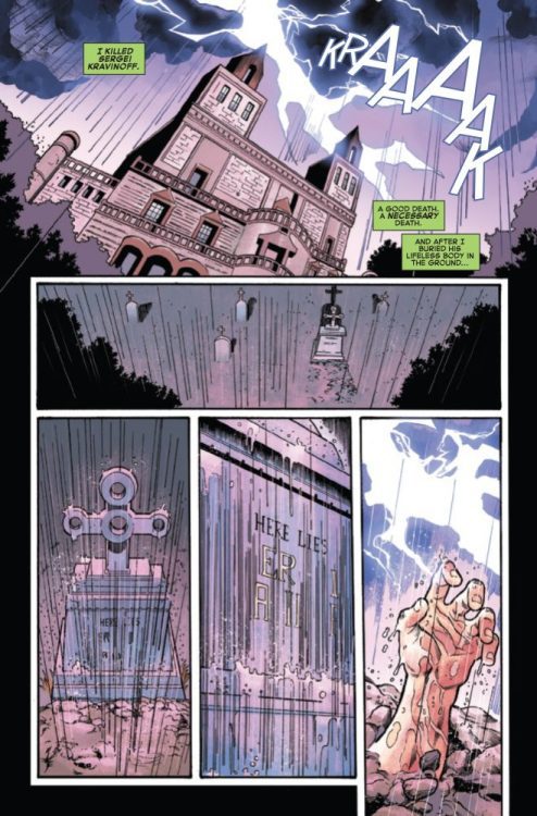
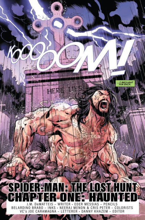
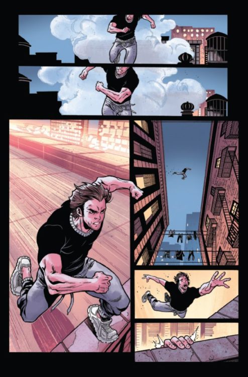
SPIDER-MAN: THE LOST HUNT #1 hits your local comic book store on November 9th, but thanks to Marvel Comics, Monkeys Fighting Robots has an exclusive five-page preview for you!
About the issue: The origins of Kraven finally revealed! J.M. Dematteis continues to spin new webs within the past, this time partnered with artist Eder Messias! Revealing secrets and answering mysteries Spidey fans have been waiting for — prepare to explore the depths of what made Kraven the Hunter the powerhouse villain he was! As Peter Parker and Mary Jane prepare for their new lives in Portland, a man from Kraven’s past stalks them. Who is this mystery man, and what does he want with Spider-Man? Find out when we return to the time period after Spider-Man: The Final Adventure when Peter Parker was powerless!
The issue is by writer J.M. DeMatteis and artist Eder Messias, with inks by Belardino Brabo, colors by Neeraj Menon & Cris Peter, and letters by Joe Caramagna. The main cover is by Ryan Brown.
Check out the SPIDER-MAN: THE LOST HUNT #1 preview below:
Are you picking up SPIDER-MAN: THE LOST HUNT? Sound off in the comments!