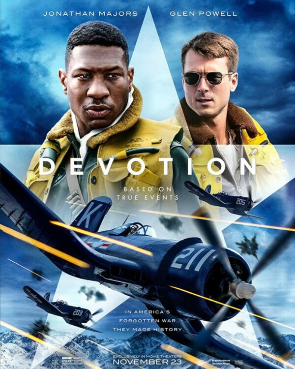
Devotion is a crowd-pleasing film based on an inspirational war story about the first black naval aviator. Top Gun: Maverick set a high bar earlier this year, making it difficult not to compare it to this latest war drama. Still, Devotion offers a moving narrative that is brought to life by two powerful performances. While its runtime could have been trimmed, the emotional weight of it all keeps the film engaging from start to finish.
The biographical war genre has been hit or miss in the past, and Devotion is a resounding hit for the most part. This wasn’t a project I was looking forward to, but that improved the overall experience. Devotion won’t achieve the lasting legacy that other war films have, which isn’t to say it’s an inferior project. It’s just being released during a year when Top Gun: Maverick will swallow any impact it could have had. Although, box office projections might prove me wrong. The film is directed by J.D. Dillard with Jonathan Majors and Glen Powell in the leading roles.
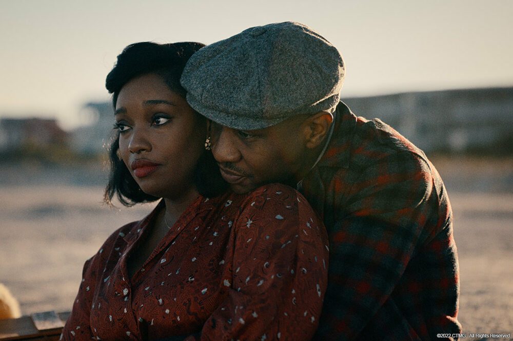
Devotion is co-written by Jake Crane and Jonathan Stewart, its story centers on Jesse Brown (Majors) and Tom Hudner (Powell). The Navy’s most celebrated wingmen during the Korean War. Specifically, it examines their interracial friendship and the obstacles Jesse overcame to make American history. Most of the characters are underdeveloped and one-note, but Jesse and Tom’s bond serves as the heart of this inspiring tale. Majors’ and Powell’s believable chemistry makes it easy to grow invested in their roles.
Racial themes are present, which can grow tiring during certain sequences. These moments are necessary to further establish resiliency of Jesse. While I personally haven’t experienced racism the way Jesse has, it’s motivating to see him brush it off and continue to chase his dreams. It’s an important piece of this character that sends an empowering message to the viewer. His colleagues feel sorry for him, but Jesse reminds them that he can fight his own battles.
The aerial sequences are a highlight of the film’s great cinematography but don’t offer the same thrill you’ll find when exploring the characters at the center of this story. The pacing isn’t the best, especially during the film’s second act which still delivers an enjoyable ride thanks to this inspiring script and the actors involved. Admittedly, I found myself growing tired of the movie towards the end until it picked up the intensity once more. Devotion gives Tom his own compelling journey, as he struggles to not feel sorry for Jesse while also staying committed to a promise he made.
Tom’s journey is socially relevant without being heavy-handed with the dialogue. The context of what is happening speaks for itself and Jesse doesn’t try to teach Tom how to not appear prejudiced. Jesse and Tom have their own separate arcs that draw them closer as friends. If there is one thing that will make this movie worth enduring, it’s the third act. It’s an emotionally draining finale that lets Majors and Powell demonstrate some of their best work during this film. Majors has Powell beat, but Powell still delivered one of the best performances I’ve seen from him in recent memory. If that doesn’t do it, the score featured throughout is very moving and will touch your heart at all the right moments.
Devotion won’t go down as one of the greatest war films, but I hope I’m proven wrong because it was an exceptional movie. It just falls flat during the second act, which could eliminate it from being a good movie to certain viewers. However, the constant comparison to Top Gun might propel this movie to legendary status as time passes.
A good rule of thumb for me is that if Geoff Johns name is attached to any DC book, you buy it. Johns is responsible for great stories like Blackest Night,Doomsday Clock and Flashpoint. He rarely misses his mark as a writer. As he returns to write Justice Society ofAmerica, any fan of DC comics has to at least be intrigued. Joining him on this story is superstar artist Mikel Janin, Jordie Bellaire on colors and Rob Leigh on letters.
WRITING
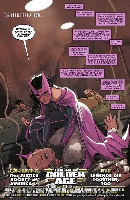
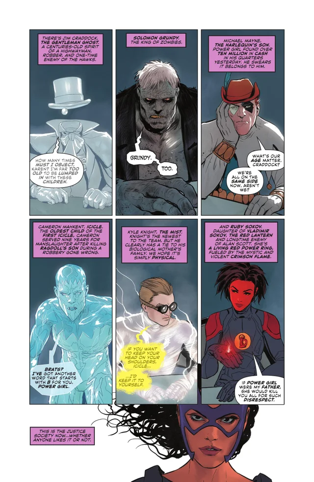
Geoff Johns starts this issue off with a time line for readers. The death of Batman’s parents, Catwoman leaving out of a window and the birth of Bruce and Selina’s daughter. This sets the tone for the rest of the issue. Helena Wayne has taken up the mantle of Huntress and she has her own running crew. Johns gives us enough of these new characters to get a feel for them and have an interest in them as well. Power Girl and Solomon Grundy are also on the team, so they aren’t all completely unknowns. What Johns does that works best for this issue is the internal monologue from Huntress. Johns allows us to see and feel everything she’s going through and his dialogue for her is intelligent, just like her parents. When there is action in this issue, it hits fast and hard. Johns keeps readers on their toes as we get punched in the gut with a shocking event in the issue. Johns continues to be one of the best writers with story structure and ideas, especially with his DC work. Justice Society of America #1 is an issue that twists and turns. It will keep your attention and interest while making you wonder what will happen next.
ART
Mikel Janin is a phenominal artist. This issue packs a lot of emotion, so the panels that work best are the ones that visually display that. Power girl getting upset with Huntress is effective because of the emotion we see coming off of both characters. Janin also makes this an aesthetically pleasing issue. Panels where Solomon Grundy and Huntress are leaving a building seems like a simple enough task. Janin silhouettes both characters in white so we only see their outline while the city is fully pictured behind them. This type of artistic gamble pays off and becomes one of the most memorable moments in the issue.
The colors by Jordie Bellaire are fantastic. Bellaire doesn’t make anything in this issue too vibrant to stick out, which works. This is a dark time in the DCU and Bellaire uses tones that reflect this. Huntress has a gorgeous purple outfit that doesn’t leap off the page at you, and it shouldn’t. As characters get picked off, Bellaire uses a red to mask the panel. This is effective because it signifies death. It encompasses the whole panel and draws the attention of the reader. Bellaire continues to be one of the most innovative colorists in comics.
The letters are done by Rob Leigh. As far as lettering goes in this issue, the thing that sticks out the most is Huntress’ internal monologue. Leigh is very careful to place all of these thoughts in the appropriate spots. Nothing runs into any of the pencils on the page and Leigh has them stashed on the right side as Huntress attacks a goon. Sound effects are crucial on an issue like this, especially when people are getting shot. Leigh goes with the classic “BLAMMM” as characters meet their end. The placement of the sound effects is key and Leigh places it out of the way of the action. Letters are crucial to a book, and Leigh does good job of making sure his work compliments the art work.
CONCLUSION
Justice Society Of America #1 is an excellent read. Geoff Johns crafts an excellent introductory issue that should engage readers and get them excited for what comes next. The art work is second to none this week. Janin, Bellaire and Leigh all give great effort to make this book look spectacular and they succeed. Justice Society of America #1 is the real deal and hands down the book of the week.
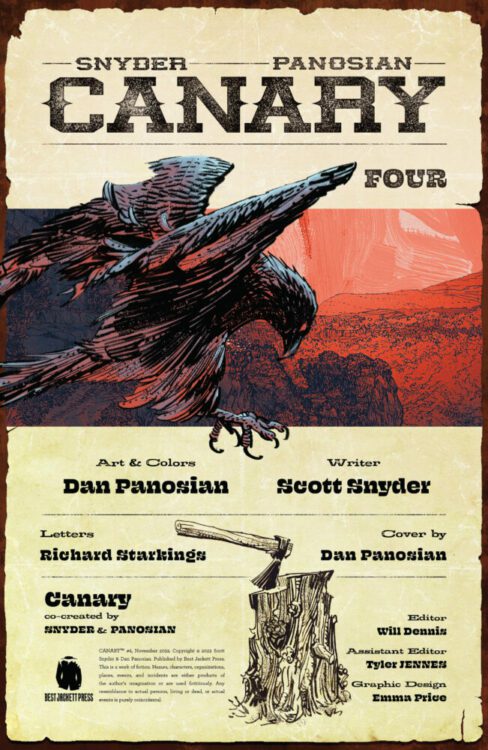
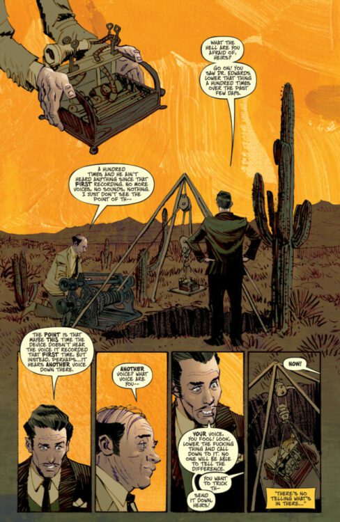
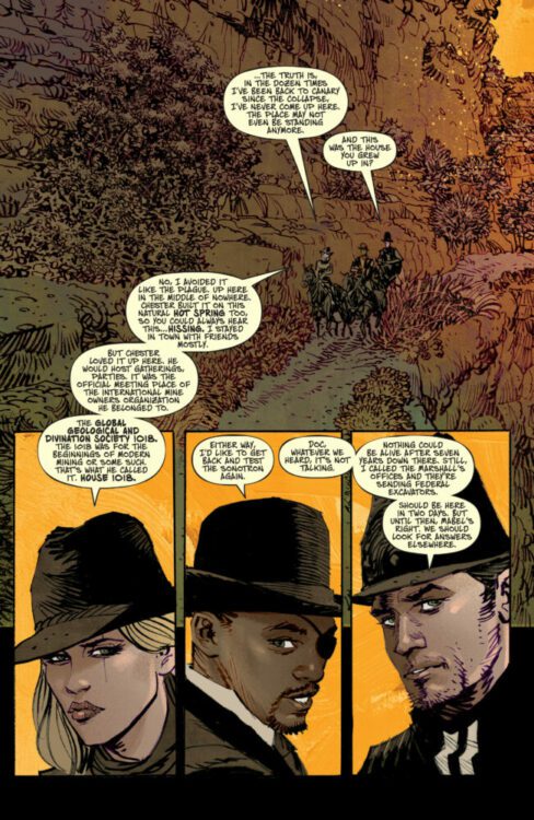
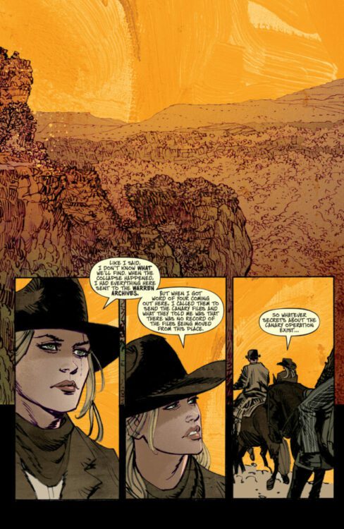
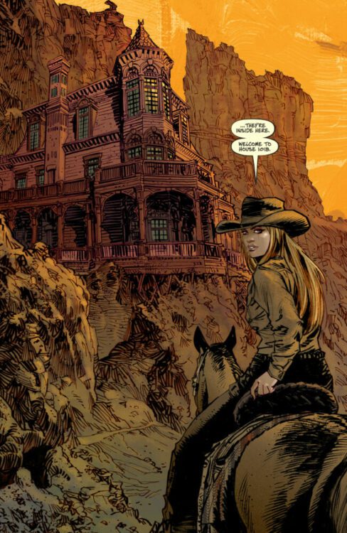
CANARY #4 drops digitally on Comixology on December 6th, but thanks to Amazon, Monkeys Fighting Robots has a four-page preview for our readers. The book is written by Scott Snyder, with art & colors by Dan Panosian, and you will read Richard Starkings’ letter work.
About CANARY: When a horrific shooting disturbs the peace of a sleepy town in the Old West, Marshal Holt is called upon to investigate. But as Holt digs deeper, he discovers that evil may just run to the core, and it all seems to stem from a place called CANARY. From writer SCOTT SNYDER and artist DAN PANOSIAN comes a western tale that will make your blood run cold…
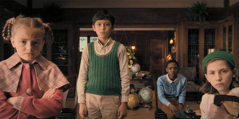
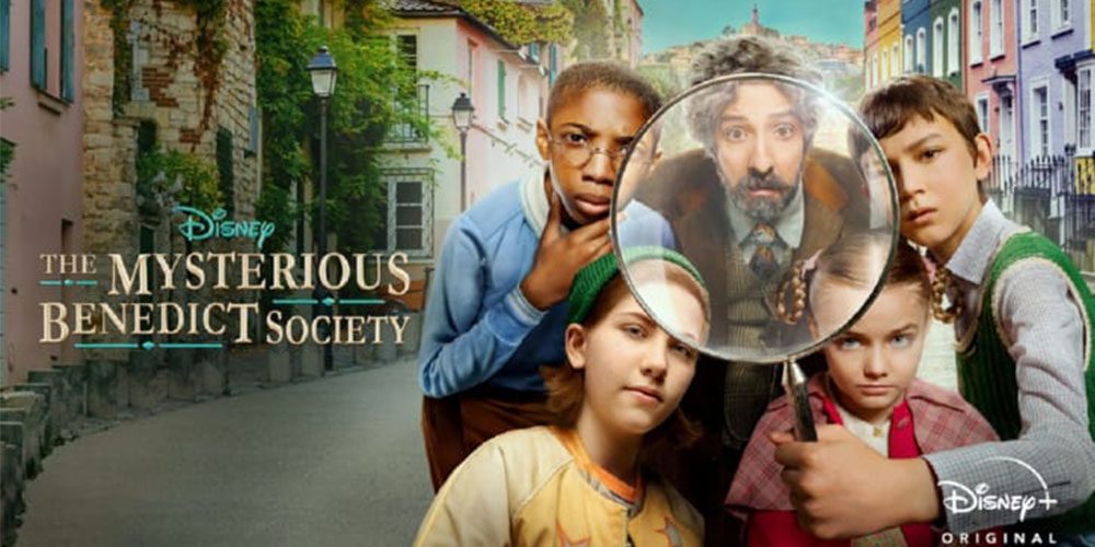
The Mysterious Benedict Society is a Disney+ series based on a quartet of children’s books by Trenton Lee Stewart, where four children unite to save the world. Now wrapping up its second season, the show brought in producer designer Cynthia Charette (Pumpkinhead, You) to continue the unique, stylized vibe.
In the series, four children, Reynard (Mystic Inscho), “Sticky” (Seth Carr), Kate (Emmy DeOliveira), and Constance (Marta Kessler), are either orphans or outcasts recruited by Nicholas Benedict (Tony Hale). The kids are selected because they possess innovative, intelligent minds and unique, complementary skills. For example, Reynard is super-smart, Sticky remembers everything he reads, Kate is a clever creator with a bucket of tricks, and Constance is a force of nature even though she is the youngest member. The kids learn to be a team in season one while saving the world. In season two, they do a little globetrotting.
Cynthia’s story starts in Nashville, Tennessee, where she was “the artist in school and knew I didn’t want to sit behind a desk.” But Cynthia “found theater. So I went to Syracuse University and majored in theatre design which I love. You get to create worlds on stage for the story.”
“I moved to New York and soon found that it was hard making a living in theatre,” she laughs, “I had a friend who was a director out of USC. He raised money for his first film, a low-budget horror movie called The Offspring. We had a budget of 250 thousand dollars, and it was an anthology.”
At this point, Cynthia was ready to work on anything she could get her hands on. “So, I went to Georgia to make the film.”
“For my first film out, we had an anthology that included the civil war, 1930s carnival, 1950s, and 1970s.” A wild mix of eras that require vastly different details. No pressure. “I was the designer, costume designer, and scene painter, and my crew were free kids from high school. I loved it. It hooked me. I knew I wanted to do it. I got to be creative and hands-on.”
Now hooked on production design, Cynthia moved to Los Angeles, and “after about six months, I got my next job.” Her burgeoning career took her into two projects — Shocker and A New Nightmare — with horror legend Wes Craven. “I loved Wes. He was a great mentor to me.”
Cynthia also worked with Stan Winston on his directorial debut Pumpkinhead. “You know, Stan Winston and Wes Craven allowed me to come to them with story and ideas. Like the burial ground in Pumpkinhead, that wasn’t even in the script. They’d let me take the visuals to another level.”
About The Mysterious Benedict Society
“I didn’t know anything about the show or story. But my agent called me saying they were interested,” she says about her path to becoming part of The Mysterious Benedict Society. “So I watched season one and thought, ‘No way, are you kidding me!’ I’ve been training for this show my whole life.”
“I was reflecting [recently] that some of these projects I did, one called Trusting Beatrice and another called Trading Mom with Sissy Spacek, they let me be so creative. I got to build worlds, and I mean every hand prop, everything that you see. Those projects were similar to what I’m doing now with the Mysterious Benedict Society.”
In the interview, Cynthia, who has an extensive portfolio, “put together all the creative stuff I’d done for other similar productions.”
The Mysterious Benedict Society is a show for tweens or early teens, and the production puts viewers in a vivid, detailed, and stylized world. Every scene looks like a flavor of ice cream. “That makes absolute sense. It’s a plan. It’s not by chance. We care about every detail.”
“I have to keep the crew on the same page but keep it fun and creative for them to get them engaged,” she says about her day-to-day work. “If we all work together, it’ll work, and you can tell the shows where they just gloss over certain things.”
That’s Not Blue
The Mysterious Benedict Society is a show full of vibrant, complimentary colors. Each character is distinct in attitude and motivation, and look. So how do they get such rich colors playing together? “Color is a gift that I have. I’m known for that. People say ‘blue,’ and I say, ‘No, that’s HC150, or that’s HC153’ I can tell the difference.”
“They didn’t have the color pronounced as I do, but I studied season one,” she says about taking the production design reigns for season two. Michael Wylie (Pushing Daisies) was the production designer on season one of the series, so what information did Cynthia receive? “I love Michael. The tone had been set. We studied it and looked at where we had to go. We’re traveling across Europe, so wherever we go, as I’m creating these different worlds, tonally, those ebb.”
The interplay between colors derived from the production and the costumes is worth watching The Mysterious Benedict Society. Especially for cinephiles. How does Cynthia and costume designer Chris Karvonides work together? “I’ll set a specific palette, then work with Chris and props and decorating to match things.”
“But sometimes Chris would have to make a costume before a set was even started,” she continues, reminding us that film and television productions are in constant motion. “Her trailer was right next to my trailer. I would run over there many times, look at her fabric, hold my palette up to it, and that’s the care we put into it. Especially when it comes to color, it works. We both cared that much.”
“When you get a show like Benedict where you can make a storybook come alive, we’re not going to let it down. We’ll raise the bar and keep it as high as it needs to stay.”
The Process
Production designers create the worlds around the actors we know and love to help tell the stories we can’t get enough of. Season two of The Mysterious Benedict Society takes things up a level, including vehicles, which brings up an essential aspect of production. “The vehicles showed up out of the junkyard. I’d have to design all those. The VFX team would get designs. It’s also important for production and visual FX to work together early on.”
“The first time I try to read it through,” she says about reading scripts and the start of the process. “It’s hard; my mind goes into visualization immediately. Then, the second pass, I start breaking it down to figure out all the sets.”
What does breaking it down for Cynthia entail? “We look at page count. If there are five pages on one set, we know they’ll spend more money, or it’s a bigger set. If I get an eighth of a page on one huge set, I talk to the producer about how we want to get that done or is it getting cut.”
“Our show has a lot of sets,” she adds, “and unfortunately, the budget takes priority. Sometimes you have to fight for a set because you feel it’s important.”
Wrapping Up
Cynthia’s influences include films like “Mary Poppins and Chitty Chitty Bang Bang, then Beetlejuice and LemonySnickets, just creative worlds. But also films from the 30s, the Art Deco, and glamour. I either love fantasy, like joyful fantasy, or absolute beauty. Anything beautifully designed.”
“It’s not in my DNA to blow up and kill,” she laughs, “But designing beauty and worlds. Never Ending Story is another favorite of mine. I’d love to do a period piece like Pride and Prejudice. I also love Succession. But I would love to do a remake of something glamorous from the 30s or 40s.
Season two of The Mysterious Benedict Society is now available on Disney+. So, what’s next for Cynthia? “I’m busy on other projects until we hear about season three of Benedict.”
Is The Mysterious Benedict Society on your watch list?
Thanks to Cynthia Charette and Metro PR
for making this interview possible.
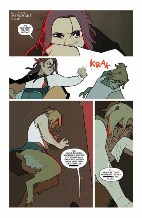
JUSTICE SOCIETY OF AMERICA #1 hit your local comic book store this week from DC Comics. The Panel Breakdown deconstructs the fantastic line work of Mikel Janín combined with the spectacular color palette of Jordie Bellaire. Geoff Johns writes the series, and you will read Rob Leigh’sLeigh’s work.
Check out the Panel Breakdown below.
About the issue: THE NEW GOLDEN AGE, CHAPTER ONE: LEGENDS DIE TOGETHER TOO
A long-lost hero from the JSA crashes into our era with a grave warning…but it’s too late. A mysterious and malevolent enemy has invaded the entire history of the JSA, and an all-new team must come together to defeat it. But what deadly secret does this messenger from beyond keep? Where are they from? And why is all of this happening now? Only the Time Masters know…
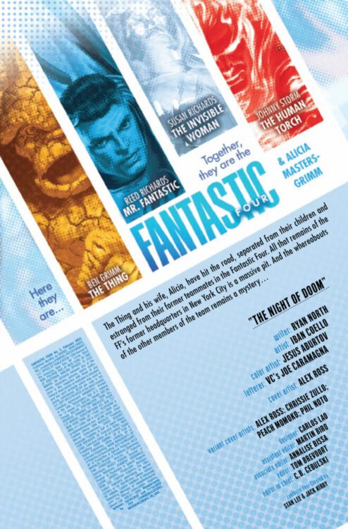
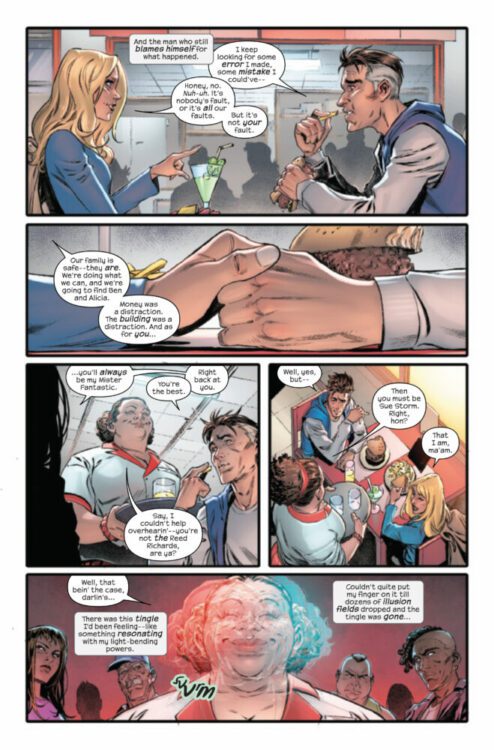
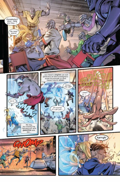
FANTASTIC FOUR #2 hits your local comic book store on December 7th, but thanks to Marvel Comics, Monkeys Fighting Robots has an exclusive four-page preview for you!
About the issue: Reed and Sue are on the run from — well, a lot of things, actually! Things are not going great for the Fantastic Four. They find themselves in even more trouble when they stop in a small town with a terrible secret! That terrible secret is revealed literally on the second page of this issue, and Reed and Sue spend the rest of the issue trying to survive it, but stop reading here if you don’t want it spoiled…Yep, it’s Reed and Sue versus a town full of killer Doombots.
The issue is by writer Ryan North and artist Iban Coello, with colors by Jesus Aburtov, and letters by Joe Caramagna. The main cover is by Alex Ross.
Check out the FANTASTIC FOUR #2 preview below:
Are you reading FANTASTIC FOUR? Sound off in the comments!
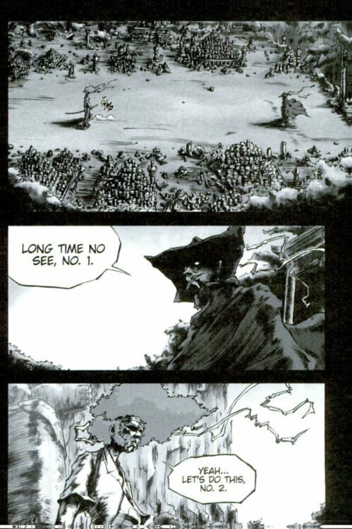
From Titan Comics and original Mangaka Takashi Okazaki comes the newest edition of a cult-hit samurai action series with Afro Samurai Vol. 1. As part of Titan’s new manga publishing initiative, this hip-hop and sci-fi influenced sword manga is getting a new lease on life with a “Director’s Cut” celebrating the 15th anniversary of the anime adaptation. With a simple yet entertaining story and hyper-stylish visuals, Afro Samurai is a blood-spattered blast of a read.
“In a feudal, futuristic Japan, samurai battle to become No.1 and rule the world, but when his father, who holds the coveted position, is challenged and killed, the young Afro Samurai vows vengeance. Relentlessly pursued by murderous assassins, will he stay alive long enough to keep his promise?”
Writing & Plot
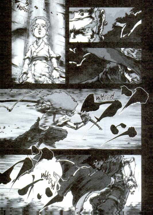
Okazaki’s opening chapters here in Afro Samurai Vol. 1 are exactly what a reader would expect from a sword/battle manga. The protagonist, nicknamed just “Afro” for short, becomes the No. 2 swordsman in the world after watching his father, the former No. 1, get killed by a mysterious assassin. The rest of the story up to this point is Afro being pursued, challenged, and ultimately dominating all those foes who come after him. It’s a simple and familiar story that is nonetheless a blast to read. Afro is your staple stoic protagonist, speaking few words and preferring to let his bladework do the talking. The only fight he’s interested in is the one against No. 1 to avenge his father – all the others are just practice. Okazaki takes noticeable influence from other great samurai works like Vagabond and Yojimbo, while also sprinkling in cyberpunk and sci-fi elements. Modern weaponry and cybernetic implants co-exist in this twist on feudal Japan, creating something that feels akin to Frank Miller’s Ronin or Samurai Jack. Despite these extra genre features, this is a lone samurai story through and through, with just enough character to keep readers attached to Afro’s coolness to keep the pages turning through all the bloodshed.
Art Direction
Afro Samurai’s simplicity with its storytelling is ultimately made memorable because of Takashi Okazaki’s artwork. His penciling covers the page with fantastic character design, stellar animations, and a unique use of shading and color that makes this manga stick out among its contemporaries. The actions flows smoothly and with massive energy, as Okazaki focuses on emphasizing speed in his fight scenes. Duels happen and are over in a sequence of simple yet carefully constructed panels that carry mountains of momentum for every sword stroke and gunshot. As with most Manga, there’s almost no coloring aside from Okazaki’s smoky sprays of red blood. He evokes a visual style similar to Hiroaki Samura’s work in Blade of the Immortal, along with hints of Western artists like Moebius. Okazaki wears his influences on his sleeve, but utilizes them in a fashion that creates an experience that is unique unto itself.
Verdict
Afro Samurai Vol. 1 is an entertaining and ass-kicking set of opening chapters for this cult-hit manga. Takashi Okazaki makes his influences plain as day, but crafts a story with those influences that is both familiar but refreshingly unique. If you’ve read manga, Afro Samurai’s narrative won’t strike you as anything new – but its visual style and genuine flair will keep you hooked. Be sure to grab this new edition when it hits shelves on December 13th!
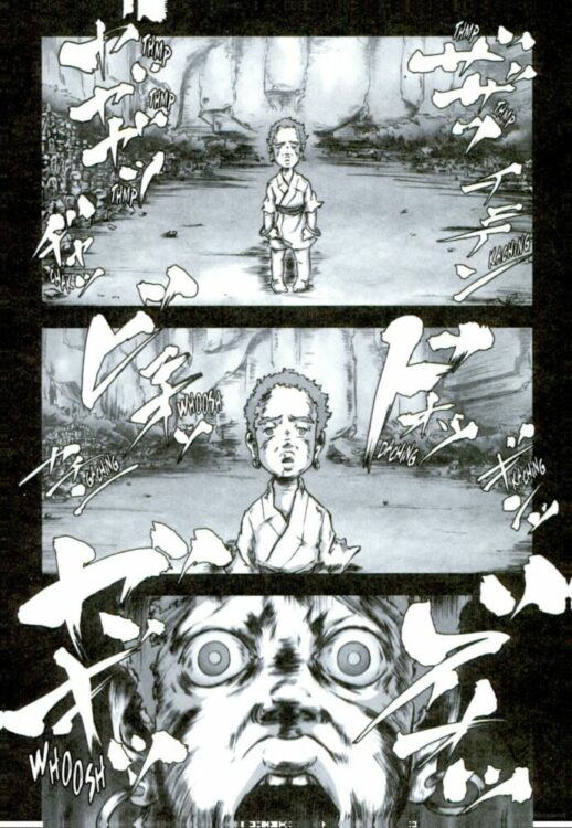
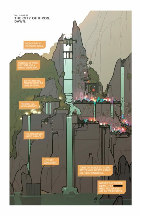
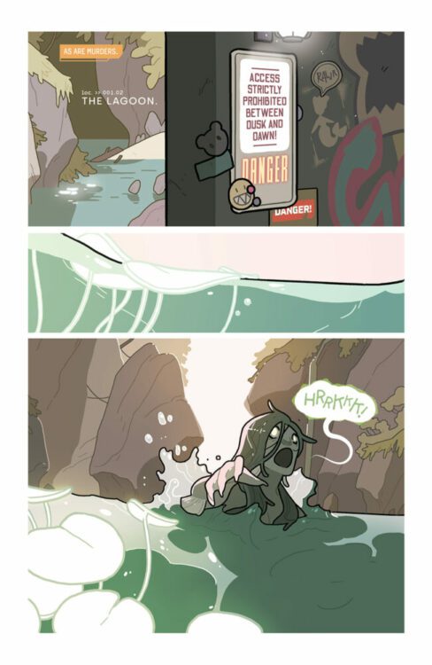
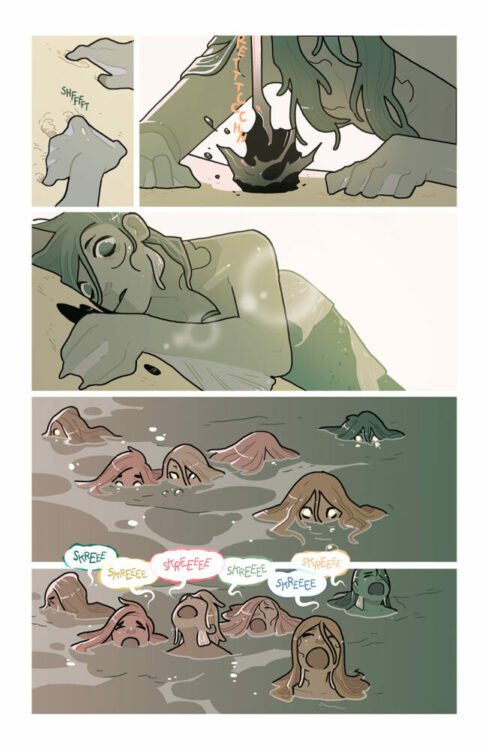
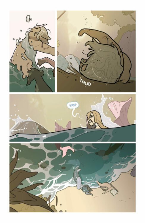
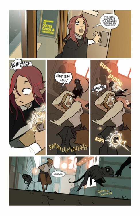
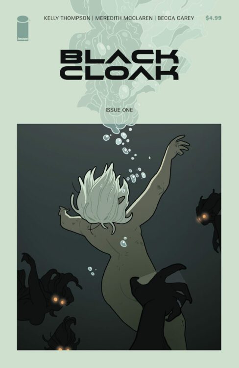
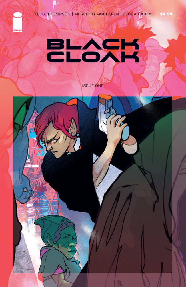
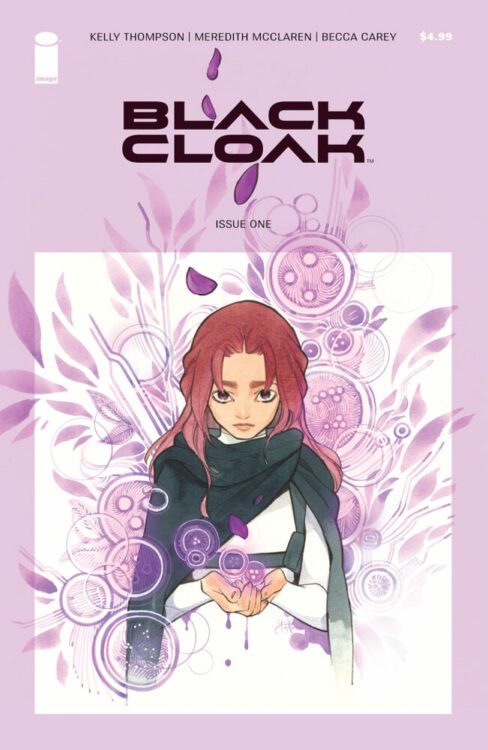
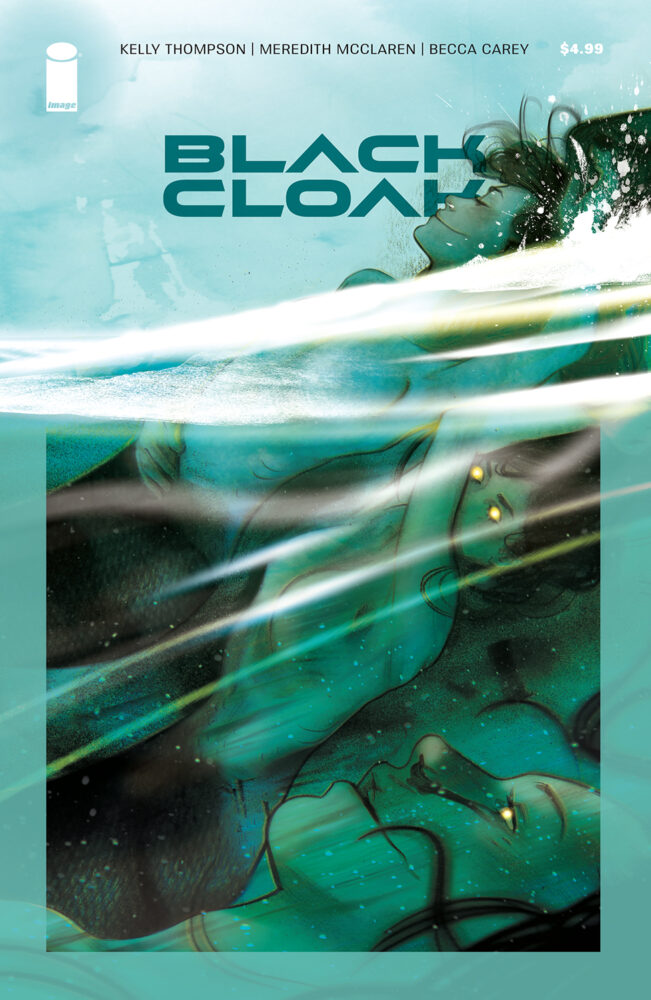
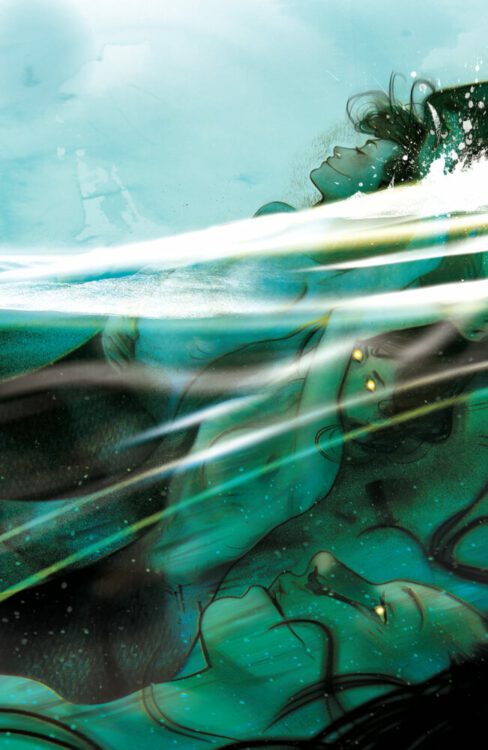
BLACK CLOAK #1 hits your local comic book store on January 11, 2023, but thanks to Image Comics, Monkeys Fighting Robots has a six-page preview for our readers. The book is written by Kelly Thompson, art by Meredith McClaren, and with letter work by Becca Carey.
About BLACK CLOAK #1: Eisner Award-winning writer Kelly Thompson (Black Widow, Captain Marvel) and fan-favorite artist Meredith McClaren (Jem & the Holograms, Super Fun Sexy Times, Hinges) will launch the mystery/fantasy mashup Black Cloak. Blade Runner style mixes with Saga-esque drama in a delectable fantasy/sci-fi blend as two Black Cloaks try to solve the murder of a beloved prince in Kiros—the last city in the known world—before his murder tips the city into war. Detective storytelling, fantasy creatures, magic, neo-noir sci-fi all collide in a spectacular triple-length first issue hitting shelves in the New Year.
Enjoy the preview below.
Are you going to add BLACK CLOAK #1 to your pull list? Let us know on social media.
Welcome to Self-Published Spotlight, a regular interview column where I will be highlighting self-published comics and the creators and small print publishers who make them.
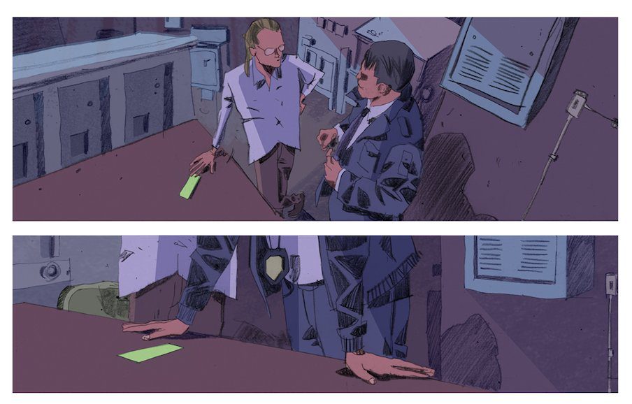
The Counterfeit, written by Jonathan Thompson (Night of The Comet/A Game of Doubles/All In) with art by Rossano Piccioni (Burn Residue) is just the latest Kickstarter campaign by Thompson that has successfully reached funding. But with this particular one, Jonathan is doing something different. The Counterfeit had a campaign run of just TWO WEEKS, in which it was successfully funded. What comes next is not only innovative new ways to use and reward stretch goals but the launch of an entire crime/horror comics imprint as well, BLOOD RUN COMICS. Jonathan is bringing back past collaborators and characters with BLOOD RUN, and it sounds awesome. So check out the interview and make sure to head over and get in on this printing of The Counterfeit and be a part of the launch of BLOOD RUN COMICS!
Art from THE COUNTERFEIT
Monkeys Fighting Robots:Jonathan this Kickstarter campaign for The Counterfeit is different than your others. Not only is the campaign length shorter (two weeks) but you are also launching an imprint, Blood Run Comics. What made you decide to take this leap? Jonathan Thompson:This is a way to consolidate the two partnerships I’ve been working on in comics with Attila Schwanz (NIGHT OF THE COMET) and Rossano Piccioni (BURN RESIDUE). The plan is to alternate books in a series with both. With Rossano, it’s a series of one-shots in the COUNTERFEIT world and Attila and I are developing a MORDRED series for next year. Two weeks is an experiment on top of an experiment. The mid-campaign times don’t net much movement so I figured I’d chop them out and see what happens.
MFR: The name is so evocative. What’s behind the name BLOOD RUN? JT: Honestly, just felt fun. Coming out of BURN RESIDUE and NIGHT OF THE COMET I established a tone with both creators and I wanted to find the right way to sell it as its own imprint. You know, just playing around and having fun. I like the idea of letting the BLOOD RUN.
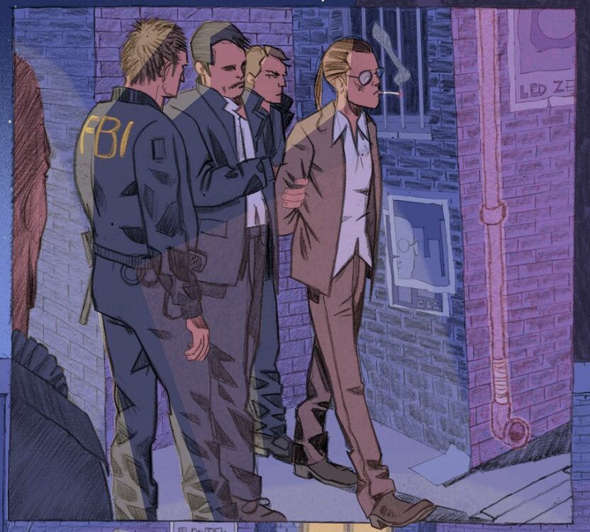
MFR: So give us some details on The Counterfeit. What’s the ol’ elevator pitch? JT: THE COUNTERFEIT is a crime one shot following a money counterfeiter and an FBI agent who’s on his tail. The story opens up with the feds raiding the counterfeiter’s print shop, but he’s easily able to wriggle out of their hands. What happens next is a dueling narrative with both characters thinking they are the hero until they converge in one big bang.
Art from The Counterfeit
MFR:Can you talk about the Mordred series with Attila that you mentioned? What’s that about? JT:MORDRED will be four magazine-sized 48-page issues about King Arthur’s bastard son. I am so excited about this one. If you know anything about Attila’s art, you’ll be excited too. It will chronicle Mordred’s quest to hold Excalibur and rule Camelot. It’s going to be insane and should be coming in March. And I should say that while this is a one-book campaign it is about building for the future. That’s why we have a low goal and short run time. Once we hit our main goal I have a bunch of landmark stretch goals that will get backers more of what’s coming. They’ll get extra pages in this issue along with previews for MORDRED and the next part of the COUNTERFEITER story.
MFR: I can’t wait to see Atilla draw Mordred. That’s a perfect fit. JT:I know, right? I have a lot of ideas circling around but we’re going to be doing some development stuff soon. We have a stretch goal that will get all backers of THE COUNTERFEIT this preview. JT:Yeah, I know. It’s going to be great.
MFR: Anything final you wanna drop before we wrap it up? JT:I’d just say that I’m excited for the future and what we can build here. I think MORDRED in particular is going to light a fire so big you can’t miss it. THE COUNTERFEIT is live until Dec. 2nd so get on it while you can. I hope to exceed our goal so we can load backers up with previews for a lot of great comics coming in the new year. And don’t forget to pre-order your copy of NIGHT OF THE COMET coming from Source Point Press in January!
*Editors Note: As of this writing, The Counterfeit has been successfully funded.
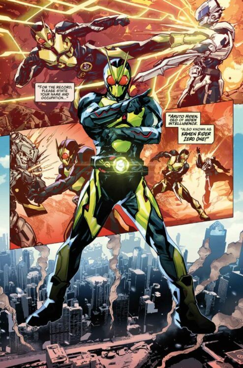
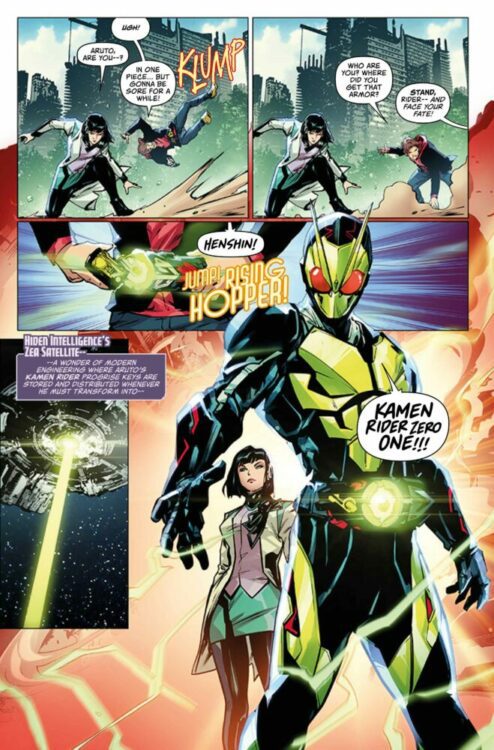
Kamen Rider Zero-One #1 is the next chapter of the legendary franchise having more presence in America. With the release of the series in America on blu-ray, along with the release of the TV series of Kamen Rider Kuuga and its manga, fans are finally getting a chance to experience this Japanese born series through proper channels. This continuation of the Kamen Rider mythology arrives thanks to Brandon Easton (writer), Hendry Prasetya (artist), Bryan Valenza (colorist), and Jamie Martinez (letterer).
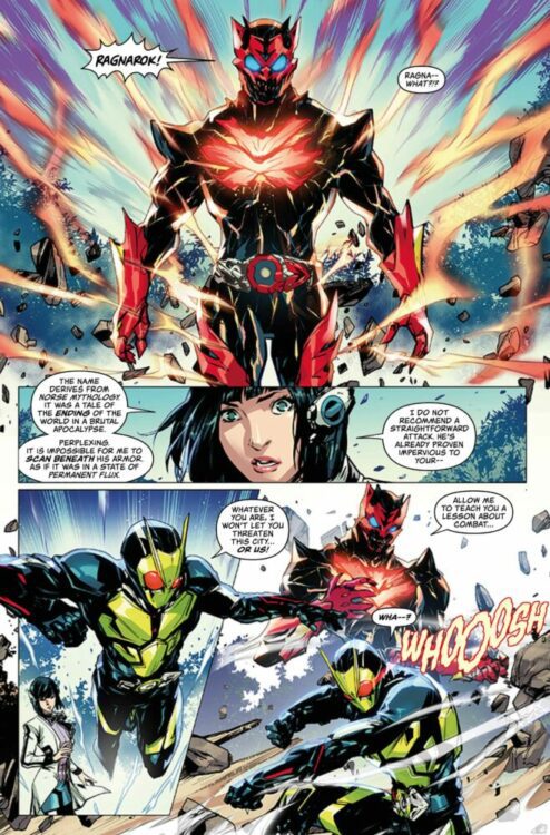
Aruto Hiden is Kamen Rider Zero-One! Along with his trusty humagear companion Izu, he’s saved the world numerous times as the insectile superhero! But when his company Hiden Intelligence is attacked by the mysterious Ragnarok, Arturo must face not only the volcanic cluster cell-powered villain, but also his own past…
Writing
The issue obtains a good balance for fans of the series and those who may be coming into the comic fresh. It recaps the events of the TV series but does not reveal major moments and spoil it for those who didn’t watch the show. At the same time the issue offers enough introduction to all the elements of the series it can still serve as a comic on its own. Many adaptations of existing properties do not always share the same luck when they attempt a transition to comics.
Brandon Easton made sure to do their homework before writing this issue. All the characters maintain the voice and feel of their TV counterparts. From Aruto’s lame jokes to Isamu doing his best not to laugh at them makes the character feel very on point. The introduction of Ragnarok is not explained but this feels very intentional. As if the remainder of the series will serve to answer the question, “Who is this mysterious rider.” This mystery will ensure those who purchase the first issue will come back for the second.
Artwork
The art by Hendry Prasetya succeeds in channeling the original series. The appearance of Ragnarok feels reminiscent of when a new major player would appear in the series, complete with a sense of foreboding and terror. The panels offer great energy and keep the reader engrossed in the action.
The color work by Bryan Valenza captures the effects of the show. The transformation and attacks are all energized thanks to the coloring and add weight to the action scenes. The weight of each punch, kick, and special move is accentuated thanks to the impressive use of color.
The lettering by Jamie Martinez helps with the flow and energy of the storytelling. The position of the word bubbles helps to perfectly encapsulate the scene where Aruto tells one of his pun based jokes and Isamu suppresses a laugh. This was one of the running gags in the television series and this use of proper lettering recreates the energy of the scene in a very impressive manner. The lettering also helps to get a great sense of flow as the combat erupts between Zero-One and Ragnorak by helping to direct the reader’s eye from one panel to another.
Conclusion
Kamen Rider Zero-One #1 is a fantastic gift to fans of the show but it’s perfect for anyone looking for an action filled book. The mini-series is set up to be another great way for the Kamen Rider franchise to have more exposure in America. Hopefully, if things go well, this won’t be the last time a Kamen Rider series will get an original comic story and fans will be able to experience more stories of this quality in the future.