Home Blog Page 59

Project 365: One Comic Every Day Week 19

The premise is simple: read one comic every day for the entire year. It seems like a simple task but there is no way that I read 365 comics last year, even if you count the individual issues in collections. So, this year, I am committing myself to this reading challenge, in the hope that I can broaden my reading habits and fully engage with my favorite hobby again.

Last week felt a bit intense, but I definitely enjoyed getting my teeth into some comics with monstrous characters. I thought I’d have an easier week this week — keep it light with some laid back reading. Catch up on some of the series I’ve started but not finished, revisit some old favorites, and play it by ear.

So, without further ado..
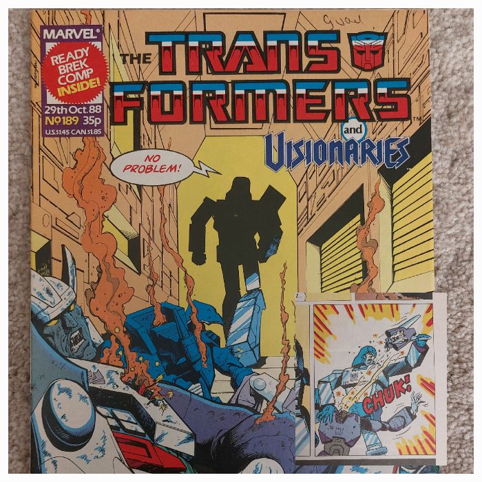
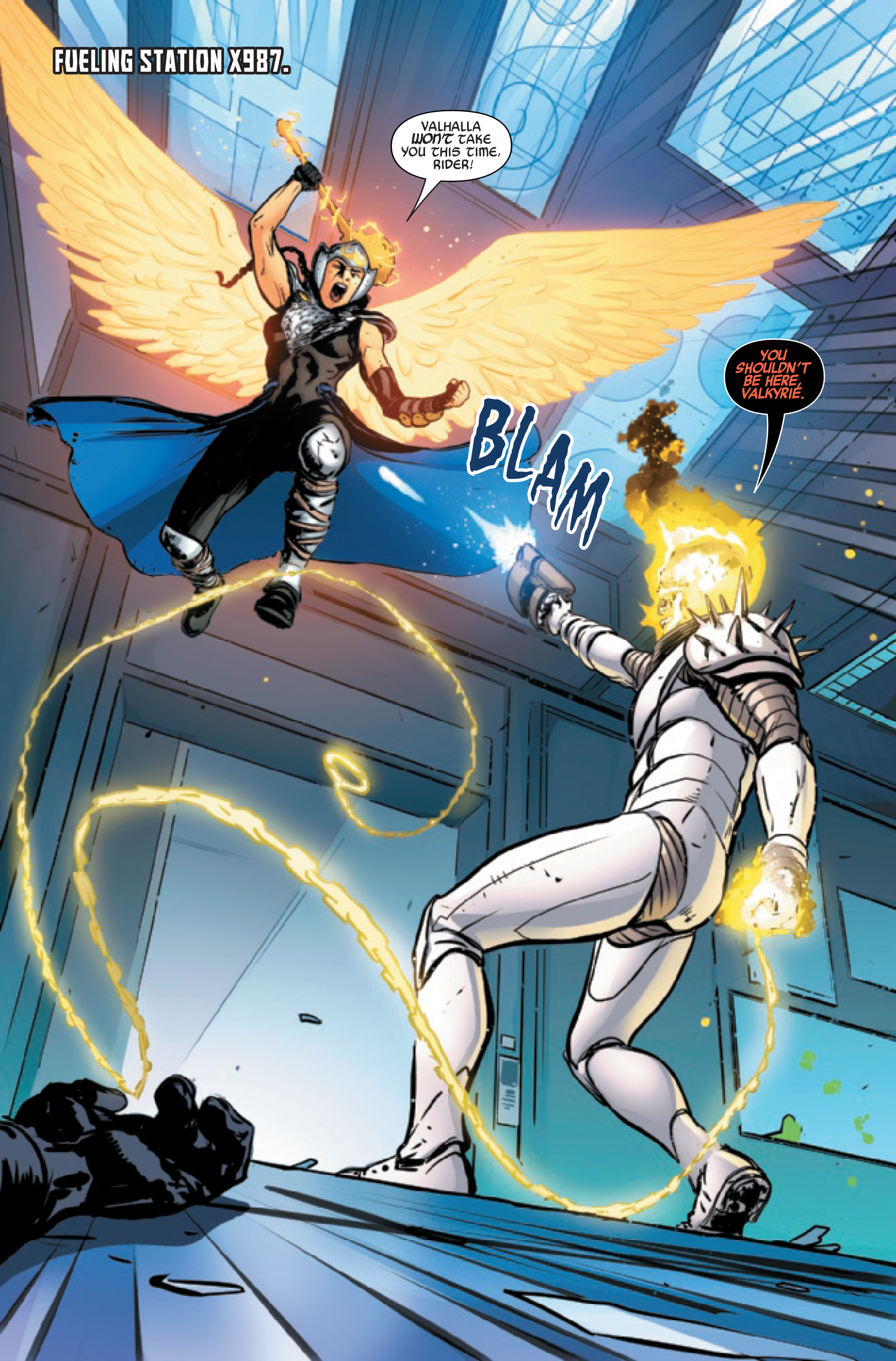
The Transformers #189 with panel Insert
Credit: Marvel UK.

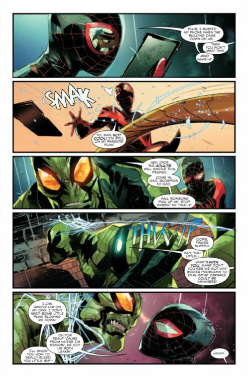
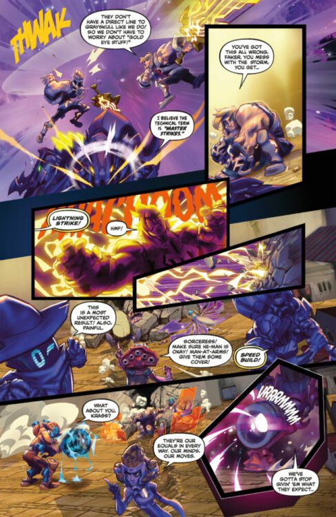
Comic Number 127: The Transformers #189

So, I failed to reach issue 200 before the end of April, but I am so close now. In fact, this issue plays a very important role in setting up the story that features in issue 200.

Dry Run, by Simon Furman, Dan Abnett, and Jeff Anderson, is a simple, stand-alone story involving the current leader of the Decepticons training the former leader of the Decepticons to kill the future leader of the Decepticons. Simple…

Jeff Anderson’s pencils breathe life into the rage filled robots and gives them an animation that is lacking in some of the earlier stories. The emphasis in the art is on the conflict between the different factions of Decepticons, and once the story gets underway, there is virtually no background detail. Anger and unbridled hatred fuel the characters and the artwork focuses on this and nothing else.

The crux of the story, and the important moment, comes when an enraged Megatron tears the head off Cyclonus. A pivotal moment that is punctuated with a panel at the bottom of the page hinting at the consequences of the action.

What is fascinating about this moment is its brutality. It is easy to forget that these robots are sentient beings with a spark of life. Throughout most of the comics the Transformers fight, get injured and reappear fighting fit a few issues later or disappear from the roster of characters. Other than the death of lead figures, the violence between the warring robots is cartoonish: ineffectual but visually exciting. This is a children’s comic after all. But the death of Cyclonus is more unsettling and glimpses at the disturbing truth about war and violence. Megatron is blinded by hatred, silent in his action which is a contrast to the constant commentary throughout the rest of the battle. The violence of the moment brings the reader to a dead stop. The final panel on the page, which sets up the consequences of the action, also acts as a palette cleanser for the scene. The reader is removed from the violent scene for a moment so that they can process what they have witnessed.

I keep thinking what the scene would look like if the two characters were people and not giant, transforming robots. You’d be looking at something Garth Ennis might have written.
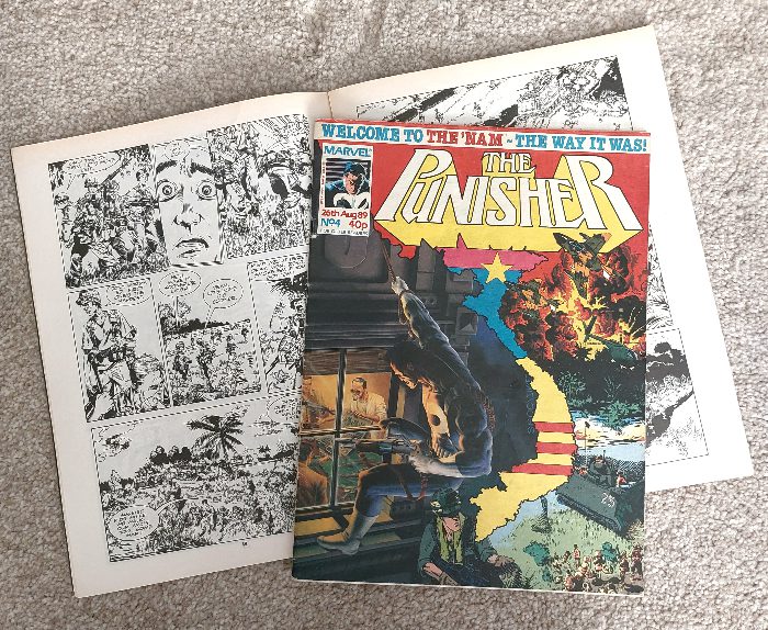
The Punisher #4 and The ‘Nam from issue #5
Credit: Marvel UK

Comic Number 128: The ‘Nam (in The Punisher #4, 5, 6 and 7)

Keep it light was the plan so why not re-read some of Marvel’s The ‘Nam, an intense war comic based (roughly) on the experiences of real veterans of the Vietnam War?

When Marvel and DC produced their early war comics, they glorified war and those who fought in them. Later comics would buck this trend and create a more authentic feel for the soldiers’ experience, shifting the focus from physical violence towards a psychological onslaught against the mind. The emphasis of war trauma moved focus and The ‘Nam was part of that shift.

In 1989, Marvel UK began publishing The Punisher, reprinting stories from the American version, in a similar fashion to The Transformers comic. Each issue came with a backup story and the first three issues contained the adaptation of Robocop. But from issue 4 onward, they introduced a black and white reprint of The ‘Nam. Written by Doug Murray and drawn by Michael Golden with Armando Gill on inks, The ‘Nam told the story of new recruit, Ed Marks, as he shipped out to Southeast Asia. The first story, Nam: First Patrol was printed over two issues of The Punisher and contained a crash course in the military action set mostly in the jungle. There is a lack of national politics in the narrative, but military politics is introduced fairly early on with Ed completely failing to realize that certain elements of the American Army were taking bribes for cushy postings.

The artwork captures the hectic day-to-day life of a newbie in the American army. The controlled line work keeps the action readable, even when the situation is out of control, and the cast are exaggerated enough to give them character but not too much that they become parodies or stereotypes.

Doug Murray uses the new recruit as a way to draw the reader into the story, allowing the audience to learn as the character learns. It also provides a certain leeway into explaining elements of army life within the narrative because Ed needs to learn as much as the reader does.

Using Ed Marks as a focal point of the narrative allows this gateway in for readers but does restrict a larger examination of the Vietnam conflict. Harriet E. Earle explained in A New Face for an Old Fight that early representations of war, and the Vietnam war in particular, had a focus that was “firmly on the military conflict and Vietnam as a theatre of war, without nuance of the country itself.” (pg 90 Studies in Comics Vol 9 No 1 2018) This is an argument that can be made in relation to the early issues of The ‘Nam, with the country and its people nothing more than setting for the story of Americans. As the series goes on, I believe that this did change and the wider narrative grew, but here, at the beginning, these “comics are snapshots of the immediate moment, of the military task at hand.” (Earle, pg 91)

The Unknown Soldier #1 Credit: DC Comics

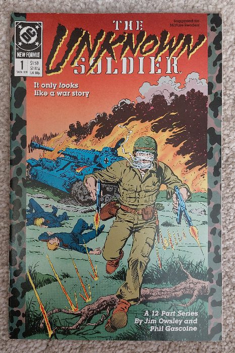
Comic Number 129: The Unknown Soldier #1 (1988)

DC’s The Unknown Soldier was, at inception, a contrast to what comics like The ‘Nam were trying to do. Original appearing in Our Army at War in 1966, the lack of identity for the character allowed the possibility for him to become any man, and real life events could be mixed with fictional representations using the Soldier as a bridge between the two.

The decision to set the comic in the past, away from the Vietnam war, gave the creators more liberty to glorify the trauma of conflict and caricature not only the people but the very war itself. It wasn’t until 1988’s 12-part series by James Owsley and Phil Gascoine that mental trauma would become more important in the comic’s story line than the physical injury from violence.

DC’s 1988 The Unknown Soldier took the concept of the Unknown Soldier in a new direction and tackled head on the brutality and politics of war as an idea, not a setting. The first issue carries the tagline ‘It only looks like a war story’ over an illustration of the eponymous hero with his bandages unfurling as he runs towards the reader, firing his weapons. Behind him a German tank burns with its crew spread, lifeless, on the ground around it. The cover is misleading as only three pages of the story inside feature the Second World War and the enemy the soldier faces is mental deterioration not physical trauma.

This section of the comic relates back to the origins of the Unknown Soldier from Star Spangled War Stories #154 (1971) but takes a more cynical look at the creation of the character. Instead of fighting his way to freedom in the face of serious disfigurement, in this retelling the Soldier goes directly from injury to hospital. He is not a hero who excels at outstanding deeds, instead it is inferred that he is a failure. His one mission was a promise to his deceased mother to protect his brother, something which he fails to do. The idea that war should not be glorified becomes the backbone of this 12-issue run as the Soldier moves from war zone to war zone doing the dirty work of the government.

Pretty Deadly #6 – 10 Credit: Image Comics

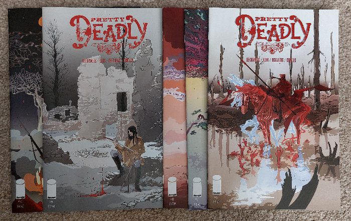
Comic Number 130: Pretty Deadly (Vol 2 ) #9

Changing the theatre of war for this comic, as the third arc of Kelly Sue DeConnick and Emma Rios’ Pretty Deadly is set during the First World War. The arc, which started in issue 6, revolves around the Reapers, central characters across the series, traveling to the trenches of France to find and safeguard one young soldier, Cyrus, so that he might return home before his mother passes away.

Scenes throughout the arc superbly capture the psychological trauma and desolation of the war. In an early scene of issue 7, Sissy tells Foxy of her visions of Cyrus and that he has “Dug himself a grave as far away from home as he could get.” The speech leads into a dark image of a soldier, hunched over with shadowed hands reaching across him. A few pages later, the reader is forced to climb into the trenches with the soldiers as the scene is broken down into a number of panels, with the boxed rooms of the trench creating natural panels for the reader to traverse. Rios covers her pages with numerous panels without over complicating or confusing the images. Small snippets of rolling dice or rat whiskers lend as much to the narrative as the open desolate shots of no-man’s land. Rios captures the landscape and uses the visuals to enhance the metaphors laid out in the script.

But it is issue 9 that contains the most interesting representation of war, or rather the theatre of war as a backdrop for a narrative. Part of the narrative revolves around two reapers, Ginny and Big Alice, as they try to stop the war. They face the Reaper of War on the battlefield and their fight is symbolic of the larger conflict that is happening behind and around them. The big reveal, towards the end of the issue, is that the Reaper of War does not work alone, and the horse that War rides is the Reaper of Fear.

It is a powerful comic that that faces the concept of war head on. The focus is split between an individual and the larger scale theatre of war. DeConnick and Rios use the narrative to highlight each aspect and how the fear and relentlessness of the greater conflict can destroy the individual.

War Story J for Jenny Credit: Vertigo Comics

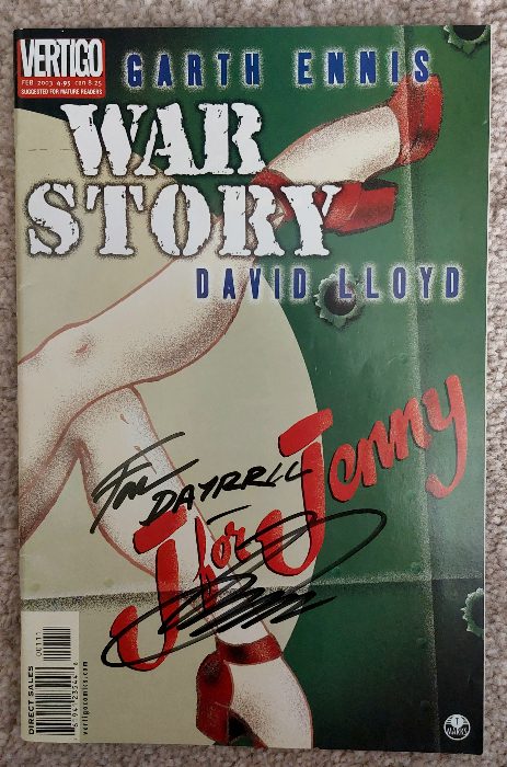
Comic Number 131: War Story: J for Jenny

I mentioned Garth Ennis earlier in the week and, if you know his work, it would come as no surprise that he’s written a number of war based stories. Not only did he write specific war based series, such as Battlefeild, but he also worked on a four issue reboot of Unknown Soldier, which I nearly picked up this week. One for the future.

Ennis is well known for writing tough, no-nonsense characters and excels at facing offensive material head on. You can expect violence, bad language, and characters with strong, conflicting opinions. J for Jenny is no different and, in fact, it forms the heart of the narrative.

The comic follows a crew of a British bomber on several missions during the Second World War. Tensions between the pilot and the co-pilot build as their differing views on the war put them at loggerheads. On the one hand you have Page, the pilot, who is gung-ho and, due to the traumatic experience of losing his own family, doesn’t seem to have any care for the consequences of their bombing raids. Do the mission, get home would be his mantra. If there are civilian casualties, so be it.

Contrasting this viewpoint is the co-pilot Thomas Stark who believes there has to be a better way to destroy the enemy without civilian casualties. At one point, he talks about using his inheritance to fund a charity to help those affected by the war.

On the surface, it’s a good versus evil story, but as the narrative unfolds, Ennis gives us the personal views of each crew member of the bomber and in doing so reveals a whole lot of gray. Each character is struggling to come to terms with the war and their role in it. They each want or expect something different from their life and even the two central characters are shown to be more complex than simply being right or wrong. J for Jenny is an examination of the mentality of war disguised as a Boys Own adventure story.

The artwork by David Lloyd does a lot of the heavy lifting at depicting the atrocities inflicted on and by the crew of the bomber. Their arguments and internal thoughts are posted to a backdrop of murky skies, chaotic fights, and flashes of destruction. Lloyd’s work has the fog of war seeping onto every page and his coloring reinforces Ennis’ main theme: the grayness between right and wrong.

J for Jenny is a thought provoking treatise of a war story which only occasionally becomes ham fisted with the points it wishes to make.

The Last American #1 Credit: Epic Comics

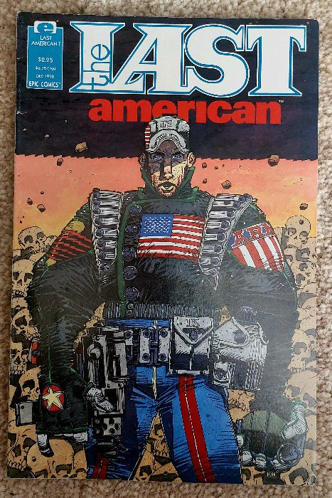
Comic Number 132: The Last American #1

In December 1990, the first issue of The Last American was released by Epic Comics. The story was bleak, hopeless, and distressing on a number of levels. However, the script by Alan Grant and John Wagner was beautifully illustrated by Michael McMahon who was beginning to perfect his own, unique style of drawing.

The comic tells the story of Ulysses S Pilgrim, the last American of the title, as he wakes 20 years after a nuclear war to emerge into a landscape of destruction and desolation. He has three robotic sidekicks and a slowly dissolving grip on reality. In essence, The Last American examines the effects of loneliness and hopelessness on the human mind — a mind raised on the American Dream.

McMahon’s artwork is the star of this comic. His cubist style with thick black lines and harsh shadows creates a world that is often abstract and divorced from reality. Just like the central character trying to come to terms with his surroundings, it is difficult to get a firm footing in McMahon’s visuals. Panel transitions are erratic, jumping from the characters to the destruction around them to quick memory flashes. The amount of panels dominated by skulls constantly reinforces the concept of death that inhabits every element of the comic. In the Solrad review of The Last American, Tom Shapira points out that the true horror of the comic is “not just death of the self, or even death of the many, but the sense of utter annihilation, the notion that nothing we do will have any meaning in the end.”

And this is a universal fear: the fear of being forgotten, of being meaningless. A lot of war narratives have this theme running through them, often hidden underneath the violence and the action. The gung-ho characters and cartoonish villains are all spurred on by the idea that to become a war hero will grant them some ever lasting life. A purpose to be remembered for. The Last American challenges that idea, showing the reader that random pop cultural items are all that remains for whoever survives.

That and the ants, apparently.

Transformer #200, 201. 205 Credit: Marvel UK

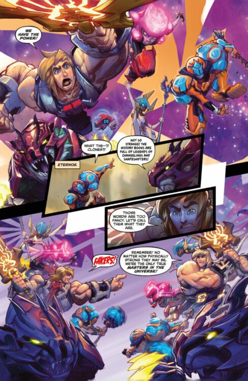
Comic Number 133: Transformers #199 – 205 (the Time Wars story line)

I wanted an easy week of reading this week, but somehow managed to surround myself with war comics and trauma. So to finish off, I’ve finally reached the 200th issue of Transformers (UK edition) that brings to an end (sort of) Simon Furman’s “future era” storyline that began way back in issue 78. The story is, for the most part, all-out action as Autobot fights Decepticon, Autobot fights Future Autobot, Decepticon and Autobot fight other Decepticons, and Future and present Autobots team with present and future Decepticons to fight Galvatron.

Furman includes a number of elements that have featured across the entire saga, including the limbo world where the displaced Transformers end up when time travel is involved. He collects all of the dangling threads and ties them off, one by one, to bring everything to a satisfying close. Plus, for issue 200, he brings back Ravage, one of the more exciting and interesting Transformers.

The artwork is provided by Robin Smith and Lee Sullivan whose styles define this era of the comic in the UK. It is fluid and dynamic, giving the giant robots an organic presence that contrasts the rigid, mechanical look of the American comic. As a result, the characters are more empathetic or even human-esq which gives the narrative an emotional punch I find lacking from some of the stories.

It is also a “save the universe” style story full of sacrifice and heroics and devastating loss. The risks are high because there is all to play for. In retrospect, Time Wars has more in common with the early propaganda style war stories, focusing on the good versus evil and the heroics of the characters rather than the actual theatre of war. Within this story, four planets are under threat of extinction and yet that devastation barely features.

But, for a story line 122 issues in the making, it is everything the reader would want. Carnage and resolution.

Monkeys Fighting Robots Youtube

Marvel Comics Exclusive Preview: MILES MORALES: SPIDER-MAN #6 — Carnage Reigns!

MILES MORALES: SPIDER-MAN #6 hits your local comic book store on May 17th, but thanks to Marvel Comics, Monkeys Fighting Robots has an exclusive four-page preview for you!

About the issue:
“CARNAGE REIGNS” – PART 2!

No matter what MILES MORALES throws at CLETUS KASADY, the Extrembiote-powered monstrosity just keeps coming. And Cletus is only getting stronger. But how? Spider-Man needs help. A distraction, a second to breathe. Anything, or anyone, to give him a chance – any chance – at slowing Cletus down. But Miles can’t rest. Help isn’t coming. He’s the only thing standing between New York City and maximum carnage…and if the heroes aren’t answering Miles’ calls…who’s left on Spidey’s speed dial?

The issue is by writer Cody Ziglar and artist Federico Vicentini, with colors by Bryan Valenza, and letters by Cory Petit. The main cover is by Dike Ruan and Alejandro Sánchez.

Check out the MILES MORALES: SPIDER-MAN #6 preview below:


Are you reading MILES MORALES: SPIDER-MAN? Sound off in the comments!

Monkeys Fighting Robots Youtube

AMAZING SPIDER-MAN #25: Enter The Walking Dead!

AMAZING SPIDER-MAN #25: Enter The Walking Dead!

It’s new comic book day, and Amazing Spider-Man #25 hits your local comic book shop from Marvel Comics. Writer Zeb Wells tells an emotional tale that rocks Peter Parker’s world and will resonate with fans.

Kaare Andrews and John Romita Jr. bring spectacular artwork to the table to elevate the drama and action. Andrews’ style has a great 90s flare that takes me back to my youth.

Marcio Menyz’s colors are bright and vibrant went needed and then take a dark twist when Peter’s life falls apart. This issue involves a ton of action, and Joe Caramagana’s letter work delivers.

Amazing Spider-Man #25 is a tough read but a great read. Check out my video for the full review.

Monkeys Fighting Robots Youtube

MASTERS OF THE UNIVERSE: MASTERVERSE #4 – Check Out A Five-Page Preview!

MASTERS OF THE UNIVERSE: MASTERVERSE #4

MASTERS OF THE UNIVERSE: MASTERVERSE #4 hits your local comic book shop on May 17th, but thanks to Dark Horse Comics, Monkeys Fighting Robots has a five-page preview for our readers. The issue tells three tales written by Tim Seeley with art by Eddie Nunez, Daniel Lopez, and Fico Ossio, Rico Renzi drops the color, and you will read the letter work by Deron Bennett.

About the issue:
As the deal between the Sorceress and Zodac reaches its tense conclusion, they witness worlds where He-Man’s good heart and strong will have influenced a new generation. In “Unfakeable,” the Masters (featured in the Netflix CG animated series He-Man and the Masters of the Universe) confront their own doppelgangers, and must figure out the things they dislike most about each other to win, while in “The Megabeast Matrix,” the He-Force is called upon once again to battle a very modular threat to the entire multiverse!

Enjoy the preview below.

Monkeys Fighting Robots Youtube

Project 365: One Comic Every Day Week 18

The premise is simple: read one comic every day for the entire year. It seems like a simple task but there is no way that I read 365 comics last year, even if you count the individual issues in collections. So, this year, I am committing myself to this reading challenge, in the hope that I can broaden my reading habits and fully engage with my favorite hobby again.

“Look, Chief, you can’t go off half-cocked looking for vengeance against a fish. That shark isn’t evil. It’s not a murderer. It’s just obeying its own instincts.” — Jaws by Peter Benchley

Jaws 2 was on television last night and I watched it yet again (missing only the opening few scenes). I’ve no idea how many times I have watched it — slightly fewer times than the original Jaws, which I’d probably name as my favorite film of all time if I was put on the spot. My enjoyment of both films hasn’t waned, not once, in all these years. In fact, after a revelation about the underlying story a few years ago, my appreciation of them as one continuous narrative actually increased.

And fueled by that human versus nature vibe from the film, I went crawling through my draws for some comics that matched. Hook Jaw was an obvious choice, as it is a comic book reaction to the success of Jaws, however other similar comics with a monster/horror vibe, especially in my collection, were harder to find.

What makes horror stories so endearing, and why do we keep coming back to them in various media? And how do writers and artists continue to instill that sense of fear in us when, as an audience, we are used to the visual horror lexicon?

In his essay The Face of the Beast, Jonathan W. Thurston discusses predators in fiction and the visual signs that writers and artists use to trigger our internal fear responses. He highlights base instincts that horror is aimed at and, by reference to the work of Paul A Trout, lists some of the triggers that literature, movies, and comics use to elicit a response. These triggers include, “staring eyes, an open mouth, flashing sharp teeth, a lollering tongue” along with “menacing movements, blood, bones, certain sounds, tracking signs, and darkness.” Obviously some of these are difficult to represent in comics, especially the sounds and movements, but the others listed are instrumental in building horrific narratives in a visual medium. By using simple visual triggers, creators can produce scary and horrific comics.

This week I’ve selected a number of comics that can be considered horror based on some level, and will use the triggers mentioned above to illustrate how successful the comics are at expressing the horror and initiating a response from the reader.

Hook Jaw Credit: Titan Comics

Comic Number 120: Hook Jaw

The “monster” in Hook Jaw has it all. When the titular shark is finally introduced to the story, it comes with: 1) staring, empty eyes, 2) a gaping, relentless mouth packed with razor sharp teeth, 3) a trail of blood contaminating the ocean around it, and 4) the blackness of the stormy waters. Even the way that Conor Boyle draws the shark in the panels gives the impression of the slow, methodical movement of a beast hunting. You can almost hear the swish of the great white’s tail as it glides through the water. The last page of chapter 1, showing the beast in all her glory, is reminiscent of the opening to Peter Benchley’s novel Jaws: “The great fish moved silently through the night water, propelled by short sweeps of its crescent tail.”

Simon Spurrier’s Hook Jaw works as a horror comic not simply because of the violence and blood that are ever present. Spurrier brings all of the horror tropes into play to unnerve and unsettle the reader. For example, dream sequences quickly shift direction as the dreamer loses control, almost like a scene from A Nightmare on Elm Street. There are also tension-building sequences where a slow burn in a scene allows the reader’s anxiety to take over and skip quickly through the panels, only to be greeted with a sudden image of violence that jolts the reading flow. Instinctively you stop, like a jump scare in a movie, only in comics you linger on the image as it burns itself into your brain.

Hook Jaw gets under your skin. Through the first chapter you might find yourself wincing at some of the two dimensional characters, or even laughing at the stupidity of the situation. However, just like in Jaws, this comforting place at the beginning is eroded by the horror that follows and as your fear responses kick in and you start to retreat, you remind yourself of the safety from the opening, and you convince yourself it can’t be that bad. Can it?

Godzilla Age of Monsters collected edition Credit: Titan Books

Comic Number 121: Godzilla, Age of Monsters

Everyone knows Godzilla. Whether it’s from the original 1950s Japanese movies, the American takes on the creature from 1998 and 2014 onward, or even the 1970s cartoon series with the adorable Godzooky, the giant kaiju has towered over films and comics for decades.

Although Godzilla is the very definition of a monster, very few of the stories containing him could be situated comfortably in the horror genre. Godzilla represents the destructive force of nature, an uncontrollable and unstoppable power that comes from the Earth and is older than humans. It is this representation that stirs any fear within the audience, just as it does in many of the protagonists of the stories themselves.

In Age of Monsters, written by Randy Stradley and Steve Bissette, the central character, Noriko, remembers the traumatizing experience she lived through as a child. The monsters of old woke up and swept towards the city where her father fought to save her and her mother. Initially, artists Steve Bissete and Ron Randell use visual triggers involving Noriko that are usually associated with the monster. A blank expression and staring eyes are the major focus of the first page of the comic. Bissette creates the impression of a slow zoom into Noriko’s face as she stares out, into the rainy city. The final panel contains a close-up of her eyes but the rest of her face has been visually transformed into the destruction wrought by Godzilla many years earlier. The reader is introduced to the concept of the monster, and the horror that comes with it, through the eyes of the victim. When we reach the end of this first chapter, we have a better understanding of the character and what she waits for. This then makes us reassess the opening page and the trauma that she went through.

It is a fascinating way of introducing horror tropes into a narrative, especially in a comic that isn’t necessarily classed as a horror. Bissette has some history with drawing modern horror stories, and corrupting genre, so that as a reader your expectations are shattered and your comfort zone removed. You only need to look at his work on The Saga of the Swamp Thing to see what I mean. (see Comic Number 124)

Aliens: Dust to Dust #1 Credit: Dark Horse Comics

Comic Number 122: Aliens: Dust to Dust

Jonathan W. Thurston states that “the artistic rendering often reduces the predator to a dark shape with glowing eyes and dripping fangs.” This description aptly fits a number of classic horror monsters, from the Vampire and Werewolf to more modern invasion movies such as Attack the Block, which features creatures that were literal black shapes on the screen with wide, drooling mouths visible only because of the glowing teeth.

In Ridley Scott’s 1978 movie Alien, the director relied on hiding the black skinned creature in the shadows and only hinted at the creature’s true shape. Although there were no glowing eyes, the mouth within a mouth design highlighted the difference between the creature and the human prey. The Xenomorph is a perfect example of the horrific beast that Thurston was discussing.

Almost from the beginning, the Alien franchise found a home in the pages of comics. In 1979, Alien: The Illustrated Story was released and there have been a string of adaptations and continuations ever since. The franchise works as well in either medium.

Gabriel Hardman’s 2018 standalone mini-series is, on the surface, a pretty standard Aliens story: a planet of colonists are exposed to the alien threat and most do not survive the ensuing onslaught. Where the story differs is in the new take on the Xenomorph/mother connection that grew out of the movie franchise and the visual presentation by Hardman and colorist Rain Beredo.

From the very beginning, the reader is given a very visually driven narrative with details picked out of the darkness and emphasized by unexpected and brief changes to background color. For example a character’s reaction to something disturbing is placed over a background of burgundy for one panel only, before the background returns to the murky teal of the colonists home.

The comic makes the reader uncomfortable through visual tricks, such as shattering a panel into a collection of haphazard smaller panels, or by illustrating a long vista with dark shadows indicating the alien threat. The grainy artwork, calling back to the title of the comic, fills each page with an almost unbreathable atmosphere, heightening the uncomfortable environment the protagonists inhabit. Just like Ridley Scott’s original movie, this comic is about the environment the characters are in and less about the history or motivation of the creature. We fear for the central characters because they already seem lost from the beginning of the story. Our fear responses are then triggered further by the jumps between full illustrations of the aliens and shadow encased mouths, drooling out of the darkness. Just as the reader grows accustomed to the alien, Hardman is able to make them scary again with a change in visual emphasis.

Aliens: Dust to Dust came out towards the end of Dark Horse Comics’ run in the franchise and I personally think it was the best interpretation at the time and hasn’t been topped since.

Creepy #7 Credit: Warren Publishing

Comic Number 123: Creepy #7

In “Duel of the Monsters” from Creepy #7, you have two classic creatures of the night duking it out in a territorial fight for killing rights to a small Spanish village. The script by Archie Goodwin is tongue-in-cheek but still manages to include moments of unnerving horror.

This eight-page, black and white story, illustrated by Angelo Torres is a charming comic that demonstrates how artists can tickle a reader’s fear response in a story that, for the most part, is a supernatural mystery. On the opening page, Torres draws two images of a werewolf stalking the village. The first shows the creature in an almost majestic pose, perched on the top of a house, with its mouth wide open, baring its fangs. The creature is out in the open, well lit, and clearly visible, seemingly in contrast to how a creature should be introduced.

The reader’s fear is provoked not directly by the creature but what the creature represents. By the time this comic was published in 1966, audiences were accustomed to werewolves thanks to the numerous novels, comics, and of course movies, that featured them. Anyone picking up a story featuring a werewolf knows what to expect when the creature goes hunting so, in this opening panel by Torres, the trepidation and fear comes not from the creature but the prey illustrated within the creature’s line of sight. Drawn in darkness, with a small lamp shedding a meager light, the victim is almost an afterthought to the image. His fate is predetermined. This sentiment is reflected in the text written beneath his window: “crouched on a roof top is a figure as much beast as a man… poised and panting as the bloodlust rises… nostrils flared in the cold air, its prey is at hand!”

The second panel on the page contains a perfect example of a beast designed to elicit a fear response. The monstrous beast stares directly towards the reader, its mouth hanging open, its teeth bared, and its body is shrouded in darkness. The face of the villager is a reflection of the readers, aghast in horror.

In contrast, the vampire, Sergeant Vega is depicted as almost human. His introduction shows him with fangs and a dead body by his side but his body language and awkward positioning in the panel do not instill a sense of fear. It is only in the presence of the werewolf where his beast side is revealed and he takes on those tropes of a visual monster, with staring eyes and gaping mouth. Throughout the story the reader is not meant to fear Vega as he is the reluctant hero of the piece.

The cover for Creepy #7 shows two wild animals tearing into each other in the ruins of a church but the story contained within is much more subtle. Goodwin injects the tale with humor, suspense, and some charming characters. This, combined with the visual signifiers for a horror story, leads to a complex, layered comic that is more than the sum of its parts.

The Saga of the Swamp Thing #21 Credit: DC Vertigo

Comic Number 124: The Saga of the Swamp Thing #21

I used to work with someone who would never watch the same film or read a book twice. Once he finished reading a book he would give it away because what is the point in re-reading it when you know what happens at the end?

I’ve watched Jaws at least once every year since I was a teenager. I don’t know why you wouldn’t want to immerse yourself in something that you truly enjoy and draw-out every aspect of the film, book, or comic so that you can engage with every facet of it. I guess people are different.

I doubt you’ll find anyone who would argue that Alan Moore’s run on The Saga of the Swamp Thing is anything other than brilliant. Within his run, there are a few issues that go to weird places you were not expecting, and others that tell simple, world building superhero stories. And then there are a few that are the pinnacle of comic book storytelling. The Anatomy Lesson is one such issue.

Its opening page — which bears an uncanny resemblance to another opening page I’ve looked at this week by the same artist, Stephen Bissette — introduces the setting and the situation but it also creates a sense of atmosphere that will permeate the narrative. The relentless rain, feeling of entrapment, and references to blood, set the tone for what the reader is about to read.

Stephen Bissette Comparison Pages

This particular issue of the Swamp Thing is fascinating for so many different reasons, as the writer dissects the central character as a form of meta-fiction, picking apart the history and narrative of the comic. Alan Moore manages to re-write the origin without changing it, and reinvent the character in a natural and logical way.

However, our focus here is on horror, and what Moore, Bissette, and Totleben achieve in this comic is to create a scary, intimidating anti-hero with the title character. The villain, Jason Woodrue, plays the role of facilitator, allowing the evil of one character, the General, to become the victim to a monster he helped to create, the titular Swamp Thing. The artwork focuses on the horrific elements of the plant creature and, once again, uses the fear response triggers to make the reader, and the General, retreat from the character. The Swamp Thing is drawn with wild, staring eyes, gritted teeth, and an imposing shape that looms out of the darkness.

Moore gives us nothing but monsters in this issue. The obvious one, with all the traits I’ve been looking at this week, is the Swamp Thing himself, but the other two characters are also monsters in their own way. Doctor Woodrue transforms himself as we watch, with his skin crawling from his body. Parts of him dissolve and become misshapen representing an other, something different than ourselves. Coupled with his glee in death and destruction the impression we get of him is more monstrous than human.

The “Old Man” is a different kind of beast, he represents the worst part of humankind. He is master and king in his glass tower with complete control over the building, lording it over his subordinates that are never seen. He raves about his power and control but he is alone, living a solitude life within his office. Comparing him to the Swamp Thing, he is very similar as he is no more than a husk of a man. The difference is that he enjoys the lack of humanity that the Swamp Thing is clinging onto. In the final scenes Swamp Thing kills the general in an emotional rage spurred by the fact he has just learned that Alec Holland, the man he believes himself to be, is dead. A soulless monster kills for a humanity he has lost and the human he kills was fighting to keep a soulless existence alive.

Crypt of Shadows #1 cover Credit: Marvel Comics

Comic Number 125: Crypt of Shadows #1

Marvel Comics enjoy toying with horror and have wonderful series with some classic monsters such as Frankenstein’s monster, Dracula, etc. They even include a number of ghoulish characters in the main Marvel Comic Universe, but the less said about Franken-Castle, the better.

When the Crypt of Shadows was released in 2019, I was sold on it because of writer Al Ewing and artist Garry Brown. Both creators have produced work I have enjoyed previously, plus I love a good horror comic. Crypt of Shadows takes a standard approach to a horror anthology with a framing story that allows the other tales to be told. And this comic is a lot of fun.

However, what I really want to talk about is the very first page. It is a simple nine panel grid with a central focus panel and two word balloons that set the tone. The central panel is a head and shoulders image of a woman with no background. There is no setting and at this point you have no idea who she is or what she’s doing. In essence she is talking directly to the reader and she is saying “Cynophobia. Fear of Dogs” The remaining eight panels contain images of a snarling, yellow eyed, blood thirsty dogs. Cynophobia? You can see why.

Crypt of Shadows #1 Interior art work Credit: Marvel

Brown has captured the trigger images for a fear response perfectly. Each panel contains “staring eyes, an open mouth, flashing sharp teeth,” and each image of a dog has a pitch black background. There is no grounding here for the reader to hold on to except in the central panel. Try as you might you end up focusing your attention directly on the woman because she is the only safety. As it turns out, she is a therapist and on that first page the reader is her patient.

It sets up the story by, in a small way, inflicting you with the fear of dogs so that you instantly have sympathy for Mr. Radley, the therapist’s patient. Ewing plants the seed early and the first page introduces a horror that waits in the background as the other two stories are told. And as it lingers, the horror grows, which in turn allows for a terrifying payoff.

Big Girls #1 Credit: Image Comics

Comic Number 126: Big Girls #1

I found something fun to end the week with. I love Jason Howard’s artwork. It’s raw and emotional, and captures the energy of the characters perfectly. With Big Girls, Howard is also the writer, weaving a wonderful tale of giant against giant.

Remember I said it was fun? Well, I’ll take that back. The first issue is harrowing, and when I first read it in 2020, it knocked the breath out of my body.

Big Girls #1 Interior art Credit: Image Comics

The opening two pages introduce the monsters of the series in a way that sows the seeds of apprehension. A voiceover explains that something bad happened, without going into detail, while the images show people running in fear through streets of debris. Glimpses of the monstrous creatures can be seen and many of the panels are soaked in a dark blood red color. In these opening pages, Howard sets a typical monster horror scene, falsely preparing the reader for what is about to happen. The reader’s expectations are immediately contradicted over the next two pages where we are introduced to the central character, Ember, who towers above a city street. Is she the consequence of the mistake referred to in the opening? Are these the monsters that we should expect throughout the series?

Howard plays with his readers, using unreliable narrators and contradictory sequences. He promises horrific giant monsters and then gives us a giant child, playful and inherently child-like. What happens next shifts the focus of the monster away from the giants and onto the humans.

There are traditional monsters in this comic, creatures of unnatural size, deformed and violent but even those are an enigma that Howard solves over the course of the six issues. With Big Girls, Howard adopts the history and traits of classic monsters, especially the Japanese Kaiju, and twists them to create a narrative that contains as much mystery as it does the expected violence.


I feel as though I have only just begun to look at the representation of monsters in comics, especially as it is something that crosses genres and can take on many different meanings. I opened with a list of traits that trigger the fear response within us and throughout this week I have found those traits in very different comics and used to tell very different stories. Putting the fear of the unknown or uncontrollable into the reader can serve a number of different purposes, and such a strong emotional reaction can have a lasting effect on you. Out of all of Alan Moore’s Saga of the Swamp Thing run, The Anatomy Lesson is one of the few that really sticks with me, despite enjoying them all. This is because it elicits the strongest reaction in me. I am equally drawn to and repulsed by the monsters that inhabit the pages.

Maybe my love of horror comics is more than a simple enjoyment of the narratives and actually comes from a deeper seated emotional response to the material.

Monkeys Fighting Robots Youtube

In Conversation with SURVIVAL Writer SEAN LEWIS

From Dark Horse and 12 Gauge Comics comes Survival, a tale of military survivalists in the remote woods of Alaska on their own against a vampire invasion.

I got to talk to writer Sean Lewis ask him about his influences, creative process, and how political tension snuck its way into this comic about fighting Russian bloodsuckers.

MFR: Vampire stories have always been a hit, especially here in the comics industry. What struck you guys to make this sort of survivalist take on the genre?
SL: (12-Gauge President) Keven (Gardner) had reached out to me. He was interested in militaristic vampires and asked if I could come up with a take. Now, this was pre-Covid. Pre-Ukraine. I was interested in survivalists. I had read an article about groups of ex soldiers living off the grid who would have convention-style gatherings in Alaska. So I thought, what if these vampires landed there? They start in Russia but travel. 
 
The vampires are captives. They’ve been found in the GATE OF WOLVES, a mountain pass that exists in Chechnya. And the Russians are trying to make them into an army. But they escape, take a plane, and crash here in Alaska. But these vampires are different. The ones who keep up in blood supply to their diet are humanoid. Those who don’t become like feral animals. 
MFR: What has your creative process together been like? How much of the story develops through the script, and how much of it happens incidentally through the visuals?
SL: I had written a large bible of the entire series before Bryndon came on. AND I THINK I had already scripted half or more of the series. Of course once the visuals come in they always shift the script, if not the plot. 
MFR: You noted that this story was already written long before Russia’s invasion of Ukraine, and therefore also the public response to that ongoing event. How has the current social and political landscape around this war changed your own view of this story, if at all?
SL: I guess it gives a right now feel to it. I won’t lie, my goal wasn’t to write a “political” book. I wanted to write an entertaining book. I think we succeeded on the latter. What’s amazing right now is you can create a wild fiction and then two years later a bunch of it comes true. Russia, when I started, seemed like a cool place to start a big military experiment because of our history with them and because they seemed desperate in real life to try and rise to prior glory. 
MFR: Like all great genre stories, Survival is planted in the portrayal of its human characters as well as its monsters. How did you guys approach portraying the intricacies of your main cast – and their traumas?
SL: I just liked the idea of a single dad raising his kids in the woods. A guy whose decisions make him see the world as a very scary place. So he tries to prepare his kids for a world he knows but they don’t. I also wanted him to be complicit in this horrible world he sees for them. He is becoming a better man but only because he has a lot to answer for.
MFR: How did the folks at Dark Horse and 12 Gauge help in supporting your vision for Survival?
SL: Keven has dealt more with Dark Horse than me. So he can answer that. For 12-Gauge-, Keven built and found the rest of the team. I just write, Keven found and hired the artist, colorist, and letterer. He and I also went back and forth on multiple drafts too, so he operated as an editor too. 
MFR: This first issue of Survival feels like a mix of influences ranging from 30 Days of Night to Red Dawn. What were some of your own unique influences you brought into the creation of this comic?
SL: I don’t really think of influences while I’m writing. They just live in you. I really like B Movies from the ’80s and character driven movies from the ’70s. So yeah, Red Dawn, but also Near Dark by Bigelow. I love Southern Comfort. And Deliverance. I like when people enter a forest- figuratively or literally and in its grasp become someone else.
Be sure to grab Survival #1 from your local comic shop, on sale now!
Monkeys Fighting Robots Youtube

Review: PEACEMAKER TRIES HARD #1 – Punching Groins & Saving Frenchies – All in the Name of Peace

From writer and generally funny guy Kyle Starks (I Hate This Place; Rick and Morty) and veteran artist Steve Pugh (The Flintstones; Animal Man) comes a new chapter of goofy, righteous bloodshed in Peacemaker Tries Hard #1. Featuring colors by Jordie Bellaire and lettering from Becca Carey, this first issue is 22-pages of the exact sort of absurdity you’d expect from a Peacemaker comic post James Gunn. With a delightfully hilarious script and outstanding character art, this first chapter is certainly a book worth picking up for fans of the HBO Max series.

“Having earned his release from the Suicide Squad, Peacemaker wants to try and do normal superhero stuff for a change. Unfortunately everyone, including the bad guys, thinks he sucks at superhero stuff. But when busting up a terrorist ring introduces Christopher Smith to the cutest thing to ever walk (awkwardly) on four legs, he finds the unconditional love he’s been denied his whole life. That is, until the dog is kidnapped right out from under him by a super-villain who has some very un-super-heroic plans for Peacemaker’s brand of ultraviolence. Will he help an infamously unstable super-powered criminal steal the world’s most valuable-and dangerous-DNA? Honestly, Christopher’s pretty lonely, so it probably just depends on how nicely they ask..”

Writing & Plot

In true Kyle Starks/James Gunn fashion, Peacemaker Tries Hard #1 is 22 pages of irreverent and inane humor with a surprising amount of heart. Christopher Smith, our titular lover of peace, has recently been relieved of duty from Task Force X (aka the Suicide Squad), and is now carving out an existence by taking solo gigs and trying to make friends. Unfortunately, social skills aren’t a part of Peacemaker’s skill set, so forming bonds seems a little out of the question – until he meets the fanciest little Frenchie in all of comics. Naturally, Smith’s handsome new friend becomes a victim of villainous shenanigans, and Peacemaker will have to cut a deal with some criminal maniacs in order to save his new four-legged friend.

Starks’ writing carries an undeniable charm along with his humor in this first chapter of Peacemaker. All of his jokes land in that “everyone is an idiot, but Peacemaker is an idiot and a loser” kind of way. The secret to Smith being so likeable is that he’s so naively pure. He’s driven by one motivation and almost never deviates from that goal, but he’s also just good enough not to be a total psychopath. Starks takes Peacemaker’s oddly well-meaning nature and total doofus-ness and pens a comic with inane charm and a ton of heart. The dialogue is basically one joke or one-liner after another, which may wear on some but is a real treat for those who know exactly what they’re getting into. Starks cleverly uses other DC universe characters to make this sort of feel like an ensemble effort – one that feels very much akin to what James Gunn has been doing in his DC films and television shows. Make no mistake, Peacemaker Tries Hard is very much a grab for the Gunn-era fanbase and his recent work with the Peacemaker character. Those who aren’t a fan of Gunn’s approach to humor will probably want to steer clear of this opening issue as well. For those wanting that exact brand of nonstop, well-intentioned jokes and gags though, Peacemaker Tries Hard is absolutely a read for you.

Art Direction

There is likely no better artist imaginable for the absurd comedy and mild satire in Peacemaker Tries Hard #1 than Steve Pugh. The Flintstones artist brings his eye for character animation and comedic pacing to possibly his goofiest project yet. Every character Pugh draws is alive with personality, with a wide range of facial features to display emotion. Christopher Smith’s face and features scream “dumb jock with a heart of blood-soaked gold,” and it creates both a stellar comedic effect and gives Peacemaker a lot of room for empathy. Pugh’s other great design accomplishment is the French Bulldog. I’m not sure a more well-drawn and personality-filled dog exists in the comics medium. Pugh’s sequential direction nails down both the story’s pacing and the comedic timing. Every moment of visual humor lands thanks to how Pugh focuses in on the physical comedy. My favorite part of the comic in terms of the visual is the dig’s introduction. All of the panels separate with Pugh’s delightful rendering of the pup in the center, and it’s gold. The pencils are really brought to life by the color art of industry veteran Jordie Bellaire, whose work adds a tremendous amount of texture along with the varied tones. Her color work in this comic is dense and vivid, utilizing lighting for a range of aesthetic touches from page to page. Becca Carey’s lettering finishes off the experience with some stellar work. Her dialogue lettering is reflexive and adapts to tone with subtle bolds and font changes. Her SFX work is a real treat here as well, with huge, often comedic letters that fit right in with the utter silliness this book has on offer. Overall, this new Peacemaker story is off to a fantastic start on the visual end.

Verdict

Peacemaker Tries Hard #1 is a delightful and hilarious start to this new series from DC’s Black Label lineup. Kyle Starks pens a laugh-a-panel script with a ton of heart and charm that, while definitely riffing on what James Gunn has brought to the character, is still plenty of fun on its own. The visuals from Steve Pugh and Jordie Bellaire are brilliantly animated and vibrant, making for a reading experience that nails the comedy of this opening chapter. Be sure to grab this first issue, on sale now!

Monkeys Fighting Robots Youtube

We Did Something Crazy For Free Comic Book Day

Monkeys Fighting Robots Free Comic Book Day

Free Comic Book Day is just around the corner on Saturday, May 6th, and we’re thrilled to announce that 3000 copies of Monkeys Fighting Robots #1 have been sent to comic book shops all over the United States. Check out the list below. As comic book fans ourselves, we know how vital FCBD is to the community, and we’re dedicated to making it an even better event for everyone involved.

Monkeys Fighting Robots Free Comic Book Day

We understand that FCBD can be a costly expense for retailers, which is why our mission is to get our book out to readers and give a boost to the hard-working comic book shops that make FCBD possible. We want to show our support for these dedicated and passionate retailers who work tirelessly to bring the joy of comics to fans all year round.

Monkeys Fighting Robots Free Comic Book Day

So mark your calendars for FCBD and head to one of the shops below to pick up your copy of Monkeys Fighting Robots #1. And while you’re there, take the time to show your support for these incredible retailers who keep the comic book community thriving. Let’s make this year’s FCBD the best one yet!

FCBD Shops With Monkeys Fighting Robots #1:
THIRD EYE COMICS (Annapolis, Maryland)
Vault of Midnight (Ann Arbor, Michigan)
Dragon’s Lair Austin (Austin, Texas)
Drawn To Comics (Glendale, Arizona)
The Comic Bug(Manhattan Beach, California)
Brave New Worlds – Old City (Philadelphia, Pennsylvania)
Mission: Comics & Art (San Francisco, California)
Laughing Ogre Comics (Columbus, Ohio)
Space Cadets Collection Collection (Oak Ridge North, TX)
Heroes Aren’t Hard To Find(Charlotte, North Carolina)
Comicazii (Somerville, Massachusetts)
FIRST AID COMICS (Chicago, Illinois)
MaximuM Comics (Las Vegas, Nevada)

Monkeys Fighting Robots Youtube

Marvel Comics Exclusive Preview: COSMIC GHOST RIDER #3

marvel comics exclusive preview cosmic ghost rider

COSMIC GHOST RIDER #3 hits your local comic book store on May 10th, but thanks to Marvel Comics, Monkeys Fighting Robots has an exclusive four-page preview for you!

About the issue:
VALKYRIE VS. COSMIC GHOST RIDER!

It’s the mighty Valkyrie versus Cosmic Ghost Rider – but which of the now TWO Riders is she facing?! As the mystery deepens, the two Cosmic Ghost Riders draw closer to one another for a final confrontation in the depths of space. But first, they both must survive the bevy of bounty hunters, heroes and villains in hot pursuit!

The issue is by writer Stephanie Phillips and artist Guiu Vilanova, with colors by Espen Grundetjern, and letters by Travis Lanham. The main cover is by Valerio Giangiordano and Morry Hollowell.

Check out the COSMIC GHOST RIDER #3 preview below:

marvel comics exclusive preview cosmic ghost rider

marvel comics exclusive preview cosmic ghost rider

marvel comics exclusive preview cosmic ghost rider

marvel comics exclusive preview cosmic ghost rider

marvel comics exclusive preview cosmic ghost rider

marvel comics exclusive preview cosmic ghost rider


Are you reading the current COSMIC GHOST RIDER run? Sound off in the comments!

Monkeys Fighting Robots Youtube

INTERVIEW: Producers Steve Loter & Rodney Clouden Discuss Moon Girl & Devil Dinosaur From Disney & Marvel

disney-Marvel-moon girl

A super-smart young woman opens a portal to another world where she gains a new friend in the form of a hungry dinosaur. Moon Girl and Devil Dinosaur is a Disney animated series based on the Marvel comic brought to life by artists and producers Steve Loter and Rodney Clouden.

Lunella Lafayette (Diamond White) is a 13-year-old genius living on Manhattan’s Lower East Side. Lunella loves to skate around and help at the roller rink her family runs. At school, she gets perfect grades, and at home, she tinkers in her secret laboratory built beneath the apartment building where she lives. Lunella makes things like jetpacks to nuclear-powered popcorn machines, and, for the most part, they work spectacularly well. However, when Lunella attempts to recreate an experiment conceived by her idol, things go awry. Lunella summons a red tyrannosaurus rex from the past. But the hulking creature and Lunella form a bond, and they fight crime as Moon Girl and Devil Dinosaur.

PopAxiom spoke with producers Steve Loter and Rodney Clouden as season one ends on Disney Channel on Saturday (May 6th, 2023). The series is also available on Disney+.

Absolutely Magic

Rodney Clouden is a longtime storyboard artist who’s worked on projects like The Wild Thornberrys, American Dad, and won an Emmy for his work on Futurama. His desire to be a working artist started when he was young. “I like cartoons. I was always drawing. I would make comic books of the cartoons that I liked or music videos. I made Michael Jackson’s “Thriller” into a comic book.”

“Animation was something I gravitated to,” he continues, “but I didn’t know how it could be a career. But unfortunately, there were no resources to help with that. So at a certain point, I thought maybe I’d do comic books.”

After school, Rodney began life as a freelance illustrator. But that came with a frustrating reality. “I had to chase people down for a hundred dollars. It wasn’t worth it.” Ultimately, Rodney “met with someone looking for a character designer, and that revitalized my desire to get into animation.”

“I’ve been fortunate to be a working professional cartoonist right out of high school.” That’s how Steve Loter’s story begins. “I worked with Disney’s consumer products and at Jim Henson Productions, but the draw was animation. I love the art of moving drawings. I knew I had to do it, and I’ve been doing it for many years.” Steve’s career includes the Clerks animated series and all things Kim Possible. Plus, an Emmy award for producing The Penguins of Madagascar.

To this day, Steve’s amazed by animation’s connection with an audience. “It’s something you’ve drawn and brought to life through illustration to tell a story and create emotions and connections. To me, that’s absolutely magic.”

moon girl-disney-marvel

About Moon Girl and Devil Dinosaur

As the story goes, Moon Girl and Devil Dinosaur development began when Marvel Studios president Louis D’Esposito showed legendary actor, writer, and producer Laurence Fishburne the Marvel Comic Book. Steve explains, “Moon Girl and Devil Dinosaur is an incredible Marvel comic book and loved by Laurence Fishburne. His company with Helen Sugland, Cinema Gypsy Productions, began the process.”

“They realized the potential of what an animated version of this could be,” Steve adds, propelling this dynamic duo to television. “Everyone knew this was a special comic book. Lunella Lafayette is an incredible character. Her story needed to be told in animation.”

Laurence was familiar with Steve’s work on Kim Possible. “We met and hit it off immediately. We had a shared vision of what this story could look like. We talked about our inspirations and all the things we had in common growing up in New York City.”

“Steve brought me in,” Rodney shares, noting it was a reasonably straightforward but exciting and unexpected project. Stave and Rodney worked together a decade prior on Duckman. “I got a text about a producer looking for an artist. I asked who the producer was, and it was Steve. I was like, ‘Oh my god, I haven’t heard that name in forever!”

Rodney and Steve met at the studio, where Rodney saw the artwork and learned about the process behind the vision. “I could just feel the passion in the pitch. This comic book about a young black girl who is a super genius sounded dope. I saw the animatic and the Gambino clip and was like, ‘Wow.’ It was also a show that my son can watch.”

The process for creating the visual spectacle that is Moon Girl and Devil Dinosaur began with the script. Steve explains, “Even before pencil to paper, we started writing. I’m fortunate to have been in TV for a while and done features, then back to TV. What’s wonderful about that experience are the different working methodologies.”

“I was able to bring the best of TV into features and the best of features into TV,” he continues, detailing that “part of that is the time you spend in writing and developing the characters; who they are, what they need, and what they really need.”

Steve brought in feature writers Kate Kondell and Jeff Howard to help develop the show. “We started with nearly hour-long descriptions of these characters. We’d pitch that to Marvel to make sure we’re on the right track. We wanted to make sure we had a really strong foundation for the storytelling. We knew the style and feeling … but wanted to ensure it wasn’t style over substance.”

“After that, we brought in some incredible visual artists,” Steve adds, revealing the next step in bringing the show to life. “The writing allowed [artists] to blossom and for the artists to take ownership of these characters. Animation can sometimes feel assignment-driven. But we’re just going to provide [our artists] a bunch of inspiration and give you a whole room to breathe.”

Rodney is one of those artists. What’s his take on this process? “The inspiration and the ability for inspiration; the freedom to explore. The idea was to do something different visually. Something even different from what Disney typically produces. I saw the lean into the idea that this is a comic book and the graphic nature of it.”

“You’re looking at the overall vision. It’s a first-season show, so you’re finding the legs, look, and process.” Rodney says about the team’s journey to solidifying the exhilarating visual nature of the series. “It’s experimentation. You see what works and what doesn’t work. It’s a lot of shaping and molding to find the process and style of the show. The style has a certain look that we start with, but then it’s discovering the show’s proper style.”

Moon Girl and Devil Dinosaur have a recurring sequence within the series known as the mixtape, where things get even wilder. But it’s an opportunity, says Rodney. “You can go wild visually. You can take it and do whatever you want because it’s a separate narrative from what the show proper is. So, to play around with that, you can have a blast.”

Wrapping Up

As animation professionals with combined many decades of experience, Steve and Rodney still face creative dry spells. So what gets those creative rivers flowing? Steve turns to music. “I’m a huge music fan and collector. It’s music for me. I feel like music is a great mood equalizer. You can always find a song that gets you to the mood you want.”

“I must admit that our music executive producer Raphael Saadiq, I’ve been a fan of his music since Tony! Toni! Toné! to today,” he shares, saying about the longtime musician, “he’s one of those artists that can do that for me and feel something through his music. So I’m thrilled to be working with him because he’s given me a whole new set of songs to make me feel good.”

Rodney’s immediate answer sparks laughter. “Naps.” But he adds a second word that sort of makes everything more profound. “Dreams.” But Rodney’s a huge music fan too and draws inspiration from songs; I start to visualize how I would approach that [song] if it were a music video.”

“Comic books” joins his answers, naturally, since he’s loved them his entire life. “I get my pull from the shop.” Rodney also adds a modern source of creative magic. “Instagram. I follow many people and look at their art and what they’re doing, pushing the envelope of illustration and design.”

Fans of the series will be happy to know that Steve says, “We are working on season two of the show.”

“Season two is fantastic!” Rodney proclaims.

Steve finishes us off. “We left off season one in a precarious position, but we come back strong. Season two has more music, more humor, a lot more Marvel, and heart. I can’t wait for people to see what we’ve cooked up for season two!”

Is Moon Girl And Devil Dinosaur on your watch list?

Thanks to Steve Loter, Rodney Clouden, and Metro PR
for making this interview possible.

Find more interviews from Ruben R. Diaz!

Monkeys Fighting Robots Youtube