Home Blog Page 470

Advanced Review: Intrigue And Spectacular Vistas In INVISIBLE KINGDOM #2

Monkeys Fighting Robots

Soaked in a world of color, Invisible Kingdom combines everyday problems with religious dogma and corporate interference. Set in a world that is both visually unfamiliar and yet instantly recognisable, the Berger Books Imprint of Dark Horse Comics challenges the readers understanding of the world around them.

Writing/Story

Vess gave up everything to follow the path of the Invisible Kingdom, including bitterly fighting with her parents who just couldn’t understand what she wanted to do. Now she has uncovered a shocking secret about the monastery and she finds herself doubting the very religion she sacrificed so much for. Alone and desperate who can she turn to?

Captain Grix of the delivery ship Sundog has also discovered a secret, one which may determine her fate as well as that of her crew. Fearing that there is a spy upon her very own ship, Grix must make a difficult choice but time is running out as they head towards the head office of Lux.

This issue is about comparing and contrasting not only the central characters but also the spheres they move in. G. Willow Wilson has created two very different characters and put them in very similar situations. This enables her to use their personal dramas to compare the worlds of religion and corporate commerce. The two landscapes may at first seem very different, especially with the nuns rigid, despised lifestyle and the delivery crew’s wild adventures, but the problems that Vess and Grix end up encountering are the same. How they deal with them and how others in power react is where Wilson draws out the real drama.

Her characters are sympathetic, each with a backstory not fully realised but containing an emotional hook that the reader can get to grips with. These are then surrounded by a small cast who serve their purpose. Wilson has crafted two separate worlds each with something to say but they are clearly on a collision course which is the driving force behind the comic.

cover art
Invisible Kingdom #2 Credit: Dark Horse Comics

Art

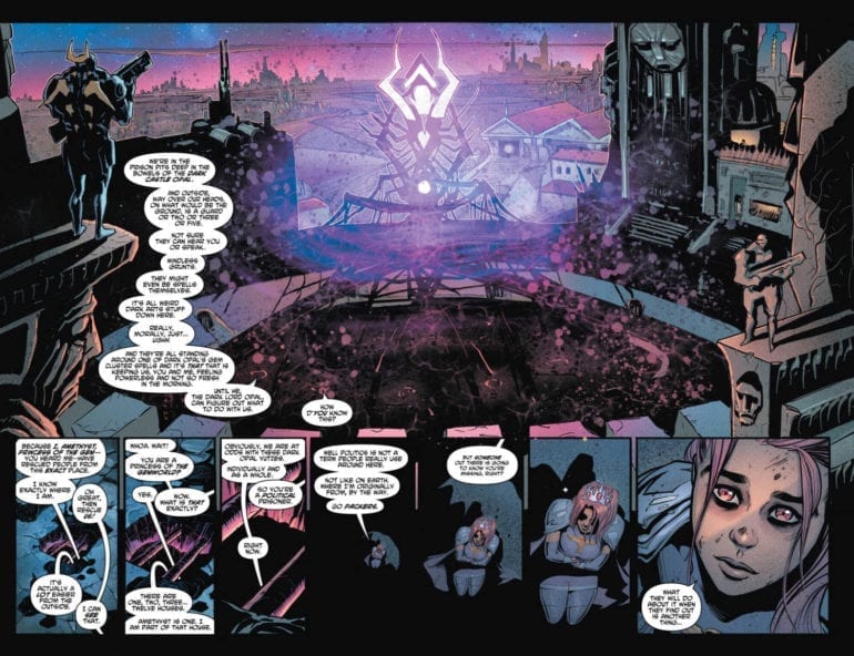
Both of the worlds in Invisible Kingdom have one thing in common, the sublimely beautiful art work by Christian Ward. He has produced exciting, alien landscapes that fill the page. Small details appear throughout the panels, unrelated to the story but set the scene perfectly. An obscure looking bird perched on a branch in the bottom of the page is a reminder to the reader that these worlds are different only in appearance; beneath, as the narrative confirms, there is much that the reader will identify with.

Ward’s design work is exceptional and the colours are striking, continuing the theme of contrasts set out in the narrative. The bright red of the nun’s habits are like a sea of red weaving through the cold blues and white of the monastery.  In contrast the Lux headquarters is awash with neon whereas the characters are reduced to dark colors and are shrouded in shadows or reduced to silhouettes. Ward’s art tells the reader all they need to know about the institutions that rule in the Invisible Kingdom; the corporation is glitzy and showy and rejects the people whereas the monastery focuses on the people while neglecting the world outside.

Sal Cipriano’s lettering is subtler but equally effective. The caption fonts match the alien-ness of the world, a constant reminder to the reader where the story takes place. The placement of the speech balloons fills voids in the background relieving the panels of any dead air. However, for intimate conversations Cipriano clusters the balloons together, as if the characters are speaking in hushed, tones.

interior art invisible kingdom
Invisible Kingdom #2 Credit: Dark Horse Comics

Conclusion

The narrative continues to be intriguing and the characters are growing at a steady pace. Wilson draws out her cast a little bit in each scene so that nothing too much is given away but the reader is always satisfied. Ward’s Artwork is outstanding and warrants attention without the surrounding narrative.

There is a lot on offer in the pages of Invisible Kingdom; character, mystery, metaphor. However, none of it over powers anything else: it all sits together on the page in equal measure. This is proving to be a must read comic and the future prospects are huge as there is a vast world of ideas for the creators, and the readers, to explore.

Invisible Kingdom #2 is released on 24 April 2019.


Monkeys Fighting Robots Youtube

Review: Devastation On A World Stage in THE EMPTY MAN #6

Monkeys Fighting Robots

The personal stories of trauma and resilience which have filled the pages of The Empty Man in the previous issues take a back seat as Cullen Bunn opens up his world of horror. As one of BOOM! Studios adult comics, The Empty Man doesn’t pull any punches and the grotesque levels continue to increase.

The series is building towards a world shattering conclusion later in the year and this issue gives the readers an idea of the scope of the narrative. The heroes safety is slowly diminishing in the face of the world wide catastrophe.

Alternative cover Empty Man
The Empty Man #6 Credit: BOOM! Studios

Writing/Story

So far the story has been centralised on a few characters fighting to survive in a world that is crumbling around them. The wider world has been featured but up until this issue the character driven aspect of the narrative has been the focal point. This 6th issue in the series opens up the playing field and explores the Empty Man virus’ larger game play.

Bunn weaves the narrative through a city in meltdown, employing the use of Newscasts and mass hysteria to link the story threads together so that the comic flows like an unstoppable river of blood. Everything is bigger as Bunn draws in the world view. The action is more spectacular featuring cars chases and massive mutations; the horror is more disturbing with suicides and family murders; the scale of the virus’ invasion is more explicit.

The purpose of this issue is to show the effect on the world that the Empty Man virus is having and that is exactly what Bunn achieves. He still keeps the central characters in play, but uses them to tell a larger story. They become the epicentre of a large storm sweeping through the city, one which Bunn revels in revealing. He has started to bring all of the pieces of the puzzle together. This is a gripping read.

Interior art Empty Man
The Empty Man #6 Credit: BOOM! Studios

Art

Jesus Hervas has his work cut out for him this month. The scale of the horror has increased and to get the full devastation across to the audience Hervas has produced open panels packed with chaos and mayhem. City wide riot scenes have been split across panels to highlight the scope of the violence, focusing on buildings in one image and people in the next. A huge traffic jam has been squeezed to the side of a page to illustrate to congestion. The sound effects, proved by letterer Ed Dukeshire, are haphazardly layered over the cars to increase confusion.

There are many scenes of a horrific nature, each with a different emphasis, but Hervas gives them their own disturbing individuality. They are all part of a greater problem, as laid out in the narrative, but the individual incidents are personal and more disturbing because of this. The reactions Hervas gives to the perpetrators and spectators helps the reader to focus on each grotesque scene at a time before the script links them all together.

The coloring by Niko Guardia helps to separate the scenes and create the atmosphere. Whether it’s a disease ridden greens and yellows portraying the spread of infection or the cold blue washes over the villains, the coloring is an important factor for holding the readers concentration. By combing the expressive color palettes with the over the top, yet effective, sound effects each page grabs the reader and instils the sense of fear that the characters are feeling.

interior art
The Empty Man #6 Credit: BOOM! Studios

Conclusion

Just like the virus in The Empty Man, this comic has been slowly evolving over the months. Each issue steps up the threat levels and turns a personal story into a world problem. A lot of end of the world stories tend to use the opposite approach; starting with the disaster and then introducing the characters. Bunn however has hooked the reader in with the family and is now opening up his world.

The art work is suitably unnerving and nothing in this comic appears for mere shock value. There are shocking scenes but they have something to say in the narrative. The creative team are using the structure of the comic to build a world of terror. They constantly force the reader into difficult situations and places so that they feel the guilt or fear or claustrophobia.

The Empty Man is a magnificent horror comic from cover to cover.


Monkeys Fighting Robots Youtube

Review: ORPHAN AGE #1 Gives Us An Obvious Look At A Harsh Future

Monkeys Fighting Robots

There are many roads to a Dystopian Future; some take months building up the tension waiting for the inevitable end; others get straight to the point and prepare for the aftermath. Orphan Age #1 is one of the later types. It’s also not too dystopian.

AfterShock Comics unleashes a harsh world of religious bigotry and pointless death into comic shops. In the vain of The Walking Dead, minus the Zombies, Orphan Age throws a cast of characters together and challenges them to survive.

Orphan Age cover art
Orphan Age #1 Credit: AfterShock Comics

Writing/Story

Ted Anderson doesn’t mess about with the end of the world. One page is all it gets at the very opening of Orphan Age. One page. All of the adults die, unexpectedly, leaving the children in charge of the world. Similar in initial premise to The Tribe, a 1999 Australian TV series, Anderson quickly moves the story forward 20 years, when most of these children have grown up.

After the opening you wouldn’t be blamed for expecting a narrative that explores the ageing process without guidance from adults however, that is not what the rest of this comic is about. Societies and misguided religion have sprung up with the usual trappings that come with them. Anderson sows mistrust and fear of strangers into every scene almost creating something that could easily slip into a copy of The Walking Dead. Dallastown is a secluded society, at peace with itself, based on simple farming and sharing openly in a group setting. It is obviously set up for a fall.

Anderson creates a diverse cast of characters who will all have to learn to live with each other in order to survive and these are the strongest element of this comic. Each of the main three characters is cleverly written with their own individual voice. The differences between them are presented in a series of staged scenes, setting up future emotional conflicts as the narrative progresses.

Orphan Age interior art
Orphan Age #1 Credit: AfterShock Comics

Art

Most of the art within Orphan Age has an earthy coloring to it. This produces much of the general atmosphere and keeps the action surprisingly sedate throughout. It is obvious from the natural shades that modern technology has been expunged from this new world. The tone of the colors sets up this element of world building without the need for expositional speeches.

Nuno Plati’s work is carefully considered with thick black lines defining the characters. Plati adds subtle gestures and expressions to the cast to give them a relaxed, contented feel.

This style continues even into the violent sections of the story which distances the reader from a lot of what is happening. The emphasis however falls on the three central characters and their reactions to the situation. This is where Plati places the emotion and gains empathy from the reader, especially in the character of Princess, the youngest protagonist of the comic.

The layouts that Plati uses creates some interesting imagery and focal points. One page in particular focuses on the three central characters and the subtly differences between them. A series of three stacked panels with compositional differences in each makes the reader carefully study each character.

The lettering within Orphan Age is a pleasure to read. Joao Lemos and Marshall Dillon’s work demonstrates how the storytelling can be affected by the speech balloons. Changes in font size can make such a difference, especially when the balloon size remains the same, a technique which is used to great effect in this comic. There is definition between speech volume and overlapping speech balloons that create naturalistic speech patterns.

Orphan Age interior art
Orphan Age #1 Credit: AfterShock Comics

Conclusion

Where Orphan Age’s narrative fails is in not giving the reader anything new. There is a gluttony of stories dealing with small societies trying to survive that it is difficult to find a new angle. Orphan Age had a potential new angle in the opening pages but then lost it almost immediately. The struggle of the surviving children, alone in an environment slowly decaying, promised a new direction but Anderson skips over it. Instead the reader is left with a Religious Organisation which is, predictably, violent and self-serving, and a small cast of characters on the run in a harsh world.

Orphan Age has some interesting art and tells its story in a sedate, self-conscious way. The highlight of this issue is the integration of the lettering into the art work and narrative. There are moments when the text leaps from the page and tells the reader more about this world than the art or the script does.

There is a lot to enjoy here, just don’t expect anything new from the plot.

Monkeys Fighting Robots Youtube

Review: ALIENS RESISTANCE #3 Promises More Than It Delivers

Monkeys Fighting Robots

Continuing the saga of the Xenomorphs and the rebellious nature of humankind, Aliens Resistance #3 from Dark Horse Comics finally pits the heroes against the Aliens. Finding the balance between character relationships and action is a difficult task, especially on a franchise like Alien where certain expectations need to be met.

Passing the halfway point of the series, the current creative team have a lot of elements to play with but can they keep all of those balls in the air?

Writing/Story

Lost in space and orbiting a moon with a secret Company science station, Amanda Ripley and Zula Henricks must put their faith in each other to survive and face the horrors ahead.

The opening sequence of Aliens Resistance #3 is an adrenaline rush that Brian Wood uses to illustrate the bond developing between the two central women. This bond is the main motif of the issue and throughout Wood focuses the dialogue on the closeness between the two of them. The ease of which they speak to each other and the jokes/sarcasm they share accentuates their friendship.

Elsewhere in the comic, Wood finally reveals the horrific nature of the experiment undertaken by the Weyland-Yutani. Set in a jungle environment, Wood uses the voice over to highlight the hopelessness of the colonists. The sequence is quick and bloody. In fact, it’s too fast. Anticipation of the moment is at a high by the time the reader gets to this section of the comic and then it’s over, almost straight away. Wood doesn’t allow the horror of the situation to sink in.

Amanda and Zula are a great duo and their friendship is the central part of Alien Resistance but this comes at a cost. The rest of the comic lacks for characters and therefore lacks any element of threat.

Aliens cover art
Aliens Resistance #3 Credit: Dark Horse Comics

Art

Just as the story focuses on character, so too does the art work. Robert Carey produces outstanding figure work giving the central characters a very strong presence on the page. The cast also perform well, expressing fear or relief as the narrative requires.

The page layout and scene setting is also exceptional. Each scene has a wide, cinematic look; the depths of space are endless and the jungle landscape over bearing. Wood’s slow pacing matches the vastness of the scenery and the expansive panels Carey uses to contrast the characters relationship against the all-encompassing space they inhabit. This layout reinforces Amanda and Zula’s need to work together and be a strong partnership; alone they would simply disappear.

The problem with the art lays in the blending of the characters and the backgrounds. Similar to the first Star Trek Discovery comic from IDW Publishing in 2018, the characters and the background seem to exist on two separate planes. The one layer has been placed over the top of the other but there is a distance between the two. This results in breaking the reader’s concentration making it difficult to retain the atmosphere.

The color work by Dan Jackson is excellent, especially on the backgrounds. He creates a sense of depth that is unnerving. The lettering by Nate Piekos is also first rate as it is always clear who is speaking, even in the caption boxes or through the radio communications. However, the problem with the foreground and the background is an issue. The lettering is clearly on one level with the characters, separated from the scenery they are supposed to be inhabiting.

Aliens cover art
Aliens Resistance #3 Credit: Dark Horse Comics

Conclusion

The recap page gives away half of this issues’ story and could cause confusion if you’ve read previous issues of Aliens Resistance. In turn this means that the narrative is constantly playing catch up with the reader and fails to meet expectations. The build-up in the previous issues and the promise of a mass xenomorth infection doesn’t come to full fruition. The Aliens have been side-lined and appear all too briefly.

Aliens Resistance has a cinematic look to it and Wood’s script is an interesting character piece for the two central women. Unfortunately, the one element this comic lacks is a sense of threat which is essential for a story in the Alien Franchise. When the Xenomorth’s are reduced to nothing more than pesky insects, like they are here and to a degree in James Cameron’s Aliens movie, they lose their impact. The narrative then requires something else to fill the gap and Wood has not produced that something else here.

This may be one of those occasions when the full story is best read in a collected state. As a single issue, Aliens Resistance #3 has the style but is lacking the substance.


Monkeys Fighting Robots Youtube

Review: Let FAITHLESS #1 Lead You Helplessly On

Monkeys Fighting Robots

Describing itself as ‘An erotic depiction of faith, sex and the devil, in the tradition of the divine comedy,” Faithless #1 is in essence a love story. BOOM! Studios have in recent years become a go to publisher for teen and young readers but with this new release the intended audience is much older. However, the initial previews may have featured heavily censored images of a sexual nature but the main bulk of this comic is about a women struggling with the void in her life.

Faithless design
Faithless #1 Credit: BOOM! Studios

Writing/Story

The opening of Faithless has been doing the rounds for a few months now, mostly with censored strips, and it introduces the central character and the tone of the comic beautifully. The second page splash image illustrates perfectly Faith and where she is in her life. She lays, unsatisfied and alone on her bed surrounded by mess, partially closed in away from the outside world.

Brian Azzarello introduces the character in a very intimate way which is arousing but ultimately unsatisfying. The reader heads into the story knowing that there is something missing and then follows Faith as she journeys through her day, feeling every knockdown and every adrenaline rush. By starting with a heightened sexual moment Azzarello introduces an electric tension into the narrative which crackles across each page and each encounter that Faith has with Poppy, the new woman in her life.

The sexual tension is evident on each page as Poppy manoeuvres Faith away from her comfort zones and into new, unexplored, territories. There are elements of tragedy, a televised suicide, and criminal manipulation mixed in with narcissistic art and talk of magic.  However, it is the interaction between the two women that makes this tale a gripping read. Azzarello makes Poppy a mystery which Faith is trying to uncover. There is one closed character and one open character duelling it out to see who breaks first and through their interactions the reader gets an insight into both of them.

Faithless
Faithless #1 Credit: BOOM! Studios

Art

Maria Llovet’s artwork is perfect for Faithless. Her character work is outstanding and extremely emotional. She has the ability to express so much emotion with the minimal amount of lines. Then she is able to switch to packed scene setting shots which reveal as much about a character as a series of extreme close ups.

The inked lines are precise with a fluidity which gives each panel a naturalistic look. This fluidity is especially effective in projecting the sensual aspects of Faith and Poppy’s growing relationship.

Llovet clearly has a passion for fashion as the design work on the clothes for all of the characters is fresh and modern. Her European heritage is reflected in the design of the buildings and the fashion but also in the loose colors and panel boarders. The bright, clean colors and hand drawn panel frames are an extension of Faith’s character and appear to react to her mood within the narrative.

Deron Bennett also adopts a free lettering style with the appearance of misshapen speech balloons and a hand drawn font. This gives the inflections of the speech some gravitas especially when he uses bold text or changes the size of the font.

There is an emphasis on the interaction between the central characters which is displayed through the art and lettering. As the pages turn the relationship between Faith and Poppy intensifies, pulling the reader helplessly along with them.

Faithless interior art
Faithless #1 Credit: BOOM! Studios

Conclusion

The influence of Dante’s Divine Comedy, referred to earlier, is obvious and Faithless has a narrative flow which reflects elements of the 12th century Italian poem. It starts with a character who is lost, trapped by the people around her until she meets someone new, who takes her on a new journey.

The creative team of Azzarello, Llovet and Bennett pack this comic with erotic tension and seduce the reader with each page. The artwork is beautiful and sensual; the script is subtle and clever; the letters are suggestive and emotive.

Issue 1 of Faithless is a superb first issue brimming with character and intrigue. A certain element of the comic will catch the eye and receive a lot of internet chatter, the eroticism element, but Faithless is so much more than titillation. It is rooted in a centuries old narrative tradition and it is at heart, at least in this first issue, a love story.

Monkeys Fighting Robots Youtube

Review: OBERON #3 A Tale In Three Parts

Monkeys Fighting Robots

The creative team behind the AfterShock Comics title Oberon are committed to the telling of tall tales. They adapt the stage tradition of weaving stories within stories to entertain the reader and further the main plot.

With a theatrical style and some myth building panache, Oberon continues to prove that there is still room for traditional fantasy titles on the shelves of modern comic book stores.

AfterShock Art
Oberon #3 Credit AfterShock Comics

Writing/Story

This issue of Oberon is a tale of tales. Each lacking in obvious moral and containing holes that don’t get filled. There is a hope in the reader that each tale will relate to another and a common theme present itself but unfortunately this doesn’t happen.

The initial tale of two brothers is vague and lacks any real substance, seeming to exist only to explain the Pig Man who roams the labyrinth that Bonnie has been left in. It would seem that Ryan Parrott loves they idea of subverting myths and legends and tweaking them to fit his new world. Although there is nothing wrong with this in principle, for it to have any gravitas either the new myth must be exquisitely told or be integral to the plot. The tale of the pig man is neither of these.

Nicholas’ tale is different. Through the script and the visuals, it combines lies and truth to relay his initial meeting with Oberon. This contrast of ‘pretty words’ and violent, harsh visuals is representative of fairy stories the world over. The Brothers Grimm made a career out of exploiting gruesome folk tales and retelling them for a more discerning audience, this is something that Parrott is drawing on here in Nicholas’ tale. It sheds light on one of the central characters and how he views the world but it is also a comment on fairy stories as a whole.

The final tale incorporated into Oberon issue 3 is a combination of both examples above. It is a biased tale strongly refuted by the subject. Because of Nicholas’ tale before it, Parrott has already informed the reader how stories can be true and yet lies at the same time. Therefore, the conflict at the end of this issue is an intriguing cliff-hanger because, as readers, we do not know who to believe.

Parrott weaves his stories around the central cast, hinting at something greater. Bonnie is a mystery much like the Tim Hunter character from the early issues of The Books of Magic, her potential and significance is as yet unknown but Parrott is slowly revealing her importance. However, a lot of time is spent on insignificant things in this issue and much of what happens has no resolution. This is turn makes parts of the plot redundant and, like the Pig Man’s tale, it seems to exist purely for the sake of an idea the writer didn’t want to discard.

AfterShock Comics
Oberon #3 Credit AfterShock Comics

Art

What really moves Oberon along, pushing the reader through the early pages especially, is the energy and vibrancy of Milos Slavkovic’s artwork. His painted visuals provide the perfect backdrop for the mythical land of fairy that Parrott is creating. The dream-like backgrounds are a soft setting for the theatrics to play over and do not distract from the cast of characters. The rendering of the characters themselves is wonderful with strong silhouettes and color coding to make them instantly recognisable on the page.

The traditional and recognised look of fairy tales is mixed with a Shakespearean flourish to produce visuals that are engaging and theatrical. The pages have a staged look to them befitting the narrative but also capture the energy of a family fantasy movie. When Bonnie, for example, runs through the labyrinth with the Pig Man towering above her, there is a sense of danger and foreboding. The beast is unnaturally large, dominating Bonnie in every panel, and more often than not, across panels. This in turn makes Oberon’s intervention even more impressive.

One artistic touch that was evident in the previous issue, played a part here as well. There is a moment where the background from one page is repeated on another with the same layout of panels but only altered foregrounds. This is a clever visual reminder for the reader that stories interact, rerun and repeat. All stories are based on something, and time and time again the same stories are updated for a new audience. This is what Parrott is doing with Oberon and Slavkovic acknowledges that in his art work.

The theatrical nature of the comic is once again illustrated wonderfully through the lettering by Charles Pritchett. He gives the caption boxes a look of scripture, as if the writing is part of an old text. The speech balloons are packed with emphasis and rhythm, with the text being laid out like lines from a play or poetry stanzas. The inflections of the actors have been picked up by Pritchett who bolds text or separate’s speech to illustrate this.

Oberon Art Work
Oberon #3 Credit AfterShock Comics

Conclusion

Overall Oberon #3 is an enjoyable read and contains all of the theatrics that the reader is coming to expect from Parrott, Slavkovic and Pritchett. The world building is on the whole enjoyable, with the art making up for any deficiency in the telling of the tales. In this issue some of the elements of the story are superfluous and exist for the sake of existing however, it does not ruin the overall reading experience. It is a shame that the weakest section of the comic is at the start.


Monkeys Fighting Robots Youtube

A Timeline Of 101 Marvel Character Comic Book Debuts

Monkeys Fighting Robots

Who was the first-ever Marvel character? Do you think you know?

It was a superhero you may have never even heard of: Namor the Sub-Mariner, a mutant son of a sea captain and the princess of Atlantis not too dis-similar from Aquaman. Namor, the star of Marvel Comics #1, is lesser-known. That’s probably because he’s never had a film, partially due to an embroiled copyright war between Disney, Marvel, and Universal.

In this comprehensive look back at the debuts of 101 Marvel characters, compiled by AAA State of Play, we see how much this incredible company has changed over the past 80 years. That’s right – Marvel is having a year-long celebration of their 80th anniversary this year!

Since Namor in 1939, the company has introduced hundreds of characters we love, but this short guide points out some comic classics. Did you know, for instance, that Thor, Captain America, and the Fantastic Four all pre-date Spider Man? Did you know that the crowd-favorite Deadpool is 28 years old? And Deadpool is far younger than Carol Danvers, who dates back to 1968 or Black Panther, who dates back to 1966.

In this celebration and retrospective of Marvel, we can see some of the hit comic-book characters who’ve made the big screen as well as who haven’t. Fans of Miss America or Rockman, for instance, have had to wait quite a while for a film. On the other hand, X-Men like Gambit were introduced on TV not long after their comic-book debut. Newer characters, like Spectrum, Ms. Marvel, and Ironheart are already smash hits and hopefully will get their own screen appearance soon.

Whether you love popular film darlings or the obscure superheros only found on the page, it can be fun to look back and see when your favorites made their debuts compared others on this list of Marvel characters.

It’s amazing to see what the company has done over the past eight decades. Who knows what kind of stories they’ll be telling after 100 years?

marvel comics timeline spider-man


About our team:
This chart was created by the AAAStateofPlay content development team, led by Kim Hart. Those who worked on it include Kim, Mitch, Joy, and Nic.

Monkeys Fighting Robots Youtube

Exclusive No More: DC’s Walmart Series Coming To Comic Stores

Monkeys Fighting Robots

The DC Comics-Walmart partnership saga has certainly had its share of plot developments already, and here’s some further information: starting in July, the new story material — until now available exclusively in Walmart’s 100-Page Giant comics — will be arriving in comic stores. Superman by Tom King and Andy Kubert; Batman by Brian Michael Bendis and Nick Derington; and Wonder Woman by Amanda Conner, Jimmy Palmiotti, and Chad Hardin lead the charge, with each character’s storyline collected as a six-issue miniseries.

DC Walmart

It’s been a long road to get here since DC announced the partnership last summer. Despite fan complaints that the comics were either not available or hard to find, DC was apparently happy enough with the sales results that they expanded the number of 100-Page titles and even brought DC Collectibles into the mix.

DC Walmart

Retailers had a mixed reaction to this plan — not surprisingly, since they were completely cut out of the mix. Then came the rumors that DC was ending the line… or not ending it… or expanding it further. Dan DiDio addressed all of this back in February, where he clearly stated that their plans included “distribution to the direct market.” Now he’s following up on that promise.

DC Walmart

DC’s official descriptions are below:

The fireworks start early on July 3, with SUPERMAN: UP IN THE SKY #1, written by Tom King (BATMAN) with art by Andy Kubert and Sandra Hope. Following a home invasion that ends in murder, Superman is put on the trail of a Metropolis mystery by Batman—but can even the Man of Steel discover the truth behind these tragic deaths, or their ties to the far-off world of Rann?

The action continues July 10 with Brian Michael Bendis and Nick Derington teaming up for BATMAN UNIVERSE #1. Following the theft of a priceless Fabergé egg, the Riddler leads The Dark Knight on a wild hunt after its true owner: Jinny Hex, a descendant of the haunted Western hero Jonah Hex. Deathstroke, Green Arrow and some of the brightest stars in the DC Universe will join The Dark Knight on the chase to find this treasure!

Amanda Conner, Jimmy Palmiotti and Chad Hardin combine their powerhouse talents on a new adventure featuring the Amazon Princess Diana in WONDER WOMAN: COME BACK TO ME #1, on sale July 17. When Steve Trevor is called in for a test flight of an experimental new aircraft, he winds up lost in the Bermuda Triangle—and it’s up to Wonder Woman and Etta Candy to follow his trail to a mysterious and savage island.

Each miniseries will also feature brand-new cover art from Andy Kubert (SUPERMAN: UP IN THE SKY), Amanda Conner (WONDER WOMAN: COME BACK TO ME) and Nick Derington (BATMAN UNIVERSE).

You can read the whole press release HERE.

Are you excited for the chance to read these stories by top creative teams? If you already managed to track down any of the Walmart copies, will you still buy the miniseries? Let us know in the comments!

Monkeys Fighting Robots Youtube

INTERVIEW: Production Designer Melanie Jones Gives Us THE DIRT

The Dirt is a new film on Netflix based on the autobiography of 80s hairband Motley Crue that tells the tale of their rise to fame, adventures in debauchery, and the hardships of humanity and Melanie Jones helped bring the neon and spandex world to life as production designer.

If you haven’t watched The Dirt, it’s a rockin’ ride through the lives of four guys who came together to become global rockstars. In the 80s, rock was alive and well and existed in many forms. But perhaps the most memorable iteration was known as the “hairband” which typically consisted of four white guys, a lot of hairspray spread across a lot of hair, and some hard-hitting rock tunes that have aged better than the look. Behind the scenes, many of these bands lived the cliche rock life that was fueled by ego, sex, and drugs. Like many stories, the volatile combination worked for a while but then it didn’t. The Dirt, like many rock biopics, is a story that’s insanely fun to watch and also has a profoundly human core.

PopAxiom got a chance to talk with Melanie before she heads off to work on a long-awaited sequel that we’ll get to at the end of the article. So, read on as the production designer tells us about her work on The Purge, the Oscar-winning Whiplash, and The Dirt.

Dancing to the Movies

Melanie’s connection to movies started early on “My parents took me to the movies a lot.”

Growing up a small town “We have a few smalls theaters. This one would play, like, all the Planet of the Apes movies.”

At a young age, Melanie’s artistic soul was driving her decisions “I started dancing when I was 11 and got into theater. I could draw. And I ended up making props and then designing sets.”

Making The Purge

The first Purge film pretty much takes place all in one house, and so choosing the right place was a priority “We found a house out in Chatsworth out in the valley in Los Angeles and left a note on the door. The owner got back to us. They’d just had this house built, and there was no furniture.”

The narrative of The Purge wasn’t the only thing that relied on the location “That house became our everything. The garage was my office. We had two trailers outside.”

The film takes place in a not-so-distant future. So to get that point across in the production, Melanie turned to a tried-and-true style “Deco comes back and comes back and comes back and it’s often a fundamental component of future-fantasy design. Repeating patterns, layers. The furniture we picked is very influenced [by that style]. I had a scenic artist paint deco-influenced murals.”

Melanie adds “And then we trashed it.” Of course, for the record, everything was fixed while the owners stayed a hotel paid for by the production.

Six months after shooting The Purge, Melanie got a call about additional shooting required “The production wanted to create a game room, and shoot in the dining room. But we didn’t want to go back to the house, and the owner had fully moved in by this point. So we rebuilt those rooms. I also built a hallway that didn’t really exist at the location.”

Work On Whiplash

Melanie brought her production design skills to the Oscar-winning Whiplash and unabashedly says about the film’s writer/director “Damien Chazelle is incredible.”

About Whiplash, Melanie adds “We shot that film, the L.A. portion of it, in 17 days. The schedule was really, really tight.”

To make sure the short time frame was used wisely, Melanie suggested finding a versatile place to shoot “We landed on the Palace Theater. We did multiple locations there. We used every inch of that place that we could. Then we moved down the street and shot the rest.”

The overall vibe of Whiplash feels very gritty 70s film, and there’s a reason for that “I treated that film like it was a 70s period piece with the colors and the sets that we built to create a look and a mood.”

About The Dirt

What was the first thing you thought of when you read the script for The Dirt? “Oh, well, a production designers wet dream.”

Melanie dishes some more on The Dirt “We shot in New Orleans, but we had to make it look like 80s Los Angeles. Building their apartment with the terrible carpet, the linoleum, burn spots from where they kill roaches. It was so much fun.”

The fun came in the time period and the evolution of the film over the course of about twenty years “As it starts it’s the late 70s and the movie moves into the 80s, so I got to reflect that in the design, the use of colors, starting with more muted colors then moving into the neon of the 80s.”

What did the band think of it all? “They were really excited about it. We submitted questions to them to get insight so that we could honor things as true to life as we could.”

Making the movie meant there would be a bit of a back and forth between creative license and sticking to reality “There were places where we pushed it. But I got to ask Nikki Sixx, ‘When you died …’ which is a weird way to start a question ‘when you died at the Franklin Plaza Hotel what did the hotel look like?’”

There were no reference photos of the hotel “What I saw in my mind was the Chateau Marmont which is infamous for celebrities and the wealthy to go when they don’t want anyone to know what they’re doing.

However, Sixx revealed to Melanie that “‘… the Franklin Plaza Hotel was a shithole.’” The reality was tweaked, and the scene in the film takes place in a fancier location than reality.

Wrapping Up

Melanie is a big fan of the movies and gives us the two extremes of her taste and influences “… I love Spike Lee. The red walls in Do The Right Thing rocked my world. It’s super-simple. But I love the look of that film, it’s one of my favorite movies. But I also love Young Frankenstein.”

Outside a film there’s a related force that drives Melanie’s creative eye “I worked with Annie Leibovitz for a while, so I’m really into photography.”

We finish off with a question worthy of arena rock legend status. If they were remaking any classic movie, and Melanie was going to be the production designer, what movie would she want it to be? “Let’s hope they don’t remake this, but that would be Gone with the Wind.”

So, that sequel I talked about earlier? That’s Melanie’s next project “I’m going … to work on Bill and Ted Face the Music.” It will be quite bodacious.

Thanks to Melanie Jones and Impact24 PR for making this interview possible.

Monkeys Fighting Robots Youtube

Review: YOUNG JUSTICE #4 Struggles With Flashbacks

Monkeys Fighting Robots

Amidst the boring politics, the light of the Young Justice family shines.


Young Justice is back! That’s what I would say if they weren’t scattered throughout Gemworld. Instead, we have been treated to flashbacks that explain what the heroes have been up to up to that point. While it’s great to get a picture of what character like Conner Kent has been up to, we practically learn nothing about the new characters in the bunch. Currently, most of the team has been captured by Dark Opal’s Forces. Bart, on the other hand, is with a new pacifist Conner, cornered by one of Opal’s commanders. Has Young Justice already fallen before it began its rebirth?

Young Justice 4 cover

**Some Spoilers Below**

Story:

We get two stories in this issue; however, unlike the last two, we get to focus on the present nearly as much as the past. In flashbacks, we see Amethyst trying to convince the other leaders of Gemworld to take on Dark Opal. When they ask what they should do, she responds by doing whatever it takes. She is sent from the room, being labeled as too young and bold to make such decisions. Meanwhile, in the present, Conner is revealed to have not lost his fighting spirit and takes on Opal’s Forces. With the gem people defeated, he and Bart go off to find the others from Earth.

Young Justice 4 p1

While the stuff in the present is short, I much prefer it over the flashbacks. The teens of Young Justice talk to each other as if they’re old friends trying to catch up. It makes the group feel more realistic, and their humor makes each part enjoyable.

However, that’s where the problem of the story is as well. There’s not enough of it to keep the overall issue interesting. The politics of Gemworld are rather dull and goes to show how the adults don’t trust the young princess. The last part of the flashbacks includes Amethyst finding Robin, meaning this might be the last issue of them. I genuinely hope that because, just like every other issue, they’ve grown dull.

Young Justice 4 p2

Art:

While the politics of Gemworld bore me, I can’t say the world doesn’t look cool. The world of Amethyst is imaginative, blending sci-fi and fantasy beautifully. The young heroes continue to look fantastic thanks to the art team’s attention to detail as well. If the comic continues to look as good as it does here, it might be enough to overlook the hiccups in the story.


Conclusion:

While the road is still rocky, Young Justice is beginning to find its way. I like the team’s interactions with each other. I wish this series has had more of it, but with the team finally finding each other,  it’s apparent that it will fix itself soon. The art is pretty good as well; both colorful and imaginative which is perfect for the team. Unfortunately, the issue still has the problem of having a large chunk of it being boring flashbacks. I see the potential for this book; it just has to shake off its big problems in storytelling.

Monkeys Fighting Robots Youtube