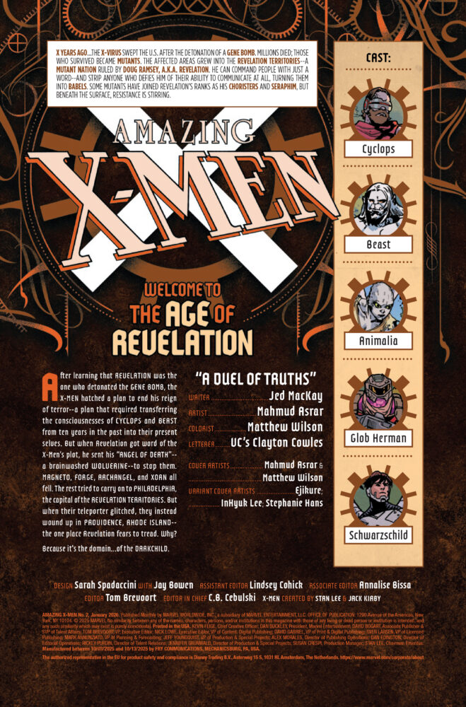
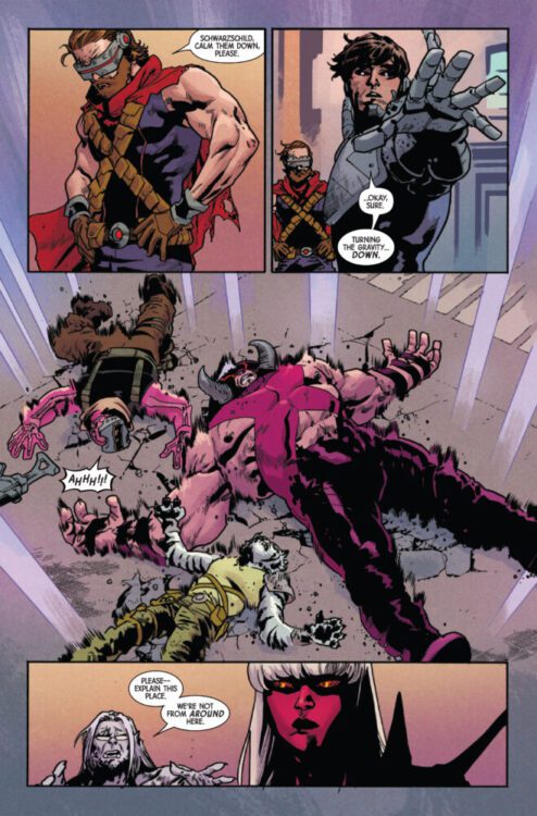
AMAZING X-MEN #2 hits your local comic book store on November 5th, but thanks to Marvel Comics, Monkeys Fighting Robots has an exclusive four-page preview for you!
About the issue: OUT OF THE FRYING PAN AND INTO THE HELLFIRE!
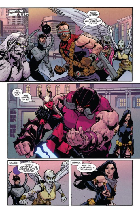
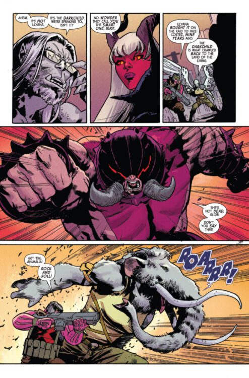
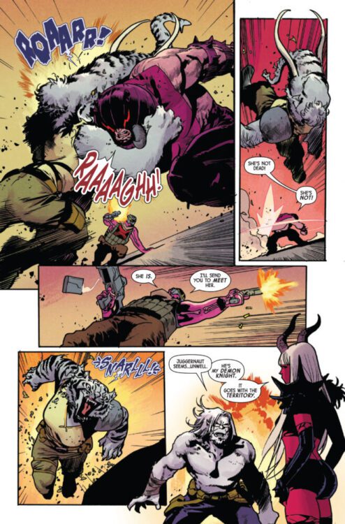
X YEARS LATER, the X-Men find themselves at the mercy of the Darkchild and her demon knight, the Juggernaut! Can the X-Men escape Providence, or will they join the residents of that cursed city in damnation? A new ally joins them, but new truths coming to light threaten to tear them apart!
The issue is by writer Jed MacKay and artist Mahmud Asrar, with colors by Matthew Wilson, and letters by Clayton Cowles. The main cover is by Asrar and Wilson.
Check out our AMAZING X-MEN #2 preview below:
Did you pick up the first issue of AMAZING X-MEN? Sound off in the comments!
Absolute Batman 2025 Annual is a very strong and emotional set of stories from many different creatives.
Writer/artist Daniel Warren Johnson, colorist Mike Spicer, and letterer Clayton Cowles focus on the first story, which also happens to be the longest one. The story features Bruce driving through an area named Slaughter Swamp in order to get some new weapons to round out his artillery. He’s quickly met with local supremacists, and decides to handle them himself.
Writer/artist James Harren and colorist Dave Stewart are joined by Cowles for a story featuring the Party Animals and Bruce finding a small group of them after having taken down Black Mask.
Creator Meredith McClaren takes on this last story herself. It’s a short two-page story featuring some facts about bats that ends up being wildly heartwarming and hopeful.
All of these stories come together very naturally to give us a new look at this Batman and his psyche as well as how Gotham operates around him, because of him.
A young Bruce talks to his father.
WRITING
Starting with Johnson’s story, we’re in for an action-packed ride right off the rip. Johnson’s specialty is giving us these awesome, larger than life characters while showing us that the problems they face and internal struggles they carry are just as large as them. The majority of the story features Bruce fighting white supremacists, protecting locals in the area. He goes all out on them, being incredibly violent the entire way through. There are voices of reason through asking him to show mercy, but he ignores them. The entire time though, the words of his father spoken at the beginning of the story really resonate in both us and Bruce. He has to help make change, because not a lot of people have the power to. With that being said, is it possible to go too far? Johnson asks this and handles the climax wonderfully.
The next story from Harren is less action focused, letting us sit more with Bruce as a sort of terrifying creature of the night. It’s a slower story that primarily features Bruce sneaking around, only going in for attacks when all else fails. Harren really balances two ideas with this story. He acknowledges that Batman is a force to be reckoned with, but also shows how there is still good in people for those less fortunate from the relative of one of the Party Animals who maybe was just on a bad path. It’s a really interesting look not only at the character, but at the people of Gotham as well.
McClaren’s story comes at the tail end of the book. It’s short, yet impactful. She shows the city’s relationship with Batman, and how they trust and support him. He’s mostly seen as this fierce, horrifying animal. McClaren shows you that while he is that, he also does something as small as getting a meal for a homeless person. He inspires the community, and that’s the essence of Batman.
Absolute Batman standing in flames with his artillery.
ART
All three of our aforementioned artists drew their own respective stories as well. Starting with Johnson, it’s honestly easy to be at a loss for words when describing his work here. He has such an incredible range to draw a heartfelt conversation between father and son in one panel with a massive Batman walking through flames in the next, both feeling incredibly relevant to the story. Johnson has always had such a good eye for character design. The people in the story living in tents look so sad and hurt, trying to make the most of what they have. The supremacists on the other hand look exactly how you’d expect them to, but with an evil glint in their eyes. Johnson succeeds in making his villains look incredibly unsettling, even when they’re just people.
Harren’s art is really out of this world. There’s this specific page where Batman enters the building from a rooftop, but his sectioned cape is flowing in the wind. Each end curls in a way that really adds a gothic feel to the story, giving more personality to both Bruce and Gotham. The story isn’t told from Bruce’s perspective, so when he is seen by the Party Animals he looks like this monstrous deity slowly roaming the halls, looking for a kill. It’s a really great look at how fear plays into this Batman’s ability to help those in need.
McClaren’s art in the final story is simple, but sweet. It may seem small, but there’s a lot going on in every little paneling. The sectioning of each panel really works. While we hear these bat-facts and news of Bruce’s exploits through the city, in the background he’s drawn doing small things to help the people of the city. It’s a good contrast from the other two stories that gives the character a little more heart.
Bruce drives into Slaughter Swamp
COLORS
Spicer handles the Johnson story, and he really excels here. When Bruce is talking with his father in flashback, or talking to another character in the story—helping people a non-Batman way—the colors of the background are these flat pinks and oranges with little to no detail. When he’s on his manhunt though, everything colored on each page is incredibly detailed with intense oranges that change with the flames surrounding Bruce. It’s really intense and provides a welcome contrast from the book’s usual hectic nature. Sometimes the calm and peace is necessary.
Stewart handles the Harren story. The story for the most part is primarily blue with the sky and lighting in the rooms the Animals are in illuminating most of what we see. There’s a special moment near the end of the story where a civilian chooses kindness to help someone, his face covered red. It shows that blue is a calm color, and the average person is safe in Batman’s Gotham. But it also shows that if you help who you shouldn’t, then you’re stained with that. It’s interesting though as that moment can also be seen as a character breaking the mold, Batman obviously noticing but allowing it to happen because of his inherently hopeful nature. Stewart gives you a lot to think about.
Onto McClaren again: her coloring is special. There’s nothing too crazy or elaborate, but it’s nicer that way. It shows that Gotham is still a city and a people. The only color changes in the issue are for the text boxes, which are black and white rather than lively like the rest of Gotham. Bruce will think about these cold hard facts and how they will take him where he wants to go, but largely won’t see the good he does for the city and how that brightens it.
Bruce buys weapons from an old man.
LETTERS
Cowles covers both the Harren and the Johnson stories in this issue, with McClaren covering her own portion. Cowles gracefully matches the style of both stories with his textplaces. He primarily uses small boxes and bubbles in the Harren story, adding to the sense of dread the Party Animals feel when they know Batman’s somewhere around them. In the Johnson story, Cowles does a really good job working around the art. He places the boxes and bubbles perfectly and really lets Johnson’s action and story soar. There’s a few pages specifically where it seems like those bubbles are almost operating around a kick or flying knee from Bruce. It’s really satisfying.
McClaren’s portion is sure to be a favorite. The only text in the story are the bat facts, and they have a really fun look to them. There’s a small bat on top of the initial box making it look almost like a sign at a zoo, most likely referencing the first issue. Each box after that ditches the bat, but keeps the same style. McClaren is especially consistent with it and it really works in favor of her story.
Bruce finds a gang attacking protestors.
CONCLUSION
The Absolute Batman Annual is a welcome look at this character and this Gotham from multiple perspectives. While Snyder and co. work hard on the main book, it’s really refreshing to see this character written, drawn, lettered, and colored by others. It results in three short stories that have every right to be as good as they are. Three important and impactful stories telling us more not only about Bruce’s character, but about this Gotham as well.
Truth, justice, and the American way… These are all themes writer/letterer Julian Darius and artist/colorist/letterer Steven Legge explore in Martian Lit’s Necropolis: The Life & Death of Mark Hernandez #1. But their exploration isn’t one of wide-eyed curiosity or general intrigue. In many ways, it feels more like an autopsy.
Writing
Darius — returning to the world he created alongside Mike Phillips and Steven Legge in Necropolitan — reintroduces us to the series’ leading man, Mark Hernandez. From Necropolitan‘s main title, we know Mark is a few things. He’s a family man, he’s the famed Kraigslist Killer, and he’s ultimately a damned soul. And yet, we also know from snippets of conversations that even Mark’s killings had a sense of justice to them. He got his name for luring in and murdering child predators. The Life & Death of Mark Hernandez is Darius’ answer to the many questions plaguing us about Mark’s character. Perhaps, it will even answer the biggest question of all: why is Mark in Hell?
But to say that Mark’s descent into the Inferno is all this issue is about would be extremely reductive. As previously stated, this issue feels like the autopsy of the American Dream. When Mark signs up to fight in Afghanistan and Iraq after 9/11, we see his years as a soldier while his wife Jessica holds down the fort back home. In their conversations over the phone, Darius—through Jessica—recounts all of the troubling news reports that indicated US soldiers were committing atrocities during these wars. We watch as Mark fights to still believe in what he’s doing, while quiet disillusionment slowly creeps in as he realizes his own culpability.
Ultimately, this is really an analysis of the “War on Terror,” playing out in the lives of these characters. In some ways, the writing does occasionally feel more like a news crawl than a story. Jessica’s relaying of information over the phone to Mark has an on-the-nose quality to it. But in grounding the story in Mark’s life, and especially in hinting that it’s these years that turned him into a killer, Darius makes the problem personal. He asks us to consider the human cost — the devastation it created not only in the Middle East but in the very heart of American morality. How does a public move on from discovering they were the bad guys?
Art & Coloring
Legge’s work is extremely versatile and fresh. There’s so much subtlety and minimalism at work in these pages. On one page, two panels set in vastly different scenes are right next to each other, with Mark standing one one side but extending into the gutter between them. In Mark’s scene, he’s on the phone while his fellow soldiers march by outside in the hot sun. Mark, in contrast to the bright outdoors, appears as a black silhouette on the page. But his form extends into the scene of Jessica and his daughter calling him from home. The looks on their faces show that they feel his absence, and the black empty space that he’s supposed to be occupying highlights that fact beautifully.
The coloring is appears deceptively simple. Legge uses only two colors on each page: black, and either yellow or blue. The early pages all appear in blue, but once 9/11 happens and Mark ships off to Afghanistan, the pages turn yellow. The bold, brash, American coloring gives way to the faded yellow of the desert. And while the blues and yellows are often used to depict things in the background, Legge occasionally but very poignantly switches it up. When Jessica feels depressed, Legge colors her surroundings using the black ink usually reserved for main characters. Jessica, though, is depicted in yellow. It makes her seem unreal, invisible, and part of the background. It masterfully reflects her inner life in that moment.
Conclusion
Darius and Legge have a truly incredible prequel on their hands. They’re interested in more than just Mark Hernandez’s story, though: They’re interested in their shared history with the character. They show us the injustice, the lying, the callous ways in which Mark is used as a tool and not seen as a person. They show the twisted, fragmented world that he came up in. In doing so, it’s like they’re saying “Yes, this all drove Mark a little crazy. But doesn’t it do the same to you?” Martian Lit’s Necropolitan: The Life & Death of Mark Hernandez #1 is available on their website here, and it’s a must-read!
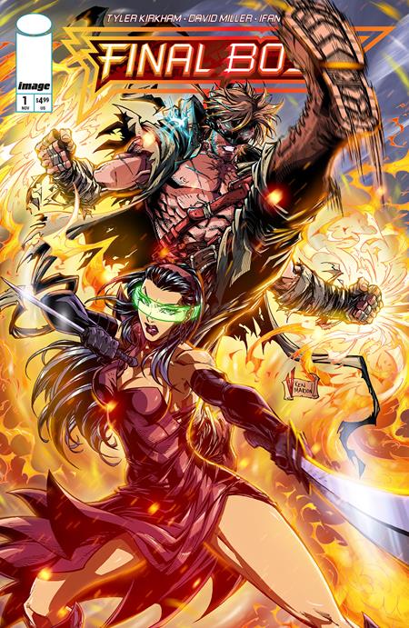
FINAL BOSS #1 hits your local comic book store on November 19th, but thanks to Image Comics, Monkeys Fighting Robots has a three-page preview for you!
About the issue: From the dynamic creator and artist, Tyler Kirkham (Amazing Spider-Man, Green Lantern), comes a thrilling new action hero: Tommy Brazen in FINAL BOSS!
Get ready for an over-the-top adventure that’s a high-octane nod to classic action stories. Trying to forge a new path, Tommy uses his newfound powers for various paid enforcer gigs and street fights, only to uncover a past far more complex than he ever imagined.
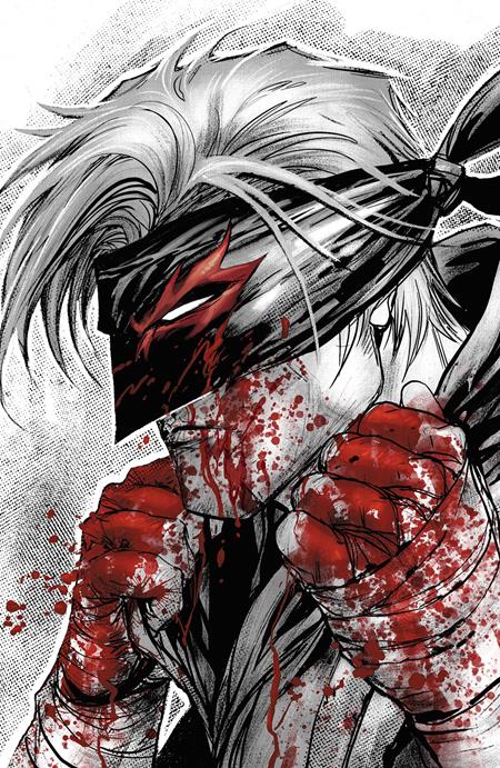
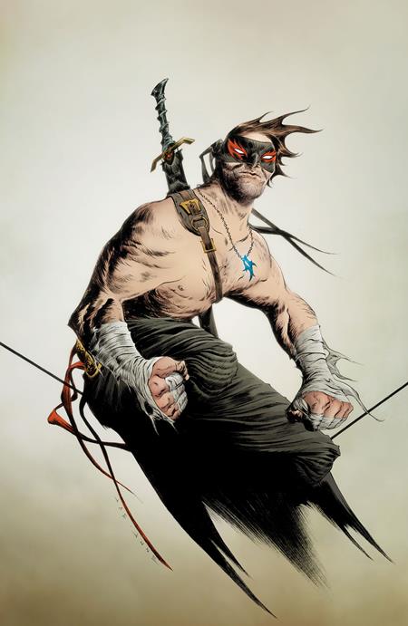
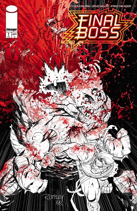
FINAL BOSS is Kirkham’s Image Comics debut. Known for his variant covers and work on titles like Amazing Spider-Man, Green Lantern, and Ultimate Fantastic Four, Kirkham is bringing his signature energy to a creator-owned series that’s being billed as “BRZRKR meets Mortal Kombat by way of Invincible.” The debut issue features variant covers by Ryan Ottley, Jae Lee, V. Ken Marion, and Kirkham himself, which you can see below.
Check out our FINAL BOSS #1 preview below:
Are you picking up FINAL BOSS #1 when it hits shelves next month? Sound off in the comments!
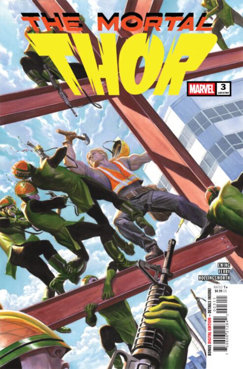
THOR #3 hits your local comic book store on October 29th, but thanks to Marvel Comics, Monkeys Fighting Robots has an exclusive two-page preview for you!
About the issue: SNAKES IN THE GRASS!
Roxxon Construction has a vigilante problem. But whoever this “Thor” is, they know he’s only human… …and the people they’ve hired to find him are much, much more. Somewhere in the city, a man with a hammer is being hunted…
The issue is by writer Al Ewing and artist Pasqual Ferry, with colors by Matt Hollingsworth, and letters by Joe Sabino. The main cover is by Alex Ross.
Check out our THOR #3 preview below:
Are you reading Marvel’s THOR? Sound off in the comments!
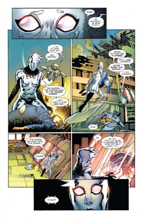
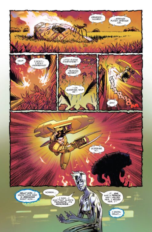
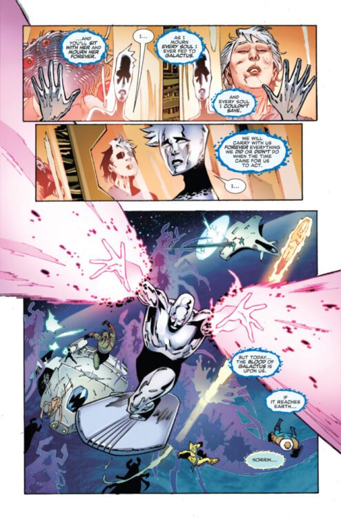
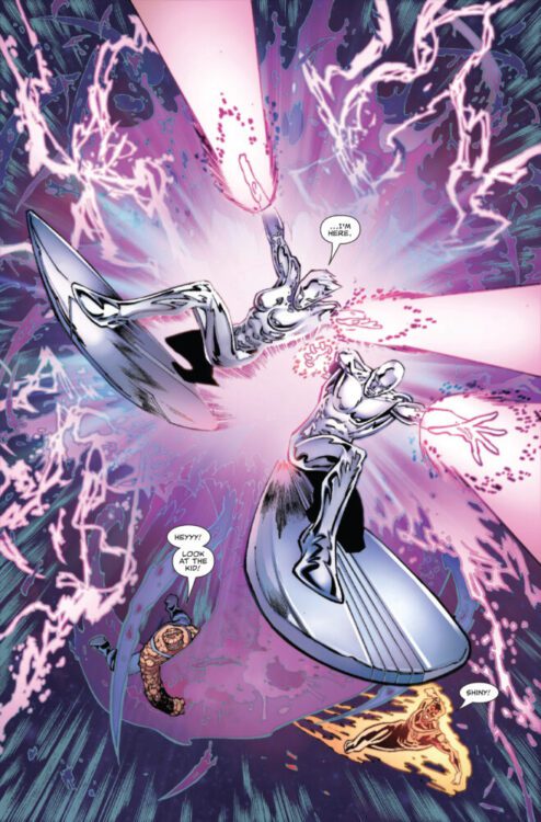
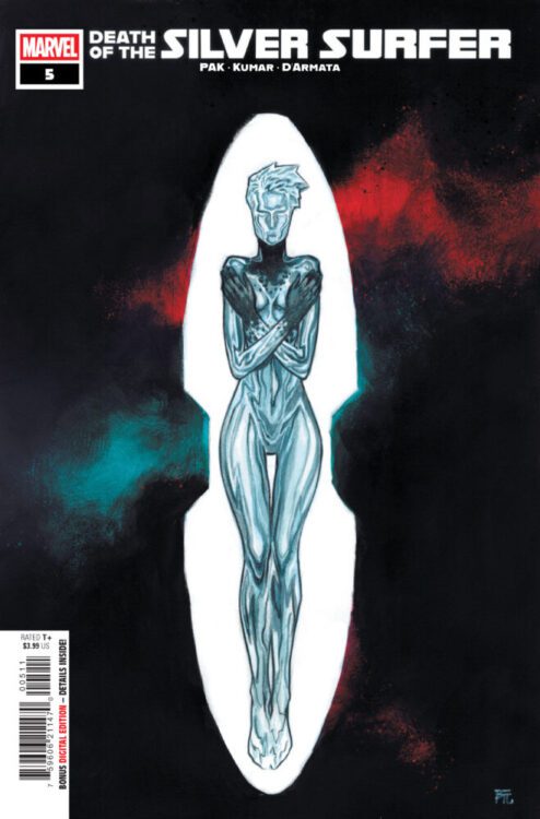
DEATH OF THE SILVER SURFER #5 hits your local comic book store on October 29th, but thanks to Marvel Comics, Monkeys Fighting Robots has an exclusive five-page preview for you!
About the issue: THE ALL-NEW SILVER SURFER?!
The Silver Surfer is dead. Long live the Silver Surfer.
The issue is by writer Greg Pak and artist Sumit Kumar, with colors by Frank D’Armata, and letters by Joe Sabino. The main cover is by Dike Ruan.
Check out our DEATH OF THE SILVER SURFER #5 preview below:
Have you been reading Marvel’s DEATH OF THE SILVER SURFER? Sound off in the comments!
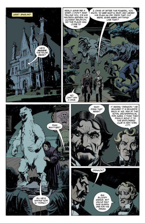
From comics legend Mike Mignola and creator Bruce Zick (The Mighty Thor, Primordial) comes a new adventure in the paranormal Curious Objects universe with Captain Henry and the Graveyard of Time #1. Featuring lettering from Clem Robins, this opening issue is exactly the sort of jaunt you’d expect and want from Mignola and his collaborators. With a witty, fun script and unique, perfectly fitting visuals, this first chapter is a must for fans of Mignola and of takes of good ol’ Gold and Silver Age adventure stories.
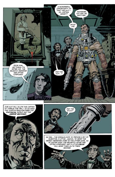
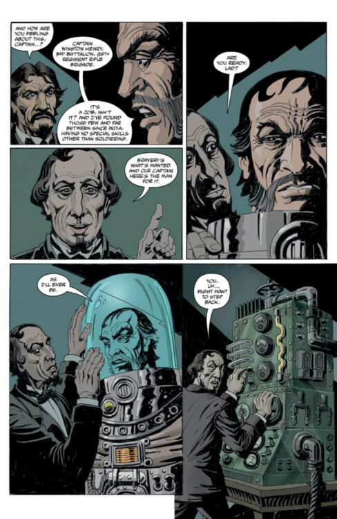
“On a dark night in 1880s England, the ever-adventurous Whittier family, along with Edward Grey, are attempting to send a man into the realm between reality and the Beyond to free the trapped spirit of a Whittier uncle. But his expedition into space—and time—will take him to places beyond even the Witchfinder’s knowledge. Captain Henry and the Graveyard of Time follows an intrepid time-travelling explorer on a journey to a new dimension. He soon discovers that the monsters he encounters aren’t his only problem, as time itself might represent the ultimate danger.”
Writing & Plot
Mignola’s storytelling across his multiple projects has built a reputation for a bit of silliness wrapped up in some occult adventuring – and that’s exactly what you get with Captain Henry and the Graveyard of Time #1. Along with series co-creator Bruce Zick, Mignola introduces readers to the wealthy and eccentric Whittier family as they try and solve a strange paranormal occurrence by putting old soldier Captain Henry in a suit to send him to another realm to save a lost soul. Chaos, calamity, and cheeky one-liners ensue. Anyone familiar with other stories in the Curious Objects series or obviously many Hellboy comics pretty much knows what they’re getting into here, but that doesn’t keep Captain Henry from being a fun read. Mignola and Zick’s dialogue is a joy to read, from the Whittier’s posh and innocently ignorant reassurances to Henry’s deadpan delivery of one-liners, the script slides on by with a focus on humor and monster-fighting action. Captain Henry reads like a modernized take on a pulpy supernatural adventure comic from decades long past, and I wouldn’t have it any other way.
Art Direction
Any comic in the Mignola library needs to have standout art to match the unmistakable tone of his comics, and Bruce Zick delivers in spades in the pages of Captain Henry and the Graveyard of Time. His distinct linework and heavy shading make for a book that fits the bill as far as Mignola comics go, but still looks wholly unique. Zick’s take on the Curious Objects universe’s 19th century steampunk aesthetic is a treat, with suit and monster designs that fit right into the Mignola library. His sequential direction is seamless, with large panels making the comic’s pace and action move along at a steady clip. Zick’s color art crafts the perfect tone for the reading experience, with his deep blacks and blues being offset by unnatural greens and flashes of magical lightning. As always, Clem Robins is on hand to letter another comic in the Mignola library, and at this point it’s impossible to imagine anyone else doing the job. His distinct dialogue letters and signature style of SFX work will be instantly recognizable to longtime readers, and fits is perfectly with Captain Henry. Overall, Zick makes a great showing with his visual direction in this new story in the world of Curious Objects.
Verdict
Captin Henry and the Graveyard of Time #1 is a witty and fun opening chapter in this new series from Mignola’s Curious Objects universe. Mike Mignola and Bruce Zick’s storytelling here reads like an almost satirical take on old pulp adventure stories, with every bit of the charm that readers have come to expect from books in Mignola’s catalogue. Zick’s visual work fits the mold of what we’ve come to expect from Mignola’s collaborators, but also stands out as a genuinely unique style on its own. Be sure to grab this debut issue when it hits shelves on October 22nd!
Dick Tracy Halloween Special
Credit: Mad Cave Studios
There’s a long tradition of putting out spooky specials around Halloween, but it’s not something that you see so much these days, especially in comics. So the arrival of the Dick Tracy Halloween Special on October 29 is something worth getting excited for. The ongoing series from Mad Cave Studios about the famous detective in a yellow trench coat and matching hat has so far been a roller-coaster ride of excitement and fan baiting. The Valentine Special released in February was a wonderful exploration of the characters outside of the main continuity. And this Halloween Special is more of the same, just with added Halloween masks.
The special is by writers Alex Segura, Michael Moreci, & Chantelle Aimée Osman, artists Craig Cermak & Emiliana Pinna, colorists Mark Englert & Warnia Sahadewa, and letterers Jim Campbell & Jodie Troutman.
Dick Tracy Halloween Special Credit: Mad Cave Studios
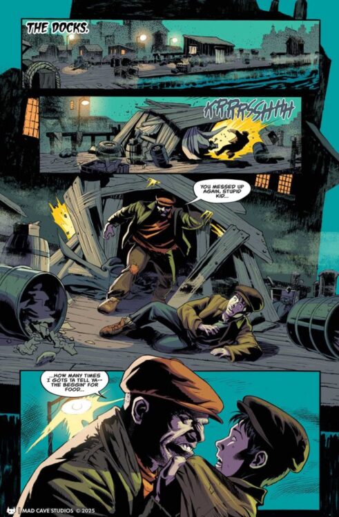
Opening on the docks at night, the story starts with the violence that has become synonymous with Dick Tracy: the Kid is getting slapped around by Steve the Tramp over the younger one’s inability to con money from their chosen marks. The fight escalates but is soon joined by a third person: the titular detective. Or is it?
The opening sequence of this comic highlights the writers’ approach to the Dick Tracy series as a whole. They have taken elements from the history of the character, from across mediums, and merged them with a contemporary ethos to retell stories that have been told many times before, but with a new and often surprising twist. The confrontation between the Kid, Steve, and Tracy is the entrance story for Junior Tracy into the detective’s world, and has been in numerous iterations. In this version, the initial fight is reminiscent of the 1990 Warren Beatty movie version, but the writers give the ending of the sequences a kick that, despite the title of this comic, you might not see coming.
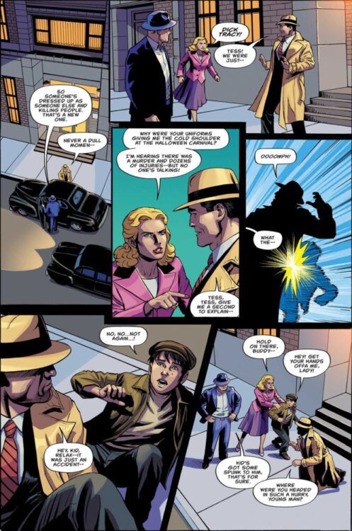
From this point onwards, the Halloween Special becomes another chapter in the excellent Mad Cave Studios continuity of Dick Tracy. By this point, nearly two years into the run, the writers have a sturdy grip on the main characters and their personalities. This allows the story to flow at a rapid pace, centering on action for the main scenes, while the characterization happens in the brief moments between. A single panel interaction tells the readers enough about the relationship between Dick and Tess, for example, without the need for long, drawn out conversations. This economy of storytelling not only allows the story to progress quickly, but it calls back to the original comic strips produced by Chester Gould. At its height in the 1940s, the Dick Tracy comic strip could do more in a few daily, single rows of panels, than some modern comics can do in an entire 26 page issue. Gould understood the need to grab a reader’s attention and instill in their minds an image or story beat that they would remember for several weeks or months, depending on the duration of any particular story. There was no going back, no flicking to early weeks to re-read the strips to pick out important plot points; the newspaper strips were read and discarded within the same day. And this style of storytelling is evident in the current Dick Tracy comics, despite the fact that most people will be keeping these comics for a very long time.
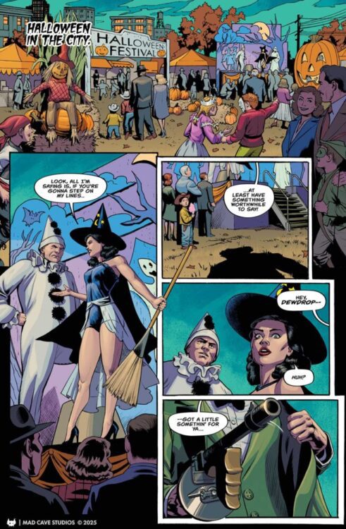
There is an urgency to the narrative that forces the story onto the reader, and allows the writers to tell a full, complete story in this single issue, with room for a back up story that is both quaint and humorous. A gang of witches stealing jewels in order to perform a magical ritual? Why not? This back up strip lets Tess do what she does best in these comics: stand on her own two feet. In fact, one of the most pleasing moments in the main story is that Tess and the Kid don’t sit around waiting to be rescued by the hard hitting detective. They take their fate into their own hands and fight back against the villain. They even take a moment to mock the killer which says a lot about the characters of both Tess and the Kid.
Dick Tracy Halloween Special Credit: Mad Cave Studios
The artwork is as exciting as the narrative, with strong characters and perfectly executed action sequences. The violence, which is at the heart of so many Dick Tracy stories, is especially shocking in this issue. There is something disturbing about the way that the effects of the violence are shown in the panel, as it happens. As a reader, you are as much a witness as the poor bystanders in the comic itself. The coloring choices add to the shock value, with bright, solid backgrounds emphasizing the foreground action. There is a definite, deliberate, visual change when a scene shifts from relative safety to one of violence. It is a jarring experience to read, as well it should be. Brutal, cruel, and uncaring. This is the kind of comic book that would have been banned in the 1950s.
While the artwork within the panels is wonderful, it is actually the panel layouts that are the most exciting part of the visuals in this comic. Although they follow a standard grid pattern for most of the pages, it is the distortion of the grid lines that make the story impactful. Some panels bend and twist in reaction to the force of the punches inflicted onto the characters the panels contain. Elsewhere, the gutters are crossed and broken as the violence cannot be contained. Even something as innocuous as a witches broom crosses panels to highlight a story moment. The way that the page is broken up and the action distributed across the panels is an absolute delight in this comic.
Dick Tracy Halloween Special Credit: Mad Cave Studios
A special mention needs to go to the letters for this particular comic. The nature of the story requires several distinctive characters’ voices to be distinguishable from those around them, The lettering for their speech changes style and font to represent the characters as they confront other members of the cast. In this issue, more noticeably than in the regular monthly series, the speech forms a part of the personalities in the same way that the facial disfigurements do. This is a perfect example of the comic form enhancing the reading experience. In film you would get accents, audible ticks, something which is much harder to do on the printed page, but the letterers here have demonstrated, successfully, that such a thing is possible.
The Dick Tracy Halloween Special is a magnificent read and a perfect entry point into the Mad Cave Studios Dick Tracy universe. While this comic stands on its own, with no prior knowledge required to enjoy it, it is clearly setting up future story-lines for the main monthly title, just like the Valentines Special did at the start of the year. There have been some ups and downs with Dick Tracy comics in recent decades, but the team over at Mad Cave are currently producing an exceptional series that is both modern and nostalgic without alienating any readers. That is a difficult task to pull off.
Pick up the Dick Tracy Halloween Special when it is released at the end of October.
From writer Kieron Gillen (The Wicked + The Divine, Phonogram, Immortal X-Men), artist Stephanie Hans (Journey into Mystery, Angela: Queen of Hel, Secret Wars 1602), and letterer by Clayton Cowles (Daredevil, Star Wars, Moonstruck), and published by Image Comics, comes Die: Loaded, the continuation of Gillen and Hans’ three time Hugo award-winner Die.
For those unfamiliar with the Die series, this new series would not be the place to start. Die: Loaded doesn’t waste time on a “previously on” recap or a gentle reintroduction. It dives straight back into the story with only fleeting reminders of what came before. New readers will be lost, so we’d heavily recommend reading Die first.
Writing/Story
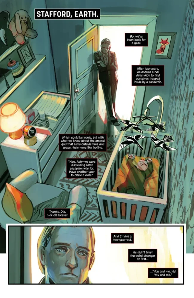
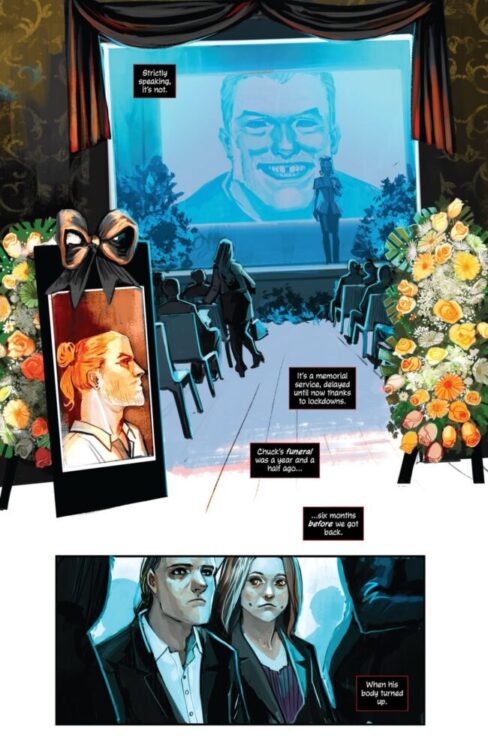
This new chapter picks up with Ash at home with his wife, about a year after the group’s return from the game. The real world has moved on, struggling with the aftermath of COVID, while Ash struggles to reconnect with a child he barely knows, born while he was away in the game. When the surviving players reunite for Chuck’s long-delayed celebration of life, new players are chosen for the game, which remains bloodier than ever.
While the comic kicks off a bit slow, Gillen uses that time wisely. Ash steps back in as both narrator and guide, offering fans a grounded recap of past events in the time since the last game ended. The issue is heavy on setup, but Gillen’s conversational writing remains razor-sharp. Each character’s voice carries real weight, and every exchange feels natural to the moment, yet purposeful in driving the story forward, a delicate balance that Gillen manages with ease. The story itself is gripping as always, with the world of the game and the regular world carrying a lot of stories in both.
In terms of lettering, Cowles, also a Die alum, once again plays a crucial role in ensuring Gillen’s writing lands with maximum impact. His lettering balances intensity and clarity, using crowded inner monologues to convey the characters’ mental noise while opening up space when the story needs room to breathe. Each character’s dialogue box and voice feel distinct and deliberate, helping to shape their personalities as much as the writing itself. The scene with the Gods’ speech, in particular, carries such immediate weight and identity that it’s an absolute lettering masterclass.
Art Direction
Hans’ artwork in Die: Loaded is as breathtaking as ever. Each god and their associated themes look strikingly distinct, a deliberate visual choice that makes the double-page spread introducing them feel both chaotic and divine. The transitions between scenes are fluid and cinematic, and when the issue ramps up toward the end, her depiction of the characters’ powers is both gruesome and mesmerizing. Just like in the original Die series, Hans manages to make every page feel like a painted revelation, dripping with atmosphere and emotion.
Regarding color, Hans knows exactly when to pull back, muting tones and essentially nixing backgrounds, so that the following page hits twice as hard. This technique shines in the moment when the first new player is drawn into the game: The subtle palette that precedes it gives way to a sudden burst of color and energy that’s likely my personal favorite in the issue. It’s an event readers have witnessed before, yet Hans makes it feel entirely new.
Verdict
In the end, Die: Loaded proves to be a sequel that honors the emotional weight and creative ambition of the original while carving out its own edge. Gillen and Hans return to their series fresh and ready for many more rounds of the game. The dice have been rolled again, and if this first issue is any indication, we’re in for something extraordinary.
Die: Loaded #1 hits your local comic shop on November 12th.
From writer Christopher Cantwell (Halt and Catch Fire, Plastic Man No More!) and artist Tyler Crook (The Lonesome Hunters, Harrow County) comes a desperate yet hopeful take on one of le last century’s greatest mysteries in Out Of Alcatraz. Now collected in a complete hardcover from Oni Press, Out of Alcatraz is a tense, focused tale inspired by both real events and stories like No Country for Old Men. With a tight, intense script and absolutely stellar visual work, Out of Alcatraz is a fantastic read.
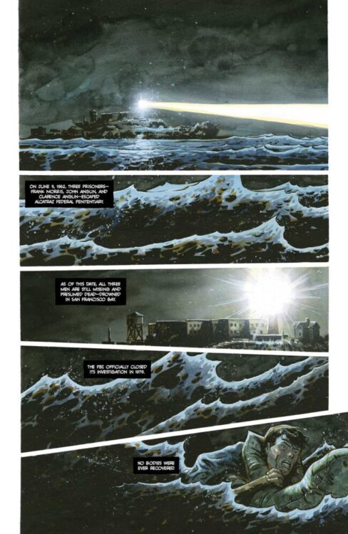
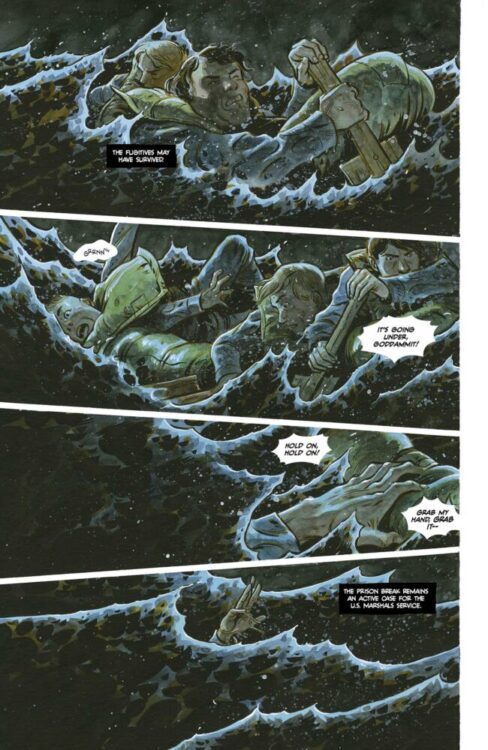
“Convicts Frank Morris and Clarence Anglin have washed ashore in San Francisco after surviving their infamous escape from Alcatraz Federal Penitentiary in June 1962. They soon meet their gruff and disappointed handler, a mysterious young woman who’s also running from something, and hope to quickly get their way north to the border — if they can even make it out of Modesto alive. As a dogged federal manhunt and chance encounters threaten the desperate convicts, everyone involved is about to discover the same bloodstained truth: life on the run is an even more hellish prison than Alcatraz could have ever been.”
Writing & Plot
Christopher Cantwell’s wisest decision in the writing of Out of Alcatraz is that this is not a conventional prison escape story. Instead, this tale covers what happens right after the escape. Morris and Anglin wash ashore on the San Francisco Bay then disappear inland to escape to the North – only to find more hardship and pain on the way. Akin to some of the great stories similar to this – think Shawshank Redemption or Of Mice and Men – Out of Alcatraz never feels triumphant and constantly challenges the reader with its depiction of the world from the perspective of two men who made a mistake. While we meet a wide variety of extra characters throughout the story, the main ones are the woman (she goes nameless until the end of the series) who istrying to get the convicts up North, and the pair of FBI agents who are on the trail of the escapees. All of the main characters are much more than they initially appear, and all have their own deeply engaging stories to follow. Cantwell runs the gamut of socio-political issues in this series – racism, misogyny, homophobia, the dehumanization of prisoners, etc. – and at times it can feel like it’s almost too much for one narrative. On the other hand, these elements are a good reminder of the time period that this story takes place in, as well as showing how little progress we’ve made in many ways. Cantwell’s fictionalization of these events works so well not just due to his thematic writing but to the simple technical ways in which he writes. His dialogue flows naturally and punches hard, and his twists come off as vaguely predictable yet still genuinely gripping. Out of Alcatraz is a phenomenally well-written comic series, and one of the most compelling stories of its kind in recent memory.
Art Direction
I should be forward about the fact that Tyler Crook is one of my favorite artists in the business. Ever since his work on Harrow County I’ve been a huge fan of his approach, and that appreciation is only strengthened by his work here on Out of Alcatraz. Crook’s signature approach to character detail and animation, with his thin linework and shading, gives each and every character dimension and a sense of realism. His sequential direction moves the story along carefully, with quieter, more tense scenes dripping slowly like molasses while the breakneck sequences come across in a staccato of imagery. His color work here is an absolute treat, with shifting watercolors in each panel. Some panels, typically during the day, have a more conventional use of lighting in them to reflect a nice summer day (albeit with an almost dreamlike quality akin to Roger Deakins work in No Country for Old Men). However, his nighttime sequences make stunning use of lighting colors, with elements like moonlight and the glow of streetlights making for memorable and almost eerie visual work. The nighttime panels have an almost mono-color aspect to them that shifts based on the angle of the light – it’s really cool stuff. As per usual, Crook also does his own lettering and the results are also stellar. His word balloons have a reactive feel that gels perfectly with the dialogue and have a distinct, hand-drawn quality about them. His SFX work is a true gem, though, as it washes over the watercolor background to highlight its sharpness while never actually overtaking the page, making it feel more diegetic. Crook continues his spree of being one of the best artists in the business today with his work in Out of Alcatraz.
Verdict
Out of Alcatraz is a phenomenal fictionalized take on a true event. Christopher Cantwell’s script is rife with desperation and humanity, making for one of the most memorable stories of its kind in recent memory. Tyler Crook’s visual work is stupendous, with his signature use of pencils and colors crafting a one-of-a-kind reading experience. Be sure to grab the collected edition by Oni Press, available today!