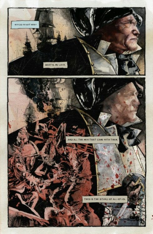
Bear Pirate Viking Queen #1 is a mind-bending tale out this week from Image Comics, by writer Sean Lewis and artist Jonathan Marks Barravecchia.
“How did we get here? Boats, my love. And all the men that came with them. This is the story of all of us.”
These words introduce readers to the blood-soaked world of Bear Pirate Viking Queen. The story follows Paul Reddish, a Captain in the Queen’s Royal Navy, whose ship comes under attack by pirates on page one. What follows in the remaining 71 pages… well that’s best left for you to experience for yourself.
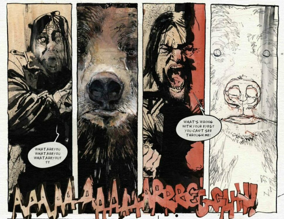
BPVQ is a book that demands to be experienced, rather than simply read about. It’s an abstract and disorienting whirlwind of a tale where the only thing you can be sure about is that—at some point—you’re going to see some bears, pirates, vikings, and queens. You may not always be sure about what’s going on or how these elements tie together, but that’s entirely by design to put you in the shoes of the main character. Because if you’re confused about how the story got from Point A to Point B, Reddish is there to reassure you that he’s not sure how he got there himself.
“Abstract” can be a scary and off-putting word in the world of storytelling, but rest assured that BPVQ is never abstract at the expense of the story’s humanity or humor. Lewis scatters more than a few gags throughout his script (because what good would a book called Bear Pirate Viking Queen be if it didn’t have some humor mixed in), and you genuinely become invested in the swashbuckling as it progresses. Writing an abstract story can be like walking a tightrope between intriguing and confusing, but Lewis strikes the balance brilliantly, falling square in the realm of intriguing rather than off-putting. Your mind is constantly engaged, piecing things together, dissecting what just occurred and what you think might happen next. It’s an exciting and stimulating experience that Lewis scripts —one which is executed beautifully by Barravecchia.
Barravecchia puts on a stellar showcase with his artwork in BPVQ. He largely utilizes breathtaking watercolors throughout, but incorporates a variety of styles, including sometimes stripping down a panel to bare black and white pencils and inks. One panel might feature clear outlines and heavy black brush strokes, and then the next panel—featuring the same characters—will be painted purely in watercolors, sans outlines or definition.
This style leans into the abstract and disorienting vibe of the story, keeping readers on their toes, but moreover, it lends itself to the idea of BPVQ being an experience. Barravecchia’s art is raw emotion etched and painted onto the page. His crashing waves exhilarate you; his black night skies, illuminated only by flashing lightning, fill you with dread. At one point, as Reddish is contemplating what’s become of his life, we see a beautiful watercolor portrait of him as the naval officer from the start of the issue, followed by a scraggly, black and white pen drawing of the man he becomes. It’s a jarring contrast, and the juxtaposition of art styles drives the point home in a more affecting way than only words could accomplish on their own.
Bear Pirate Viking Queen starts by saying “this is the story of all of us,” and by the end, you start to understand what that means. It’s a thought-provoking tale of humanity, a species which has been at war with itself for as long as we’ve been on this planet. It’s a story that wants you to feel something, and wants you to ask questions. And, ultimately, it’s a comic about bears, pirates, vikings, and queens…how can you say no to that?
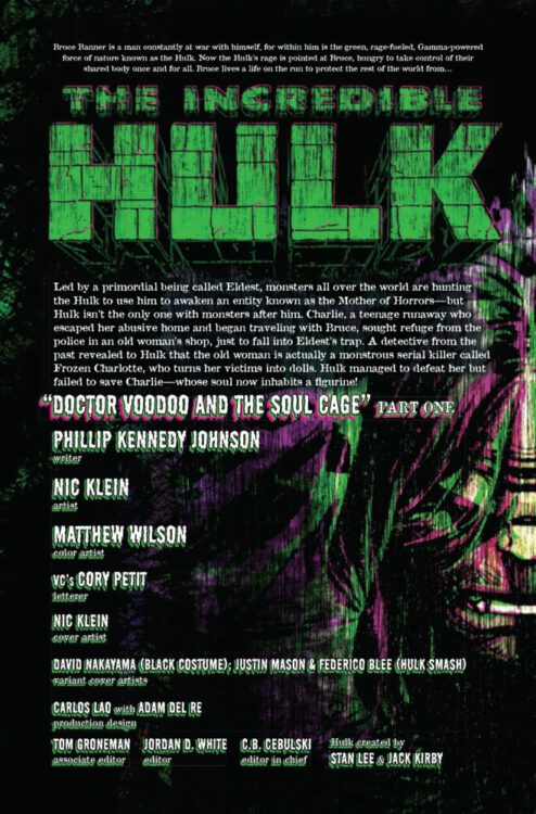
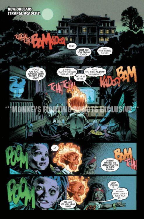
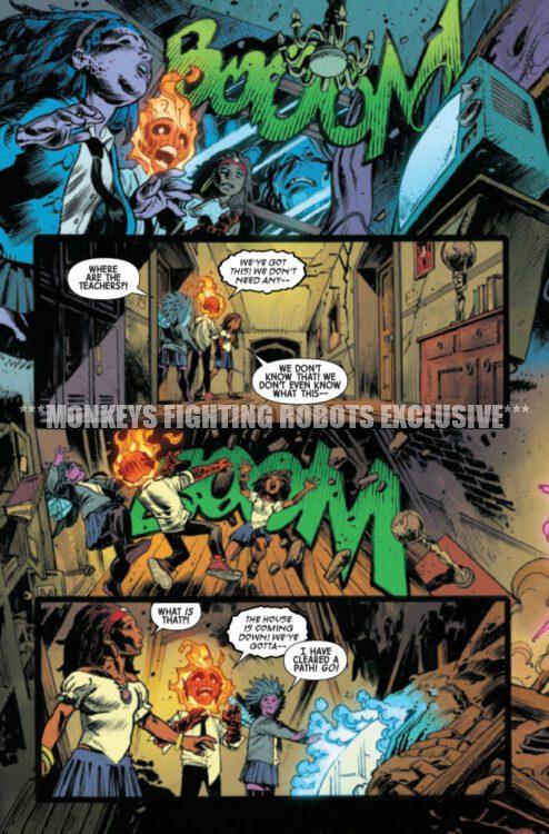
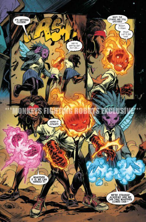
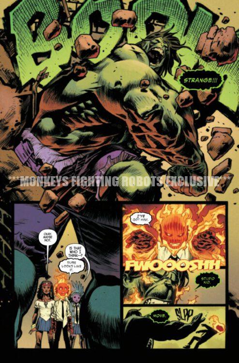
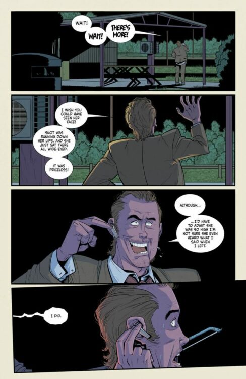
INCREDIBLE HULK #12 hits your local comic book store on May 1st, but thanks to Marvel Comics, Monkeys Fighting Robots has an exclusive four-page preview for you!
About the issue: In the aftermath of the tragic battle against Frozen Charlotte, Hulk pays a visit to STRANGE ACADEMY, seeking the help of BROTHER VOODOO in saving Charlie’s immortal soul! But when the task calls for a one-way descent into an exorcist’s ancient prison in search of the immortal FLESH-WEAVER, is the price too high even for the Incredible Hulk?
The issue is by writer Phillip Kennedy Johnson and artist Nic Klein, with colors by Matthew Wilson, and letters by Cory Petit. The main cover is by Klein.
Check out our INCREDIBLE HULK #12 preview below:
Are you reading INCREDIBLE HULK? Sound off in the comments!
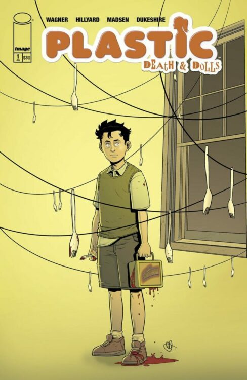
After 7 years, writer Doug Wagner and artist Daniel Hillyard return to the story that started their hit “Material” universe with Plastic: Death & Dolls. Published as always by Image Comics, the first issue of this 5-part mini-series is set to hit shelves on June 12 and promises to bring all the twisted humor and over-the-top gore readers have come to expect from this creative duo.
I got to sit down once again with Wagner to talk about why he and Daniel decided to come back to these characters and where they might be headed in the future.
MFR: Yours and artist Daniel Hillyard’s “Material” series always seems to offer something fresh and new every time you come back to it. What about Edwyn’s character made you want to come back to tell more of his story?
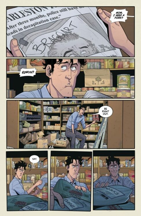
DOUG: Oh, man. A couple of things. First and foremost, Daniel and I tend to fall in love with every character we create. Edwyn holds a special place there. He was our first serial killer, and Edwyn proved to us that there are people out there that love the same sort of weird, over-the-top, comedic horror Daniel and I love to create. Without Edwyn, we wouldn’t have created VINYL or PLUSH or what is yet to come. So, as you can probably imagine, both of us couldn’t wait to get back to this character that means so much to us. And, without admitting to too much, Edwyn encapsulates traits from both Daniel and I that we find horrifying, hilarious, and endearing all at the same time. He’s awkward, he struggles to fit in, he has odd ticks and tastes, and he has a side of himself that will not stand for injustice. Injustices we wish we had the courage to act on but can’t… you know, for legal reasons.
MFR: One of the most impressive aspects of all of your work in this twisted little world you’ve made is that there’s a surprising amount of heart in every story. How do you maintain that spark every time, and can we expect that here with Plastic: Death & Dolls?
DOUG: First, thank you for saying that. It means a lot to hear you see and feel what we try really, really… REALLY hard to find each time. We strive to find that mix between horror and heart that makes you squirm on one page and tear up on the next. I’d never presume we’re always successful at it, but we give it our best. I think our secret is that we’re both pretty sensitive guys, and we love to have our heart strings tugged. BUT we don’t want to get the feels for too long so we jump to ridiculous mayhem as quickly as possible.
Plastic: Death & Dolls will hopefully bring that same surprising amount of heart too. There’s a particular scene between Edwyn and his mom that makes me choke up a bit every time I try to tell someone about it. Let’s hope you and some others are just as big of a crybaby as I am.
MFR: Your lead partner in crime across all of these books – Plastic, Vinyl, and Plush – has been the ridiculously talented Daniel Hillyard. What about your collaborative style do you think makes these comics work so well every time?
DOUG: Egoless collaboration. That and we both share the same dark sense of humor. Honestly, Daniel and I learned early on that we both prioritize the story and its delivery over all else. What I mean by that is we don’t get caught up or concerned with who’s idea this or that was. The story comes first. Add to that, we can criticize each other’s work without worrying about offending each other. I’ve found that’s really rare. Daniel can tell me a certain scene or a line of dialogue aren’t resonating with him without worrying about how I’ll take it. If anything, he knows my next statement is going to be, “How do we fix it?” I’ve done the same with him about a layout or panel, and he’s ALWAYS had no problem redrawing another take. Sure, it can slow down the process, but story always, always comes first.
MFR: Has Daniel had any “WTF am I drawing?” moments that you can recall over the years in reaction to the scripts?
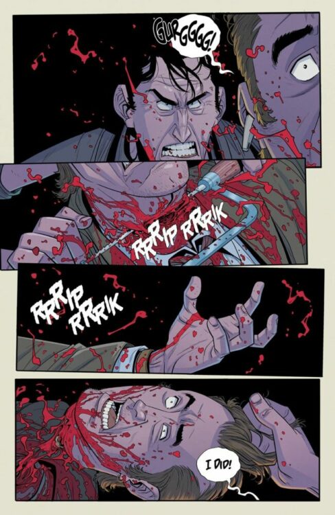
DOUG: LOL. That’s happened a few times now. My favorite was the first time it happened. In Plastic #2 when we’re cutting off the guy’s head in the car, I kept asking for more blood. He sent me like three takes, and I kept pushing for more. On the fourth take, he said, “That’s more blood than I think the human body can store.” I said, “NOW you’re getting it.” Almost every time we bump into a “WTF” moment, it has to do with science versus story. Is it possible to rip a human in half with your bare hands? Can you make a furry suit that can separate a man from head to toe? We always answer with the same response… does it make us giggle when we see it?
MFR: How stoked – or disturbed – was the team at Image to hear that you were coming back with more Plastic?
DOUG: I would have never guessed this, but surprisingly the folks at Image seem to love our weirdness. That probably explains why we’ve been so successful as a team. We get each other. The entire crew at Image have always been so supportive to us. When we meet up at cons and the like, I always apologize for the work I can only assume offends them, but to a person, they’ve all admitted they adore Daniel and I’s work. It’s always wonderful working with like-minded weirdos.
MFR: Do you think we’ll see any more work in the “Material” world in the future, with or without Edwyn?
DOUG: Absolutely. Daniel and I are having a blast, and as long as there are people wanting more, we’ll keep delivering. Stay tuned.
Hit up your local comic shop to order your copy of Plastic: Death & Dolls #1 before it hits shelves on June 12th!
The Creature from the Black Lagoon Lives #1
Credit: Universal/Skybound Comics
Universal Monsters: Creature from the Black Lagoon Lives! #1 is out this Wednesday from Image Comics and Skybound Entertainment, written by Dan Watters and Ram V, with art by Matthew Roberts, and colors by Dave Stewart.
Over the years, I have made a number of comic book related confessions in my reviews and articles: I’ve never read a Green Lantern comic; I’ve probably turned off more superhero movies than I’ve watched to the end; and the percentage of comics that are worth talking about is actually very low. Most comics are entertainment and, if they entertain you, then all is good, but that does not mean that they are great comics or have anything to say about the medium. I love the Alien franchise, but only the original movie pushed the boundaries of what cinema could achieve, and very few of the comics have engaged with the comic medium in surprising and exciting ways.
This leads me back to Universal Monsters: Creature from the Black Lagoon Lives, and my confession isn’t that I haven’t seen the original movie. I have, several times, once on the side of a canal, late at night, in the open air. No, the confession is that there are very few comics that interest me at the moment. I am finding it hard to get excited about any new publications except spin-off or tie-in comics. Everything new that has caught my eye, and that I’ve actually picked up, can be filed in the adaptation folder in my collection. Planet of the Apes, Alien Black, White and Blood, and the upcoming Dick Tracy title from Mad Cave. But we can now add to that two new(ish) titles due this month: the re-release of the original comic book adaptation of Labyrinth and, of course, Creature from the Black Lagoon Lives.
Universal Monsters: Creature from the Black Lagoon Lives #1 Credit: Universal/Skybound Comics
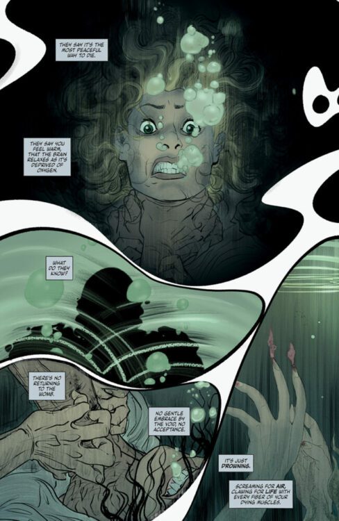
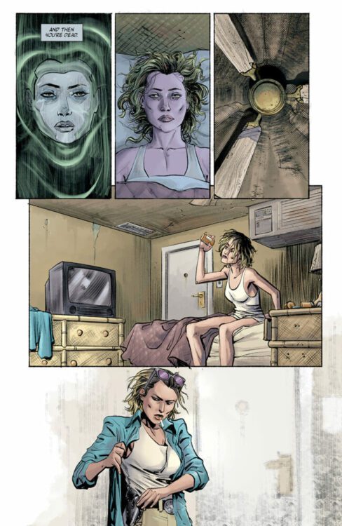
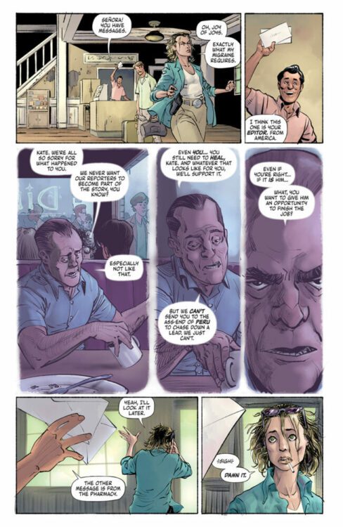
The premise behind the new Creature comic from Universal Pictures and Skybound is simple: journalist Kate Marsden is tracking a monster, a serial killer who drowns his victims. Her hunt is personal (for reasons that become apparent) and she has tracked the killer to the depths of Peru. There is nothing further you need to know. This opening issue is a character piece centered firmly on Kate and the trauma that keeps her going day-to-day. She is both a victim and hero. Dan Watters and Ram V, the writers, have woven a tale of flashbacks and nightmares to let the reader know exactly the kind of person that Kate is. Determined, strong minded but also broken and, at times desperate.
Everyone knows what’s coming—it is a monster comic afterall—but like the classic monster movies of old, the buildup is long and the pacing is slow, deliberately so. The writers know they have to construct a connection between the reader and the hero before the monsters turn up, otherwise there’s no drama, no tension. The second half of Jaws is so successful because the audience is 100% behind Chief Brody. Readers are heartbroken when Elektra crawls into Matt Murdock’s arms to die in issue 181 of Daredevil because Frank Miller created a strong bond between the two characters and relayed this perfectly to the readers. In this Creature comic, Watters and Ram V show you the strengths, and weaknesses, of Kate, making her a sympathetic character that you will root for.
The character beats and emotional reactions of Kate are brought out by artist Matthew Roberts, who emphasizes Kate specifically by making her dominate the pages and the layouts. Compared to the previous Universal Monsters comic from Skybound, Dracula, the layouts and panel designs in Creature are fairly standard and straightforward in approach, but this highlights the composition within the images. A page with a nine-panel grid is designed in such a way that the scene plays out in a linear, Z-pattern reading structure but also contains shorter story beats fitting the rhythm of the layout. It then goes one step further by creating visual emphasis to draw the reader’s view against the standard reading pattern, making you notice elements in certain panels that you may have missed with a quick skim read. Your eyes are drawn diagonally down the page, focusing on the image in a security camera in panel one, the gulf between the two characters in panel five, and finally onto the gun tucked into Kate’s belt in panel nine. All this before you have read through the page.
Universal Monsters: Creature from the Black Lagoon Lives #1 Credit: Universal/Skybound Comics
The coloring by Dave Stewart is surprisingly subtle, especially compared to the previously mentioned Dracula. Where that comic was all expressive coloring and border shattering layouts, Stewart gives Creature a naturalistic palette, saving emotional hues for dramatic moments or flashbacks. A purple wash accompanies Kate’s flashbacks, hinting at the unfolding mystery surrounding Kate and her presence in Peru. And the natural greens of the jungle are a beautiful contrast to the manufactured colors of the clothes and interiors.
The original Creature from the Black Lagoon movie advertised itself as a suspenseful, terrifying movie and focused on the monster’s brutal presence. The trailer highlights the “underwater thrills never photographed before” and “titanic underwater battles never dreamed of.” This focus on the underwater element of the story is reflected in this follow up comic, with the highlights of the comic being the water-based scenes. It opens and closes with the most memorable moments, which will mirror most people’s memory of the movie. A monster, swirling water, and the heroine in peril. These are the movie’s CliffsNotes, and these are the jump-out pages of the comic.
Just as the creature grabs hold of its victims and drags them down into the murky depths, the creators of this follow-up take the reader by the hand and slowly pull them along, towards the edge of the river, and, finally, into the waters. The story starts out fascinating and becomes engrossing as Kate is dragged out of her depth. The artwork displays the emotional characters very well, but lacks something outrageous. There are a few pages that manage to elevate the visuals, make it live up to the shocking promises of the original movie, but there is not enough to single it out as an outstanding comic. This isn’t as bad as the King Kong ripoff that was Revenge of the Creature, and it avoids the bizarre creature feature elements of The Creature Walks Among Us, instead favoring a more modern, gritty realism. But is that the best path to take?
Universal Monsters: Creature from the Black Lagoon Lives #1 Credit: Universal/Skybound Comics
The Universal/Skybound Dracula comic was outstanding because it leaned into the outlandishness of the source material. It took the cinematic elements of the original and turned them into comic specific visuals, while maintaining a link through the plot and character speech. With this new Creature comic, the essence of the movie is lacking from the majority of the pages. It is only during the water scenes that any connection to the 1954 movie is stirred up in the reader. Remove the actual Creature and there is nothing in this comic that links it to the source material: nothing thematic, nothing narrative, nothing visual. From a general comics reader point of view, this actually doesn’t matter. Creature from the Black Lagoon Lives is a very successfully constructed comic that tells its story solidly—beautifully, even. From the point of view of an adaptation, however, the comic is a touch disappointing. I don’t necessarily want over-dramatized actors in black and white 3D emoting to me while constantly getting snatched by a man in a rubber suit, but a little part of me does want some of that. I want the feeling of watching the movie when I’m reading the comic. That feeling you get when you read the Marvels Planet of the Apes comics from the 1970s, that twinge of nostalgia you get from reading Innovation Comics’ Lost in Space series, or any of the Star Trek tie-ins. I want what you get only at the end of this comic.
With that said, we circle back around to my opening. I adore this comic. It is an exciting and intriguing comic, one that I will follow to the end. The subtlety in the artwork, especially the coloring, gives the comic a gravitas that is lacking from a lot of current publications. The creators are taking the process of making comics seriously and thoughtfully, and it shows on the page. I only hope that more of the movie seeps through into upcoming issues. This comic should look and feel like a sequel, a successor, but at the moment it leans more towards a modern remake.
Universal Monsters: Creature from the Black Lagoon Lives #1 is out this Wednesday, April 24th, from Image Comics and Skybound Entertainment.
After the explosive ending of Dark Horse Comics’ Helen of Wyndhorn #1, you’d expect the next issue to be full of fire and bombast. Instead, writer Tom King, artist Bilquis Evely, colorist Matheus Lopes, and letterer Clayton Cowles choose to make their second issue quiet and subtle. They find their stakes not in action-packed adventure, but in the complexities of their characters.
Writing
The first issue of Helen of Wyndhorn ended with Ms. Lilith Appleton and Helen face-to-face with a gargantuan monster — whose head had been recently removed by the burly Barnabas Cole, Helen’s grandfather. In issue #2, after a brief introduction via our frame story, King brings us back to a startlingly calm scene in Wyndhorn. As Lilith, Barnabas, and Helen sit around the dinner table, nothing at all seems to be amiss. Lilith admires the food as Barnabas hungrily gnaws a turkey leg. Helen is the only one who isn’t ready to move on from the horror of the night before.
“Excuse me…” Helen says. “…What the hell is happening?” What indeed, Helen! Last time we saw any of these characters, they were facing down some supernatural beast. By skipping ahead to the next day and underlining how “normal” everyone is acting, King imbues Helen of Wyndhorn #2 with an immeasurable amount of tension. He also, brilliantly, keeps this story focused on its characters. Lilith and Barnabas seem to be intent on pretending nothing at all happened that night with the monster — albeit for very different reasons. And Helen, as stubborn as ever, will not let it go. King pushes the supernatural elements of this story into the background, at least for this issue. He insists that if we are to care about these characters, and any fantastical situations they may someday find themselves in, we have to know them first. Helen of Wyndhorn #2 is beautifully normal in so many ways, and yet rife with tension and personal stakes.
Art
In one of Lilith’s narrations, she talks about noticing a familial similarity between Barnabas and Helen. “Something around the eyes,” she says. Even as a reader, you can see there’s an undeniable resemblance there. The way that Evely achieves this is outright remarkable. For one thing, when you actually focus in on the eyes of Helen and her grandfather through the rest of the story, you’ll first notice something particularly odd about Barnabas. He is often pictured with his eyes barely open at all. He looks down and away, rarely making eye contact with other characters. Barnabas may seem confident and jovial at times, but it all looks like one big act. Instead, as we see him continually avoid our gaze, it becomes more and more obvious that this is a man who is hiding plenty of pain and shame.
There’s some of that same shame in Helen. Perhaps that’s why liquor has become her closest confidante. But she also has a dreaminess about her. She stares off-panel, looking like she’s a million miles away. She only occasionally looks at characters (and us) directly in the face. When she does, it’s usually because she’s mad about something. But just like her grandfather, she’s almost always looking away. Lilith’s eyes, however, frequently look to us. She looks at the reader with a piercing and determined expression. It’s as though she’s telling us that she’s not dreaming like Helen. She’s not ashamed like Barnabas. She’s wide awake and ready to account for her actions. Through Lilith, Evely includes us in the narrative. We’re Lilith’s witness to these events. We’re the ones who are hearing her story. She wants to make sure we’re still paying attention and seeing all the ways she tried her best.
Coloring
Lopes wastes no time at all in this issue. He immediately connects us to the themes of this story, by starting with a painted looking page that depicts C.K. Cole’s character, Othan, fighting a monster (not unlike Barnabas at the end of the last issue). When you flip that page, you find an incredibly similar color scheme being used for a scene in the dining room at Wyndhorn. Lopes is underscoring that Cole’s stories came from his childhood in Wyndhorn. Cole’s books all found their sources, their root, right where Helen sits now.
Elsewhere, Lopes continues to use an eerie looking turquoise color to mark scenes that take place at night. These hues take you right back to that final scene in the previous issue, where a twisted monster lumbered through a landscape depicted in that very same hue. Surprisingly, Lopes also maintains the warm green coloration of the hills outside the house. Despite the dangers that could be lurking behind any tree, Helen still feels alive as she stretches out on the grass. As this issue closes, we see Helen and Barnabas setting out on a journey together. Lopes covers the page in a mix between his turquoise and warm green colorations. It’s a stunning way to end the issue with a giant question mark, suggesting that bright days out on the grass or cold nights fighting monsters could be what come next. Only time will tell.
Lettering
In the first few pages of this issue, Helen wants to get her grandfather’s attention. She slams her fists down on the table. “BANG,” Cowles writes the sound in big white letters. Barnabas chuckles before saying, “No. Like this,” bringing his own two fists down on the table. The resulting “CKKKRAKKK” is shown in jagged, hollow letters that take up the whole bottom half of the panel. It’s a brilliant, colorful moment where Cowles shows us undeniably who can cause the bigger disruption.
But Cowles does a lot of subtle work in this chapter as well. It seems — though it’s not always a rule when space dictates otherwise — that when a word balloon goes up from a character’s mouth, their dialogue feels deliberate, sometimes cutting. Alternatively, when the balloon drops downwards, their words feel almost to have lazily tumbled out of their mouths. Cowles uses these ideas extremely effectively in an argument between Lilith and Barnabas. Lilith constantly changes tactics, trying to get through to Barnabas through gentleness or blunt truth. Her words ping pong across her face. Barnabas often answers her in a balloon that appears above his face, then continues on dismissively in dialogue that is depicted below him. But when Lilith finally cuts through to Barnabas, his words start low. “You…” You can hear the quiet fury in his voice. When he next speaks, Cowles writes his dialogue in smaller font than the rest. “Get out…” He no longer has the energy to speak deliberately. “Just go. Please. I beg you.” All these words descend towards the bottom of the page. The fight has gone out of him and Cowles shows us exactly that.
Verdict
Helen of Wyndhorn is about many things. It’s about coping mechanisms, family dysfunction, and fantastical lands populated by mythical creatures. But most of all, this creative team assures us, it’s about its characters. Helen of Wyndhorn #2 is a stunning second chapter. This intimate, understated story is surprising and moving. You don’t want to miss it! Helen of Wyndhorn #2 is out from Dark Horse at a comic shop near you!
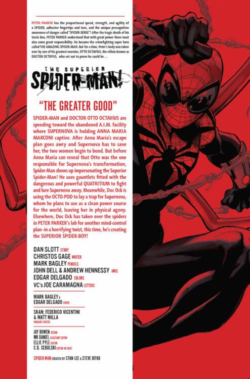
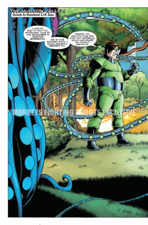
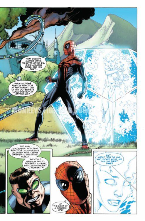
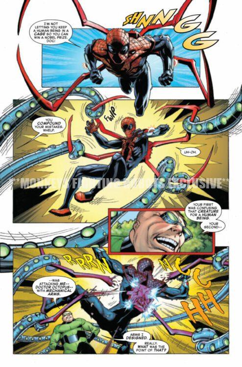
SUPERIOR SPIDER-MAN #6 hits your local comic book store on April 24th, but thanks to Marvel Comics, Monkeys Fighting Robots has an exclusive four-page preview for you!
About the issue: A final showdown will determine once and for all who is truly the Superior Spider-Man!
The issue is by writer Christos Gage (from a story by Dan Slott) and artist Mark Bagley, with inks by John Dell & Andrew Hennessy, colors by Edgar Delgado, and letters by Joe Caramagna. The main cover is by Bagley and Delgado.
Check out our SUPERIOR SPIDER-MAN #6 preview below:
Are you reading SUPERIOR SPIDER-MAN? Sound off in the comments!
From the creator-centric publishing house of DSTLRY Comics comes a series of insane new variant covers for The Blood Brothers Mother#2. The 2nd chapter from Brian Azzarello and Eduardo Risso’s brutal new Western series gets some incredible new art from the likes of Fabio Moon (Daytripper) and the iconic Dave Johnson!
The hit Western from DSTRLY by Brian Azzarello and Eduardo Risso – the
legendary creative team behind the seminal crime series 100 BULLETS – keeps
on charging!After the brutal murder of their step-father and the willful abduction of their mother, the
three Blood brothers set off in hot pursuit…but their way is fraught with killer bandits,
battle-scarred soldiers and female preacher that’s not at all what she appears!
In the tradition of The Searchers, The Outlaw Josie Wales and Blood Meridian comes a
brutal new western series from writer BRIAN AZZARELLO and artist EDUARDO RISSO
– the Eisner award-winning team behind the Vertigo crime classic, 100 BULLETS and
Image Comics’ MOONSHINE!For fans of YELLOWSTONE 1883, CLINT EASTWOOD, TRUE GRIT.
Cover B by Dan Panosian
The A and B covers are from Risso and Panosian respectively, while Moon takes the 1/10 C Incentive cover and Johnson is behind the 1/25 D variant. As you can see here though, every one is worth picking up.
Cover C 1/10 Variant by Fabio Moon1/25 Cover D Variant by Dave Johnson
The Blood Brothers Mother #2 hits shelves on 7/3, but be sure to contact your local comic shop or hit up dstlry.co before the FOC on 5/19 to lock in these exclusive incentive covers!
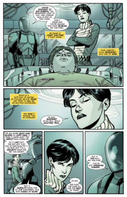
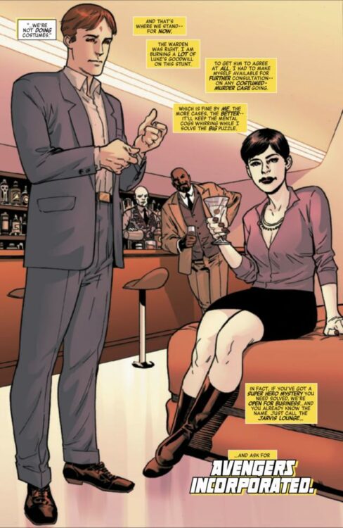
Avengers Inc.: Action, Mystery, Adventure is out next week from Marvel Comics, and it’s perfect for any readers looking for a bit more intrigue in their superhero books.
The series is by writer Al Ewing and artist Leonard Kirk, with colors by Alex Sinclair, and letters by Cory Petit. The covers are by Daniel Acuña, and artist Belardino Brabo assisted Kirk with inks on issue #3.
After a string of supervillains are murdered under suspicious circumstances, Janet Van Dyne (aka The Wasp, founding member of The Avengers) opens up Avengers Incorporated, dedicated to solving superhero mysteries. Joining Janet is the curious Victor Shade, whose name might sound familiar to you, but he’s not the Vic Shade you think you know.
And that’s all you really need to know going into Avengers Inc., because, as you’ve probably surmised, this is a mystery comic, and figuring out what the heck is going on is half the fun.
Writing an interesting mystery story must be a daunting task, but Ewing is (not surprisingly) able to deliver. This five-issue series feels like a season of classic procedural television. Each chapter features its own intriguing case (how does one get murdered in Valhalla?) while a larger riddle continues on in the background, and you get a number of cameos from Jan’s super-friends (think of them as your “weekly guest stars”).
Mysteries need to lure you in and keep your interest; you can’t let your audience get bored with the story, and Ewing sure doesn’t. These cases keep your mind working as a reader—you’re trying to solve the mystery yourself alongside Jan and Vic. Plus, there’s still plenty of superhero fun to satiate any Marvel fan.
Kirk is given the big challenge, being asked to draw a superhero book where the emphasis is less on action and flashy costumes. In fact, due to mandates from former Mayor Wilson Fisk, costumes are outright forbidden for Janet and Vic. However, they are never missed, as Kirk and Sinclair are able to keep Avengers Inc. a visually engaging comic. It’s not devoid of action by any means, but even in more dialogue-driven scenes, you’re kept invested by the characters’ expressions and the dynamic color palette. And between Kirk’s panel layouts and Petit’s masterful lettering, there’s never a lull in the story. You can read this in one sitting (which also makes it an easy re-read when you’re jonesing for some superhero intrigue).
The only major downside to the story is that it wraps up somewhat quickly and abruptly, which is probably due to the creative team discovering issue five would be their final one. This isn’t an uncommon happening in comics, but at least here it’s handled with grace and doesn’t feel clumsy. And, though it might end quicker than you’d like, at least you can go into Avengers Inc. knowing that you’re getting a complete story.
Avengers Inc.: Action, Mystery, Adventure is out April 23rd. If you like superhero stories that take risks and try new things, be sure to pick it up so we can continue to get comics like this.
FANTASTIC FOUR #22 is coming to your local comic book store July 24th, but thanks to Marvel Comics, Monkeys Fighting Robots has the exclusive first look at the issue!
About the issue: BLOOD HUNT TIE-IN: ONE LAST HOPE!
Alicia Masters and Reed Richards – and the survivors of New York – are lost, alone against the vampire menace, and Reed’s exhausted. But they still need to survive – and avoid being turned into undead blood parasites. Reed has one last desperate hope, and it’s not guaranteed to work – but there is at least a chance…if he can survive long enough to test it!
This conclusion to our BLOOD HUNT tie-in ends in a twist that you will NOT want to miss!
The issue is by writer Ryan North and artist Ivan Fiorelli. The main cover is by Alex Ross.
Get your first look at Ross’ FANTASTIC FOUR #22 cover here:
Are you excited for BLOOD HUNT? Sound off in the comments!
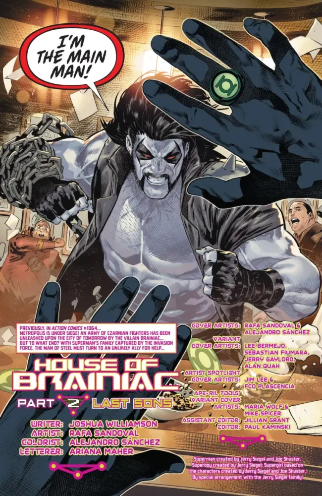
Superman #13 is the second installment in DC’s “House of Brainiac” crossover story from writer Joshua Williamson, artist Rafa Sandoval, colorist Alejandro Sanchez, and letterer Ariana Maher.
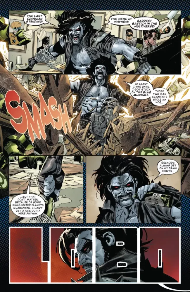
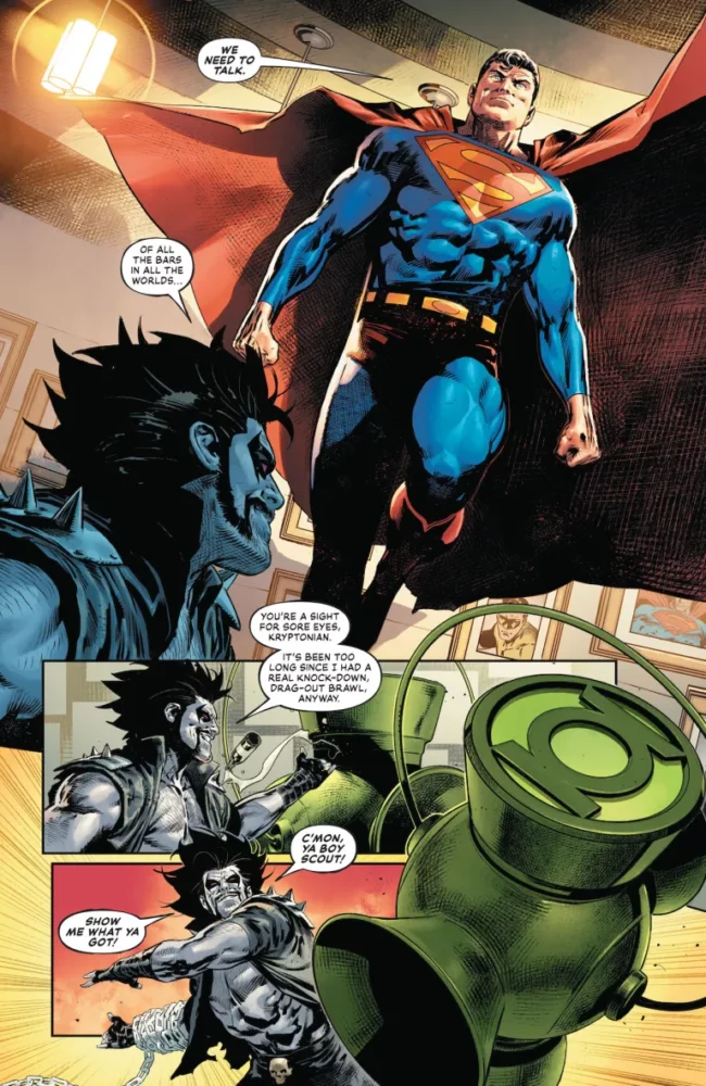
This issue picks up back on Earth after Action Comics #1064’s cliffhanger. Superman is on the search for Lobo and finds him in a Green Lantern-themed bar in Coast City. The two battle it out while Brainiac is up in space, holding superpowered individuals from Metropolis hostage and using them to power up some mystery weapon. Lobo teams up with Superman, and the two head to space to confront Brainiac and his army of Czarnians.
WRITING
Williamson writes a sterner Superman than we’re used to here, but it fits considering the situation. Williamson allows the reader to see how emotionally taxing Brainiac’s assault is for Superman, letting us see a more vulnerable side of him that doesn’t often emerge. To establish this, he has the issue open with a battle between Lobo and Superman. The regenerative Lobo was a great choice for this, as he provides an outlet for Superman’s anger, as well as information to help move the plot forward. It does take Williamson a while to find his footing with Lobo. The character’s presence in the first chunk of the issue feels too convenient, but smooths out over time as Williamson successfully incorporates him into the plot as a whole. The Czarnians that Williamson uses in the story feel as though they connect to Lobo naturally. It’s absolutely believable that Brainiac has an army of this long extinct race trapped in his ship, and given the competitive and reckless nature of Lobo, the two parties butting heads seemed inevitable.
Lobo wrecks a bar.
Brainiac himself is the star of the show here. He doesn’t necessarily explain his plan, but he does explain what he needs for said plan to come to fruition. There’s a lot of mysteries surrounding Brainiac in the early chapters of this story. There’s clearly something wrong with him, but we’re unsure to what. Williamson uses the Super Family members in Brainiac’s captivity to move the story forward, getting information out of the villain while also asking who these other Brainiacs are, and what his endgame is. Williamson doesn’t waste a single character. It constantly feels like everyone has their own role to play, which is impressive with a cast this large.
ART
Sandoval seemingly has a lot of fun with this issue. He draws and details this Green Lantern-themed bar in Coast City with a plethora of neat little details. What he details just as well is Lobo’s rampage through the bar. There’s a weight and power that’s felt behind every blow, the broken furniture really allowing you to feel the impact from every hit. Where Williamson lays the groundwork for a ticked off Superman, Sandoval follows up on it with menacing facial expressions that show he’s not messing around.
Superman confronting Lobo.
Sandoval generates these intimate moments between members of the family in Brainiac’s captivity. A lot is said through facial expressions that enhances the scenes they’re present in as a whole. There’s a page where a few of the characters from Superman’s supporting cast are trapped in these tubes, and you really get a sense of urgency through their expressions. Whether it be Supergirl’s looks of strategizing, or Mercy trying to test the limits of the prison she’s in, there’s always something important happening for each individual character. Sandoval really allows that to come across in his art.
COLORING
Alejandro Sanchez does some really beautiful work on coloring this issue. Where the first part of this event was bright and hopeful, this issue is dark and malevolent. The setting of Brainiac’s ship is really creepy. Various shades of purple fill not only the room itself, but sometimes the actual page that the panels lay on top of as well. The purples and blues that the ship radiates blend together really well in a way that really strongly connects you with that specific location. Now, whenever we return to it, it feels almost familiar. The light that emits from Brainiac’s body is especially interesting. Sanchez uses the lighting in a really intriguing way where a character can be lit from a purple prison cell from one direction while also being lit in another purple light relative to wherever Brainiac is standing. It fills out character faces nicely. The lights also seem to be tied to Brainiac’s status. If he’s rejuvenated, they seem brighter than they would be if he wasn’t operating at full capacity. There’s lots of attention to detail in Sanchez’s coloring here.
LETTERING
Maher knocks it out of the park here. Starting with Lobo, everything said feels loud and rowdy because of those big and bold bubbles that accompany nearly every word he says during his introduction. It helps to establish the character for readers unfamiliar with him. With Brainiac, Maher is smart about differentiating the different versions of him present that were seen in the last issue. All the Brainiacs have the same black speech bubbles with green lettering and outlines, but the actual shape of the bubbles is different depending on the Brainiac. For the main one, They’re these sort of smooth circles indents on the top right and bottom left corners. With another, it’s this octagonal shape. It helps to separate each one. So much personality for these new characters is brought forth through this thoughtful lettering.
Lobo causing chaos in the Lantern bar.
CONCLUSION
Williamson, Sandoval, Sanchez, and Maher continue the arcs established in the first issue while also skillfully weaving new characters into the mix. They really hit the ground running with this event. Superman #13 is a strong second entry in what is shaping to be one of Brainiac’s most compelling stories.