Home Blog Page 332

Review: TRANSFORMERS #19 Falls Flat

Transformers

The Decepticons are making their move in Transformers #19 by Brian Ruckley, Anna Malkova, Joana La Fuente, and Jake M. Wood. Is this revolution a nailbiting experience or does it get lost in the disorder?

Summary

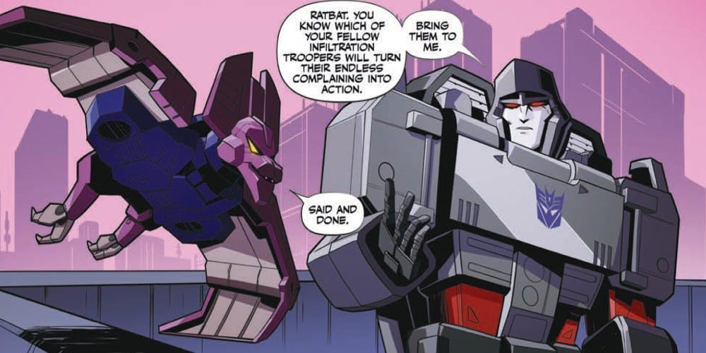
“All Fall Down.” Cybertron is in crisis. Calamity has befallen the planet. This is Megatron’s moment to show just how much power he has and to deal with any problems accordingly…

Writing

If the previous issue was showcasing the best of Brian Ruckley, this issue points to all of the flaws in their style. The issue suffers from too much dialogue and not enough action. The revolution has come, the setup for this has been broadcasted for several issues. There shouldn’t be so many panels talking about suspicions and characters about to make moves. Less talk and more scenes of destruction are what is needed in this issue.

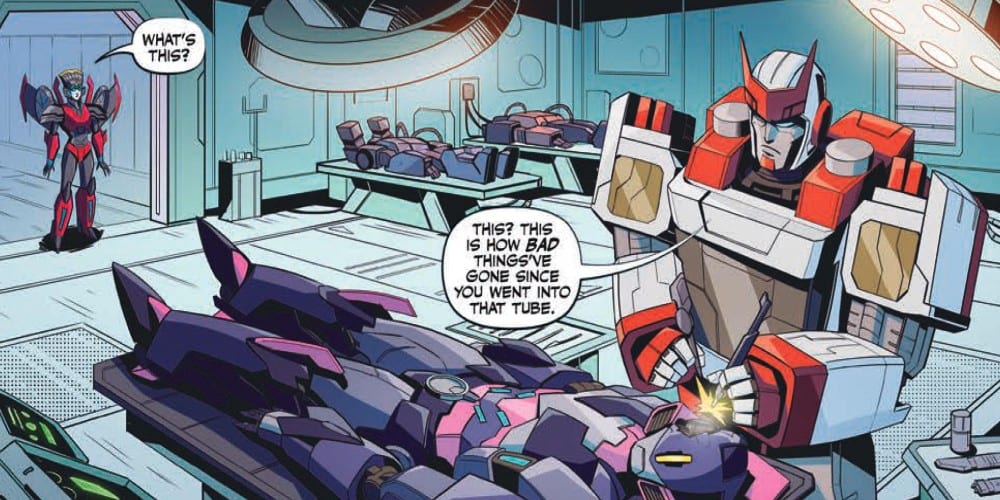
The biggest problem this issue is the revelation about the Titan introduced at the start of the catastrophe. The massive has disappeared, confirmed to be gone with a single panel dialogue and will not be participating in moving the story forward. Though the giant robot did make the Tether fall and cause a lot of collateral damage on the surface, there was a chance for more mayhem to unfold. Sadly, it appears this possibility has disappeared for the moment which serves as a reminder of the wasted grandeur this arc could posses.

Transformers

Artwork

The art by is Anna Malkova is decent but seems to be inconsistent. Some panels are filled with great detail and striking expressions. Other panels the characters seem blocky and have facial expressions which throw off the severity of tense situations.

The coloring by Joana LaFuente is suffering from the same erratic nature. Some panels the colors help to add a striking look to the characters and other times it seems to add to the blandness. This doesn’t seem up to LaFuente’s usual level of consistency.

Transformers

The lettering by Jake M. Woods seems to be the only area standing out in this issue. The letterboxes for Soundwave are very distinct and perfectly encapsulate the unique speech pattern the character is known for. Seeing the same style used later to symbolize a comlink message helps to nail down a non-auditory sound when seeing the boxes.

Conclusion

Transformers #19 doesn’t feel like the start of a grand uprising. Instead, it feels boring which is the last thing you want from a comic which seemed to have been building to this point for several issues. As its only the start hopefully this arc will pick up some speed because right now it’s hard to imagine it getting any slower with its pace.

Monkeys Fighting Robots Youtube

DCEASED UNKILLABLES #2 Runs Full Speed to the End of the World

Written by Tom Taylor, with pencils by Karl Mostert, inks by Trevor Scott, Neil Edwards, and Karl Mostert, colors by Rex Lokus and letters by Saida Temofonte, DCEASED Unkillables #2 out this week from DC Comics throws out the playbook. Instead of conforming to comic book “norms,” this team continues a series in which anything can and does happen.

Writing

DC, in its infinite wisdom, has handed the keys to the kingdom to Tom Taylor. He gets the whole sandbox, all the toys, to do with as he pleases. The world of DCEASED is so full of possibility, Unkillables seems like only the tip of the iceberg. With the anti-life equation running rampant, and the series being firmly out of continuity, anything could happen. Taylor’s knack for making us care about unlikely heroes finds its stride in this issue. While the world burns around them, we are reminded that even the cruelest individuals have a heart deep down.

DCEASED Taylor DC

Art

Mostert, Scott, and Edwards also find their stride in this issue. While the first issue of DCEASED Unkillables occasionally veered into the territory of the Uncanny Valley, this issue maintains its style while avoiding the same pitfalls. Perhaps the most interesting part of this issue is what the artists choose not to show. Instead of reveling in the guts and gore, the scenes that risk tipping the balance are often cut short. A particularly heartbreaking scene ends with characters seeing their essential targets. We then cut to days after the deed is done. A scene that could have been a little too cheesy, ensures a kiss is about to happen but cuts away again. And so these artists keep the story on its true course by course-correcting moments it veers too far in any direction.

Coloring

It’s interesting to review this comic among so many others. The colorwork that Lokus does here is quite different from a lot of other modern comics. Many comics work against a moment to create surprise. Scenes of impending doom are colored brightly. So when the other shoe drops, we’re left shocked and awed. But Lokus knows this story is a story of dramatic irony. It’s Armageddon. We know death is coming for so many of our beloved characters, so Lokus decides to give us advance warning. Though much of the comic is colored brightly to show the happy tone, impending doom looks like impending doom. We can only clench our knuckles and wait for the apocalypse to be over.

Lettering

Temofonte’s lettering might be the bloodiest part of this apocalypse. With gory sound effects for gunshots, bones breaking, skin tearing, and sword stabbing, there’s plenty of red on the page. Even the captions narrating the events of the issue are in text boxes that are covered in blood splatters. Yet few sound effects are lettered the same way. Some, like the gunshots, look like big block letters, and others look like they’ve been messily penciled in. We get the sense that the more brutal the moment, the messier the letters look. There are lots of messy letters in Unkillables, as this team pulls out all the stops.


DCEASED Unkillables #2 is a sprint into the abyss. Rules are broken as fast as they are set up, and the mess of the end of the world takes its toll. This creative team doesn’t pull back and doesn’t stall. Every moment is full speed ahead. Pick up the next issue of this great series on March 18th at a comic book shop near you!

Monkeys Fighting Robots Youtube

Review: STARSHIP DOWN #1 Questions Human Origins

Starship Down #1, Mutti Cover

Out this week, Dark Horse Comics’ STARSHIP DOWN #1 uses the familiar trope of scientists finding an ancient spaceship buried in the Arctic ice. Does this issue bring something new to the SciFi genre? Let’s find out.

Cover

Andrea Mutti is responsible for both the cover and internal art. Mutti’s cover painting is expertly crafted with color, texture, and technique. However, the painting lacks any interesting content that entices the reader to look further. The main character depicted on the cover looks bored with her surroundings. Mutti can do better with future covers by adding some action or an element of surprise.

Writing

Justin Giampaoli has created a standard setup issue where you meet a whole range of assorted scientific, military, and even religious officials. You can tell Giampaoli did his research when it comes to choosing authentic Russian names and using military lingo. In particular, the military and scientific jargon makes the story feel very authentic to the scenario as the setup is fleshed out.

On the downside, there are a few panels that are a little too jargon-heavy, which makes for a cumbersome read. Here’s a sample from a single word bubble on page 22:

“We’ll fire several standard dating vectors to make sure any anomalies will be out of your data path. When you’ve gotten past the stratigraphy and carbon-14 dating, proceed directly to mass spectrometry. Understood?”

That’s quite a mouthful.

Giampaoli’s story is a classic “ancient spacecraft found buried in the ice” brand of SciFi. Nothing Giampaoli has written here deviates much from that trope. We’re interested to see if future issues contain some original ideas, but there are none to be found in the first issue.

Coloring

Vladimir Popov’s coloring is the highlight of this issue. Camouflage is not easy to render, but Popov does an excellent job coloring camouflage onto coats and making it look like it folds and creases in all the right spots. Popov has done excellent work here.

Starship Down #1, Coloring Sample

Lettering

Despite the heavy amounts of jargon used, the lettering by Sal Cipriano keeps it all straight. This issue is very light on action and heavy on observation. The reader needs to see and process a lot of still imagery. Cipriano’s lettering keeps the conversations rolling and adds an element of pace to an otherwise static story.

Pencils/Inks

Mutti’s artwork is like a collection of mini paintings. Mutti’s panels are well constructed, and her command of anatomy is strong. The weakest part of Mutti’s art is the faces. None of the characters has a distinctive face or features that make them memorable. This may partly be due to how quickly such a larger number of characters are introduced. You never really get a sense of distinction for each character, and the amorphous art for each character’s face makes it more challenging to connect with them.

Favorite Panel/Page

For a story with a BIG reveal, the favorite page is the money shot, and this issue is no exception. Page 19 is a full length, single panel showing an (alien?) spaceship trapped in ice. The ship is advanced looking without being so alien that you can’t picture how it would fly. Mutti drew the ship well enough to make it look massive next to the scientists without losing a sense of scale. It’s an exercise in perfect perspective.

Conclusion

STARSHIP DOWN #1 uses a classic SciFi setup to begin its story. There’s potential if Giampaoli can introduce something fresh in the next issue, but not much to get excited about so far.

Monkeys Fighting Robots Youtube

Review: RED SONJA & VAMPIRELLA MEET BETTY & VERONICA #10 Face New Enemies

Red Sonja & Vampirella meet Betty & Veronica #10, Dalton cover

Out March 25 from Dynamite Entertainment, RED SONJA & VAMPIRELLA MEET BETTY & VERONICA #10 finds half the quartet stranded on Drakulon. Will Betty and Veronica wind up as Vampiri food? Let’s find out.

Cover

Fay Dalton’s cover painting is a beautiful work of art. Dalton captures the essence of that late-60’s to early-70’s hippie mod style. The one suggestion to be made for improving the cover is the placement of the characters. They’re meant to look like they’re all lying together in a field. However, they look like individually posed characters that are stacked on top of each other on the page.

Writing

Amy Chu’s story gets right to the point. Betty and Veronica are kidnapped by Draculina and taken back to her homeworld. Along the way, the Riverdale natives are accosted by all sorts of strange characters. Draculina reveals her master plan to the reader before deciding to make Betty and Veronica her next meal.

Chu’s story does well in providing a fair bit of backstory into Vampirella’s people and the type of civilization that dominates her planet. Chu adds in a little cyborg action at the very end to hint at a future conflict between the worlds that could lead to war (or not). The story is deceptively simple, easy to read, and fun.

Pencils/Inks

Laura Sanapo’s art draws you into an alien world inhabited by vampire-like humanoids. It’s an excellent example of world-building. Sanapo’s character designs are consistent with what we know of Vampirella, and yet, the characters are just different enough to stand on their own as individuals.

Sanapo’s one flaw in the art is the costume designs on the Vampiri that are not Draculina. The locals are wearing tattered button-down shirts and slacks. However, Draculina goes out of her way early in the issue to describe her very skimpy outfit as typical for the Drakulon weather. When we finally see other locals, their garb does not match what Draculina describes in any way.

Favorite Panel/Page: Page 4 is the favorite of this issue. It’s a full-page panel depicting starving Vampiri dive-bombing the group to claim their next meal. It’s our favorite for capturing everything that works best for this issue from the scorching Drakulon heat in the colors to expert lettering on the sound effects to an excellent inking job that shows the flying threat in stark silhouette.

Coloring

Drakulon is a hot, barren wasteland, and Mohan pulls off the feeling of heat and oppression in the use of colors. The sky is not blue and sunny as a day at the beach, but scorched and hazy like nearly every scene from a Mad Max film.

Lettering

Taylor Esposito and Rieanna Bates focus their talents almost entirely on the dialog. There is no narration at all, and the only sound effects you’ll find are in the one fight scene against hungry Vampiri locals. That said, the dialog lettering matches the ink art exceptionally well.

Conclusion

RED SONJA & VAMPIRELLA MEET BETTY & VERONICA #10 is a fun and “out there” issue. It lays the groundwork and motivation for a potential battle between Earth and Drakulon with high stakes (no pun intended).

Monkeys Fighting Robots Youtube

Review: JUDGE DREDD 100-PAGE GIANT – From Good To Great

Judge Dredd 100-Page Giant, Quah Cover

JUDGE DREDD 100-PAGE GIANT is a 4-story anthology highlighting some of the more unique takes on the future law enforcer over the last few years. Each story is a chapter from runs by such writers as Ulises Farinas, Erick Freitas, Mark Russell, and Paul Jenkins. Some chapters are stronger than others, so let’s find out which ones rise to the top.

Mega-City Zero – Written by Ulises Farinas and Erick Freitas

What if you crossed Planet of the Apes with The Time Machine to form a primitive future society raised on Twitter? Judge Dredd finds out in this story.

This is easily the most unique story of the anthology. It’s our writing favorite for originality and satirical commentary on the long-term effects of social media.

The lettering by Chris Mowry is clear and sparse when it needs to be to let the art speak for itself while Dredd struggles to figure out what’s going on. Colors by Ryan Hill are bright and help emphasize how much Dredd looks out of place in a primitive landscape.

If there’s one area where the story falters, it’s in the inks by Dan McDaid. The lines are thick and blotchy to the point of sloppiness. None of the lines are clean or clear, giving you the impression you’re reading the story through rippling water.

The Blessed Earth – Written by Ulises Farinas and Erick Freitas

This story could have easily been call Old Man Dredd with another trip to the future. The infrastructure has been wiped out, and Dredd takes on the challenge of rebuilding the systems of justice throughout the land. It’s a Western, with robots.

Again, Farinas and Freitas demonstrate a real knack for building worlds. They’ve seamlessly blended the outdoor aesthetic of an old-time Western with the trappings of a deadly future.

The lettering by Shawn Lee is clean if a bit crowded on a few pages. The story has a lot of exposition to catch the reader up, causing some of the panels to get bubble heavy. The coloring by Ryan Hill is bright and distinctive but very flat. There’s almost no shadows or shading on any of the characters in the full daylight scenes, giving the overall story an overly 2-D feel.

As with Mega-City Zero, the inking by Daniel Irizarri is the weak point of the story. Every outline on every surface and every character is overly thick, and there’s not a single straight line anywhere. Irizarri made a creative choice that just doesn’t work.

Under Siege – Written by Mark Russell

Under Siege comes closest to a traditional Judge Dredd story, closer still to the film JUDGE DREDD (2012). Our favorite Judge must find a way to escape a high rise that’s been taken over by mutants.

Russell shows an aptitude for fast-paced action that keeps the tension high throughout. He throws in enough jabs at current and future society to cause a few chuckles (e.g., a touchscreen in a church where you can choose your own virtual holy droid)—really enjoyable story.

The lettering by Simon Bowland stands out, particularly on the signage of the set pieces. Buildings and billboards all have unique fonts for their titles that look futuristic and well-worn. Jose Luis Rio does an outstanding job putting color gradients on just the right surfaces to give the impression of ambient light and glow from digital screens. Rio does the best coloring job of all the stories in this GIANT.

Likewise, the art by Max Dunbar is stellar. Every surface and character has depth and weight. This is the story that looks like it would best translate to film.

Toxic – Written by Paul Jenkins

Jenkins weaves a tale of xenophobia in the Dredd-verse but doesn’t quite stick the landing. A collection of symbiotic “bugs” are marooned on Earth and bond with waste disposal workers. The bonding causes miraculous healing for the workers to tolerate their highly toxic working conditions better, but somehow that triggers a xenophobic reaction among the citizens living topside.

Frankly, the reaction makes no sense. Jenkins tries to use the futuristic setting to make a point about irrational immigration and border control fears, but the phobias he paints strain believability, and the point fails to stick.

The coloring by Jason Millet is particularly strong in giving each character depth when most of the story is set in either nighttime exteriors or low light underground sewers. The art by Marco Castiello is crisp on characters in the foreground but tends to get muddled for background characters. The lettering by Shawn Lee is very easy to read for both dialog and narration. Oddly, there are almost no sound effects in this story, so the story is very “quiet.”

Conclusion

The stories in JUDGE DREDD 100-PAGE GIANT span the range from “just okay” to “taut and exciting” in all the creative ways. Mega-City Zero by Farinas and Freitas gets top marks for the story. Dunbar and Rio win high honors for Art and Coloring, respectively. We recommend you pick this issue up if you’re a Judge Dredd fan.

Monkeys Fighting Robots Youtube

Review: KILLING RED SONJA #1 Is (Not) A Children’s Book

Killing Red Sonja #1, Ward cover

Out March 25 from Dynamite Comics, KILLING RED SONJA #1 by Mark Russell and Bryce Ingman has almost nothing to do with Red Sonja. Seriously. She’s not in it at all except as a background character. Does it hold up when the title character is nowhere to be found? Let’s find out.

Cover

Christian Ward’s cover perfectly captures the tone of the entire issue. The Prince (Cyril) is shown with vengeful malice that is both bloody and childishly naive. Ward’s rough style on the cover is also evocative of the art throughout the whole book, so the cover does a really nice job letting you know what you’re in for.

Writing

Russell and Bryce Ingman have taken on a daunting task. How do you write a ‘Red Sonja’ book that’s not really about ‘Red Sonja’? To Russell and Ingman’s credit, it works. They’ve written a strange tale of vengeance as told through the eyes of a boy. All the dialog and action is true, so you don’t feel like the Prince is an unreliable narrator. That said, the Prince does not seem to understand the seriousness of his quest. Russell and Bryce succeeded in having a child act like a child in extraordinary circumstances, which turns this book into a sort of bizarre fairytale. It’s different and entertaining.

Pencils/Inks

Craig Rousseau made a creative choice to go with a sketchbook style, giving the reader the impression of a child’s coloring book. It works very well for the entirety of the book. There a few panels where the background characters are so lacking in detail that they’re little more than blobs, but that could be to reflect that a child would not draw to that level of detail anyway. It’s a novel approach here. I’m interested to see how it holds up in subsequent issues.

Favorite Panel/Page: The Prince imagines himself standing by Red Sonja as she’s hung from a tree in one panel. The Prince stands there with a broad smile, looking at the body, hands-on-hips in a triumphant pose. The image is so childlike in its depiction of heroism that you almost forget how disturbing the scene really is.

Coloring

Dearbhla Kelly is tasked with coloring this book to match the storybook style of the issue. Kelly went with a watercolor approach that amplifies Craig Rousseau’s art choices. The coloring mostly works, but it’s very dull for several pages. Kelly only uses bright colors when depicting red blood, but a child would use bright, crayon-like colors liberally. Kelly’s toned-down coloring detracts from the artistic theme of the book.

Lettering

Hassan Otsmane-Elhaou’s lettering is spot on for this issue. In particular, the sound effect lettering is overly simplistic as it would be interpreted through the eyes (ears?) of a child. Excellent coordination here to match the lettering with the art style.

Conclusion

KILLING RED SONJA #1 tricks you into thinking you’re going to read a Red Sonja adventure before convincing you to stay for a bizarre (and bloody) fairy tale. It’s unique and interesting. We recommend picking it up.

Monkeys Fighting Robots Youtube

Review: CLASH OF KINGS Part II #3 – Brienne’s Loyalty & Tyrion’s Downfall

Clash of Kings Vol 2 #3, Cover

CLASH OF KINGS Part II #3 from Dynamite Comics, hits your local comic book shop on March 25, is the continuation of George R.R. Martin’s Game of Thrones saga, adapted in comic form by Landry Q. Walker. We pick up the tale as Catelyn forms an alliance with Brienne of Tarth on their way to Catelyn’s home. How does this issue fair compared to reading the book or watching the TV series? Let’s find out.

Writing

Walker does an excellent job adapting Martin’s story in great detail. That said, if you haven’t read the prior issue or know the source material, you will be lost entirely. Walker does his best to add necessary backstory exposition, but you feel like you’re drinking from the proverbial fire hose. It’s an overwhelming amount of backstory to try and absorb in a single issue. It would be best if you don’t try to read this issue without reading the previous issues first.

That said, the story moves at a decent pace, and the exposition slows the story down in only a few spots.

Pencils/Inks

Mel Rubi excels at bringing Martin’s characters to life. Rubi chose to render the characters much more faithfully to the original novels versus the TV series, and it shows. These designs give you a more definite sense of how these characters behaved, from their mannerisms to their interactions with other characters.

Favorite Panel/Page: My favorite panel is the second to last of the issue. Tyrion sees his own distorted reflection in a polished chalice. It looks cool, but there’s a meta meaning as well. Tyrion sees himself in the opulence and power of his position and recognizes how he’s become distorted by it. The panel sticks with you.

Coloring

Ivan Nunes coloring work here is fantastic. With so many narration blocks on every page, the panels tend to get a little crowded.  Nunes’ coloring manages to push the image out and draw your attention.

Lettering

Tom Napolitano deserves a medal for the amount of lettering needed to pull this issue off. He stops just short of transcribing Martin’s novel verbatim, which is no small task. The Game of Thrones novels have a lingo all their own, so Napolitano shows more than a little extra attention to detail to get the language right.

Conclusion

CLASH OF KINGS, VOL. 2, #3 stays true to the source material and is a must-read for any Game of Thrones fans. However, don’t pick this up if you haven’t read the previous issues first or don’t know the source material.

Monkeys Fighting Robots Youtube

Advance Review: SPY ISLAND #1 – Beware of The Mermaids, and Spies

Nothing beats a vacation on a tropical island in the Bermuda Triangle; that is if it didn’t have spies, murder, and mermaids, yet if that sounds like your type of trip lookout for Dark Horse Comics’ Spy Island #1 come April 1st.

The creative team from Image Comics Man-Eater groups back up to take you to an island full of mystery and murder. Sneak on over to Dark Horse Comics’ Website to learn the full top-secret briefing on Spy Island #1. If any of that interests you, make sure to tell your LCS you want to book your visit.

TOP SECRET STORY

Spy Island #1’s strengths lie in its characters and the wild world it inhabits. Writer Chelsea Cain creates a great spy with her main character, Nora Freud, who harkens back to classic spy films. Freud is everything you expect from the main character focusing around a spy, while never feeling overdone or boring. The same can be said for the few interactions she has with the other spies. Yet, the story takes the wackiness seen in some of those films and takes it up a notch. I mean, its subtitle is A Bermuda Triangle Mystery, so expect some aliens, mermaids, monsters, and all-around weirdness.

A nice swim. Before death.
Art by Elise McCall. Colors by Rachelle Rosenberg. Letters by Joe Caramagna.

Although the characters and world excel in Spy Island #1, the plot itself feels stagnant. That’s not to say there isn’t one, alas, it takes a backstep compared to other elements. A few plot elements are dangled in your face that shows where the story could lean towards, but it never kicks in. Instead, it seems Cain focused more on building her characters and world in its first issue instead of the plot. This perse isn’t bad, but when the plot synopsis gives you more info than the first issue itself, it reads awkwardly.

All that said, Cain’s island full of spies and worse is a blast to visit. Her characters are diverse and feel like they’re all hiding something. If you weren’t worried about the mermaids, you would be about the human company you keep.

This doesn't look good for him...
Art by Elise McCall. Colors by Rachelle Rosenberg. Letters by Joe Caramagna.

SPY ISLAND AND THE BEAUTIFUL LOCAL

The locals seen throughout Spy Island #1 are downright gorgeous. This is due in part to two factors, the first being Elise McCall’s beautiful art. McCall’s art will make you save up all your money and drop it on a visit to the Bermuda Triangle Island. This can be seen in the awe-inspiring architecture of the structures, and the realistic water. As someone who hates the ocean, McCall makes me want to swim. Among her fantastic art is her panel structure, which is just as magnificent and includes few visual gags that’ll make sure you’re paying attention.

Another great aspect McCall adds is realistic photos (seen below) of fish and other objects. These real-life captured images can be seen in their own panels in some pages, yet in others, they are added to the background. When this transpires, McCall is able to find a perfect balance between the two and show how comics are a visual medium.

Ahhh, Fishes
Art by Elise McCall. Colors by Rachelle Rosenberg. Letters by Joe Caramagna.

The secondary factor for the beautiful locals is Rachelle Rosenberg’s jazzy colors. Rosenberg’s bright colors help bring McCall’s waves to life. During the first few pages of water, the colors of the ocean are gorgeous and will mesmerize you. This carries into the panels that include the deeper ocean, where she uses a dazzling palette of colors. Rosenberg keeps these lively colors throughout, which gives Spy Island #1 an 80’s vibe that bodes well with the characters. On the 80’s vibe, whoever designed the costumes did fantastic with the styles, especially when Rosenburg’s colors come into play.

Uh oh, somethings got you!
Art by Elise McCall. Colors by Rachelle Rosenberg. Letters by Joe Caramagna.

CONFIDENTIAL LETTERS

Lia Miternique is credited for multiple things, with the design being one. Usually, this applies to the comics logo. Spy Island #1’s logo is simple, yet it gives off vibes you’d see in a classic spy film. Another amazing element that resembles spy films is Joe Caramagna’s usage of impact label fonts. This isn’t seen all the time but is used more for locations and names, which works better than using constantly. But, damn does the usage of impact label looks gorgeous when applied.


A VISIT TO SPY ISLAND

Spy Island #1 is a great introduction to its characters and world, yet falters at its plot points. Nonetheless, the gorgeous art, fun characters, and the mysterious world will suck you in like the Bermuda Triangle itself.

Memorable Quote: “I don’t like places I can’t spell.” – Nora Freud.

Well, that would take a lot of places off my list for me.

Monkeys Fighting Robots Youtube

WICKED THINGS #1- When The Detective Becomes The Suspect

Following their award-winning series Giant Days, John Allison and Max Sarin show how being everyone’s favorite child detective isn’t what it’s cracked up to be years later in BOOM! Studios’ Wicked Things #1 out this week.

Wicked Things takes place in Giant Days world, so now is the best time to check it out if you haven’t! The series was a huge departure from the usual comics while being an immensely great read. If you haven’t read the previous series, check your LCS, as you should. Nonetheless, check out how Giant Days changed Samuel Pratt’s concept of comics.

A MURDER MYSTERY BEGINS

Yes, Wicked Things #1 takes place in Allison’s previous universe, yet at no time will you be lost if you’re new here. Instead, Allison spends the first issue effectively setting the plot, characters, and the world. We’re introduced to everyone’s favorite child detective – Charlotte Grote – and her most recent case: growing up. As with any child detective, at one point, they become a teenage detective, then a full-grown detective—hopefully. During the first few pages, Allison establishes Grote’s personality and a bit of her history for the readers.

That is a lot of stuff.
Art by Max Sarin. Colors by Whitney Cogar. Letters by Jim Campbell.

Once Wicked Things #1 moves to the hotel where the “teen detective of the year” award is hosted, Allison starts to introduce a multitude of characters. Each of these characters mirrors their place of origin in their clothing and mannerisms: a small, yet fun touch. Allison excels at writing side-characters. As each character is introduced, you want to learn more of them, which Allison keeps teasing throughout with small interactions.

Nonetheless, one element stands out, which hopefully will be explored in future issues. Wicked Things revolves around Grote becoming a suspect of murder. This occurs due to her being lured in by the translator of another famous detective, who previously had a fantastic interaction with Grote that sets this scene up. But alas, the whole “set-up” feels too staged, with quite a few questions coming up. Why Grote? Was it meant to be her? Could it have been anyone? How’d they know she’d fall for it?

The set-up all felt lucky that it even transpired as such. Luckily, this is a detective story, so all that will come to fruition in time.

Some history on the now almost adult detective.
Art by Max Sarin. Colors by Whitney Cogar. Letters by Jim Campbell.

THE MYSTERY IS IN THE DETAIL

Sarin’s art matched with Allison’s writing continues to bring the panels to life with lovely energy. Whenever a panel calls for a character to react to something transpiring, Sarin makes sure you can see the emotion strained across their face and body. Yet, in some scenes, they draw the character overreacting in an anime-esque style that further emphasizes how they feel. Throughout Wicked Things #1, this style caters to the visual gags making the jokes land quite well. However, this isn’t the only place Sarin’s art stands out, as their panels include quite a bit of detail. In other words, a perfect style to have for a detective story.

Also returning from Giant Days is colorist, Whitney Cogar, whose bold colors help bring Sarin’s pages to life. As Sarin includes a variety of details, Cogar makes sure each stands out independently with color. Another element she brings to the pages are the single color panels. During these moments, she helps the object pop by adding a shade behind it that never takes away from the foreground.

When Allison introduces the side characters and the country, letterer Jim Campbell adds the information above their heads. The way Campbell displays the information feels like what you’d see in BBC’s Sherlock, which is a pleasant touch. In some moments, when characters overact or are seen doing certain movements, Campbell adds onomatopoeia that helps amplify what they’re doing.

Art by Max Sarin. Colors by Whitney Cogar. Letters by Jim Campbell.

WICKED THINGS ARE AFOOT

Wicked Things #1 had one huge hurdle to get through once it was announced; be on par, or greater than Giant Days. With such a huge series in the rear-view mirror, people are sure to compare the two due to it being the same team. Yet, Wicked Things is a whole different beast. Fans of the team’s previous work will find something to love, while newcomers will too. If it keeps this momentum it could very well be your next favorite detective comic.

Monkeys Fighting Robots Youtube

TARTARUS #2 Continues to be The Next Epic, Must Read Series

When your first issue is a damn masterpiece, it’s hard to follow up with the same quality, yet Image Comics Tartarus #2 proves that the team knows what they’re doing when showcasing it’s one of the best series out there.

If you haven’t had the chance to check out the first issue – what I called “the best of 2020 contender” – then make sure you click the link and check it out. Plus, make sure you pick up the first (if you haven’t) and the second at your LCS, as you don’t want to miss out on Tartarus.

THE WORLD OF TARTARUS

First and foremost; Tartarus #2 may not be for everyone. Yes, that can be said for a lot of comics, yet it rings true here. That’s due to how different the series is from others being published. This can be seen in the heavy dosage of politics and a huge roster of characters. Those and the fact it feels much like Frank Herbert’s Dune (and 1980’s European Comics) with its vast history and rich mythology. In its first double-sized issue, Johnnie Christmas spent about half the page count fleshing out some of the past. Although Tartarus #2 doesn’t contain that huge page count, Christmas sprinkles in important history throughout.

Art/Colors by Jack T. Cole. Letters by Jim Campbell.

Whereas Tartarus #1 is slow-paced throughout, its second issue detours a bit. For example, more action takes place, yet Christmas still allows breathing room. During these moments, characters and the world are fleshed out, giving you a better understanding of the characters and the world they inhabit. Each moment this transpires, you are sucked into their world, making you want the next issue even more. Pretty soon Tartarus will become the next craving you seek. Words aren’t enough to talk about how great this series is, even in its second issue you can tell it’ll become the next epic.

Art/Colors by Jack T. Cole. Letters by Jim Campbell.

EACH PAGE A WORK OF ART

Jack T. Cole’s art continues to be nothing short of drop-dead gorgeous. Nearly every page could be a work of art you’d find at a Museum. Cole’s lines are a beautiful blend between Frank Quitely and Moebius. Throughout Tartarus #2’s panels contain fascinating amounts of details in every aspect that you’ll be inspecting each panel for hours to come. Yet there are two aspects he excels at. The first being one that wasn’t delved into much in my first issue review.

Above all, designs are everything, especially when crafting a world from the bottom up, more so a sci-fi tale. Cole’s designs for every aspect of Tartarus is gorgeous in its execution between the busy, cluttered skyscrapers, ships, costumes, and weapons. Each page you’ll be enamored by the elegant designs of ever aspect. The other element Cole excels at is the colors.

Much like the first, Cole keeps the 80’s science fiction palette with a bright retro feeling. There’s nothing ever “too” bright, as the colors are more of a flat bright. Specifically, they keep the pop bright colors will have, but tones it down to not overpower the art. Yet, some of the most excellent examples of Tartarus # 2’s fantastic art can be seen in the action when the crew’s ship is crashing with chaos surrounding. Cole portrays a chaotic crash with his art. Yet it’s the clashing of colors all around the sell the brutality of the crash.

Art/Colors by Jack T. Cole. Letters by Jim Campbell.

AN EPIC NEEDS LETTERS

Letterer, Jim Campbell’s work continues to mirror some of Tom Frame’s work on Judge Dredd. Like the previous issue, and the work in Tartarus #2, it matches the European Comic vibe. Except, to just focus on that would be a disservice to Campbell, as the lettering isn’t just about the font choice. Throughout the issue, Campbell continues to make each of Cole’s panels stand out, never covering up pieces and adding great sound effects. In addition to adding varying font sizes and opacity to some word bubbles, helping make a point.

WHEN CAN I GET THE NEXT ISSUE? (CONCLUSION)

While writing this review, I had to step away from my computer for a few moments, because everything about Tartarus #2 spoke to me. Likewise, reading you’ll feel all giddy and realize you are taking part in what may be one of the next huge comics released in America. Every element in the book works perfectly in conjunction with the other, while constantly complimenting each other. If Tartarus sounds like your type of comic, its second issue will continue that feeling. Yet, if you didn’t give it a chance, as it may not be your type of book, I’d recommend going to your LCS and picking up a copy.

Memorable Quote: “Everything you just said. Was profoundly stupid.” – Tilda

Each new issue I fall in love with Tilda’s character even more.

Monkeys Fighting Robots Youtube