

Nothing beats a vacation on a tropical island in the Bermuda Triangle; that is if it didn’t have spies, murder, and mermaids, yet if that sounds like your type of trip lookout for Dark Horse Comics’ Spy Island #1 come April 1st.
The creative team from Image Comics Man-Eater groups back up to take you to an island full of mystery and murder. Sneak on over to Dark Horse Comics’ Website to learn the full top-secret briefing on Spy Island #1. If any of that interests you, make sure to tell your LCS you want to book your visit.
TOP SECRET STORY
Spy Island #1’s strengths lie in its characters and the wild world it inhabits. Writer Chelsea Cain creates a great spy with her main character, Nora Freud, who harkens back to classic spy films. Freud is everything you expect from the main character focusing around a spy, while never feeling overdone or boring. The same can be said for the few interactions she has with the other spies. Yet, the story takes the wackiness seen in some of those films and takes it up a notch. I mean, its subtitle is A Bermuda Triangle Mystery, so expect some aliens, mermaids, monsters, and all-around weirdness.

Although the characters and world excel in Spy Island #1, the plot itself feels stagnant. That’s not to say there isn’t one, alas, it takes a backstep compared to other elements. A few plot elements are dangled in your face that shows where the story could lean towards, but it never kicks in. Instead, it seems Cain focused more on building her characters and world in its first issue instead of the plot. This perse isn’t bad, but when the plot synopsis gives you more info than the first issue itself, it reads awkwardly.
All that said, Cain’s island full of spies and worse is a blast to visit. Her characters are diverse and feel like they’re all hiding something. If you weren’t worried about the mermaids, you would be about the human company you keep.

SPY ISLAND AND THE BEAUTIFUL LOCAL
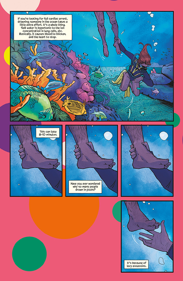
The locals seen throughout Spy Island #1 are downright gorgeous. This is due in part to two factors, the first being Elise McCall’s beautiful art. McCall’s art will make you save up all your money and drop it on a visit to the Bermuda Triangle Island. This can be seen in the awe-inspiring architecture of the structures, and the realistic water. As someone who hates the ocean, McCall makes me want to swim. Among her fantastic art is her panel structure, which is just as magnificent and includes few visual gags that’ll make sure you’re paying attention.
Another great aspect McCall adds is realistic photos (seen below) of fish and other objects. These real-life captured images can be seen in their own panels in some pages, yet in others, they are added to the background. When this transpires, McCall is able to find a perfect balance between the two and show how comics are a visual medium.
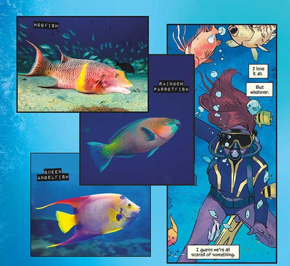
The secondary factor for the beautiful locals is Rachelle Rosenberg’s jazzy colors. Rosenberg’s bright colors help bring McCall’s waves to life. During the first few pages of water, the colors of the ocean are gorgeous and will mesmerize you. This carries into the panels that include the deeper ocean, where she uses a dazzling palette of colors. Rosenberg keeps these lively colors throughout, which gives Spy Island #1 an 80’s vibe that bodes well with the characters. On the 80’s vibe, whoever designed the costumes did fantastic with the styles, especially when Rosenburg’s colors come into play.
CONFIDENTIAL LETTERS
Lia Miternique is credited for multiple things, with the design being one. Usually, this applies to the comics logo. Spy Island #1’s logo is simple, yet it gives off vibes you’d see in a classic spy film. Another amazing element that resembles spy films is Joe Caramagna’s usage of impact label fonts. This isn’t seen all the time but is used more for locations and names, which works better than using constantly. But, damn does the usage of impact label looks gorgeous when applied.

A VISIT TO SPY ISLAND
Spy Island #1 is a great introduction to its characters and world, yet falters at its plot points. Nonetheless, the gorgeous art, fun characters, and the mysterious world will suck you in like the Bermuda Triangle itself.
Memorable Quote: “I don’t like places I can’t spell.” – Nora Freud.
Well, that would take a lot of places off my list for me.