Home Blog Page 319

Review: THE LOST CARNIVAL Is A Near-Perfect YA Graphic Novel

The Lost Carnival, Nuwer cover

THE LOST CARNIVAL, available from DC on May 5, is a YA-focused graphic novel about an adventure in the early life of Dick Grayson. Dick is feeling the call to see the world, away from his parents and the circus life, when a mysterious carnival appears on the scene. Is this book low-brow tweeny melodrama, or is the carnival ticket worth the price of admission? Let’s find out.

Writing

THE LOST CARNIVAL was written by Michael Moreci, and he sets a very high bar for YA novels set in the DC universe. There’s a tendency among YA authors to lean heavily on teenage angst and contrived drama for emotional impact, leaving the meat of the story for a distant second place. Teenage love triangles, falling in love with the bad boy from the wrong side of the tracks, mean girls bullying the new student, and on and on and on. Thankfully, Moreci avoids all of that here and focuses on a top-notch story that reads more like Romeo & Juliet crossed with an episode of Steven Spielberg’s Amazing Stories.

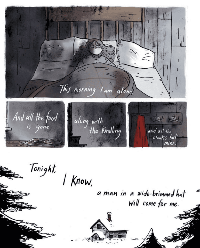
Plot (No Spoilers): The Flying Graysons are the headline act of a failing, traveling circus. Dick Grayon, about 17 at this time, is feeling a pull to see the world and all it has to offer. Frustrated by a life that never seems to change, Dick starts breaking a few family rules as he straggles with the need to feel independent and find his own way in the world. While dropping in on a party his parents don’t know about, Dick encounters the mysterious Luciana who is part of the nearby, competing carnival. It doesn’t take long for Dick to figure out Luciana and her carnival are not all that they seem.

Let’s set a few expectations. This Dick Grayson (known as the first Robin to Batman, and eventually Nightwing) is purely presented as the youngest member of the Flying Graysons. Aside from a brief interaction with a tarot card reader, nobody mentions Robin, Batman, or Gotham City. Effectively, Moreci’s story is Easter egg free and avoids any foreshadowing to Dick’s future, crime-fighting career. Got it? Good.

What you do get is a teenage love story wrapped in a supernatural mystery. There’s a little bit of magic, and yes, some family drama. More importantly for a mystery, Moreci wrote a twist on the bad guy reveal that I honestly did not see coming. It’s hard to surprise me with mysteries, so Moreci earns high praise for pulling a rabbit out of his hat that I didn’t expect..but truly works.

Another high point in Moreci’s writing is the dialog. Every conversation between Dick and his parents, between Dick and Luciana, between the carnival and circus folk, felt very natural and believable. I didn’t roll my eyes once during any of the exchanges. Moreci created characters that talk like real people in extraordinary circumstances, and that’s the best compliment I can give for dialog.

From start to finish, Moreci wrote an entertaining story that keeps a steady pace, is inhabited with interesting characters, and encompasses a solid mystery. Be warned – there’s a lot of crying, but it fit the story.

Pencils/Inks

Illustration credit goes to Sas Milledge with Phil Hester. Milledge does a tremendous job illustrating a fairly large graphic novel (175+ pages, not counting the covers and credits pages). This is a YA novel, so every scene is going to have somebody getting angry or sad or falling in love – in other words lots of emotion. Milledge deftly covers the range of expression on every characters face at the right time and in the right place.

The overall design of the characters and the setting gives the book a classic, B&W movie feel. Think about the simplicity and wholesomeness of the The Wizard Of Oz when Dorothy is still in Kansas. That tone works for the story and the setting perfectly.

There are two areas where Milledge’s art doesn’t quite work as well – the hair and the movement. Almost every character’s hair that isn’t cropped short seems to be constantly moving and in conflicting directions to what the character is doing. It’s a small thing but it stands out with so many close up panels. This could be improved by matching the hair movement to the motion of the character.

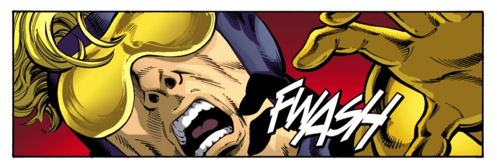
The other area is the movement of the characters. The Flying Graysons are acrobats, and Dick employs acrobatic movements in a few of his fight scenes. Milledge’s movement art tends to freeze the characters midway through their motion, and that kills the momentum of the panel. This could be improved by adding speed lines to the characters when called for.

Admittedly, those two points were minor distractions and were mostly prevalent in the first couple of chapters. Milledge’s art distinctly improved through the progression of the book, so it becomes less of an issue as you read through. Nice job, overall.

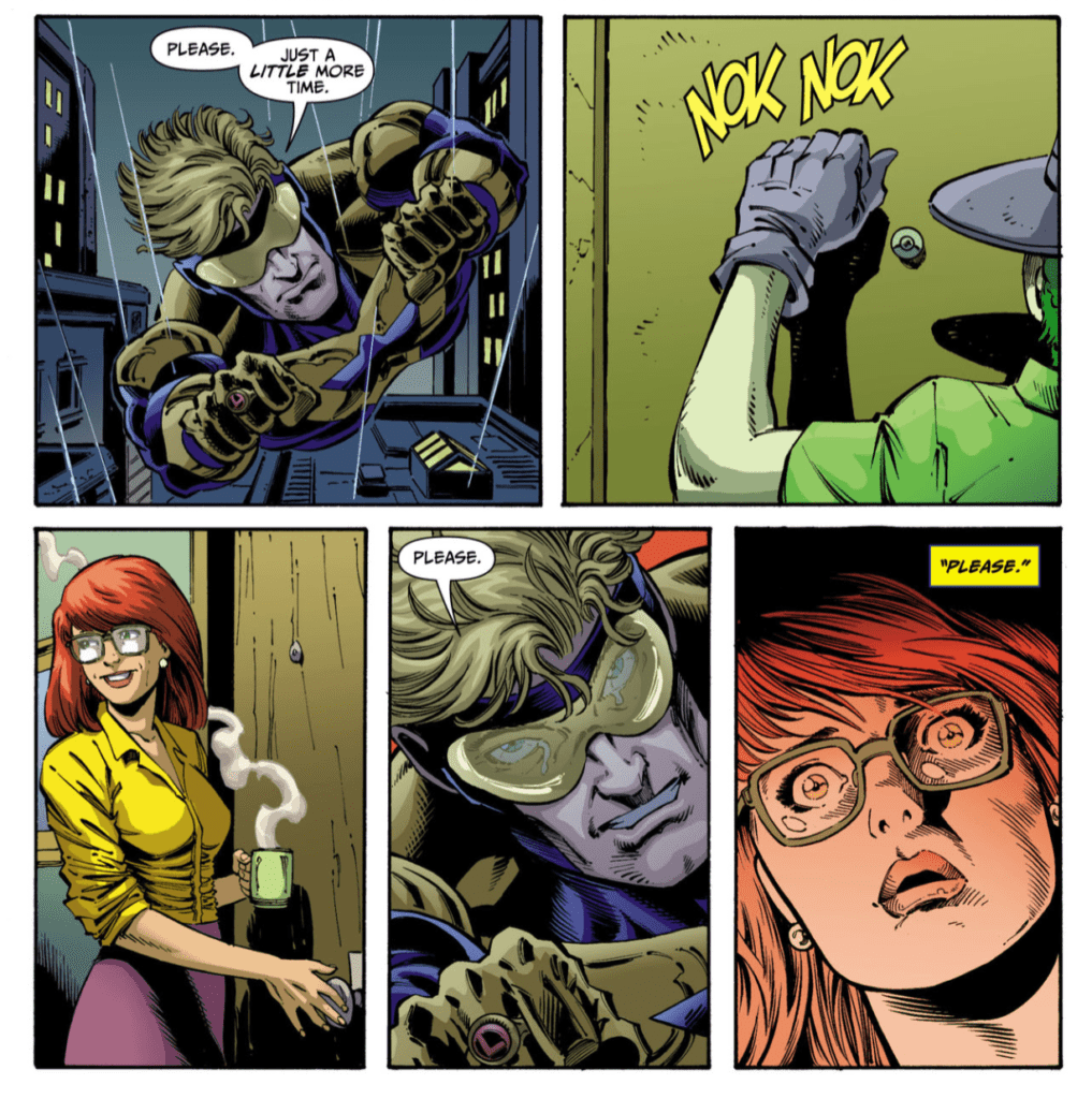
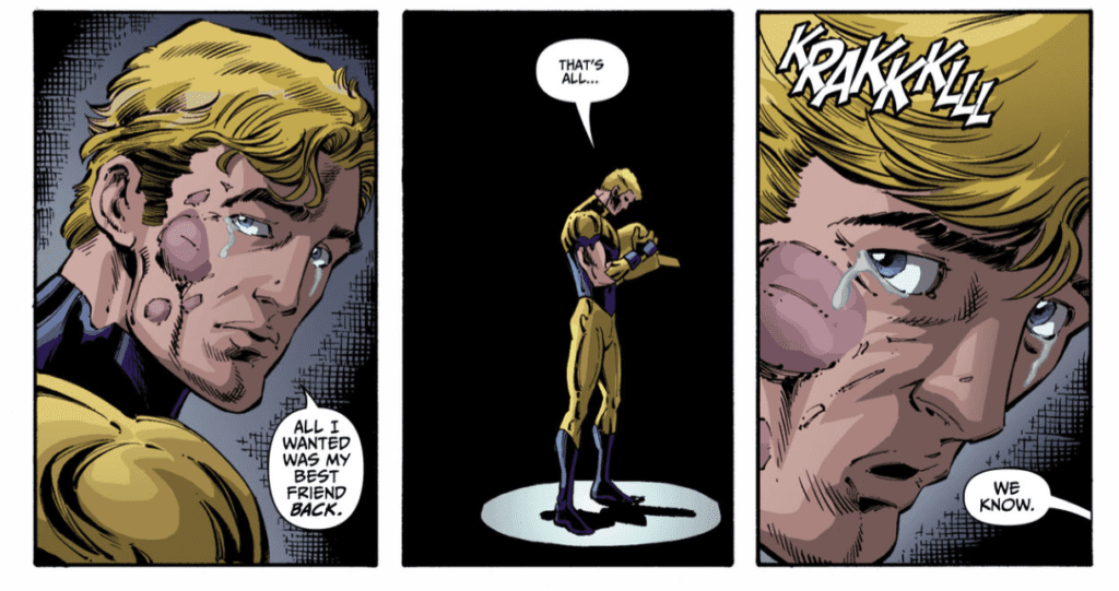
Favorite Panel/Page: Page 188 earns the favorite page spot for this book. Again, no spoilers. Dick has just lost something precious, and you see three successive panels where his expression changes from shock to shock to realization to grief. No dialog or narration, it all comes through by art, and it’s a gut punch.

Colors

The colors are sparse in this book as it’s drawn to mimic a B&W film, but that doesn’t prevent David Calderon from doing great work. What Calderon has done is use an old movie trick of using different filter colors to represent different settings. Dick’s circus is colored in all blue tones. Luciana’s carnival is colored in all sepia tones. Calderon’s color choice here infuses each setting with distinction, and actually helps inform where you are in the story. That’s something most coloring examples don’t do, so kudos to Calderon.

Lettering

Moreci gets praise for writing the dialog, but Steve Wands’ lettering helps bring the story to life. The word bubbles were as naturally integrated into each panel as the dialog itself. At no point did word bubbles crowd out the artwork or feel pasted on. With a few exceptions, there’s almost no narration, allowing the art to tell the story where words don’t. This was a wise choice because I never felt lost or confused by what was going on. Sometimes less is more, and this is as much a great example of lettering AND a great example of when not to letter anything at all.

Conclusion

THE LOST CARNIVAL is an almost perfect example of the type of YA novels the comics publishers should be putting out. Moreci’s story fits neatly within Batman canon so as not to put DC fans off, but it completely works if you have no knowledge of Batman lore. Forgetting a few nitpicks, the entire art team did a stellar job. Pick this book up, from DC on May 5th, for an enjoyable read.


Author’s Note: Local Comic Shops (LCS) are going through a tough time right now with the pandemic outbreak of COVID-19. Comics fans of every flavor that care about his or her LCS should try to do what they can. So, here’s my part:

If you’re in Northern Delaware, South East Pennsylvania, or Southern New Jersey area, please take a moment to visit Captain Blue Hen Comics in Newark, DE. Say ‘hi,’ pick up a book, order a book (they’re on Comichub.com), and let them know you support them.

If you’re nowhere near that area, please find YOUR LCS using Comic Shop Locator and lend your support.

Thanks, and stay safe.

Monkeys Fighting Robots Youtube

Longbox Legends: THROUGH THE WOODS – Storytelling At Its finest

Emily Carroll may not be a household name yet, but every comic she creates is a horror-filled masterpiece. My first brush with her name was 2019’s When I Arrived at the Castle, which became one of my favorite graphic novels of 2019. Ever since then, when I see her name on something, I can’t help but be excited. So, when I found Through the Woods at my local used book shop, I knew I had to buy it.

THROUGH THE WOODS IN FIVE TALES

Through the Woods contains five separate horror stories each created by Carroll, including woods to some degree. Horror seems to be Carroll’s forte, and this shows extremely in each tale. Whereas she could’ve had each story interact, or connect in some manner, she keeps them short, contained stories. That in mind, not much background is given, keeping each story mysterious. This works out great in her favor, as each story makes you think once you’ve finished it. Instead of giving to much in the way of plot, Carroll hides a lot, making you imagine a lot of the horror.

Emily Carroll

Nonetheless, when she does show the mysterious happenings, it’s equally terrifying. Yet, her horror isn’t just scary due to the mysterious, but for the real fears they draw upon. Through the Woods deals with isolation, a parent leaving, fear of the unknown, the guilt of killing someone, a body snatcher, and the woods. As Carroll say’s, “It came from the woods. Most strange things do.” As someone who lives next to woods, Carroll captures the creepiness in each story perfectly.

PLAYING WITH LETTERS

As a creator, Carroll has a lot of strengths. As she does every step herself, she knows what and how she wants something done. That in mind, her lettering has always been fantastic in her comics. The manner that she uses words, and the job of lettering vastly improves her stories. She not only uses this to portray what the character has to say but as a visual element as well. Her lettering is by no means the conventional manner you’d see in comics, and that’s what makes it stand out. She uses the element to its full extent to excel the story she is telling.

A fantastic example in Through the Woods is when a character say’s, “We were separated.” During this, the “We were” is outside of the panel, whereas “separated” is contained in the panel. This trick makes you pause in the middle, verbally making you separate the read. Carroll can make you feel the separation just by messing with the lettering. Nonetheless, this is but one moment of her fantastic lettering.

Lettering with rhythm
Emily Carroll

ART THAT SCARES

Carroll’s art is always a treat to indulge yourself in. Much like her lettering, she holds herself to no rules when it comes to storytelling. One page could contain a myriad of panels, yet the next could be empty except one panel, to emphasize what she is showing. This is what is exciting about her work. Each page is a visual phenomenon, where she uses the page to her advantage. One thing Carroll uses a lot is negative space. She uses this for different story reasons, yet never overuses it.

One scene in Through the Woods that deserves mention is when Carroll introduces three sisters. Although just looking at these characters, you could tell whose older; she uses panels to showcase even more. Carroll has the oldest sister in a bigger panel, with the sizes getting smaller for each younger sister. Nevertheless, this may not be the biggest visual achievement in Through the Woods, it’s a simple, effective one.

Panels grow smaller
Emily Carroll

HORROR THROUGH THE WOODS

Emily Carroll is a master at her craft. It’s hard to pick up any of her graphic novels and not fall in love, even if it isn’t your genre. Her writing is fantastic, yet combined with her masterful eye for visuals, you’re always in for an amazing read. She completely understands how to make a gorgeous comic. This skill is showcased in every aspect of Through the Woods. Even if you aren’t a fan of horror, these five tales are worth the read.

Monkeys Fighting Robots Youtube

Box Office Flashback: May – Time Travel, Tom Cruise, And An Iron Man

May is the start of the summer movie season even while spring hangs in the air. Sequels are a big deal this time around with one centered around time travel, another on impossible missions, and yet another sequel is an early entry into the now decades-old Marvel cinematic universe.

One-hundred-plus years of film making provides a long, rich, and deep history to look back on. Retro reviews and analysis of old films are practically necessary full-time specialties. Month after month, films release, vying to make as much money and grab as much attention as possible. Some rise, some fall, but regardless of financial success, the lasting effect of a film in popular culture is unpredictable.

So, where does that leave past box office champs? Let’s take a look back ten, twenty, and thirty years ago at the biggest movies released in May.

1990 • Back to the Future III • 87.3 million

back to the future-box office-may-film

The 80s were over, but a holdover franchise, and two-time box office titan, that started in 1985 released its third installment. Back to the Future III starred Michael J. Fox and Christopher Lloyd as the time-traveling duo Marty and Doc. The third film completed the series and answered many of the questions left unanswered by the cliffhanger ending of the previous entry. The wild-west action was intense, and the train sequence still holds up.

After Back to the Future III, things get interesting. 1990 was transitioning from 80s experimentation to a decade of superbly crafted films, even if the stories weren’t even remotely interesting. Bird on a Wire starred superstar Mel Gibson and Goldie Hawn and ended with a domestic gross of nearly 71 million. What do you get when you put actor/director Tim Robbins in a film with the legendary Robin Williams? Well, you get the poorly received box office anemic Cadillac Man. Following that, a horror film version of anthology TV series Tales from the Darkside came in a respectable fourth place. Rounding out the top five domestic earners is Fire Birds, a sort of Top Gun with helicopters starring Nicolas Cage, which did not make great money and was even further panned by critics.

2000 • Mission: Impossible II • 215.4 million

mission impossible-film-may-boxoffice

The first Mission: Impossible film from auteur Brian De Palma was a big, box office hit, enough that it spawned many sequels though De Palma would never return as director. John Woo took the reigns for the sequel, which again featured Tom Cruise as Ethan Hunt in another set of high-flying, stunt-crazy adventures. To date, the franchise has six films with the most recent being 2018s Mission: Impossible – Fallout.

Tom Cruise’s spy action beat out Ridley Scott’s Oscar-winning epic Gladiator. In third place was the 39th Disney animated film, Dinosaur, which I didn’t even remember happened until I wrote this article. The raunchy comedy Road Trip starring Breckin Meyer, Seann William Scott, and Tom Green drove its way into fourth place. Jackie Chan and Owen Wilson’s Shanghai Noon, action-western finishes off the top five for the month.

2010 • Iron Man 2 • 312.4 million

iron man-MCU-film

Movies certainly have made more money since 2000, but it doesn’t necessarily speak to quality. Iron Man 2 is regarded as one of the low points of the Marvel Cinematic Universe. However, the whole MCU was heating up fast, and Iron Man 2, despite Mickey Rourke and his weird bird fetish, still made a butt-ton of money.

Shrek Forever After, the fourth in the Shrek series, sucked up plenty of money on its own though it still fell 100 million or so behind Iron Man 2. Ridley Scott tried to make another monster hit set centuries ago with his version of Robin Hood starring Russell Crowe. The film did well at the box office, but it came and went with little fanfare. HBO’s Sex and the City television series released its second and last film in 2010, which went on to earn a little over 95 million domestically. Lastly, Jake Gyllenhal starred in one of many mediocre video game to movie films with Prince of Persia: The Sands of Time.

May 2020 & Predictions

Usually, this monthly look at the box office ends with a discussion about what’s coming this month, and what I predict will be the dominant box office film. However, the global pandemic has shut down movie theaters across the world, and film productions are on pause. So, nothing is coming to theaters this month. Universal scored a big hit by releasing their recent film, Trolls World Tour, straight to on-demand. Will that be the new normal?

Stay safe, everyone, and find those gems that exist on streaming platforms until our beloved cinemas open up their box offices again!

Read more from Ruben R. Diaz!

Don’t go, there’s so much more on PopAxiom!

Monkeys Fighting Robots Youtube

Review: THE GENTLEMAN Updates Lovecraftian Detective Horror

The Gentleman #1, cover art

THE GENTLEMAN, available now from Evoluzione Publishing, is an intriguing new series about the exploits of a former occult detective coaxed out of retirement to help an old friend. The first two issues are a healthy mix of H.P. Lovecraft’s eldritch horror combined with Clive Barker’s Harry D’Amour occult noir.

Writing

The inaugural issues, written by Greg Anderson Elysée, follows Detective Oliver Solomon as he investigates a string of deaths which may or may not be murders carried out by supernatural forces. Magic definitely exists in this world, and Oliver (“Ollie”) uses it to his advantage in pursuit of the truth. Ollie fights with Cthulu-like demons in the present and the relationship demons of his past, where nobody is quite what they seem.

Fans of Lovecraft and Barker will get the tone right away. Elysée has created a world that’s more surreal than real, and the reader can easily accept magic as an everyday practicality here. The character of Ollie is a haunted man that struggles with the burden of his magical abilities and the toll they take on his life. Once an old friend and flame knocks on his door for help, Ollie is forced to call upon his magic to save lives while wrestling with old, emotional scars.

Elysée impresses by taking the material seriously, and not going too over-the-top with magical antics. Remove the horror element, and Elysée has created a fairly powerful detective noir drama. Every character Elysée has written has emotional depth, motivation and dimension to who they are. The horror isn’t silly or bombastic. The magical elements have a practical quality the increases the believability of the plot. If this was simply a novel, the writing could stand on its own as an excellent read. It’s that good.

Pencils/inks

Massimiliano Veltri is credited with the artwork, and it matches the tone of the writing perfectly. Veltri chose to use deep, thick lines to give the entire series a rough, charcoal-like quality. When characters are deep in thought or conversing in scenes with heavy emotional impact, Veltri’s art plays up the shadows so the reader feels the movement as much as reads about it.

Except for one fight/escape scene in the second issue, there’s very little by way of action in the series so far. That said, Veltri infuses little movements with meaning to get you inside the heads of the characters, strongly conveying feelings of regret or suspicion or conflict. It’s those small, subtle movements that keep the story moving and keep you invested in what happens next.

Favorite Panel/Page: The favorite point of the series is a scene between Ollie and Espere, starting on page 10 of issue #2. Espere, the femme fatale of the story, initiates a Quid Pro Quo game with Ollie to build trust while prying him for information. It’s a clever way to give the reader plenty of backstory on these new characters without resorting to flat narration. The ending of the scene says so much without either character saying a word.

Coloring

Marco Pagnotta colored the first two issues and bumped the visuals from good to great with exceptionally shading. Veltri’s used heavy, thick lines to give each scene and character weight. It would have been easy for Pagnotta to fill in colors between the lines. Not here. Pagnotta fills every panel with gradients and filters to take Veltri’s shadows and give them depth and texture. In the second issue, Pagnotta pushed the coloring by using broad strokes to give each panel a watercolor look. The effect is very close to having a comic filled with mini paintings. It looks beautiful.

Lettering

Micah Myers is on lettering duty for the first issue, and Marco Della Verde lettered the second. Ollie is constantly either monologuing or hearing the voice of the magical force within him (“The Void”). Myers and Della Verde both do an excellent job of keeping multiple inner voices separate from the external conversations. There’s more verbal conversation in the second issue, so the word balloons tend to crowd the panels slightly. However, it’s not so much that it detracts from the beautiful artwork.

The lettering is clear, it integrates with the highly-stylized artwork naturally, and the dark, internal voices pop exactly where they need to.

Conclusion

THE GENTLEMAN, available now from Evoluzione Publishing, stands out as a high quality, indie series. The writing is dramatic and nuanced. The art is beautiful and surreal. This series has great potential to be a classic in the occult detective genre.


Author’s Note: Local Comic Shops (LCS) are going through a tough time right now with the pandemic outbreak of COVID-19. Comics fans of every flavor that care about his or her LCS should try to do what they can. So, here’s my part:

If you’re in Northern Delaware, South East Pennsylvania, or Southern New Jersey area, please take a moment to visit Captain Blue Hen Comics in Newark, DE. Say ‘hi,’ pick up a book, order a book (they’re on Comichub.com), and let them know you support them.

If you’re nowhere near that area, please find YOUR LCS using Comic Shop Locator and lend your support.

Thanks, and stay safe.

Monkeys Fighting Robots Youtube

Review: DISASTER INC. Invites You On A Trip Of A Lifetime

Disaster Inc. #1 cover
Disaster Inc. #1 Credit: Aftershock Comics

With new comics slowly returning to the shelves of shops that can stock them, Aftershock Comics have a couple of new number ones to get people back into the hobby. With Disaster Inc. written by Joe Harris and art by Sebastian Piriz, a national disaster zone becomes the holiday park for rich adventurers and environmental activists.

With an array of covers hosting magical samurai intent on destruction, the comic promises to mix a hefty piece of mysticism into the ‘underground holiday gone wrong’ scenario. In an interview with The Hollywood Report, Harris cited that Akira Kurosawa movies, Samurai stories, and illegal bungee jump parties as inspiration for his story. This gives you some idea of what to expect from the 22 pages on offer.

Disaster Inc #1 art work
Disaster Inc. #1 Credit: Aftershock Comics

Booking A Place

The Fukushima Daiichi Disaster forms the backdrop for Harris’ supernatural thriller. He teases out information about the disaster, setting up the back story in the same way a movie builds the character of the killer in a slasher movie. The site and history of the disaster acts like character for the reader to get to know, a concept that Harris plays into throughout the story. A collection of news reports, spoken legends, and documents shape this mysterious character. Each reference illustrates a little bit more, hinting at things to come.

In front of all of this, acting as the main focus for the reader, is the introductory plot of a modern horror. A group of people are gathered together to enter an unknown and potentially hostile environment. The characters all have their own backstories, some of which Harris lets the reader in on from the very beginning through the use of ‘background checks’. The narration for this issue comes from the central character, Amorina, who is also the assistant to the owner of Disaster Inc. Through her role in the company, she has access to all of the ‘holiday makers’ backgrounds and Harris’ uses this as a framework to introduce each traveller.

This works well as a narrative framing device and Harris uses it brilliantly to give the reader some important information without spoiling the plot. It also allows the writer to introduce a rogue element into the narrative in the form of Melody. Melody isn’t on the Disaster Inc. books so Amorina doesn’t know anything about her; in turn the readers don’t get to know anything about her.

Disaster Inc art with letters
Disaster Inc. #1 Credit: Aftershock Comics

Step by Step

Disaster Inc. has a very steady pacing that slowly lowers the reader into the story. There is a beautiful yet horrific opening that sets the scene, introducing the location and supernatural element. The narration then turns to Amorina and the gathering of the Disaster Inc. customers. What follows is a melee of character introductions that immediately create different tensions within the group. This first issue sets up the potential personality conflicts and friendships perfectly. By the end the reader already has a sense of who people are and what they are potentially willing to do in a crisis situation.

By setting up the story in this manner, Harris is making a statement about the themes of his story. All of the supernatural and disaster elements are making up the background, the foundation of the plot, but the true nitty-gritty falls to the characters. Going into a story where it, inevitably, is going to end in disaster, the reader has to have a connection with the characters. Harris has created a group who are identifiable and that the reader can empathise with. There are traditional narrative heroes and villains within the group which becomes apparent as additional members are added. Harris makes you root for Amorina but leaves everyone else a bit of mystery about them.

Disaster Inc Interior art
Disaster Inc. #1 Credit: Aftershock Comics

Drawing Danger

For the opening issue, Sebastian Piriz keeps the artwork fairly straightforward. He uses thin, descriptive inked lines to establish the characters within the panel while allowing the color to create the beautiful background visuals. He employs a watercolor style to create a very naturalistic look. The open aired country scenes have an unoccupied feel to them, as if nature rules the landscape.

The characters themselves include more vivid colors but only a few, signature traits to differentiate them from each other and their environment. Amorina has distinctive green hair making her a focus on most of the pages, cementing her place as the central character. Other characters, however, have distinctive features separating them from the rest of the cast. Toshiro, the Japanese guide, for example has jet black hair which matches the leather jacket and dark sunglasses that he seems to wear at all times.

Carlos M. Mangual threads the speech and caption boxes throughout Piriz’s artwork maintaining a steady balance between the two. The placement of the speech acts as a leader, drawing the reader across the page highlighting elements of the visuals. Mangual uses the same font for all of the speech but creates differences in speech patterns by breaking the sentences up. Instead of using large balloons, Mangual separates the speech into smaller, easier to digest, nuggets of speech. It is the way that he then links these balloons and makes them interact on the page, that creates personality and a voice.

There is one moment where Mangual places one of Paolo’s speeches between Amorina’s with a long, sweeping connector underneath. Mangual could have used two separate balloons but by presenting it like this the reader understands that Paolo is the type of person to talk over other people while Amorina is persistent in sounding out her thoughts and ideas. She will have her say.

Disaster Inc Panel art
Disaster Inc. #1 Credit: Aftershock Comics

Conclusions

Disaster Inc. has a wonderful set up. The artwork creates scenes of beauty but Piriz demonstrates that he can produce disturbing and unsettling images also. There is a groundwork for horrific things on display in this first issue. The narrative focuses on the characters, drawing the reader in, while setting up an intriguing mystery/adventure

This comic does the one thing that first issues should do: it leaves you wanting more. More of the story, more of the characters, and more of the history leading to the creation of Disaster Inc. Joe Harris has created a fascinating collection of travellers and one hell of an intriguing world for them to explore. The second issue cannot come quick enough.

Monkeys Fighting Robots Youtube

Brian K. Vaughan and Tony Harris’ EX MACHINA: Where Heroism Goes to Die

Brian K. Vaughan and Tony Harris’ Ex Machina ran on DC Comics’ WildStorm imprint from 2004 to 2010, and sits as one of the more divisive comics of the past 20 years. The often-used trope of placing a superhero in the real world is supported by a heavily political parallel plot.  Ex Machina is a series about political opportunism and its corruption of morality. It is also the most complex comic now-icon Brian K. Vaughan has ever written. With brilliant artwork from Tony Harris,  Ex Machina is a series recommended to those who like their comics thought-provoking, if not necessarily emotionally satisfying.

Writing & Plot

Mitchell Hundred is a civil engineer turned vigilante hero after coming into contact with an “alien” device that enables him to talk to machines. After earning a reputation as “The Great Machine,” he successfully runs a campaign to become the mayor of New York City. From here, both the ins and outs of political actions and the consequences of his powers become the day to day for the Mayor and his allies. This is a story that mixes American politics and interdimensional conspiracies and tests the true moral character of Hundred himself.

Writer Brian K. Vaughan himself admits that he prefers stories with a focus on character over themes, which is part of what makes  Ex Machina such an odd series in his bibliography. While the slick dialogue and unique characterization found in Vaughan’s other works are here (albeit muted), there is a clear focus on political and moral concepts. Hundred is in conflict with nearly everyone around him, including his most trusted allies. He clashes with his friends who supported him through his time as The Great Machine in an effort to distance himself from his vigilante past. He butts heads with his political allies over making the right moves on a litany of divisive key issues. As Hundred becomes further wrapped in his political career, he kicks harder and harder against his past. The plots dips back and forth between the “present” with Hundred as the mayor of NY, and a few years prior during his time as The Great Machine. He doesn’t just secretly fight against the rising threats from his power’s origin, but against the very people who have helped him along the way. The most shocking element of  Ex Machina is how Vaughan is able to create a protagonist that is understandable and compelling as a character but is also devastating to watch. Hundred’s descent from hero to jaded opportunist is a brutal journey, and lead to one of the most disturbing finales to a long-form story in recent memory.

It doesn’t sound like I’ve given much reason to pick this series up, but I assure you that this isn’t my intention. This is a BKV work after all, so although it may be a bit dour, it’s still immensely compelling. The dialogue is sharp and highly varied among a large cast of recurring characters. While there is a considerable amount of political jargon in the text, it’s supported by a knowledgeable intent and personality unique to Vaughan’s writing style. Note too that this series started in 2004, so many of the exact political events the comic references could be considered a little dated. On the other hand, they could be considered a window through time to a different political era (like watching  All the President’s Men in 2020). The events that transpire in Hundred’s life, from personal, to political, and to the supernatural, serve to zero in on his conflicted morality and often pained decision-making. The discoveries about his powers take a backseat to how Hundred handles them within his political career. While the circumstances around the Mayor’s ability have a decent story that becomes more complex as the series continues, it pales in comparison to Hundred’s steady transition to a political opportunist. Before long it becomes clear that his friends and allies are just items he “handles” for gain. It isn’t a sudden and malicious change, however. Hundred’s ideals and reasons for getting into politics are all presented to be for the right reasons. He’s amicable and trustworthy to the people around him for the large majority of the series. The slow transition from hero to opportunist is subtle, so much so that by the series’ end you’re left slack-jawed by Hundred’s cold actions, even if you aren’t surprised by them.

Art Direction

Arguably the real star of  Ex Machina is Tony Harris‘ phenomenal artwork. Take the awe-inspiring but certainly human artistic style of his  Starman covers and apply them to fifty-issues of character-focused political drama, and you have this comic’s aesthetic. The attention to detail in both the wide cast of characters and the urban environment of NYC is staggering. This series looks and feels like a high-budget television drama, and this is largely due to Harris’ work. His work here sits among the most consistently great-looking long-form series ever published. The level of craftsmanship needed to keep this kind of visual integrity up for the entire span of the run is mind-boggling, and I honestly believe it’s the single most impressive facet of this comic. Of course, much of this is aided by an immensely talented team of inkers, who provide dimension and atmosphere to Harris’ pencils. The art is brought to life with J.D. Mettler’s interesting use of colors. Outside of the usual detail coloring, Mettler will bathe entire pages and sequences in a unique color palette. Bright yellows, moody violets, rusty brown sunsets and eerie greens will tint whole scenes with thematic intent. It’s details such as this that make Harris & Co.’s work of  Ex Machina such a visual marvel in the comics medium.

Ex Machina is a difficult comic to recommend. It’s a fantastic piece of the comics medium, and a riveting story about the evolution and death of a man’s desire to do the right thing to satiate his newfound political opportunism. The political and interpersonal writing overshadow the supernatural plot, but this I expect more and more is by design. It also has one of the most brutally dour endings to a long-form story in recent memory, but it actually sticks the landing in terms of how such an ending is approached. It’s written with every bit of craft one would expect from a Brian K. Vaughan work, but it focuses more on themes and concepts than character drama. The visual work from Tony Harris & Co. is some of the finest seen in a long-running series from the past twenty years. Again, this is not a story for everyone. However, if the tragic demoralizing of a likeable character and political intrigue are up your alley, then I cannot recommend this series enough.


Monkeys Fighting Robots Youtube

INTERVIEW: Composer Christian Davis Puts the Sonic Frights Into Horror Film ‘Behind You’

Christian Davis scores the fantasy-comedy Dwight in Shining Armor, but in Behind You, the composer crawls under the viewer’s skin to make the haunted house horror film come to creepy life.

Behind You stars Addy Miller (Secret Life of Bees) as Olivia and Elizabeth Birkner (The Outpost) as her younger sister Claire. The siblings are staying with their estranged aunt in her old home. As the sisters explore the house, they find all the mirrors are covered up. When one of the sisters uncovers a particular mirror, she unknowingly unleashes a demon that terrorizes everyone in the home.

PopAxiom talked with Christian Davis about his road to making music in the film and television industry, Dwight in Shining Armor, and the way he used his own house to make Behind You that much scarier.

christian davis-composer-interview

Almost A Dentist

Christians’ musical connection began with guitar lessons. “Music came into my life when I was young. I played in some grunge rock bands in high school, I sang in a school choir. It was fun.”

About Christian’s grunge rock sound, he says, “We were kinda like grunge punk, Nirvana and Green Day type stuff. A little Blink 182.”

However, trying to become the next Nirvana was mostly a hobby. “In college, I was pre-dental and hated it. I discovered they had this media music major with a scoring emphasis, and I thought ‘that sounds cool.’ It’s two things I’m passionate about music and movies. I hadn’t thought about it as a career until then. I switched majors then shipped off to LA after I graduated.”

In Los Angeles, Christian found work as an assistant.” That’s the thing you do as you’re starting. You’re an assistant to established composers. Doing anything from fixing computers to writing music.”

From his time as an assistant, Christian points to two people as vital to his growth as a composer. “My two mentors Rupert Gregson-Williams (Wonder Woman, Aquaman), I worked with him for four years … Kevin Kiner (Star Wars: Rebels, Star Wars: The Clone Wars).

dwight in shining armor-composer-interview-christian

Bagpipes & Punk Rock

Christian’s days as an assistant are now a thing of the past as we talk about his own show Dwight in Shining Armor. “It’s a really fun show. I think of it like The Princess Bride meets the Disney Channel. It’s geared towards a younger audience, but it makes me laugh. Parents will enjoy it too.”

In his words, Christian explains the show. “Dwight is this geeky kid who kisses awake a sleeping princess who is now in charge to keep her safe from all her enemies. It’s middle-earth meets middle-America. It’s comedy, action, adventure, it’s sentimental.”

In regards to creating the music, Christian says, “It’s a fun show to write. I used bagpipes, some Celtic punk rock, and epic orchestra.”

christian davis-composer-interview

About Behind You

Behind You features a small cast in a confined space. The music is this subtle pressure that builds for the runtime. The film is directed by duo and first-time directors and writers Andrew Mecham and Matthew Whedon. How did Christian connect with them for the gig? “It was a cold email. I saw some friends of mine that were working on it. They were posting these cool set pictures on Facebook. I found the director’s email and said I’d love to demo for this. So I sent him some music, we had some meetings, and I got the gig.”

Cold calls and emails are common but don’t have a high chance of success. However, you miss 100 percent of shots you don’t take. “It was a shot in the dark. And you usually don’t get anything. But in this case, I was lucky.”

Christian shares a bit of the process from meetings to music. “Andrew and Matthew didn’t really have too much of a super-clear vision, which is great. Sometimes you go into a movie, and an editor has cut in some other things soundtrack like Stranger Things … then the filmmakers want things to sound like that, and you’re stuck trying to make them happy but also make something original.”

On Behind You, things were different. “They didn’t have much of that. I came in and watched the movie and said they had a very traditional ‘haunted house’ scary movie. I didn’t think they should go too contemporary like an orchestra or anything too modern. We tried stuff. They said the one thing they wanted to do in the score was making the house a character in the movie. They said ‘Is there a way you can create and give the house its own sound?’”

In Behind You, Christian succeeds in making the house come to life. But how? “What I did was went around my house and recorded different sounds. I have things like dropped silverware sounds, tea kettles instead of violins … more organic sounds from around my own house. So, it’s a bit of the traditional orchestra mixed with house sounds.”

For every project, Christian has his process, which is simple and low-tech. “I definitely have a notepad next to me because ideas are going to come. You don’t have time to execute all the ideas, but I don’t say no to any ideas. I watched the rough cut with my notepad thinking ‘what about this or what about that’”

The composer puts a lot of stock in that first viewing. “I think those first gut reactions, your instincts, are usually the best ones and the right ones. The first time you watch a movie and the way you react to it, you’re only going to get that once. I only get that opportunity once also, so I try to write down all the thoughts and reactions I have to the movie.”

Wrapping Up

Christian reveals his ever-shifting sources of inspiration. “I always go through phases. Some new movie comes out, and I’m like ‘whoa, that score is so cool!’ The most recent one was from Ben Salisbury and Geoff Barrow (Ex-Machina, Annihilation) and the show Devs on FX. They did the most exciting stuff with synths and sound design. I listen to all their stuff lately. But, two months from now, it might be someone else.”

Christian is an 80s/90s kid, and there are a lot of movies from that era coming back to the big or small screen. What would the composer love to score if it were remade? “I’m going to go with Dumb and Dumber. There are so many great ones. Jurassic Park, Titanic, The Matrix, but Dumb and Dumber I never stop quoting.”

Behind You is VOD, and the soundtrack album is available on iTunes. So, what’s next? “I’m working on Dwight, season three is airing right now with new episodes airing every Sunday. Another horror movie I did comes out in May, it’s called The Voices.”

Will you be watching Behind You?

Thanks to Christian Davis and Impact24 PR
for making this interview possible.

Want to read more interviews like this? CLICK HERE.

Monkeys Fighting Robots Youtube

Longbox Legends: How THE FLASH (2011) #1 Reminded Us Why We Love Barry Allen

THE FLASH (2011) #1, released in 2011, signaled the first solo story for Barry Allen after his return to the DC landscape. It was met with great adoration from longtime fans as well as newcomers. Francis Manapul, the writer and main artist of the issue, shows readers just how much he loves the character of Barry Allen, capturing the optimism and determination that makes him enjoyable.

Story

Fresh out of the Speed Force and placed in the midst of Central City, Barry finds himself picking up with a reworked life from his pre-New 52 counterpart. But instead of being in a romantic relationship with Iris West, our hero is happily dating Patty Spivot of the Central City Police Department. And the peace doesn’t last long when a mysterious gunman attacks their headquarters.

After apprehending the threat, Barry finds that the gunman is none other than Manuel, his best friend and roommate from college. And it looks like the Scarlet Speedster will have to embody both the hope and determination that readers love him for.

Manapul’s depiction of Barry in this issue is suitable for old and new readers alike. Readers experience the care their hero feels for his former roommate, yet see his determination to protect people from the damage he’s caused.

Artwork

One of the greatest aspects of this comic is the fact that Manapul both wrote and illustrated its contents. Along with Brian Buccellato’s coloring and Sal Cipriano’s lettering, THE FLASH (2011) #1 makes for a visual treat for any fan of the character. The penciled lines give Barry definition while at the same time creating a sense of movement. And the coloring complements this beautifully with clean strokes of yellow, red, and orange. What’s more, the lettering placements are fitting for this artwork; it looks like the lighting bolts themselves are creating the word bubbles.

Conclusion

THE FLASH (2011) #1 was one of the best comics to come out of the New 52. It gave Barry a fantastic new story to firmly place him back in the DC landscape for years to come.

Did you enjoy the characterization of Barry in this issue? Let us know in the comments below!

Monkeys Fighting Robots Youtube

DC: THE NEW FRONTIER is a Wonderful Callback to the Silver Age

DC The NewFrontier cover

The Silver Age of DC Reborn

The late Darwin Cooke is famous for his fantastic art style. He usually was called in for stories published by DC Comics, such as Catwoman and Batman Ego. In 2004, He was approached to make a Justice League story that would bridge the Golden Age of Comics to the Silver Age. He quickly got to work in creating this story, and soon DC: The New Frontier was born. How does this take on the transitional era hold up?

DC The NewFrontier cover

**Some Spoilers Below**

Story:

Due to the size of the story, focusing on the age, we follow three protagonists closely. The first is J’onn J’onzz, who, after being brought to Earth on accident, seeks to find his way home. With rising tensions of the Cold War, he worries he’ll be found out as he goes about his daily life. However, it’s not just J’onn as Barry Allen also tries to find a peaceful existence in a world where masks are frowned upon.

The last character we follow is Hal Jordan, a former air force pilot, as he is recruited for a space mission to Mars alongside Task Force X. The group learns of J’onn’s existence and worries his people will end up a threat to the world.

DC the new frontier p1

This story is big, and even that is an understatement. While the summary may focus on three characters, it truly focuses on the period between the Gold and Silver ages of comics. We see Golden Age DC heroes such as Superman, Batman, and Wonder Woman adapting to a world that questions their intent. At the same time, the Justice Society of America is put on trial. It’s genuinely fascinating to see how this time period looked to their heroes as one war ended and a new one began.

Out of the three listed above, Barry’s story is shown the least, yet it is the most intriguing. While Jonn’s evolution from visitor to cop to hero is very well done, Barry goes through a bit of growth himself. He takes the name of The Flash and does his part to help Central City and is appreciated for it. When the government tries to capture him, Barry begins questioning his position. Should he continue down this path when the government would try to vilify him? While it’s obvious what he chooses, Barry’s story is a prime example of the real issues of this time.

DC the new frontier p2

Art:

Darwyn Cooke is well known for his fantastic art style, and it fits perfectly here. He captures an old school feel, calling back to the style of the legendary Jack Kirby. To keep up with the authenticity, he looked to design the heroes as close to their original looks as possible. Superman is designed to match his old cartoons, Batman and Jonn match their original comic appearance, even an explanation of why Hal wears his Green Lantern mask. 

Cooke also manages to include a variety of references to the period. Television personalities, celebrities like Cassius Clay and Frank Sinatra, and even C-List heroes by the time the final battle comes around. This DC world of a time long past looks excellent even by today’s standards.

Conclusion:

DC: The New Frontier presents a fantastic recreation of a time long past. This world is full of references to the history of these characters we’ve grown to love. The art matches this world perfectly, calling back to the comics of yesteryear. The issue, sadly, is it’s too big to enjoy fully. The story is good, but the amount of hopping around we have to do detracts from the plot. Darwyn Cooke created more than just a story when he made this series. He made a world where legends were born.

DC the new frontier p3

Monkeys Fighting Robots Youtube

Longbox Legends: BOOSTER GOLD #5 Goes To Hell And Back

Booster Gold may seem like a complete imbecile on the outside who’s only chasing fame, but Booster Gold (VOL. 2) #5 shows just how much of a hero he truly is.

To get the full story, we need to look back at Countdown to Infinite Crisis, 52, and the first few issues of Booster Gold (VOL. 2) #5; hereafter, dubbed Booster Gold #5.

Spoilers for issues leading to Booster Gold  #5 and Countdown to Infinite Crisis, 52 follow.


BLUE AND GOLD

Ever since their meeting in the 80’s Justice League, Booster Gold and Blue Beetle (Ted Kord) became inseparable friends, dubbed Blue and Gold. The two went on to rely on each other for nearly everything, while completely understanding one another. When no one respected them or their opinions, they had their friendship—the type of friendship everyone wants. But during Countdown to Infinite Crisis, Blue Beetle learned of Maxwell Lord’s plans with the Omacs and went to stop him. Blue Beetle was shot dead. Booster Gold lost more than a friend.

Following this, Booster Gold went and saved the Multiverse in 52, but with such knowledge, he couldn’t tell anyone. This made him “The Greatest Hero You’ve Never Heard Of.” The second volume’s fantastic tagline. Nonetheless, he constantly had the death of Blue Beetle in the back of his mind, especially after learning it was a dear friend that killed him. These plot points become a driving force for the first few issues of his solo series, where he deals with the death of a friend.

Writing by Geoff Johns, Jeff Katz. Art by Dan Jurgens, Norm Rapmund. Colors by HI-FI, Lee Loughridge. Lettering by Nick J. Napolitano

BOOSTER GOLD VOL. 2

Now in his solo series, Booster Gold believes he deserves to be back in the spotlight after saving the Multiverse. He isn’t wrong. He spent most of the series fighting for and fixing the Multiverse in the background with Rip Hunter, another time traveler. The thing is the Multiverse is always in trouble and Rip returns needing his help. After all the Crises, some wormholes need to be closed, especially now that someone is trying to stop multiple heroes’ origins.

But the catch is he has to do it all in the background without others knowing. He has to continue to play the moron who only wants fame, riches, and fun. Having just received membership in the Justice League, he has to decline. He does this in a loud fashion saying he only did it so he can decline them. Granted, the readers know this isn’t true. After saving multiple origins, it’s finally time for Booster Gold to save his best friend.

Writing by Geoff Johns, Jeff Katz. Art by Dan Jurgens, Norm Rapmund. Colors by HI-FI, Lee Loughridge. Lettering by Nick J. Napolitano

A HARD LESSON LEARNED

Having told him from the start that messing with time could cause a Butterfly Effect and that he should know better, Booster Gold presses on. Seeing no other option, Rip lies and tells him that he needs to save Barbara Gordon. Supposedly she was never to be paralyzed in The Killing Joke. Knowing after this he can get his friend back, he goes to save Barbara. What transpires is one of the best Booster Gold issues and a heart-wrenching look at time travel.

Writers Geoff Johns and Jeff Katz have Booster Gold repeatedly fail, just to get back up to try again. Although this could be seen as him only doing it so he can later save his friend, it isn’t. He constantly has tears in his eyes and a strained face trying to save Barbara from being shot. Throughout the series, humor has been added in with amazing fashion, per usual with the character. But for Booster Gold #5 Johns and Katz keep it a consistent tone throughout, showcasing how dire it is. You start to feel the pain Booster Gold does when all he wants is to save someone’s life. But, it all comes to a head when Rip tells him the truth.

Having lied to him, Rip explains Solidified Time and how Blue Beetle and others that are dead can’t come back. Seeing the usual cheerful, prankster Booster Gold defeated in such a manner hits hard from the story that transpires, but also from the art.

Writing by Geoff Johns, Jeff Katz. Art by Dan Jurgens, Norm Rapmund. Colors by HI-FI, Lee Loughridge. Lettering by Nick J. Napolitano

BOOSTERRIFIC ART

Joining on art is Booster Gold creator, Dan Jurgens who throughout the years usually has a hand with the character interpretations. Helping Jurgens on art is Norm Rapmund credited as finished art. Throughout the following issues, the team has kept consistent quality art that is realistic. The same can be said with Booster Gold #5, where it works perfectly with the story told. Their style compliment Brian Bolland’s from The Killing Joke. Even a few panels look straight from the original.

Nonetheless, the strongest point is the duos work on Booster Gold’s face and the pain he shows. While he is making his way to save Barbara and failing, there is a constant strain of pain on his face. This is due to him knowing he won’t make it. But, the strained face isn’t enough, as tears run down his face. Jurgens and Rapmund are able to portray such a horrid face in one panel, that makes you feel for the character. Then to rub salt in the wound they show a brutal fight between Booster Gold and Joker.

Writing by Geoff Johns, Jeff Katz. Art by Dan Jurgens, Norm Rapmund. Colors by HI-FI, Lee Loughridge. Lettering by Nick J. Napolitano

COLORS/LETTERS OF EMOTION

As Booster Gold #5 takes place in Gotham the colors are darker. This is mind, HI-FI, and Lee Loughridge, do keep the bright colors seen in the series for some moments, but for Gotham, they keep it dark. The contrast of a bright Booster Gold in a nasty looking Gotham is interesting and the team does it well. Yet, the highlight of the colors occurs towards the end. Walking away Booster Gold announces he is done helping Rip. But before he leaves, he grabs Skeets, cries, and declares, “All I wanted was my best friend back.” This is Booster at his lowest, just wanting a friend. HI-FI and Loughridge drop all the background and put Booster Gold in an ever encompassing black. The team even goes as far as to put him in a spotlight when a full shot is shown, so all of your focus is on him and his pain.

Writing by Geoff Johns, Jeff Katz. Art by Dan Jurgens, Norm Rapmund. Colors by HI-FI, Lee Loughridge. Lettering by Nick J. Napolitano

Letterer Nick J. Napolitano was at the top of his game with Booster Gold (VOL. 2) #5. Throughout, Napolitano adds in some great science fiction sound effects, yet when it comes to the fight, he adds in Joker’s constant laugh. Between these laughs and Joker taking pictures off-panel with a “FWASH” showing up, you can feel Booster Gold’s pain.

Writing by Geoff Johns, Jeff Katz. Art by Dan Jurgens, Norm Rapmund. Colors by HI-FI, Lee Loughridge. Lettering by Nick J. Napolitano

THE FUTURE, THE PAST

Booster Gold is an interesting character. In the DC-Universe, citizens and other heroes think he is an idiot who can’t do anything right and only wants fame. Then you have readers who’ve only read him in cameo instances or have seen him in media and think the same. Yet, this is what makes the character so great, the writers have done what they set out to do; make him such an idiot, you’d never believe his feats. Nonetheless, once you read the first few issues of Booster Gold (VOL. 2) you see a character with a lot more to give and love. This especially rings true in its fifth issue.

If you’ve never read the character before, Booster Gold #5 will change your mind on him. Plus, it may make you sad as hell.

Monkeys Fighting Robots Youtube