Home Blog Page 292

LOIS LANE #12: Does It Fizzle or Does It Bang? A Little of Both

Lois LAne DC comics Rucka

Does DC Comics’ Lois Lane #12 end this stellar series with a fizzle or a bang? Well, it’s not quite that simple. Writer Greg Rucka, artist Mike Perkins, colorist Andy Troy and letter Simon Bowland put forth an issue that feels as “split” as Renee and Elicia. Despite moments of pure, unadulterated beauty, the script feels torn between what it’s trying to do. Is it trying to tell us that love makes the world go round? It does so brilliantly with small moments shared by many of the characters. Or is it trying to tell us the Multiverse is on fire? Because I’m a little less convinced of that.

Lois LAne DC Comics Rucka

Writing

Rucka’s writing in this chapter seems to get slightly off course. The plot’s connection to the multiverse is something we are told is of utmost importance, yet those moments feel out of step. Rucka manages to ground these high minded ideas in the characters of Renee and Elicia. They represent the concepts he puts forward of personas splitting, and they represent it with a brilliant flair. Yet Lois and Sister Clarice’s final moments leave you scratching your head. Their mission together, though it has supposedly been just beneath the surface all along, feels like it comes out of nowhere. It seems Rucka bit off more than he could chew when he introduced the Multiverse in the final three issues, making this ending a little half-baked.

In the end, the multiversal aspect of the series only serves to distract from the intimate story Rucka is telling. An intimate story that still shines in these pages. With Lois and Clark reuniting, Alejandra coming back to her family, even Elicia and Renee going on a joyride, it’s impossible to read these pages without a smile. Though Rucka’s writing stumbles, it’s only for a moment. Rucka takes his eye of the prize for a second, forgetting briefly that these characters are good as they are. There’s no need for a multiverse to back them.

Art

Perhaps one of the reasons the multiverse feels out of step here, is because of the beautiful job Perkins does. His artwork is just so present. It feels real. It’s tangible. So intangible, high-minded ideas like a multiversal meltdown feel a little too out there. It’s strange to see a series concerned with the big picture, when it’s so familiar with the crease of a forehead or the shape of an eyebrow.

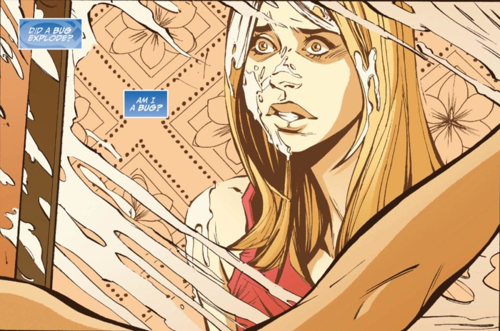
In the last two issues of Lois Lane, Perkins makes the intangible Multiverse real with his gorgeous spreads. Despite their sheer power at making your jaw drop, it’s nice they aren’t in these pages. We come back to the things that matter in this final chapter. We see the smirks and winks that make Renee and Elicia work. The grins from ear to ear on Alejandra’s children make your heart warm. And Lois Lane’s easygoing smile in the face of a world on fire is the face of what makes her and this series so incredible.

Lois Lane DC Comics Rucka

Coloring

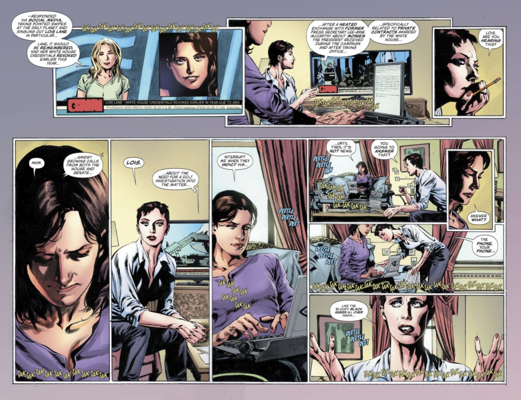
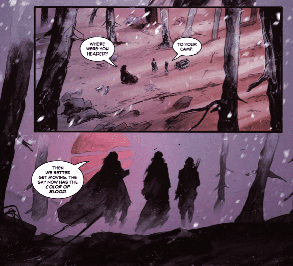
Troy finishes his sonata of colors in this issue. The palette warms up considerably, compared to the last couple issues. We get a sense of safety, a sense that the danger has passed, in the first few pages. But what’s so interesting, as has been all along, is Troy’s use of the color purple. Throughout this series this is a color Troy keeps coming back to. From Lois Lane herself, constantly garbed in purple and always a source of mystery, to his coloring of magic and the “other.”

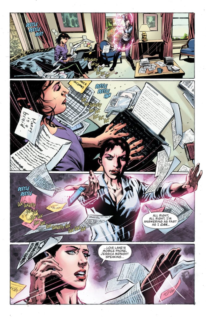
We see Troy continue to do that. Lois is in her purple top, Midnight uses purple magic to find a cellphone. Midnight gets on a call with Renee who is surrounded by a purple background. Troy’s use of the color hasn’t changed, but the characters’ reaction to it has. Lois, Renee and Midnight take it all in stride. The unknown has become the known, they are no longer afraid of what they don’t know. And so, with a simple recurrence of one color, Troy gives us a barometer of every character in this series. It’s amazing to see it all come full circle.

Lettering

Bowland’s rhythm and timing allow the smallest moments in this issue to speak volumes. Bowland sparsely letters much of the first part of the issue. In the place of dialogue, we instead get sound effects and action. But when we cut to the Daily Planet newsroom, this all changes. Word balloons overlap one another, as everyone in the everyday chaos of the bullpen is trying to be heard. Of course much of the dialogue goes over our heads. Snippets of stories we have no context for. But Bowland focuses us in on one set of word balloons, a thought train we follow panel to panel, by placing it in the middle of each panel. It’s just someone looking for their mechanical pencil, asking people if they’ve seen it.

Brilliantly, when Lois enters the bull pen for the first time in ages, all the dialogue disappears, except for a word balloon in small lettering of someone saying “… I gotta call you back…” Once Lois enters Perry’s office, it’s business as usual. And hilariously, Bowland shows us this by placing “Look can I just borrow a pen, then?” as the last thing we see on the page. It connects us to the wonderful mundanity of life, even on the heels of seemingly important moments.


There is so much to say about this issue and about this series from DC Comics. With the direction it was heading, this issue could have been such a letdown. But it wasn’t. It was a beautiful story about our connectedness, and our need to depend on one another. The introduction of the multiverse to this series retrospectively feels like Godzilla barging in on two people making love. It’s out of place and so much bigger and less intimate than the story being told. But this creative team didn’t allow it to steal enough focus to ruin anything.

So while there’s the briefest of moments where one reads this and says “huh?” we come back to an image of Clark and Lois holding hands. The creative team doesn’t allow the series to get derailed. We just hit a tiny speed bump. This is a gorgeous series, one of the best DC Comics has produced in the past ten years. And It’s certainly left us wanting more Lois Lane. LOIS LANE #12 is out from DC Comics July 7th!

Monkeys Fighting Robots Youtube

ADVENTUREMAN #2 is Fantastic and Mundane, All At Once

Adventureman Dodson Image Comics

Image Comics’ Adventureman #2, written by Matt Fraction, with pencils and colors by Terry Dodson, inks by Rachel Dodson and letters by Clayton Cowles, is a love letter to old superhero stories. But it’s also a love letter to everyday life. It invites us deeper into a world and a history that these characters already know well. Claire, a single mom who lives in New York and owns a bookstore, delves deeper into the city’s history. And she begins to wonder if the pulp-action stories she reads with her son at bedtime are more than stories. We are brilliantly left in the dark, yet every new detail that comes to light already feels familiar.

Writing

Fraction overloads these pages with captions, based off of Claire’s inner monologue. For any other comic, this would be a simple info dump. But Fraction balances humor and exposition tactfully, making the whole thing work. In captions, we get to see what Claire is thinking she should be saying. The humor comes from the fact that she rarely listens to her own inner monologue. She plays everything close to the chest, living in her own world, even though we know she feels she should share more. But her self-awareness is more than just funny. It gives us a trust in the character, shows us she knows the difference between a dumb and a smart move. Even if she tends to opt for the dumb one. It makes her likable, and so human.

Art

Rachel and Terry Dodson create a world in this issue. I mean, of course they do. That’s what a comic book is. But their real world base of New York City, with an added fantastical filter, is full of life. The issue opens with a few pages set in some kind of mythical purgatory. Filled with tentacles, skulls, and bugs, the Dodsons somehow make it look beautiful. Terrifying, but beautiful. And only a page later, they’re showing kids playing basketball, and buses pulling up to schools. Though we’re now focused on the mundane, it doesn’t stop feeling fantastical. The panels and framing make every page feel fun and playful. And a simple page of Claire on her scooter looks as cool and fun as any superhero flying through the air. The Dodsons don’t “talk down” to normal life. They make it seem just as fun and majestic as fighting monsters.

Coloring

In the same way that the art doesn’t talk down to normal life, Terry Dodson’s colors actually celebrate it. In fact, it’s the “super” scenes that Dodson gives a washed out color palette. Scenes of family dinners around the table are beautifully colored. Warm, inviting colors characterize these scenes. Whenever Claire finds herself tangled up in the mystery of long lost superheroes, the pages become monochromatic. While this shows us that a normal day in NYC is just as adventurous as any day with Adventureman, it also reminds us the heroes are gone. They are a thing of the past. The washed out colors look like faded photographs. We’ll have to wait and see if the colors warm back up if the heroes ever make a comeback.

Lettering

Cowles is not the man you hire if you just want to get the job done. He’s not going to slap a few letters up there so the characters are all saying what you told them to. Cowles is going to have fun with it. This issue is no exception. First, Baron Bizarre’s lines all get special treatment. Every word balloon is framed in tiny moth-like shapes. It’s as if the words sound like they’re rotting. And later, as Claire and Tommy discuss the book they’ve found, the lettering switches back and forth based on whether they’re reading. The lines that are read look like they’ve been typed, not handwritten. All Cowles needed to do was put quotation marks around these lines, which he did, but adding a change of lettering just looks so great. Cowles adds this little extra step just to make it fun.


Image Comics’ Adventureman is going to be a blast. The owner of a bookstore in NYC, finding out a book she found was written by who she thought were fictional superheroes. I mean, what’s not to love? This series has already hit its stride. Fraction, Dodson, Dodson and Cowles are a great team producing brilliant work. Pick up Adventureman #2, out from Image Comics on July 8th!

Monkeys Fighting Robots Youtube

Review: SUPERGIRL – BEING SUPER – Supergirl Done Right!

On July 7, 2020, DC Comics releases an updated edition of Mariko Tamaki and Joëlle Jones’s limited series Supergirl – Being Super. With Sandu Florea assisting Jones, Jeremy Lawson on colors, and lettering by Saida Temofonte, this story reimagines the origins of Supergirl as she struggles to find her place to belong while trapped between two worlds.

Writing

Supergirl can be a hard character to get right and keep right. Sometimes, she’s a pale shadow of her well-known cousin. Other times, her alien nature is emphasized over-against any human connections or attachments to Earth. Still other times, she begins with an already convoluted status quo that degenerates into the worst kind of comic book silliness. One thing all of these stories have in common, however, is that eventually Supergirl comes face to face with Superman. Which she does. Eventually. The Man of Steel is quite de-centered in this story (at one point I wondered if he even existed in this tale), which allows Kara to shine!

Tamaki’s strategy is to copy part of Clark’s upbringing while making it unique to Kara. She was discovered in a spaceship by two farmers in the town of Midvale, Kansas, but these are not the Kents. Her father is a gruff but compassionate country man, slightly wary of his daughter’s powers, who may ask for her help around the farm, but Kara is her own person. She is an athlete (who carefully controls how fast she runs track). She is Gen-Z, constantly on her phone with her friends. And she is given her own unique inner world. While some of the elements of her life rhyme with Clark Kent’s, they are not the same, and Kara is given a chance to shine as a fully realized character.

Tamaki also explores Kara’s relationship with Krypton. She is still an older child when she is sent away in a spacecraft by her parents, but she blocks the memories from her mind, which allows her to embrace humanity more than, say, the New 52 version of Supergirl. With her powers fluctuating throughout the series, readers eventually learn that LexCorp is performing experiments on her and another Kryptonian, Tan-On (who I thought might be Clark at first, in some sort of role reversal), who having suffered at the hands of humanity seeks revenge against them. This puts Kara at odds with her homeworld the person who symbolizes her homeworld. After establishing that, yes, Superman does indeed exist in this world, Kara seeks advice from this other strange visitor from another planet. The Supergirl origin arc is complete, although in a way that builds on Kara as a unique character and gives her agency.

Art

One of the joys of this collected series is seeing teenage Kara navigate high school life as someone with superpowers. And these moments are illustrated beautifully by Jones and Florea. Now, some of you may have always wondered, “Do Kryptonians get acne?” and even more importantly, “If they get acne, is it ‘super acne’ since they’re on Earth?” Well, wonder no more friends.

I am equal parts hilariously amused and grossed out by this panel. But it is representative of the humor and heart in this book.

This is the face of horrified teenage self-consciousness.

This is very much a coming of age tale that these panels capture, albeit in the most excessive of ways.

There are some more subtle moments that capture the coming of age angle of the story, like when Kara rescues Tan-On.

From the eye contact, to the bashful looking away, to the slightly curved up smile on Tan-On’s face, this scene made me think of a season one Buffy/Angel interaction on Buffy the Vampire Slayer (complete with the heel-turn from the older Kryptonian possible/forbidden love interest). Two lonely hearts, connecting with someone like themselves. As Kara says, “This feels like a dream,” but the dream soon becomes a nightmare.

Coloring

Lawson’s colors really play on the red, blue, and yellow of the Supergirl costume. As readers can tell in the images above, each page is saturated in either yellow or blue, with the red popping on page and providing an accent. It’s a credit to Lawson, Jones, and Florea that despite each page essentially being one color, that the shading of the blues and yellows creates enough nuance and differentiation to never be distracting. In fact, it looks quite good!

Lettering

I guess Kara is technically Gen-Z in this story (remember, Millennials are 40 now), and Temofonte’s lettering does a good job depicting the one-fourth of all social interactions that happen on Kara’s phone, complete with emojis and ellipses (for when you can tell the other person is typing). As the way we communicate changes, so should the way we depict communication (like texting), and this story works in those conversations seamlessly and makes them nuanced and meaningful.

Conclusion

Kara is a cool person in this story and a fully realized and compelling character. Tamaki and Jones give her a little bit of a Buffy vibe, and it works. I would love to see a follow-up that addresses the loose threads of this story, like Kara’s conversation with Superman and the dual threats of Tan-On and Lex Luthor. I do think there were a few pacing issues here and there, with the Tan-On story in some ways feeling like it might’ve taken a little long to get to and then accelerated a little too quickly, but overall, this was a very enjoyable tale, and could serve as a fresh entry point for new young adult comic readers.

What did you think of Supergirl – Being Super? Tell us in the comments below.

Monkeys Fighting Robots Youtube

Deep Dive With Artist Ryan Browne Of QUANTUM & WOODY

Deep Dive With Artist Ryan Browne Of QUANTUM & WOODY

Quantum & Woody #4 hits your local comic book shop on July 8, but thanks to Valiant Entertainment, Monkeys Fighting Robots was able to chat with the artist of the series, Ryan Browne.

Quantum & Woody is written by Christopher Hastings, with pencils & inks by Browne, Ruth Redmond handles colors, and you will read Hassan Otsmane-Elhaou letters. The series is fun, intense, and crazy.

About the final issue:
Home Alone, the boys are left to defend their lair against would-be bandits! What is Woody’s dark secret? The truth is finally revealed!

Deep Dive With Artist Ryan Browne Of QUANTUM & WOODY

Enjoy The Interview With Ryan Browne:

MFR: Ryan, thank you for taking the time to chat with me. The final issue of Quantum & Woody comes out this week, after a 3-month delay. What’s your emotional reaction going to be when you see it on the shelf at your local comic book shop (Challengers)?

BROWNE: Well, we are quarantining pretty hard in the Browne household–keeping my baby son Kirby safe–but when I make Challengers deliver the issue to my house it will be a fantastic thrill! So happy we got to finish the arc and that everyone gets to see the shocking cliff-hanger ending!

Deep Dive With Artist Ryan Browne Of QUANTUM & WOODY

MFR: Issue three had some fantastic action/reaction panels. Do you have a favorite panel or page from the series, and if so, why?

BROWNE: Thank you! I’m really proud of the acting I’ve drawn into the issue. The two characters really carry their personalities in their postures and gestures. I’m a fan of the drawing of Quantum at the end of issue 1 when he realizes that he’s just punched that evil kid in the face. Trying to show terror and regret on a face that wears a mask was no easy feat!

Deep Dive With Artist Ryan Browne Of QUANTUM & WOODY

MFR: The colors in Quantum & Woody hit extremes when the action happens, can you talk about Ruth Redmond’s color palette?

BROWNE: Oh! It’s so good. This issue has ghost energy, Woody blasts, and evil dude Kirby krackle all flying around in one big battle sequence. No easy feat for a colorist to handle all of those different glowy light sources, and Ruth crushed it! Having multiple light sources and still keeping the depth and focus is no easy feat!

Deep Dive With Artist Ryan Browne Of QUANTUM & WOODY

MFR: Quantum & Woody talk a lot! How do you balance panel design with all the back and forth banter?

BROWNE: Well, Hass is a master of lettering twisting tails of dialog–so he bails me out a lot. It’s always important to note which character speaks first in the panel before I draw it so I can have them on the left side of the panel. Then it’s just leaving lots of room for Hass to work his magic! Good lettering is no easy feat!

Deep Dive With Artist Ryan Browne Of QUANTUM & WOODY

MFR: The creator of Quantum & Woody, Christopher Priest drew inspiration from Woody Harrelson and Wesley Snipes in White Men Can’t Jump. Did this inspiration come over in your interpretation of the characters?

BROWNE: Not as much. I wanted to get sillier and more rubbery with Woody and give Quantum some stillness and weight. Woody can flop around clumsily, whereas Quantum is a well ground tank. Coming up with that was no easy feat!

Deep Dive With Artist Ryan Browne Of QUANTUM & WOODY

MFR: Your commission sketches are insane. What is the craziest commission sketch you’ve done, and can you share it with the readers?

BROWNE: Uh once someone asked for Bib Fortuna (I’m not looking up the correct spelling), and I drew her (I think?) riding Kaneda’s bike from Akira because I wanted to try and draw that bike! Once someone asked for Red Sonja and I drew her as a centaur complete with metal bikini bottoms on the horse end. My great, great ideas are no easy feat!


Ryan Browne ECCC

MFR: When Valiant Entertainment first approached you to work on Quantum & Woody, what part of the project got you most excited and did that come across in the four issues?

BROWNE: I was most excited to work with Chris Hastings. Dr. McNinja was popular around the same time God Hates Astronauts was gaining popularity, and I was always jealous of his great jokes and ideas. Also, I was excited to work for Valiant for a while. They had a great reputation, and they lived up to it for sure. Also, I’ve known Heather Antos for years, and I always love working for her, so I knew it’d be stress-free! Finding such a perfect job was no easy feat!


Deep Dive With Artist Ryan Browne Of QUANTUM & WOODY

MFR: The first time I met you 10+ years ago, your self-published book God Hates Astronauts cost $5 when Big Two books cost $3. You stated that it was a self-published book, and it cost more. What I remember most about that conversation was the other indie creators around us taking note (you could see the light bulb turn on). You knew the worth of your creation and demanded it (not in a bad way). Now, self-publishing comic books is booming, and readers are paying a boutique price to support creators. Do you think you were a trendsetter, and how do you think you influenced other self-published creators?

BROWNE: Hmm. I don’t know I was a trendsetter, but I certainly had to figure it out my own way. Lots of gimmicks and dumb merch kept comic shows manageable, and being at those artist alleys is really how I built my following. My comics seem to work best if I have a personal connection with the reader–which is something I know I used to really love about going to comic shows in the 90s and meeting creators. Before comic shows got so popular, meeting comic artists sure was an easy feat!


Deep Dive With Artist Ryan Browne Of QUANTUM & WOODY

MFR: The comic book industry is at crossroads here in 2020, what are your predictions regarding what the industry will look like in 2030?

BROWNE: Well, I think that collector energy will never go away even as digital comics become easier and cheaper. I still love ordering zines from creators and self-publishing myself. I think those personal DIY stuff will never go away or really change. No clue what will happen with mainstream, but Valiant has an amazing and dedicated fanbase, so I’m sure Quantum and Woody will be alive and Klanging.

MFR: Ryan, thank you again for your time and best of luck with your next project.

BROWNE: Sure thing. Answering these questions was no easy feat!


Again, the final issue of Quantum & Woody is out this week. You can read Cat Wyatt’s review of issue four here: The End of An Era In QUANTUM & WOODY #4

What Valiant books are you reading? Comment below with your thoughts.

Deep Dive With Artist Ryan Browne Of QUANTUM & WOODY

Monkeys Fighting Robots Youtube

Review: UNDISCOVERED COUNTRY VOL. 1 is Well-Honed Chaos

The tremendously talented all-star pair of writers in Scott Snyder and Charles Soule have come together to craft the completely bombastic and highly engaging  Undiscovered Country. Along with a massive visual team consisting of Giuseppe Camuncoli on layouts, pencils from Daniele Orlandini and Leonardo Marcello Grassi, and colors from Matt Wilson, this first volume containing the 6 issues that make up the “Destiny” story arc are a volley of meticulously crafted and completely insane comic issues. This is a highly engaging story with carefully woven threads, compelling characters, and utterly insane visuals. Equal parts  Mad Max, Escape From N.Y, Contagion, and  Saga, Undiscovered Country Vol.1 is among the most entertaining and original comics hitting shelves right now.

“Journey into the near future, and an unknown nation that was once the United States of America—a land that’s become shrouded in mystery after walling itself off from the rest of the world without explanation over thirty years ago. When a team seeking a cure for a global pandemic breaches U.S. borders, they quickly find themselves in a struggle to survive this strange and deadly lost continent!”

Writing & Plot

The major power in Undiscovered Country Vol. 1’s compelling direction is the combined strength of A-List writers Scott Snyder (Batman, American Vampire) and Charles Soule (Daredevil, Letter 44). The two former Swamp Thing writers utilize their combined strengths to craft a story that is rich in originality, character, and complexity but never feels overstuffed. The elements of political thriller, high-octane action, hard sci-fi, and well-constructed character drama are all due to Snyder and Soule’s meticulous process of weaving a narrative that includes a multitude of character stories, double-crosses, and high-concept plot details. This is a masterclass in what can be accomplished in a 6-issue volume without ever losing grip on pacing. The plot is told via the steadily unraveling mystery of what has become of the United States in the time since it has sealed, in combination with flashbacks and historical segues that all manage to be entertaining and fascinating. The presentation of both the plot and the character drama is paced out in perfectly manageable chunks of character interaction and illuminating story events. This volume does so much in terms of how it divulges the story, but it never loses itself in bulky exposition.

Admittedly, when I first saw that Snyder was a part of the project I was a bit worried. While his earlier works such as�� Batman: The Black Mirror,  his New 52 Batman run, and the early volumes of American Vampire are great carefully crafted series, some of his more recent material suffers from being overstuffed and inconsistently paced. Fortunately, Charles Soule is on hand to maintain this comic’s steady pace. Soule has a similar style to Snyder (probably why he was chosen to follow up Snyder’s Swamp Thing run), albeit he’s been notably more consistent in his stories’ quality. Regardless, Undiscovered Country is a series that throws a considerable amount of info at the reader, but it always manages to stay compelling thanks to its pacing and attention to character. The inclusion of the more bombastic and wild features such as the desert-roving mutant men, rolling fortresses, and flying sharks, take a Saga style approach – that is, just put it on the page and take it or leave it. While there is obviously mystery around why the U.S. suddenly looks like this, any explanation at this point is eschewed in favor of fleshing out other more pressing plot threads.

Art Direction

A series with such a complex net of interwoven plot threads and insane concepts needs not just a crack creative team, but a considerable amount of visual direction. As such, Undiscovered Country  Vol. 1 has issue layouts from Giuseppe Camuncoli, who has done a stellar job of constructing how this story visually flows. The shifting perspective in characters, as well as the frequent flashbacks elaborating on the plot, are handled in a smart visual manner that makes these sudden shifts a seamless reading experience. The art is handled by Daniele Orlandini and Leonardo Marcello Grassi (the former on issues 1-4, the letter on 4-6), and it never skips a beat in terms of creativity and detail. The designs of the various wastelanders and their steeds both mechanical and mutated animal are delightfully off-the-wall, and their attention to character detail is stellar. Every character looks wholly unique and their array of expressions makes them easy to interface with as a reader. Although the two artists switch duties just over halfway through this volume, their styles are so similar that the difference is hard to notice. Much of this is likely due to the outstanding coloring of Matt Wilson. His palette here ranges from the dusty browns that permeate the American wasteland to the super-vibrant neon colors that exude from land-sea creatures and the glowing appendages of their masters. The consistent and excellent colors unite the entire visual experience that matches the concise insanity of the script.

Undiscovered Country Vol. 1 is a carefully constructed, highly original, and completely insane 6-issue opening arc that is an absolute joy to behold. The plotting and script of Scott Snyder and Charles Soule is compelling for every page of every issue, and divulges its story through thoughtful character writing and well-earned revelations. The visual work of Giuseppe Camuncoli, Daniele Orlandini, Leonardo Marcello Grassi, and Matt Wilson is a fantastic quilt of creative panel layouts and consistently detailed artwork. Pick up the first volume of this insane romp from your local comic shop on July 8th!

Monkeys Fighting Robots Youtube

Review: DCEASED: Dead Planet #1 Debuts A Dynamic Justice League

DCeased: Dead Planet #1 cover

DCeased: Dead Planet #1 cover

In DCeased: Dead Planet #1, on sale July 7, writer Tom Taylor kicks off the spin-off to DC Comics’ horrifying zombie invasion story with an opening chapter that strikes a bittersweet balance between devastating loss and courageous perseverance. Taylor offers readers a heartfelt story that transcends its genre, though he still sprinkles plenty of frightening moments throughout the issue.

DCeased: Dead Planet #1

Writer: Tom Taylor

Pencils: Trevor Hairsine

Inks: Gigi Baldassini & Stefano Gaudiano

Colors: Rain Beredo

Letters: Saida Temofonte

From the first page, Taylor sets the scene: the heroes have lost everything, but they still have to keep living. The art team, led by the work of pencil Trevor Hairsine, opens the issue with an alarming collage that shows a zombified Batman, a decapitated Cyborg, and other similarly fallen heroes. The Dark Knight’s devilish grin is particularly disturbing, as it shows that all semblance of the hero we know is gone. This harsh, brief recap of DCeased makes it impossible to forget the series’ dire consequences, and it immediately draws the reader into the sequel; the heroes are already broken, so we’re eager to see how they carry on.

Justice League Dead Planet 2
Right away, Tom Taylor reminds us how far the heroes have fallen.

Though we see Cyborg’s head right away in the story, Taylor still clearly has big plans for Victor Stone. When Cyborg sends a distress signal to the new Justice League, he serves as the catalyst for the rest of the plot. The scene’s emotional impact is magnified by its terrifying effect on the reader. Hairsine shows Victor’s decapitated head left abandoned on the ground of the abandoned Earth. After a time jump, Cyborg’s head hasn’t moved an inch. Instead, Hairsine shows that weeds and moss have grown both around and on him. Cyborg’s implied misery is staggering; the man watched his friends turn to zombies and his world fall apart in every conceivable way . Now, for five years, he has been completely stationary and alone. Taylor leaves the reader to imagine Cyborg’s suffering, which leaves us feeling utterly unsettled.

Justice League Dead Planet 3
Cyborg’s suffering is unimaginable.

On a happier note, Taylor introduces a Justice League that will leave you begging for another spin-off. Led by Superman (Jonathan Kent,) this unconventional lineup features Batman (Damian Wayne), Green Lantern (Dinah Lance), and other roles filled by new faces under their respective costumes. All of the legacy heroes have been forced to grow up too fast, as Damian and Jonathan are both coping with the loss of their legendary fathers. As seen in series like Super Sons, the bond between Damian and Jonathan is always a fertile ground for narrative possibilities. Unfortunately, a heroic sacrifice at the end of the issue limits the room for further exploration in this series. Still, both men face the unenviable task of filling their fathers’ shoes. Their ability, or lack thereof, to do so will likely shape the story as a whole.

DCEased: Dead Planet #1 4
Cyborg holds the key to the mystery in DCeased: Dead Planet

The opening installment of this series appropriately revolves around Jonathan, who, as Superman, is the heart and soul of the Justice League. Two tear-jerking moments distinctly place Jonathan at the foreground. First, when the Justice League decides to answer Cyborg’s distress call, he discusses the matter with his mother, Lois Lane. She affectionately caresses Jonathan’s face and says, “Come straight back. We’ve lost enough, Superman.” Color artist Rain Beredo makes the moment visually striking, as he uses a white background to place even more importance on the characters. The implicit gravity of Lois calling her son Superman after Clark Kent sacrificed himself in DCeased demonstrates Taylor’s brilliant subtlety. This touch allows him to infuse a story about zombies with genuine tenderness. 

Whether you read every issue of DCeased or randomly decided to pick up this issue, Taylor presents a story that draws the reader in by including warm moments amidst profound horror. Additionally, a gutting cliffhanger leaves the reader already counting down the days until the next issue’s release.

What’d you think of DCeased: Dead Planet #1? Check out your local comic shop to see if you can pick it up there, or you can also shop online.

Monkeys Fighting Robots Youtube

Review: VLAD DRACUL #1 Contains The Sublime Beauty Of The Dracula Mythos

Vlad Dracul #1 Cover Credit: Scout Comics

Set during his second rule as Voivode of Wallachia, and just before his war against the Ottoman Empire, Vald Dracul #1 from Scout Comics traces the history of the historical figure often cited as the influence for the fictional vampire Count Dracula. At 64 pages long, the comic sets the scene and lays the foundations for what promises to be an intriguing and violent stomp through Romanian history.

This is a translation of the Italian comic Vlad, published by Feltrinelli, written by Italian novelist Matteo Strukul with artwork by fellow Italian Andrea Mutti. Mutti’s name will be much more familiar to comic book fans as he has worked on a number of comics for most of the American publishers.

The life of Vlad the Impaler, as he is more widely known, is not virgin territory for comics having been covered most recently in AfterShock Comics 2018 title Brothers Dracul. However, Strukul and Mutti bring a new take on the character and imbue it with their own European style.

Vlad Dracul #1
Vlad Dracul #1 Credit: Scout Comics

Legends Formed

Strukul’s story starts in the winter of 1456, high in the Transylvanian mountains. Katharina and her brother Istvan are confronted by a pack of hungry wolves and they ready themselves for a fight. In steps the majestic figure of Vlad Dracula, ruler of not only the state but the land itself.

The sister and brother are the reader’s entry point into Vlad’s life and the majority of the plot revolves around them to a certain degree, with Vlad at the centre. After this initial meeting Strukul leaps the plot forward five years to the start of Vlad’s rebellion against Sultan Mohammed II. This is where the writer begins to display the violence that surrounds the legend’s of Vlad. Assisting him is a ward like Istvan, who is shown to be knee deep in the bloody acts Vlad dictates.

Elsewhere, the reader learns what happened to Katharina, now the not-so secret lover of the Voivode. Jealousy and hatred drive a group of women to attack Katharina and turn the local populace against her. The treatment of Katharina is disturbing and Strukul does not hold back, making sure that the cruelty resonates from the page. This is in contrast to the actions of the men in the story, where there is more revelry in the violence and a sense of justification.

Strukul changes this as the story progresses and as the titular character is explored at a greater depth Vlad doesn’t become the hero his introduction implied. Vlad lives in a violent world surrounded by atrocities and injustices but he is also the instigator for some of these. His treatment of his wife, for example, is a stark contrast to his protective behaviour towards Katharina. The devotion and love is coupled with anger, cruelty and hate.

Vlad Dracul #1
Page from the original Vlad published by Feltrinelli

Artistic License

The historical accuracy of the story is perhaps questionable. The main events and actions are spoken of in many historical documents but the intimate, day to day lives of the characters are not so forthcoming. Any liberties Strukul may be taking with the historical facts are instantly forgiven, however, by the sheer beauty of the artwork.

Andrea Mutti creates a perfect setting for the story. His landscapes are gorgeous but also intimidating. The reader can almost feel the wind chill of the Transylvanian Mountains and the cold, inhospitable villages. This is wonderfully contrasted with the alluring warmth of the interiors, especially within Vlad’s home. It’s not difficult to see why Katharina and Istvan would devote themselves to this violent leader.

This extravagance and hypnotic beauty is the point of Mutti’s work. Through his depictions of places and people he gives the reader some understanding of the characters’ decisions. Vlad himself stands out on the page, his garish colored clothes almost drowning everyone else’s drabness. He is larger than life and draws his followers to him like moths to a flame.

Vlad Dracul #1
Vlad Dracul #1 Credit: Scout Comics

Fascination and Morbid Curiosity

There are very few characters to fall in love with in this comic but that doesn’t mean you won’t want to follow them to their inevitable end. Between them Strukul and Mutti have created an alluring world populated by a cast of intriguing characters. There is some clunky dialogue, and very cliched Captions, but letterer Joel Rodriguez does an amazing job of giving the characters their own voices. To some degree this helps to hide, or at least explain away, the cringey elements in a similar way that Interview With The Vampire is over romanticised because it is a tale told by the leading character who is an insufferable sentimentalist.

Mutti’s watercolor washes and sketchy art style heightens elements of the narrative and creates a sublime realism similar to contemporary Italian artist Rudolf Stingel’s landscapes. There is a connection between the audience and the image that involves an appreciation of the creative process; it’s evident within the paintings. Something similar is happening in Vlad Dracul. You are conscious that this is a fiction told in a comic format and the process of creating the artwork reflects the creation of a Man which, in turn, is central to the narrative.

This is an artistic reflection of history and an enjoyable one at that. It features an array of elements associated with the more classic Dracula mythos without actually addressing the link directly. There are no signs of vampirism or extended life in Vlad Dracul, instead it is a violent, historical drama. Fans of Brothers Dracul, or even Topps Comics 1993 publication Vlad the Impaler will definitely enjoy this new take on the character but so will fans of historical dramas and lovers of exciting art.

Monkeys Fighting Robots Youtube

COMMANDERS IN CRISIS Arrives In October From Steve Orlando And Davide Tinto

Commanders In Crisis, preview cover

Image Comics has announced a new on-going to arrive this October from creators Steve Orlando and Davide Tinto. COMMANDERS IN CRISIS follows a team of superheroes, brought together by a collapsed Multiverse, to solve a murder mystery on our world.

Steve Orlando’s success rate with DC characters. coupled with his fondness for Championship Wrestling, promises to fill this new series with unparalleled bombast and energy. Davide Tinto’s penchant for sharp lines and action-emphasizing perspective should make for action panels that are gorgeous and pulse-pounding.

You can read Image’s full press release below.

Are you looking forward to this series? Let us know what you think in the Comments section, and please share this post on social media using the links below.

NEW SERIES COMMANDERS IN CRISIS TAKES FLIGHT THIS OCTOBER FROM IMAGE COMICS

PORTLAND, Ore. 07/03/2020 — Fan favorite Steve Orlando (Wonder Woman, Doom Patrol: Milk Wars, Martian Manhunterteams up with Davide Tinto (Marvel Action: Spider-Man) for a superhero story unlike any other in the forthcoming Commanders in Crisis. This new ongoing series is produced by Arancia Studio—the Italian media company which worked on Mirka Andolfo’s bestselling Image Comics titles—and will launch from Image Comics this October.

Commanders in Crisis is all the energy and creativity I’ve served for the past five years, now completely unchained!” said Orlando. “No rules, no restraints, the type of strange and passionate ideas that brought me into the medium in the first place. Comics should be bold, comics should be big, and comics should be badass. This is my first freelance launch since 2015, and we’re taking a nuclear shot across the bow. No vanilla vengeance here! This is a fight for comics as they need to be.”

The last survivors of the Multiverse live among us under new, superheroic identities, five survivors of doomed worlds…taking a second chance to ensure our world lives on. A new twist on strange superhero comics, with a bleeding-edge eye on the modern moment, Commanders in Crisis follows in the footsteps of Doom Patrol and Thunderbolts as five unexpected heroes come together to solve a murder unlike any other. The victim? Compassion itself…This is ideacide!

Tinto added: “I am really happy about being onboard for Commanders In Crisis. Steve is a great guy and a fantastic writer and publishing with Image Comics, which put out Invincible, my favorite superhero comic, is a dream come true. I am very thankful for the opportunity.”

This intense, weird action thriller will remind readers of the importance of compassion and hope in the present moment—all while putting fists to faces along the way!

Commanders in Crisis #1 will be available at comic book shops on Wednesday, October 14.

Commanders in Crisis #1 will also be available for purchase across many digital platforms, including Amazon Kindle, Apple Books, comiXology, and Google Play.

Monkeys Fighting Robots Youtube

Face Your Fears: Revisiting INFIDEL During Our Time of Revolution

Collection Cover

Racism was woven into our cultural fabric before we would even call ourselves the United States. It’s woven into the red, white, and blue of our beloved flag. From Uncle Tom’s Cabin to I Am Not Your Negro, we’ve made attempts in our art to apologize for and otherwise contend with our country’s past. It’s difficult to strike a balance in messaging. If you lean too sentimental, you miss the point. Too violent and you risk re-traumatizing those who experience racism daily and feel the ripples of slavery. Infidel from Image Comics manages to strike the balance.

In the midst of our new revolution and artistic efforts to help an American audience unlearn racism, my thoughts turned to this 2018 graphic novel. Written by Pornsak Pichetshote and illustrated by Aaron Campbell, I first read this a few months ago.

Alert: If you haven’t  already read Infidel, here’s your SPOILER WARNING!

A Familiar Story

Infidel is a horror graphic novel originally released as a five-issue series by Image. It’s the story of a young Muslim woman named Aisha who is being haunted by the racist ghosts of explosion victims on the top floor of her apartment complex.

The haunting comes at a time when Aisha is dealing with tension between her white fiancé Tom and his mother Leslie, due to the older woman’s prejudice. Aisha is forgiving while Tom is not, putting her in an intermediary position and causing confusion for Tom’s young daughter, Kris. His bitterness and anger are shared by Aisha’s best friend Medina who, like Aisha, has lost her faith.

It turns out that this lack of faith is precisely what keeps Aisha around her fiancé’s family, and Medina’s story is ostensibly the same. Found family keeps these women alive. Tragically, the ghosts start to intensify these already strained relationships.

Despite an Atavan prescription, an investigation, and some exploration of the occult, nothing but another explosion can rid Aisha and her friends from these ghosts. Faith, a theme of the book, is also ineffective. Other than making a McGuffin out of Aisha’s misbaha (prayer beads), faith, like the occult elements, is weak in the face of the destructive power of racism, mental illness, and murder. As Medina says early in the book, “Racism’s a cancer that never gets cured. The best you get is remission.” Prescient words that resonate with current feelings of cynicism and weariness.

Medina doesn’t believe Leslie’s changed

An Unlikely Choice

Medina embodies this cynicism and weariness, making her an unlikely choice of heroine. And yet she must avenge Aisha who becomes comatose after a ghost-involved accident which also causes the death of Leslie and serious injury to Kris.

Medina does her best to continue Aisha’s interrupted investigation. However, once she does find out the truth, her attempt at vanquishing the occult demons fails. The misbaha that could have exorcised the ghost breaks. Thus, Medina is forced to blow up the apartment complex, setting us back into the vicious cycle of racist blame.

The violence in this particular portion of the book is hard to witness given its roots in reality. Medina’s a martyr, but a villain to the press in the aftermath. We’ve read it before. Here, what keeps the reader invested is the empathy we now feel for these women. We want to scream at the reporters, “Medina was a person! She had no choice!”

I’d argue that the violence was necessary for such an emotional payoff. Medina couldn’t write her own story just like other victims of racial violence.

Reaching Out

In the aftermath of the explosion, Aisha wakes from her coma. She’s been declared innocent in the death of Leslie. Her new pastel world gets juxtaposed with a conversation between two white developers as they assess the ruins of Aisha’s apartment complex. They joke about the tragedy, and one tries to convince the other that people can change if you give them a chance. He says, “You just have to have faith” as the ghosts resurface behind them. It’s a self-aware sentiment reminding us that expressions of faith are tantamount to indifference in our harsh world.

What saves this from turning into a completely bleak ending is the image of Aisha reaching for her mother’s hand with Kris’s drawings making up the background. The message here being that cultivating strong bonds across divides can heal our broken society.

Infidel‘s creators, especially in the final chapters, balance the violent and avoid the sentimental except where it may serve a broader point. Their healthy cynicism gives the story nuance, appealing to the jaded reader. The creators want us to feel empathy and anger by the end. Anger toward racism, empathy for the victims of it, and perhaps, the urgency needed to enact social change.

A Familiar Hate

The book was indeed very timely when it came out in 2018, responding to a rise in Islamophobic hate crimes in the U. S. That was also the year in which President Trump’s “Muslim ban” saw its day in court. Regardless, Infidel doesn’t comment on these things directly. It’s never preachy, and it doesn’t rely on the ghosts to scare the reader. Rather, it poignantly delivers on the fear that racism both creates and is based upon.

One example of this can be found in a short scene in which Leslie, while riding the subway, clutches her purse tight to herself because she sees a Black man nearby. Campbell’s hard lines and attention to facial expressions turn a subtle moment into suspense. Actions like hers chill the bones of anyone capable of empathy.

We may not see the nationwide change our protests hope to achieve by the of the year. There were three years between the 1916 Rising and War of Independence in Ireland, and then another sixteen years before the country became firmly established with a constitution. It was two years between the Emancipation Proclamation and Juneteenth when every slave finally saw freedom. Racism can’t be eradicated, but social and political change will come.

Pichetshote never intended Infidel to be prescriptive. As Campbell said in an interview, “we didn’t seek to answer these questions as much as try to simply just ask the questions.” As such, it’s a good place to start to unlearn racism. You may pose the same questions asked in the book and have those difficult conversations. It may also move you to act.

Monkeys Fighting Robots Youtube

Scaring is Caring: SOMETHING IS KILLING THE CHILDREN VOL. 1 Review

Growing up is scary. Fiction is replete with metaphors for adolescence. Horror especially has mined the depths of childhood psychology since before the genre was cool. As a result, us readers may think we’ve seen and read it all before. Something is Killing the Children Vol. 1 from Boom! Studios will convince you otherwise.

In a world that gave us Stranger Things and It, Something is Killing the Children appears to be riding a trend. The book features a shy teenage protagonist, a child-killing monster, and a police investigation, all standard tropes of the young adult sci-fi/horror genre. What sets SiKtC apart is its heroine and her intriguing subplot.

WARNING: SPOILERS AHEAD

Written by James Tynion IV and illustrated by Werther Dell’Edera, the book opens with a vignette in which a group of four boys play truth or dare. The game takes a turn when one of the boys doesn’t believe that James, our shy teenager, saw a monster outside his house.

We later learn that this monster is real and that it killed James’ friends. James was only spared because he tripped on a tree root and fell down the ravine where he claimed to have seen the monster. This convenient fall leads to James being questioned by police and accused of murder by his classmates.

The story proceeds realistically from there until we actually see the monster on page twenty-eight of issue one. At this point, James’ drama has dovetailed with the mission of Erica Slaughter, our mysterious heroine.

Erica Slaughter Hunting

Mysterious Heroine

Erica hunts monsters. Equipped with a flip phone, two machetes, and a bandanna with a Cheshire cat grin on it, Erica is a badass. Sure, her only friend seems to be an octopus toy that may or may not be possessed by a spirit. And so what if she’s a bit aloof sometimes? Erica does not embody any “strong woman” stereotypes. What sets Erica apart is her maternal nature toward James and other children, always comforting and sympathizing in the face of horror.

It’s as if Erica is the consoling older figure we all wish we had when we were kids afraid of the dark. She’s honest without being harsh, and always affirms James’ feelings. Despite being a reluctant and imperfect person, Slaughter is the perfect intermediary between two worlds.

In the world of SiKtC, only kids can see monsters, like a more twisted version of the Polar Express motif. Erica is the only exception to this rule. This, along with her phone calls with an unidentified employer and her fake ID made of paper, make her alluring to the reader and to James. He pressures her to let him tag along on her hunt for the monster that killed his friends and other children in the town of Archer’s Peak.

James is a stand-in for the author while Erica might be Tynion’s ideal heroine. As he said in an interview with CBR.com, “We kind of live in this world of horror day-to-day and a lot of times we want somebody to just show up who knows how to face the horror we don’t know how to face….” Erica and James make for an oddly matched yet perfect pair, adding moments of levity to a heavy horror about killing children.

That said, the story is still a horror. It’s gory and tragic. Shades of dark blue and black highlight the ominous tone and contrast the bright red viscera. Moody grays and browns steep the story in the dull colors of obsession that another character, Tommy, feels regarding the disappearance of his younger sister.

The Hunt

Tommy gets sucked into the hunt after a chance meeting with Erica at his place of work, cheekily called Applebeams. Erica reveals that she knows Tommy’s sister is missing, which sends the wrong message to Tommy. He now believes Erica is his sister’s murderer.

Tommy stalks our heroes to a cave and ends up getting in the way of Erica killing the monster. The well-meaning idiot accidentally shoots James, freaking out about the monster. But Erica manages to kill the monster, and Tommy takes James and a girl who managed to survive out of there.

Still, the hunt isn’t quite over. Volume 1 ends with a delicious twist you may have seen coming if you’ve seen the Alien films. Will James survive? Who is Erica talking to on that flip phone?

Something is Killing the Children delivers on story and art in ways television can’t. It twists our childhood fears while providing a comfort for them. No doubt the next set of issues will up the ante.

Monkeys Fighting Robots Youtube