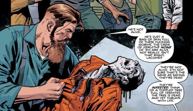
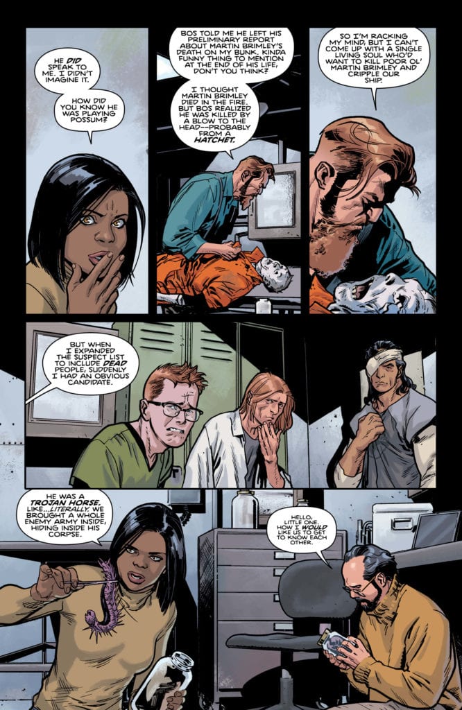
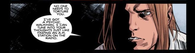
PLUNGE #5 hits comic book stores on Tuesday, July 28th, and it promises to give readers some answers. The team of divers have just learned the secret of the zombie-like crew from the Derelth, and it’s not for the faint of heart. They are actually dead, but extraterrestrial worms have taken over their corpses to further spread their kind.
Story
Once cracking open their books, readers are brought to a moment of tension—one in which the salvage crew must reckon with the plotting of these worm-like creatures. And surprisingly, they were able to hatch a plan that would have lead the crew to a locked hatch in the Derelth.
Though Gage Carpenter discovered this secret, it’s clear the crew has no idea how to unveil the creatures’ true intentions. That is until Russell Gage volunteers to use his psychic-fueled headphones to dive into their minds.
Unfortunately, the young diver finds more than he bargained for in the motive behind the worms. One that could alter the fate of the known world.
Joe Hill’s narrative is as startling as it is engaging. We’re drawn into the mystery of the worm creatures just as we’re repulsed by their goriness. The safety of our protagonists is at the forefront of most readers minds, but many of us can’t resist probing the depths of this extraterrestrial threat.
Artwork
Stuart Immonen’s penciling and ink work, David Stewart’s coloring, and Deron Bennett’s lettering added just the right flavor to compliment the narrative. The dark shading applied to each panels adds to its mysteriousness. Each of the zombie creatures’ forms are outlined by wavy lines in front of these shading backdrops, which helps them stand out more prominently. And the word balloons are placed in such a way as to guide the reader through each terrifying scene.
Conclusion
While PLUNGE #5 answered many questions, it also gave us dozens of new ones. How did these worms get to Earth? Why are they so interested in spreading their kind? We’re eager to find out.
What was the biggest surprise for you in this issue? Let us know in the comments below!
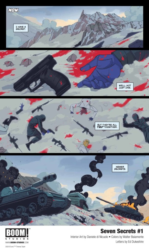
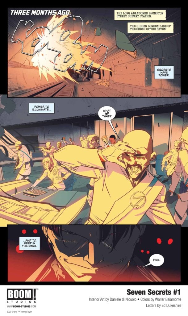
Writer Tom Taylor, artist Daniele Di Nicuolo, colorist Walter Baiamonte, and letterer Ed Dukeshire know how to keep more than seven secrets. In fact, in BOOM! Studios’ Seven Secrets #1pretty much everything is a secret. We don’t know who any of the characters are, what they’re fighting about, or what kind of world they inhabit. It’s madness. And it’s some of the best world-building in a first issue out there.
Writing
Taylor doesn’t treat his readers like they’re idiots. He doesn’t beat us over the head with who’s who and what’s what. We’re intrigued by what we don’t know, so Taylor doesn’t let us know much. Briefly, he slips into vague language that gets a little repetitive, talking about the nature of a secret. But that’s a small price for the truly secretive intro that Seven Secrets #1 is. Even the characters, and how they’re connected, become hard to read. But Taylor uses that. Characters in this world seem so callous and unloving that the slightest touch of familiarity speaks volumes. A passing joke, speaks of a deep connection, a simple apology points to a life bond. It’s going to be interesting to see if Taylor keeps his great wit in check, or if Caspar’s generation will be of a different kind than the stone-faced characters we’ve seen so far.
Art
It’s Di Nicuolo to whom we owe these stone faces. It doesn’t matter what is happening to these characters; they will not be moved. One character thinks he’s dying, but his face is simply serene. There’s no fear, no pain in his eyes. And when another character announces her pregnancy, she scowls. Seven Secrets exists in a world where people cannot show weakness. They can’t show happiness when they’re family is growing, or sadness when they face the great beyond. It’s for this reason that the moments of fear, the few tears, have great meaning. These characters have been told to never show emotion. When an emotion breaks through to the surface, and we see it on their face, we know it must be overpowering.
Coloring
Baiamonte’s colors cascade over every scene. It’s not just a matter of what are the right colors, but what is the overwhelming feeling in each moment. Baiamonte gives moments of danger a red film, explained by a light in the distance or a splattering of blood. He gives scenes filled with fear a yellow tint. Whether it’s the color of Sigurd’s hair or the tiles behind Eva, Baiamonte tells us they’re scared even if their faces don’t. Sigurd and Eva’s trial is shown in bright white. It speaks of the indifference their judges have for them and the cold, calculating atmosphere of the room. Baiamonte’s work on Seven Secrets is efficient, and his colors are all carefully chosen to tell us more about each scene.
Lettering
Dukeshire brings the fun and pizzazz to this issue. It’s what makes Seven Secrets feel like a comic book. But his use of bright yellow and white lettering, in big block letters, dwindles as the issue progresses. Sure, there’s less opportunity for sound effects in Eva and Sigur’s backstory, but even when we come back to the present chaos, Dukeshire is restrained. It takes away the fun for a second. And the silence is terrifying. As Amon and Sigur square off, we become nervous about what will break the silence. It’s the pause before the finale that makes us lean forward in our seats and bend our ears. It focuses us in on the conclusion and leaves us ready for the next issue.
BOOM! Studios’ Seven Secrets #1 is a feat in storytelling. It may occasionally get lost in the weeds of trying to fill pages with captions, but it never gets lost in exposition. Every new character is exactly that, new. We don’t need to know more; this creative team expects us to take each character as they are, and trust that we’ll know more when we need to. BOOM! Studios’ Seven Secrets is aptly named. It uses the best tool a writer has to get readers intrigued: secrets. Pick Seven Secrets #1 up from a comic book shop near you, out August 12th from BOOM! Studios!
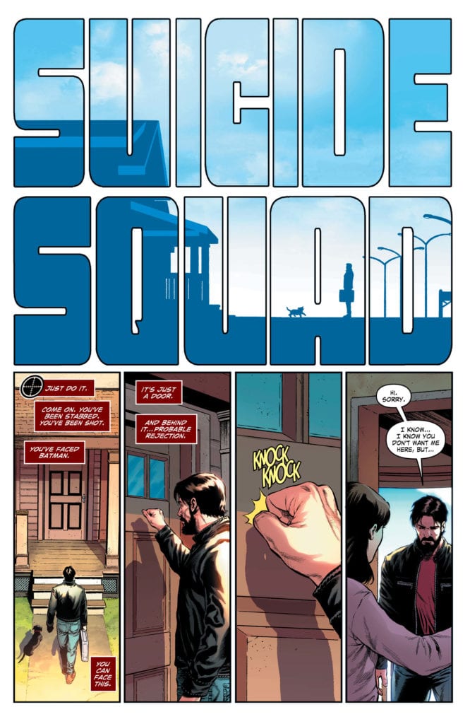
DC Comics’ Suicide Squad #7, written by Tom Taylor, with pencils by Daniel Sampere, inks by Juan Albarran, colors by Adriano Lucas and letters by Wes Abbott, is an issue that flips the series formula on its head. What has so far been a punchy, fast-moving, funny series, takes a little timeout to raise the stakes. This issue’s tone flies in the face of every issue so far, but still strikes a perfect balance.
Writing
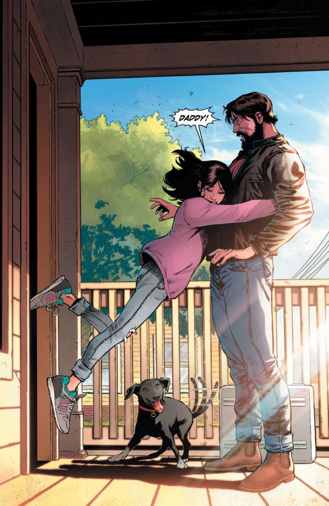
Taylor’s scripts are always pretty funny. Suicide Squad #7 still has some great jokes thrown in, but it’s not as raucous as a typical Taylor script. With Deadshot going home to see his wife and daughter, Taylor slows down the pace and allows things to get serious. It’s in this issue that we see how much Floyd loves his family. How scared he is of losing them. And even in the midst of all the fear, Taylor fills the most terrifying moments with hope. With Zoe being happy to see her father, and Michelle already back to teasing Floyd, Taylor provides a dream for Deadshot. We now know why we want Deadshot to survive this series. Floyd is no longer just “trying to get home.” His home now has a face and a name, and we want him to get back there as much as he does.
Art
There is always a feeling of whiplash when one artist takes the wheel from another in a series. But Sampere and Albarran give us a new layer to these characters. The Floyd Lawton that comes home to his family isn’t the one we saw in the last issue. He has lines on his face. He looks tired. So while it feels strange on some level that Redondo isn’t drawing this issue, the strangeness adds to the experience. It highlights the difference in their styles, and Sampere and Albarran’s version of the characters look a little more worn out. And a lot more pissed off. In most of the depictions of the Suicide Squad, we don’t see their eyes. It’s their eyebrows, knit in anger, that cast a shadow over their eyes. Sampere and Albarran’s Suicide Squad is out for blood.
Coloring
Lucas shows with his coloring that he wants Floyd Lawton to stay home. When Floyd is outside, it almost hurts your eyes to look at the page. Lucas’ depiction of the bright sunlight feels too real not to squint at. But when Floyd enters his house, we get the cool blues of the interior. It makes it feel safe, calm, and welcoming. We see this especially when contrasted with Deadshot leaving the house and being incapacitated by a bunch of soldiers. As he’s held against the ground, the light shines over him and into our eyes. The Suicide Squad enters the fray soon after, accompanied by a cooling in the colors. But as it gets mingled with a ray of sunshine, and later the glare of headlights, it leaves one wondering: is the Suicide Squad bringing the cool blues of safety or is this the beginning of Deadshot’s twilight?
Lettering
Abbott creates the tension in this issue. It’s all great that Floyd is back home, but will his family want to see him after all his years in the Suicide Squad? We see Floyd at the door of his home, waiting to have to give a defense. He wants to be back with his family, but he figures he’s got some explaining to do. The silence is palpable. The sound of him knocking on the door is dwarfed by his fist. His lettering is small, and even after his daughter has jumped into his arms, he doesn’t have much to say. His word balloons stay close to his face as if he’s scared to speak. This is what makes Floyd’s character so brilliant in this issue. Even when things seem to be going well, he’s used to pain, and he’s scared of screwing up. He loves his daughter and won’t say anything confidently until he’s sure he won’t hurt her.
DC Comics’ Suicide Squad #7 might be a change in pace, but it’s the perfect intro to Deadshot’s family life. We’re no longer talking in hypotheticals here. We know what Deadshot is risking every time he heads out with Task Force X. This quiet issue (for this series, there’s still plenty of fighting) brilliantly raises the stakes. Pick up DC Comics’ Suicide Squad #7 July 28th at a comic book shop near you!
It has been nearly five months since the penultimate issue of IDW Publishing’s Pandemica was released and in that time the real world has changed dramatically. Jonathan Maberry’s thriller about a manufactured, ethnic cleansing disease and the conspiracies behind it’s creation was a lot more fun when it started but the narrative has become much more uncomfortable.
Real world events have not escalated in the same manner as Maberry’s comic but the subjects and the themes behind his narrative have definitely become more relevant. A growing number of conspiracies have emerged regarding Covid-19 and various government’s handling of the pandemic. When world new is dominated by a deadly disease is there still a place for a comic like Pandemica?
Pandemica #5 Credit: IDW Publishing
Unsettling Fictions
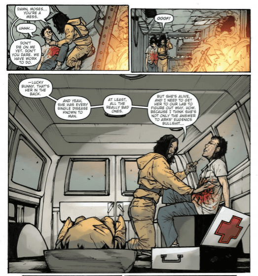
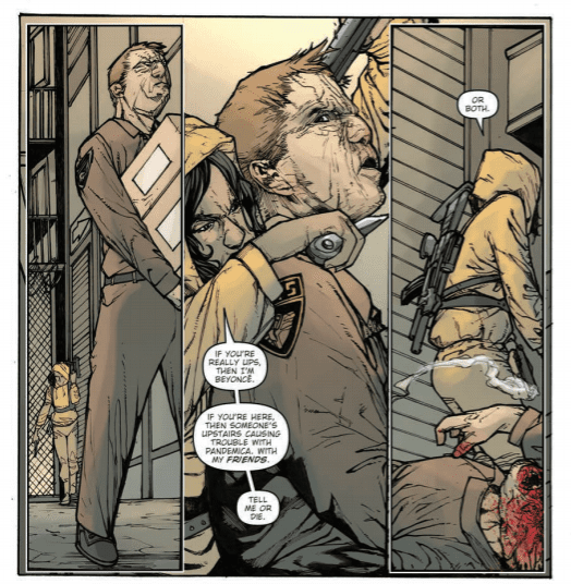
In the final part of Maberry’s story, De struggles to protect Mya, a child infected with all of the world’s worst diseases and also the potential saviour of humanity. She fights to stay alive and stay one step ahead of the conspiracy member’s while searching for the Lighthouse. The Lighthouse is a place of safety where a cure is being developed and is De’s ultimate goal.
From the start of this issue Maberry puts De on her path towards safety. He teases his central character, and the reader, with a morsel of hope. The insinuation that Mya is the saviour is constantly reiterated to increase the stakes. De isn’t just struggling to survive, she has a greater mission that Maberry wants the reader to understand. This is achieved by repeating over and over again the threat and the supposed solution.
This on the one hand does help to make De’s experience’s mean something significant. She has a purpose and a desired outcome which will benefit the world. A noble goal indeed. Unfortunately it hampers some of the storytelling. The constant requirement to have De in danger means that Maberry doesn’t have a chance to explore the characters very much. By this issue their intentions have been set out and they move through this issue like personality traits rather than characters with complex emotions. Maybe there is no need for that form of narrative this late in the day but the simplistic nature of the character’s motives make them two dimensional and sadly predictable.
The overall plot itself seems to take a step backwards in complexity from previous issues. Whether or not the recent events have affected the story-line, although it is doubtful, it seems that the focus shifting purely onto De takes away from the larger narrative. The morally corrupt people behind the spread of the disease become nothing more than hired guns to shoehorn in action sequences. The terrible effects of the disease and the social commentary created by it’s spread is barely mentioned, thus losing the impact that the story once had.
Pandemica #5 Credit: IDW Publishing
Rushed But Finished
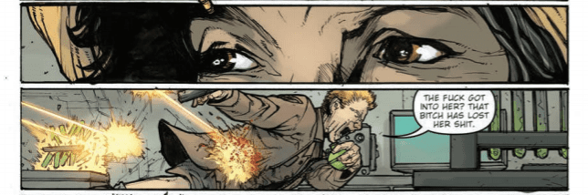
There are problems with the pacing of the narrative that effect the art production. Some of the pages feel as though Alex Sanchez wasn’t given enough space to allow the action to breath. Transitions between panels are cumbersome with more work required on the readers part than is necessary. On page two, for example, De moves to threaten a fake UPS guy, she issues her warning and then, instantly, he’s dead on the following panel. The insinuation is that he has imparted some information or resisted, however the panels play as if she issued the warning then instantly sliced open his throat. The moment is too fast and nothing is done in the artwork to slow it down.
Shawn Lee’s letters are a good guide for following the action. He creates a simple reading pattern, placing captions and speech balloons in an easy to follow string of letters. There is also a clear definition of De’s emotional states as she moves through the scenes. Lee places emphasis on her speech to express anger or fear, allowing the reader to have some insight into her reactions in certain scenes. Unfortunately, Lee’s lettering isn’t enough to fill the gaps lacking from other parts of the storytelling.
Jay Fotos gives the world of Pandemica a realistic atmosphere. His colors are muted and toned down. Across the page the scenery and characters blend together with a lot of murky colors giving the impression of a worn out environment. The notion of sickness, that is at the heart of the story, definitely is represented through Fotos’ work. Page after page, scene after scene, the most oppressive element of the comic is the coloring that wears the reader down.
Pandemica #5 Credit: IDW Publishing
Conclusion
There is a rushed feel to the narrative and the storytelling as a whole in the issue. Maberry has a number of plot threads to tie up and that compulsion not to leave anything hanging produces a by-the-book effect. This is ultimately neither satisfying nor rewarding.
Despite the ease of the narrative flow created by the lettering and the atmospheric nature of the coloring, this issue of Pandemica doesn’t draw the reader in. The gap of four months since the last issue doesn’t help as any attachment to the characters has dissipated. Without revisiting previous issues you will find yourself wondering what, if anything, there was to like about the cast.
The comic book industry has suffered in a number of different ways because of the pandemic that has shut down so much of the world. Pandemica as an idea should have stronger resonances with readers because, in part, the narrative deals with a lot of current real world issues. Unfortunately, the final issue is the weakest of the five and suffers more by having turned into an action/chase story instead of an investigation into the effects of a deadly disease.
As a conclusion it is rushed. Binge reading the series may induce a greater empathy for De and her struggles but for most this ending will come as a disappointment. The very end itself is nothing more than a ploy to make you think that something dramatic or exciting has happened when in actuality it’s a paint-by-numbers near apocalypse thriller. Lacking in emotional drive and any real spark of imagination, Pandemica feels outdated even before it is finished. Current circumstances will affect the way that you approach this material, and you will find it wanting, but even without the shut down of the world, Pandemica still does little to push it’s own narrative into new and exciting places.
After COVID-related delays, Marvel Comics was finally able to release X-Men/Fantastic Four #4 on July 22. Following up on a lingering thread from House of X #1, the series addressed the place of Franklin Richards in the new Krakoan society. Writer Chip Zdarsky, penciler Terry Dodson, Inkers Rachel Dodson, and Ranson Getty, color artist Laura Martin, and letterer VC’s Joe Caramagna bring the miniseries to a satisfying if unnerving, conclusion.
Writing
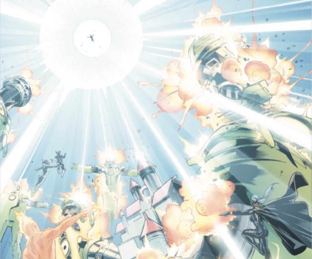
The X-Men and Fantastic Four are able to make short work of Doom’s sentinels (or “Latviathans” as he calls them…for some reason) thanks largely to Franklin Richards’ choice to sacrifice his chance to fix his powers in order to save the day.
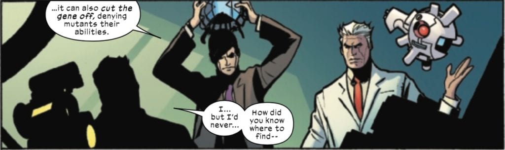
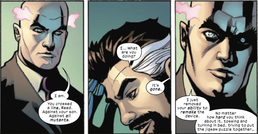
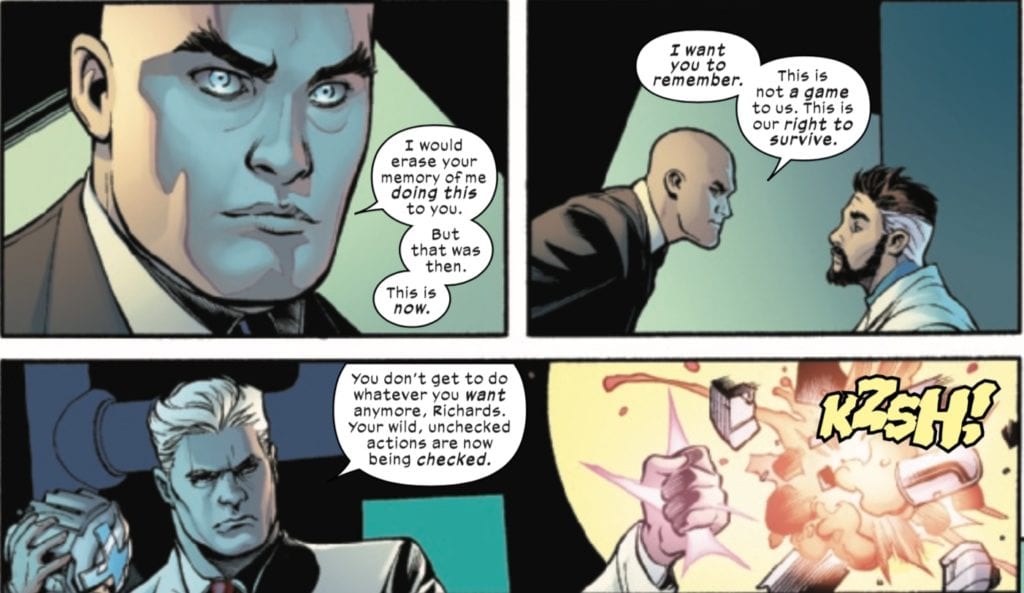
While a future threat from Dr. Doom is teased, the most unnerving part, and the true menace, comes at the end of the book, when Xavier and Magneto visit Reed. When Reed tries to apologize, Xavier and Magneto cut him short, telling him that his apologies are not enough. He has crossed a line. Xavier removes the knowledge of how to build the mutant gene suppression device from Reed’s mind and lets him know that unlike what he would’ve done in the past, he wants Reed to remember what Xavier did. There are no rules now, and Reed can’t just do whatever he wants anymore. He is told, “Welcome to the new world.”
While the Dr. Doom part of this story was fine enough, and I hope they follow it up, Doom’s involvement serves as something of a pretext for this story to happen to flesh out the conflict between the X-Men and the FF over Franklin’s fate. Also, thanks to Reed’s choice to invent a device to suppress his own son’s mutant gene, it brings Reed into conflict with Xavier and Magneto, further underlying the subtle menace that appears to be hiding just under the surface of Xavier’s attitude and actions in this new X-era. While his actions are those of a man who is fed up with the oppression of his people and are in that light understandable, something still feels off about him. Guess we’ll have to wait and see.
Art
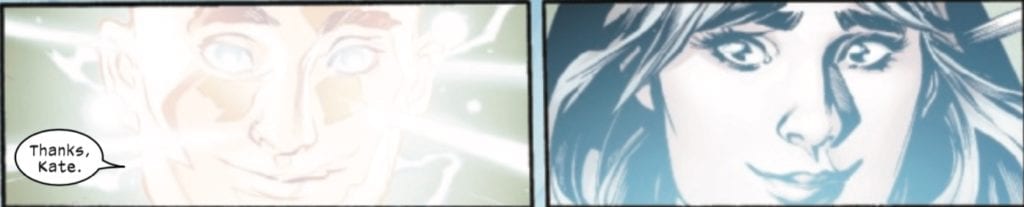
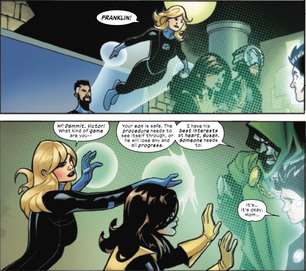
The art team does a great job in this issue, conveying both the powerful, larger than life moments and some of the more quiet character moments. In a scene that combines both, the art team does a great job of capturing one of the more hopeful moments of the issue, when Kate Pryde releases Franklin from Doom’s control, and Franklin unleashes on the “Latviathans.”
Kate had been recruited to gain Franklin’s trust because of a shared history. My fear had been that that relationship would get betrayed and tainted in this series, but I think this scene communicates the purity of the trust and the bond between these characters. And Franklin immediately puts that trust to good use!
One of the other character moments in the book is a bit more menacing. When Xavier takes off the helmet, you know it’s not going to be good.
There’s something a bit unsettling about a Xavier/Magneto team working with such harmony. Add to that the glassy-eyed way Xavier is drawn and the smug, indignant look on his face, and we are left with a Xavier that is much menacing, and one that maybe we should be afraid of.
Coloring
Martin’s colors are beautiful! I particularly like the way she captures the translucent nature of Franklin’s powers. There’s actually a lot of that type of coloring in this issue. The force field Doom places around himself and Franklin is also well-colored.
There’s a lot of subtle coloring in this panel. Not only do you have the force field and Franklin’s powers manifesting themselves, but the Invisible Woman’s force fields also have to be colored in as well. Martin captures all of these subtleties of powers and technology and makes them all stand out.
Lettering
The prose sections of these X-titles allow for an extra dose of creativity by the letterers. This issue is no exception. These prose sections don’t always simply provide exposition and information to the reader, but the form of the page can contribute to the story as well. In this case, the prose page shows Xavier’s mindwipe of Reed’s mutant suppression device via the mechanism of the prose section.
You can see how Caramagna portrays the erasure of the device from Reed’s mind, with the final page itself being blank. Caramagna should get credit here for how much his lettering contributes to the fleshing out of the final part of this issue.
Conclusion
So Franklin is now permitted to go to Krakoa, and the X-Men and the Fantastic Four are at peace again (minus a fairly significant mindwipe). It will be interesting to see how these two teams continue to interact moving forward and what future conflicts may arise over Franklin and his currently dwindling powers. Also, let’s not forget that Dr. Doom is still out there, and now has a chip on his shoulder against Krakoa as well. I don’t this is the last time we’ll see a heated engagement between Krakoa and Marvel’s First Family!
What did you think of the X-Men/Fantastic Four series? Tell us in the comments below!
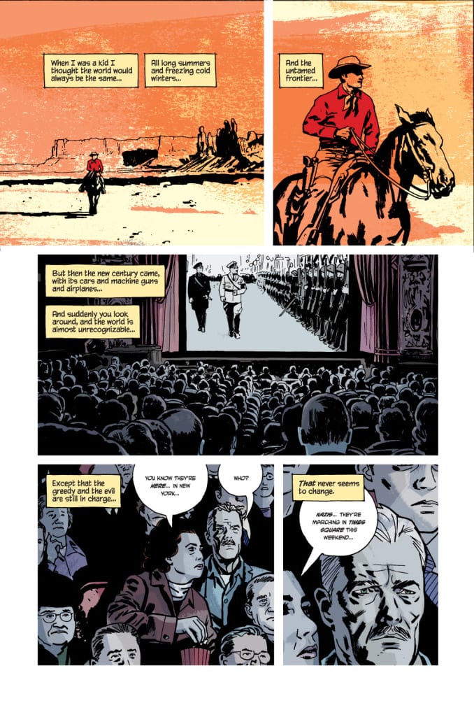
Written by Ed Brubaker with art and lettering by Sean Phillips and colors by Jacob Phillips, Image Comics’ Pulp is a fresh spin on a plot we’ve seen before. An old man, Max Winter, with his glory days behind him, is given one last shot to stand against injustice and possibly go out in a blaze of glory. It’s a familiar story. But this creative team makes it feel fresh by dialing back the action and romanticization, and allowing their main characters’ fears and dreams to take precedence.
Writing
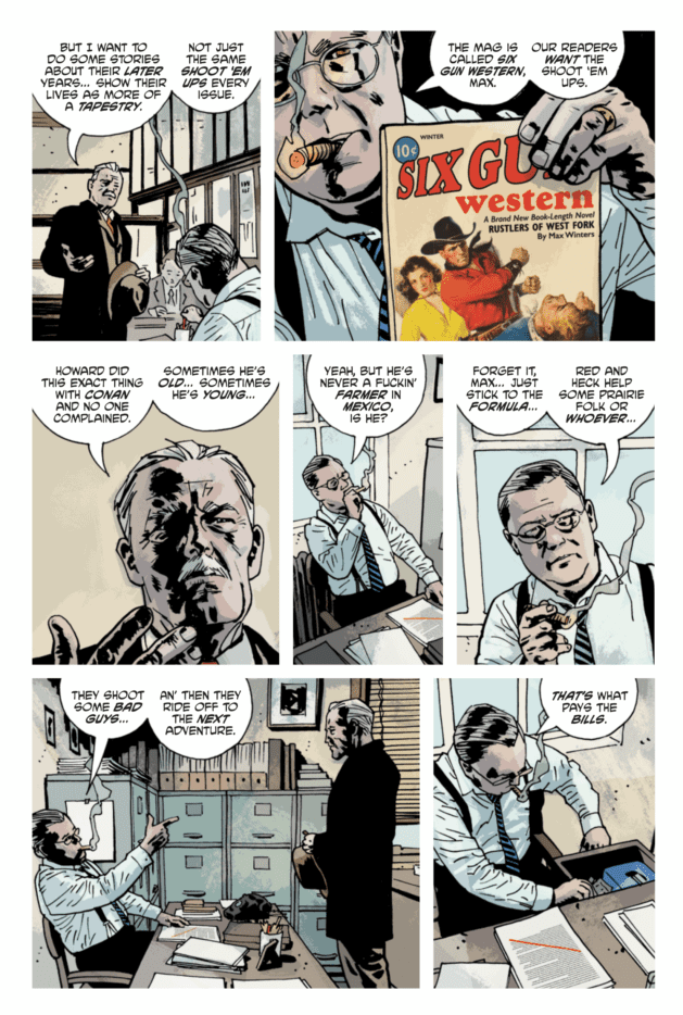
Under “understated” in the dictionary, there should be a note that says “see: Pulp.” It’s literally a comic about cowboys and nazis, yet it spends more time on Winter’s fear of old age and death. There’s a lot of text on every page of this comic, yet it feels quiet, because most of what is written is going on in Max’s head. He’s contemplating his place in the world and what he’s going to be leaving his wife when he’s gone. This could feel more like sitting down for a lecture than reading a comic, if Brubaker didn’t only tell us what we need to know to understand the character.
Revelations in this graphic novel have a habit of happening “off panel.” Max talks about his brother’s death almost nonchalantly, and the death isn’t even shown. We know Max had a wife and daughter, but it’s only ever inferred what happened to them. Max refuses to go into further detail, even in his own mind. His inability to revisit the details tells us more than any explanation about his wife and daughter could. Max even thinks to himself at one point, “I guess when you’ve lived this long, your silences can say as much as your words.” It’s Brubaker’s empathy for the character — his refusal to drag Max back through his painful past for the sake of exposition — that gives this graphic novel its understated brilliance.
Art
Sean Phillips doesn’t want the flashy action scenes to take center stage in this comic. They could. There are car chases, plenty of gun fights, a mugging — the list goes on. But these moments in the graphic novel seem to fly by. A simple conversation between Max and his editor takes up three full pages. A car chase is over in a page and a half. It’s because these moments aren’t the moments that make Max who he is. As much of a gun-slinging cowboy as he once was, it’s clear from the get go that he wants a quiet life. He writes an ending for the characters in his cowboy magazine where they ride off to Mexico and retire. We see the pain on his face as his editor slashes that part out of the script. He wants that for his characters because he wants it for himself.
We also see Max reminisce about the old days a lot. But the details are often foggy. Rarely are the faces of the characters in Max’s flashbacks given as much detail as the ones in Max’s present day life. And it’s even rarer in Max’s memories that we see Max or his partner Spike facing us. Their faces are obscured by shadow, or they’re looking in the other direction. It gives us distance. But we also see the moments that, for Max, still feel like they happened yesterday. Max remembers his brother being shot off his horse in vivid detail. He remembers seeing Spike, one last time, a man empty without adventure. We know that the real thing that makes Max feel so old, is that he’s outlived all the people closest to him.
Coloring
Jacob Phillips not only brings us into Max’s mindset, but creates an ode to old comics at the same time. Phillips colors Max’s flashbacks, which were introduced as stories from his Western Magazine, with two or three colors. It looks like something out of the Sunday paper, when colorists had four or five options to pick from. Phillips throws us back into the world of old comics, to show us how Max feels about reliving his past. The scenes may be colored simply, but they look breathtaking. So we see those memories as a time when things were simpler, but more beautiful for it.
Most of the rest of the graphic novel looks pretty bleak. Max is tired, and his world looks tired with him. But there are a few moments of sudden color. Rosa, Max’s wife, is always depicted in warm colors. In fact, every scene she’s in is colored with a warmer palette. We get the sense that she brightens every room she’s in. And there are a couple times that we see Max against a red background. It’s when he feels close to death, when he’s in danger that this happens. It’s fitting then that he wears red in all of his memories of being a cowboy. Max Winter was cloaked in death in those days, and maybe that’s what made him feel so alive.
With Pulp, Brubaker, Phillips and Phillips have given us Inglourious Basterds with the volume turned down. It’s an intimate revenge comic that somehow manages to feel deeply empathetic. Image Comics’ Pulp doesn’t want to get your heart racing with easy thrills. It wants you to contemplate the mark you leave on your world. It wants you to stop lusting after a life of adventure, and start working towards beautiful simplicity. Pulp is out July 29th from Image Comics, and it’s a must-read.
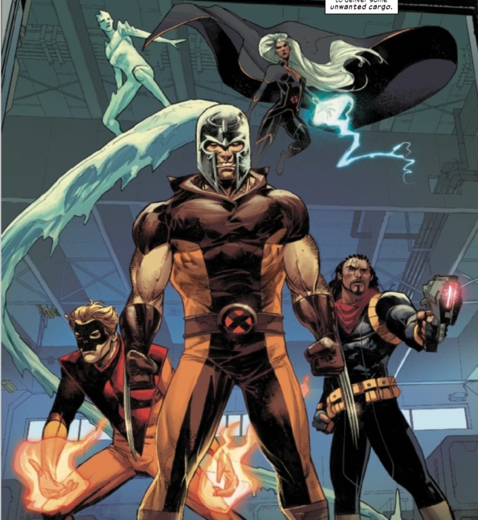
Marvel Comics released Wolverine #3 on July 22. Writer Benjamin Percy continues Wolverine’s search for the Flower Cartel and the Pale Girl, who caused him to turn on and kill his teammates. Joined by artist Adam Kubert, colorist Frank Martin, and letterer VC’s Cory Petit, Percy and company put together a very well-crafted issue, one that makes me excited for this series moving forward!
Writing
After the cliffhanger at the end of the last issue, we find out that all is not as it seems and that Wolverine’s situation isn’t as hopeless as it first appeared. We learn, via a series of flashbacks (including a humorous one involving Magneto), that Wolverine, far from having been caught off guard by the Pale Girl, has set his own trap.
With the help of Kid Omega, Iceman, Storm, Bishop, Pyro, and Magneto’s helmet (which shields the wearer from being affected by telepaths), Wolverine is able to infiltrate the Flower Cartel and confronts the Pale Girl. Oh, and Agent Bannister is actually still alive, too. That was a fake-out.
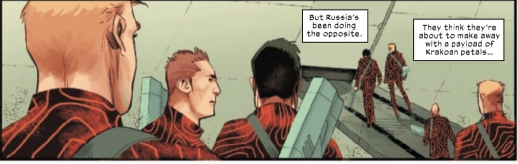
Percy does a number of interesting things in this issue, not the least of which is some not-quite-veiled criticism of Russia’s strong man tendencies in real life, reflected in this story by their opposition to mutant sovereignty and mutant freedom. Percy continues to plant seeds for the mystery of the Pale Girl’s identity, with Xavier, in one of the prose sections, describing the feeling of contacting her mind as “like Jean…but other.”
Finally, I have to admit to a bit of giddiness on seeing Wolverine step out of the ship with Magneto’s helmet on which his friends at his back. This is followed by an inner monologue by Wolverine, where he reflects on how his friends have “fixed him” in some sense. This, however, is immediately undermined by the Pale Girl’s comment to Logan that he thinks his friends are a strength, but they are in fact a weakness. Whether or not this is Percy setting up a future arc for Wolverine’s character that sees him leave Krakoa and strike out on his own, we’ll have to wait and see. Either way, it’s a very good juxtaposition, with the Pale Girl’s comments coming on the very next page after the end of Wolverine’s personal reflections
Art
I’ve already commented about this, but I want to double down on how cool I think this panel is.
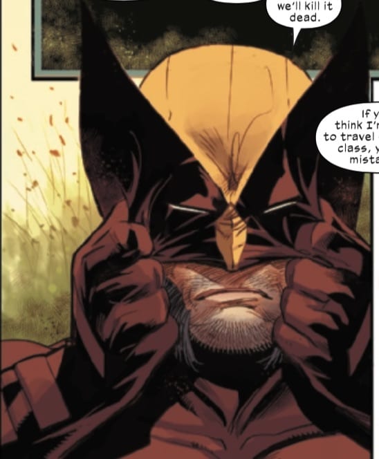
After seeing Wolverine get beat down so much over the last two issues, with issue #2 seeming to end with another defeat for Logan, it was nice to Logan have a triumphant moment, made all the more cool by him wearing Magneto’s helmet.
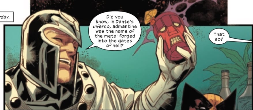
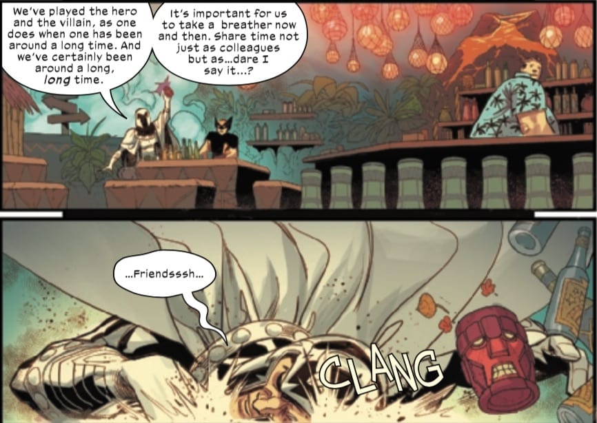
Speaking of Magneto, I’ve been enjoying seeing a more laid back version of the character both in his own giant-size issue and here.
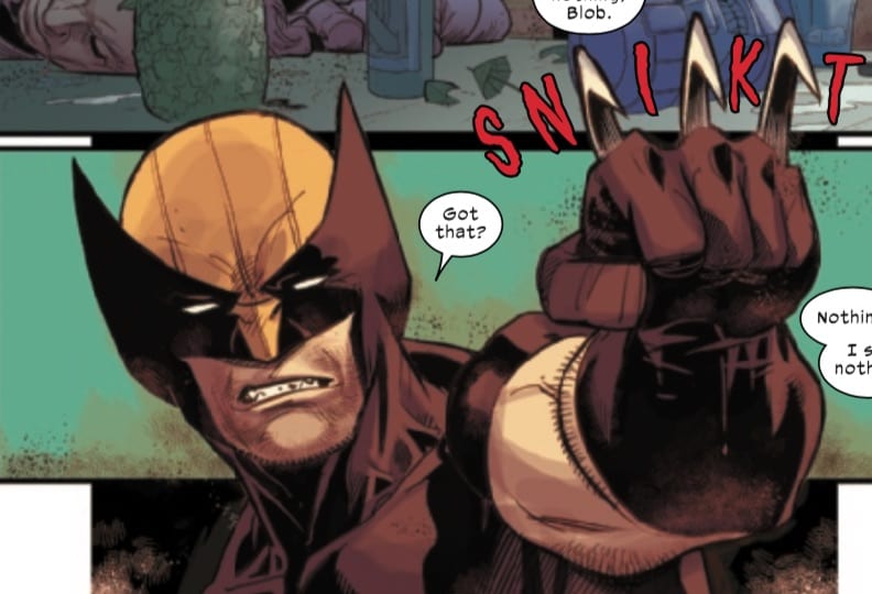
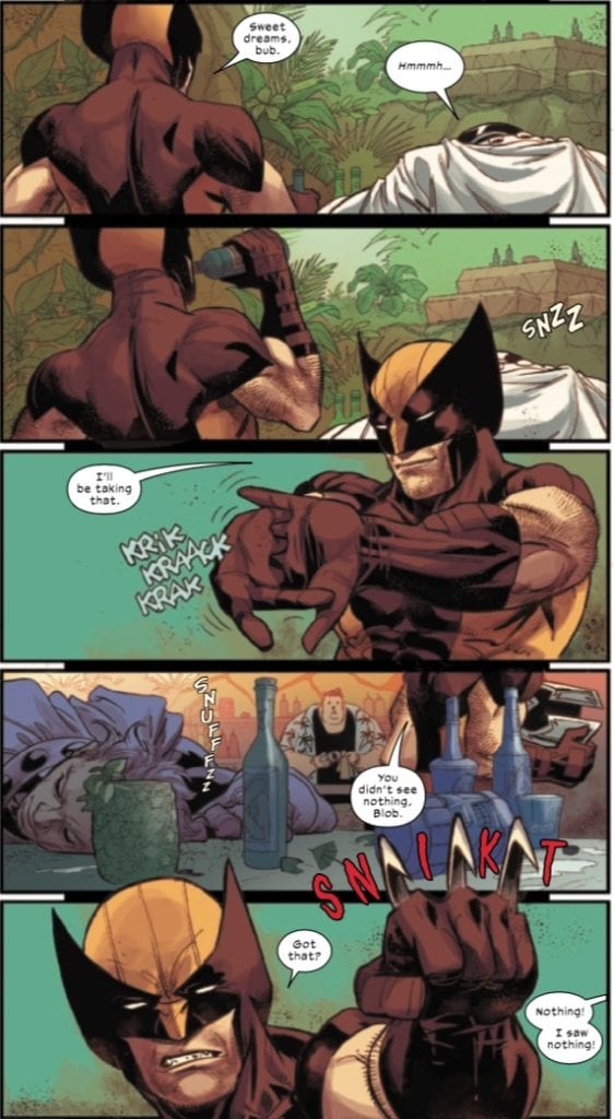
It seems like a jovial Magneto would be hard to pull off, but Kubert does it well here. Everything about these panels is great, from the sentinel-shaped mugs to the laid back drunk Magneto with Wolverine in the wings waiting for him to pass out.
This is one of my favorite scenes from this issue. It’s funny. It’s clever. And Kubert communicates it well.
I also think that Kubert does a great job with Logan’s mask.
The shading, symmetry, and texture of the mask is pitch perfect. Masks and cowls can be hard to draw, but I think Kubert nails it here (although I think the cover image is a little weird in terms of the eyes).
There are a few weird character designs, specifically Juggernaut’s face in a flashback, and again, Wolverine’s face on the cover, but this book is drawn very well on the whole.
Coloring
Martin’s colors are a boon to this story. In the images above, the speckled and grainy outlines and backgrounds around the characters give the comic just enough of a gritty, visceral feel (quite appropriate for a Wolverine comic!) without being over the top.
Also, in the image above with Wolverine and the X-Men, all of the characters’ colors pop, and Martin’s use of shading really makes for some beautiful character images. The characters have a very nice shine to them, which adds to the overall visual experience.
The Flower Cartel outfits are also colored very well.
These costumes are unique looking, and the blending of the red and the black, the way the colors bleed into each other, gives the impression that these outfits are coursing and swirling with energy. Again, good work by Martin.
Lettering
There is an entire page in this book that makes me appreciate Petit’s lettering. Again, I return to my favorite scene from this issue.
So much of this scene works because of the various sound effects and background noises that Petit letters, from Magneto’s snoring to Wolverine cracking his knuckles.
A nice additional touch is Wolverine’s trademark “snikt” being drawn between his claws as he pops them and threatens Blob to keep quiet.
So much of the story revolves around this opening scene, and Petit’s lettering is part of what makes it work so well.
Conclusion
This is my favorite issue of the new Wolverine series so far. It’s nice to see this first arc resolve while setting up future mysteries and personal questions for Logan moving forward. It’ll be interesting to see how the question of the Pale Girl’s identity resolves. I’m definitely intrigued given some of the revelations in the prose sections of this issue. I am also looking forward to seeing the relationship between Logan and Agent Bannister develop in future issues.
What did you think of Wolverine #3? Tell us in the comments below!
On July 22, Marvel Comics released New Mutants #11. Writer Ed Brisson wraps up his arc with the nightmare-causing mutant in Carnelia (her name is Cosmar, btw), addressing the fallout from the New Mutant’s experiences in the nightmare sphere while setting up a confrontation with the anti-mutant blog DOX. Brisson is joined by artist Flaviano, colorist Carlos Lopez, and letterer VC’s Travis Lanham.
Writing
I complained in my review of the last issue that the writing was…let’s say a tad bit dialogue-heavy. I’m happy to say that this issue corrects that problem. Where the last issue over-relied on dialogue and some at-times heavy-handed exposition, this issue brings the nightmare arc in Carnelia to a conclusion, and while it doesn’t necessarily do so in a high-octane way, it does so through character moments and by focusing on the drama of mutants being misunderstood by a world that hates and fears them.
I’ve been noticing a trend lately for Magik to feature in a lot of the X-titles I’m reading, and even some non-X-titles like Strange Academy. She has a very cool, dramatic moment in this book that shows off what a badass she can be. Magik is a cool character, but I imagine her many appearances of late might be an attempt to boost her profile when for when The New Mutants movie comes out…whenever that is.
One casualty of this mission was Armor, who after seeing her dead family in the nightmare orb, is left with a lot of emotional damage that I’m sure will play out over the next few issues.
Art & Colors
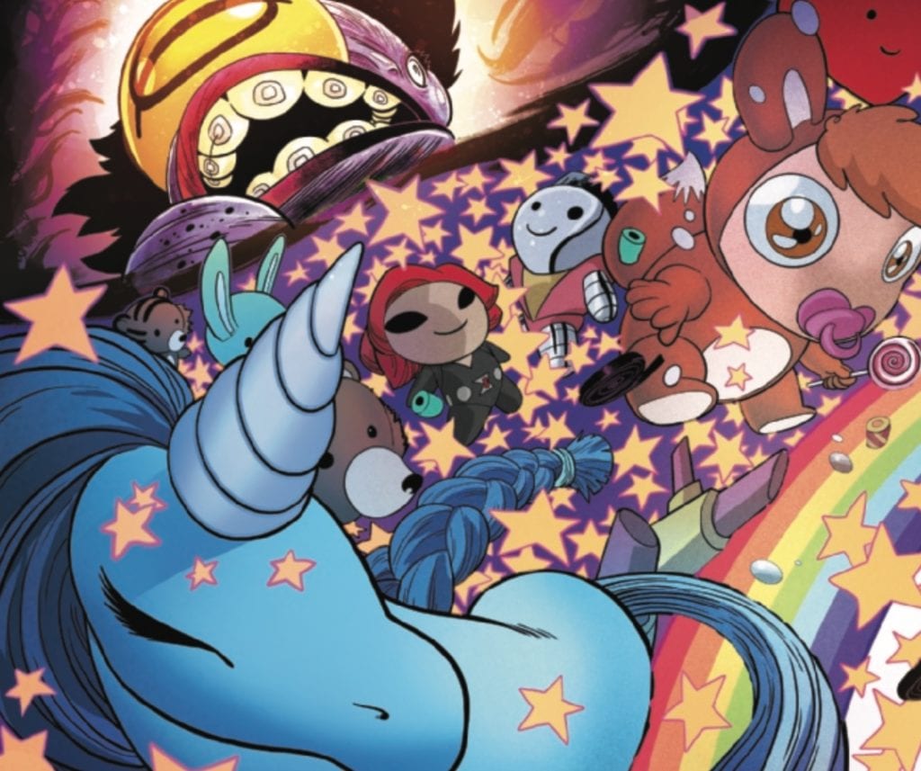
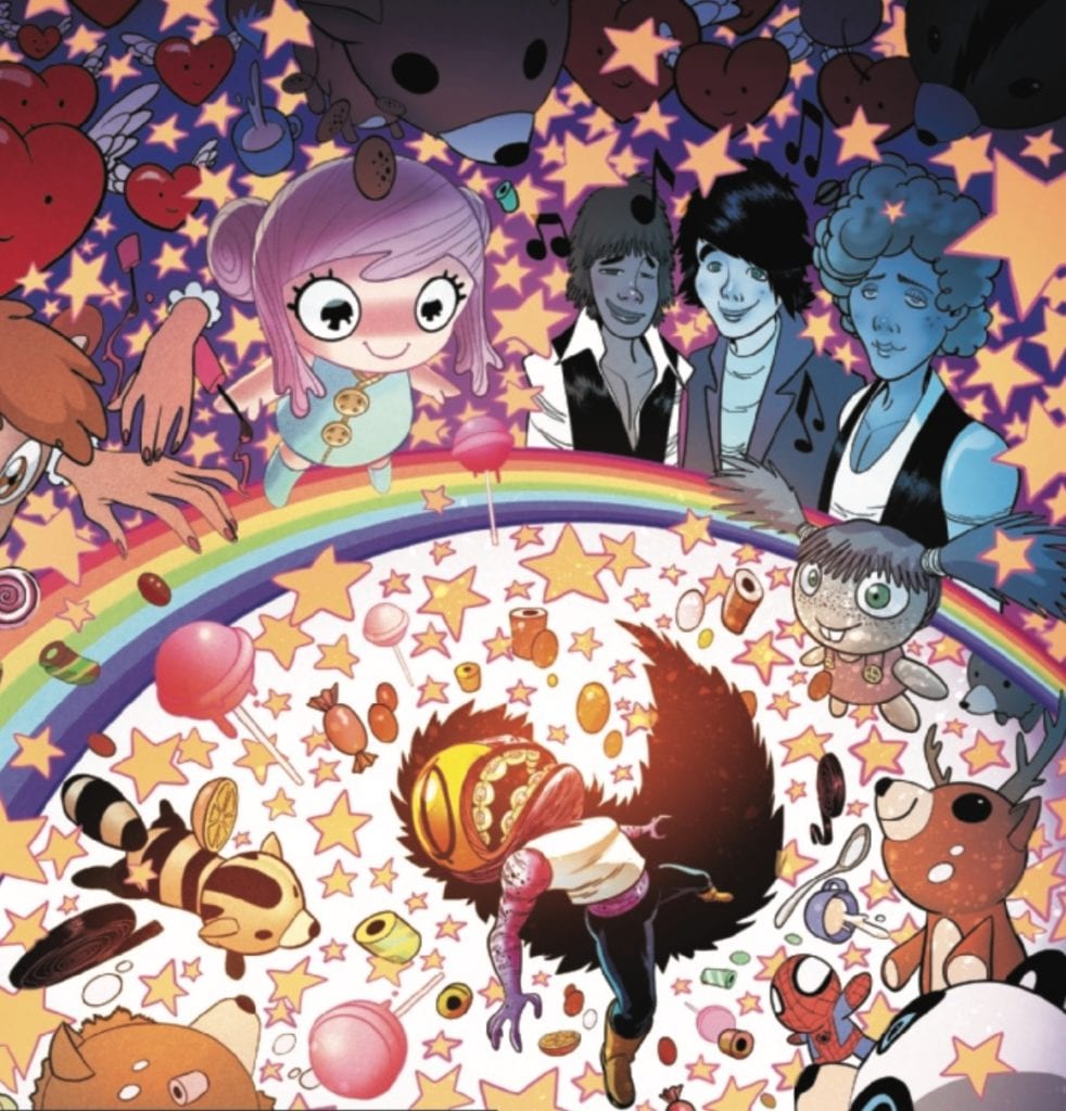
Flaviano and Lopez create some really beautiful panels in this title, particularly when Wild Side turns Cosmar’s nightmares into happy dreams.
Some might argue that the overly smiley stuffed animals are more creepy than the nightmare creatures ever were. Nevertheless, the move from the dark and grotesque to the bright, rainbow colors is quite a creative interpretation of this shift in Cosmar’s dreams.
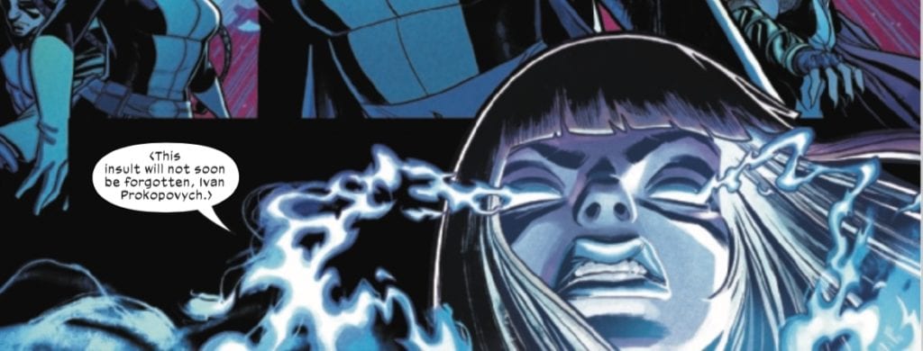
I already mentioned Magik’s badassery in this issue. When the New Mutants bring Cosmar’s threat to an end, the leader of Carnelia turns on them and forces them to surrender, but then Magik shows up.
Not only is her appearance in this issue super cool (I was getting worried for the New Mutants for a second), but I love that menacing look that Flaviano and Lopez give her.
In a world controlled by media sound bites and spin (a problem that the New Mutants are set up to address moving forward), I love how triumphant Magik looks here and how she speaks truth to power without giving a f*%$!
Lettering
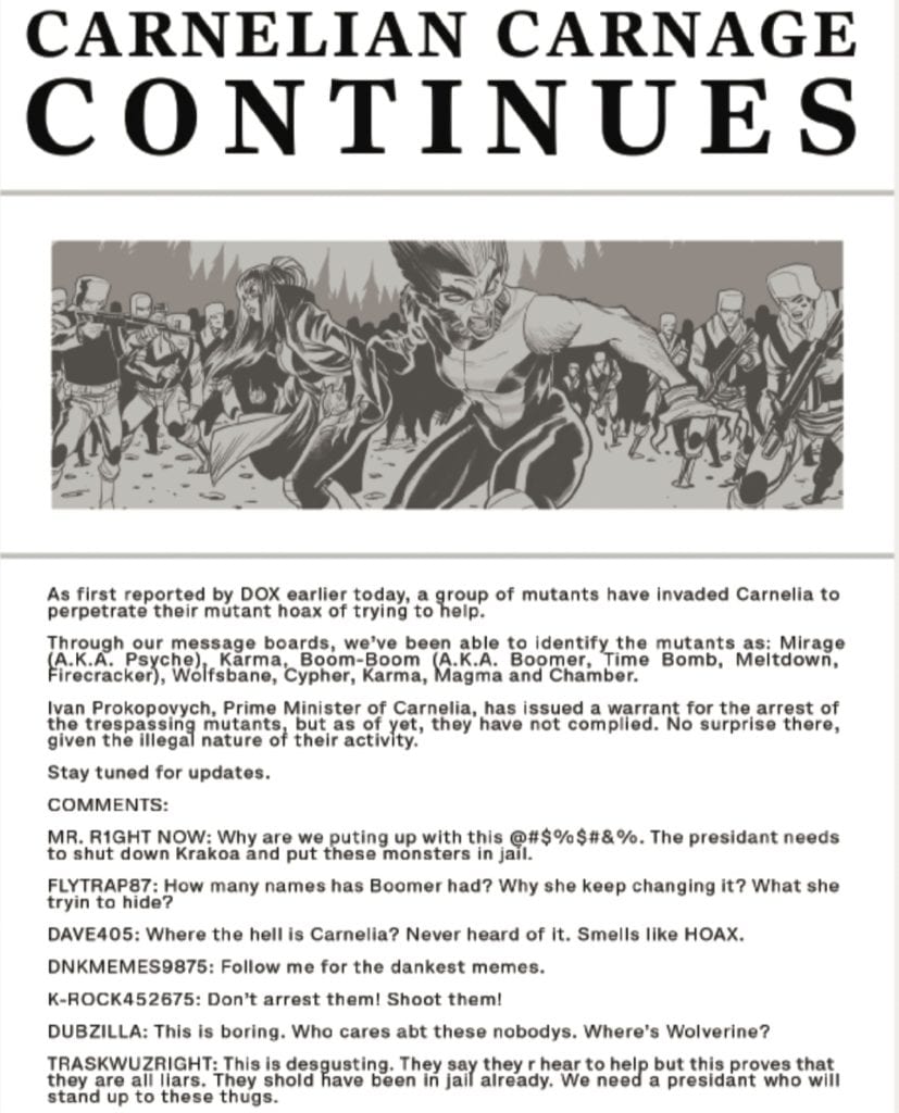
One thing we learn about in this issue is that an anti-mutant blog site, DOX, is responsible for stirring up anti-mutant sentiment and for cyber-bullying/stalking mutants by posting their home addresses and monitoring activity at the Krakoan gates. This is how the cartel found Beak, Angel, and their family in previous issues. In light of the Carnelia incident, DOX is at it again.
Some of these prose pieces in the X-titles have been a bit much at times (as I’ve noted here). Although this page is text-heavy, I think it supplements the story well by showing a glimpse of the anti-mutant, InfoWars style website that’s spouting anti-mutant misinformation, hysteria, and conspiracy theories. Lanham’s lettering for this page is excellent and reminds me of a few unpleasant encounters on internet message boards and comment sections. I wonder if the New Mutants are also fighting an inner voice that’s telling them, “Someone on the internet is wrong. I must correct them!”
Conclusion
Despite some of my criticism of issue #10, I still think New Mutants is a good title, although I still wonder if the cast of characters should be split into two books (again, I’m rooting for a Generation X title, no matter how anachronistic that name would be now. Generation Z maybe?). It will be interesting to say how the book handles the group’s mistakes and missteps moving forward as well as their upcoming clash with social media.
What did you think of New Mutants #11? Tell us in the comments below!
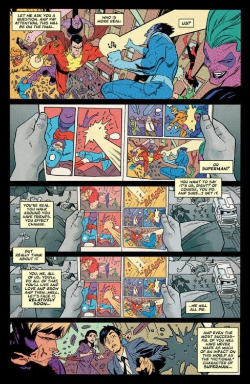
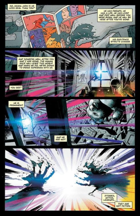
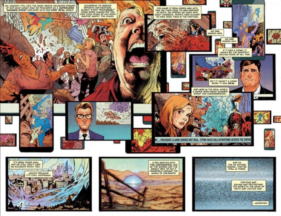
Image Comics has announced they’re bringing the God Country band back together. Donny Cates (Venom, Thor), Geoff Shaw (Thanos Wins), Dee Cunniffe (Redneck), and John J. Hill will be reuniting for a “genre-defying series” titled Crossover.
Says Image of the enigmatic new title: “What if a comic book summer event generated so much energy, broke down so many barriers, and upended so many expectations that the sheer critical mass of the moment blew open a portal into our world? ”
You can read all about it in the official Image press release below, as well as check out some very colorful preview images.
This certainly sounds like a creative experiment. Are you interested in picking up this comic? Let us know what you think in the Comments section, and please share this post on social media using the links below.
GOD COUNTRY CREATIVE TEAM REUNITES FOR THE MOST EXPLOSIVE COMIC BOOK EVENT OF THE YEAR IN NEW SERIES CROSSOVER
PORTLAND, Ore. 07/24/2020 — Image Comics is pleased to announce that powerhouse creative team Donny Cates (Venom, Thor), Geoff Shaw (Thanos Wins), Dee Cunniffe (Redneck), and John J. Hill (Nailbiter) have reunited since their breakout hits God Country and Redneck, for an all-new, genre-defying series, Crossover. This mind bending, ongoing series will take the best of comic book launch events and up the dose of energy and shock value to the next level in November.
What if a comic book summer event generated so much energy, broke down so many barriers, and upended so many expectations that the sheer critical mass of the moment blew open a portal into our world? Imagine if everything you thought was fantasy…was real. Now join us on an epic quest through a world where reality is dead… and anything is possible…
Crossover #1 will take comic book shops by storm in November 2020.
Crossover #1 will also be available for purchase across many digital platforms, including Amazon Kindle, Apple Books, comiXology, and Google Play.
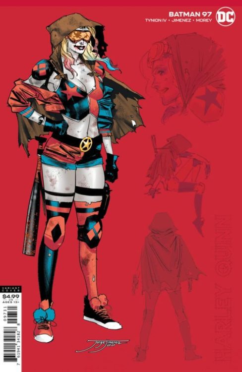
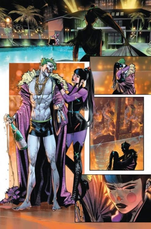
DC Comics might want to consider nicknaming 2020 the year of the Joker. Following on the success of the first two issues, DC is getting ready to ship part three of The Joker War to retailers on August 18th.
Written by James Tynion IV and illustrated by Jorge Jimenez, DC describes the issue: “The Joker’s army is growing hour by hour, with weapons beyond anything the Clown Prince of Crime has ever used before.” You can read the full description in DC full press release below, as well as check out a few preview pages.
Can’t get enough Joker? Let us know what you think about this preview in the Comments section, and please share this post on social media using the links below.
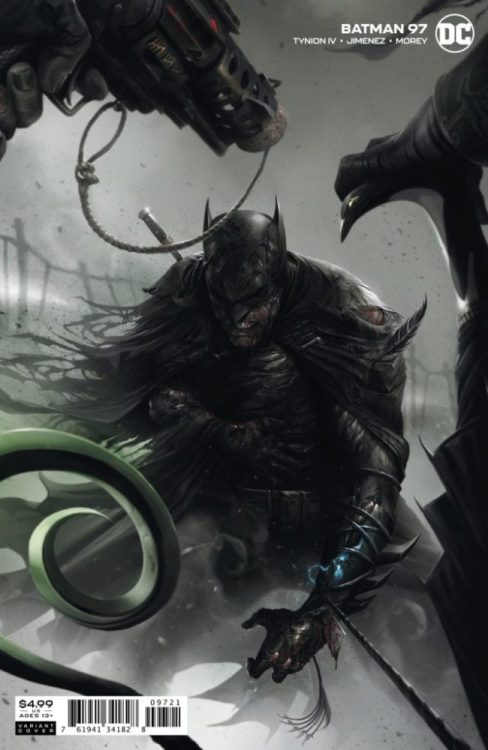
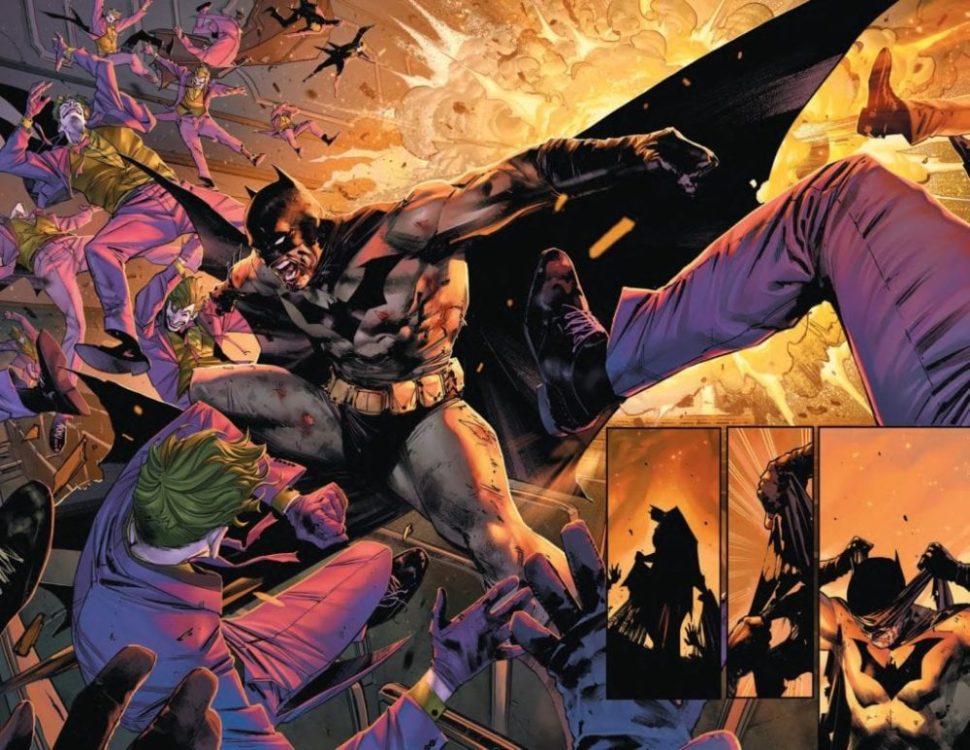
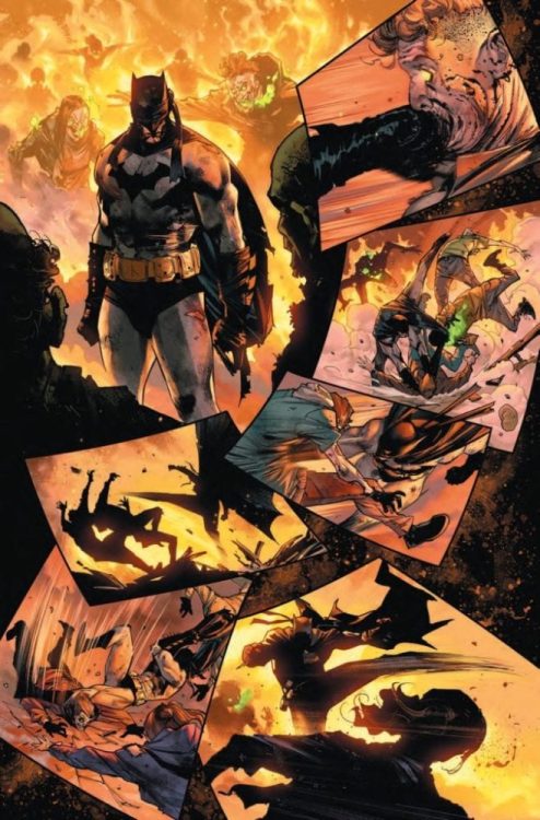
The war for the fate of Gotham City continues between the Clown Prince of Crime and the Dark Knight and his allies! Here’s a look at some incredible pages from Batman #97 (The Joker War, Part Three), by Jorge Jimenez and Tomeu Morey!
The Joker’s army is growing hour by hour, with weapons beyond anything the Clown Prince of Crime has ever used before. Batman must hold his mind together so he can strike the final blow and take back his city – but how can he heal the rifts he’s created in his life to get the help he needs? And while all this is happening, the villains of Gotham City are waiting out the carnage that Joker has unleashed, and Catwoman assembles and army of her own!
Batman #97
Written by James Tynion IV
Art by Jorge Jimenez
Cover by Guillem March
Card stock variant cover by Francesco Mattina
1:25 Harley Quinn card stock variant cover by Jorge Jimenez


 Thor), Geoff Shaw (Thanos Wins), Dee Cunniffe (Redneck), and John J. Hill (Nailbiter) have reunited since their breakout hits God Country and Redneck, for an all-new, genre-defying series, Crossover. This mind bending, ongoing series will take the best of comic book launch events and up the dose of energy and shock value to the next level in November.