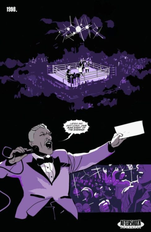
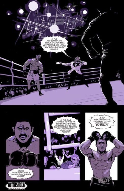
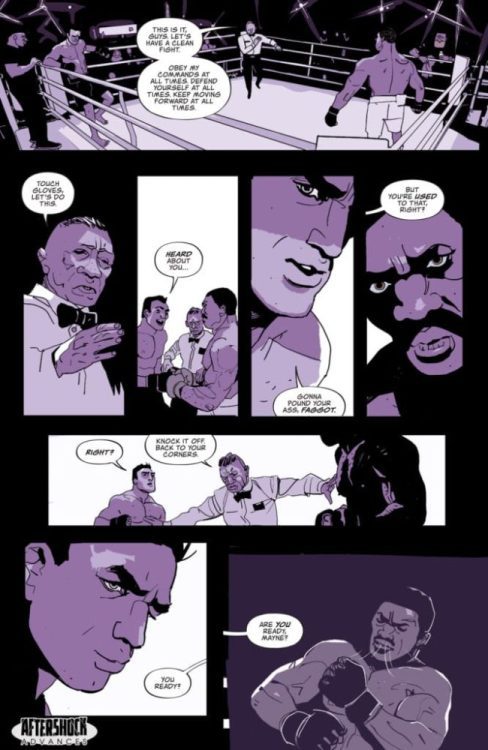
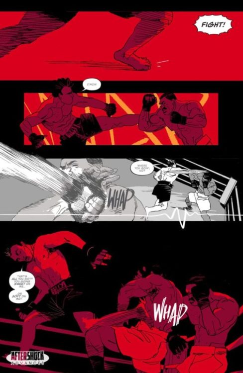
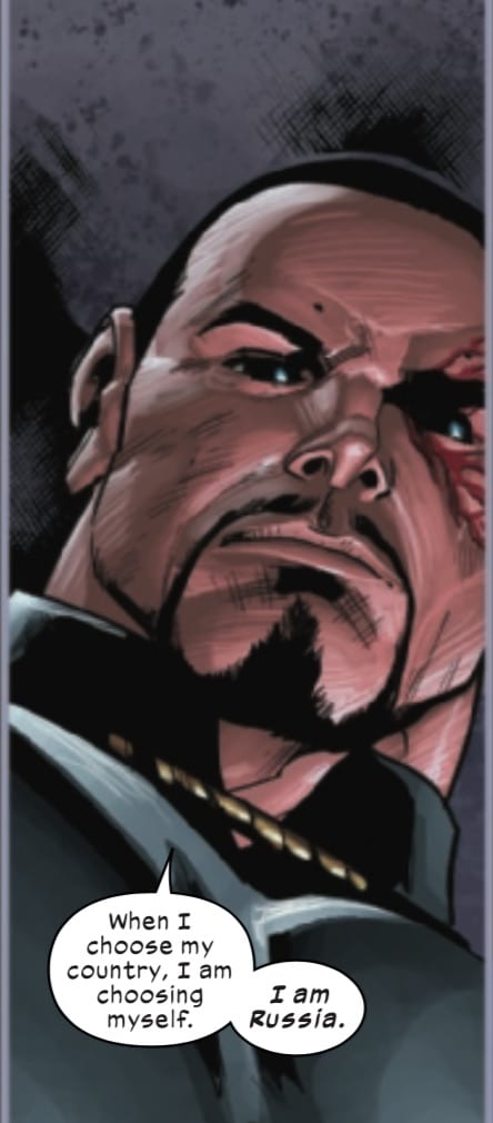
Kill a Man original graphic novel hits your local comic book store on October 7, but thanks to AfterShock Comic, Monkeys Fighting Robots has an exclusive four-page preview for our readers.
The book is written by Steve Orlando & Phillip Kennedy Johnson, with art & colors by Al Morgan, and you will read Jim Campbell’s letter work.
About Kill a Man: The Truth is Worth Fighting For.
As a child, James Bellyi watched his father die in the ring as payback for slurs he threw at his opponent. Today, James is a Mixed Martial Arts star at the top of his game, and one of the most popular fighters in the world…until he’s outed as gay in his title shot press conference.
Abandoned overnight by his training camp, his endorsements, his fans, and his sport, to regain his title shot, Bellyi is forced to turn to the last person he ever wanted to see again: Xavier Mayne, a gay, once-fighter in his own right…and the man James watched kill his father.
A singular achievement from writers Steve Orlando (Martian Manhunter, DEAD KINGS) and Phillip Kennedy Johnson (Aquaman, Adventure Time, The Last Time), and artist Al Morgan (Midnighter, Daredevil, Battlestar Galactica).
KILL A MAN will be printed in a 6.5 x 9.5 softcover format.
Enjoy the preview below:
After reading the synopsis, this story is going to go after your heart. The color palette and words are strong; I need to read the next page. Is Mayne going to fight back?
With my love of Rocky films, the fight ring always gets my blood pumping, and it makes for a great introduction to a story as you can go from a wide focus to a very intimate focal point quickly.
What did the announcer sound like in your head, this is what it sounded like to me:
The Babysitter: Killer Queen, the sequel to Netflix’s campy horror-comedy, The Babysitter, is more ridiculous than its predecessor. Not a bad thing at all, these films are not taking themselves that seriously. The over the top gore sequences are back, and so is the exposition based dialogue. The Babysitter: Killer Queen follows the same formula as the original, but there are unexpected twists this time around and a lot of unanswered questions from the first film are resolved.
Netflix’s coming of age horror-comedy certainly didn’t need a sequel, but the mid-credit scene from the previous film indicated there was room for more. What worked so well for the original was the heartwarming relationship between Bee and Cole. Also, Cole was an easy character to get behind, and all the actors made the most of the horrendous dialogue they were given to work with. Once again directed and co-written by McG, The Babysitter: Killer Queen stars Jenna Ortega, Bella Thorne, Hana Mae Lee, Robbie Amell, Emily Alyn Lind, and Judah Lewis. Set two years later, Cole (Lewis) is still haunted by the night he defeated a satanic cult lead by his babysitter, Bee. He’s considered crazy, but his next-door neighbor, Melanie (Lind) convinces him to attend a lake party and his old enemies return.
Andrew Bachelor, Bella Thorne, and Robbie Amell in The Babysitter: Killer Queen
This film probably will upset fans of the original because actress Samara Weaving, who played Bee, will not be at the center like before. Despite that, The Babysitter: Killer Queen can stand on its own without the leader of this satanic cult. Overall, the dialogue is awful as expected, the plot is just as uninteresting, but watching everything unfold is what will keep viewers glued. Every single character is underdeveloped outside of Cole, and that’s fine for this film because there’s no point to it other than to give you a few laughs at just how absurd it is. Lewis rocks it as Cole and it’s great to see him back in this nerdy role, but more mature.
Cole doesn’t need a babysitter anymore, his interest in girls is heightened, and Lewis gives off the perfect shy and unexperienced vibes. Newcomer Ortega, who many will recognize as the little sister from YOU, enters this film with purpose and comes off as if she has always been here. She’s the new girl at school, Phoebe, and she has a shocking connection to Cole that many won’t see coming. Ortega has been making great impressions with her recent projects and her performance here is just another good showing. Again, despite how lacking the script is, these actors and actresses give it their all once again. McG delivers yet another fast-paced film and doesn’t turn back once Cole and his friends arrive at the lake.
Judah Lewis as Cole in The Babysitter: Killer Queen
Beat for beat like its predecessor, calm innocent setup that gets undone by an unexpected character decision. From there, we have over an hour’s worth of ridiculousness unfolding. McG provides a suspenseful ride that you’ll only care to see finish just because it’s so over the top. Of course, Cole being the only character you will have interest in makes the film watchable as well. The components that worked before work here, it really just comes down to the fact that this film has awful dialogue throughout, and it’s mixed with characters you don’t care about because they are throwaways. The score in the film matches the campy, coming of age narrative, so there are some redeeming qualities for this sequel.
The Babysitter: Killer Queen may or may not be another sleeper hit for Netflix, but it’s fine for what it is. Just another horror-comedy that adequately balances the genres, and gives you enough to at least sit-down and endure it. It is a decent follow-up to another subpar film, and fans of the genre will appreciate the redeeming qualities it possesses.
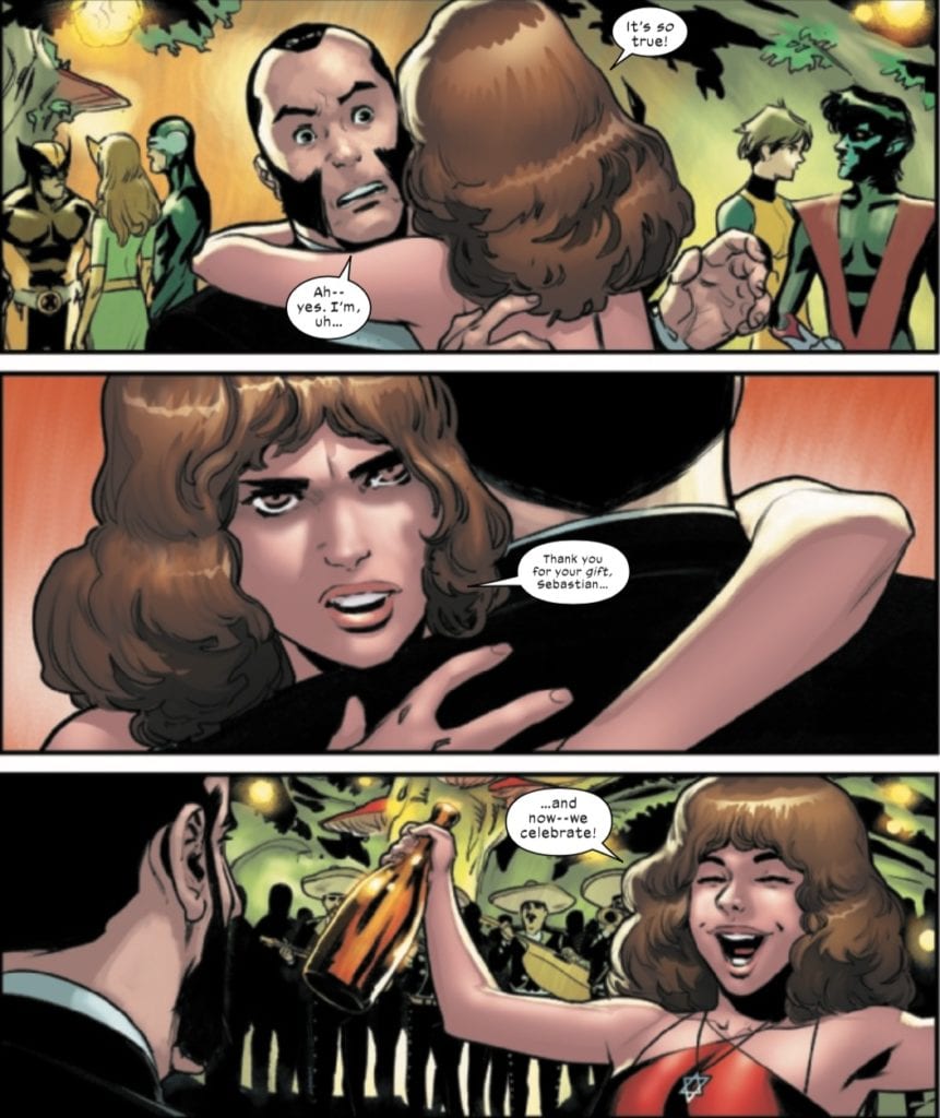
On September 9, Marvel Comics released Marauders #12, featuring a recently resurrected Kate Pryde re-entering the world. Writer Gerry Duggan, artist Matteo Lolli, color artist Edgar Delgado, and letterer VC’s Cory Petit show Kate reuniting with her friends as well as coming face to face with the man who killed her–Sebastian Shaw.
Duggan begins this issue with a ceremony similar to the one seen in House/Powers of X, celebrating Kate’s resurrection and recognition by Storm, with Kate surrounded by the mutants she rescued and brought to Krakoa.
Later, as Kate and Emma horseback ride to a reunion party with friends like Nightcrawler, Iceman, Rachel Summers, and Magik, Kate telepathically reveals her plans of revenge against Shaw, who confronts her at the party. What follows is an excellent sequence by the entire creative team, as Shaw congratulates Kate on her resurrection with a bottle of whiskey, and while he seems to be attempting to intimidate her, Kate throws him off balance.
Everything about this scene works, from the look of surprise drawn on Shaw’s face to the lettering for Kate’s whisper to Shaw, to her admonition to celebrate. But readers know that Kate has something special in store for Shaw.
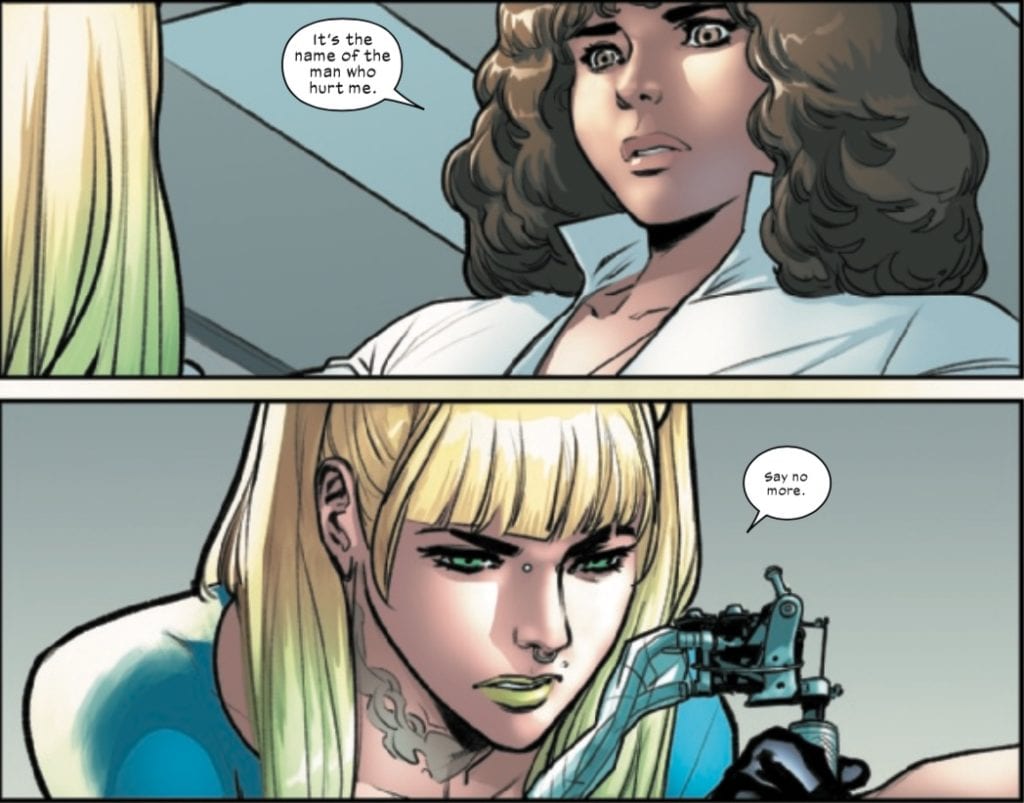
Another great scene in this issue comes in the tattoo parlor, where she gets the knuckle tattoos seen on the cover. There are two standout scenes with the tattoo artist. The first occurs when the tattoo artist asks about the tattoos themselves.
The look in both characters’ eyes and the whispered reply of the tattoo artist communicates the shared experience two women who have suffered from abusive men, from the look of vulnerability in Kate’s eyes to the squint of remembrance and the whispered “say no more” of the tattoo artist.
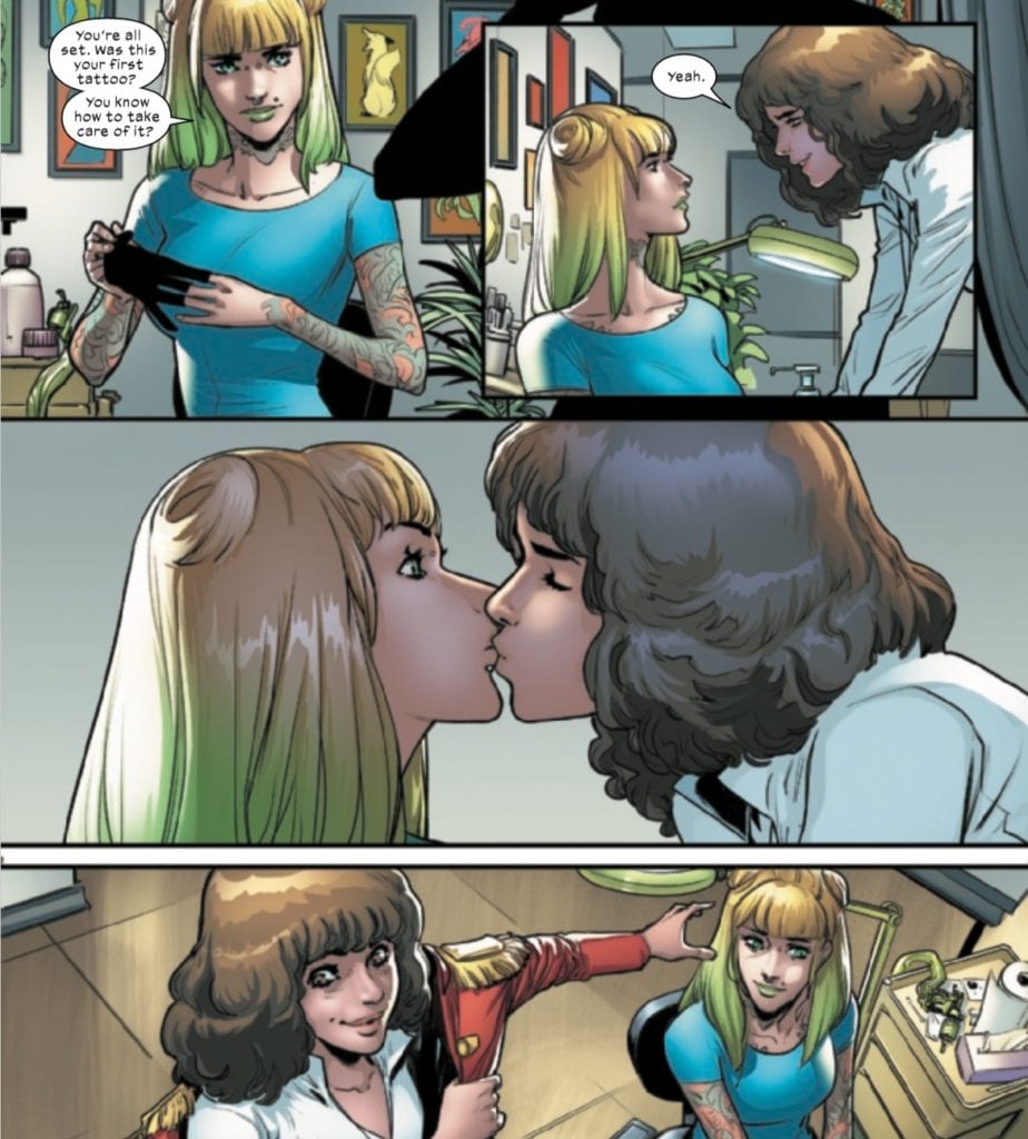
The other scene involves an interesting step in the direction for Kate.
Historically, Kitty Pryde has always been attached to Colossus as a love interest; however, both characters have each moved on. The Marauders has, at least in part, been about Kate’s journey of self-discovery, leaving behind who she thought she was and embracing a life of adventure on the high seas. This scene really captures her hunger for life and the surprise she feels at her own actions as she continues to become “Kate” and leaves “Kitty” behind.
While Marauders #12 carries the “Path to X of Swords” moniker, it doesn’t appear to really tie-in to the lead up in any obvious way. Given her new tattoos, she apparently has something very special in store for Shaw, and perhaps the beginnings of a new love interest. Kate’s resurrection has given her a new lease on life, and one gets the impression that she won’t be surprised by betrayal ever again.
What did you think of Marauders #12? Tell us in the comments below!
Marvel Comics releases X-Force #12 on September 9. Writer Benjamin Percy, artist Bazaldua, colorist Guru-eFX, and letterer VC’s Joe Caramagna deal with the aftermath of the attack on Krakoa, the fate of Kid Omega, and the plans of Mikhail Rasputin (older brother of Colossus and Magik). This issue also bears the “Path to X of Swords” moniker.
Writing
In this issue, Percy reveals that Mikhail is working with the anti-mutant group Xeno. He offers them the Sword of Cerebro, which readers learn contains all of Krakoa’s intelligence, although how it is accessed remains a mystery. Xeno is also in the process of creating an army of super-soldiers sliced and diced from mutant DNA, and now Mikhail offers them Kid Omega’s body to experiment on.
Pursuing leads on the missing sword, Beast and Sage discover a message carved in the ground by the dying Kid Omega. The message contains one word: MIKHAIL. Beast proceeds to round up all mutants with either national or family ties to Mikhail, including Omega Red (whose appearance in this issue with Wolverine doesn’t quite jive with Percy’s use of both characters in the Wolverine series, but oh well) and Colossus (although not Magik).
Beast, in yet another show of shadiness in the character’s portrayal in the last few decades, makes a spectacle of Colossus’s arrest, putting him in handcuffs and gathering a crowd of mutants in Krakoa to watch him come through the gate, much to Domino and Wolverine’s consternation (the latter punches Beast). Nevertheless, Wolverine seeks Jean Grey’s help to psychically determine what, if anything, Colossus and Omega Red might know.
It appears that X of Swords is going to be an event fought on many fronts. In Cable, the Sword of Galador has involved a bunch of sci-fi space knights, while in Excalibur, Brian Braddock has acquired the mystical Sword of Might. X-Force has now added the Sword of Cerebro to the mix. I’m not sure that any of us are prepared for how big and multi-faceted this event is going to be!
Art & Colors
Bazaldua’s art in this issue is great! The faces in this issue are done really well, particularly when they are capturing the sinister or intimidating nature of the character. When he is looking down at a dying Quentin Quire, Bazaldua provides the impression of a robust and confident killer.
Bazaldua is, of course, assisted by colorist Guru-eFX, whose blackened, empty eyes help to capture Mikhail’s threatening presence.
Likewise, Bazaldua and Guru-eFX create a beautiful panel showing Mikhail and the leader of Xeno staring each other down.
This panel captures the menace of both men. Both are stone-cold killers with evil behind their eyes and yet a cool respect for the other’s power. One gets the impression of two snakes waiting to strike the other (speaking of snakes, doesn’t the Xeno leader kind of look like Cobra Commander here?). The shading of the colors on the Xeno leader’s mask and the shadows around his eyes add to this effect.
Finally, Beast just can’t help but continue being terrible as a character, and his assholery is on full display, which the art team portrays well when depicting his smug, arrogant face.
The first panel reflects his confrontation with Omega Red, which makes sense because readers of Wolverine know that Omega Red is up to no good. The second panel, however, depicts Beast confronting Colossus, his longtime friend, and ally. We definitely see a Beast in this issue, which is too smart for his own good and is letting his power go to his head.
Letters
Caramagna’s letters are serviceable for this issue. There are a lot of character interactions in this issue, but the dialogue never gets out of control and is well-constructed around the images. Likewise, Caramagna’s sound effects are subtle and merely accentuate certain actions beats.
There are, however, two prose pages in this issue. The first is from Beast’s log, explaining his reasons for parading Colossus through Krakoa. I have some doubts about the necessity of this panel. It certainly fleshes out Beast’s motivations, but this is an example of something being told to an audience when it should be shown (although it does avoid expositional thought balloons).
The second prose section is actually interesting, reflecting some sort of third-person journal or autobiographical novel of some sort being written by Colossus. The last paragraph has been struck through, but readers get a glimpse into the darkness of Colossus’s thought life and a potentially different fate for Beast (if Colossus didn’t have so much self-control).
Conclusion
X-Force #12 is another part of a tapestry being created for the X of Swords event. Krakoa will be facing many threats from all sides, which now includes Mikhail and Xeno. Beast flirts with fascism and continues to be dragged through the mud as a character. Someone should really stop putting him in charge of things after Astonishing X-Men and the Illuminati and All-New X-Men and Secret Empire…should I go on?
I am curious to find out what Percy is planning for Omega Red, as he has figured prominently in both his Wolverine and X-Force series (although seemingly in disconnected ways).
What did you think of X-Force #12? Are you excited about X of Swords? And do you think a reckoning is coming for Beast? Tell us in the comments below!
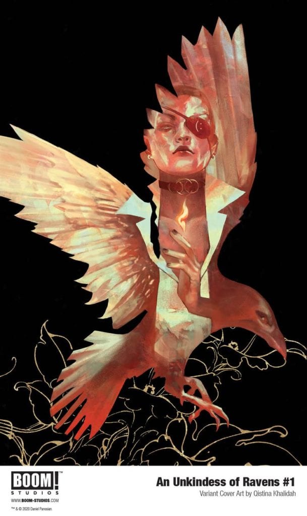
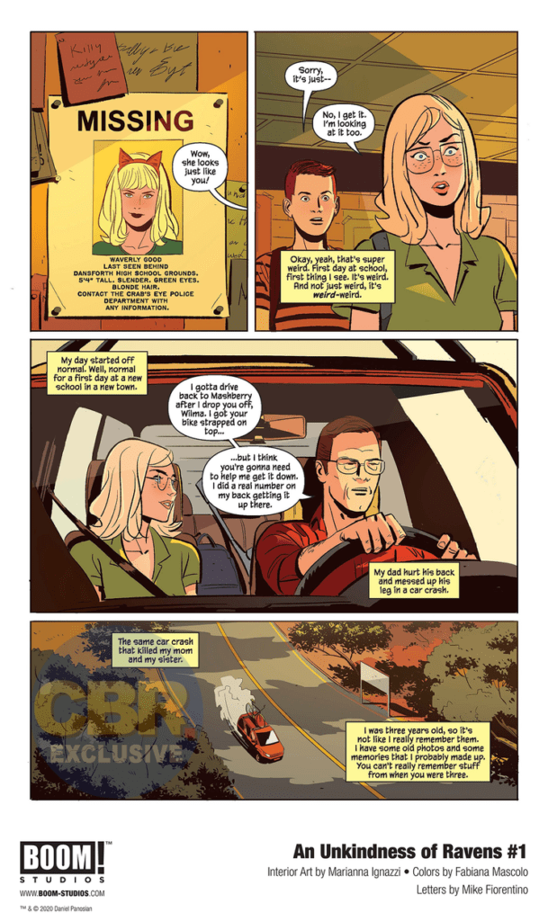
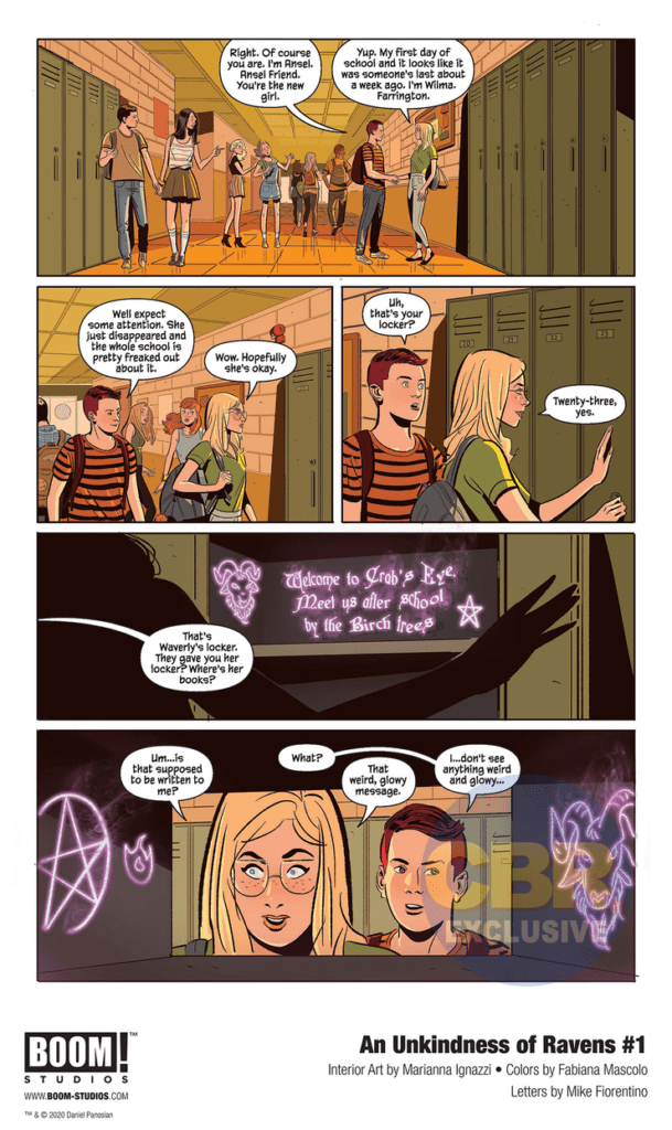
Take The Craft, mix it up with a Riverdale and a John Hughes movie, and you’ve got a good idea of what “An Unkindness of Ravens” #1, from writer Dan Panosian and artist Marianna Ignazzi, looks like. Where Dan Panosian’s script isn’t exactly original, it manages to stay entertaining thanks to this first issue’s promise of mystery, and fun YA high school dialogue. Ignazzi, with help from colorist Fabiana Mascolo, cultivates a fitting aesthetic for this comic, making this an enticing and entertaining opening chapter for fans of both Young Adult fiction and tales of witchcraft.
“Not all the witches burned during the Salem Witch Trials—and the ones that survived did so together, protecting the ancient secrets entrusted to them for generations. They call themselves the Ravens. Wilma is the new girl in school, and she plans to go completely unnoticed—except that she bears an eerie resemblance to the Raven member Waverly, who just went missing. The truth behind Waverly’s disappearance will put the entire coven in danger—and Wilma will have to rely on power she never knew she had if she wants to save her new friends.”
Writing & Plot
What writer Dan Panosian‘s script for “An Unkindness of Ravens” #1 lacks in originality, it makes up for it in its steady pacing, solid character writing, and intriguing world-building. There’s a constant feeling that something is lurking just outside of what we can see in the story, something that’s cautiously waiting for Wilma’s greater understanding of the world she has stepped into. Panosian’s withholding of information in favor of mystery is felt in how he gives the audience tidbits of relevant background story in the introduction, then dances around the subject for the rest of the issue. There’s a sense of dark grandeur following the plot as we follow Wilma through her High School halls. Hiding realms magic behind standard high school tropes would be annoying if it weren’t for Panosian’s decision to avoid many of these tropes in favor of building mystery around the school’s social groups. This is a clever twist on an old cliche that is (again) not new, but it’s handled with a practiced sensibility that adds to the growing mystique in the rest of the issue. The dialogue and character writing is succinct and naturalistic as well, with narration that offers just enough to keep the audience informed of need-to-know character backstory and personality moments. The lead characters we’re introduced to in this first issue are presented in an engaging enough manner to want to see where this trail leads. All in all, Panosian produces a solid script that takes advantage of its familiar setting and divulges just enough backstory to keep the audience intrigued.
Art Direction
The simplistic but effective visual style of “An Unkindness of Ravens” #1 is due to the talents of artist Marianna Ignazzi and colorist Fabiana Mascolo. The visual focus here is not on overwhelming detail, but instead on crafting scenes that are focused around the characters in them. Ignazzi draws characters that sometimes overlap with facial models that look a bit *too” much like one another, but she makes up for it in not only minor-details and visual cues, but how she constructs a scene panel by panel. The mysterious tension I spoke of earlier is largely due to how Ignazzi frames her focus on characters on in and out of the panel’s focus. The way she introduces new faces leaves a lasting impression that makes up for any kind of accidental similarity they have with one another. The atmosphere created by Mascolo’s color palette is a massive contributor to what makes this comic work. Her use of plain, funny-paper style colors that transform into pallid green hues and then into mystic foggy violets is a subtle but jarring effect that drags the audience into the ever-growing mystique around Wilma and this high school gang of supposed witches. Mike Fiorentino uses a slim font that is easy to read, and keeps his lines dynamic with shifting italics and bolds/size changes to make the actual reading experience seamless, while also adding to the comic’s shifting tones.
“An Unkindness of Ravens” #1 is an engaging read that follows familiar trends while still offering up enough mystique to stay refreshing. Dan Panosian’s script offers familiar territory delivered in a sharp and suspenseful manner that hides the plot’s lack of uniqueness under solid character writing and growing unease. Marianna Ignazzi and Fabiana Mascolo’s visual work is full of smooth panel direction and a continually changing color palette that work superbly for this comic. If this kind of witchcraft seems up your alley, grab up this debut issue from your local comic shop on 9/23!
With hype building for the much anticipated King In Black event due out this December, Marvel Comics has decided to give readers a dark taste of what’s to come. In the upcoming ATLANTIS ATTACKS #5, available through retailers in December, the King In Black will emerge during the final battle between “the Atlanteans, the Sirenas, and the interdimensional Pan.”
Written by Greg Pak, Marvel describes the King’s arrival as a “shroud” over the Marvel Universe. “And when the dust of one war settles, a new enemy will emerge from the depths…” You can check out the cover for ATLANTIS ATTACKS #5 and read the full Marvel press release below.
Are you more excited for the Atlantis Attacks finale or a glimpse of the King In Black before the main event? Let us know what you think in the Comments section, and please share this post on social media using the links below.
KING IN BLACK EMERGES IN ATLANTIS ATTACKS #5!
New York, NY— September 9, 2020 — Writer Greg Pak and artist Ario Anindio bring the war between the Agents of Atlas and the armies of Atlantis to a startling conclusion this December in ATLANTIS ATTACKS #5. With the fate of the world hanging in the balance, all will be revealed in this titanic tale of love and betrayal featuring Namor, Shang-Chi, Silk, Wave, and more. And when the dust of one war settles, a new enemy will emerge from the depths…
“It blows my mind that we’re now capping off our third big miniseries for the new Agents of Atlas,” Pak said. “Huge thanks to all the readers and retailers who have made this all possible with their huge support for this team. We’re pulling out all the stops with huge payoffs and turning points for key characters—dontcha dare miss it!”
Amidst this epic clash between the Atlanteans, the Sirenas, and the interdimensional Pan will be a tantalizing tease of Marvel’s upcoming event, KING IN BLACK. Knull, the God of the Symbiotes, has arrived to forever shroud the Marvel Universe in his unflinching darkness. Check out the brand-new main cover by acclaimed artist Carlo Pagulayan (Incredible Hulk) and don’t miss this surprising chapter in Donny Cates and Ryan Stegman’s monumental Venom event when ATLANTIS ATTACKS #5 hits stands this December!
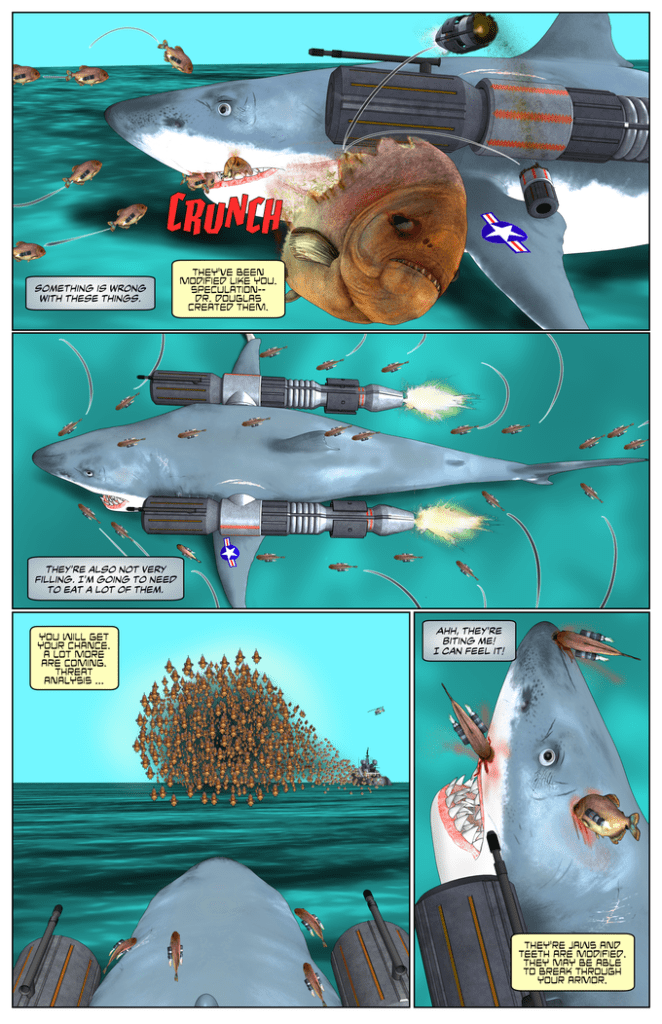
The first issue of SHARK OF WARis chock full of campy sci-fi and excessive violence, great for fans of those straight-to-video science fiction/horror movies. Now the USS Gnasher (the titular shark of war) is back to take a bigger bite out of the evil that lurks in the murky depths of the ocean.
Written and illustrated by Ben Lacy, with lettering by Nikki Powers, Shark of War #2: A Parade of Piranha is now available to support on Kickstarter.
Story
In issue 1, ‘The New King of The Sea,’ we learned his origin and how he came to take on everything bad happening on the Eastern Seaboard. In issue 2, A Parade of Piranha, the bad strikes back. They’ve hired one of his creators to make creatures even deadlier than he, piranha who’ve been modified just as he has. But there are hundreds of them.
What stands out most in the writing is the humor. Lacy doesn’t take his story too seriously. Just read the title – Shark of War. You can’t help but smirk at the daffy concept. From the cover to the very last panel, Lacy jumps the shark (don’t forgive the pun) every chance he can. There’s also the humorous dialogue, particularly the interactions between the Gnasher and its on-board artificial intelligence. In short, just go in expecting some cheese and laughter, and have some fun with it.
Art
Again, Lacy’s artwork is a unique, computer generated style in Shark of War #2. It looks like as if it were rendered in a Sims game. This style helps enhance the campiness of the concept, crafting this b-horror world akin to Sharknado or The Meg. If you’re looking for artwork filled to the gills with blood, gore, explosions, and aquatic creatures equipped with military-grade weaponry, this is the book for you.
Conclusion
This is b-movie horror/sci-fi in comic book form. It’s filled to the gills with blood, gore, explosions, and aquatic creatures equipped with military-grade weaponry. In short, just go in expecting some cheese and laughter, and have some fun with it.
Show your love for indie comics by helping fund Shark of War #2 on Kickstarter. You can also follow Biting Comics on Facebook for updates and extra tidbits.
Are you an indie comics creator with a recently published comic book, or one that you’re about to put up for crowdfunding?Let us know!
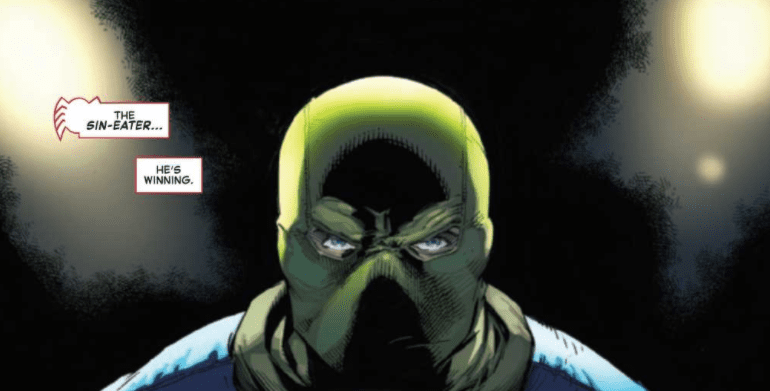
As the Sin-Eater continues to create chaos in Spider-Man’s life, the web-slinger faces a deeply emotional dilemma in The Amazing Spider-Man #48, out this week from Marvel Comics.
About the book:
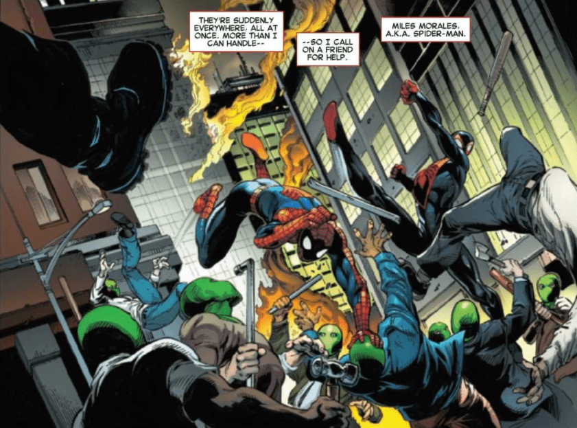
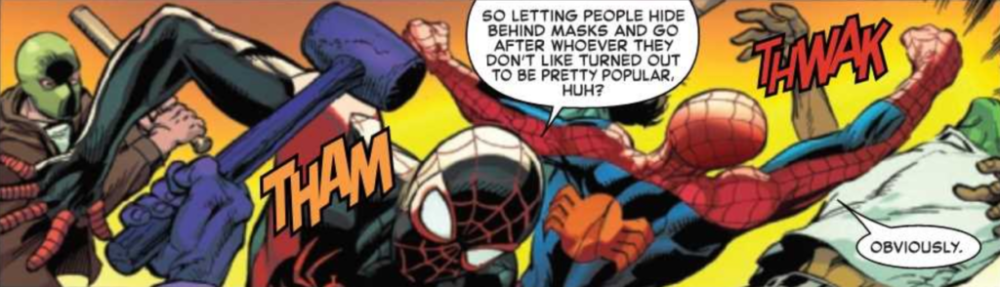
The Sin-Eater has been recruiting anyone who wants to help him bring “justice” to “sinners,” and an overwhelming amount of people have signed up for his cause. Now, Spider-Man has to deal with a mob of hate-filled followers while also questioning whether he should save the Sin-Eater’s next target, Norman Osborn. Spider-Man enlists the help of several other heroes with spider-powers to not only support him as he fights off Sin-Eater’s followers but also emotionally as he decides whether to save one of the worst people he has ever known.
The Amazing Spider-Man #48 Story
Nick Spencer does a perfect job of inspiring emotion in the reader in The Amazing Spider-Man #48. The choice that Spider-Man is faced with is difficult to make with any villain, especially when the Sin-Eater isn’t killing them. By “cleansing” villains, it isn’t apparent that the Sin-Eater is doing anything wrong, but Spider-Man knows there will be unforeseen consequences in the future. By having the villain in question be Norman Osborn, the decision of whether to save him or not becomes so much harder. Miles Morales had the Spider-Man of his world killed by the Green Goblin. Gwen Stacy died because of the Green Goblin. If he continues to live, he will kill again. Having the decision Spider-Man has to make, be about Norman was such a fantastic choice, and bringing in other heroes to help him choose brought out all the emotion attached to the decision, and made the issue an utter pleasure to read. The conversations in the issue pulled easily at heart-strings since they were all based around deep history related to the characters, and the issue continued to build until the shocking conclusion that leaves you with a jaw-dropping cliffhanger.
Art
The pencils of Mark Bagely and the inks of John Dell once again come together to give us some astonishing art in The Amazing Spider-Man #48. The city contains so many beautiful buildings in the background, action sequences have so many dynamic poses and motion lines that they come to life on the page, and figures and objects often overlap the edges of panels, which causes them to stand out. Every page is a pleasure to look at, but perhaps the most important thing that Bagely and Dell are able to do in this issue is give the characters expressive faces. With so much of the issue focusing on the internal conflict of Spider-Man, it’s important to show it through facial expressions, and Ferreira and Poggi are able to do just that.
David Curiel does some great work in The Amazing Spider-Man #48, with many uses of vibrant colors that bring so much life to the page. The establishing shots of the city are particularly stunning, with a wide variety of colors being showcased. The use of bright colors in action scenes increases the energy of the scenes and the bright-colored backgrounds that Curiel chooses let characters pop out while they are performing certain actions.
The lettering of VC’s Joe Caramagna does an excellent job of presenting the dialogue in a way so that the story flows naturally. This is especially important for emotional scenes, such as the ones in The Amazing Spider-Man #48. Caramagna also provides many different colored sound effects during fight sequences, which highlight just how much fighting Spider-Man and his friends have to do to ward off Sin-Eater’s followers.
Conclusion
The Amazing Spider-Man #48 is one of the best issues to come out of the Sins Rising event, and that says a lot when you compare it to the quality of the other issues. The story is captivating throughout every page, and the art complements it all so well. By the end, this issue leaves you with your heart aching from the emotional conversations Spider-Man has with other spider-powered people and your jaw open from the awe-inspiring cliffhanger.
Usagi Yojimbo Color Classics #7 is this week’s finale to IDW’s republishing of the very beginning of the franchise, as Stan Sakai’s original story gets a dynamic recontextualization with Ronda Pattison’s colors.
Usagi Yojimbo Color Classics #7 On Pacing
Unlike the last issue where two separate stories are necessary for the reader to get an idea, this time, only one is okay. Featuring the debut of semi-regular character Tomoe and her lord Noriyuki, their appearance at an attack shows how dire this issue is unlike others. This fast pace is to the point of being in the background where some villagers don’t even notice the fleeing pair. Fortunately, their encounter with Miyamoto Usagi allows them levity. When Tomoe takes the time to explain their circumstances to Usagi after attacking him, it’s an expert use of slowing the pace to care about these characters. Not to mention when Usagi helps Tomoe and Noriyuki out, the reader sees his motivations considering who wants to kill Noriyuki, the killer of Usagi’s own master, Lord Hikiji.
Art
Stan Sakai certainly presents himself as a highly capable storyteller in Usagi Yojimbo Color Classics #7. In addition to his above writing, his artwork, when it comes to action sequences, is of high quality. There’s a genuine sense of both movement and point-of-view throughout the pages. Thanks to great use of both panels and layouts, there is consistency in how the characters interact. Despite the moving panels, it doesn’t feel like a camera is switching from one point to the next. Rather the changes feel natural as they represent where a character is standing. Even when another panel comes up, it feels like the characters did not move. Not to mention the action sequences have a real sense of speed and weight, as shown when Usagi swings his swords.
Ronda Pattison, meanwhile using coloring to make some of these actions have even more weight. The usually stilted faces of Stan Sakai’s early artwork designs are given more definition thanks to this. This allows them to look more expressive than they normally are. Another appears in a crucial battle; the background features a gradient that changes from a calming blue to an alarming yellow to signify a higher intensity. Still, when it comes to the lettering, the colored wordmarks can blend in without the outlines.
Usagi Yojimbo Color Classics #7 Is Kurosawa-Style Cinematics
Usagi Yojimbo Color Classics #7 retains its sense of urgency in pacing with an enhancement in action. This issue lives up to its name of “Classics” by ensuring its sense of urgency with color to further express this. Readers might look a little disappointed by a different art style, unlike the cover, but they’ll still get something out a samurai story evoking the classics like Akira Kurosawa – one that will leave audiences satisfied for future stories in IDW.
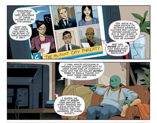
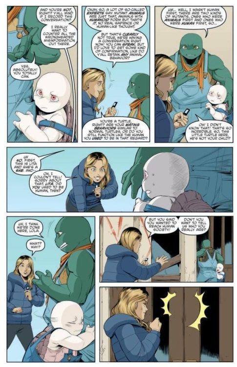
Issue #109 of TEENAGE MUTANT NINJA TURTLES hits stores on Wednesday, September 9th, bringing readers to the heart of Mutant Town—the freshly irradiated suburb of New York. As its citizens begin to cope with their predicament, multiple outside pressures make their lives even more difficult. What unfolds is a social commentary on our culture’s negative attitudes toward marginalized groups.
Story
Writer Sophie Campbell, with consulting by Kevin Eastman and Tom Waltz, set up this issue with multiple plots, each focusing on various characters in Mutant Town. Readers find that even though the mutants have their own community, it’s severely impoverished. What’s more, the media and public at large is circulating hyperbolic myths about this marginalized group—much like certain outlets in our own world.
This tendency to mischaracterize affects Michelangelo and Lita directly when a reporter attempts to get a story out of them. Rather than listening to their perspectives, she seeks to confirm preconceived narratives.
Readers will find prejudices within the mutant society as well. A killer whale humanoid attacks Donatello and Mona, and later readers find that Jenny, solely out of fear, escalates a situation with a former villain. It becomes clear that even within groups on the edges of society, prevailing attitudes of prejudice linger still.
This issue portrays the mutant society’s oppression with a realism one finds in our own world. We clearly see how prejudices can hit a marginalized community from all sides.
Artwork
Jodi Nishijima’s penciling and ink work, Ronda Pattison’s coloring, and Shawn Lee’s lettering crafted beautiful artwork for this issue. The mutant characters are full of personality and life, which is contrasted by the slum-like buildings that surround them. This helps to juxtapose the unique beauty of their new forms with the poor conditions they’ve been forced into. In addition, the lettering boxes help frame each important feature of the panels, helping to tell the story without taking way from the illustrations.
Conclusion
TEENAGE MUTANT NINJA TURTLES #109 provides readers with a unique perspective on mutant society. Seeing the differences between their living conditions with those of the rest of the city is a good wake-up call.
Do you think Mutant Town will ever find peace? Let us know in the comments below!