Home Blog Page 252

Landscaping Atmosphere in STILLWATER #1

Stillwater #1 Cover Art Credit: Image Comics

Note: this article includes some minor spoilers for Stillwater #1. If you want to get the best experience out of the comic, don’t read anything about it. Buy it and read it first. Then come back here or check out the MFR review.

Setting a scene is important. Not just because it gives the characters a location to inhabit but because it can create a tone for the story. The setting is important for mood, for genre, and for highlighting characters. The location for a story and the way that it is depicted is as much a trope as a trench-coat wearing detective. The opening sequence in The Walking Dead is as much about the world Rick wakes up in than it is about Rick himself.

In a medium where we talk so much about character and action, it is easy to overlook the locations. However, the setting leads the reader through the narrative, signposting the genre through recognisable motifs and creating a mood that enhances the foreground action.

In Stillwater #1, published by Image Comics, Chip Zdarsky and Ramon K Perez use a changing landscape to reaffirm the central characters’ journey and draw the reader into their pseudo horror story.

Stillwater #1
Stillwater #1 Town Scene Credit: Image Comics

Cold Introductions

The first issue of Stillwater is a classically framed opening for a horror story. As to where the series eventually goes may be somewhat different but for the introduction Zdarsky and Perez have adopted a familiar journey. Their two main characters, one down on his luck and the other too rich to care, are mysteriously summoned to a small, out of the way town, by the promises of an inheritance.

The journey takes the characters from the urban sprawl to a quiet backwater and the changing landscapes really tell the story. One is sterile, uncomfortable and violent while the other is serene and laid back, however every horror fan knows that the grass is never greener. The contradictions between the scenery and the experiences of the characters is the mechanism that gives Stillwater it’s narrative punch. The opening scene is a perfect example of the contradiction inherent throughout the comic.

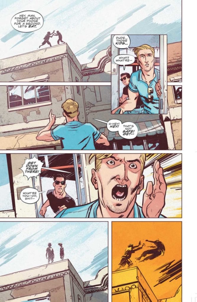
Daniel is at work, in an open plan office surrounded by fellow co-workers. It is a scene that many will identify with and must surely be a safe space. Everything is open and bright. Nothing every bad happens during the day, especially not at a mundane place of work. But if you look closer at the panels not everything is at it seems. The office is open plan but Daniel is still cut off from the rest of the workers. His desk is a physical barrier between him and everyone else; he has oversized earphones on cutting him off from the office chatter; and his name, our introduction to the character, is placed beside a large red wall hanging, the only vivid color in the room.

Letterer Rus Wooton places the speech balloons above and below the red painting which emphasises the placement and draws your attention to the vivid warning color. The added border of yellow around the second shout of the characters name gives extra weight to the interpretation that not all is as it seems. Far from being a safe place, the first panel actually insinuates that something bad is about to happen.

As the page progresses and we learn that Daniel is in trouble with his boss and the character becomes further isolated by the scenery. The red wall of the manager’s office surrounds Daniel putting him under threat. The distance between him and his Boss is exaggerated by the comparison between the different sides of the room: on one side is furniture and personal belongings which create a sense of permanence, on the other is a flat red wall with blank, white paintings, unwelcoming and empty. There is a clear division in one panel created by the desk and a cleverly placed plant, separating the characters. The panel is also silent because no words are necessary: this is clearly a man getting fired.

Stillwater #1
Stillwater #1 Into The Country Credit:Image Comics

From City to Country

In the opening scene the writer/artist uses the backgrounds to enhance the character interaction. As you move through the comic, you come to realise that the scenery also feeds into the greater narrative in a similar, but more expansive, way. The growing tension and the sense of unease that the story relies on comes from the changing landscape.

Daniel lives in the city. Zdarsky tells us through the plot that it is a dangerous and violent place. In turn Perez gives it a kind of grittiness however it is not uninviting. Mike Spicer throws a cool pink light across a nightclub scene, highlighting the characters against the grey backdrops. Despite the conflict evident on the page there is a comfort to the location, as if Daniel is at home in this place. This theme is continued into the next scene which is literally his home. He wakes up wrapped in blankets, his friend comfortable on the floor playing a games console, the warming sunlight drenches the scene.

It is a safe place and still clearly the city. The architecture and the greys in the background link Daniels apartment to the nightclub of the previous night. It is an aggressive place but one that is familiar to the characters and therefore desirable to them.

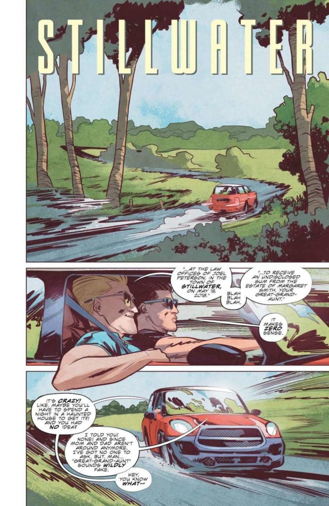
All of this is about to change with the arrival of the unassuming, little old man.

A classic unexpected inheritance is the catalyst for the story and forces Daniel and Tony to embark on their road trip. From this point onward the importance of the landscape becomes unmistakable.

Think of any horror movie or comic where the protagonists journey into an unknown location. In every single one, the change from their home, their place of safety, to the dangerous location is represented visually. The classic is the switch from the city to the county. From Evil Dead to Cabin in the Woods, 30 Days of Night to Winnebago Graveyard, the contrast of locations fuels the tone of the narrative.

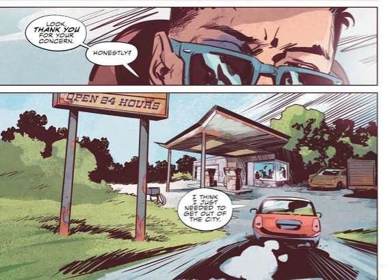
In Stillwater Perez contrasts the rigidness of the city with a free flowing, expressionistic countryside. From the moment the characters leave the urban setting Spicer’s colors become softer, greens and light browns, but there is an overbearing element to the panels and pages. Perez changes the reader’s viewpoint, moving it lower so that we are constantly looking up at the surroundings. This gives the impression of the landscape towering over us, trapping us. This is often a feeling people experience in large cities surrounded by skyscrapers, so to invoke that feeling in wide open spaces is telling of the situation. There is a moment of discomfort as Daniel drives up to a local gas station because the forecourt stretches over the reader like the lid of a box. And the further into the wilderness the two men drive, the more oppressive the landscape becomes. Perez uses dutch angles, low angles, and a lot of over the shoulder shots in order to make us as uncomfortable as possible.

Stillwater #1
Stillwater #1 Gas Station Credit: Image Comics

Unnerving outcomes

By the time Daniel and Tony reach the town of Stillwater, we already know that there is something different, something wrong with this place. Long before the unusual actions of the townspeople fill us with dread, the location has us longing for Daniel to turn around and go home.

The horror tropes are there, within the narrative but as with so much of this genre it’s the presentation that marks a title out. Zdarsky, Perez, Spicer, and Wooton encapsulate the readers expectations of a horror story in dramatic ways. They build a visual landscape that reflects the unnerving narrative so that one aspect feeds beautifully into the other. Simply put, it’s engrossing. This is exactly what you need to make the jump scares work, especially in a comic.

Monkeys Fighting Robots Youtube

Review: The Search For A Purpose In MARVEL’S SNAPSHOTS: X-MEN #1

Marvel's Snapshots X-Men #1, Ross cover

MARVEL’S SNAPSHOTS: X-MEN #1, available from Marvel Comics on September 16th, reaches back into Scott Summers’ childhood and retells how heroes are born with a little inspiration from other heroes. Written by Jay Edidin with art from Tom Reilly, this is the first Marvel Snapshots issue to showcase the tactical leader of the X-Men, and it’s the best Marvel’s Snapshots issue this reviewer had read to date.

Cover Art

Despite the vague title, Alex Ross’ cover nails the content by focusing on the subject of this issue. Scott is the planner, the leader who gets everyone moving in the right direction. He’s as laser-focused as his optic blasts, but he wasn’t always that way. It’s an interesting play to show a cover of the ending for an issue that starts at the beginning.

Writing

Edidin’s story deeply inhabits the personality of Scott Summers before he becomes Cyclops and before he even discovers he’s a mutant. We often see the origin of X-characters when they turn, and the X-gene becomes activated. That would have been the easy choice. Instead, Edidin goes back further to the plane crash that “killed” his family and subsequent life in an orphanage. From those early years, Edidin portrays a boy feeling the pull of heroism and leadership. The force grows more potent with the dawn of heroes, mostly via the arrival of the Fantastic Four and the realization that heroes inspire and beget more heroes.

MARVEL’S SNAPSHOTS: X-MEN #1 is a strong character piece by Edidin that tells a personal story of growth for a boy who chooses his path to become a man, and eventually, a hero in his own right. This comic is an excellent story by Edidin.

Pencils/Inks

Reilly’s art style works very well for the type of narrative and the time frame in which the story is set. Scott is awakened to the concept of heroes by watching the Fantastic Four’s first public battle on TV. Reilly designed the issue in a retro, mid-century 1950’s style that’s reminiscent of the dawn of the American space age. That style typifies the nuclear family tone of the Fantastic Four, and it sets a time period for the story that places Scott in Marvel continuity in an organic way.

Reilly also chose to keep most of the panels zoomed in on Scott to force the reader to view the world as near as possible from Scott’s perspective. It’s a great panel choice to maintain the personal feel of the story—lots of great creative choices here by Reilly.

Marvel's Snapshots X-Men #1, art sample

Coloring

Consistent with the retro style of the issue, Chris O’Halloran uses liberal amounts of blues on most of the pages to imply the story is in Black & White. It’s not, and when the full-color panels pop, they boldly stand out, but the patina of blues helps emphasize the sense that you’re watching an old documentary. O’Halloran’s color choices elevate Edidin’s story nicely.

Lettering

Tom Orzechowski’s lettering is the glue that holds this issue together. Edidin’s story is heavily dependent on Scott’s inner monologue to carry the whole way through. By specifically coloring and breaking up Scott’s thoughts into a very specific lettering style, it makes the story very easy to read, and the technique enhances the idea that you hear Scott’s thoughts as he wrestles with his choices. Great work here from Orzechowski.

Conclusion

MARVEL’S SNAPSHOTS: X-MEN #1, available from Marvel Comics on September 16th, is the best of the Snapshots so far by a country mile. The story is a thoughtful coming-of-age tale during the dawning age of heroes, and the artwork blends seamlessly with the writing. I strongly recommended picking up the book.

Monkeys Fighting Robots Youtube

INTERVIEW: Writer And Director Richard Chandler Talks Parts Unknown

Richard Chandler is an actor, writer, and director whose horror film Parts Unknown revolves around one of his life-long interests — wrestling.

Parts Unknown is a film about a family of wrestlers known as the Von Strassers. Their days of glory in the ring are behind them. Patriarch Hermann Von Strasser (William DeCoff) is looking for a new way to satisfy the lust for violence coursing through his family’s veins. The solution comes from an unusual place and sets off a string of violence.

PopAxiom spoke with Rick at the center of the ring to talk about the road to showbiz, Doctor Doom, and Parts Unknown.

Tenacious

Richard’s IMDB resume includes 58 acting credits, plus 27 directing credits, 25 as a producer, and another 23 as a writer. What came first? “I wanted to be a writer as a teenager. I wrote books … crazy literature … that would probably be better suited to comics. Then I wrote screenplays.”

Writing was the motivating passion, but it wasn’t long before Richard “jumped into the fire and transitioned into trying to direct and produce … super low budget films.”

Richard considers himself, “… someone who is tenacious,” which is a valuable personality trait in showbiz.”

parts unknown-richard chandler-film

About Parts Unknown

Richard says he’s “Always been a big wrestling fan.” He continues, “It’s something that people like to talk about as having this super dark side to the business. It’s showbiz. There’s always messed up stories.”

Richard’s other favorite thing is horror. The birth of Parts Unknown was a natural connection between the two. “What if I try to put this lifelong thing that I’ve watched and put it into a horror movie vibe.”

If you’re a wrestling fan, then the Von Strasser family in the film might feel familiar. “It’s a family of wrestlers … loosely based on the Von Erichs.

Hermann Von Strasser is “… a harsh patriarch who wants everyone to be good, but he’s not exactly a loving character. He beats them if they fail.”

In Parts Unknown, the family is “… down on their luck now,” Richard says, “They’re all on drugs or involved in other bad habits. They’ve all lost their jobs with the big federation.”

“Herman,” Richard says, “ends up finding this demon creature that may or may not exist in his head. He talks to the creature, and the family slowly devolves. They become sort of this cult that uses the demon to satisfy their craving for blood and the spotlight.”

Making Parts Unknown

Earlier in life, Richard did work “… a little in local wrestling promotion, not as a wrestler, but as the evil general manager type characters. I was good at that and getting the fans upset.”

The experience let Richard see “… how things work backstage, but not a tremendous amount.”

Parts Unknown isn’t a super-budget feature from a major Hollywood studio. What was a challenging aspect of production? “Getting the ring and places to put it was a challenge. We had to film a lot in one day. It was a ridiculous amount to cram in there.”

Fortunately, casting made it a little easier. “Most of the leads did wrestle. But,” Richard adds, “finding actors who could wrestle was a challenge too.”

Wrapping Up

Our talk turns to other artists and creators who inspired Richard. “Oof, that’s tough. There are so many.” Richard ponders before answering, “John Carpenter.”

Outside of horror, Richard loves old-school action films. “Death Wish and Cobra and Commando. I grew up obsessing over that stuff.”

Who does Richard want to play? “Doctor Doom. When Fantastic Four is created for the third time, I want to play Doom. I want to give him a weird, modern spin.” What about a slasher? “I think the obvious answer is Freddy.”

Richard writes and directs. If he could only do one, which one would it be? “Probably writing. But if we throw acting in there, I’d choose acting. I have fun as an actor. As a writer or director, people constantly love saying, ‘I would’ve done this or that. It’s too reminiscent of this or that.’ They can all do it better.”

Richard explains, “But it takes so long to write a movie, and most don’t understand how frustrating it is to have comments thrown at you.”

The time spent with the project is a big difference that isn’t brought up often enough. “As an actor, you come in for a few months, train to play your character, and then you’re out. A director might have worked on the film for four years.”

Parts Unknown is available on Amazon Prime and other streaming services. You can find more information by following @BostonUndead on Instagram. What’s next? “We managed to shoot a short called Rats. It’s about 20 minutes. That’s the project that’s in post.”

Is Parts Unknown on your watch list?

Thanks to Richard Chandler and October Coast
for making this interview possible.

Want to read more interviews? CLICK HERE.

Monkeys Fighting Robots Youtube

Review: HELLFIGHTER QUIN #5 Comes To A Storybook End

Hellfighter Quin #5, Ilhan cover

HELLFIGHTER QUIN #5, available from Mad Cave Studios on September 16th, brings Quin’s fight in the tournament to an end with a shakeup of the status quo. Jay Sandlin’s story finds a satisfying conclusion for the reluctant hero and the five tribes while wrapping up all the loose ends.

Cover Art

Atagun Ilhan’s cover demonstrates great composition and sets up the finale beautifully. Quin and Shard are ready to possess the Azure Sun as the Doomseer’s visage looms over them, but if you’ve read the last issue (read our review here), you know it’s a lot more complicated than the cover lets on. Additional credit to Maria Santaolalla for coloring work that really pops.

Writing [No Spoilers]

Sandlin wastes no time dropping Quin and Deadeye into the last round of the tournament as final opponents and secret allies. Before we get to the action, Sandlin gives the readers a brief but information-packed flashback to explain the big reveal of Doomseer’s identity in the last issue. It’s a clever twist that pits good versus evil in a completely unexpected way.

The big boss twist, in a way, informs a critical theme of the entire series. There is no cartoonish depiction of purely evil bad guys and ultra-pure good guys. Sandlin seems to suggest there’s good and evil in all of us, and those forces are vying for dominance at any given time. For a straight superhero comic, the reveal leads to some deeply thought-provoking ideas that I truly appreciated.

One side note that’s both criticism and praise, the prologue was optimistic to an almost corny degree. Yes, some of the lines like “Whoomp there it is” were eye-rolling but sincere in a way that made me smile. I couldn’t help but think, “Sure, it’s cheesy, but they earned it.” Nicely done, Jay.

Pencils/Inks

Ilhan’s artwork has shown some steady improvement throughout the series. What stood out most in this issue is the panel work and the page layouts, which don’t get enough attention in modern comics reviews. Ilhan demonstrated interesting panel shapes and arrangements to create a kaleidoscope effect for the story. Several pages felt like scenes in motion, one panel telling its tale and then quickly being replaced by a new panel.

Overlapping panels can get quite confusing, visually, so big kudos goes to Ilhan for perfecting expert level layouts.

Coloring

Santaolalla’s coloring work stands out for the use of filters during the flashback scenes, of which there are multiple. From the formation of the clan leadership to Tyrell’s acceptance in the tournament, each of the flashbacks is colored in stark contrast against the setting of current events to give them a very clean and clear separation in the timeline and add a patina of age. This is a good example of using color to tell part of the story.

Lettering

Justin Birch’s most striking technique in this issue is marrying the coloring and design of the narration boxes with the characters doing the speaking off-panel. Sandlin’s story has a lot of ground to cover to complete the story in a single issue, so it’s not always possible to have every character in every panel when there’s so much going on. The use of color in the lettering, coded to the characters, really helps the reader keep everything straight and allows for more storytelling in fewer pages—excellent work by Birch.

Conclusion

HELLFIGHTER QUIN #5, available from Mad Cave Studios on September 16th, brings the series to an exciting, fun, and at times, thought-provoking finale. The story ties up all the loose ends in a satisfying way while still leaving room for a future adventure, and the art team continues to grow and deliver solid work. I would recommend the entire 5-issue run for comics lovers looking for some creative adventure.

Monkeys Fighting Robots Youtube

Review: The Unstoppable Force Vs The Immovable Object In GRIT #3

Grit #3, Castaniero cover

GRIT #3, available from Scout Comics on September 16th, pits Barrow against Ari in a competition to see who can beat the Blood Demon first. Brian Wickman’s story takes the concept of the lone wolf and gives it a twist that ends with a refreshingly human reaction.

Cover Art

Kevin Castaniero’s cover sets up the issue perfectly. Ari believes the Blood Demon was never truly vanquished and picks up the hunt where Barrow left off. Barrow, not wanting to be shown up for failing his job, follow suit. The Blood Demon uses every tool at its disposal, including the townspeople, to stop the hunters. All that can read from this one cover, and Castaniero nails it.

Writing [No Spoilers]

Wickman’s continuation of Barrow’s hunt leans heavily into the old adage: “You can’t teach an old dog new tricks.” Barrow is feeling his age, and Ari’s constant challenges to Barrow’s capabilities aggravate Barrow’s stubbornness and push him to recklessness. In the end, Barrow is forced to question whether or not he’s too old to keep hunting.

The ending of Wickman’s story was swift but extremely potent. Too often, the grizzled hunter is stereotyped into a caricature of invincibility. Unflappable. Unstoppable. Here, Wickman chose a different path that’s much more relatable and opens up a wider possibility for storytelling in the following issues.

Pencils/Inks

You can tell Castaniero had fun pushing the comedic elements of the story much more in this issue than previously. Barrow’s exaggerated attention to scat in his attempt to track the demon. Ari’s bizarre plant magic attacks that de-possess the possessed. And Barrow’s bare hint of a smile as he’s enticed to buy some unsavory looking street food. It’s these little touches that layer on dark humor charm to the issue.

In stark contrast, Castaniero’s designs for the blood demon and the big battle are tense and horrific. The juxtaposition of the humorous shows of bravado from both Barrow and Ari, combined with the deadly urgent action sequences, makes for an exciting and thoroughly enjoyable issue.

Coloring

Simon Gough continues to make a very powerful choice with the coloring by keeping everything restrained in as many earth tones as possible. When the Blood Demon shows itself, the red stands out shockingly and with a much higher impact. The coloring signifies that the Blood Demon doesn’t belong in this world, and it projects an unnatural element to the character—nice work by Gough.

Lettering

Micah Myers’ lettering is most notable here for the imaginative creation of sound effects that have no analog in the real world. Myers dreams up a Blood Demon manifesting through vomit and seed pods that explode on impact. All through very imaginative, and at times gross, sound effects that match the tone and spirit of the issue. Great work by Myers.

Conclusion

GRIT #3, available from Scout Comics on September 16th, takes the story of the old dog being shown up by the young upstart and gives it a fresh coat of paint. The writing has plenty of rise and fall to keep the reader engaged, and the stylized artwork marries to the story perfectly. A strong series so far from Scout.

Monkeys Fighting Robots Youtube

How A Legend Dies in ONCE & FUTURE #11

A new monster rises in Once & Future #11.

ONCE & FUTURE #11, available Wednesday from Boom! Studios continues to merge the present and the past through lore and legends coming back to life. Yet this retelling has a few horrifying twists – literally.

***SPOILER WARNING***

spoilers ahead

The legends of old are waking up, and they are proving to be far from benevolent. First, it was King Arthur – who had a different sort of plan for his country. Now he’s working alongside other beings of old, and that is less than ideal for humanity.

Once & Future #11 brings fans right back to the fight, with Duncan and his grandmother facing a classic foe, and all of the challenges that come with it. It’s hard to believe that only recently, Duncan had no idea that monsters were real. Now he’s charging into danger and without even a second’s thought or hesitation.

A new monster rises in Once & Future #11.

The Writing

Once & Future #11 is one of those issues that doesn’t hesitate to dive right back into the action. Then again, the cliffhanger from the last issue required it. It’s hard to know how things are going to go, but easy to picture the worst.

Kieron Gillen has done an excellent job of setting the scene, that much is for certain. We’re talking about a giant monster attacking an elderly home. Even with somebody like Gran around, it’s still going to be a problem. Especially when there’s no available weapon stash (kind of a critical point when battling monsters).

The issue is mostly action, reactions to said violence, and that sort of thing. Yet it’s all very well done, showing a surprising amount of wit and an appreciation of dramatic irony. There are even a few more humorous moments woven into the mix, to help lighten the mood.

All of which sets up for the next series of events. It’s starting to look like Duncan and his Gran are not going to be getting a break anytime soon. Which is a bit of a shame since before this battle took place, it was starting to look like they both needed one. No rest for the wicked, huh?

Once again, all of the references to lore and legend have enhanced the series. In this case, it created new foes to battle, while also setting the tone, as well as setting up a perfectly timed conclusion.

The plan unfolds, with a few new complications in Once & Future #11.

The Art

Once & Future #11 is another vibrant and intense issue. As mentioned above, it’s dominated by battles, which means there’s a lot of excitement and flash to go around. Dan Mora (art), Tamra Bonvillain (colors), and Ed Dukeshire (letters) all teamed up to make this issue what it is – and it was worth the effort.

The battle is surprisingly long, with lots of clever moments and details – none of which would have carried across without the help of the artists. Little things, such as the taxi’s expression, to that little surprise Duncan found, and more. It all created a fight that actually felt surprisingly believable and real.

As with the rest of this series, the colors are so bold and beautiful. It’s a signature of Bonvillain’s work, and yet it’s perfect here. Her colors have added that required ethereal and fantasy element, transporting readers to a world where dead kings and monsters really can rise back up.

Finally, the lettering is everything this issue needed to bring it all together. There’s a lot going on in these pages, and Dukeshire’s work makes sure that not a single detail is missed, leading our eyes with intention. All while making sure that the screams and stakes felt larger than life – as it should be.

And so the fight continues in Once & Future #11.

Conclusion

Once & Future #11 was another tense addition to this series, one that is full to the brim of fighting – and blood. It’s an issue that doesn’t leave much room for relaxing, and it looks like it’s setting up for the next issue to follow suit as well.

Monkeys Fighting Robots Youtube

The Search for a Home in FIREFLY #20

Firefly #20's cover is a throwback to 'Out of Gas.'

FIREFLY #20, available Wednesday from Boom! Studios dives back into the world of Firefly, but with a few unique twists. Our beloved characters seem to keep growing up and changing.

***SPOILER WARNING***

spoilers ahead

The crew of Firefly has gone through a whole lot of changes in the most recent comic series. In many ways, it’s hard to believe that these are the same characters that we first fell in love with back when the show launched.

Yet there’s still no doubt that they are one and the same, especially during certain moments when their core characteristics shine through. Malcolm Reynolds may be a sheriff – which is hard enough to believe on its own – but he’s still shown trying to take care of his crew. Time and time again.

The last several issues have focused heavily on Mal and his imploding plot arc. All while others have barely made an appearance at all. That being said, Firefly #20 is about to give some of those wayward characters a chance.

The Writing

So for those fans wondering where on earth (or rather, in the ‘verse) the rest of the crew has gotten to, Firefly #20 is going to be a refreshing change of pace. Suddenly our missing characters (Zoe, Walsh, Shepherd Book, River, Simon) are all back again.

Greg Pak’s version of events has been a bit of a deviation, but it’s still been fascinating regardless. Here is a version of Zoe who has not lost her husband – but she’s still very strongly driven to find a safe space for everyone she loves. More than that, she wants to protect every friend and ally they’ve ever made.

That basically sounds like the most Zoe thing of all time, and it was refreshing to see her once again. The others are basically getting dragged along for this adventure, which also sounds about right. River’s side of things is borderline depressing, as she struggles to make something for herself with each attempt.

On the whole, the change of focus for this issue was appreciated and is starting to give back the hope that we might just see the crew back together. It may not be in the next issue, but it’s certainly on the horizon.

Firefly #20 featuring Malcolm Reynolds, Captain, and Sheriff.

The Art

The artwork inside Firefly #20 is bold and dynamic – as it should be, given the world and stories that have occurred within it. Daniel Bayliss (art), Francesco Segala (colors), Jim Campbell (letters) all worked together to bring this issue to life.

There’s a lot of action in the earlier scenes for this issue, some of which can be a bit confusing at first glance. Once it all comes together, though – that’s when it gets pretty comical (with intent, that is). It suddenly is feeling exactly like something the Serenity crew would have tried to pull off.

Another highlight of this issue has got to be the settings. Zoe’s quest forced the artists to portray several different scenes, each more different than the last. Yet they all have one thing in common – the lack of civilization nearby. That’s something the artwork makes painfully clear, and with good reason.

It’s the lettering that really gives a sense of volume and impact during that initial scene, and it carries the story forward towards the end as well. It carefully ties everything together in an understated way that really shouldn’t be ignored.

The Bandit King versus Malcolm Reynolds, that would be a fight worth watching,

Conclusion

Firefly #20 finally brings us back to the missing characters we love so much, showing us what they’ve been up to this whole time. With that little bit of insight, suddenly, everything that has been going on begins to make a lot more sense. Now to see how long it’ll be before the crew is back together again.

Monkeys Fighting Robots Youtube

How CATWOMAN #25 Marks the Occasion

A very special edition of Catwoman #25.

CATWOMAN #25, available Tuesday from DC Comics, celebrates the 25th issue of Catwoman with an extended issue. That essentially means there’s more material than ever for the fans, as well as a little bit more room to play with.

***SPOILER WARNING***

spoilers ahead

There are three stories to be told within Catwoman #25. It makes sense; this extended issue doesn’t focus entirely on one individual plot. Though it does begin to tie in the events from the latest Batman run – something that fans have been waiting for.

It should go without saying that you really shouldn’t read this issue if you’re not up to date with Batman. Not unless you’re okay with spoilers, that is, in which case, go right on ahead. The context should be fairly easy to follow, even if you haven’t been keeping up, so that isn’t a problem.

A very special edition of Catwoman #25.

Duende

The first in Catwoman #25 story is the longest and is the one that ties into current events. Duende flows like a dance – which was certainly the intention. Written by Ram V, the entire plot makes direct comparisons between the two. Catwoman’s plans, and a deadly dance she has found herself in.

It’s a pretty easy connection to draw, truth be told. Yet that doesn’t make it wrong. The comparisons in this issue are well done, though admittedly, the artwork does go a long way in carrying it further forward.

There are a lot of moments to appreciate here, from getting a chance to truly see Selena’s reaction to the entire mess to the villains included alongside her adventure. Bringing back characters from previous adventures in her series was an added bonus, really.
There are still questions about everything that has happened. Events and details that need to be wrapped up. But again, it’s all tying into something larger, so the assumption is that it will be handled elsewhere.

The artwork side of things was covered by Fernando Blanco (pencils), FCO Plascencia (colors), and Tom Napolitano (letters). Together they brought Selena’s story into brilliant focus. The heavily stylized portions of the tale – where the comparisons are made – is beautifully done. You can almost feel the rhythm of the music she’s dancing to.
The colors are divine, varying from vibrant golds to muted sepia tones, as the scene calls for it. It all sets the tone, all while providing room for those classic touches that scream Catwoman.

Selena Kyle is on the prowl on this variant cover of Catwoman #25.

Return to Alleytown

Next up in Catwoman #25 is Return to Alleytown, also written by Ram V. Given that this issue is one of those landmark numbers, taking a moment to celebrate Selena’s past is actually pretty perfect. It’s a strong reminder of all the weight she still carries from her past – but how she carries it differently than many others out there.

In many ways, this story is a lot more lighthearted than the previous one. That’s probably a good thing, given how dark things have been getting in Gotham as of late. It’s refreshing to see a bit of hope in this city. Almost like a reminder of why everyone, Catwoman included, has been fighting so hard.

This is a side of Selena not frequently shown – the mentor. Fans know very well how sharp she is, but usually, her intelligence is only ever shown when applying it to heists or getting what she wants. This time, it’s being used to read the adolescents in need of a second chance and her way of solving the problem.

The Artwork for Alleytown

John Paul Leon took charge of the artwork for this story, while FCO Plascencia provided the colors, and Ariana Maher the letters. All of their work blends nicely together, creating a calmer moment. Even the background colors suggest it’s time to take a breath and to see what the future will bring.

The characters introduced here are young and believable, especially given where they’re growing up. All of that is explained rather quickly, thanks in large part to the details provided by the artists.

Speaking of the characters, it seemed like all of the sass and personality was really allowed to shine here. Not just for those adolescents, but for Selena as well. She got to play with people just like her, after all.

The dance of Catwoman begins.

Cat vs. Woman

The final story in Catwoman #25 is Cat vs. Woman, and you guessed it; it’s also written by Ram V. This one is, without a doubt, the most casual and fun of the group, as it takes a bit of a twist. It’s told from the perspective of a cat.

Yes, you read that right. Normally that’d be totally silly, but it sort of fits the theme of Catwoman. It’s a quick story, and it doesn’t take itself too seriously. It makes for a fun conclusion to this issue.

Juan Ferreyra (artist), FCO Plascencia (colors), and Ariana Maher (letters) were also involved in this segment, and it is wonderfully done. The attention to detail around that black cat is so lovely. They could have gone simple, but they didn’t. It made the whole story (and cat) come to life.

Duende is one of three stories found within Catwoman #25.

Conclusion

Catwoman #25 collects three completely different stories. Some are relevant to the core events happening right now, while others are fun and a much-needed distraction. All of them felt like they were celebrating the history of Catwoman, and that alone makes this issue the perfect way to mark the twenty-fifth issue in her series.

Monkeys Fighting Robots Youtube

Review: DETECTIVE COMICS #1027 – A Few Batman Stories More…

Celebrating 1000 issues since Batman’s first appearance, DC comics released Detective Comics #1027 on September 15. The issue features Batman writers current and past like James Tynion IV, Peter Tomasi, Scott Snyder, and Tom King, along with Kelly Sue DeConnick’s first Batman story. The plethora of writers is joined by many legendary artists, including John Romita Jr., Klaus Janson, Walter Simonson, and Dan Jurgens.

Fans of Grant Morrison’s Batman run will be happy to see his return to the title in a story entitled “Detective #26.” In standard Morrison fashion, he tells a meta-story incorporating the real-world publishing history and precedents to Batman in this retelling of Batman’s first adventure from Detective Comics #27, “The Case of the Criminal Syndicate.” The story follows “The Silver Ghost,” a gun-wielding pulp hero who answers Gotham’s call for a hero to fight crime in the tradition of the pulp heroes that preceded superheroes like Batman and Superman. However, the Silver Ghost quickly discovers that Gotham has given birth to a new hero, leaving the pulp heroes of the earlier era behind. In exemplary Morrison fashion, the story ends with an anti-climax for our hero, who after waxing eloquent about the importance of the vow he made to be Gotham’s savior, states rather wryly that he’ll never make another vow again, having seen that Gotham has a hero, and he’s not it.

There are several cool easter eggs in this story. Characters who preceded Batman in Detective Comics, like Crimson Avenger and Slam Bradley, are mentioned by name. In one image beautifully rendered by Chris Burnham, one can make out The Grey Ghost.

If you can name each of these characters in the comments, you will get 1,000 cool points.

If you love Morrison’s penchant for going meta, you’ll love this story!

It was also nice seeing Greg Rucka return to write a very Gotham Central style story about a rookie cop attempting to navigate the politics of a corrupt police force (one wonders how much Rucka intended this story to speak to our current historical and political moment). Renee Montoya and Crispus Allen make an appearance, and Batman remains a constant but peripheral presence throughout the story, just like in Rucka’s former series. Fans of Gotham Central will want to grab this issue.

Walter Simonson joins Tom King in a tale dedicated to the late, great Denny O’Neil. In this story, readers discover how Batman dies, not at the hands of one of his more classic rogues gallery, but by the more obscure (and poisonous) Dr. Phosphorus (initially designed by Simonson in his first appearance in Detective Comics #469). Simonson’s images move back and forth between Phosphorus’s fight with Batman and an older Bruce Wayne, smiling at Selina Kyle as he passes away from cancer. Simonson’s action scenes are kinetic and action-packed, while his scenes of Bruce on his deathbed capture the final tender moments between Selina and her dying love.

Riley Rossmo serves as the artist for James Tynion IV’s for “Ghost Story,” a tale that sees Batman and Robin (Dick Grayson, judging by the outfit) team up with Deadman to stop a villain who captures the spirits of the dead and feeds on them, destroying them before they can find their final resting place. As I’ve noted elsewhere, Rossmo’s style is reminiscent of a Tim Burton aesthetic and is a perfect complement to the horror themes of this story. Rossmo’s style communicates an almost demonically mischievous when his characters smile, while the shape of his characters’ bodies is a bit inhuman and unsettling in a Jack Skellington kind of way.

This issue has a lot going for it. Several great artists are contributing to the posters and stories in this issue, and the writers create some very entertaining short stories (remember standalone comic stories? Good times…). The weakest stories in this issue, the ones that won’t stand up as potentially timeless in this milestone issue, are those that tie into current ongoing series like Death Metal, Tomasi’s Detective run, and Tynion’s Joker War. These stories aren’t bad, but I’m just not sure they belong in an anniversary issue like this one.

Detective Comics #1027 also follows in a long line of special anniversary issues from DC Comics. While 1027 is indeed a significant number for Batman as a character, it comes across as a little bit of a gimmicky cash grab, considering that readers have done this already with Detective Comics #1000.

That said, this was still a very enjoyable issue with many talented creators bringing their A-game.

What did you think of Detective Comics #1027? Tell us in the comments below!

Monkeys Fighting Robots Youtube

Review: STILLWATER #1 Sometimes Dead Is Better

Stillwater #1, Perez cover

STILLWATER #1, available from Image Comics on September 17th, begins a new series about a down-on-his-luck stranger answering the call to a mysterious town where death has taken a permanent holiday. Written by Chip Zdarsky, this new story feels right at home as a potential Twilight Zone-esque series with a harder edge.

Cover Art

Ramon K. Perez’s cover gets right to the point with the contrast between a snuggling baby and a matronly skeleton meeting at a black heart. The positioning of the characters symbolizes a continual relationship between life and death that permeates the town’s foundation—Perez piles on enough symbolism to make this cover a conversation starter for hours.

Writing

Zdarsky’s story centers around the main character, Daniel, who has no shortage of anger issues, frequently leading to violence. After being fired for inappropriate conduct, Daniel receives a mysterious letter summoning him to a mysterious town to receive an inheritance. As the previews have already revealed, nobody can die in Stillwater, and that revelation puts Daniel at odds with the townsfolk desperate to keep their secret.

The story is well written, well structured, and well-paced, and the characters feel like real people. That said, the main character is wholly unlikable for his angry, violent demeanor, and the plot of the mysterious town is, in a word, unoriginal. Granted, this is the first issue, and the cliffhanger reveal at the end has potential, but anyone who’s been exposed to SciFi anthologies of the last fifty years, ala The Twilight Zone or The Outer Limits, will see this as very familiar territory. Overall, it’s a well crafted story, but it’s generally disappointing for lack of originality.

Pencils/Inks

Perez’s art is hit or miss throughout the inaugural issue. Where the art is the strongest is in the close up scenes when the characters are interacting in an animated fashion. The fistfight between Daniel and Deputy Ted is the most potent example of solid anatomy and dramatic tension through action.

Where Perez’s work doesn’t quite work is in the long shots. The wide panels with detailed backgrounds tended to be very rough and unpolished. To be fair, that can be an artistic choice, but it only works if it’s applied consistently throughout the issue. I’m interested to see how Perez’s art settles into a rhythm in subsequent issues.

Coloring

Mike Spicer’s coloring captures light and shadow very effectively. There are several venue changes throughout the issue, from a neon-soaked night club to a lonely forest road to a harshly bright office. Spicer makes handy work of the transitions that lead characters through each setting and uses the color shading to push Daniel’s mood further than the facial expressions can do on their own.

Lettering

Rus Wooton’s lettering is solidly executed throughout the issue. As you can imagine, there’s a ton of indirect exposition as the townspeople react to Daniel’s reaction about the town’s secret. Hint dropping and confused surprises pepper nearly every page, and Wooton keeps the dialog moving so as not to bog you down with unnecessary explanations.

Conclusion

STILLWATER #1, available from Image Comics on September 17th, is a familiar story with generally passable art. There’s potential for the second issue based on the ending, but it’s too soon to tell if this series is a winner.

Monkeys Fighting Robots Youtube