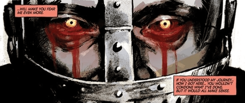
Bomb Queen Trump Card #3 out this week from Image Comics brings Jimmie Robinson’s mini-series to its rising action. By displaying everything the Queen does to push her agenda, the reader sees why she reigns supreme.
Recap
Previous issues deal with Bomb Queen running for president against Donald Trump. Even if it is under the bribe/threat of her heroic counterpart White Knight, not that she’s following his plans.
Bomb Queen Trump Card #3: Bluffing Hands Win
With Bomb Queen handling things her way, her confidants/opposers try to get a leg up on her. But no matter what they do, the results only seem to blow up in their faces. Bomb Queen Trump Card #3 only further explores why. Some critics against Bomb Queen say she’s an anti-hero, but this issue reminds readers and critics that she’s a supervillain who outsmarts all who oppose her. What better way to display that than doubling down on her vileness. Still, even stuff like exploding thongs and such are a distraction from her true villainous qualities. What makes the Queen so dangerous is her ability to turn all odds in her favor. By coming to the White Knight in his time of need, she not only secures her place in the election but is in the process of removing his restrain on her.
Nothing Is Too Far!
Robinson gets the chance to show off all of his skills. At one point, he even displays how far he’s come since Bomb Queen’s early days, through the roughs of an issue. His art is extremely emotive, from facial features to character actions, unlike before, where designs were much simpler. Even masked characters have wrinkles in their mask’s designs to display detail. Bomb Queen Trump Card #3 also displays coloring for action scenes as the backgrounds fade away to reflect the character’s color schemes. That way, it tells how characters are the central focus of the immediate narrative. Sometimes just sitting on a red chair is an indicator that White Knight is the one in trouble.
Then there’s arguably some of the less notable but important parts of comic art, lettering. On that page with roughs, Bomb Queen Trump Card #3 goes out of its way to show how Robinson uses both traditional lettering tools and setting them up before inking. It’s why many of the wordmarks look similar but are never the same or get in the way; they’re tailor-made for situations. In particular, one matches the flashbang explosion it accompanies as a natural extension, complete with a Silver Age style design; it looks harmless as comics in that era.
Bomb Queen Trump Card #3 Holds The Detonator
Bomb Queen Trump Card #3 holds everyone’s expectations by the balls, forcing them to pay attention. Because if they dismiss this as just bad girl trash, they miss out on why the Queen rules all. Every action, reaction, and small detail has a purpose that a supervillain takes to her full advantage. One that wins the approval of hardcore fans while compromising her ideals for a bigger payoff that’s coming.
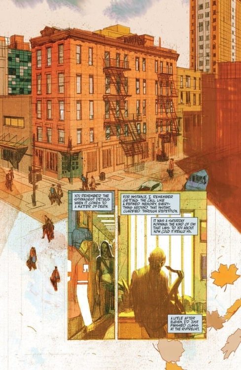
Blue In Green, out now from Image Comics, is a horror OGN about an aspiring musician who returns home for his mother’s funeral and finds amongst his mother’s keepsakes a photograph of a late sixties jazz musician.
Now, I know what you’re thinking. “How can a comic with a simple premise like this turn out to be one of the greatest graphic novels of 2020?” Well, this is exactly what I’m here for. Get ready to read all about why Blue In Green has become my new favorite horror graphic novel.
Writing
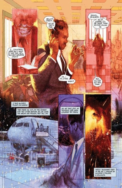
This book is wordy. Incredibly wordy. The way writer Ram V writes his narration; it’s sometimes easy to get lost in the words and feel like you’re reading a proper novel. It’s a stylistic choice that works well. All I’m saying is it might not be everyone’s cup of tea. So, be warned.
Speaking of the narration, the captions are mellow and mysterious. Ram V describes the main character’s feelings and thoughts elegantly, using intricate and vivid descriptions, but not to the point where it starts confusing the readers.
Early on, the reader can’t help but feel for Erik, the main character, and want him to find greatness. Throughout the entire comic, we’re witnessing Erik pursuing the extraordinary, willing to take every step necessary to achieve it. We see him fall, get beaten up, relieve painful memories, ruin relationships, but we never judge him or grow to hate him. By making the reader sympathize with Erik initially, we can understand every choice Erik makes even if we disagree with it.
Overall, it’s a beautiful and effective horror story. It’s poignant and terrifying. Everything you can hope for in a horror graphic novel. But, beneath the surface hides a wonderful thought piece about jazz music, obsession with greatness, talent, and art.
Art
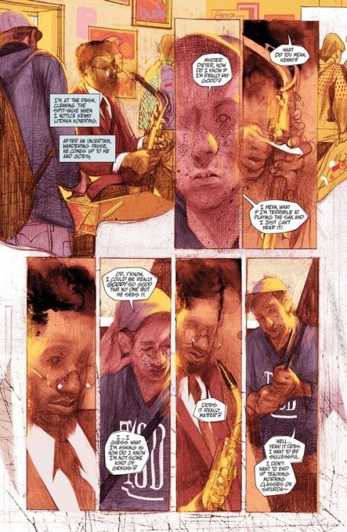
Anand RK‘s work on this book is nothing short of exquisite; he chose to use mixed media and a unique art style to tell this strange, gloomy tale.
Inspired by Dave McKean’s work, the style fits in perfectly with this story’s dark themes.
Most of the time, the pencils are rough, raw, all over the place, Weirdly poetic. Some of the pages, especially the panels where buildings appear, look like painted-over architectural drawings. It’s a bold choice that works well here. The panel layouts are messy, blending into one another, creating a trippy look to the pages while we watch Erik slowly slipping into madness.
Anand RK usually holds back on details concerning the characters’ faces, which complements the mysterious vibe of the writing, but to emphasize an important character moment or dramatic beat, Anand RK isn’t afraid to go all out and draw the faces in great detail. Almost too many details which definitely make the readers feel awfully uneasy. More specifically, there are two instances in the book where the main character plays the sax. As backgrounds, there are music sheets behind Erik. A simple, ingenious touch.
Anand RK often takes every chance he can get to use high angles to make the panels resemble a vinyl record.
The artwork oozes with uniqueness. It’s not an exaggeration to say that every page and every panel in this book can stand on its own as a beautiful piece of art.
Coloring
John J. Pearson definitely knows how to use colors to play with the readers’ emotions. Whenever there is daylight and Pearson wants us to feel safe and comfortable, the color tones are warm and friendly. They truly feel like cozy summer days in New York City. But whenever Pearson wants us to feel anxious and nervous, pink and purple colors are visible everywhere. They’re not colors which usually make us feel goosey, but it absolutely works here.
With a unique art style such as Anand RK’s, it would have been easy to play it safe and color the pages as realistically as possible, but Pearson bravely decided against it. The strange color choices compliment the dreamy art style and supernatural story perfectly.
Lettering
Aditya Bidikar‘s lettering is on par with the other amazing elements of this book. The balloons are rugged, crude. The font is hand-lettered and looks somewhat inconsistent, which works especially when the story takes its dark turns. Bidikar also chooses to remove the caption boxes surrounding the narration from time to time and blends the words with Anand RK’s art. He sometimes doesn’t even show us all the words, hiding them behind the art. By doing this, Bidikar makes the readers work a bit and lets us fill in the blanks for ourselves. Bidikar’s stylistic approach complements the art beautifully and elevates the story’s eerie, enigmatic vibes.
Conclusion
In years to come, Blue In Green will turn out to be one of those books art kids just won’t shut up about. It’s stylish, haunting, terrifying, and exceeds expectations on all accounts. If you like horror stories where the jump scares are the least important thing, Blue In Green is the graphic novel for you.
THAT TEXAS BLOOD #5, available from Image Comics on November 4th, takes Randy down a dark, bloody path as Sheriff Joe finds a clue to Travis’ killer. Written by Chris Condon and drawn by Jacob Phillips, this issue is the series’s bloodiest so far.
Cover Art
In the writer’s notes, Condon reveals the cover was unintentionally inspired by an iconic scene from Halloween (1978), but given the content of this issue, it works better as an inspiration from the film Misery (1990). Randy’s backlit outline stands out in blood-red contrast to the killing that occurred in the last issue. He wears a look of callous, malicious energy when he’s focused past the reader to whatever grisly scene lies at the bottom of the steps. It’s a powerful image from Phillips.
Writing
A good crime noir has to have a few key elements in it to make it work. One of those elements is an absolute low point for the main protagonist. Here, Randy is definitely at a low point with his own investigation into his brother’s murder, his relationship with his girlfriend, and his own moral standing.
Condon’s story is so effective because you feel bad for what Randy’s going through but are simultaneously repulsed by the callousness of his actions. Only through the progress in Sheriff Joe’s own investigation is the reader given any blessed relief from sharing in Randy’s downward spiral. Condon’s writing is as fascinating as it is painful.
Pencils/Inks
Phillips’ grounded style centers the realism of Randy’s actions, the aftermath, and the unwelcome surprise later in the issue. With every panel, you can see the burden of what Randy’s done weigh on his face when he looks in the mirror. The defeated way he slumps in a chair exudes defeat and surrender.
Randy’s spent years away from his home town, and Phillips expertly shows he’s visibly dejected by how quickly all his betterment is tossed away in just a few days. This issue is all about internal angst, and Phillips gives it to you in spades.
Coloring
This issue is effectively black and white, but Phillips wisely colors groupings of pages and panels with a specific filter to help aid the story’s visual flow. Each scene is cast in its own hue to separate the settings, giving the reader a trigger for the change in mood for what’s happening. It’s an excellent use of color for mood setting.
Lettering
Phillips’ lettering work is generally good. The conversation flows and leads the reader’s eye in the right direction. Word balloon placement is excellent, and the copious amounts of the dialog are broken up well, preventing it from becoming massive walls of texts. There could be some improvement in the leading (space between text lines) as some of the text tended to look very close to overlapping and crowded—other than that, a nice lettering job by Phillips.
Conclusion
THAT TEXAS BLOOD #5, available from Image Comics on November 4th, drives a man into a downward spiral of inner conflict and murder. The story is dramatic, and the art is brimming with mood. Issue five is another excellent entry in this series.
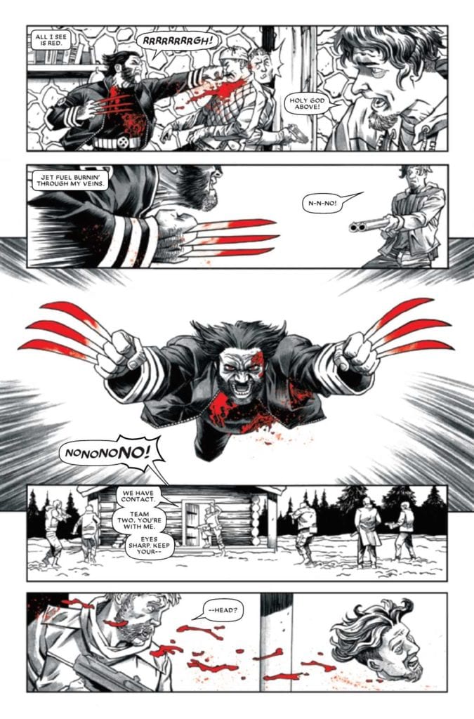
Wolverine Black White & Blood #1 is the beginning of an anthology series featuring the tragedies and complexities of Logan. Three stories by different creative teams display different sides to Wolverine. Writer Gerry Duggan, artist Adam Kubert, and colorist Frank Martin display Logan’s early days within the Weapon X program in The Beast Within Them. The second story, I Shall Be A Wolf by writer Matthew Rosenberg, artist Joshua Cassara, and colorist Guru eFX go into Wolverine’s days as a soldier during WWII with Nick Fury. The final story, Cabin Fever with Declan Shalvey in all three roles, shows Logan at his most feral but compassionate. Tying them all together is letterer Clayton Cowles of VC.
Wolverine Black White & Blood #1 (Tragedy, Sacrifice, & Foundation)
Throughout Wolverine Black White & Blood #1, the reader sees the title character in many walks of life. It’s an appeal that can serve as both an introduction of Wolverine to new readers, while older fans see bits of Logan’s upbringing without continuity getting in the way. Gerry Duggan shows Logan in agony as he is thrust into danger by Weapon X. It’s there that Logan struggles with the animal Weapon X wants him to be and the humanity beneath all of it.
The subsequent stories of Wolverine Black White & Blood #1 bounce off of these two conflicting aspects. Matthew Rosenberg shows the animalistic hunter willing to put himself at risk to kill similarly evil men. Say what you will about Hydra’s origins, but hunting down Nazis with Nick Fury sounds satisfying. But then there’s Declan Shalvey’s piece where Logan’s berserker rage contrasts with his humanity. Despite all the darkness Logan went through, he is still willing to come to the aid of a crying child.
Life In One Color
Wolverine Black White & Blood #1 lives up to its title by displaying different art styles in only three colors. Adam Kubert gives The Beast Within Them a shifting point of view. Half of the pages are in double-page spreading grids where the reader is in a similar position to Weapon X. Everything on that end looks like they’re in control of the situation while Logan is thrust into danger for their amusement; so dangerous the pages turn into splash pages. To further illustrate this, Frank Martin colors the Weapon X staff in dark grays but are safe within red spaces. Compare this to the white outdoors where Logan fights the Wendigo and the splashes of blood decorating the setting.
I Shall Be A Wolf has Joshua Cassara make most of the moments in the Wolverine Black White & Blood #1 stories feel like photographs. Considering most of the plot takes place in flashbacks, seeing each moment frozen in time gives the reader time to enjoy the carnage, complete with red coloring from Guru eFX to detail the bloodbaths. Finally, Declan Shalvey takes all illustrative duties of Cabin Fever, where he designs the emotions of everyone. But even the facial features mean little where red becomes a symbol of violence and sin. Not only from the men Logan fights but who he interacts with when the fight is over. Because who would dare bring a baby into the residue of carnage?
Lettering With Intention
VC’s Clayton Cowles acts as overall letterer of Wolverine Black White & Blood #1. Throughout the anthology, Cowles uses different techniques to display character and emphasize action. In The Beast Within, one of the Weapon X scientists has black word balloons, showing her detachment from everything else. Unlike her superior officer, who speaks with red word balloons to show his antagonism towards Logan. In I Shall Be A Wolf, several wordmarks like Wolverine’s signature “Snikt” look tailor-made to display his claws’ impact. Finally, Cabin Fever displays the emotions Logan goes through in battle. When reason fails in reaction to brutality, Logan’s captions turn red with hostility until he can calm down.
Start With Wolverine Black White & Blood #1
When it comes to characters with decades of history and complex characterization, Wolverine Black White & Blood #1 gives readers easy access. Great storytelling can be told if everyone involved can bounce off one another. With a character as complex as Wolverine, there is a lot of ways to do that. All without getting in the way of decades of character development.
The Craft: Legacy is a new horror film directed by Zoe Lister-Jones (Band Aid, New Girl) about four young witches coming of age and coming to grips with their incredible powers.
The Craft: Legacy is a sequel to the 1996 film The Craft. It stars Cailee Spaeny (Devs) as Lily, a young girl moving into her potential step father’s house. Lily eventually meets three new friends at school: Frankie (Gideon Adlon), Tabby (Lovie Simone), and Lourdes (Zoey Luna). Soon, the quartet begins to experiment with witchcraft. From there, a lot of drama and thrills ensue. Capturing the colors and telling the visual story of the film is director of photography Hillary Spera.
PopAxiom spoke with Hillary about becoming a cinematographer, 70s cinema, and making The Craft: Legacy.
Images & Story
Hillary’s been in love with still photography for as long as she can remember. “My mom tells the stories of how I used to run around with a camera. It was my instinct to collect images at a young age.”
“That led to my interest in cinematography during college,” Hillary says, though that was, in part, due to available opportunities. “The school I was in didn’t have a distinct photography class, so I took a course in cinematography. I developed a love for telling stories through images. And I shot everything that I could that came my way.”
The instinct to take pictures has a definite through-line. “I see myself in those photos from when I was a kid with a camera, and the same instinct as I have now. in my profession. It’s almost eerie!”
“I feel fortunate,” she says, “I’ve always felt like I had a distinctive eye and view, and it’s something I can proud to see through my work, despite different types of projects.”
About The Craft: Legacy
The Craft: Legacy is a film with plenty of supernatural razzle-dazzle, but at its core, it’s about relationships. “Zoe and I made a movie a few years ago called Band Aid. It was a musical comedy that she wrote, acted in, directed, and produced. This project was so special to me because the entire crew was made up of women. We also made a pilot together for ABC called Woman Up, (likely shouldn’t say this: which didn’t end up going), but it was an amazing experience.”
“When Zoe called me for The Craft,” Hillary says, I fell out of my chair because it’s a movie that I’m deeply obsessed with and was such a fan as a kid. The fact that she was making her take on it and it was The Craft was a dream come true.”
The first discussion between Zoe and Hillary was a familiar one. “All of our work together has always been grounded. It’s something we’ve always tried to do. It’s important to keep the focus on character, story and identity.”
“We talked early on,” she continues, “about how to shoot a story that’s about magic and witchcraft, and make it about the characters. The magic and witchcraft is a nice element, but it’s more about the women and their connection, the power of their bond of friendship.”
The Craft: Legacy doesn’t try to mimic the 90s style of Andrew Fleming’s original film. Instead, it pays homage and draws inspiration from much older films. “We looked to classic thrillers and horror from the 60s and 70s like Rosemary’s Baby and Andrei Tarkovsky.”
“More elevated thrillers,” she dives deeper into the vision behind The Craft: Legacy, “as opposed to more modern takes. I think the juxtaposition of telling a modern story, grounding it, and some classic filmmaking works well.”
Hillary shares some of the little things you’ll spot in The Craft: Legacy. “There’s a lot of frames within frames that reference Rosemary’s Baby. Many shots through doorways, frames that contribute to composing the actual frame.”
“There’s a scene where Lily wakes up out of a nightmare,” she takes us into the process, “and she sees a shadow in the corner. That was a fun challenge. It’s a challenge to shoot perceivable darkness.”
Hillary continues explaining the evolution of this one scene. “Zoe had this awesome idea of seeing the shadow in peripheral vision, like your eyes barely adjusted to the dark. But how do you visually represent that? How do you shoot something that’s hard to perceive visually?”
The director and cinematographer put their heads together. “We went back and forth on a bunch of ways on how to do that. It was cool to see it come to fruition.”
Making The Craft: Legacy
Hillary’s work in The Craft: Legacy is visually mesmerizing, like a spell cast by one of its magically empowered characters. The colors pop while muted and so richly textured. “In collaboration with costume designer Avery Plewes and Hillary Gurtler, our production designer, there was a lot of intention with color. The girls all had their own color, tied to their element and sign.”
I noticed a lot of gold and brown towns. “The gold is interesting,” Hillary responds, “Lily’s character has a lot of warmth to her. So, it’s fascinating that you picked up on that. I love that.”
“For Zoe, the use of elements and colors and their connection with the characters was at the forefront of what was motivating our use of color and and how we represented all that.”
The Craft: Legacy‘s connection to real-life Wiccan practices was something the filmmakers took seriously. “Zoe was very into the authenticity of witchcraft. We had three witch consultants on the film. We even participated in ceremonies before we started filming. Ceremonies where we state our intention with the film and what we’re setting out to do.”
“I’m a huge fan of the original, and that was a very intimidating part of making the film,” Hillary says of a particular moment in the film that this article will not spoil, but you’ll know it when you see it.
The Craft: Legacy is a sequel, though it doesn’t require viewing the original to understand. “It’s a very new take; it’s not like the original in a lot of ways. But it’s got the energy, the blessing, and the vibe from the original.”
Hillary’s final word on The Craft: Legacy: “It was such a powerful film to make. I am very grateful to have been a part of it. At the heart of it, the film is about the bond between the women and the importance and power of friendship among women. There couldn’t be a better time for it, and I think it will occupy and represent a unique space.
Wrapping Up
Hillary’s IMDB credits include 50 entries as a cinematographer. What’s something she’s learned since her first project, The Dresden Dolls? “That’s a deep cut!” she laughs, “The Dresden Dolls are this awesome band out of Boston. I worked on their live show/film when I lived in Boston out of college. I just saw yesterday that they’re doing a 15th-anniversary show from that first credit of mine on IMDB that we shot.”
“Trusting your instincts,” she declares as advice to up-and-coming directors of photography. “For me, it’s taking on the projects that will challenge me the most. Something that will keep me on my toes and force me to find new ways to tell stories visually. And have fun. It’s such a gift to have this job and do what I love every single day.”
Hillary’s passion for photography began as a child and is alive and well to this day. “Whether it was my job or not, I’d be shooting.”
“I love and am most inspired always by films of the 70s,” she says when asked about other work that she admires. “Vilmos Zsigmond (Deliverance, Close Encounters of the Third Kind, The Deer Hunter) and Robby Müller (Paris Texas, Repo Man, Dead Man). Films that took a risk and had something to say. Often, small stories that weren’t big blockbusters. I pull references from those films all the time. Also, photographers like Saul Leiter and Mary Ellen Mark have humanistic eyes. I pull a lot of inspiration from her.”
“There’s something to be learned from watching.”
What’s a dream remake for Hillary? “I would love to make a western, so Once Upon A Time In The West or Butch Cassidy. But I feel that it’s sacrilegious to say, those films are perfect.
The Craft: Legacy is now available on VOD. So, what’s next for Hillary? “In November, a movie I shot called Run, a thriller, will be on Hulu and starring Sarah Paulson (American Horror Story, Ratched). And a TV show called The Flight Attendant is coming out on HBO Max.”
Is The Craft: Legacy on your watch list?
Thanks to Hillary Spera and Impact24 PR
for making this interview possible.
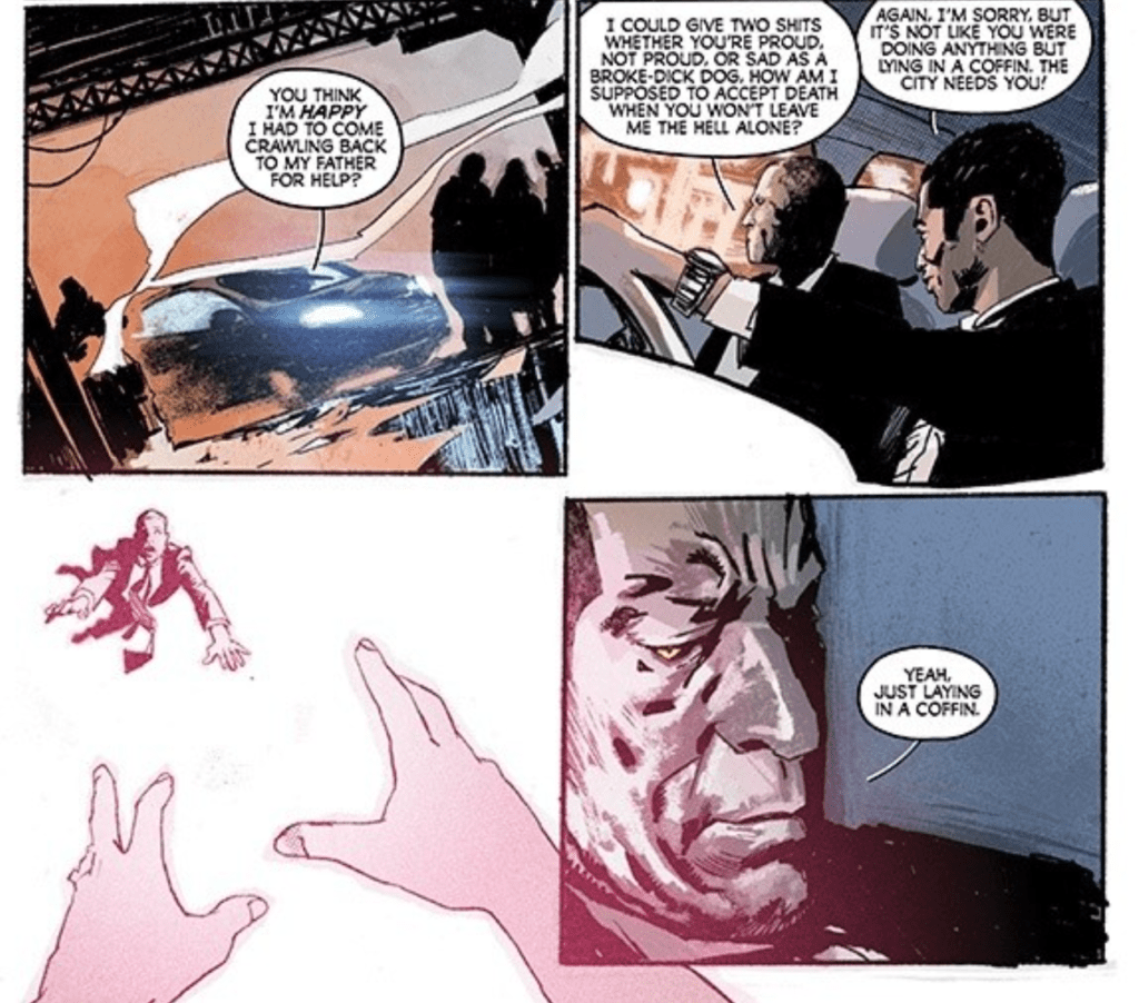
Released October 7th from Dark Horse, writer Cullen Bunn and illustrator Miguel Valderrama continue their four-part series in the second issue. Providing colors and lettering are Jason Wordie and Frank Cvetkovic, respectively.
Valderrama’s kinetic and expressive style complements Bunn’s economical writing. The result is an evenly-paced, enticing issue that builds upon Nadia’s (the protagonist) struggle with survivor’s guilt and PTSD.
Issue two begins with a short continuation of the interview from issue one, which acts as a teaser. From there, the action picks up right where it left off. One of Nadia’s teammates, Gordon, gets hit in their firefight. Unable to resist, Nadia immediately goes into rescue mode to save her teammate.
Trigger
But the firefight and recognition of the client trigger a flashback in Nadia. At that moment, Wordie’s color palette warms and brightens while Valderrama builds on a visual motif set by the cover art. The flashback reveals that she was actually dating Dobbs, the teammate killed by her current client.
A flashback to a normal date gets interrupted by a bullet to Dobbs’ head in the middle of the issue. Valderrama drew the page as a shattered mirror, parsing out each action and reaction in a broken shard. In effect, the page captures how devastating and world-changing the violent death of a loved one is.
Heightening the drama and dreamy quality of the page is dead Dobbs continuing to speak. Nadia and Dobbs’ preceding conversation was about the importance of their job. So Dobbs continues, expressing his view that it’s more than a paycheck while Nadia seems not to be taking it as seriously. Thus, within this visceral mosaic, we understand the root of Nadia’s personal and professional pain.
Point Blank
Nadia is a medic, a healer working to save people who may not deserve it for the profit of a corporation. For Nadia, Dobbs represents the higher purpose of the job. All this to say, the stakes for her are high in being forced to save the killer of her boyfriend.
Now, with Gordon’s death, Nadia has been pushed to an emotional breaking point. But just as Nadia raises her sidearm to the back of the killer’s head, the issue ends. Bunn’s cliffhangers would be infuriating if everything weren’t so well set up. At this point, the satisfying balance of shocks and slow character reveals make you wish the series were longer than four issues.
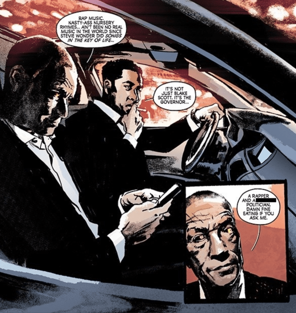
Killadelphia #9, out now from Image Comics, reveals the backstory of one of the most mysterious characters in the series and features some absolutely outstanding art.
Ever since John Adams, the leader of the vampires, was killed, his wife has taken over. Abigail Adams is even more ruthless and has plans to enslave all of humanity. The vampires have already murdered the governor and a famous rapper as they inform the public that they are still around. Abigail also has a new ruthless monster on her side, a vampire known only as Jupiter, whose past has been shrouded in mystery until now.
Rodney Barnes’ choice to wait until Killadelphia #9 to reveal Jupiter’s past was a smart way to pull in readers. For the past few issues, Jupiter has been a dreaded monster that Abigail unleashes to do her bidding, and it is exciting to see when he is in action. By leaving the fans to wonder what his past was, this issue is more engaging for them since they can finally get the answers they wanted. The backstory is an interesting tale featuring historical figures and is sure to leave readers who wanted to know satisfied.
Killadelphia #9 is full of many captivating scenes. Whether it be as simple as a conversation or as intense as a scene resulting in a bloodbath, Rodney Barnes’ writing keeps the reader engaged. The issue features a discussion between vampires that shows that not everyone may be on board with Abigail’s sinister plan, which adds another dimension to the evil vampires’ character and shows that they are not all mindless monsters. The issue also had some intense action that will leave you in shock at how bold the vampires’ strategy is.
Jason Shawn Alexander provides astonishing work in Killadelphia #9. Every character’s face and form seem so lifelike that it is stunning that Alexander can provide such high-quality art in every issue. The realistic faces he draws adds a lot to the story, especially during the vampires’ carnage. When their face is showing genuine fear, a person being attacked is a horrific image to see, and Killadelphia is full of it. Alexander’s art style is incredibly unique, and every page in Killadelphia is a pleasure to look at.
Luis NCT’s coloring pairs wonderfully with the art of Jason Shawn Alexander. Just as in previous issues of the series, Killadelphia #9 has a dark color palette that fits nicely with the story’s tone. This technique also has the added effect of making blood stand out when it appears since the bright red pops out against the dull colors of everything around it. This low saturation has the lasting effect of making the issue more terrifying.
Killadelphia #9 features the lettering of Marshall Dillon that allows the story to progress seamlessly. Speech bubbles never have an odd placement that interrupts the story’s flow, and captions are stylized depending on which character is speaking, so there is never confusion. The only downside to the lettering is the lack of sound effects in the story. There are no places where bold or interesting lettering is used, so Dillon’s talents are never fully shown.
Killadelphia #9 is another entertaining issue of the series that is full of violence and brilliant dialogue. The art is gorgeous, and the coloring pairs with it incredibly well. The story unfolds more and more each issue, leaving the reader always waiting to get their hands on the next issue.
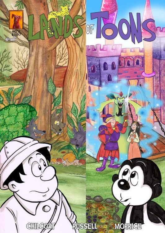
Lands of Toons is the indie comic project of creator Kevin Chilcoat. Joining Chilcoat are artists Hayley Russell and Andrew Morriss, who share all art duties. The Kickstarter for the third issue (ending November 7) is currently the only known way to get these comics.
Animate Has A New Meaning
From the words of the creator:
This story was initially written by me (Kevin Chilcoat) as a screenplay, as it was and is intended to be a movie. The screenplay is complete and has been for a year at this point. Unfortunately for me, getting an animated movie made is something I don’t have experience in, and I don’t have any resources to help me with that goal. So I’ve decided to take a chance to do what I can to bring this story to life and adapted it into comic book format. I’m also working with Hayley Russell and Andrew Morrice of HRAM Comics, who have illustrated, inked, lettered, and colored this book.
Lands of Toons is a story created by a fan of animation and is for fans of animation. From Walt Disney to Chuck Jones to Don Bluth, Lands of Toons pays homage to the types of stories, themes, and characters that each of these entities brought to life. To stay true to the evolution of animation, the first issue is almost entirely in black and white, where the second and third issues are in full color.
Lands of Toons: The Grind of Popularity
Lands of Toons details the development and life of cartoon characters with self-awareness. Much like the screenplay itself, Chilcoat has them come into existence as they enter all of the motions. Magnus The Monkey and Zookeeper Ted quickly fit into their preordained roles for skits. It’s like the toons are actors purely out of necessity with a system based on ratings keeping them alive. Nobody really understands it; everybody does what they’ve been given. That sounds dangerously like living your mundane life and taking some form of entitlement out of it. Some people like Magnus and Ted get lucky with their high ratings, but the less popular and notable get left behind.
Imagine that scenario with every cartoonist’s hopes and dreams. Whether it’s the funny papers or TV, artists struggle to make something work while competing against others looking for a chance to shine. Even then, it’s mostly telling the same jokes over and over again until something new comes along. Even longtime favorites like Garfield go down this path. So what happens when toons start disappearing when their ratings drop? Well, if you’re on top like Magnus at first, you keep doing the grind. Because if you’ve got something good, why change anything?
Out Of The Box Improv
But what about the people who are less fortunate than you in these situations? The other toons can’t help that their scripted episodes don’t appeal as much. But ignoring others’ problems like they won’t be yours is just denying the reality of the situation. Just because one team of toons won’t disappear as fast doesn’t mean that they won’t. It’s that kind of entitlement that leads to complacency. Had it not been for Ted motivating Magnus into going into the other Lands, Magnus would have lived in denial.
Between all of the hijinks and new experiences, there are some genuine moments of living outside the Lands of Toons’ boundaries. During an act in one of the lands that evoke the tragedies from movies like Bambi. Magnus and Ted’s actions in rejection of the script actually make that scene a higher rating. Unfortunately, despite having a minor victory, what happens after this act gives way to another tragedy in issue 2. Without spoiling anything, it’s a genuine loss because of Magnus and Ted’s choices and ultimately sticking to it. The quest to save their remaining friends even forces Magnus to reflect on his earlier entitlement in Issue 3. What better foil than a spoiled prince who gleams toxic masculinity?
Lands of Toons In Colors
The two artists Hayley Russell and Andrew Morrice, take on all creative rolls in Lands of Toons. Between the two of them, each issue’s change in artwork tells a piece of the story. The monochromatic rubber hose designs of the early toons perfectly encapsulate the simpler times Magnus and Ted live in. Everyone sticks to the script, and everything seems fine with all of the slapstick gags like flattening on a brick wall. But the lack of sophisticated insight is what holds them back.
The more colorful lands certainly try to add more sophisticated designs. The backgrounds are meant to evoke the highly detailed stills from Disney animation’s likes from 1937’s Snow White and the Seven Dwarves and onwards. In contrast, characters with simpler designs are built to be more expressive. If Magnus and Ted ever got color redesigns, they would fit nicely in the land. Princess Myra certainly covers that aspect in her travels to the different colored lands. It’s the kind of warmth people watching family films would like to reminisce and enjoy with others. Which just so happens to be what Chilcoat is hoping for.
The Language of Comics
All of the above can easily be done if Lands of Toons was animated. Russell and Morrice, however, ensure that this is still a comic through both panel layout and lettering. For example, a page of issue 3 features a classic 9-panel grid where Magnus is panicking from trying to take back control of the situation. A couple of word balloons going out of the next-to-last panel from Magnus and Myra reveal that this is an overreaction on Magnus’ part. The last panel effectively reacts by straightening out this inner turmoil by the last panel focusing on Magnus, and his word balloon stays in bounds.
Lands of Toons is Fun For The Whole Family
Lands of Toons effectively captures the essence of classic animation by displaying what makes them memorable. It’s not the fame or high ratings that keep them going; it’s the memories made. Spending these moments with others can help one person find the shortcomings of others. Breaking away from the formulaic grind is just the first step to creating a self-aware identity. Otherwise, they’re stuck in a grind until everything dries up. All of this in a screenplay made into a comic that isn’t even done with its first act.
Chad Faust’s Girl was the dull point during Fantastic Fest, and Bella Thorne gave one of her worst performances to date. When your film includes a nameless protagonist and other nameless characters, it would be nice to have them fleshed out in other areas. The film has something to say about cycles of abuse and family turmoil. Sadly, Girl is a dull drama with almost no redeeming qualities.
Girl is a coming of age film about a young woman discovering that most of her life has been a lie. The premise is intriguing, but the execution is a misfire, unfortunately. Behind all of its themes regarding loyalty and abuse, is a film that could have been much better. It’s not the narrative itself, but the performances from the actors don’t seem to do justice for this material. Directed and written by Chad Faust, Girl stars Bella Thorne, Mickey Rourke, Chad Faust, Lanette Ware, Elizabeth Saunders, and John Talbot. Girl follows a woman (Thorne) returning to her hometown to kill her father, but someone has already taken his life the day before she arrived.
Bella Thorne in Girl
The reason Girl comes to her father’s town is because of a threatening message sent to her mother, but that ends up being half of the truth. After the discovery, she spends time searching for answers and unravels a family secret. As mentioned, the characters involved have generic names or none at all. The names are their positions in the town or role in Girl’s (Thorne) life. For instance, Rourke stars as the town sheriff so his name is Sheriff, and the girl is Girl. Her name not being disclosed may be to represent other women who have been abused by men in the past. Faust doesn’t do enough here for you to care about this woman, or her issues honestly. The dialogue between these characters is nauseating at times since none of the performers seem to care and come off like they just needed something to do. There is some sense of growth for our protagonist, in the end, so she is at least developed throughout the film.
Thorne’s performance is lackluster at best because she has this awful accent throughout and her delivery comes off as uninterested. Girl probably would have ended up a lot better if the performances were done differently. Rourke is fine, but he comes off just as uninspired and bland. Still, his performance is enough to make it clear that the sheriff in town is corrupt after he stalks Thorne’s character when she arrives in town. Faust stars in the film as well, as some assistant to Rourke and they are after something from this girl’s father. Girl was just a poor outing performance-wise, and it’s no help when your lead character is horribly brought to life.
Mickey Rourke in Girl
Faust does show potential as a director, Girl has a solid pace, and he manages to make you uncomfortable during a lot of her interactions with these men in her life. He effectively builds tension throughout and captures some intense action sequences. The look of the film helps establish the dark nature of the town and the cloud hanging over our protagonist’s life. Faust has a good film in him, but this debut is watered down by weak performances and a subpar script. There are twists, but again, everyone seemingly doesn’t care about the material they are working with, so as a viewer you won’t care either.
Girl is a bleak revenge film that features some of Rourke and Thorne’s worst performances to date, but its themes of abuse might be enough to satisfy some viewers in the end. However, it is important to mention that the film doesn’t even seem like it’s about our protagonist at times, so it’s clunky in that way. A clunky revenge tale that pits a nameless woman against nameless men.
Come Play has a lot of great ideas it could mess with but decides not to, and still serves up a decent horror film. Horror fans will instantly notice the similarities between this film and The Babadook. Derived from a short film, Come Play gives parents another reason to monitor their children’s every move. The film started strong but dove into typical horror shenanigans as it progressed.
If it wasn’t made clear above, Come Play is one of those films that you know could have been better and it might sting after viewing it. The film is not overly bad, it’s fine for what it is, but it squanders the potential to be great. Directed and written by Jacob Chase, Come Play stars, John Gallagher Jr., Gillian Jacobs, Azhy Robertson, Winslow Fegley, Jayden Marine, and Gavin Wright. The film follows Oliver (Robertson), an autistic child who struggles to make friends and finds solace in his mobile devices. However, a monster named Larry begins to manifest itself through Oliver’s devices. That brief synopsis might turn some off, but the film’s silly premise never comes off as such.
Azhy Robertson as Oliver in Come Play
Oliver is a sympathetic character with credit given to Robertson for delivering a terrific performance in the role. He has a disconnect from his parents due to his inability to communicate, struggles socially at school, and gets picked on at times. Chase provides enough for audiences to connect with Oliver, but glazes over some ideas presented in the film. For instance, Come Play casually touches on the connection between technology and loneliness, but it never digs into it. Still, some development decisions were refreshing to see. Oliver has a bully at school, who we learn was once a very good friend, and the two eventually reconcile along the way. Oliver’s parents, Sarah (Jacobs), and Marty (Gallagher) are doing the best they can. Chase explores the family dynamic, which allows viewers to feel for them, so he does a great job making you care about what happens.
Robertson shines as Oliver, the young eight year old who just wants to be accepted for who he is. He delivers one of the more tasteful depictions of autism and it will be exciting to see the future projects he tackles. All of the child actors involved in Come Play are great. As for the adults, Jacobs and Gallagher deliver serviceable performances as Sarah and Marty. It feels as if they are an actual family because there’s some heartbreak involved while watching them raise Oliver. Jacobs’ portrayal of Sarah is the most heartbreaking because she spends most of her time with Oliver. She embodies the desire of Sarah wanting to hear her child speak in a very beautiful manner.
Oliver and friends in Come Play
Chase understands how to build tension and keep viewers on the edge of their seats. Come Play offers up terrifying sequences early on, but then eases up later on. Chase’s directional debut isn’t a complete home run, but it’s clear that he has a lot to offer in the future. There are some horrendous visual effects of Larry and it is unfortunate because the design isn’t that great either. Chase does a terrific job creating scares by teasing the appearance of Larry, but once the monster appears it sucks the scares out with its laughable design. Come Play includes some stellar cinematography and a solid score to accompany the films terrifying moments.
Come Play never lives up to its full potential, but it’s one of the better horror films released this year. It follows familiar beats of other horror films and it is destined to be compared to The Babadook, but with more focus on technology. Playing it safe would be the best way to describe Come Play because of how it glazes over certain aspects of the narrative. A subgenre of techno horror seems to be on the way and this was a decent offering.


 But what about the people who are less fortunate than you in these situations? The other toons can’t help that their scripted episodes don’t appeal as much. But ignoring others’ problems like they won’t be yours is just denying the reality of the situation. Just because one team of toons won’t disappear as fast doesn’t mean that they won’t. It’s that kind of entitlement that leads to complacency. Had it not been for Ted motivating Magnus into going into the other Lands, Magnus would have lived in denial.
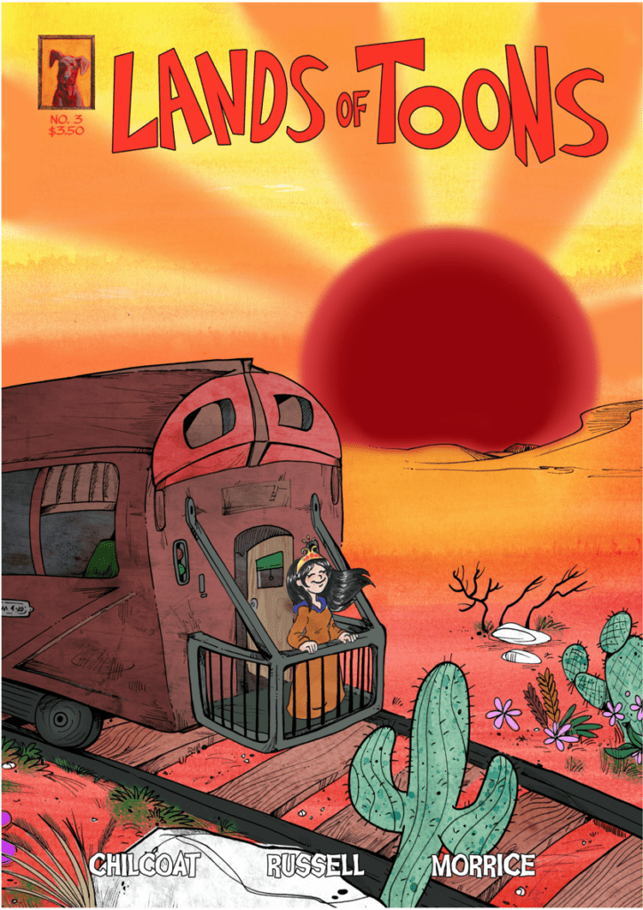 All of the above can easily be done if Lands of Toons was animated. Russell and Morrice, however, ensure that this is still a comic through both panel layout and lettering. For example, a page of issue 3 features a classic 9-panel grid where Magnus is panicking from trying to take back control of the situation. A couple of word balloons going out of the next-to-last panel from Magnus and Myra reveal that this is an overreaction on Magnus’ part. The last panel effectively reacts by straightening out this inner turmoil by the last panel focusing on Magnus, and his word balloon stays in bounds.


