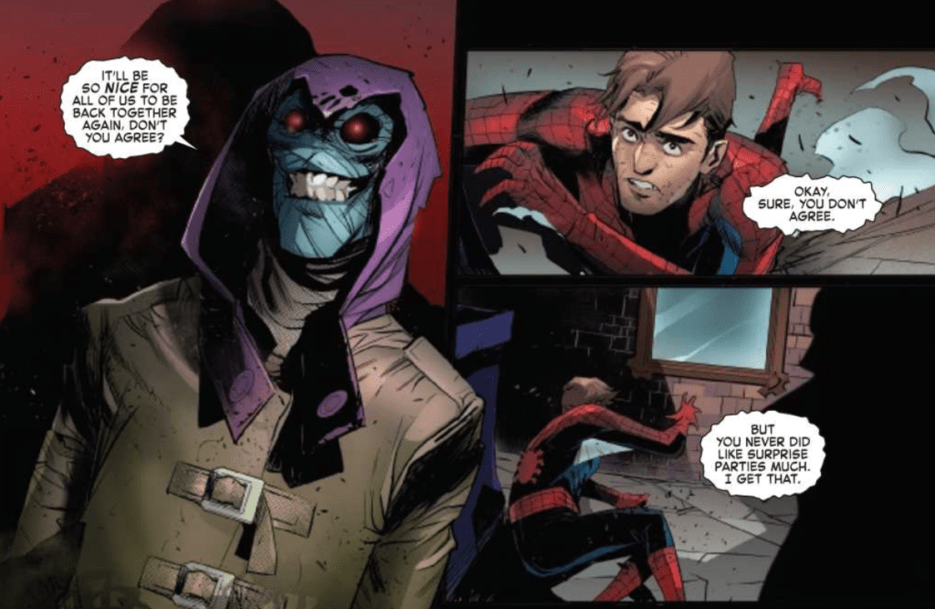
The Amazing Spider-Man #55 is where everything begins to come together but is still so far from concluding. Out now from Marvel Comics, this issue is a page-turner that will keep your heart racing, as the multiple storylines that we followed all culminate into one outstanding tale.
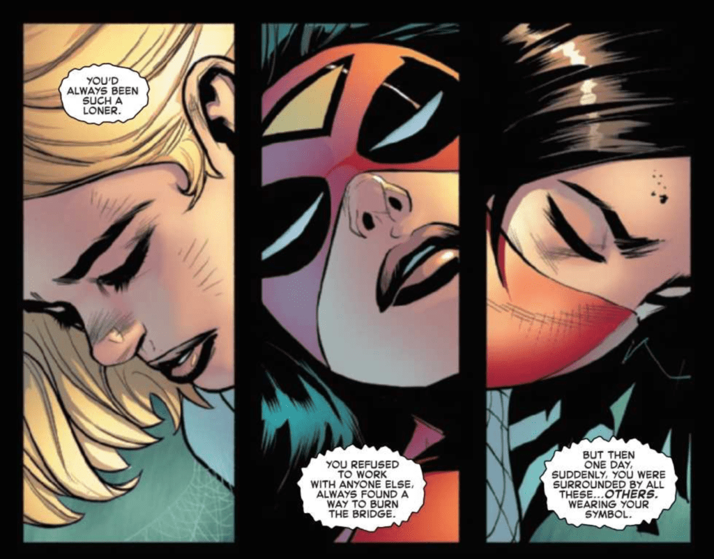
The Amazing Spider-Man #55 is some of Nick Spencer’s finest work in the entire series. After we have been following the stories of Kindred and Peter, Norman and Mary Jane, and the Order of the Web for the majority of the “Last Remains” arc; we finally get to see all of them connect in a scene so tense that you will be unable to stop turning the pages. The dialogue in the issue is superb and allows for scenes that effortlessly tug at the readers’ heartstrings. The dialogue is so heavily tied to the characters’ emotional connections, and we already care so much about all of the characters involved, that it is easy to become invested.
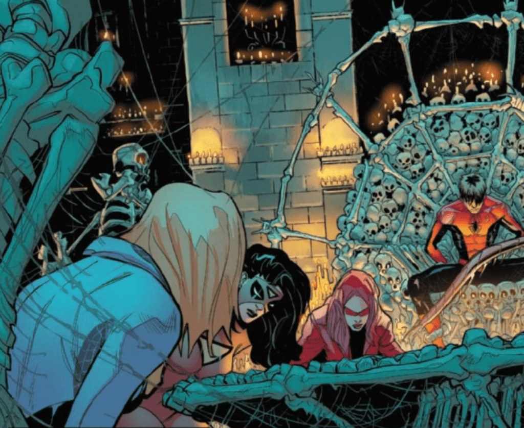
The best response I can give to describe Patrick Gleason’s art in The Amazing Spider-Man #55 is WOW. Just WOW. His work in some panels is incredibly intricate, and his characters’ faces perfectly capture the emotional scenes of the issue. The experience of reading the issue is one of flying through pages as you take in Spencer’s phenomenal story and then having to pause at the stunning artwork presented by Gleason. His depiction of Kindred is disturbing, the setting establishes a creepy tone with ease, and the action is some of the most intense I have ever seen. Gleason also uses some unconventional panel framing that adds to the eerie tone of the beginning of the issue, which helps tell Spencer’s story.
Edgar Delgado provides fantastic coloring in The Amazing Spider-Man #55, which reinforces the issue’s themes. Since the issue has a very dark tone, Delgado makes sure to reflect that in his color palette choice. However, he does not let the colors be too dark or dreary, which would result in a bland color composition, but instead finds a delightful middle ground. The colors still represent the tone, but there is still plenty of color that makes each page pleasant to look at. Delgado also provides some excellent gradients for the characters’ faces, which helps them come across as realistic.
The Amazing Spider-Man #55 features VC’s Joe Caramagna’s brilliant lettering talent, and it drastically improves the issue. Bold fonts and vibrant colors give sound effects a deeper impact and cause the blows inflicted to seem more brutal. Caramagna’s positioning of word bubbles also allows for the story to flow smoothly, which is vital for a tense issue such as this.
The Amazing Spider-Man #55 is a nearly perfect issue that had me deeply engaged the entire time. The art is jaw-dropping, and the story had me dying to turn the page and discover what happened next. The coloring helps the creepy art disturb the reader, and the lettering adds weight to the action. I really couldn’t recommend this issue enough. It had everything I wanted and more with combining the separate storylines that we followed in The Amazing Spider-Man.LR issues. I am eagerly waiting to see where the following issues will take the story.
The Amazing Spider-Man #54.LR, out now from Marvel Comics, is an issue where the plot is continually twisting and turning in ways that a reader couldn’t predict, and the art is stunning.
Nick Spencer and Matthew Rosenberg wrote The Amazing Spider-Man #54.LR, and successfully provided for a captivating issue. As the events that were set up by the previous issue begin to play out, there are twists that almost everyone would fail to predict. The surprising way the plot plays out leaves the reader wondering what will happen next and glues their eyes to the page. It all builds up to a shocking conclusion that excites the reader for the next issue in the series.
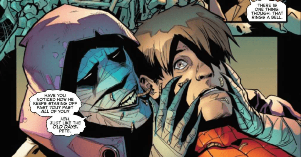
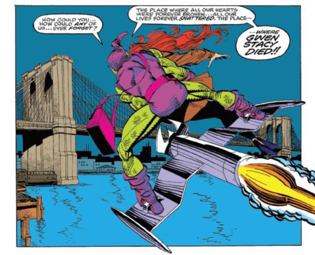
An intriguing aspect of The Amazing Spider-Man #54.LR is the inclusion of pages from Peter Parker: The Spectacular Spider-Man #200. Written by J.M. DeMatteis, drawn by Sal Buscema, colored by Bob Sharen, and lettered by Joe Rosen, Peter Parker: The Spectacular Spider-Man #200 is related to the issue because of its focus on the same characters. Since the history of the characters involved is so long, many readers may be unfamiliar with the dynamic between the characters the issue is focusing on. They included this scene to give context to new readers, and by having an actual scene from a past comic book, the reader knows the information about the past isn’t embellished in any way.
The pencils of Federico Vicentini and Takeshi Miyazawa combined with the inks of Vicentini, Miyazawa, and Scott Hanna result in a delightful cartoonish art style for The Amazing Spider-Man #54.LR. This cartoonish style allows for action scenes to have a lot of dynamism, which is difficult for highly realistic art. The exaggerated expressions they have would look ridiculous in other art styles, but here it helps easily carry the issue’s emotional moments. The style is also not overly cartoonish, but instead is a nice semi-realism that allows both a serious tone and exaggerated emotions.
The Amazing Spider-Man #54.LR features Erick Arciniega’s coloring talents, and he brings life to the issue that would have been absent otherwise. Each page’s color composition is beautiful, and the gradient backgrounds help add a creepy tone during one encounter. Arciniega also uses the technique of drastically changing a panel’s background color from the setting to help instill energy into the scene, and it works perfectly. I can not say enough good things about his performance in this issue.
VC’s Ariana Maher’s lettering never ceases to amaze. Her work in The Amazing Spider-Man #54.LR is particularly impressive, as the bold captions and choice of fonts do wonders to enhance the issue’s experience.
The Amazing Spider-Man #54.LR is an excellent issue, which shows that the story has lots of excitement to come. The art is terrific, the coloring is gorgeous, and the lettering helps make the issue a page-turner. If you’re a fan of what’s currently happening in The Amazing Spider-Man series, you will not want to miss this superb issue.
There’s not much that’s new about DC Comics’ Generations Shattered #1. It feels more like a retelling of DC history than its own original story. But somehow, writers Dan Jurgens, Andy Schmidt, and Robert Venditti, along with a huge cast of artists, colorist Hi-Fi and letterer Tom Napolitano, make this patchwork of DC favorites feel fun and fresh. It’s the dose of 80’s/90’s joy and weirdness comics sorely need right now.
Writing
Jurgens, Schmidt, and Venditti borrow from a lot of major DC works. In fact, most of Generations Shattered #1 feels nearly identical to Crisis on Infinite Earths. A major villain is destroying the DC Universe, and a cast of heroes is brought together by someone who’s watching from out of time (dare I say, a monitor?) to put a stop to this big baddie. So why does Generations Shattered feel like it works? For one thing, it seems deeply aware of its own “plagiarism.” It rehashes Crisis to comb through it for opportunities missed. And the moments that Generations Shattered does its own thing are pitch-perfect. Old man Booster, Kamandi meeting Changeling, the general flubbing of Skeets’ entire plan. It feels so true to ’80s and ’90s comics, forever humbly nodding to its influences. It’s a creative team that’s throwing out the rule book for the sake of fun. They’re telling us a story we’ve seen before because they’ve decided it’s about time we got a rerun.
Art
There are a good 22 separate artists working on Generations Shattered #1. A little overkill? Well, actually no. Because Generations Shattered is a treasure hunt through DC’s multiverse and history. So when Dan Jurgens and Klaus Janson are drawing pages, following the Golden Age Batman, they’re deliberately imitating the style of 1940’s comics. But when we meet our very ’90s-esque supervillain, it’s John Romita Jr. and Danny Miki who take the helm, using the edgy stylistic linework we know from that era. When Generations Shattered #1 mimics works like Animal Man, with characters falling outside of panels, Rags Morales takes over. Morales’ style is remarkably similar at times to that of Chas Truog, Animal Man regular. And finally, we land in a world drawn by Mike Perkins. It’s a peek behind the curtain, a humanity behind the theatrics. Generations Shattered #1 is a spectrum of themes, eras, and styles. A team of artists brings their wildly different approaches to the table, with intense diversity to the spectrum.
Coloring
Hi-Fi is constantly adapting to each new scene in Generations Shattered #1. To match Kevin Nowlan’s style in the 1960’s scene of space battles, Hi-Fi makes the scene bright and vibrant. Much of the comic is incredibly colorful, in fact. It’s reminiscent of the Bronze and Silver Ages. Occasionally, like when Dr. Light fights Hector Hammond, we’re reminded that we’re reading a modern comic. And when we see our heroes falling through time, the scenes behind them are slightly faded. It’s like we’re watching these scenes through shards of glass as time is literally shattering. Finally, as the issue closes, Hi-Fi drains the page of all color. It’s an interesting turn. It reminds us both that we’re reading a modern comic, it feels quite new and experimental to change the color scheme so late into the issue suddenly, but it also reminds us this issue is dealing with the world of old comics. Like a 1920’s comic strip, we’re left in a strange, old world.
Lettering
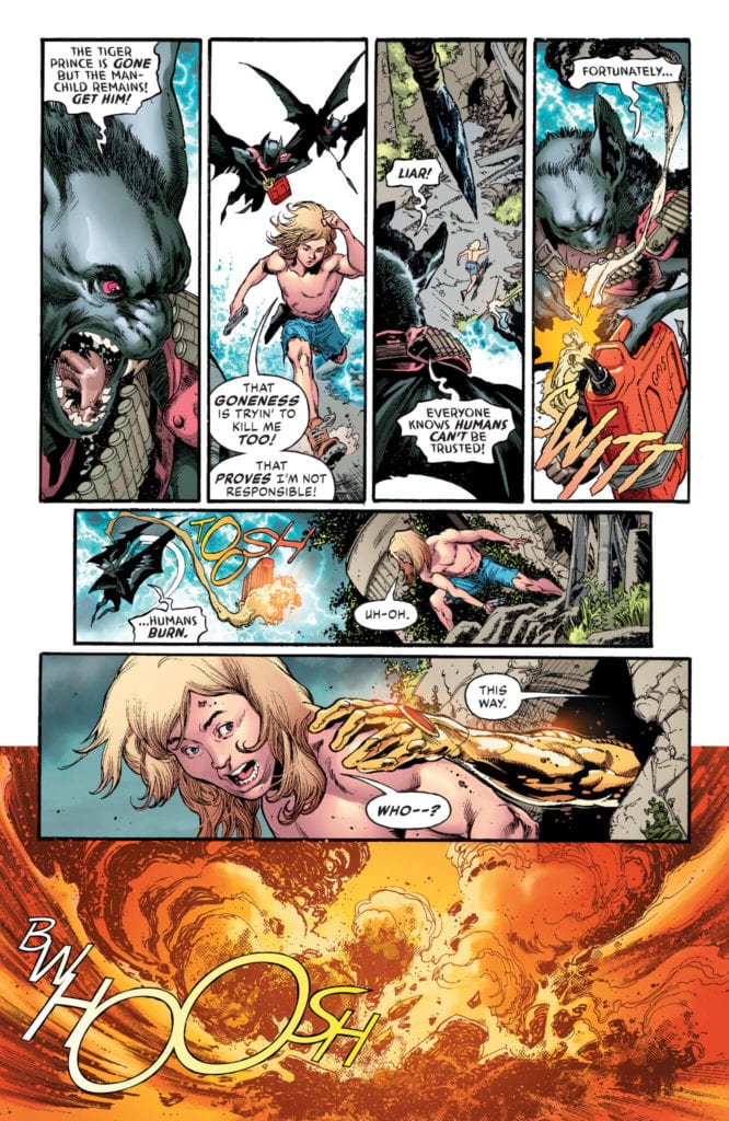
So much of what makes this issue feel like a fun romp through time is Napolitano’s lettering. Napolitano’s lettering is constantly changing, especially noticeable in his sound effects. The thin lettering of an ’80s style “BWHOOSH,” marking an explosion, looks so different from the “KRAK” of 1940’s Batman breaking open a door. When we finally meet our big bad villain, Napolitano brilliantly shows us his state of mind. First, as he sees the heroes undoing his hard work, his lettering is all over the place, from small whispers of disappointment to screaming in anger. And as he makes his move, the change is chilling. We see the next few lines as cold, emotionless captions. It feels like a flex. This villain is so powerful that he doesn’t have to follow up with screaming and wailing when he makes his move. Instead, his actions speak for themselves.
DC Comics’ Generations Shattered #1 is a love letter to the DC Universe. It takes classic earth-shattering events like Crisis and Zero Hour and brings them together in one fun romp through time. It’s nothing new, but it makes for an awesome rerun. Pick up Generations Shattered #1, out from DC Comics on January 5th, at a comic shop near you!
Available now, Tales from the Dark Multiverse #1 Dark Nights Metal is the latest event comic from DC Comics written by Jackson Lanzing and Collin Kelly, originating from a story by Scott Snyder, Jackson Lanzing, and Collin Kelly. Providing pencils and inks are Karl Mostert, Trevor Scott, and Norm Rapmund. Finally, rounding out an appropriately epic creative ensemble, Romulo Fajardo, Jr. provided the colors, and Andworld Design created the lettering.
The difficulty in judging event comics lies in the fact that they aren’t really singular books. Obviously, there has been lots of set up leading to this comic. Because of the natural dependence on what came before, nothing much happens in this book. Despite the strong concept and art, the story’s heavy exposition and clichés mean the book falls flat.
Tempus Fuginaut, an interdimensional deity meant to preserve the boundaries between worlds, opens the book explaining who he is and how this world was corrupted. Batman became Barbatos, and everything was destroyed, including most of the Justice League. Now Duke Thomas, a metahuman and former Robin, is one of the few left along with Hawkman, Hawkgirl, Iron Man, and Nightwing who must defeat Barbatos.
Into the Darkness
In disguise, Nightwing has managed to fend off demons and dragons with his “multiversal frequency disruptor” that looks an awful lot like an electric guitar. But neither he nor the Justice League has managed to defeat the villains. Instead, they hide, doing their best to survive.
Duke Thomas seems to be the underdog of the story, but it’s his hope that galvanizes the remaining Justice League, and he devises a plan. While the high concept and inspiring underdog story are all well and good, by the end, Duke Thomas has an easy time defeating the enemy.
Aside from Barbatos, the story’s main villain is the Batman Who Laughs, an evil hybrid of Batman and The Joker. He’s equipped with Zatanna’s magical hand and a Joker dragon hybrid who does the dirty work. Here, we see the strengths of this book: character design.
Aesthetics
For example, The Batman Who Laughs, along with the rest of this dark, corrupted world, is full of sharp edges and muted coloring. Zatanna’s decomposing hand and the Joker Dragon are effectively disturbing for the same reason. Moreover, Zatanna’s hand permanently stuck in a Ronnie James Dio metal gesture and Nightwing’s guitar are a couple of decidedly metal aspects. Thus, Mostert, Scott, and Rapmund’s overall aesthetic are striking and exciting.
Andworld Design’s lettering, while fun, feels quite conventional in keeping with the established DC/Richard Starkings look. Unfortunately, each of these elements makes for a mediocre, forgettable read. Regardless of some conventionality, unnecessary expository monologues from Joker and Tempus Fuginaut, and plot conveniences, the most disappointing aspect of this event book is that it just isn’t very metal.
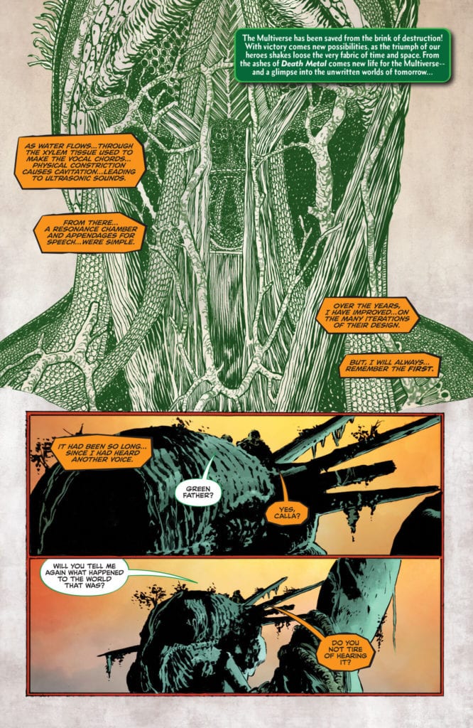
With art by Mike Perkins, written by Ram V, colors by June Chung, and letters by Aditya Bidikar, DC Comics’ Future State: Swamp Thing #1 is unnerving and mysterious. V, Perkins, Chung, and Bidikar have the hefty task of introducing us to a world that must be both new and familiar. But even the new, here, feels somewhat familiar. That’s because this creative team pulls from the real world to give their mystical story the smack of realism.
Writer
V links our new cast of characters, a nomadic tribe of plant creatures, to nomadic tribes of the real world. We get a sense of more than just survival happening. When a young plant girl comes to Swamp Thing, he tells her of their history. It feels ritualistic, like a pillar of a culture steeped in oral traditions. Ultimately, that’s what V achieves in these pages. He makes us feel like these are characters with an established, almost ancient culture, even if it’s new to us. And every few pages, V walks us through how Swamp Thing went about creating life. We see the challenge of making lungs, muscles, and emotions out of leaf and root. So, while we feel like we’re playing catch up in some ways, we’re regularly reminded that this fantastic new world is rooted (no pun intended) in realism.
A separate article could be written, dedicated solely to V, Perkins, Chung, and Bidikar’s beautiful work on this fantastic splash page.
Art
Perkins does a brilliant job of making us feel that this is a tribe of real people we’re following. Their skin might be bark, their hair leaves, but their smiles and suspicious glances are unmistakably human. Characters like Indigo, and the curious young girl who meets with Swamp Thing at the opening, are bursting with character. In fact, Perkins’ juxtaposition between these two is what highlights their traits. Indigo is a gnarled, bitter, trouble-making old man, while the young girl is bright-eyed and full of hope. Perkins also imbues seemingly innocent moments with human drama. When Indigo asks Swamp Thing to “lay bare your secrets,” it’s Swamp Thing’s fear, clear on his face, that makes the request suddenly feel dangerous. And Perkins’ nuanced expressions are interrupted by impersonal images of a plant person’s anatomy. DC Comics’ Future State: Swamp Thing #1 is a visual tug of war between the emotionless, secretive nature of its titular character and the excited humanity of its offspring.
Coloring
To fully understand Chung’s coloring, you have to be familiar with the mythology of Swamp Thing. Guardian of the Green, Swamp Thing is a character who lives in a place of tension. Previously, he’d been a man. A creature of “the Red.” But now he lives to protect plant life. So it’s interesting, then, that Chung associates the color red with a few things. For one, Chung uses red to show when characters become panicked or angry. It’s their display of human emotions, marked by a color that is typically associated with humanity in this world. But, even stranger, Chung uses red to show Swamp Thing communing with the Green. When he uses his power, we see the roots of trees in red, looking like blood veins through the earth. Maybe it’s because Swamp Thing uses his power to find humans or because he’s a bit of both himself. Either way, Chung’s use of red and green in this issue is more than just cosmetic. It’s a representation of Swamp Thing’s warring natures.
Lettering
Bidikar makes some fascinating choices when lettering this issue. We see Swamp Thing’s dialogue, written in the same format we’re used to. The orange word balloon and black lettering with a jagged edge, with ellipses showing his difficulty forming words. But the rest of the plant people, Swamp Thing’s offspring, are lettered differently. They have a green outline to their white word balloons with no ellipses to show any hesitation. Bidikar shows us that Swamp Thing is different than everyone else. He’s not like the plant people, nor is he like humans. The one moment Bidikar seems to have missed an opportunity is when Swamp Thing finds a human. “Let me speak… to him in a voice… he will understand…” he says to the others. And he does, but his dialogue doesn’t change visually. There’s no change in font of any kind to show this transition, which is slightly confusing. It’s a tough moment though. There’s no way Bidikar can mark Swamp Thing’s lines to the others as “translated from” because there’s no known language for plants. But even an absence of ellipses when they’re chatting amongst themselves could be a small tell to show a change.
DC Comics’ Future State: Swamp Thing #1 doesn’t feel like a first issue. It feels like another chapter in the long lineage of an ancient tribe. V, Perkins, Chung, and Bidikar make this new world feel marvelously lived-in. It’s a great introduction to the mystical side of DC Comics’ Future State event. Pick up Future State: Swamp Thing #1, out from DC Comics on the 5th of January, at a comic shop near you!
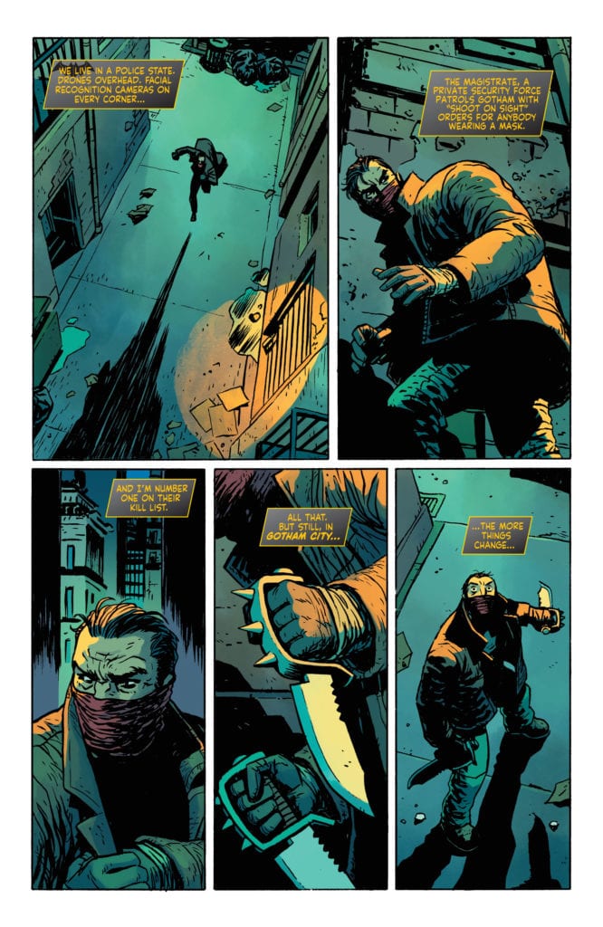
Back in October of 2020, we were first given a peek into the future of the DC Universe. Future State gives writers a chance to explore new characters while taking up the mantles of iconic heroes. Along with that, it expands on potential stories for fan-favorite characters in this new world. The first of these Future State issues sees The Next Batman after Bruce Wayne. While this is not the first time we’ve seen a futuristic Batman, I’ve personally been excited to explore this new Gotham and its heroes. So what does the Bat-family of Tomorrow have in store for the readers of today?
**Some Spoilers Below**
Story:
In the future, there is a new form of law enforcement in Gotham known as The Magistrate. They send out peacekeepers, which the new Batman has to contend with due to their more violent ways. We focus on the Fox family, with Luke helping out his mom, working on case laws during the day. He visits his comatose sister, Tamara, and comes face to face with his brother, Tim, going by Jace. The pair don’t see eye to eye since the latter went awol from army training. That said, it becomes more and more clear they are working to protect their city.
We also get two other stories involving the Outsiders and the Arkham Knight. The Outsiders follow Katana, now in sweet samurai armor, taking on Kaliber while protecting Duke Thomas’ pursuit of getting people out of Gotham. During one of her missions, Tatsu meets up with Black Lightning, now a lightning elemental, who has come to warn her that The Magistrate is setting Duke up to fail. The Arkham Knight, in contrast to the Outsiders leaving town, is leading a battle against the new order of Gotham. Using volunteers from Arkham, Astrid leads the battle against The Magistrate and their peacekeepers.
This issue is less about Batman and the other heroes of this new age and more about shaping this futuristic Gotham. That isn’t to say this is a bad thing. If anything, it sets the scene extremely well. We still get cool sequences of action, such as Tatsu hunting down Kaliber in an amazing two-page spread, and wonderful character moments, such as Astrid playing psychiatrist to one of her soldiers.
However, the best moments come from the main story, as we get to know our new Batman. While we don’t get too much action from him, we see him offering misguided kids a chance to go straight rather than leave them beaten down or taken down by the Magistrate. This new Dark Knight can be tough yet still be a hero. As the issues go on, and the rest of the world gets filled in with the other Batman book and Justice League titles, we’ll learn more about who he is. From this first issue, though, it’s already turning out to be promising.
Art:
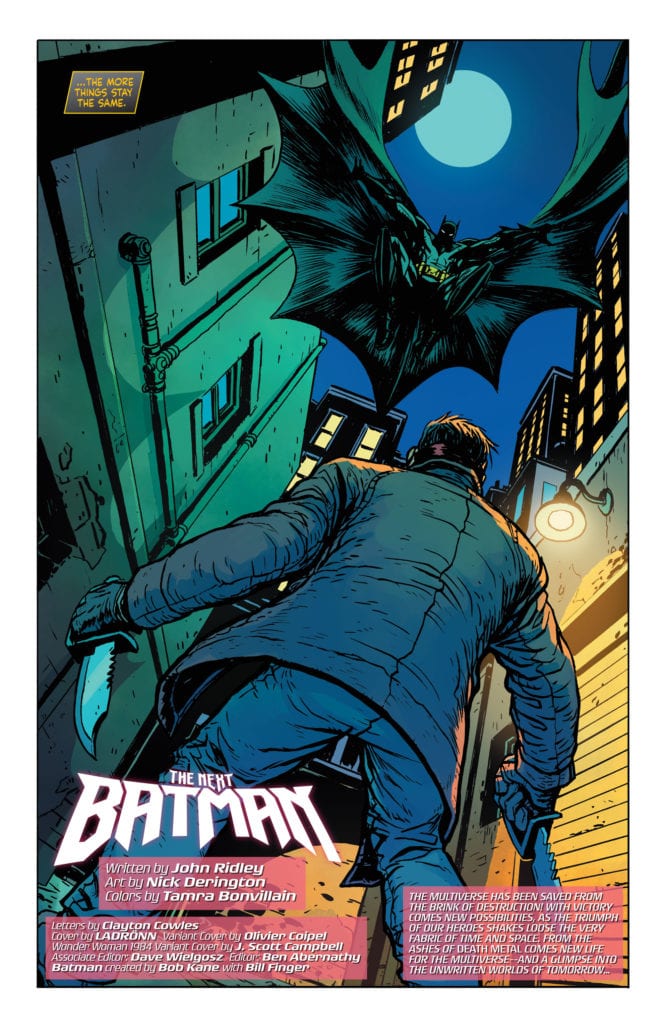
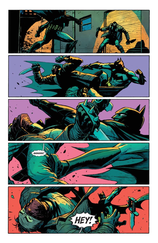
The art teams do a fantastic job in crafting this world in their stories. Nick Derington covers The Next Batman, providing that style he mastered in Batman: Universe with Gotham gangs and our new Dark Knight. Jack Herbert worked on the Arkham Knights story, and while his style doesn’t quite match with Derington’s more cartoonish style, he is able to make the Arkham Knight and her fellow fighters look amazing, leaving us with a final page that could be made into a movie poster. However, Sumit Kumar provides one kick-ass, two-page spread in The Outsiders, showing Katana at her best cutting through foes to find her target. I truly hope these teams stick around for their stories because I really can’t imagine anyone different.
Conclusion:
Overall, this first issue into the world of Future State’s Gotham was pretty good. With fantastic art across the board, we got three stories that provide the context of what the city has become. The Outsiders showed heroes doing their duty to get people away from the Magistrate, Arkham Knights showed the active fight against them, and The Next Batman is that middle ground of just protecting the people. It was nice to get these perspectives. The only complaint I really have is that the main story’s slow-burn can be a little dull when you expect action. That said, we still have more issues coming, and this reviewer can’t wait to pick up the next issue.
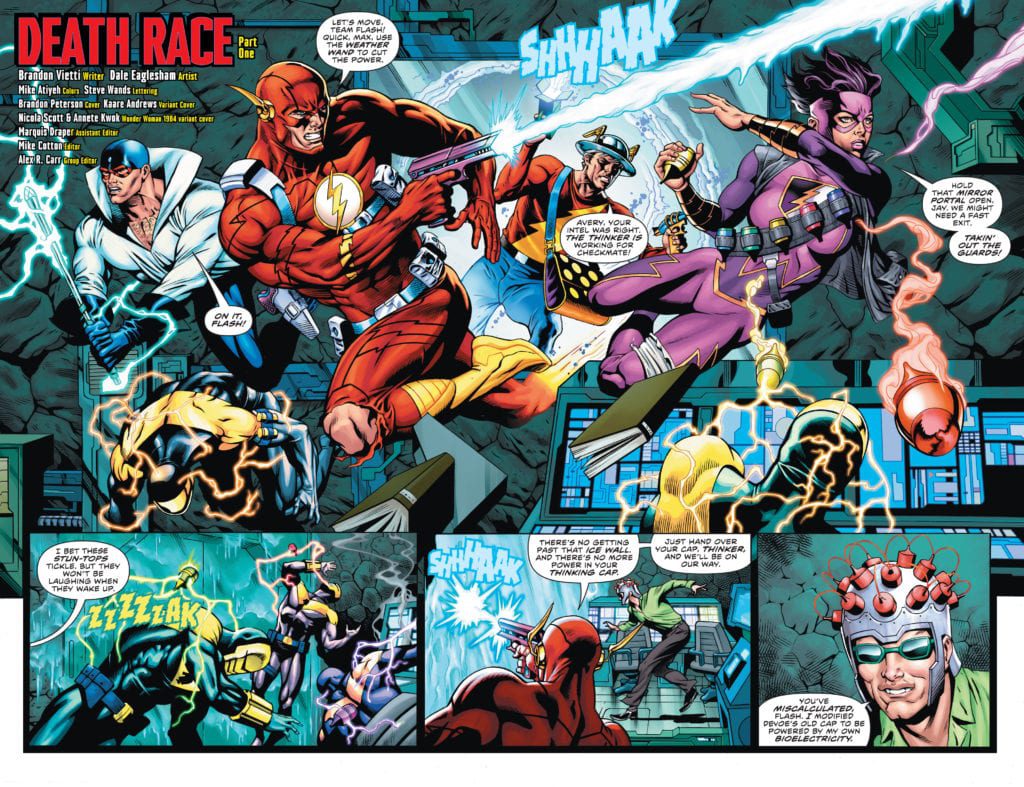
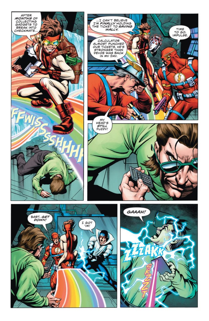
FUTURE STATE: THE FLASH #1, available in stores Tuesday, January 5th, is the first of two issues that will lay out the character’s new status quo. After losing control of himself due to some mysterious entity within the Speed Force, Wally West murdered Wallace West and removed the powers of all the Flash Family speedsters. Now the team finds themselves on a mission to steal a helmet that could change the course of Wally’s self-destruction.
Writing
Wrecked by the recent deaths of Wallace and at the hands of a cursed Wally—and his speed powers stripped—Barry opts for a new strategy. He and the remaining members of Team Flash came across weapons from their defeated enemies, opting to seek out more useful items that could help Wally. Their most important mission leads them to The Calculator (initially believed to be the The Thinker).
The hope of these heroes emanates from the pages. Readers can emotionally join in with these characters’ last ditch effort to save their friend. The coordination, communication, and cleverness in their attack on The Calculator is an inspiring site. But all good things must come to an end at some point. And unfortunately, Impulse feels the full brunt of this via a dangerous energy blast. Will he survive this encounter?
Brandon Vietti’s writing is incredibly well-paced. Despite so many scenes of high-paced action, he lays them them out in a way that slowly builds momentum in the main plot. The story has many elements, making for great rereading value.
Artwork
Dale Eaglesham’s penciling and ink work, combined with Mike Atiyeh’s coloring, put together beautiful illustrations for this issue. Despite losing their speed, the protagonists are cast in a flowing style to still give the appearance of movement. The bright warms colors used for these figures are set against duller backgrounds to help them stand out. Steve Wands’s lettering helps complete these effects by placing the word balloons alongside our characters to follow the action.
Conclusion
FUTURE STATE: THE FLASH #1 is a thrilling, dark first step into this new chapter of Barry’s story. We are anxiously waiting to see how the Scarlet Speedster fairs against this demonic version of Wally.
Do you think there’s hope to save Wally? Let us know in the comments below!
ETERNALS #1, out this week from Marvel Comics, is the debut issue of an ongoing series by writer Kieron Gillen, artist Esad Ribic, colorist Matthew Wilson, and letterer Clayton Cowles. This first issue introduces new readers to the Eternals’ backstory and world effectively while keeping things fresh for the hardcore fans with a humoristic take on the god-like characters.
Writing
As a first time reader, I’ve personally enjoyed Kieron Gillen’s take on these characters. Although, to be honest, it took me additional reads to truly appreciate it. Going in, the reader expects an epic, grim tale about war, gods, and demons- a tone which all of us are already familiar with. But instead, what the reader gets is an exchange of witty banter between the characters, deadpan humor, and a fourth-wall-breaking narration, which elevates the story’s quirky tone. Even with a murder mystery taking place in the last few pages, the story still manages to amuse and entertain.
All of this made the reading experience a lot less daunting and intimidating. Also, Gillen took the time to explain some basic elements and history, which made the new readers feel not left behind. He also threw into the mix some well-known characters to create a sense of familiarity with this world. Personally, I’m excited to see where Gillen is going to take the story next.
Art
In perfect contrast to Gillen’s off-kilter story, Ribic’s artwork looks larger-than-life. The backgrounds usually look well-detailed and beautiful; The way in which the characters are drawn makes each character feel majestic and phenomenal, and the action sequences- the way they’re paced- manage to keep the reader engaged and interested in the fight. But most importantly, Ribic decides to focus on the character’s facial expressions in Eternals #1 to complement the offbeat tale. Each facial expression has an emotional weight to it but also makes the jokes land even better—incredible work from Ribic.
Colors
Wilson’s colors definitely complement Ribic’s artwork and make each page look all the more extravagant and fantastical. Wilson usually colors the backgrounds in a monochromatic manner, which helps the reader keep track of each new place. But, when he wants the reader to feel something specific, Wilson knows exactly which colors to use in order to extract this emotion out of the reader. For example, during the action sequences, Wilson uses the few light sources available to him to his advantage, elevating the dramatic tension. But, when the more light-hearted scenes take place, Wilson uses the sunlight to give the readers a sense of warmth and friendliness.
Lettering
Clayton Cowles’ (Whom Zac Owens and I had the privilege to interview last week) lettering is top-notch. The caption boxes’ octagonal shape immediately lets us know the narrator is an AI/robot; Cowles also places the captions and the balloons in a way that never distracts the eye. All in all, Cowles’ lettering is effective and elevates the art’s look and feel.
Conclusion
In the hands of less passionate, experienced creators, this tonal battle between the art’s regal look and the story’s quirky mood would have created a royal mess. But, somehow this battle seems to work brilliantly, each element playing off the others’ differences. Eternals #1 sets the series off to a great, fascinating start. Strongly recommended.
The trade paperback collecting the entire series of JOIN THE FUTURE from AfterShock Comics hits your local comic book shop on January 6th. Writer Zack Kaplan joined Monkeys Fighting Robots to reflect on the series and take a deep dive into some of the meaning in the pages.
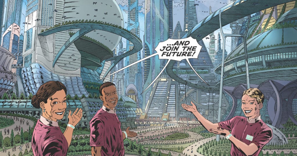
About JOIN THE FUTURE: The Future. Ultra-modern megacities reward millions of their citizens with a completely funded life, with every need met, from food to housing and healthcare, in order to compete in an economic power struggle in which population is key.
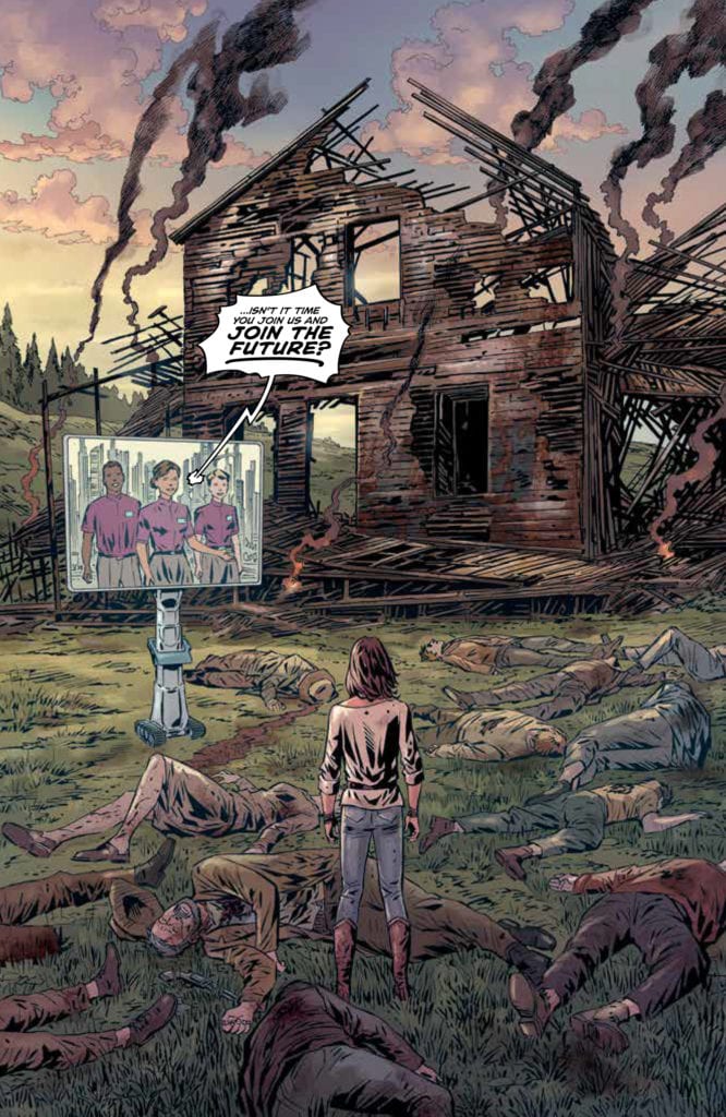
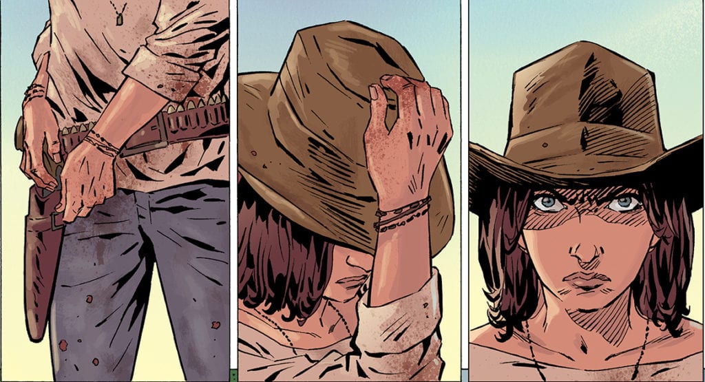
But a few rural residents still cling to their independence in what last American small towns are left. When a nearby megacity pressures the people of a small town to join up or else, a young teenage girl named Clem will learn how far she’ll go to defend her principles.
Enjoy The Zack Kaplan Interview Below:
MFR: JOIN THE FUTURE is published by AfterShock Comics; from a creator’s perspective, what are they doing right as a publisher?
KAPLAN:Where to begin! I think AfterShock has a sharp eye for rising talent and creators with something interesting to say, and they don’t seem to be afraid to tackle interesting concepts and stories. Piotr, Brad, Hassan, and I were very grateful to bring JOIN THE FUTURE to their library. They instantly got our epic vision for this grand and dramatic sci-fi western, they gave us the freedom to tell the story the way we wanted, and they supported us all along the way. They have a very hardcore group of readers who know that if it’s an AfterShock comic, it’s most likely going to blow you away. I wanted to work with AfterShock because I was a fan before I was an ASC creator.
MFR: You mentioned that the GOONIES was a huge influence on THE LOST CITY EXPLORES. What are the cinematic influences for JOIN THE FUTURE?
KAPLAN: JOIN THE FUTURE takes place in two worlds, a futuristic one and a Western one. In fact, that is the premise of the conflict in the series, how the hi-tech future dominates the rural countryside. Initially, I looked for film and TV references that explored a futuristic story with Western vibes, but I was hard-pressed to discover something that didn’t lean into fantasy, cyberpunk, steampunk, or comedy. Hit the same roadblock in comics. So, I actually leaned on Westerns. They didn’t have to have young female protagonists, although TRUE GRIT was one key landmark. THE GOOD, THE BAD AND THE UGLY, or FIST FULL OF DOLLARS helped me capture the spaghetti western atmosphere, and the first Season of THE MANDALORIAN was a nice touchstone for more grounded sci-fi Western. But JOIN THE FUTURE definitely was a mash-up of many different cinematic touches.
MFR: This is your second series with AfterShock; what did you learn from working on THE LOST CITY EXPLORERS that you could apply to JOIN THE FUTURE?
KAPLAN:In retrospect, THE LOST CITY EXPLORERS was an ambitious title for me because it was a very fast-paced adventure with a lot of world-building and a full ensemble of characters, and I wanted to spend quality time with each and every character. So, when it came time to develop and design JOIN THE FUTURE, I made the choice to focus on one heroine, our headstrong Mayor’s daughter, Clementine Libbey, and spend a lot more time with just her. I wanted to find quiet moments, and really let her emotional story breathe, so that readers could connect with her, care about her. That was where the heart of the story was for me. Stripping back plot and world, and putting character at the foreground: that was my goal for this series.
MFR: JOIN THE FUTURE is very intense. Can you talk about how you paced out the book?
KAPLAN:Spoiler Alert on this one! I knew that since it was a revenge story, the bulk of the story was going to be Clementine’s journey to arm herself, receive the proper training, and launch her retribution. The first act was a delicate dance where we had to see the allure of the future city, then appreciate the subtle intimacy of Clementine’s small-town world, then destroy it all with the attack. That heavy series of gut-punches as she loses people she loves, and then her community allowed us to go without any major action for a bit. But because Clementine is training and finding her way in the world, it was important to juxtapose those calm moments with some very intense action. It also helped to set up the feeling that Clementine is up against the impossible. She can’t stop these high-tech lawmen. Even one gives her a tremendous amount of trouble. But in the end, it’s a classic western, and the third act climax ends in the streets, at high noon, with some wins and losses.
MFR: What elements make up Clementine Libbey?
KAPLAN:The world is supposed to follow a code. A code of morality, of decency, and most of all, independence. Clementine has grown up her whole life learning from her father and her town to respect one’s ability to be independent from technology and controlling forces. She hasn’t even understood these lessons until she’s confronted in this particular moment. With such a spirited willpower, she’s determined to do whatever it takes, from using her ingenuity to her resilience, to preserve against her foes. She was by far the best character I’ve had the pleasure of writing and she was a joy. She even surprised me sometimes with her choices, as I discovered along the way she didn’t even want to use a hi-tech gun to combat her antagonists. She has a grit like no other.
MFR: Content and storytelling are everywhere; is it getting harder to create a lead character that feels original? Or do you let the overall narrative create the originality?
KAPLAN:Sure, if you have a unique and original world or backdrop, it can easily make a typical story or a familiar character feel fresh or new. But here’s a secret. Readers crave truth more than newness. In my opinion, when readers pick up a story, no matter what grabbed their attention, if they find the story to be authentic and the character dilemma to be honest and compelling and surprising, they will accept any familiarity. That character’s story will become iconic and original. When I write, I focus on making the character’s emotions authentic and their drama convincing. And a dynamic world or high concept hook doesn’t hurt.
MFR: JOIN THE FUTURE engages in a conversation about compromising morals for survival. The reflection of our current time is in your face. I felt self-doubts and unanswered questions with the series. Do you think about the conversations you might inspire when tackling a series like JOIN THE FUTURE?
KAPLAN:It is interesting, because I first embarked on this idea years ago, as an abstract exploration of how technology is affecting us. And I always wondered in future stories what happens outside the megacities to the rest of the world. That was coupled with stories I read about declines in small-town America. Then, the series came out at a time when our country was very polarized and some elements in the series, like city v country, or small-town independence, took on all new meanings. I was intending to make a more timeless series, no about red states or blue states, but the ongoing evolution of the human state. But it was my intention to make readers think, and to offer an open-ended conversation without answers. What do we do as a society when the futuristic technology surrounds us? How do we hold on to our self-sufficiency or life’s simplicity or our ideals? I don’t think that technology or progress is bad (I love my tech) and I don’t think small towns are bad (I grew up in an Iowan town years ago). I just think sometimes we find ourselves immersed in our own futures, and before realizing how we got there, we realize we lost something. A little privacy. Something that was pretty to look at, like the stars. Maybe our innocence, which can be worth losing in the long run. Is it good or bad? The reader can decide. So, yes, I do hope the series inspires positive big picture conversations without drawing any direct modern connections too much.
MFR: Do you have a favorite page from the first five issues, and if so, why?
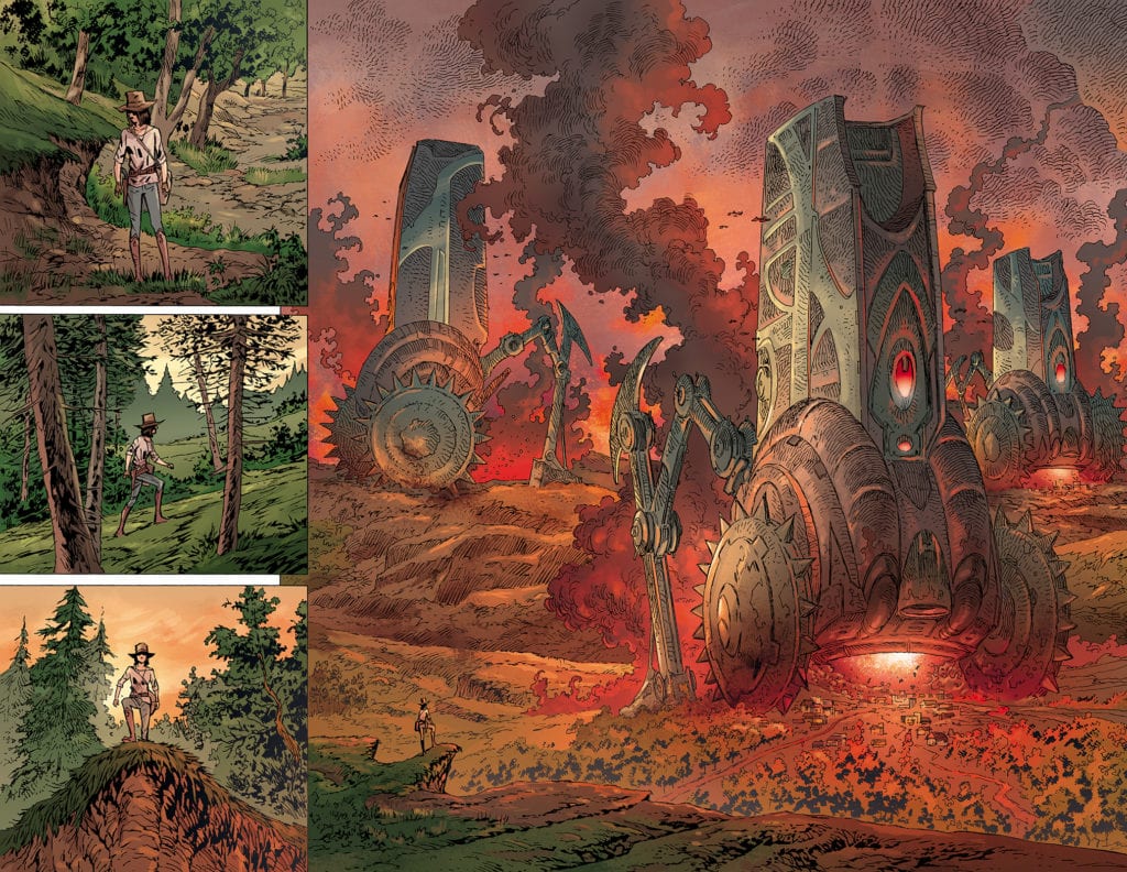
KAPLAN:The double-page spread when Clementine first sees the machines. In this future, the City is using terraforming machines to repurpose abandoned towns and transform them into natural preserves. Sounds nice! But it’s a jarring picture of how technology is obliterating the past without thought, a hammer rather than a scalpel. And for Clementine, it’s an existential threat to the world she has known as a child. The spread required a lot of chaos, dominance and power. Piotr Kowalski, the brilliant artist of the series, and Brad Simpson, the unreal colorist, manage a lot in the book. Glistening future cities, earthy forests, slick weapons and heartfelt characters. Hassan Otsmane Elhaou, our fantastic letterer, also flits through these varying landscapes and elements with ease, making the letters a joy to read. But this double-page spread was an ambitious order. And of course, they all nailed it. It’s hard to look at this double and not feel Clementine’s helplessness, and at the same time, want to see her take down these machines.
MFR: The color work by Brad Simpson on issue four is very impressive. Did you have conversations with the creative team about thematic elements?
KAPLAN:Brad Simpson is one of the best working colorists in the game right now. He’s that Zoolander hot. The guy does Coffin Bound, Crone, Wellington, Black Stars Above and this one, to name a few, all in the same year. We absolutely had conversations about the theme and the tones. We wanted white skies for the future city, not blue, because white signals an emptiness. We opted for muddy tones in the town, to leave it stuck and heavy. After the initial talks, Brad understood the story and he brought an incredible instinct to the colors and the palette. It’s a gorgeous looking book.
MFR: Will we ever see inside a Megacity?
KAPLAN:Hahaha, why? If you’ve read the opening five pages, you’ve seen our Megacity offer you and all readers and rural residents a promotion like no other, a city that can solve all of your problems. And if you think it’s true, that a megacity of technology that dispenses a fully supported life is the utopia it promises to be, then you have already seen all you need to see. They got you! But if you want to verify what you secretly suspect, that it’s not all it’s cracked up to be, that there is some flaw in its design, well, let me ask you? Why can’t you trust your own instinct? You really want to tempt fate just to know if you are right? Will we see inside that Megacity? The answer is – I don’t know. Perhaps, Clementine will ride again, and if she does, she might make the same mistake and go to that city to tempt fate, pit her morals and values against the allure of the future once again. But perhaps she’ll survive in the countryside, a legend to all of us who now and then try to resist aspects of the future. Time will tell. If you want more, let AfterShock and the creative team know.
MFR: Thank you for your time and best of luck with JOIN THE FUTURE.
KAPLAN:Thank you! Find me on social media: @Zackkaps and let me know what you think!
Wonder Woman 1984 is probably the most disappointing superhero film in recent memory. After wondering whether it would be released this year, the film arrived this past Christmas to a divided reception. Wonder Woman 1984 falls short due to its script that spends too much time on the wrong topics. Still, the film isn’t aggressively bad it just squanders its potential in favor of a hollow spectacle.
Wonder Woman 1984 is visually pleasing, the performances are great, and Hans Zimmerman has crafted another terrific score. Despite that, Diana Prince’s return manages to miss the mark on more than one occasion. The anticipated successor to the hit 2017 film probably should have had a few more rewrites along the way. Directed and co-written by Patty Jenkins, the film stars Gal Gadot, Kristen Wiig, Chris Pine, Pedro Pascal, Robin Wright, and Connie Nielsen. Set in the 1980s, Wonder Woman (Gadot) must fight off two new foes, The Cheetah (Wiig) and Max Lord (Pascal) all while dealing with the return of her former love. The film starts very promising but then makes the mistake of introducing subplots only for them to amount to almost nothing in the end.
Gal Gadot as Diana Prince in Wonder Woman 1984
Jenkins co-wrote the script alongside Geoff Johns and Dave Callaham, and most of the film feels like they were never on the same page. For instance, the opening sequence showcases a young Diana (Gadot) in a competition where she gains an unfair advantage. This theme of cheating is revisited in a very lukewarm manner through Steve Trevor’s (Pine) return. Over the last several decades, Steve died, but Diana has held onto her love for him ever since. She jumps at the shot of resurrecting him, which is an issue in itself that many will question after watching. The script focuses too much on Diana and her inability to let go of Steve, and this takes away from developing Barbara Minerva (Wiig), who eventually becomes Cheetah.
Barbara is introduced as the typical underappreciated staff member who will make her peers regret their past behavior towards her. Her arc is intriguing, and her development is cut short for focus on a dead man. Barbara wants to be just like Diana, strong, confident, and meaningful. The writers do a great job making her a sympathetic character, but then viewers are beaten down by the never-ending love story between Diana and Steve. The significance of the opening scene vanishes due to the way it’s connected to Diana’s present predicament. The introduction of the Dreamstone creates more narrative issues that the writers just can’t escape. Wonder Woman 1984’s narrative about a magical stone granting wishes is unimpressive overall. The film does an adequate job laying out that everyone wants something from this stone, but this plot device creates glaring logic issues as the film progresses into insanity.
Pedro Pascal as Maxwell Lord in Wonder Woman 1984
As mentioned, the performances are fine and everyone is doing their best with this subpar script. Pascal is wonderful as Max Lord, the film’s primary villain who eats up every scene. His descent into madness is exciting to watch, and Pascal delivers a powerful performance from start to finish. Gadot impresses once again as the titular character, but her stardom doesn’t outshine Pascal. She is far less interesting here compared to her two foes, and Wiig is amazing as Barbara. Her ability to transition from the shy outcast to the dominant foe is great, and it’s a shame her character isn’t focused on as much as this dead romance.
Jenkins delivers an emotional ride, yet the pacing was kind of stagnant after a certain point in the film. Wonder Woman 1984 is exciting for the first half, but then it slows down for what felt like forever. Most of the action sequences are pretty bad as well, but despite that and its lackluster script, she manages to deliver an engaging film. Zimmerman’s score is an emotionally draining experience, especially during the final moments. The energy behind this score is on another level, but that’s to be expected at this point when dealing with Zimmerman. If the characters fail to keep audiences interested, then Wonder Woman 1984 will keep viewers watching and listening due to its score, which is the film’s strongest component.
Kristen Wiig as Barbara Minerva in Wonder Woman 1984
Wonder Woman 1984 doesn’t completely sink thanks to certain aspects mentioned above, but this script holds it back too often. Its central conflict surrounding this Dreamstone becomes problematic, and the lack of development for certain characters in favor of romance is astoundingly frustrating. This divided reception is warranted, and hopefully, it is enough to spark a better sequel in the future.


")