Home Blog Page 196

Comics Studies: SUPERMAN and Transmedia Myth Making

Superman The Movie Poster

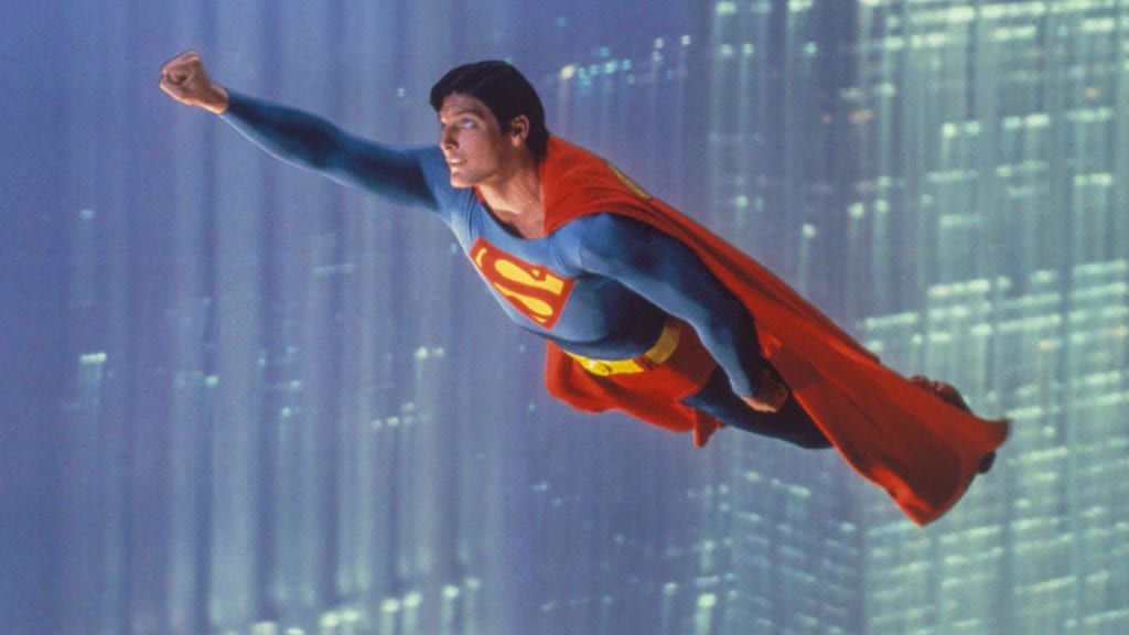
In 1978 the world was made to believe a man could fly.

Richard Donner brought the iconic American superhero, Superman, to the big screen and created a new movie genre that has since taken over the summer blockbuster. However, the translation from Comic Book to Cinema screen wasn’t a straightforward process and was just one element of an ongoing transmedia project.

Christopher Reeve
Christopher Reeve’s Proves a Man Can Fly

From Page to Screen

Superman wasn’t the first superhero to appear on the big screen. In fact, several superheroes, Superman among them, had already appeared in cinemas throughout the early half of the 20th century. Superheroes were popular in print, and Hollywood was quick to snap up the properties and entice children with film serials that were shown every week on the big screen. Some characters proved to be popular, and it turned out that the superhero story fitted perfectly into the serial format.

Donner’s version of Superman was the first big-budget outing for any superhero, and translating the character’s serial, and often inconsistent, history to the big screen was to prove one of the most important aspects of its success. The film did such a good job telling the story that the film’s version of Superman’s origin is still seen as the defining one. Donner took aspects of the comic books and reimaged the character to sell to a new audience. It could be argued that the film was not aimed at the readers of the comic but at this new cinema audience, and Donner’s treatment of the character reflects this. The defining characteristics of Superman, and alter ego Clark Kent, were extracted and these formed the basis for the new origin story. In constructing the film’s plot, Donner and writer Mario Puzo reduced the character to the bare essentials. The visual reduction necessary in the art of comic book production became a narrative necessity for the movie, so it to appeal to a large audience.

Superman Secret Origin
Superman Secret Origin Cover Credit: DC Comics

Revisiting the Origins, Again. 

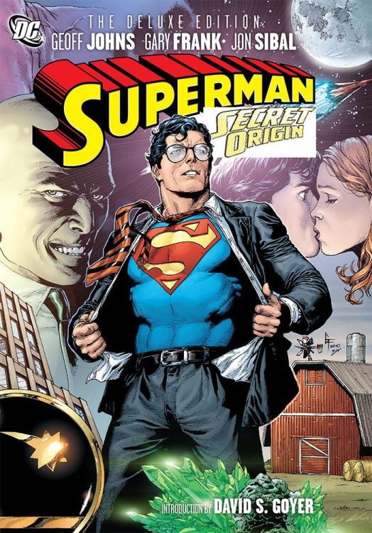
Years later, Geoff Johns would be faced with retelling Superman’s origin story after the events of DC’s line-wide Infinite Crisis storyline. When reading Superman Secret Origin #1, illustrated by Gary Frank, you are instantly reminded of the 1978 movie. Although Kal-El’s initial transition from Krypton to Earth is absent, a number of the set pieces in the comic mirror the early scenes in the movie. A scene involving the throwing of an American Football; the introduction of Ma and Pa Kent; a sequence with a thrasher; all have duplicate sequences in Donner’s movie, but they have been altered to fit Johns’ new, updated narrative. He invokes the movie’s nostalgia, giving the fans what they want, but he also subverts the narrative to situate the characters in the ‘new world’ after the DC Crisis storyline.

The 1978 movie took the noblest aspects of the character from over four decades of comics and condensed them into a single story to highlight the attributes that mattered. In Johns’ reworking of Superman’s origin in 2009, he reverses this reduction, fleshing out the character. Using recognizable scenes, he can enhance aspects of the character that the readers are already familiar with. It’s a case of ‘re-show and tell.’

The changes that each writer makes are reflective of the time periods in which they worked. The movie is seen as a reflection of innocence, a simple breakdown of an all American hero. Donner’s Superman is the ultimate boy scout trying to fit in and do the right thing. He listens to his adoptive father’s advice, even though this makes him an outsider to his immediate peer group. He learns restraint and control and grows up to be charming and the epitome of ‘goodness.’ The teenage Clark is the type of child that American society wanted, the opposite of the juvenile delinquents that were supposedly created by reading comics in the 1950s.

Johns’ story comes after a long history of ‘darkness’ enveloping the superhero genre. Characters like Spider-Man made teenage angst popular in the comics. Towards the late 1980s, Alan Moore and Frank Miller thrust superheroes into the darkest depths, giving the genre an uncomfortable autopsy. The landscape had changed, and Johns acknowledges this with his take on the Superman origin. He takes the character-building moments from Donner’s movie and twists them to create a different tone and a much more angst-ridden Clark Kent. This Clark is more in line with modern sensibilities and the experiences of modern teenagers. Years of darkness within comic book plots, and teenage coming of age movies, have altered the narrative playing field, and Johns used remnants of the past to make the story relevant to a modern audience. He attempts to pacify the long time readers while attracting a new audience.

Superman Secret Origin
Superman Secret Origin Credit: DC Comics

Conclusion

Over the years, from his first appearance in comic strips, through radio and television, and back into the latest iteration of the character in DC’s monthly floppies, the mythology of Superman has grown beyond the boundaries of his own stories. Superman has become a part of popular culture, reaching audiences who have never read a superhero comic. Each retelling reinforces aspects of the myth but also introduces new elements. Like any legend, there is no longer any ‘true’ Superman origin, merely an accumulation of ideas and concepts drawn from multiple sources. Each new writer/artist/director picks and chooses the elements that best suit the story they tell in the medium they are telling it. It is impossible to pick one comic or one film that is the starting point of the legend: Superman lives through them all, a transmedia character in a multi-narrative universe.

Monkeys Fighting Robots Youtube

Review: KILLADELPHIA #12 – Glorious Macabre Art

Killadelphia #12 Cover

Killadelphia #12, on sale now from Image Comics, features some of the darkest and most interesting art the series has seen so far, and the story is full of twists and turns to shock the reader thoroughly.

It doesn’t matter what kind of emotions Rodney Barnes is trying to provoke in Killadelphia #12; he always nails it on the head. It could be a tender moment between people visiting loved ones who have passed on, or a horrifying sequence of grotesque violence; either way, Barnes can inspire emotions in the reader. This issue also provides one of the craziest twists we have seen for a long while, which ends this second arc with a bang. It’s sure to have readers dying to get their hands on the next issue.

Killadelphia #12 Story Example

I have nothing negative to say about Jason Shawn Alexander’s art in Killadelphia #12. It is jaw-dropping. As always, his faces are remarkably realistic, as if each one of his drawings has a soul. Even better is when he decides to draw a body whose soul has left it, and we are left with haunting imagery that brings this issue to the next level. Another brilliant part of this issue was how Alexander showed some of his best work with disturbing macabre art that is sure to chill readers’ spines. Every single page was a pleasure to gaze upon, and I cannot sing enough praises about Alexander’s work in this issue.

Killadelphia #12 Art Examples

Luis NCT’s colors in Killadelphia #12 perfectly complement Alexander’s art and adds lots of energy to the issue. His bloodshed is particularly notable, as he always finds a way for it to pop out against the colors behind it, which results in some delightfully horrifying panels. NCT also does some marvelous work in choosing a palette that reflects the tone. The backgrounds might frequently be red to accent a scene full of violence, or they might be calming colors for moments in the afterlife. Either way, NCT does a stunning job of making sure the colors reflect the emotions that the story is trying to get across.

Killadelphia #12 Color Example

Marshall Dillon uses a variety of lettering techniques that allow Killadelphia #12 to be more immersive. He has dialogue extend past the borders of a speech bubble, which clarifies that a character is yelling. He gives some characters a uniquely colored font for their dialogue, highlighting that the characters are inhuman. Dillon also will change the color of a font to show that a character is screaming out and is overcome with emotions, which is a subtle yet effective way to carry that out. Dillon accomplishes everything he sets out to do, allowing the issue to flow seamlessly and to pack a harder punch on several occasions.

Killadelphia #12 is a mind-blowing issue that any fan of the series would hate to miss. It has an engaging story throughout its entirety, there is plenty of the violence we love, and Alexander can shine with macabre art that knocks it out of the park. All of it is extraordinarily beautiful, and the colors of NCT and the lettering of Dillon polish it off to create an unforgettable issue.

Monkeys Fighting Robots Youtube

WANDAVISION – Now in Color | TV Review

WandaVision has moved forward to the 1970s with Wanda and Vision continuing to live the suburban dream with the arrival of a child.

“Now in Color” picks up where “Don’t Turn That Dial” left off: Wanda is suddenly four months pregnant and turned the world of the suburbs from the black-and-white ‘60s to the colorful ‘70s. Wanda experiences the quickest pregnancy in history but giving birth makes her powers go haywire.

“Now in Color” apes the cheery sitcoms of the ‘70s, particularly The Brady Bunch and The Partridge Family to a lesser extend (at least to me as a Brit), The Good Life. It was wonderfully upbeat as Wanda and Vision prepare to have a family life.

The comedic setup of the episode was Wanda’s accelerated pregnancy and the need to hide it from the pregnancy from the neighbors. However, her powers work against her when she has contractions. They suddenly change her coat or bring a painting to life. Hiding something is a common trait in sitcoms, but due to Wanda’s superpowers it made WandaVision similar to the ‘90s version of Sabrina the Teenage Witch.

The drama of the episode came after Wanda gave birth. Wanda makes a reference to the fact she was a twin and Geraldine reminds Wanda of the events in Avengers: Age of Ultron. Besides being a nice callback, it also shows the amount of pain Wanda has suffered. Wanda has been experimented on by Hydra, used by Ultron, lost her brother and her life partner, been killed and accidentally killed people at the beginning of Captain America: Civil War.

Wanda was willing to do anything to protect the world. This was shown with Geraldine’s punishment and the reveal that SWORD has surrounded a wall of static. The other action Wanda did was when Vision starts to question the strangeness of the world Wanda reversed time. The third episode has reduced the ambiguity that Wanda hasn’t been manipulated.

Whilst Wanda tried to prevent Vision from asking questions and finding out what’s happening, it doesn’t stop him. After Wanda gave birth Vision talked to the neighbors about Geraldine, at the same time as Wanda questions Geraldine’s identity. The question that remains is the identity of the residents – were they also creations of Wanda’s mind, or were they ordinary people who got caught up within Wanda’s illusion? If it’s the latter would it cause the residents a moral dilemma on whether they should go back to the real world? It was a similar issue to what happened in the “House of M” comics because many characters got to live a false dream and questioned whether they should leave it.

A final point which is a minor one is I enjoy Vision using Britishisms like ‘leg it.’

“Now in Color” does keep the intrigue that was established in the previous episodes. The humor was appropriately silly and far-fetched and the dark twist was well executed.

Monkeys Fighting Robots Youtube

Self-Published Spotlight: Robb Mirsky’s SLUDGY

Sludgy

Welcome to Self-Published Spotlight, a regular interview column where I will be highlighting self-published comics and the creators and small print publishers who make them.


I discovered Robb Mirsky’s Sludgy in 2020 as part of a deep dive into new mini-comics. Deceptively simple, Sludgy is a comic that really understands cartooning and all its components; from conception, to design, to production. I was able to catch up with Robb recently and pick his brain. Read on and make sure to grab Sludgy!

Monkeys Fighting Robots: First off Robb, thanks for taking the time to talk to us. How are you doing so far in 2021?
Robb Mirsky: Hey Manny! Thanks for talking to me! After the hell that was 2020, I’m feeling pretty good.  I know it’s just a number on a calendar, but I was more than happy to move on from last year.  Things still obviously suck, but I’m working on a bunch of new stuff and feeling good regardless.  Comics keep my focus away from all the BS that the news and social media keep piling on.  It’s a nice distraction.

MFR: For our readers that don’t know your work, give us an introduction. And tell us all about Sludgy.
RM: I’m a cartoonist in Toronto, Canada.  I’ve been self-publishing for the better part of two decades. I work mainly in the vibes of alternative comics, or like, the undergrounds.  I don’t really mess with the Big 2 comics.  I like to make funny comics.  I’ve spent most of my childhood reading MAD Magazine and newspaper strips like Calvin & Hobbes, and The Farside.  I like to see comics as an escape.  I wanna laugh away the pain of the real world, and a good goofy comic is perfect for that.  Sludgy is one of my many characters.  They are cute, they are cuddly, and they are deadly, though I don’t think they really realize that.  In the first Sludgy story, they are just wandering around the forest looking for a companion, and wind up killing everything they try to touch… Heart of gold.  Hands of death.  I like to describe Sludgy as Casper the Friendly Ghost meets The Toxic AvengerSludgy

MFR: So let’s start with the classic, basic…how did you get into comics and how did you get into MAKING your own comics? Who are your influences?
RM: I’ve been into comics for as long as I can remember.  Like I said, I grew up with newspaper strips and MAD Magazine.  Things like Peanuts, Archie and Harvey Comics were really big for me as a kid.  I have comics I made when I was 8 and my dad sent them to the newspaper.  They didn’t print them (shocking), and it was my first taste of rejection in the world of comics!  I got bored of superhero comics pretty early in life but fell into The Maxx pretty hard as a teen.  It wasn’t until I discovered Robert Crumb for myself that I really felt a want to make my own comics and actually try.  All the other comics I had read up to that point looked like I couldn’t make them.  All polished and neat, and boring.  Crumb turned my head upside down (much like early experiments with drugs) and comics seemed exciting again.  Then I found Johnny The Homicidal Maniac and I was sold.  Content-wise it was perfect.  I could almost draw like that too.  It was the first time I was like “I can do this.  I wanna do this”. So for influences, I would probably say (but not limited to) Robert Crumb, Peter Bagge, Jhonen Vasquez, Bill Watterson, E.C. Segar, the art of ‘Big Daddy’ Roth, and honestly, there’s too many to list.  I’m constantly influenced by great work I see on a daily basis.  Inspiring books are spilling off my shelves. There are so many!

MFR: What’s your process for making comics? How do you start and where do you start? How long did it take to start and finish Sludgy?
RM: The process changes from project to project really.  Sludgy is an improvised comic.  I take it page by page and just try to figure out where to go next.  I don’t like heavy planning. It usually kills a project for me.  I’m part of the Toronto Comic Jam, and the idea of jamming comics is a really appealing way for me to make.  I’m currently making a new comic, and I just drew quick thumbnails of each panel, thinking only what the next panel should be, and then I break it down and lay it out on the pages.  I dunno how long it’s gonna be till I reach the end.  I like working loose.  Scripts are too formal.  If I keep it simple, I work quicker, and the results are always better.  I wrote and drew that Sludgy story in 2 months.  I just finished another Sludgy story that took 5 weeks.  So, I’m speeding up, which is great, cuz comics take a long ass time to make!

MFR: When did the idea for Sludgy first come? It’s such a wonderful character design.
RM: I literally drew the title to the first story and the first panel (a swamp) on a scrap of paper to get it out of my head, and that doodle just sat on my desk for a month before I wanted to do something with it.  I used to participate in a November drawing challenge called ’30 Days of Comics’ in which yer supposed to draw a new comic, or page, or panel a day.  Sludgy just became Sludgy cuz I wanted a comic to work on.  And the design is based on Casper.  Melty and drippy, Sludgy is basically the same shape and has a similar disposition.  That’s pretty much where the similarities end though.  

MFR: How did it progress from there? did you see a comic in it right away?
RM: I just kept drawing.  I drew a 17-page story with no planning, and thought “well that was so much less stressful than when I try!”  It was the longest story I had done at that point.  I kinda felt like I had something, and I enjoyed the character, so I just kept going with it.  And I usually think in terms of comics. I love comics.  They are the language I understand best.  So, there’s always comic ideas rolling through my brain.Sludgy

MFR: I really love the color palette you used. What color exactly is the dominant one? How did you get that unique color?
RM: Thanks!  It’s a gross kind of yellow, a perfect accompaniment to a kinda gross character!  I use a pink to shade it and when it blends with the yellow, it gets that weird sludge vibe.

MFR: What led to you deciding on such a striking color for the book?
RM: Hehehe.  So, I’m colourblind, and colouring my comics is painful and stressful.  The first Sludgy story was printed in my old collective’s anthology series ‘Read More Comix!’ (No affiliation with Cartoonist Kayfabe, we had the name first), and the anthology series is in full colour…. So my colour choice was based on a mix of finding an easy way around colouring, and it’s also supposed to simulate like old monster movie films. Instead of the same black and white, it’s a murky slime colour. I think colouring the Sludgy stories with a proper palette would ruin the story.  But I could just be lazy… who knows!

MFR: Sludgy is also a mini-comic. Why did you go with the smaller format?
RM: I love floppy comics. I love big ol graphic novel format comics too, but my true love is short stories, strips, things like that. I’m not sure if I have a graphic novel in me.  I just gotta keep trusting my gut and make things that I wanna make. I try not to worry about if anyone else will enjoy it until I’m done..  and then it’s all I worry about cuz selling books is stressful!!!

MFR: And what kind of stock is Sludgy printed on? It feels good to flip these pages!
RM:  It’s like the standard glossy paper from a printer here in Toronto.  I’m not crazy about glossy paper usually, but I lucked out.  It does feel nice!

MFR: Are you going to be working on any new Sludgy (or any other comics) in 2021?
RM: I already finished the next Sludgy story.  It’s 24 pages long.  I just gotta scan and colour it, but the writing and drawing are all done.  I have more ideas for Sludgy, so I’ll probably write more when I feel it’s time.  Currently, I’m working on a couple new things for the year.  And I’d like to draw more for the strip I created last year to ward off pandemic insanity. It’s called ‘Dingus & Dum-Dum’ and it follows two 1930’s inspired goofballs that are always on the hunt for a couple of bucks or some food or just a good grift.  You can read 75 strips of them on my Instagram now.  I’d like to do more and collect them in a book maybe, but I’m not really committed to any one idea.

MFR: And where can readers find your work?
RM: I’m on Instagram as @mirsktoons. You can read some other things on my website www.robbmirsky.com. Or you can pick up a real book. Sludgy – https://mymovingparts.com/collections/comics/products/sludgy-comic. Read More Comix! Anthologies at https://readmorecomix.storenvy.com/ (Sludgy #1 is printed originally in Read More Comix #5). I also design and co-run a shirt-making business with my wife.  She’s a screen printer and I design the shirts.  You can check out and buy stuff at www.mymovingparts.com and follow us on IG @mymovingparts. There’s a limited amount, but we made a Sludgy shirt too!  Thanks so much Manny!  I appreciate you talking to me!

Sludgy

Monkeys Fighting Robots Youtube

Review: HISTORY OF COMICS Embarks On An Ambitious Project

History of Comcis
History of Comics 1986 Credit: Foster Media Cover Design: Flops Comics

If you are a comic fan in the UK you may have heard of Comic Scene, a very British magazine dedicated to comics and (mainly) the British comic industry. The magazine included everything you would expect from such a publication, with reviews, articles, and comic strips. Despite a successful year in 2019, which saw the magazine hit the newsstands across the country, a new project by the publisher somewhat overshadowed the monthly publication and shifted the focus for the future.

Comic Scene History of Comics is an ambitious project that intends to chart a century of comics, with each book focusing on a single year. The first set of four books were launched on Kickstarter in 2020 and easily reached their required project goal. Digital and physical copies are available, in sets or individually. Basically, however you want to consume it, they’ve got you covered.

Comic Scene
Collection of Comic Scene Publications Credit: Foster Media

Content and Coverage

Deciding not to release the books in a chronological order, the first four releases cover the years 1950, 1977, 1984, and 1986. These years have some monumental pop culture releases, the Watchmen comic and the Star Wars movie for example, and allows the magazine to come out of the gate running. The covers, featuring Pop Art renditions of Princess Leia and Silk Spectre, leap off the page to entice readers. In fact, all four of the covers feature powerful and complex female comic book characters, which makes a strong statement about the magazine and establishes the inclusivity of the project.

The contents, overseen by managing editor Tony Foster, are a mixture in every sense. They cover a wide range of comics and related culture, from the classic Superhero floppies to comic strips such as Peanuts. Featured articles cover the history of characters, creators, and even publishers, while the rest of the pages are filled with reviews, general historical facts, and a gallery of images relating to the specific year. This means that you will find yourself entirely engrossed in some sections while flipping quickly past others. However, there is more than enough content in each issue to keep most readers satisfied.

Each issue opens with a Culture and Comics section written by John McShane. These articles superbly set the scene for the magazine by capturing the dedicated year in terms of Comics and the society surrounding them. They include hints to features coming up while painting a comics-centric landscape for all of the other elements of the magazine to grow in.

And there are some gems included among the articles. In the 1984 issue there is a fascinating interview with Ian Gibson about his work on Halo Jones for 2000AD. Bob Bailey shines a light on the Silver Age versions of Lana Lang and Lois Lane in the 1950 issue, which also includes some shorter articles on the Eagle and Dan Dare. 2000AD is picked up again by Chris Hallam in the 1977 issue but is overshadowed by Mark Newbold’s look at the rise of the Star Wars publications.

History of Comics
History of Comics 1986 Credit: Foster Media
Cover Design: Flops Comics

Considerations and Comic Strips

There is a very nostalgic feel to a lot of the writing, with the authors sharing personal memories along with established facts. Articles covering some of the lesser known comics and characters prove to be the most interesting reads. While pieces on more popular works, like Chris Hallam’s article on Watchmen, don’t tend to have anything new to say. In fact, the Watchmen article barely has anything to say about the comic at all and is more interested in the cultural influence and adaptations that came out of it. One of the few drawbacks to the History of Comics is the inconsistencies with some of the articles included. The 1986 issue should have featured a much more in depth look at Watchmen because of its significance to the comic book industry and the article that is included ends up being a disappointment by default.

Another example of the inconsistencies comes in the 1950 issue which features an article on the Senate Subcommittee Hearings on juvenile delinquency. Written by Christoper Irving, the article itself is insightful and well researched, however it covers an incident in comics history from 1954 and would surely fit better into the volume dealing with that year. 1950 saw the release of a number of first issues from EC Comics that have become world famous. With comics like Crime Suspend Stories, The Haunt of Fear, and Two-Fisted Tales making their debut, a feature covering the releases of these comics would have been more fitting than drawing attention to their ending.

The History of Comics project isn’t all that the Comic Scene team are up to. They also have a commitment to producing new comic anthologies using some amazing creators. Just like the magazine, the comic strips are a mix of styles and genres and have a fairly wide appeal. If you have grown up on the likes of 2000AD then the Comic Scene Annual will be worth checking out.

Comic Scene Annual Credit: Foster Media

Conclusion

There is no denying that the world of Comics is expanding. The movie industry is awash with characters from the pages of comic books, television is adapting and expanding comic narratives, and the internet is becoming a new medium to engage and consume comics. Into this mix a magazine like History of Comics is a welcome addition, feeding on the nostalgia of long time readers but also acting as an introduction for a new generation into the world of comic books. With appealing covers, a curated mix of articles and reviews, and plenty of images to break up the text, History of Comics is definitely making a lot of the right moves.

The first four issues have a few teething problems, with a little more care required to some of the article’s inclusions, but on the whole they are satisfying reads. Personally I could live without the pages of Comic Facts, most of which are elaborated on earlier in the issues, and the Comic Museum could use some work to make it more appealing. However, these aspects will appeal to some of the readers and the diversity in features is one of the magazine’s strong points.

History of Comics is an ambitious project and has got off to a great start. If you have an interest in how the modern comic industry was formed and how certain characters became Icons, then this magazine is for you. Not every page will be of interest but the majority of it will be. Even if you only have a passing interest in comic book history, there will be an issue that appeals to you and in a format that suits your reading habits.

Check out the website (comicscene.org) for news and updates on the project and to get your hands on a copy of one, or more, of the magazines.

Monkeys Fighting Robots Youtube

Review: WRONG TURN Makes The Woods Kind Of Scary Again

The Wrong Turn franchise has returned with this seventh entry that wipes the slate clean. After a lengthy hiatus, the West Virginia mountains appear to have changed, but the danger has remained. Originally titled Wrong Turn: The Foundation, Wrong Turn separates itself from prior entries by eliminating previous plot elements. This latest installment may not be what fans of the franchise are familiar with, but it’s leaps and bounds better than the abysmal sequels that have come before it. 

After the botched sixth entry, it seemed like the franchise was dead, but only part of it seems to have died. The series is known for its group of backwoods cannibals stalking stranded individuals in West Virginia. Launched in 2003, the film went on to spawn five sequels that went straight to video. Directed by Mike P. Nelson and written by Alan B. McElroy, who penned the original film. Wrong Turn stars Charlotte Vega, Matthew Modine, Emma Dumont, Adain Bradley, Dylan McTee, Bill Sage, and Adrian Favela. Similar to past entries, this film follows a group of friends who go hiking the Appalachian Trail only to find themselves trapped by a group of mountain dwellers known as The Foundation.

Adrian Favela as Luis in Wrong Turn

Jen (Vega) and her friends were warned to not stray off the trail, but an unfortunate series of traps lead them into dangerous territory. Her friends include Milla (Dumont), Luis (Favela), Adam (McTee), and Darius (Clemons). McElroy’s return isn’t wasted, but the question many might have by the end is why is the Wrong Turn title associated with this project. As mentioned above, Wrong Turn: The Foundation was the original title, but it feels like the wrong title was kept. He has penned a film that has no connection to previous entries, and The Foundation are not backwoods cannibals at all. Still, looking past the fact that Wrong Turn is not itself anymore, there is decent film underneath those hiccups.

The film delivers a sufficient group of entertaining, and slightly likable characters, but we don’t learn too much about them outside of a few minor details. The Foundation has a specific way of life that they do not want to be disturbed, and anyone who comes in contact with them learns this. McElroy has written up an interesting group of offbeat individuals that do not seem pleased with life outside of those mountains. Lead by Venable (Sage), these mountain dwellers have their own sick style of justice, punishment, and much more that will keep audiences engaged. There are plenty of intense sequences throughout this screenplay, which was missing from the past couple of sequels. The script must have included several moments of shouting because the group we follow does nothing but yell to deliver their lines. Shouting aside, the acting is solid across the board, and the film’s biggest issue comes from its underdevelopment of certain characters despite the film being nearly two hours.

Charlotte Vega as Jes Shaw in Wrong Turn

Vega and Sage deliver in every scene they are in, especially when they share the screen. With material that doesn’t resemble previous entries at its core, it is nice to have performances that make this transition acceptable. Nelson keeps the film interesting by raising the tension with each passing scene. Wrong Turn’s pacing is adequate, but it slows down a bit towards the middle and it begins to grow dull at times. This feels like a return to form, but it’s incomplete because it really has no reason to be titled Wrong Turn. Also, the score featured throughout is one of the best in this franchise. It will keep viewers on the edge and may spark a few chills as well. It heightens the sense of urgency presented at times and makes it apparent that the serious tone has returned to this series.

Wrong Turn probably won’t lead to further entries, but it’s another average entry in this series with a few issues in its narrative. It will most likely be ridiculed for erasing the cannibals, but given how poor previous entries have been, this film deserves some applause. It revives the serious tone that has been missing and offers a decent narrative about what could be lurking in the West Virginia mountains besides deformed cannibals.


Monkeys Fighting Robots Youtube

X-O Manowar #4: The Power Vacuum Tears Itself Open

X-O Manowar #4 Cover

X-O Manowar #4 drops on January 27 to close out one subplot to focus on another more dire one. It’s a plot that writer Dennis Hopeless builds up since the introduction of Troy Whitaker. Artist Emilio Laiso provides a grand scale for the reader to follow within the issue. All while colorist Ruth Redmond and letterer Hassan Otsmane-Elhaou add a  decorative spectacle.

X-O Manowar #4: Firing On All Cylinders

Within X-O Manowar #4 is a conflict with Aric’s character and how it is shared between reader and characters. In the beginning, everyone is anticipating something to happen. The reader shares feelings with just about every character on display. Aric’s adoptive family remains hopeful for Aric to defeat Ukrainian warlord Yakiov after everything he’s done. Then there’s Yakiov who, while confident that his plan against Manowar will work, connects to the reader by not being dumb enough to think he goes down easily.

Hopeless displays the best and worst of X-O Manowar #4 during the climax. He presents Aric in a place that, while not perfect, is great after everything up to this point. The problem arises when all of that development seems to go down the drain in one moment. Just when things look good, Aric flies into a blind rage. The reader shares frustration with the armor Shanhara’s who tries to be the voice of reason.

Scales Of Spectacle

X-O Manowar #4 features stakes and action rising in scale. Laiso illustrates with both detail and panel size the conflicts of the issue. Aric’s adversary Yakiov gloats like a madman at some of the damage and equipment he has ready for a slaughter. That one large panel matches two other panels on the following pages for attacks on what looks like X-O Manowar.X-O Manowar #4 page plot point

Redmond’s coloring furthers that illusion as the blow on “X-O Manowar” matches the fires Yakiov already set off. Combine this with intensely drawn SFX from Otsmane-Elhaou, and it looks like a killing blow. Unless like Yakiov, the reader finds the word balloons from his army odd after hearing conflicting descriptions. It’s nice to have characters and the reader on the same wavelength; it allows them to follow events easier.

X-O Manowar #4 Hooks Readers In

X-O Manowar #4 is enjoyable for taking the time to empathize and communicate with its readers to the point where the reader feels like they play an important part of the story. They genuinely feel the excitement, anticipation, and frustrations that come off the pages. The plot points and moods never feel like hand holding, just different points-of-view that the reader jumps into. Every character and artist brings out their best to reach out to the general audience, creating an experience where everyone is a piece of a bigger picture.

Monkeys Fighting Robots Youtube

WANDAVISION – Filmed Before a Live Studio Audience & Don’t Touch That Dial | TV Review

After an unintended yearlong break, the Marvel Cinematic Universe is back with their first show for Disney+, WandaVision. The first two episodes have been released on Disney+ and it sees the MCU go in an unusual direction.

Wanda (Elizabeth Olsen) and Vision (Paul Bettany) have moved into retro suburban America. Vision works as a company that does something, and Wanda is a housewife. They must deal with typical sitcom situations like cooking a meal for Vision’s boss and the pair having to perform at a neighborhood talent show. However, the suburban bliss is not all that it appears.

Out of all the Marvel Disney+ shows WandaVision was the one I was the most interested in. It seemed the most unique out of all the shows because of its visual style and retro approach. The first two episodes harp to sitcoms of the 1950s and ‘60s, particularly The Dick Van Dyke Show and Bewitched. They were both filmed in black-and-white, the aspect ratio was 4:3 and both episodes had title sequences that homage to the aforementioned sitcoms. The humor presented was also like what was in those shows like Vision causing a distraction to prevent his guests from seeing chaos in the kitchen and Wanda trying to fit in with the fellow housewives. Their superpowers added to the mix.

The first two episodes were more than just sitcom shenanigans. Vision died in Avengers: Infinity War and Wanda came back from the dead. This leads to questions about what’s really going on. The suburban world had a Truman Show/The Stepford Wives vibe because it seems perfect but there’s something more sinister going on. Even in the first episode Wanda and Vision get hints that not everything is what it seems, like not knowing what the message on the calendar meant and there were questions like what Vision’s company does, or why they don’t have wedding rings? It reminded a little bit of the scene in Inception where Ariadne realized she was in a dream.

The big question is Marvel doing a “House of M” style storyline where Wanda created an alternate reality to cope with her grief or is she being manipulated in some way. The first two episodes provide evidence for both cases. The first episode ends with the couple being watched on TV and the second episode showed Wanda changing the fabric of reality.

The first two episodes had a fair amount of surrealism to them. There were moments where the illusion of the sitcom was broken. In the first episode there was the eeriness of the dinner scene, whilst the second episode had the appearance of the Beekeeper. The surrealism, retro-styling, and the potential broken mental state of the main character made WandaVision seem like the MCU’s version of Legion. This surrealism and mystery give the series its hook and you would want to see where the story goes.

Even at this early stage WandaVision is a bizarre series that properly won’t please casual fans of the MCU who are more used to action and spectacle. It is an interesting homage to TV of yesteryear, and it would be interesting to see where the series goes.

Monkeys Fighting Robots Youtube

Review: FUTURE STATE: SHAZAM! #1 – The Big Red Cheese Has Changed

Future State: Shazam! #1 Cover

Future State: Shazam! #1, out now from DC Comics, introduces us to a colder and less caring version of the world’s mightiest mortal and leaves us questioning what could have made him this way.

Written by Tim Sheridan, Future State: Shazam! #1 tells the tale of the big red cheese as the leader of the JLA. As a leader, he is closed, cold, and secretive, basically the opposite of how we’ve known the light-hearted and childish hero in the past. Throughout the entire issue, the reader is left to wonder what could have caused this drastic change, and it results in each page drawing the reader in.

Future State: Shazam! #1 Writing Example

Eduardo Pansica’s pencils and Julio Ferreiro’s inks create some jaw-dropping art in Future State: Shazam! #1. The issue contains some unquestionably stunning splash pages. One thing that I really enjoyed about the art was the portrayal of Shazam. When he appears on-panel, his hulking muscles and clearly defined eight-pack make it entirely believable that he would have the power of the gods. It would also be a sin not to mention how well Pansica and Ferreiro can portray fabrics. The issue is full of capes billowing in the wind and clothes that aren’t skin tight, and each time they appear, they make the issue feel more realistic because of how accurately they are drawn. Pansica and Ferreiro also do a fantastic job at switching up perspectives between panels, which gives the issue a very cinematic feel.

Future State: Shazam! #1 Art Example

Future State: Shazam! #1 features the coloring talents of Marcelo Maiolo, who brings a broad color palette to the issue. Maiolo is never afraid to use distinct colors, which results in a visually compelling issue. The art of Pansica and Ferreiro seems to have a darker and more realistic tone, which is contrasted by the bright color choices of Maiolo. I found this quite enjoyable because the coloring felt like a nice reminder of the characters’ mystical world, despite the story taking a more grim tone. The gradients used and the shading of the faces in the issue are gorgeous and bring the art to life.

Future State: Shazam! #1 Coloring Example

Rob Leigh makes several atypical lettering choices in Future State: Shazam! #1, and each one does amazing things to improve the issue. Whether making lettering extend off-panel several times in a row to give the feeling of a blaring siren or making a font specific to a character, Leigh brings his A-game in this Future State title.

Future State: Shazam! #1 is an issue full of gorgeous art and a story that will leave you wondering. It is Shazam as we’ve never seen him before, and every page floods your mind with new questions to be answered. The end leaves off on such a cliffhanger that it would be difficult not to pick up the next issue when it is released.

Monkeys Fighting Robots Youtube

4-Page Preview RED ATLANTIS #4 From AfterShock Comics

4-Page Preview RED ATLANTIS #4 From AfterShock Comics

RED ATLANTIS #4 hits your local comic book shop on February 10, but thanks to AfterShock Comics, Monkeys Fighting Robots has an exclusive four-page preview for our readers.

The book is written by Stephanie Phillips, with art by Robert Carey, Rosh drops the color, and you will read Troy Peteri’s letter work. Robert Hack designed the cover.


About RED ATLANTIS #4:

A series of unexplained, violent crimes on Election Day around the U.S. leads the FBI to zero in on a covert group of Russian terrorists.

When a Texas journalism student named Miriam Roberts accidentally finds herself mixed up in the investigation, her life will never be the same. Gifted or perhaps cursed with powers that she can’t control, Miriam is on the run from the FBI and Russian secret agents, fleeing a crime she didn’t commit and can’t explain. Forced to question even her own identity, is there anyone left for Miriam to trust? With political espionage, treason, and even mind control, can she clear her name and stop the U.S. from entering a new Cold War?


Enjoy the AfterShock Preview Below:

Monkeys Fighting Robots Youtube