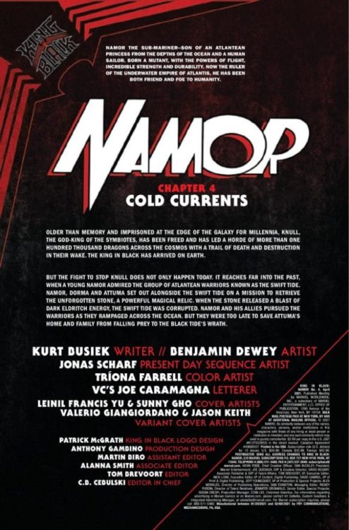
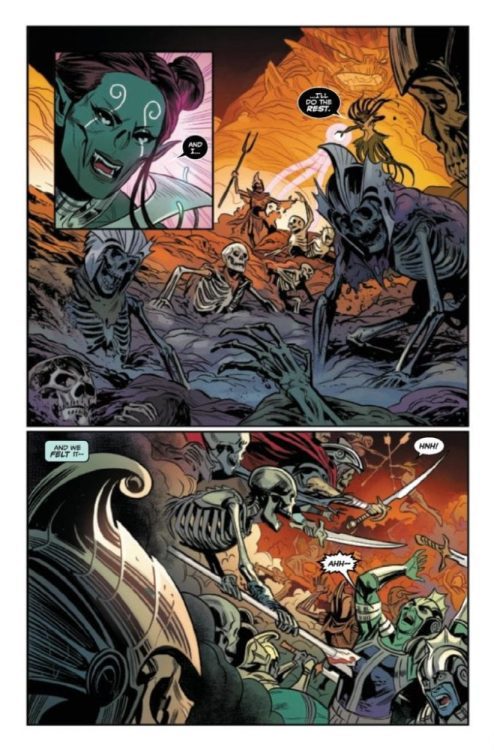
Preview: KING IN BLACK NAMOR #4 (OF 5) hits your local comic book shop next week, but thanks to Marvel Comics, Monkeys Fighting Robots has a four-page preview for our readers.
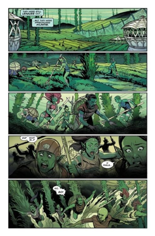
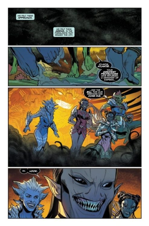
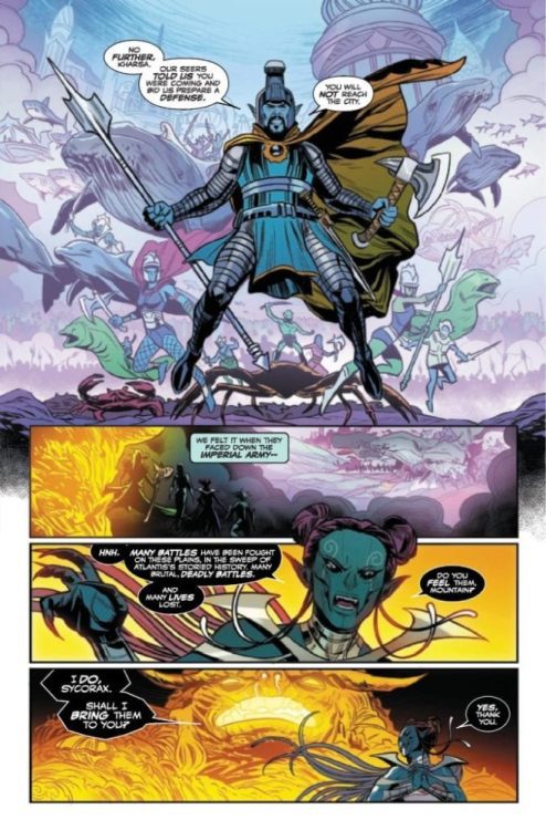
About the issue: The Black Tide’s wave of devastation now threatens Atlantis itself. Namor, Dorma, and Attuma may be the undersea world’s only hope, but unless they can shake off their utter defeat from the last issue, they don’t even stand a chance. And worse, the one possible weapon they could wield against the Black Tide is in Murmansk, thousands of miles away. It’s Atlantis’s darkest hour…
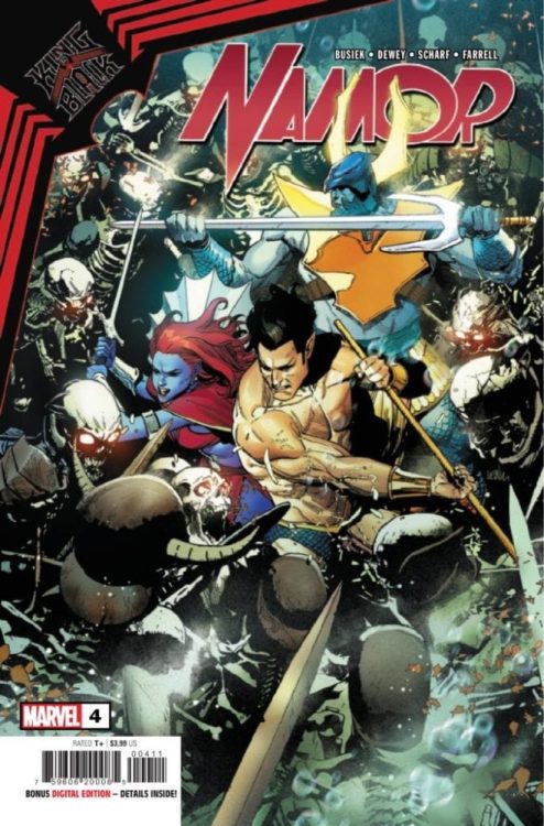
KING IN BLACK NAMOR #4 is written by Kurt Busiek, with art by Ben Dewey, Jonas Scharf is the “present-day sequence artist,” Tríona Farrell added the color, and you will read Joe Caramagna’s letter work. Leinil Francis Yu and Sunny Gho worked on the cover.
Romeo and Juliet turns 424 years old this year, and in 2021 composer René G. Boscio became part of a new film to infuse the centuries-old play with some Latin flavor.
You know the story. Two young members of unfriendly factions, Romeo and Juliet, fall in love causing an uproar. But the pair can’t bear to be apart, which ultimately leads to their demise. In this new version, which premiered at Sundance in January, the cast is primarily black and Latino, and the story comes to viewers through smartphones and social media’s unique perspective.
PopAxiom spoke with René about his road from Puerto Rico to LA and making music for Romeo and Juliet.
The Start
“I began playing drums when I was around 11,” he says about the start of his musical journey. “I used to skateboard and play video games and play video games about skateboarding — Tony Hawk. The soundtrack was all these punk bands, and I got very into Blink 182. I wanted to be like Travis Barker.”
René “switched over to guitar, and I spent most of my teens playing in rock bands. I would have these little ambient, electronic side projects.”
The time came for college. “I knew I wanted to make music, but I didn’t exactly know how. I was interested in Berklee, but it didn’t quite work out financially. So I went to the conservatory in Puerto Rico.”
René completed a bachelor’s degree in classical composition. The process was his “introduction to the orchestral world. My family is very much into the rock and pop world. This was my first time being in front of all these orchestral instruments. It opened up a different world of musical exploration for me.”
“At that point, I started noticing music in movies,” he states before pointing out a particular movie, “The Holiday.”
The Holiday is a 2006 romantic-comedy by director Nancy Meyers. Unlike most romantic comedies, however, the score for this film came from Hans Zimmer. “That score was the first that popped out to me because it was pop-y and jazzy with an orchestra and guitars.”
René said to himself, “This is what I’d love to be doing, a combination of those styles.”
A flame lit up in René. “I started reaching out to film students and begging them to let me score their shorts. That’s how I got started, by doing these short films while finishing my bachelor’s.”
Unique Sound
After graduation, René attended a two-day workshop for composers. At the center of this event was one of the most prolific composers of today. “I met Blake Neely at a workshop, and he ended up changing my whole world.”
During the workshop, “Blake gave us homework to score a scene,” he says. René caught Blake’s attention. “For a couple of weeks, he and I emailed each other back and forth. Eventually, he offered me an internship.”
René flew out to LA and spent a week with Blake in the studio. “At this point, I didn’t even know composers had teams. That’s how far removed from how things work in Hollywood I was. When I got here, it was him and Nathan Blume. I spent that week seeing how everything worked. It was all very eye-opening to me. By the end of the week, he offered me an assistant position.”
Working for Blake “was amazing,” he says, “It was like a master’s program in real-time. At first, it was mostly assistant tasks like cataloging music or doing tech work. Slowly, he started giving me more opportunities to arrange cues, all the way to writing music for the many shows he works on.”
First-hand experience from a veteran like Blake is priceless. What’s one lesson René took from his time? “How important it is to craft your sound and not use stuff out of the box. Often, when you’re working with virtual instruments, you’re able to pull up a preset. With some instruments, you just push a button, and it writes the cue for you.”
“It was always essential for Blake to take anything pre-made and tweak them to a point they became a unique sound.”
About Romeo & Juliet
“It’s my first feature film, and it’s at Sundance,” René says of Romeo & Juliet. “It was on my five-year list of goals when I started freelancing a few years ago. It happened! I’m very excited.”
“The filmmakers took on-screen representation to heart with a talented cast of black and Latino youth,” he says, but adds, “But we didn’t want the music to be too on-the-nose.”
René plucks on an instrument. “I take something simple and sample it. Then I create my virtual instrument and add different layers and textures, which will help create the score’s unique sound.”
Romeo and Juliet’s score is “not entirely orchestral,” he says, “but it’s not wholly electronic.”
The mix of Latino instruments, traditional instruments, and electronic music creates a sonic blend throughout the film. “It’s also one of those things,” he says, “that if I didn’t point it out, you might not even know they’re Latino instruments I’m using.”
Wrapping Up
René reveals “Trent Reznor and Atticus Ross” as having had “a huge impact as far back as Nine Inch Nails.”
“David Fincher films were always …” René makes a sound as if his mind were being blown.
More influences include “Sigur Ros and Alex Somers. Gustavo Santaolalla from the Latino side has influenced a lot of what I think of as Latino cinematic sounds.”
René’s got a dream project in mind that he hopes to one day make. “Think of Hocus Pocus from the Latino perspective, exploring the Brujeria side of things. When you think of something like Sabrina, that kind of dark, coming age thriller-horror story but with a Latin angle, I would love.”
“I’m currently wrapping up a feature called 7th and Union,” René answers when asked what’s coming next. “It’s directed by Anthony Nardolillo. I don’t know how much I can say, but it’s a drama.”
Is Carey Williams’ Latin-infused Romeo & Juliet on your watch list?
Thanks to René G. Boscio and Lumos PR
for making this interview possible.
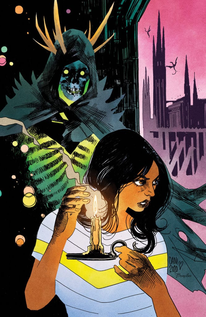
Aria Heavenly Creatures releases February 17 from Image Comics’ Shadowline imprint. Co-creator/writer Brian Holguin revisits his cult classic series from 90s Image with this one-shot. In order to bring it to a modern audience, Anomaly Press members bring their gothic atmosphere stylizations.
Background
Originally releasing on the turn of the century, the Aria franchise follows Kildare, a fae living in the mundane world. Working as an occult detective, Kildare goes out of her way to help the denizens of a hidden magical world. The series lasted 5 years, including a crossover with former Spawn character Angela… which is the topic of this one-shot.
Aria Heavenly Creatures Is A Retcon
Full disclosure, Aria Heavenly Creatures is actually a retroactive version of the Aria/Angela crossover from 2000. Due to Angela’s copyright issues further rereleases were stuck in a legal limbo. So in order to republish the story for a modern audience, Holguin tweaks some details by replacing Angela with a nameless angel. Other than that, it’s pretty much the same story, featuring tropes from the 2000s including monologuing narrators. This retains the feeling of mystery surrounding the setting of the one-shot. It’s gloomy and foreboding. Otherwise, some conversations last for longer than they should and can seem rather boring.
A Gothic Makeover
Aria Heavenly Creatures retains the penciling by artist Jay Anacleto, save for the angel’s redesign. Because some elements, like Angela’s headdress, have to be removed, there are noticeable empty spaces that take away the angel’s presence. As a result the angel feels smaller despite retaining a fierce aura.
Brian Haberline pulls a double duty as one of the co-artists and the colorist. Much like his other series Marked, there is a foreboding atmosphere from just the architecture and skyline. The early 18th century London is a place of marvel, in wealth as well as decay. This actually serves as decent foreshadowing. Despite how good the city can look, there are plenty of parts that are just ugly, like dominating parts of the world. The Angel, held prisoner by a freak show host, is the most prominent example.
The rest of Haberline’s Anomaly Productions, like Drew Posada and Raymond Lee, colors Aria Heavenly Creatures in preservation of the original. With how comic book ink can fade, a fresher paint job can give new life to a story’s theme. Like a freak show audience member’s lack of coloring that makes him look ghastly. London claims a victim here and the Angel could very well have been next.
Lettering An Era
Francis Takenaga as letterer gives Aria Heavenly Creatures captions worthy of 18th century London. The scroll-like captions as well as the fancy opening letter are all hallmarks of classical writing. It gives a sense of regal appearances where reputation matters. Unlike the SFX such as a werewolf’s snarling or an ominous laugh that reveal a magical creature’s inner nature. That’s all in contrast to the wealthy partygoers in the one-shot’s beginning. Despite society openly being against acts of social deviancy like bong smoking, the word balloons express how people of high status enjoy it all in seclusion. For the antagonists and setting, domination to fulfill perverse desires in secret are an ever present threat.
Give Aria Heavenly Creatures A Try
Aria Heavenly Creatures is a piece for older fans to collect while telling new fans that a classic is making a comeback. Sure, historians will appreciate the history behind this one-shot more, but that doesn’t mean it’s exclusive to them. It can serve as an introduction for new fans to dive into a cult classic. Just look at how the creative team took efforts to restore a piece of their history.
Are any of you going to give this one-shot a try? Or have the stylizations in storytelling aged poorly? Leave your thoughts in the comments.
Recount #2 is a socially relevant political thriller, releasing on February 17, from Scout Comics. Writer Jonathan Hedrick examines the fallout of an election where people try to steal away control. The art, by Gabriel Ibarra-Nunez, brings a strong sense of kinetic scale in the series’ threats. The coloring by Sunil Ghagre enhances these threats with shading as these threats thrive in the shadows. Finally, the lettering by Cristian Docolomansky gives impact to every action, no matter how small.
Background
Recount follows a post-election/presidential assassination story about the United States, as they’re gearing up to enter a civil war. After a militia kills the president elect, his vice president Meredith McDearmon comes into power to try and get some control. Unfortunately, when the changes in militia encourages regular people to attack supporters of the late president; what control is left?
Recount #2 For The Times
Recount #2 and the series as a whole releases at a time when political tensions continue. With voter suppression and conspiracies running rampant after the 2020 elections, nobody knows who to trust. Politicians will always promise to make the country better, but they often don’t have the power to. These more often turn out to be lies to appease the public.
Within the series, Hedrick makes it plain as day that the lies these politicians tell their supporters make them like a cult. Meredith finds that her late boss made deals that turned people against their loved ones, with no hope of turning their lives around. To the militia, as well as the public attacking electoral college members, this is enabling corruption. Even then, retaliation is just more cult behavior akin to the Capitol riot. It’s all rather scary how much this issue seems closer to life and keeps the reader guessing at what happens next.
Art Of Guerrillas
Recount #2 features the art of Ibarra-Nunez making gritty shading as well as small but powerful movements. In the six and nine panel grid pages, there is a sense of control only for it all to fall apart. A 6-panel conversation between Meredith and Secret Service Agent Barto has Barto taking command of the situation by deconstructing Meredith’s defensive attitude. Barto exerts a constant in control posture, unlike Meredith who relaxes in each panel appearance. Compare this to the 9-panels where in three instances, electoral college members are killed while going about their day. Somebody needs to be in charge, and fast.
The coloring by Ghagre is utilized for dramatic effect. A number of panels in pages that happen in broad daylight have blank backgrounds. These reflect the angry civilians who are going out killing the electoral college. After building up their rage, the actions that take place are plain as day; nothing else matters to them but those moments.
It’s all contrasted against dark rooms where the influence of assassination militia reaches the most. When Meredith and Barto meet with an electoral college member, the only light comes from a desk lamp. In this area, the man feels the weight of all his actions as he reflects over everything. The light from the doorway Meredith and Barto came from might’ve been a way out, but the militia’s influence lingers on.
Impactful Lettering
The lettering by Docolomansky is often an extension of what’s occurring in the moment. When Meredith is trying to steer a car, while she and Barto are being shot at, the cussing in different font feels heavy with the lack of control. Of course each SFX can say just as much about a lack of control. Unlike when people speak in regular word balloons, a hand drawn scream brings about a feeling of chaos. Seeing somebody get shot and the gunshot hitting somebody certainly can do that. Compare that to the SFX made from a computer, these are extensions of mechanical devices like a car or doorbell. Their functions are simple and don’t interfere with anything, they are more easily controlled.
Demand Recount #2 For Some Control
Recount #2 is shaping up a very relevant political thriller. By channeling today’s political outrage into a speculative field, the comic delves into a need for order. It’s a feeling that’s all the more powerful thanks to how the art presents it. Panels and colors shift in response to the threat of a militia ready to throw everything into chaos.
What do you all think? Is this series worth continuing for its own sake? Or is it getting so much like the real world that it’s uncomfortable?
King In Black: Planet of the Symbiotes #2 features two C-List Marvel character stories, on February 17. Tying American Kaiju and Hornet together are two complementary stories about nostalgia. American Kaiju explores how the inspirations that propel people to action must come from an awareness of toxicity. Hornet meanwhile is about details how while inspirations have their downsides, they can still propel people to do good.
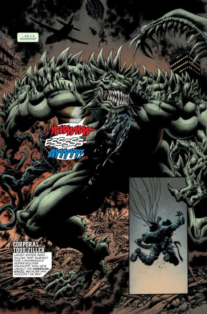
American Kaiju: Nostalgia vs Reality
Opening with American Kaiju, writer Marc Bernardin dives right into the title of this section of Planet of the Symbiotes #2. The American Kaiju, Corporal Todd Ziller, lives the ultimate fantasy of a Marvel fan. The serum that makes him the American Kaiju is made up of several Marvel Universe elements like the Hulk, Ant-Man, and Captain America. Since a number of military soldiers, like Super Soldiers author Jason Inman are comic book fans, Ziller is able to connect with some real world fans more than others. Nothing beats actually sharing experiences with these heroes.
So what happens when fans, like Ziller, catch onto the downsides of superhero life when they live it? Artist Kyle Holtz and colorist Rachelle Rosenberg showcase a large grand design of American Kaiju, as a force of nature rampaging through the city. A buff giant green lizard with the American Flag on his chest practically screams Ziller’s sense of patriotism as much as his roaring of “USA!” But they also show in his fight with a giant symbiote dragon how he trashes the city, like using a public train as a weapon. Sure it looks cool but after this, the city folk will need some transportation when this is all over.
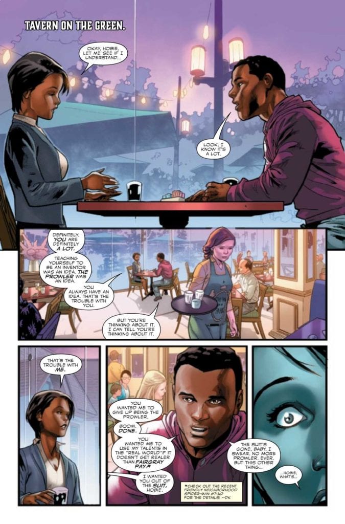
Hornet: How Nostalgia Inspires
Meanwhile, in the other half of King In Black: Planet of the Symbiotes #2, there is a more positive story about nostalgia. Former Prowler Hobie Brown is called into action after leaving the superhero life behind. In contrast with the above story, writer Geoffry Thorne goes into the process of how nostalgia is still a process of inspiration. Hobie hasn’t quite given up the superhero attitude like the Prowler suit. Thing is, despite his girlfriend wanting Hobie out of that costume, she appreciates how he’s able to take charge in emergencies.
It’s this attachment to the past that can inspire people like Hobie to understand what they like and apply it in the rest of the world. It’s why artist Jan Bazada designs Hobie’s costume with the Prowler mask. Aside from good color balance provided by Rosenberg, it’s a period of transition that shows Hobie off with one last bit of glory. His technological expertise is on full display when he fights against the symbiotes, with cell phones no less! While Hobie is taking on one of Spider-Man’s other alter-egos, his actions here display how he earns the mantle of Hornet.
King In Black: Planet Of The Symbiotes #2 – Lettering
Tying King In Black: Planet of the Symbiotes #2 together is letterer Cory Petit of VC, giving characters distinctive voices. The limited speech of American Kaiju has its own coloration, coupled with loud SFX to evoke a sense of loud patriotism. That’s in juxtaposition to the green captions that express Ziller’s awareness of the situation and his own self-loathing.
The Hornet section, meanwhile, serves as a complete extension of Hobie in action. The word balloons help guide the reader throughout all the movements. The light purple SFX also tend to accompany every hit and tap on a phone. It’s what makes the reader naturally progress from action to reaction throughout the story.
Get King In Black: Planet Of The Symbiotes #2
King In Black: Planet of the Symbiotes #2 is an ideal tie-in for several reasons. By forgoing tying directly into the main plot of the crossover event and not interrupting currently running series, C and D-list characters get the chance to be seen. The efforts creators put into developing these characters internally and externally means more arcs need to follow. It’s what put this issue in the same ranks as the Black Knight tie-in.
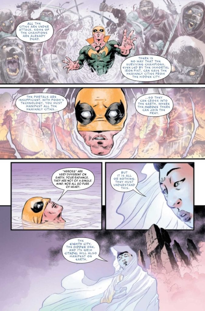
Iron Fist Heart of the Dragon #2 continues Marvel’s martial arts epic on February 17. Larry Hama continues to write about the martial arts world of Iron Fist converging with the greater Marvel universe. With how artist Dave Watcher depicts each new character joining the fray, the tension and excitement builds. Colorist Neeraj Menon enhances the mythic scale by showcasing how the settings envelop the characters; all while the lettering by Travis Lanham showcases the cheesy dialogue of some of these characters.
Iron Fist Heart of the Dragon #2: Crossover Catalyst
Hama shows that the greater martial arts world is ready to become something more than a Marvel niche. With this series, as well as Shang-Chi, getting more exposure, it’s good to see some in-universe recognition. Due to the actions of an enigmatic antagonist, the greater Marvel world can’t ignore this series any longer. While it is nice to see this less represented mystical part of Marvel, there are some concerns.
Luke Cage, being only casually invested thanks to his friendship with Iron Fist, notes that even with a new threat, characters from the greater world of Marvel don’t exactly have any personal stakes. World-ending threats are so common, it’s too hard for Marvel’s superheroes to take these things seriously. It’s nice to see Iron Fist Heart of the Dragon #2 having a sense of self-awareness.
That’s not to say that some parts of Marvel don’t mix with this wuxia style world. Black Panther‘s Okoye looks ready to join the battle. With how many appearances she makes outside Wakanda, it’s nice to see her brought into different a new niche.
Art of the Hidden Dragon
Iron Fist Heart of the Dragon #2 features mythic backgrounds by Watcher. The architecture of the Under Heaven cities can look genuinely divine as they materialize in places like a Wakandan jungle. The very presence of the dragons in these cities make even the run down Bao Fu look otherworldly. Then there are the Immortal Weapons who jump out of their debuting panels and converge on a conjoined ground. It’s a sense of narrative weight so strong, it brings three seemingly separate panels together.
Menon makes the otherworldly presence all the more obvious. When Iron Fist speaks with an actual goddess, the surrounding cool colors, in juxtaposition with his costume, make Iron Fist feel small. Then there’s the darker settings of Bao Fu where Iron Fist’s colorful costume (regalia) feels empowering. It’s like a light through the dark city.
Then there’s the lettering by VC’s Lanham. The goddess Guan Yin speaks in a light blue colored and archaic looking font. This makes her appear more divine and presents her as a benevolent force. Otherwise, the way Lanham presents the Immortal Weapons is like watching an old dubbed wuxia movie. In a few panels, the Immortal Weapons practically speak in sequence, like they rehearsed their lines. The lettering flow certainly brings that sentiment through how many words they speak in one breath.
Continue The Journey In Iron Fist Heart of the Dragon #2
Iron Fist Heart of the Dragon #2 will certainly strike some readers’ fancy, especially those willing to take a break from A-Listers and tie-ins. The wuxia styled world of Marvel is ready to make itself known. The series is really shaping up by displaying its mythic glory. I’m certainly looking forward to more developments.
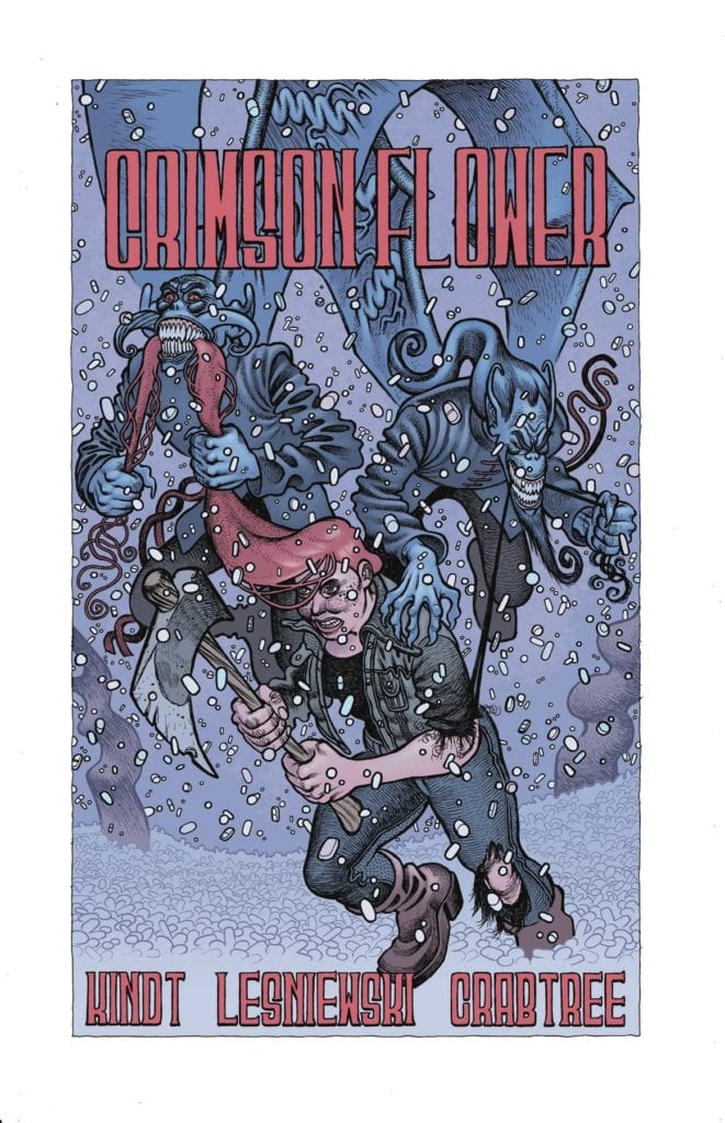
CRIMSON FLOWER #2, available February 24th from Dark Horse Comics, continues the tale of one young woman, and her bloody path towards revenge. It’s a dark story, one seeded with folklore and surprises.
The hunt continues in Crimson Flower #2.
Crimson Flower is one of those series that demands attention. The style and aesthetic alone are eye-catching, especially when in combination with the heavy use of Russian folk tales. It is reminiscent of a fractured fairy tale, but with a few unique twists.
This is not one of those happy fairytale retellings. This is the story of a young woman who watched her father get brutally murdered. Now, she’s using her love of those very tales to shield her mind as she hunts down his killer.
While not a happy tale, it does fit in rather nicely with some of the more classic fairytales out there. The original versions that is, not the versions we so commonly see these days. This is the setting from which Crimson Flower #2 springs out.
The Writing
Crimson Flower #2 is every bit as dark and twisted as its predecessor, if not more so. The hunt continues, and thus we’re about to see another round of desperation and violence, as more killers enter the fray.
Matt Kindt really does an excellent job of using folklore as a lens here. It translates all the horror and pain one character is experiencing and turns it into something else entirely. It’s fascinating, and more than a little bit horrifying.
Which makes it a great read, when you think about it. Now that we’re done learning the backstory of this character (and her late father), there’s more room to focus on the here and now. Mostly, it’s starting to look like a series of increasingly dangerous situations for her.
There are a lot of interesting questions and debates raised by this issue, and arguably the series as a whole. Discussions about loss and grief, and how toxic it can become. Not to mention a dozen other concerns that have already been raised as well.
The Art
Crimson Flower #2 is the second most visually unique comic I’ve read this year. The first being Crimson Flower #1, in case that wasn’t obvious. The artwork itself tells its own story, one that is likewise steeped in the tales of old.
Matt Lesniewski (art) and Bill Crabtree (colors) really brought something new to the table here. The intentional plays with proportions are fascinating, giving the series such a unique look. Because of this, the series gets away with many stylistic decisions that wouldn’t work anywhere else.
The end result? A striking collection of panels that somehow manage to feel brand new and ancient all at once. Then there’s the addition of texture, which brings the imagery to a whole new level, making it feel like something you could run you could reach out and physically touch.
Conclusion
Crimson Flower #2 is another dark addition to this series, one that dove headfirst into the hunt – and horrors. It’s been a fascinating read, one that isn’t afraid to combine the past with the present in such a twisted way.
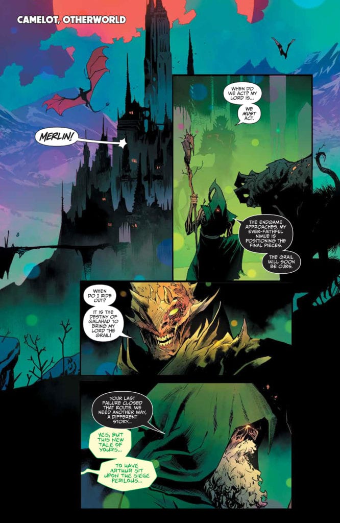
ONCE & FUTURE #16, available now from BOOM! Studios, throws Duncan and allies back into the fray, as the tales of old continue to warp and complicate an already wrought situation. For these are beings that do not belong in the world of men, as they say.
Two forces on the verge of a collision on this variant cover of Once & Future #16.
It’s hard to believe that it was only fifteen issues ago that Duncan first learned the truth about his family history. Well, some of the truth. I personally have no doubt that there is a lot that has been kept from him, even now.
The fact remains that it was just a short time ago that he went from being an ordinary guy to a guy that battles monsters in the dark. Normally family secrets aren’t quite so dangerous, not in the literal sense.
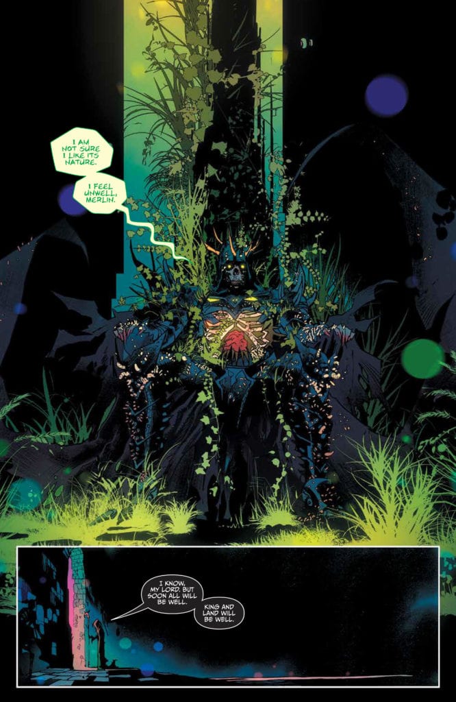
Ever since that moment, Duncan (with the help of others) has been battling. The legends of old are waking up, and they aren’t intending to treat the human world with any level of kindness. And thus, that is where Once & Future #16 begins.
Enter Camelot in the Otherworld, where legends of old are scheming.
The Writing
The plot of Once & Future has been steadily getting more complex, introducing new characters, legends, and monsters with every passing issue. All of it building towards an inevitable confrontation, one that sincerely could go either way.
Once & Future #16, written by Kieron Gillen, continues to build that tension and anticipation. The last issue introduced more complications than most, and this issue did an excellent job of running with what was handed to it.
That isn’t to say that it didn’t introduce its own complications (it did), but it didn’t drop any of the threads that were formed in the last issue either, which I have to appreciate. Mostly because I (along with many other readers, I’m certain) am desperate to get answers for some of what is happening.
There is a strong sense of irony in this issue. Things coming back to bite (or potentially bite) characters for their previous actions or decisions. It’s tempting to say that this is highly satisfying, but well…it is happening on both sides, so not exactly ideal.
Though what is satisfying is seeing how it is all weaving together. We’re still missing out on several pieces, that much is obvious. But the larger picture is starting to come into focus. Further proof of all the careful planning that went into the writing for this entire series.
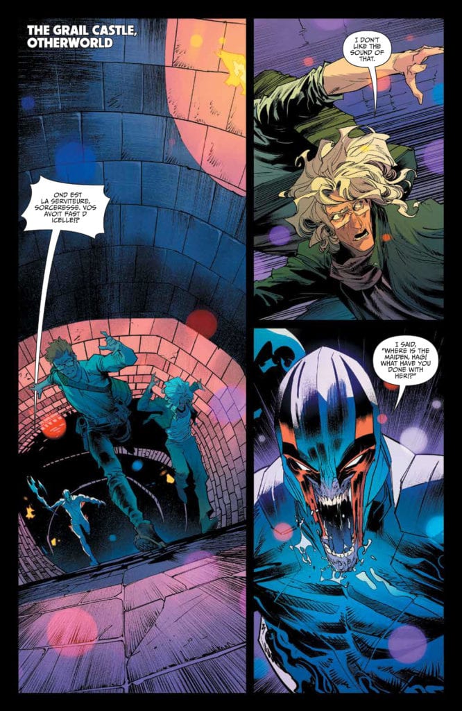
Uh, King Arthur is looking a little different than his legend would have had us believe…
The Art
Once & Future #16 has yet more striking imagery to add to the series. Once again, I find myself wishing that there were prints available for some of these pages (namely page 8). They’re terrifying, bewitching, and striking all at once.
Dan Mora’s art style is so perfect for this world that is both real and fantasy. The monsters he draws are horrifying and beautiful in a combination that shouldn’t work – but really does. They’re larger than life in all the best ways, and all have a personality to their designs.
Admittedly, Tamra Bonvillain’s colors have a lot to do with all of that. Her colors are bright and amazing, adding a strong sense of fantasy to everything. Her blues and greens are divine, especially in this issue.
Ed Dukeshire’s lettering showcases the myriad of emotional and vocal responses available within this single issue. That and many other details really bring it all home in such a haunting manner.
Meanwhile, our heroes run from an angry knight.
Conclusion
Once & Future #16 is a bright and intense issue, bringing many plot arcs together for one dramatic issue. The best part? It looks like that dramatic element is going to continue building in the next issue, so there’s more to look forward to here.
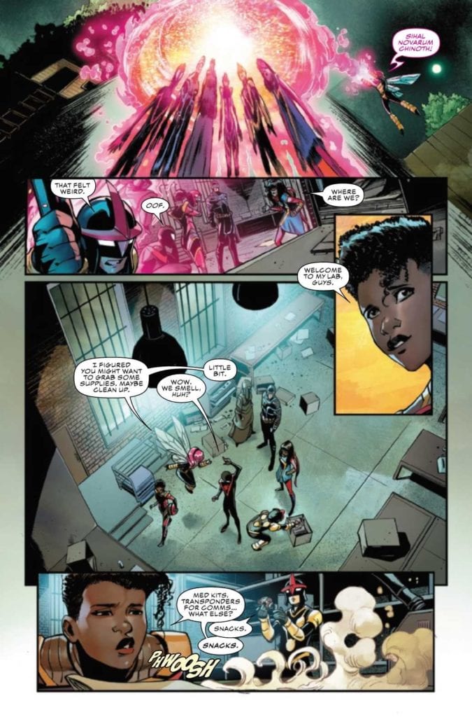
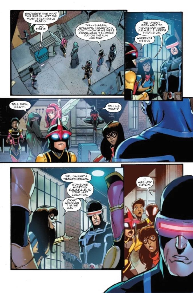
CHAMPIONS #4, available now from Marvel Comics, brings the Champions, Cyclops, and the Marauders together, even for a brief moment. All while the Champions, and any underage hero, are dealing with the consequences of Outlawed.
Things are getting complication in Champions #4.
For those that haven’t been following along, or who have been distracted by other events (ie: The King in Black), Marvel is once again facing an event that aims to control the actions of superheroes.
This time around, the focus is specifically on all those heroes that are deemed underage. Ignoring the fact that it is probably not easy to tell the ages of those that haven’t revealed their identities, this resulted in a new law coming into place: Kamala’s Law. It gives agencies like C.R.A.D.L.E. The authority to essentially hunt and track down those that disobey.
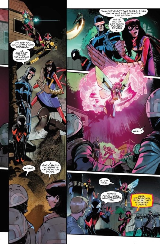
Those like the Champions, because naturally, they’re not going to step down, even if it was their actions that were the cause of this law, to begin with. Thus, half of the Champions (and dozens of other young heroes) have been captured, and the rest are on the run. That is where Champions #4 picks up.
Now seems like a good time for an escape.
The Writing
The last issue left fans on a bit of a high note, giving us reason to hope that there will be change (or at least help) on the horizon. Naturally, that meant we were fairly excited to see what happened next in Champions #4.
Written by Eve L. Ewing, this is an issue that gave the perfect excuse for the Champions, Cyclops (previously a member of the Champions, if you recall), and the Marauders to interact. Our young heroes are hurting, exhausted, and tired of having to be on the run all the time.
Yet this issue continues to remind us of all the reasons why the remaining Champions can’t just turn themselves in and hope for the best. As we’ve been shown, the ‘best’ is really not ideal, and instead is reminiscent of horrible times in history. Both in comics, and in real life, as Marvel always tends to mirror real life.
Naturally, this issue had its ups and downs. It had some high moments, and it also highlighted (once again) the stakes at hand. Seeing other heroes are reacting to this law is always refreshing, especially those that have found a way around it.
Now the appearance of the Marauders makes sense.
The Art
Champions #4 is a visually complex issue, one that portrays multiple scenes and even more characters. In terms of what there is to see, this issue has a little bit of everything. It has some action, some grandstanding, character development, and obviously the opportunity for characters to show and express how they’re holding up.
Bob Quinn’s art really is perfect for this series, matching the style of the Champions, while also including several other well-known characters. The artwork is bright and the action is fun and easy to read – always a highlight for this crew.
The colors, provided by Federico Blee, bring that whole feeling even further. While many of the locations should feel dull and muted, there’s something about the colors that makes them feel more alive. Especially when there’s a hero standing in the middle of the room.
VC’s Clayton Cowles’s letters are the final touch that this issue needed. The Champions really do feel torn apart and tired, thanks to the subtle detail work provided by Cowles. Likewise, his work carries readers in a flowing motion, carrying the narration ever onward.
Unfortunately, their troubles are far from over.
Conclusion
Champions #4 hits hard, as does the whole of this series thus far. There’s no avoiding the implications of this new law, not when we’re directly seeing the impact of it all. It hits close to home in many ways, as this compelling story continues to unfold.
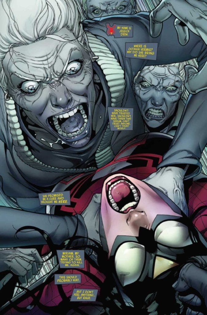
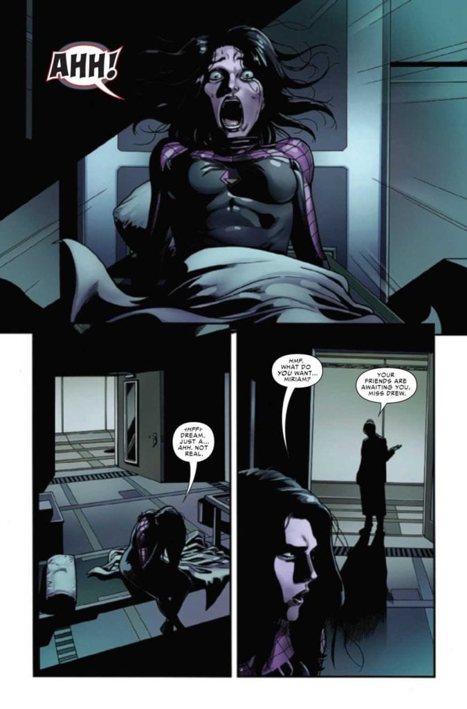
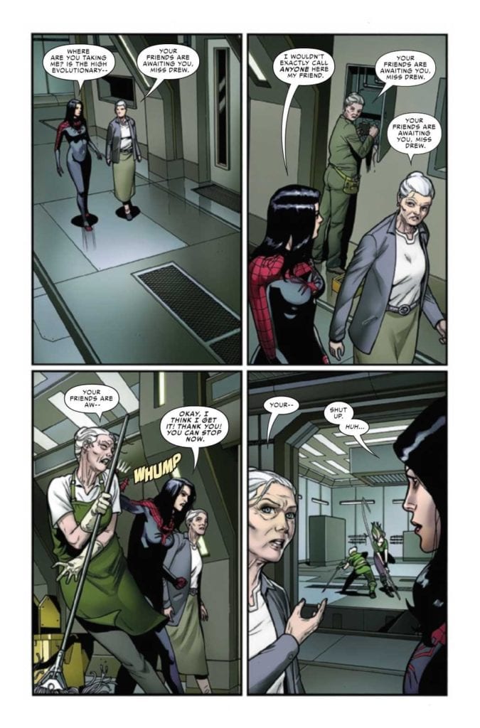
SPIDER-WOMAN #9, available now from Marvel Comics, continues Jessica Drew’s desperate hunt for a cure. Once again she’s in a surprising situation, as she finds herself in the home of several distracting surprises and revelations.
Talk about a startling introduction to this issue!
So far, Spider-Woman‘s latest series has forced Jessica Drew through quite a lot. She learned more about her family than she probably ever wanted (which is saying something), she is sick, and now fears for her son. That was all before Knull invaded, changing the world around her even as she continued to fight for a cure.
Oh! And don’t forget Spider-Woman’s current ally, who feels like a risky decision at best. Especially for any fan who is up to date in Spider-Verse and the various characters that it introduced.
Spider-Woman #9 continues from that point, throwing Jess into yet another chaotic and dangerous situation. It seems that she still can’t catch a break, though she is apparently getting closer to her goals, so there’s that.
Thankfully, it appears that it was all a dream. Well, perhaps not all of it…
The Writing
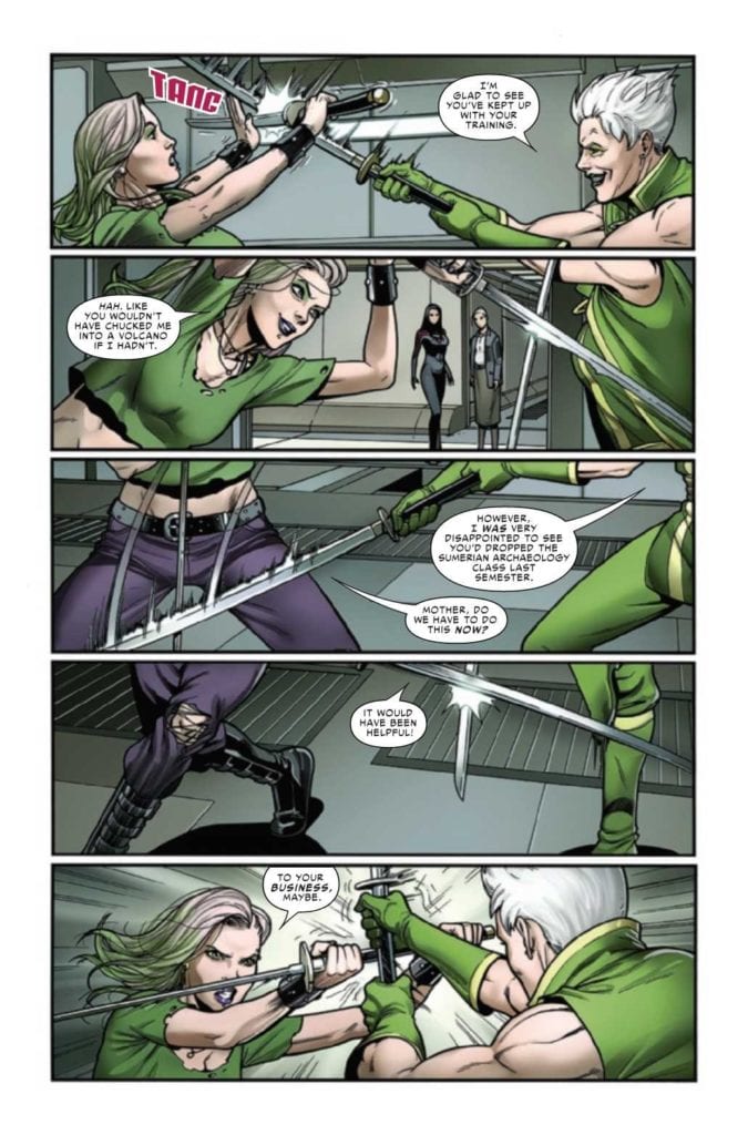
Spider-Woman #9, written by Karla Pacheco, really does nail that whole family drama vibe. But with a Spider-Woman twist, naturally. After all, it isn’t every day that you come across a woman interacting with a room full of clones of her own mother. No, that’s the sort of luck that only Jessica Drew (and probably Peter Parker, if we’re being honest) could come up with.
All things considered, Spider-Woman #9 is a fascinating issue. One that drops a whole lot of information, without falling into the sins of show/tell issues. A liberal use of flashbacks helps to explain the situation, while also raising many more questions along the way.
On the bright side, it does answer a few longer running questions in the process, so we’re not going to go and complain about it. Yet even with that in mind, there is a lingering sense of dread that grows as each page passes.
That probably has something to do with a gut feeling for how this is all going to play out. There are many elements that feel achingly familiar here, for Spider-Man fans. That isn’t to say that the plot is derivative, more like it’s taking advantage of our knowledge and understanding to create something subtly haunting.
There are a lot of…familiar faces around here.
The Art
Spider-Woman #9 has some of the best cut scene/flashback art I’ve seen in quite some time. It quickly runs the readers through years of backstory, and it does so quickly and smoothly. These small vignettes easily layout the lives before us, while still leaving some room for imagination to fill in the gaps.
That isn’t the only highlight from this issue, naturally. With Pere Perez as the lead artist, this is an issue full of visual twists and turns. Most of them being memorable ones at that. The overall layout for this issue is remarkable, literally. As are the character designs, cameos, and fight scenes.
Frank D’Armata’s do help to enhance the scenes, naturally. There’s heavy use of negative space for the layouts, leaving plenty of white on the pages. Meaning that the colors really pop, especially those familiar greens and purples.
The lettering, provided by VC’s Travis Lanham, really gives a sense of impact, especially during the fight scenes. There’s nothing quite so satisfying as knowing that a hit landed, or that somebody undoubtedly received a solid zap.
Meanwhile, a sparring match is going on.
Conclusion
Spider-Woman #9 is one of the most visually compelling issues I’ve read in recent times, and coupled with the clever writing, it leaves a strong impression. A positive one, to be clear. Naturally, we’re all left wondering how that cliffhanger is going to get resolved.