Home Blog Page 161

Review: The Pieces All Fall Together in RORSCHACH #8

Rorschach King DC Comics

The story of DC Comics’ series Rorschach is complex and confusing. But writer Tom King, artist Jorge Fornes, colorist Dave Stewart, and letterer Clayton Cowles don’t let us think for a second that that’s because they are being unclear. No, Rorschach #8 is incredibly clear. It’s concise and meticulously ordered. Yet somehow, this creative team is able to communicate chaos. It’s through order that they show us what’s missing and what doesn’t make sense. They lay everything out carefully, that way we can see all the holes. This creative team continues to use their incredible powers to blow our minds.

Writing

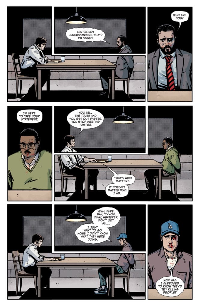
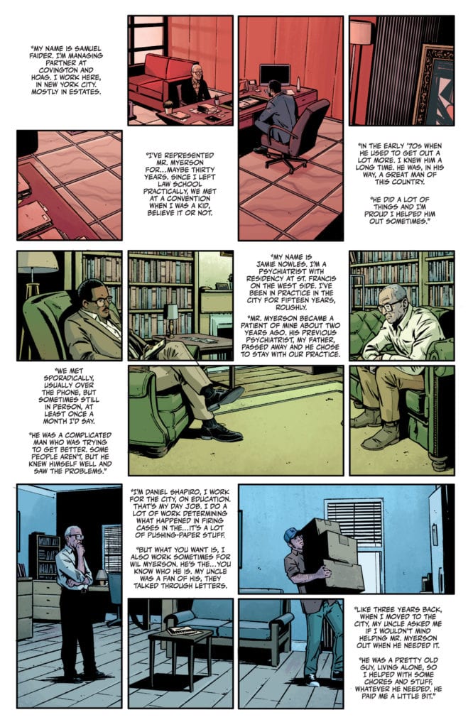
King has never been so verbose. His pages are full of text in this issue. King is usually known for his quiet comics. Often, the pauses in his scripts speak louder than the words do. This issue is actually no exception. Our main character, the detective figuring out the story behind Wil Myerson, is interrogating three people. Each witness has a lot to say. Their accounts spare no details. For every brief question, there’s a long answer. But everything about their testimonies feels harmless. We begin to wonder if the detective has gone down the wrong rabbit trail, or if he’s just being played. King masterfully skirts past holes in each story, then comes back to make us question what we think we know. It’s like he dumps all the puzzle pieces on us, then shows us that they don’t fit together. They can’t be the right pieces. It’s a brilliant journey that he takes us on in this issue, deepening the mystery with each revelation.

Rorschach King DC Comics

Art

Fornes’ page layouts play a huge role in making us feel like we’re missing part of the picture. He makes use of dead space throughout this issue. Almost every page is more or less a 24 panel grid. Many pages combine some panels, but when you break it down, it’s still 24 panels. Often, pages have panels that are fully dedicated to text. Instead of using caption boxes, we get white panels full of text. And when Fornes combines panels to create one image, with a panel in the middle of that image blanked out for text, we get the sense that we’re missing part of the picture. Because we quite literally are. Fornes makes us feel that it’s the dead space that holds the answers. The issue reads like an evidence board that’s missing what links it all together. It’s fantastic, infuriating, and beautifully done.

Rorschach King DC Comics

Coloring

Stewart’s coloring is deliberately simplified. When one character tells their version of events, those events are shown in a certain hue. When Wil’s lawyer says what he remembers, we see everything through a red haze. Wil’s therapist and handyman recount things in green and blue respectively. Not only does this help us keep track of who’s speaking, but it gives us a sense that the truth is being distorted. We aren’t seeing things as they truly are. When the detective finished his interrogation, he grabs a cup of water from the water cooler. Each plastic cup is colored differently. One is red, one is blue, one is green. As he updates his supervisor on how the interrogation went, we see him drink the water and throw it away. But in each image of the cup, it’s a different color. It’s Stewart’s incredibly simple way of showing how monotonous these things are to the detective. His routine is the same, his conversations with his supervisor don’t change, only the days change. Same thing, different day.

Lettering

Cowles places much of the lettering in this issue in the dead space of each page. The white panels not only get filled with captions, but with the speech bubbles of the characters. Their words go from their mouths in one panel, up into the dead space of another. When Cowles does place captions over an image, he stays true to the style of the rest of the issue. Caption boxes are big and white. They purposefully get in the way of the rest of the picture. And finally, Cowles makes a point of always having quotation marks around the captions. Even when two paragraphs exist in the same caption box, each starts with a quotation mark. Other letterers often omit quotation marks where they can. But Cowles never wants us to forget that we’re being told this story. We won’t forget who the speakers are, Cowles makes sure of that.


DC Comics’ Rorschach #8 is an incomplete picture. It taunts us with the information we don’t have while overloading us with information that doesn’t fit. This creative team impresses upon us what it feels like to look for the truth in a sea of misinformation. They use their ordered, clean storytelling to show us the chaos beneath the surface. Pick up Rorschach #8, out from DC Comics May 11th, at a comic shop near you.

Monkeys Fighting Robots Youtube

S03E01: Kickstarter, Comics, and Disc Golf

Monkeys Fighting Robots Podcast Logo

If you are reading this, it means you have survived the apocalypse! I’m back to talk with you about life, comics, and a bit of disc golf. Man, I’m such a nerd! Thanks for checking out the podcast, have a great week, and let me know if you read any great books on NCBD!

Send emails to Matt@monkeysfightingrobots.com

About the Monkeys Fighting Robots Podcast

Never heard of Matt Sardo?
For starters, he made the Kessel Run in less than 11 parsecs. Prior to that, he gave Doc Brown the idea for the flux capacitor and led the Resistance to victory over SkyNet – all while sipping a finely crafted IPA. As a radio host, he’s interviewed celebrities, athletes and everyone in between. He’s covered everything from the Super Bowl to Comic-Con.

Monkeys Fighting Robots Youtube

Exclusive Preview: NUCLEAR FAMILY #4 from Stephanie Phillips & Tony Shasteen

Exclusive Preview: NUCLEAR FAMILY #4 from Stephanie Phillips & Tony Shasteen

NUCLEAR FAMILY #4 hits your local comic book shop on May 26, but thanks to AfterShock Comics, Monkeys Fighting Robots has an exclusive four-page preview for our readers.

The book is written by Stephanie Phillips, with art by Tony Shasteen, JD Mettler drops the color, and you will read Troy Peteri’s letter work.

About NUCLEAR FAMILY #4:
Propelled into an alternate reality where the Cold War turned hot, and America has been nuked, the McClean family has been captured by a paranoid military that believes them to be spies. Desperately searching for a way to get home, the McClean’s uncover even darker secrets buried in the nuclear bunkers beneath Milwaukee.

Enjoy the preview below.

Monkeys Fighting Robots Youtube

Review: INITIATION Delivers Gory Statement About Sexual Assault

Initiation will appeal to those with a love for Urban Legend, Scream 2, and several other college campus-based horror films. Initiation may be another slasher film, but it has a message for those that want to sweep sexual assault under the rug. Now, many films have touched on these subjects in the past, but Initiation’s decision to go for a more nuanced approach is refreshing to see. The slasher resurgence continues with this surprisingly engaging new addition.

People will only sit back and watch for so long when it relates to crimes that are ignored countless times. Initiation takes pleasure in exploring that breaking point, and while the characters involved aren’t that fleshed out, it still delivers the gory fun you’d expect from a slasher film. Directed and co-written by John Berardo, the film stars Froy Gutierrez, Lochlyn Munro, Yancy Butler, Jon Huertas, Isabella Gomez, and Lindsay LaVanchy. After the death of star athlete, Wes Scott (Gutierrez), Whiton University’s dark secrets are threatened. His sister, Ellery Scott (LaVanchy) finds herself in the mix of it all as a killer begins slashing their way through the campus.

Froy Gutierrez as Wes Scott in Saban Films Initiation

Berardo and his co-writer have managed to put together a story that will keep you guessing. The downfall in this narrative is found in how flat the characters are, and this isn’t a discredit to the solid performances. Ellery is the sorority final girl that spends most of the film in shock and denial about the controversy surrounding her brother’s recent demise. She’s a very likable character but just seems unfinished by the end of the film. The decision to take a subtle approach to the themes in Initiation helps eliminate the chance of being too forceful with its message. Sexual assault, cyberbullying, and toxic masculinity on college campuses are all addressed during this film.

Once the hooded figure is revealed, some viewers may be shocked at how the film subverts your expectations. The puzzle is being pieced together little by little, and certain details may go overlooked that you’ll notice during a second viewing. Initiation sets up two prominent issues, one being the killer on campus, and the unity of it all, in the end, is more than satisfying. Ellery’s role in the film is important, as the sister of Wes, and the writers could have chosen to go with her friend, Kylie, to lead the film since she has an important role too. However, between what Kylie endures and Wes’ death, Ellery becomes a more suitable fit, as viewers get to develop sympathy for her while she searches for answers regarding two people she cares about.

Lindsay LaVanchy as Ellery Scott in Saban Films Initiation

LaVanchy embodies the final girl trope with ease, Ellery might be an underdeveloped protagonist to follow, but the performance delivered makes up for that. Her powerful performance makes it easy to feel for Ellery, as she attempts to uncover the truth behind her brother’s death. Her sorority sisters deliver adequate performances as well but aren’t made to feel that important. However, Gomez who stars as Kylie shines in her role as she struggles to come to terms with what happened to her during a party. One scene, in particular, amplifies the enormous amount of anxiety her character is suffering from. Berardo’s direction is sort of jumbled here, and some moments without the bloodshed feel lifeless. He can deliver a fun blend of drama and tension for the most part, but the pacing can grow tiresome.

Initiation delivers the slasher goods horror fans are looking for but doesn’t go without hiccups along the way. The underlying message in the film is made abundantly clear, and Berardo has shown his strengths with this outing. It wouldn’t be shocking if the film goes overlooked only to develop a cult following many years later. The film won’t be spawning the next big slasher, but it still is worth watching for its surprisingly engaging story.


Monkeys Fighting Robots Youtube

Preview: CHILDREN OF ATOM #3

Preview: CHILDREN OF ATOM #3

CHILDREN OF ATOM #3

Publisher: Marvel Comics
Diamond Code: APR200893
Creators: (W) Vita Ayala (A) Paco Medina (CA) R. B. Silva

About the issue: ORIGIN REVEALED! Who are the X-Men’s sidekicks behind the masks? Meanwhile, a brand new alternative medicine is changing lives at school, but who’s recruiting the victims – I mean patients?

Rated: T+
In Shops: May 12, 2021
SRP: $3.99

Monkeys Fighting Robots Youtube

Review: GOD OF WAR: FALLEN GOD #3 Brings The Rage

GOD OF WAR: FALLEN GOD #3, available in comic book stores on Wednesday, May 5th, features another set of monumental challenges for Kratos. Running from the challenges facing the demigod clearly isn’t working, so he’s decided to unleash his rage once again. As a result, this issue features a version of Kratos longtime series fans will love.

Story

Much like in previous issues, Chris Roberson’s narrative follows Kratos across a series of trials. Despite defeating the Chaos Beast moments before, an even greater monster takes its place.

What purpose do these monsters serve? Who is sending them to Kratos? These are the questions readers continue to ask.

Whatever lesson Kratos is meant to learn, it’s a abundantly clear that the answer is unclear. And that’s arguably Robertson’s intention. Kratos believes he has served his purpose in the world, which is why he ran away from these challenges in the first place. But tapping into his uncontrollable rage seems to be the only path forward.

Artwork

Tony Parker’s penciling and ink work, Dan Jackson’s coloring, and Jimmy Betancourt of Comiccraft’s lettering crafted thrilling, action-packed illustrations worthy of the God of War. The details on the Chaos Beasts are exceptional, ranging from its harsh scales to its terrifying claws. These features are brought to life by a mix of bright and dark hues to create stark contrasts. And the lettering fits in well with the images; they’re placed well around Kratos to frame his form.

Conclusion

GOD OF WAR: FALLEN GOD #3 raises more questions than it answers, but this keeps us coming back for more.

What purpose do you think Kratos must fulfill? Let us know in the comments below!


Monkeys Fighting Robots Youtube

X-MEN: CURSE OF THE MAN-THING #1: Monster Matters

X-Men: Curse of the Man-Thing #1 Cover

X-Men: Curse of the Man-Thing #1 brings to comic stores the finale of a Marvel Comics mini-event on May 5. Writer Steve Orlando completes the arc of the titular Man-Thing with help from the X-Men. Artist Andrea Broccardo provides dynamic artwork that makes monstrous characters look heroic. Colorist Guru-eFX continues the atmospheric contrast of the settings. Finally, letterer Clayton Cowles gives impact to every decision and action.

X-Men: Curse of the Man-Thing: Embrace Your Monster!

Orlando’s focus on Man-Thing and his subconsciousness Ted Sallis comes to a resolution. After all of the self-pity in previous issues and a talk with X-Men’s Magik, it’s nice to see Ted take back control of his life. For Man-Thing and Ted, this self-acceptance comes with a bittersweet reward. While it is nice to see them exacting payback on Harrower for the first issue, it’s hard not to feel frightened by how the Man-Thing is no longer passive. With Ted driving his actions, this development is comparable to Immortal Hulk.

Art

Broccado gives X-Men: Curse of the Man-Thing character dynamics in art. Man-Thing, for example, is accompanied by Magik’s Dark Riders, mutants with monstrous appearances. Considering these monsters are attacking the conflict’s source while the regular superheroes are on cleanup, it says a lot about their narrative weight. Man-Thing, alongside these mutants, looks more heroic than the Avengers. Even if the scenes they share feature generic pin-up posing.

X-Men: Curse of the Man-Thing imagery
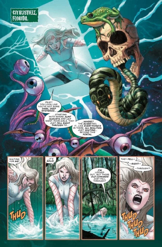
Guru eFX provides a dark atmosphere that looks enticing in X-Men: Curse of the Man-Thing. Everything concerning Ted Sallis takes place under a cover of darkness. It brings an air of suspenseful mystery waiting to unravel. The bright daylight that Harrower and the Marvel superheroes are under looks boring in comparison. A small glimpse into this weird and wonderful world is enough for the reader to understand Harrower’s frustrations at not reaching it, especially when she tries to force her way past an invisible wall with sound effects by Cowles.

See X-Men: Curse of the Man-Thing Through

X-Men: Curse of the Man-Thing closes out this crossover series in a satisfying manner. With Ted and his mushy alter-ego just beginning their new status quo, the readers will be eager to see more of them. Hopefully, with as much appreciation for their inner monster as they do Man-Thing.

Monkeys Fighting Robots Youtube

FEAR CASE #4: Closing One Case Opens Up More

Fear Case #4 Cover

Fear Case #4 ends Dark Horse Entertainment’s gripping mini-series on May 5. Writer Matt Kindt wraps up the story by satisfying the reader’s dread. It’s a feeling that artist Tyler Jenkins expresses to the reader with empty space, and for Hilary Jenkins to fill those spaces with colors of terror immediately. Finally, letterer Jim Campbell provides captions to ensure each character’s voice is heard.

Fear Case #4: After Fear

Kindt was building up to a dreadful climax for the protagonists since the first issue. Without going into spoilers, the reader will share Mitchum’s sense of helplessness because his partner Winters’ fate resulted from the choices he made throughout the series. Nothing could prevent what happens in Fear Case #4, including a few unspoken rules about the titular case; again, no spoilers.

The issue’s plot has a structure that completely evokes a sense of no control. It’s a rather intelligent commentary on conspiracy theories; no matter how people explain the reasons for them, it doesn’t make dire situations surrounding conspiracies any better. To drive the point even further, Kindt ends the mini-series with a sense of disenchantment, like the events of Fear Case feel doomed to happen again.

Art of Desolation

Tyler brings a lot of empty space to Fear Case #4 to emphasize a sense of confusion between the reader and Mitchum. The first pages are half-empty, with Mitchum entirely out of view. Through these void spaces, the reader empathizes with Mitchum’s frustrations. By the time Mitchum is seen in full to explain why he is frustrated, his explanations are in flashbacks via half-full panels. Because it illustrates how unsatisfying the answers he receives are.

Hilary, in the meantime, gives the panels phantasmic colors. A brooding night sky over Winters has a slight tinge of a brighter sunrise. Only for the next image to have an even brighter red image like a nuclear bomb just went off. It explains the dilemma Winters is facing at that moment before transitioning back to the darker sky setting.

With so much suspense in Fear Case #4, Campbell provides just enough distinction in lettering. The captions have a color code between Winters’ light gray captions and Mitchum’s dark green. Unlike the psychiatrist, Mitchum is speaking with whose captions are white like all of the word balloons. It’s almost like Mitchum would be speaking to anyone so he wouldn’t be alone with his thoughts.

Complete Fear Case #4

Fear Case #4 ends a must-read series in the best way possible for a thriller. The story might be over, but there’s no sense of finality. All that’s left are anxieties that will stick to the characters and the readers who empathize with them.

What do you all think? Will Fear Case be something worth remembering? Or is it too unsatisfying for your tastes?

Monkeys Fighting Robots Youtube

Review: Danny Faces Okoye And Others In IRON FIST: HEART OF THE DRAGON #5

IRON FIST: HEART OF THE DRAGON #5, hitting comic book stores on Wednesday, May 5th, features a massive escalation in tension among the heavenly cities. Hierophant and his servants are hell-bent on stealing the mystical powers of the cities’ dragons. And others are vying for the power as well.

Fortunately, Danny Rand and Okoye of Wakanda are hot on their tale. But they’ll need to sort out their differences in order to stop the evil forces.

Story

There are two major points of focus in this issue, both on the sides of the antagonists and protagonists. Readers first get an up close view of Hierophant as he wrecks havoc across the cities and their dragons.

Soon enough, readers will find that the tension is brewing between the protagonists as well. After witnessing Okoye kill a dragon herself and absorb its chi, Danny confronts her in a fit of rage. She tries to explain her noble purposes but the optics of the situation prevent any hope of reconciliation.

Writer Larry Hama brilliantly builds animosity and tension among the heroes who are the last line of defense against the true foe. Their dialogue reminds us of epic tales from storybooks, drawing us in even more. And the surprise appearance of Brenda Swanson, Danny’s former lover, makes this tale all the more suspenseful.

Artwork

The illustrations within this issue are beautiful. Dave Wachter’s penciling and ink work does double duty in crafting elegant cities while creating detailed warriors battling within them. These images are brought  to life with Neeraj Menon’s coloring, which sets brilliant displays of yellow chi power against the duller backgrounds. In addition, we loved how VC’s Travis Lanham’s lettering made it extremely clear who was speaking via multiple font styles.

Conclusion

IRON FIST: HEART OF THE DRAGON #5 is the ultimate hype building issue of the series. Bringing together seasoned warriors like Okoye and Danny makes us want to see this amazing series through.

Who else would you like to see Danny confront? Let us know in the comments below!

Monkeys Fighting Robots Youtube

Review: CYBERPUNK 2077: YOU HAVE MY WORD #1—For Oriona

Main Cover

Dark Horse Comics and CD Projekt Red follow up Trauma Team by taking us underground Night City in Cyberpunk 2077: You Have My Word #1. Available nowthe first issue of four is written by Bartosz Sztybor and illustrated by Jesús Hervás. Contributing colors and lettering are Giulia Brusco and Frank Cvetkovic respectively.

You Have My Word #1 keeps the stylish aesthetic from the Trauma Team limited series while opening the world to fresh characters and locales. Writer Sztybor introduces us to three members of the Valentino Gang. Their shady, fedora-wearing boss tasks them with sabotaging Militech Corporation’s new urban development in Night City.

Our protagonist, Oriona, is the youngest member of the gang and the only female in the group. She wants to use her payout from this job to move herself and her daughter out of the grandparents’ house and into their own space. By focusing You Have My Word #1 on Oriona’s point-of-view, Sztybor gives us an easy entry into a poor enclave in Night City. Oriona’s naiveté and bright personality contrast with the cynicism and anti-capitalist politics expected of the cyberpunk genre.

Cyberpunk Subversion

Later, Sztybor uses a Hitchcockian twist to keep the reader on their toes and place us firmly in the camp of Night City’s lower class. In that case, Sztybor subverts expectations set up in Trauma Team. Regardless, the same spirit that Cullen Bunn put in Trauma Team‘s Nina exists in Oriona.

CUSTOMER HARASSES ORIONA’S MOTHER, TERESA.

On the art side of things, illustrator Jesús Hervás adds darker lines and rougher brushwork to the delicate watercolor aesthetic established by Miguel Valderrama. This edgier look signals that we’re in a different part of Night City now. To that end, Hervás also includes bionic characters, casual clothing styles, and characters of color—more diversity, to put it plainly—than before.

One of Hervás most impressive artistic flourishes is a panel featuring a mural of La Llorona, a figure of Latin American folklore. The mural telegraphs the story itself while highlighting the culture of this part of Night City. Augmenting Hervás edgy style is Giulia Brusco’s color palette.

Style and Substance

Colorist Brusco uses competing warm, bright neon, and pale pastel colors against cold gray and black. When the Valentino Gang are out during the day, the environment is bright and colorful. Then, at night or when in shady areas, black and gray consume everything. Any lights on in the city at night are neon pinks and blues. Meanwhile, Oriona’s family home is predominantly brown, soft gray, and orange—safe, plainer colors.

Moreover, Brusco’s dark colors reflect the city’s industrial, mechanized aspects while the neon evokes its debaucherous underbelly. Hervás and Brusco’s combined efforts immerse us in the harsh realities of Night City at the same time as they allow us to find comfort and familiarity in Oriona’s family home. Thus, alongside the stylish aesthetic, there’s a sense of grounded realism.

Last but not least, letterer Frank Cvetkovic, who also lettered Trauma Team, handles lengthy dialogue and captions well. He does so by breaking up dialogue bubbles and using a thin font for the rare occurrence of SFX. This lettering style feels more utilitarian than flashy. And so, Cvetkovic complements both the grounded and stylized elements of the book.

Cyberpunk 2077: You Have My Word #1 is an effecting follow-up tp Trauma Team. The ending twist alone promises an exciting adventure full of deep grief and the possibility of revenge. I, for one, look forward to escalating emotions and plenty of grit in the ensuing three issues.

Monkeys Fighting Robots Youtube