Welcome to Self-Published Spotlight, a regular interview column where I will be highlighting self-published comics and the creators and small print publishers who make them.
When I started seeing Ben Perkins’ art on social media, I was floored. This guy can draw! So when Ben launched the Kickstarter campaign for his book, HEAVY, I was immediately on board. The book has reached its goal, and with the end of the campaign looming, the prospect of holding HEAVY in my hands has me stoked beyond belief. I reached out to Ben and he was gracious enough to take some time to chat about his art, process and of course HEAVY. Make sure to support and grab the book before the campaign ends!
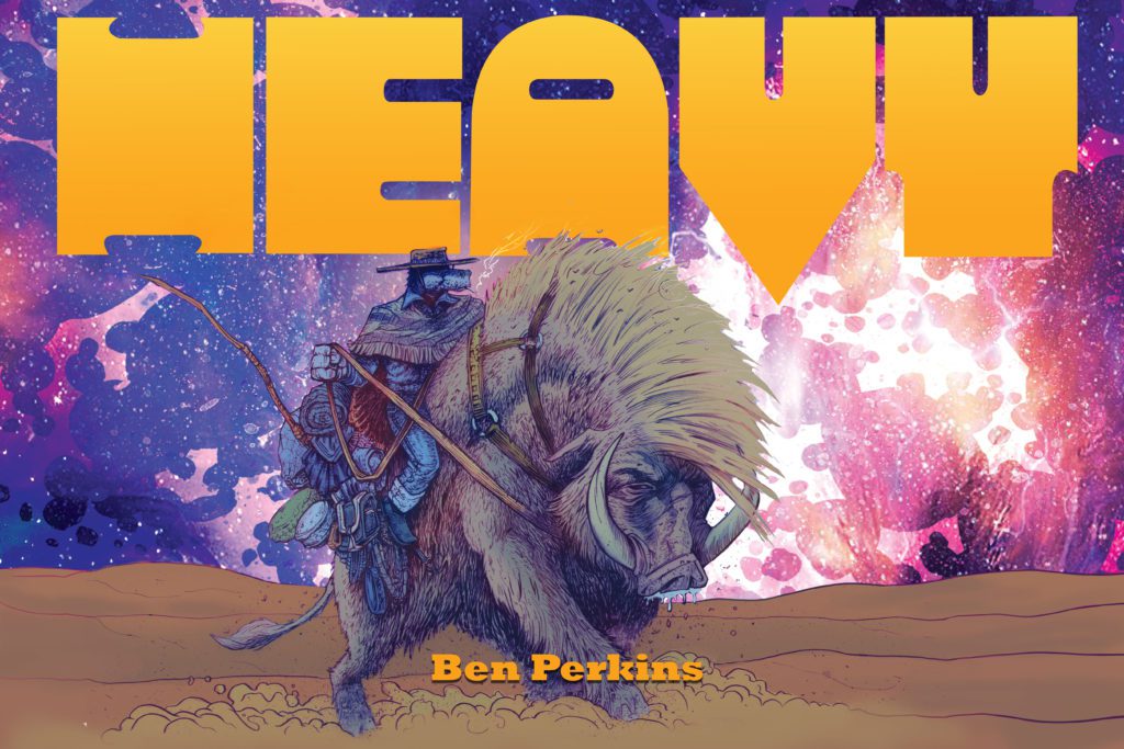
Monkeys Fighting Robots: First off, thanks for taking the time to talk Ben, I know how busy you are with various projects!
Ben Perkins:Thanks for taking the time to speak with me. Very exciting times and I’m never too busy to talk about comics!!
MFR: I always start every Spotlight by asking about comic book origins. So what’s your comic book origin? When did you get the four-color bug?
BP:My comic book origins are murky. I know I loved cartoons from an early age and was really into the Batman ’66 show which would run on Nickelodeon in the afternoons and weekends, and I know comics swirled around somewhere, but it was really in fourth grade when my buddy Alan gave me a Flash book, I can’t remember the issue, but I do remember it ended with this huge villain, with a morning star beats the bloody paste out of the Crimson Speedster and the last panel had Flash with blood all over his face in the foreground, like RIGHT THERE!!, with this behemoth of a man headed towards the city. I was riveted. After that it was finding them at the drug store and such. It wasn’t until I got in high school, I learned there was a comic shop in my small town and then I was nearly spending every day there.
MFR: Do you have a comics Mount Rushmore? Who are your biggest influences?
BP: Mt. Rushmore of comics, huh? I can never remember how many white dudes are carved upon that stolen rock. Four? Five? Regardless, I think mine would be Miller, Eisner, Mignola, Smith, and Klaus. (I know there are four, I just cheated.)
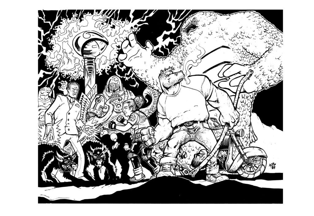
MFR: What’s your favorite thing about creating comics? Or favorite thing about comics in general?
BP:My favorite thing about making comics is the puzzle making. For me, it’s the layout. I love laying out a book, and when I learned that a good trick is to lay out the entire book at once, it unlocked so many things for me, in terms of pacing, viewing angles, etc. I like the fact that, if I can use filmmaking as an analogy, you get to be everyone. The director, the costume designer, the special effects house, the editor, the choreographer, make-up artist, lighting, set designer, etc. It’s daunting when you really think about tearing down all those decisions into a whole department of people, you understand just how much thinking goes into cartooning. For me, at least.
MFR: Alright so let’s get into HEAVY. Can you give us an elevator pitch? What’s the history behind the story and idea? Is it something you had been cooking for a while?
BP:The pitch for HEAVY is very simple: In a ruined world, Heavy must navigate the wastelands to restore balance to a world he has inadvertently destroyed. The history behind the character is long. Very long. I’ve been developing this story for fifteen to twenty years. Honestly, I’ve lost count. It started as a joke between me and some roommates I was living with when I was in my early twenties and had just moved to Portland. Years later we would reunite and reminisce and he mentioned this “heavy horse” threat we used to use and it just sparked my imagination and I saw this horse-headed badass coming out of the shadows. Really powerful. It didn’t start how it ended up. It started as a joke. A farmhouse horse who took mushrooms all the time. It was limited. So I just kept rotating worlds around Heavy that I thought would work. None really did until I realized I could use the horse motif easier if I made the story a western. That’s when the ideas I’d been cultivating really took off.
MFR: This is also your first Kickstarter project. What made you take the leap and what was the process like?
BP: Kickstarter wasn’t an easy decision for me. Primarily because of how I was aware that not all of them did well, and the people I saw running the successful ones seem a heck of a lot smarter than me. I was at the time in a fortunate position of having a small publishing company license the pages for their app as I was creating the pages for the first issue, effectively paying me to work on the book. It was a real dream come true and a real nice bump in finances, but they had to close because the publisher felt the app wouldn’t be viable for what they were spending. Fortunately, I had the first issue all done. So I decided it was time to maybe crowdfund and see if I should make more of this book.
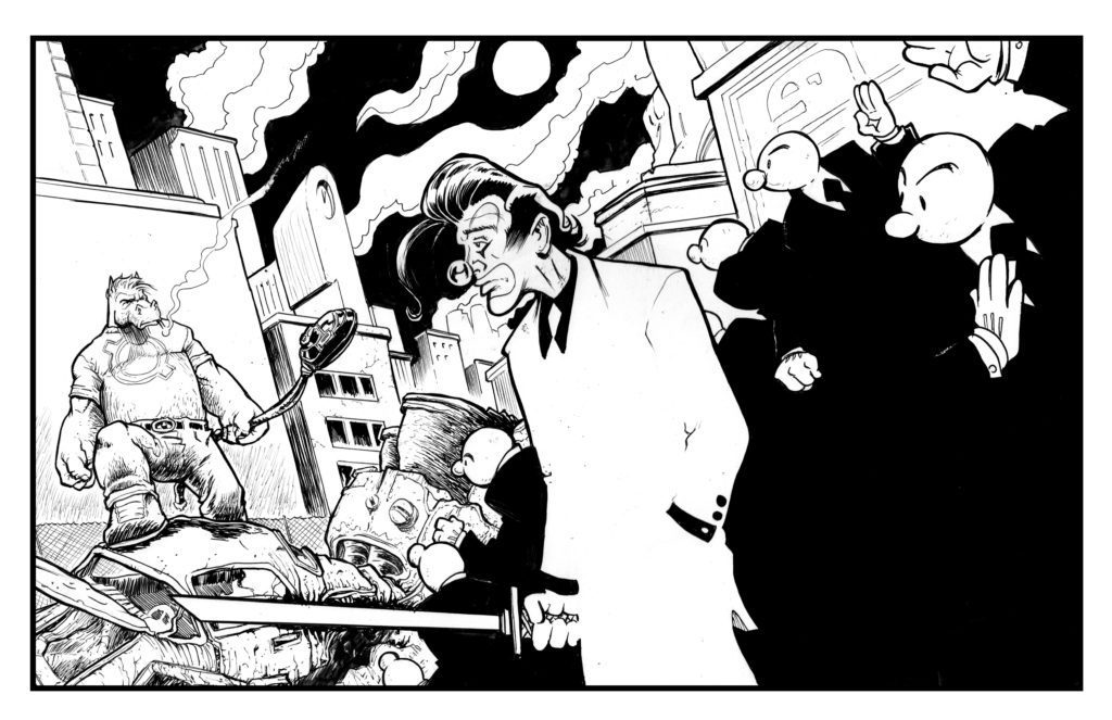
MFR: Kickstarter has become one of the best ways to publish comics. Why do you think the method has taken off so much?
BP:Kickstarter has taken off for most because you can control every aspect. This is my first one, so I have no real experience to speak of, but I took about three weeks to read, and speak to other folks who have run a campaign so I could understand the pitfalls and responsibilities. I wanted to understand the amount of work it would be, and I’m glad I did. I still have the other side, with the fulfillment section, that will be when the real work comes in, but I’m prepared and excited.
MFR: Do you think you will use Kickstarter again on a future project?
BP: I will definitely use Kickstarter in the future and be able to really take advantage and try something new. I don’t know what that would be, yet, hopefully, more Heavy, but I have other ideas that are coming into fruition and other gimmicks I want to try out that I think people will really enjoy.
MFR: Your art is fantastic. There is a lot of weight and texture to it. How do you create the images? Like what tools do you use? More specifically, what is your creative process like?
BP:Thanks for the compliments about the art. I appreciate that. I just use regular pencils. I have some Japanese brush pens I like and I love my Gpen, but I’ve been using digital a bit more, obviously for coloring, but I’ve found some brushes that simulate what I need to do. I can never give up the analog though, so most of the Heavy pages are traditional pen and paper.
MFR: Did you approach HEAVY differently than past projects?
BP:Yeah, with HEAVY, it was this thing where I had this character that I didn’t know what to do with. It started as a Miller/Sin City kind of homage/spoof, and I didn’t really like that, because I couldn’t write detective fiction at the time, and so the world around him and his role in it kept getting redefined. A boxer, a mental patient, a cab driver, all these things and different worlds and tones for each. It was getting overwhelming. So I hit on the idea of trying to do every version. Then when I made Heavy immortal, that was the key. From there everything seemed to fit. It was a trope, in a way, but it was a way to give his moods context by time period. It was a weird notion I clung to. Then just figuring out what that world would be like with him running around on this planet. And what would happen if his meddling may have accidentally destroyed Earth? What would happen then? How do you fix that? How do you take responsibility for that? That’s the story I found.
MFR: Are there any other projects you want to mention or talk about?
BP:I’m doing a number of fan projects. Both Batman fan comic projects, 1963 Annual and Darker Image. I have a secret anthology I’m a part of that I’m excited about. I’m in the new WEAPON ECHH, which I’m super happy with. What else? Oh! I have an original graphic novel dropping on Friday so I’m excited to share that at that time. I’m working with Eli and Cosmic Lion for a really cool gimmick I think I’ll keep to myself right now, but I can almost promise you’ve never seen a comic like it. That I’m really excited for!
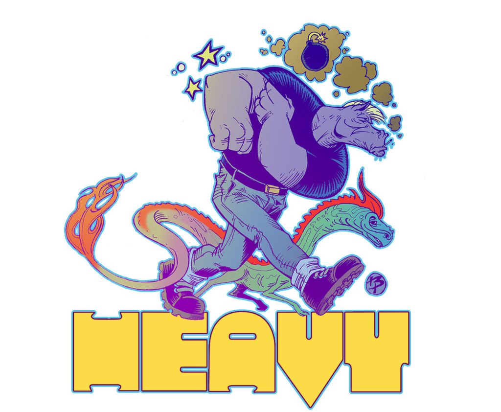
MFR: Can we expect more HEAVY stories in the future?
BP:With HEAVY, I don’t know what to do with him now. I have the first half of the next issue done but I’m at a stage with it right now that I’m thinking of restructuring. Initially, it was very overblown. It took me about a month to figure out how to make it twelve issues. I really like the idea of that, but as a Kickstarter, I’m not sure I can ask people to hold out and keep coming back, and I don’t know how long twelve issues at average 40 pages a piece it’ll take me. I’m debating seeing how much fat I can trim off and still be able to tell the story and see if I can shrink it to half the size and make it a one-and-done type of adventure. Jim Rugg’s AFRODISIAC kind of inspired me on how to handle a character in multiple ways. I don’t think I can use that exact model, but that off-balance nature of the narrative he was pulling off, while at the same time keeping everything in this understandable continuity, is something I took away from that project. Plus it looks really pretty.
MFR: Where and how can readers get your work and output?
BP:Right now, my Kickstarter is where you can sign up for the first issue of Heavy. You should be able to search that and it’ll pop right up. I have a book I did with a very good friend of mine over at galaxygator.net which is Galaxy Gator. I think there are five or six issues. There’s a trade. It’s actually pretty beautiful and a great all-ages book. Very proud to be a part of that one. Otherwise, I’m plugging things on Facebook, I’m @brattyben on Instagram and if you’re a dinosaur like me, DeviantArt as well.
MFR: Any final thoughts or comments you wanna share with us?
BP:Anyone out there that wants to make a comic, just do it. Keep on keeping on!
EAT THE RICH #2 hits your local comic book store September 22nd, but thanks to BOOM! Studios, Monkeys Fighting Robots has an exclusive five-page preview for you.
About the issue: Is Joey willing to pay with her life to uncover the gruesome secrets behind Crestfall Bluffs? Joey is beyond disturbed by what she has just witnessed, but when she confides in her boyfriend Astor, his reassurance about his family’s weird rituals and traditions only fuels her suspicions. As she digs further, what she finds produces more questions and danger than answers!
EAT THE RICH #2 is by writer Sarah Gailey and artist Pius Bak, with colors by Roman Titov, and letters by Cardinal Rae. The main cover is by Kevin Tong, with variant covers by Becca Carey and Maria Llovet.
What unspeakable horrors are lying in wait behind the idyllic lives of the one percent?
Check out the EAT THE RICH #2 preview below:
Are you reading EAT THE RICH from BOOM! Studios? Sound off in the comments!
CLANS OF BELARI #3 hits your local comic book store September 15th, but thanks to AfterShock Comics, Monkeys Fighting Robots has an exclusive four-page preview for you.
About the issue: After Gummy bribes the right people, Te’a is able to pursue her dream of being a pilot. As it turns out she is a gifted pilot, whose accomplishments quickly earn her notoriety. But her maverick decision-making puts her at odds with her own Chieftain, Burke Graff.
Cluthian’s quest for alien-tech weaponry leads him to a surprising discovery: a technology that is destined to alter the balance of power in the System. But for Cluthian to carry out his plan, he needs someone capable, and expendable…
The series is by writers Rob Blackie & Peter Blackie and artist Daniel Maine, with colors by Carlos Lopez, and letters by Taylor Esposito. The cover is by Andy Clarke with Jose Villarrubia.
Check out the CLANS OF BELARI #3 preview below:
Are you reading CLANS OF BELARI? Sound off in the comments!
Martian Lit’s The Tessellation #1 is, quite frankly, terrifying. But it’s not necessarily a horror comic. Its scares go deeper than a typical horror story. The Tessellation isn’t about ghosts or nightmares. It’s about all the little, seemingly insignificant choices in life that can lead to all kinds of horrible consequences. Writer Mike Phillips, artist Hernán González, colorist Javi Laparra, and letterers Julian Darius and Steve Legge deliver a haunting first issue to this anthology series, all about how easy it is for your life to go off the rails.
The Premise:
What if every decision you (n)ever made, big or small, became a new reality, with infinite you’s living out those decisions. What if you could travel to these other realities, even observe other versions of you? Welcome to The Tessellation. This dazzling, mind-bending first issue tells four related stories in four separate “reality rows,” playing out horizontally through the issue… Buckle up for a new kind of anthology!
Writing
The Tessellation #1 marks Phillips’ first outing as a solo writer in comics. But you certainly wouldn’t know it. Phillips’ confidence in storytelling is what makes this issue so compelling. Instead of carefully setting up the rules of this narrative, Phillips throws readers right into the action. We see the life of our protagonist, James Beach, play out. Or maybe “lives” is the better word. At first, the issue seems to be stuck in a loop. The same scenes happen over and over. But as the issue progresses, tiny changes begin to occur. Soon, we’re witnessing massively different versions of one person’s life. And Phillips lets each of these moments speak for themselves. No explanations are provided, no exposition dumps occur. Instead, the reader coaxes answers out of every scene, getting fully immersed in the world this creative team has created.
It’s tempting to go into more details about the plot and the incredibly efficient script, but it’s the process of discovering these details that make this such a strong first issue. Phillips is a master of the golden rule of writing: “Show, don’t tell.” What seem like normal conversations are full of subtext. Little quips from characters are actually brilliant tools for Phillips’ worldbuilding. The Tessellation #1 is subtle and explosive, all at the same time.
Art
González creates a visual rhythm in these pages. As the issue begins exploring the idea of multiple realities, we see rows of repeated images. But it’s when these realities begin to diverge that González’s work really shines. An image of a hospital bed is juxtaposed against an image of a bed from a brothel. Similarly, a scene in a graveyard mimics a panel of a couple fighting. The gravestones stand in a similar place in the panel as the couple did before. González seems to be showing that even James’ worst moments have become impossible to get back to. That reality is dead to him now.
González also hones in on each character’s body language in this issue. You can see the awkwardness of James trying to be a good dad. His shoulders are tense and his face is anxious. Elsewhere, you can see his casual anger or disregard for morality. It’s in the shape of James’ brow or the look in his eyes that González tells us everything.
Coloring
Laparra’s coloring shows us a lot of the differences in James’ many lives. The James we meet at first, stuck in a prison cell, lives in a world that’s devoid of color. When his alternate self shows up, we see a huge difference. This version of James lives a colorful life. His panels are full of bright red signs and vibrant blue suits. He’s an adventurer. But the other versions of James are often just busy surviving. In their lives, we see when tragedy strikes that color slowly fades from each panel. Laparra is showing us visually how much each loss is affecting James’ outlook on life.
Lettering
Darius and Legge’s lettering is brilliant. Right from the get-go, we see how they’re always changing up their font to show rhythm or volume. When James is confused by his lawyer’s presence, the cop in the scene has had enough. “fuckin’ jeez louise,” he says in small lettering. The lower case “F,” even the oversized “ee” in “jeez,” tells us everything we need to know to hear this line in our head. But that’s far from the only brilliant example of lettering in this issue. At one point, the rows on the page almost act as a kind of acceleration of events. We see bad things occur, and they get worse and more impactful as the page goes down. Darius and Legge mirror this in the sound effects. As the page progresses the sound effects get bigger and more messy looking, showing us the impact and destruction caused by each moment.
Martian Lit’s The Tessellation #1 is an incredible start to this anthology series. This creative team presents a complicated idea in a surprisingly simple way. Yet, they never overexplain or talk down to the reader. It’s a smart, tight script for a great new series. We can only hope there’s plenty more where that came from!
From Martian Lit Comics comes a fantastic new anthology series, The Tessellation. Writer Mike Phillips sat down with Monkeys Fighting Robots to talk about his strange and brilliant new sci fi series.
About The Tessellation #1: What if every decision you (n)ever made, big or small, became a new reality, with infinite you’s living out those decisions. What if you could travel to these other realities, even observe other versions of you? Welcome to The Tessellation. This dazzling, mind-bending first issue tells four related stories in four separate “reality rows,” playing out horizontally through the issue… Buckle up for a new kind of anthology!
Written by Mike Phillips, with art by Hernán González, colors by Javi Laparra, and letters by Julian Darius and Steven Legge.
Monkeys Fighting Robots: Thanks for being willing to do this interview. Again, I absolutely loved this issue and am excited to talk about it. I feel like there’s so much to talk about and I could go on for days. This is really one of those issues that when people read it they’re all going to go, “Damn, I wish I’d thought of that!”
Mike Phillips: It’s my pleasure! Thank you for the compliments! I’m so happy you liked it!
MFR: My first question for you is something you cover a little in your afterword, but I’d still love to revisit it. You mention that THE TESSELLATION #1 partially sprung from your anxieties as a new parent, finding that you picture yourself doing the wrong thing. How did you go about harnessing that and making a story out of it?
Phillips: I don’t know about other parents’ experiences, but I know from mine that there isn’t a week that goes by that I don’t feel like I could have done more with / for my kids. I’m tired. I’m grading quizzes. I’m writing. I’m decompressing from work. I’m whatever. And during all of that, my boys are asking to play, asking about life, needing to be fed, needing to be washed, wanting to tell me a non-sequitur-laden adventure they had. And when I sometimes say “I can’t do that right now,” I immediately feel like a piece of shit. It’s inevitable and depressing.
But not only that, I’m in charge of these wonderful beings. Their life is in my hands most of the day. I drive them around. I make sure they don’t fall off of the playset. I make sure they don’t choke on their food. You get the idea. You can imagine what my overactive imagination does with all of that stimuli. And then there’s a whole other branch of this relating to how I treat my wife… So long story short, it’s pretty easy to come up with a bunch of story ideas of a dad / husband who fucks all of that stuff up.
MFR: Another thing you mention, which I love, is your willingness to just do things with the idea that “If it makes sense to you, then keep going!” A lot of writers have a tendency to do too much hand holding, but you just throw us right into it. It’s great! Did that approach happen from the beginning or did you go through a few drafts before working up to that?
Phillips: Yes, that was the game plan from the outset. It was the only way this comic was going to get finished. And as I mention in the backmatter of the issue, it’s all David Lynch’s influence. That dude rarely explains anything. And that was a mantra for me. I’m an over-explainer by trade; as a K-to-12 teacher I was taught to deliver the curriculum in many different ways. (They called it “differentiated instruction”; every student absorbs information in their own way, so try to reach them all by disseminating the info in as many ways as you can: verbal, visual, auditory, tactile, etc.)
I had to mute that instinct, which was a challenge, because I’m OCD, so there’s always an urge to say it and double back and say it again in a different way. But being a student of David Lynch helped me just shut all of that out and trust where the story took me.
MFR: I just kind of marvel at your confidence in storytelling, in that sense. It’s very refreshing.
Phillips: Thank you so much! I had a lot of good teachers: Grant Morrison, Alan Moore, Neil Gaiman, Frank Herbert, David Lynch, Stephen King, George R.R. Martin, Paul Chadwick, Christopher Nolan, and Julian Darius. They created the guide posts.
MFR: This next question is kind of a double-whammy. Your titles are awesome. The Tessellation is great, tessellations even show up on the page layout. “A Nicer Cage” is also brilliant. How do you feel these titles tie into the themes of what you’re talking about?
Phillips:The Tessellation as a title was a long time coming. How to sum up the Multiverse, you know? Eventually I settled on the idea that all of our realities are right next to each other. All nestled in together. Just a decision away from each other. I was trying to find a title that would encompass the entire thing. So I envisioned that every reality was a corridor, from the past to the future. The best “tube” I came across was a hexagon, as they can tessellate into infinity, so I ran with it. Only later did I remember that the linoleum flooring of my childhood home was a hexagonal tessellation. Branded in my brain, I guess. The pattern repeated from the dinner table to the stove to the fridge. The hexagons were brown and the lines between were beige. Totally ’80s! As far as the issue’s title “A Nicer Cage,” I’m going to leave that to interpretation.
MFR: Going back to the tessellations on the page layout: that’s a really effective technique. Artist Hernan Gonzalez does some incredible work throughout the issue. Did you both come up with that technique together? Was it you? Was it Gonzalez?
Phillips: It was me. My longtime collaborator Julian Darius [Sequart, Martian Lit] made the hexagonal “reality borders” from my instructions. I needed a non-verbal way to communicate to the reader that these stories are in different realities, and this seemed like the simplest solution. So after Hernan delivered the art, Julian laid the “reality borders” over the relevant spots.
MFR: This issue is such a great one-shot. Of course, you have more planned as you’re already working on the script of #2. But there are a couple things in this issue that feel like they hint at a larger arc. Loose ends which, even if they just stay loose, are kind of satisfying in a mysterious way, but could lead to more. Do you plan on having these issues include connecting characters and overarching stories? If so, how many issues are you hoping to produce?
Phillips: Yes, there will be many connections throughout the series. It’s a slow burn, however, so I’m hoping readers will be patient with me! My goal is to make at least 25 issues before I go into “crazy climax & finale mode”. But yeah, there will be loose ends that won’t get fully answered, and I’m okay with that. That’s for the readers’ imaginations to fill in, which is another great lesson from Lynch: “If you answer every mystery — if everything gets solved — why would anyone talk about it afterwards?”
MFR: The actual structure this issue takes is just fantastic. The parallel storylines. You mention in your afterword that issue #2 will have characters that are very different from each other. Is that affecting the structure of the issue as you write it?
Phillips: Thank you! The structure for issue #2 is slightly different, but that’s the joy of using this format; there are mutations and avenues I didn’t think of in the first issue. But I’m sure that if readers figured out how to absorb issue #1, then issue #2 will be no problem. Incidentally, issue #3 will be a typical anthology with no “reality rows”. Just a few stories moving the whole series forward.
MFR: You mention some of the work that inspired issue #1. People who you say were good teachers throughout the process, like Morrison, Moore, Gaiman and Herbert. Who were some of your influences for issue #2?
Phillips: I decided that since issue #1 focuses on various versions of a man, issue #2’s main character should be a woman, so I came up with Camila Rodriguez-Santiago. A lot of issue #1 leans heavily on “write what you know”, so I figured #2 should be a foray into personal unknowns. There was a lot more research involved this time. I decided one of the versions of Camila would get into politics, and over the past few years I’ve been inspired and energized by Alexandria Ocasio-Cortez, Stacey Abrams, and Elizabeth Warren.
During my research, I discovered U.S. Representative Louise Slaughter, who recently passed away, but her legacy as an advocate for women’s rights and women’s health was a huge find for me. Simply put, she was awesome. Look her up. Camila’s mom is a strong presence in the issue, and a major influence on Camila, so I made sure to focus on the major female influences in my life: my wife, my mom, and my sister. Between the three of them, I’ve learned so much about empathy, ingenuity, art, self-respect, and tenderness. I’m doing my best to pour aspects of that into these characters.
MFR: And lastly, when are we going to see a TV show of this? I mean, come on! It’s just waiting to be adapted.
Phillips: 2022! Just kidding. (But thank you for the compliment!) Yeah, this has crossed my mind once or twice, and I’m 100% open to seeing other media interpret it. But I did use some of the comics medium’s most unique elements to make it as hard as possible to adapt, didn’t I?! (Totally worth it, though!) I can definitely see a major streaming service using remote-control functionality to allow the viewer to move between the issue #1’s various stories / realities to create an interactive experience.
MFR: Thank you for chatting with us about this! It was a pleasure to read!
Phillips: Thank you! It’s so satisfying to hear that you were entertained! Mission accomplished!
Ninjak #2 from Valiant Entertainment comes to comic stores on August 25th. Writer Jeff Parker and artist Javier Pulido’s high octane series showcases the medium’s biggest strengths.
Background
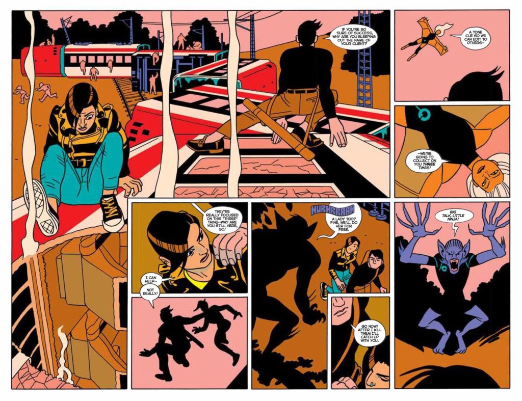
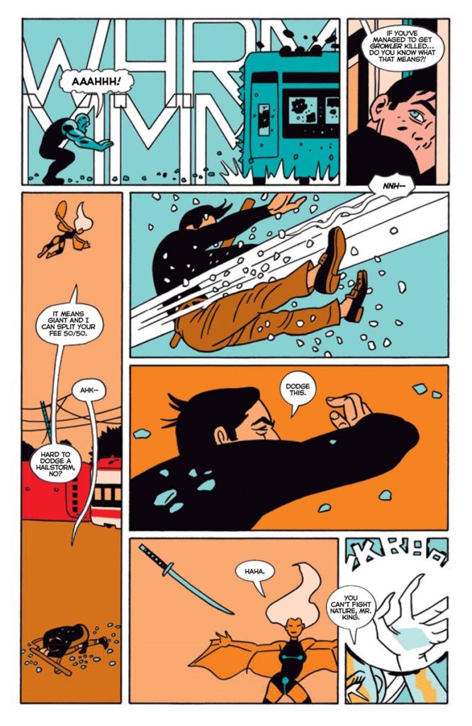
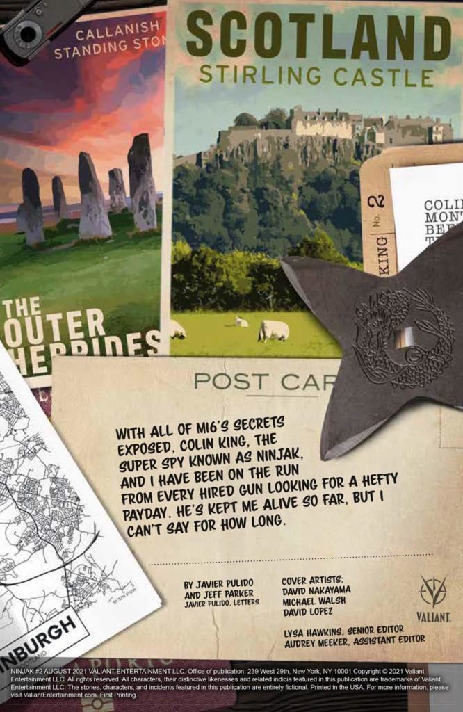
Ninjak and the rest of MI6’s connections are exposed. With killers at his heels, Ninjak must use every resource he has to survive, and take out the perpetrators.
Simple Stories and Outlines
Jeff Parker’s story in Ninjak #2 follows a simple outline. With Ninjak and his co-starring spy’s covers blown, there’s a strong sense of vulnerability. Between a battle with characters that act as X-Men stand-ins, and the main villains always appearing to be a step ahead, safety doesn’t seem to exist.
Ninjak #2: Blink And You’ll Visual Storytelling
Ninjak #2 wastes absolutely no time when it comes to its plot’s pacing. With Parker planning out the outline, work in tandem brilliantly to get the plot rolling. Pulido’s visual storytelling, which showcases the strengths of the comic medium, is the real attraction. Readers experience a whiplash effect when they and Ninjak study the faux X-Men’s biographies and powers on a hologram. While the reader may take a while to get through the intel, it’s apparent from the lettering that Ninjak only needed a quick look to turn the tide in battle.
Pulido shows the power of these villains in intricate ways. A spiraling two-page spread with complex panel layouts, character movements, and an artistic display of one villain’s psychic powers guides the reader’s attention. In these instances and the page’s red hues, the antagonists control the reader like they do their enemies.
Report In For Ninjak #2
Ninjak #2 presents many of the exclusive strengths that comic books use to tell stories. Whether it’s the pacing or how the page layouts guide readers through events, readers connect with these characters and to the story.
Freeform’s hit sitcom Grown-ish takes up the story of Zoey Johnson (Yara Shahidi), in college and away from her Black-ish family. She’s surrounded by all new friends, romances, heartbreaks, and triumphs. As the young woman learns more about herself and grows, so does the show’s look, thanks to cinematographer Mark Doering-Powell.
PopAxiom spoke with Mark about becoming a DP, how tech affects filmmaking and the evolving looks of Grown-ish.
This Side
“I was always an artsy kid in school. I would draw a lot,” Mark says of his early years. “I worked on the yearbook and all that. Then, I went to art school in New York for painting and graphic design.”
While in New York, Mark discovered, “The film department was in the basement of the building. It was an amazing department. They also had a fledgling computer graphics area.” Soon after, Mark says he “transferred my major to film and video.”
Mark’s love for films started young, and he says, “There was probably some influence because my parents owned a video store.”
“I started as a camera assistant,” he shares of his first days as a budding filmmaker, “focus puller, and camera operator. After that, I moved up through the ranks. I was also shooting spec spots to learn.”
Does Mark want to direct someday? “People ask me, ‘Oh, you should direct’ But I feel like, having prepped with other directors, you see how much more there is to that. I’m happy to do certain parts, but I’ve never aspired to be a director. I love this side of the collaboration.”
About Grown-ish
Mark didn’t work on the first season of Grown-ish. “Kenya Barris and Paula Huidobro set up the first season. I came on through Michael Petok. Paula went on to work on Barry, I think. Michael brought me to meet with the EPs [executive producers]. I loved the show.”
“It was interesting trying to prep it because the first season looked a certain way that was appropriate for the first season,” he explains about taking over the DP reigns. “But if you read the scripts for the second season, I knew that the show had to grow. I had to do more varied looks. I had to figure that out — feel that out — to see how everyone would respond to that as we were tackling each episode.”
A TV show is an evolving process. “There are technical things we changed too with the rig and green screen versus a backdrop. We’re always figuring out how to make things better.”
“I’m very much into not jolting and transitioning in,” he answers when asked about evolving the look of the show. “I didn’t discuss that with anyone. I didn’t feel I had to. I knew that would be something I could do with the lighting, the lensing, and the color palette. Besides what the production designer is giving me. Kathleen [Widomski] was our production designer in the first season that I did.”
As Zoey grows into adulthood, they find a place to live. “When they move into their apartment, it’s sparsely dressed, and they add stuff with the episodes. So we moved with that.”
Mark takes a minute to share the love with his collaborators. “Kristan Andrews is our current production designer. I’ve worked with her for a long time. She’s amazing, and we have no shortage of a great crew.”
The look of the show started “branching out because the story changes. She becomes a fashion major, so we start glamming things up a bit. The show is in this comedy wrapper, but it takes on all these serious topics. I think that’s why it resonates with the audience the way that it does.”
Good Excuse
“I always try to find a good excuse to do an interesting light,” he says, “It doesn’t take any longer to put the light in the right place.”
A scene for Mark always “starts with continuity and the time of day. So, I always check with our script supervisor about the time of day and start going from there, whether we’re doing something duskier or sunset-y and make lighting that interesting. Then, the story arc, the character arc, the topics that they’re visiting, and the environments that they’re in; all those things inform us. So, we definitely glam it up and add spice to it up but always anchored in the scene.”
Be Prepared
Filmmaking is not an exact science, but we get lots of great shows like Grown-ish with enough practice and knowledge. “We did a scene where Nomi and her professor are having a fling. She comes back to her professor’s apartment, and they kiss. We blocked the scene loosely, and we asked, ‘Okay, what happens at the end of the scene?’ Neither of the actors was sure of what they were going to do. Everyone looked at me like I was going to have a hard time with that. I said, ‘Great, it’s all good. Go get ready, and when we come back, you guys do your thing.”
What was the solution? “I designed it with the camera operator so that when they get over here, they are either going to go left or right. Just be ready. You can work things out so many different ways.”
Where does the understanding of dealing with a scenario like that come from — film school or experience? “Both, but probably from the latter. That situation was unusual. It’s something you might bristle at first, ‘How can I do this?’ But at the same time, in this particular scene, they were right next to a practical [light], so I could silhouette them against that. Paul Sanchez was my A-camera operator, he’s brilliant, and he was going to be on hand-held. So as long as we’re prepared to go the other way, it was an easy answer. If everyone loves the blocking, we can do anything no matter what the actors do.”
Red Flags
For Mark, it’s essential to know what’s a real problem. “You want to know what moments to raise a red flag. You want to do things as few times as possible and solve stuff. That’s your job.”
“People might come to you and say that you have to shoot half a scene on one day and half the scene on another day,” he explains, “and it’s going to be night over here, and day over there, it’s your job to make that look the same.”
It might sound like a terrifying process for some, but for Mark, “It can’t get any more fun than that.”
There are other times when, like this past season’s season opener, we were supposed to shoot it with three cameras in a small space during COVID. It was the one scene that nagged at me, so I raised the flag. The director, Chris Robinson, helped me figure it out. He moved it outside. We did it with two cameras.”
Tech Chat
In part, Grown-ish features a creamy, cinematic look because it’s shot on an Arri Mini camera and mostly Leica SummiLux-C’s lenses. Could you achieve the same look with different hardware? “You could. Now, we’re in a place where I could shoot this with a Sony Venice and a different lens and make it match up. But I will say, there are other reasons we pick a certain camera.” Arri Mini is a very filmic, natural-looking sensor out of the box, so that’s helpful to where we’re heading. It’s also got a small body on it; I can put it on a gimbal or steady-cam.”
“The Leica SummiLux-C,” he continues, “are incredible lenses. Paola used them in season one. I probably would’ve picked another lens, but I kept all that because I didn’t see a reason to try to change. I just used filtration. A lot of it is filtration.”
Mark delves deeper. “The cameras and filters are so important. You live with them every shot. It gives you part of your look, and it doesn’t take longer; it’s just a decision. You want to make the right decision because it helps nudge you in the right direction.”
“Those Leica lenses, those are very sharp and could be accused of being clinical lenses,” he says. “They’re amazing … they’re very sharp, but using a little pearlescent filter and smoke filter, two filters that I lean on, and maybe occasionally a soft FX filter; having that recipe helps so much.”
However, Mark explains how the tech has to adapt. “But if I’m on a night exterior and there are all kinds of street lamps and headlights, those filters won’t respond well. It’ll make fuzzy cotton balls from every light out there. But you can deal with that because the camera offers so much versatility.”
Wrapping Up
Who are some of Mark’s influences? “So many. Roger Deakins, Harry Stradling Jr., Jordan Cronenweth, my buddy Erik Messerschmidt. It’s an endless list of DPs that I love and watch their work.”
“Roger Deakins,” he focuses on a legend. “It’s amazing how well he uses atmosphere. How much he uses it to simplify the frame and get rid of all the busyness.”
Another legend for Mark, “I would say Emmanuel Lubezki. It’s a great way to cover a scene when you’ve got the blocking done. Then, instead of doing a master shot, close-ups, you’re moving with them. There are all kinds of ways that you can build those scenes, and Lubezki does it so well.”
What’s something Mark would love to work on? “I would love to do a whole fantasy-space thing that takes place on another planet. That sort of thing fascinates me. To do something that’s completely out of this world [pun intended]. You’re doing stuff where you’re floating in space. As much as I love doing naturalistic work, I like the idea of bending that into a place we don’t normally visit. Gravity is a perfect example. The rules of light are different in that sort of environment.”
Are you watching Grown-ish?
Thanks to Mark Doering-Powell and Rhapsody PR
for making this interview possible.
Nia DaCosta’s Candyman holds strong connections to Bernard Rose’s classic while carving a fresh take on the original story. Deciding to expand on the legend of Daniel Robitaille by incorporating another story similar to his. This iteration of Candyman is less subtle in expressing its themes, but the powerful direction, impressive world-building, and top-notch performances keep it afloat. Candyman is a unique spin that never grows dull and carries this feeling of dread and unease throughout.
The themes of injustice are on display just like they were in Rose’s 1992 film. However, the subtly in Rose’s film is missing from this new iteration, but it still stands strong on its own. The transfer between not only racial perspectives, but the ties it shares to the events of the original, is chilling to watch unfold. Directed and co-written by Nia DaCosta, who teams with Jordan Peele and Win Rosenfield to pen the screenplay. Candyman stars Yahya Abdul-Mateen II, Colman Domingo, Nathan Stewart-Jarrett, Rebecca Spence, Teyonah Parris, Vanessa Williams, and Tony Todd. The film centers on Anthony McCoy (Mateen) and his partner Brianna Cartwright (Parris), who moved into the gentrified Cabrini. Anthony’s artistic career becomes revived after he learns about Candyman, but this unlocks a viral wave of violence.
Yahya Abdul-Mateen II as Anthony McCoy in Candyman, directed by Nia DaCosta.
DaCosta’s vision never strays from the original lore and builds on it in ways that by rewatching the original you will notice certain moments pointing to the events in this new film. The lovable bond established between Anthony and Brianna early on makes them a likable pairing. Brianna is an art gallery director, while Anthony is struggling to maintain his status as an artist in Chicago. Upon learning about Candyman from an old-timer in Cabrini, William Burke (Domingo). Anthony’s new macabre depictions in the art gallery lead to gruesome murders connected to his new artwork. Candyman does feel like it’s being held back by its runtime, clocking in at just over 90 minutes long. The characters can feel underdeveloped, but the emotional distress they endure makes for a very uncomfortable watch. Anthony and Brianna both have trauma they are dealing with, but Anthony’s trauma had been locked away his entire life.
Love is evident between the two, so audiences will feel for the pair when it begins to crumble. It’s a complete contrast to Helen Lyle’s relationship crumbling because her husband was disloyal. The writers position Brianna as being highly intelligent, it’s great to see a character maintain common sense throughout the film. She is written in a way that subverts tropes that would have lead to a character’s death. Candyman does have some hit-or-miss dialogue along the way, which makes the racial themes come off aggressive at times. While crucial to the narrative, it could have been written better. Peele’s touch is felt when the humorous dialogue is present, but it’s never overdone. The film suffers from being more focused on its message than spending time developing the characters on screen.
(from left) Anthony McCoy (Yahya Abdul-Mateen II) and Anne-Marie McCoy (Vanessa Williams) in Candyman, directed by Nia DaCosta.
Mateen’s performance as Anthony McCoy is unnerving to watch. The second he summons Candyman, audiences are in for a gripping descent into madness. Anthony is the young child Helen saved towards the end of the original, but he has been raised on lies to keep him safe. His interactions with his mother, Anne-Marie McCoy (Williams), are disheartening for his character because he must confront the knowledge of Candyman always being after him. Williams’ brief return as Anne-Marie is satisfying enough, and her chemistry with Mateen makes them believable as mother and son. Parris shines as Brianna, the gallery director who tries to protect Anthony from his pending demise. The trauma Brianna holds onto from her childhood makes it easy for audiences to side with her during this ordeal.
Dacosta’s direction is superb, the script is muddled, and most of the characters are hollow, but her unique camerawork is undeniable. The use of mirrors to capture the kills in Candyman is done tremendously. She creates this atmospheric feeling of dread from the moment the film starts with the shots of Cabrini while Robert Aiki Aubrey Lowe’s score chimes in to amplify the uncomfortable feeling established. Capturing the kills through reflections, the gore is in great supply, and some of the kill sequences/body horror are so well shot. Dacosta’s depiction of body horror will have viewers wincing in their seats. Candyman features gorgeous visuals, its cinematography creates an appealing scenery for the kills when they occur.
Teyonah Parris as Brianna Cartwright in Candyman, directed by Nia DaCosta.
This spiritual sequel doesn’t surpass the original, but what it manages to do through expanding the mythos is incredible. Daniel Robitaille (Todd) is still Candyman, but the film explores how this character has adapted to stay relevant. Dacosta’s direction combined with the disturbing visuals and stellar performances makes this the best follow-up to Rose’s superior film. Being held back by its short runtime and the clunky script doesn’t ruin the stronger aspects. Candyman is a worthy continuation that fans of the original can appreciate.
Welcome to Self-Published Spotlight, a regular interview column where I will be highlighting self-published comics and the creators and small print publishers who make them.
*This interview has been edited and formatted slightly for clarity.
Atilla Schwanz is the artist behind writer Jonathan Thompson’s (Tales From The Dead Astronaut, Burn Residue, A Game Of Doubles) latest Kickstarter campaign, the graphic novel, The Killer-In The Dead of Night. With just days to go before the campaign ends, the very busy artist (hailing from Itlay!) sat down with us for a bit to talk to about his amazing artistic approach and style to this riveting comic narrative. Check out the interview below and make sure to support the Kickstarter campaign so we can all get our hands on this book!
Monkeys Fighting Robots: Atilla, first of thanks for taking the time to talk to us. I know the campaign deadline is days away. I’m sure you are busy! So this is always my first question: What’s your comic book origin story? How did you get into comics?
Attila: I don’t have a precise moment. I have loved art from a young age. I remember that I have always loved comics. Since being a child I read every kind of comic. I began with mangas and classic American comics like Image, Marvel and DC. Now I’m more interested in graphic novels and short stories.
MFR: Who or what would you say are your biggest influences?
Attila:My influences arrive from all the arts. My masters are H.R. Giger (He’s god for me), Gustav Klimt, Caravaggio, Sergio Toppi, Dave Mckean, Vangelis, Bjork, Klaus Schulze, Matthew Barney, Arnaldo Pomodoro, Hans Zimmer, Philip Glass, David Cronenberg, David Lynch, J.R. Tolkien, Philip Dick, William Shakespeare, Alan Moore, Neil Gaiman and many others! I love, no, I live for art!
MFR: And did The Killer: Dead of Night have any specific artistic influences?
Attila: The principal influence is Japanese cinema. I also looked at classic Japanese art. But in general, I study different sources for any page. I follow winds of chaos and distinct emotional situations!
MFR: Can you tell us a little about your artistic background? When did you start creating art?
Attila: I was possessed by a Daemon of Art when I’m 6 years old: I saw Walt Disney’s Little Mermaid at the cinema and everything changed! I graduated in Visual Arts from Brera Academy of Milan. I won different contemporary art prices and exhibited in different European cities. In 2018 I found the KNOT the artist collective. My work ranges from artistic installation to painting, to illustrations, comic books and graphic design. I love the potential and flexibility of the ballpoint pen, especially when used in contrast to the materiality of elements and pigments. I work above all with ink, watercolor, acrylic color and pastel. Sometimes, I work with a graphics tablet. The main focus of my work is the influence that the visual image has on man and society. I’m particularly interested in the body, rendered a fetish by the obsession of appearance; evaluating and examining spectators’ reaction and transformation with this ‘metamorphosis’. All this is expressed, in most cases, by the figure of the “monster”, for its dramatic potential and its changing character.
MFR: Doing research for this interview, I came across your previous work Symposium Club. Can you tell us a bit about this project?
Atilla: Symposium Club is a graphic novel written by Andrea Cavaletto and issued in Italy by Edizioni Inkiostro. It is a new interpretation of Greek mythology with a splatter-punk and horror pulp style. The book talks about this couple of hedonists looking for a mythical and mysterious club (the Symposium Club) where every desire is reality. During the investigation, they meet several interesting characters.
MFR: How did you get connected with Jonathan on this project? Where you aware of each other as creators?
Attila:He saw my work thanks to Rossano Piccioni, his partner on Burn Residue. He thought that I was the perfect artist for this project. I thank Jonathan for having wanted to involve me in this fantastic work!
MFR: Can you describe The Killer to readers? What’s your elevator pitch on the book? Attila:THE KILLER – IN THE DEAD OF NIGHT is a horror graphic novel about a bloodthirsty serial killer working as a hitman for the Yakuza and his target, an old, life-worn samurai ready to commit his final act. THE KILLER is an homage to the insanity of Japanese Noir films like BRANDED TO KILL, TOKYO DRIFTER, PALE FLOWER and the daring art of Marcel Duchamp, Dave McKean, Liam Sharp, and Bill Sienkiewicz. For fans of ARKHAM ASYLUM, BLUE IN GREEN, FROM HELL, and DEPARTMENT OF TRUTH.
MFR: How would you describe your style on The Killer? Google seems to want to put you under the ‘fumetto’ label?
Attila:I don’t know! I try to communicate emotions and sentiments. So I change my style and technique in accord with this purpose.
MFR: What was the working process with you and Jonathan? What kind of system did you guys have to get these amazing pages done?
Attila:It’s a freeing work system. Jonathan describes the pages and dialogue. After seeing my sketches or paintings, he then changes texts or adds new scripts. We influence each other with our works. The keywords are “no restrictions”.
MFR: Do you have a favorite moment, image or page from The Killer?
Attila:I love the Killer. All moments where madness and chaos rule are my favorites!
MFR: Your work has so much to it. What kind of tools and processes did you use to create? Was it a different process than what you have done before?
Attila:Thank you! I follow the winds of chaos! I work with different techniques. New for me is the use of watercolor with a classic style.
MFR: Where can those interested find your work?
Attila:I’m on the most popular social media, like Facebook and Instagram. Soon I will have my website. It’s under construction.
MFR: Anything final you would like to share with our readers?
Attila:Yes! Support and donate for THE KILLER-IN THE DEAD OF NIGHT Kickstarter project, please! There are many surprises and gifts for supporters. For any news follow me and Jonathan Thompson on our social media accounts.
A dark mystery is brewing in the world of Spawn. Sean Lewis, with help from Spawn creator Todd McFarlane, crafts a brilliant supernatural crime to expand on that mystery. This tale is great for those who are well versed in McFarlane lore as well as those who are looking for a good place to jump in.
KING SPAWN #1 is out on August 25th from Image Comics. This first issue’s central story is scripted and plotted by Sean Lewis, and Todd McFarlane provides additional dialogue and backup stories. The King Spawn main story’s art is handled by Javi Fernandez, and colors are provided by FCO Plascencia. Finally, Andworld Designs crafted the lettering.
STORY
The story is dark and packs an emotional punch right at the get go. It is clear that, in some ways, this is a traditional Spawn story. There are battles between Heaven and Hell, where no one appears too morally righteous. There are elements of social commentary that track all the way back to the first issue of the original series, nearly 30 years ago. However, Sean Lewis is able to be a new voice in McFarlane’s world and open it up for new readers. In the space of a single issue, Lewis introduces the world and a plethora of characters. Of course we have our hero, Spawn. While we do not have his entire origin, we see enough into his character to understand he is gruff and that he’s the middle voice in the supernatural war. Spawn is a character with heart, who cares about this issue’s central mystery. The story also gives a supporting cast featuring She-Spawn, Sam and Twitch. While their time in front of the reader is minimal, they make an impression. If you’ve never met them, you’ll get a taste. If you have read Spawn before, it is nice to see your old friends.
The tone of the story is great as well. Lewis does a great job spinning a tale that feels like a supernatural crime noir. It is a mystery, and it is dark. Spawn is reminiscent of a 1950’s tough-as-nails PI. The crime is big and hard to comprehend. It is a gut punch, and you are cheering for the good guys to solve the crime. However, you are worried that Spawn and his supporting cast won’t be able to find out who is behind this. The villain or villains are playing many people like pawns. When our protagonist and the reader think they have figured it out, the rug is pulled out beneath them. But you don’t feel cheated or lied to. You want to keep reading, and the next issue can not get here soon enough
ART
Javi Fernandez handles the elements of the story masterfully. It feels gritty, dark, and rough. The pencils feel steeped in the tradition of McFarlane but still fresh and full of the artist’s own voice. The opening crime is depicted with victims that say little to nothing but, due to how they are rendered, they feel like real people. Fernandez also has two amazing splashes in the book. One feels new and does a great job constructing a piece that wrestles with the reality of radicalization on the internet, and the role that technology and social media plays. On its own it can stand as a piece of art that would make you think. The other is very familiar to those who have read Spawn. It is the usual three news networks the title depicts spinning the events in the world. This piece feels like a great tribute to what has come before, and really makes this comic feel connected to the larger Spawn narrative. Fernandez’s art is really strong, fresh, yet familiar to those who have been on the thirty year journey.
COLORING
FCO Plascencia’s colors do the world and story justice. The colors help set the crime noir tone for the book. They are dark and the backgrounds are various stages of gray, while the characters are vibrant and colorful. This helps them jump off the page and puts them in contrast to the harsh environment they are inhabiting. It is not as drastic as Frank Miller’s use of a single color in the black and white Sin City stories, but it invokes a similar construction.
LETTERING
Andworld Designs lettering does exquisite work, using a variety of fonts to differentiate the voices of the characters on the page. The character of Spawn has his constant rough letters, letting you hear his gravely voice. There are traditional characters that have very standard letters. Then a villain has a font that feels sleek but grows to show the sinister nature of the plot. The lettering offered is a cornucopia of styles but it never feels disconnected.
CONCLUSION
KING SPAWN #1 is well executed first issue in an established world. It tells a wonderfully sublime supernatural crime noir tale that should delight long time readers and invite new patrons to the party.