Home Blog Page 130

Review: CATWOMAN: LONELY CITY #1 – New Old Neighborhood

From all-star comics creator Cliff Chiang (Wonder Woman, Paper Girls) comes this tale of a tired old thief coming back to a city that wants her gone. Catwoman: Lonely City #1 is an intriguing and gorgeous opening chapter from DC’s Black Label imprint. With Chiang seting up a troubling new era for Gotham that’s brought to life by his ever-spectacular visual work, this is a new series that will be a must-read for DC fans.

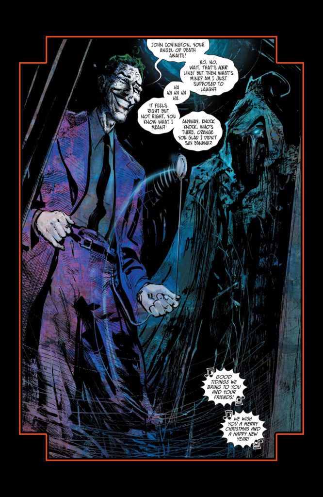
“Ten years ago, the massacre known as Fools’ Night claimed the lives of Batman, The Joker, Nightwing, and Commissioner Gordon…and sent Selina Kyle, the Catwoman, to prison. A decade later, Gotham has grown up—it’s put away costumed heroism and villainy as childish things. The new Gotham is cleaner, safer…and a lot less free, under the watchful eye of Mayor Harvey Dent and his Batcops. It’s into this new city that Selina Kyle returns, a changed woman…with her mind on that one last big score: the secrets hidden inside the Batcave! She doesn’t need the money—she just needs to know…who is “Orpheus?”
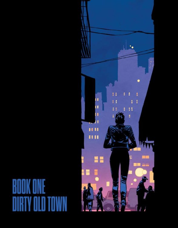
Writing & Plot

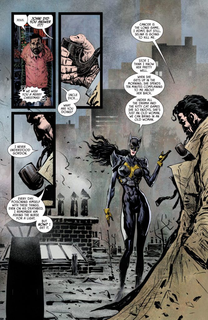
A big question leading into Catwoman: Lonely City #1 was if Cliff Chiang can write as well as he can draw. Well so far, the short answer is damn near. Lonely City sees us in a changed, unfamiliar Gotham without the Batman. Instead, we are guided into the life of a much older and fresh out of prison Selina Kyle. Chiang writes this Catwoman as a guarded, struggling version of the confident thief and part-time villain she used to be. She’s carefully tip-toeing around this “peaceful” new Gotham all too aware of her physical limitations due to her age. Some other favorite  villains (and one old hero) make some appearances as well, and really sell just how much has changed. Gotham under the protection of Harvey Dent teeters on dystopic fascism, where some of his old co-rogue’s have to hide in the undergrowth of dives and alleys.

Chiang’s choices of plot focus show a range of what he wants to focus on for both Gotham and Selina as a character. Catwoman’s knowledge that she is obviously older and not as physically capable is at war with who she is. She cannot allow herself to give up, especially with the guilt she feels at events prior to her imprisonment. She’s still absolutely Selina Kyle, but now she’s one with no reason to exist than to, well, keep being Catwoman. It’s like a more measured version of what Miller did in The Dark Knight Returns, but more graceful and a more believable commentary on modern fascism. Every character interaction has enormous weight, and every plot detail answers a question while posing a dozen more. I am immensely intrigued by what Chiang has opened up here in this first issue.
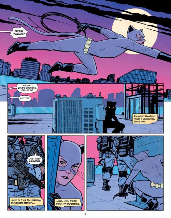
Art Direction

While the question of his writing skills was a draw for this comic, Cliff Chiang’s art is basically a no brainer. Unsurprisingly, Catwoman: Lonely City stands tall as yet another visual piece of comics brilliance. The Wonder Woman and Paper Girls artist brings his signature brand of expressive, colorful storytelling to this alternate Gotham City. It’s an absolute treat seeing Chiang draw his takes on various iconic Batman characters. They are all obviously easily identifiable, but drawn with a compelling in-universe important design rethinking and Chiang’s own artistic touches. The cast have all aged in different ways and we see it both in their features and their expressions. Chiang draws Selina absent the usual hyper-feminine, “feline” figure most artists give her in favor of a regular athletic woman’s build. This could be a deliberate choice by Chiang, or it could just be his own style.

Color & Direction

Chiang’s panel direction carries the comic’s pacing carefully and with momentum. There’s a natural sense of being carried along through the comic at a pace that ebbs and flows with events. Conversations are full of loaded pauses and detailed choices of focus (hand movements, room details) that lend weight to these scenes. The action scenes, which are mostly Selina hiding and running from guards cat burglar style, are carried along by quiet tension. This often explodes into intense escapes Mission: Impossible style.

Much of this direction is held together by Chiang’s unique color style. His pages all have a unifying palette, such as a range of blacks and dark blues for a break-in or browns and dim-yellows for a bar. This sort of flat style an unmistakable mark of Chiang’s work that brings out the pacing by quietly separating the sequences. Every artistic beat is measured in a manner that only comes from the writer and artist being the same person.

Chiang’s lettering (yes, he does all of it) is just as carefully built as his art. The main font is a semi-standard and clean modern comic font. This is punctuated by Selina’s inner dialogue which is depicted as actual handwriting. It’s even on little notebook pages instead of bubbles! His SFX lettering is uniquely understated for little effects, then turns massive for the big sequences. It’s some of the most finely tuned SFX lettering I’ve seen in recent comics. Every part of this chapter visual experience is part of a gorgeous, well-oiled machine.
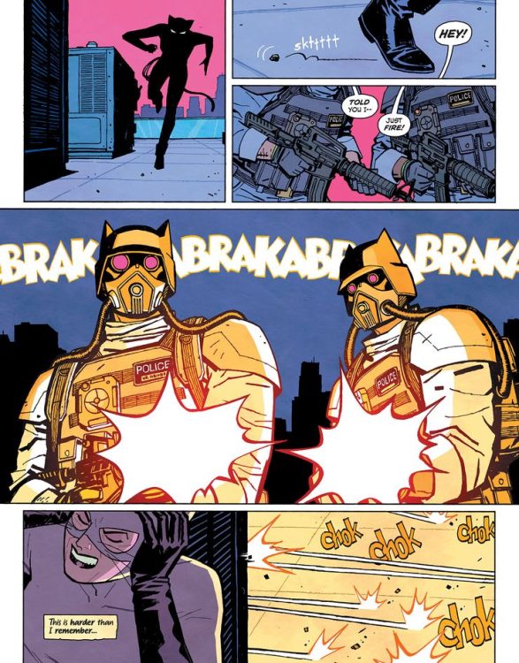
Verdict

Catwoman: Lonely City #1 proves two things: first, there is absolutely room at DC for more Catwoman a stories. The second thing, Cliff Chiang can do anything. His writing is flavorful yet naturalistic, weaving great character interactions with a mysterious and compelling plot I have to get more of. His visuals are… I mean it’s Cliff Chiang, it looks incredible. His visual style paints this strange new Gotham in a light we’ve never really seen it as, and I can’t wait to see what he has in store for this city and it’s most famous surviving denizens. Be sure to grab this issue when it hits shelves on 10/19!


Monkeys Fighting Robots Youtube

Review: BATMAN/CATWOMAN #8 Takes a Dark Turn

Batman/Catwoman King DC Comics

When DC Comics’ Batman/Catwoman began, it was a love story, with some dark undertones. Now, Batman/Catwoman #8 verges on being outright horror. Writer Tom King, artist and colorist Liam Sharp, and letterer Clayton Cowles take us down a dark new path in this chapter. It’s riveting and terrifying.

Writing

A lot of King’s writing changes in this issue. We aren’t dealing with the happy couple from issue one. But what’s even more unnerving about this issue, is how much of King’s style stays intact. The same nonchalance we’ve seen Selina have in previous issues is still on full display. Only now, she’s surrounded by dead bodies and murderers. The Joker is just as giggly, his punchlines are just far more gruesome. It’s the laid back attitude of some of the characters, in the face of great darkness, that actually deepens the horror of what’s happening. When Selina yawns as Batman tries to save someone, it’s disturbing. King leans into the more terrifying corners of this story by holding onto the levity of these characters.

Batman/Catwoman King DC Comics

Art

Sharp’s artwork is just as much of an uncomfortable mix of the light and dark. Sharp wants us to question these characters and this world, by switching up his style mid-page. In one scene, we see Selina and the Joker talking. The Joker is a twisted cartoon character. When he and Selina laugh at something, their faces are about as detailed as a character from Peanuts. As the scene continues, the Joker stays that way. The linework on his face is simplified, the colors are exaggerated. But soon, Selina looks fleshed out. Her face is almost three dimensional, full of detail and realism. Sharp joyfully jumps back and forth between these styles, from panel to panel. He captures the complex nature of this story in this scene. It’s a tug-of-war of themes. Batman is a gritty realist, Joker is a cartoon monster, and Catwoman is stuck in between.

Coloring

Sharp gets us back to the color coding we’ve seen in this story. Scenes from different timelines have different hues. That way, when we read the story, we can tell when each event is happening at a glance. But Sharp takes it a step further, deliberately muddying some of the lines between each scene. The grey of a future scene blends into the grey tones of a scene from the past. Sharp is pointing out the common threads of these characters’ lives. He’s pointing to the repetition of what they do, the endless cycle of violence and mayhem. Batman and Catwoman are just small players in a never-ending struggle against evil.

Batman/Catwoman King DC Comics

Lettering

Cowles lettering is filled with a simple and effective flair. The Joker’s warped font and word balloons lend him an unearthly tone. The small “shake shake shake” noise of a boy lifting a Christmas present is understated, showing the quietness of the noise. Cowles keeps these details in mind. But on one page, Cowles isn’t trying to show us what the dialogue sounds like, he’s showing us something else. While Batman and Catwoman are fighting, they each stand on either side of the page. They have a lot to say, but their word balloons steer clear of each other. It’s a small thing, but with it Cowles shows the widening distance between these characters.


DC Comics’ Batman/Catwoman #8 is wild. It’s a patchwork of different styles, both visually and tonally. But it captures the complex nature of this story beautifully. This creative team is taking their gloves off to take us to dark new places. Pick up your copy of Batman/Catwoman #8, out from DC Comics October 19th, at a comic shop near you!


Monkeys Fighting Robots Youtube

Review: A Masterful Blend Of Classic & Modern Horror In NIGHT OF THE GHOUL #1

Interview: Scott Snyder Talks About The Future Of comiXology

From modern legends Scott Snyder (Batman, American Vampire) and Francesco Francavilla (Detective Comics, Black Beetle) comes a chilling opening chapter of comics horror. Night Of The Ghoul #1 is a perfect union of Golden Age and modern horror sensibilities. With a taut and carefully-planned script and stunningly atmospheric art, this is the start of something horrifyingly beautiful.

“A dazzling work of horror, intercutting between the present-day narrative and the story of a lost horror film. The writer and artist behind Batman: The Black Mirror reunite to shed light on a celluloid artifact once thought forever missing, perhaps with good reason..”

Writing & Plot

Scott Snyder’s skill with the horror genre reaches an arguable peak with Night Of The Ghoul #1. Both the careful world-building and tense, mounting terror are pulled off with thoughtful skill. There is little to no exposition in this comic. Every plot point is brought out by character interaction and in-panel events. The tense relationship between Forest and his son Orson is played out through fantastic father-son dialogue. The pair’s damaged relationship is never delved into in detail, but we’re given just enough to understand what may have happened. Snyder intentionally leaves much to our imagination, and to be delved into in later chapters.

The same goes for the core horror plot itself. Aside from the Inman’s meeting of a mysterious man in a retirement home, there’s another story in another time. This bit is the equivalent of a film’s “explaining the monster” trope, but done in a manner only comics can pull off. The tension mounts as the B-plot’s story intensifies and the events in the nursing home become more unsettling. Tonally, this comic feels like something that would be introduced by Vincent Price that is somehow also directed by Mike Flanagan. Every aspect of the horror story is kept with details close to the chest, though. This is an intense and deftly paced comic that isn’t quite a slow burn, but settles just enough to keep the reader mired in tension. This opening chapter is a potential career-best for Snyder.

Art Direction

There is no artist alive that could have been a better choice for Night Of The Ghoul #1 than Francesco Francavilla. His iconic style that has graced pulp covers and horror-tinged Batman stories blesses the interiors of this tribute to Golden Age tales of terror. Francavilla’s thick pencils and heavy inks craft an immersive and oppressive atmosphere. His character designs are deceptively simplistic but well-detailed. We can catch the nuances of complex emotion that every person feels; from regret to apprehension and  – naturally – fear.

The comic takes place almost entirely at night in a poorly-lit building. As such, environments are cloaked in darkness and lit primarily by soft light reflections. Francavilla does impeccable work in this regard. Character features are lit by the blue screens of phones and computer monitors, or by the soft glow of dim fixtures. The coloring and framing Francavilla uses in the main plot is reminiscent of horror films from the 70’s and 80’s. The B-Plot (which I will not get into) is colored in a fine sepia tone due to its time period. This is a simple decision that Francavilla turns into a stroke of genius, setting an unsettling tone through even more of this comic. Francavilla’s monstert design is a shape that will stay in my mind for some time to come.

The lettering from Andworld Design is professionally legible while carrying a great deal of tone. The font changes subtly to mark the steady changes in the speakers’ tone. Every aspect of this comic’s visual storytelling is a masterful feat of atmospheric tension.

Verdict

Night Of The Ghoul #1 is an incredible opening chapter of horror storytelling. Scott Snyder delivers one of his best scripts yet with a tense, carefully paced plot that guards its secrets close. Francesco Francavilla’s art is as stunning as it is unsettling, with excellent panel direction and tension-building design. If you’re a horror fan, you need to read Night Of The Ghoul #1 when it releases on Comixology on 10/19.

Monkeys Fighting Robots Youtube

Comics Studies Review: THE ESSENTIAL GUIDE TO COMIC BOOK LETTERING Does What It Says On The Tin

Comic Book Letterinf
The Essential Guide To Comic Book Lettering Cover Credit: Image Comics

For a number of years now, award winning comic book letterer Nate Piekos, founder of Blambot.com, has been posting lettering tips on various social media. He has also toyed with the idea of producing a book of these ideas, and this week The Essential Guide to Comic Book Lettering goes on general release. Published through Image Comics, the book is a detailed guide to the process of lettering in the comic book industry and is packed with guides, tips, and anecdotal commentary from the creator himself.

The Comic Book industry has changed massively over the last 100 hundred years. Creator rights and recognition are elements that have seen a dramatic shift from barely getting a mention in the early comics of the 1930s and 1940s to becoming major selling points of some titles. Relaunches of famous characters, such as Batman or Spider-Man, have been built around the creative team, especially the writer or artist, and this has led to some creators becoming almost household names. However, there are still elements of the industry that are less known; production elements that many readers and critics take for granted. Elements such as Coloring and Lettering.

A few years ago, the appreciation of comic book coloring began to grow thanks to advocates such as Jordie Bellaire, Matt Wilson, and Laura Allred. And now, letterers are beginning to get more recognition because of the promotional drives from creators like Hassan Otsmane-Elhaou and Nate Piekos.

Nate Piekos
The Essential Guide To Comic Book Lettering Credit: Image Comics

The Format

To some, lettering is seen as simply copying and pasting from a script, and to others it is a mystical art; unexplainable witchcraft. The truth, as The Essential Guide to Comic Book Lettering proves, is somewhere in between: it is a highly technical skill, but one that is attainable. Piekos breaks the process down across the 256 pages and walks the reader, and potential future letterer, through each step in highly detailed yet easy to follow instructions. He takes every aspect of the craft, from setting up the studio and equipment to delivering the final product to the publisher, and explains everything you could possibly need to know; step by step; process by process. This book is a highly detailed instruction manual for the budding letterer.

Piekos opens with an introduction about himself and why the book exists in the first place. He makes it clear from the start what he hopes to achieve and, without doubt, he hits the mark. This is a comprehensive instruction manual full of facts, guides, and useful tips for creating the best comic book lettering possible. It is acknowledged that a certain level of creativity is required but the learning process is mentioned again and again. Practice makes perfect is one of the themes running throughout the chapters and an encouragement for experimentation is one of Piekos’ strongest recommendations. This book gives future letterers the tools and knowledge to work in the industry but it is also an encouraging read. You get the impression that Piekos is on your side, an enthusiastic teacher plying you with as much knowledge as possible. The bonus is that it’s all there, on paper, ready to be flicked through over and over again.

Comic Book Lettering
The Essential Guide To Comic Book Lettering Credit: Image Comics

Educational or Entertaining?

In essence The Essential Guide to Comic Book Lettering is an instructional manual, like a ‘How to’ book on the craft. However, there is so much more in this volume than dry instructions and walkthroughs. Piekos has an uplifting flair to his writing style so that paragraphs read like stories and sections feel more like anecdotes rather than lectures. Even in the technical areas, where readers could allow for some dryness to the text, Piekos manages to keep the movement of the writing ticking over. You dip into a section or a chapter and before you know it you’ve read right through it all. This ease of reading allows you time to re-read and then apply the knowledge that the author is imparting. Following each section line by line, step by step, is so easy that you can flick between book and computer to try out the advice. This does not mean there is a lack of information as the book’s coverage is surprisingly wide-reaching. By setting up, for example, a template word balloon, Piekos is able to teach a fundamental part of the process, but then encourages the reader to expand on what he teaches. One section of the book can be read in minutes but will then provide enough information to keep you occupied for hours, if not days.

One of the highlights of the book are the asides Piekos makes from time to time. Appearing in colored boxes, to differentiate them from the rest of the text, these asides contain some of the more entertaining aspects of the work. They highlight topics such as discussions on page rates, informal arguments regarding hyphens, and even bust the myth that lettering is an ‘invisible art’. From a critical point of view, these sections were the most engaging as they contain less technical practicalities and allow Piekos’ personality to shine. However, they also function as breaks between lessons and give the reader a chance to switch off for a moment from the learning. This illustrates that the author has considered the pacing and structure for this book, making sure that it doesn’t become too much of a cold textbook. Piekos reminds the readers that the love of the job is one of the driving factors behind working in comics and therefore this book has to have an element of entertainment. It has to encourage readers to become involved and in this aspect Piekos hits the mark perfectly. The Essential Guide to Comic Book Lettering is the lesson at school with your favorite teacher. Even if you had no interest in the subject at the start of term, you can’t help but soak up some of the teacher’s enthusiasm so that, by the end, you really want to have a go.

Comic Book Lettering
The Essential Guide To Comic Book Lettering Credit: Image Comics

Conclusion

At the end of the day, a book like The Essential Guide to Comic Book Lettering is aimed mainly at those people who wish to embark on a career in comics lettering. From that point of view, it’s a perfect book to own and will become an instant must-have for people joining the industry. It will also prove to be a must-have for some people already within the industry.

One audience that the book may not be aimed at, but could do with at least reading once, is that of the critic. In cinema, theatre and music reviews, understanding the craft is essential and reviews discuss not only the actors and stories but also the sound, the cinematography, and the production. One of the issues with so many comic reviews is that they become obsessed with story and lack engagement with other aspects of the craft. A large part of this is to do with a lack of understanding or education because, let’s face it, there aren’t many books on Comic Book Coloring or Lettering. A book like this one is perfect for demonstrating what letterers actually do, how their work is produced, and the effects the work has on the final comic page. Critic’s can’t have too much knowledge and The Essential Guide to Comic Book Lettering is a much needed source of information and education about one of the least understood aspects of comic production.

If you read comics to simply marvel at the superheroics of the central characters and occasionally get lost in the soap opera of their secret identities, then this book will not have much to offer you. If you have a burning desire to understand all aspects of Comics, their production, history, and creative majesty, then make room on your shelves because this comprehensive guide is going to need some space.

Monkeys Fighting Robots Youtube

Marvel Comics Exclusive: Ron Lim And Superlog’s DARKHAWK #4 Covers

Marvel Comics Exclusive

DARKHAWK #4 hits your local comic book store November 24th, but thanks to Marvel Comics, Monkeys Fighting Robots has an exclusive first-look at Superlog and Ron Lim’s variant covers for the book!

About the issue:
TEAM-UP WITH SPIDER-MAN AND CAPTAIN AMERICA?! Connor Young’s only been the new Darkhawk for two whole minutes, and already he’s not sure the super hero life is for him. But will he feel the same way when he meets Miles Morales and Steve Rogers?

The issue is written by Kyle Higgens, with pencil art by Juanan Ramirez.

You can see both variant covers below. Ron Lim’s cover pays homage to Mark Bright’s iconic Spider-Man Versus Wolverine cover, whereas Superlog’s is an electric breakdown of Darkhawk’s suit.

Ron Lim:

marvel comics exclusive preview reveal darkhawk cover ron lim


Superlog:

marvel comics exclusive preview reveal darkhawk cover superlog


Are you reading the new DARKHAWK? Sound off in the comments! And call your local comic shop today to order DARKHAWK #4!

Monkeys Fighting Robots Youtube

Self-Published Spotlight: Drew Morrison’s BROKENLAND

Brokenland

Welcome to Self-Published Spotlight, a regular interview column where I will be highlighting self-published comics and the creators and small print publishers who make them.


I follow a lot of indie artists and books, but I had not had the pleasure of experiencing Drew Morrison’s cartooning until Monkeys Fighting Robots editor Anthony ‘Ace’ Composto showed me some images and asked if I wanted to interview Drew. Upon laying eyes on those BROKENLAND images, I could not say YES fast enough! So check out my chat with Drew and then dive into BROKENLAND! You can actually check out a preview of the first issue here. And support the Kickstarter for issue four here.

Monkeys Fighting Robots: Drew, thanks for taking the time! Can you tell us a bit about yourself? What’s your comic book secret origin? How did you get into these funny books?
Drew Morrison: Thanks for having me, Manny!  I grew up in Buffalo NY in the ’80s & ’90s, in a home that fostered creativity, with access to a number of awesome comics shops.   I mainly read TMNT, Spiderman & Venom back then but also loved The Far Side, Calvin & Hobbes and Edward Gorey.  I had aspirations of going to the Joe Kubert school but my Mom made a strong argument for Pratt.  She basically said, go immerse yourself in all the different art forms and you can always make comics if you choose to.  I started drawing comics in college alongside making larger fine art pieces.  We had an incredible selection of graphic novels and comics at the library so I’d spend hours there reading, to save money.  Post-college I pursued commercial illustration to some success, but in the end I completely prefer the comics medium over just about anything else.  I think if we’re lucky we come around full circle to the things that excite us in our youth.

MFR: Let’s talk about your latest project. First of all, congratulations on hitting your goal for issue four. So can you give us a synopsis on BROKENLAND? 
DM: Thank you!  In truth, it’s my first comics project of any length.  I’ve been trying to boil down the story into as few words as possible – what I came up with is ‘Abused Marshmallow Navigates Uncaring Urban Cartoon Hellscape’.  The main character Meeso is trying to find themselves, their way, and also do a bit of good in the process.  As in real life, the obstacles are endless and we dive into both internal and external conflict throughout each issue.  The setting really serves as the main character and an abrasive foil for Meeso (and the reader) to be pressed against.  Brokenland
MFR: How about a little history behind the publication of past issues? How did you get to issue four? How long was that journey?
DM: I started planning Issue 1 in 2018, so it’s been about 4 years of self-publishing Volume 1 of this book.  I basically set out thinking that I only get to do the next issue if each one is well received and reaches the funding goal.  I like setting up near-impossible goals for myself.  It’s a 128-page book with over 850 color panels and I’m very proud of it.  I worked plenty of other gigs and rebuilt our current house during that time frame so it was a challenge carving out consistent time to work on BROKENLAND.
MFR: You’ve stuck with Kickstarter for this series from issue one. What led you to Kickstarter in the first place and what made you stick with it as a way to get the series out? Did you ever consider other publishing options?
DM: Around the time I was finishing colors on Issue 1, I joined up with the ComixLaunch group and that led me down the Kickstarter path.  We’re a group of like-minded self-published authors and creators who help each other build and run campaigns.  Collectively the group has published over 3 million dollars in comics projects!  The Kickstarter platform has grown my readership substantially since the first launch so I kept using it.  My future ambition is to get BROKENLAND released as a graphic novel from an established publisher.
MFR: One more Kickstarter question. I’ve asked this to almost every creator I interviewed and I always learn something new from their answer. Why do you think Kickstarter (and crowdfunding in general) has become so huge in the comics world. 
DM: The short answer is that it lays waste to the gatekeepers and lets creators sell directly across the globe.  It’s accessible, easy to use and a far more exciting place to browse books than Amazon.  I think dedicated comics fans know they can find really unique projects to back on Kickstarter and that keeps them coming back.  I also think most comics creators know that getting picked up by a publisher is wildly competitive and this is a pretty great tool to have as an option. 
 
MFR: The first thing that stood out for me was actually something that was missing, the dialog. What made you want to make this a ‘silent’ story? Was that something you decided early on?
DM: The decision was mainly about making Meeso a silent character.  The idea to keep the book silent quickly followed.  I’d been drawing the character for years and never heard them speak a word in my mind.  I figured if the protagonist is not speaking, why not let the reader have an image-driven experience.  By approaching the world silently, Meeso acts like a vessel for the reader and it keeps the story more interpretive as far as I can tell.  Brokenland
MFR: The art is also beautiful. For a story taking place in a world with so much grit and grime, the linework is clean and easy on the eyes. What’s your process for getting these images on the page? Where and how do you start?
DM: I appreciate that!  I definitely like the balance of the grimy subject matter with the intricate linework and generally bright palette.  I do rough thumbnail layouts on letter-sized paper and then translate them into blue-line pencils at 1.5 scale.  I draw at an old wooden drafting board that belonged to my Mom.  It has an architectural parallel ruler for laying out panels.  For BROKENLAND I decided early on to work within a 9-panel grid, because I knew with some limitations I’d go crazy.  I ink directly onto my pencils (after scanning them) with a Micron Pigma Graphic 1 marker and FC Pitt Artist Pens.  
MFR: Are you a digital guy or pen/pencil paper?
DM: I only go digital for the coloring process, or for small corrections in the drawings.  Ink on paper is just a satisfying method that feels good, I’d never want to replace it.  My colors were nearly flat for Issue 1 but through the series, I’ve learned how to do some fun color holds, gradients and dissolve to increase the depth.  Ink on paper forever! 
 
MFR: Would you say you have any specific influences on BROKENLAND, both thematic and artistic?
DM: My experiences in NYC and rebuilding 2 forgotten homes definitely drove the theme of this series.  Growing up in the suburbs of Buffalo, your garbage kind of magically disappears at the end of the driveway.  A garbage bag is like a black hole we use to conceal the disgusting truth.  In NYC the sheer population density scales waste output in a way that’s unfathomable if you stare at it long enough.  When gutting houses, you spend a lot of time at the dump and witness everything that’s brought there.  Anyway, this really affected me and I wanted to discuss it through the comics while holding onto humor in what truly is a comical situation.  My artistic influences are broad and I think they all influence the look of the comics.  I can appreciate a set of 1800’s etchings as well as a late 70’s grindhouse flick.    
MFR: Who and what would you say are your biggest artistic influences overall?
DM: If I were to list the artists who influenced BROKENLAND the most:  Robert Crumb, KAZ, Jim Woodring, Jason, Thomas Ott, Dave Gibbons and Geof Darrow.  Dark comedy in the form of writing, art or film fills my creative well the most.
 
MFR: Now that you have met your goal and with almost two weeks still left in the campaign, what stretch goals do you have in mind?
I don’t really get into the serious stretch goals – once a campaign is funded I try to focus on delivering the best experience for everyone who has already backed.  I think I’d like to include something extra for everyone if possible, like a small set of trading cards or sticker pack.  That said, the more I can earn on this the better proof I have when shopping BROKENLAND to publishers.
 
MFR: What’s the future plan for BROKENLAND? Any more stories to tell?
I’ve ended Issue 4 / Volume 1 in a way that is conclusive but would allow me to continue the story down the road.  I think I would revisit it with focus on a different protagonist and thematic focus.
I can say with confidence that I’m done self-publishing the series for the time being.  I’m eager to find a publisher to reprint and release 1-4, with potential future volumes.
 
MFR: Besides BROKENLAND, are there any other projects you are working on you want to talk about? 
 
DM: In the background, I’ve been gathering ideas and material for an anthology of short horror stories in comics form.  I know these are coming out faster than they can be read, but my goal would be to make it a truly frightening reading experience.  I’m planning to co-write the stories with a good friend and create the artwork in black and white.
MFR: Where can folks find your work?
DM: I update my Instagram page the most, @drewmorrisonart.  My portfolio of illustration work can be viewed at http://drewmorrison.com
MFR: And finally, any final thoughts you wanna share with our readers, any last-minute marching orders?
DM: Most importantly, check out the current Kickstarter for BROKENLAND 4 / Volume 1 !  Please consider backing the Kickstarter, it’s live through October 31st!  The more I can overfund, the greater ability I have to jump right into the next publishing project without taking gigs in construction or retail in between.Brokenland
Monkeys Fighting Robots Youtube

Review: TALES FROM HARROW COUNTY: THE FAIR FOLK – Consistency Is Key

Writer Cullen Bunn, in collaboration with artist Emily Schnall, return to the realm of backwoods Appalachian magic in Tales From Harrow County: The Fair Folk. With returning series co-creator Tyler Crook on letters, this sequel mini-series is a superb piece of character and lore-driven horror. With fantastic interpersonal writing, clever world building, and fantastic art, this series is more than worthy of the series that preceded it.

“Fresh off the loss of her goblin friend to a strange portal, Bernice must weigh her responsibilities as protector of Harrow County with her desire to get her companion back safe and sound. But the past weighs heavily and the fair folk use Bernice’s and her memories against her. And something more disastrous than she could have feared may be around the corner to threaten both the worlds of humans and of haints.”

Writing & Plot

Possibly the most remarkable thing about Tales From Harrow County: The Fair Folk is Cullen Bunn’s ever-present style. The Harrow County creator is able to drop in and resume telling this world’s stories as if he never stopped writing that original series. Bernice is every bit as compelling a protagonist as Emmy was. She and Georgia’s relationship is written with insight, complexity, and care enough to make them feel real. Bunn keeps all of the reminders of the original comic’s old magic and combines them with mythology to craft new lore for this creepy yet ever-enchanting world.

Despite some of the more “mystical” elements this mini-series introduces, this is still absolutely a Southeast horror story. The peaceful yet eerie setting of Harrow will never cease to charm or send chills. Without spoiling anything, what happens here in Fair Folk is on par with the major events in the original series while taking the possibilities of this story even further. In all of this Bunn never loses that core of what makes Harrow County so special. The memorable, naturalistic dialogue from both people and haints still endears us to them and their world. The scripts for this new series stand strong with the best moments from the original comic. I cannot wait to see where Bunn takes these characters next.

Art Direction

Following up the likes of Tyler Crook on the original series and Naomi Franquiz on Death’s Choir is no easy task. Fortunately, Tales From Harrow County: The Fair Folk is visually crafted by Emily Schnall. Schnall does an excellent job of maintaining the Harrow County visual style while making it very much her own. Her interpretations of Bernice, Georgia, and others are faithful and easy to identify. She still manages to fit her own style of expression and detail into their animations and design.

Schnall makes a lasting impression with her monster designs as well. Some of Harrow’s most disturbing denizens come to life under her pencils and colors. One particular beast, the new “leader” so to speak, will stay with me as one of my favorite creatures I’ve seen in a horror comic. The town and woods of Harrow are as quaint and mysterious as ever. The simple town is as deceptively peaceful and surrounded by magics as it ever has been. Schnall’s coloring of the foliage in the backdrop of the simple wood barns and businesses is charming – yet still unsettling. Her watercolor styling aesthetically matches the work of Crook and Franquiz before her, and she makes just as great an impression as they did.

Speaking of Tyler Crook, he returns to provide letters in the series. That same iconic use of twisting, whispering fonts that vary as much as the comic’s cast does remains perfect for Fair Folk’s reading experience. Visually, this mini-series stands tall with the prior comic’s visual storytelling.

Verdict

Tales From Harrow County: The Fair Folk is a clever and brilliant continuation of the Harrow County story. Cullen Bunn scripts some of the best material in this universe thus far, continuing the character developments of its cast while expanding upon the lore in this spooky little town. Emily Schnall crafts a visual experience on par with the rest of the series’ offerings. Her detailed lines, creepy creature designs, and atmospheric watercolors stand with the best visual work in the series. Be sure to grab the final issue of this series when it hits shelves on 10/20, or the collected trade paperback in March!

Monkeys Fighting Robots Youtube

Vigil | TV Review

Vigil is the latest series made by World Productions, the production company behind Line of Duty and The Bodyguard. The BBC has been advertising Vigil as their most popular show of 2021.

Craig Burke (Martin Compston), a sonar mapper on HMS Vigil has been found dead. Due to the death happening in British territorial waters, a civilian police officer, DCI Amy Silva (Suranne Jones), is sent to investigate. Silva believes the death was a murder and she investigates on the sub, whilst her partner, DS Kirsten Longacre (Rose Leslie), and the rest of the Scottish police do their job on land. They must determine whether the crime was personal, a cover-up, or the work of outside forces.

The BBC and World Productions wanted to make a statement with this show. It had an all-star cast of British talent that included Suranne Jones (Gentleman Jack), Rose Leslie (Game of Thrones), Shaun Evans (Endeavour), Paterson Joseph (Peep Show), and Stephen Dillane (Game of Thrones). Martin Compston’s role was small considering he stars in one of the biggest shows on British TV. The BBC promoted the show for months and even after the show has aired, they are still promoting it.

Vigil had a great set-up because it was the ultimate lock-room mystery. The murderer had to be on the submarine. It was something Agatha Christine would have come up with. For fans of police procedurals and techno-thrillers like Tom Clancy’s The Hunt for Red OctoberVigil should be a delight. This series had a traditional murder investigation story that was filled with suspects, motivations, and red herrings. The submarine crew had to deal with life-threatening situations and there were wider issues involving British politics, the military, intelligence, and Britain’s nuclear deterrent.

Vigil had to keep a lot of plates spinning throughout and this adds to the intrigue. All these plotlines kept the levels of intrigue high because they kept asking questions. Audiences will be kept guessing and wondering. The show was able to have lots of moments of tension and excitement. Many of the episodes ended on cliffhangers which made it great for binge-watching. However, the use of all the story elements was a double-edged sword because numerous storylines ended up unresolved and pointless. A great example of this was the role of the US Navy in the series. It was set up to be a major part of the series, but their role in the series disappeared just as quickly.

Another issue was the pacing of the series. After so much going on in the first three episodes the fourth episode ended up being a let-down because it slowed things down so much. The series threw up so many twists that it strained the story. Vigil would have benefited more from a shorter run of four episodes instead of six.

Vigil has been criticized for its inaccuracies and for having an anti-nuclear stance. The premise was flimsy because if a death happened on a submarine then it would probably be the military police who would investigate, not civilian police. This was a series that showed an untrained civilian going around a submarine. Former Naval officers have pointed out a real nuclear submarine would be a lot more cramped, and submariners would be a lot more disciplined. Some of these changes were done for the sake of drama and making filming a lot easier. But even people with a basic knowledge of submarines would know their crews would be some of the most disciplined in the navy. When one character revealed why he worked with the Russians I wanted to shout out ‘how stupid are you?’

As well as being a police and military thriller, Vigil had a personal element. Silva was a woman who had a lot of baggage and had to deal with issues of grief and depression. It’s a regular feature in detective fiction to show the main character having personal struggles of some sort. This was probably why Jones took on the role because it made Silva a meatier role than just a detective investigating a crime.

Vigil had a great setup for a murder mystery and techno-thriller and there’s enough in the series to please fans of those types of stories. But it was a show that got ridiculous with all its reveals and was unable to maintain its momentum. Vigil doesn’t match the heights of Line of Duty and Bodyguard.

Monkeys Fighting Robots Youtube

In Conversation With LORE OF THE HAVAMAL Writer Cat Mihos

Writers Cat Mihos and Ethan McQuerrey, along with artist Jouni Koponen, bring us a new tale of old gods in their new graphic novel Lore Of The Havamal. I got to speak with Mihos about the influences, creative process, and historical input behind this tale of the fall of the Norse Gods!

“Ragnarök, The Twilight of the Gods is over, but something went wrong. Instead of dying heroically in the final battle, Odin One-Eye finds himself working as a bartender, reflecting on past losses and the death of his loved ones. If this truly was Ragnarök, why didn’t the old world end and a new better world emerge?”

MFR: Mythological tales are seemingly always popular, especially right now. What made you decide on the Norse Pantheon for a story and not the Greek, Egyptian, etc.?
 
CM: We were approached by a Scottish tourism board to write a comic about the Norse myths to help interest a younger tourist demographic, and really did a deep dive into that magical world. That being said, I am half –Greek and have spent time backpacking in Egypt, so either of those worlds may be next!
MFR: Reinterpretations of mythical tales are all over the place in every medium, including comics and graphic novels. With so many stories involving the Norse pantheon being out there, was the challenge to put your own stamp on these characters more daunting or exciting? Or both?
CM: I absolutely loved the idea of an eternal Odin behind the bar with his all-seeing ghost ravens. Working so closely with Jouni, the Finnish wonder,  I knew it would only be a terrific exciting ride. His knowledge of the myths is incredible.
MFR: Your collaborators on this graphic novel include (co-writer) Ethan McQuerrey and artist Jouni Koponen. How did this team form and what was your combined creative process like?
CM: Ethan and I met long ago in Baltimore, and I met Jouni in 2004 when he came from Finland to Wisconsin for a Sandman convention. We are all old comic book nerds, so to speak.
 
We were dodging the time zones and work schedules in a big way. (Although I cannot complain, as I have heard all the stories about how comics were collaborated upon via the mails, fax machine and long distance telephone calls.)
 We had the amazing Dee Cunniffe on colors, and he saved the day with his lightning fast work.
MFR: What and/or who are your biggest influences, in any and all mediums and genres, going into telling this old tale in a new way?
CM: For this project, Jouni and I talked it out in great detail, and tried to stick closely to the outline we originally pitched. A few things had to change here and there as in any collaboration. I always love a bar atmosphere as a storytelling vehicle–this has been going on since forever, people gathering in a space to hear the tales of times gone by.
Obviously, Alan Moore and Neil Gaiman are huge comic influences on me, and I collect old House of Mystery comics. I love a host talking us through a story.
MFR: A really cool note I wanted to talk about was the Follow The Vikings Project and how your use of Edda literature in Lore of the Havamal. How did your interest in this project start and how did you come to use it for this graphic novel?
CM: My husband Drew and I are ex-roadies. We have travelled with many different bands, across the world. He was in Iceland with the Deftones and was reading me an Asatru passage from a book on the Havamal, and it got me thinking about how that could be woven in as an educational thread. Jouni was able to elevate the concept with his incredible art.
MFR: The nature of myths through history is that the core stories change and end up reinterpreted time and time again, like a centuries old game of telephone. Do you tend to welcome diverging stories involving the Norse world and its characters, or do you tend to favor the closest translations to the source material?
CM: That’s an excellent question. Out of respect for the culture of the Norse, I did want to look closely and carefully at the source material. I do feel that expanding on a myth/storyline can bring more eyes on to a the rich historical cultures. We hope to inspire more people to explore the past.
Lore Of The Havamal is out now via Z2 Comics, so be sure to grab yourself a copy today!
Monkeys Fighting Robots Youtube

Marvel Comics Exclusive Preview: PHOENIX SONG: ECHO #1

marvel comics phoenix song echo exclusive preview

PHOENIX SONG: ECHO #1 hits your local comic book store October 20th, but thanks to Marvel Comics, Monkeys Fighting Robots has an exclusive four-page preview for you.

About the issue:
STRAIGHT OUT OF HER TRANSFORMATION IN AVENGERS, ECHO GETS AN EXHILARATING SOLO SERIES FROM BESTSELLER REBECCA ROANHORSE!

Against all odds, one of the most powerful entities in the Marvel Universe chose Maya Lopez, a deaf street fighter, as its new avatar. And the burning question on everyone’s minds is: WHY?! But Echo is the last person to answer. Still learning her new cosmic abilities – and struggling with the Phoenix’s overwhelming personality – Echo strikes out to return to her roots. But the reservation has even fewer answers. And where power goes, evil follows. Someone wants Echo to fail – and unleash a power only the greatest heroes in history have been able to control. Avengers artist Luca Maresca joins superstar writer Rebecca Roanhorse for a story that will light the universe on fire!

The issue is by writer Rebecca Roanhorse and artist Luca Maresca, with colors by Carlos Lopez, and letters by Ariana Maher. The cover is by Cory Smith and Alejandro Sánchez.

Check out the PHOENIX SONG: ECHO #1 preview below:

marvel comics phoenix song echo exclusive preview

marvel comics phoenix song echo exclusive preview

marvel comics phoenix song echo exclusive preview

marvel comics phoenix song echo exclusive preview

marvel comics phoenix song echo exclusive preview

marvel comics phoenix song echo exclusive preview

marvel comics phoenix song echo exclusive preview


Have you been reading Marvel’s AVENGERS? Are you looking forward to PHOENIX SONG: ECHO? Sound off in the comments!

Monkeys Fighting Robots Youtube