Home Blog Page 120

Review: SPEED REPUBLIC #1 — A Dour Fix For Our Current Times

Speed Republic #1 Cover

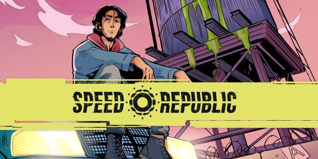
Speed Republic #1 from Mad Cave Studios presents readers with an all-too-relatable world about feeling helpless amid excitement. This issue releases February 2, 2022 and is available for pre-order now.

Series Synopsis

From the official press release:
In the future, Europe has united under one man, The Autocrat. He rules the apocalyptic landscape from corporate monopolies with a vision of unity that is gospel to some, but hollow to others. To distract the 99% from their poor and empty lives, they are given the opportunity to compete in the Grand Race. A marathon street race through Europe where only one driver can make it to the end and win a life of luxury. Our hero, Sebastian Valencia enters with the hope that winning this race can make up for his wasted past, but along the way he starts to question what kind of future he is actually buying into.

You Can’t Outrun Your Feelings

Speed Republic #1 banner

Speed Republic #1 introduces writer Ryan K Lindsay’s Europe in a dystopia that can feel close to home. This series looks at the entrepreneurial escapism that pervades our modern world. So it makes sense that our protagonist Sebastian Valencia is a burnout like some readers. Sebastian’s situation presents a most compelling look at hustle culture; imagine if you had the chance to get a dream job but had to cut yourself off from your old life. Sebastian’s father is sick and wants Sebastian around, but Sebastian wants to find a stable way to provide for him. But this has also caused Sebastian to lose out on relationships with his ex-girlfriend and older sister.

Then there’s the bigger conflict in Speed Republic #1, on whether it’s even worth winning the central race at all. Sebastian knows that his situation won’t get better by winning the race. There are too many larger systemic issues to fix, all because of an unnamed Autocrat whose policies strangle the life out of the citizens of Europe. This all means some people aren’t too fond of the racers because they’re part of the problem. A significant few people are even ready to tear drivers to pieces. Tensions are high all around as readers wonder what will happen with Vincent going forward.
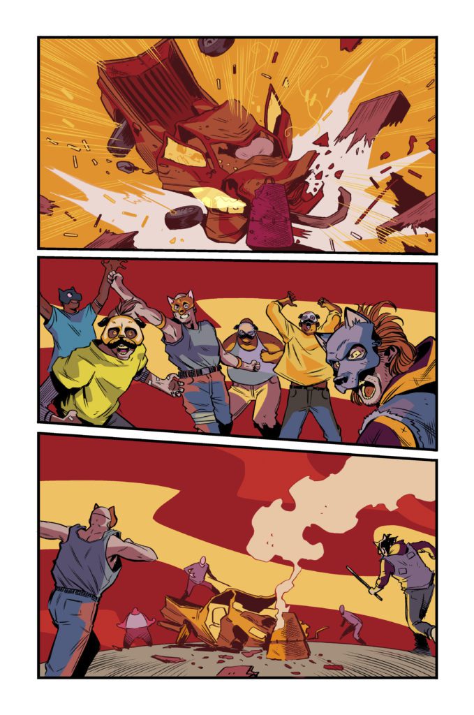
Mad Max without the apocalypse

Eye-Catching Traps

The art by Emanuele Parascandolo presents simple yet highly expressible designs in Speed Republic #1. In addition to the facial language of every character that helps set the mood, the cars show off plenty of personality. The way some vehicles are driven and the equipment they come with says a lot about their drivers. A pickup truck driver moving fast and recklessly works just as much as seeing the driver’s face high on adrenaline. Readers can find just about any character to latch onto depending on their personalities.

At least pretend to enjoy yourself.

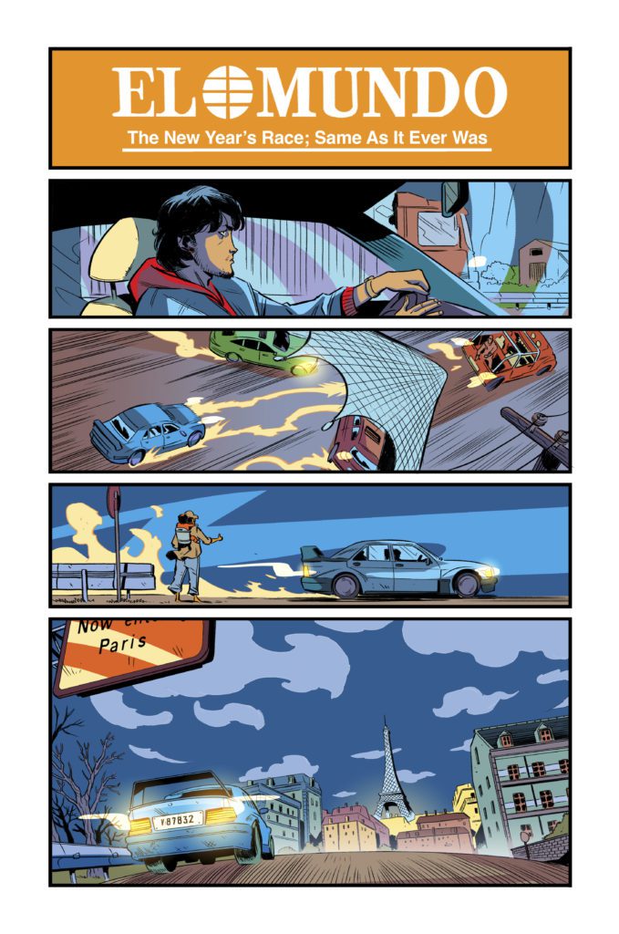
Most of the coloring of Speed Republic #1 by Michele Monte is in an enticingly colorful if muted display. Despite the amount of costumes, cars, and settings, they feel devoid of life which evokes the series’ actual tone. It gives readers a strong sense of empathy for almost every character on display; especially after they look at one page that has brighter colors along with a news banner. That page serves as an enticing ad for readers to get excited over the race in the preview catalogues, obviously belying the depressing content. Readers connect to people struggling with all of their might in this neo-noir atmosphere.

Finally, the lettering by Joamette Gil provides the appropriately designed SFX for some intense moments. Each one allows the reader to feel the event as it happened. Some feel like extensions of actions like a gunshot to signal the start of the race. A truck crashing into a piano meanwhile has a very attention grabbing SFX in bright white colors. This makes the event stand out to the reader with how surprising it is.

Subscribe With Speed Republic #1

Speed Republic #1 has just about everything to entice readers amid workplace burnouts. Something as out-of-this-world as a race to survive just can’t cover up the depressing situations every character has to face. And yet this is something readers refuse to look away from because of how it tugs at their heartstrings.

Monkeys Fighting Robots Youtube

Review: SAVAGE AVENGERS #27 – Is This the End of Kulan Gath?

Writer Gerry Duggan brings his Kulan Gath story kine to an end in Savage Avengers #27. Teaming up with Patch Zircher on pencils, Java Tartaglia on colors and Travis Lanham on letters, we are treated to a well thought out climax to the years-long story.

In the two years since this story has been going on, Savage Avengers has brought in various cast members to appear on the team. From Venom to Magik, many of Marvel’s most brutal characters all took a turn. Despite the rotating cast, Conan and Doctor Strange have been at the forefront for most of this run. This was essentially Gerry Duggan welcoming Conan in and having him interact with as many Marvel characters as he can.

Writing

Savage Avengers #27 gives fans who have stuck with the book for two years an ending they will be satisfied with. Duggan has built up Conan wonderfully throughout this series. This issue we see him finally accept what it means to be a teammate. He works with Magik and the Black Knight to defeat Kulan Gath. Duggan doesn’t falter with such a large cast either. If you’re a fan of any of the characters in this book, they’re all treated with respect from Duggan. The way Duggan deals with Kulan Gath is both creative and disgusting. Our heroes have to take a chance on working with characters like Dr. Doom and Kang to make sure they can come away with a victory.

Art

The pencils by Zircher are amazing. Zircher has smooth lines that make each panel a joy to look at. The graphic panels, like someone getting a hand cut off, are drawn with great precision. The most amazing stretch artistically in the book comes with how Kulan Gath is handled. Without going into spoilers, Zircher draws his fate in a grotesque way that would make even a veteran horror fan squirm.

Tartaglia’s colors shine in this issue with his vibrant backgrounds and dark tones. As Kulan Gath attempts to ascend, Tartaglia gives us a gorgeous yellow background. In the battle panels Tartaglia gives us dark colored blood that is a mix of black and red. Tartaglia’s colors are effective in this issue because he doesn’t overdo it with wild colors. Everything he does has a natural feel to it. While his backgrounds are crazy colors, and we occasionally get a purple sky, in a mystical book, that seems legitimate. The colors on characters fit with the shading and changing backgrounds as well.

Lanham handles the lettering for this issue. As Kulan Gath laughs, believing that he has assured a victory, Lanham emphasizes his laugh with a nice red word balloon. Lanham also makes great use of the effects from weapons this issue. Whether it’s Black Widow blasting or Conan slicing, the sound effects play in your head as you read the issue.

Conclusion

Savage Avengers #27 is a fitting end to a long story arc. We get to see a ragtag group of heroes who hardly interact come together for the greater good of the Marvel Universe. This well written ending that really shines with great pencils and colors should please any reader. This isn’t the end of Savage Avengers, but merely the beginning. Marvel’s Savage Avengers #27 is out now at a comic shop near you!


Monkeys Fighting Robots Youtube

Review: The Sass and Mystery Build in HAWKEYE: KATE BISHOP #2

One of the sassiest heroes in Marvel Comics is back in action in Hawkeye: Kate Bishop #2. First, it was a missing sister, then a missing ring, and now a missing child? What next? Kate’s endless ability to find trouble continues thanks to writer Marieke Nijkamp, penciller Enid Balam, inker Oren Junior, colorists Brittany Peer & Chris Peter, and letterer VC’s Joe Caramagna.

Jumping right into another quippy conversation, huh?

The timing of Hawkeye: Kate Bishop could not be better. Fans are actively seeking out new material thanks to the most recent Disney+ series (which fans of either Hawkeye will surely adore). In both instances, we’re getting a heavy dose of Kate Bishop charm…or sass, depending on how you feel like labeling it.

Last we saw, Kate had been lured to a suspiciously lovely hotel under the guise of helping her estranged sister. Given her family, she naturally knew that it was a trap. Yet if there’s one thing Kate can’t resist, it’s checking a situation out.

Hawkeye: Kate Bishop #2 picks up right where the last issue left us, which means we’re knee-deep in Bishop family drama, two separate investigations, and a Kate very intent on finding excuses to avoid heading home.

Kate’s keen eyes are spotting lots of important details here.

Writing

Kate Bishop’s series are always the perfect find for those looking for a light read that is guaranteed to bring laughter. Hawkeye: Kate Bishop #2 is no exception to that rule, as Marieke Nijkamp lets Kate’s bright personality fly free. In this instance, flying free means throwing herself headfirst into a strange situation — with no backup. Well, that’s not entirely true. She has Lucky, after all.

For those that need a refresher: Kate Bishop is currently working as a private eye. This fact is made evident as Kate notices dozens of little details of the scene. Details like this are very helpfully pointed out to us readers (with a heavy dash of commentary, of course).
That’s the refreshing thing about Kate: you never have to wonder for long about what is in her head. She’ll quickly make a point of telling you even if you don’t want to hear it. Admittedly, this makes the whole situation with her sister all the more entertaining and awkward.

Despite the lighter tones that come with a series such as this, there is no denying that the stakes have been steadily rising throughout Kate’s investigation. It’s difficult to predict how severe it’ll get before the end, but we just know that Kate will somehow find herself in the center regardless.

She knows how to handle this situation, thankfully.

Artwork

Hawkeye: Kate Bishop #2 is so very nostalgic for Hawkeye fans. Every spec of detail emanates with the humor and style that fans know her for. It’s an impressive feat, come to think of it. Enid Balam (pencils) and Oren Junior (inks) clearly understand her character.
They also know the fans well, as evidenced by a sneaky little Jeff the Land Shark cameo (did you spot it?). Little moments like this give so much personality to a series, so it is a delight to see them embracing it.

The colors are another element of this series that set the tone. Brittany Peer and Chris Peter portray a vibrant palette, yet there’s no missing that iconic purple suit, even with those bold colors pulling our attention elsewhere. Out of all the highlights worth mentioning here (and there are a lot), what is possibly most impressive is their mastery of subtle blending for backgrounds. It makes what would otherwise be a dull scene at night turn into something striking.

You can tell that VC’s Joe Caramagna had a bit of fun with the lettering here. It helps that there is so much to work with! First, we’ve got Kate’s ever-present banter, plus her commentary on investigations. Then we’ve got dozens of other details, from sound effects to blurred out conversations — the works. Oh! And don’t forget the frequent text chats with the exceptional America. Yet Caramagna perfectly fits everything on the page without it ever feeling crowded.

All of the above sounds good right about now!

Conclusion

Hawkeye: Kate Bishop #2 is a whirlwind of a read, throwing Kate from one investigation to the next. It’s almost like they’re trying to distract her (or like she’s trying to stay distracted). Yet the character and charm shine through all that chaos, leaving fans with a captivating read.

Monkeys Fighting Robots Youtube

Review: Getting The Band Back Together In CATWOMAN: LONELY CITY #2

Acclaimed comics creator Cliff Chiang returns to a new era of Gotham with Catwoman: Lonely City #2. From training montages to exciting heists, and from political debates to nostalgic reunions, this comic nails every plot point it aims for. With outstanding writing and predictably phenomenal artwork, this could shape up to be the defining Catwoman story of the modern era.

“If Selina Kyle is going to break into the Batcave at her advanced age, she’s going to need a crew to help…and luckily for her, some of Gotham’s craftiest former villains have time on their hands and bills to pay. But who is the mysterious OGBeast? And with political pressure mounting, how long will Mayor Harvey Dent let this cat stay out of the big house?”

Writing & Plot

Cliff Chiang constructs an insanely fun and carefully plotted story chapter with Catwoman: Lonely City #2. Each of this comic’s plot points, setting changes, and character (re)introductions are handled with deliberate pacing that makes the absolute most out of the page count. What’s so striking is how each sequence is massively entertaining and revealing about these characters new and old. From the humorous yet inspiring training montages, to the tense heist sequences, and even to the political debates, every part of this book is pure comics magic.

Chiang has the tonal consistency of a practiced screenwriter. The entire comic manages to maintain a sense of levity while know when it needs to get serious. Even then, while the more serious sequences are rightfully poignant and emotionally heavy, they don’t overstay their welcome. Chiang’s characters, from his takes on our old favorites to the new faces, is uniquely written and brilliantly portrayed. With this chapter, Chiang proves that he is every ounce as great a writer as he is an artist.

Art Direction

If you’ve seen his work on Paper Girls or New 52 Wonder Woman, then you know the visual caliber you’re getting in Catwoman: Lonely City #2. Chiang’s thick pencils and inks carve personality into his characters and life into Gotham City. There is a massive amount of work and attention to detail going on in this comic. Post-Batman Gotham is already a fascinating and unique signature made by Chiang on this legendary city. What’s even more astonishing is the work he puts into his characters with his art. Chiang’s designs for the returned Selina Kyle, Barbara Gordon, Killer Croc, and others are a perfect combination of familiarity and unique flair. The real winner here (and hear me out) is the outfit design.

Everyone’s sense of fashion is picked out is perfectly picked out in terms of character personality and practicality. Gone are Selina’s alluring catsuits, replaced with loose-fitting sweats and custom-made sneakers. Croc’s large jersey’s and newsboy cap give him more characterization than he’s ever received. This same pattern applies to every person, including those I can’t share because of spoilers. What’s doubly impressive about this feature? Their clothing is constantly changing. Everyone’s wardrobe alters what feels like every 3 pages. This may seem like an odd detail to focus on, but think about it. When was the last time you noticed significant clothing changes on a character in a mainstream comic? More than just going from a signature costume to *one* standard plainclothes outfit? It doesn’t happen much. The effort and eye Chiang puts into the detail is insanely impressive to think about.

Colors

Chiang’s color choices create a sense of tonal mastery for every page and specific scene. His neon, almost pastel choices at points juxtapose with the tone we typically get from a comic set in Gotham. The twilight skies dotted with searching lights during a heist lend a sense of kinetic energy to the scene. More conversational moments are typically dominated by a single shade over the whole sequence, cast by an internal light source. Chiang’s colors mesh perfectly with his pencils and storytelling structure in a way seldom seen. His lettering is on point as well, with a sharp font that reflexively matches the character’s voices and focus words in the word bubbles. This whole experience is a carefully crafted piece of a smooth running, gorgeously put-together machine.

Verdict

Catwoman: Lonely City #2 is a perfect comic book, and a brilliant continuation of this Black Label comic series. Cliff Chiang crafts a comic with the energy of an action/heist film and rounds it off with relevant political discussion and deep character moments that all nail their landings. His visual work is as stellar as one might have guessed – and then some. Please make sure you’re reading this comic and pick up this issue when it hits shelves on 12-21!


Monkeys Fighting Robots Youtube

Review: THE MATRIX: RESURRECTIONS Combines Meta With Action-packed Adventure

The Matrix: Resurrections decides to bring a meta aspect to this innovative universe. This is a solid return to a franchise credited for redefining Sci-fi and action films. Some plot threads might be easier for fans of the trilogy to appreciate, but the breathtaking action sequences might be enough to draw in a new generation of fans. The meta approach is handled very well overall, Keanu Reeves impresses as a matured Neo, and his chemistry with Carrie-Anne Moss remains strong.

Jumping back into this world after so many years felt surreal at times. The original trilogy is heralded for its groundbreaking action and complex narrative. While this fourth entry could be overlooked as just another sequel, Neo and Trinity’s relationship makes The Matrix: Resurrections worth enduring. The film follows Neo (Keanu Reeves) living as Thomas Anderson once again, he has now made a name for himself by turning The Matrix into a game.

When a woman who appears to be Trinity (Carrie-Anne Moss) enters his life, an alternate version of Morpheus (Yahya Abdul Mateen) arrives to get his help against a new threat. The progression of Neo’s character is fitting when considering his computer programming background. This meta approach does grow tired once it’s put through the wringer. Luckily, it’s forgotten for a more familiar narrative. The Matrix: Resurrections does try to coast on nostalgia too much, but glimpses of the previous entries do help the romance being rekindled between Neo and Trinity.

The film’s events can be difficult to follow, especially when considering how Neo and Trinity are alive again. It’s necessary to have watched the previous installments because The Matrix: Resurrections caters to the established fan base in more than one way. Exposition dumping isn’t mandatory, nor is it always used in the best way. However, with the fourth Matrix film, there’s an argument to be made that not enough exposition dumping took place.

The Matrix: Resurrections script may have needed some revisions, but the performances are remarkable. Mateen joins the legacy cast as if he’s been present from the start. There’s familial chemistry that everyone shares. Jada Pinkett’s return was underwhelming, and this is due to Niobe (Pinkett) not having much to do. Reeves’ return as Neo doesn’t disappoint, but he does feel more at home when sharing the screen with Moss. The new additions to the Matrix family seemed more committed than some of the returning talent.

While the action sequences are thrilling to watch, none of it was memorable compared to the original. Neo and Trinity share some intimate moments complimented by excellent lighting choices. Sadly, a lot of the cinematography can be dull and lifeless. Lana Wachowski captures some brilliant shots and this franchise is still one of the best for slow-motion sequences. Neo and Trinity share a breathtaking moment during the film’s final act and Wachowski’s style heightens the emotions, as you anxiously wait to see if one of them will perish. This action-packed adventure is paced very well and the complexity of its narrative keeps you engaged just like its predecessors.

The Matrix: Resurrections arrives in theaters this week and audiences should have fun with it for the most part. The nostalgia baiting does get played out, and its meta aspect does get worn out rather quickly. Neo and Trinity’s revived relationship, the film’s complexity, and its gripping action sequences are its primary strengths. A second viewing will be needed to fully appreciate this long-overdue return to The Matrix. Staying true to its roots and only suffering from its narrative getting messy at times, The Matrix: Resurrections is a blast from start to finish.

Monkeys Fighting Robots Youtube

Review: SING 2 Unveils Lighthearted Family Affair

Sing 2 is the highly anticipated follow-up to the animated spectacle that warmed millions of hearts. Sing 2 aims higher, provides even more lovable characters, and reminds you to believe in yourself. Its humor wasn’t my personal favorite, but children should have a good time with the jokes. Some of the charms from the original aren’t present here, making certain scenes more difficult to sit through. Despite that, Sing 2 is another animated delight that can entertain the entire family.

Having avoided most of the trailers, I can say that Sing 2 didn’t feel ruined or predictable while watching. Musical films have been doing great this year, and Sing 2 joins the list to end the year on a high note. The amount of heart mixed with talented voice work and superb animation makes Sing 2 a great sequel. If a third film happens, it’ll be interesting to see what hit songs will be used next time. Being a crowd-pleaser comes easy when you can generate a sing-along from kids and adults alike.

Garth Jennings returns to direct this sequel, which much like its predecessor, could be considered a near two-hour compilation of popular songs done by animated animals. Sing 2 is much more than that, it serves a purpose even if children are the ones that will primarily appreciate it the most. In the film, Buster (Matthew McConaughey) and his cast of performers set out to debut a new show in a major city. With a few stumbling blocks in their way, Buster and his team do everything they can to make this grand-scale performance a reality. Buster and the returning characters are all a delight to witness again, and the new additions to their team help push the conflict in pleasant directions.

Scarlett Johanson and several other notable names return in this effective continuation. Aiming higher, the narrative moves to a big city named Redshore. Buster believes his crew can put on a grand show for Jimmy Crystal (Bobby Canavale), a major individual in Redshore. Those plans take a turn for the worst, but Buster’s sneaky tactics don’t completely ruin everything. Sing 2 switches up the formula enough to stand strongly on its own.


Including fresh characters provides a lot of heartwarming moments and a lot of humor. The vocals on display were impressive. Specifically from Taron Egerton who plays Johnny, a gorilla with a dancing fear. Sing 2 accomplishes a lot with this crowded list of characters in less than two hours. Each character has their own struggles and gets developed properly before Buster’s big show.

Everyone delivers in their respective roles. Their delivery in terms of singing, or just bringing these likable animals to life, plays a huge factor in the film’s message getting across. You can feel the issues everyone is dealing with, which makes their eventual triumph more rewarding. There’s an emphasis on believing in yourself when no one else does. An important message for everyone, but Sing 2’s target audience needs to hear it the most. Visually, this animation is vibrant and energetic thanks to the soundtrack played throughout. 


Sing 2 may not be the most necessary sequel to be released this year, but it delivers a satisfying family affair filled with a lot of heart. A decent enough repackage of its predecessor that can be cliched depending on who is watching. The returning voice talent is terrific at making you feel for the animals’ dilemma and their chemistry keeps you invested. If Buster and his crew return for a third outing, perhaps the stakes will get raised even higher. Sing 2 doesn’t stray too far from what made the original special and that’s what keeps it afloat the most.

Monkeys Fighting Robots Youtube

Review: NIGHTWING #87 is a Race Across the Page

Nightwing DC Comics Taylor

How to talk about Nightwing #87? It’s one of those comics that is so different, there aren’t even the words to begin discussing it. From the very start, writer Tom Taylor, artist Bruno Redondo, colorist Adriano Lucas, and letterer Wes Abbott make it clear that they are breaking the mold. For one thing, Taylor and Redondo aren’t credited as writer and artist. They’re both billed as “Storytellers.” It’s a seemingly small detail that represents how much we need new vocabulary to even discuss this incredible issue from DC Comics.

Nightwing DC Comics Taylor

Writing &  Art

Nightwing #87 is one continuous image. In the past, Redondo has shown the trajectory of Nightwing’s leaps and bounds through the air in a single panel by drawing Nightwing’s figure at each point of the jump. This is how the whole of Nightwing #87 is done. We see Dick Grayson clambering across the page, almost like he’s chasing himself. And Taylor makes a point of taking a backseat in this issue. The script isn’t text heavy, the narrative beats are very simple. Because anything more than a chase across town threatens to bog down this issue with unnecessary details, slowing the reader down when the action ought to be moving at breakneck speed.

Yet, Taylor manages to find some truly emotional beats in the chaos. He straddles that line of “too much” and “too little” brilliantly. We get just enough from the script, not feeling like the art is the sole purpose of this issue. And Redondo does the same thing. It’s not just Nightwing’s trail through town that matters on each page. Redondo’s figures are dynamic and the chase is enthralling, but the context of each scene is just as charming. Redondo places nods to all kinds of things around each page. He also uses depth to allow the reader to take in the whole scene, rather than laser focusing on Nightwing. When Nightwing drives across a bridge, he’s a small figure on the page. Redondo brings our attention to the cityscape around him, giving us a second to marvel at its beauty.

Nightwing DC Comics Taylor

Coloring

Lucas, in previous issues, has already shown his brilliant ability to make us feel time passing. To do a fade from late afternoon to early evening in a single image, though? Now, that’s impressive. The transition is seamless. Lucas allows the soft lighting of streetlights to blur the lines between one page and the next. That way, each page can get progressively darker. But Lucas also gives Bludhaven’s many streets a sense of character. The dimly lit bridge is a completely different landscape to the shining fluorescent lights found in Bludhaven’s fast food joint, Tolay Away. Ultimately, Lucas grounds us in the timing of this chase across town. But he also helps us to feel the spirit of the city Nightwing is zipping through.

Nightwing DC Comics Taylor

Lettering

Just as Redondo marks Nightwing’s trajectory through this comic, Abbott marks ours. He guides us from building to building, placing word balloons and caption boxes close to the action. But it’s his sound effects that are truly remarkable. When Nightwing speeds off on a motorcycle across a bridge in the background, the noise of the bike’s motor disappears behind a corner, then reappears in the background of the scene. With this, Abbott gives us a sense of the depth of the scene. And later, when another character joins Nightwing in his chase, we begin following both their trajectories through a building. The sound effects of them beating up the bad guys trace two lines, but the lettering for each character remains relatively the same. Nightwing’s letters are blue and yellow, while the other character’s are white and black. Abbott brings order to what could have been a really confusing scene.


DC Comics’ Nightwing #87 is fresh and brilliant. With their “one uninterrupted image” approach, this creative team could have made this issue seem empty and gimmicky. But instead, they bring just the right amount of story and emotion to an action-filled race across the page. It’s fun and truly, truly impressive. Pick up Nightwing #87, out from DC Comics December 21st, at a comic shop near you!

Monkeys Fighting Robots Youtube

Review: BATMAN/CATWOMAN #9 – Where Have the Good Times Gone?

Batman/Catwoman King DC Comics

DC Comics’ Batman/Catwoman has always been full of nostalgia. You hear it in the way that the Joker and Catwoman talk with one another. You hear it in the Penguin’s lamentations. But more than anything, you can see it in Tom King’s writing. Writer Tom King, artist Liam Sharp, and letterer Clayton Cowles make something quite clear in Batman/Catwoman #9. Whenever the Golden Age was for these characters? The Joker is making damn sure that it’s not now.

Writing

There’s a twisted kind of fun that these characters all seem to have. King shows this especially in a conversation between Catwoman and the Penguin. They talk about when they used to commit their crimes in the daylight. But by this point, Selina and Oswald are old and bitter. They live in a world that has broken them. So King brings us back to the Golden Age, when Batman and Catwoman are fighting the Joker together. But these scenes are also dark and disturbing. The Joker’s playfulness only makes the scene feel even more ominous. And even further back, we see the Joker and Selina chatting like old friends. But again, things take a sudden turn for the macabre. King is showing us that these characters are fooling themselves. They’re always dreaming of a bygone era. But when it comes down to it, they’ve been dysfunctional all along.

Batman/Catwoman King DC Comics

Art & Coloring

Sharp’s styles change drastically throughout this issue. It’s a mesmerizing dance of different approaches. He bounces back and forth between making the Joker look cartoonish or demonic. It perfectly captures the dual nature of the Clown Prince of Crime. But Sharp’s choices go further than that. Each timeline has its own style. The future scenes, with old lady Selina and Oswald, are shown in gritty realism. The dark blue lighting makes everything feel somber and sober. But Catwoman and the Joker’s conversations in the distant past feel quite the opposite. They’re cast in a red and green tone of cartoony brilliance. The linework is simpler, often with very little shading in their faces. It makes it feel like a brighter time.

And then there’s the Joker holding a hostage in our middle timeline. Sharp pushes into both extremes here. Batman looks gritty and realistic, but the Joker has a smile that curls impossibly out from his face, like a wisp of red smoke in the air. The purple lighting sometimes feels playful, other times it feels cold and threatening. And as the issue progresses, the lines between these timelines start to blur artistically, as though they’re mimicking each other. The simplified art style of the Joker and Catwoman’s conversations in the past suddenly look grotesque and monstrous, like the scene of where Joker holds someone hostage. And the hostage scene looks animated and playful, before returning to its gruesome tone. It’s a gorgeous war of styles that culminates in an issue that manages to be both versatile and focused.

Batman/Catwoman King DC Comics

Lettering

There are some scenes in Batman/Catwoman #9 that end in the middle of a page, before another scene begins in the page’s next half. There isn’t a ton in the page layout to show this, though Sharp’s colors are a great visual cue. But it’s actually Cowles’ letters that make these transitions work. On one page, he disrupts the flow of his word balloons leading them off the page, effectively ending the scene. Then the next panel’s letters are much higher and it feels like we begin reading the page all over again. Through this, Cowles gives us time to reset and notice the panel differences before tackling the next scene.


DC Comics’ Batman/Catwoman #9 is a beautiful, layered lament. These characters want the simple days of the Golden Age. They want to chase each other over rooftops and laugh when they’ve been caught. But this creative team is underlining that these characters have poor memories. The times they long for were just as complicated and heartbreaking. Which is really the most heartbreaking thing of all. Pick up Batman/Catwoman #9, out from DC Comics December 21st, at a comic shop near you!

Monkeys Fighting Robots Youtube

SPIDER-MAN: NO WAY HOME – Film Vs Comic Book Movie Discussion

Spider-Man: No Way Home movie poster

SPIDER-MAN: NO WAY HOME hit theaters last week and made a boatload of money because it was epically bonkers and awesomeness. Yet, you can have a conversation about its cinematic quality versus a great comic book movie. Thanks for checking out the podcast.

Have you seen SPIDER-MAN: NO WAY HOME? Chat with me on Twitter (@matthewsardo). Below is my reaction to SPIDER-MAN NO WAY HOME in the dimly lit parking of AMC Theaters, about 15 minutes after I saw the movie.

SPIDER-MAN: NO WAY HOME SYNOPSIS:
For the first time in the cinematic history of Spider-Man, our friendly neighborhood hero’s identity is revealed, bringing his Super Hero responsibilities into conflict with his normal life and putting those he cares about most at risk. When he enlists Doctor Strange’s help to restore his secret, the spell tears a hole in their world, releasing the most powerful villains who’ve’ ever fought a Spider-Man in any universe. Now, Peter will have to overcome his greatest challenge yet, which will not only forever alter his future but the future of the Multiverse.

Directed by:
Jon Watts

Written by:
Chris McKenna & Erik Sommers

Cast:
Tom Holland
Zendaya
Benedict Cumberbatch
Jacob Batalon
Jon Favreau
Marisa Tomei

Based on the MARVEL Comic Book by:
Stan Lee and Steve Ditko

Monkeys Fighting Robots Youtube

INTERVIEW: Writer/Director Cheryl Allison Discusses Documentary Film PIECES OF US

cheryl allison-pieces of us-LGBTQ+

Pieces of Us is a new documentary film from longtime actor turned writer and director Cheryl Allison (Honk) about LGBTQ+ hate crime survivors who took their recovery public to inspire others to do the same.

A global story, Pieces of Us travels from New York to India to reveal the inspirational stories of several survivors. These disparate people stood against hate, becoming unlikely heroes. The stories, like those of transgender activist and Stonewall Riots survivor Victoria Cruz, sparked powerful connections worldwide with other survivors. By speaking their truth, the community strengthens and motivates change.

PopAxiom spoke with Cheryl Allison about becoming a creative professional and making Pieces of Us.

Documentarian

Cheryl’s a longtime performer. “For over 30 years, I’ve performed in primarily musical theatre in New York City and theatres across the country.”

“As many actors do,” the actress, who’s also been on TV in shows like Dallas, says, “I always enjoyed the process behind the scenes. Then, about five years ago, a story fell into my lap that I thought would make a good documentary. So, I decided to tell this story. I formed WOW Films and began making the documentary I’m still filming.”

Soon after, Cheryl “directed my first narrative, a short film called Hiding in Daylight, in 2018. After that, it just sort of snowballed from there.”

“I consider myself a documentarian,” she affirms, “but that’s how that evolved. I still perform and I love being an actress.”

cheryl allison-pieces of us-love-LGBTQ+

About Pieces of Us

Creating Pieces of Us started even before Cheryl or the film’s primary subject Mykel Dicus were aware. “I’d met Mykel Dicus back in the early 90s. He’s a fellow musical theatre performer. Fast forward to a couple of years ago, and he’s a survivor of a hate crime.”

“So, what he’d done in his recovery and working through years of PTSD … he created a one-man cabaret show called Pieces of Me.” In the show, Mykel talked about the crime, how he survived it, and the process for his healing. “In talking to other survivors, he realized the story was bigger than him. So, he approached me with the idea for this documentary.”

“I loved the fact that the film was going to concentrate on being a survivor,” she declares, “not a victim. How do you heal from such an event, and how do you pay it forward?”

“Mykel had already secured an executive producer for the film called Mark von der Heide,” she says, which is a vital part of any burgeoning film production. “I began to film things in June of 2019, where we filmed at World Pride.”

Making A Documentary

A narrative film follows a script, though it might change through the process, “the script gives you the template of where the story’s going to go.”

“But with a documentary,” Cheryl adds, “it can go anywhere. You know the main subject of the film. We knew this film was going to deal with LGBTQ+ hate crime survivors. But how do we tell it, and how do we connect all these different stories?”

Mykel was a subject of the film and one of its producers. “The way I approached it, I told Mykel, you’re going to have to trust me and remove yourself from the producing end of it and just be the subject. So let me handle it.”

“I asked our executive producer, can you give me autonomy?” Cheryl continues, “I like to work with autonomy. In a documentary, you have to allow yourself the freedom to let the story unfold how it’s supposed to unfold. You can’t predict things.”

As if written in a script, our call fails right here.


Reconnected

Cheryl returns to discuss further how to let a documentary organically come together. “If you try to squeeze it too tight into some preconceived notion of what the documentary is supposed to be, then you’ll suffocate it. It changes depending on what you get in interviews and through the process.”

Interviews were the first step for Cheryl in making Pieces of Us. “I interviewed amazing people and followed them to World Pride. After about five months of filming, I felt very comfortable that I had everything. But the scary part is going into editing to look at everything. It’s a jigsaw puzzle.”

Pieces of Us took nine months to edit. “It’s like sewing together a film. It’s a process that you have to understand is going to come and give it that breathing room to happen.”

“I always think about editing like a sculptor,” she adds, “Instead of building the movie, we already have everything, and we just need to chip away. That’s what editing is until you see that movie develop.”

Global Story

“The website has so much information about the film on there.” Cheryl asserts that anyone worldwide can learn more about the film and the stories it documents. “The website I love because you can read about the various survivors in the film.”

Pieces of Us took Cheryl from New York to Pittsburgh to India. “The circle of people involved is international. We have the Prince of India, the only openly gay royal in the world.”

The story of Manvendra Singh Gohil is harrowing and all too common. “… when he came out, his country disowned him. They burned his effigy. His father disowned him. He talks about the process of his healing. Now, his father is accepting. His mother is not. He endured shock therapy while his country tried to ‘make him straight.'”

The story of Pieces of Us is powerful and poignant. It’s a deep dive into the darkest sides of bullying and hate. But the film hopes too that others will stand against such evil. “We have a section of the film that talks about straight allies. We need straight allies.”

cheryl allison-interview-pieces of us-hate crimes

Wrapping Up

Cheryl is a musical theatre performer and enthusiast, so what’s her favorite musical? “That is hard! That’s like choosing a favorite child or pet. I will say I have two that are opposites, but I had the honor of doing them. The first is Les Miserables which is one of my favorites. I saw it when I’d just graduated high school, and I knew that’s what I wanted to do with my life. My other favorite show is Mamma Mia. It’s so much fun.”

“I’m finishing up a documentary about a goose that I rescued during the pandemic. He went viral. He has eighty thousand followers on Instagram. People all over became invested in this goose. His name is Honk.”

Is Pieces of Us on your watch list?

Thanks to Cheryl Allison and Wild Works PR
for making this interview possible.

Find more interviews from Ruben R. Diaz here!

Monkeys Fighting Robots Youtube