Home Blog Page 119

THE DEATH OF DOCTOR STRANGE #4: The Killer Revealed

Writer Jed Mackay continues to weave his mystery with the Death of Doctor Strange #4. Joined on pencils by Lee Garbett, featuring colors by Antonio Fabela and letters by Cory Petit, this issue answers some questions but leaves readers with a couple of new ones before we get to the finale.

Whenever a major character dies, there is usually an event to signify its importance to the greater Marvel universe. This five-part mini-series captures a lot of what makes these books work. We have some underused characters, like Clea and Baron Mordo, and they are able to take center stage and show off how great they can be when written well. These characters need to come together to solve the mystery or figure out how someone died. It’s a bit formulaic, but it usually ends with a new status quo for a while and some much-needed spotlight on other characters.

WRITING

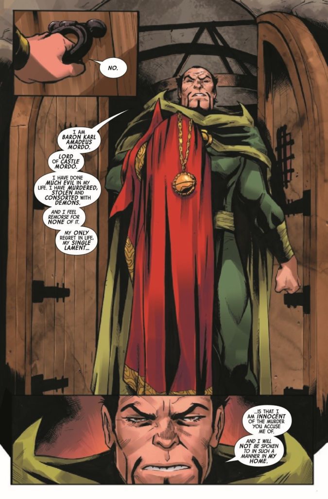
Mackay has been on a hot streak at Marvel, making a book like Black Cat a must-read. As we saw in the last issue, there was a confrontation with Baron Mordo. The conflict is resolved intelligently. However, Mackay doesn’t make things so obvious that the usual suspect is the killer; we have to work to find answers. The supporting cast is also written superbly. From Wong to Clea, even to Bats, every character serves a purpose and plays a part in this story.

ART

The pencils by Garbett work well with this issue. Garbett’s work is detailed but not overly so. As you can see in the image above, everything looks outstanding, and our eyes are drawn to what Garbett wants us to see. Garbett uses close-up panels that focus on character faces to effectively show readers the facial expressions of the major players in the issue. As Strange reveals how he was killed, Garbett has a tremendous and trippy panel layout that takes us through all the characters and why they are not suspects. These two pages allow Garbett to cover multiple threads in a short period while also making this a joy to view visually.

Just as crucial as the pencils laid down by Garbett are the colors by Fabela. For such a dark book, Fabela doesn’t use that dark of a color palette. Much of the book takes place in the Sanctum Santorum, and Fabela uses lighter gold colors that illuminate the page. As the story moves to Antarctica, colder blues signify the change in tone of the story. Fabela also does a fantastic job with the pages that focus on Strange revealing the killer. Vibrant pinks and greens draw your eye as you read the dialogue on the page.

The lettering by Petit is standard for the most part, but his best work is done on the pages that signify a chapter change. The lettering is stylized and reads like an old book from the library. These chapter changes are crucial to the story, and Petit does a phenomenal job on them.

CONCLUSION

The Death of Dr. Strange #4 is a fun read that builds on previous issues. As we inch closer to the conclusion, questions remain about how the perpetrator will be dealt with, but never doubt Dr. Strange. Death of Dr. Strange #4 is out now at a comic shop near you!

Monkeys Fighting Robots Youtube

Exclusive AfterShock Comics Preview: SEARCH FOR HU #5

Exclusive AfterShock Comics Preview: SEARCH FOR HU #5

SEARCH FOR HU #5 hits your local comic book shop on January 19, 2022, but thanks to AfterShock Comics, Monkeys Fighting Robots has an exclusive four-page preview for our readers.

The book is written by Steve Orlando & Jon Tsuei, with art by Rubine, DC Alonso drops the color, and you will read Carlos M. Mangual’s letter work. Rubine and DC Alonso created the cover.
About the issue:
Aaron Tse came to China to avenge family against family, diving into a generations-long feud that caught him and his parents in the crossfire. Now, on the other side of a blockbuster heist, Aaron’s dodged a bullet from an unexpected gun. And with a blood relative in his trunk, and the endgame on his mind, he races towards the true source of the hit on his mother and father. Fists up – it’s the final round!

Monkeys Fighting Robots Youtube

Marvel Comics Exclusive Preview: CAPTAIN AMERICA/IRON MAN #2

marvel comics exclusive preview captain america iron man

CAPTAIN AMERICA/IRON MAN #2 hits your local comic book store January 5th, but thanks to Marvel Comics, Monkeys Fighting Robots has an exclusive three-page preview for you.

About the issue:
Meet the PALADINS! When a group of eager new super heroes interrupts Cap and Iron Man’s hunt for escaped Hydra commander Veronica Eden, Steve and Tony struggle to determine whether the team is an asset or a liability. But they’ll need all the help they can get when Veronica makes a powerful new friend…

The issue is by writer Derek Landy and artist Angel Unzueta, with colors by Rachelle Rosenberg, and letters by Joe Caramagna. The main cover is by Alex Ross.

Check out the CAPTAIN AMERICA/IRON MAN #2 preview below:

Exclusive Preview: CAPTAIN AMERICA IRON MAN #2 (OF 5)

Exclusive Preview: CAPTAIN AMERICA IRON MAN #2 (OF 5)

Exclusive Preview: CAPTAIN AMERICA IRON MAN #2 (OF 5)

Exclusive Preview: CAPTAIN AMERICA IRON MAN #2 (OF 5)

Exclusive Preview: CAPTAIN AMERICA IRON MAN #2 (OF 5)


What Marvel characters do you want to see in a team-up series? Sound off in the comments!

Monkeys Fighting Robots Youtube

Review: Self-Destructive Fools in THE HUMAN TARGET #3

Human Target DC Comics King

There’s something so enticing about The Human Target. This series, from DC Comics, plunges you into the dark world of Christopher Chance. Chance, who works as “The Human Target,” is investigating the Justice League International. These characters, who all starred in 1987’s treasured run, seem bright, fun, and occasionally a little simple. But Chance isn’t fooled by any of it. He’s ahead of the curve, a force to be reckoned with. Yet still, beneath Chance’s own cool-headed façade, he can still be a self-destructive fool. Writer Tom King, artist Greg Smallwood, and letterer Clayton Cowles will play with your mind and heart in The Human Target #3. Because, after all, can’t we all be a little self-destructive?

About The Human Target #3 (from DC Comics)

Christopher Chance is a man on a deadline and working to solve a crime that might be unsolvable. Despite his better judgment, he’s falling for his lead suspect, and her violent ex-boyfriend isn’t happy about it. Oh, and that ex? He’s a Green Lantern.

Writing

Christopher Chance, the Human Target, is a professional. You can see it in the way he carries himself. You can hear it in the coolness with which King writes Chance’s thoughts. But Ice is cool too. And King shows us in this issue just how much she’s getting under Chance’s skin. In the opening to this issue, Chance gets visited by Ice’s “violent ex-boyfriend,” Guy Gardner. Gardner is everything that Chance isn’t. He’s a hot-headed, quick to judgment, “shoot first, ask questions later” kind of guy. He’s the kind of man who can make a mess of things when he puts his mind to it. So it’s funny that the next time we see Chance, he’s still got Ice tagging along with him. King clearly sets it up for us: Ice is trouble, whether that’s her fault or not. If Chance wants to solve this case before his impending demise, it’s best to shake her. But that’s exactly what King is saying. Chance can’t shake her. And the self-destructive voice in the back of his head – the auto-pilot voice that his conscious mind is railing against – is telling him that maybe he shouldn’t even try.

Human Target DC Comics King

Art & Coloring

When we first see Guy Gardner, he’s a huge presence. Smallwood shows Gardner from the chin down, as he grins a little. With this, Smallwood does two things. He makes Gardner feel very big on the page. And he creates a power dynamic between them. Gardner is above Chance. He’s looking down on him. Then, as the issue progresses, Smallwood puts Chance and Gardner on the same level. Sometimes, Smallwood even makes Gardner look small and weak on the page. He shows panels of Gardner standing far away, so that all his threats feel just a little less menacing. But that’s just one of the many ways Smallwood tells such a smooth story in the visuals of The Human Target. In fact, these pages feel like they’d be more at home in a pop-art gallery of a museum, than in a comic book.

Smallwood’s colors have a stunning depth to them. When Chance parks his car out in the street, on a late night, his headlights create a beautiful pattern across the panel. Smallwood’s incredible impressionist-style use of light is jaw-dropping. But he’s also playful with his coloring. When he creates a gag of Booster Gold running across the page, each panel a flashback to a recent time travel escapade, the colors are flat but bright. Smallwood drops all sense of realism in these panels to help this moment pop. It’s whimsical and funny. Even the return back to reality, in the bottom two panels of the page, feels like cause for a chuckle. Smallwood’s art and coloring, together, make for some of the most breathtaking work in comics. He’s on an entirely different playing field. His peers aren’t even legends like Kirby, Lee, or Ditko – they’re Warhol, Cezanne, and Turner.

Human Target DC Comics King

Lettering

The sound effects of this issue seamlessly blend with the art on each page. When Chance throws a punch at Gardner, and it’s blocked by a brick wall, the “THUD” noise almost seems to smash up against the wall too. The U and D get much thinner than the TH, brought to a stop by Chance’s fist making contact. But there’s so much more to Cowles’ lettering than the brilliant sound effects. For one thing, the placement of Chance’s captions tells us a lot about him as a character. On one page, he’s fighting with Gardner. His captions are all in the top left corner of every panel. But when the fight is over and Ice enters the scene, his captions sink to the bottom of the page. Cowles shows us how Chance seems to relax around Ice. He lets his guard down and settles. Cowles shows us that Chance isn’t the bitter bastard he wishes he was. He’s got a beating heart behind that rough exterior, and his thoughts are proof of that.


DC Comics’ The Human Target is delightful. You’d be hard-pressed to find a team that works together as brilliantly as Tom King, Greg Smallwood, and Clayton Cowles. With a smooth script, gorgeous pop-art style visuals, and a subtle rhythm to the lettering, what’s not to like? The Human Target #3 is just another example of this creative team’s unmatched brilliance. Pick it up, out from DC Comics December 28th, at a comic shop near you.

Monkeys Fighting Robots Youtube

Review: SWAMP THING: GREEN HELL #1 and the Fight to Survive

Swamp Thing

DC Comics’ Swamp Thing: Green Hell feels like it’s coming out at just the right time. It’s the story of the leftovers of humanity. A battle-worn group of people, on the brink of extinction. With Swamp Thing: Green Hell #1, writer Jeff Lemire, artist Doug Mahnke, colorist David Baron, and letterer Steve Wands, ask the question: “Is humanity – in all its destructive glory – really worth fighting for?”

The Premise of Swamp Thing: Green Hell #1 (from DC Comics):

The Earth is all but done. The last remnants of humanity cling to a mountaintop island lost in endless floodwater. The Parliaments of the Green, the Red, and the Rot all agree: it’s time to wipe the slate clean and start the cycle of life over again. And to do so, they’ve united their powers to summon an avatar—one of the most horrific monsters to ever stalk the surface of this forsaken planet. Against a creature like that, there can be no fighting back…unless you have a soldier who understands the enemy. Someone who has used its tactics before. Someone like Alec Holland.

Of course, it would help if Alec Holland hadn’t been dead for decades…

Writing

Lemire retreads some familiar territory with this series. We come back to a world of warring Parliaments, much like we saw in Lemire’s 2011 run on Animal Man. The Parliaments of Red, Rot, and Green, watch the slow extinction of mankind in impatient anticipation. And, honestly, it’s tempting at first to side with the Parliaments in this. The world Lemire puts forward is bleak and uncaring. But Lemire then sprinkles in characters with big hearts and sturdy senses of integrity. Characters that, Lemire shows us, have weathered all kinds of hardship and heartbreak. Yet they’re still here, fighting for what’s right. With this, Lemire connects to an audience that feels exhausted by our years in the pandemic. He places us in the story: an optimistic few who have managed to survive some of the worst the world could muster. And so, Lemire has created what seems like insurmountable odds in this story, but odds we’re truly invested in seeing the characters overcome.

Swamp Thing

Art

Mahnke’s art is terrifying. He gives the entire issue a feeling of foreboding. While there are small moments of brightness, of characters smiling and swapping jokes, it’s the evil things in this story that take up the most space on the page. When a group of armed bandits show up to the town, it’s there image at the bottom of the page that makes up the background of every panel. And when they beat a man in the center of town, the same thing is true. By placing these images in the backdrop and eliminating page gutters, Mahnke makes these violent moments feel inescapable and all-encompassing. It’s only at the end of the issue, after we’ve seen plenty of gore and carnage, that we see the good guy equivalent. Characters ask someone for help to fight off the evil that’s quickly spreading. When the character arrives, his moment of arrival acts as the backdrop of the page. He’s just as powerful, just as inescapable, as the threats they’re facing.

Coloring

Baron actually keeps to a relatively bright color palette throughout this issue. At times, it feels a little strange. Some moments are quite dark thematically, yet the characters are shown in vibrant flesh tones, wearing colorful clothing. But there’s something really interesting to this choice. For one thing, it’s quite disturbing. We see people ripped apart on a page that feels unsympathetic to their struggle. It’s the same coloring treatment you’d get for a big superhero battle. But it also means that the darker moments, the ones where Baron pulls back on in his coloring, really do stand out. When one character ominously sinks into the sea, or when our main character has a tough conversation with his daughter, these scenes mean something. It’s an unorthodox choice on Baron’s part, but it brilliantly highlights the emotional moments of this issue.

Swamp Thing

Lettering

Wands’ sound effects similarly almost seem to ignore the gravity of each moment. It has a disturbing and sadistic feel to it. When people are slaughtered, Wands shows the “SPLORT” noise of branches puncturing flesh in neon yellow. In fact, it’s actually once the carnage begins that Wands’ sound effects really come to life. Up until that point, his sound effects are quite subtle. We see the small “KRK” of someone’s nose breaking shown in red. We see the noise of a bell ringing in orange purple hues that blend in with the rest of the page. It’s when heads roll that Wands’ sound effects splatter across the page in sadistic joy. It works really well to make these scenes feel even more disturbing than they already are.


DC Comics’ Swamp Thing: Green Hell starts off with a no-holds-barred first issue. This creative team presents a bleak future and insurmountable odds, begging the question “Is humanity really worth all the trouble?” But somehow, in the midst of the blood, guts, and horror, they also manage to tease out a subtle optimism. In the end, we want these characters to beat this. Because if they can, maybe we can too. Pick up Swamp Thing: Green Hell #1, out from DC Comics December 28th, at a comic shop near you!

Monkeys Fighting Robots Youtube

AfterShock Comics Exclusive Preview: MY DATE WITH MONSTERS #3

aftershock comics exclusive preview my date with monsters

MY DATE WITH MONSTERS #3 hits your local comic book store January 19th, but thanks to AfterShock Comics, Monkeys Fighting Robots has an exclusive four-page preview for you.

About the issue:
Machi is being strangled. Croak meets a fox woman. Risa goes on a string of terrible dates, and Genka finally manages to have a good idea. Meanwhile, all the horrors of the world of nightmares are creeping closer, more than a few people are going to die and someone’s going to end up bald, but, hey: at least there’s a dog.

The series is by writer Paul Tobin and artist Andy MacDonald, with colors by DJ Chavis, and letters by Taylor Esposito. The main cover is by MacDonald and Chavis.

Check out the MY DATE WITH MONSTERS #3 preview below:

aftershock comics exclusive preview my date with monsters

aftershock comics exclusive preview my date with monsters

aftershock comics exclusive preview my date with monsters

aftershock comics exclusive preview my date with monsters

aftershock comics exclusive preview my date with monsters

aftershock comics exclusive preview my date with monsters


Are you reading MY DATE WITH MONSTERS? Sound off in the comments!

Monkeys Fighting Robots Youtube

Marvel Comics Exclusive Preview: AMAZING SPIDER-MAN #83

marvel comics exclusive preview amazing spider-man

AMAZING SPIDER-MAN #83 hits your local comic book store December 29th, but thanks to Marvel Comics, Monkeys Fighting Robots has an exclusive four-page preview for you.

About the issue:
The creator behind the biggest cover in the last decade is going to show you what he can do with one of the biggest Spider-Moments in decades, as Patrick Gleason writes and draws this issue. The Web-Head is facing unbeatable odds again. Can he rise to the occasion and save the day?

The issue is by writer/artist Patrick Gleason, with colors by Morry Hollowell & Nathan Fairbairn, and letters by Chris Eliopoulos & Joe Caramagna. The main cover is by Arthur Adams and Romulo Fajardo Jr.

Check out the AMAZING SPIDER-MAN #83 preview below:

marvel comics exclusive preview amazing spider-man

marvel comics exclusive preview amazing spider-man

marvel comics exclusive preview amazing spider-man

marvel comics exclusive preview amazing spider-man

marvel comics exclusive preview amazing spider-man

marvel comics exclusive preview amazing spider-man


Have you seen SPIDER-MAN: NO WAY HOME yet? Sound off in the comments! And check out our reaction to the film here!

Monkeys Fighting Robots Youtube

Review: Maggots, Sharks, And Snake Gods In KING CONAN #1

Writer Jason Aaron (Conan The Barbarian, Scalped) and artist Mahmud Asrar (X-Men) return to the Hyborian Age to tell tales of a Cimmerian with a crown in King Conan #1. With Matt Wilson on colors and Travis Lanham on letters, this opening chapter is full of the exact kind of thundering action and blood sport one would expect from a Conan story. With a fun, fitting script and stellar visuals, this is a great start to this follow-up series and a solid addition to the legacy of Conan tales as a whole.

“CONAN’S LAST STAND AT THE EDGE OF THE WORLD! Jason Aaron and Mahmud Asrar return to the saga of CONAN in an all-new adventure that takes the story of the Cimmerian further than has ever been revealed in ANY media to date! As Robert E. Howard posited, when King Conan grows restless on the throne, he sails west, toward land and adventure unknown. Now see the first step of King Conan’s fateful journey from Aquilonia, as an old and terrible danger threatens to end the saga of the Cimmerian once and for all!”

Writing & Plot

As with his prior 2019 series, Jason Aaron pens a fitting script for this well-trodden world in King Conan #1. His scripting is full of the grandiose narration and dialogue used in all the tales of the Hyborian Age. Aaron’s first chapter here is a simple retread of what many Conan tales are like. This time there is the wrinkle of his now being the King of Aquilonia, and the responsibilities he is escaping. Much like in Howard’s original writings, Conan’s hardened exterior hides the complexities of his character. For a long time Conan reader, watching the legendary Cimmerian develop into a man who struggles with the weight of massive responsibility is cathartic. Don’t let this fool you though, this is a sword-swinging barbarian tale through and through.

Aaron’s careful pacing makes the most of this comic’s 22-page length with some solid action, revealing flashbacks, and a great cliffhanger. Even with the reintroduction of a classic Conan foe, this comic isn’t going to blow your mind if you’re a long-time Conan fan. However it’s still a a great start to this mini-series.

Art Direction

There is a strong argument to be made for Mahmud Asrar being the premier contemporary Conan artist, and King Conan #1 builds more of that case. The X-Men artist’s truly epic framing and visual style makes every panel look like a piece of mythic tapestry. His heavy inks and thick pencils capture detail and atmosphere in this comic’s desolate environment. Asrar’s take on this older, graying Conan  posits him as every bit the cunning and eager warrior he always has been, albeit a bit wiser. The aging Cimmerian is captured here at his most regretful and contemplative. He reflects on the choices he’s made that have led him to the throne – and this cursed island. Asrar draws Conan with the needed complexity across multiple flashbacks and in the quiet moments in the current plot.

Unsurprisingly, he also still draws some kickass fight scenes. Conan has scarcely looked more fearsome than when drawn by Asrar. The kinetic power that the Cimmerian is drawn with matches some of the best Conan artists in the character’s history.

Matt Wilson’s colors in this book perfectly fit the vision crafted by Asrar. The rich, dark tones used on characters and the foreboding island lend a sense of timeless myth to the story. Natural tones clash with the dark-magic and supernatural purples and misty greens that arrive with Conan’s nemesis.  Conan’s chiseled, scarred appearance is on par with that the best of the color interpretations done by colorists past. Travis Lanham’s lettering is sharp and easy to follow, with a classical font on the narration for that “scroll” effect. This is a stellar looking comic that’s visually on par with many other great Conan books.

Verdict

King Conan #1 is a wholly entertaining opening chapter to this addition to the Conan mythos. Jason Aaron’s script keeps Robert E. Howard’s vision intact while still crafting a story in his own style. The visuals from Mahmud Asrar and Matt Wilson are deep and full of energy, bringing more complexity to the story. Be sure to pick up this #1 when it hits shelves on 12-22!


Monkeys Fighting Robots Youtube

Review: X-O MANOWAR #9 -The Thematic Conclusion

X-O Manowar #9 Cover

X-O Manowar #9, which came out on December 15th, concludes an enjoyable Valiant Entertainment run by celebrating the connections these characters have made.

Background

After X-O Manowar finally manages to settle in as a superhero, his advisor Troy Whitaker takes it all away. How? By using his battle suit’s AI to help take over New York.

X-O Manowar #9: Communicate Don’t Dominate

Dennis Hopeless writes an entertaining story built on the shoulders of every issue before it. It’s always enjoyable for characters like X-O Manowar to look heroic, as a source of inspiration. Everyone Aric has helped comes to his and Shanhara’s aid against Troy, a character who readers love to hate for deceiving their hero. It’s a classic clash of ideologies wrapping up in a manner that makes readers feel good.

Standing Out Amongst Progress

X-O Manowar #9 page
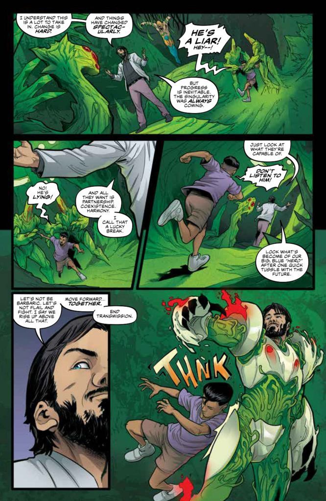
The art of X-O Manowar #9 continues to be a visual delight for readers. Ruth Redmond makes the dominating green hues of Troy’s technological singularity very eye-catching. Just about every character looks helpless before it. Thankfully, the body language from Emilio Laiso’s pencils and Raffaele Forte’s outlines make major characters stand out for a fighting chance. That’s not even including how Hassan Otsmane-Elhaou’s word balloons match the emotional state of every word spoken. Plus it is interesting to see the way the singularity speaks through echoing captions.Unique perspective

X-O Manowar #9: A Good Ending

This run concludes with a pretty good ending. It really shows off X-O Manowar as a superhero who can inspire people. Enough to make the characters from prior issues stand out among an otherworldly presence. X-O Manowar #9 is out now, from Valiant Entertainment, at a comic shop near you!

Monkeys Fighting Robots Youtube

Review: DEFENDERS #4 — New Ideas Form The Backbone Of Everything

Defenders #4 Cover

Defenders #4 is out December 15th, and serves as the most attention-gripping issue of this remarkable Marvel mini-series. Why? Because it delves into the very essence of comic books in terms of ideas and art. Mainstream superhero comics have a reputation of resisting change; but maybe looking at how this issue deconstructs the central elements of the Marvel Universe can inspire new ideas.

Background

The ragtag group of Defenders are chasing rogue scientist Cario Zota through previous Marvel multiverses. After a close encounter with primordial magic, they come upon a bizarre world.

Defenders #4 On Comic Patterns

Writer Al Ewing has a lot to say about comic books in this issue. Through the POV character, Cloud, readers witness comics’ foundations in the Fourth Cosmos. There’s something so appealing about experiencing the abstract caricatures that represent modern Marvels. These archetypes comment on the central ideas surrounding Marvel’s most popular characters and how they interact in the main Marvel universe. Co-plotter Javier Rodriguez makes this extremely relevant with a spread that evokes similarities to Marvel’s Civil War promotional material. For all of the eye-catching character designs, they feel secondary to the nostalgic tone that Rodriguez is creating. Which goes into a Defenders #4 theme about patterns and how they can limit expression.

POV character Cloud in their glory
Cloud of the Defenders

Cloud’s character development via pattern recognition serves as a highlight. After many issues of just being a background element, this underutilized character finds a way to express themselves. Cloud shifting their appearance into a new form feels hopeful; the way they interact with the Fourth Cosmos feels like inspiration, enlightenment, and a coming out moment all at once.

Art’s Not Just Patterns

Defenders #4 abstracts
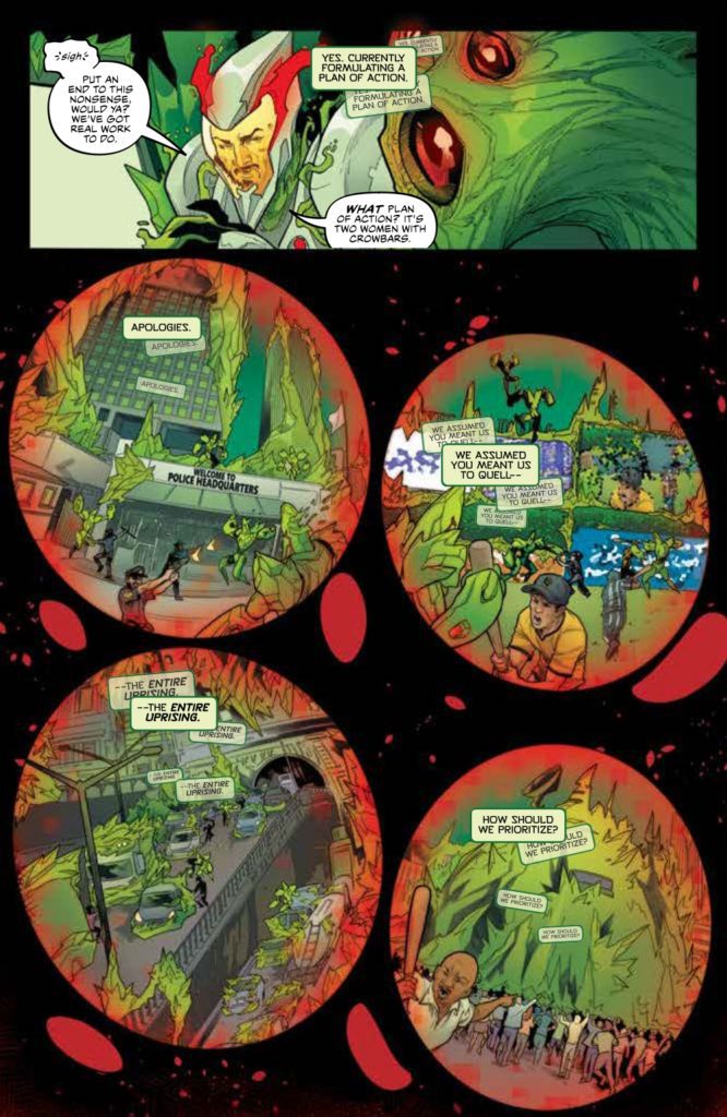
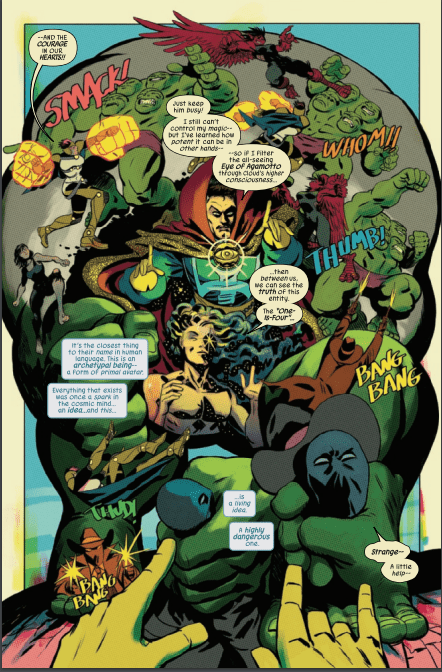
Rodriguez’s larger-than-life art is so complex it’s mesmerizing. The way most of Defenders #4 has a pale yellow background evokes the nostalgia of aged comic books. There are also instances where panel layouts get so abstract, it feels like perspectives are warping. Take for example the Defenders fight against the Hulk Archetype “One-Is-Four.” The reader gets a genuine feeling of how much of an immovable wall he is with how characters transition across the page. Readers could be so used to reading comics a certain way that instances like this inspire the idea of The Fine Art of Comics.

Joe Caramagna’s lettering also assists in this surreal setting. The way “Four-As-One” speaks in colors adds a sense of minimalism. Even as the archetypes start speaking in full words, the multiple colored words showcase the archetypes’ inability to speak in full sentences. The simpler fragments they utter make them feel primitively alien.

Defenders #4 Goes Beyond Perspective

Defenders #4 is so far the best issue of this entire mini-series. After so many developments, this issue’s absurd art doesn’t just keep attention, it gives new perspectives. Readers are guaranteed to walk away with more of an appreciation for the craft of comic books. This awe-inspiring story is perfect for readers who feel like they’re experiencing superhero burnout.

Monkeys Fighting Robots Youtube