Home Blog Page 11

Review: ABSOLUTE POWER: GROUND ZERO #1 – Setting The Stage

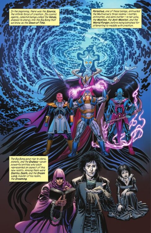
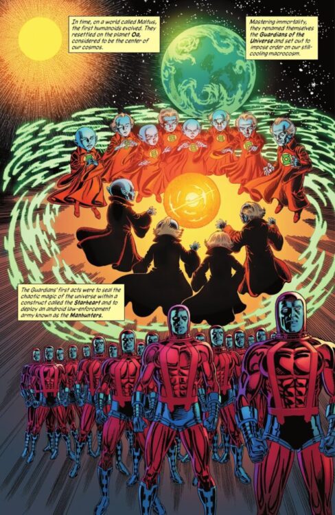
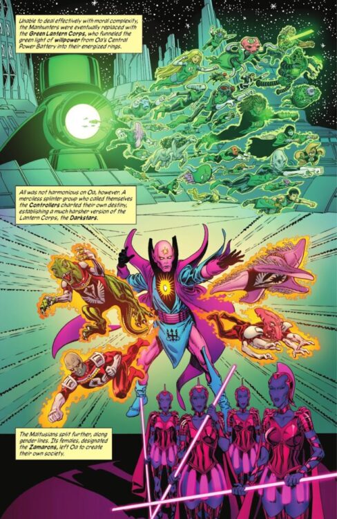
Absolute Power: Ground Zero #1 is an anthology one-shot from DC Comics written by Mark Waid, Nicole Maines, Chip Zdarsky, and Joshua Williamson, and lettered by Steve Wands. The issue is drawn by Skylar Patridge, V Ken Marion, and Gleb Melnikov, with colors from Patricio Delpeche and Melnikov.

The issue features three stories, the first of which follows Dreamer and the Suicide Squad hunting down Jay Nakamura for Amanda Waller. It’s unsure why Waller wants Jay, but she says that she has a way to leverage him. Dreamer is obviously reluctant in doing this as she’s being blackmailed herself, and wants to take Waller down. The second story features Waller capturing John Starr, the Time Commander, and using him to rebuild something that she needs to fully enact her plans. The third story features Waller conditioning the new Brainiac Queen in order for her to utilize her properly in the coming days. All three stories feature Waller getting ready for her big final play, leading into DC’s big summer event, Absolute Power.

Amanda Waller briefs Dreamer

WRITING

The first story is written by Maines and Waid, and it picks up after the ending of Suicide Squad: Dream Team, with Dreamer plotting on how to take down Waller. Having portrayed Nia Nal in the live action DC TV shows, it’s clear that Maines has a strong voice for the character. What really shines in this story is how Maines highlights Nia’s reluctance to work with Waller. She shows how Dreamer is only doing this because Waller is holding Nia’s family hostage, and how she hates her. It’s the point in the issue where the stakes feel the highest because of that.

Waid and Maines write a ruthless Waller, but not a reckless one. She’s cold and methodical, using whatever she can to push her own agenda forward. Dreamer is the best character they could’ve put in this position. She’s still fairly new to the page, and so she’s without that baggage and history that most of the other characters in this universe have. This story helps in strengthening her personality and really gets you invested in her through that.

The second story is written by Waid and Zdarsky, and they dive into what Zdarsky had written in recent issues of Batman. The small problem is that Batman provided a satisfying enough ending already to the “Failsafe” storyline. To return to that here makes you wonder why. The goal of the story is to undo the destruction of Failsafe, but in doing so, it cheapens the conclusion Zdarsky had already written for the characters in the pages of Batman.

They use Time Commander as a narrator, and the strength in that is the same as the first story’s strength. John Starr isn’t a new character, but he’s been away long enough for his perspective to feel new and fresh. He’s as confused as we are, and something that all three writers do here is use a character the reader may not know much about in order to tell us as little of what Waller is planning as possible. They notice that she keeps things secret, but they don’t know what. They also know their place, so they’re too scared to push it. We know only what Zdarsky and Waid want us to.

The final story comes from Williamson alone, and it’s the strongest in showing the lengths Waller would go to in order to enact her plans. Williamson writes a more emotional Waller, but it’s unclear whether that’s all part of her act or not. The story keeps you guessing, but provides a meaningful and surprisingly emotionally charged explanation as to why the Brainiac Queen joins Waller. Williamson finishes the story with all of the pieces ready to go now in the main event, and it ends on a note that makes the reader want to see what comes next.

Jay Nakamura on the run

ART

Starting with Patridge’s work on the first story, she comes out of the gate swinging. Not only does she immediately capture the tone of the story through facial expressions and hasty actions, but she also adds more of an emotional core to the story. You can see how Dreamer is horrified by what Waller wants to do, but she plays along. You can see the horror and determination in Jay’s face as he runs from Waller’s people. It’s all there. There’s this one great panel (seen above) where Jay is running, but the background behind him turns into the image of his mother being thrown out of a window. The glass shards turn into him as he continues to run. Attention to detail is key here, and what we have really amplifies the stakes.

Next is art from Marion in the second story. His work is incredibly detailed and expressive here, specifically the action. There’s a page that shows a flashback of a fight between Batman and Failsafe. The implied motion of it is really strong and shows both characters putting their all into their respective blows. Another example of really great detail is when we’re shown the inside of the robot while it’s hooked up to a separate machine. Every last detail and part of the machine is shown, making it feel less hollow later when shown in full force. The art here just really added a great perspective to the characters.

Finally, there’s Melnikov. Having drawn Superman before, nothing feels out of place. He’s already gotten his feel for the character and his supporting cast down, and uses that well here in showing them and Metropolis. This story is from the perspective of Waller in an artificial world, but with the Brainiac Queen around, there’s a very innocent feeling attached to it. The art makes you feel like you’re at home where you’re supposed to be, it makes you comfortable. When returned to the real world, the art and feel once again becomes cold and strategic. It’s a well done shift.

Jay Nakamura in Waller's sights
Jay Nakamura in Waller’s sights

COLORS

The colors in the first two stories are both done by Depelche. He uses lighting and shading to hide advantage in both stories. In the first, Jay is shown fully lit up most of the time with Nia always covered in a light shadow, showing that she’s unhappy with what she has to do. The issue starts with Waller’s back turned to the reader, fully shaded as though she’s a silhouette. This immediately introduces us to her as the person we know the least about. The only time Jay is really covered is when Waller initially captures him and right before Dreamer leaves his cell.

In the second story, purple is one of the main colors showcased. A purple glowing hourglass is the main power source for Starr’s powers, and so everyone has to be constantly shaded in the glow of it. It’s done well, but it mostly only appears when John is by himself. Anywhere else the colors feel cold and foreign, especially when around Waller’s people. Something interesting though is that the purple also returns when Starr is with Waller, especially after she gets what she wants. It’s not out of his control, and it fills the room.

Melnikov takes over on colors for the third story that he draws himself, and most of what was said about his art applies here too. It feels very warm and inviting, only drastically shifting to a more menacing and dramatic set of colors when Superman arrives. Waller is creating this experience, so doing this helps to present him as an enemy. His head is shaded with only the red of his heat vision showing. From the perspective of Waller and the Brainiac Queen, he’s this evil enemy sent to bring nothing but pain and suffering.

LETTERS

The lettering is all done by Wands. The introductions to each story really stood out as interesting here. They show up as calculated and mechanical, showing that each story in this one-shot is simply just a means to an end for Waller. It’s what she needs to do to prepare. The text boxes are well placed and never distract from any of what we’re seeing, which is especially noticeable in the second story. The purple of John’s bubbles blend into his powers, and are placed along the glow of them as it’s shown in action.

In the final story, The letters for Failsafe are back and his text boxes are different from how they usually are. Still mechanical, but they now feel more sinister. The boxes are connected through these static lines, and there are spiked breaks in the boxes that help to imagine the cold and technical voice coming from him. Interestingly, Brainiac Queen has normal bubbles. She’s not all machine; she’s what Waller helped mold her into. She’s a reflection of that, and wouldn’t be shown speaking as a robot, but as a person. it’s a great contrast.

CONCLUSION

Absolute Power: Ground Zero #1 gives us some insight to where the story will go, and does a good job of getting us ready for the event. The teams on this issue show very meticulously what the powers in play are, even if it does go back on previous stories in order to do that. This is a very Waller-centric issue, and can only mean that what to expect going forward is a Waller-centered event. It’s time for her plan to be enacted, and she’s going to enjoy it.

Monkeys Fighting Robots Youtube

Marvel Comics Exclusive Preview: THE SPECTACULAR SPIDER-MEN #4

marvel comics exclusive preview spectacular spider-men peter parker miles morales spider-man

SPECTACULAR SPIDER-MEN #4 hits your local comic book store on June 26th, but thanks to Marvel Comics, Monkeys Fighting Robots has an exclusive three-page preview for you!

About the issue:
The world comes crashing down around Peter and Miles. Someone has just ticked off the wrong Spider-Men. The gloves have come off, and people are going to get hurt.

The issue is by writer Greg Weisman and artist Humberto Ramos, with inks by Victor Olazaba, colors by Edgar Delgado, and letters by Joe Caramagna. The main cover is by Ramos and Delgado.

Check out our SPECTACULAR SPIDER-MEN #4 preview below:

marvel comics exclusive preview spectacular spider-men peter parker miles morales spider-man

marvel comics exclusive preview spectacular spider-men peter parker miles morales spider-man

marvel comics exclusive preview spectacular spider-men peter parker miles morales spider-man

marvel comics exclusive preview spectacular spider-men peter parker miles morales spider-man

marvel comics exclusive preview spectacular spider-men peter parker miles morales spider-man


Are you reading SPECTACULAR SPIDER-MEN? Sound off in the comments!

Monkeys Fighting Robots Youtube

Comixology Originals Exclusive Preview: COLD HARD CASH #5

comixology originals exclusive preview cold hard cash comics

COLD HARD CASH #5 hits the internet June 25th, but thanks to Comixology Originals, Monkeys Fighting Robots has an exclusive five-page preview for you.

About the issue:
Martha and her colleagues are on the brink of discovering the stolen funds if they can only survive the final confrontation and walk away with the money… and their lives!

The series is by writer Gary Phillips and artist Adriana Melo, with colors by John Kalisz, and letters by Tom Napolitano.

Issue #5 is the conclusion to COLD HARD CASH, which itself is a spinoff of Phillips’ crime novels High Hand and Shooter’s Point.

Check out the COLD HARD CASH #5 preview below:

comixology originals exclusive preview cold hard cash comics

comixology originals exclusive preview cold hard cash comics

comixology originals exclusive preview cold hard cash comics

comixology originals exclusive preview cold hard cash comics

comixology originals exclusive preview cold hard cash comics

comixology originals exclusive preview cold hard cash comics

comixology originals exclusive preview cold hard cash comics


Are you reading COLD HARD CASH on Comixology? Sound off in the comments!

Monkeys Fighting Robots Youtube

Dark Horse Exclusive: LESTER OF THE LESSER GODS #2 Preview, and Preorder the Hardcover Today!

dark horse comics exclusive lesser of the lesser gods eric powell lucky yates gideon kendall

Eric Powell, Lucky Yates, and Gideon Kendall’s Lester of the Lesser Gods hardcover is available for preorder today, and thanks to Dark Horse Comics, Monkeys Fighting Robots has your exclusive first-look at the collection’s new cover, as well as a five-page preview of the upcoming issue #2!

About the series:
Eric Powell (The Goon) and comedian and voice actor Lucky Yates (Archer) combine twisted comedic talents to bring you Lester of the Lesser Gods. Originally created as an unproduced animated short by Powell a decade ago, the concept was revived when the two writers were looking for a comic project to work on.

Lester, the larping bastard son of the Odin, wanders the post-apocalyptic wasteland after thwarting Satan’s attempt to bring about the end of days. But can this hero of the downtrodden survive the battle arena of Will Frye the Technomancer Guy?

Lesser of the Lesser Gods is currently coming out through Dark Horse Comics; issue #2 releases this month on June 26th, with the series finale slated for August 7th. The hardcover collection will include all three issues of Lesser of the Lesser Gods, as well as the original one-shot, a sketchbook section, and a cover gallery.

Check out Powell’s new cover for the LESTER OF THE LESSER GODS collection right here:

dark horse exclusive lester of the lesser gods eric powell lucky yates

And read on for the first 5 pages of LESTER OF THE LESSER GODS #2 below:

About issue #2:
This episode… SIDE QUEST! Lester and his battle companion, Kathy Stroyer, are pulled away from their assault on the empire of Will Frye the Technomancer Guy to raid a mountain fortress where their automaton pal, Duck Bot, is held captive.

dark horse exclusive lester of the lesser gods eric powell lucky yates

dark horse exclusive lester of the lesser gods eric powell lucky yates

dark horse exclusive lester of the lesser gods eric powell lucky yates

dark horse exclusive lester of the lesser gods eric powell lucky yates

dark horse exclusive lester of the lesser gods eric powell lucky yates


Are you reading Lester of the Lesser Gods from Dark Horse? Sound off in the comments!

Monkeys Fighting Robots Youtube

Review: DESTRO #1 – Welcome to the Arms Race

From writer Dan Watters (Lucifer, Cowboy Bebop: Supernova Swing) and artist Andrei Bressan (Dark Ride) comes a fantastic refresh of a fan-favorite G.I. Joe character with Destro #1. Featuring colors by Adriano Lucas and lettering from Rus Wooton, this opening issue fires a salvo of action, intrigue, and pure comic-book goodness to make one of the best debuts of Skybound’s new Energon Universe.

“James McCullen Destro XXIV is the man behind M.A.R.S. Industries, the undisputed leader in providing high-tech weapons to world powers…for the right price.
But the emergence of Energon has changed everything.
As Destro’s ambitions grow, the “Crimson Twins” Tomax and Xamot Paoli emerge to destroy their competition, and Cobra Commander realizes his current ally could be his future greatest enemy.”

Writing & Plot

Dan Watters is the latest writer to be tasked with giving a classic G.I. Joe character a fresh start for Image/Skybound’s new iteration of this universe, and he comes out swinging with Destro #1. The steel masked head of the Military Armaments Research Syndicate (M.A.R.S) makes his first appearance in the Energon Universe by testing out his new battalion of Energon powered robot-soldiers, using them to overthrow a despotic government. As a result, some of his rival weapons dealers – and the sole energon supplier himself, Cobra Commander – start to understand how much of a threat Destro may be. Watters pens a debut chapter that is as fun as it is fascinating. Destro’s appeals to his ancestors juxtaposes against his machinations against Cobra Commander and his other weapons dealer rivals, and it makes him a blast to read about. Watters’ dialogue is punchy and memorable, mixing realistic speech with Hollywood-esque flair. Every major supporting character in this issue is memorable, as they are all given unique personalities and stellar writing to make them and this new world of G.I. Joe feel like an established place. In terms of scripting, this is a phenomenal first issue that makes the wait for chapter 2 a painful one.

Art Direction

One of the best parts about the Energon Universe so far is how different each comic’s visual style has been, and Andrei Bressan creates one of the best so far with his work in Destro #1. His eyes for character detail and action choreography make for a phenomenal looking book. Bressan’s inks and distinct penciling approach make for a comic that feels timeless in a way, like a direct continuation of the old Marvel-era Joe comics, but with a modern style. Almost every page in this issue is memorable, due to both Watters’ plotting and especially Bressan’s panel and art direction. Adriano Lucas’s color art fills in the visual experience with an approach that goes perfectly hand in hand with the pencils. He veers towards a saturated palette that, when combined with Bressan’s inks, gives every panel an extra sense of dimension and texture. The action especially comes alive with their approach, a explosions and debris feel like they rain down over the entire page. Rus Wooton’s lettering finishes off the reading experience with a reflexive font that captures the tone of the dialogue, and SFX work that works like an accent to the action while still being very comic-book-y. Destro is an outstanding looking comic in terms of visual direction.

Verdict

Destro #1 is a fantastic opening issue for this new take on one of G.I. Joe’s best characters. Dan Watters’s script is witty and punchy, making every character memorable while setting up a compelling conflict for the coming chapters. The art work from Andrei Bressan and Adriano Lucas is perfectly directed and visually unique, enough to make this one of the best looking comics in Skybound’s Energon Universe thus far. Be sure to grab this issue when it hits shelves on June 19th!


Monkeys Fighting Robots Youtube

Marvel Comics Exclusive Preview: SENSATIONAL SHE-HULK #9

marvel comics exclusive preview sensational she hulk

SENSATIONAL SHE-HULK #9 hits your local comic book store on June 19th, but thanks to Marvel Comics, Monkeys Fighting Robots has an exclusive three-page preview for you!

About the issue:
The most explosive SHE-HULK story in HISTORY starts here! Something is brewing that is going to have effects felt beyond just SENSATIONAL SHE-HULK. You cannot afford to miss it!

The issue is by writer Rainbow Rowell and artist Andrés Genolet, with colors by Dee Cunniffe, and letters by Joe Caramagna. The main cover is by Genolet and Romulo Fajardo Jr.

Check out our SENSATIONAL SHE-HULK #9 preview below:

marvel comics exclusive preview sensational she hulk

marvel comics exclusive preview sensational she hulk

marvel comics exclusive preview sensational she hulk

marvel comics exclusive preview sensational she hulk

marvel comics exclusive preview sensational she hulk


Are you reading SENSATIONAL SHE-HULK? Sound off in the comments!

Monkeys Fighting Robots Youtube

Review: SARU NO WAKUSEI — “Planet of the Apes” Adaptation At Its Best
Cover Art for Saru no Wakusei - 1971

It’s very difficult to be on the ball in the comic review game—to be up to the minute, or even ahead of the curve. Most comics are sent out to review in the same week that they are published and, for a lot of people, if you don’t have the book on order, you have to get to the shop on the day of release or miss it forever. That means waiting for the reviews to come out, to see what people are saying about a specific comic, will mean that it may be too late to pick up the ones that are getting the good reviews.

I know what I like, and I have certain titles that I will look out for, in Previews or publisher announcements—certain comics that I know I’m going to buy long before they come out so that I can make sure I get them on a pre-order. There aren’t many, but I know them when I see them. Dick Tracy from Mad Cave comics was one such title. And pretty much anything with Planet of the Apes in the title. Unfortunately, I missed out on Saru no Wakusei (the first Japanese adaptation of Planet of the Apes written by Kuroda Minoru) on account of not being born yet when it released in 1971. Luckily for me, after many years of hearing about, and seeing glimpses of artwork, Hunter’s Planet of the Apes Archives have recently made a full PDF available for download. And to say I was excited, is an understatement.

A vast Ape City

A small confession to start with, but one that’s important to this review: I can’t read Japanese. You would think that should be instrumental to the review of a Japanese comic and, in a way, I would agree. However, I am not aware that any English translation exists for Saru no Wakusei, and this allows me to ignore one aspect of adaptation that can prove to be a contentious point. Often, with adaptations, an audience can become fixated on the fidelity of script, of the actual speech within any given text. You can see this in Zack Snyder’s Watchmen where lines from the comic are spoken almost word for word in the movie, or in Marvel’s adaptation of Blade Runner, where the incessant voiceover from the film is placed into caption boxes throughout the pages of the comic. This obsession with accuracy highlights the limitations of one medium, and/or shines a light on the problems of one of the versions. To expand on the two examples given: the Watchmen movie demonstrates how the spoken word has different uses in comics than it does on film, thus repeating the comics script seems ungainly and awkward coming out of the actors’ mouths. In a film when character A bursts through a door and punches character B in the face, character B falls to the floor and says “ you punched me in the face,” the line is superfluous, unless you are going for a comedic angle. In a comic, one panel can have character A bursting through the door and panel be can have character B on the floor, speaking the same line. This time, the line acts as information, telling the reader what just happened without the need for a string of action panels. Also the line becomes less cheesy and lacks the comedic element it would on film because the audience reads it as information and therefore gives it a different tone.

The second example, Blade Runner, illustrates how cumbersome and intrusive the voiceover is in the movie. The comic book adaptation works beautifully, with the rolling inner monologue adding to the reading experience; even Harrison Ford hated the voiceover in the film. Which is why you should always watch the director’s cut.

But back to Planet of the Apes: Without needing to worry about looking for those famous lines represented within the pages of the comic, I can instead focus on the artwork and the layouts of the book, which is the real reason I’ve always wanted to read it. I know the story, I’ve seen the film hundreds of times, read the original novel a handful of times, and read the various adaptations from different publishers over the years. My interest here is the visual difference between the 1971 Japanese version and those that I am already familiar with.

Gorilla violence in the pages of Saru no Wakusei

The first thing that is noticeable is the cartoon style of the characters. They are more simplistic than, for example, the Marvel Comics interpretations in 1974, which could be classed as more realistic in representation. Saru no Wakusei demonstrates the reductive quality of the comics medium, proving that less can sometimes be more. There is a character guide in the first few pages which compares photo images of the characters from the movie with the drawn characters in the comic. This makes it easy from the start to see who are the main characters, but it’s not needed. It’s more of a presentation feature than a true guide. Following the story through, it’s easy to see who is who and, if you want to match them to the film, even without speech you know which ape is Zira and which is Zaius.

As stated, the characters are simplified, which allows for more panels on a page, or larger populated panels that aren’t too busy. There is also a lack of backgrounds, focusing instead on the characters, their actions and reactions. Marvel’s Planet of the Apes is highly detailed with quite complex settings; Saru no Wausei uses establishing panels at the start of a sequence to set the scene and then drops the backgrounds. This style is more often seen in earlier Western comics or cartoon based comics, such as children’s anthologies and the underground comix of the 1960s. This style is still very popular in modern manga and is one of the major differences between eastern and western comics.

Despite the characters being simplified, they still have a lot of life in them, as is illustrated when the Icarus crashes near the beginning of the comic. Throughout the sequence, the characters express shock at finding their crew mates dead, surprise as water bursts into the cabin, urgency in their attempt to escape, and are mournful for the loss of their ship and colleagues. All of this comes through the art work, the emotive facial drawings and the clever mix of close up and medium view panels.

The brutality of Saru no Wakusei demonstrated

The narrative follows the same structure as the original movie, however some scenes in this adaptation are extended to include longer, more drawn out fight sequences. The human space travelers especially put up a more of a fight than in the movie. When Taylor and the other astronauts run from the hunting gorillas, they just run in the movie, attempting to escape the unbelievable situation they have found themselves in. In Saru no Wakusei, they turn and fight the gorillas, standing up to them, at first in defiance and then in desperation. In turn, the gorillas are much more sadistic in their approach to the hunt. We see glimpses of pride and enjoyment in the movie, with the apes taking photos of each other with their human trophies, but again Saru no Wakusei is more violent, more brutal. The gorillas turn the hunt and their prey into a mindless sport. They allow the humans to run for their lives, two at a time and then gun them down before they can escape. They cheer and celebrate the brutality but are mortified when the violence is turned against them.

In this sequence, the creators are highlighting a much deeper difference between the astronauts and the apes on this new world. Where the original touched on elements of physical difference and racism, this Japanese translation extends the comparison to internal beliefs and actions. The apes don’t just look different but have a different philosophy and moral judgment to the humans. This is demonstrated later on in the comic when the apes scientists are shown to be experimenting on the humans—not just studying them like in the movie, but experimenting with their physiology, and grafting parts of the humans together to create monstrosities.

One of the major differences between the manga and the film, at least in the visuals, is how violent Saru no Wakusei is. The treatment of the humans by the gorillas is one thing, but the visual effects following the hunt are disturbing, with corpses left to rot in the beautiful landscape. In the labs, a monstrous creature literally tears itself apart, and a table is covered in the remains of a human body, dissected and tinkered with. And poor Taylor is constantly being violently hit on the head with a club. The fact he doesn’t suffer from some permanent brain damage is a miracle.

The highlights of this comic are the beautiful vistas that fill half pages, full pages, and even double page spreads. Although much of the comic features characters only in the panels, when the settings are used, they are outstanding. Ape City is a massive, tall, and imposing city, not the collection of small dwellings as seen in the film. It is befitting of the term city. When Taylor is put on trial, there are some amazing courtroom images, with hundreds of ape faces staring out of the page or, in one outstanding double page spread, the circle of apes stare inwards towards an ominous looking stone pulpit in the center of the image where the human Taylor is being led. The sense of scale really grabs you as you realize the size of this city and the vast number of inhabitants. The film uses long sequences of places, each populated with a few apes, to give the sense of size, but in this comic the true scale of the city can be expressed in a single, awe inspiring image.

An example of the superb crowd scenes in the comic

At over two hundred and fifty pages, Saru no Wakusei is a fascinating adaptation of the American Planet of the Apes movie. It has some oddities, such as the inking changing color from black to red or blue for large sections, mostly in chapters 2 and 3. There are also the occasional still images from the movie inserted into a panel to replace the drawing that you would expect. There doesn’t appear to be any pattern to these inclusions and they are few and far between, but they do leap out when you get to them. The visuals in this comic are amazing and it is definitely worth looking at, even if, like me, you can’t read the text. A general knowledge of the movie will allow you to navigate the many pages but, in all honesty, the spectacular artwork and page layouts make up for any lack of understanding of the language. That said, I would love to get my hands on a translated version to read the script and see how it differs from the western versions that have appeared over time.

Photo images were mixed with traditional drawings

It may seem odd to recommend a Japanese comic that is over 40 years old, but Saru no Wakusei is visually beautiful, often harrowing, and a fascinating comparison to existing Planet of the Apes adaptations. If you are a fan of Planet of the Apes, then it is a must see and you need to get over the Hunter’s Planet of the Apes Archives and check it out. And while you are there, check out the vast collection of other Apes related things. There are some amazingly fascinating comics from all over the world.

And I will wait patiently for someone to translate this wonderful looking comic so that I can get the most out of this gorgeous piece of history.

Monkeys Fighting Robots Youtube

Marvel Comics Exclusive Reveal: VENOM WAR: VENOMOUS #2

Marvel Comics Exclusive

VENOM WAR: VENOMOUS #2 is coming to your local comic book store September 18th, but thanks to Marvel Comics, Monkeys Fighting Robots has the exclusive first look at the issue!

About the issue:
BEWARE THE SYMBIOTE STING OF THE BLACK WIDOW!

BLACK WIDOW gains new symbiote allies – FLASH THOMPSON, AGENT ANTI-VENOM, and LIZ ALLAN, MISERY – in the VENOM WAR! And they’re winning the fight – until they come face-to-face with the ZOMBIOTE HORDE swallowing all of New York! One of Widow’s teammates may hold the key to victory – but the price they’ll need to pay may be too steep!

The issue is by writer Erica Schultz and artist Luciano Vecchio. The main cover is by Leirix, and the variant cover is by David Lopez.

Get your first look at Leirix’s NAMOR #2 cover here:

marvel comics exclusive preview cover reveal venom war venomous black widow leirix

And see Lopez’s variant cover here:

marvel comics exclusive preview cover reveal venom war venomous black widow david lopez


Are you excited for VENOM WAR? Sound off in the comments!

Monkeys Fighting Robots Youtube

Dark Horse Comics Exclusive Preview: KILLER QUEENS 2: KINGS, NOT WINGS

dark horse comics exclusive preview killer queens 2 kings not wings pride month

KILLER QUEENS 2: KINGS, NOT WINGS hits your local comic book store on June 19th, but thanks to Dark Horse Comics, Monkeys Fighting Robots has an exclusive ten-page preview for you!

The trade paperback includes issues #1-4 of Killer Queens II.

About the series:

The Galaxy’s sassiest (and GLAAD-nominated!) assassins are back!

Join rising star David M. Booher (Canto, All-New Firefly, Rain, Specs) and an all-LGBTQ creative team as they tackle issues of identity, family, and freedom in this hilarious and heartfelt sequel.

During a day of questionable choices at Space Pride, Max & Alex bump into their old boss, Bieti and his new-and-improved hench bears. The grumpy little simian tries to get them back on his team to chase down a runaway heir to the throne of Sarelia, an alien planet ruled by a brutal patriarchy. Little does he know that the heir in question happens to be Alex’s younger sibling. And they have… wings.

Turns out, a genetic quirk gives some of their race wings when they’re born. But on a planet that lives by the motto “Kings, not wings”, those born with wings are required to have them cut off. It’s supposed to make them more “masculine.” The king is doing all he can to get his youngest heir back on the butcher block and restore the line of succession.

As Alex and Max race to save Alex’s sibling from Bieti, the king’s guard, and a galaxy-wide bounty hunt, they’ll dredge up Alex’s past and confront her planet’s misogynist present. If that means burning the patriarchy to the ground, well, get out the torches.

The series is by writer David M. Booher and artist Bradley Clayton, with colors by Harry Saxon, and letters by Lucas Gattoni. The cover is by artist Chris Ables.

Check out our KILLER QUEENS 2: KINGS, NOT WINGS preview below:

dark horse comics exclusive preview killer queens 2 kings not wings pride month

dark horse comics exclusive preview killer queens 2 kings not wings pride month

dark horse comics exclusive preview killer queens 2 kings not wings pride month

dark horse comics exclusive preview killer queens 2 kings not wings pride month

dark horse comics exclusive preview killer queens 2 kings not wings pride month

dark horse comics exclusive preview killer queens 2 kings not wings pride month

dark horse comics exclusive preview killer queens 2 kings not wings pride month

dark horse comics exclusive preview killer queens 2 kings not wings pride month

dark horse comics exclusive preview killer queens 2 kings not wings pride month

dark horse comics exclusive preview killer queens 2 kings not wings pride month

dark horse comics exclusive preview killer queens 2 kings not wings pride month


Are you picking up Killer Queens 2? Sound off in the comments!

Monkeys Fighting Robots Youtube

Marvel Comics Exclusive Preview: GIANT-SIZE DAREDEVIL #1

marvel comics exclusive preview giant-size daredevil kingpin

GIANT-SIZE DAREDEVIL #1 hits your local comic book store on June 12th, but thanks to Marvel Comics, Monkeys Fighting Robots has an exclusive four-page preview for you!

About the issue:
SIN WILL FIND YOU OUT, DAREDEVIL!

He’s on the hunt: One of DAREDEVIL’s deadliest and most dangerous foes, empowered by forces unknown even to himself, prepares for the kill. Yes, none other than KINGPIN, stalking the streets of Manhattan by night. And no matter the speed with which Daredevil moves…there will be blood.

PLUS: Includes a reprinting of DAREDEVIL #170 by Frank Miller – A.K.A. “THE KINGPIN MUST DIE!” – get your Fisk fix here, fearless fans!

The issue is by writer Saladin Ahmed and artist Paul Davidson, with colors by Matt Hollingsworth, and letters by Clayton Cowles. The main cover is by Bryan Hitch and Alex Sinclair.

Check out our GIANT-SIZE DAREDEVIL #1 preview below:

marvel comics exclusive preview giant-size daredevil kingpin

marvel comics exclusive preview giant-size daredevil kingpin

marvel comics exclusive preview giant-size daredevil kingpin

marvel comics exclusive preview giant-size daredevil kingpin

marvel comics exclusive preview giant-size daredevil kingpin

marvel comics exclusive preview giant-size daredevil kingpin


Are you reading DAREDEVIL? Sound off in the comments!

Monkeys Fighting Robots Youtube