Home Blog Page 10

Review: THE DOMAIN #1 — Why Choose?

The Domain #1 from Image Comics is a wonderfully meta idea from writer Chip Zdarsky, artist Rachael Stott, colorist Eren Angiolini, and letterer Jeff Powell. It’s a spin-off of Zdarsky’s Public Domain series, with The Domain being the comic-within-a-comic that the characters in Public Domain end up creating. This series is mostly separated from its parent series, but there are some stylistic choices to be found and appreciated throughout the issue that reference Public Domain.

The issue starts with the three main characters, Destiny, Liz, and Max, making friends with each other in high school after a fight with a bully. It then fast forwards to the current day where the three are still friends and sit outside together, tracking things in space. Their world is completely turned upside down when a spaceship lands and an alien emerges, fighting them. They fight back against the robot, gaining some sort of power that can be shared between the three of them in the process.

WRITING

Zdarsky creates an original story here, but with an interesting setup that feels fresh and new. As a comic-within-a-comic, while The Domain is written by Zdarsky, it’s actually “written” by Zdarsky’s characters from Public Domain. Because of that, a lot of their personalities really shine here.

Not only can you guess which ideas came from which character, but also where the characters start to disagree on how to tell this story. If you’ve read Public Domain, then you likely know what this issue will be about. It’s outlined there, but the execution here is interesting. In the most recent issue of the parent series, the team at Dallas Comics decides to split the character of The Domain between three protagonists. While it’s not widely agreed upon in that comic, it happens here. Because of that uneasiness though, you can almost feel how that part specifically is a little rushed along with the explanation of how exactly the plot mechanic works. Having the power shared between three characters is interesting, but you don’t really know how they figure that out or how it works at all. Of course, this power is still new to them, so there’s also just still a lot to learn there. Overall, Zdarsky crafts a familiar story that’s really made more interesting by the context, and thrives because of that.

Liz and Max plan their night

ART

Stott draws this issue entirely, whereas in Public Domain she’s had a couple of credits as “Art Assist.” Her biggest strength taking lead in The Domain is character design. While the characters are given rough outlines in PD, they’re fully fleshed out here and really become something tangible. Each character has their own style. Liz is more fashionable, while Max just wears whatever’s comfortable to him at the time. Destiny is a businesswoman, so her clothes are more professional. That doesn’t really change from the flashback in the beginning to the present day later. You can physically see how these characters grow, and what that says about them.

The alien ship later in the issue looks good, but there’s nothing that really stands out about it. That’s not to say work didn’t go into drawing it well, but the design itself just leaves something to be desired. It should reflect the civilization it hails from in some way, but it just doesn’t seem to. The alien lifeform itself, however, looks unique and not like something from modern comics. There’s personality to it through its design. It’s not just the generic big eyed and gray aliens you typically see. It has these almost horn-like things on the top that almost loop together again, but don’t quite connect. It’s a creative look. The actual Domain suit is interesting as well; it transforms to account for who’s wearing it, which further solidifies the personalities of these characters.

The trio stargazes
The trio stargazes

COLORS

Angiolini colors the issue, and she does a great job of giving it a specific feel. The mood is really cemented through the issue’s darker color scheme. The entire issue uses a darker palette, so you get more comfortable with these characters, almost as though you’re sitting and watching the stars with them. Even when it seems like it should be brighter, it’s still almost muted because of this all taking place at night. Lighting is important here because of the story taking place at night, and Angiolini really blends everything together naturally through that. The explosions and fire from the spaceship is just enough to light the characters, but none of it is strong enough to change the feeling from night. It’s really well done.

The three discover something entering orbit

LETTERS

Powell’s letters in the issue aren’t just confined to regular speech bubbles, but also text messages and the way the alien’s speech bubbles look. Text messages are seen pretty early in the issue, and the perspective of them follows each character’s color scheme. We don’t see Max’s, but Liz’s are orange, and Destiny’s are blue. The placement of them is also great, specifically Destiny’s messages. They look like texts, but are placed right in front of the character.

Later in the issue with the alien’s speech bubbles, they’re not just the regular white bubbles. The alien’s are yellow and give off the impression that its voice is sort of raspy. The bubbles aren’t smooth, but instead scratchy and seem like the alien is struggling. It’s a smart differentiation.

CONCLUSION

The entirety of the issue is an interesting spin-off from Public Domain, but isn’t at all unoriginal. It forms its own story that Zdarsky, Stott, Angiolini, and Powell all work hard to enhance through each of their respective talents. The setup is intriguing, and it’s a solid first issue that’s sure to hook any new readers, or those coming from Public Domain.

Monkeys Fighting Robots Youtube

Marvel Comics Exclusive Preview: THE SPECTACULAR SPIDER-MEN #5

marvel comics exclusive preview spectacular spider-men spider-man peter parker miles morales

SPECTACULAR SPIDER-MEN #5 hits your local comic book store on July 17th, but thanks to Marvel Comics, Monkeys Fighting Robots has an exclusive three-page preview for you!

About the issue:
PETER PARKER vs. MILES MORALES! No holds barred, each trying to take the other OUT! What could have pitted them against each other so viciously? Who has the skills to pull that off? What effect will the collateral damage have?!

The issue is by writer Greg Weisman and artist Humberto Ramos, with inks by Victor Olazaba, colors by Edgar Delgado, and letters by Joe Caramagna. The main cover is by Ramos and Delgado.

Check out our SPECTACULAR SPIDER-MEN #5 preview below:

marvel comics exclusive preview spectacular spider-men spider-man peter parker miles morales

marvel comics exclusive preview spectacular spider-men spider-man peter parker miles morales

marvel comics exclusive preview spectacular spider-men spider-man peter parker miles morales

marvel comics exclusive preview spectacular spider-men spider-man peter parker miles morales

marvel comics exclusive preview spectacular spider-men spider-man peter parker miles morales

marvel comics exclusive preview spectacular spider-men spider-man peter parker miles morales


Are you reading THE SPECTACULAR SPIDER-MEN? Sound off in the comments!

Monkeys Fighting Robots Youtube

Review: ABSOLUTE POWER #1 — Metahumans No More

Absolute Power #1 is an absolute powerhouse of an issue coming from writer Mark Waid, artist Dan Mora, colorist Alejandro Sánchez, and letterer Ariana Maher. It marks the first official issue in DC’s Summer event, and it doesn’t disappoint. It’s a high stakes rollercoaster that just doesn’t let up.

The issue begins with Superman being shot. He’s lost his powers, and he falls to the ground. Then, around the world, people are scared of heroes. Waller has created a false narrative, showing videos of the heroes of the world attacking the general public. People believed it, and are now trying to fight back against the heroes. Waller finally strikes, and that’s all only stage one of her plan. As previously teased, she also has an army of Amazo robots ready to go, one for each member of the disbanded Justice League. With the Brainiac Queen and Failsafe on her side, she’s seemingly unstoppable. She thinks she’s won, and that very well could be the case.

WRITING

Mark Waid is in his element. He doesn’t waste any time with this one. He knows what has already set up, he knows what pieces are in play, and he showcases that excellently here. His control over this number of characters is impressive and he handles them all well. The only real characterization complaint is his otherwise flat Wonder Woman comparatively, but he himself has admitted to not having fully cracked her yet as a writer. She doesn’t say much, but she was also the character with the least amount of setup coming into the event. It just feels like she should be more important than she is here, like something is missing.

However, the issue truly does feel like it’s pushed forward by an evenly distributed ensemble. Most characters assist in damage control following the release of Waller’s fake videos, and Waid writes that with a sense of confusion and urgency that immediately makes you feel like all might already be lost. The biggest strength of the issue is Waid’s ability to display how hectic everything is—how the heroes should’ve seen this coming, but they didn’t. The pacing of the issue really highlights that. All the cuts to and from Waller and the heroes feel natural. Not only that, but once the Amazos are fully revealed the speed of the issue ramps up. The pot is overflowing, the bomb has gone off. No one can control what’s happening and the pacing reflects that. The stakes are known, and Waid does a fantastic job of making the reader just as worried as the heroes.

Superman is shot by common criminals

ART

Dan Mora is a different beast altogether in this. It’s arguably his best work so far. There’s so much detail to these characters, and a force to each one, in the sense that he perfectly captures the weight of a falling Superman, a panicked Batman, and a battle-ready Wonder Woman. There are a lot of characters in this issue, and each one feels three-dimensional. Mora doesn’t miss a beat. Each character feels like they have their own agency; not a single one really has the same mannerisms as another. For example, in a Justice League Dark group shot featuring Wonder Woman and a couple of members from the Shazam family, you can tell so much about each character’s personality and their reaction to these attacks simply from how Mora has drawn them standing.

Mora’s layouts are also exceptional. Every time we’re focused on the heroes, you feel almost boxed in. However, when you look at Waller and her crew, it’s all mostly closeups where the characters can hardly fit inside of the panel. The members of the Justice League feel trapped, and the tight spaces they’re displayed in really reflect that.

There’s specifically this great spread where the Amazos are revealed for the first time and the detail in those designs is breathtaking. They look like these sinister, robotic reflections of these powerful heroes, and they’re frightening. Not only that, but there are a few pages showing the heroes losing their powers and the amount of emotion Mora manages to fit into one panel in the form of so many different characters is astonishing. This is all without even mentioning Mora’s ability to create the pulse-pounding action of the issue. All the heroes are caught off guard with multiple explosions as they’re raided by the Amazo robots, and he shows them putting up a hell of a fight. It’s a short one though, as Waller has seemingly already won. Everyone has a stake in this, and Mora shows that beautifully with a somber sense of incoming dread.

Waller addresses the heroes

COLORS

It’s hard to call one specific aspect of this issue the “best” considering the hard and exceptional work of everyone involved, but Sánchez really does come close in claiming that crown. In terms of the issue’s look, Waid serves the ball, Mora sets it, and Sánchez spikes the hell out of it. He solidifies the tone of it, using mostly darker colors. There are a couple of big, bright moments in the issue. The heroes lose their powers and are covered in this glitching texture that looks good enough at first, but is enough to leave you in awe when you realize it looks different for each and every character on the page. Different patterns, different colors, it’s all taken into account. Another moment is when Waller starts her attack, we’re immediately thrust into this bright explosive setting. It’s not comforting, it feels sinister and powerful. She’s taking what she wants by force, and Sánchez reflects that in his coloring of the events. It’s too fast for anyone to process, the world has just been set on fire.

Something to talk about is also Sánchez’s palette. For example, in the group shot involving Wonder Woman, he uses these very visually pleasing shades of red, but doesn’t just keep the same red throughout it. He acknowledges that the different characters look different, but also takes the lighting mostly hitting the center of the room into account. No two things look the same when they shouldn’t; it’s all incredibly detailed and well crafted.

LETTERS

Maher letters this intense issue delicately. Everything is clear and concise and placed to not deter us from what we’re supposed to be looking at. There’s this letter written by Waller that’s placed in these boxes throughout the issue, and it’s formatted like a document. Her name is signed at the end to add authenticity to it, and it was a good call from Maher. There are also these great character introduction boxes that help introduce us to the cast of characters, and they really help—especially for characters who haven’t shown up in a while. Not only that, but outside a couple of those boxes are also small explanations for why a character is where they are currently. It’s really helpful and the way it’s set up is a big win on Maher’s part. It’s solid work.

Batman and Robin watch Animal Man attacked

CONCLUSION 

Absolute Power #1 is a powerhouse of a first issue, and one that won’t fly under the radar. It’s filled with memorable art, colors, writing, and letters that are sure to stick with you for the weeks to come until the next issue. Waid, Mora, Sánchez, and Maher all come together to put Waller’s plan into motion. It’s quite a display and feels like a return to what events should be.

Monkeys Fighting Robots Youtube

Marvel Comics Exclusive Preview: HULK: BLOOD HUNT #1

marvel comics exclusive preview incredible hulk blood hunt

HULK: BLOOD HUNT #1 hits your local comic book store on July 10th, but thanks to Marvel Comics, Monkeys Fighting Robots has an exclusive three-page preview for you!

About the issue:
WHAT LIES BENEATH!

Hulk and Banner’s quest to save Charlie’s soul leads them through the Old West town of OLD TUCSON, population of one… but the last man in town has a heck of a story to tell. Before the night ends, Hulk and Banner will learn that there’s a lot more than meets the eye in Old Tucson, and that there’s a lot more under the desert floor than either of them could have guessed. Don’t miss this spine-chilling chapter of the BLOOD HUNT event!

The issue is by writer Phillip Kennedy Johnson and artist Danny Earls, with colors by Matthew Wilson, and letters by Cory Petit. The main cover is by Nic Klein.

Check out our HULK: BLOOD HUNT #1 preview below:

marvel comics exclusive preview incredible hulk blood hunt

marvel comics exclusive preview incredible hulk blood hunt

marvel comics exclusive preview incredible hulk blood hunt

marvel comics exclusive preview incredible hulk blood hunt

marvel comics exclusive preview incredible hulk blood hunt

marvel comics exclusive preview incredible hulk blood hunt


Are you picking up HULK: BLOOD HUNT #1 when it comes out? Sound off in the comments!

Monkeys Fighting Robots Youtube

Review: BEAR PIRATE VIKING QUEEN #3 – Ode to the Survivors

From writer Sean Lewis and artist Jonathan Marks Barravecchia comes the final chapter of this powerful epic on war and colonialism in Bear Pirate Viking Queen #1. This penultimate issue subverts the expectations set by the prior chapters to drive home the thematic point in a memorable and intentional anticlimax. With more thoughtful scripting and more staggering visual work from Barravecchia, this issue rounds off one of the most unique and unforgettable comics of this year.

“As the Viking and Queen finally go to war, the Bear’s true purpose emerges.”

Writing & Plot

Sean Lewis has been making a statement with every issue of this mini-series, and Bear Pirate Viking Queen #3 serves as the final word on this story of imperialism. As the Viking and the Queen square off in a battle of conquerors, the story’s true main character is revealed. The titular Bear leaves the two monsters to their vengeance, while he returns to the victims of both Viking and British conquest. While it may come off as anticlimax, the message here is what makes this comic stand tall. The Pirate, the Viking, the Queen, and all of their quests for power and bloodshed are unimportant compared to the people who fall victim to their unceasing war. The survivors who continue living as themselves – despite being enslaved by monsters from across the sea – are the ultimate victors, as long as they keep living and remembering who they are while the empires who took them fight and burn. Lewis leaves behind the storm and bloodshed to bring us an ending that is both melancholic and hopeful – a stunning and unforgettable ending to an equally unique mini-series.

Art Direction

Jonathan Marks Barravecchia has made himself one of the best comics artists of this year with only three issues of Bear Pirate Viking Queen, and his best work may be here in the final chapter. The busy, chaotic page layouts and clashing imagery from prior issues give way to one dominated largely by splash pages. BPVQ has structurally always felt like the comic book equivalent of going through a hurricane, with Barravecchia’s art battering the reader with a deluge of striking imagery in complicated panel overlays and sequential direction. As such, this final issue feels like the equivalent of sailing out of a storm into the sunlight. Barravecchia’s work here sees him crafting incredible splash pages of unique character and setting design. The reader is taken on a journey, through the eyes of the Bear visualizing the lands and gods of their original home. The latter two-thirds of this comic feel like a dream, with Barravecchia’s compositions presenting us with gorgeous watercolor depictions that will make you hang on the page. His work here cements the comic’s themes of hope and perseverance even in the darkest of circumstances, and it’s some of the best visual work in comics in recent years.

Verdict

Bear Pirate Viking Queen #3 is a beautiful and surprising end to one of the best comics of 2024 so far. Sean Lewis subverts expectations by literally leading us away from the chaos to redirect attention to the victims of this story of unending conquest, resulting in a brilliantly executed anti-climax. Jonathan Marks Barravecchia’s art takes his already incredible visual work to new heights, offering full splash pages and subtle pacing to bring this mini-series to a memorable close. Be sure to grab this issue when it hits shelves on July 3rd!

Monkeys Fighting Robots Youtube

Review: DICK TRACY #2 Rolls Out The Villains

Dick Tracy #2 Cover art Credit: Mad Cave Studios

There is a tendency in media to make reboots all gritty and serious with an adult edge, as if trying to justify their existence (see the excellent Battlestar Galactica TV series, for example, or the Scooby Apocalypse comic book series). Arguably, however, Dick Tracy was always dark and serious with spontaneous outbreaks of humor and ridiculousness, especially later in cartoonist Chester Gould’s career. Therefore, the new ongoing series from Mad Cave Studios can fit the modern tones of the comic book into the series without having to reject the principles of its founding narratives.

Dick Tracy issue #2 re-introduces a new set of characters to the readers and places them more specifically within history. Whereas the first issue had a more generic, early 20th century setting, a number of sequences in this second issue distinctly place the action after the Second World War. These references, and disturbing dream sequences, feed into the characterization of the main cast, but also the city setting itself. There is a pronounced air of distrust between characters, and a sense of re-traumatization evident in more than one cast member. The aftereffects of the war hangs heavy over the characters and this is represented by the constant threat of violence.

Dick Tracy #2 Alternative Cover art
Credit: Mad Cave Studios

In issue two, the plot begins to thicken as Dick Tracy continues to investigate the murder of Emil Trueheart at The Green Eye with the assistance of the victims daughter, Tess. Their main lead, Mumbles, isn’t saying very much (that they can understand), but he clearly knows something. Meanwhile, Pat Patton is searching for the truth about what happened to his brother on a seedy rebuilding project and comes face to face with someone he knows to be a traitor to the country.

The two story threads begin to come together, and there is the ultimate tragedy for one character as a gang war looms on the horizon with our favorite detective holding court at the center of it all.

Alex Segura and Michael Moreci expertly reintroduce well known characters into the comic in a way that makes them new and interesting but also familiar and comforting, which is no easy task. In the same way that Mumbles appearance in issue one was exciting and intriguing for long time fans of the property, so too are the appearances of familiar faces such as Pat Patton and old wrinkles himself, Pruneface. Elements of their original characters are still there, embedded in their personalities and their actions, but these are new takes with new motivations and goals. For example, Pat Patton is yet to become a member of the police force, but his inherent investigatory skills are still there, and the driving force behind his story.

One of the beauties of this reboot is the way that the characters have been reinvented and brought to life on the page. It’s like revisiting friends you haven’t seen in ten years: their lives are different and exciting, having branched off into new, unexplored territory but, deep down, they have the same personality traits that you’ve always loved. The writers have done an excellent job with these 60 plus year old characters.

Dick Tracy #2 Interior art
Credit: Mad Cave Studios

Any fans of Dick Tracy will know Pruneface the minute he turns up on the page. He doesn’t look like the Pruneface from Chest Gould’s run on the comic strip, or even like the character played by R.G. Armstrong in the 1990’s movie, but he is still distinctive enough to be recognizable. And non-fans of the franchise, who wouldn’t know him from Adam, will still get the impression that he is an important figure in the story. This is because Geraldo Borges knows how to frame a character’s reveal on the page. With Pruneface, it starts with a wide panel of action: Patton struggling with some goons. The next panel, equal in size and shape, has taken a step back and moved behind Patton to show the view over his shoulder. On the far left of the panel, positioned between the figures of two of the goons, is a man cast in shadow, ominous and clearly significant. Finally, two panels, half the size as the previous ones, each with a close up: one of Pruneface and then of Patton. Pruneface is a man, worn out and despondent, and the facial features that give him his name, adds to the impression of this tired old man. It is, however, Patton’s reaction that tells the reader that Pruneface is a significant player in the narrative, a man with a past that will somehow become relevant. Patton stares in shock, Borges giving the reader a close up on his face so that we can see his reaction clearly.

But it is the words in the panels that are the biggest clue here. “I should have known,” Patton says from off-panel in Pruneface’s close up, and then again but bolder, louder, with more shock in his own closeup. Jim Campbell emphasizes the words and in turn heightens the emotion by changing the size and boldness of the text. The first speech is like a whispered exclamation, a confession Patton is making to himself, but the second speech is an accusation and acknowledgment, screamed at the man Patton clearly knows.

I have focused on this one scene to highlight the craft of the visuals, to demonstrate how much creative design goes into a single page. This level of storytelling happens again and again throughout the pages of the comic. The attention to detail makes this a fascinating comic to read. Each page is a cornucopia of visual treats, often providing clues to elements of the narrative, like the police procedural it is. Tracy’s dream sequence and the burst of violence towards the end of this issue is superbly visualized and is where Mark Englert’s colors really shine. The violence of the sequences are brought out with the stark blood red that dominates the panels. This is contrasted with the muted yellows and oranges in the panels but very little other color remains. The dreams of the central character are soaked in violence and this is reflected in the violent scene later in the book. The matching color scheme makes the reader draw a connection between these two moments, linking Tracy’s memories of fighting in the war with the violence he faces on the streets of the City.

Dick Tracy #2 Interior art
Credit: Mad Cave Studios

I am slightly biased when it comes to this comic because I love Chester Gould’s creation so much. I have read and re-read some of Tracy’s adventures over and over again. Just the announcement of this comic was exciting for me because there is nowhere near enough Dick Tracy comics out there, and a few of the previous outings that do exist haven’t been to my liking. Whether it was the style of the artwork or the narrative decisions made, there was something lacking from them. This new comic from Mad Cave Studios, however, is exactly the kind of Dick Tracy comic I have been wanting. It takes the characters and the themes of Gould’s original stories and gives them a modern twist, visually and narratively. This has more in common with the comic prequels for the 1990’s movie, drawn by Kyle Baker, and is less like the Mark Allred written reboot brawn by Rich Tommaso. It is also set in a very specific time frame allowing the creators to tie in with real world events and the history of the comic strip. The 1940s were the high watermark for Gould’s run on the newspaper strip, so setting the comic in that period is an acknowledgment to the greatness that came before.

In conclusion, I would say that the following two things are true: existing Dick Tracy fans will love this and people who have never read a Dick Tracy comic will also love this. It is an intriguing, exciting, superbly visualized crime/adventure comic. What more do you need to know?

When is it out?

It’s out now!

Monkeys Fighting Robots Youtube

Humanoids Exclusive Excerpt: Ilias Kyriazis’ WHAT WE WISHED FOR

comics exclusive preview humanoids Ilias Kyriazis what we wished for

Ilias Kyriazis’ graphic novel WHAT WE WISHED FOR hits stores next week, but thanks to the fine folks at Humanoids, Monkeys Fighting Robots has an exclusive four-page excerpt for you!

About the issue:
On the night a mysterious comet passes overhead, a group of kids encounter a supernatural being who promises to grant them one wish each. As they contemplate their wishes, they take too long and the comet passes without a trace until 35 years later, when the comet returns…and their wishes begin to come true!

But what seemed like their deepest desires in childhood come back to haunt them in the most unexpected and for some, deadliest, of ways. Now, they must face the consequences of their childhood dreams before those very dreams turn into disastrous nightmares.

“WHAT WE WISHED FOR is very personal to me. It’s a story I had in my mind ever since I first started thinking about the passage of time and the possibility of not all my dreams coming true,” said Kyriazis. “It took me years to feel ready but it’s time to reach out with my comics and attempt to connect with everyone who feels the same.”

Kyriazis also called the book “A twist on a classic superhero trope,” and added “Sometimes righteousness is just anger and sometimes people are looking for a ‘villain’ they’re ‘justified’ to attack.”

Kyriazis is a cartoonist based out of Athens, Greece who has drawn comics for DC Comics, Image, IDW, Dark Horse, and more. WHAT WE WISHED FOR is his first solo graphic novel with Humanoids, having previously co-created Chronophage with Tim Seeley.

Check out our WHAT WE WISHED FOR preview below:

comics exclusive preview humanoids Ilias Kyriazis what we wished for

comics exclusive preview humanoids Ilias Kyriazis what we wished for

comics exclusive preview humanoids Ilias Kyriazis what we wished for

comics exclusive preview humanoids Ilias Kyriazis what we wished for

comics exclusive preview humanoids Ilias Kyriazis what we wished for


Are you picking up WHAT WE WISHED FOR when it comes out? Sound off in the comments!

Monkeys Fighting Robots Youtube

Dark Horse Comics Exclusive Preview: SPACE USAGI: DEATH AND HONOR

dark horse comics exclusive preview space usagi yojimbo stan sakai emi fujii death and honor

SPACE USAGI: DEATH AND HONOR hits your local comic book store on July 17th, but thanks to Dark Horse Comics, Monkeys Fighting Robots has an exclusive ten-page preview for you!

The trade paperback includes issues #1-3 of Space Usagi: Death and Honor (originally published in 1992, now in color), and the never-before-collected Space Usagi: Yokai Hunter one-shot.

About the series:
The rabbit ronin’s classic adventure in space–now in color and with a bonus issue-long story!

Featuring Stan Sakai’s emotive artwork and expert lettering, with colors by Emi Fujii. With a new introduction from Stan Sakai, and also collecting the Space Usagi: Yokai Hunter one-shot comic!

As the general of Lord Shirohoshi’s space fleet, it’s Usagi’s responsibility to keep the lord and his heir safe. Now tasked with the education and protection of the lord’s heir, Usagi must remain vigilant at all times to protect the heir from a murderous plot and an unexpected betrayal.

The series is by writer, artist, and letterer Stan Sakai, and colorist Emi Fujii.

Check out our SPACE USAGI: DEATH AND HONOR preview below:

dark horse comics exclusive preview space usagi yojimbo stan sakai emi fujii death and honor

dark horse comics exclusive preview space usagi yojimbo stan sakai emi fujii death and honor

dark horse comics exclusive preview space usagi yojimbo stan sakai emi fujii death and honor

dark horse comics exclusive preview space usagi yojimbo stan sakai emi fujii death and honor

dark horse comics exclusive preview space usagi yojimbo stan sakai emi fujii death and honor

dark horse comics exclusive preview space usagi yojimbo stan sakai emi fujii death and honor

dark horse comics exclusive preview space usagi yojimbo stan sakai emi fujii death and honor

dark horse comics exclusive preview space usagi yojimbo stan sakai emi fujii death and honor

dark horse comics exclusive preview space usagi yojimbo stan sakai emi fujii death and honor

dark horse comics exclusive preview space usagi yojimbo stan sakai emi fujii death and honor

dark horse comics exclusive preview space usagi yojimbo stan sakai emi fujii death and honor


Are you picking up SPACE USAGI when the collection hits stores? Sound off in the comments!

Monkeys Fighting Robots Youtube

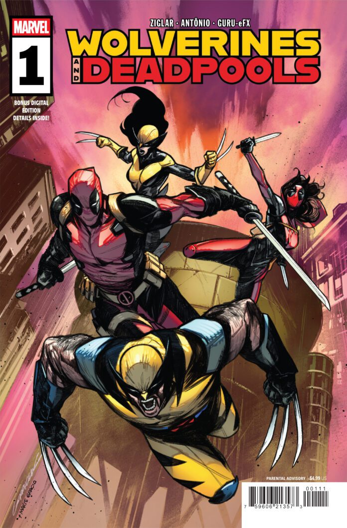
Marvel Comics Exclusive Preview: DEADPOOL #4

marvel comics exclusive preview deadpool

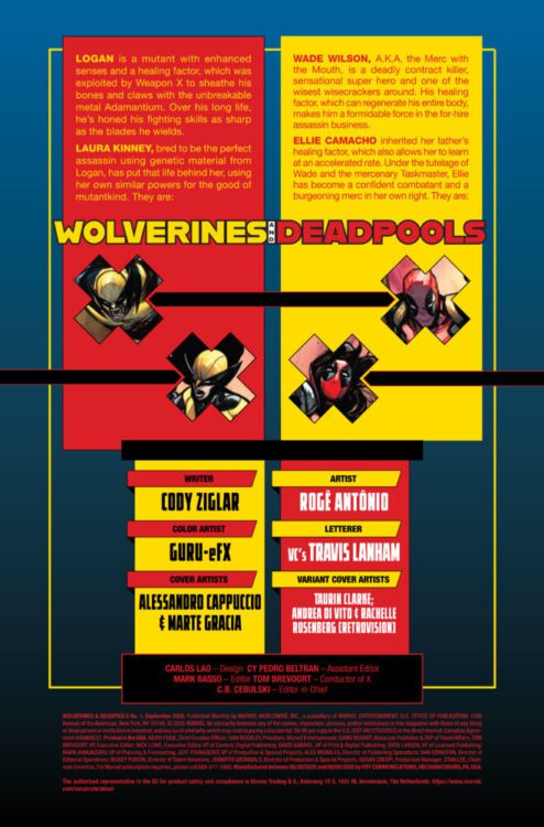
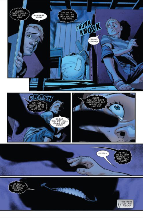
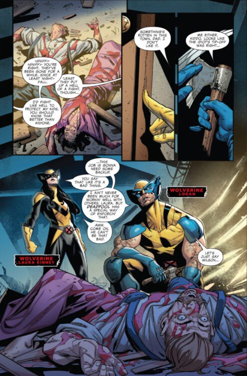
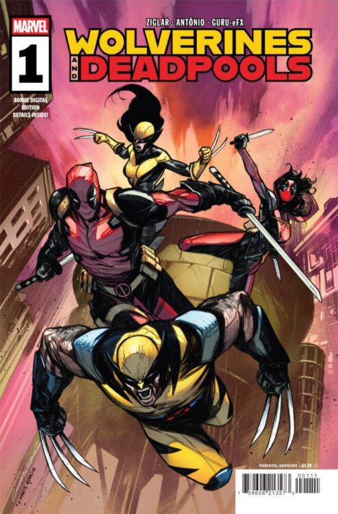
DEADPOOL #4 hits your local comic book store on July 3rd, but thanks to Marvel Comics, Monkeys Fighting Robots has an exclusive three-page preview for you!

About the issue:
DEADPOOL V.S. DEATH GRIP! The showdown you’ve been waiting for! But first, a training montage for Deadpool’s newest recruit!

The issue is by writer Cody Ziglar and artists Rogê Antônio & Eric Gapstur, with Jonas Trindade’s inks on Antônio’s pencils. Colors are by Guru-eFX, and letters are by Joe Sabino. The main cover is by Taurin Clarke.

Check out our DEADPOOL #4 preview below:

marvel comics exclusive preview deadpool

marvel comics exclusive preview deadpool

marvel comics exclusive preview deadpool

marvel comics exclusive preview deadpool

marvel comics exclusive preview deadpool


Are you reading DEADPOOL? Sound off in the comments!

Monkeys Fighting Robots Youtube

G.O.D.S. Adds Even More Mystery and Wonder to Marvel’s Cosmology

marvel comics GODS G.O.D.S. Wyn Doctor Strange Aiko

G.O.D.S. recently wrapped up its run, and it is a rich, exciting, and character-driven look at a brand new corner of the Marvel Universe.

The eight-issue series is by writer Jonathan Hickman and artist Valerio Schiti, with colors by Marte Gracia (and additional colors by Fer Sifuentes-Sujo on the final issue), letters by Travis Lanham, and covers by Mateus Manhanini.

G.O.D.S. follows Wyn, the immortal avatar of The-Powers-That-Be, and Aiko, a Centivar of The-Natural-Order-of-Things (and Wyn’s former flame), as they navigate mysteries at the crossroads of magic and science. Along the way, we also meet some of their cohorts, such as Dimitri, an envoy of The-Natural-Order-of-Things and Wyn’s companion, and Mia, Aiko’s protégé.

marvel comics GODS G.O.D.S. Wyn Doctor Strange Aiko
Aiko and Wyn

In typical Hickman fashion, G.O.D.S. isn’t a “normal” narrative like you’d expect from a Marvel comic book. There is a plot structure that drives the series forward, but it’s more about character exploration and building out this new cosmology of the Marvel Universe. The-Powers-That-Be and The-Natural-Order-of-Things are introduced as two forces that shape existence (the former driven by magic, and the latter by science), joining the ranks of beings like Eternity and the Living Tribunal. Their agents on Earth work in an uneasy alliance with one another for the betterment of all existence, while rubbing shoulders with Doctor Strange and other familiar faces.

It’s a high concept, philosophical read—one which explores how the concepts of “good” and “evil” matter on a cosmic scale—but it’s also a fairly accessible and fun read. Even though Hickman packs this series with a lot to chew on conceptually, he also keeps the characters at the forefront. Prioritizing characterization over the philosophy turns out to be G.O.D.S.‘ biggest strength. Even though Wyn, Aiko, and Dimitri are immortal beings whose roles have driven them to be a bit detached and cold, they still feel like real people. They still make you laugh, and you still root for them (even if they themselves probably wouldn’t feel like they’re worth rooting for). There are giant cosmic consequences at stake throughout this series, but your concern as a reader always seems to be more for these characters that you’re meeting for the first time. This also makes all of the high concept questions about the nature of existence that much easier to digest. Instead of parsing through abstract philosophical questions, you have names and faces that you’re emotionally attached to, and you get to work through the questions alongside them.
marvel comics GODS G.O.D.S. Wyn Doctor Strange Aiko

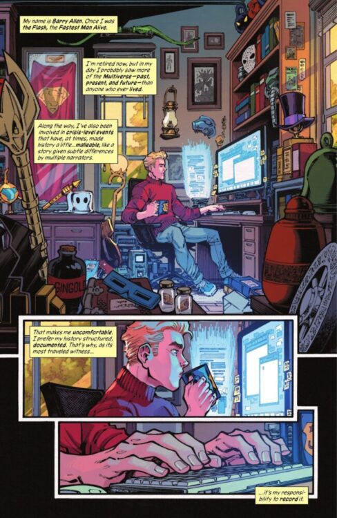
In addition to Hickman’s dialogue, Schiti’s artwork seals the deal on connecting readers to these new characters. There is so much charm and wit in how he draws Wyn or Dimitri that you can’t help but immediately be in their corner. There does tend to be a quite a bit of exposition in the dialogue throughout G.O.D.S., but Schiti nails small character moments, like Wyn rubbing his face in exhaustion or booping Dimitri’s nose in a condescending way, that the exposition feels natural instead of disruptive. He also balances out these small moments with big, epic scenes of cosmic chaos. We’re seeing new locations and new creatures throughout this series, and Schiti does a stellar job of captivating our attention and curiosity. Some things are horrifying in their true form, whereas others are magnificent in their beauty, but nothing is ever boring.

We see perhaps the perfect blending of Schiti’s talents in issue #5, where Wyn recruits Mia to help him check out a shady medical clinic dealing in some occult business. There’s a wide range of character acting on display in this issue, culminating in a gut-punch ending that is sold entirely in the look on the characters’ faces as Wyn delivers some bad news. On top of that, Schiti mixes the common settings of apartments and clinics in this issue with magical wonders and eldritch horrors. When the veil is ultimately pulled back on the clinic, you feel a fascinating mix of shock, fear, and fascination.

Gracia’s colors are, of course, the other ingredient in captivating readers’ attention and curiosity. When dealing with cosmic stories, like those in Thor, Doctor Strange, or now G.O.D.S., the colors have to reflect an otherworldly sense of wonder, and Gracia’s work does just that. Moreover, the characters in this series straddle the line between Earth and the cosmos, so the colors have to strike a balance between reality and that otherworldly sense of wonder. There is a scene in one issue where Aiko must travel from the heart of New York City to see the Living Tribunal. The transition from more muted, mundane colors at home, to hazy, ethereal greens and blues initially as she travels, and finally to bright and striking purples and golds after she arrives is masterfully done.

As stated, the dialogue throughout G.O.D.S. can be a bit heavy on exposition. Thankfully, Lanham’s lettering, in tandem with the artwork, keeps it from feeling like a chore to read. He breaks up the text blocks into easy to absorb chunks, and lays out word balloons to navigate you through the pages with ease. Hickman is putting out a lot of new information regarding the world surrounding The-Powers-That-Be and The-Natural-Order-of-Things, and the exposition is a necessary byproduct of that. Luckily, Marvel brought in a deft hand in Lanham to help readers take it all in with ease.

G.O.D.S.‘ biggest downside is that there isn’t more of it. There’s a ton of story packed into these eight issues, but with questions yet unanswered, you’ll be left itching for more once you reach the final page. It’s not an easy thing to take a universe with a history as storied as Marvel’s and carve something new into it, but Hickman, Schiti, Gracia, and Lanham have managed to do it with grace. Here’s hoping we get to see these characters again soon.

Monkeys Fighting Robots Youtube