Home Blog Page 25

Project 365: One Comic Every Day, Weeks 48, 49, and 50.

box of comics

The premise is simple: read one comic every day for the entire year. It seems like a simple task but there is no way that I read 365 comics last year, even if you count the individual issues in collections. So, this year, I am committing myself to this reading challenge, in the hope that I can broaden my reading habits and fully engage with my favorite hobby again.

Despite covering three weeks, this post will not be very long. After recent reads, I wanted to pick up something with an epic feel — a long, ongoing story that filled a number of comics but was different to the broken connectivity of Fear Itself.
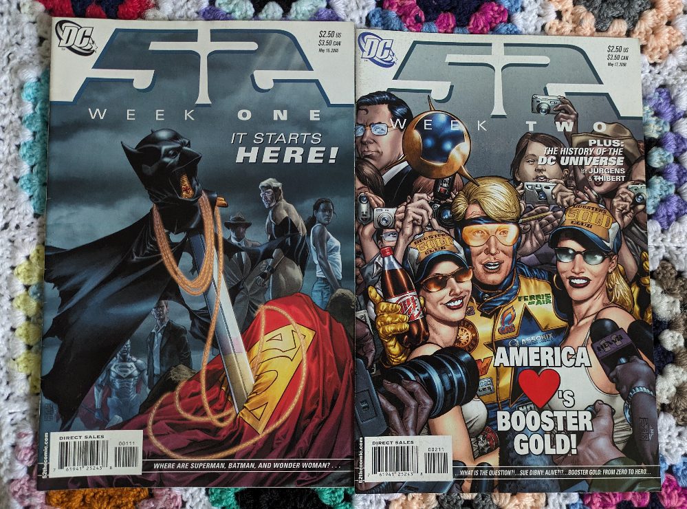
52 #1-2
Credit: DC Comics

My initial choice was DC’s 52, a year-long weekly comic that bridged the gap between Infinite Crisis and the reboot series that appeared in 2006. The series is jointly written and illustrated by a number of the creators working for DC at the time and, on occasion, you can tell. I only got two issues in before changing my mind: not because I think there is anything wrong with the comic, I know it has its detractors just like any superhero story, but because I am not in the mood for superheroes. And that can really effect the enjoyment of a comic.

A lot of what I know about certain characters in the DC Universe comes from reading 52. I’ve not read any other Booster Gold comics, or Plastic Man, and my reading of The Question is very limited. There is an interesting murder mystery playing out in the pages of 52, and a world without the three most famous heroes is a fascinating one. The concept is sound, if a little pretentious, but its main flaw is trying to introduce a new universe to old and new readers and never really finding a comfortable balance between the two. It somehow manages to alienate everyone instead of appealing to everyone. Except me, obviously, because it is a series I have read a few times and, when I am in the mood, I would happily re-read.
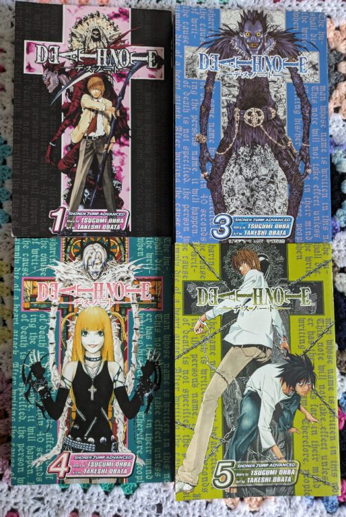
Deathnote
Credit: Viz Media

Attempt to find an epic comic series number 2: ‘Death Note’

I have, so far, worked my way through 5 books out of the 12 (15?) that makeup the entire story of Death Note. The versions I own are the pocket sized, Shonen Jump collections published by Viz Media starting in 2005. The series is written by Tsugumi Ohba and illustrated by Takeshi Obata and was first published in Japan in 2003. It became an international sensation, partly for the engrossing story and energetic artwork, but also because of the moral ambiguity and teams of morbid fans who obsessed over the merchandising.

The basis of the narrative is: if you could kill anyone at anytime without consequence, what would you do? In the comic, Light Yagami finds a Death Note, a notebook belonging to a god of death (Shinigami) and soon realizes he can kill people indiscriminately. He chooses to focus his attention on criminals, those he feels do not deserve to live, but this draws attention from L, an independent, international crime fighter (think a modern day Sherlock Holmes). And so the battle of wits between the two characters begins.

Death Note is a great series. It is aimed at a young adult audience, which is why it is taking me longer to get through. There are bits that, to me, are a little cliched or twee, but younger readers would love the romance and the childish bickering. The main appeal for me are the designs for the Shinigami and the way that the narrative handles the moralistic elements of the story. At the center of it all is quite a dark, serious question: Does anyone have the power to make a decision about whether someone deserves to live or die? This aspect of the comic is not only the driving force behind the narrative but also the point of contention for those who spoke out against the comic. When taken as a complete narrative, the creators deal with the moral aspect in a mature and responsible way, in isolation, however, a single volume could easily be used to show the glorification of violence and murder.

The Terminator #1-3
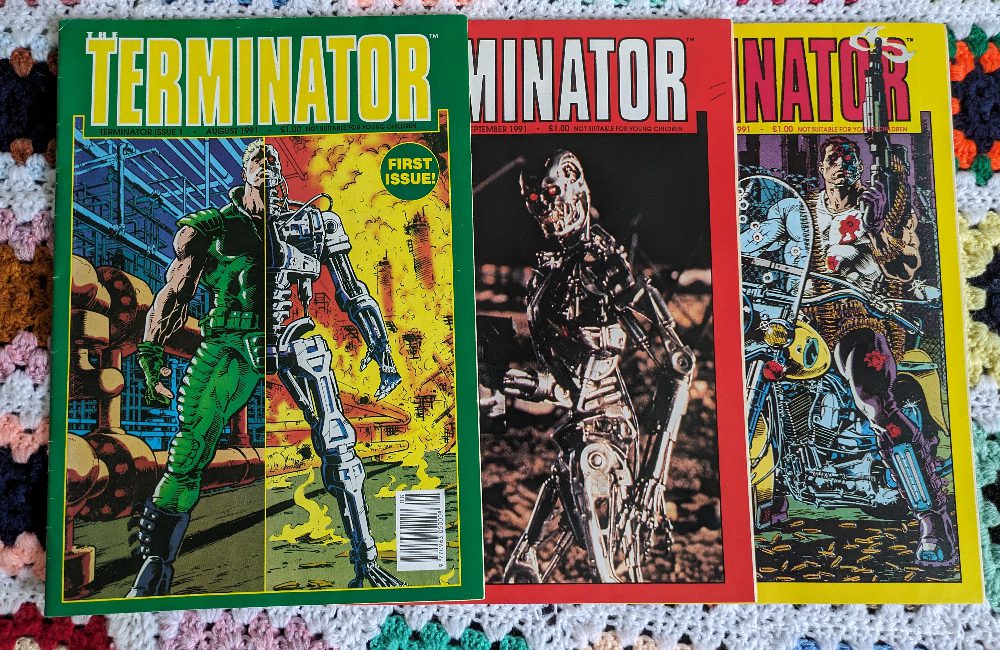
Credit: Trident Comics

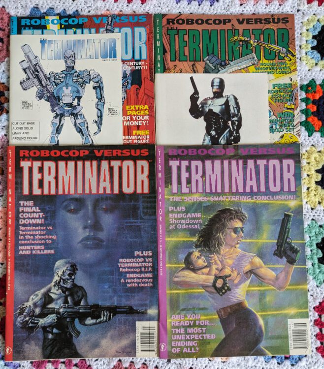
Attempt to find an epic comic series number 3: The Terminator

Although I am enjoying my read through of Death Note, reading the volumes back to back is difficult. Reading one every month allows each one to breathe and doesn’t overwhelm you as a reader, so that’s how I’m going to read the remaining volumes. And I just watched the remake of RoboCop with my son, so I had a hankering for some cyborg action. You’d think that I might pick up the Marvel RoboCop series that ran in the early 1990s but no, The Terminator comics from the same period suit my taste more. Plus, there is the epic crossover at the end of the run, which I will get to in a minute.

In 1991, Trident Comics repackaged a number of American comics and released them into British shops. The had Batman collections, Aliens comics, and, of course, The Terminator. The monthly comic at first reprinted a single American comic and included a few adverts, nothing more. But it soon became like the other UK titles, with backup stories, articles, and letters pages, however the comics were always focused on the Terminator franchise.

The first few stories followed a new group of time travelers who journey back in time to stop either the rise of Skynet, or stop the human rebels from stopping the rise of Skynet. The stories are action packed with some great artwork that is ideal for the franchise. The first story has Chris Warner on pencils and Paul Guinan on inks and between them they perfectly capture the feel of the original movie. The desolation of the future and the seedy present are reflected in both the narrative (written by John Arcudi) and the artwork. On the face of it, the comic doesn’t venture into any new territory and is a reflection of the movie. However, as the comic progresses, with different writers and artists, different aspects of the original concept are explored. The internal struggles of a human/Terminator hybrid question what it means to be human; the contrast between present and future makes one character doubt her actions; and self preservation overrides doing what is best for humanity.

Pages from One Shot appearing in issue 7 of The Terminator from Trident Comics

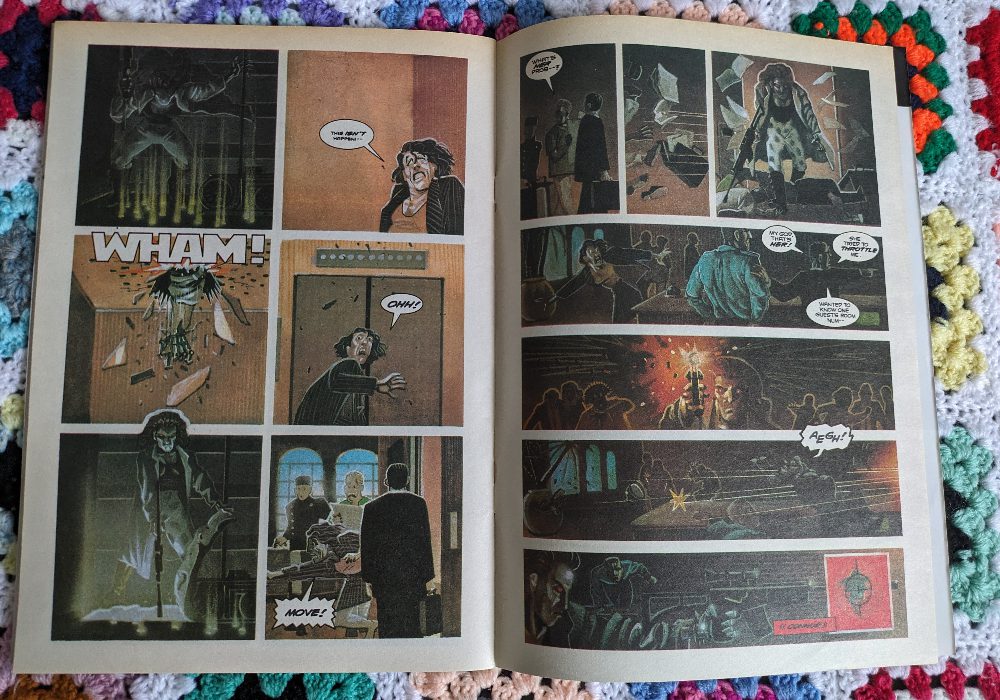
Within the pages of The Terminator, there are a number of backup stories that focus the action on different characters and are drawn in different styles. One Shot (which started in issue 7), written by James Robinson and illustrated by Matt Wagner and Pat Brosseau, tells the story of a backup Terminator who is sent back in time and attempts to kill the wrong Sarah Conner. The artwork is very different to the main story and received some criticism in the letters page but it suits a story where there are no real heroes and you actually find yourself rooting for the killer cyborg.

By far the most interesting story in the UK run of The Terminator has to be the RoboCop Vs Terminator reprint. This was written by Frank Miller and illustrated by Walt Simonson and does exactly what you would expect from Miller with these two iconic characters. Miller’s voice is there on every page, with his trademark broken voice-over leading the characters through a time altering adventure of death and destruction. You can’t help but read each caption box in a gruff, defeated voice. However, there is surprisingly an ever present sense of hope throughout this story. The inclusion of RoboCop as the instigator of Skynet’s self awareness makes perfect sense, so does Alex Murphy’s desire to change what his future self is a part of.

One of my favourite aspects of this series is the ever changing future. Ripples from the past change the future slowly, allowing new outcomes and desperate moves to be made. It is a fascinating take on the consequences of time travel and is a step away from the predestined narrative in the original movie.

The Terminator #14 -17
Credit: Dark Hose UK

That’s 3 weeks, 2 DC comics, 5 Manga books, and 17 issues of a UK publication (which was taken over by Dark Horse UK towards the end). I should have enough to cover off comics numbered 328 to 348.

Monkeys Fighting Robots Youtube

Review: ANIMAL POUND #1 — Remixing A Classic

“Now, please, young one, hear me, for soon I shall speak no more.” Lucky the dog is not as well off as his name would suggest. No, in the opening scene of BOOM! Studios’ Animal Pound #1 — written by Tom King, with art by Peter Gross, colors by Tamra Bonvillain, and letters by Clayton Cowles — Lucky is waiting to be taken to a room marked with a sign that simply says “Animal Disposal.” In his last moments, he calmly speaks to Fifi, a curious kitten who has made a hole between her cage and his, telling her all he’s learned about dogs, cats, rabbits, and man. And so, our story of revolution and change begins with a whispered manifesto. In the spirit of George Orwell’s masterwork Animal Farm, King, Gross, Bonvillain, and Cowles bring us a meditation on power, wealth, and class — tweaked and remixed for a modern audience.

About Animal Pound #1:

When animals grow tired of being caged, killed, and sold off-it’s only a matter of time before they’ve had enough…

When an uprising puts a pound in control of the animals, they quickly find themselves as comrades, united against everything that walks on two legs.

But with this newfound power comes a sudden challenge: how best to lay the groundwork for this new democracy as they write their first constitution!

Writing

One of the most interesting things to keep in mind when reading King’s script is that he’s writing in a vastly different environment than Orwell was. Orwell wrote his book to condemn Stalin’s commandeering of socialist ideals towards totalitarian ends. He was describing allegorically, with the help of his pigs and horses, how the Soviet Union had corrupted the effort to live as a community of people who looked out for each other. Orwell, himself, was a democratic socialist. King, however, is writing in a time and place where the word “socialism” is automatically heard as “communism” by many. And yet, this is also a time and place where capitalism has started to show some ugly cracks in its foundation. Every other week we hear about yet another billionaire planning to use his wealth for some vanity project, all while finding elaborate ways to avoid taxation. And so King has an interesting task ahead of him. How does he give us hope that the world could be better, just as Animal Farm suggests at first, while warning us of the pitfalls we must avoid along the path?

If you read Animal Pound #1 with all of that in mind, you won’t be disappointed in the slightest. The whole allegory immediately contrasts itself to Animal Farm in a few important ways, while keeping Orwell’s complex balance of hope and dread intact. The most obvious difference, of course, is the setting. Where a farm is lush, bountiful, and open, an animal pound is bleak, dirty, and closed off. “The doors, you see, the doors,” Lucky the dog says in his final moments. “We spend our entire life staring at the door, scratching at the door, howling at the door.” That’s the difference he sees between animals and men. Men can open a door, while animals have no hope but to break it down.

King narrates much of this script in poetically descriptive language. Sounds aren’t just loud, they’re a “cacophony.” A kitten doesn’t simply describe a dog as mean, but “ornery.” Cats and dogs have really never spoken so eloquently. But all of that beautifully lends itself to the charm of this first issue. King wants you to know that this isn’t just an animal speaking, this is a character with a heart and soul. These characters have dreams just like anyone of us. Mostly, they dream of freedom.

Art

Gross’ ability to show an animal actually emoting is unrivaled. When a bulldog is called on to make the first move in an elaborate plan, Gross draws him with nervous eyes. You can almost see them darting around between panels. But while this is a very dramatic story, with incredibly high stakes, there is still a wonderful subtlety to these pages. When we first see Lucky, for instance, he doesn’t look very emotional. He’s resigned to the approaching end of his story. When he’s been taken away, his feline confidante’s face is blank. We can’t tell if Fifi is feeling sad or resolved.

Much of the way Gross designs his page layouts speak to the tone of each scene. When the cats and dogs are locked away in their cages, the page looks ordered and contained. The panels stack neatly on top of one another in organized rows. There’s no resistance to the norm that man has put in place. The animals aren’t trying to break out of their bonds, but instead sit meekly between the gutters. Later, when the chaotic coup begins, the pages erupt into pandemonium. One dog howls, his snout jutting past the outline of the panel he’s occupying. The ears, noses, and paws of the rebels all refuse to be kept in check, as the panels tilt and twist. When the animals begin to try and bring about their own brand of order, the page obediently falls back into a tidy rhythm. Gross leaves us wondering what it is that will set the beasts apart from their previous masters. Will they simply replace one tyranny with another?

Coloring

Bonvillain’s coloring feels deliberate and symbolic. While there are plenty of warm colors, often seen in the furs and flesh of our cast — orange tabbies, brown beagles, and the pink noses of kittens — everything seems to be cast in the cold, blue light of the pound. The men, who come in as guards and occasionally as bearers of food, wear blue uniforms. The dogs’ collars, the sofas in the entryway, even the cages, are all blue. It’s interesting, then, that it’s with blue paint that the beasts decide to spell out their new manifesto. It’s just a can that they found leftover in a closet, but its hue has begun to take on a certain meaning at this point in the story. Bonvillain seems to be wanting us to ask those same questions Gross left us with. Can the animals really do much better building a society when they’re left with all the same tools that man had?

Lettering

The small, specific choices that went into Cowles’ lettering makes all of the difference in the story. When the uprising begins, Cowles lines the bottom of every panel with the jaggedly lettered sound effects of desperate barking. When a cat screams, its letters are still big and messy, but they’re written in a more slender font to help us hear the sharpness of the noise. But it’s actually one of the most understated moments of this issue that shines the brightest. When Fifi and a dog are talking about the fateful day that’s approaching them, it’s clear they’re both feeling very differently about it. Fifi’s word balloons have an uneven outline to them. The first of them has a tail that wanders along, snaking lazily towards her mouth. When the dog speaks, his word balloons are neat and straightforward. He’s alert, even nervous, while Fifi is as relaxed as the hand that outlined her dialogue. But right before they both go to sleep, Fifi’s final words are written in a normal balloon. She’s assuring the dog that she’s as much a part of this as he is, and she’s ready for what comes next.

Conclusion

The best thing about Animal Pound is that it’s not just a carbon copy of Orwell’s classic. It would almost be more accurate to call it a modern day response to Animal Farm. It’s brilliant, heart-wrenching, adrenaline-pulsing, and revolutionary. Animal Pound points to the bars of our cage and asks us if we want to be free. But it also wants us to ask what the cost is for change and whether we know how to get change the right way. Animal Pound #1 is out from BOOM! Studios the 20th of December at a comic shop near you! Don’t miss it!

Monkeys Fighting Robots Youtube

Marvel Comics Exclusive Preview: INCREDIBLE HULK #7

marvel comics exclusive preview incredible hulk

INCREDIBLE HULK #7 hits your local comic book store on December 20th, but thanks to Marvel Comics, Monkeys Fighting Robots has an exclusive three-page preview for you!

About the issue:
HULK VERSUS THE WAR DEVILS! The Hulk and the undead Ghost Rider make amends, but Ghost Rider smells an evil in the air – and it’s been terrorizing a small community. With Bruce’s teenage sidekick, Charlie, determined to prove herself as a hero, Hulk must face them down before she gets herself into more trouble than she bargained for!

The issue is by writer Phillip Kennedy Johnson and artist Nic Klein, with colors by Matthew Wilson, and letters by Cory Petit. The main cover is by Klein.

Check out our INCREDIBLE HULK #7 preview below:

marvel comics exclusive preview incredible hulk

marvel comics exclusive preview incredible hulk

marvel comics exclusive preview incredible hulk

marvel comics exclusive preview incredible hulk

marvel comics exclusive preview incredible hulk


Are you reading INCREDIBLE HULK? Sound off in the comments!

Monkeys Fighting Robots Youtube

Review: UNDERHEIST #1 – Digging for Stolen Riches

From Stray Bullets creators Maria and David Lapham comes a compelling opening chapter about desperation and criminals stiffing criminals in Underheist #1. Featuring colors from Hilary Jenkins, this first issue does incredible work in delivering a sense of desperation among a group of relatable people who decide to do something extremely rash – like robbing a score from a bunch of hardened professional criminals. With a brilliantly paced plot and expressive visuals, Underheist is off to a stellar start.

“After his gambling addiction brings David to the lowest point in his life and decimates his personal life, he’d do anything for one last chance at setting things right but the road to hell is paved with good intentions. He may just be in luck-if he can call it that; the grapevine yields illicit fruit as he learns of a heist, one involving a tunnel system that no one knows better than former NYC subway veteran David…”

Writing & Plot

Maria and David Lapham excel at creating an enticing crime plot with fleshed out characters in Underheist #1. The grim version of NYC – full of criminals, debts, and satanic gangsters – feels grounded in reality. This is largely due to how fleshed out the cast is. David is an increasingly desperate subway worker, struggling under gambling debts and what he owes to more nefarious beings. While searching for a way out of his situation, he overhears a plan from a group of professional criminals to rob a banks and use the subway tunnels to get away. David hatches a plan along with some old friends and coworkers to swipe their score – and naturally, things get complicated. What makes this first issue’s story stand out so much is how well the characters are handled. There’s a relatively large cast to look after here – David, his wife, his white collar friend, two coworkers, a coworker’s fling, etc. The Lapham’s do an incredible job of making all of these people feel complete and distinct. Every one of them has a different angle and a completely unique personality. The fact that this much care has been put into a 22 page issue without coming off as overloaded is an immense feat. There’s also the hints of a supernatural element at play, stemming from one of David’s more nefarious debtors. The Laphams have only loosely hinted at this though, leaving whatever unnatural forces are at play a mystery for now. This is a wise choice. With the amount of plot development and characterization at play in these pages, an extra layer would have been overfilling the comic. As it is though, Underheist is off to an astonishing start in terms of writing.

Art Direction

David Lapham provides the visual experience for the grimy subterranean crime plot in Underheist #1. Lapham does some incredible work in making his cast a diverse and unique group of individuals, all with distinct appearances and animations. His environmental detail is also stellar, especially when it comes to the underground worksites and their labyrinthine corridors. Lapham’s sequential direction carries the story at an even pace as well. His mixing of large scenic panels combined with smaller ones that focus on minute details make sure the audience catches everything that Lapham wants readers to focus on. The comic runs almost entirely on a six-panel layout, making for a consistent focus that shifts right when Lapham needs to change what our attention needs to be on. There’s a mastery in the subtlety going on with Lapham’s pencils in Underheist, and it makes the visual experience’s main flaw a bit tragic in a way.

Hilary Jenkins’s color art for Underheist #1 is solid, with a sort of muddy, dark set of tone choices that work great for the comic’s atmosphere. However, it’s hard not to imagine how this comic would have looked as a black and white experience. If you’ve read Stray Bullets, you know exactly what I’m talking about. This isn’t a slight on Jenkins’s work at all – again, her work here is very good, offering a sort of twisted pop-art aesthetic to Underheist. Lapham and Jenkins’ work separately is great, but together it’s unfortunate that it almost feels like something may be getting lost. Overall, this is still a good looking comic with a well-defined aesthetic.

Verdict

Underheist #1 is a stellar opening issue with one of the most complete introductions to a setting in recent comics. Mara and David Lapham expertly craft a cast of characters and present a plot with a brilliant sense of pacing and unique characterization. David Lapham’s pencils, combined with Hilary Jenkins’ color art, make for a visually unique and atmospheric take on a grimy NYC crime tale. Be sure to grab this issue when it hits shelves on December 13th!

Monkeys Fighting Robots Youtube

DSTLRY Update: GONE #1 Digital Now Available!

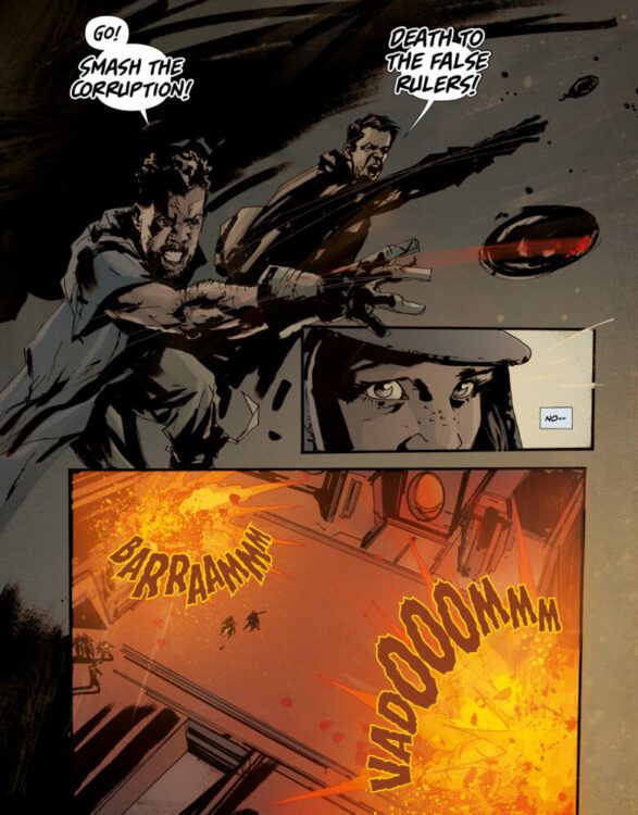
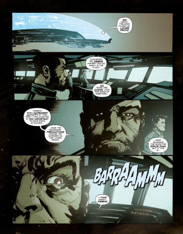
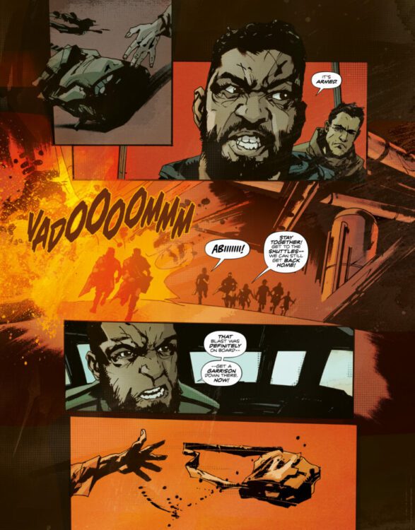
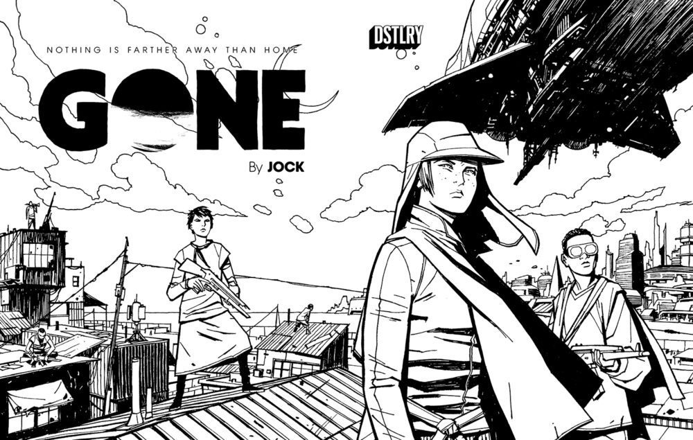
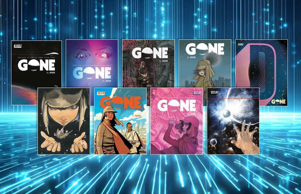
From renegade comics supergroup publisher DSTLRY comes the digital debut of Jock’s sci-fi epic with Gone #1. The highly sought-after and acclaimed opening issue is now available to read online on DSTLRY’s own v0.1 desktop reader beta at
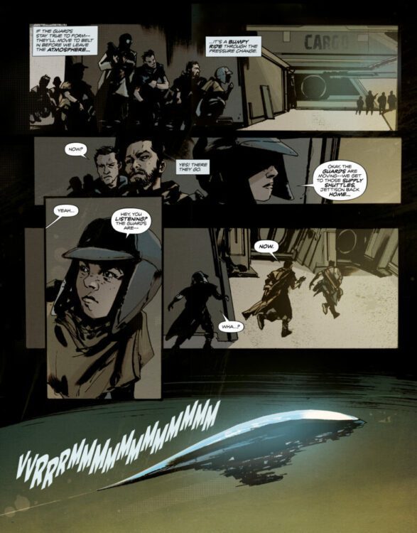
 dstlry.co. 

The digital launch of GONE #1 continues the lineup of exciting releases DSTLRY has in store for fans. The publisher’s debut release, The Devil’s Cut, kicked off the platform’s launch last week. Readers who purchased a digital copy of the The Devils Cut get exclusive access to purchase two GONE #1 variant covers—a Cliff Chiang B&W Gone #1 print variant and an Ariela Kristantina digital variant. Next week, fans will be able to purchase a digital copy of SOMNA #1  by Becky Cloonan and Tula Lotay on December 20.


DSTLRY’s digital store and reader beta fuses the excitement of New Comic Book Day with digital reading, while establishing a new revenue stream for creators. Mirroring the limited-run nature of print comics and the excitement of New Comic Book Day, DSTLRY’s digital releases will be available directly from the publisher on dstlry.co for one week—Wednesday through Tuesday—upon release. Mass market digital releases will follow when trade paperbacks arrive in print. The v0.1 iteration of DSTLRY’s  v0.1 digital reader beta allows fans to enjoy their comics library in full page view, fit to the width and +/- zooming controls on their desktops. While also available via mobile web, the best experience for v0.1 is on the desktop. The full digital marketplace is scheduled to debut in 2024.


Written, drawn, and colored by Eisner-Award winning creator Jock, the series spins out from his 8-page story “The Stowaway” from DSTLRY’s debut release, The Devil’s Cut.


On an impoverished and distant planet where menial workers scratch out a living resupplying starships, the best place to be is GONE…and that’s exactly where 13-year-old Abi wants to be. Along with her street-tough friends, Abi stows away on a colossal luxury space-liner, hoping for a better life. Unbeknownst to her, Abi’s “friends” are not who they seem, and she suddenly finds herself branded a saboteur as she desperately struggles to evade the ship’s deadly crew to stay alive! As the young heroine confronts betrayal, discovers her true allies, and fights against all odds, Abi will soon realize that nothing is farther away than…home.

Today, December 13, readers can purchase GONE #1 digitally for $1 on the day of release (December 13th), and $9 from December 14 through December 19. Mass market digital releases will follow when trades arrive in print. A percentage of each digital resale directly benefits the creators, emphasizing the collectible value of each issue.

Don’t forget, readers of The Devil’s Cut will also have access to the stunning exclusive digital cover from Ariela Kristantina!

About DSTLRY

DSTLRY is a next-generation comics publisher and physical-digital collectibles company that redefines creator-owned comic books for consumers worldwide. Created by comiXology veterans David Steinberger and Chip Mosher, DSTLRY gives customers premium stories by top creators in premium physical and digital formats, including resellable digital editions with no crypto or NFT-hassle. Learn more at dstlry.co, and follow us on Instagram (@DSTLRY_Media) and Twitter (@DSTLRY_Media).


Monkeys Fighting Robots Youtube

DSTLRY Debuts Two New GONE #1 Covers for DEVIL’S CUT Readers

Review: THE DEVIL'S CUT #1 - This Could Be The Beginning Of Something Amazing!

DSTLRY The Devil’s Cut Digital readers keep eating good with two new covers, this time for Gone #1.

“As DSTLRY’s digital December continues, we’re nearing the finish line for sales of The Devil’s Cut digital edition. If you don’t own this debut collection of short stories from DSTLRY—eight of which lead to ongoing series—by the end of Tuesday, December 12th, you won’t have another chance until the marketplace opens in 2024.”

Wednesday is when it gets very interesting for the proud owners of The Devil’s Cut digital edition. Owners gain exclusive access to purchase not one, but two Gone #1 covers—a digital version and a physical version. And yes, you can grab both, though the supply of the print benefit is strictly limited (not so with digital, though it’s only available from December 13th-19th). Only owners of The Devil’s Cut digital edition have access to these benefits—but remember: the clock is ticking.

Here in detail is what owners of The Devil’s Cut digital edition will have access to purchase:

The Cliff Chiang B&W Gone #1 Print Variant: A visual masterpiece in black and white, this print cover by Chiang (Paper GirlsCatwoman: Lonely City) is a strictly limited-edition gem. It’s a testament to the auteur’s honed line, and it’s up for grabs on a first-come, first-served basis. You’ll want to be quick on the draw here.

Gone #1 Exclusive Physical (Print) Cover


The Ariela Kristantina Digital Exclusive: For a fleeting week, this gorgeous digital-only variant by Ariela Kristantina (Adora & the Distance) can grace your digital library. It’s a digital cover that’s as exclusive as it is ephemeral, hinting at the infinite cosmos Abi hurtles through in her search for home.

Gone #1 Exclusive Digital Cover

Gear up and get ready. These exclusive editions are rare and timed and they won’t be around long. It’s a unique opportunity to expand your collection with something truly special specifically designed for fans who came early. Remember, the countdown is on, so make your move and secure The Devil’s Cut digital edition so you will be eligible to grab these exclusive benefits before they’re…eh…gone.

Once again, these covers will only be available from December 13th-19th. Keep your eyes open, as there will be more exclusive goodies to come for readers of The Devil’s Cut.

Monkeys Fighting Robots Youtube

Review: BEYOND REAL #1 – I Want This To Be My Reality

2:28 / 9:23 Review: BEYOND REAL #1 - I Want This To Be My Reality

BEYOND REAL #1 from Vault Comics hits your local comic book shop this week! This five-issue mini-series is crazy good, and I can’t wait to read the complete series. Check out some amazing artwork and my full review below.

BEYOND REAL #1 is written by Zack Kaplan, with art by art Fabiana Mascolo and Toni Fejzula, Toni and Jordie Bellaire the colors, and you will read Hassan Otsmane-Elhaou’s letter work.

About BEYOND REAL #1:
An artist’s discovery. When struggling artist June is injured in a severe car accident that leaves her boyfriend in a coma, she begins to experience strange visual phenomena. Soon, she’s able to see that we are all actually living in a computer simulation. June must set out on a journey of possibility and peril into the metaphysical layers of the simulation to reach the world’s creator and save her true love from death.

Monkeys Fighting Robots Youtube

Dark Horse Exclusive: Get your first look at David Mack’s cover for BLUE BOOK: 1947 #1

dark horse comics exclusive cover reveal blue book 1947 david mack

BLUE BOOK: 1947 #1 is out February 7th, and thanks to Dark Horse Comics, Monkeys Fighting Robots has an exclusive first-look at artist David Mack’s variant cover for the book!

About BLUE BOOK: 1947 #1:
In 1947, Kenneth Arnold flew his Call-Air A-2 over the skies of the Pacific Northwest when all of a sudden he saw a blinding flash of silver light. What followed was a bizarre and difficult to explain encounter with several flying objects that would change the course of his life forever.

Long before Betty and Barney Hill excited the public with their alien encounter story, there were years and years of suspected sightings and abductions. James Tynion IV, Michael Avon Oeming, Tom Napolitano, and Dark Horse Comics return with another deeply weird non-fiction tale exploring alien sightings in the upcoming comic, Blue Book: 1947.

As stated in the solicit, the series is by writer James Tynion IV, artist Michael Avon Oeming, and letterer Tom Napolitano.

1947 is the second volume of Tynion and Oeming’s BLUE BOOK series, which is described as an “ambitious, non-fiction comic book experience depicting true stories of UFO abductions with an eye to capturing the strange essence of those encounters.”

Get your first look at David Mack’s cover for BLUE BOOK: 1947 #1 right here:

dark horse comics exclusive cover reveal blue book 1947 david mack


Are you picking up BLUE BOOK: 1947 #1 when it hits the stands in February? Sound off in the comments!

Monkeys Fighting Robots Youtube

Review: DOCTOR WHO: THE STAR BEAST

Doctor Who is celebrating its 60th Anniversary with a series of specials that see the return of the series’ important figures from its early revival years.

The Doctor has regenerated and landed in Camden. There are two complications: the Doctor has regenerated back into the Tenth Doctor’s body, and a spaceship has crashed in London. The Doctor also meets his old companion, Donna Noble, who will die if she remembers who the Doctor is, yet the adventure with a stranded alien ends up involving Donna and her family.

Under Chris Chibnall’s tenure, Doctor Who was heavily criticized. Some critics were reactionaries who were using controversy to gain clicks, but there were genuine issues with the show. The show’s writing was suffered during this era due to “tell don’t show” storytelling, unsubtle political commentary, bland characters, and massive retcons. The series reached its lowest point since its revival. The BBC had to bring back the big guns for the Doctor’s Platinum Anniversary.
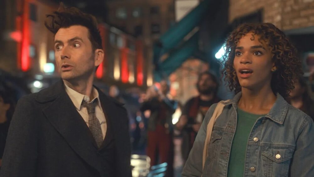
Russell T. Davies was instrumental in the show’s revival, and since leaving Doctor Who, he written a lot of well-received TV shows like A Very English ScandalYears and Years, and It’s a Sin. He brings back some faith to fans who didn’t enjoy the Chibnall era.

“The Star Beast” had to do two jobs: it needed to follow on from the events of Series Four, and be accessible to a broad audience. To achieve this, “The Star Beast” had a simple story where an alien spaceship comes to London. This was done in “Aliens of London” and “The Christmas Invasion,” episodes made during Davies’ previous run on the show. The first half of the episode was the Doctor Who version of E.T., since the story revolved around Donna’s daughter, Rose (Yasmin Finney), finding and protecting The Meep, the alien that crash-landed. The references were blatant with the use of a back garden and a shed, and The Meep hiding amongst a bunch of stuffed toys.
At the same time, “The Star Beast” continued a story from 15 years ago. This was the hook for long-time fans, especially fans who stopped viewing during the Chibnall era. There was a risk that revisiting the Doctor/Donna relationship could undermine the bittersweet conclusion back in Series 4. Yet this needed to be done because the specials needed a selling point of nostalgia. There was also a risk that bringing back David Tennant would be seen as desperate, but the Specials are setting up a mystery on why the Fourteenth Doctor regenerated with the Tenth Doctor’s face.

The tone of “The Star Beast” was light and broad to ensure it could appeal to a wide audience. The first half was like a kids’ show due to the humor and The Meep being a cute creature with a high-pitched voice. The special was a throwback to Nu-Who’s heyday with its style of humor, and setting up a mystery box for the upcoming episodes. There was a sense of scale to this Special. London was in jeopardy and the city was shown to be in peril. The Special also brought back the Shadow Proclamation and showed a three-way battle between UNIT, mind-controlled soldiers, and insect aliens who looked like the Federation troops in Rick and Morty.
Another issue some audiences had with Chibnall was his political messaging and how ham-fisted it could be. “Orphan 55” was a prime example of this since it forced a message about Climate Change when it didn’t fit the story. Those commenters who declared the show as being “woke” under Chibnall are still going to hate it under Davies. Davies is an openly gay man, and LGBTQ+ themes have been a presence in his shows. Years and Years and It’s a Sin were politically charged mini-series, and with “The Star Beast” he incorporated trans themes. Rose and her trans identity became an important plot point. There was also some grounded drama involving Rose since she was bullied because she recently came out as trans and even her family was still adjusting. It added a little bit of reliability to the Special, and it felt natural to the story.

“The Star Beast” was a fun, back-to-basic start for the new Davies era. It managed to be a continuation of Davies’ own plot points and be an entertaining standalone adventure for the Doctor and Donna Noble.

Monkeys Fighting Robots Youtube

Dark Horse Comics Exclusive Preview: MASTERS OF THE UNIVERSE: FORGE OF DESTINY #4

he-man masters of the universe forge of destiny dark horse comics exclusive preview

MASTERS OF THE UNIVERSE: FORGE OF DESTINY #4 hits your local comic book store on December 20th, but thanks to Dark Horse Comics, Monkeys Fighting Robots has an exclusive five-page preview for you!

About the issue:
A Battle for the Soul of Anwat Gar!

As Gen. Storm’s soldiers close in on King Randor, He-Man and Teela make their stand against the evil polluting the heart of the island. But now that he wields the power of the Forge itself, can anything stop the Lord of Destruction?

Prince Adam’s first year as He-Man comes to an explosive conclusion!

The issue is by writer Tim Seeley and artist Eddie Nunez, with colors by Brad Simpson, and letters by AndWorld Design. The main cover is by Nunez, and there will also be two variant covers, one by Tom Fowler and Bill Crabtree, and the other by Fico Ossio.

Check out our MASTERS OF THE UNIVERSE: FORGE OF DESTINY #4 preview below:

he-man masters of the universe forge of destiny dark horse comics exclusive preview

he-man masters of the universe forge of destiny dark horse comics exclusive preview

he-man masters of the universe forge of destiny dark horse comics exclusive preview

he-man masters of the universe forge of destiny dark horse comics exclusive preview

he-man masters of the universe forge of destiny dark horse comics exclusive preview

he-man masters of the universe forge of destiny dark horse comics exclusive preview
Cover A by Eddie Nunez
he-man masters of the universe forge of destiny dark horse comics exclusive preview
Cover B by Tom Fowler with Bill Crabtree
he-man masters of the universe forge of destiny dark horse comics exclusive preview
Cover C by Fico Ossio

Are you reading MASTERS OF THE UNIVERSE: FORGE OF DESTINY? Sound off in the comments!

Monkeys Fighting Robots Youtube