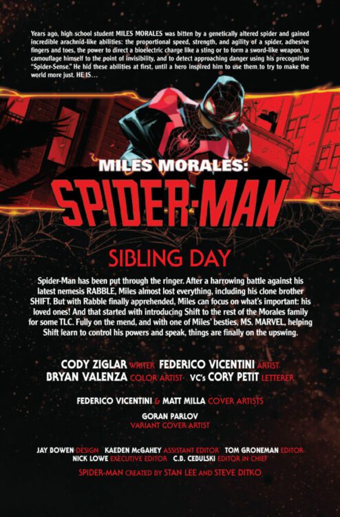
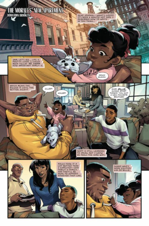
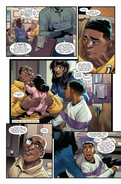
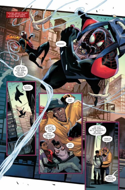
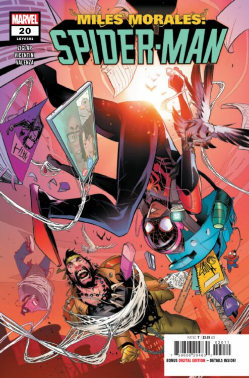
MILES MORALES: SPIDER-MAN #20 hits your local comic book store on May 15th, but thanks to Marvel Comics, Monkeys Fighting Robots has an exclusive four-page preview for you!
About the issue: Miles Morales, A.K.A. SPIDER-MAN, faces his greatest challenge yet – BABY SITTING HIS LITTLE SISTER BILLIE! But wasn’t he supposed to fight crime with Shift? Oh, and there was a thing with Ms. Marvel! Oh no! He forgot to call Ganke back! And he’s an hour late to meet Starling?! Miles’ world is spinning, and he has no idea that it’s all about to get turned upside down!
The issue is by writer Cody Ziglar and artist Federico Vicentini, with colors by Bryan Valenza, and letters by Cory Petit. The main cover is by Vicentini and Matt Milla.
Check out our MILES MORALES: SPIDER-MAN #20 preview below:
Are you reading MILES MORALES: SPIDER-MAN? Sound off in the comments!
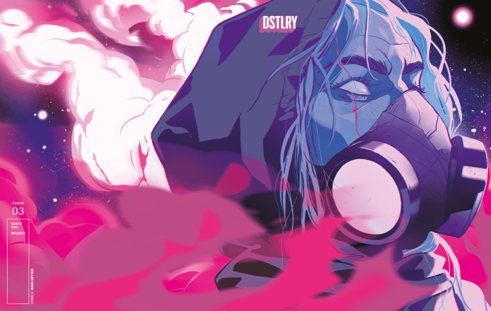
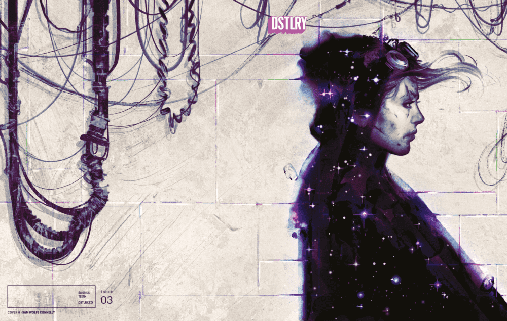
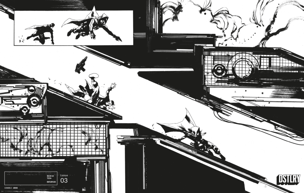
From contemporary game-changing publisher DSTLRY Comics comes a slew of exclusive new covers for Gone #3, the final issue of Jock’s (Batman: The Black Mirror; Wytches) stellar sci-fi series.
“Abi has been from one end of the galaxy to the other and just about the only place she hasn’t reached is the one place she’s most afraid to go…HOME. But fate, and her own steely will, have combined to send her there, and now she must confront a past secret that’s darker than the deepest depths of outer space.”
G. Rossi Gifford Undressed (dstlry.co exclusive, print and digital)
On top of the 6 already revealed covers, DSTLRY is unveiling 3 new variants, including an undressed Rossi Gifford piece, an undressed Sam Wolfe Connelly piece, and a Jock interior piece.
H. Sam Wolfe Connelly Undressed (digital ownership benefit; buy print, get digital free)Z. Jock Interior (dstlry.co digital exclusive)
Be sure to go to your local comic shop or dstlry.co to grab your exclusive print and digital copies of this penultimate issue!
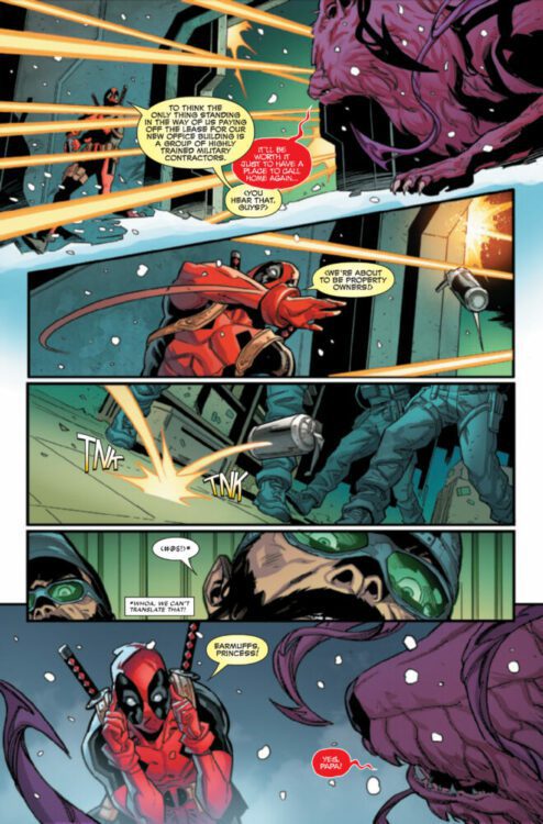
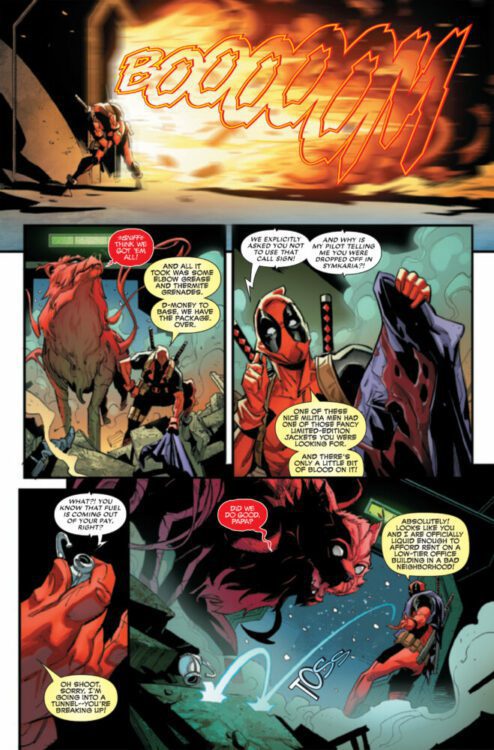
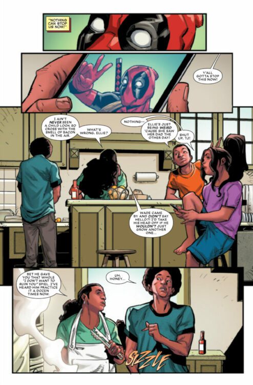
DEADPOOL #2 hits your local comic book store on May 8th, but thanks to Marvel Comics, Monkeys Fighting Robots has an exclusive four-page preview for you!
About the issue: After botching the Montreal job and making a new enemy out of DEATH GRIP, Deadpool had the great idea to start his own boutique mercenary agency (definitely his idea! Not at all Agent Gao’s!) But a startup is a lot of work, so Wade asks TASKMASTER to run it! Their first assignment? Finding out who this Death Grip is and why he’s so interested in Wade.
The issue is by writer Cody Ziglar and artist Rogê Antônio, with colors by Guru-eFX, and letters by Joe Sabino. The main cover is by Taurin Clarke.
Check out our DEADPOOL #2 preview below:
Are you reading DEADPOOL? Sound off in the comments!
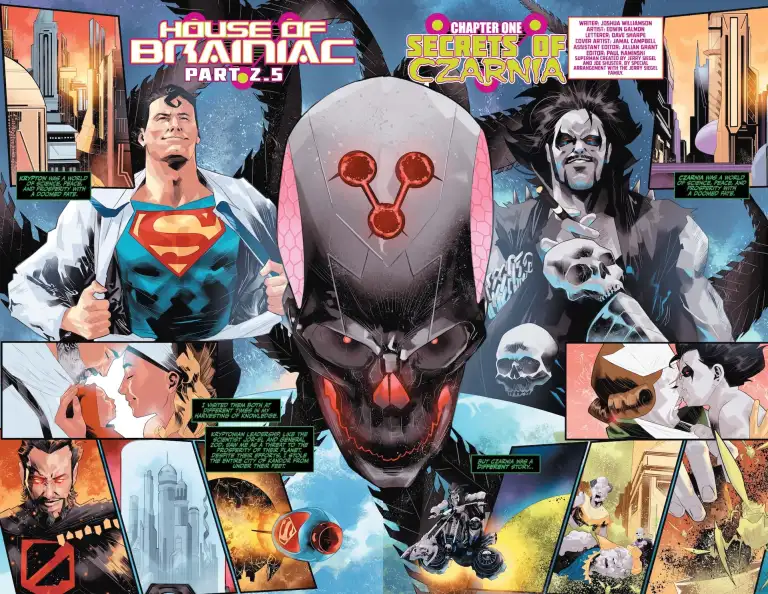
Superman: House of Brainiac Special #1 is out now, and acts as both exposition and interlude to DC’s “House of Brainiac” event, featuring three main stories.
The first story in this issue is by writer Joshua Williamson, artist Edwin Galmon, and letterer Dave Sharpe, and it shows the reader what exactly Brainiac’s connection to Lobo’s home world is. Not only that, but also how he has the Czarnian army in his possession now. It retells the story of Brainiac’s initial journey to the planet, and a deal that he made with a scientist that swayed him from capturing and preserving the planet in his ship.
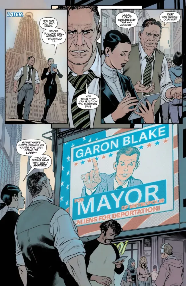
The second story takes place back on Metropolis. By writer Mark Russell, artist Steve Pugh, colorist Jordie Bellaire, and letterer Sharpe, a tale is told from the perspective of Bibbo, owner of the Ace O’ Clubs bar and a recurring character in Superman’s circle. While he narrates the story, it follows Perry White’s struggles as he campaigns to be mayor of Metropolis. The story doesn’t tie into the event much aside from a reference later on in the story explaining that the heroes are gone, so it’s time for the people of Metropolis to show that they can take care of themselves.
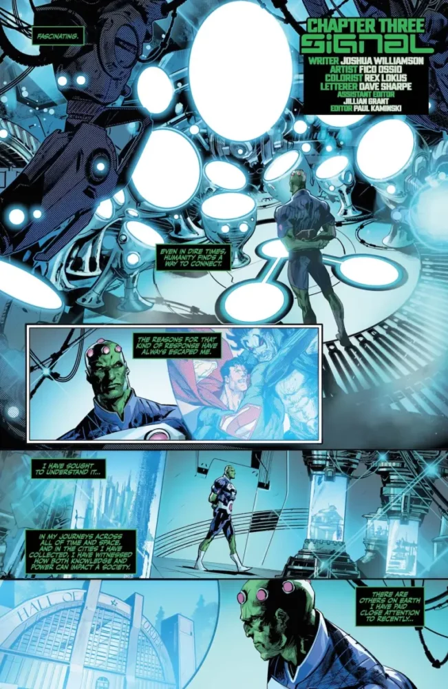
The final story is again written by Williamson and lettered by Sharpe, accompanied here by artist Fico Ossio and colorist Rex Lokus. This story is told from Brainiac’s perspective and follows Amanda Waller, desperate for knowledge and power. Peacemaker and Peacewrecker report back to her, telling her that they were unable to capture Professor Ivo. She leaves after this and tries to find out who comprises the Council of Light, and ends with a reveal built up to since the beginning of the Dawn of DC initiative.
Brainiac compares Krypton and Czarnia
WRITING
Williamson’s first story provides some necessary backstory for how Brainiac got to where he is right now. Williamson provides an easy to understand backstory for the Czarnian army, and manages to connect it to the rest of the story by showing how exactly Brainiac got this army of his. Brainiac narrates this first part of the issue, and Williamson’s voice for the character is in line with the previous two installments of the storyline. He shows that he really understands the character by putting Brainiac’s curiosity and lust for knowledge on full display. Brainiac’s quest has always been one for knowledge, and Williamson expands on that by telling the story of a planet and a city that truly piqued his interest. One thing Williamson does especially well is show how Brainiac is merely a detached scientist testing a hypothesis. He has Brainiac interact with a few of the people from this world, but allows the reader to see it in a way that increasingly shows Brainiac not necessarily toying with the Czarnians, but attempting to understand them better in every way as the story progresses.
Forward to Williamson’s other story—the third one—we again see Brainiac taking whatever information he can from his actions. Not only is his focus on what his plan is and what’s taking place in his ship, but also what was left in the wake of that. It’s almost like he threw a rock in a pond just to observe the ripples of water. Any writer with a solid plan for a story has the potential to write a good Amanda Waller, because it’s almost as if whatever the author knows, she knows it as well. Because of that, Williamson’s Waller is fantastic at making her presence known. He clearly has big things in store, which is why this story of her discovering something that she previously wasn’t aware of works so well. She takes charge of the situation, and even threatens the higher power before her.
Backtracking a little to the middle story, Russell provides a surprisingly emotionally charged story that was pretty unexpected to see in this special. It’s about being informed, and the choice to have Bibbo being the narrator was a good one. It shows that even the most old fashioned citizens of Metropolis can change their ways and help unite people towards a greater good. It can be a little heavy handed in its execution at times, but it ultimately works in favor of the story that’s being told. He gets Perry across as not a perfect hero, but one who can understand the difference between right and wrong. Russell shows how being in such a close proximity to Superman for so long can really change people, and it’s interestingly explored here through Perry.
Perry White Struggles with running for office
ART
Starting with Galmon’s work in the first story, we’re immediately taken to Brainiac’s ship where he watches the events of the last issue unfold. Galmon really does a great job showcasing Brainiac’s higher technology. The room where Brainiac watches what’s happening with Superman and on Earth is futuristically designed and gives a small glimpse of his intelligence. Later, we see Brainiac’s whole ship floating above a Czarnian city from a low angle that really manages to capture the terror of the situation. The perspective of being someone on the ground looking up at it is one that serves the story well, and really lets the weight of Brainiac’s actions sink in. Not only that, but he also manages to give each Czarnian citizen a very distinct look that can either display a lot of insanity and bloodlust, or show a sort of pretentious façade. It’s a really impressive range.
Pugh takes care of the story back in Metropolis, and he really excels at capturing interpersonal relationships between two characters. Because of that, he fits the story perfectly. For example, there’s a page between Lois Lane and Perry White where the two stand together, talking. There’s no background, it’s just the two of them. They’re surrounded by floating heads of each other as the conversation flows, and it feels natural because of that. Pugh details every single look, and it really feels like every character really takes in what the other is saying, and reacts because of that. There’s an alien mother and daughter shown earlier in the story. The daughter is curious and confused as to why she can’t join the people protesting them, but the mother is worried and holding her child back, protecting her. Pugh expresses every character in the situation their in in a way that is bound to connect the reader to them further than the words alone ever could.
Ossio takes over the final story, where the focus is mostly on Amanda Waller. There’s an interesting parallel here where Brainiac is standing in front of this room of screens, enamored by what he’s seeing and learning from it. Those screens, however, are all positioned lower than him. He is in control. On Waller’s side though, we see her standing in a room with the screens of the Council of Light all hanging above her head. As she becomes more and more in control, the screens lower until they’re finally on the same level as her. She took control.
Brainiac reacting to what’s happening in Metropolis
COLORING
Galmon colors his own work in that first story, and his art really thrives because of that. On a page where Superman and Lobo are both being presented with Brainiac’s ship cutting between them, Superman’s side is filled with brighter colors while Lobo’s is filled with darker ones. The Superman side of the image also features a panel where his Kryptonian parents hold him, a white background filling the space. With Lobo, he bites the nose of the nurse and the background is this peach color with white strikes interrupting it, giving this frantic sense to it. Czarnia’s orange skies also contrast Brainiac’s green and purple ship well. The orange skies almost blend into the fires on the ground, really cementing this place as a breeding ground for chaos.
Bellaire on the middle story does a great job capturing the small moments that are meant to get the tone across. Bibbo is shouting into a phone at one point, and the background is a lighter orange outlined by a spike darker one. Later, with the page mentioned earlier of Lois and Perry talking, their talking heads above them are both blue as we hear Lois’s side of the story. When we hear Perry’s side of it, he’s captured in this sterner red tone. Later in the story too, during a debate between Perry and his competitor, an orange color fills the background as tensions raise. When they finally reach a boiling point, it becomes a blood red. Bellaire’s coloring supports both Pugh’s art and Russell’s writing through this.
Lastly, we have Lokus’s coloring. There’s a part in this story where we’re faced with multiple Brainiacs, and each one is differentiated through their designs. Something to keep in mind though is how the shade of purple on each one is different. An earlier iteration of the character is covered in a more pinkish shade while the current one rocks circles of bright pink around his body, but is mostly clothed in a darker purple. The color of each fits the time period that they’re from. When Waller is faced with the light later, it’s brighter as its higher above her, and then a darker blue when it’s on her level. It does well to further what Ossio tries to convey while also giving each of the Brainiacs their own personality.
LETTERING
The lettering for the entire issue is handled by Sharpe. He does a great job throughout, and it’s a lot to get through. First is Brainiac’s green and black speech bubbles that are never misshapen. They’re constantly these perfect rectangles that only change when Brainiac actually speaks, becoming these ovals with machinelike breaks in them. It’s almost like the speech bubble itself is trying to contain more information, but can’t. In Russell’s portion of the issue, there’s a blog post spreading misinformation that is shown in all caps, where someone following it types in lowercase. The louder one gets the point across while the quieter one takes in the information. The white background of the post is broken by this gray box with Bibbo’s narration, combating what is said here. Sharpe is clearly very careful in his placement, which is also shown by his work in the third story. The Brainiac lettering returns, but the Waller’s speech bubbles are really what deserve some focus as well. Every emphasized word feels like it carries a weight behind it that almost makes you scared of her. What is actually said in her bubbles is spaced out well too. On one side, you’ll have her setting up a point that she then executes in the bubbles on the other side of her head. It splits up the hammer of her words falling in a way that draws the reader in.
CONCLUSION
DC’s Superman: House of Brainiac Special #1 is a welcome interlude to the main story that Williamson is writing, where Russell is also able to shine and provide a different perspective on what’s happening. With all the creators working on this issue, it’s also a diverse work that really gives multiple artists and colorists the spotlight, allowing them to be a part of this. Williamson, Russell, Galmon, Pugh, Ossio, Bellaire, Lokus, and Sharpe all work together to give a deep looks into the minds of Brainiac and Amanda Waller while also exploring what the fallout of this event could be.
From writer Sean Lewis (Bliss, King Spawn) and artist Jonathan Marks Barravecchia (Record Store Rendevouz, Gundam Battle Breaker) comes a furious storm of comics creativity with Bear Pirate Viking Queen #1. With an intentionally muddled script that constantly leaves the reader questioning reality, and an utterly staggering visual approach, Bear Pirate Viking Queen is one of the strongest debut issues in Image Comics’ entire catalogue.
“A blood-splattered story of conquest. Bears. Pirates. Vikings. And Queens—all battling for their claim to determine what the world will become.”
Writing & Plot
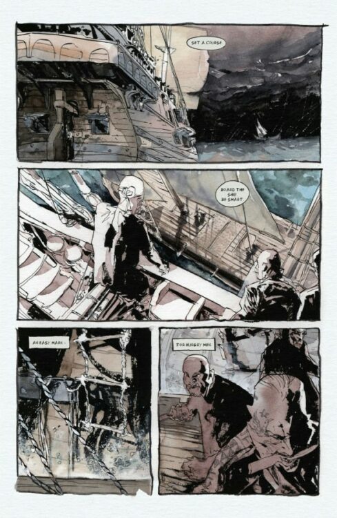
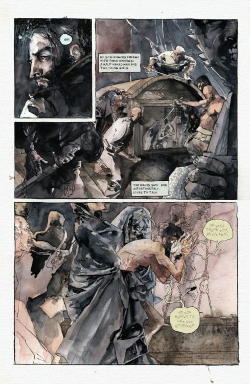
Sean Lewis’s ever-unique approach to narrative reaches a new career peak with Bear Pirate Viking Queen #1. This first issue follows Captain Paul Reddish, a sailor with the Royal Navy – and his descent into madness and piracy. A once “respected” sailor scorned by the very county he was loyal to, he turns his loyalty to plunder and slaughter, all while his mind slips further from reality. Lewis has always been a master of delivering fragmented plots with not always reliable narrators. However, especially in conjunction with this comic’s art style, the reader never quite has a bearing on which parts of the story are actually happening, and which ones are a figment of Reddish’s ailing psyche. Lewis’s character dialogue is scant, focusing mostly on Reddish’s internal thoughts and how he focuses so much on hate and anger. His entire existence now seems like he’s waging a war on those who appeal to law and reason, after being abandoned by those very principles. Viking Queen becomes more and more intriguing as it continues, and this issue peaks at the very end – when you realize that Reddish is not this mini-series’ main character. Lewis’s plotting here is deeply intriguing – but he lets its strongest aspects be told through the visual storytelling.
Art Direction
Jonathan Marks Barravecchia is responsible for the art and lettering of Bear Pirate Viking Queen #1, and as such he firmly plants himself as a massive creative force in comics today. His dark watercolor style both perfectly crafts this book’s chaotic, oppressive tone while obfuscating reality for the reader. Collages of blood and battle turn into smoky, dreamlike hazes as Reddish looks back upon his battles and reckons with what he sees in his mind’s eye. Barravecchia’s interpretation of storms on the ocean are perhaps the most effective use of weather I’ve seen in comics. Every panel is wrapped in the deep blues of storm clouds and flashes of lightning, and when paired with the narration it makes the setting feel like a living, vengeful being. Barravecchia’s character unique character rendering is a standout as well, as he constantly changes his approach to the human characters in the book. Reddish drifts between visible primal rage, to leadership-focused determination, and then to fear and despair. There’s a scene when Reddish first encounters the bear where the whole panel washes out white as dear grips him. The approach to characters who appear later in the book brilliantly contrast to the pirates, making them look like ethereal dreams and nightmares aboard a rotting ship. Barravechia’s hand-penciled lettering is the only way that this comic’s reading experience could have been tied together. The natural inflections of character speech and sudden changes in emotion, as well as the SFX work, have the grimy and unpolished look that perfectly matches the art. There’s a character near the end whose dialogue lettering is almost illegible, capturing the words of a delusional old man whose grip on reality long left him behind. Barravecchia’s work makes this comic feel like an illustrated scroll telling some old, terrifying myth.
Verdict
Bear Pirate Viking Queen #1 is a furious storm of comic book creation. Sean Lewis’s script intentionally muddles the reader’s view of the lead character as he loses his mind and focus on reality, offering twists and revelations galore. The visual work of Jonathan Marks Barravecchia is astounding, with a watercolor and kind of messy penciling approach that pulls the audience into the book’s atmosphere of madness, myth, and terror. A must read for fans of The Northman, Hellblade, and Ridley Scott’s Taboo. Be sure to grab this first issue, out now.
Bear Pirate Viking Queen #1 is a mind-bending tale out this week from Image Comics, by writer Sean Lewis and artist Jonathan Marks Barravecchia.
“How did we get here? Boats, my love. And all the men that came with them. This is the story of all of us.”
These words introduce readers to the blood-soaked world of Bear Pirate Viking Queen. The story follows Paul Reddish, a Captain in the Queen’s Royal Navy, whose ship comes under attack by pirates on page one. What follows in the remaining 71 pages… well that’s best left for you to experience for yourself.
BPVQ is a book that demands to be experienced, rather than simply read about. It’s an abstract and disorienting whirlwind of a tale where the only thing you can be sure about is that—at some point—you’re going to see some bears, pirates, vikings, and queens. You may not always be sure about what’s going on or how these elements tie together, but that’s entirely by design to put you in the shoes of the main character. Because if you’re confused about how the story got from Point A to Point B, Reddish is there to reassure you that he’s not sure how he got there himself.
“Abstract” can be a scary and off-putting word in the world of storytelling, but rest assured that BPVQ is never abstract at the expense of the story’s humanity or humor. Lewis scatters more than a few gags throughout his script (because what good would a book called Bear Pirate Viking Queen be if it didn’t have some humor mixed in), and you genuinely become invested in the swashbuckling as it progresses. Writing an abstract story can be like walking a tightrope between intriguing and confusing, but Lewis strikes the balance brilliantly, falling square in the realm of intriguing rather than off-putting. Your mind is constantly engaged, piecing things together, dissecting what just occurred and what you think might happen next. It’s an exciting and stimulating experience that Lewis scripts —one which is executed beautifully by Barravecchia.
Barravecchia puts on a stellar showcase with his artwork in BPVQ. He largely utilizes breathtaking watercolors throughout, but incorporates a variety of styles, including sometimes stripping down a panel to bare black and white pencils and inks. One panel might feature clear outlines and heavy black brush strokes, and then the next panel—featuring the same characters—will be painted purely in watercolors, sans outlines or definition.
This style leans into the abstract and disorienting vibe of the story, keeping readers on their toes, but moreover, it lends itself to the idea of BPVQ being an experience. Barravecchia’s art is raw emotion etched and painted onto the page. His crashing waves exhilarate you; his black night skies, illuminated only by flashing lightning, fill you with dread. At one point, as Reddish is contemplating what’s become of his life, we see a beautiful watercolor portrait of him as the naval officer from the start of the issue, followed by a scraggly, black and white pen drawing of the man he becomes. It’s a jarring contrast, and the juxtaposition of art styles drives the point home in a more affecting way than only words could accomplish on their own.
Bear Pirate Viking Queen starts by saying “this is the story of all of us,” and by the end, you start to understand what that means. It’s a thought-provoking tale of humanity, a species which has been at war with itself for as long as we’ve been on this planet. It’s a story that wants you to feel something, and wants you to ask questions. And, ultimately, it’s a comic about bears, pirates, vikings, and queens…how can you say no to that?
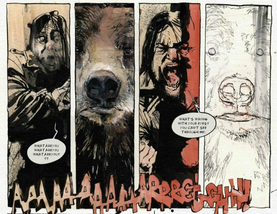
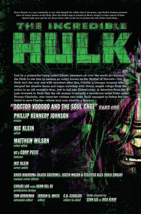
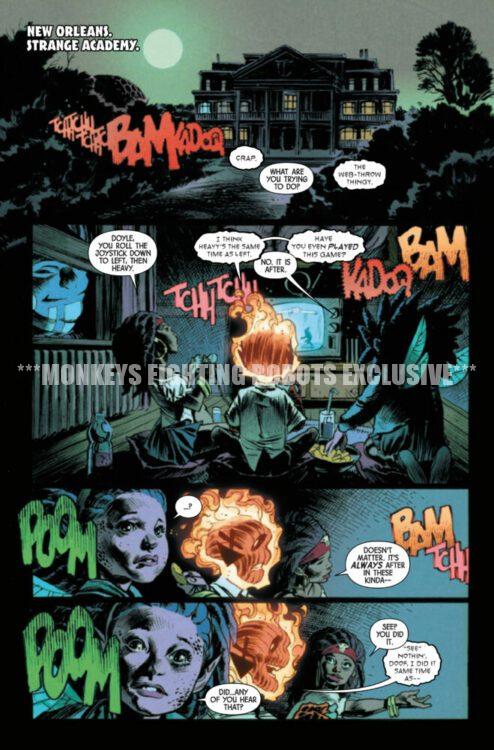
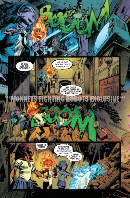
INCREDIBLE HULK #12 hits your local comic book store on May 1st, but thanks to Marvel Comics, Monkeys Fighting Robots has an exclusive four-page preview for you!
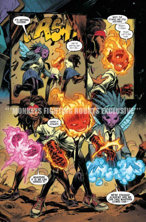
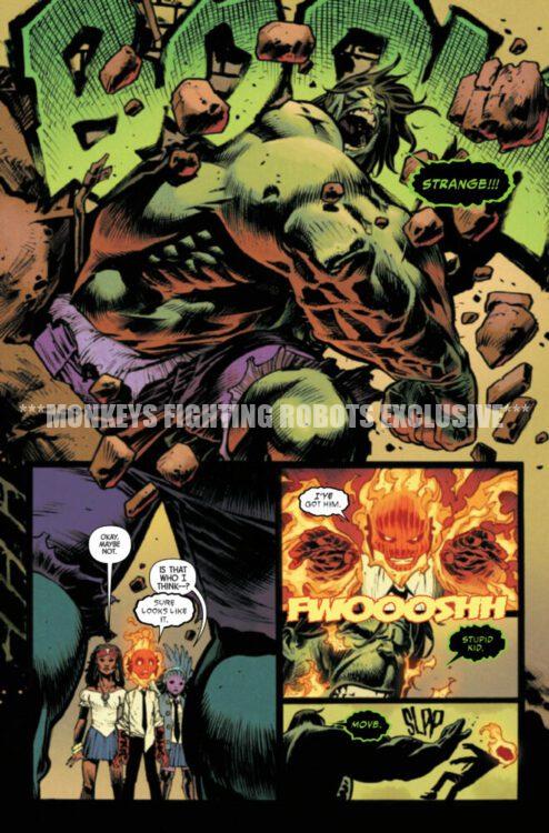
About the issue: In the aftermath of the tragic battle against Frozen Charlotte, Hulk pays a visit to STRANGE ACADEMY, seeking the help of BROTHER VOODOO in saving Charlie’s immortal soul! But when the task calls for a one-way descent into an exorcist’s ancient prison in search of the immortal FLESH-WEAVER, is the price too high even for the Incredible Hulk?
The issue is by writer Phillip Kennedy Johnson and artist Nic Klein, with colors by Matthew Wilson, and letters by Cory Petit. The main cover is by Klein.
Check out our INCREDIBLE HULK #12 preview below:
Are you reading INCREDIBLE HULK? Sound off in the comments!
After 7 years, writer Doug Wagner and artist Daniel Hillyard return to the story that started their hit “Material” universe with Plastic: Death & Dolls. Published as always by Image Comics, the first issue of this 5-part mini-series is set to hit shelves on June 12 and promises to bring all the twisted humor and over-the-top gore readers have come to expect from this creative duo.
I got to sit down once again with Wagner to talk about why he and Daniel decided to come back to these characters and where they might be headed in the future.
MFR: Yours and artist Daniel Hillyard’s “Material” series always seems to offer something fresh and new every time you come back to it. What about Edwyn’s character made you want to come back to tell more of his story?
DOUG: Oh, man. A couple of things. First and foremost, Daniel and I tend to fall in love with every character we create. Edwyn holds a special place there. He was our first serial killer, and Edwyn proved to us that there are people out there that love the same sort of weird, over-the-top, comedic horror Daniel and I love to create. Without Edwyn, we wouldn’t have created VINYL or PLUSH or what is yet to come. So, as you can probably imagine, both of us couldn’t wait to get back to this character that means so much to us. And, without admitting to too much, Edwyn encapsulates traits from both Daniel and I that we find horrifying, hilarious, and endearing all at the same time. He’s awkward, he struggles to fit in, he has odd ticks and tastes, and he has a side of himself that will not stand for injustice. Injustices we wish we had the courage to act on but can’t… you know, for legal reasons.
MFR: One of the most impressive aspects of all of your work in this twisted little world you’ve made is that there’s a surprising amount of heart in every story. How do you maintain that spark every time, and can we expect that here with Plastic: Death & Dolls?
DOUG: First, thank you for saying that. It means a lot to hear you see and feel what we try really, really… REALLY hard to find each time. We strive to find that mix between horror and heart that makes you squirm on one page and tear up on the next. I’d never presume we’re always successful at it, but we give it our best. I think our secret is that we’re both pretty sensitive guys, and we love to have our heart strings tugged. BUT we don’t want to get the feels for too long so we jump to ridiculous mayhem as quickly as possible.
Plastic: Death & Dolls will hopefully bring that same surprising amount of heart too. There’s a particular scene between Edwyn and his mom that makes me choke up a bit every time I try to tell someone about it. Let’s hope you and some others are just as big of a crybaby as I am.
MFR: Your lead partner in crime across all of these books – Plastic, Vinyl, and Plush – has been the ridiculously talented Daniel Hillyard. What about your collaborative style do you think makes these comics work so well every time?
DOUG: Egoless collaboration. That and we both share the same dark sense of humor. Honestly, Daniel and I learned early on that we both prioritize the story and its delivery over all else. What I mean by that is we don’t get caught up or concerned with who’s idea this or that was. The story comes first. Add to that, we can criticize each other’s work without worrying about offending each other. I’ve found that’s really rare. Daniel can tell me a certain scene or a line of dialogue aren’t resonating with him without worrying about how I’ll take it. If anything, he knows my next statement is going to be, “How do we fix it?” I’ve done the same with him about a layout or panel, and he’s ALWAYS had no problem redrawing another take. Sure, it can slow down the process, but story always, always comes first.
MFR: Has Daniel had any “WTF am I drawing?” moments that you can recall over the years in reaction to the scripts?
DOUG: LOL. That’s happened a few times now. My favorite was the first time it happened. In Plastic #2 when we’re cutting off the guy’s head in the car, I kept asking for more blood. He sent me like three takes, and I kept pushing for more. On the fourth take, he said, “That’s more blood than I think the human body can store.” I said, “NOW you’re getting it.” Almost every time we bump into a “WTF” moment, it has to do with science versus story. Is it possible to rip a human in half with your bare hands? Can you make a furry suit that can separate a man from head to toe? We always answer with the same response… does it make us giggle when we see it?
MFR: How stoked – or disturbed – was the team at Image to hear that you were coming back with more Plastic?
DOUG: I would have never guessed this, but surprisingly the folks at Image seem to love our weirdness. That probably explains why we’ve been so successful as a team. We get each other. The entire crew at Image have always been so supportive to us. When we meet up at cons and the like, I always apologize for the work I can only assume offends them, but to a person, they’ve all admitted they adore Daniel and I’s work. It’s always wonderful working with like-minded weirdos.
MFR: Do you think we’ll see any more work in the “Material” world in the future, with or without Edwyn?
DOUG: Absolutely. Daniel and I are having a blast, and as long as there are people wanting more, we’ll keep delivering. Stay tuned.
Hit up your local comic shop to order your copy of Plastic: Death & Dolls #1 before it hits shelves on June 12th!
The Creature from the Black Lagoon Lives #1
Credit: Universal/Skybound Comics
Universal Monsters: Creature from the Black Lagoon Lives! #1 is out this Wednesday from Image Comics and Skybound Entertainment, written by Dan Watters and Ram V, with art by Matthew Roberts, and colors by Dave Stewart.
Over the years, I have made a number of comic book related confessions in my reviews and articles: I’ve never read a Green Lantern comic; I’ve probably turned off more superhero movies than I’ve watched to the end; and the percentage of comics that are worth talking about is actually very low. Most comics are entertainment and, if they entertain you, then all is good, but that does not mean that they are great comics or have anything to say about the medium. I love the Alien franchise, but only the original movie pushed the boundaries of what cinema could achieve, and very few of the comics have engaged with the comic medium in surprising and exciting ways.
This leads me back to Universal Monsters: Creature from the Black Lagoon Lives, and my confession isn’t that I haven’t seen the original movie. I have, several times, once on the side of a canal, late at night, in the open air. No, the confession is that there are very few comics that interest me at the moment. I am finding it hard to get excited about any new publications except spin-off or tie-in comics. Everything new that has caught my eye, and that I’ve actually picked up, can be filed in the adaptation folder in my collection. Planet of the Apes, Alien Black, White and Blood, and the upcoming Dick Tracy title from Mad Cave. But we can now add to that two new(ish) titles due this month: the re-release of the original comic book adaptation of Labyrinth and, of course, Creature from the Black Lagoon Lives.
Universal Monsters: Creature from the Black Lagoon Lives #1 Credit: Universal/Skybound Comics
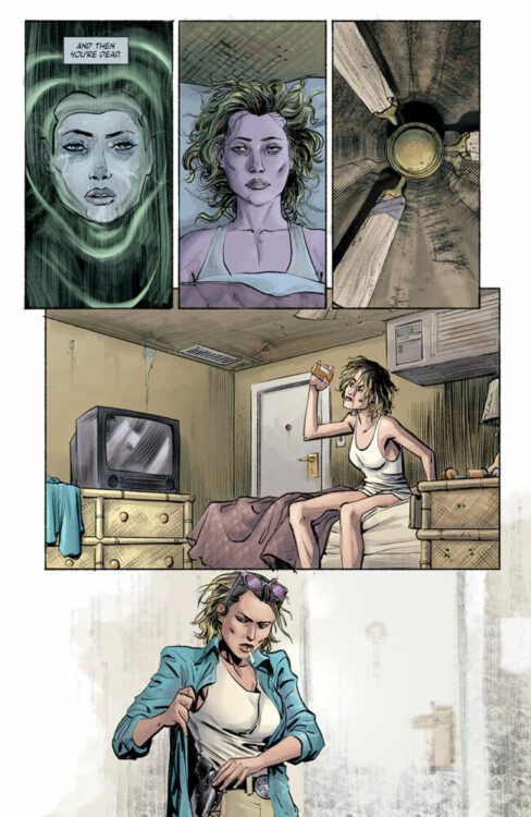
The premise behind the new Creature comic from Universal Pictures and Skybound is simple: journalist Kate Marsden is tracking a monster, a serial killer who drowns his victims. Her hunt is personal (for reasons that become apparent) and she has tracked the killer to the depths of Peru. There is nothing further you need to know. This opening issue is a character piece centered firmly on Kate and the trauma that keeps her going day-to-day. She is both a victim and hero. Dan Watters and Ram V, the writers, have woven a tale of flashbacks and nightmares to let the reader know exactly the kind of person that Kate is. Determined, strong minded but also broken and, at times desperate.
Everyone knows what’s coming—it is a monster comic afterall—but like the classic monster movies of old, the buildup is long and the pacing is slow, deliberately so. The writers know they have to construct a connection between the reader and the hero before the monsters turn up, otherwise there’s no drama, no tension. The second half of Jaws is so successful because the audience is 100% behind Chief Brody. Readers are heartbroken when Elektra crawls into Matt Murdock’s arms to die in issue 181 of Daredevil because Frank Miller created a strong bond between the two characters and relayed this perfectly to the readers. In this Creature comic, Watters and Ram V show you the strengths, and weaknesses, of Kate, making her a sympathetic character that you will root for.
The character beats and emotional reactions of Kate are brought out by artist Matthew Roberts, who emphasizes Kate specifically by making her dominate the pages and the layouts. Compared to the previous Universal Monsters comic from Skybound, Dracula, the layouts and panel designs in Creature are fairly standard and straightforward in approach, but this highlights the composition within the images. A page with a nine-panel grid is designed in such a way that the scene plays out in a linear, Z-pattern reading structure but also contains shorter story beats fitting the rhythm of the layout. It then goes one step further by creating visual emphasis to draw the reader’s view against the standard reading pattern, making you notice elements in certain panels that you may have missed with a quick skim read. Your eyes are drawn diagonally down the page, focusing on the image in a security camera in panel one, the gulf between the two characters in panel five, and finally onto the gun tucked into Kate’s belt in panel nine. All this before you have read through the page.
Universal Monsters: Creature from the Black Lagoon Lives #1 Credit: Universal/Skybound Comics
The coloring by Dave Stewart is surprisingly subtle, especially compared to the previously mentioned Dracula. Where that comic was all expressive coloring and border shattering layouts, Stewart gives Creature a naturalistic palette, saving emotional hues for dramatic moments or flashbacks. A purple wash accompanies Kate’s flashbacks, hinting at the unfolding mystery surrounding Kate and her presence in Peru. And the natural greens of the jungle are a beautiful contrast to the manufactured colors of the clothes and interiors.
The original Creature from the Black Lagoon movie advertised itself as a suspenseful, terrifying movie and focused on the monster’s brutal presence. The trailer highlights the “underwater thrills never photographed before” and “titanic underwater battles never dreamed of.” This focus on the underwater element of the story is reflected in this follow up comic, with the highlights of the comic being the water-based scenes. It opens and closes with the most memorable moments, which will mirror most people’s memory of the movie. A monster, swirling water, and the heroine in peril. These are the movie’s CliffsNotes, and these are the jump-out pages of the comic.
Just as the creature grabs hold of its victims and drags them down into the murky depths, the creators of this follow-up take the reader by the hand and slowly pull them along, towards the edge of the river, and, finally, into the waters. The story starts out fascinating and becomes engrossing as Kate is dragged out of her depth. The artwork displays the emotional characters very well, but lacks something outrageous. There are a few pages that manage to elevate the visuals, make it live up to the shocking promises of the original movie, but there is not enough to single it out as an outstanding comic. This isn’t as bad as the King Kong ripoff that was Revenge of the Creature, and it avoids the bizarre creature feature elements of The Creature Walks Among Us, instead favoring a more modern, gritty realism. But is that the best path to take?
Universal Monsters: Creature from the Black Lagoon Lives #1 Credit: Universal/Skybound Comics
The Universal/Skybound Dracula comic was outstanding because it leaned into the outlandishness of the source material. It took the cinematic elements of the original and turned them into comic specific visuals, while maintaining a link through the plot and character speech. With this new Creature comic, the essence of the movie is lacking from the majority of the pages. It is only during the water scenes that any connection to the 1954 movie is stirred up in the reader. Remove the actual Creature and there is nothing in this comic that links it to the source material: nothing thematic, nothing narrative, nothing visual. From a general comics reader point of view, this actually doesn’t matter. Creature from the Black Lagoon Lives is a very successfully constructed comic that tells its story solidly—beautifully, even. From the point of view of an adaptation, however, the comic is a touch disappointing. I don’t necessarily want over-dramatized actors in black and white 3D emoting to me while constantly getting snatched by a man in a rubber suit, but a little part of me does want some of that. I want the feeling of watching the movie when I’m reading the comic. That feeling you get when you read the Marvels Planet of the Apes comics from the 1970s, that twinge of nostalgia you get from reading Innovation Comics’ Lost in Space series, or any of the Star Trek tie-ins. I want what you get only at the end of this comic.
With that said, we circle back around to my opening. I adore this comic. It is an exciting and intriguing comic, one that I will follow to the end. The subtlety in the artwork, especially the coloring, gives the comic a gravitas that is lacking from a lot of current publications. The creators are taking the process of making comics seriously and thoughtfully, and it shows on the page. I only hope that more of the movie seeps through into upcoming issues. This comic should look and feel like a sequel, a successor, but at the moment it leans more towards a modern remake.
Universal Monsters: Creature from the Black Lagoon Lives #1 is out this Wednesday, April 24th, from Image Comics and Skybound Entertainment.
After the explosive ending of Dark Horse Comics’ Helen of Wyndhorn #1, you’d expect the next issue to be full of fire and bombast. Instead, writer Tom King, artist Bilquis Evely, colorist Matheus Lopes, and letterer Clayton Cowles choose to make their second issue quiet and subtle. They find their stakes not in action-packed adventure, but in the complexities of their characters.
Writing
The first issue of Helen of Wyndhorn ended with Ms. Lilith Appleton and Helen face-to-face with a gargantuan monster — whose head had been recently removed by the burly Barnabas Cole, Helen’s grandfather. In issue #2, after a brief introduction via our frame story, King brings us back to a startlingly calm scene in Wyndhorn. As Lilith, Barnabas, and Helen sit around the dinner table, nothing at all seems to be amiss. Lilith admires the food as Barnabas hungrily gnaws a turkey leg. Helen is the only one who isn’t ready to move on from the horror of the night before.
“Excuse me…” Helen says. “…What the hell is happening?” What indeed, Helen! Last time we saw any of these characters, they were facing down some supernatural beast. By skipping ahead to the next day and underlining how “normal” everyone is acting, King imbues Helen of Wyndhorn #2 with an immeasurable amount of tension. He also, brilliantly, keeps this story focused on its characters. Lilith and Barnabas seem to be intent on pretending nothing at all happened that night with the monster — albeit for very different reasons. And Helen, as stubborn as ever, will not let it go. King pushes the supernatural elements of this story into the background, at least for this issue. He insists that if we are to care about these characters, and any fantastical situations they may someday find themselves in, we have to know them first. Helen of Wyndhorn #2 is beautifully normal in so many ways, and yet rife with tension and personal stakes.
Art
In one of Lilith’s narrations, she talks about noticing a familial similarity between Barnabas and Helen. “Something around the eyes,” she says. Even as a reader, you can see there’s an undeniable resemblance there. The way that Evely achieves this is outright remarkable. For one thing, when you actually focus in on the eyes of Helen and her grandfather through the rest of the story, you’ll first notice something particularly odd about Barnabas. He is often pictured with his eyes barely open at all. He looks down and away, rarely making eye contact with other characters. Barnabas may seem confident and jovial at times, but it all looks like one big act. Instead, as we see him continually avoid our gaze, it becomes more and more obvious that this is a man who is hiding plenty of pain and shame.
There’s some of that same shame in Helen. Perhaps that’s why liquor has become her closest confidante. But she also has a dreaminess about her. She stares off-panel, looking like she’s a million miles away. She only occasionally looks at characters (and us) directly in the face. When she does, it’s usually because she’s mad about something. But just like her grandfather, she’s almost always looking away. Lilith’s eyes, however, frequently look to us. She looks at the reader with a piercing and determined expression. It’s as though she’s telling us that she’s not dreaming like Helen. She’s not ashamed like Barnabas. She’s wide awake and ready to account for her actions. Through Lilith, Evely includes us in the narrative. We’re Lilith’s witness to these events. We’re the ones who are hearing her story. She wants to make sure we’re still paying attention and seeing all the ways she tried her best.
Coloring
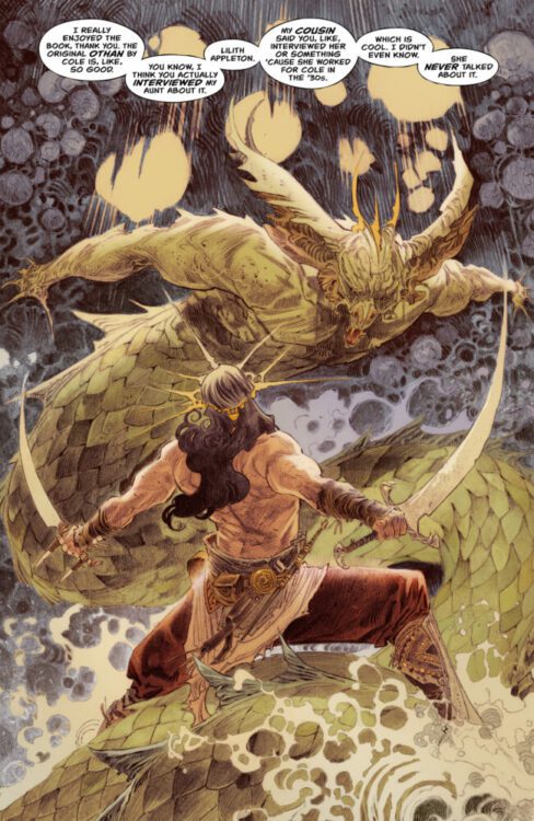
Lopes wastes no time at all in this issue. He immediately connects us to the themes of this story, by starting with a painted looking page that depicts C.K. Cole’s character, Othan, fighting a monster (not unlike Barnabas at the end of the last issue). When you flip that page, you find an incredibly similar color scheme being used for a scene in the dining room at Wyndhorn. Lopes is underscoring that Cole’s stories came from his childhood in Wyndhorn. Cole’s books all found their sources, their root, right where Helen sits now.
Elsewhere, Lopes continues to use an eerie looking turquoise color to mark scenes that take place at night. These hues take you right back to that final scene in the previous issue, where a twisted monster lumbered through a landscape depicted in that very same hue. Surprisingly, Lopes also maintains the warm green coloration of the hills outside the house. Despite the dangers that could be lurking behind any tree, Helen still feels alive as she stretches out on the grass. As this issue closes, we see Helen and Barnabas setting out on a journey together. Lopes covers the page in a mix between his turquoise and warm green colorations. It’s a stunning way to end the issue with a giant question mark, suggesting that bright days out on the grass or cold nights fighting monsters could be what come next. Only time will tell.
Lettering
In the first few pages of this issue, Helen wants to get her grandfather’s attention. She slams her fists down on the table. “BANG,” Cowles writes the sound in big white letters. Barnabas chuckles before saying, “No. Like this,” bringing his own two fists down on the table. The resulting “CKKKRAKKK” is shown in jagged, hollow letters that take up the whole bottom half of the panel. It’s a brilliant, colorful moment where Cowles shows us undeniably who can cause the bigger disruption.
But Cowles does a lot of subtle work in this chapter as well. It seems — though it’s not always a rule when space dictates otherwise — that when a word balloon goes up from a character’s mouth, their dialogue feels deliberate, sometimes cutting. Alternatively, when the balloon drops downwards, their words feel almost to have lazily tumbled out of their mouths. Cowles uses these ideas extremely effectively in an argument between Lilith and Barnabas. Lilith constantly changes tactics, trying to get through to Barnabas through gentleness or blunt truth. Her words ping pong across her face. Barnabas often answers her in a balloon that appears above his face, then continues on dismissively in dialogue that is depicted below him. But when Lilith finally cuts through to Barnabas, his words start low. “You…” You can hear the quiet fury in his voice. When he next speaks, Cowles writes his dialogue in smaller font than the rest. “Get out…” He no longer has the energy to speak deliberately. “Just go. Please. I beg you.” All these words descend towards the bottom of the page. The fight has gone out of him and Cowles shows us exactly that.
Verdict
Helen of Wyndhorn is about many things. It’s about coping mechanisms, family dysfunction, and fantastical lands populated by mythical creatures. But most of all, this creative team assures us, it’s about its characters. Helen of Wyndhorn #2 is a stunning second chapter. This intimate, understated story is surprising and moving. You don’t want to miss it! Helen of Wyndhorn #2 is out from Dark Horse at a comic shop near you!