Home Blog Page 13

Review: ZATANNA: BRING DOWN THE HOUSE #2 — Rabbits & Hats

Zatanna: Bring Down The House #2 is the second part of DC’s Black Label Zatanna story from writer Mariko Tamaki, artist/colorist Javier Rodríguez, and letterer Hassan Otsmane-Elhaou. All three of these creators work together to deliver a visually stunning story that also pulls at the heartstrings.

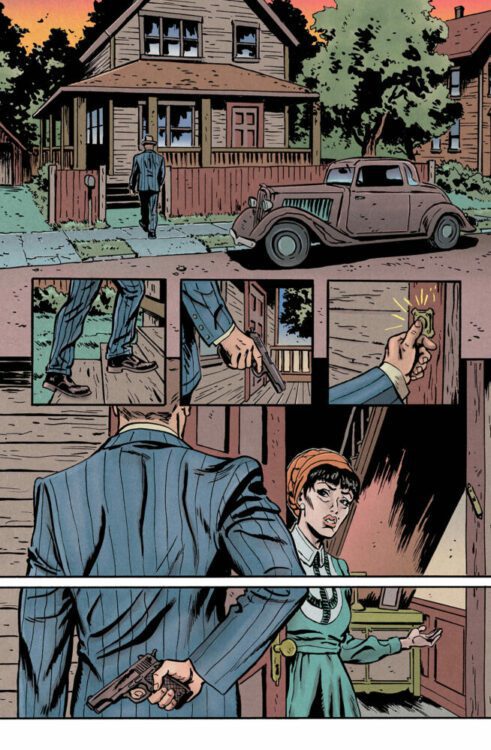
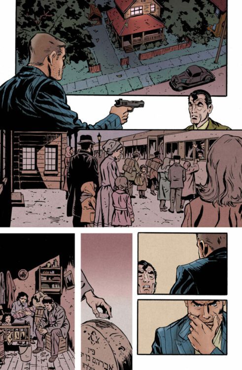
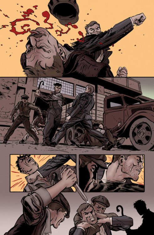
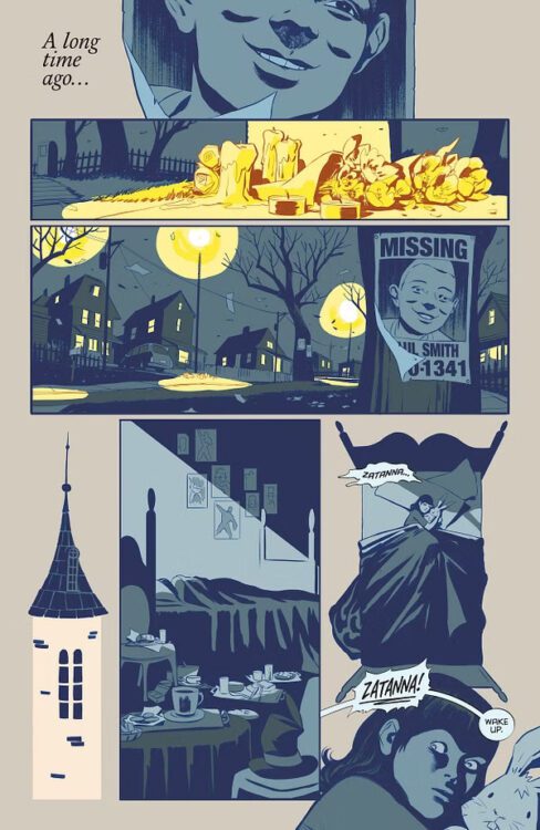
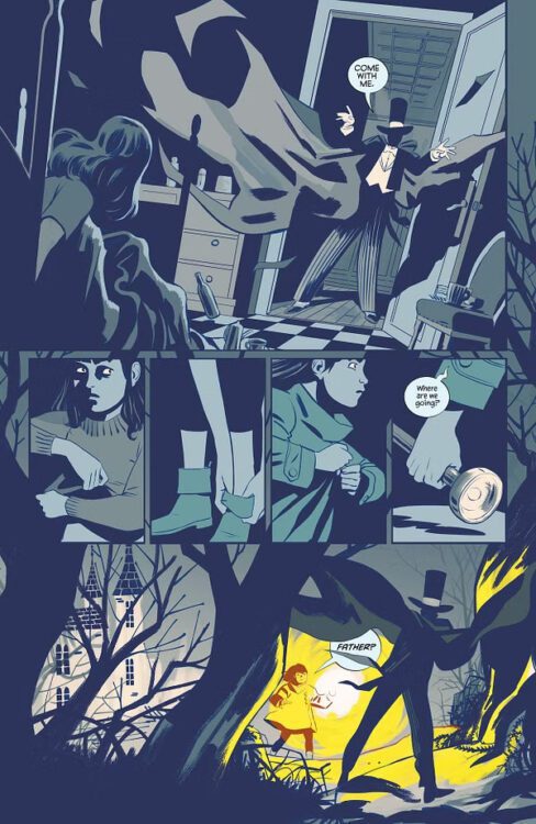
The issue starts with Zatanna following her father into the woods. He’s going to let her reverse the spell that she cast in the first issue, bringing back the bully that she made disappear. He blindfolds her, and then we’re brought back to the present day. Chaos ensues as the inside of Zatanna’s venue has become a battle colosseum for another magician and a demon. She helps where she can, but claims that she doesn’t know magic anymore. She saves a few people and the demon is dealt with, but then Zatanna and the other mysterious magician are taken to The Palace of the Casters, where she speaks to their leader and argues with them, continuing to deny that she has any magical capabilities.

Zatanna awakens in the dead of night

WRITING

Tamaki does a great job of handling Zatanna’s past trauma in this issue. Like the last issue, we’re not told the whole story at once. We get a flashback at the start, and then it circles back near the end of the issue. The remaining middle section is Zatanna’s adult life filling in some blanks. Tamaki writes Zatanna’s father almost as though he’s this mysterious, all-powerful being that we know nothing about and should fear. The flashback is told from Zatanna’s perspective, and so that’s exactly how she sees him.

Tamaki uses perspective well in this, but also doesn’t let that stop her from having Zatanna keep some secrets. For the most part, we know what the character knows. Because of the flashbacks, we feel invited into her psyche. Once they reach the Palace of the Casters though, that changes. We start to doubt her and really wonder if even she knows the whole story, or if she’s suppressed these traumatic memories. It’s really well done on Tamaki’s end, and is an excellent way of setting up a mystery within the character.

ART

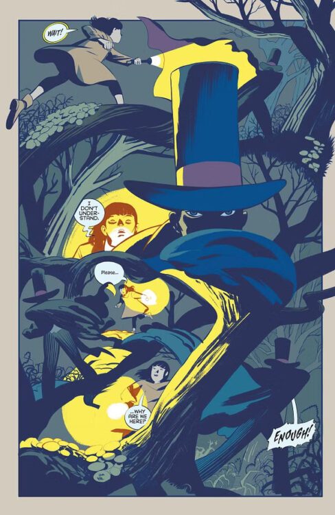
Rodríguez makes this issue look absolutely stunning. The paneling of the issue is strong from the first page alone, with a panel of Zatanna’s room almost morphing into one laying in her bed. Rodríguez draws her father as this elusive being, having him radiate that energy visually that Tamaki has written into him. His movements are not normal, it’s like he’s one with the shadows. His entire face is never fully drawn either, only ever his eyes. An interesting thing is that you start to wonder if this is how Zatanna remembers this night, or if this is just how she remembers her father to be.

Rodríguez’s designs are also wonderful to look at. The second magician’s suit that she dawns against the demon is something almost reminiscent of his designs in his work on Defenders and Defenders: Beyond. Not only that, but the actual demon itself is bone chilling. It has multiple arms, long hair, long fingernails, a bony back, everything. Its cracked mask where the hair falls out of is especially unsettling. The design of the Palace also feels like something straight out of a sci-fi film. It’s a society of robed sorcerers, and statues resembling their leaders. A lot of work and detail went into this, and it shows with every panel.

Zatanna follows her father into the woods

COLORS

Rodríguez colors his own work in this issue, and it’s gorgeous. From the beginning scene with Zatanna and her father in the woods, the only light is present comes from Zatanna’s flashlight. Her father seems to almost dodge it, and because of that he’s almost always completely shaded in. His only defining features are his clothing and his eyes, both detailed to provide a further sense of wonder and mystery. When her father is around, everything is dark and shrouded.

She tries to make a name for herself in the future, and the venue where she and the other magician fight the demon is incredibly colorful and vibrant, she leads a different life entirely from her father. When we enter the Palace, however, she feels like she’s dragged right back into the world of her father and a color scheme similar to that at the start of the issue is adopted. When she later leaves the Palace, her world is still vibrant, but some of the colors seem flatter. It’s like that that run-in with her father’s past has tainted who she is now, changing her. It’s a subtle yet effective touch.

LETTERS

Otsmane-Elhaou letters the issue and gets really clever and creative with it. Zatanna’s father’s words feel stern and they scare you. Most of his bubbles have emphasis, and when he yells at Zatanna, it’s almost like the bubble can hardly contain his words. At the end of the flashback, an unsettling noise is lettered near the bottom of the page, but it’s not quite all contained in the page. It carries over to the next, where it’s revealed that the noise the entire time was just two older women sipping away at their dranks. It enhances an already great transition.

Something else that’s interesting is when younger Zatanna says the magic word. As present Zatanna doesn’t remember what it is, it’s all shrouded, you can’t make out any of the word. Along with that, all of the signature Zatanna backwards speech in order to cast spells is really well done in this issue, with higher emphasis put on stronger spells. It must be a pain to put together, but Otsmane-Elhaou pulls it off.

Zatanna follows her father, confused

CONCLUSIONS

Altogether, this is a stellar issue. Every new aspect of it helps to bind together the others, and it’s an experience that’s sure to leave the reader content with it. Rodríguez both drawing and coloring the issue is a massive strength that shines, but also wouldn’t be possible without Tamaki’s clever writing. Otsmane-Elhaou provides the cherry on top with the powerful lettering that truly makes you feel the weight behind every word spoken. It’s a fantastic collaboration that keeps the mystery of Zatanna and her father going, and it does that in an immensely intriguing way.

Monkeys Fighting Robots Youtube

Review: CRUEL UNIVERSE #1 Shoots Readers Into EC’s Future

Cruel Universe #1 Cover art Credit: Oni Press / EC

In space, they say no one can hear you scream. However, the second title in Oni-Press’ new venture with EC, Cruel Universe, is hoping that the incidents in these stories will make your scream heard even through the vast vacuum of space. Whereas Epitaphs from the Abyss follows titles like Tales from the Crypt into the realms of horror, Cruel Universe takes its lead from Weird Science and Weird Fantasy. It is an anthology of four science fiction stories, each with the famous twist at the end that was the hallmark of EC’s excellence.

Cruel Universe #1 Alternative Cover art by J.H. Williams III
Credit: Oni Press / EC

Out of the new titles, Cruel Universe is the weaker of the two, but it has more potential to grow into something exciting and find a new voice in today’s comic book market. There are many horror anthologies within comics, but science fiction tends to stay in the realms of prose, despite the infinite possibilities that comics can afford such magnificent ideas. 2000AD is a testament to the worlds and stories that can be shared through science fiction short stories, but where Cruel Universe differs is by having self-contained stories within each issue, a format made popular by the original EC comics of the 1950s.

For more information about EC in general, check out my review of Epitaphs from the Abyss. However, it is worth noting that the original science fiction comics published by EC included the same moral lessons as their other titles, a concept that was challenged when they adapted a Ray Bradbury story without getting permission. This led to a string of official adaptations of Bradury’s work, which turned out to be a boon to the publisher.

There are no adaptations in issue #1 of Cruel Universe, but there is a familiarity about the stories. Matt Kindt’s opener is a gladiatorial tale set on an alien world, where a merchant is forced into brutal combat for the pleasures of others. It’s not a particular new concept, but Kano’s artwork keeps the reader interested throughout, and the charming twist gives readers an indication what to expect—or rather, not to expect anything, from the following stories. Corinna Bechko’s Solo Shift is another example of the journey being much better than the destination. The ending is fairly obvious from several pages into the comic, but the beauty of Bechko’s writing, and the clinical artwork by Caitlin Yarsky, means that you actually don’t really think about where the story is going until the final page. The colours by Michael Atiyeh across these ten pages are muted and grey, with an oppressive blood red lighting effect that sets the ominous tone. This is contrasted by the yellow caption boxes that really give this story that EC feel of old. The layouts might be more suited to a modern comic, but the aesthetics in the panels are a definite call back to the 1950s.

Cruel Universe #1 Alternative Cover by Jay Stephens
Credit: Oni Press / EC

The weak link in the mix is Chris Condon’s Drink Up. It has a fascinating start, but meanders and ends suddenly with no fanfare or real build up. It’s obvious where it’s going, and seems to give up as soon as all of the information has been laid out. Jonathan Case’s artwork is the saving grace, giving the story a bit of dynamism. But not enough. Luckily, the final story washes away the bitter memory pretty quickly. There are a number of twists and turns in Ben H. Winters’ Priceless, and the influence of television shows such as Black Mirror are obvious. It is a bittersweet story and the emotional conflict of the central character is captured perfectly by Artyom Topilin’s artwork. Topilin has a beautiful style that brings out the characters’ emotions with soft shapes and subtle lines that present deception, concern, panic, and happiness. Priceless is a complex story which mixes vibes of the Strange Days movie from 1995 with an episode of the brilliant Inside No. 9, or Jordan Peele’s recent Twilight Zone series. At each junction of the narrative, you think you have a grip on it, but it wiggles its way into a different direction, keeping you on tenterhooks.

There are highs and lows throughout Cruel Universe, as with any anthology, but the dedication to the craft from all of the creators is represented on the page. Each story is different but commits to the concept of comic as a whole, recreating that 1950s EC feel. As mentioned in the review of Epitaphs from the Abyss, the layouts are very modern. However, more so than the horror anthology, there is an aesthetic in Cruel Universe that recreates the feel of the 70 year old publisher. These stories are science fiction but have the beauty of also being retro in design. It’s like the future as seen by creators in the 1950s, tinted with modern ideals and influences. They are both old and new, light and dark, modern and nostalgic. Despite the 2024 production, Cruel Universe is closer in reading experience to the original Weird Science comics than Epitaphs is to The Haunt of Fear.

Cruel Universe #1 Artist Edition Style Cover art
Credit: Oni Press / EC

The imagination and talent involved in Cruel Universe makes the anthology an exciting and intriguing read. Even where elements of the comics fall flat, there is enough to keep any reader interested. The twist at the end might be obvious, but the journey to the twist makes up for it. Or the script might be a touch cliched, but the artwork will see you through. Cruel Universe is fun, shocking, and contains moments of poignancy that made the original EC titles so dangerous and popular. There is great potential in this comic to tell some exciting and important stories, and I can imagine that the creators in the industry will all want to get involved. The possibilities are endless.


And check out Darryll’s review of CRUEL UNIVERSE’s sister series, EPITAPHS FROM THE ABYSS, right here!

Monkeys Fighting Robots Youtube

Review: EPITAPHS FROM THE ABYSS #1 — Shrieking EC Horror In The 21st Century

Epitaphs From The Abyss #1 Cover Art Credit: Oni Press/EC

Hitting the shelves of every comic book shop this week, and (if there is any justice in the world) falling into the hands of every comic book reader, is the greatly anticipated Epitaphs from the Abyss. A product of the Oni-Lion Forge Publishing group, this is a revival of the Entertaining Comics (more commonly known as EC) line of horror and science fiction comics that ended with Incredible Science Fiction #33 in 1956. Although their satire comics lasted the 1950s backlash against obscene publications, and there have been many reprints over the years (not to mention knock offs), this is the first official return in 70 years for this part of the EC brand—in comic book form at least.

Epitaphs From The Abyss #1 Alternative cover by ANDREA SORRENTINO WITH DAVE STEWART
Credit: Oni Press/EC

The old school design of the cover, with a title that is extremely reminiscent of the horror comics of the 1950s, copies titles such as Tales from the Crypt and Vault of Horror in both layout design and striking visuals. With a bold title and disturbing cover picture, the comic disrupts the modern comic book aesthetic, creating a scream back to a time when comics had the power to truly shock and outrage. A cover needs to grab a reader’s attention, and it has been a long time since a design has really stood out among the slew of superhero titles that overstock most comic shops. That’s not to say we haven’t had great covers, but it’s been a while since something challenged the norm, and embracing a 70 year old design just highlights how impactful those original covers were. Issue one of Epitaphs pays homage to the best of those covers, and you can’t help but think that the inclusion of the blood spattered axe is a reference to the most infamous cover: Crime SuspenStories #22.

The enduring feature of the original EC comics of the late 1940s and early 1950s was “to offer better stories than can be found in other comics. [..] They are true-to-life adult stories ending in a surprise. That’s our formula” (a quote from Bill Gaines reproduced in Qiana Whitted’s excellent book EC Comics: Race, Shock & Social Protest). This formula proved successful. So successful, in fact, that other publishers used the mass hysteria of the 1950s’ fight against juvenile delinquency and the creation of the Comics Code Authority to pretty much bankrupt Gaines’ publishing company.

Epitaphs From The Abyss #1 Alternative cover by JAY STEPHENS
Credit: Oni Press/EC

However interesting the history of EC is, I don’t want to delve into it too much here, because the history of the publisher is not as important as the formula of the comics when we look at the new Epitaphs from the Abyss. The portmanteau approach to the comic, with four separate stories linked by theme rather than character or creator, is a long standing tradition, especially within the horror genre. It can be seen in cinema with companies like Amicus Productions releasing a series of seven movies between 1965 and 1974. But the tradition dates back even before EC’s venture into horror and crime comics, and can be seen in the Grand Guignol theatre traditions from 1897. Like its predecessors, Epitaphs is a collection of stories, linked via a storyteller of supernatural appearance, with each twisted tale featuring a protagonist who is far from heroic, and just deserts are meted out on a golden platter. There’s no hope here, no-one to come to your rescue, and brutal justice is the closest you will get to a happy ending. Let’s face it, it is exactly what you have come looking for.

There are two major takeaways from this premiere issue, and the first is that each of the four stories is a magnificent example of the short story horror genre. There are despicable characters driven by greed and jealousy: acts of theft, murder, mind control, and unspeakable violence. Desperation flows through the panels as the characters face and attempt to escape their fate, and there is social commentary front and center. One of the aspects of the original EC comics was their fight to publish stories that challenged the status quo and the unjust elements in society. Epitaphs follows in this footstep, although not at quite the groundbreaking level that stories like Judgement Day from 1953 did. But that challenge is there. If you are concerned about politics in comics, you might want to stay away from this title.

Due to the short length of each story, I don’t want to dwell on them individually and give anything away, but there are elements of the supernatural, conspiracies within the government, and disturbing social experiments that border on Black Mirror territory with a hint of the Twilight Zone (I’ll come back to this later). Each of the writers has something to say and they use their short page count perfectly. J. Holtham’s story contains some very obvious twists, but it is the way that he leans into the obviousness that makes the story work. Chris Condon and Brian Azzarello both use modern politics to create their scares, but it is Stephanie Phillips’ tale of terror that is the most disturbing, if not the most original. Phillips’ also has the advantage of Phil Hester’s artwork to back it up. His work has a recognisable style and suits the twisted horror genre perfectly. The line work is heavy and almost unnatural. He is a bold inker and brings a high level of dynamism to his panels. There is an energy that fuels the story and heightens the horror. The artwork brings a sense of urgency and builds levels of emotion so that you almost forget the familiarity of the story.

The artwork on Us vs. Us by Vlad Legostaev does something similar with its simplified characters and exaggerated forms. This story, which is the most obscure of the four, is initially the most EC of these stories. This is helped by the bold colouring of Brittany Peer who picks up the palate of the comics title and runs with it throughout the comic strip. Large, flat areas of colour denote the backgrounds, enhancing the foreground storytelling while creating a nostalgic feeling for the old 1950s printed comics. While Senator, Senator looks and reads like an early X-Files comic, Us vs. Us is the most EC-esque when it comes to horror, with Killer Spec taking a close second.

Epitaphs From The Abyss #1 Alternative cover by DUSTIN WEAVER
Credit: Oni Press/EC

If all of this sounds like your idea of a great comic, then, stop reading and go pick up Epitaphs from the Abyss. It’s a fun, entertaining comic that will annoy all of the right people. The writers and artists all do a wonderful job of bringing this horror comic to life, with a perfect blend of horror and comedy.

However, this comic’s biggest selling point is the fact that it is the return to the stands of EC, a brand that had a massive impact on the publishing world and influenced hundreds of people in the last 70 years. Steven Spielberg, Tobe Hooper, and George A Romero were all fans of the comic series, and each would have been boarding on their teenage years when EC’s infamous comics hit the stores. The artists—such as Bernard Krigstein, Graham Ingels, Johnny Craig, and Wally Wood—all became synonymous with the comics they worked on, which helped some of their careers, but also ended others when the bubble burst. If you become known for drawing grotesque horror comics and then these become banned, getting follow up work becomes very difficult.

When you promote yourself as a specific thing, in this case a return of EC, it comes with certain expectations, and meeting those expectations is never easy. It is true to say that EC titles are known and loved today mostly by people who weren’t around when they were originally released. The fandom has grown overtime, feeding into the legend with every new generation that discovers the magnificent stories, and the hard hitting “prechies” that challenged the society of the early 1950s. But not all of the stories in titles like Haunt of Fear or Crime SuspenStories were ground breakers. In fact, many of them would be problematic if released as new in today’s market and a large number of the stories would be classed as mediocre at best. So what is it that makes the brand so exciting and differentiates it from the many horror and crime compilations that have come and gone since Tales from the Crypt was last on the stands? How can EC stand out in a world which has comics such as Creepy, Creepshow, Red Room, and television series like Inside No. 9 and Black Mirror? How can you make a comic compete while still remaining true to what it was?

Step one is attention to detail, and with letterer Richard Starkings, Oni Press have found the perfect person to recreate the lettering style of the original comics. The font and style of the text in those 1950s comics was as iconic as the stories themselves. And Starkings has painstakingly recreated this for both of the new EC titles, Epitaphs from the Abyss and Cruel Universe. From the cover title to the hosts opening preamble, there is something nostalgic and satisfying about the way the lettering looks. It instantly makes you feel like you are reading one of the classic comics, despite the fact that the rest of it looks completely different. Getting those few initial pages right was probably the most important part of this brand relaunch because it satisfies the readers expectations from the beginning, allowing for the format to change going forward with little resistance. If the covers weren’t right, the contents would be a harder sell.

Epitaphs From The Abyss #1 Alternative cover
Credit: Oni Press/EC

Personally, I wanted the comics inside to adopt the style of the original EC comics, with text heavy caption boxes, standard grids for the panel layouts, and highly detailed images within each panel, reflecting the complexity of the stories being told. Remove the paratext from Epitaphs and it would be hard to differentiate this comic from any other horror anthology. Unless we examine the themes, that is. Back in the 1950s, a number of common themes emerged from the titles that EC published: Poetic Justice, political and social messages, cheeky adaptations. Each of these are present in Epitaphs with the stories featuring at least one, but in some cases more. And the familiarity of some of the stories won’t be a coincidence, as the writers and artists are drawing on modern influences, such as Black Mirror or the Purge movies, to recreate a tale that might have appeared in The Vault of Horror, for example. The idea behind Oni Press’ new venture is to imagine what the EC line of comics would look like in today’s market, and this opening issue is probably a good example. Obviously the style of storytelling would have changed over time, despite my personal love for the old format, but the obedience to theme and attention to the details makes this a worthy successor.

I guess that the only way we will know for sure if these comics have the same impact is if, in 50 years time, the movers and shakers of the movie, television, and gaming industries cite these as inspiration. Without Tales from the Crypt, we might not have Jaws or Night of the Living Dead. We definitely wouldn’t have Creepshow in any of its iterations, and possibly comics such as Shudder and Creepy may never have found an audience, desperate for more horror anthologies. Epitaphs from the Abyss is an exceptional endeavour and a truly entertaining comic. Whether it can maintain momentum and live up to the legacy created by Bill Gaines in the 1950s is a different matter. There are some really big shoes to fill, and it is up to the editors of this series to fill them and make sure the ethos of EC is maintained and brought back to life after 70 years festering in publishing hell.


And keep an eye out for Darryll’s review of EPITAPH’s sister series, CRUEL UNIVERSE, dropping Wednesday at 9am ET here on MFR!

Monkeys Fighting Robots Youtube

Review: KOSHER MAFIA #1 Is A Definite Contender

Kosher Mafia #1 cover art Credit: Mad Cave Studios

It starts with a wooden suburban house surrounded by trees. A classic 1930s Ford two-seater is parked out front, and a man in a pinstripe suit is walking up to the front door. The first brown-heavy panel sets the scene and the tone for the first issue of Kosher Mafia published by Mad Cave Studios. Written by David Hazan and drawn by Sami Kivelä, Kosher Mafia is a mobster story told in the classic gangster style, with ultra-violent sequences nestled between boardroom meetings and family drama. Flashbacks and plotting are the highlights to describe this first issue, and you are in for a treat when it is released on August 7th.

Kosher Mafia #1 page 1 art
Credit: Mad Cave Studios

Set in Cleveland in 1936, the story opens with a meeting between Mr. Gold and Howard Berkowicz, enforcer and bookkeeper respectively for the Jewish Mafia. Their quiet confrontation, a cliche of the gangster genre, is the centerpiece from which the rest of the story spirals out. Through a collection of flashbacks—memories shared between Gold and Berkowicz—Hazan sets up the story and begins to build his specific narrative. This approach ties in with the tropes of the genre and allows Hazan to control the information being fed to the readers. Each speech by the two main characters is backed up with visual representations of actions taken previously, giving their words power and credibility. The plot oscillates between Gold and Berkowicz, giving their slightly biased interpretations of events, so that the reader not only gets a view of the characters as they see themselves, but also how their opposite sees them. Gold is brutal and fair, but also, as we can see from Berkowicz’ reactions to him, intimidating and loyal. In return, Gold shows us that Berkowicz is to be respected as he is a valuable member of the mafia.

Hazan’s script and way of unfolding the plot makes everything personal to the central characters. There is a massive story playing out around them: the rise and fall of American gangs, the oncoming storm that is the Second World War, and the rise of the Nazi beliefs within America. However, Hazan is able to keep the comic focused on the two main characters, their personalities and interactions. Kosher Mafia is a personal tale set in the violent and stormy sea of history.

Kosher Mafia #1 interior art
Credit: Mad Cave Studios

The highlight here, for me at least, is Sami Kivelä’s artwork. Having worked on some wonderful titles such as Abbott and Deer Editor, he has also produced art for two of the best comics in recent years: Machine Gun Wizards and Undone by Blood. In both of these titles, Kivelä has demonstrated that he understands the intricacies of genre illustration while also retaining a personal style. This is no different in Kosher Mafia. The tropes of gangster storytelling are visible on the page but the characterisation of the main cast and the inspired panel layouts add depth to the reading.

The opening page is a prime example of Kivelä’s brilliance. There are two main images on the page, but six individual panels. Three inserts, close ups of Mr. Gold, highlights the characters actions as he walks steps onto the porch of the house from the first panel, but it is the final two panels that are truly brilliant. One image is split into two by a thick white gutter. There is no plot requirement for the gutter, it does not give the reader any additional information about the surface scene, however it emphasizes elements of the characters in the image. The reader is given specific information about Mr. Gold and his intentions in visiting the house and the hesitancy of Mrs. Berkowicz at inviting him in. The gutter provides a pause to the reading, forcing the reader to focus on Mr. Gold’s gun and Mrs. Berkowicz’ invitation; it singles both of these out from the image, giving them additional weight in the scene. It seems so simple, using the format specific elements of comics to help enhance the story, but it is so often overlooked in modern, mainstream comics. You will see people arguing about how comics are an art form, and work like this is a perfect example of what people should be doing in comics. Stop trying to mimic other mediums and embrace the format. The excessively violent scenes in films like The Godfather or Goodfellas, are represented here in a single panel made up of solid black figures in the foreground and a large, blood red, word filling the background. A silhouette of a man striking another man with a crowbar in front of the word “CRACK” written large behind them has the same narrative punch as Robert DeNiro beating a man to death with a baseball bat in Untouchables.

Kosher Mafia #1 interior art
Credit: Mad Cave Studios

Not yet convinced? Maybe color is your thing. If so, award winning colorist Ellie Wright delivers exactly what you are looking for. There are some clear color transitions between the present and the flashbacks, with the latter taking on a sepia tone befitting a 1930s gangster tale. The present day element has some brighter, almost vivid, colors, however these still fit the era the story is set in. Nothing is too modern, too artificial. Most of the vibrancy comes from the natural world—the distinctive greens of the trees or the vivid orange sky.

Add to this the excellent lettering work by Simon Bowland and there isn’t a weak link anywhere in this comic. Bowland has a history of producing wonderful work (just see his long run of The Boys and any of his 2000AD work) and his experience shows here. He delicately splits out the speech, sharing the words across multiple balloons in order to add emphasis to the dialogue and create specific speech patterns. In addition, the speech balloons fit perfectly into the space in the panel, neither dominating or becoming lost in the art. There is a synergy between the art, the colors and the letters that create a single, lasting impression of the characters and the world in which they live.

Having said all of that, this comic will not appeal to everyone. The genre of the comic will instantly turn some readers off, and that is fine. Not everyone likes the same thing and genres are a great separator of readers. Superheroes don’t, as a general rule, float my boat, but I can still appreciate a well crafted superhero comic, while ignoring the continuity and all that comes with a franchise. You can learn a lot about a medium from genre-specific texts that are classed as classics in their field: The Godfather, Jaws, and Night of the Living Dead are all very different movies, but each is a shining example of what cinema can achieve, technically and culturally. We may have to wait until more issues of Kosher Mafia have been released to say for sure that it is a title worth examining, but based on the first issue, there is a lot to discover in these pages.

Monkeys Fighting Robots Youtube

Marvel Comics Exclusive: SCARLET WITCH #3 First Look

marvel comics exclusive preview scarlet witch russell dauterman jacopo camagni steve orlando

SCARLET WITCH #3 is coming to your local comic book store August 21st, but thanks to Marvel Comics, Monkeys Fighting Robots has the exclusive first look at the issue!

About the issue:
LORE RETURNS!

Scarlet Witch’s fight to reach the land of the living puts her face-to-face with her necromantic multiversal counterpart! Lore won’t stop until her death at Wanda’s hands is avenged – but another one of Wanda’s nemeses may hold the key to her survival!

The issue is by writer Steve Orlando and artists Jacopo Camagni & Russell Dauterman. The main cover is by Dauterman.

As the solicit text states, this issue features the return of the villain Lore—Wanda’s demonic counterpart from 1994’s Scarlet Witch limited series. Dauterman will be taking art duties on the fight between Wanda and Lore (as seen in the first three images below), while regular series artist Camagni will handle the “real world” scenes (seen in the final image below).

“Redesigning Lore was a huge treat!” Dauterman said. “Lore is an evil Wanda variant, so I wanted to contrast the design I did for our Scarlet Witch, which was meant to be magical, vibrant, and super-heroic, by going dark and sinister, with a goth, undead vibe. I’m incredible excited to also be drawing some interiors in the issue where these two Wandas face off!”

Get your first look at SCARLET WITCH #3 here:

marvel comics exclusive preview scarlet witch russell dauterman jacopo camagni steve orlando

marvel comics exclusive preview scarlet witch russell dauterman jacopo camagni steve orlando

marvel comics exclusive preview scarlet witch russell dauterman jacopo camagni steve orlando

marvel comics exclusive preview scarlet witch russell dauterman jacopo camagni steve orlando


Have you been reading SCARLET WITCH? Sound off in the comments!

Monkeys Fighting Robots Youtube

Marvel Comics Exclusive Preview: VENGEANCE OF THE MOON KNIGHT #7

marvel comics exclusive preview vengeance of the moon knight

VENGEANCE OF THE MOON KNIGHT #7 hits your local comic book store on July 24th, but thanks to Marvel Comics, Monkeys Fighting Robots has an exclusive three-page preview for you!

About the issue:
BLOOD HUNT TIE-IN – MIDNIGHT MISSION IMPOSSIBLE!

Hunter’s Moon, Tigra and Reese launch their boldest offensive yet! The clock is ticking, the odds are against them, and the (vampiric) stakes have never been higher! BUT WILL THEY SUCCEED?! The entire Earth’s future just might depend on it!

The issue is by writer Jed MacKay and artist Alessandro Cappuccio, with colors by Rachelle Rosenberg, and letters by Cory Petit. The main cover is by Davide Paratore.

Check out our VENGEANCE OF THE MOON KNIGHT #7 preview below:

marvel comics exclusive preview vengeance of the moon knight

marvel comics exclusive preview vengeance of the moon knight

marvel comics exclusive preview vengeance of the moon knight

marvel comics exclusive preview vengeance of the moon knight

marvel comics exclusive preview vengeance of the moon knight


Are you reading VENGEANCE OF THE MOON KNIGHT? Sound off in the comments!

Monkeys Fighting Robots Youtube

Review: TEENAGE MUTANT NINJA TURTLES #1 – Shell-Shank Redemption

From modern comics all-star Jason Aaron (Thor, Scalped) and artistic phenom Joelle Jones (Catwoman, Lady Killer) comes an awesome, ass-kicking new start for the heroes in a half-shell with Teenage Mutant Ninja Turtles #1. Featuring color art from Ronda Pattison and lettering by Shawn Lee, this opening chapter is a grimy, gritty, and rad as hell issue that starts this new series off with a bare-knuckled right hook. With a gripping script and outstanding visual work, the new TMNT is off to one hell of a fine start.

“The Teenage Mutant Ninja Turtles have all left New York to pursue their own interests, but there are forces gathering that will pull them back together—whether the bad guys like it or not. First up: Raphael! But why is everyone’s favorite brawler in prison?! When a surprise attack behind bars puts Raph’s position in jeopardy, he needs to figure out how to get out of jail and warn his brothers that trouble is coming.”

Writing & Plot

Jason Aaron comes out swinging with his absurdly cool script in Teenage Mutant Ninja Turtles #1. This first chapter focuses on Raphael spending time in a prison, playing convict while helping the Warden out with some loose ends. Of course, some kinds of hell break loose, and Raph realizes he needs to get the brothers back together to face the coming threat. Aaron really leans into the grittiness of the early Eastman and Laird TMNT comics, as well as the likes of Frank Miller’s Daredevil and the Marvel Knights era of grimy, more brutal vigilante comics. This is Aaron at his best, with dialogue that hits like a hammer and a plot the stays gripping from start to finish – the fact that it stars a mutated ninja turtle is just pure comics magic. Crime comics angle aside, this also feels like the kind of standalone issue that Raph fans have no doubt been craving, and Aaron undoubtedly knows the character. Raphael is the perfect fit for a writer of Aaron’s credentials, and it admittedly makes starting with the red bandana-wearing rage turtle a given for opening the series. It will be interesting to see how Aaron approaches the other brothers in the coming issues – with Mikey starring in issue #2. Overall, TMNT #1 is a phenomenally written start, with an issue that takes inspiration from the franchise’s earliest chapters and their influences.

Art Direction

When a preview for Teenage Mutant Ninja Turtles #1 came out in the Alpha one-shot, I was a bit sad that Chris Burnham wouldn’t be the artist on the actual main series. Now that the series has started and we get to see Joelle Jones’s TMNT work, I am beyond stoked that she’s the artist on this run. Jones takes a departure from her earlier work for a comic that is visually very different from anything she has worked on prior. Her thick lines and heavy inks are replaced by thinner pencils and hatching to achieve a style more akin to the early days of Turtles comics. As such, Jones has created the perfect aesthetic for a gritty, martial arts-heavy and character-focused Turtles comic book. The combination of her animation and sequential direction makes for perfect story pacing, as well as making the big action sequences really stand out. The major fight scene is a wordless page of cut up, fragmented panels of Raph delivering a bloody smackdown against a classic returning enemy. It’s one of the best action scenes in comics this year, and really flexes Jones’s skill at drawing these kinds of stories. Even the quieter moments are constructed with a sense of tension, carrying the story forward with a constant tension. Returning TMNT color artist Ronda Pattison rounds out the visual experience with the signature series aesthetic. Her dense color palette accentuates the grey concrete of the prison and the mucky brown of the sewers, letting it reflect off of every panel. Pattison perfects this comic’s atmosphere with her work, pairing with Jones’s pencils for one of the finest-looking TMNT comics in recent memory. Even Shawn Lee’s stellar lettering mostly stays out of the action. His dialogue bubbles punctuate every moment, but his SFX work is sparing, letting the art and the reader’s imagination do the legwork for sound.

Verdict

Teenage Mutant Ninja Turtles #1 is an outrageously badass start to this new era for the iconic franchise. Jason Aaron’s script is compelling and hard hitting, with the veteran writer doing what he does best with the angriest of the brothers set in a brawl behind bars. The visuals from Joelle Jones and Ronda Pattison are some of the best in the series, with gritty atmosphere and bloody martial arts action sucking the reader into the harsh new circumstances the brothers now face. Be sure to grab this issue when it hits shelves on July 24th!


Monkeys Fighting Robots Youtube

Review: THE DOMAIN #1 — Why Choose?

The Domain #1 from Image Comics is a wonderfully meta idea from writer Chip Zdarsky, artist Rachael Stott, colorist Eren Angiolini, and letterer Jeff Powell. It’s a spin-off of Zdarsky’s Public Domain series, with The Domain being the comic-within-a-comic that the characters in Public Domain end up creating. This series is mostly separated from its parent series, but there are some stylistic choices to be found and appreciated throughout the issue that reference Public Domain.

The issue starts with the three main characters, Destiny, Liz, and Max, making friends with each other in high school after a fight with a bully. It then fast forwards to the current day where the three are still friends and sit outside together, tracking things in space. Their world is completely turned upside down when a spaceship lands and an alien emerges, fighting them. They fight back against the robot, gaining some sort of power that can be shared between the three of them in the process.

WRITING

Zdarsky creates an original story here, but with an interesting setup that feels fresh and new. As a comic-within-a-comic, while The Domain is written by Zdarsky, it’s actually “written” by Zdarsky’s characters from Public Domain. Because of that, a lot of their personalities really shine here.

Not only can you guess which ideas came from which character, but also where the characters start to disagree on how to tell this story. If you’ve read Public Domain, then you likely know what this issue will be about. It’s outlined there, but the execution here is interesting. In the most recent issue of the parent series, the team at Dallas Comics decides to split the character of The Domain between three protagonists. While it’s not widely agreed upon in that comic, it happens here. Because of that uneasiness though, you can almost feel how that part specifically is a little rushed along with the explanation of how exactly the plot mechanic works. Having the power shared between three characters is interesting, but you don’t really know how they figure that out or how it works at all. Of course, this power is still new to them, so there’s also just still a lot to learn there. Overall, Zdarsky crafts a familiar story that’s really made more interesting by the context, and thrives because of that.

Liz and Max plan their night

ART

Stott draws this issue entirely, whereas in Public Domain she’s had a couple of credits as “Art Assist.” Her biggest strength taking lead in The Domain is character design. While the characters are given rough outlines in PD, they’re fully fleshed out here and really become something tangible. Each character has their own style. Liz is more fashionable, while Max just wears whatever’s comfortable to him at the time. Destiny is a businesswoman, so her clothes are more professional. That doesn’t really change from the flashback in the beginning to the present day later. You can physically see how these characters grow, and what that says about them.

The alien ship later in the issue looks good, but there’s nothing that really stands out about it. That’s not to say work didn’t go into drawing it well, but the design itself just leaves something to be desired. It should reflect the civilization it hails from in some way, but it just doesn’t seem to. The alien lifeform itself, however, looks unique and not like something from modern comics. There’s personality to it through its design. It’s not just the generic big eyed and gray aliens you typically see. It has these almost horn-like things on the top that almost loop together again, but don’t quite connect. It’s a creative look. The actual Domain suit is interesting as well; it transforms to account for who’s wearing it, which further solidifies the personalities of these characters.

The trio stargazes
The trio stargazes

COLORS

Angiolini colors the issue, and she does a great job of giving it a specific feel. The mood is really cemented through the issue’s darker color scheme. The entire issue uses a darker palette, so you get more comfortable with these characters, almost as though you’re sitting and watching the stars with them. Even when it seems like it should be brighter, it’s still almost muted because of this all taking place at night. Lighting is important here because of the story taking place at night, and Angiolini really blends everything together naturally through that. The explosions and fire from the spaceship is just enough to light the characters, but none of it is strong enough to change the feeling from night. It’s really well done.

The three discover something entering orbit

LETTERS

Powell’s letters in the issue aren’t just confined to regular speech bubbles, but also text messages and the way the alien’s speech bubbles look. Text messages are seen pretty early in the issue, and the perspective of them follows each character’s color scheme. We don’t see Max’s, but Liz’s are orange, and Destiny’s are blue. The placement of them is also great, specifically Destiny’s messages. They look like texts, but are placed right in front of the character.

Later in the issue with the alien’s speech bubbles, they’re not just the regular white bubbles. The alien’s are yellow and give off the impression that its voice is sort of raspy. The bubbles aren’t smooth, but instead scratchy and seem like the alien is struggling. It’s a smart differentiation.

CONCLUSION

The entirety of the issue is an interesting spin-off from Public Domain, but isn’t at all unoriginal. It forms its own story that Zdarsky, Stott, Angiolini, and Powell all work hard to enhance through each of their respective talents. The setup is intriguing, and it’s a solid first issue that’s sure to hook any new readers, or those coming from Public Domain.

Monkeys Fighting Robots Youtube

Marvel Comics Exclusive Preview: THE SPECTACULAR SPIDER-MEN #5

marvel comics exclusive preview spectacular spider-men spider-man peter parker miles morales

SPECTACULAR SPIDER-MEN #5 hits your local comic book store on July 17th, but thanks to Marvel Comics, Monkeys Fighting Robots has an exclusive three-page preview for you!

About the issue:
PETER PARKER vs. MILES MORALES! No holds barred, each trying to take the other OUT! What could have pitted them against each other so viciously? Who has the skills to pull that off? What effect will the collateral damage have?!

The issue is by writer Greg Weisman and artist Humberto Ramos, with inks by Victor Olazaba, colors by Edgar Delgado, and letters by Joe Caramagna. The main cover is by Ramos and Delgado.

Check out our SPECTACULAR SPIDER-MEN #5 preview below:

marvel comics exclusive preview spectacular spider-men spider-man peter parker miles morales

marvel comics exclusive preview spectacular spider-men spider-man peter parker miles morales

marvel comics exclusive preview spectacular spider-men spider-man peter parker miles morales

marvel comics exclusive preview spectacular spider-men spider-man peter parker miles morales

marvel comics exclusive preview spectacular spider-men spider-man peter parker miles morales

marvel comics exclusive preview spectacular spider-men spider-man peter parker miles morales


Are you reading THE SPECTACULAR SPIDER-MEN? Sound off in the comments!

Monkeys Fighting Robots Youtube

Review: ABSOLUTE POWER #1 — Metahumans No More

Absolute Power #1 is an absolute powerhouse of an issue coming from writer Mark Waid, artist Dan Mora, colorist Alejandro Sánchez, and letterer Ariana Maher. It marks the first official issue in DC’s Summer event, and it doesn’t disappoint. It’s a high stakes rollercoaster that just doesn’t let up.

The issue begins with Superman being shot. He’s lost his powers, and he falls to the ground. Then, around the world, people are scared of heroes. Waller has created a false narrative, showing videos of the heroes of the world attacking the general public. People believed it, and are now trying to fight back against the heroes. Waller finally strikes, and that’s all only stage one of her plan. As previously teased, she also has an army of Amazo robots ready to go, one for each member of the disbanded Justice League. With the Brainiac Queen and Failsafe on her side, she’s seemingly unstoppable. She thinks she’s won, and that very well could be the case.

WRITING

Mark Waid is in his element. He doesn’t waste any time with this one. He knows what has already set up, he knows what pieces are in play, and he showcases that excellently here. His control over this number of characters is impressive and he handles them all well. The only real characterization complaint is his otherwise flat Wonder Woman comparatively, but he himself has admitted to not having fully cracked her yet as a writer. She doesn’t say much, but she was also the character with the least amount of setup coming into the event. It just feels like she should be more important than she is here, like something is missing.

However, the issue truly does feel like it’s pushed forward by an evenly distributed ensemble. Most characters assist in damage control following the release of Waller’s fake videos, and Waid writes that with a sense of confusion and urgency that immediately makes you feel like all might already be lost. The biggest strength of the issue is Waid’s ability to display how hectic everything is—how the heroes should’ve seen this coming, but they didn’t. The pacing of the issue really highlights that. All the cuts to and from Waller and the heroes feel natural. Not only that, but once the Amazos are fully revealed the speed of the issue ramps up. The pot is overflowing, the bomb has gone off. No one can control what’s happening and the pacing reflects that. The stakes are known, and Waid does a fantastic job of making the reader just as worried as the heroes.

Superman is shot by common criminals

ART

Dan Mora is a different beast altogether in this. It’s arguably his best work so far. There’s so much detail to these characters, and a force to each one, in the sense that he perfectly captures the weight of a falling Superman, a panicked Batman, and a battle-ready Wonder Woman. There are a lot of characters in this issue, and each one feels three-dimensional. Mora doesn’t miss a beat. Each character feels like they have their own agency; not a single one really has the same mannerisms as another. For example, in a Justice League Dark group shot featuring Wonder Woman and a couple of members from the Shazam family, you can tell so much about each character’s personality and their reaction to these attacks simply from how Mora has drawn them standing.

Mora’s layouts are also exceptional. Every time we’re focused on the heroes, you feel almost boxed in. However, when you look at Waller and her crew, it’s all mostly closeups where the characters can hardly fit inside of the panel. The members of the Justice League feel trapped, and the tight spaces they’re displayed in really reflect that.

There’s specifically this great spread where the Amazos are revealed for the first time and the detail in those designs is breathtaking. They look like these sinister, robotic reflections of these powerful heroes, and they’re frightening. Not only that, but there are a few pages showing the heroes losing their powers and the amount of emotion Mora manages to fit into one panel in the form of so many different characters is astonishing. This is all without even mentioning Mora’s ability to create the pulse-pounding action of the issue. All the heroes are caught off guard with multiple explosions as they’re raided by the Amazo robots, and he shows them putting up a hell of a fight. It’s a short one though, as Waller has seemingly already won. Everyone has a stake in this, and Mora shows that beautifully with a somber sense of incoming dread.

Waller addresses the heroes

COLORS

It’s hard to call one specific aspect of this issue the “best” considering the hard and exceptional work of everyone involved, but Sánchez really does come close in claiming that crown. In terms of the issue’s look, Waid serves the ball, Mora sets it, and Sánchez spikes the hell out of it. He solidifies the tone of it, using mostly darker colors. There are a couple of big, bright moments in the issue. The heroes lose their powers and are covered in this glitching texture that looks good enough at first, but is enough to leave you in awe when you realize it looks different for each and every character on the page. Different patterns, different colors, it’s all taken into account. Another moment is when Waller starts her attack, we’re immediately thrust into this bright explosive setting. It’s not comforting, it feels sinister and powerful. She’s taking what she wants by force, and Sánchez reflects that in his coloring of the events. It’s too fast for anyone to process, the world has just been set on fire.

Something to talk about is also Sánchez’s palette. For example, in the group shot involving Wonder Woman, he uses these very visually pleasing shades of red, but doesn’t just keep the same red throughout it. He acknowledges that the different characters look different, but also takes the lighting mostly hitting the center of the room into account. No two things look the same when they shouldn’t; it’s all incredibly detailed and well crafted.

LETTERS

Maher letters this intense issue delicately. Everything is clear and concise and placed to not deter us from what we’re supposed to be looking at. There’s this letter written by Waller that’s placed in these boxes throughout the issue, and it’s formatted like a document. Her name is signed at the end to add authenticity to it, and it was a good call from Maher. There are also these great character introduction boxes that help introduce us to the cast of characters, and they really help—especially for characters who haven’t shown up in a while. Not only that, but outside a couple of those boxes are also small explanations for why a character is where they are currently. It’s really helpful and the way it’s set up is a big win on Maher’s part. It’s solid work.

Batman and Robin watch Animal Man attacked

CONCLUSION 

Absolute Power #1 is a powerhouse of a first issue, and one that won’t fly under the radar. It’s filled with memorable art, colors, writing, and letters that are sure to stick with you for the weeks to come until the next issue. Waid, Mora, Sánchez, and Maher all come together to put Waller’s plan into motion. It’s quite a display and feels like a return to what events should be.

Monkeys Fighting Robots Youtube