This is a video I’ve wanted to make for a long time, but I’m still emotionally scarred from the NBC Special, The Mystery of Al Capone’s Vaults hosted by Geraldo Rivera. As we approach the 40th anniversary of that insane event, I probably should get over my fears and go bargain-hunting for comics at Ollie’s. What’s the worst that could happen?
If you want to see this series continue, make sure to comment, and I will find more grab bags of goodness.
Ever since Mike Mignola began ushering in other artists to take on his signature creation, Hellboy comics have never stuck to a single artistic look. Each artist brought to work on Mignola’s shared universe of comics has been given a great deal of freedom in interpreting his characters. Though the artists that get chosen for Hellboy have certainly changed. Mignola once used his influence to work with cartoonists he grew up admiring, like Richard Corben or John Severin. Over time, he’s shifted to highlighting rising young stars. Like Rachele Aragno. Or in this case, Jesse Lonergan. An artist who’s been getting a fair amount of buzz through recent works like Hedra or Planet Paradise. Miss Truesdale and the Fall of Hyperborea#1 by writer Mike Mignola, artist Jesse Lonergan, and letterer Clem Robins, acts as a great showcase for Lonergan’s unique talents.
About Miss Truesdale and the Fall of Hyperborea #1:
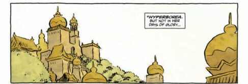
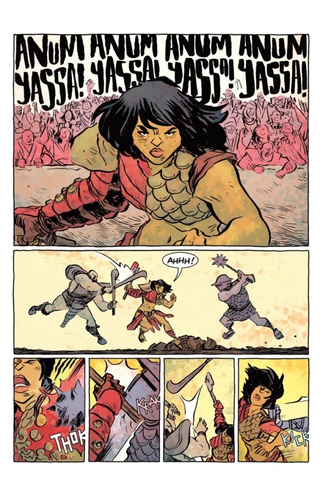
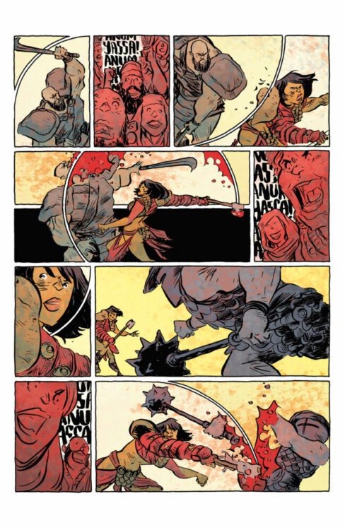
Miss Truesdale and the Fall of Hyperborea #1 opens in 1883, with the titular Miss Truesdale in conversation with the Queen of the Heliopic Brotherhood of Ra. The Brotherhood is a long-active secret Victorian occultist society, with deeply held beliefs in all sorts of supernatural phenomena. One of their strongest beliefs is in reincarnation. This belief is how a woman rose to the highest position of the Brotherhood, the members believing her to be the reincarnation of their founder. Miss Truesdale is not so lucky. For being a shy, unassuming young woman, the men of the Brotherhood have been treating her poorly. But the Queen confides in her that the two of them met in a previous life, in the mythical ancient city of Hyperborea. Though not in the city’s glory days. They met during its long decline, under the shadow of a violent gladiator tournament. And it turns out Miss Truesdale’s past life might not be as shy as her current self.
Writing
There’s a lot of ground to cover in setting up both two different time periods and reincarnated lives, but Mignola keeps a healthy ebb and flow throughout the issue. An exposition-heavy first few pages makes way for several of silent action. Then, after explaining the circumstances of the past, the characters of the present react in relative silence. For all the lore that the issue has to juggle, the thoughts and feelings of the characters are expressed with the simple directness of a fable. But the depths and details of each feeling are trusted to the reader, shown through subtle expressions or blank, black panels.
Art
That reliance on expressions and pages of silent action means a lot falls on Lonergan’s shoulders. Thankfully, he’s more than up to the task. One of Lonergan’s most celebrated works, Hedra, mixed a simple style and limited color palette with dense, experimental layouts. Miss Truesdale still showcases some unusual page layouts — mainly in the action scenes — but its more straightforward storytelling and the bigger panels put more focus on expressions and body language. Much like with the writing’s “less is more” approach, Lonergan draws a great deal of expression out of simple linework. Truesdale’s face is often reduced down to dots for eyes, a curved line for a nose, and arched lips. And while the backgrounds will often drop out to put more focus on the characters, the ones we do get help establish a great sense of place. The Queen’s room in Paris and Truesdale’s place in London both feel of the time period, but Lonergan shows the differences between both effectively. The Queen’s room of reclining couches, plush furniture and wide windows is a far cry from Truesdale’s cramped space of bookshelves, desks, and knick-knacks.
Coloring
The coloring helps fill the wide open spaces throughout the comic with its speckled texture. The typical flat coloring style of the Mingolaverse is abandoned for spaces where different shades of the same color are applied in blocky splotches. It gives character and interest to the art, especially when it leans on single, overpowering colors to aid the storytelling — like the near-uniform brown of Truesdale’s mundane apartment in contrast to the bright reds and yellows of the past.
Lettering
Letterer Clem Robins is the main visual holdover from other Mignolaverse comics, keeping his rounded, clear block lettering. The text wavers with emotion during the gladiator tournament and shrinks during quiet moments to leave wide expanses of white in the word balloons. Clarity is the name of the game here, but with subtle shifts to highlight emotion.
VERDICT
Miss Truesdale and the Fall of Hyperborea #1 keeps true to Mignola’s long running love of classic pulp and the Victorian occult, but filtered through the vision of an incredibly promising up-and-comer. People who’ve kept up with the Mignolaverse will find more of what they like here, but will hopefully be inspired to check out more of Lonergan’s work, too. And if you like Lonergan but don’t know your Heliopic Brotherhood from your Oannes Society, just know that despite all the lore, the core of the story lies in simple, straightforward emotion. It’s out today from Dark Horse, so make sure to check it out.
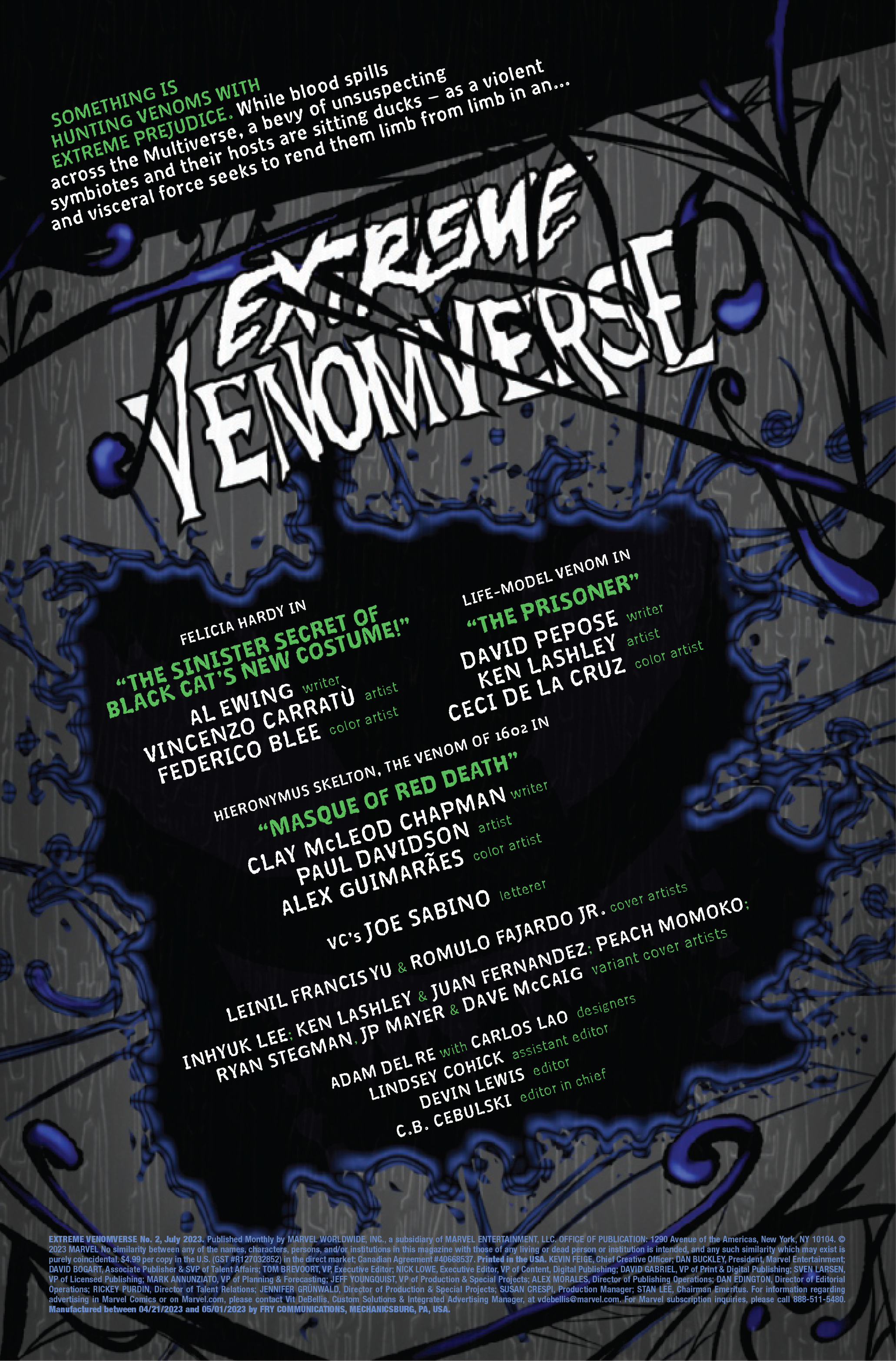
EXTREME VENOMVERSE #2 hits your local comic book store on May 24th, but thanks to Marvel Comics, Monkeys Fighting Robots has an exclusive five-page preview for you!
About the issue: More VENOMOUS symbiotes enter the fray! The summer of symbiotes continues to weave its tendrils through the Marvel multiverse as even more never-before-seen Venoms bear their fangs for the very first time!
VENOM scribe Al Ewing and artist Vincenzo Carrat? (MARY JANE & BLACK CAT) unite to tell a purrfect tale about your favorite cat burglar and a certain heist she may have pulled on Marvel’s First Family!
Revisit MARVEL: 1602, with Clay McLeod Chapman and Paul Davidson, as they introduce the creepiest Venom EVER!
David Pepose and Ken Lashley introduce you to what we’re calling the L.M.V.: LIFE-MODEL VENOM! Cyborg Spider-Man, eat your heart out!
The issue features three stories: the first is by Al Ewing, Vincenzo Carratù, and Federico Blee; the second is by David Pepose, Ken Lashley, and Ceci de la Cruz; the third is by Clay McLeod Chapman, Paul Davidson, and Alex Guimarães. All three stories are lettered by Joe Sabino, and the main cover is by Leinil Francis Yu and Romulo Fajardo Jr.
Check out the EXTREME VENOMVERSE #2 preview below:
Are you picking up EXTREME VENOMVERSE? Sound off in the comments!
You’d be hard pressed to find a show that did more for the comic book world than X-MenThe Animated Series. This show brought a whole new group of readers into comic shops as they clamored to read about their favorite mutants. Marvel has capitalized on this before as a battle world during Johnathan Hickman’s Secret Wars, as well as a spin off series following the event. This new series focuses on the recent House of X story line that Hickman also wrote. Seeing these events play out in the style of the animated series should please fans of the show and fans of House of X.
WRITING
One of the biggest challenges that Steve Foxe has to face while writing this series is capturing the feel of the original animated show and blending it with the recent House of X story. Foxe starts us off right in the middle of the big battle between mutants and the sentinels. This is a condensed series, so it’s acceptable, but it does lose some of the ground work and nuance that Hickman did in House of X. Foxe does a great job of giving us the characters that we know and love. Cyclops takes charge, Wolverine is an impulsive wild card and Rogue is sassy. Foxe succeeds in making this series just different enough so we don’t know what is going to happen. There are new characters, like Psylocke. The Five are also different and Foxe uses characters who were present in the animated show. Foxe changes the story enough to give us some surprises and some different elements from the Hickman series.
ART
The pencils by Salva Espin are crucial to this book. He had the task of making this series look like the animated show. Espin succeeds in giving us look that is similar to the cartoon, but still feels modernized. Espin also inserts a little homage to the Dark Phoenix Saga as Scott and Jean have a panel where they are fighting off Sentinels. Espin excels at keeping the look and feel of the show while also updating the design a little. The mutants are wearing new battle outfits that have green on their limbs. Little touches like this show Espin putting a little creative design and style on this series.
The colors by Israel Silva needed to match the color scheme from the animated show perfectly to be effective. Silva accomplishes this task with ease. The colors are slightly modernized and not quite as vibrant, but they do feel familiar. Gorgeous reds and blues dominate the backgrounds as the mutants battle for their lives. Silva makes sure that when a mutant unleashes their power it demands your attention. An optic blast or a kinetic charge light up the page. Silva succeeds in capturing the glory of the cartoon while also changing enough to please modern readers.
Joe Sabino is on letters this issue and he does a phenomenal job. He’s most effective on his constant sound effects. When an explosion happens, there is a large “THOOOM” that is layered on the bottom of the page. Storm blasting several sentinels gives us a transparent “KRAKABOOM” that looks and feels like lightning. I would have liked to see a “ZAP” or two when Cyclops unleashed an optic blast, but Sabino lays so many sound effects down, missing a few isn’t a big gripe.
CONCLUSION
X-Men ’92 House of XCII is a worthy addition to the X-Men ’92 cannon. Steve Foxe has managed to blend two worlds together to satisfy fans of both stories. The art matches up very well to the show. This series is off to a blazing hot start and is in great hands. X-Men’92 Hous of XCII is available at a comic shop near you!
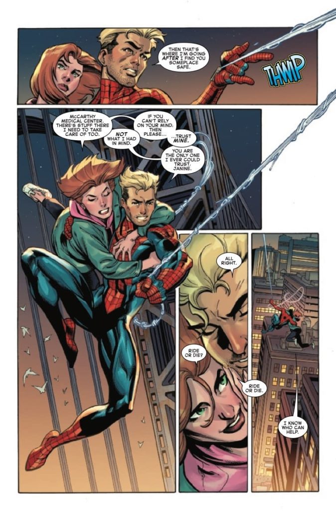
If we were going to rattle off Spider-Man’s biggest rival, surely the Green Goblin’s name would come up. Spider’s have always had problems with goblins. Hobgoblin, Demogoblin, Red Goblin, Green Goblin. It seems like every few years a new goblin comes along to wreak havoc on Spider-Man’s life. Amazing Spider-Man #90 gives us a battle between the Goblin Queen and Peter Parker. If you’ve been waiting for Peter to step back into the spider suit, today is your lucky day. Patrick Gleason is the writer of this issue. He’s joined by Mark Bagley on pencils, Bryan Valenza, Dijjo Lima and Andrew Crossley on colors and Joe Caramagna on letters.
WRITING
Amazing Spider-Man has had several writers filling in on the title since Nick Spencer left. For this story arc, Patrick Gleason takes on the writing duties. Gleason is lucky enough to be writing both Peter and Ben in action sequences this week. At this point Peter is no longer in a hospital bed and has donned his costume again to take on Queen Goblin. Gleason uses this issue to show us how heroic Peter actually is. Even though he’s not ready for battle and still injured, he risks his life to save Black cat and fight Queen Goblin. While this is going on, Gleason builds on the mistrust between Ben and Beyond. After sending Queen Goblin after Janine, Ben has finally had enough of Beyond’s antics. Gleason has Ben turn off his locator and officially hide from Beyond. This is a big step for Ben. He’s been going back and forth on whether he should end his relationship with Beyond due to them being shady. Gleason gives us an issue of Spider-Man where characters overcome their inadequacies and doubts. Whether it’s standing up to an evil corporation or digging deep to help your friends, this issue works because Gleason lets heroes be heroic.
ART
The pencils this issue are handled by Mark Bagley. Having Mark Bagley on this book is a trip down memory lane. His pencils on Ultimate Spider-Man are legendary. One of the things Bagley does so well this issue are his scenic backgrounds. As Ben swings Janine past a bridge early on in the issue, Bagley draws the huge bridge in the background perfectly. We see a burning building in between the wires on the bridge and smoke in the air. Action sequences are easy on the eyes as the panel structure is easy to navigate. Bagley still has a distinct style that resonates with Spider fans. issues like this one continue to show he’s one of the best.
There are a few colorists on this issue, but the majority is handled by Bryan Valenza. The colors for this issue have great contrast in the first few pages. Valenza has to have many dark colors due to the night sky and the smoke from the fire. Valenza allows Ben’s red on his spider suit to pop out as a vibrant color on a dark image. Around the middle of the book, the colorist changes. The colors get lighter and the colors Peter’s spider suit looks a little harder. There almost seems to be a texture to the colors as he swings Queen Goblin with a web. Although different colorists are used for this issue, the change in style isn’t so different that it takes you out of the issue.
The letters by Joe Caramagna contribute in many ways, but none more important than seeing the classic “Thwip” as Spidey shoots his web. As Queen Goblin uses her Goblin’s Gaze, Caramagna enlarges the world bubble to emphasize the importance of her power. These are all nice touches put on an issue by a true professional.
CONCLUSION
Amazing Spider-Man #90 is an issue that has some good character moments while also moving the plot forward. Gleason is putting our heroes in a position to finally give Beyond what they deserve. Any fan of this series has been waiting for this moment, and Gleason is delivering. Amazing Spider-Man #90 is out at a comic shop near you.
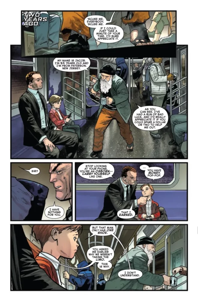
In the world of Spider-Man, the goblins are one of the biggest pains in the ass. Green Goblin, Hobgoblin, Red Goblin; it just never seems to end. What’s different about this particular iteration of the Red Goblin is that it’s Norman Osborn’s grandson Normie. He’s attempting to do the right thing, but the dilemma lies in the fact that the symbiote is more violent than a 12 year old boy. Alex Paknadel handles the writing for this issue. He’s responsible for giving us all the internal drama going on within little Normie. Joining him on this adventure are Jan Bazaldua on pencils, David Curiel on colors and Joe Caramagna on letters.
WRITING
This is a surprising issue in terms of depth for a super hero comic book. There are pages early in the book dealing with flashbacks to when Normie was younger. Paknadel shows us Norman and Normie riding the subway together. This is an interesting scene because the Osborn’s have an endless supply of money and never nee to be on the subway in New York. Norman, an eviler man at the time, uses this to show Normie what the enemy looks like. It’s a clear cut case of classism and elitism. This is used in the story as Normie fights for his life in the sewers to rescue his Pop-Pop. Paknadel also does a great job of reminding the reader that Normie is still just a child. He makes mistakes and constantly tries to be optimistic, even when he’s getting pummeled. Paknadel also hammers home the relationship between Norman and Normie. Even though Norman has done terrible things to his grandson, Normie still loves him and would do anything for him. This issue is littered with undertones and deeper problems that people face in society. Kudos to Alex Paknadel for turning in an amazing book.
ART
The pencils for this issue needed to be slick with a tone of creepiness. Jan Bazaldua pulls this off wonderfully. In the early pages of the book, while Normie and Norman ride the subway, Norman essentially tells Normie that they are better than the poor people in society. As this conversation happens, Bazaldua draws a creepy Green Goblin behind Norman. The image is eerie and is used to remind us who Norman used to be. The design for Phil Urich is also scary in it’s own right. I understand this is a book about goblins, but something about his look is unnerving. Bazaldua draws a worn down mask with sharp teeth. Bazaldua’s style works well for the spooky side of the book, but it also shows off his talent for drawing large battle scenes. As the Red Goblin fights to save his Pop-Pop, Bazaldua draws him getting pummeled by a barrage of thugs. The pencils are clean and crisp and we don’t lose detail with such a large group in the panel.
The colors by David Curiel are important for this issue. He has to keep the tone for the pencils that Bazaldua puts down. Curiel is successful in doing this. Panels with close ups of Phil Urich are dark and have a lot of shading, especially around his face. When Normie has a vision with his symbiote, Curiel has the entire page with a reddish hue. This is effective to show readers that this is a dream like sequence, but it also works because the red is the color of his symbiote. One of the things Curiel does the best this issue is that he makes this entire issue seem dark. Even in pages where Normie’s mother is talking to the principal, the mood and atmosphere are dark and rainy. These little touches made by the writer and artists help set the tone for everything to leap off the page and get the reader in the mood of the book.
The letters by Joe Caramagna play a large part in the story. Caramagna has to use different word balloons, red serrated balloons, when Normie is talking as the Red Goblin. This works well and allows the reader to see that the goblin has a different tone and voice when he’s suited up. The sound effects flow in this issue. Caramagna “SWIKK” as pumpkin bombs fly at enemies. There is a nice transparent “BOOOMMMM” as a bomb explodes forcing the villains to run. Perhaps my favorite effect is when Normie’s mother talks to the principal at Normie’s school. She scratches her nails into the wood of the desk she sits at. Caramagna puts a little “KRRRrkk” right above her nails. This shows that she isn’t messing around and the whole family is dangerous.
CONCLUSION
Red Goblin #3 is another exciting issue in a series that has exceeded expectations. Alex Paknadel touches on real life issues from class discrepancy to young kids growing up too fast. This series has more depth than other books on the shelf. Red Goblin #3 is available at a comic shop near you!
Benjamin Percy is without a doubt a huge Wolverine fan. He’s been writing him in X-Force as well as his solo Wolverine series. Having said that, this is perhaps one of the most unique story lines in a Wolverine title because Percy had made one of the most lovable X-Men one of their worst enemies. Beast has gone off the rails and done some unforgivable things, and it’s up to Logan to fix this. One way or another. Joining Percy on this title is Juan Jose Ryp on pencils, Frank D’Armata on colors and Cory Petit with the letters.
WRITING
This story arc on Wolverine has been one of the more interesting runs in a while. Beast turning to the dark side initially started during Percy’s X-Force series, but it seems like everything will be coming to a head in the pages of Wolverine. If you really look at this objectively, it’s not hard to see Beast’s motivations. Percy shows us a mutant who has had enough and is willing to take out the bad guys by any means necessary. Which begs the question of how far is too far? A big highlight and character moment for Logan in this issue is standing up to the Quiet Council. Percy uses Logan as the voice for the reader when he tells the Council that they let Beast do what he wanted and didn’t check up on him. While Logan has always been a character that does what he wants, standing up to the Council is a big step for him. It’s also been great seeing Maverick back in action. Percy has been using him here and there throughout his run. It’s a move that plays on Wolverine’s past and allows the reader to continue to see the layers Logan has.
The pencils by Juan Jose Ryp are very good this issue. For some of these pages and panels it feels like there is a texture to the artwork. When we get a look inside Beast’s new base of operations, there are several clones connected to the walls. Ryp draws veins and tentacle like things in the stasis area for these clones. As you look at this page you can almost feel the roughness of the image. Facial expressions are big in this issue as well. As Wolverine drops off Beast’s corpse to the Quiet Council, there are several looks of disgust from characters like Mystique to Charles Xavier. Ryp draws his fight scenes very violent and brutal. This works well because it shows how far Beast is willing to go and just how dangerous these Wolverine clones are. The Maverick pages are done wonderfully. Maverick takes some hits, but also causes a lot of damage, and Ryp perfectly draws all of this.
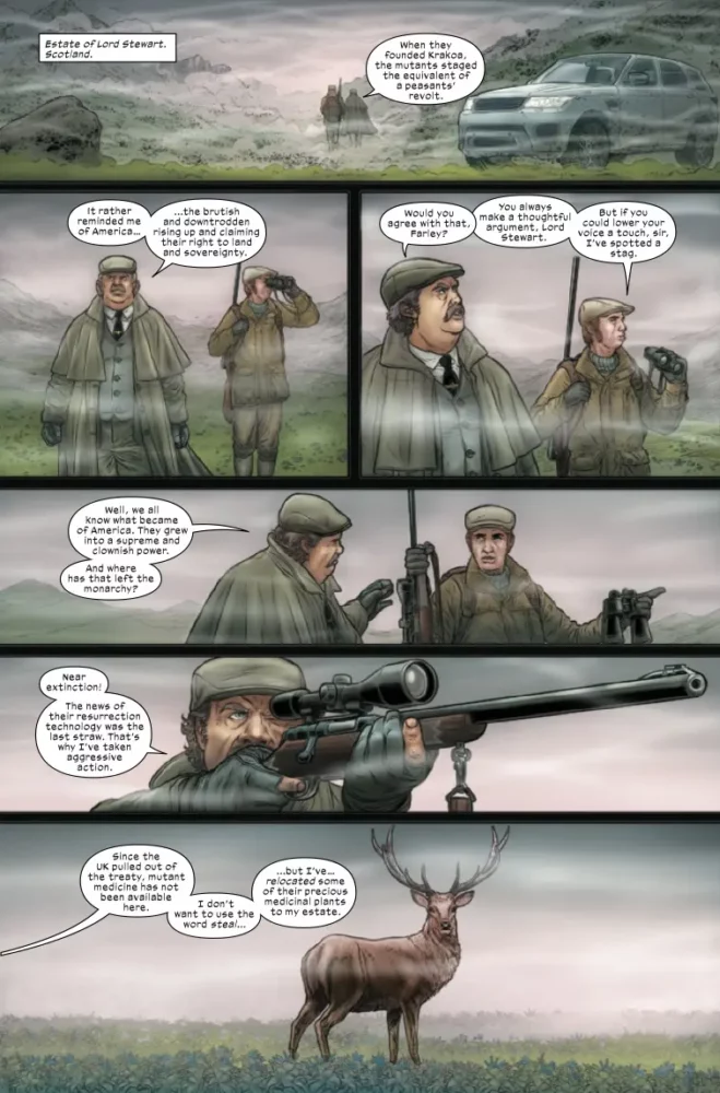
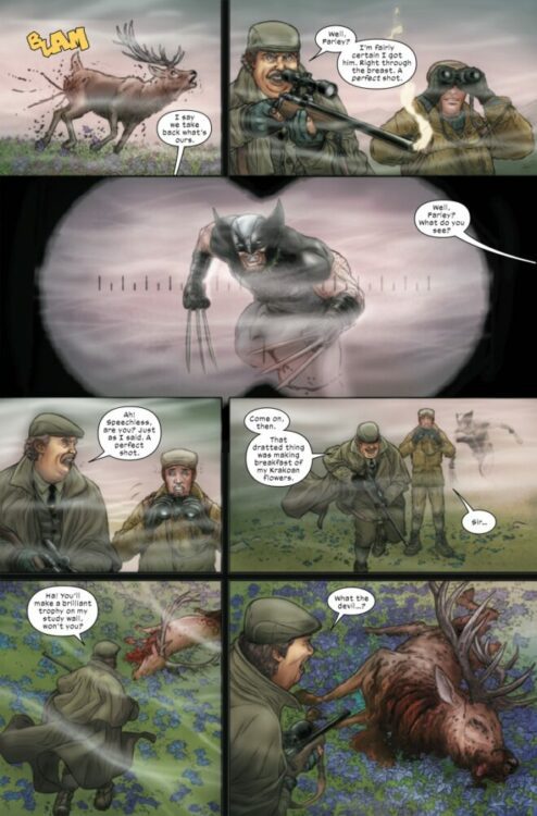
The colors by Frank D’Armata are integral to the issue. D’Armata is in charge of setting the mood for the book, and he does an excellent job in the opening pages by giving the reader a look at foggy old Scotland. The color palette for these pages are dull and dark, which add to the creepiness of the scene. For the rest of the issue, D’Armata sticks with darker colors. Shades of blue, like during the Maverick pages, or greens and browns as we get a look at Beast’s base, are also less vibrant. This all works well for the story being told. This is a sadistic story about manipulation and murder, D’Armata uses the color palette accordingly.
The letters by Cory Petit are set up nicely here. Petit makes sure that the word balloons or thought boxes are out of the way of the pencils. On pages where several characters appear to be talking at the same time, no one is covered by any dialogue balloons or boxes. As Logan faces the Council, he pops his claws and Petit uses the iconic SNIKT. What makes this panel a little cooler is that he allows the letters to go up Wolverine’s hand as he pops his claws. The other sound effects are used well for this issue. Maverick shooting Wolverine clones has “BUDDA BUDDA” as he unloads bullets from his gun. This is a finely lettered issue from Cory Petit. He continues to deliver wonderful placement and good effects when he’s on a title.
CONCLUSION
Wolverine #32 continues the story of how Beast is turning into a villain. Benjamin Percy has developed Beast more in the past few years than any writer has in the last ten years. His run on Wolverine has been a memorable one that has to have repercussions in the future. The art is great for this issue. It matches the tone an energy that Percy is writing. Wolverine #32 is available at a comic shop near you!
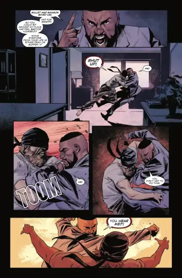
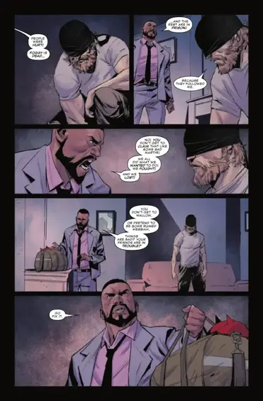
To say that Matthew Murdock has had a rough time lately is putting it lightly. He just lost his best friend Foggy Nelson, and got into a big fight with his super hero buddies last issue. The Stromwyns and the hand have been relentless in trying to torment him, and with almost no allies left, Matt turns to Cole North to whip him into shape. Chip Zdarsky continues his epic run on Daredevil this issue. He’s joined by Rafael De Latorre on pencils, Matthew Wilson on colors and Clayton Cowles on letters.
WRITING
Chip Zdarsky is one of the top writers in comics at the moment. He’s done Batman, Daredevil, the critically acclaimed Eight Billion Genies. Essentially anything he touches is worth a read. We’re at a point in his Daredevil saga where Matt is at his lowest. His wife is arrested and he has next to nothing left to lose. Zdarsky knows this is when Matt is at his most interesting. The Stromwyns have been a worthy white collar adversary for Daredevil. This issue, Zdarsky gives us a Daredevil that has nothing left to lose. As Detective North says, “People were hurt! Foggy is dead!” He’s the perfect person to snap Matt out of his funk. Zdarsky doesn’t hold back in this issue either. We see Daredevil do crazy and unexpected things to gain any semblance or normality back. One thing is clear in this issue though, Matt Murdock loves Elektra. This has been one of the things Zdarsky has been trying to hammer in this volume of Daredevil.
ART
The pencils this issue are handled by Rafael De Latorre. The line work and inks are smooth. De Latorre uses a lot of detail, particularly when he does some close up faces. Detective North is seen on panel with a disgusted look on his face. De Latorre captures this perfectly as the detailed lines really add to his anger. His pages with the Stromwyns are drawn with a level of smugness to them. How they’re postured to how their faces look scream entitled and privileged. There are images where De Latorre out does himself, specifically during some eye gouging. The panels are eerie and creepy perfectly drawn.
The colors by Matthew Wilson have to match the intensity of pencils from De Lattore. Wilson uses bright bursting yellows and reds as a background during action sequences or tense moments in the book. This is effective and adds an extra layer of depth to the art. In a panel where Daredevil confronts the Stromwyns, Wilson allows Daredevil’s uniform to pop out with a nice bright red, while shading out his face. This is an expert job in coloring from Wilson and one of the most memorable pages in the book.
The letters by Clayton Cowles work here. The monologue boxes he uses for Matt as he walks through the city are layered perfectly in a descending pattern. They sink lower and lower on the page and allow your eyes to follow the flow of thought. As someone gouges out their eye, Cowles uses a “SHNK” in red to signify blood. This is also placed across the shaded face of the character. It’s the perfect area for the sound effect.
CONCLUSION
Daredevil #11 is perhaps the most surprising issue of the series so far. Chip Zdarsky continues his great character work and interesting story telling. The pencils and art compliment the writing to a T. Daredevil #11 is available at a comic shop near you!
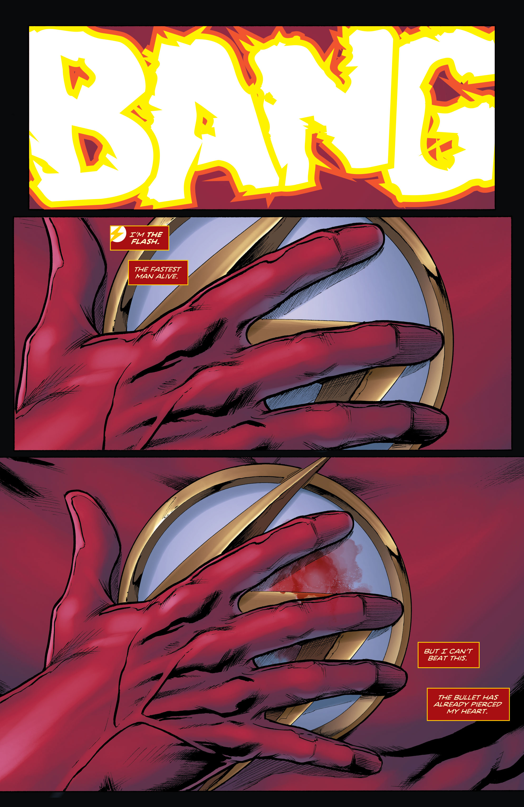
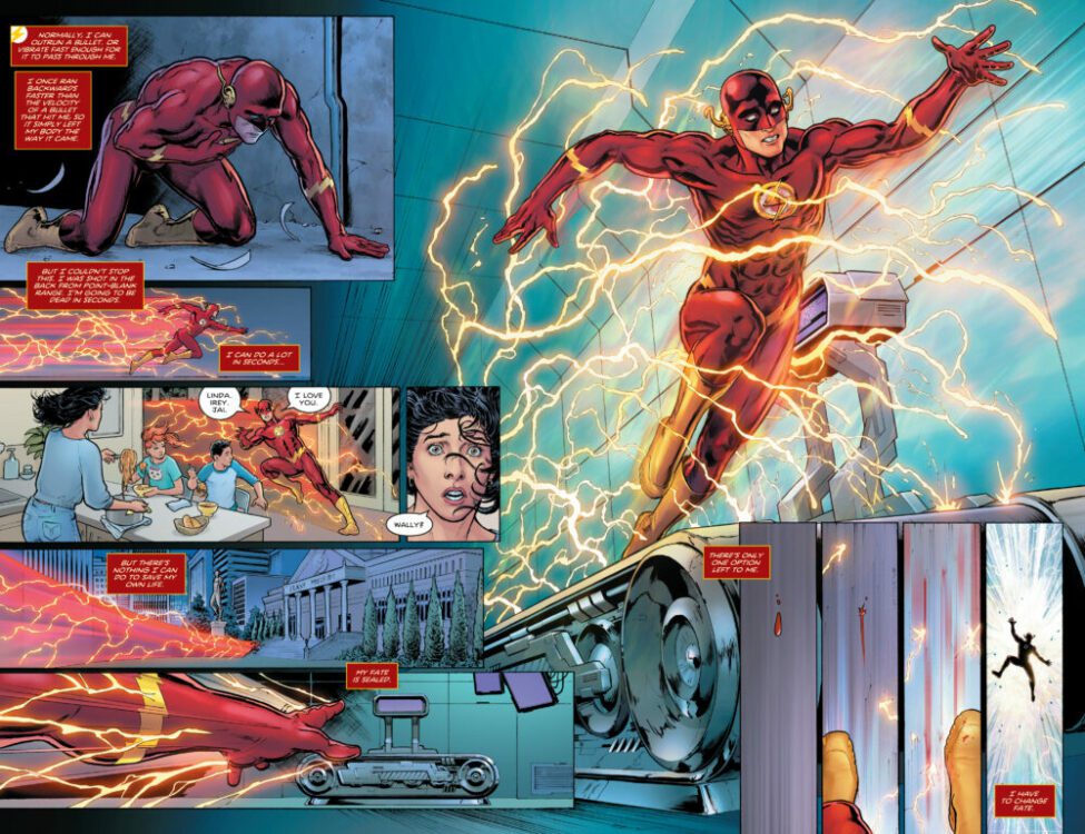
Marvel Comics announced yesterday that spoiled the story in AMAZING SPIDER-MAN #26; why do they persist in pulling back the curtain and spoiling the surprises? I have thoughts about Marvel’s marketing plan in the below video.
Do you even care when a comic publisher announces a death in advance?
Since death is never permanent, how numb have you become to events like this?
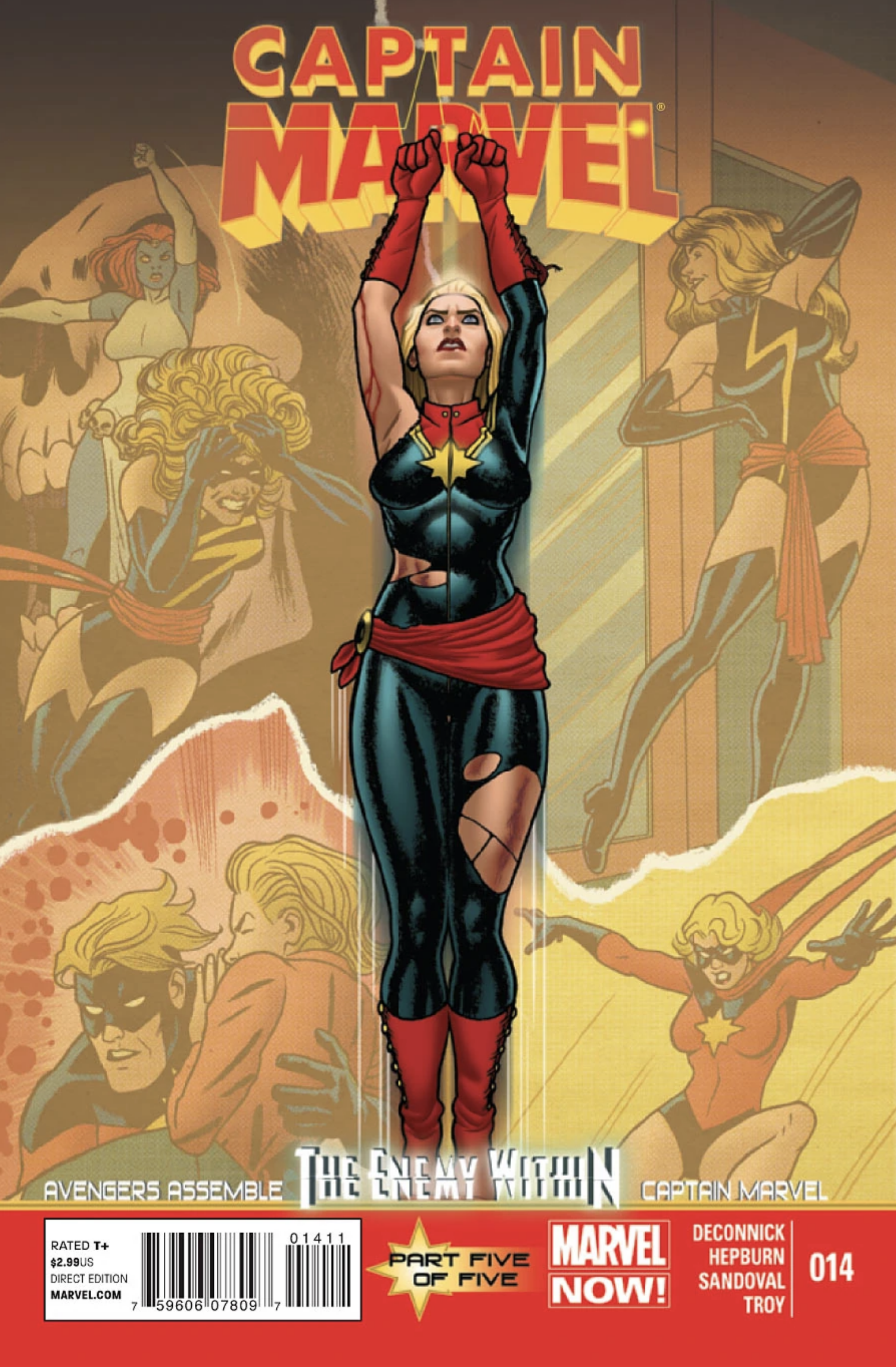
Kamala Khan, also known as Ms. Marvel, first appeared in Captain Marvel (vol. 7) #14, released in August 2013. Kamala Khan was created by writer G. Willow Wilson and artist Adrian Alphona. Her debut marked a significant milestone in Marvel Comics, as Kamala became the first Muslim character to headline her own comic book series. Her relatable personality, cultural background, and shape-shifting abilities quickly endeared her to readers, making her a beloved and influential character within the Marvel Universe.
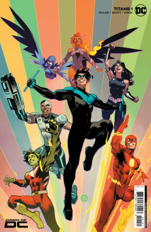
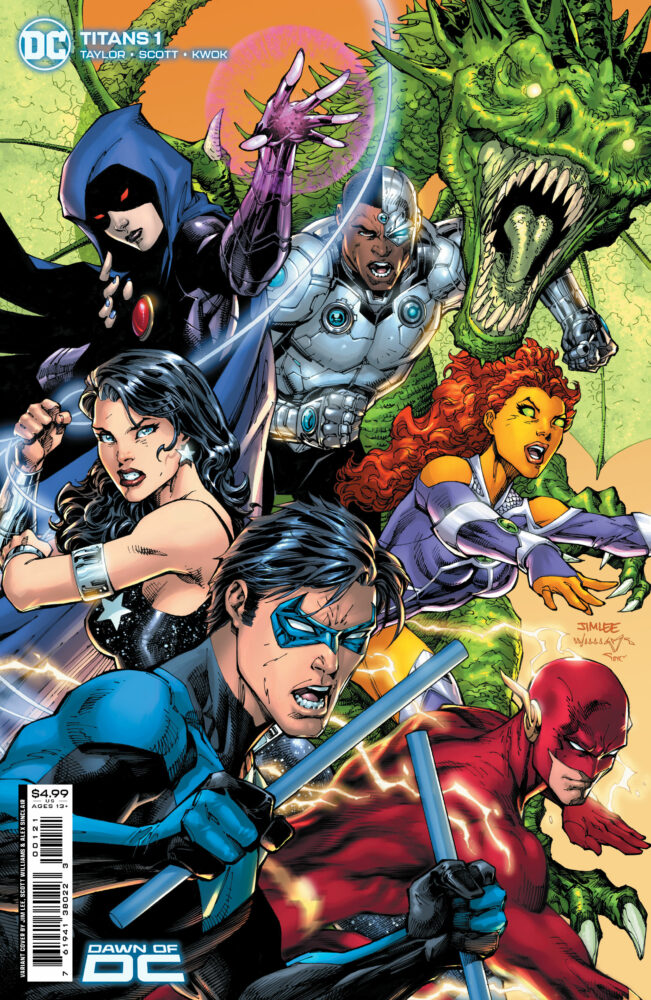
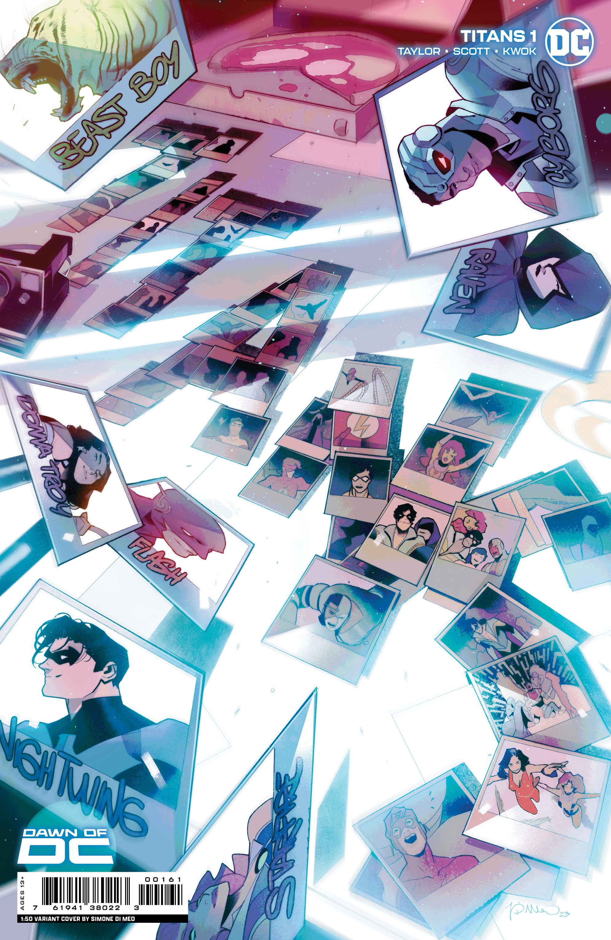
It’s NEW COMIC BOOK DAY and TITANS #1 hits your local comic book shop today from DC Comics, the first issue sets the stage with multiple storylines and hooks the reader with a murder mystery. TITANS #1 is a must-read — check out my full review below.
TITANS #1 is written by Tom Taylor, with art by Nicola Scott, Annette Kwok drops the colors, and you will read Wes Abbott’s letter work.
About the issue: OUT OF THE SHADOWS The Dark Crisis is over, and the Justice League is no more. Now, a new team must rise and protect the Earth…Titans, go! The Teen Titans are ready to grow up. Each member joined as a much younger hero, certain that one day they’d be invited to join the Justice League. But the time has come for them not to join the League…but to replace it! Are the no-longer-teen heroes ready for the big leagues? Danger lurks around every corner as heroes and villains alike challenge the new team before they’ve even begun. Will the DCU ever be the same? Find out in this landmark first issue brought you by the all-star creative team of Tom Taylor (Nightwing, DCeased) and Nicola Scott (Wonder Woman Historia, Earth 2)!