Home Blog Page 56

Project 365: One Comic Every Day, Week 23

A box of comics

The premise is simple: read one comic every day for the entire year. It seems like a simple task but there is no way that I read 365 comics last year, even if you count the individual issues in collections. So, this year, I am committing myself to this reading challenge, in the hope that I can broaden my reading habits and fully engage with my favorite hobby again.

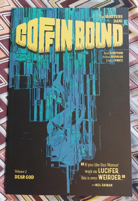
My reading this week took a turn to the macabre because of my first read, Coffin Bound (volume 2). I’ve had the book sitting in my reading pile since last November, but always seemed to find other things to read and haven’t got around to picking it up until this week.

Now, that’s a part of this hobby I find fascinating. Almost everybody I know who buys, collects, and/or reads comics has a pile of stuff that they have bought but not gotten around to reading. Titles capture our interest and we have to have them but we don’t read them the minute we get them home. I could understand the attitude with novels, because they take more of a commitment to read, but most single issue comics can be read (at least initially) in 30 minutes at most. And yet our “read piles” keep growing.

Personally, I do this because I am not always in the right mood to read something in particular, but I also know what kind of comics I do like to read. For example, the first volume of Dan Watters and Dani’s Coffin Bound was outstanding. I loved the art and the deeply philosophical story, so I knew I had to get the second volume when I saw it, especially as it was at a convention where Dan Watters was signing. However, if I had not bought it at that moment, I would probably never have got around to buying it. My list of wants far outstrips my finances. So my comic buying becomes a kind of happenstance and those that I buy then have to wait patiently until I am in the right mood to read them.

Coffin Bound Vol 2
Credit: Image Comics

Comic Number 155: Coffin Bound volume 2 (Chapters 1 and 2)

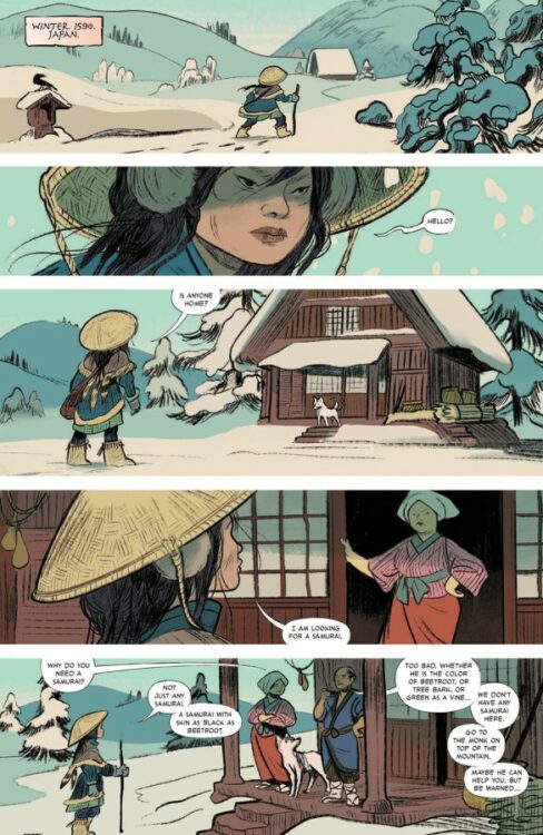
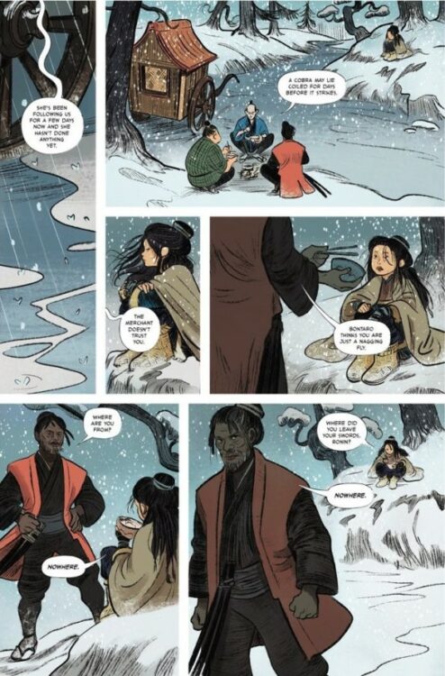
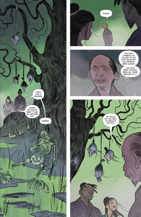
If you haven’t read Coffin Bound, I highly recommend it. It’s extremely entertaining, has a surreal sense of humor, and waxes lyrical with the script and the art. This second volume revolves around Taga’s search for the Vulture, a mythical creature whose existence would also prove the existence of God, thus making it impossible for the state to pass legislation banning religion. Taga can hear the voice of God when she injects herself with a drug (named God) and she believes that the only way to draw the Vulture out is to put out an open contract on her own life.

It is a crazy ride, but Watters’ script is outstanding at holding all of the ludicrous ideas together in such a way that it all makes perfect sense. The characters are believable and likable, and the narrative is packed with humor and musings on the grander things in life. Watters plays with high concepts and forces the reader to look at them in a different light by presenting them in a new way: God as a literal drug allows the writer to explore the idea of religion, addiction, and how faith relates to both.

The artwork throughout this series is mind blowing. Dani switches the line work between precise cartooning and abstract shapes, and this creates a world of complexity, reflective of the script. The characters are instantly recognizable on the page which is a great achievement considering some of the outlandish turns the artwork takes.

Coffin Bound is a brilliant example of a creative team pooling their best work to create something that is far greater than the sum of its parts. The comic would not work without the atmospheric, moody colors by Brad Simpson, or the character-driven lettering of Aditya Bidikar. Even the design work by Emma Price helps to make this comic the superb read that it is. I think I would need many more hours and thousands of more words to really talk about Coffin Bound.

Daytripper #1 -3
Credit: DC Vertigo

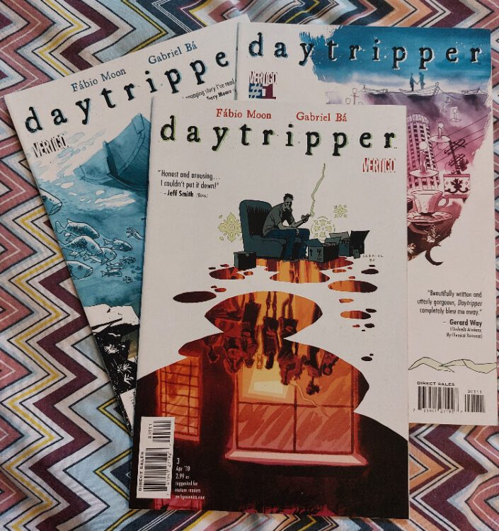
Comic Number 156 – 158: Daytripper #1 -10

Daytripper in another outstanding comic, this one published by DC’s Vertigo imprint in 2010. The creators, Gabriel Bá and Fábio Moon produced a series that played with a notion that is intrinsically comic book: the recurring death of the same character. Each issue of the series focuses on a different period of Bras’ life and the final page of each issue contains a short obituary explaining how he died in that particular period. The next issue then picks up at a different point in his life, with Bras alive and well, even though this chapter might be in the past or the future. Bá and Moon kill off their central character in every issue.

But despite the fact that the comic is about death, about that final moment when Bras ceased to be, the series is actually a celebration of life. The death’s become metaphors of the evolution of Bras and the life he leads. At each age depicted in the comic, Bras reaches a turning point, an experience that deeply affects him and, in essence, a part of him dies but his life continues.

Although I have read all ten issues, I have picked three out worth mentioning separately.

Daytripper #4-7
Credit: DC Vertigo

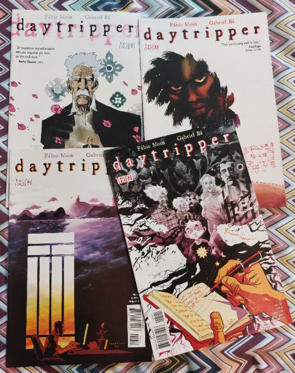
Issue 3 sees Bras breaking up with his longtime partner at the age of 28. The relationship had become stagnant because of the normality of life and Bras dwells on the final argument that they had. The artwork throughout this issue captures that feeling of loss perfectly. There are panels that have an emptiness to them, even though characters and props are present. Dave Stewart’s coloring helps to create this effect, with Bras physically and emotionally separated from the world around him. And the change of atmosphere towards the end of the comic is subtle and delicate. The issue takes the reader through the emotional journey of a breakup, and just like life, out the other side in such a way that you barely notice the change.

Issue 4 is, at this point in the series, the most upsetting. By this issue you understand the pattern the narrative takes and the inevitable death that Bras will face at the end of the comic, so the cover depicting Bras as a child immediately grabs you. Chapter 5 is about an eleven year old Bras, his family weekends away at his grandparents, and his first kiss. It is a heartwarming story told with such joy and excitement. The artwork captures the childlike excitement for the world and elevates everything to the sphere of adventure. Memories of your own childhood will come flooding back as you identify with the essence of the age, if not the actual events.

Of course, we all know where this is ultimately going but the ending is still shocking. It’s a punch in the stomach and a knife right through the heart. Fábio Moon and Gabriel Bá seem intent on breaking their readers’ hearts, and this issue is almost the pinnacle of that goal.

Daytripper #8-10
Credit: DC Vertigo

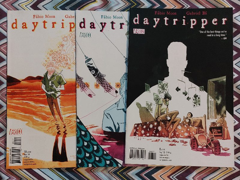
Issue 8 is a little different to the others because it features Bras’ family and he is off panel for the entire issue. The narrative here is about how interconnected people’s lives become and, ultimately, about those we leave behind. If you thought issue 4 was a heart-breaker you’ll not be ready for this one. The absence of the central character is ever present and the emotional connection that the writer and artist create between his family and the reader is overpowering as a result. There is a moment in this comic that is actually a visual representation of my worst nightmare, as a parent. The Young Miguel stands in front of his classmates on the day his father is supposed to talk about his career and the expression on his face says it all, and is almost too much to bear.

From issue 1 to issue 10, Daytripper is a magnificent read; Powerful, emotional, and heartbreaking. But ultimately it is the story of a life worth living.

“Only when you accept that one day you’ll die can you let go and make the best out of life.”

Punisher #12
Credit: Marvel Comics

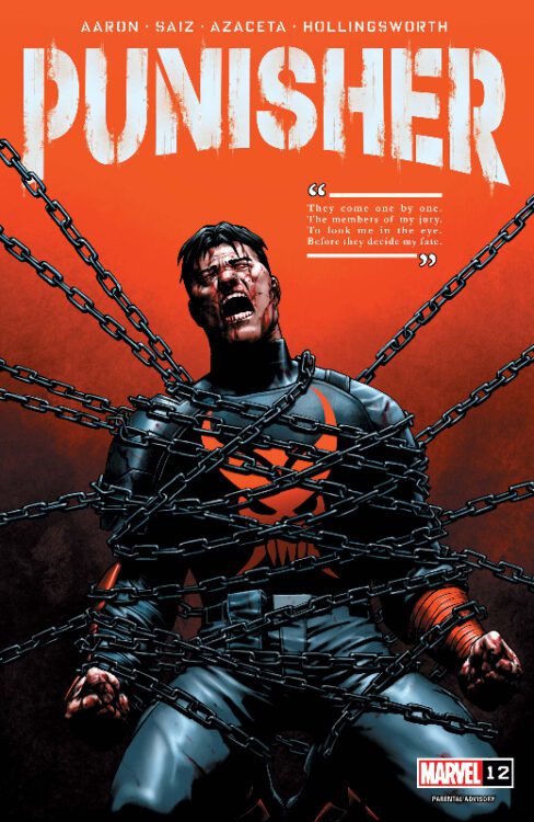
Comic Number 159: Punisher #12

Superheroes die all the time. And they always come back. One of the biggest complaints about any comic that features the death of a superhero is that no one believes the death will last. The best way to handle such stories is to openly, through the narrative, admit that the character isn’t dead, like Jonathan Hickman killing Johnny Storm in the Fantastic Four. The death was to illustrate the effect it would have on the rest of the team, not on creating a sensational headline to sucker readers. Unfortunately, I don’t think Marvel PR got that memo.

Another example is the recent “death” of the Punisher in issue 12 of Jason Aaron’s recent run. CBR ran a story with the headline “Marvel confirms ‘the Punisher is no more’” leading people to think that Marvel have killed the character. I saw a number of tweets and Facebook posts outraged at the publisher for doing away with a fan favorite. But, unlike the recent killing of Kamala Kahn, they don’t even kill Frank Castle, not even for a moment, in the comic. The CDR article even says that the character survives. Unfortunately, there are a number of people who only read headlines and then react, or more precisely, overreact, to the news.

I read Punisher number 12 to see what the fuss was all about. (Do you see? The false outrage worked.) There are some great things in this comic — for example, the change in art style between the modern day story and the flashback sequences, and the questions Aaron raises about the morality of Castle’s actions. However, there is also a lot here that a) doesn’t interest me (I always find it disappointing when the Punisher becomes a part of the superhero world but that’s personal preference), and b) is a cop out. I enjoy Aaron’s work, but under the Marvel umbrella, I think that writers can become restricted in what they can do, especially as they reach the end of their run. The characters have to return, or be able to return, to a reset point for the next creative team. This can undermine a lot of the work that the current team has put into their narrative. Personally, I think the creative team should just bail on a high and let the next lot sort it out. Jonathan Hickman’s Avengers run would have been perfect if it had ended with issue 1 of Secret Wars where he killed everything (nearly) instead of the dire 9 issue run where a series wide reset had to be worked out. Again, that’s just my personal opinion.

Anyway, I think Punisher issue 12 is probably a good ending to the series, and if you’ve been reading it, it will feel like a satisfying conclusion. But this comic is not about killing a hero, it’s about the transition from one story to another, in much the same way that the deaths of the central character in Daytripper were metaphors for the stages of his life.

Batman #686 and Detective Comics #853
Credit: DC

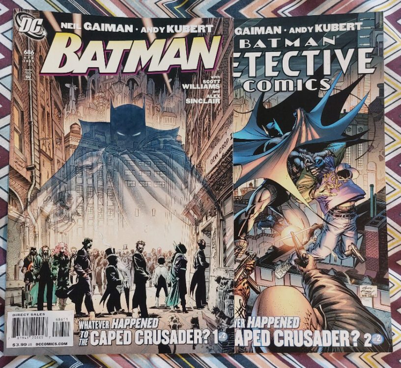
Comic Number 160: Batman #686 and Detective Comics #853

One way to look at the history of a character is through a final story — a last swan song before the character dies. Grant Morrison and Frank Quitely used the premise to great success on All-Star Superman and Alan Moore also had a hit on his hands with another final Superman story, Whatever Happened to the Man of Tomorrow.

In 2009 Neil Gaiman wrote a similar story for DC entitled Whatever Happened to the Caped Crusader. Illustrated by Andy Kubert, the story revolved around a wake for the Gotham vigilante that was held in the back room of a pub. Friends and foes turn up to mourn the death of Batman and take turns to tell the story of how he died. Each story is different and takes in the history of the character, illustrating the various incarnations of Batman and those he fought. Gaiman’s deft narrative layers history, myth, and comic book clichés as a way of dissecting the character and his history in pop culture. The wild shifts between the art and narrative styles are reflected in the different stories the various characters tell. This is most prominent in the Catwoman tale as she alters appearance from panel to panel, showcasing her wide ranging history.

There is, obviously, something else going on behind the scenes and the big reveal isn’t as corny as it could have been. Although, in the hands of a writer like Neil Gaiman, even the most clichéd narrative can seem like poetry. As a stand-alone Batman story, Whatever Happened to the Caped Crusader is a joyful exploration of the character and evolution of stories, especially through comic books. The finality of death once again acts as a catalyst for the examination of life.

The Sandman Special #1
Credit: DC Vertigo

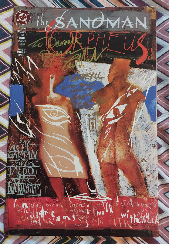
Comic Number 161: The Sandman Special #1: Orpheus

I don’t have much to say about this comic, at the moment. It is one of my favorite comics of all time, written by one of my favorite writers. The blending of mythology with modern comics lore is expertly handled and the artwork by Bryan Talbot and Mark Buckingham is majestic.

The overwhelming theme of death that has featured in my reads this week is exemplified in Orpheus. Death, the rejection of that death, and the fight to overcome and reverse death, leans heavily into the main themes of ancient myths and the greater story in Gaiman’s Sandman comic. One fate that we all share is that we will one day die. How we deal with that, and how we live our lives, will ultimately shape our history. Orpheus stands out from many of the characters featured in this week’s reading because he cannot accept the death of his wife and, in the end, suffers eternally by losing the ability to die himself. Whereas previous comics have been about the life lived before death, This Sandman Special is about the life wasted fighting against the inevitable.

It is a beautiful story, brilliantly crafted, and stands as a reminder to embrace life and suffer things that we can’t change.

Monkeys Fighting Robots Youtube

Review: KLIK KLIK BOOM #1 Is A Bright Spot In The Darkness

Review: KLIK KLIK BOOM #1 Is A Bright Spot In The Darkness

KLIK KLIK BOOM #1 hits your local comic book store on June 14 from Image Comics. The first issue has me excited for the five-issue miniseries; exceptional art and color work cemented the bold and fun concept. Check out my full review below.

KLIK KLIK BOOM #1 is written by Doug Wagner, with art by Doug Dabbs, Matt Wilson drops the colors, and you will read Ed Dukeshire’s letter work.

About the series:
In Klik Klik Boom, readers meet Sprout, a mute assassin who communicates exclusively through Polaroid pictures. After being raised by her doomsday-prepping grandfather in the rolling hills of Idaho, Sprout has grown up with little exposure to other people, TV, or seen clothes outside of Army fatigues. Now she’s headed to the big lights of New York City to avenge her grandfather’s murder, but will the city’s mesmerizing glitz and glam help her succeed—or be the death of her?

Enjoy a four-page preview.

Monkeys Fighting Robots Youtube

Marvel Comics Exclusive Preview: SPIDER-GWEN SHADOW CLONES #4

marvel comics exclusive preview spider-gwen shadows clones spider-man spider-verse

SPIDER-GWEN: SHADOW CLONES #4 hits your local comic book store on June 14th, but thanks to Marvel Comics, Monkeys Fighting Robots has an exclusive four-page preview for you!

About the issue:
THE END OF GWEN?

Spider-Gwen is imprisoned, and the only hope she has is relying on her very own clones! But is it too late? As Lyla gears up to act out her final revenge against Gwen. One that will affect the entire multiverse!

The issue is by writer Emily Kim and artist Kei Zama, with inks by Oren Junior, colors by Tríona Farrell, and letters by Ariana Maher. The main cover is by David Nakayama.

Spider-Gwen is currently featuring in Spider-Man: Across the Spider-Verse, in theaters now.

Check out the SPIDER-GWEN: SHADOW CLONES #4 preview below:

marvel comics exclusive preview spider-gwen shadows clones spider-man spider-verse

marvel comics exclusive preview spider-gwen shadows clones spider-man spider-verse

marvel comics exclusive preview spider-gwen shadows clones spider-man spider-verse

marvel comics exclusive preview spider-gwen shadows clones spider-man spider-verse

marvel comics exclusive preview spider-gwen shadows clones spider-man spider-verse

marvel comics exclusive preview spider-gwen shadows clones spider-man spider-verse


Are you reading SPIDER-GWEN: SHADOW CLONES? Sound off in the comments!

Monkeys Fighting Robots Youtube

Review: GOSPEL – For the Love of Stories

Created by the omni-talented Will Morris and published by Image Comics, Gospel is a stunning achievement of sequential storytelling. This six-issue mini-series is the perfect blend of historical fiction and fantasy, making for a read that is just as enlightening as it is entertaining. With sharp, clever writing and staggeringly brilliant artwork, Gospel is undoubtedly one of the best comics of the last several years.

“When opportunity refuses to knock for restless hero Matilde the devil comes knocking instead. Thrust into action by the hellish arrival Matilde and storyteller Pitt will quest for renown the soul of their community and answers to the toughest question of all: “Who am I?”

Writing & Plot

Will Morris succeeds in making Gospel such a well-crafted, enjoyable story by taking a simple yet strong thematic core and wrapping it up in true religious history and a bit of clever fantasy. Matilde is a local hero looking for fame as the “Hero of Rumpstead.” She has to build her reputation on whatever small deeds she can accomplish in her tiny home village, and then have them embellished with the help of her friend & local bard, Pitt. Her job – and life in general, however – have just been made more complicated by the splitting of the Roman Catholic Church and the Church of England. On top of this, the Devil himself has apparently come to Rumpstead, bringing explosions and tidings of doom. Everything Matilde and Pitt grew up with has come into question, and so this quest serves as a simple solution – and a distraction from – an increasingly complex problem. Complete with assassins, gentle giants, helpful ghosts, and extraordinarily long-lived bards, this story is a treasure trove of storytelling genius. The splitting of the Catholic church makes for a great plot device and historical backdrop to the core narrative. That same narrative is charged by thematic depth, complex character relationships, and constant internal and external challenges for the cast. Every story beat comes naturally, and the personal developments for each character are satisfying to watch. Even with the time period and sense of fantasy, Matilde, Pitt, and others feel like real people. The twist at the end of the comic isn’t wholly unsurprising – but its ramifications for Matilde are still heartbreaking. Morris mixes a sort of romanticized “olde English” with modern dialogue styles to create something that feels naturalistic and right for the story’s tone. From a writing perspective, Gospel is an absolute triumph.

Art Direction

As incredible as his plotting and writing are, Will Morris’s art in Gospel is somehow just as impressive. His thick penciling captures the unique designs and expressions of his cast of characters, as well as his sharp eye for historical detail. Everything from clothing and accessories to architecture shows a dedication to at least *some* level of historical accuracy – the kind I imagine involved a fair amount of looking at books on medieval fashion & housing. Morris’s sequential direction is equally impressive, with more conventional panel structure sometimes falling away to borderless, free-flowing events. His sense of visual pacing is excellent, as the whole story flows naturally with effortless form. His color art is stunning as well. Every panel shines with the gradients of natural light at different times of day or night. Each page is a vast array of color with shifting tones thanks to Morris’s staggering work with shadows and directional lighting, making for some of the most finely-tuned color art in a comic in recent memory. From the visual storytelling angle, Gospel is an incredible achievement.

Verdict

Will Morris’s Gospel is a phenomenal work of fantastical historical fiction. Every aspect of his writing, from his use of a major historical event as a backdrop to his thematic character work and Miyazaki-like sense of fantasy, adds up to a brilliant cohesive whole. His incredible visual style and flawless sequential direction goes on to make this mini-series one of the best comics of the last few years. Be sure to grab Gospel in its entirety when the collected trade paperback hits shelves on June 21st!


Monkeys Fighting Robots Youtube

Review: FRIDAY #7 — Let’s Do This Again, One More Time

Friday #6 was the first issue in this series that I didn’t write a review for, and that’s for a very simple reason: I couldn’t make up my mind about it. Did I love it or hate it? Friday #6 was a massive change in direction for the series. It sees the supernatural elements of the story — only hinted at in previous issues — take center stage. With monsters and time travel now in the mix, and what felt like a drastic change in tone, I just needed to see how it all shook out to know what I thought. Friday #7 shows how writer Ed Brubaker, artist Marcos Martin, and colorist Muntsa Vicente bring us back home. They prove to us that this change in tone does work for the series, and not only that, they show us that the supernatural elements have been there all along, hiding in the darkness.

Writing

Part of what makes Brubaker’s script work so well is that we’re not the only ones trying to wrap our heads around these weird new developments; Friday is too. Having hopped to the past, we see the events of the first issue but from a different angle. Friday tortures herself with questions of agency. Can she change the past now that she’s here? If she was here all along, does that mean things are destined to stay the same? This is a brilliant example of Brubaker not stopping at the usual superficial trappings of a time travel story. He isn’t interested in Friday’s journey back in time being simple set dressing. No, he’s immediately connecting us to the emotional ramifications of something like this. Friday has said goodbye to her best friend — it’s something she’s still processing. So how is she going to process seeing him alive again, unsure if she can do anything to save him? As always, Friday Fitzhugh stuffs the panic down and trudges on, which is what makes us feel for her and love her all the more.

Art

Martin makes you feel like you’re experiencing everything with the characters. It’s only when you hone in on Martin’s methods of storytelling that you realize why you’re so immersed. At one point, Friday hits her head and is slowly regaining consciousness. Martin shows the next page from Friday’s point of view and makes every other panel pitch black. You can feel the heaviness of her eyelids as she’s waking up. But what’s even better about this moment is that the panels aren’t the same size. The panels shrink as they go on, showing Friday pushing back against blacking out, her eyes closing for less and less time as she tries to get up.

And when things get more otherworldly, Martin’s linework becomes thicker and wavier, making you almost feel like another artist has stepped in. “These things don’t belong,” is your first thought, which is surely what Martin intends with this change of style. And speaking of Martin’s style, Friday #7 is chock full of style. Everything from a simple panel of Weasel holding the stone knife, his crooked shadow cast against a nearby wall, to Friday’s face split in two by a gutter, showing her struggle with agency and inability to move against the passage of time. Everything is picturesque, beautiful, and deeply effective. Martin absolutely shines in this issue, pulling you headfirst into this wild and twisting story.

Coloring

When you sit down to read Friday #7, bring a jacket. You’re going to need it. That’s because Vicente’s coloring actually has you feeling like you’re there, standing in the snow with Friday. You can feel the cold in the deep blues that are cast across each page, contrasted by the subtle, warm red glow of Friday’s cigarette. You’ll want to pull your collar up and you’ll find yourself blinking against the snowflakes that seem to fly off the page and into your face.

Just like with Martin’s change in style, Vicente highlights how jarring it is for Friday to be seeing what she’s seeing. The scene gets flooded with neon green and fluorescent purple. The cacophony of pink, yellow, and red that follows perfectly sums up Friday’s confusion and panic. What in the world is going on? Where did the comfortable world of soft blues and muted browns disappear to? As Friday runs in the opposite direction of everything, she dives back into that old, familiar world. But there’s a pink glow in her glasses, like she’s still seeing it all play out before her, even if she’s gotten away for now.

Lettering

From the warbled tails that lead to Weasel’s ranting dialogue, to the scratchy, primitive looking language of monsters, there’s so much to love about the lettering in this issue. As Friday is ducking through scenes we’ve seen before in Friday #1, trying to remain unseen and unheard, her dialogue often shows up through tiny letters on big white balloons. She’s hushed, often confused and even scared as she speaks. And as small and intimate as the lettering gets, it gets just as big and vibrant. The jumbled green block letters of a scream wrap around the source of the noise, tumbling down the page frantically. The language the monsters speak shows up on bright word balloons of different colors. Everything they say stands out as being strange, maybe even beautiful? Martin’s work on lettering is as stunning as his work on art, full of lovingly added details and exciting flourishes.

Verdict

If I’m completely honest, there was a part of me that didn’t want to like Friday #7. I had fallen in love with a vision of where I thought this series was going — a version of Friday’s story that felt incredibly subtle and kept the magical elements in the margins of the story, only appearing in ambiguous sequences that could all turn out to be dreams. But, damn it. I was wrong. Friday #7 shows me that all those things I loved, all the subtlety and emotional heart at the center of the story, are still intact. There might be ghosts and ghouls coming out of the woodwork, but the questions we’re left with are still all about the characters and their motivations. Friday #7 brilliantly marries the paranormal elements of this series to the poignant story of self-discovery that Friday has been on. You can find issues of Friday on Panel Syndicate where you can pay what you want when you download them. Check them out and give what you can — it’s more than worth it! Friday is a constantly evolving masterpiece. It’s one of those rare works that wants to “do everything” and somehow succeeds.

Monkeys Fighting Robots Youtube

Enjoy A 5-Page Preview: MURDER INC.: JAGGER ROSE #2 (Bendis & Oeming)

MURDER INC.: JAGGER ROSE #2

MURDER INC.: JAGGER ROSE #2 hits your local comic book shop on June 14, but thanks to Dark Horse Comics, Monkeys Fighting Robots has a five-page preview for our readers. The book is written by Brian Michael Bendis, with art by Michael Avon Oeming, Taki Soma drops the colors, and you will read Carlos Mangual’s letter work.

About the series:
Master assassin Jagger Rose has forever turned her life and the life of everyone around her completely upside down. So much so that she finds herself invited to the Vatican for an audience WITH THE POPE. WTF? Ooh! What does the Vatican and the Pope look like in a world where the five families of organized crime never gave up their power? This and more shocking secrets will be revealed in this all new, gorgeously illustrated new chapter of MURDER INC.

This bold new vision of crime fiction gives you everything you expect from the creators of Powers, one of the most successful and longest-lasting independent comics in history. Fans of The United States of Murder Inc. this is the same series! New title. Better logo. All new stories!

Enjoy the preview below.

Monkeys Fighting Robots Youtube

SHAZAM! #2 – DC Comics Has Something Special Brewing In This book!

SHAZAM! #2 - DC Comics Has Something Special Brewing In This book!

SHAZAM! #2 hits your local comic book store today from DC Comics. The first two issues set the stage for an epic hero’s journey, and I couldn’t be more excited. Mark Waid’s story adds new twists to the mythos, every panel of Dan Mora’s art bursts with a spectrum of emotion, and Alejandro Sánchez keeps the series grounded with his color palette and brush stroke. SHAZAM! is a must-read. Check out my full review below.

About the issue.
Shazam versus S-H-A-Z-A-M! Billy Batson was given the powers of the gods by the Wizard Shazam—but Solomon, Hercules, Atlas, Zeus, Achilles, and Mercury never gave the Wizard their permission. Displeased with how Billy is representing them, the disgruntled gods engage in a six-way fight for sole control of the World’s Mightiest Mortal…or, if they get their way, the World’s Mightiest Puppet. May the craftiest god win!

The book is written by Mark Waid, with art by Dan Mora, Alejandro Sánchez drops the colors, and you will read Troy Peteri’s letter work.

Enjoy a five-page preview of SHAZAM! #2 below.

Monkeys Fighting Robots Youtube

Exclusive Interview: Norse Horror in RATATOSK — Now on Kickstarter!

Are you desperately in need of a spine-tingling story? Do you wish someone could guide you through the shadowy realms of Norse mythology’s creepiest haunts? Well, you’re in luck, because a new project on Kickstarter called Ratatosk does exactly that!

Writer Grant DeArmitt, artist Armando Zanker, colorist Shan Bennion and letterer Lucas Gattoni have put together a book that’s sure to keep you up at night, and Monkeys Fighting Robots got the chance to ask them all about it.

About RATATOSK (from Kickstarter):

Ratatosk treads the misty ground between investigative thriller and folk horror. It’s a story for people who know not to go into the woods at night, but can’t help wondering why.

Book One is the first of three chapters; it introduces the main cast, central mystery, and the strange fictional town of Sturridge, Vermont. If you’re a fan of Twin Peaks, Picnic at Hanging Rock, or American Gods, we guarantee it’s a comic you’ll enjoy.

Interview

Monkeys Fighting Robots: What drew you all to Ratatosk in the first place?

Armando Zanker, Artist: I’ve been hopping between genres for a while, but I’ve been riding a horror wave lately and could not be happier. You pretty much just need to say ‘Monster’ to get my attention, and once I’d hear what Grant had in mind, it was a no-brainer.

Shan Bennion, Colorist: I love myths and legends, had been hearing about Ratatosk from God of War 2 funnily enough!! And as a colorist, you gotta appreciate the art you’re going to be playing with, and I love the shadow work!

Lucas Gattoni, Letterer: Half the mythological side of the pitch, and half Grant’s sizzling energy and push to get this one out!

MFR: What is it about the character of Ratatoskr that stuck out to you in all of Norse Mythology?

Grant DeArmitt, Writer: Armando and I wanted to do a story featuring a Krampus-like character – a creature from folklore that had a Green Man, wilderness god feel – that we could turn into a monster. Ratatoskr had that sense about it, and with very little actually written about the character, there was a lot of room to extrapolate, play, and rework, etc. And by the way, that last ‘R’ in the character’s name is left out on purpose. I promise it’s not just a spelling error I’m too proud to correct.

Not this time.

MFR: What would your elevator pitch be to readers? What’s the thing they shouldn’t miss that this book has?

DeArmitt: “Viking-flavored True Detective” is the elevator pitch. As for what’s unmissable about this book, I have to tout its atmosphere. Between Armando’s scene composition, Shan’s mood-setting colors, and Lucas’s eerie-sounding letters, this comic really does have more of a ‘feel’ than most of what you get on the shelves right now.

MFR: What comic book creators did you borrow tools from? Who influenced your work?

Zanker: Chief among all, Kirby– Grant are both big Etrigan the Demon fans, as I hope will be obvious if we can complete Ratatosk, and in the case of this particular comic, I’m always looking at my Eerie, Creepy and House of Mystery collections– that’s the spirit I hope to be channeling.

MFR: What works outside of comics — books, movies, TV — influenced your work?

Bennion: Ohh, hm. Definitely anything by Guillermo Del Toro, the exquisite joy and sadness so intertwined with horror and fantasy, that’s my alley! Terry Pratchett is also incredible, what a story teller! And so much animation right now, She-Ra, The Owl House and Over the Garden Wall are a few favs!

MFR: How did you folks find each other, as a creative team?

DeArmitt: I think Armando responded to a tweet I sent out a while ago, one about possibly making a horror comic. We started brainstorming soon after that and the idea for Ratatosk was born.

Once the idea turned into something we were both committed to making, I started hunting down the rest of the team. Out of a couple colorist options, Armando suggested Shan for their painterly style, which he knew the book needed. And then Lucas’s online profile is so extraordinary, I reached out expecting him to say no. By some miracle, he didn’t.

MFR: What’s your personal favorite part of this project (that you can share)?

DeArmitt: You mean besides talking to the hotties at Monkeys Fighting Robots?

Zanker: Monster design, absolutely– I really hope we get funded so we can share it with the world!

Bennion: We’ve only gone through a little of it so far, so I can’t go too deep but I love the vibe of it, the southern horror and deep colours I’m allowed to play with!

Gattoni: So far it’s been coming up with the lettering style for a certain group of characters that you can see right away in the preview pages.

MFR: How can we get you to work together a million more times? The pages I’ve seen are incredible, this feels like a creative team that makes pure magic.

Zanker: Oh damn, thank you! And it’s true, Grant has put together an incredible team– I love sending pages and seeing how Shan and Lucas take them to another level with their kung fu. Hopefully, the book is funded and we keep going from there!

Bennion: It always depends on the story! You gotta love what you work on, especially if you’re coloring the characters a hundred times through! And, you know, of course the support, a fella’s gotta eat!

Gattoni: Well, you have to support this Kickstarter, and tell ALL your friends they should tell ALL their friends to do the same, times a million!

Support Ratatosk!

The only way this amazing book can be completed is with your support. Check out the Kickstarter here, which is full of amazing tiers, rewards, and incentives. Ratatosk is a delightful treat for fans of mystery, horror, and folklore just waiting to happen!

Monkeys Fighting Robots Youtube

Project 365: One Comic Every Day, Week 22

The premise is simple: read one comic every day for the entire year. It seems like a simple task but there is no way that I read 365 comics last year, even if you count the individual issues in collections. So, this year, I am committing myself to this reading challenge, in the hope that I can broaden my reading habits and fully engage with my favorite hobby again.

It’s my third week of trying to read comics from a specific year. So far, it’s not turned out to be the most successful plan, mostly because I’m easily distracted. However, this week I’m heading back to 2007 when my buying was at a high (in the sense of number of comics), and my excitement for comics was being fueled by Marvel’s Civil War crossover event — one of the few events where I read 99% of the tie-in comics and I have a special box which contains only Civil War banner comics. There is some good stuff in that event. None of which I am reading this week.

Spawn #169
Credit: Image Comics

Comic Number 148: Spawn #169

I was a Spawn fan back in the day. I enjoyed the first extended story arc where Al Simmons had a countdown of demons to work through to reach salvation. After a while, I drifted away from McFarlane’s baby, but returned sometime in 2006 when I discovered different writers and artists working on the title.

Issue #169 is a stand-alone story written by David Hine and illustrated by Brian Haberlin. Yes, it helps to have some knowledge of the characters to really get the most out of the comic, but it can also be read as a single issue. A story with a start, a middle, and an end that doesn’t require additional reading. Hine masterfully creates an uncomfortable world for the characters to move through and the sense of tension and desperation inhabits the script.

Haberlin’s artwork is very dark, with shadows enclosing the characters and seeping out of the panels to infest the gutters. This creates a feeling of immersion as if you, poor reader, are being sucked into the magical world.

Andy Troy’s coloring is instrumental to the creation of this atmosphere. For the most part the colors are dark with faded tones but an occasional contrasting color draws the eye across the page. Constantly teasing the reader to jump ahead a number of panels to see what is happening.

Early Spawn is very much of its time, although some of the later stories are probably more accessible to new readers. The problem is that the continuing story aspect became increasingly complex and very difficult to follow for casual readers. However, there are moments of genius, like this one, that can be picked out of the greater mire of continuity.

Testament #17 and 18
Credit: DC Vertigo

Comic Number 149: Testament #17 and #18

Science fiction and fantasy is a hotbed of religious allegory and sneaky re-working of mythological or religious stories. In Douglas Rushkoff and Liam Sharp’s Vertigo title Testament, there’s nothing subtle about the religious undertones. In fact, the undertones are bubbling up all over the narrative, becoming the upper crust for large segments of the story.

In issues 17 and 18, the central characters are reaching a turning point in their lives and the supernatural beings, the Gods, are making themselves more prominently known. The comic raises questions of free will and the manipulation of characters by other worldly, and human, sources. Situation and society creates the rebels in the narrative but are their actions guided by fate (controlled by gods) or do they create their own mythology to justify their actions?

Rushkoff is a media theorist and the religion/technology comparisons are made at several points throughout Testament, however, in this two-part story, it is human nature that is under the spotlight. These issues are also drawn by Dean Ormston and have a different look to Liam Sharp’s usual interiors. The pages have a more rigid appearance with layouts that repeat from page to page. This helps to make visual links between different stories and characters. Ormston has an illustrative style that focuses on emotional representation. There is a mild expressionistic feel to the visuals but this allows Ormston to bring out the emotions of the characters.

With the color work by Jim Devlin and the lettering by Todd Klein, these two issues of Testament have some excellent visual storytellers working on the script. It almost goes without saying that the two-part Blood Brothers story line is an impressive and intriguing read.

Streets of Glory
Credit: Avatar comics

Comic Number 150: Streets of Glory #1-6

I was only going to read one issue of Streets of Glory because I think you can get everything you need to know about the mini-series from a single issue — however, the story pulled me in.

On the one hand, this comic is a typical, well-told western about the dawn of a new age and the retirement of the past. The two central characters represent the different era’s and the uncomfortable transition from one age into the next. Garth Ennis handles this metaphor with aplomb but parts of the narrative are marred by aspects of Ennis’ writing that have become known as his trademarks.

The violence is full on. It leans heavily into gross, over the top, exhibitionist blood thirst. A character doesn’t just get shot, parts of his body are torn apart as the bullets fly through them. The skin is stretched to tearing point and blood splashes across the page. In some cases less is more but that clearly wasn’t the brief for artist Mike Wolfer.

Wolfer definitely has a style that lacks character versatility, but this is made up by clear atmospheric pages and attention to detail. Granted, most of the detail is in the gore and violence but it proves that there is a deft hand at work with the pens and ink.

As you read through the series there are some questionable representations, especially in the blood lust of Red Crow. He is the only Native American in the comic, and is defined by uncontrollable violence but has no other characteristics. The female characters also lack any depth, although in the first couple of issues it does seem that Ennis was setting a number of them up for something. Unfortunately, nothing really comes of them.

Having said all of that, I enjoyed re-reading Streets of Glory. Partially because it was a pure western story, no mixed genre here, but also because Ennis is able to tell a good story. If you overlook the need for excessive violence, the central flow of the narrative is a strong and sturdy metaphor for the notion of changing times.

The Savage Strength of Starstorm #1
Credit: Image Comics

Comic Number 151: The Savage Strength of Starstorm #1

It’s New Comic Book Day, so I thought I’d try an actual new comic. Starstorm #1 (published by Image Comics) is a homage to the early days of the publisher, or so says Drew Craig, the creator, writer and artist for this comic. And in a lot of ways, he’s right. Unfortunately, not in a good way.

I had no expectations for this comic, and the cover does resemble some of those early Image books that launched the careers of a number of creators. I can see this comic finding an audience and some will rave about the rawness of the images and the straight forwardness of the narrative. The artwork has the appearance of a small press, photocopied amateur comic that has been hand stapled and sold for $1 at a small convention. This, generally, is not a bad thing and lots of fun can be found from this type of comic. However, this does not distract from the problems with this comic.

The characters are stiff and lifeless, with blank expressions and zero emotion. The script at one point mocks the clichés of high school while itself being nothing but layers of clichés from page one. The dialogue is also unwieldy and laughable in places. Is this an homage? A clever insider joke playing on the awkwardness of those early indie comics? Or is it just poor writing? If there had been any contrasting elements that demonstrated that the writer understood the medium and wasn’t just mimicking the superhero genre of yesteryear, then maybe we could give them some leeway. But there is nothing here that hints at a subtly pastiche with deeper meaning.

I don’t often write negative reviews, instead either look for the positive or ignore the work entirely, but somebody is going to pay $3.99 for this and, unless you’re a massive fan of the early, low-quality Image comics, it will be a waste of money. A few dynamic images do not make a good comic.

Planet of the Apes #2
Credit: Marvel Comics

Comic Number 152: Planet of the Apes #2

I’ve drifted away from 2007. How easy is it to distract me? Simple, give me issue 2 of Marvel’s new Planet of the Apes comic.

I found the first issue to be a touch lackluster, with nothing firm to hold on to, and I would say the same with the second issue. The artwork by Dave Wachter is good but the coloring for a lot of the story is quite bland. I understand that they are aiming for a realistic aesthetic, more in keeping with the recent films rather than the bright and boldness of the original apes. However, this creates an atmosphere that drowns the characters in the seriousness of the story making it difficult to engage with.

The backup story starting in this issue, “The Smartest Gorilla in the World,” has a more interesting visual. The short opening is steeped in conflict and is told like a myth, like one of the ancient scrolls from Ape lore. The coloring is more intense and reflects the exaggerated narrative. It is also reminiscent of Conquest for the Planet of the Apes by using a similar color scheme, which essentially boils down to the impression of the old world burning to the ground. This backup story has more going for it and represents the rebellion of the apes in a more engaging way than the lead story.

This Planet of the Apes hasn’t grabbed me yet. None of the characters are particularly memorable or can carry the story. I still believe it was a mistake to set the comic so close to the end of the third reboot movie. Maybe the creators don’t want to step on the toes of the forth movie or have been given a mandate to set all stories in this time period, but it seems a waste not to explore the future of this planet.

The Dark Tower: The Gunslinger Born #1
Credit: Marvel Comics

Comic Number 153: The Dark Tower: The Gunslinger Born #1

For those who don’t know, The Dark Tower is a series of books by Stephen King that weave a very large web around the author’s entire back catalog. Characters from numerous different books turn up in one guise or another and there is a lot of hopping through time and space. Just like any long, self involved series of books, you tend to find people love or hate them. The Gunslinger (Book 1) is one of my favorite Stephen King books.

In 2007, Marvel began producing a series of tie-in and adaptations of The Dark Tower, all under the watchful eye of Robin Furth (King’s personal research assistant, and the author of Stephen King’s The Dark Tower: A Complete Concordance). The comics are painstakingly researched to fit in beautifully with the novels, and as such, they could so easily pamper to the fans. But they don’t. The comics stand on their own and, as long as you start at the beginning, you don’t need to read the books.

The first issue of The Gunslinger Born introduces the hero, Roland Deschain, and tells a story of his early days as a child. The series is a journey into adulthood and sets Roland on his quest for the Man in Black.

It’s a coming of age story buried in a mix of western and fantasy tropes. There is some excessive violence but the visuals are not gore orientated. The way that artists Jae Lee and Richard Isanove portray the injuries is unsettling; you feel the pain that is inflicted. In contrast to the violence in Streets of Glory, there is a realism to the physical trauma which in turns makes it more psychologically disturbing.

Although this is issue one, there is a self contained story within these pages. There is a narrative dilemma and that dilemma is solved by the end of the issue. But at the same time, writer Peter David has filled the pages with a vast array of background and setting.

This comic is outstanding. It sucks you into the narrative and blows you away with the visuals. There is a page with twelve full-width panels, stacked like pancakes on the page and the golden colouring seems to drip down the page like honey. In describing the page it sounds like a bad idea: the panels are too thin, how can you start a confrontational gladiatorial action sequence in such a way? But the finished page is an absolute work of art. It creates a tension building back and forth between two characters and is clearly influenced by the spaghetti westerns of Sergio Leone.

This is easily the best comic I have read this week.

American Gothic
Credit: Rebellion

Comic Number 154: American Gothic

Finishing the week with more 2000AD reprints (see last week). American Gothic by Ian Edginton and Mike Collins fits quite nicely in with some of the other titles I have read this week. The western theme with an element of the supernatural squeezes it beautifully between Streets of Glory and The Dark Tower.

The story follows a group of misfits trying to find a place in the world away from the cruelty of humans. The metaphor is clear, and Edginton handles their blight with empathy. No explanation is given, or needed, about who the travelers are or where they came from. They are simply people who are different in appearance and beliefs. Their persecution at the hands of small minded, greedy people is the driving force of the story and leads to the violence against, and by, them.

The artwork by Collins is wonderful and looks stunning in black and white. Dark shadows fill the panels and the action breaks out to cross the gutters as if the ancient battle between the old world and the new cannot be contained. The theme of old versus new that was the backbone to Streets of Glory is again a significant theme in American Gothic, but there is an emphasis on the idea of stories — of myths and legends. As the new world begins to take hold, the old world is being lost. The stories are being pushed out to be replaced with something derogatory and lacking substance. A comment on popular culture of the time? Surely not.


This week I have read a number of comics, roughly from the same time period, that have dealt with similar themes but in very different ways. There is such a range of art and storytelling techniques in just these five comics (not including Planet of the Apes and Starstorm) that it goes to demonstrate that there are comics for everyone, whatever your taste in story. Three of these five are westerns at heart and each is very different despite being built around the same initial themes.

I’m not sure where my reading will take me next week but I intend to find a range of different comics to illustrate the breadth of the medium. Comics are often associated with the superhero but we all know there is more on offer. Why don’t you drop some examples below, and maybe I can give them a read in the future?

Monkeys Fighting Robots Youtube

Review: HITOMI – Vengeance & the Corruption of the Samurai

From writer HS Tak (Redshift; BOY-1) and artist Isabella Mazzanti comes the best samurai comic of the last 10 years with Hitomi. Featuring layouts from Nicoletta Bea, colors by Valentina Napolitano, and lettering by Rob Jones, this 5-issue mini-series about a young girl seeking vengeance on an old ronin far from his homeland is the greatest comic of its kind since Inoue’s Vagabond. With intelligent and poetic scripts and staggering visual work, Hitomi is one of the best comics of the past year and a must-read for fans of the genre.

“In Feudal-era Japan, a drifter with no prospects begins training in secret under Yasuke, a once-famous and now-disgraced warrior, as she struggles to find her place in a society entrenched in discrimination and violence. Combining the historical sweep and elegance of Kurosawa with the visceral action of Tarantino, this saga follows the trials and tribulations of a young female warrior who travels the country-side unendingly working to gain the rank of Samurai, a title no man, monster, or myth can give to her, but one that she will have to take.”

Writing & Plot

HS Tak mixes the classic tropes of a great revenge story with both wisdom and incisive political underpinnings in Hitomi. A young woman whose family was killed when she was young begins a journey to find and kill the samurai responsible for making her an orphan. That samurai? None other than Yasuke, the legendary African samurai of the 16th century. Yasuke has since become a ronin, giving up the blade and now only seeking passage back to his homeland. The girl manages to convince Yasuke to become her teacher (he doesn’t know who she is) with aims to betray him later, and that’s where our main story begins. Tak goes to great lengths to sow the general disregard the samurai have for regular people – and the internal class struggles that come with that. The comic has a slightly episodic structure, with each issue continuing the overall plot but having a distinct scenario that helps paint a larger picture of this setting. From being threatened for execution for stealing a small bottle of sake, to witnessing an entire culture of violent abuse towards women, Tak never takes his foot off the gas to show that the honor-focused way of the samurai is often grossly over-romanticized. Both of our protagonists in Yasuke and the angry young woman are unique, compelling characters with great arcs. Their flaws – the girl’s rash nature and Yasuke’s constant hesitation – make them feel more real. The rest of the cast is made up of memorable faces as well, as a variety of folks help or hinder the pair along their path. Tak’s dialogue is sharp and full of wit, with surprise hits of what feels like period accurate poetry. Tak makes his influences known for this mini-series, but keeps the entire experience feeling fresh. Hitomi has a sense of age and wisdom in the comic, as though it were a tale crafted during Japan’s feudal era – that’s just the magic Tak brings to the table.

Art Direction

Hitomi has the benefit of not only having a smart and timeless-feeling script, but the visual experience to match its story. Penciler Isabella Mazzanti and color artist Valentina Napolitano have created an art style that is as timeless as the book’s storytelling conventions. The pair of artists intentionally aim for a style that reimagines period-correct emakimono scroll paintings that bring the reader right into the setting. Mazzanti’s thin lines and attention to historical detail bring the pages to life with one of the most impressive representations of a realistic setting in recent comics. Her sequencing is also stellar, with the whole issue feeling well-balanced and expertly paced. There are some sequences that break panel structure, with borderless images stacked on top of each other. Every page has a spread or panel that is worthy of being in a gallery – or at least as a desktop background. Napolitano’s flat-style colors bring home the 16th century feel of this comic, with her tones having that scroll-printed appearance that makes this issue like nothing else on shelves today. The lettering from Rob Jones has a classical hand drawn look that matches the comic perfectly. His SFX work has a very distinct approach as well, with a sort of minimalist but noticeable punctuation of sound in each panel where he uses it. Overall, Hitomi is a stunning comic mini-series and an excellent representation of traditional Japanese styled art in a Western comic.

Verdict

Hitomi is a brilliant story of vengeance and political history from the eyes of regular people under the rule of the samurai. HS Tak pens scripts full of poetic wisdom, clever humor, and poignant storytelling to create an entertaining yet thoughtful story set in 16th century Japan. The visuals from Isabella Mazzanti and Valentina Napolitano look as though they were ripped right out of the time period they portray, but with a modern comic book-style creative approach that makes Hitomi one of the most unique comics in recent memory. This is a must-read for fans of samurai stories and revenge tales as a whole.


Monkeys Fighting Robots Youtube