Home Blog Page 467

Review: THE MAGNIFICENT MS. MARVEL #2 Keeps the Ball Rolling

Monkeys Fighting Robots

The Magnificent Ms. Marvel #2 follows immediately from our last issue. It’s a fun read, but offers little in the way of surprises.

The book picks up with Kamala rushing to discover what happened to her parents, and how she can rescue them. With some help from Bruno, she follows the clues, ultimately leading to a revelation…at least for her.

The Writing

At the beginning of the first issue, it’s directly stated that there’s an interplanetary “chosen one” aspect to the story. While it’s an interesting direction, the result of providing that foreknowledge is that a lot of what comes before ends up feeling like a prologue. And, that seems to be the dominant sense here.

Much of the appeal in The Magnificent Ms. Marvel #2 is (unsurprisingly) focused on our titular character. Watching Kamala work is always fun, as the character has an inherent charm and warmth. It’s also interesting to get Bruno’s perspective on the situation via narration. That said, the book doesn’t offer too much outside of that. There’s a brief encounter with a former foe that doesn’t really impact the plot. Other than that, the book leads to where it’s already projected to go.

Where we leave off reveals her role in the larger story, opening the door that gets the broader narrative underway. While not intensely compelling on its own, The Magnificent Ms. Marvel #2 keeps up the reader’s interest, making you want to keep reading and see what will happen in successive issues.

The Artwork

The artwork by Minkyu Jung and Juan Vlasco is still strong overall in this issue. The pencils retain the same sense of dynamism present in the first issue, and action sequences have plenty of energy. In terms of layout, though, it’s a bit fragmentary, not always flowing with tight cohesion. However, when Jung pulls back into a larger illustration for emphasis, it’s well-motivated.

The bulk of The Magnificent Ms. Marvel #2 is fixed on Kamala and Bruno. While the former is very expressive and well-drawn, Bruno’s facial expressions and movements are points that fall a little flat. More often than not, we see him with a stony, stiff face that clashes with the tone of the scene.

Ian Herring employs the same softer colors seen in the first book. Here, as much of the episode takes place at night, we see more vibrant, purplish and greenish hues dominate, giving it an interesting look.

Final Thoughts

The Magnificent Ms. Marvel #2 does what it needs to in order to move the story. It’s not an incredibly exciting issue on its own, but it promises some interesting stuff is right around the corner.

Monkeys Fighting Robots Youtube

Review: JUSTICE LEAGUE #22 Goes Back to the First Crisis

Monkeys Fighting Robots

Previously in Justice League, old man Superman was the World Forger in disguise, who revealed to the League the only way to create the utopian multiverse – which comes at a significant cost. Surprisingly, the team found themselves divided on the matter.

In Justice League #22, the prime Multiverse continues to descend into chaos, courtesy of Mr. Mxyzptlk. As the Legion of Doom swoops in to save the day, the story takes a brief tangent through the origin of Perpetua, her children, and the Multiverse.

**Some Spoilers Below**

Justice League #22 Cover

Story

The Multiverse is teetering on the brink, and Lex Luthor’s Legion of Doom is poised for victory. But as the combined intellects of Brainiac and the world’s smartest man make their move toward conquering the keys to the sixth dimension, a much bigger power grows on the horizon. At last, the final form of Perpetua takes her shape, and the DCU will never be the same again!

Writing

James Tynion IV takes over writing for Scott Snyder in Justice League #22, and veers away from “Sixth Dimension” main narrative. Instead, he takes readers back 20 billion years to the creation of everything.

One of the reasons the previous few issues of JL are so beloved is that, despite its incalculable scope, it is still a human story full of heart and humor. The members of the League are in awe as they discover this idyllic possibility of a future, and find themselves divided as they debate the ramifications if they pursue it.

With Justice League #22, Tynion pens a fable that, while missing the heart of the last three issues, is still a worthy entry in this series. It is a bit jarring to have the story make a sudden stop and jettison backward, but Tynion makes up for it by scribing an intriguing creation myth for the DC Multiverse. He also reveals how Perpetua was imprisoned in the Source Wall to begin with, and why Earth is such an important piece of the Multiverse.

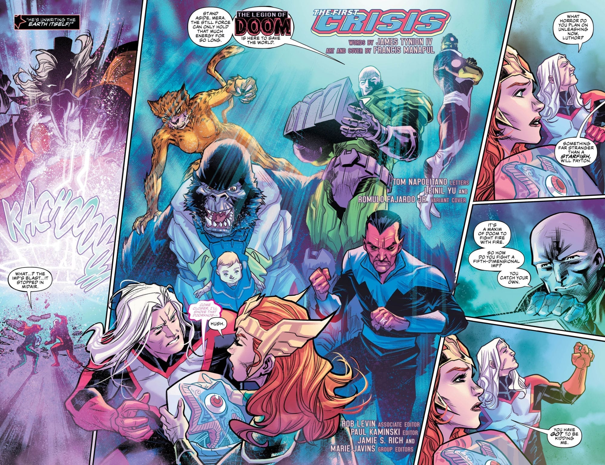
The standout story-line in this issue of Justice League is in its first few pages, with Mera, Starman and Jarro attempting to tame the out-of-control Mr. Mxyzptlk. The Legion of Doom arrives just in the nick of time with an inter-dimensional secret weapon – Bat-Mite. The reality warping altercation between these two will hopefully make for fun story and artwork in the coming issues.

Justice League #22 Page

Art

Francis Manapul’s art is as epic as the story. If anything, readers should pick up the book to take a look at the artwork. His line-work is bold and rigid, crafting statuesque characters. These cosmic gods are intimidating, yet wondrous. Much like Jorge Jimenez, Manapul easily conveys Justice League‘s scope and magnitude.

Manapul’s use of color is much less vivid than Jimenez’s work in the previous issues of Justice League. His use of a hazy, cloudy overlay in each panel makes his work otherworldly, and dreamlike.

Conclusion

Justice League #22 is pure exposition, as if this story really needed any more. It’s a worthwhile read with interesting dollops of world-building. However, the series works better when it is moving forward, and sticks with its main characters.

What did you think of Justice League #22? Let us know in the comments!

Monkeys Fighting Robots Youtube

Review: BATMAN #69 Bounces Back from the Edge

Monkeys Fighting Robots

Bruce finally discovers how he can break free of the nightmares, and also deduces the culprits responsible in Batman #69. The key is to uncover his greatest fear: the answer to a question he was too afraid to ask.

The Writing

In terms of broader theme, a discussion of whether or not Batman should—or even can—have a happy life is central to the discourse surrounding Tom King’s run. Without offering spoilers, suffice to say Batman #69 comes down on one side of that debate in very certain terms. This could prove to be a polarizing issue as a result. Readers’ reactions to that conclusion will depend on which side of the question one lands on.

Looking solely at the writing, though, Batman #69 is refreshingly purposeful. Coming off a few weak recent issues, this book seems intent to make up for it, pushing the narrative forward with intent. That said, some of the story ends up condensed into exposition, delivered via dialogue toward the issue’s end. Not ideal, but not a deal-breaker.

Batman #69 splits its time between Batman trying to break free, and the culprits behind his torture. While it’s no surprise that Bane has a hand in the plot, the individual working alongside him comes as a surprise. It’s an interesting twist based on a plot point seeded dozens of issues ago. It’s too soon to say with confidence how it will pan out in the story, though.

Batman #69

The Artwork

Yanick Paquette provides solid artwork for this issue. He divides the book in an interesting manner; many of the panels featuring Bane are tightly-cropped, stark, and gridded. In contrast, pages following Bruce and Selina are much more free-flowing, often opening into two-page spreads. You feel the sentiment behind the latter, and the cold ruthlessness and rage behind the former.

One complaint about Batman #69 is the facial expressions, which can sometimes look a bit lifeless and static. In one panel, you can clearly feel Bane’s rage; in another, he feels flat. The same goes for Selina, who looks a little dead-eyed from time to time. Overall, though, there’s a lot more here that works than that doesn’t.

Nathan Fairbairn’s work on colors complements Paquette’s inks nicely. The wide palette of unnatural colors employed throughout gives everything a stylish look and highlights the dreamlike qualities.

Final Thoughts

Batman #69 bounces back from a few weak prior chapters, delivering a stronger close to the Knightmares storyline. This issue will divide fans, perhaps even more than the wedding itself. That said, the book is well-executed, and gets us back on narrative track.

Monkeys Fighting Robots Youtube

Review: The Old Gods Clash With Mother Salt In AQUAMAN #47

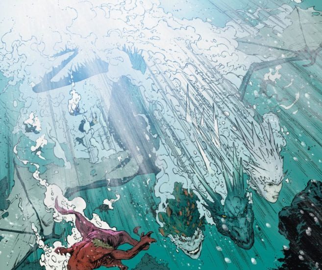
Aquaman’s journey with the Old Gods finally comes to an end in AQUAMAN #47. Mother Salt, the co-creator of the ocean, is mustering up her primordial powers to flood the earth with her bitter salt water. Aquaman (now known as “Andy” after losing his memories) calls out to every sea creature to take on the deity. But will it be enough to defeat her in the final part of the “Unspoken Water” storyline?

Story

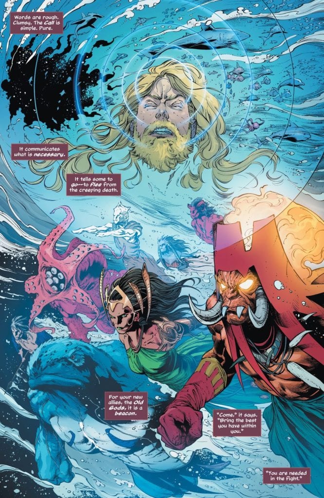
Andy’s famous “Call” ability to enlist the help of sea creatures is known to turn the tide of many a battle. The only difference this time is who answers. And lo and behold, it’s the Old Gods in their fully realized forms.


The beauty of Kelly Sue DeConnick’s writing lies in its fluidity. Much like the water this story is set in, the scene transitions are incredibly smooth. This is an effective technique that keeps the reader engaged when a lot of separate events are taking place at the same time. We’re able to follow the events in a connected trail instead of bits and pieces of action.

With the Old Gods at his side, Andy prepares for a battle with a power that formed the sea. Readers are pulled into his anticipation of the fight like a tide. But with this anticipation comes the fear of what would happen to the world if they fail.

Art

Sunny Gho, Robson Rocha, Clayton Cowles, and Daniel Henriques produced stunning visuals for this issue. Rocha’s penciling and Henriques’ inking combine to create solid lines to define the characters in the midst of wavy haze of sea. This meshes quite well with Gho’s aquatic hues, setting the scene of this story’s torrential battle.

Clayton Cowles’ lettering provides effective differentiation through character dialogue. The varied shapes of speech balloons emphasizes the intensity of dialogue, such as Mother Salt’s jagged font style to help readers imagine her shrieks.


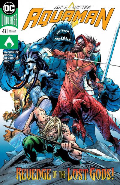
Rocha, Henriques, and Alex Sinclair’s work on the main cover fits perfectly with the story inside. The artwork showcases Andy and the Old Gods in their fighting stances as they prepare for battle. In addition, Joshua Middleton’s variant cover offers a hyper-realistic depiction of the aquatic hero to remind us how human he feels after losing his memories.

Conclusion

AQUAMAN #47 offers a thrilling conclusion to the “Unspoken Water” storyline. It’s filled with the drama and intrigue readers expect from such climatic battles.

Did you like the conclusion to “Unspoken Water?” Let us know in the comments below!

Monkeys Fighting Robots Youtube

Review: The Demon Vs. The Devil In DAREDEVIL #4

Monkeys Fighting Robots

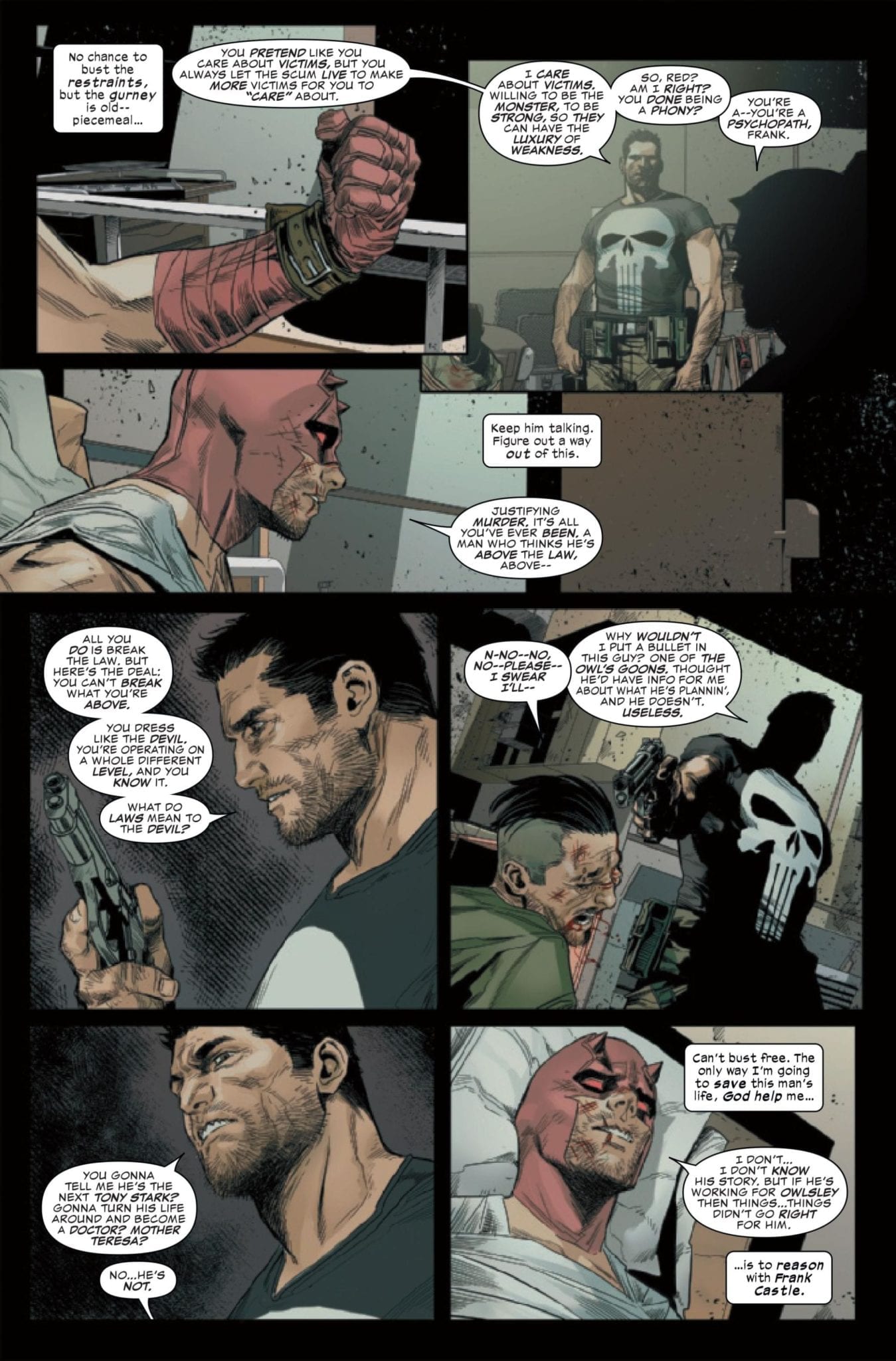
Matt Murdock has been doing some soul searching lately. Last issue saw the grim vigilante accidentally kill a man while fighting a gang in Hell’s Kitchen. This devastating news makes Matt question whether he’s ultimately fighting for the victims or simply for the sake of unleashing his rage upon criminals. These introspective questions come to a head when The Punisher, a.k.a. Frank Castle, confronts him in DAREDEVIL #4.

DAREDEVIL #4 main cover

Story

While attempting to investigate the scene where the murder took place in DAREDEVIL #3, Matt was attacked by Detective Cole North, who attempts to arrest him. The ensuing conflict leaves Matt with a gunshot wound. It’s here the reader is invited into the mind of the hero as he contemplates his predicament.

Matt senses his surroundings

Chip Zdarsky’s writing beautifully brings the readers into Matt’s internal consciousness. We follow along this internal investigation of his surroundings, sensing the nearby heartbeats. But just then Frank the murderer/vigilante appears in all his moralizing glory.

Frank Castle confronts Matt Murdock

It is here Frank claims Matt is turning into a killer. The murdered gang member and recent fight with the police speak for themselves, but Matt responds with outrage. One can feel the emotion laced in his words.

Frank Castle confronts Matt Murdock 2

Matt is left to contemplate what he’s become while Frank tortures a criminal he captured. Caught between these dilemmas, the Devil of Hell’s Kitchen will need to figure out who he is before another man’s blood is on his hands.

Art

Julian Totino Tedesco’s main cover sums up the issue’s central theme in it’s melding of The Punisher’s image with Matt’s face. It places focus on the notion of identity and whether Matt will be able to distinguish himself from Frank.

John Romita Jr. and Richard Isanove’s variant edition depicts Matt swinging through the city and capturing crooks. It serves as a direct contrast to main cover, helping the reader see how far Matt’s gone from his former identity.

The art style in the “No Fear” run is a big improvement for Daredevil stories. Sunny Gho’s faded reds and blacks and Marco Checchetto’s penciling offers a realism fitting of the character’s Netflix series.

Matt attempts to escape from Frank's trap

VC’s Clayton Cowles’ lettering adds to the suspense, especially in the scene where Matt’s gathering his thoughts in the dark. The placement of each thought balloon slows one’s reading down to the slow pace of his regaining of consciousness.

Conclusion

DAREDEVIL #4 succeeds at its deep dive into morality and self-image. Through Matt’s internal dialogue and confrontation with Frank, it asks us to examine the difference between our actions and our idealized selves.

Do you think Matt is turning into an even nastier version of The Punisher? Let us know in the comments below!

Monkeys Fighting Robots Youtube

WAR OF THE REALMS #2 Keeps Its Foot On The Gas Pedal

Monkeys Fighting Robots

Jason Aaron’s massive epic WAR OF THE REALMS continues in the explosive second issue. The heroes of Marvel’s universe are all that remains against Malekith’s crusade to rule all realms.

war of the realms 2 cvr

***SPOILERS LIE AHEAD***


“It’s like a Dungeons & Dragons bomb went off!” says Iron Man as he soars through the battleground that is Manhattan. War Of The Realms #2 jumps right back into the street-level action, constantly one-upping itself with every page turn.

Jason Aaron’s monumental story is full of all the elements that made Marvel events matter in the first place. His script throws every bit of action you can handle right at your face while effortlessly showcasing hilarious and charming character moments.

There isn’t a character in the 616 universe that Aaron doesn’t have a handle on, he flexes his Marvel muscle in almost every scene by delivering witty and often hilarious exchanges. He’s also single-handedly molding the Robbie Reyes Ghost Rider into a very charismatic character between his work on Avengers and War Of The Realms.

Doctor Strange’s helpful spell that was a bit too helpful was a memorable turn that sets in motion the story lines taking place away from the front lines. Malekith’s televised slaughter is legitimately brutal and disturbing as our heroes watch in terror. There’s so much going on in this war but it’s delivered in a cohesive package that won’t lose you.

Whether it’s Captain America bursting through a top story window to bash the face of a giant or Odin and the Valkyries arriving to provide backup, Russell Dauterman dazzles. There’s a massive scale that’s felt at every turn, the destruction is awesome and majestic.

Every character’s concern and determination is illustrated flawlessly. The drama unfolds in Dauterman’s art while Jason Aaron keeps things light upfront with the dialogue and story. This creative team is absolutely dynamite once again.

Colorist Matthew Wilson perfectly elevates Dauterman’s art to the next level with an impressive and satisfying display. There’s so much life and chaos flooding your eyes on every page thanks to the chemistry Wilson and Dauterman have established.

War Of The Realms nails the scale and execution needed to make this event live up to the hype created by Jason Aaron’s longtime run with Thor. There’s plenty of comic book crossover event cliches but they’re deployed in clever ways and you’re having way too much fun to even notice any familiarity.

This is shaping up to be the best Marvel crossover event in years and we’ve barely just begun. Giving Jason Aaron the keys and and control to so much of Marvel’s crucial properties was a very wise decision to get the universe back on track.

There’s a healthy dose of humor, action, violence, drama, and cheese all wrapped up in a beautiful looking package.

War Of The Realms is the real deal. If you’ve taken a break from Marvel events, now might be the time to come back.

Monkeys Fighting Robots Youtube

GUARDIANS OF THE GALAXY #4: The Galaxy’s Most Dysfunctional Family

Monkeys Fighting Robots

Donny Cates and Geoff Shaw pit Guardians against Guardians as the intergalactic dysfunction continues. GUARDIANS OF THE GALAXY #4 brings Gamora back into the fold.

***SPOILERS LIE AHEAD***


The race for Gamora leads to a fight between both teams of Guardians and one Peter Quill makes the ultimate sacrifice…again. We get a glimpse at Rocket and his killer battle fortress before Gladiator and company wipe the floor with our heroes.

Donny Cates continues to slowly develop his lineup of galaxy guardians but they’re nowhere near fully formed. This is still very much a dysfunctional family that seems to grow farther apart the more they venture forward.

Gamora is the only one who sees that Thanos’ posthumous threat is merely another game but she gets dragged into the chaos regardless. She throws herself into the mix, leading to Star-Lord taking a possibly fatal shot for her.

It seems like Peter Quill sacrifices himself to save a teammate every six issues or so that he’s featured in, it’s getting rather stale. This time in particular feels hollow as Peter hasn’t really had any time to shine or charm yet in this young series.

He’s also sacrificing himself for somebody who was just a straight-up villain in Gerry Duggan’s Infinity Wars. It’s comics, we know this obviously isn’t the end for Quill but it should still matter a tiny bit that he’s willing to pay the ultimate price for his former teammate.

Donny Cates has quickly put together an impressive run of great comic book series, however this one may not be fully cooked yet. It has a lot going for it; the lineup, creative team, antagonists, dilemma, and concept. Guardians Of The Galaxy is still just missing something, maybe that’ll change once Rocket emerges from his fortress inevitably.

If we’ve learned anything from the brilliant Abnett & Lanning run, it’s the more Nova the better. Richard Rider brings the fight to our team’s front door and the ensuing battle is brief but beautiful. What this issue lacks in character up front, it makes up for in style and action.

Geoff Shaw and colorist David Curiel keep the edge of this book sharp. Groot’s mo-hawk isn’t the only punk thing about Guardians Of The Galaxy; it’s the atmosphere and attitude as well. The aesthetics established early on work wonders, we just need to inject some charm into some of these characters.

This may not be the finest hour of Donny Cates so far but it’s far from being a bad read. It’s still a solid cosmic Marvel tale and gives us most of our favorite Guardians, there just needs to be more heart and intent throughout. Having Star-Lord be down in the dumps drags the entire experience down a peg.

Beta Ray Bill has been the standout star so far. Cates knows how to extract what he needs from the hammer-wielding horse without going too far or saying too much. Despite it still being weird that he’s speaking full sentences, Groot has been the biggest source of joy. He reluctantly serves as the reader, desperate to get the family back together fully formed.

Guardians Of The Galaxy #4 is a solid read that’s still figuring itself out as we head towards some more exciting cosmic chaos. We’ve come to expect nothing but instant classics from Donny Cates, maybe this time around it’s going to take a bit longer for his vision to become clear.

Monkeys Fighting Robots Youtube

Review: MARY SHELLEY: MONSTER HUNTER #1

Monkeys Fighting Robots

Like Mary Shelley, many real people have been featured in works of historical fiction, taking these historical figures on supernatural adventures that were never documented in the public record. The most notable is the 2011 novel (and its 2012 film adaptation) Abraham Lincoln: Vampire Hunter. Other noteworthy individuals have similar “untold stories,” such as Edgar Allan Poe, William Shakespeare, Queen Victoria, and even Lizzie Borden.

Mary Shelley: Monster Hunter #1, from AfterShock Comics, is the latest tale to fit nicely into this sub-subgenre. However, not only does the book divulge the secret life of the infamous horror writer, it puts a new spin on Shelley’s own masterpiece, Frankenstein; or, The Modern Prometheus.

** Some Spoilers Below **

Mary Shelley: Monster Hunter #1 Cover

Story

For nearly two centuries, scholars have wondered how on earth Mary Shelley, a nineteen-year-old girl, was able to conjure one of the most frightening and enduring horror stories of all-time: Frankenstein.

But with the recent discovery of Mary Shelley’s secret memoir, the truth is finally revealed: Mary Shelley didn’t just write Frankenstein, she lived it. Traveling back to that historic Geneva winter of 1816, Mary, her fiancé Percy, sisters Claire and Fanny, and the celebrated poet Lord Byron, find themselves guests of the eerie Frankenstein Estate.

Writing

Though the title would suggest otherwise, readers will not find any monster hunting in this first issue. Instead, scribes Adam Glass and Olivia Cuartero-Briggs opt for a slow burning introduction to the setting and characters. Kudos must be given to the writers for using Victorian era English in Mary Shelley: Monster Hunter’s captions and dialogue.

However, their decision to include two prologues felt unnecessary. Particularly in the second, with a tour in the final home of Mary Shelley. The missing manuscript found mere moments after the guide spoke about it feels forced. Furthermore, it seems unlikely that the story will ever return to that time, as it doesn’t seem relevant to the overall tale. The readers would have come to the understanding that they are reading an unaccounted for part of Shelley’s life on their own.

Art

Artist Hayden Sherman illustrates a chilling world that is bleak and minimal. The architecture is narrow and angular, with rough and jagged lines. All these elements work together to craft this air of dread and chaos while flipping through the pages.

The colors are splotchy, like oil paints that poured out of its container and onto the page. Hayden also only uses shades of red and blue, minimal coloring, to round out the book’s otherworldly atmosphere.

Conclusion

Overall, the team behind Mary Shelley: Monster Hunter #1 have crafted  a satisfactory setup for their horror adventure. Readers won’t find any actual monsters until the final pages. However, it is still intriguing enough to see what happens now that Mary has met her mysterious host.

Which historical figure could you see as a monster hunter, like Mary Shelley? Let us know in the comments!

Monkeys Fighting Robots Youtube

Review: Controlled Mayhem In STRONGHOLD #3

Monkeys Fighting Robots

Conspiracies; Alien Invaders; Superhero actions; Stronghold #3 from AfterShock Comics has it all. Continuing to dig into the ‘Alien among us’ concept, the creators pull out all the stops and expand their world view.

Stronghold keeps getting bigger and bigger, and going to places the reader would not expect.

cover art
Stronghold #3 Credit: AfterShock Comics

Writing/Story

After the massacre at the stadium, the Stronghold rally to control the situation and keep the Primacy out of the action. But the best laid plans don’t stand a chance against the ingenuity of Michael and his mission to find Claire.

With his emerging new powers and a villain to confront, how will Michael react to the deaths of so many innocent people?

Phil Hester opens this issue with a bang. It’s big and it’s bold. He does not apologise from the harshness of the scene but at the same time he does not wallow in the violence. The Adversary is a larger than life character and an obvious villain but one of the brilliant aspects of Hester’s script is that, as the story unfolds, the villain becomes sympathetic. The obvious black and white elements of the narrative are quickly muddied, just as in previous issues, so that the reader is not sure who or what to believe.

Hester creates a world where the reader instantly wants to root for the superhero character but he then makes the reader question this choice. What do we know about him? Where does he come from? Why are the Stronghold so obsessed with controlling his environment? All of these questions are raised and, to a certain point, Hester leaves the answers up to the reader.

Stronghold is about character’s getting manipulated and the consequences of that. It is also a comment on how mainstream comic’s handle their hero’s. So often superhero stories are straightforward, the reader knows who to stand behind even when things go awry. There is comfort in them, knowing who the hero is. With Stronghold Hester is challenging that conception. He uses elements from the format to create a world of grey areas. There is a large element of control and manipulation by various characters throughout the comic making this relevant to today’s world.

If comics like Superman and Captain American represented the need for Hope in the 1940’s then Stronghold represents the need for information in the modern world. It highlights the dangers of accepting everything at face value but also the reasons why it is easier or more appealing to do this.

Stronghold interior art
Stronghold #3 Credit: AfterShock Comics

Art

Ryan Kelly has a firm grasp on a sense of the dramatic. Each of the pages of Stronghold is packed with bold images and dynamic composition. Kelly creates a cinematic staging of the scenes using the panels like a camera, following the action and focusing on characters in slow zoom like movement. The intensity of a moment is heightened by the pacing in the panels: a slow turn followed by a stepped close up, for example, produces a menacing moment and enhances the threatening behaviour.

There is a tone set by the coloring throughout Stronghold. For a large part of the comic, Dee Cunniffe uses mostly a blue hue across the pages. This reflects the twilight setting for much of the comic but also makes the reader uncomfortable, as it portrays a coldness penetrating the narrative. It also allows Cunniffe to highlight one element of a scene and make it easy to follow across the panels.

Simon Bowland excels in giving the speech some punch. He spreads the speech across linked balloons to create a rhythm which he punctuates with the use of bold text. The text directs the way that the reader digests the images around it, giving moments set beats and a reading pattern. This in turn dictates the pace of each page and the transition between panels. The gutters work to identify the tone of a scene but it is Bowland’s lettering that gives each page it’s pace.

interior art work
Stronghold #3 Credit: AfterShock Comics

Conclusion

Stronghold has layers. There are stories and concepts over lapping and weaving together to form a complex and challenging work of fiction. The art work gives the narrative depth and tone. It also packs an emotional punch. There are disturbing scenes and touching scenes, each containing the same intensity.

AfterShock have produced some outstanding comics in the last few years and Stronghold is one of their best. It delves into the ethos of modern superhero comics to produce a piece of work that is both part of the mainstream and a critique of it at the same time.

Monkeys Fighting Robots Youtube

Review: STAR TREK THE Q CONFLICT #3 Continues To Plod On

Monkeys Fighting Robots

The Star Trek franchise is currently experiencing a surge in popularity thanks to the successful ST: Discovery show on Netflix and the constant reports of various potential spin offs. So this is a prime opportunity for IDW Publishing to push it’s Start Trek comics, and what better way than with a universal cross over event.

Featuring the crews of two Enterprise’s, Voyager and the Defiant along with some of the most powerful beings in the franchise’s history, Star Trek The Q Conflict is an epic undertaking.

interior art
Star Trek The Q Conflict #3 Credit: IDW Publishing

Writing/Story

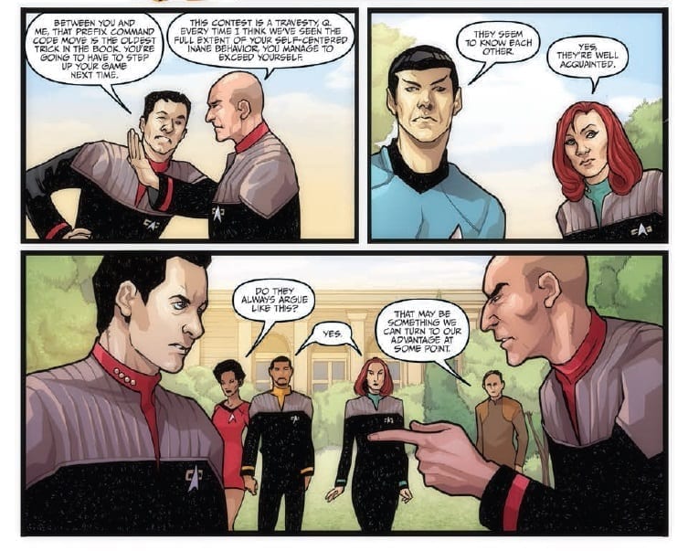
Continuing the interstellar game set by Q and the other god-like beings, the federation crews are pushed to their limits. After an initial loss in the first game, Q argues with Captain Picard over the importance of the situation.

Meanwhile the other captains take some time to dig for information about what is really going on.

All too soon the second game begins and someone bends the rules to add an element of danger to the proceedings.

With such a large cast writers Scott and David Tipton have to pick and choose the characters carefully for each scene. They have an advantage in that most readers will know the characters quite well: very few none Start Trek fans will be reading this comic. But this also leads to very little character building within the narrative. The characters are there to play a given part and nothing more, like the survivors in a 1970’s disaster movie who each have a single skill to help plot move forward but nothing more.

There is some great dialogue between a number of the characters, especially Picard and Q who the Tipton’s have got spot on. Unfortunately, a lot of the speech is exposition with no real character voice. Large sections of the dialogue could be spoken by any of the cast. With all of this exposition you would expect that the narrative to move on at a fast pace however, apart from the constant references to the war Q is raging, there is nothing new added to the overriding story.

Just like last issue, the game that the crews are forced to play is barely entertaining and over before it’s had a chance to get interesting. The whole escapade feels like an opportunity missed.

Interior art
Star Trek The Q Conflict #3 Credit: IDW Publishing

Art

This comic’s saving grace is the artwork. The strong inking by Ellsabetta D’Amico defines the characters wonderfully giving them a presence on the page. There is a clearly defined foreground focusing the reader’s attention on the crew and the ships. The backgrounds are mere color washes that serve no purpose giving the entire story an air of unreality. This works well for The Q Conflict because much of the story is set in environments created by the God like beings.

Alessandra Alexakis’ color work successfully differentiates the foreground from the background. The cast have a uniformity to them but he still manages to separate each of the different crews, allowing the reader to instantly recognise who is who. Part of this is down to the pencil work and lay out design by David Messina who creates striking likenesses of the characters, even from a distance.

Unlike the rather mundane plot, the art has some expressive features and the cast display some emotional reactions to the world around them. There is an element of dynamism in the space battle but not enough plot for the art work to really shine.

Due to the amount of dialogue Neil Uyetake has a difficult time positioning the lettering in exciting or effective ways; there are moment’s where it feels that he has had to fill a space just to get the speech in. He does, however, employ a number of clever balloon framing techniques to emphasis the loudness of the speech. He presents whispers in the background and shouts in the foreground in subtly different ways that the reader subconsciously picks up.

cover art
Star Trek The Q Conflict #3 Credit: IDW Publishing

Conclusion

Star Trek The Q Conflict has a wonderful premise at the heart of it but because of the cast, or writers, insistence on no fighting there is a distinct lack of conflict. At most there is some heated bickering but this is not enough to make the comic a compelling read. Most of this issue is a half time locker room pep talk. And when the action does start it is over too quickly, losing any sense of threat that the situation may have held.

Overall this comic has more in common with the original 1960’s episodes of Star Trek than it does any of the newer incarnations. The other federation cast member’s seem out of place and lost in a narrative not suited to their characterisations.

The best way to sum The Q Conflict up is to quote Trelane from this very issue:

“Nothing is happening! This isn’t combat or strategy! There’s no stakes! I’m not feeling the excitement!”

Monkeys Fighting Robots Youtube