Home Blog Page 389

RUNAWAYS #27 Brings Us A New Team Leader?

RUNAWAYS #27, out this Wednesday from Marvel comics, brings us once again to a changing team. Is it time to have a new leader for the Runaways? Or is there something much more sinister happening behind the scenes?

The Runaways are looking a bit…different than usual.

***SPOILER WARNING***

Runaways #27 is an interesting read. Here we are facing change, once again. But most of the team seems incapable of seeing that. Woven throughout these pages are individual concerns, humorous moments, and relationship dynamics. All in a day’s work for this team.

A fun arm. That seems safe. Right?

The Runaways are still at Doc Justice’s mansion, and that means that they’re slowly being subsumed into his world. Or not so slowly, as the case may be. The Runaways are no strangers to change, but this seems dramatic even for them.

And that is leaving readers feeling like the other shoe is about to drop at any moment. After all, it isn’t exactly normal to see things going well for the Runaways for any length of time. And there’s just something…off about this Doc Justice and his assistant.

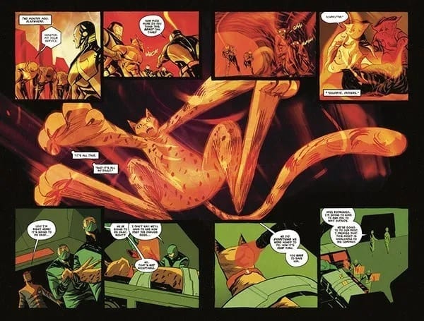
Adding to an already complex situation are several other concerns. Such as what is going on with Gibb and how Gert fits into the larger picture these days. It seems that each character has been given their own subplot to work through, and it’s Gert’s turn to be a bit more on the vocal side of things.

Molly is digging Chase’s new armor. Nico? Not so much.

Rainbow Rowell has done an outstanding job sowing the seeds of something larger here. It’s clear to the readers that there’s something not right about this situation. But it’s impossible to put our fingers on what it is – though there are plenty of theories out there.

While there was obvious and subtle tension weaving in and out of these pages, there were also moments for comic relief. What was striking about these comical moments is that they can also be construed as commentary. It would seem that the creative team behind Runaways has some opinions about the costumes women in comics have been forced to wear in the past. Honestly, it was refreshing to see this subject openly discussed amongst characters in that world.

Runaways #27 may have seemed like a calmer issue on the whole, but it also felt like it’s building up towards something larger. Each character is dealing with their own emotions and reactions to the changes around them. And while they have been overwhelmingly excited about that fact, that just means when the truth hits, it’s going to hit hard.

And here’s a look at what has been going on, and what creative team is involved for this latest issue.

As per usual, Runaways #27 boasts a large creative team. First, Kris Anka is working on the pencils for the artwork. Anka also provided some of the inkings, alongside Walden Wong. Dee Cunniffe and Jim Campbell provided the coloring for this issue, while VC’s Joe Caramagna did the lettering.

Together they’ve created another vibrant issue. And they had a lot to tackle in this issue, as most of the characters faced at least one costume change (with a few exceptions). As mentioned above, the costume changes resulted in some commentary, and thus these outfits had to be extreme and noteworthy.

The final costume designs our characters went with were actually quite striking. Karolina’s design is perhaps the best one of the bunch, but there’s something to be said about all of them. But once again, all of these changes are leaving us wondering what’s going to happen next.

Runaways #27 was an issue full of foreshadowing events. Though it was perhaps just a bit more relaxing than its predecessor (oh Runways #26, how you broke our hearts and freaked us out). Rowell’s commentary allowed for some lighter moments in what was otherwise an issue dedicated to building up a plot.

Monkeys Fighting Robots Youtube

Review: BATTLEPUG #3 Features Disruptions In The Balance

BATTLEPUG #3 cover artwork

BATTLEPUG #2 left the last Kinmundian in dire straits; the Queen of the Northland Elves overwhelmed him with Jofel’s forces and, adding insult to injury, convinced Sprinkles to leave with an other-worldly, giant human. Crushed in both body and soul, the Kinmundian must somehow find the strength to defeat the evil Queen all alone, lest she continue terrorizing the realm. Elsewhere, Bryony and the rest of the group continue to track their friend through the countryside, leading to an unfortunate confrontation with the Nobody’s Ponies, a group of horse thieves intent on murdering the entire group.

Can both groups use their connections to the mystical Balance to defeat their foes, or will these events cause a disruption in the world’s forces unlike any before? Find out when BATTEPUG #3 hits stores on Wednesday, November 13th.

Story

The Nobody’s Ponies have no intention of letting anyone pass through their woods unscathed, especially a group of mages. Their prowess in stomping is nothing to brush aside. Sasha, the Immortal, leads the charge against the lead Pony wearing her impenetrable armor in hopes of alleviating the threat. But the hero acted too soon; another thief snuck up on her partner, Ladora, threatening to chomp her head off.

But in this moment of felt powerlessness, Bryony’s mage abilities erupt in a powerful display. A mass of vines entangle the Ponies before any harm can be done, squeezing the life out of them. The rage the girl expresses toward those who would harm her mother is unparalleled. We feel the anger of Bryony at anyone who would harm our loved ones. And it’s a this moment that the young mage pushes past self-defense and seeks vengeance, claiming the Balance would be on her side as well.

Back in the Northland, the Kinmundian faces torture at the hands (or candy canes) of Jofel while the Queen explains her master plan (as villains often do). We learn her ultimate quest is the seek a power beyond the Balance led her to the giant boy, a being said to come from another reality. In exchange for Sprinkles, he grants the Queen a mystical amulet that could grant her far greater powers.

Writer Mike Norton is ramping up the Queen’s powers in these gut-wrenching ways. But with the incredible might of Bryony and the other warriors, it looks like the coming conflict will be earth-shattering.

Artwork

Norton’s penciling and inking, Allen Passalaqua’s coloring, and the lettering from CRANK! work together beautifully in BATTLEPUG #3. Norton’s ability to craft illustrations that are fantastical distortions of the real world gives readers the impression that this world could theoretically exist in a parallel universe alongside our own. Passalaqua aides in this effort by featuring bright, wild colors alongside the lush greens and icy blues found throughout the story’s setting. And CRANK!’s lettering uses fonts that appear to be handwritten; it’s almost as if the dialogue were taken from one of the character’s journals, adding to the story’s immersive effects.

Comic Covers

Cover A

Norton and Passalaqua’s main cover for the book places all the focus on Bryony; she’s pictured in a mass of her own vines holding a miniature version of the Nobody’s Ponies boss, representing her power over them.

Cover B

Jason Shawn Alexander and Luis Nct’s variant cover hearkens back to the original two characters in this series—the Kinmundian and Sprinkles. The use of pastel colors gives the illustration an almost historic look.

Conclusion

BATTLEPUG #3 unveils many of the mysteries we saw in issue #2, but opens up another batch of unanswered questions. We’re excited to learn more about the Queen and Bryony’s powers.

What do you think the Kinmundian’s chances of survival are at this point? Let us know in the comments below!

Monkeys Fighting Robots Youtube

FAMILY TREE #1 – A Twisted and Knotted Tale Begins

FAMILY TREE #1 is the first in a brand new series by Image Comics, out this Wednesday. The series blends fantasy, horror, and family drama all into one twisted form. This series is going to be perfect for those looking for something unusual.

A striking cover for a brand new series.

***SPOILER WARNING***

Family Tree #1 launches a new series from the minds of Jeff Lemire, Phil Hester, Eric Gapstur, and Ryan Cody. This series merges together the mundane and the horrifying. The family dramas and the grotesque. And in doing so, it’s creating something entirely new along the way.

When the day first started, Loretta’s biggest concern was her dull job as a grocery store clerk. Or perhaps she was once again worried about her son, and what trouble he might be getting up to this time. She certainly wasn’t prepared for the new dangers that were about to pop up in her life.

That may sound like the beginning of any old tale, but Family Tree is different. It’s a true Cronenberg horror – the fear of losing control over what happens to our very own bodies. And that means Loretta is about to lose control over her life – and quite possibly her family.

A gloomy start to Family Tree. That’s not at all foreboding.

Family Tree #1 was a subtle beginning to what is sure to be one of the more horrifying series on the shelves. But that’s just going to make it more painful in the long run. You see, now we have time to get to know the family. And possibly even start liking them. Now we’re invested in their welfare. And that means we’re going to care about what happens to them. And whether or not they turn into a tree, as pictured on the cover of this issue.

Jeff Lemire really knew how to weave a fascinating introduction into this world. It is full of the mundane drama, the family issues, the troubled teenager, the quiet daughter, the works. But it takes all of that and throws it off the deep end.

And there are plenty of little tidbits for readers to pick up on. Not to mention a new mystery introduced at the conclusion of this issue. All in all, this issue did an outstanding job of grabbing onto our attention and refusing to let go.

Nothing is quite what it seems here.

The artistic team behind Family Tree #1 knew what they were doing. They knew how to capture the mundane, this quiet and boring little town. But they also knew how to weave in the horror elements as needed. The steady growth of the unusual is not something that can be ignored, as we’ve been clearly shown here.

Phil Hester, Eric Gapstur, and Ryan Cody all played a hand in making this series what it is. The dramatic shading went a long way in foreshadowing the darker events down the road. Overall, the tone was finely balanced between something commonplace and something…more. It will be exciting to see how they push the horror elements in later issues.

And that does not look good! Nope, not one bit.

Family Tree #1 proved to be an intense and unexpected introduction to a series that will likely prove to get even more interesting with time. The groundwork has been carefully laid out, and now it is time to see it all get torn apart.

Monkeys Fighting Robots Youtube

Review • BIG HERO 6: THE SERIES #1 – The Heroes Are Back!

BIG HERO 6: THE SERIES #1, out this Wednesday from IDW, is the beginning of an all-new tale following some beloved heroes. This tale is one perfect for all ages and isn’t afraid to take on a slightly more silly or whimsical tone.

Our heroes are back for another round of adventures!

***SPOILER WARNING***

Big Hero 6: The Series #1 brings back all of our fan favorites. If at all possible, this series is even more kid-friendly than ever before. The tale included within these pages is slightly silly and fanciful, but is still full of all the charm fans will remember (especially fans of the movie).

The first issue in this series is split into two stories though both have a Fred-centric leaning. As if you needed more proof that the series wasn’t afraid to go a little bit silly for the sake of entertaining its readers.

This alternate cover for Big Hero 6 The Series #1 is looking absolutely amazing.

The first plot in Big Hero 6: The Series is called ‘Fred’s Comic Book Adventure’ and you can probably already take a guess at what happens here. Fred is pumped up from his most recent battle as part of Big Hero 6, finds himself unwilling to lounge around his house all day. Sorry, his mansion.

So instead, why not be productive? Makes sense. Except that Fred’s idea of productivity is a bit different from most people. He’s going to plan out how to take down their next villain. And by plan, we of course, mean he’s going to draw a comic.

Imagine Fred’s idea of storytelling. Now add artwork. Now you have a solid idea of what’s going to happen over the next several pages of this series. That being said, it was a pretty funny collection of events. The tongue in cheek humor surrounding Fred’s limitations in his artwork brought it all to a whole new level.

This plot was written by Hanna Blumenreich, and illustrated by Nicoletta Baldari. Blumenreich had some fun writing Fred’s story if the teasing nature is anything to go by. Meanwhile, Baldari did an exceptional job of portraying two different art styles (the ‘real’ versus Fred’s comic).

Our heroes are ready for a fight, in this series cover.

Next up on the list is ‘Mini Maximum Noodle Boy.’ This one was written by Joe Caramagna, but it was also drawn and colored by Baldari. This plot was significantly shorter than the first one. But it was also a little bit crazier, so it balances out in the end.

Once again, the plot is focused on Fred. And that means that things are about to get silly. Throughout this mini-arc, we learned a whole lot about Fred’s preferences in foods and restaurants. So you can probably guess at how comical everything is about to become.

As far as quick one-shots going, this was a pretty funny series of events. It perfectly captured the insanity machine that is Fred. And how he tends to warp everything around him to suit his nature. And Baldari managed to keep up with all of the crazy demands, which is even more impressive.

And here’s a look at the cover for next month’s issue.

What made Big Hero 6: The Series #1 so brilliant were all of the elements worked into it that brought it all together. The issue is split into two plots could have gone several ways. But having it all centered around Fred gave it a sense of cohesion. Having the artist and letterer (Christa Miesner) be the same throughout was another smart touch. It made the issue all look like a whole cohesive piece, instead of two random short stories stuck together.

The real question now is, how is the rest of the series going to go? Will each issue be a collection of short stories? And if so, will each member of Big Hero 6 be given a chance to shine? That would certainly be a different take on this team so far, so that certainly seems possible.

Monkeys Fighting Robots Youtube

Review: STEEPLE #3 – The Enemy Of The Enemy

STEEPLE #3, out this Wednesday from Dark Horse Comics, brings us back to a sleepy little town full of monsters from the sea. Oh, wait, not so sleepy after all. Once again, this is a town that finds itself on the face of change. But it isn’t the monsters that are the threat.

Not in my back yard! So um, what do you think is the cause of this little protest?

***SPOILER WARNING***

You might think that in the world of Steeple, there are enough threats and antagonists already. But you’d be wrong. Steeple #3 went above and beyond in proving to us that sometimes the enemy isn’t the monstrous-looking creature you’d expect.

Steeple #3 is perhaps the most bizarre issue of the series, featuring a new set of characters who believe they can utilize the power of windmills in order to force an early rapture. And yes, that is as risky and crazy as it sounds. And it’s going to force enemies to work together in order to stop it from happening.

Is that a windmill with a cross on it?

Written and drawn by John Allison, Steeple #3 has a particular sense of humor about itself. It isn’t afraid to have a little bit of fun, while also exploring human nature, all while commenting on religious organizations. It’s an interesting and unique blend, one in which Allison has found an ideal balance.

Billie is settling in well in her new town, even if she is still a bit well, shocked about what she witnessed at the end of the previous issue. Thankfully that doesn’t seem to be enough to chase her away.

What’s more, a flashback is required in this issue. It was all done to explain the sudden appearance of a bunch of windmills. Windmills that mysteriously have crosses on their fronts. The twists that follow are unexpected and proof that not everything is as it seems.

Naturally, there were plenty of amusing moments during this series of events. After all, we’re talking about a plot revolving around three different forms of religion, and how two must join up to stop the third. And the third is using windmills, which should be enough said in and of itself.

Allison’s humor is very much of the tongue in cheek variety. It’s a breath of fresh air in a series that is utterly unique. It’s impossible not to look forward to seeing more of this series, and towards getting to know the characters better.

As mentioned above, John Allison was the lead artist, as well as being the author. That’s why the artwork matches the plot so perfectly. He’s created capricious characters that are full to the brim of drive and personality. And their personalities shine through in their sense of style and expressions.

The colorist for this issue was the one and only, Sarah Stern. She did an excellent job applying a color palette that fit the nature of this story. All of the colors were done in bright blocks, except for the stormy backdrops, which were delightfully dynamic.

And finally, Jim Campbell was the brains behind the lettering for this issue. Thanks to the unique story told, he had plenty of opportunities to shine in this issue. His lettering added a comical edge, while also providing vital information about what was going on.

Steeple #3 in many ways was the most surprising issue of the series so far. It was slightly insane and comical, while also taking a moment or two to establish something larger happening. The unique tone and plot of this issue are sure to make it a memorable one. And it’s left us looking forward to seeing what will happen in Steeple #4.

Monkeys Fighting Robots Youtube

DOCTOR MIRAGE #4 – Death, Questions, And A Beginning To The End

The beginning of the end starts this Wednesday, as The Death Defying Doctor Mirage defies death yet again in the fast-paced penultimate issue of Valiant Entertainment’s DOCTOR MIRAGE!

Art by Nick Robles. Colors by Jordie Bellaire

As Doctor Mirage #4 takes place directly following issue three’s cliffhanger, there may be a few spoilers. To save yourself from getting spoiled, check out our review, or pick up the previous issues from your local Comic Shop!

A Story Built Upon Questions

It turns out Doctor Mirage isn’t called “The Death Defying” for nothing, as yet again she lives! How long was she “dead”, or how exactly did she survive a hole that big? Well, much like a multitude of other questions, these are never answered! But, that’s one of writer Magdalene “Mags” Visaggio’s strengths. By answering past questions, Visaggio adds in new queries. Or keeps said answers questionable.

In the previous issue’s review, we questioned Grace’s motive. Taking a break from the deadly action, Visaggio gives the duo a quick catch up scene, since Grace mentioned time had passed while Shan was dead. The amount of time is never mentioned, with Shan asking Grace multiple times how long it had been, but never receiving an answer. Proceeding this, Shan starts to question Grace more on her motive.

Having Shan give Grace the benefit of the doubt in the first two issues was understandable. In issue three, when she started questioning her, that progression made sense. But her only pushing it so far in Doctor Mirage #4 didn’t make much sense. After having just defied death, and supposedly been there for awhile, wouldn’t you ask and demand a question? Shan makes the interrogation with Grace quick as she breaks down crying. As Shan says, this action is understandable with Grace’s age. But, with everything the duo have been through, why shouldn’t Shan push even further? All of these story moments hit hard, but Shan could’ve/should’ve hit harder.

Letters by Dave Sharpe. Art by Nick Robles. Colors by Jordie Bellaire

A Sight to Behold

Doctor Mirage #4 continues the trend of being a beautiful work of otherworldly wonder. This theme of the visuals being phenomenal may soon get to the point that the dictionary will run out of explanatory words. Much like the other issue, art is courtesy of Nick Robles, with colors by Jordie Bellaire, and letters via Dave Sharpe.

Robles keeps the panel sequences sublime, never shying away from trying something unique, or different. One page’s visuals could be an easy three paneled page, with the following consisting of thee panels yet bending the rules. Or during the dialogue driven moment Robles moves the scene around the room and characters helping portray emotion, while keeping the ready interested.

Keeping the colors bright and popping, Bellaire continues the vibrant spectrum seen throughout Doctor Mirage. One sequence stands out more so than the others. That being when Shan explains the history behind the knife. In this flashback of ancient Egypt, Bellaire adds a filter of sandy brown, giving the feeling of being in the desert where the moment transpires.

Doctor Mirage #4 has heavier dialogue moments than its previous issues; luckily Sharpe is able to maneuver the bubbles around the characters while keeping the readers eyes moving. All that while keeping the font styles changing for dramatic effects, or helping portray someone else’s speech.

Letters by Dave Sharpe. Art by Nick Robles. Colors by Jordie Bellaire

The Death Defying Doctor Mirage Defies Death. Again

Doctor Mirage #4 contains only one moment that kills its perfect score. That being an important panel looking muddied, resulting in its visuals all blending together. Beside that small blemish, the beginning of the end is an action packed, character driven fantastic penultimate issue.

Cover Story: Doctor Mirage #4 received a few variant issues. The best one would be Cover C by Yoshi Yoshitani (seen below). Yoshitani has a fun and unique style that pops, while Yoshitani makes the title transparent while drawing ‘beings’ grabbing Shan. I absolutely love when artists mess with comic titles/logos. Even if it’s this small of a change.

Cover C by Yoshi Yoshitani

Dear Reader

The endgame now in sight, what did you think of Doctor Mirage #4? Let us know down below!

Monkeys Fighting Robots Youtube

Review: STRAYED #4 – A Tale of Time and Loss

Dark Horse’s cat-centric series, STRAYED #4 is out this Wednesday. Lou’s unique tale (no pun intended) continues here, as he learns the true consequences of his actions. This is one series sure to tug at the heartstrings of any cat lover in the audience.

The big bad is on the cover of Strayed #4.

***SPOILER WARNING***

Strayed #4 is the second to last issue in the series, and as such it’s got a lot of development to get through. After all, it has to set up for the dramatic conclusion of the series. All while giving us more time to fall in love with adorable little Lou.

In the last issue of the series, we saw Lou forced to confront the truth of his actions. Now we see the direct consequences of his realization. And what exactly he’s going to do about it. This is a moment we’ve been waiting for since we first heard about this series. And it’s finally here.

This alternate cover for Strayed #4 is both striking and powerful.

Written by Carlos Giffoni, this series has had its ups and downs. It took us a little while to become invested in Lou’s tale (with the exception of the cat lovers in the audience – we were sold from the start). There were more questions than answers in the beginning. But over time, the story has unfolded, revealing a universe full of complex beings and motives.

And one very obviously bad guy running an evil corporation. We really didn’t need to know more than that to hate him, did we? Alright, we were seeking a bit more information about his goals or motives, which we have gotten in a piecemeal format.

Then there’s Lou. For such an adorable cat, he sure has one unique gift. The last few issues have taken the time to show us how he came into being, how he can communicate. And most importantly, the price he pays each time he’s sent off on a new journey. The last issue left is concerned about Lou’s fate, as he had pushed himself harder than ever.

Lou is reeling while his health plummets in this series of panels.

With all of that in mind, Strayed #4 leaps into being. Lou has been forced to face an awful truth – and it’s one that he helped build, albeit unknowingly. But Lou is a sweet cat, one not content to let all of these horrendous acts of genocide slide. And that means he’s about to start acting out.

This was the plot described to us when the advertising for Strayed first began. And thus, this has been the moment we’ve all been waiting for. Lou’s adoration of his owner isn’t enough to stop him from taking a risk because this risk is required in order to do what is right.

This whole time we’ve been wondering what Lou would do when it came time for him to start resisting. And now we finally have an answer to that question. It’s not the answer we expected. But it does fit in well with the characters we’ve come to know, and with the story as a whole.

The conclusion of this issue, once again, has left us eager to see what will happen next. It’s somewhat hard to believe that the series will have enough time to wrap things up, given that there’s only one issue left.

Poor little Lou. He’s been through so much these past few issues.

Strayed #4 has some of the most brilliant and striking artwork of the series, and that’s saying something. Juan Doe outdid himself this time. There are several two-page scenes to be found within this issue, and they’re all worthy of praise.

Doe’s representation of Lou’s astral projected form is beautiful, elegant, and unique. It’s the highlight of the series, in many regards. And that is why this issue was so stunning since Lou spent a tumultuous amount of time in that form. Doe managed to capture the strife Lou was facing, all while showing off what makes the series so wonderful.

Matt Krotzer was the letterer behind this issue. And as usual, he did an ideal job. There were plenty of sound effects worked into these pages, and Krotzer kept them fresh, all while not interfering with the iconic artwork.

You’ve got to admit, these pages have been striking.

It’s hard to believe that Strayed is almost at an end. And yet, Strayed #4 did its job well, setting up for the final issue. The stakes have been set, and Lou is finally in action. And it looks like he might be learning a new ability or two, just in the nick of time.

Monkeys Fighting Robots Youtube

Review: FOLKLORDS #1 (Or How I Learned Earth Is Another World’s Fantasy)

In BOOM! Studios newest series Folklords, Matt Kindt and Matt Smith ask the big question: do fantasy characters dream of earthly realms?

Interior art by Matt Smith, Colors by Chris O’Halloran, Letters by Jim Campbell

A World Reversal

Folklords‘ premise seems like an obvious one in fantasy, yet it seems to have barely been touched upon before now. Instead of someone from Earth dreaming of a fantasy world, it’s reversed. The series’ #1 main adventurer, Ansel, receives visions of a fabled land called Earth where a multitude of things are different. The visions get the better of Ansel and he sets out to find the fabled Folklords. Gotta love when a comic references the title in its interior.

Unique premise aside, writer Matt Kindt crafts a lively fantasy world bristling with nods to other works. That doesn’t mean Kindt solely relies on past inspirations and creations, though. At the age of 18, all kids in this fantasy realm must announce a quest they plan on tackling, and then set out upon it. Kindt portrays this announcement as a ‘coming of age’ ritual, while having each kid present it to the town. These moments of quest announcements are magnificent as they expand the world, history, and characters all in a hilarious manner.

Interior art by Matt Smith, Colors by Chris O’Halloran, Letters by Jim Campbell

A World of Art

Matt Smith’s art is a perfect fit for fantasy worlds. You may have seen him recently on Hellboy And The B.P.R.D.: Long Night At Goloski Station, furthering the fact of being a top artistic choice for any fantasy realm. While Kindt portrays the characters and world through dialogue, Smith matches said storytelling with each page of artwork.

Smith is able to depict the large fantasy world in all its grander. Folklords #1 seems to take place in only one city (no name is ever stated), but each section visited stands out on its own due to Smith’s art. Smith’s portrayal of a fantasy realm is breathtaking, while the colors by Chris O’Halloran match the feel good vibes and beauty. Each page’s charm beckons you to live in its world.

O’Halloran showcases a complex color spectrum with bright and otherworldly moments, while mixing in dark and moody backgrounds throughout Folklords #1. If neither Kindt’s writing nor Smith’s art could convince you to move to this fantasy realm, then O’Halloran’s colors will.

Helping further Folklords #1 fantasy story are the letters provided by Jim Campbell. During narration moments, Campbell crafts them as a handwritten page in a storybook, taking the fantasy theme to the next level. The characters showcased thus far are human, with the only non-human (Charles The Troll) receiving differing dialogue bubbles. Instead of the clean circular bubbles the humans receive, Charles’ bubbles are shaky and uneven. His dialogue is bold and shaky, helping showcase the difference.

Interior art by Matt Smith, Colors by Chris O’Halloran, Letters by Jim Campbell

Off To Find The Folklords

Each member of Folklords creative team brings their best to the opening issue of a new fantasy world. Throughout Folklords #1, the team adds just enough intrigue about the world, essentially drawing you in slowly. By the end of its first issue you’ll be as excited as Ansel is to explore a new world.

Memorable Quote: “I’m a Troll. I like what I do. And I ain’t a fan of crowds.” – Charles The Troll

Hey, I never agreed to be in Folklords! Seriously, no character has spoken to me more than Charles The Troll.

Cover Story: We aren’t talking about the cover art for Folklords #1, instead I wanted to mention other insane news. A week before its release BOOM! Studios announced a third printing. For a brand new series’ first issue to go to third printing before its release is pretty awesome!

Step Into The Fantasy World

Let us know what you thought of the start to a new fantasy story down below!

Monkeys Fighting Robots Youtube

SABAN’S GO GO POWER RANGERS #25 Gives Fans EXACTLY What They Wanted

Cover by Amelia Vidal

Out this week from BOOM! Studios, Saban’s Go Go Power Rangers #25 continues the exciting “Necessary Evil” story arc by further integrating one of the TV show’s most beloved plot points. (Previous issues Spoilers ahead)

If you liked Power Rangers as a kid, and you haven’t been keeping up with the BOOM! Studios comic, then I don’t know what to tell you other than to change that A.S.A.P. The “Shattered Grid” story arc was an absolute roller coaster front to end, and now we’re in the series’ second big story event, and it is every bit as addictive from issue to issue as the first.

For Go Go Power Rangers, “Necessary Evil” started with issue 21, where we said goodbye to Tommy’s Green Ranger powers. Which anyone who’s seen the show knows what is inevitably coming after, and for some, it meant saying goodbye to their favorite Ranger, for others, it means saying hello to theirs instead.

We’ve already gotten a glimpse of Tommy’s White Ranger powers back in “Shattered Grid” when Lord Drakkon held both the Green Power Coin and the White Light at the same time. Even more recently on Go Go’s sibling comic, Mighty Morphin Power Rangers, which is also partaking in the “Necessary Evil” arc just further along the timeline, Tommy is already the White Ranger and has shown what his new powers are capable of.

Saban’s Go Go Power Rangers #25 gives us our first look at writers Ryan Parrott and Sina Grace’s interpretations of the White Ranger’s, something we did not get when Tommy lost his Green Ranger powers. Instead, they had brought us in during the tail end of the Green Ranger’s last fight with an editor’s note telling us to check out the episode of the show “Green No More Part 2” which I dig because it makes the story feel more connected and interactive with the source material.

One example of Tommy “coping”

Right from the get-go, this issue gives us something the show did not, a look at how Tommy is coping with being powerless. Comic and show alike, after Tommy lost his powers, he leaves Angel Grove to take some time for himself, here we get to see what he was doing during this time.

The origin of the White Ranger is not the only tale being explored in Go Go this issue though, all who watched also remember the change in the cast that came shortly after Tommy’s return. Already well established in Mighty Morphin, which again is further down the timeline, we see that Jason, Zack, and Trini have been replaced in their roles as the Red, Black, and Yellow Rangers by newcomers Rocky DeSantos, Adam Park, and Aisha Campbell.

More about Jason’s mission and the burden that comes with it.

Although it’s sad to see the three leave the team, it was going to happen eventually. However, it is good to see Jason, Zack, and Trini will not be forgotten about altogether. In this issue, we are shown more on Jason’s mission granted to him by the Emissary of the Morphin Grid, which while being set up here in Go Go, is already well in motion by the time we get to Mighty Morphin. As far as floating, all knowledgeable, mysterious, ancient beings in sci-fi go, the Emissary honestly has one of the coolest designs of all of them.

BOOM! Flashy entrance

The idea that it constantly shifts between Ranger designs of the same color is a neat concept and very visually pleasing. Francesco Mortarino’s illustrating for this issue is top-notch. Every panel the Emissary is in, he is drawn dramatically and bursting with both figurative and LITERAL electricity. Alongside Raùl Angulo’s colors, which give this glow and energy just radiating off of him at all times, it makes the Emissary eye-catching every time.

As a whole, this issue does more to set up than it does to progress the plot. But that’s not all that bad considering we know most of where the story is going and Go Go has been more the fun ride getting us there. The dialogue has been solid and believable for each cast member, which is amplified by Ed Dukeshire’s lettering, who is still giving us all the “Kee-yas” and “Hoo-Has” in the fight scenes, which is so reminiscent of the source material.

Saban’s Go Go Power Rangers #25 is still giving us everything we love about this Boom! Studios series, and I can not wait to see what happens next. I’m excited to see what they do to tie this story in further with what is currently happening in Mighty Morphin Power Rangers and see how the story progresses to what it has become there. The team has given this series so much love, and I’m thrilled to see how strong it is going still. Definitely a series worth following closely.

Like Power Rangers as much as we do? What’s your take on Tommy changing from Green to White? Let us know in the comment section below!

Monkeys Fighting Robots Youtube

Review: PUNISHER: SOVIET #1 – Classic Punisher… TO THE MAX

Punisher:Soviet Feature Image

It’s not every day that an acclaimed writer such as Garth Ennis returns to a character that helped him establish himself as one of the more talented creators in the industry, but that is exactly the case with Punisher: Soviet #1. With Jacen Burrows on pencils, Guillermo Ortego on inks, Nolan Woodward on colors, and Rob Steen on letters Punisher: Soviet #1 has all the makings of another pivotal entry in the Punisher’s catalog.

Punisher: Soviet #1 begins with The Punisher following a tip from a government source about a Russian Mobster’s hideout, only to find out that the encampment has already been taking out by someone with a similar set of skills and M.O to Castle. Before going further into this review, it is necessary to point out that this is a continuation of Marvel MAX line, specifically (and obviously) Punisher MAX. So this comic is graphic and mature, but simultaneously more grounded and realistic. This Frank Castle ages normally, and he is not currently the cosmic Ghost Rider.

A majority of this chapter is spent in Castle’s mind, with some pretty heavy narration. But Ennis makes this work, as The Punisher is probably one of the easier Marvel Characters to make into a narration heavy noir-like story. And the story itself is pretty straightforward, but that truly is how Castle operates, so it works in the larger picture. Castle sees someone he deems evil; he eliminates them.

This is why narration works so well with The Punisher because otherwise, he is a simplistic murder machine. Only when you hear his thoughts does his military expertise and strategic planning show itself. And when there is no narration, the brutality shines through even stronger. This is all evident in the scene in which he is taking down one of Pronchenko’s envoy. He is able to spot their pattern and identify the main target, all while intimidating the envoy into explaining everything through their radio and then lures them into an enclosed space where he is able to hide and explode 200 pounds of plastic explosives, dealing maximum damage. His brutality shines through as he interrogates a survivor by insinuating that he will cut him while his family is listening on the phone. This scene is a showcase for the Punisher at his sharpest and most powerful.


Punisher: Soviet Cover Art
Garth Ennis’s Return To The Punisher MAX Line

Burrows’ lines, Ortego’s inks, Woodard’s colors, and Steen’s letters are essential to the success of Punisher: Soviet #1. Burrows’ detailed and natural linework is almost photo-realistic, and it plays into Castle brutish physique. The inks and colors are brilliant, however. The manner in which the colors change from an almost sickly green or tan to dense and faded blues and finally transitioning to explosive orange is almost masterful as it engages the reader’s eyes as it flows seamlessly between events. Steen’s letters are stark and bold, just like the Punisher, and how plain they are in this chapter works to the story’s advantage.

Garth Ennis’s original run on Punisher: MAX is legendary, and it would be unfair to compare most Punisher stories to it. However, the joint effort of Ennis, Burrows, Ortego, Woodard, and Steen makes Punisher: Soviet #1 feel like the final story could reach some of those lofty heights.

Monkeys Fighting Robots Youtube