Home Blog Page 33

Review: THE BOY WONDER #2 — Demons Inside

The Boy Wonder #2 is the second issue in DC Comics’ mini-series following Damian Wayne and his adventures with some of the other previous Robins. The issue is both written and drawn by Juni Ba, with colors by Chris O’Halloran and letters by Aditya Bidikar.

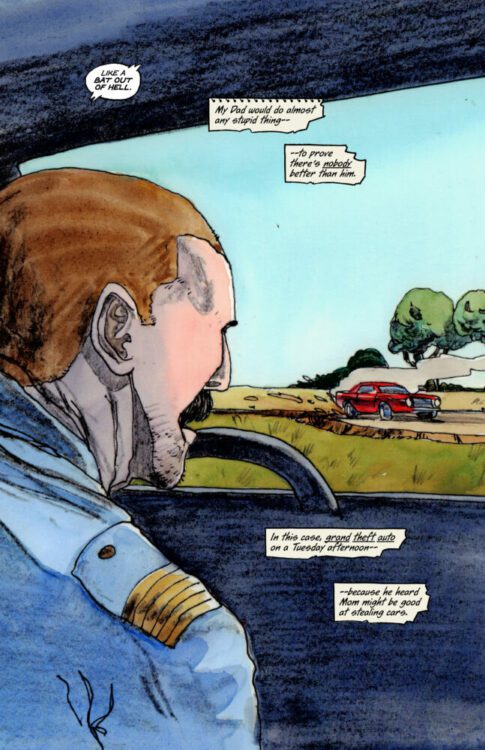
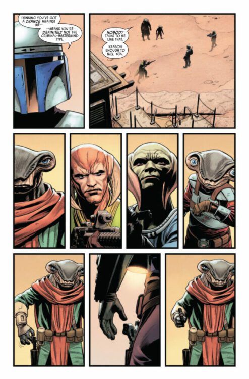
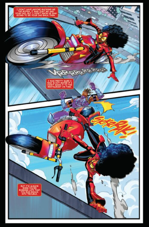
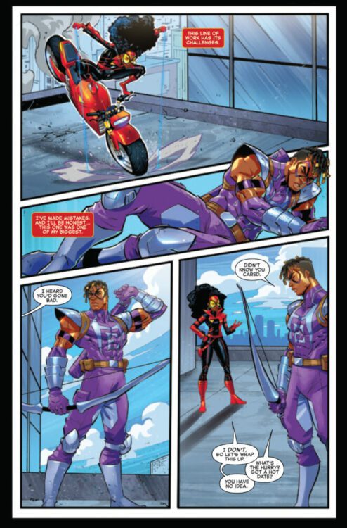
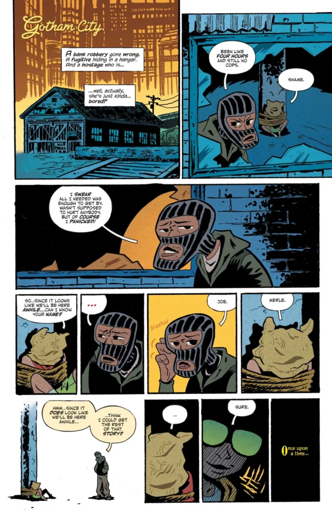
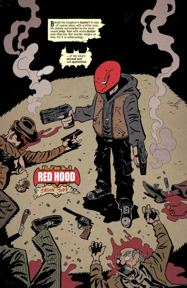
The issue starts with a young girl being held hostage by a man named Joe. The two are both bored, so the girl continues telling him the story that she started last issue. She tells the story of the Red Hood, Jason Todd. She talks about how people are scared around him, and how people believe he shouldn’t be idolized. Damian Wayne appears to Jason and tries to get him to come out on a mission with him, which Red Hood reluctantly agrees to. They depart and find themselves against a demon instructed with helping show them what they run from.

WRITING

Ba’s selected narrator should be a topic of discussion. It’s not one of the Robins themselves, but rather a little girl being held hostage by a generic criminal. She’s not a scared little girl, just a bored one. How she knows these stories of Damian and his brothers, we don’t yet know. Something interesting is that she never directly references the story of the Batfamily. She speaks of kingdoms and kings and sons and apprentices, but not once of Gotham or Batman. She uses this metaphor, and displays Jason, “the second son of the king,” as coarse and bitter. Jason is shown living a hard life, but it’s not told in an unfair way. Ba acknowledges the hardship that Jason has faced and uses that to educate the reader. He’s not just grumpy to be grumpy. He’s actually fairly passive for the first chunk of the issue. We’re given context clues through the narration, but also through the world around him. How people react to him and how he reacts back shows how the public views him, but also how he can’t help but let it get to him no matter how hard he tries.

A criminal asks his hostage to tell him a story

Ba compares and contrasts the Robins on a deeper level than what we’re used to. The story isn’t really told through Damian, but through Damian’s relationship with the other characters. This shows the similarities between Jason and Damian that Ba succeeds in highlighting. Jason reacts to the world around him because of how it acts towards him. Damian reacts to Jason’s story because of how he feels connected to it. Neither can run from their demons. It’s an interesting contrast from the last issue, where Damian was trying to prove himself to be better than Nightwing. Ba understands Damian’s nature, and his desire to be accepted by his mother and father. He understands that Damian believes he can only achieve that by being the best, and shows us that.

ART

Ba also draws the issue, and that really helps him in telling the story. He’s able to juggle this deep and sometimes dark storytelling with these highly expressive characters, but it doesn’t feel out of the ordinary. Well, it does, but that’s because it’s supposed to. It feels almost like a storybook. The reader isn’t being shown what’s happening, but we’re being told from a different perspective. We’re told the story of a king, his sons, and his kingdom, and we’re shown these characters in that style. You could rip any single panel out of a medieval storybook and it would fit. Ba shows how the world and what happens around each character affects them in an exaggerated way, but one that really gets the point across. Jason’s mask is more scribbled the more frustrated he gets. Damian is passionate and emotional when things don’t go his way. Ba is a reactive storyteller, and he makes that clear in this part of his story.

Red Hood after a battle

COLORS

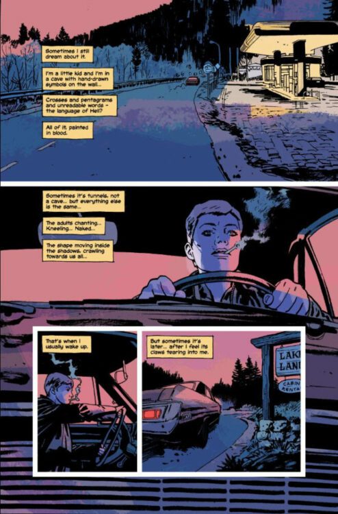
With O’Halloran on colors, new life is brought to the comic. He especially excels in displaying Jason’s trauma. There’s a scene where Jason is forced to relive a moment from his past, and everything around him is flooded with green. It returns to normal, but when it’s brought to his attention again, we’re faced with that same green once more, only cracked this time. There’s a moment where Jason is with Damian and a black background is behind him. Damian says something that catches Jason off guard, and so the black background behind him shatters to show a red behind it. It’s who Jason is, but he covers it up behind this mask he puts on. O’Halloran excels with these small details, and the issue is better for it.

LETTERS

Bidikar is on the lettering for the issue, and a really interesting part of his work is the storybook narration. With the young girl narrating this story, the text boxes almost seem aged and torn. When introducing Jason, however, the box tears further in order to take on the shape of a bat. Later in the issue when Jason is hallucinating, nothing is right. All the text boxes are shaky and sinister. Jason isn’t sure what’s real, and those bubbles make the audience unsure of what they’re seeing as well.

CONCLUSION

Every single aspect of this comic ends up elevating whatever came before it. Every new layer manages to expand on the last, and strengthen the overall message of the story. This team worked together to create a story that acts as a look into the grief and trauma of these characters, while also showing what drives them. It’s a powerful issue that tells the story of two brothers who are more similar than they’d like to admit, and it doesn’t shy away from showing us that with some dark examples. If the first issue didn’t hook you, this one is sure to.

Monkeys Fighting Robots Youtube

Review: SCARLETT #1 – Double Oh Joe

From acclaimed writer Kelly Thompson and artist Marco Ferrari comes the return of G.I. Joe’s crossbow-wielding spy in Scarlett #1. Featuring color art from Lee Loughridge and lettering by Rus Wooton, this new chapter in Image/Skybound’s Energon Universe does a solid job of reestablishing Scarlett as a staple G.I. Joe character by giving her a unique espionage story that feels like an important building block to the larger connected story.

“Shana “Scarlett” O’Hara is about to take on the most dangerous black ops mission of her career: infiltrating the mysterious rising power in Japan known as Clan Arashikage. Her one lead is her former partner—Jinx—turned Arashikage enforcer.
Now, Scarlett must use her very particular set of skills to survive undercover…and discover a shocking weapon that could change the balance of power on Earth.”

Writing & Plot

Kelly Thompson brings back a classic member of the G.I. Joe cast by writing a proper espionage comic in Scarlett #1. Every aspect of this issue feels like a mixture of Fleming’s 007 and Marvel’s Black Widow. The opening sequence is right out of your average spy story – a big party for the ultra rich are bidding on attractive human stock. The details that arise here, however, and the aftermath of this scene, are what really set Scarlett apart. Scarlett’s friend and former partner, Jinx, makes an appearance, and much of the comic studies the pair’s backstory. Thompson uses this pair to build an emotional core to carry us through the rest of the series. It’s easy to become fully invested in Scarlett and Jinx’s backstory, with their personal puzzle pieces and shared experiences filling in gaps that make the story feel like a whole character-focused journey. Don’t worry though, because the action/spy stuff still hits plenty hard too. Thompson’s use of other classic Joe characters – including a last page reveal that put a big smile on my face – will please many-a fan while keeping them wholly compelled by the actual story. Kelly Thompson really knocked Scarlett’s reintroduction out of the park.

Art Direction

Despite the lofty espionage and franchise heights Scarlett #1 has in store, it retains a sort of grounded visual approach thanks to Marco Ferrari’s pencils and Lee Loughridge’s color art. Ferrari takes us along from luxurious manors full of armed guards to an unforgiving ninja-filled tundra fortress, and it’s all delivered with the scope of a big-budget spy movie. Ferrari’s character animations make for great fight choreography, and his designs make every classic Joe character instantly recognizable for long time fans. His panel direction stays pretty standard, with wide panels being punctuated by splash pages in a structure that makes the combat feel almost rhythmic. Character-focused dialogue scenes are broken into smaller panels to make scenes feel more intimate and break up the pacing. In this way, Scarlett’s pacing is basically perfect, making a 32-page comic feel like a full story. Lee Loughridge’s practiced color style is the perfect tonal match for this visual experience. His flat palette fills in Ferrari’s thin penciling perfectly, and makes for a unique approach to this spy comic that separates it from other works in this genre. One note I have to make is that, while his pencils are generally solid, they can be a bit inconsistent. There is one specific panel in the opening pages that I have not been able to get out of my head – and not in a good way. It’s a notable weakness in an otherwise stellar comic that is set to be a focal point of Skybound’s relaunch of G.I. Joe in this medium.

Verdict

Scarlett #1 is a blast of an opening, both as a Joe comic and as a spy story. Kelly Thompson’s script brings the staple character back to the forefront with a story that is fun, character-focused, and feels like a proper espionage comic. Despite some inconsistencies with the penciling, Marco Ferrari and Lee Loughridge’s visual work is brilliantly directed and offers a unique look for this kind of comic book. Be sure to grab this new chapter in Image/Skybound’s Energon Universe when it hits shelves on June 5th!

Monkeys Fighting Robots Youtube

Review: BEAR PIRATE VIKING QUEEN #2 – Vengeance of the Conquered

Writer Sean Lewis (Bliss, Above Snakes) and artist Jonathan Marks Barravecchia continue their chaotic story of conquest and retribution on the open sea with Bear Pirate Viking Queen #2. This issue focuses in on the comic’s true Viking protagonist as he sails towards those who took his land from him – with only blood on his mind. With a ponderous and inventive script and more of Marks’ staggeringly unique visual work, Bear Pirate Viking Queen #2 is a gripping follow-up to a thunderous first chapter.

“The Viking has taken control of the boat, and through the tempest, he heads to England. It’s a land he has ancient history with, and a land whose queen is dressing for war with him. With the Bear, he stalks its streets destroying British soldiers. Until he finds a home—and a whole other story to take out on the British flag.”

Writing & Plot

Sean Lewis elaborates on our new protagonist and his ocean-faring tale of vengeance in Bear Pirate Viking Queen #2. After killing the pirate captain that led most of the first chapter – one of the best opening comic issues I’ve ever read, mind you – the Viking sails for Britain, the land that conquered his own home and so many others. Aiding him are a pair of witches he has enslaved in his own conquests, and together they head for a battle with the very Queen of England herself. The brazen madness Lewis presents us with in the first issue is sharpened to a fine point here in part 2. He shows readers where the Viking came from and just how powerful a figure he once was in his own society. The most effective sequences in the comic come from the opening, where we get the Viking’s origin (we get his name too, but that’s a spoiler if you know anything about mythology), as well as a part in the middle where he basically gives his manifesto. The Viking speaks of conquest and glory as a savage right of passage and power while using child’s toy ship as a physical prop. Lewis poses the Viking’s brutal, simplistic view of conquest against the Imperial takings of the British, and the comic begins to come to the correct conclusion – that these are one and the same, but on a different scale.

It’s a bit funny seeing the Queen of England as some fearsome monarch and not the useless prop we know they are now. In context though, at the time this comic takes place, the head of the British Empire may very well have seemed like some ineffable threat to those subjugated by their forces. Lewis posits in this issue that the thing empires fear most is their past and the desperation the British show once the Viking show up demonstrates this perfectly.

Art Direction

As with the first issue, Bear Pirate Viking Queen #2 is brought to visual life by the insane talent of Jonathan Marks Baravecchia. His thin pencils and watercolors combined with this collage-esque sequential direction make for a comic that is best described as well-conducted chaos. The drawings of the Viking towering over the British he’s “visiting” make him appear like some sort of invading god, especially while walking astride a bear. Barravecchia presents him in an all-white aesthetic, making him shine like a beacon against the backdrop of industrial England. Certain beings are contorted into monstrosity, with a sort of scrap-paper Dave McKean style to make them seem more inhuman. While this issue lacks the monsoon of thunderous entropy that the opening chapter does, Baravecchia’s artistic style is still utilized to its fullest in more subtle ways. His intricate character models make the conversational pieces in this issue really stand out, which is especially impressive since most of the visuals are in the realm of fever dreams. His lettering is just as much a part of the art as his pencils and colors, with ever-shifting hand drawn fonts that rarely use speech boxes or bubbles. Bear Pirate Viking Queen #2 is yet another staggering work of visual art from Barravecchia.

Verdict

Bear Pirate Viking Queen #2 is an incisive 2nd chapter that adds some subtlety to Lewis and Barravecchia’s narrative about conquest and imperialism. Sean Lewis’s script paints a brutal and frightening picture of our Viking protagonist, at the same time offering an examination of the world he lives in opposed to the British Empire. The visuals from Jonathan Marks Barravechia are stunning and complex, with a singular visual direction that sets this series apart from anything in the medium from the last few years. Be sure to grab this new chapter when it hits shelves on June 5th!


Monkeys Fighting Robots Youtube

Marvel Comics Exclusive Preview: VENOM #34 — Blood Hunt!

marvel comics exclusive preview venom blood hunt

VENOM #34 hits your local comic book store on June 5th, but thanks to Marvel Comics, Monkeys Fighting Robots has an exclusive four-page preview for you!

About the issue:
BLOOD HUNT TIE-IN: LEE PRICE RETURNS!

The CAPTIVE is loose! And the vampiric super-foe thirsts for one thing – VENOM! And the Captive isn’t the only problem – the dead now walk an Earth smothered in eternal night. Vampires infest New York City, and LEE PRICE, one-time host to the Venom symbiote, rises from the grave! And he has unfinished business with his old partner.

The issue is by writer Al Ewing and artist Juan Ferreyra, with letters by Clayton Cowles. The main cover is by CAFU.

Check out our VENOM #34 preview below:

marvel comics exclusive preview venom blood hunt

marvel comics exclusive preview venom blood hunt

marvel comics exclusive preview venom blood hunt

marvel comics exclusive preview venom blood hunt

marvel comics exclusive preview venom blood hunt

marvel comics exclusive preview venom blood hunt


Are you reading VENOM? Who is your favorite symbiote? Sound off in the comments!

Monkeys Fighting Robots Youtube

Comixology Originals Exclusive Preview: SHE’S RUNNING ON FUMES #5

comixology originals exclusive preview she's running on fumes

SHE’S RUNNING ON FUMES #5 hits the internet June 4th, but thanks to Comixology Originals, Monkeys Fighting Robots has an exclusive five-page preview for you.

About the issue:
With Dad, the cash and cocaine all being high speed chased, Patti’s back with a vengeance, expecting Mom to pay in full.

SHE’S RUNNING ON FUMES #5 is by writer Dennis Hopeless and artist Tyler Jenkins, with colors by Hilary Jenkins, and letters by Hassan Otsmane-Elhaou. The series is edited by Heather Antos.

Check out the SHE’S RUNNING ON FUMES #5 preview below:

comixology originals exclusive preview she's running on fumes

comixology originals exclusive preview she's running on fumes

comixology originals exclusive preview she's running on fumes

comixology originals exclusive preview she's running on fumes

comixology originals exclusive preview she's running on fumes

comixology originals exclusive preview she's running on fumes

comixology originals exclusive preview she's running on fumes


Have you been reading SHE’S RUNNING ON FUMES from Comixology Originals? Sound off in the comments!

Monkeys Fighting Robots Youtube

Review: Demons and Disillusionment in HOUSES OF THE UNHOLY

The first image we see in Image Comics’ Houses of the Unholy is that of a pentagram. It’s shown in a brilliant red that makes it looks like it’s been carved into the flesh of the book. It’s a fitting first image. Writer Ed Brubaker, artist Sean Phillips, and colorist Jacob Phillips — the unbeatable team behind works like Cruel SummerPulp, and Where the Body Was — are telling a story about wounds that won’t heal. This creative team steeps their narrative in actual history, making their themes and questions all the more poignant.

About Houses of the Unholy:

An FBI agent from the cult crime beat and a woman with a past linked to the Satanic Panic are drawn into a terrifying hunt for an insane killer hiding in the shadows of the underworld. Can you ever escape your past, or are all your bad decisions just more ghosts to haunt you, wherever you go?

Writing

Brubaker, in his newsletters, has described his fascination with the Satanic Panic of the 80’s. Houses of the Unholy, in many ways, feels like his answer to the proverbial question, “What is it you find so interesting about that time?” His answer is thorough, thought-provoking, and moving. Because, while the Satanic Panic may largely be something that’s been left in the past, we can still see its fingerprints today. And when the world seems to be falling apart, it can be hard to not feel like you’re living through “The End of Days.”

Our main character, Natalie Burns, was five years old when the Satanic Panic swept through her school. She, along with five other classmates, testified to being forced into demonic rituals by her teachers. When Brubaker reintroduces us to her, she’s thirty five years older, and she knows that her and her classmates’ testimonies — along with the demon-filled memories that plague her at night — are all fabrications, the result of an impressionable mind being caught in the middle of a strange cultural moment. Brubaker shows us her guilt about the fallout of her testimony in his usual subtle way. It’s in her tough exterior, in the nonchalant way that she relays traumatic memories, and in her reliance on pot to quiet the noise in her head.

Thanks to Natalie, this isn’t just a history lesson. Brubaker’s ability to weave in historical details is incredible, but it’s not the point. Natalie is running from her past and disillusioned by her present. She can’t trust her own memories and seems unsure of what the truth even is anymore. She’s been burned by the church, by her parents, by her school, and by a culture that wants to punish her for things she did as a child. She carries those things with her, more as open wounds than as scars. Brubaker doesn’t want us to just know about the Satanic Panic. He wants us to feel its effects, and see just how relatable Natalie’s story really is.

Art

At times, Houses of the Unholy can be deeply disturbing. We see images of women being covered in blood, as part of some sadistic ritual, but these moments are surprisingly scarce. Sean Phillips, save for a few exceptions, relegates most of the dark ritualistic imagery to the periphery. We see the shadow of a monster, cast along the walls of a tunnel. We see a cultist and a demon in the background of a panel, as figments of Natalie’s imagination. We see symbols, silhouettes, and shadows. After all, the Satanic Panic was full of uncertainty, fabrication, and confusion. Phillips’ choice to avoid bringing any of those scenes or images into center stage masterfully maintains that ambiguous atmosphere.

Those aren’t the only details Phillips chooses to obscure. One particularly tragic moment happens mostly off-panel, with only a fragment of the scene shown to let us know what’s happened. It’s enough. In fact, avoiding depicting the whole thing not only hammers in the quiet tragedy of the moment, but it speaks to Natalie’s attempt to forget it happened. On one page, however, the fragment of the scene reappears like a specter, hovering over the panel from out of nowhere. Natalie looks up at it with tired eyes. Try as she might, Phillips shows us, Natalie cannot escape her past.

Coloring

Not only is Jacob Phillips fantastic at inviting you into the atmosphere of a scene, but his bold color choices enhance the story beats brilliantly. All of the flashbacks to Natalie’s childhood are shown in shades of red and white. It’s as though the glow of Hell itself lights these pages. Or maybe it’s that Natalie can’t help but see these moments through the lens of her own blood-soaked soul. Either way, these scenes appear as garish reminders of horrible memories. And we can see just how much Natalie’s past affects her, as the same red hues creep slowly but surely into her present day.

Elsewhere, Phillips sets scenes so effectively it’s hard not to feel like you’re in the room with the characters. You can smell the dank air of a basement, colored in cold greys and blues. You can feel the cool breeze of the night air as you stand out in a parking lot, watching the sun go down in a pinkish twilight. Phillips’ colors aren’t simply a part of the things you’re reading on a page: They’re an invitation into the world of the story. They’re there to be felt, rather than read.

Lettering

Sean Phillips’ lettering in Houses of the Unholy is mostly typical of his work with Brubaker. It’s clear, ordered, and uses a lot of the same visual cues from their other works. You see the straight edged word balloons of people gruffly shouting, the small font in the middle of a large balloon of someone saying something under their breath, as well as the caption boxes with hand drawn edges. But Phillips also lets loose a little more than usual. Car crashes and sirens get big, sweeping sound effects, written with block letters that have scribbled outlines to them. And every chapter is punctuated by a flashback, which always begins with an all black panel that has a title written in white block letters. It gives the whole story the feel of a true crime series. Phillips lettering, as always, perfectly adds to the feeling and tone of the narrative.

Verdict

It’s hard not to call every new project from Brubaker, Phillips, and Phillips their best. But that’s because this creative team is constantly growing, putting out better and better material. Each new graphic novel feels more vulnerable, poignant, and layered than their last. Houses of the Unholy follows this trend perfectly. It’s not only an effectively told story, but it’s also just as ambiguous and troubling as the cultural moment from which it springs. Houses of the Unholy is out from Image Comics on August 27th at a comic shop near you. It’s sure to be another massive hit, so get your copy while you can!

Monkeys Fighting Robots Youtube

Marvel Comics Exclusive Preview: STAR WARS: JANGO FETT #3

marvel comics exclusive preview star wars jango fett

STAR WARS: JANGO FETT #3 hits your local comic book store on May 29th, but thanks to Marvel Comics, Monkeys Fighting Robots has an exclusive four-page preview for you!

About the issue:
JANGO VS. AURRA SING! The heavyweight BOUNTY HUNTER battle that will shake the galaxy! Who is the mysterious figure behind the heist that is igniting a war? Prepare for a new twist when an unexpected alliance is revealed!

The issue is by writer Ethan Sacks and artist Luke Ross, with colors by Nolan Woodard, and letters by Joe Caramagna. The main cover is by Leinil Francis Yu and Woodard.

Check out our STAR WARS: JANGO FETT #3 preview below:

marvel comics exclusive preview star wars jango fett

marvel comics exclusive preview star wars jango fett

marvel comics exclusive preview star wars jango fett

marvel comics exclusive preview star wars jango fett

marvel comics exclusive preview star wars jango fett

marvel comics exclusive preview star wars jango fett


Are you reading STAR WARS: JANGO FETT? Sound off in the comments!

Monkeys Fighting Robots Youtube

Marvel Comics Exclusive Preview: EDGE OF SPIDER-VERSE #4

marvel comics exclusive preview edge of spider-verse spider-man spider-woman jessica drew

EDGE OF SPIDER-VERSE #4 hits your local comic book store on May 29th, but thanks to Marvel Comics, Monkeys Fighting Robots has an exclusive five-page preview for you!

About the issue:
Witness the comic-book debut of the SPIDER-WOMAN from the smash hit ACROSS THE SPIDER-VERSE MOVIE! That’s right, the Jessica Drew that stole that great movie is coming to the comics with a story from NILAH MAGRUDER and MARCUS WILLIAMS working with the filmmakers! And if that’s not enough, witness the true birth of the Spider-Society setting up the next SPIDER-VERSE storytelling epic!

The issue features three stories from across the Spider-Verse. The first story featuring Jessica Drew is by writer Nilah Magruder and artists Marcus Williams & Eric Gapstur, with colors by Raúl Angulo & Marcus Williams. The second story featuring Spider-Rex is by writer Karla Pacheco and artist Pere Pérez, with inks by Wade Von Grawbadger, and colors by Brian Reber. The final story featuring Araña is by writer Alex Segura and artist Salvador Larroca, with colors by Guru-eFX. All three stories are lettered by Joe Caramagna, and the cover is by Chad Hardin & Andrew Dalhouse.

Check out our EDGE OF SPIDER-VERSE #4 preview below:

marvel comics exclusive preview edge of spider-verse spider-man spider-woman jessica drew

marvel comics exclusive preview edge of spider-verse spider-man spider-woman jessica drew

marvel comics exclusive preview edge of spider-verse spider-man spider-woman jessica drew

marvel comics exclusive preview edge of spider-verse spider-man spider-woman jessica drew

marvel comics exclusive preview edge of spider-verse spider-man spider-woman jessica drew

marvel comics exclusive preview edge of spider-verse spider-man spider-woman jessica drew

marvel comics exclusive preview edge of spider-verse spider-man spider-woman jessica drew

marvel comics exclusive preview edge of spider-verse spider-man spider-woman jessica drew


Are you reading EDGE OF SPIDER-VERSE? Sound off in the comments!

Monkeys Fighting Robots Youtube

Marvel Comics Exclusive Reveal: NAMOR #2

Marvel Comics Exclusive

NAMOR #2 is coming to your local comic book store August 21st, but thanks to Marvel Comics, Monkeys Fighting Robots has the exclusive first look at the issue!

About the issue:
THE WAR OF THE SEVEN KINGS RAGES!

Barbarian hordes have gathered on the sunless plains of Attumacht Deep, 28,000 feet below the waves. They howl with bloodlust, ready to scour every inch of ocean to find the most hated traitor in all the seas. But that won’t be necessary now. Here comes Namor, the Sub-Mariner, fallen king of Atlantis…to swim the Crimson Swim.

The issue is by writer Jason Aaron and artists Alex Lins & Paul Davidson. The main cover is by Alexander Lozano.

Aaron describes this NAMOR series as “very much a dark exploration of one of the truest antiheroes, while also serving as a roadmap and a redefinition of the entire undersea world,” and teases “some faces from Namor’s past, plus a bunch of new friends and foes.” We see one of these new faces on the cover of issue #2: Kailani, a character from Namor’s past who is one of his rivals in the War of Seven Kings.

Get your first look at Lozano’s NAMOR #2 cover here:

marvel comics exclusive preview cover reveal Namor Jason Aaron ALEXANDER LOZANO Kailani


Are you adding NAMOR to your pull list? Sound off in the comments!

Monkeys Fighting Robots Youtube

Marvel Comics Exclusive Preview: SPIDER-GWEN: THE GHOST-SPIDER #1

marvel comics exclusive preview spider-gwen ghost spider gwen stacy spider-man

SPIDER-GWEN: THE GHOST-SPIDER #1 hits your local comic book store on May 22nd, but thanks to Marvel Comics, Monkeys Fighting Robots has an exclusive six-page preview for you!

About the issue:
TRAPPED IN THE 616…FOR GOOD!

Welcome to New York! Gwen truly becomes a Ghost-Spider when she moves full time to the universe where Gwen Stacy died years ago. But why did she leave Earth-65? Why aren’t the other spiders supposed to know she’s here? Why isn’t she supposed to suit up? And who will get hurt when she does?

The issue is by writer Stephanie Phillips and artist Federica Mancin, with colors by Matt Milla, and letters by Ariana Maher. The main cover is by Mark Brooks and Nolan Woodard.

Check out our SPIDER-GWEN: THE GHOST-SPIDER #1 preview below:

marvel comics exclusive preview spider-gwen ghost spider gwen stacy spider-man

marvel comics exclusive preview spider-gwen ghost spider gwen stacy spider-man

marvel comics exclusive preview spider-gwen ghost spider gwen stacy spider-man

marvel comics exclusive preview spider-gwen ghost spider gwen stacy spider-man

marvel comics exclusive preview spider-gwen ghost spider gwen stacy spider-man

marvel comics exclusive preview spider-gwen ghost spider gwen stacy spider-man

marvel comics exclusive preview spider-gwen ghost spider gwen stacy spider-man

marvel comics exclusive preview spider-gwen ghost spider gwen stacy spider-man


Are you picking up SPIDER-GWEN: THE GHOST-SPIDER #1 next week? Sound off in the comments!

Monkeys Fighting Robots Youtube