Home Blog Page 323

Is PAX ROMANA Still Ahead Of It’s Time?

Pax Romana Cover
Pax Romana Credit: Image Comics

In 2007 Image Comics published Pax Romana by the upcoming writer/artist Jonathan Hickman. With this being one of his first forays into comic book publishing, with his first title The Nightly News just starting to make waves, has Hickman written a reader friendly, industry embracing, historical romp packed with action and adventure?

Not even slightly.

That, however, is the beauty of Jonathan Hickman.

Pax Romana
Pax Romana Credit: Image Comics

Secret Histories

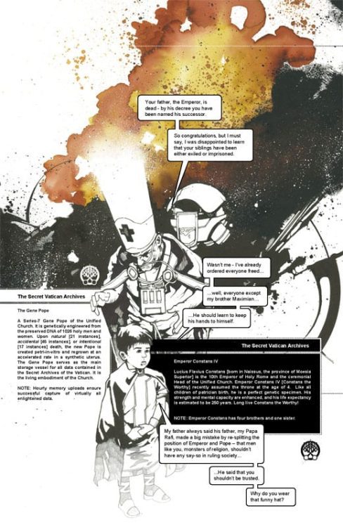
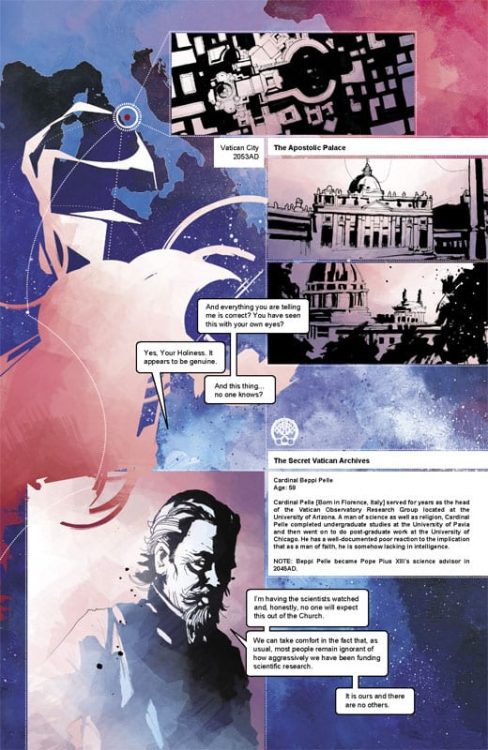
The plot In summary: The Emperor has died and a new Emperor must rise but first he must learn of the secret history of Rome. A history that starts centuries in the future. In 2053, the discovery of time travel allows the Vatican the opportunity to influence history in a whole new way. Plans are drawn, an army raised, and the journey into the past begins.

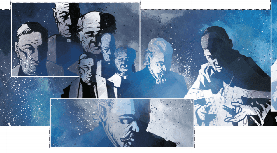
Drawing on the political intrigues of the Roman Empire and a modern obsession with conspiracies, Hickman weaves a complex narrative with an interesting framing sequence. Starting in the middle, with the Gene Pope instructing the new child Emperor, the story takes the form of a dry history lesson based on the archived files within the Church. Elements of the modern world, including the CERN laboratories in Switzerland, become merged with the political world of ancient Rome.

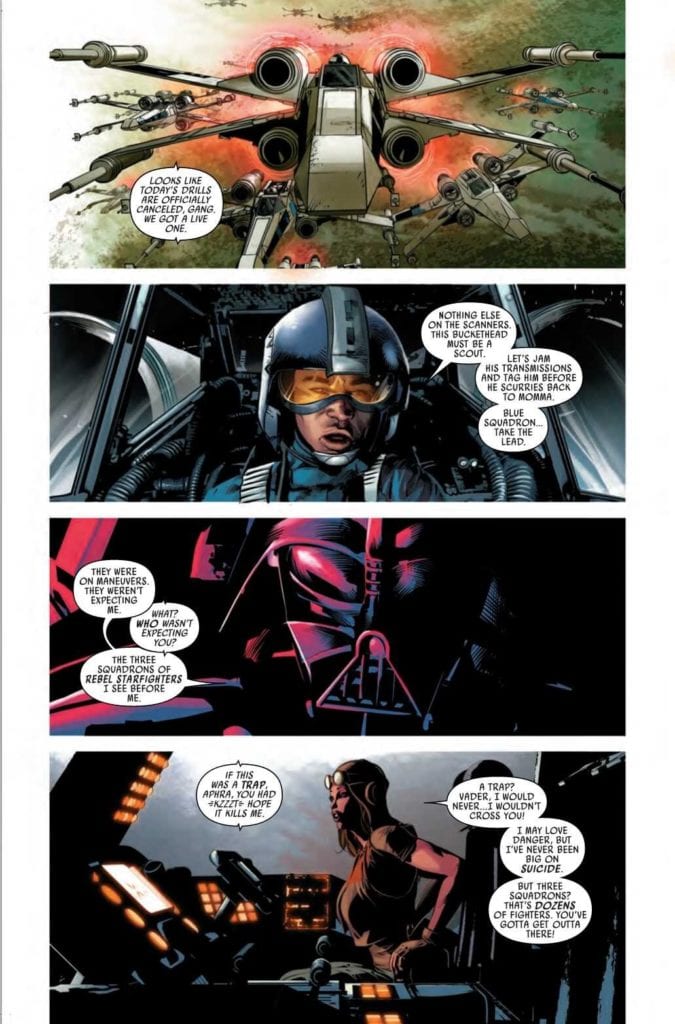
The narrative is told through a mix of dossier style caption boxes, recorded conversations, prose, and occasionally panelled comics. It is this structure that makes Pax Romana so distinctive and surprising for a creator’s early work. Most readers will know Hickman from his current Marvel work, as overseer of the current X-Men line, but the groundwork for the style of those big comics is founded in his early works such as Pax Romana. Divergent timelines? Check. Resurrected characters? Check. Complex narratives that build up from the first page to the last? Double check.

Pax Romana has, on the surface, a very simple story-line. Hickman, however, has the skills to tear open his ideas and slowly dissect them so that the audience can see exactly how it all works and all fits together. At the start it is a mass of sinew and organs but by the end it is a complex machine where every artery serves a purpose.

Pax Romana Page Art
Pax Romana Credit: Image Comics

Dissecting Rome

When recommending a book it helps to compare it to something else. With Pax Romana you want to say it’s like Terminator meets Gladiator, conjuring up elaborate time travel and Roman battle scenes. Although, it is actually more like a Robert Harris novel set in an episode of Quantum Leap. The future characters are trying to alter the past for the better, their better at least, but political intrigue means that they ultimately become helpless to a constant shifting world alliances and personal agendas.

To help the reader navigate all of this Hickman creates a collage of literary techniques, jumping from one form of storytelling to another with ease. There is no doubt that as an artist he holds prose, scripts, and illustration in the same regard, using whichever fits the scene best to get his ideas across. The outcome is a unique comic that has as more in common with novels like Slow Chocolate Autopsy by Iain Sinclair and Dave McKean than it does comics published by the Big Two.

The style can be difficult to adapt to if all you are used to is standard Superhero-esq comics. The linear progression of panel to panel transitions barely features in these pages. Instead vistas of dialogue cross double page spreads or trail down the centre of a page, slicing through a single, heavily inked image.

The visuals are created by using a combination of heavy shadows and negative space, colored with blocks of emotive color. It’s as if Hickman is chipping the illustrations out of narrative granite, revealing a story that has been buried for centuries. The shadowy nature of art also reflects the conspiratorial nature of the narrative. Everything is shrouded in secrecy and mere tricks of the light. At times you are not sure if what you read was real or imagined. It has a fleeting quality to it while also being, by its very nature, permanent; as solid as rock.

It’s also impressive that Hickman created everything on the page. From story, to design, to color and lettering. The main body of this comic is a one man job; not a feat that many creators can pull off with such elegance as is evident here.

Pax Romana
Pax Romana Credit: Image Comics

Conclusion

Hickman books can look overwhelming, especially when collected together, and because of this many readers will be but off. Pax Romana is only four issues, 148 pages in the collected edition, but the ideas and concepts contained within will keep you thinking for weeks and months afterwards. It is a comic that will stay with you. This is because the style is unique and a testament to Hickman’s creativity.

Visually, this comic is beautiful. It has a look that is heavily designed and orchestrated to produce a singular world from the cover to the very last page. Knowing that Hickman worked in advertising will not come as a surprise because this comic makes an immediate, lasting impression. Normally you shouldn’t judge a book by it’s cover but in the case of Pax Romana, the cover perfectly sets up the contents.

If you read comics to see muscled guys punching other guys in the face, panel after predictable panel, then you will find nothing in Pax Romana. For everyone else, to quote from Blair Butler’s foreword in the collected edition, “If you’re looking for the future of comics, welcome aboard”.

Pax Romana is currently available as part of the Humble Bundle Creative Spotlight here.

Monkeys Fighting Robots Youtube

INTERVIEW: ‘This Is Us’ Composer Siddhartha Khosla Goes ‘Looking For Alaska’

Looking For Alaska is a drama from Hulu based on John Green’s novel of the same name that centers around the lives of teenagers at a boarding school in Alabama. Filling the world with an emotional soundscape is This Is Us composer Siddhartha Khosla’s job.

Miles “Pudge” Halter (Charlie Plummer, Boardwalk Empire) is a teenager from Florida who’s sent to Alabama to spend his days studying at Culver Creek Academy. Miles meets a cohort of characters at the school, including “The Colonel” and a girl named Alaska (Kristine Froseth, The Society). Together, these young adults learn about life and love. So far, the reaction to the series has been spectacular.

PopAxiom spent some time speaking with Siddhartha about his work on This Is Us, the Hulu series Looking For Alaska, and the only remake he’d be willing to be a part of.

Strange Days

The world is in the midst of managing COVID-19. Siddhartha shares his thoughts on the global pandemic. “In this crazy time we’re all living in right now, part of me feels uncomfortable having conversations about my work when there are so many bigger problems that people in the world are facing right now.”

But he asserts another truth “… we have to continue to live our lives as much as we can too.”

Measures taken in countries around the world have certainly changed the way we’re living life. “It’s a very strange time.”

https://www.youtube.com/watch?v=rWNlrgNNVm4

About Looking For Alaska

Looking For Alaska was going to be a movie for years. After repeated delays, producers Josh Schwartz (Gossip Girl) and Stephanie Savage (Runaways) hit the ground running when Hulu picked it up as a mini-series. But long before it was in production the show found its composer. “Josh, Stephanie, and I worked together several times over the last few years on so many different projects. The first thing we started working on together was Marvel’s Runaways, and that lead to this.”

For Siddhartha, creating the score meant more than he expected. “Working on that show was such a special experience for me. I loved every minute of it. I loved getting together with Josh and Stephanie and our whole team to talk about episodes and where music would need to go.”

Looking For Alaska takes place in 2005. Siddhartha explains how the period played in the score. “Josh and I spoke a lot about tone and music and score. There were definitely influences from all different directions. One of my favorite bands that I was listening to back in 2005 was Sigur Ros. So, in the palette, I wanted to make sure I was very atmospheric and ethereal when needed and sweeping and epic when we also needed to be as well. More of the broad stroke, Sigur Ros approach. That lends itself really nicely for this. It was a super-creative project to work on.”

To achieve the sounds on Looking For Alaska, Siddhartha says he used, “Piano, atmospheric tones made with real instruments that I run through various reverb and echo chambers and all sorts of different effects to give that wide, cinematic feel. I’m singing on the score as well …”

A textured dramatic narrative, Looking For Alaska’s score from Siddhartha features “… several signature themes that weave in and out during the show.”

Siddhartha’s voice crackles with excitement when he talks about Looking For Alaska. “It’s a dream project for me. It was really deep in my wheelhouse. It was a deeply emotional show. I was able to pull from all sorts of interesting influences.”

sid khosla-interview-composer

Timelessness

The score for This Is Us, a show that features an array of time periods, is intentionally made to feel timeless. It’s a “… classic sound. You can’t really put a stamp on where it came from …”

The same goes for Looking For Alaska. Siddhartha says, “I don’t think I really grounded the score in 2005.”

Siddhartha takes us deeper into his creative process. “I like to immerse myself in my score as much as possible. Knowing this took place in 2005,” Siddhartha thought, “… let me hear what I was listening to in 2005 to kind of put myself in an emotional space.”

For Siddhartha, this helps him “… draw more from the emotional weight of what people were listening to back then.”

Looking For Alaska features songs deeply rooted in the era, and that’s thanks to music supervisor Alexandra Patsavas. So, how does one aim for timelessness? “It’s all very subjective. For me, timeless means using instrumentation that was around 50 years ago, 80 years ago, and that will continue to be around years from now. That’s timeless. An acoustic guitar, piano, voice, cellos; those are very organic sounds. If I’m rooted in organic sounds, not drawing from something that’s trendy, because then all of a sudden, there’s a timestamp on it.”

Siddhartha continues, “I think creating your own palette in your own original voice keeps things timeless. I don’t think someone listens to the This Is Us score and says ‘It sounds like this, or it sounds like that.’”

After four seasons, Siddhartha says, “I feel like it sounds like me. It sounds like what comes out of my soul. I think that’s important to maintain artistic integrity and to also feel classic and timeless.”

this is us-nbc-series

Season Four

This Is Us just completed it’s fourth season on NBC. Series ratings are going strong, and so are the creative juices behind the show. “… it’s probably our most ambitious and biggest season yet. It’s been a really wonderful ride this season. The finale was epic and sweeping and big and expansive. That’s where the show continues to go.”

The evolution towards a big-screen feel on television has made This Is Us ��… really fun for me,” says Siddhartha.

Siddhartha asserts, “The score’s gotten more cinematic than ever.”

Wrapping Up

COVID-19 has changed a lot of ways people do business. Fortunately, working remotely is much more common today and easier to do now than ever. Siddhartha says, “On This Is Us, there’s a lot of cello work happening, and Ginger Murphy plays cello on the score. She does a phenomenal job. She and her husband, who’s a musician as well, they are recording and doing some arrangements from afar. I’ve never recorded Ginger in person once. This is the time when we can do more of that.”

Productions are at a standstill at the moment, but the creative process never stops. “In this off time, I’m continuing to write. I’m flirting with writing a little a classical record.”

So, what’s the remake that would get Siddhartha’s attention? “I think, E.T.. If there was an E.T. remake, that would be something that would excite me. I would love to do that.”

For now, Siddhartha ends our interview by saying, “… we should all stay safe. And who knows, maybe I’ll write a score for a project that doesn’t exist.”

Are you a fan of This Is Us? Will you be watching Looking For Alaska?

Thanks to Siddhartha Khosla and Rhapsody PR for making this interview possible.

Want to read more interviews like this? CLICK HERE.

Monkeys Fighting Robots Youtube

Longbox Legends: Why AVENGERS (2016) #1 Was A Perfect Blend Of Old And New

Avengers comic tittles have undergone too many changes to count in its long history. But of the modern reboots, Mark Waid’s AVENGERS #1 is perhaps the most unique among its peers. How? It beautifully blends a passion for the history of the mythos with a yearning for the future.

The scene is set: an all-new Avengers team assembles to take down a Frost-Wolf in classic superhero fashion. But the creature isn’t the only thing on their mind. The Vision is missing, and Peter Parker, the CEO of Parker Industries, has requested that they pay him a visit.

Story

The new roster of Avengers—consisting of Captain America (Sam Wilson), Thor (Jane Foster), Hercules, The Wasp (Nadia Pym), and The Vision (who’s suspiciously missing)—take down the Frost-Wolf with relative ease. However, they soon find themselves in Parker’s building with doubts about his intentions. But to their surprise he offers technological goodies in the hopes that they invite Spider-Man to join their crew.

The team is repelled by Parker’s overeager attitude, but are soon interrupted by Kang the Conqueror. In response, the heroes spring into action with the help of Spider-Man (who is just as cringeworthy as his alter ego). What’s more, they find the villain in conflict with The Vision, who seems to be hiding something from the rest of the team.

Waid’s narrative offers readers a breath of fresh air for fans of Earth’s mightiest heroes. The banter between Parker and the other teammates, even when facing the time warping powers of Kang, reminds us of classic Avengers stories. And Vision’s secrets adds plenty of intrigue. But the best gem in this issue is Waid’s updated roster of heroes, which adds a fresh flavor that makes this a saga to remember.

Artwork

Mike Del Mundo’s penciling, ink work, and coloring, combined with Marco D’alfonso’s color work, presents readers with a cohesive set of beautiful panels. Readers will find the illustrations transition smoothly throughout the story—it’s as if the characters blend in with the environments around them like an abstract painting. Yet at the same time each hero’s colors are differentiated to showcase their unique superhero identities. Cory Petit’s lettering, working in tandem, seems to flow with the action as if it were part of the scene itself.

Conclusion

AVENGERS #1 was an exciting start to this particular era in Avengers history. It brought fan favorites together from the past and the future in marvelous fashion.

Were you excited to see Kang make an appearance in this issue? Let us know in the comments below!

Monkeys Fighting Robots Youtube

Review: HOTELL #2 – Or, a Case for Couples Therapy

Writer John Lees and artist Dalibor Talajic, along with Lee Loughridge on colors and Sal Cipriano’s lettering, bring another chapter of short comic horror with “Hotell” #2. This issue manages to smooth out the rougher edges of the first issue by more carefully implementing its completely off-the-wall moments. The final product is a comic with a familiar premise that still offers gruesome and darkly hilarious slasher-horror fun in an ever-building mythos.

“You won’t find it on any map, but if you happen to be driving down Route 66 late at night and you’re truly desperate for shelter, sanctuary or secrecy, you might see a battered sign on the side of the road: The Pierrot Courts Hotel. – where many check in but few check out.”

Writing & Plot

The story of “Hotell” #2 centers around a couple taking a road trip who check into the Pierot Courts Hotel for the night. They seem like a simple and lovey-dovey couple until the husband’s intentions become clear. What starts as a simple story of two lovebirds turns into a grisly and eerie tale in a Hotel at the edge of reality and sanity. The idea that Pierrot Courts makes itself available to travelers with questionable motives is the central element to these comics. This issue reinforces that element with a simple example of murder trope, but then complicates it with the Hotel’s own supernatural elements. That’s the real potential in “Hotell,” just the idea that such a place can elevate familiar horror and add twists specific to the strange aspects of Pierrot Courts.

Lees’ linear plotting and mix of horror and gallows humor are reinforced by his sense of dialogue. “Hotell” has little to no narration outside of the desk clerk’s ominous introduction to the establishment, and so the rest of the storytelling is told by silent panels and character interaction. The dialogue has a naturalistic and believable flow to it that aligns with whatever strange or grotesque happening may occur in-panel. The silent panels are used largely for foreshadowing, an effect that creates an entertaining reveal for the final page. The blend of horror and gallows humor in this issue is reminiscent of a  “Tales From The Crypt” episode, and will no doubt be a treat for fans of this kind of short-horror experience.

Art Direction

Dalibor Talajic demonstrates an incredible amount of artistic range in “Hotell” #2. Like the first issue, he is capable of crafting character drawings and environments that are naturalistic and believable, while also creating moments of eerie supernatural horror. There’s an unusual subplot involving a black rabbit (no spoilers) that jumps out in immediate contrast to the rest of the relatively normal-looking events that really showcase how Talajic can jump from one tone to the complete opposite. While there isn’t anything quite as trippy or outlandish as the prior issue here, the art holds its own just by being so sharp. This is helped by Lee Loughridge’s colors, which provide the meat to Talajic’s bones of penciling. The more alarming scenes mentioned earlier are so striking because of Loughridge’s color choice, with deep blacks taking up whole panels and then shifting into literal rainbows on the next page. There’s a shifting range from the innocuous to the insane that makes the art in this series a perfect match for what’s planned in the scripts.

“Hotell” #2 is a simple yet satisfying and fun second chapter in this short-horror anthology series. The abstract elements from the prior issue are cut down in favor of a familiar premise that is contorted by the supernatural elements of Pierrot Courts to create a surprising and often humorous time in the desert at the edge of sanity. If “Hotell” seems like your kind of trip, be sure to check out AWA Studios at webtoons.com, where you can read this and other comics for free right now!


Monkeys Fighting Robots Youtube

DAREDEVIL: YELLOW Brightens the Life of Matt Murdock

Daredevil Yellow Cover

The Brighter Origins of Daredevil

Daredevil is one of Marvel’s most famous street-level heroes. Since 1964, Matt Murdock had defended the streets of Hell’s Kitchen from the likes of the Kingpin and other threats. Most comic readers would recognize the hero from his red suit that he’s worn over his publication history. Not many actually know, however, he started his career wearing a yellow suit. This suit is seen most prominently in Jeph Loeb and Tim Sale’s miniseries, Daredevil: Yellow. This duo, famous for their work on Batman: The Long Halloween, approached the origin of Daredevil in a different way from other stories with the character. How can you change up the formula for a man dressed like a devil?

Daredevil Yellow Cover

**Major Spoilers Below**

Story:

The framing device of the story is Matt Murdock writing a letter to his late love interest, Karen Page, as a way to move on from her passing. He decides to write the story of how his origin of Daredevil leads him to her. Starting from his time in law school, Matt and his friend, Foggy Nelson, are close to graduating law school. Matt’s father, Battlin’ Jack Murdock, inspires the boys and takes them out to dinner the night before a big boxing match. Knowing that his father fights fixed fights, Matt urges him just to fight next time. 

After he wins the match, Jack gives his son his bright yellow boxing robe. A few hours after that, Jack is murdered by gangsters for not taking a fall. Matt and Foggy try to take down the gangsters in court, but due to the alibis given, they get off scot-free. Matt doesn’t take kindly to this, and that night creates his first Daredevil outfit out of the robe.

Daredevil Yellow p1

The biggest thing to note here is that, unlike other retellings of his origin, this version of Daredevil’s origin is more grounded. We don’t focus on Daredevil. We focus on Matt Murdock. The majority of the story follows the life of Matt without the need for extravagant action sequences. While the battles can be neat, a simple scene where Matt, Foggy, and Karen go out to a bar is much more intriguing. It’s this slower, more character-driven burn that allows this story to thrive. 

Another fantastic aspect is seeing the dynamic between the trio in this early time. When it’s the three of them, one can feel the tension around them as the men try to win Karen’s heart. It’s a dynamic that’s uncommon in comics nowadays, as the girl picks the hero. However, since we focus more on the human side of things, you see both men having a chance to win this girl’s heart. There are times readers will honestly root for them both to get the girl. It’s a smaller aspect, but one that gives this story charm.

Daredevil Yellow p2
Art:

Tim Sale illustrates the story, and it can be seen as divisive, if anything else. His style is unique, harkening back to classic stories rather than the more smooth style of today. Some might be turned away by this look, but honestly, it’s the perfect style for the story. There are iconic panels that genuinely define this comic, and it wouldn’t have the same impact in another style. The greatest part, however, comes in the form of Daredevil’s suit. The yellow suit is ridiculous in concept, but thanks to Sale’s design and Matt Hollingsworth’s colors, it has become this reviewer’s favorite Daredevil Design.


Conclusion:


Daredevil: Yellow is an excellent Matt Murdock story that gives a little more light in a character that seems darker than most. There are still dark moments littered throughout, but its seen more as character building than something terrifying to shock audiences. We have a tale of a young man who grows into the hero we know while finding love in an unlikely place. With the unique art of Tim Sale illustrating this tale, Yellow might be one of the greatest origin stories of all time.

Monkeys Fighting Robots Youtube

OPED: Why GOTHAM CENTRAL Wants Us To Hate Batman

GOTHAM CENTRAL #1 cover by Michael Lark.

Gotham Central takes every superhero comic and places them under a microscope. It takes the Deus ex machina of decades gone by and asks, “Is life really that simple?” Because if life isn’t as simple as superheroes make it out to be, what good are they? Writers Ed Brubaker and Greg Rucka say you should hate Batman. And by the end of this heavy-hitting series from DC Comics, it’s hard to argue the point.

It’s simple, really; life that is. Or at least, that’s how life is depicted in the vast majority of superhero comics. The tedious paperwork and depressing repercussions of catastrophes are sidelined. Instead, we get heroes with dimpled chins in tight spandex and titillating banter. The paperwork and consequences are stories for another time. Brubaker and Rucka draw a line in the sand and say that’s enough of that. The time for paperwork is now.

In Gotham Central, we follow the cops who work in the GCPD. Not Batman or Joker, though their presence is felt throughout. It’s a police procedural that’s haunted by Batman. Gotham Central occurs in Batman’s shadow, and how the detectives feel about his influence is what drives the series forward.

Batman: Ringleader of the Rogues

Gotham Central Rucka DC
GOTHAM CENTRAL #1, art by Michael Lark. The first arc of this series is titled “Line of Duty,” to imply further these kinds of things are all in a day’s work.

Right out the gates, we see how Batman seems to make Gotham worse. Key players like Mr. Freeze and Two-Face gleefully inflict misery upon the general populace. It all reads as a kind of twisted love letter to Batman. They just want his attention, and no one is too insignificant to die for that. So whether the freaks followed the Caped Crusader’s example or not, his dysfunctional relationship with his gallery of rogues affects everyone in Gotham.

Issue 1 sees Detective Fields and Driver investigating a lead on a kidnapping. Instead, they accidentally stumble onto Mr. Freeze, hiding out in an apartment. Driver watches Fields get frozen and then deliberately shattered by Freeze. Michael Lark, the regular series artist for Gotham Central, makes it clear with every face that this is all in the line of duty. No one cries or vomits when they come onto the scene. One officer even cracks a joke. Thanks to Batman acting as a kind of flame that the twisted gather to, this kind of horror show isn’t uncommon in Gotham.

Batman: Reminder of GCPD Shortcomings

Batman Brubaker DC Gotham Central
GOTHAM CENTRAL #1. The shadow of the Bat looms large in the GCPD bullpen.

The GCPD are only human. And, as far as they know, so is Batman. Yet Batman often operates with superhuman speed. When the cops arrive on the scene of a burning building, they find Batman leaping out with the last tenants in hand. The detectives are happy to see lives saved, but the Bat’s help can be as belittling as bedwetting. He spurs them forward or leaves them grumbling in his wake. More often, he does both.

There are some obvious reasons that Batman is more efficient than the GCPD. He does not have to work within the law. He’s a criminal they’ve all come to rely on. And while they may have an intern to turn on the bat signal, who technically doesn’t work for the GCPD officially so they can deny a tie to Batman, they hate that they have the signal at all. Some officers even seem to question whether inside the law is worthwhile. Detectives like Harvey Bullock and Renee Montoya, Batman’s sometime confidantes, seem lured away from their uniforms towards vigilantism.

Batman: Arrogant Son of a Bitch

Batman GCPD Brubaker DC
GOTHAM CENTRAL #25. Art by Michael Lark. Seeing Commissioner Akins’ side to the story, you find yourself hoping he’ll put the Bat in his place.

Criminals plague Gotham City to get the Batman’s time. Some want his attention; others just want to meet him. They’ll do anything to get a piece of the Bat. Yet Bruce Wayne waltzes into many scenes in this series and stares down his cowl at the officers. His problems are so much more significant. Their issues are petty and small. The thing is, their problem is they’re cleaning up another mess he made.

He’s the silent-type when called in. His code of conduct and ways of communicating take precedence. But when you’ve lived in these pages with Detectives Driver, Bartlett, and Allen, you care that they’re being belittled. We read about them working their asses off only to have Batman insinuate in a rooftop meeting that they need to do better. Life is not as simple as Bruce Wayne sees it. And no matter how much he agonizes on gargoyles, he isn’t as down-to-earth as the GCPD.

Batman Rucka DC GCPD
GOTHAM CENTRAL #2. Art by Michael Lark.

Brubaker and Rucka accomplish a feat with Gotham Central. They take one of the most popular DC characters, one they themselves have made you love in their own Batman and Detective Comics issues, and they get you to hate him. And when you see the hoops the GCPD has to jump through to live in “the Bat’s city,” you understand why. It’s the kind of series that makes you wish every comic were like it.

This creative team shows us what it’s like to be a regular human being in the world of comic books. While human beings don’t get the trumpeting herald of Batman or Superman, they see life for what it is. It’ll make you think twice about buying real estate in the DC Universe, but not about buying this masterpiece of a series.

Monkeys Fighting Robots Youtube

Longbox Legends: URTH 4 Holds A Key To Comics’ Future

Urth4 #1, Adams cover

Urth 4 is a superhero team book published by Continuity Comics, and their first issue solves a mystery about what’s been missing from comics for the last 30 years. What’s that? You’ve never heard of Urth 4 OR Continuity Comics? Is this going to be a boring history lesson? Let’s find out.

What the heck is Continuity Comics?

Good question. Way back in the decade of plastic, hairspray, and shoulder pads, (aka the 80’s) a new comic publishing company was formed by Neal Adams, the famed DC artist. Adams’ goal was to create a comics house where he could exercise more creative ownership and control over his own creations. Sound familiar? It’s the same model used by other creators to start companies such as Image. You can read much more about it here.

Alas, the dream only lasted a few years, and Continuity Comics folded in 1994. Many of the properties created in their 10-year existence disappeared into a dusty cabinet somewhere, or they were picked up by other publishers like Valiant. One such property, the subject of this post, is a little team known as Urth 4.

Tell me more about this Urth 4

Gladly. Urth 4 was a 4-person superhero team with powersets matching the basic elementals: Earth, Fire, Air, Water. The group was diverse in gender and ethnicity, and they interacted (at least in the first issue) as a coordinated team. In a way, this was Adams’ attempt at creating his own version of the Fantastic Four with a different origin spin and a general focus on environmentalism. You would expect to see similar story themes on an episode of Captain Planet, but the story structure catered to an action-oriented audience. In short, cross Captain Planet with the Fantastic Four and you get Urth 4.

Urth 4 ran for eleven issues in total. The team called themselves Urth 4 through the first four issues. They renamed themselves (and the book) to Earth 4 for the remaining seven. Neal Adams, co-founder of Continuity Comics, painted the debut issue’s cover, and the first issue’s art team is a cavalcade of who’s who from comics history:

  • Peter Stone – Lead writer
  • Trevor Von Eeden – Pencils
  • Ian Akin, Brian Garvey – Inks
  • Liz Berube – Colors
  • Ken Bruzenak – Letters

Was it the best superhero team book ever created? No

Does the first issue contain the best art ever seen on planet Earth up to that point? It’s good but not THAT good.

Does the story and dialog read like the second coming of Shakespeare? No. To be honest the dialog is clunky, and I found several typos.

How does this book hold the key to anything?

Ahh, the key is in the premise of the team’s origin. On page 17, we learn the team was gifted their powers by the entity that embodies the life force of the planet.

Don’t call her Mother Nature. She reprimands the team for calling her that.

She chooses the team to possess the elemental powers based on their collective strength of character and will. She believes these four are the best candidates to use elemental gifts to defend her body (Earth) for the betterment of all its inhabitants. In effect, the team is powered and assembled by a call from a greater, higher power.

The team doesn’t come together to fight for a mutual benefit, or to fulfill a promise, or to avenge a lost loved one. They are brought together by something greater than themselves as defenders and champions. And, that’s what’s been missing of late in so many story arcs from current publishers: A call to fight for some greater purpose.

Call it Fate. Call it Destiny. Call it God. Call it the Universe. Call it the Force. Call it whatever you like, but the idea is the source of an higher mind that has a greater view of our world and the struggles between good and evil. From this source comes the call to adventure that is referenced in every version of “the hero’s journey” that’s been the archetype of every legendary adventure story since the beginning of the written word.

Heroes Heed The Call, Everything Else Is Just Squabbling

When heroes fight against villains or worse, against each other, in many books that are published at the time of this writing, it’s usually in pursuit of a personal goal. That goal being a tribal interest (Marvel’s mutants), or a governmental interest (Marvel’s SHIELD), or a personal albeit altruistic interest (pretty much anything related to Batman). It’s rare to find any superhero these days that’s fighting in answer to a call. A call that comes from some higher power or ideal that’s greater than themselves; barring some staunch personal code.

Too often we’re finding superheroes who’s main focus is wrestling with their personal demons or at odds with their friends and foes in ideological conflicts. The fight of every hero has almost universally degenerated into the squabbling of mere mortals. Consider examples where popular heroes are either connected to, or in some way, beholden to a higher power and the opportunity that connection has opened up for more fertile storytelling:

  • The Flash has the Speed Force
  • Green Lantern has the Guardians of OA
  • Luke Skywalker has the Force
  • Every Marvel character has the One-Above-All

All good examples of this point in action, and there are not nearly enough of them.

In each of these examples, the connection to a higher, guiding influence not only gives the storytelling a larger scope to explore, but adds so much more diversity and complexity to the story ideas. Let’s face it, there’s only so many ways to explore the Bat/Cat relationship or Peter Parker/Osborn clan relationship before you start to think “This again?”

Hey, Publishers! Take a tip from a defunct superhero team. Give your old heroes something to fight for that’s greater than themselves, and watch the story well overflow.

Thank you, Urth 4! You left us too soon.


Author’s Note: Local Comic Shops (LCS) are going through a tough time right now with the pandemic outbreak of COVID-19. Comics fans of every flavor that care about his or her LCS should try to do what they can. So, here’s my part:

If you’re in Northern Delaware, South East Pennsylvania, or Southern New Jersey area, please take a moment to visit Captain Blue Hen Comics in Newark, DE. Say ‘hi,’ pick up a book, order a book (they’re on Comichub.com), and let them know you support them.

If you’re nowhere near that area, please find YOUR LCS using Comic Shop Locator and lend your support.

Thanks, and stay safe.

Monkeys Fighting Robots Youtube

Craig Sawyer: How 80s Buddy Cops Influenced MARS CITY VICE

Mars City Vice by Craig Sawyer

Craig Sawyer is an indie creator who’s not letting quarantine or Diamond’s crumbling empire stop his comic. Mars City Vice is a comic at the time of this post halfway through its funding goal. Monkeys Fighting Robots recently got into contact with Sawyer for some behind the scenes insight.

But before we do let’s give credit to the entire creative team of Craig Sawyer and Chris Webb as writers, penciler Deivid Deon, inker Sandro Rebeiro, colorist James Brown, and letterer Ed Dukeshire.

Craig Sawyer’s Mars City Vice

Straight from the Indiegogo campaign:

Mars circa 2089, humans live and play alongside various extraterrestrial races. Several planets in our solar system have been colonized for many years. The Moon has sprawling slums, while Mars has become a popular and exclusive theme park based on a super stylized version of 80’s Miami. Two unlikely police detectives, a human Maxwell ‘Moony’ Boone, and his new alien partner Tykar ‘Ty’ Baths try and overcome their differences, as they work undercover in a fake 1980’s Miami investigating a mysterious kingpin that is threatening to corrupt the solar system with a new drug made from a rare alien blood.

Time For The Testimony

Monkeys Fighting Robots: From the look of the images, there are a lot of homages to 80s buddy cops like Lethal Weapon and Miami Vice. What do you find so appealing about this genre and how will you try to make it different?

Craig Sawyer: I was in prime impressionable age when I saw the first Lethal Weapon, I was twelve. That film came out in 1987. The third season of Miami Vice had also debuted. Buddy cops and mega explosions were in full swing. Lethal Weapon‘s writer Shane Black infused LW with dark humor and helped birth the modern genre we know. The story is constantly dancing on the edge between cartoonish absurdity and the dark serious. It has emotional gravitas with Rigg’s suicidal tendencies, but also lots of dumb fun entertainment, plus the cast was great.

Miami Vice had a cultural aesthetic that had never been seen on TV, and my young self just thought it was damn cool. I mean, fast cars, shootouts, and hot women. Action cop shows become the new western in the 80s, but the line between the good guys and the bad guys had started to blur. The 80s saw the birth of the anti-hero.

Although Mars City Vice is strongly influenced by those action films and shows, we are trying to build in some deeper philosophical ideas into our story. The main theme being – nothing is as it seems, and what is reality?

MFR: Following up that, what is it about Miami that you wanted to include this replica as the setting? For that matter, aside from the presence of aliens what kind of culture encompasses this city?

Sawyer: The 80s seemed very sci-fi to me, plus it was a golden age for rad movies, TV shows. music, cartoons, toys and tech. The computer age was born in the 80’s. And what better place than Miami to be inspired by. , The TV Show Miami Vice was a big part of that time period’s look, using no earth tones in its color palette. The same colors we use to bring this world to life, and it makes for a great looking comic book. The 80’s MTV look, with Armani jackets and Ferragamo shoes, but with an outer space sci-fi twist. I thought it was a mash-up that was begging to be brought to life, and here it is in Mars City Vice the graphic novel.
MFR: The images and suggest something of a noir-like story with action; not unlike the video game Hotline Miami. Can fans and backers expect the over-the-top action from those influences?
Sawyer: Oh, there is real crime in bogus 80’s Miami Mars City, and tons of over the top violence. This book is for mature audiences. I’m a big fan of movies like Scarface and the humor of Deadpool. Hotline Miami looks like a very cool game, but I haven’t played it yet, I’ve been too busy writing! Our main protagonists, Boone and Baths, are a homage to Crockett and Tubbs from the old 80s TV show, but they are very different characters in our world. For example, Baths is a chameleon cat man from a race called Maldakiens, who’s blood has become a valuable commodity in the drug trade. Boone was excommunicated from his old job in Lunar P.D., and put out to pasture in this 80’s theme park, which he can’t stand. These two guys start out at odds until they realize they have similar agendas. The humor comes in from these guys living in 2089 having to go to a place where only 80’s tech is allowed.

MFR: Aside from the influences of the above titles, what exactly are the themes surrounding Mars City Vice?

Sawyer: Mars City Vice will have all the big explosions and car chases, but Chris Webb (my writing partner) and myself started with the series with an underlying deeper philosophical theme in the back of our minds. We wanted to explore the big existential question of what is real and what is not. This world we have built has many different levels of reality. What is reality? I mean, our lead characters are real cops, who play fake cops in a replica of 80s Miami, but who also pretend to be undercover cops that end fighting real criminals. The author Phillip K. Dick asked this very question with sci-fi novels like “Do Androids Dream of Electric Sheep? (became the film Blade Runner) and “A Scanner Darkly.” His fiction often explored alternate realities, simulacra, etc.

MFR: Which of your characters do you have the strongest affinity towards?

Sawyer: I gotta say, the more broken and on the fringe they are, the more I like them. The bigger the outcast, the better. Boone and Baths are both pretty broken and seeking redemption in their own ways. Family plays a big part in who these guys are too. It’s the one thing that keeps them being heroes. There has always been a thin line between those who break the law and those who uphold it. I love the quote from the TV series True Detective (the first season) where the character Rust Cohle says “The worlds needs bad men. We keep the other bad men from the door.” Props to writer Nic Pizzolatto for putting those words in that characters mouth. I think about that quote a lot while writing.

MFR: How would you consider the process of this series involving your creative team?

Sawyer: This has been a fun and challenging book. Some of my art team lived the 80’s and some didn’t. There have been a lot photo descriptions sent. I couldn’t ask for a more professional team. I have been really lucky to find these guys and work with them. A lot of these artists have worked for the big publishers Marvel and DC. It’s been good being able to keep artists working through this Covid craziness. That’s one of the main reasons for doing a Indiegogo fund raiser. The money raised to keeping artists working, we aren’t just burning this money.

MFR: Finally how many parts of this series will backers and fans be expecting?

Sawyer: This will be a five-issue arc that we are planning to release in a part one and two. If this first Indiegogo goes well, we will try and finish it all. I am also going back toe Kickstarter in late May with my other passion, my board game Secret Unknown Stuff: Escape from Dulce. I am also co-owner in Sentient Cow Games. Also (I’ve been busy in Quarantine – lol) look for a Hitchcockian short film ‘The Check’ I wrote and directed to be released on Youtube in the next week on my Craig Sawyer Channel (Not to be confused with Craig “Sawman” Sawyer’s channel).


Thanks again to Craig Sawyer for taking the time to interview with us. To join in on the Indiegogo campaign, click this link (or the above one) to help fund this series.

Monkeys Fighting Robots Youtube

EVIL ERNIE: How The Wild Youth Horror Became Tame

Evil Ernie doing something

Evil Ernie is creator Brian Pulido’s earliest success in comics. A product of the Dark Age of comics, Ernie alongside Lady Death, brings about Chaos Comics. But who is Evil Ernie? And how did Ernie succeed during the 90s while his subsequent series are so lackluster? This is the research from the gutters.

Evil Ernie’s Eternity

The Eternal cover
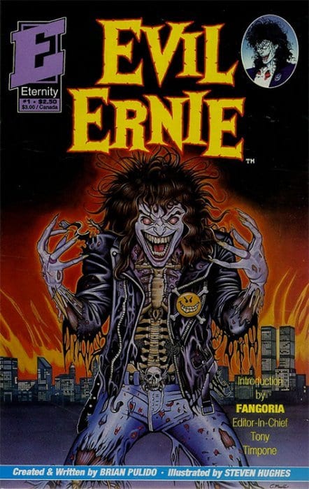
Evil Ernie begins Pulido’s career in Eternity Comics, an indie publisher best remembered for translating manga like Captain Harlock. But during the one year of publishing Pulido gets a fanbase and decides to use Ernie again in his own company. Chaos Comics republishes and continues the story of Ernest Fairchild, a telepath abused by his parents. As a child, Ernie experienced early signs of his powers. Ernie could not only hear people’s thoughts; he could manifest his own directly into other people’s heads. His parents did not take this well and abused Ernie every night.

Eventually, the Fairchilds commit Ernie to some experimental psychosis treatment. This results in Ernie making contact with Lady Death. Feeling Ernie’s need for love, she agrees to love him if he kills all of the living. Ernie accepts when he hears the neighbors’ thoughts on being unwilling to help him. With Ernie’s parents being the first victims, he slaughters 35 people before he is committed to an asylum, under the guilt-ridden Leonard Pierce, the doctor behind the initial treatment. Ernie would spend years foreseeing his future as the ghoulish Evil Ernie.

A new doctor Mary Young who grew up in the same town as Ernie, tries a seemingly improved psychosis treatment. Unfortunately, the machine mixing with Ernie’s telepathic connection to Lady Death instead explodes, killing him. Only to resurrect as Evil Ernie with the ability to control the dead.

Evil Ernie Is Chaos!

Brian Pulido makes Evil Ernie a supernatural thriller story by instilling relatable horrors alongside the absurdity. Like Stephen King’s Carrie, we have a social outcast who can’t help being different. But their differences make them sensitive to the people around them. Teenagers have it the worst when they have bad childhoods filled with trauma. If you need a milder depiction of how childhood traumas affect people in the long run, look at Steven Universe Future. The fact Ernie needed an escape fantasy is very believable; Lady Death herself was initially just a figment of Ernie’s imagination. Such delusions often come from afflictions like schizophrenia. Even now, people have difficulties dealing with this affliction, and the wrong move can make things worse.

Such wrong moves affect Ernie in several ways. His parents are unable to deal with Ernie’s powers and the stress of their failing mill business. So they take all their frustrations out on him as a scapegoat. The initial treatments on Ernie can even be seen as analogous to lobotomization, a process where patients have been known to deteriorate with time. Such a lack of care or understanding leads an innocent boy into a life of mayhem.

Fear The Teens

What’s more interesting is how Erne’s retaliation against his parents is like a youthful rebellion. Heavy metal has often been a symbol of rebellion in teens, to the point of parents accusing it of Satanism. Given the album covers’ apocalyptic designs, it’s hard not to draw the parallel themes between the genre and Evil Ernie. Ernie’s early design even evokes heavy metal singer Blitz Ellsworth. Not to mention his debut story has the subtitle of Youth Gone Wild.

Evil Ernie dealing with the Clone Saga
Everybody hates the Clone Saga.

Perhaps in a meta-textual way, Ernie can even be a way of rebelling against mainstream comics. With so many people trying to make superheroes in the 90s, especially the dark and edgy kind, Evil Ernie murdering pastiches of these characters is the ultimate catharsis. Ernie also shows up these mainstream publishers by resisting events and inter-continuity by focusing on character. It’s only once the company is about to go into bankruptcy that Evil Ernie sets in motion a grand finale to Chaos Comics.

Pulido Pays The Devil’s Due

Unfortunately, by the turn of the century, Pulido all but leaves Ernie behind. With Chaos! Comics going bankrupt, all properties save for Lady Death go to Devil’s Due Entertainment. But why does Pulido leave Evil Ernie behind? At this point, the only hypothesis comes from Ernie’s nature as a character. Most of the fears surrounding Evil Ernie like teenage angst and Heavy Metal have more or less become a part of everyday life. With such tolerance, Ernie doesn’t seem all that scary.

What’s more, Ernie’s status as a force of nature only gives him two layers. He’s an abused child who lashes out at the world and desperately wants love. But strip Lady Death from him, and he’s just a bratty teenager.

Unlike Lady Death, who grows into a character of her own, Evil Ernie is rather one-note. Pulido likely ran out of ideas for Ernie and couldn’t find ways to reinvent him. So when the rights go to Devil’s Due, creators try to expand Ernie’s character. Unfortunately, this takes away aspects that make Ernie so interesting. Starting with how he kills Satanists for harming a child, this makes Ernie less… evil. Keep in mind that in his Chaos days, Ernie had no problem killing children.

Dynamite And Evil Ernie

DynamiteOriginCover
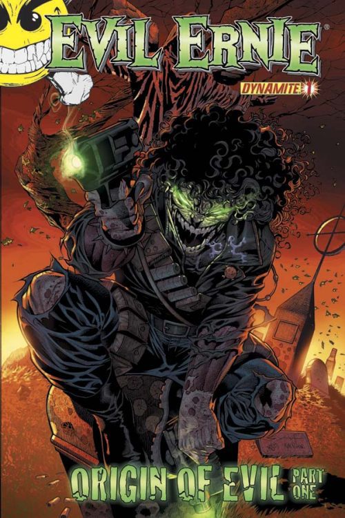
When the rights of Evil Ernie go to Dynamite Publishing, creators double down on this depiction. This character, who was once the embodiment of evil, becomes a vigilante. Now Ernie’s killing urge stems from daddy issues involving his imprisoned foster father. The fact that he kills everyone with even a hint of evil in them while working for Archdemons makes him too similar to characters like Ghost Rider. What’s more, unlike the original Ernie, who had practically no escape from evil, this Ernie had a fairer chance of a better life.

This might seem more appealing than the character whose spotlight was stolen by Lady Death. But in the end, the moral ambiguity surrounding everything makes him so sympathetic, Evil Ernie is now just a title. In the end, he’s still a bratty teenager looking for attention—all the more worse by the fact he’s driven by pettiness.

Can Evil Ernie Resurrect Again?

Evil Ernie will be forever remembered as the series that brings about Lady Death. But for the titular character, his time may be very well long gone. Ernie was a product of the public’s perceptions of taboo topics like puberty, mental health, heavy metal, and the 90s comic industry. Trying to adapt such a thing in modern times however proves to be difficult. With people having a greater understanding of those subjects, how can anyone tolerate such an evil character?

One idea is to explore the very idea of evil. With Halloween managing to make a comeback in theaters, it might be good for Ernie to go in a similar direction. Rather than focusing on the abuse, gore, or demonic nature, it would be good to see how the presence of such evil affects the people around Ernie. Maybe a reboot focusing on Ernie snapping for no actual reason like in We Need To Talk About Kevin would be a good angle.

What do you think should be done about Evil Ernie? Leave your thoughts in the comments.

Monkeys Fighting Robots Youtube

Longbox Legends: Remembering The Awe-Inspiring Battle In STAR WARS: VADER DOWN #1

VADER DOWN #1 was one of many new titles to come out of Marvel to celebrate its revitalization of the Star Wars franchise in comic books. Written by Jason Aaron and illustrated by Mike Deodato Jr., Frank Martin, and Joe Caramagna, the 2015 issue was an ambitious cross-over event that honed in on Darth Vader in order to further explore his character. The villain, originally on a trip to Vrogas Vas in search of Luke Skywalker, finds himself surrounded by a Rebel Forces’ fleet. If anyone else were in Vader’s position they would have virtually no chance of survival. But as this issue will show us, the Sith Lord is a force of nature all his own.

Story

Receiving a tip from Doctor Aphra, Vader moves in on Luke’s location. Upon running into the fleet of Rebel X-Wing Starfighters, one would think the Dark Lord would attempt an evasive maneuver. But the confidence exuding from him would never permit him to do such a thing.

Star Wars fans know how egregious the sins of Vader are, but few can deny the draw to a character with such determination. We (regretfully) find ourselves almost routing for the villain. But once he lands on the planet, readers will see how Vader fairs against an armada of Rebels on the ground.

The beauty of Aaron’s narrative lies in his portrayal of Vader. His elegant ease in dismantling the Rebel forces makes one feel as if he’s a force of nature himself. It is the perfect setup for this storyline—casting the tyrant in an unstoppable position from the get-go leaves ample room for him to fall in the future.

Artwork

Deodato Jr.’s penciling and ink work, Martin’s coloring, Caramagna’s lettering were each integral pieces of this beautiful issue. The fighter ships are incredibly detailed, complete with dark grays for the side panels and intense reds to represent their explosive fire. The lettering used for the Rebel Fleet blends in which the explosions themselves—it’s as if their exclamations of fear were part of the visual landscape.

Conclusion

STAR WARS: VADER DOWN #1 was the perfect way to launch into a new era of Star Wars comics. Though we want our hero Luke to survive, we have to admit Vader’s unmatched power in the Force is nothing short of awe-inspring.

What was your favorite part of the issue? Let us know in the comments below!

Monkeys Fighting Robots Youtube