Home Blog Page 320

Self-Published Spotlight: THE CELERY STALKS By Patrick Ian Rooks

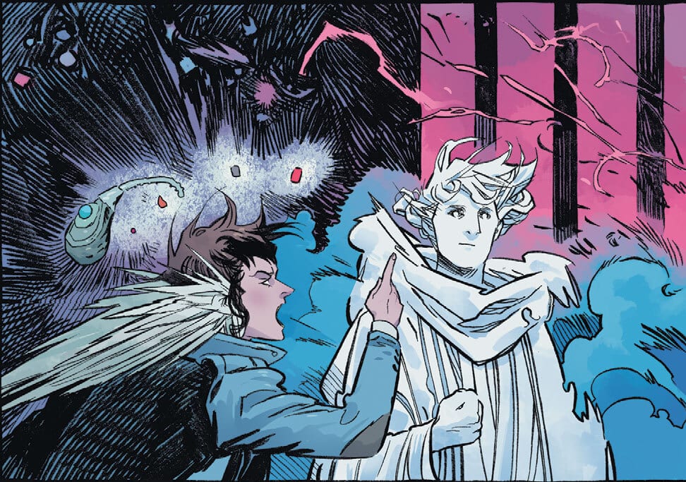
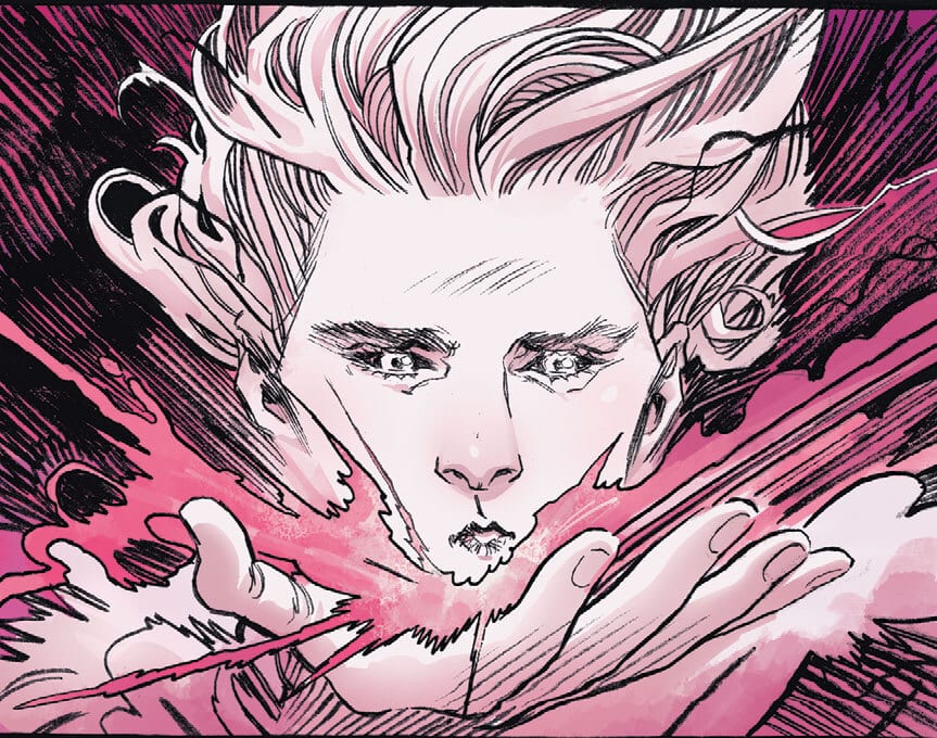
Welcome to Self-Published Spotlight, a regular interview column where I will be highlighting self-published comics and the creators and small print publishers who make them.


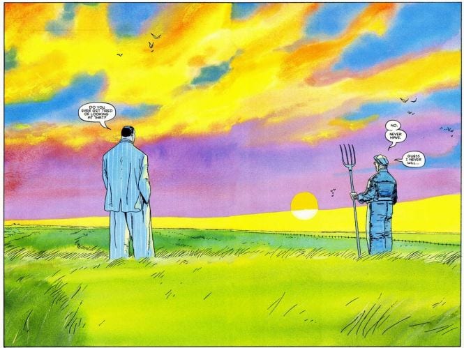
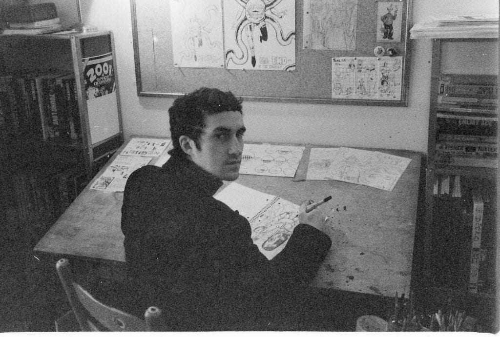
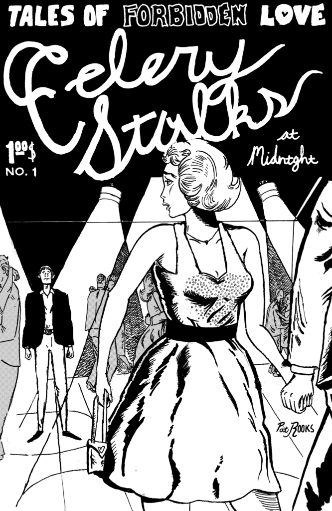
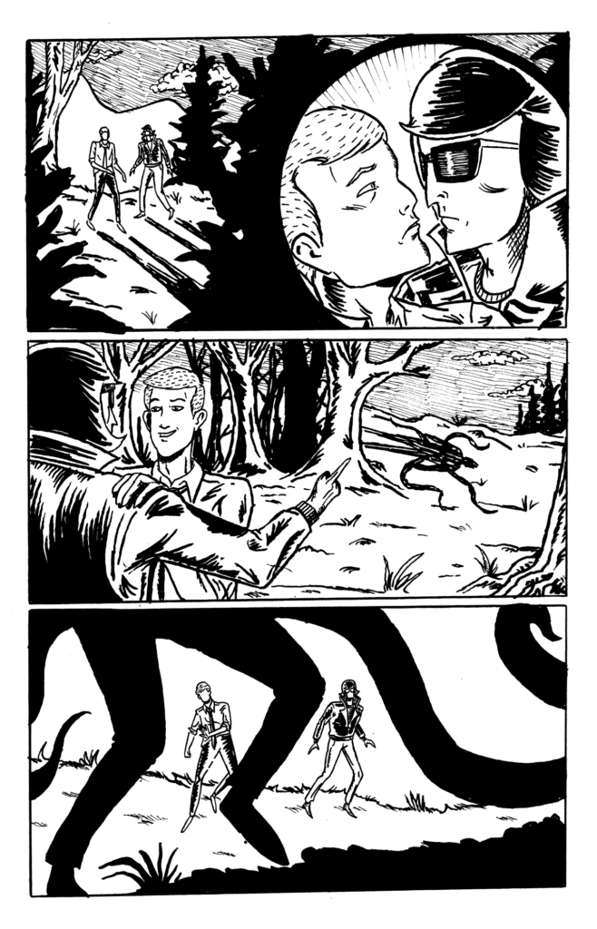
This inaugural column is going to focus on Patrick Ian Rook and his mini-comic, The Celery Stalks. I discovered Pat’s work on his Instagram and was immediately taken by his linework and style; it’s equal parts indie comics (think Chester Brown), horror comics, romance comics, Steve Ditko and a whole lot more. It’s best to let the art and artist speak for themselves so read on for a chat with Pat and a look at some of the pages from The Celery Stalks.

Celery Stalks
Cartoonist Patrick Ian Rooks

Monkeys Fighting Robots: Okay, so first off Patrick thanks for taking the time to talk to us over at MFR.
Patrick Ian Rooks: Glad to be here!

MFR: Just because I feel I have to ask everyone, how are you holding up during the Covoid 19 crisis? You and yours doing ok?
Rooks: I’m well! It’s a cliche all the cartoonists are using, but quarantine is a lot like an average day for me haha! I’m not a huge fan of going out, so I’m not missing anything.

MFR: Ha. Very true. I’ve been talking to a bunch of cartoonists and they all seem to agree on that.
Rooks: It’s tedious work. I’d say to anyone who wants to make comics the same thing people are saying in these trying times “stay home!”

MFR: That’s actually really solid advice! So now that we’re talking comics, why not tell our readers a bit about your latest, ‘The Celery Stalks’.
Rooks: Yeah, so it’s the comic I serialize monthly. So far I’m focusing on doing about 6 a year. It’s sort of a B Movie horror/romance/adventure strip. Basically each issue is heavily influenced by whatever sort of story I want to tell that month, while still telling a big picture story over a bunch of years.

MFR: Oh I can totally see all those influences in there. Like the cover for issue 5 really made me think of ’50s romance comics. The interior of that issue too. Like with the heavy use of thought balloons and the narration. I loved it! Who would you say are some of your cartooning influences? Because I see a bit of Chester Brown in your work, a little Charles Burns too.
Rooks: Ah, thank you! I’m pretty happy with issue 5, and I’m glad all of that translated. It’s funny you’d say that I come from more golden age/ silver age influence. My alt collection is pretty lacking. In fact, I just got my very first Robert Crumb comics like a week ago. I like what I’ve seen of Brown and Burns, but I’ve only read the latter once. Celery Stalks specifically has an unhealthy amount of Ditko influence. Specifically his work with Creepy & Eerie magazines and his Spiderman Run. Besides him would be your Romitas (Jr and Sr), Miller and Janson, Johnny Craig to name a few.

Celery Stalks
Cover to The Celery Stalks #1

MFR: Yeah, I can totally see the Ditko in your work. I feel like Ditko is a lot weirder of an artist that some people think. And a lot of the indie/underground artists always cite him as a big influence. So the edition I have of The Celery Stalks is the collected version. I absolutely love the size of the book. Were the comics themselves the same size and dimensions? I just love smaller formats like this.
Rooks: Thanks. Umm right off I can’t think of the exact measurement, but the mini-comic versions were just a little bigger. I wanna say 7″ by 4.5″. I like small format stuff for sure. And I always had that small paper book size in mind when I started working on the collection. I love old sci-fi paperbacks a lot.

MFR: Do you also create at those dimensions, or do you draw bigger then scale it down? And speaking of process, what’s yours? Like do you start with detailed writing, sketches, layouts, thumbnails, or whatever?
Rooks: I drew this stuff bigger and shrunk it down. The boards got bigger with each issue, but I’m shrinking them back to like 11″ by 7″ for the next run of issues. I can go a lot quicker at that size. So when I started Celery Stalks I just grabbed your classic college rule spiral-bound notebook and filled it with drawings until the story sort of became clear, at least what happens in that first and second issue. My process was different for pretty much each issue, but basically, I’ll write a script that’s really just dialogue-less layouts on folded graph paper and then go from there.

Celery Stalks
Page from The Celery Stalks by Patrick Ian Rooks

MFR: I take notes on graph paper too. I use these small ‘field books’. There’s just something about how they look. Have you always wanted to be a cartoonist?Rooks: Pretty much as long as I can remember. When I was like 16-17 I changed my mind and thought it would be a good idea to become a famous screenwriter and then use that to leverage my way into comics haha. Now I find that idea to be outlandish. After a year at film school, I pretty much decided comics was where I belong.

MFR: What made you decide to self-publish?
Rooks: Well mainly because I wanted my stuff out and my work was not ready for major publication. In my opinion, it’s still not, but self-publishing gives me the opportunity to build an audience while I get better at the craft.

MFR: I think some of the best comics come from the self-published world these days and it’s on the rise like me, you’re sort of part of the whole Cartoonist Kayfabe community that has sprung up around CK podcast. I see so much creativity and support for each other coming out of that network. Why do you think a community like that resonates so much?
Rooks: Hmmm that’s a good question. I’m not really sure how involved in that community I am. They’ve been supportive to me and I’ve done some promoting of my work through that network so that’s all positive! The way I look at it, Jim and Ed were on the shortlist of pros I was sending all my stuff to years before they had a youtube thing, but I like seeing that it’s gotten a lot of people talking about comics in a way that makes sense to me and not just about which superhero would win in a fight or something.

MFR: Yeah. It really is about a love of the craft, which is what I love about the underground/indie/self-published world. So where can people get your work? What’s the best outlet to check out what you are doing?
Rooks: So you can buy whatever I have in print at patrooks.bigcartel.com and I’m about to launch a Patreon for issues 7-12 of Celery Stalks that’s gonna be the only place the minis will be available until they’re collected next year. You can find that at https://www.patreon.com/patrickianrooks. I’ve got a really exciting artist doing the back cover to issue 7, so you don’t wanna miss that. If you just wanted to see what I’m up to my Instagram is patrickianrooks. That’s where I’m most active.

MFR: Awesome man. Now you’ve got me hyped and I can’t wait. Is there anything else you are working on you want to mention?
Rooks: Nope! Just working hard on that new Celery Stalks run! I didn’t mention it but that starts in July!

MFR: And that’s right around the corner! Awesome! Anyway thanks again for talking to us Pat, let’s do this again when the new issues start to hit.
Rooks: It would be my pleasure! Thanks for having me


Monkeys Fighting Robots Youtube

Longbox Legends: SPIDER-MAN/DEADPOOL #14 Showed Us Spidey At His Limit

SPIDER-MAN/DEADPOOL #14, published back in February 2017, takes place in the midst of writer Joe Kelly’s Itsy Bitsy storyline. But unlike most mid-act story arcs, this issue cuts to the heart of the plot in grandeur. Spidey and Deadpool fans will remember the intriguing plot: an unknown antagonist used the two heroes’ cells to create Itsy Bitsy, a being more powerful than both of them. And the duo learns she could easily kill thousands of people. While Deadpool learns to seek alternative ways to combat the creature than his usual M.O., Spidey finds himself drawn to the ever-looming temptation of killing the menace.

Story

In order to prepare for the next Itsy Bitsy attack, Spidey and Deadpool meet with their X-Men ally Kurt Wagner, a.k.a. Nightcrawler. The webbed hero recently lost the ability to tap in his Spidey sense, so Kurt agrees to help him train. However, Kurt notices how much anger Spidey holds and attempts to get to the heart of his frustration.

Kelly’s narrative isn’t told in chronological order. Though the training with Kurt takes place first, the reader experiences these events as memories in Spidey’s head. These scenes are diagnosed by none other than Kurt himself, acting as Spidey’s personal priest for the issue. After some probing, we soon learn the hero is debating breaking his “no kill rule” due to the immense threat Itsy Bitsy poses. We get to see his personal rationalizations while receiving caring yet firm pushback from Kurt.

Readers find themselves contemplating the ethics of the right to take life alongside their favorite arachnid themed superhero. Kelly helps them get inside Spidey’s head through the confessional framework, showing him locked in a war against his very identity.

Artwork

Ed McGuinness’s penciling, along with Mark Morales’s ink work, Jason Keith’s coloring, and VC’s Joe Sabino’s lettering worked together beautifully. The characters are defined with solid borders, yet retain a sense of fluidity to create a sense of movement. In addition, the coloring gives readers a sense that our three heroes are connected through the use of similar red shading on their outfits. And, to top it all off, the lettering is placed in a way to compliment the action, giving the appearance that the characters are moving around the boxes themselves.

Conclusion

SPIDER-MAN/DEADPOOL #14 did a fantastic job of pushing Spidey to his limits. But we, the reader, had the opportunity to join our hero in the emotional turmoil. We highly recommend revisiting this issue.

Did you enjoy Nightcrawler’s guest appearance? Let us know in the comments below!

Monkeys Fighting Robots Youtube

Unpacking The Destruction On The PLANET OF THE APES

Planet of the Apes Cataclysm
Planet of the Apes Cataclysm #3 Cover Credit: BOOM! Studios

The Planet of the Apes franchise has achieved a lot considering the entire planet, and all of its inhabitants, was destroyed at the end of the second movie. In fact the entire series, books and comics included, is packed with violence and destruction.

Despite all of the devastation within the Ape stories, it is not necessarily this aspect that people associate with the franchise. People remember the Statue of Liberty, the Alpha/Omega bomb, the hoards of apes charging into battle against a militarised human outpost, however, it is the themes behind these sequences that resonate with the audience.

So, the question becomes, why so much destruction in the first place?

Planet of the Apes
Beneath the Planet of the Apes Credit: Marvel Comics

Resolution on the Planet of the Apes

The ending of the second movie, Beneath, has the largest destructive force unleashed anywhere in the Ape Franchise but it is not the first example of utter destruction. That award would go to the ending of the first movie and the implications that the scene makes. As Taylor, the astronaut out of time played by Charlton Heston, rides into the wilderness looking for Truth he finds the remains of the Statue of Liberty and the remnants of his past.

The scene illustrates the destructive force of the Humans and annihilation that Taylor feared would come from the outset of the movie. Taylor was a pessimist, he was running away from his own kind because he saw nothing good in them. His journey across the Planet of the Apes rekindled some of his softer feelings for what he left behind. This made the shock of his true predicament that much worse. Taylor was in the process of being redeemed but it turned out to be too little too late.

The ending of the first movie was a warning against turning a blind eye, against hiding and hoping that someone else would clear up the mess. It was also about bringing a story to an end. The discovery of the Statue of Liberty closed the chapter on Taylor’s hope for the Human race. There was no saving his people, no redemption. The original ending, as written by Rod Serling, took this idea one step further.

Planet of the Apes
Planet of the Apes Visionaries Credit: BOOM! Studios

Original Endings

In the original script, which was released in Graphic Novel form by Boom! Studios in 2018, the man Thomas discovered the same remains as his counterpart Taylor. The build up shows Thomas running through the fields, chased by Police Gorillas and followed by the Chimpanzees he had befriended. Suddenly he stops and stares into the foreground. Despite his friends shouting for him to run he simply stands still, in awe of something the reader can’t yet see. His last words “There’s no place to go,” signifies the remains of his hope leaving him and, with a tear on his face, he is gunned down. Only then is it revealed what he was staring at, the now famous Statue of Liberty remains.

This ending is in some ways more upsetting than the filmed version. This is partially because the character of Thomas is less pessimistic than his movie counterpart. He embraces his situation with more vigour and fights not only for survival but for his way of life. Therefore, when he comes face to face with the destruction caused by his own kind, his spirit is destroyed as completely as the world he came from.

In the graphic novel adaptation by Dana Gould, illustrated by Chad Lewis and David Wilson, Thomas is shown running into the wilderness, the ‘Thup thup thup’ of a helicopter in the background like the sound of a beating heart. This ominous air is replaced by a shadow falling across the panels, finally to cast Thomas in darkness while the background behind him is showered in light.

On the following two pages Lewis and Wilson depict a man losing his will to live. The panel with his last words is devoid of any background, the only panel in this sequence to be displayed in this manner, and it emphasises the moment. This is the point where the effects of all of the destruction is best realised. Even before the reveal, Thomas’ spirit is broken in that single moment. He gives up and almost welcomes the hail of bullets that end his life.

What Serling was suggesting here is that the cost of all of Human Kind’s hatred, greed and intolerance is the destruction of the soul, of the spirit. In the end, things come and go, but once Hope has been destroyed there is no redemption, no coming back, there is only the end.

Planet of the Apes Cataclysm
Planet of the Apes Cataclysm Credit: BOOM! Studios

A New Cataclysm

It’s not just the Human’s who are victims of destruction, the Apes suffer too. Throughout the movies and the comic series, the Apes are often persecuted, hunted, and killed at the behest of the Humans.

In the Boom! Studios prequel tale Planet of the Apes Cataclysm, a biblical epic unfolds over the eight years before Taylor arrives from the past. Corinna Bechko and Gabriel Hardman start their story off with the destruction of the moon and the events that follow read like the 10 plagues of Egypt. Meteor showers, floods, and starvation face the Apes as they try to adapt to their new climate.

The devastation and subsequent trials are merely plot devices, however, for Bechko and Hardman’s examination of Ape society and some of the characters that live within it. Cataclysm tells the backstory of the major ape players from the original film; Zaius, Cornelius, and Zira. It follows them through the turbulent times as they meet and get to know each other.

In contrast to the destructive ending of Taylor and the Human Race’s story, in Cataclysm, it heralds in the beginning of the characters so beloved of the franchise.

Planet of the Apes Cataclysm
Planet of the Apes Cataclysm Credit: BOOM! Studios

Character Breaking

The tragic events depicted at the beginning of Cataclysm affect the characters featured in a number of different ways. Sometimes the result is for the better, others not so much. At times it leaves you wondering what would the characters have become under different circumstances.

Take Doctor Zaius as an example. The destruction of the moon has the greatest impact on his life. At the start of the series the orangutan is depicted as a loving father and husband. He shows compassion towards other Apes and extends the hand of friendship towards those who stand against him. In the opening issue Zaius sends his wife, Siena, to talk to the leader of The Anti-Vivisection Society as a way of appeasing an awkward situation instead of antagonising it.

This is when disaster strikes and over the course of the series, Zaius becomes more like the suspicious, keeper of secrets that we all know and love. Through the reign of destruction he is forced into the role of Leader of the Council when he witnesses the death of the other council members. He also loses his daughter, who dies giving birth in the middle of the chaos, and his wife is nearly killed.

As the new leader he has to make a number of decisions under difficult situations. Making this harder is a Brother of the Faith who turns out to be a human mutant in disguise, manipulating the Apes minds but also Zaius’ decisions.

Damien Couceiro’s depiction of Zaius changes across the run. To start with he is always shown in a positive light, standing up straight with his head in the air. The reader sees him as a strong, reliable figure of the community. As fire rains down and Ape City is torn apart, so too Zaius’ stature is diminished. He becomes down beat as if the weight of the world is on his shoulders. Colorist Darrin Moore uses darker tones and shadows creep across his face and body.

With each new disaster that threatens Ape City, Zaius is broken a little bit more. He soon becomes cynical, distant from family and the needs of community. Ultimately he becomes like Taylor at the start of the first movie: bitter and broken. The front cover of issue 6, drawn by Mitch Breitwiser, sums the character up perfectly. Zaius has become a mere reflection of his former self, lost in the debris of the once great city.

Planet of the Apes Cataclysm
Planet of the Apes Cataclysm #6 Cover Credit: BOOM! Studios

Hope in the Chaos

Each of the major characters in Bechko and Hardman’s Planet of the Apes tale is directly affected by the violence and destruction around them. It is easy to argue that without the disasters the characters wouldn’t become who they are. The chimpanzees would not have a need to challenge the authority of the Council. Zaius would not have travelled the path towards a war of self-righteousness. Cornelius would not have met Zira.

The stories within the franchise are driven by the need for survival and striving against the odds. From the very beginning a destructive adversity has formed the foundations of Planet of the Apes. From Caesar’s parents being mercilessly gunned down by order of the American President’s Science Adviser, to the violent uprising of the Apes, and through to the mindless war with the mutants. But a foundation is all that it is: everything that makes the world and the stories so engaging are built upon the back of this. The characters grow and take their full shape in response and reaction to the very worst circumstances possible.

The history of literature is littered with violence and destruction with some of the most famous stories centred around these themes. As a species we are drawn to these types of stories so it goes without saying that Planet of the Apes would capture the imagination of fans for decades. However, the true brilliance of stories like Cataclysm is not the action or the devastation but the characters that grow and survive within the hostile environment.

Various volumes of BOOM! Studios’ Planet of the Apes comics are currently available to buy.

Planet of the Apes Cataclysm
Planet of the Apes Cataclysm Credit: BOOM! Studios
Monkeys Fighting Robots Youtube

INTERVIEW: Composer David E. Russo Scores The Odyssey ‘Windows On The World’

David E. Russo’s music is featured in Gotham and its spin-off Pennyworth, and in the new film Windows on the World from director Michael Olmos, the soundscape takes viewers along an emotional odyssey of lives changed by the horrific events of September 11, 2001.

Starring Ryan Guzman (9-1-1) as Fernando, Windows on the World centers on the character’s journey from Mexico to New York in search of his father. The latter may have died at ground zero. Fernando’s father, Balthazar, played by the legendary Edward James Olmos (Miami Vice, Battlestar Galactica), is an undocumented busboy working at Windows on the World, a complex of venues atop the north tower. The film is a journey full of hope, love, and hard lessons.

PopAxiom spoke with David E. Russo about Sicilians, the rise of technology, and underscoring the film Windows on the World.

Sicilian Sounds

David’s career spans three decades. His earliest IMDB credit is for fun alien comedy Spaced Invaders. How did music play a role in his life before it became a career? “I came from a family of disgruntled Sicilian immigrants, all of whom were musicians. My grandfather used to play guitar on the radio in the 1920s in New York. No one ever made any money, and it was never really possible as a career.”

David continues to share his early years. “I grew up in a house full of Sicilians singing, and there was always music and fighting and yelling, but it never occurred to me there was a living to be made at it.”

A realization later in life prompted David to start working on what would become his lifelong passion. “It wasn’t until after college, where I had no idea what I was going to do, that I kinda woke up and realized the only thing I had any ability in was music.”

Truer words are rarely spoken. “Fear is a tremendous motivating factor, and it got me moving.”

Beyond Belief

More films and TV followed, including scoring 28 episodes of the Beyond Belief: Fact Or Fiction. “That kept me afloat. In the early days, it’s pretty touch and go. That kept me alive.”

About Beyond Belief, David says it was “… an ultra low budget series. The options you had as a composer those days were very limited on a low budget. Now, we can do full orchestras, and it’s pretty convincing. Back then, it was heavy lifting to get things to sound decent.”

Like most artists, David is his own worst critic. “It’s really cringe-worthy when I look back on it. But I was fortunate to have the job.”

edward james olmost-film-vix

About Windows on the World

Windows of the World is available on streaming service Vix. The composer’s relationship with the film begins long before filming began. ”I’ve had a deep friendship with [writer/producer], Robert Anderson, for 15 or 20 years now. He’s a remarkable guy. He’d written this script with his cousin [Zack Anderson], and I had read it years before. It was a moving story.”

David heaps praise on Robert. “I’ve done one other film with him. I just love being around him and working with him. It’s incredibly creative.”

So, for David, he “… knew the story intimately long before I met Michael.”

Film-making is a massive collaborative artistic process. David says, “When Michael came in, he had a particular vision that was clear and emotional.”

The music for Windows on the World came about in a particular way for David. “For this one, I wrote an entire suite of pieces based on my feeling about the film. For me, it was clear from the beginning. It was a film about family. There was a theme for the family and a theme for the main character’s odyssey as he travels.”

A significant influence on a film and its score are the locations. “… the difference between going from Mexico to New York. Trying to musically express the differences in cultures and energy. How he comes to this foreign place and deals with the craziness of New York.”

Ryan Guzman-vix-film-windows on the world

David wrote, “… a bunch of pieces based on what I imagined.” So, how much of that music was in the final cut? “Almost all of it.”

However, David shares the story about one piece that didn’t make it to the end. “Robert has deep relationships with jazz musicians, he’s won Grammy’s for producing jazz albums … I did one piece for New York with saxophone and jazz that he hated. It was summarily trashed. He went to Grammy award-winning David Sánchez, who wrote a piece for New York that was far, far better than what I’d done.”

The script, the settings, the director, and producer all contributed to the energy David used to create the music. But there was one more influence with a significant impact. “The film has these interstitial paintings by artist Sandow Birk, those were really inspirational. The kid is reading Don Quixote, and it’s about this odyssey. There’s this little mythic element that undercuts the film that I was tapping into. I was trying to emotionally connect with what those drawings say and the idea of this journey.

Get the soundtrack!

Music 2.0

Computers are now a vital part of the film scoring process. David shares his thoughts on the good and the bad of working with technology. “The challenge now is, if you’re working on TV … there’s a time crunch. You’ve got seven to twelve days to make music for an episode. Gotham, let’s say, was 42 minutes of the show after commercials, and we had 38 minutes of music every week. So, the computer enables you to physically get it down. The shows I’ve been doing involve full orchestras, which is impossible in the time frame to do it without these tools.”

The drawback to this technology is that “… everyone seems to have the same toolkit. So, the challenge is to create something that serves the story and is sonically distinctive in the time that you have. I’ve always struggled with the machines trying to bring life to them. That’s the biggest challenge, trying to create something that is true to the story and is not just generic.”

More tools never hurt, though, and neither does taking the time to blend the old and new school. “Computers are really good at taking a sound and manipulating it endlessly to become something else. I found that I spend much more time these days putting a microphone up and trying to record stuff; capture performances and sound.”

In the end, scoring a film or TV series requires an approach that’s “… essentially the same … it’s trying to get a feeling for what the spirit of the thing is and trying to come up with a sound palette to express that. And limiting yourself to a particular palette in a certain sense to find a unified expression for what this show is about.”

About his own process, David says, “I’m never theoretical about stuff. It’s always about emotion and what feels true. If I feel like I’m lying, I know it’s not true. It’s not an intellectual process at all.”

Wrapping Up

As humans, we acquire inspiration from all manner of sources. For an artist, being around other artists provides a creative energy boost, unlike anything else. “The first job I got out of college was at Paramount Studios as a secretary in the music department. At that time, this was in the early 80s, they had this recording studio, Stage M, that was really vibrant. I saw everybody work. John Williams, James Horner, Bill Conti, everybody who was doing big stuff. That was really inspiring to me.”

David reveals who is his personal number, one composer. “Ennio Maricon is the sensai. I love John Barry too. But Maricon inspires me more than anybody.”

In the age of remakes, what movie would David love to score? “There was a really cheesy movie from the 70s called Logan’s Run. That would be a great film. The story is pretty interesting and the dehumanization of society and over-population. It could be great.”

Windows on the World is available on Vix. What’s coming next from David? “I’m contributing to a documentary. It’s from Michael Webber, I scored something for him a few years ago called The Elephant In the Living Room. He’s been working on this new one called The Conservation Game. That’s going to be a good one.”

Is Windows on the World on your watch-list?

Thanks to David E. Russo and Costa Communications
for making this interview possible.

Want to read more interviews like this? CLICK HERE.

Monkeys Fighting Robots Youtube

Review: THE DREAMING #20: The Point is Simply to Feel

Writer Si Spurrier and Artist Bilquis Evely, along with colorist Mat Lopes and letterer Simon Bowland finally bring their saga to a conclusion with  The Dreaming #20. Spurrier’s complex, intelligent, and emotional script collides with the jawdropping visual work of Evely and Lopes to craft not only an incredible ending to their story but one of the most memorable chapters in this universe’s entire publishing history.

“The citizens of the Dreaming make their final play against the artificial intelligence that seeks to replace them with cold rationality…and the fate of Dream is revealed!”

Writing & Plot

Si Spurrier‘s handling of interwoven plotlines both new and old are much of what carries the success of  The Dreaming all the way to his final script. The outcome of every character plot, from Matthew the Raven, Cain & Abel, Lucian the Librarian, Wan, and of course the Dreamlord himself, are intertwined seamlessly and given proper attention to become weighty additions to the overall plot. The inclusion of Rose Walker is an element that not only works as a nostalgic throwback to classic Sandman fans but as a brilliant subplot that effectively ends a plot thread some thirty years in the making. As is in keeping tradition with Gaiman’s Sandman universe, the manner through which this story resolves is somewhat vague and complicated, but it’s presented with such grace and emotion that this hardly hampers the experience. The dialogue and narration are as varied as ever, with some characters’ naturalistic dialogue blending with others’ more poetic prose-like speech as has always been done in great Sandman universe comics. Si Spurrier has proven himself a worthy custodian of what Neil Gaiman started back in 1987, and his work on this series will be missed.

Art Direction 

Bilquis Evely‘s pencils have been an artistic wonder for each issue of The Dreaming she’s illustrated, but she’s saved her best for the final 20th issue. Her usual levels of immense character and dreamy environmental detail are here, but turned up to unbelievable levels. There a multiple two-page spreads of wildly unique and insanely detailed artistic vision that may be the most impressive work this universe has ever seen. Much of this beauty is the work of Mat Lopes’ colors, which once again bring this dream-world to life with blending tones from every piece of the color spectrum. Topping off the aesthetic is the lettering of Simon Bowland, who has had the unenviable job of maintaining the  Sandman universe’s varied fonts and styles for each character. He has proven more than up to the task these past 20 issues and offered the exact voice that this comic needs to be read in seamlessly. The visual talent behind this series has been second to none, offering up some of the best artwork hitting stands for its entire duration.

The Dreaming  #20 brings this stellar run to a poignant finish. Si Spurrier’s complex and emotional script is full of satisfying finishes and heartfelt goodbyes. Bilquis Evely and Mat Lopes saved their best work for last, adorning this issue with unbelievable visuals on a massive scale that still cater to the individual characters and their most intimate moments. This final chapter will go down as one of the most memorable comics in  Sandman’s long history and caps off a brilliant run worthy of this wonderful universe. As sad as it is to see this top notch creative team leave the series, I’m curious and excited for what G. Willow Wilson and Nick Robles have in store for their follow-up. If you’re a  Sandman fan such as myself, this issue will be a must-buy when it releases on 4/28 at your local comic shop.


Monkeys Fighting Robots Youtube

Netflix Review: BIG MOUTH Season 3

Netflix’s Big Mouth returns for a third season, but it was not as impactful as the first two seasons.

After the events of “My Furry Valentine,” Andrew is ostracized for his meltdown at Lola’s party, and Matthew finds a guy he has connected with. Jay comes to terms that he’s bisexual, Nick becomes addicted to his smartphone and Missy, and Jessi continues with their struggles with puberty. And Andrew continues to act like a grotty little pervert because he falls for his cousin.

One of the best features of the first two seasons of Big Mouth was the likable characters. Nick, Andrew, and Jessi were good friends who supported each other, such as in episodes like “Everybody Bleeds” and “The Department of Puberty,” but they have degraded as the season progressed. In season 2, this was reasonable because Jessi was dealing with her parents’ divorce, and Nick and Andrew were influenced by their Hormone Monsters.  However, in season three, Andrew and Nick get worst.

Andrew suffers the worst. In the first season was a good kid who’s Hormone Monster acted as the devil on his shoulder. In the second season, The Shame Wizard balanced out Andrew’s bad urges. But in this season, Andrew was unrestrained. In the episode “Girls Are Angry Too,” he starts to stream his toxic views about women because of his experience of rejection, leading him to meet some unsavory people. In the episode “Florida,” Andrew attempts to hook up with his cousin, and whilst she flirted with Andrew first, he didn’t have to reciprocate. Nor was it a case for Andrew that he hadn’t seen his cousin for a few years, so he changed a lot in the intervening years.

Nick’s big fault comes when he forms an unhealthy attachment to his sister’s phone. The phone acts like a Hormone Monster and corrupts him. One of Nick’s worst actions was recording an embarrassing video of his father and posting it online. When Nick got separated from his phone, he acts likes an addict trying to find her. Nick also grew jealous of Jay when his family takes him in. This was a continuation of the episode “I Survived Jessi’s Bat Mitzvah,” where Jay acted like the good son when Nick pushed his mother away.

The characters who grew the most in this season were Matthew and Nick. Matthew grew a bit in the second season, and the character continues to develop in this season. Outwardly Matthew is the sassy gay character who doesn’t let anything phase him, but due to his age, he has never had a boyfriend. Matthew was nervous around Aiden as he tries to get into a relationship: so standard teenage stuff. Matthew has the added complication that his dad is an army officer, and Matthew pretends to be straight for him.

In Jay’s case, he has to accept that he’s attracted to boys and girls and later outs himself to the school. Jay’s other storyline involved his family because he has a Home Alone situation, and he gets taken in by Nick’s family. Despite Jay trying to laugh off his family’s actions, he experiences being with a loving family when he stays the Birches and subconsciously doesn’t want to leave.

The best episode of the season was the ninth episode “ASSes.” In that episode, the students of Bridgeton Middle School have to undergo the standardized tests and the stresses that they cause. Jay finally gets medication for his ADHD, and he’s a business opportunity by selling his pills as study aids. But for the kids who take the pills, they suffer negative effects. Jessi gets to shine in this episode because her mother puts pressure on the girl to do well in the exams, and the stress and the pills lead to a relapse into depression. Jessi only snaps out of it because she has a heart-to-heart with her dad.

The weakest episode was “Duke,” where the ghost of Duke Ellington retells the story about how he lost his virginity and growing up in the early 20th Century. This episode was nothing more than a filler episode and felt like an outlier because it felt unconnected to the rest of the season.

Like the previous two seasons, the finale of season three was fantastical. In this finale, the students gain superpowers, and the characters find out some life-changing revelations. The best aspect of this episode was it showed the characters were graduating from the seventh grade, so it means the characters will age. The finale has a downbeat ending, so it will be interesting to see what happens next.

Fans of the previous two seasons will be satisfied with Big Mouth‘s third season, continuing the style of humor and the themes of the previous seasons. But the characters who I grew to like in the first season were starting to grate.

Monkeys Fighting Robots Youtube

A Conversation With Dan Abnett – RAI, COVID-19, And The Future Of Comics

A Conversation With Dan Abnett - RAI, COVID-19, And The Future Of Comics

Dan Abnett is responsible for creating more than a handful of epic stories during his 30-plus year writing career. Over the past year, he has built out the Valiant Universe with the Fallen World mini-series and the relaunch of Rai. During this crazy time in history, a rainy Friday afternoon was a perfect time to chat with the writer via email. Below are Abnett’s thoughts on the future of the comic book industry, Juan José Ryp’s artwork, and hopes for a post-coronavirus world.

A Conversation With Dan Abnett - RAI, COVID-19, And The Future Of Comics

MFR: Dan, thank you for taking the time to talk with me. I hope you and your family are staying safe at this time.

Abnett: Thank you. All good here. Hope you are too.

MFR: How are you handling the lack of conventions and social distancing?

Abnett: Honestly..? I miss seeing people very much, but I am probably at my happiest at my desk, writing, so it’s just an opportunity to do that, but more. I’ve been training for this my whole career 🙂 But it’s hard to be “happy at home and in work” when so many people are suffering. I’m still stunned by what’s going on.

MFR: Last time we spoke, FALLEN WORLD was about to drop; now we have six-issues of RAI in the books. If you reflect on Valiant’s past year, what was the one moment that stands out the most to you, and why?

Abnett: Probably, getting the first pages of art in from Juanjo and realizing this was going to be an amazing book. I cannot tell you how stunned I was. I knew he was good, but…

So, generally, Rai as a series. I’ve written stories I’m pleased with, scripts I’m proud to send in, and I think it’s a damn good read… but Juanjo. Man! He’s just taken it to the level beyond next. My scripts work because Juanjo ‘gets’ it too, and invests so much effort in the storytelling, the detail, the design, and the ‘acting.’

A Conversation With Dan Abnett - RAI, COVID-19, And The Future Of Comics

MFR: For readers who are not familiar with Rai, what are the essential elements that make up the character?

Abnett: Far future, ‘post-apocalypse’ Earth. Rai is a noble, semi-synthetic super-warrior who protected the orbital city of New Japan, a utopia… until he realized that father, the AI that created him and New Japan, was a tyrant. Rai brought Father down, for the good of mankind… but the price was New Japan crashed on the mysterious and abandoned Earth (which has rewilded in the past few centuries). New Japan’s survivors have to rebuild…and though saved from Father’s cruelty, they kind of resent Rai for ruining what they saw as their utopian lives. Rai is now on a quest across the strange new world to finish his job by hunting down the last back-up parts of Father, called “Offspring”, which are scattered. If they reform, Father comes back. Rai will not rest until Father is absolutely finished. Rai is accompanied by Raijin, who is an earlier “Rai prototype.” Raijin is his older brother, but appears to be a young child. They have an odd relationship (Raijin being more’ human in personality).

MFR: How have you played with these elements to make them your own?

Abnett: Building the relationship and giving Raijin a key role, and also in creating (with Juanjo) the wild and crazy environments of the Earth they discover. Almost anything is possible… nature and rogue technologies have run wild since mankind last had a proper foothold here.

MFR: Juan José Ryp’s artwork is beautiful, and Andrew Dalhouse’s colors explode off the page. How would you describe the artistic tone for the series?

Abnett: World-class, and the main reason for following the series (okay, the story’s not bad, but that art….)

MFR: At the end of issue five, Rai says, “I’m trying to be human so that when the time comes, I know how to die.” Do you have an endgame for your run, or is this a sentence that you put out there for future writers to finish the tale?

Abnett: Now, I have an endgame. I have several. I hope to deploy them one after another 🙂

A Conversation With Dan Abnett - RAI, COVID-19, And The Future Of Comics

MFR: During the aughts, the superhero genre in comics was gritty, then over the past ten years, the film boom influenced the books, and there were more than a few reboots and relaunches – What are your expectations for comic books over the next ten years?

Abnett: I’m no prophet. I hope the good things continue and the best things get better. Right now, we have no idea what shape the industry will be in when this pandemic is ‘over’ (and it won’t ever be “full stop” over). There’s a lot of gloom and doom that comics are ‘finished.’ But I’ve already seen (and am involved in) some innovative new ways to make and deliver comics in unorthodox forms, and I can already see ingenuity and creativity flourish despite the situation. Maybe there’ll be an industry we recognize when we come out of this; maybe it will have changed dramatically, or been stripped right back. Maybe the mainstream won’t quite occupy the position of power it once did. But I believe there will be all sorts of other, new, innovative things: comics, projects, ideas, series, that will have arisen from this crisis and which will repopulate the industry in remarkable and unexpected ways. Varied, strange things that would never have happened if things hadn’t stopped. A bit like Rai’s Earth. A greater variety, and a renewed freshness and vigor, that may reshape the industry in very positive ways. Good out of bad.

MFR: The coronavirus has turned the world upside, and the loss of life is devastating. Once we get past this pandemic, what positives do you see coming out of this?

Abnett: I’m hoping that the sort of things I’ve just said about the comics industry may be true of society in general. It’s going to be tough. But this crisis has shown us the things that are truly important and “essential,” and they’re often things that were regarded as of low worth before, or we took for granted. We’ve also seen things working because they’ve HAD to work: the sorts of ideas for how we live that have often been voiced, but which have always been shot down as “they’d never work in practice.” Well look – they did and they have. The arguments are invalid. Some things need to change. Let’s just hope as many of us as possible are still here to appreciate that shift.

MFR: Comic book shops are drastically adapting during this time to sell comics by any means necessary. Are there any shops you want to give a shoutout to?

Abnett: All of them. My locals are Get Ready Comics in Rochester, and the American Comic Shop in Chatham (here in the UK). Both are great. But my support goes to all of them: those that are struggling to maintain a service, those who are innovating to mail-order to keep customers entertained, and those who have shut down, weathering the storm, ready to re-open when they can. Support your local comic shops. They may not be “essential” like the brave health care professionals and other vital services, who deserve unstinting praise, but comics, books, music, movies… art…. they’re important for our mental health while we shelter in place. Stimulation, entertainment, distraction, company, and escape.

MFR: Again, thank you for your time, best of luck with your Valiant books, and stay safe.

Abnett: Thank you – and stay safe yourself.


What are your thoughts on the conversation and Abnett’s career? Comment below.

Monkeys Fighting Robots Youtube

Review – HEXAGON #2: The Tutorial Ends And The Main Story Begins

Hexagon #2 Cover

Hexagon #2 is the issue where the series’ main plot truly begins. Whereas the previous issue is about character introductions, this issue highlights how their actions come into effect. Despite the series influences, this is about paying the price for wish fulfillment.

How HEXAGON #2 Defies Its Influences

Warning: Spoilers ahead

Hexagon #2 wastes no time in showing its creators’ knowledge of its source material. Opening with references of Back To The Future, a new character’s arrival reminds the reader that this is a different kind of story. The series’ plot is an inversion of The Last Starfighter, a movie deconstructing wish fulfillment. That movie however has a hopeful overtone of finding a better life through recognizing effort. Here, the choices that people make are a turn for the worse.

Protagonist Don’s success at the video game Crucible might seem good for the moment, but people have a right to be skeptical. Just one win doesn’t mean that he’s an ace. Don can’t even turn down the challenges that come his way – his choice is taken from him. That of course foreshadows Crucible’s true purpose, finding a “chosen one” to end an intergalactic war. Which is how the evil empire (the Lakenzi) finds Don.

Hexagon #2’s main strength is its self awareness, and not just for its 80s movie references, but its character interactions as well (something writer Michael Moreci has experience in previous work like Wasted Space). The so-far-unnamed new character is tough as nails, but not stupid enough to just take Don off the streets. She can tell just from the settings that this would be kidnapping. It’s also nice that Don’s relationship with his dad is stable and is willing to face the consequences. It’s what makes the issue’s climax so tragic when the Lakenzi show up. Unlike the deaths of Luke Skywalker’s aunt and uncle that starts Star Wars‘ hero’s journey, Mr. Van Vliet’s abduction isn’t liberation for Don; it’s his draft notice.

The colors of Hexagon #2 in action

HEXAGON #2 Artwork

Jheremy Raapack continues to display great artwork with his character expressions and dynamic outlining accompanying cinematic widescreens. This allows a faithful tribute to many of Hexagon #2’s influences. As far as new character designs go, the Lakenzi and the new character feature video game aesthetics, such as simple helmet designs. The new character’s floating computer even resemble Ghosts, the drones from the video game Destiny. Along with their weapons’ simple designs, this shows how alien they are to Earth. What might look impressive from a reader’s point of view is terrifying to the characters.

The colorists David Kim and Nuo Xu (with help from Bryan Valenza and Marc Monroy) show a higher amount of color variation in Hexagon #2. The more mundane but important situations are practically gone, showing a shift in the series’ tone. The lights no longer even serve as a guide; they are now a warning of danger. The red illuminations are a clear sign of offense towards Don while yellow is a sign of warning.

To top it off, when the game Crucible is played, it now looks pixelated unlike in the previous issue. It doesn’t feel immersive anymore; it’s now just an arcade game with little importance. If that’s not Hexagon #2 transitioning from the opening to the main plot, I don’t know what is.

How the lettering an panel layouts serve all mediums
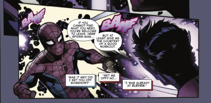
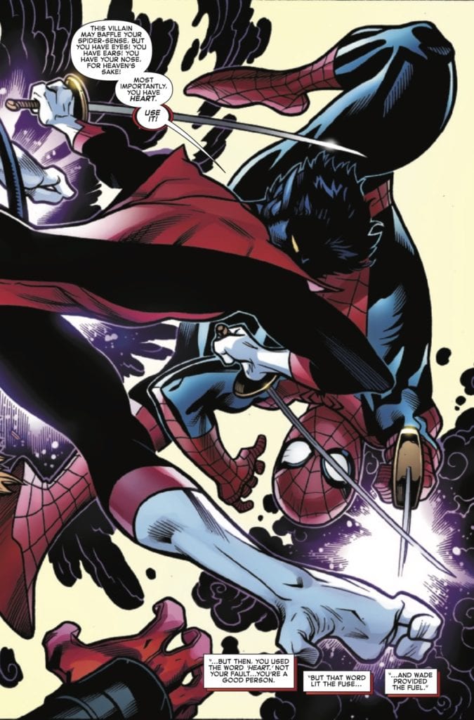
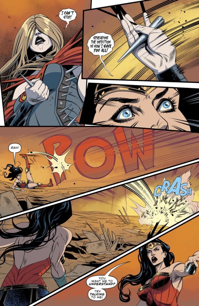
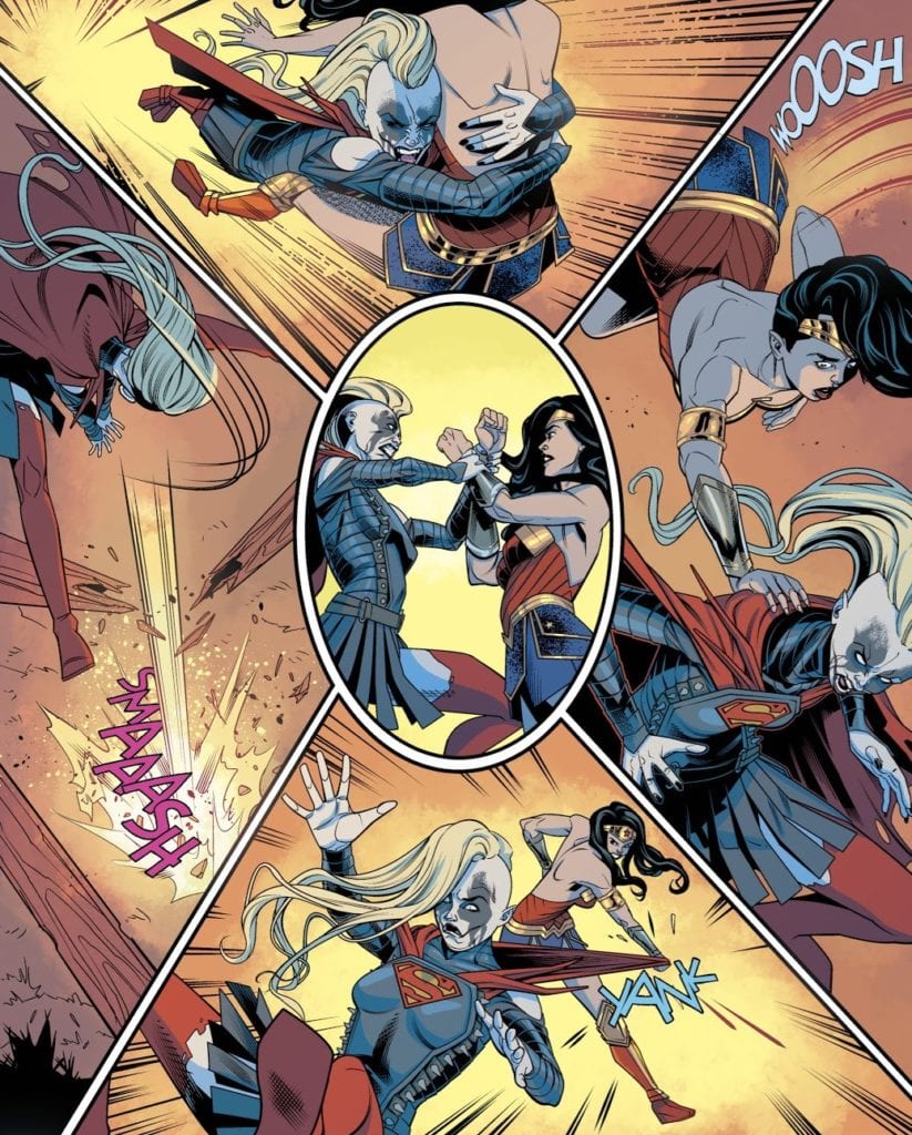
Finally, A Larger World Studios delivers lettering worthy of viewing this comic on a screen. With each word balloon fully contained within its panel, whether the reader views the comic on infinite scrolling or Comixology’s Guided View, they can read the comic without ever missing a beat.

Get Ready For HEXAGON

Hexagon #2 is the end of act 1 by setting up the plot. As the creative crew readies for the next level, the reader will have everything they need to see this act through. Even if people don’t understand the references, they can at the least see how entertaining playing them out is. Because as fun as the last issue was, it’s time for the real show to begin.

Monkeys Fighting Robots Youtube

SUPERGIRL and COMBAT COLIN: Two Peas In A Pod?

Supergirl cover art
Supergirl #39 cover Credit: DC Comics

Towards the end of 2019 a new writer and artist took over duties on DC Comics Supergirl. Jody House and Rachael Stott have a track record of producing wonderful work, especially together, so the scene was set for a fun, intensive run for the Last Daughter of Krypton.

When their story finally started in issue 37 it wasn’t the spectacular I expected. In fact, I would go as far as saying it was a disappointment, although not necessarily because of the work that Houser and Stott were doing. The plot revolves around an ongoing DC Universe event and has Kara infested with the Batman-Who-Laughs virus. The following four part story entitled I’m The Bad Guy pits Supergirl against a number of other DC heroes in a less than original story.

The narrative takes four full issues of Kara fighting for her to realise that the virus is in control of her and then the conclusion takes place in a separate comic. On the surface it was unimaginative despite some visual flair and witty scripting.

Combat Colin
Combat Colin #1 cover Credit: Lew Stringer

All Change

But then lockdown. The international pandemic has affected everyone and changed day to day living. One of the outcomes, personally, is that I am re-reading a lot of comics that are kicking around in my home. It was while reading one, random comic, that I gleaned a new perspective on the Houser/Stott Supergirl run. Something in the UK strip comic Combat Colin by Lew Stringer made me re-assess how I should have been reading Supergirl.

In an essay published in Critical Approaches to Comics published by Routledge in 2012, Joseph Witek discusses modes of comics. He posits that there are two traditions in visual representation for modern comics; The Cartoon Mode and the Naturalistic Mode. The former deals in caricature, expressiveness over realism, and the interpretation of the world through exaggeration. The later creates a ‘realistic’ world for the characters to live in with some form of grounding to explain how the world works. This often takes the form of realistic artwork with complex and detailed scenery or characters.

One is often seen as more serious than the other but this is a misnomer as comics fitting under The Cartoon Mode often deal with complex matters of politics, relationships, sexuality, and violence. The Underground Comix scene had a large influence on the ‘darkness’ that took over superhero comics in the late 80’s because the instigators of that movement, people like Alan Moore and Frank Miller, came out of an environment rich with self published comics and pulp noir novels.

But what has this got to do with Supergirl and who is Combat Colin?

Combat Colin Strip
Example of a Combat Colin Strip Credit: Lew Stringer

Everyman Colin

If you grew up in the UK reading Transformers or Action Force comics you will know and love Combat Colin. For those who didn’t, he is a down to Earth street hero who has some super strength and a sidekick named Steve. The character was created, written and drawn by Lew Stringer. At first in a single row strip before blooming into a half page, or even full page, gag comic.

The character and the strip is charming and funny, even after 30 plus years since its creation. Although there isn’t much continuity within the stories, occasionally a number of strips would build up to form a larger story. One such story introduced an arch nemesis for Colin in the form of The Brain; a super intelligent alien and ruler of an underground domain. The references to Superhero comics, such as the Fantastic Four, are obvious but there is a lot more going on in these short strips.

Stringer uses Combat Colin to parody mainstream comics, riffing off of established characters and tropes to create absurd situations. However, the reading can be taken a step further. Stringer uses the Cartoon Mode of comic representation to poke fun at the society he lives in. In The Brain story, for example, the masterminds plan is to ultimately control Humans by turning their brains to custard via boring television shows. Through the control of programming, The Brain is able to fill the homes of the UK with endless drivel like Game Shows and Soap Operas.

This comical dig at the state of British television highlighted a growing concern that the dumbing down of television would lead to an less engaged audience. It is clear from the comic strip that Stringer believed this was possible and depicted it as a travesty that must be stopped. Stringer’s fight wasn’t against television but a lack of imagination, something that he has in spades.

Combat Colin's The Brain
The Brain from Combat Colin Credit: Lew Stringer

Complex Characters

The other aspect of the comics that I noticed more with a re-read is the complex personalities of the characters. Initially they seem like two dimensional caricatures with a boldness that matches the artwork. This was perfectly acceptable to the young teen version of myself as I read through the Transformers comics, but in retrospect I can see Stringer working in layers.

The heroes have one goal and are determined to save the day at all costs: true hero qualities. But they are also flawed. They wear their fear openly in their reactions, “I want my mummy,” screams Colin when he comes face to face with a grotesque alien creature. His bravado melts away as his sidekick turns in an attempt to escape the panel. Colin reacts in a way that most people would react, not like the Superheroes in the comics that Stringer is sending up, but with realistic panic and desperation.

The villains of his story are equally interesting. The Brain has as many facets to his personality as Colin or Steve does. He is offended by being called a monster, a reference to the creature from Frankenstein, and he has created life and wishes to care for it. He also has a backstory that is familiar to any readers of DC comics, as it closely resembles that of Superman and Supergirl. Lost in space, separated from his own kind and marooned on a world that could not accept him.

Supergirl Interior Art
Supergirl fights in an empty landscape Credit: DC Comics

And Now Supergirl

It wasn’t, however, The Brains backstory that made me link Combat Colin with the current run of Supergirl. Instead, it was the style in which the story was being told. To compare the two you would instinctively find little similarity between them and you would definitely not say that they are working to the same modes of storytelling. As a general rule DC comics would fit Witek’s Naturalistic Mode perfectly by creating a realistic world for their superheroes to live in. The artists more often than not strive for realism, and there appears to be a house style to this effect.

In issue 37, the first of Stott’s Supergirl run, it would appear that the artist is continuing this approach to the comic. The characters are fully realised and the scenery is highly detailed giving the reader a clear sense of their surroundings. However, as the story continues into part 2 and most notably in parts 3 and 4, the style begins to change.

Stott does not alter her rendering of the characters very much although they do seem to become more stylised, more like caricatures of the superheroes they represent. Instead she takes a leaf out of The Cartoon Mode of representation and reduces the scenery. The backgrounds become empty landscapes with the occasional building required for plot reasons. The sense of location is lost as the focus shifts to the concepts of the characters fighting.

The emphasis of issues 39 and 40 is not the DC Universe; it is not the larger narrative beyond these pages in previous or future issues; it is not even the fight that is happening between Supergirl and Wonder Woman. Houser and Stott want the reader to focus entirely on the struggle that is happening within Supergirl, the fight between Kara and the Batman-who-laughs virus. The reality of the world slips away as the focus on personality takes over.

Just as the Combat Colin strips contain layers of character within simple, broad strokes of art, so too does Stott’s Supergirl. The physical fight becomes ridiculous, as illustrated by the ever changing ‘metal’ costume that Supergirl wears. The interaction between Wonder Woman and Supergirl becomes a parody of superhero punch ups. Through it all, however, is the psychological battle, the hinted at struggle, and the depths that the reader has to find for themselves.

Supergirl interior art
A Parody of it’s own storytelling in Supergirl Credit:DC Comic

Conclusion

By reading through an event story that features in a number of different titles, it is easy to become lazy in your reading. Especially if that event is in one of the two big publishers because a certain house style is expected and therefore you automatically adjust yourself to a particular frame of reading. This can cause issues if something a bit different is thrown into the mix.

With Houser and Stott’s Supergirl an element of realism, grounded in the DC Universe is to be expected because, as I have shown, the usual  approach to these comics is Witek’s Naturalistic Mode. However, this version of Kara’s adventures leans more heavily into a Cartoon Mode, taking a more metaphysical route into the narrative. Stott chooses to forgo the complex visuals required to tell a realistic story and creates an abstract setting for larger than life characters. Reading the story through from issue 37 to issue 40, you can clearly see that the art style changes, dropping further away from reality as Kara’s struggle intensifies. The entire story-line is a visual metaphor for Supergirl’s journey while infected and, just as the story becomes more ridiculous, the art adopts an expressionistic style.

The lesson here, and one that I have learned, is not to judge a comic by its predecessors or current partners. The scope, even within a DC Comics event, for different styles and modes of storytelling is massive. Sometimes it is important to look past expectations and to embrace these different modes of storytelling.

I may still have some problems with the narrative of the current run of Supergirl but by applying a different mindset to my reading I can appreciate much more what the creators are doing.

Are there any comics you are reading that you are seeing in a new light? Let us know in the comments below.

Monkeys Fighting Robots Youtube

SUPERMAN FOR ALL SEASONS – A Boy Becomes A Man

To an outsider, Superman is not an easy character to like. He’s an all-powerful boy scout with a stupid disguise and a cheesy suit. Even more ardent superhero and DC Comics fans can find it hard to find a Superman tale that makes the Man of Steel more appealing. It takes a specific kind of creator to pinpoint and flesh out the characteristics that make this icon arguably the greatest superhero of all time. The acclaimed creative duo of writer Jeph Loeb and artist Tim Sale accomplished such a feat by scaling back the “super” and just focusing on the man.  Superman For All Seasons is the story of a boy growing up to be a man, and the responsibilities that come with that. It is an intimate and timeless tale that any person of any age could enjoy and relate to, that just so happens to be about a superhero who grew up on a farm.

Writing & Plot

Superman For All Seasons watches Clark Kent as he struggles to define himself and leaves his family’s farm to become the hero of Metropolis, all the while maintaining the values and manner instilled in him by his humble beginnings. The four issues that make up this miniseries are each told from the perspective of a different person in Clark’s life: his father, Jonathan Kent, his co-worker and future lover Lois Lane, his arch-nemesis Lex Luthor, and his high school sweetheart Lana Lang. The series takes place over the course of a year, with each issue representing a season. The four issues each pose a different internal or external conflict that a young Superman has to evolve past. Despite the fact that the comic is told from the perspective of other people, it is still clearly introspective on Kal-El. In these pages, the boy from Smallville decides to become a hero, learns what responsibilities that entails, starts to walk back his decision, and then is reminded by those who raised him as to why he does what he does.

Writer Jeph Loeb has proven himself tour de force in the comics world with the likes of  Batman: The Long Halloween and  Daredevil Yellow. What makes  For All Seasons such a special piece in his bibliography is the small scale heart and effectiveness of the style used in this miniseries. The majority of this comic is written in internal narration from the four chosen characters in Superman’s life, and they each bring a new perspective and tone; the aging farmer who raised his son the best he could, the dedicated reporter in awe of her newest subject, the envious and insecure genius targeting his newest rival, and a girl trying to understand the boy she once loved. Loeb gets into the minds and hearts of these characters with an intimacy and simplicity seldom seen in any medium, making the comic an emotional joy to read. The events in the comic are the perfect examination of Superman’s dedication as well, as he saves people and communities in Metropolitan disasters and small-town mishaps alike. Most importantly of all, Loeb succeeds as a writer who understands what makes The Man of Steel a great character.

Art Direction

Tim Sale’s signature unorthodox visual style may seem an odd fit for a Superman comic to anyone coming away from his work on The Long Halloween or  Challengers of the Unknown. However, Sale manages to curb the eccentricities in his style for  For All Seasons to accommodate a simpler tale. The result is one of the most charming aesthetics in all of comics. Sale’s interpretation of Supes is one of the most recognizable in the character’s history, towering over his peers with a muscular sort of “pudginess” that makes the character especially endearing. All of the character detail is down to earth and easy to interface with, as character expressions are nailed down in lieu with the comic’s introspective nature. Sale’s vision of Smallville may be the best ever drawn, as its beauty in all four seasons is reminiscent of a Rockwell painting. While Metropolis looks as fine as ever, it can’t compete with the sunrises and sunsets, the snowy fields, or the quaint Mainstreet views of the Kent family hometown. This is some of Sale’s finest work, and it’s all out of artistic finesse.

Jeph Loeb and Tim Sale’s  Superman For All Seasons is the sort of comic that should be thrust into the hands of anyone who says they don’t like Superman. It’s a quiet, quaint, and simplistic tale of a boy from Kansas who takes off for the big city, only to need to be reminded as to why he’s made the decisions he has. Jeph Loeb’s idea to frame Supes in the viewpoint of four different people in his life is an intimate and varied touch unique within any medium. Tim Sale’s art captures characters and scenery in a quiet beauty rarely seen in comics. I mentioned earlier that  For All Seasons succeeds because Loeb understands what makes Superman a great character. What exactly is that, though? Well, Superman succeeds as a character because of the impossibility of his choices. An alien crashes into a farm to be raised by a kind pair of small-town farmers. The values instilled into the child stay with him for the rest of his life even as he becomes impossibly powerful. Kal-El/Clark Kent is a man with all the power in the universe, who decides to simply be good. This is why Superman is great.


Monkeys Fighting Robots Youtube