Home Blog Page 301

Review: American Muscle, Fetish Suits, and Grade-A Ass-Kickin’ in THE RIDE: BURNING DESIRE

Just in time for the 15th anniversary of Gaijin Studio’s original  The Ride series, writer Doug Wagner and artist Daniel Hillyard ( Plastic), along with a slew of guest artists and storytellers bring forth The Ride: Burning  Desire. This 5-issue mini-series anthology from Image and 12-Gauge Comics serves as both a reintroduction and a sequel to the original story, and it spares none of over-the-top thematic craziness or surprisingly effective emotional beats one could expect from such an unhinged pulp-noir comic centered around a cursed ’68 Camaro

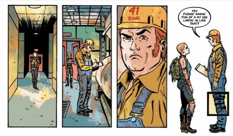
“After a 15-year stint in prison, disgraced former detective Samantha Vega works as a bouncer. But when she discovers the exotic dancers in her care are in danger, Vega must decide if she’s willing to risk her freedom to help the people with nowhere else to turn.”

Writing & Plot

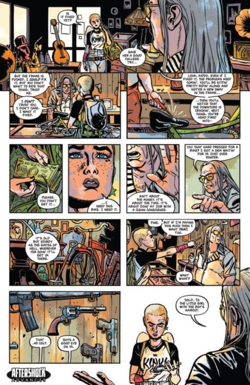
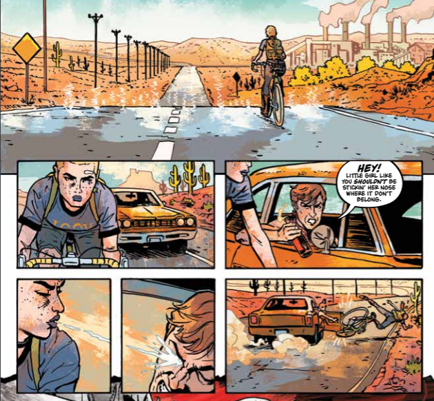
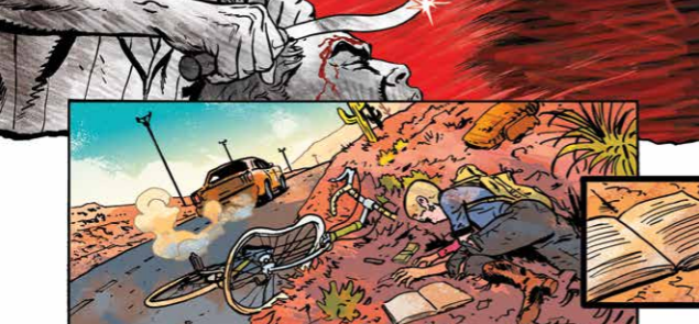
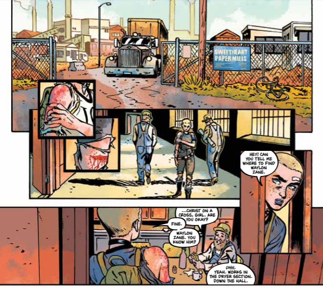
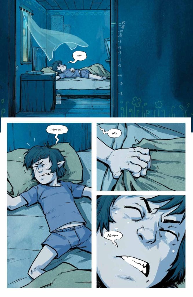
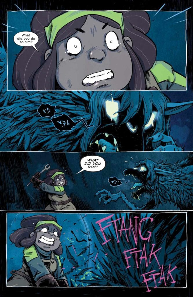
Wagner and Hillyard do a great job of maintaining a sense of familiarity to these characters and this story for those who had read The Ride previously, while also crafting a story for readers whose point of entry is Burning Desire. The script offers brief but effective windows into Samanta Vega’s past and why she was in prison, but it never becomes a point of such focus that it detracts from the here and now. Vega herself is a kickass protagonist – flawed, but good-natured and always ready to finish a fight. Jumping into this world of Unicorn onesies, old grudges, and crooked cops (topical, eh?) is a simple blast of an experience due to the sharp storytelling and unrelenting humor. The um… unusual cast of characters that make up the crew of the Burning Desire are each noteworthy characters in their own right, not only aiding Vega in her mission to save a young girl from the demons of her past but as characters in their own stories. Each of the club’s dancers has their own short going over their background and how they got to the present, and each story is brought to life by a rotating team of guest artists and storytellers. This list of talent includes Adam Hughes, Cully Hamner, Tomm Coker, Chris Brunner, and Doug Dabbs, and each creator brings their own style to the table for an anthology that offers varied but fitting tales to the main story. Despite its obvious absurdity, this comic has a lot of heart as well. The attention paid to the whole cast makes them all almost instantly likable, and this ends up in scenes that can be wholesome, or cathartic, or sometimes emotionally devastating. If I had to pitch this comic to a friend, I’d say it’s like a neon-colored  Sin City. I mean this in a completely positive manner, as this comic’s written delivery is a brilliant exercise in balancing effective character writing and absurd humor and wrapping it all up in a grindhouse-noir paint job.

Art Direction

The shifting visuals of  The Ride: Burning Desire are brought to life by Daniel Hillyard and colorists Laura Martin and Charlie Kirchoff for the main story, as well as the previously mentioned list of guest artists for the character shorts. Hillyard’s pencils offer a simple, almost cartoonish sort of design that works very well for the kind of comic  The Ride is. Anything more stylized would have robbed the serious moments of their gravity, while anything more geared towards realism would have made the tone harder to parse. There’s a focus on character in Hillyard’s art that makes interfacing with each character an easy task for the reader (the good guys look lovable, the bad guys look like assholes). The “Burning Desire” story looks superb, and this is all in part to the vibrant work of colorists Martin and Kirchoff (whose mid-series switch is impossible to notice).

Every bit of the guest art is superb as well, and all offer wildly different styles to separate themselves from both the main story and the work of the other artists. Adam Hughes work in “Sparkles” brings his usual gorgeous soft textured work to the table in what’s probably the outright “prettiest” art in the book. Chris Brunner and Rico Renzi’s “Ash” story offers excellent character detail and stark imagery to a story of childhood trauma. Cully Hamner and Nayoung Kim’s work in “Foo” (my favorite character) uses dark shades and Hammer’s heavily textured pencils to bring to life the most unsettling story in this mini-series. “Nun” from Tomm Coker is the most visually striking story of the bunch, using stark black and white imagery to tell a short grindhouse tale full of venom and attitude (I half expected Frank Miller’s Marv to come rumbling into frame at any moment here). Finally, Doug Dabbs’ art for “Arnie & Albert” is the most unconventional, and it works brilliantly for the completely out-of-left-field psychedelic trip this short is. This whole series is lettered by Ed Dukeshire (who also worked on  Blacking Out), whose consistent lettering talent offers fantastic voice context for every scene and situation this comic covers.

The Ride: Burning Desire is a grindhouse comic with as much goofiness as it has heart. Underneath its cast of lovable weirdos and potentially cursed muscle cars, this is a noir story of bad people trying to do what’s right by the people they care about. Doug Wagner, Daniel Hillyard, and every other talented artist and storyteller that contributed to this mini-series have had their unique hand in creating a little gem of noir storytelling in comics. If this seems like your kind of ride, pick up the trade paperback now from your local comic shop.


Monkeys Fighting Robots Youtube

Image And Diamond Partner To Benefit Comic Shops By Reviving THE WALKING DEAD

Negan Lives #1, cover

In a surprise press release from Image Comics, The Walking Dead will be returning to comic shops this July in a special one-shot titled NEGAN LIVES #1. Written by the series creator, Robert Kirkman, with art by Charlie Adlard, NEGAN LIVES #1 is an all-new story chronicling the titular character’s adventures since the events of THE WALKING DEAD #174.

This surprise one-shot is intended as a ‘thank you’ and show of support for comic shops hit hard by the COVID-19 lockdowns. The support is both symbolic and financial as all shipping costs by Diamond will be waived, and 100% of the sales go to the shops selling the book. You can read the press release in full below.

Is this the best surprise comic shops could have hoped for? Do you want to see other publishers follow suit? Let us know what you think in the Comments section, and share this post on social media using the links below.

THE WALKING DEAD WILL RISE AGAIN IN SPECIAL NEGAN LIVES #1 STORY THIS JULY

The surprise one-shot from Robert Kirkman & Charlie Adlard aims at generating new excitement for comic shops recovering from the COVID-19 crisis

PORTLAND, Ore. 06/18/2020 — The New York Times bestselling, award winning creative team behind The Walking Dead phenomenon—Robert Kirkman (Fire Power, Oblivion Song) and Charlie Adlard (Vampire State Building)—returns to the beloved series for a surprise one-shot story, Negan Lives #1, which will arrive in stores this July.

This shipment arriving in July will be without financial burden to receiving retailers—with no freight cost for them to worry about. “I’ve been inspired by Steve Geppi and Diamond’s efforts to shine a light on how essential the Direct Market is to our beloved industry with their #backthecomeback campaign,” said Kirkman. “While Charlie Adlard and I had laid the series to rest, this felt like something special we could do for the store owners who made our series a success to begin with. To that end, I’m happy to report that 100% of the revenue generated from this book will go to the stores selling it. The retailer community does backbreaking work to get comics into the hands of our loving fans, we should all be doing more in these trying times to show them how appreciated they are.”

Negan Lives #1 will not be available digitally and will be available exclusively at comic book shops. Fans interested in ordering a copy can find the comics store closest to them on Local Comic Shop locator. Many comic book shops are fulfilling orders online and via curbside pickup.

Spurned by a slowly rebuilding society, Negan lives a life of desperate isolation… or does he? In the tradition of Here’s Negan, this all-new story in Negan Lives #1 gives readers a glimpse into what has happened to one The Walking Dead‘s most popular characters in the time since his last appearance in The Walking Dead #174.

As long-time readers of the post-apocalyptic survival series will recall, The Walking Dead #174 proved to be a pivotal point for Negan, as he was tracked down and confronted by a vengeful Maggie, still heartbroken and furious over the murder of her husband, Glenn, in The Walking Dead #100.

Negan Lives #1 (Diamond Code MAR208199) is a 36-page, black and white comic book, available exclusively at comic book shops on Wednesday, July 1. There are extremely rare Gold (Diamond Code MAR208201) and Silver (Diamond Code MAR208200) foil variants of Negan Lives #1 in limited quantities, inquire with your local comic shop for availability and further details.

Negan Lives #1 hits comic book shops on the same day as the Fire Power, Vol. 1: Prelude original graphic novel and the FCBD Fire Power #1 free promotional comic, both by Kirkman and co-creator/artist Chris Samnee.

Monkeys Fighting Robots Youtube

Exclusive AfterShock Preview: UNDONE BY BLOOD #4 – Sami Kivela Does It Again

Exclusive AfterShock Preview: UNDONE BY BLOOD #4

Undone by Blood or the Shadow of a Wanted Man #4 hits your local comic book store July 15, but thanks to AfterShock Comics, we have a four-page preview with a great look at Sami Kivela’s panel design.

The book is written by Lonnie Nadler & Zac Thompson, with art by Kivela, Jason Wordie drops some color, you will read Hassan Otsmane-Elhaou’s letters, and Kivela & Wordie designed the cover.

About Undone by Blood or the Shadow of a Wanted Man #4:
As Ethel approaches the truth about the man who murdered her family, she’s discovering that the justice of the old West isn’t as glorious as fiction makes it out to be. Chasing one fickle lead after another has not paid off. No one can be trusted – a lesson she failed to learn from cowboy legend, Solomon Eaton. And Solomon is in his own heap of trouble, going up against a town full of men who will do anything to prevent him from saving his son.


“Kivela does not conform to any set panel layout. There isn’t an overriding pattern that can be discerned from reading each issue. There are no formulaic nine-panel grids here. Instead, Kivela chops and changes the layout page by page, choosing a structure that suits the scene.” Darryll Robson

Enjoy the preview below.

What other AfterShock books are you reading? Comment below.

Monkeys Fighting Robots Youtube

Eye Grabbing Panels In UNDONE BY BLOOD #3

Undone By Blood #3 Cover
Undone By Blood #3 Cover Credit: AfterShock Comics

One of the things that is often said about comics is that you can do things you can’t do in any other medium. Often this isn’t always obvious because a large number of mainstream comics don’t tend to experiment too much with the format, instead mimicking other mediums to make themselves easier to access. However, there are plenty of comics, published by some of the big named publishers, that push the storytelling boat out. Undone By Blood from AfterShock Comics is one such title.

I have written previously about Undone By Blood and artist Sami Kivela’s clever use of the image to break one panel into many. However, this is only the tip of the iceberg when it comes to the creative techniques that are used in this comic.

Kivela does not conform to any set panel layout. There isn’t an overriding pattern that can be discerned from reading each issue. There are no formulaic nine-panel grids here. Instead, Kivela chops and changes the layout page by page, choosing a structure that suits the scene. On occasions, the narrative may warrant a character comparison, so the panel layouts on given pages will mirror or match previous pages. At other times there may be specific elements of the plot that need to be emphasized; small details that Kivela can zoom in on. There are also specific page transitions that need to be made for the story to flow easily.

Undone By Blood #3
Undone By Blood #3 Page 9 Opening Credit: AfterShock Comics

Inserts and Overlays

One of the techniques used by Kivela to accomplish a number of different narrative tasks is to employ the use of inserts into larger panels or small panels that overlap gutters. These are not simply a quick succession of panels in a tier to increase the narrative pace, although he does do this on occasion (see example above).

The inserts that I am referring to are usually close-ups of an object or part of a scene. These close-ups draw the reader’s attention to something specific in the narrative that plays an important part in a particular scene. They also act as a narrative device themselves to inform the reader of some change either in place, time or as in the following example, a move from one fictional world to another.

The narrative within Undone By Blood is split between two stories; the first is about Ethel Lane, who is looking for her family’s killer; the second is the book that Ethel reads, entitled The Shadow of a Wanted Man. The shift from one narrative to the other is usually pretty clear, especially if you compare the artwork side by side. Kivela uses a different style to render the characters and backgrounds for each story, and the color, by Jason Wordie reflects the two different time periods.

Undone By Blood #3
Undone By Blood #3 Page 9 Closing Panels Credit: AfterShock Comics

Narrative Breaks

The two concurrent stories do not appear on the same page, however, and occasionally the artist signals to the reader that a transition is coming. This signal prepares the reader before a page turn that the focus will shift from one character to another. It acts like a full stop, or paragraph break, and takes the form of a small square panel at the bottom of the page. The panel has a thick border, sometimes white or sometimes black, and the image bleeds to the right of the page. Its other distinguishing feature is that it overlaps the final panel on the page, becoming more prominent.

This form of page ending happens on several occasions in issue 3, and the example from Page 9 (above) highlights how it looks and functions. The page shows Ethel being attacked and knocked from her bike as she scrambles by the side of the road in that penultimate panel on the page the moment is interrupted by a close up of her book. It has fallen from her bag and lays open on the ground, the writing visible (but not legible) on the page. The thick black border makes the panel stand out because it is different from every other panel design on the page. The right of the panel bleeds away into the page turn and takes the narrative into the book on the next page.

Undone By Blood #3
Undone By Blood #3 Page 11 Inserts Credit: AfterShock Comics

Concentrated Detail

These small panels don’t just appear at the end of a scene or a page. Kivela enjoys placing them throughout the comic like a close up in a movie. Single beats that make a quick point, drawing the reader’s attention, and then back to the larger scene. There are three such panels on page 11 that are especially interesting as they work together to enhance an element of the narrative.

After being knocked down, Ethel has followed a lead to a Paper-mill in the hopes of meeting someone who can help her. As she enters the Mill, two overlapping square panels are very similar to the one discussed above. Each panel features a close up image and thick black borders. The difference is that they are solid on each side, contained images that do not lead to something. In essence, they act like bullet points highlighting, in this instance, the injuries that Ethel has sustained.

Her scraped shoulder and bleeding knee not only explain her stance in the panel that lays below, panel four if you will, but they also relate to a third, similar panel later on the page. This third panel is a true insert as it is situated completely in the final panel. It is designed in the same way with a thicker border and acts as a close-up image. The difference is that there is no zoom; it merely emphasizes an element of the image, inviting the reader to take note.

The image is of Waylon’s strapped up leg, denoting an injury of his own. The simple panel border that Kivela places around the leg reinforces part of the conversation that Waylon and Ethel are having but also refers to the top of the page and Ethel’s own injuries. It is making a contrast between the open wounds of the heroine and the old wounds of Waylon. The moment also makes a comment on the freedom of one character against the restraints of the other.

So much is inferred by the one overlapping panel and its relationship to the overall page.

Undone By Blood
Undone By Blood #3 Page 11 Closing Panels Credit: AfterShock Comics

Conclusion

The creative team of Undone By Blood is experimenting with the storytelling possibilities of the comic book medium. Each member of the team is pushing the boundaries of what they can do for the greater good of the comic and the story.

Kivela is not bound by rules, especially those that define other mediums, and instead demonstrates exactly what you can do with a page of panels and images. He thinks about the single panel image and what that has to convey, but he also considers the page and even beyond to the issue as a whole. When you read Undone By Blood, you get the impression that everything matters, and the creators are leading you through the pages, allowing significant clues to sneakily slip by in the background.

The majority of comics aim to engage the readers enough to pick up the next issue. Undone By Blood has so much going on it feels like it’s aim is to get you to instantly re-read it. There is so much to take in; Kivela’s use of small, close up panels is only a tiny fragment.

Undone by Blood #3 from AfterShock Comics is currently on sale at your Local Comic Book Shop.

Monkeys Fighting Robots Youtube

TRANSFORMERS #20: Round Up The Usual Suspects

Transformers

The Rise of the Decepticons event continues in Transformers #20 thanks to Brian Ruckley, Anna Malkova, Joanna LaFuente, and Jake M. Wood. The last issue seemed to lose the velocity from the previous issues. Will Transformers #20 reclaim the flow of recent events or cause it to further grind to a halt.

Summary

Prowl and his team need information and decide to investigate Swindle’s illegal operations for the answers they need.

Transformers

Writing

Something which immediately sticks out about this issue is how characters seem to actually have some amount of personality. Instead of being objects moving a plot forward actual glimpses of characters with conflicts and persona are coming forward. Details such as Prowl keeping a pet, Hound feeling remorse for innocent lives killed by recent events, and Sideswipe being eager to prove his worth display a depth needed in this series. It has often felt like we not getting the chance to connect with these characters and understand what they are like in this new installment of the franchise. Hopefully, more moments like this will be commonplace in the future.

There is a sense the story Brian Ruckley introduced back in issue #1 is moving towards wrapping up. Frankly, this ending is way overdue as the murder of Brainstorm seems less important than the other issues such as large scale destruction and widespread civil unrest have appeared since the first issue. The mystery of why Brainstorm was murdered needs to be solved so the audience can move onto bigger things.

Artwork

The art by Anna Malkova sells the stress and frustration the characters are under. Looks of pain and exhaustion are prominent on Prowl and Hound and illustrate just how much recent events pushed them to the breaking point. There also is a great splash page in Swindel’s illegal casino filled with some recognizable faces from previous incarnations of the series.

The colorwork by Joanna Lafuente suceeds in making the scenery pop. The darkness of the alleys where Prowls team meets, to the ominous golden glow from inside Swindle’s casino helps to make the energy of the setting come through much clearer. Also, the coloring nails the unnatural power Mindwipe has at his control.

Transformers

The lettering by James M. Wood finds a way to meld perfectly with the artwork in many deceptive and impressive ways. Too often sound effects are thrown on and end up becoming more of a hindrance than adding to the action of the story. In this issue, Wood hides the effects in energy attacks and speed lines to not distract from the rest of the panel.

Conclusion

Transformers # 20 offers a bit of depth and a bit more progress in the overarching plot. Still, moments of promise have appeared before. The groundwork of setting up the tension of the world of Cybertron has been laid. From here on out, the fans deserve to see some powerful and truly fulfilling moments.

Monkeys Fighting Robots Youtube

Rock Out: DARK NIGHTS DEATH METAL Music Video Arrives

Dark Nights Death Metal

After all the teases and all the waiting, Dark Nights: Death Metal is finally here. To commemorate the release of the first issue by Scott Snyder and Greg Capullo, DC Comics has revealed an “equally epic” music video.

Check it out below:

Monkeys Fighting Robots Youtube

JOKERS Wild: DC Offers Free Souvenir Playing Card

Three Jokers card

DC Comics just gave fans another reason to pick up Three Jokers in August: each issue will now include a free souvenir playing card illustrated by series artist Jason Fabok.

Here’s the official word:

GET A FREE COMMEMORATIVE PLAYING CARD WITH EACH ISSUE OF

BATMAN: THE THREE JOKERS!

In celebration of the highly anticipated Batman: The Three Jokers prestige miniseries, DC and participating comic book stores are dealing fans the ultimate wild card by offering a free with purchase souvenir playing card for each of the three issues of the series, while supplies last.

Featuring breathtaking new artwork by series artist Jason Fabok, each issue of the Geoff Johns-penned series will feature a different card, spotlighting the Clown Prince of Crime and his three major adversaries – Batman, Batgirl and Jason Todd.

Batman: The Three Jokers reexamined the myth of who, or what The Joker is, and what’s at the heart of not just his eternal struggle with Batman, but how his horrific treatment of Barbara Gordon and Jason Todd has affected them. Arriving at open and operating comic book stores on Tuesday, August 25, the series will carry DC’s “Black Label” content descriptor, identifying the series a appropriate for readers 17+.

Three Jokers card

Monkeys Fighting Robots Youtube

AFTER REALM #2: The Origin Worthy of Simonson

After Realm #2 Cover

After Realm #2 out this week from Image Comics provides an epic backstory to the series’ main character before really going into the mythic main series. In fact, this issue would make epic comic creator Walt Simonson proud.

Recap

After Realm is a post-apocalyptic story where the event of Ragnarok wreaks havoc with Loki’s release, his releaser, the elven ranger Oona must now journey throughout Midgard to discover the fate of the Old Gods.

After Realm #2: The Origin

Last issue Michael Avon Oeming shows Midgard in chaos with trolls and the Statue of Liberty alive. All while Oona struggles to keep herself and her bird friend in one piece. But where does it all begin in After Realm #2? Why in a flashback Oona dramatizes of course. Readers can tell from the dialogue of the younger Oona that the present version isn’t too fond of this part in her life. However, there’s a colorful contrast to all of the bleak moments. A child’s naivety can lead to optimistic ideas to combat grimdark settings.

After Realm #2 and its conflict with Loki goes to lengths to show how Oona’s struggles react to her identity. Not able to fit in, she makes a startling discovery about her parentage. But that doesn’t stop her from trying to make what little friends she can or let Loki do as he pleases. However, there’s a flaw in how the series goes into details you would need Norse mythology knowledge for. Like Loki’s love for his wife or the goat that transports Thor. Good for people familiar with Marvel Thor, especially Oeming’s take, or Walt Simonson, but not so much for everybody else.

A Familiar Creative Team

After Realm #2 features scenes of intense emotion such as the facial language of young Oona’s eyes. The look of shock at seeing her friend expresses a perfect state of mixed emotion. Along with the breathtaking landscapes, a reader could return to the pages just to take it all in. Thankfully Oeming’s wife and colorist, Taki Soma helps make those images memorable while keeping the reader on track. Something as simple as Oona’s red hair against the blue backgrounds helps guide the reader through.

Which along with Shawn Lee’s lettering helps keep the emotional intensity up. The part where Oona convinces herself that her ploy against isn’t a trick by repeating words as they enlarge and embolden displays this. In addition, Loki’s red word balloons act as a reminder of his clash with Oona. At least until his emotions run high and they can’t be contained.

After Realm #2 Is The Abridged Ragnarok

Oeming instills pure passion into After Realm #2. By setting up how the main character sees herself and how she operates, the reader finds an enjoyable romp. All the better thanks to the mythic tone through the coloring and lettering. In any case, if you’re mythology buff like Oeming or Simonson, you just might like this.

Monkeys Fighting Robots Youtube

Review: WYND #1 – Coming Of Age In The Age Of Magic

Wynd #1, Dialynas cover

WYND #1, available from BOOM! Entertainment on June 17th delivers the story of a magical, LGBTQ+ teenager who hides his identity from forces that want to purge Pipetown of magical beings. James Tynion IV and Michael Dialynas have crafted a new story that’s a mix High Fantasy, a dash of Steampunk, and current year coming-of-age all in one.

Cover Art

Michael Dialynas’ cover is a strong encapsulation of the titular character’s free spirit and energy. In the story, Wynd chooses to live among the humans but likes to run a little wild when the opportunity strikes. Since Dialynas also drew the interiors, the art is as consistently light and optimistic as the story itself.

Writing

Tynion IV’s story is an original concept that leaves you with more questions than answers. It sets up the world, the characters, and the social conflicts deftly while still leaving you wondering, “How did we get here?” and “Where are we going?”. Wynd, the titular character, is of magical heritage, and any magical being is forbidden from living in Pipetown. Banning magical creatures is apparently the result of some past conflict – possibly a war – that’s mentioned but never explained. Wynd hides his pointy ears to “disguise” his magical origins so he can remain in Pipetown and live out his days in peace, working at the local diner as a busboy.

The straight-forward premise is further complicated by Wynd’s affection for the son of the royal gardener, Thorn. Affection might not be the best choice of words here because in actuality, Wynd regularly goes off to ogle the sweaty, shirtless Thorn from a nearby rooftop using a telescope. It’s an understandable move from somebody who’s wrestling with their identity in more ways than one, but it’s still a creepy move on its surface. It’s unclear if Thorn is even aware of Wynd’s existence, and Thorn clearly expresses some level of affection for the Prince, as the two have been friends and confidantes for some time. This pseudo-love triangle is flawed, but made all the more relatable and realistic because of its flaws. That said, the ages of the characters are undetermined, and depending on the panel and page, Wynd looks like a young boy barely over twelve, making his ogling habit, and the overall romantic aspects of the story, a bit uncomfortable to read.

Does the story work? It’s tough to say with just the one issue. It’s certainly well constructed with organic dialog, but the future potential of the plot is unclear. I will say that I’m intrigued to see where Tynion goes in issue #2. Keeping a reader to hooked enough to see what happens next is the best compliment for a #1 issue.

Pencils/Inks

Dialynas’ artwork is light, colorful, and playful. It’s very reminiscent of reading a child’s book, although the subject matter is not wholly for children. Regardless, the child-like, verging on cartoonish designs of the characters infuse the story with elements of whimsy and innocence. It’s the type of artistic style that would likely translate very well to film and fit right in with Netflix’s The Dragon Prince or The Seven Deadly Sins.

Regarding the main character, Wynd, his design is innocent and impish without any hint of mischief. From the first panel, you know something deeper is going on with Wynd’s magic, but he doesn’t know what it is. (Yet another question for the reader to hold on to for the next issue.) But at no point is Wynd threatening to the ones around him. His facial expressions and overall demeanor smack of a teenager trying to figure himself out.

While Wynd is imminently relatable and likable, there is one aspect of his design that didn’t quite make sense. The townsfolk are on the lookout for magical beings, identifiable by their pointy ears. Wynd not only has pointy ears, but he has chalk-white skin and deep navy blue hair. In short, pointy ears are the least standout aspect of his design. If the townsfolk were truly watching out for somebody “weird,” Wynd wouldn’t make it two steps outside his home before getting tagged. In isolation, Wynd’s design suits the design of the world well. Contextualized in the plot of the story, it doesn’t make much sense.

Coloring

Dialynas’ coloring is likewise perfectly suited for the world Tynion built. Blue skies are bright and cheery. Wynd’s chalk-white skin reflects the shades of his surroundings — going from neutral white in the sunny outdoors to dreamy blue in the nighttime panels. There’s a lot of attention being paid here to the assortment of flesh tones and shading on each character, and it pays off.

Wynd #1, color sample

Lettering

I’m always awed when a letterer finds a way to visualize a sound effect for something that doesn’t actually exist, and yet, makes you imagine that the sound is accurate. Aditya Bidikar’s lettering pulls off just such a feat with unique sound effect lettering that underscores great imagination. What does it sound like when you hit a gryphon with a crescent wrench? I have no idea, but the lettering for those sounds are in this issue, and it completely works.

Wynd #1, lettering sample

Conclusion

WYND #1, out now, is a promising start to a completely new property. The art is whimsical and fun, and the story starts a lot of threads that begs more than a few questions. I’m looking forward to seeing what happens in the next issue. Would recommend.

Monkeys Fighting Robots Youtube

Review: THE CROW: LETHE #2 Pits Harbinger Against Scavenger

The Corw Lethe #2, Momoko cover

THE CROW: LETHE #2, available on June 17th from IDW Publishing, pulls away the veil of Null Narcos’ amnesia to show him his purpose as the latest Crow. Unfortunately, denying his memories and past opened the door for a scavenger to kill Null’s friends. It’s un-dead against un-dead in this violent and bloody (good) issue.

Cover Art

Peach Momoko’s cover captures the right tone of goth flavored with sideshow freak. Narcos wearing the Western hat, combined with bird bones, evokes a distinctively ‘cowboy’ feel. And the general WANTED poster composition perfectly reflects the nature of the story inside.

Writing

Tim Seeley’s story works by playing with the fringes of reality. We know there are traveling sideshows that exist and wander through the lonely towns of America. We know those sideshows offer acts that surprise, titillate, and repulse. So Seeley’s world, although populated by a collection of bizarre characters, lingers right on the periphery of what’s real.

Null Narcos, the latest Crow, has been arrested for Bust’s murder. His interrogation, and subsequent lockup with Benga, forces Null to face the memories he’s been avoiding. The new knowledge gives Null his purpose in resurrection and reveals the origin of the real murderer.

Without spoiling anything, this issue was surprisingly gory. Null’s awakening is voluntarily brought on by pain and violence, and the big battle between Null and the villain is probably the most creative use of circus tent poles I’ve ever seen. You learn a little bit about the Crow’s backstory, you get a little insight into what happens when the Crow avoids his duty, and you get a pretty kickass fight scene. All in all, a solid issue by Seeley.

Pencils/Inks

Ilias Kyriazis’ art is exploitative without being cheap. All of Kyriazis’ character designs keep their oddities on full display. You see the armless woman (“Stalk”) in all her glory, and she’s treated as just another person with an unusual difference. Likewise, Benga’s tiger stripes and Masterpiece’s emaciated frame all combine to form a motley crew that appreciates Null for his unusual look while effectively hiding in plain sight.

The Crow Lethe #2, art sample

Likewise, Morgrau’s design looks just like you would expect a scavenging vulture to look like in human, albeit un-dead, form. The use of a bomber jacket works just as well here as when Michael Keaton used it for a similar effect in Spiderman: Homecoming. The net effect is the visage of a surly bird of prey that’s equal parts tough and deadly.

Coloring

Katrina Mae Hao’s coloring is top-notch in this issue. Contrary to previous Crow incarnations and O’Barr’s original B&W compendium, the main character is typically cast in dark shadow in gritty urban scenes. In this issue, Hao is tasked with coloring the sunny, dusty back roads of the American mid-west while still keeping the Crow’s signature style sufficiently glum. The colors of every scene are vivid, and the blood, when it starts to copiously flow, is shockingly red. Hao also uses the blood’s red brilliance to highlight silhouette scenes when Null and Benga perform their stage show. It risks coming across as schlocky and cheap…but it doesn’t.

Excellent work here by Hao.

Lettering

Samuel Murray’s lettering is most effective during Null’s dream/vision sequence. In the scene, Null is getting lectured by Death(?) about his mistakes and what he needs to do to correct what’s happening. The scene is drawn and colored like an old. B&W film, so Murray’s choice of reverse bolding and placement adds the right flare of disembodied voice, tinged with death and gloom. It’s a great choice of lettering that keeps the scene moving when the reader is pulled out of the action in the middle of a big fight scene.

Conclusion

THE CROW: LETHE #2, available on June 17th from IDW, pulls you into a world that’s almost real for a thriller filled with truly evil villains and big, bloody battles. The characters are bizarrely fascinating, and the art team hits all the right notes for a Crow story. Worth picking up.

Monkeys Fighting Robots Youtube