Home Blog Page 298

Review: IRON MAN 2020 #4 Builds Towards Greatness

Iron Man 2020

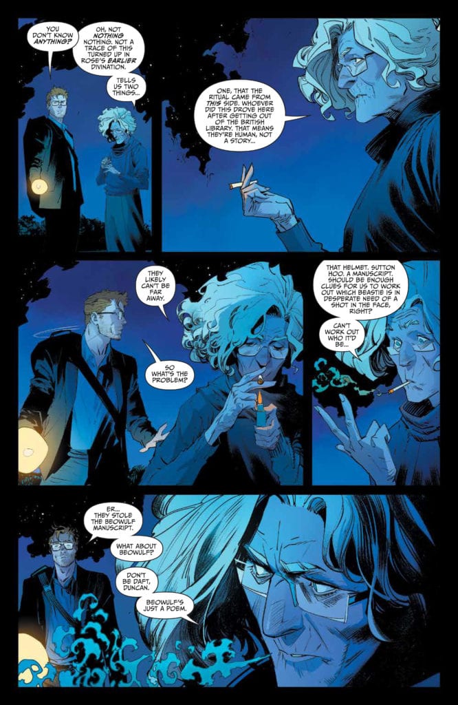
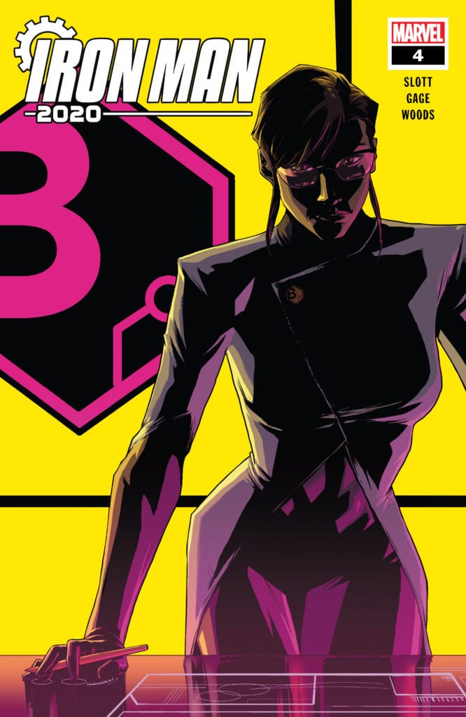
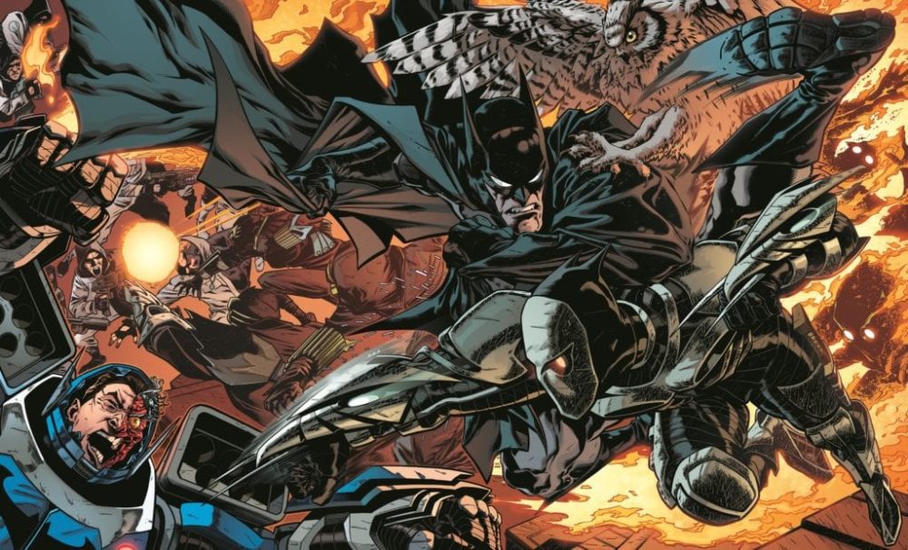
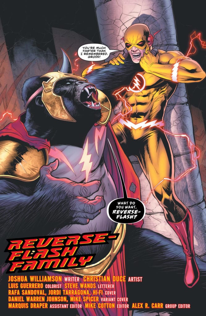
The robots are on the run in Iron Man 2020 #4, and Dan Slott, Christos Gage, Pete Woods, Celeste Woods, and VC’s Joe Caramanga deliver an incredible issue full of both visual wonder and plot development. After the events of the previous issue, Arno Stark has removed the most significant threat on his quest to eliminate all the rebellious robots in the world. What events could be happening behind the scenes to throw a wrench in his plans?

Summary

Arno Stark seems like he is on the precipice of absolute victory. Sadly, he’s about to have some setbacks thanks to his cloned parents and his comatose brother, Mark-1.

Iron Man

Writing

Arno keeps having villain moments without officially wearing a sign reading, “I am the new Doctor Doom.” This time around, his callus nature is put on full display by how he interacts with his parents and how he treats Sunset Bain. Sure the first issue of this series established he has an alien threat he needs to defeat, but he could accomplish this without treating everyone around him like crap. It’s painfully obvious at this point we were never even remotely supposed to consider Arno as a permanent replacement to Iron Man.

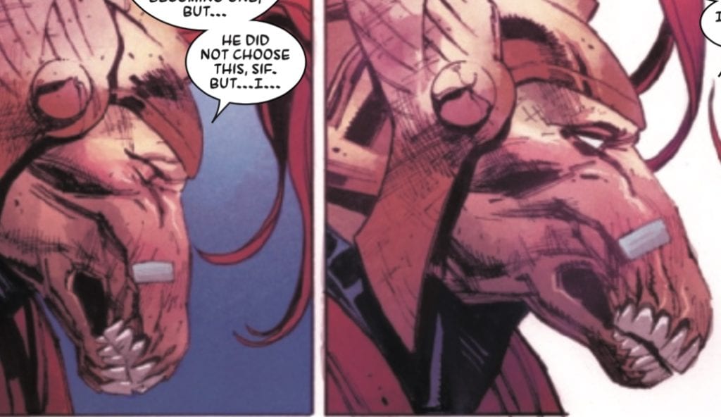
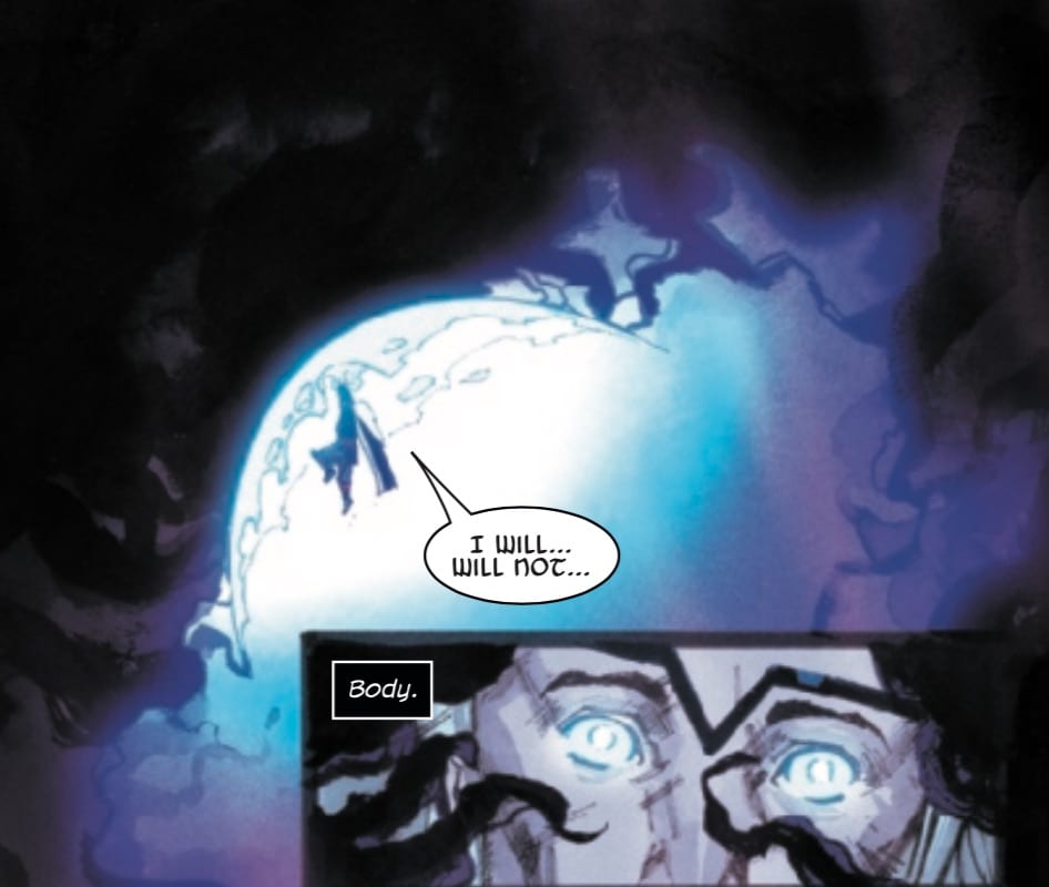
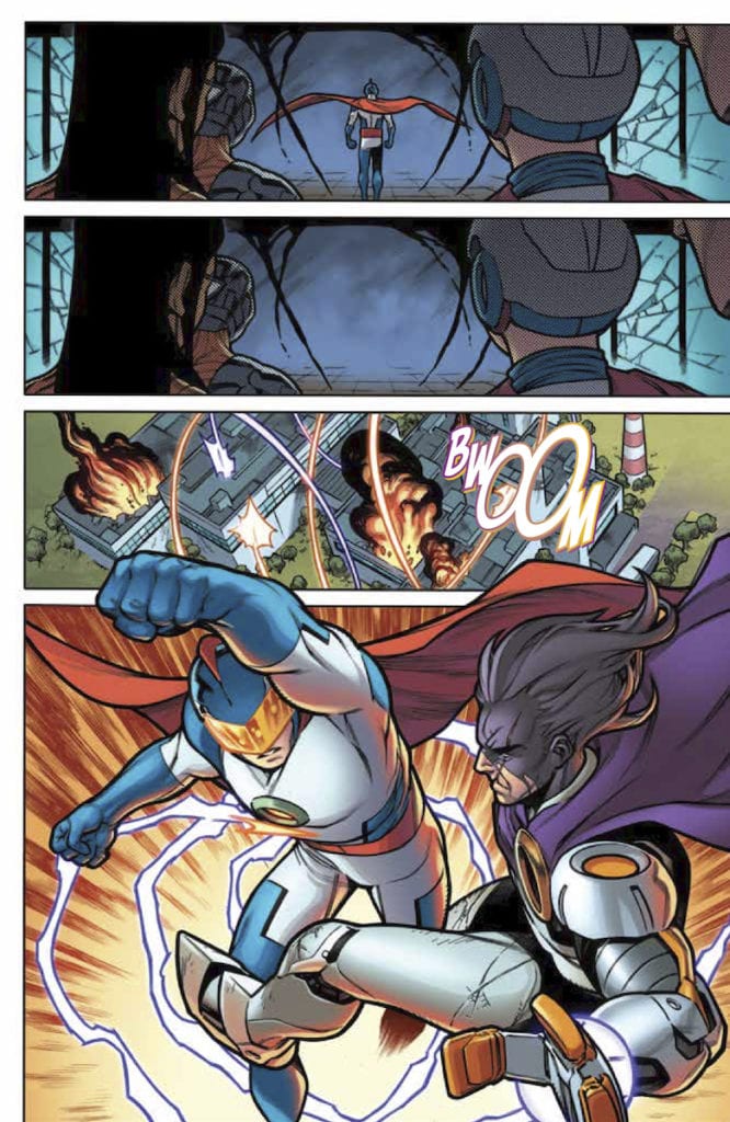
Meanwhile, after the devasting blow he suffered in the previous issue, Mark-1 becomes comatose and gets lost in his memories. This is a classic staple with Iron Man comics, where Tony finds himself injured, has flashbacks, and allows for the character to reflect on what makes him a hero. Slott and Gage take the time to help Mark-1 get over the issues which have plagued him since the 2020 event began with the help of a friend. All of it leads up to a final page, which has to be seen to appreciate.

Iron Man

Artwork

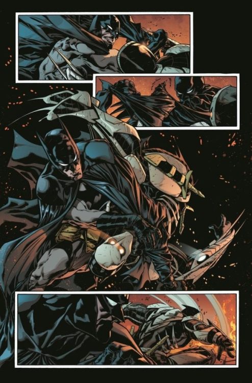
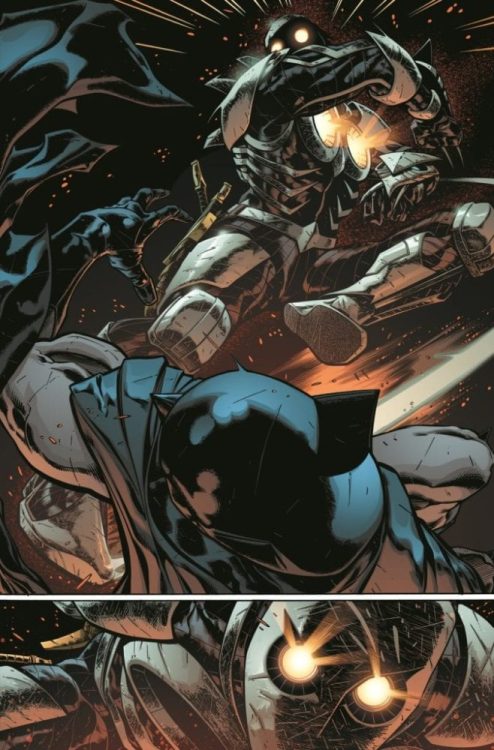
The most appealing thing about Woods’ art in this issue is how it’s used to showcase the dive into Tony Stark’s Mark 1’s mind. Moments of his life through fragment, including him donning the armor and the Avengers assembling for the first time, are easily recognizable thanks to his art. Again, the final page can’t be undersold, and the art helps to bring it all together.

The colorwork by Woods adds to the fantastic elements and effect as they dive into Mark 1’s subconscious. Through the right use of colors, the reader can feel themselves being drawn into the depths of Mark 1’s journey. It also helps to sell the ominous nature of Arno Stark’s Iron Legion, an army of remote-controlled robot killing machines (but he’s totally not evil or anything).

Iron Man

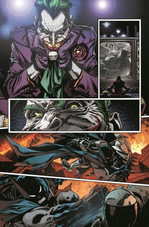
The lettering by Caramanga helps to push the soundtrack and direction of the comic. From panel to panel, carefully placed fonts and styles give the story a sense of sound. This is especially true as when different versions of Tony Stark from throughout start to chime in and the speech bubbles imply one of them is when Tony was struggling with his alcoholism.

Conclusion

The power of a good comic can put a smile on your face and make you remember hope springs eternal. Is Iron Man 2020 #4 a perfect issue? No, but it offers a feeling of positivity, which is a win in itself. With all the chaos happening in the world today, everyone could stand to have a few more victories.

Monkeys Fighting Robots Youtube

DC Preview: DETECTIVE COMICS #1024 “Joker War” Prelude

Detective #1024

Each week brings us closer to the “Joker War” storyline in the various Bat-titles, and DC continues to tease some of the dramatic events on the horizon. This time they’ve got a preview of Detective Comics #1024, featuring another longtime Batman foe. What exactly does Two-Face have do with the Clown Prince of Crime?

Check out the official description and preview art, including Lee Bermejo’s variant cover for the issue:

DETECTIVE COMICS #1024

Written by PETER J. TOMASI

art and cover by BRAD WALKER and ANDREW HENNESSY

Card stock variant cover by LEE BERMEJO

In this prelude to “Batman: The Joker War,” the story of Two-Face reaches its end, and Harvey Dent will at last find peace after decades of schism. But will that peace be in death, or in the chance at a new life?

All along, The Joker has been the puppet master behind the torment of Two-Face, and in this issue, the Clown Prince of Crime definitely knows how to make an entrance! Don’t miss the final battle between Batman, Two-Face, and Lincoln March, with a shocking conclusion that’s sure to split you right in two!

ON SALE 07.21.2020

$3.99 US | 32 PAGES 

CARD STOCK VARIANT COVER $4.99

Monkeys Fighting Robots Youtube

Review: Thawne Creates A Flash Family in THE FLASH #756

The Flash 756 cover

The Flash Families Form

There is a new war between Flash and Thawne coming. After setting aside their differences, Barry and his nemesis from the future took on Paradox. The villain threatened the very timeline by removing the Flash with the help of Godspeed. Barry frees the villainous speedster and proceeds to distract the time-breaking villain as Thawne heads back and averts the accident that created Paradox in the first place. The trio of speedsters escape the realm of Paradox, and the Flash Age is saved. Just when everything seemed to be going great, Reverse-Flash kills Godspeed and swears to create a Flash Family of his own. Will Barry be prepared?

The Flash 756 cover

**Some Spoilers Below**

Story:

Barry is still reeling from the end of the Flash Age. As he mourns to his friend/enemy, Godspeed, he begins to mentally prep himself for the coming battle. He first tells Iris that she has to lay low for the coming battle. She finds this suspicious as Barry runs off to find the young speedsters. After telling them to run, Barry prepares for his confrontation with Thawne.

Meanwhile, Reverse-Flash travels to the past and begins recruiting Flash villains. After he recruits Grodd, The Rogues, and Turtle, he heads to the future to recruit two dangerous villains to his cause.

The Flash 756 p1

After the explosive ending last issue, we take it down a few notches for this one. This issue is hinting at a coming battle between Barry and Thawne, which will likely lead to Thawne’s death(again). This time around, however, we get the hype that this will be an all-out throwdown with the entire cast of the Flash series. The biggest surprise, however, comes from the villains Thawne picks up from the future. While this reviewer will be keeping it a secret, I can already tell this is going to be one hell of a game-changer.

The problem of the issue comes from the basis that it is just hyping up the next arc. There isn’t much else to it. Sure we get what both Flash and Reverse-Flash are thinking, but there isn’t a huge action set piece and is mostly just discussion. While that usually isn’t a problem, it wouldn’t have hurt to have some excitement in the issue. There is drama building that will make for nice character building in the not too distant future, but as it stands alone, it’s a bit boring.

Art:

Christian Duce provides his usual fantastic art for this in-between arcs chapter. His designs for all of The Flash’s villains are excellent, with the highlights being the surprise future villains. Along with the visuals for the powers used, Duce is able to capture the emotions of the slower scenes. You can feel the frustration with Barry radiating off the page. I don’t just mean the anger, but the sadness and regret as well. The illustrations are able to convey emotions from everyone exceptionally well. The only thing that makes it better is the fantastic vibrant colorwork of Luis Guerrero, which has characters pop off the page. A great team effort for a great looking book.

Conclusion:

Overall, this issue isn’t a terrible follow up to Flash Age, but it could have been better. Big arcs can get a pass for a slower, emotional issue, but they need to be game-changers. With the finale being subpar, it just felt like a boring follow-up. The art team did a fantastic job for the comic, all grievances aside. I hope this team returns as we enter this next arc. There is a lot of promise to be seen here, but I’d rather it now then promised later.

Monkeys Fighting Robots Youtube

Review: Rivals Clash And Secrets Revealed In STAR WARS: BOUNTY HUNTERS #3

Star Wars Bounty Hunters #3, Bermejo cover

STAR WARS: BOUNTY HUNTERS #3, available from Marvel Comics on June 24th, pits Bossk against Valance in a battle to the death for Nakano Lash’s location. Ethan Sacks’ story picks up right in the middle of the action from issue #2 (read our review here), with the two bounty hunters locked in mortal combat. Paolo Villanelli’s art brings the story to life with an action-heavy issue that answers the key question about Nakano Lash’s betrayal: Why?

Cover Art

Lee Bermejo’s cover stands as a strong representation of this issue’s central conflict. With the exception of a few sub-plot panels and the big reveal at the end, it’s all Bossk and Valance duking it out. Bermejo’s art is strong realism with excellent us of texture. Bermejo’s signature style captures the little bumps and curves that bring a character to life, and that style is on full display with the cover.

Writing [No Spoilers]

Now we’re cooking with Midachlorians!

Ethan Sacks put together a fast-paced, knock-down, drag-out fight between Bossk and Valance. Rather than a simple blaster battle, Sacks used the opportunity to showcase how Valance’s cybernetics give him an extra edge as a bounty hunter with some “I didn’t know he could do that” moments.

Meanwhile, we get a little flashback action showing how Nakano Lash assembled the team she would ultimately betray. Flash forward to now, and we finally (partly) get the answer to why Nakano Lash killed the team’s client and went into exile. Valance is already positioned as the series anti-hero protagonist, so it will be interesting to see what Sacks will do with the characters once Valance learns of Nakano’s secret.

Pencils/Inks

Paolo Villanelli deftly handles the action in this issue with expert execution of momentum. Valance’s cybernetic fist slamming into Bossk’s jaw. Valance getting flung backwards into a wall. General Vukorah mercilessly gunning down the spice smugglers. Nearly every panel is a visual feast of deadly speed and momentum with things hitting things. Villanelli’s action art practically crackles with energy.

On the flip side, the quiet, conversational moments with Nakano Lash, as she plans to make her return, are filled with deep, deep shadow. Villanelli’s choice to reserve the deep shadow for Nakano’s scenes heightens the dramatic effect of her conversations that separate it from the main story with Valance, and it heightens the mystery of the changes that have happened to her since she left.

Coloring

Arif Prianto’s coloring style is highlighted best in the light sources: lens flares, sunbeams, explosion bursts, and cybernetic eyes. Every light source glows with brightness and heat, giving the action sequences more energy on top of Villanelli’s dynamic art.

Lettering

Travis Lanham’s lettering excels in complimenting the art and coloring with excellent use of contrast. The explosions are big and bright, so the bombastic and heavily-bordered lettering accentuates the SFX rather than getting lost in the visuals. Lanham’s lettering is impact on top of impact, which makes every panel feel bigger.

Conclusion

STAR WARS: BOUNTY HUNTERS #3 unveils the answer to a lingering mystery and turns the action up full blast. The art is exciting, and the story engages the reader equally well in both action and dialog. The story is finally kicking into high gear, and I’m looking forward to seeing what happens next.


Monkeys Fighting Robots Youtube

DOCTOR TOMORROW #3 – How The Multiverse Puts Things Together

DoctorTomorrow #3 Cover

Doctor Tomorrow #3 after Valiant’s long hiatus returns this week with a head-turning issue. But is it enough for readers to get back on track after the pandemic hold? In a comic about subtle context, it just might be possible in the multiversal lotus.

Recap

15-year old Bart Simms encounters his older superhero self, Dr. Tomorrow, who needs help defeating his archenemy Hadrian. So Tomorrow recruits Bart and (somehow) the Valiant Universe to stop him from destroying their world.

Doctor Tomorrow #3 Story

Doctor Tomorrow #3 wastes no time when it comes to driving the plot forward. Yet it’s still somewhat strange how the Valiant superheroes are on board with this. It’s very sudden, and they might come across as mere plot elements than characters. But no one can deny that the battle with Hadrian isn’t essential considering what happened in the first issue. Yet it’s how the Doctor fights against Hadrian that reveal their motives. Like when Bart’s failing in his attack, the Doctor holds him by the neck to continue. Neela is right to be surprised by this to the point of asking Hadrian’s story. Because as it turns out, these events happened before; something that Bart pieces together from just Hadrian’s words.

Alejandro Arbona has this context serve a dual purpose, both as character-driven exposition and as Bart’s Hero’s Journey. In this way, Hadrian serves as a helper and unwitting mentor the way he was with Dr. Tomorrow. One that drives both Barts into the Abyss, but only the Doctor ends up metaphorically dead. Bart, however goes through the rebirth and transformation phase. It’s a pretty interesting dynamic despite the series rushing this formula.

Artwork

Doctor Tomorrow #3 dynamic scenesJim Towe keeps up a very good art style in Doctor Tomorrow #3 that keeps up with the pace of Arbona’s writing. The simple act of making subtle changes creates great dynamics in big action scenes. Yet it’s the facial features that make the biggest impact from Neela’s reaction to Dr. Tomorrow’s actions to the faces of Hadrian and Tomorrow as they get burned. It practically says everything about the revelations of these two and how ugly their ambitions are. Compare that to some of the volumes of character outlines of characters who barely even speak.

The colors by Diego Rodriguez and Kelly Fitzpatrick meanwhile have just the right amount of contrast to make sure the emotional scenes have weight. Otherwise, without Towe’s inking, some of the colors would blend.

Lettering

Clayton Cowles’ lettering, for the most part, mirrors the artwork of Doctor Tomorrow #3. Some of the word marks combine color outlines to display the clash between the Doctor and Hadrian. Other wordmarks have weight with their size and texture that accent a punch to the face. Even the word balloons flow nicely between where to guide the reader although there are a few minor errors like when the Eternal Warrior speaks up with a command that previous panels display come from Doctor Tomorrow.

Doctor Tomorrow #3 Has Its Strengths

Doctor Tomorrow #3 is not a perfect issue, especially if you take it at face value. With a plot that moves for its own sake, it’s easy to overlook how the series interweaves a narrative. The subtle writing techniques and changes in art hold a decent amount of weight when it comes to the decisions Bart makes. This series shows how the formula of the Hero’s Journey can be more than just a superhero formula. Self-reflection is an important theme, one the absurdity of superheroes uses to its finest.

What do you think? Is this series in too big a rush, or is there something to all of this? Leave your thoughts in the comments.

Monkeys Fighting Robots Youtube

Review: The Golden Girls Stop the Apocalypse in ASH & THORN #1

Writer Mariah McCourt and artist Soo Lee join forces to create a comic about a pair of retirees charged with saving the planet from Lovecraftian annihilation in “Ash & Thorn” #1. With colors from Pippa Bowland and letters from Rob Stein, this first issue offers an intriguing and lever start to this comedic horror comic, despite some missed opportunities in the writing and plot.

“The apocalypse is nigh! The world needs a Champion, and the only heir to a sacred mystical lineage is…a little old lady? Meet Lottie Thorn, reluctant savior of the world, and her also-elderly trainer Lady Peruvia Ashlington-Voss. They might not look it, but these women are prepared to take on any Big Bad that comes along. But first, perhaps a nice cup of tea?”

Writing & Plot

Mariah McCourt‘s self-proclaimed mixture of  The Golden Girls and  Buffy the Vampire Slayer in “Ash & Thorn” #1 is a clever and inviting premise. The overt comedy and irony of this pair of old women tasked with defending the world from eldritch horrors while bickering and baking makes for a charming read. The dialogue between the two leads is sharp and fun and sells the notion that these are two very different women. Peruvia stammering out spells and instructions while Lottie bashes giant spiders over the head with an iron skillet is a good time. The arch-villain seems like a stereotypical doom-and-gloom monster at this stage, but that’s perfectly okay for a comic such as this. Despite the positives here, it has to be said that there was a missed opportunity with this opening issue in terms of character building. The comic shifts between starting out a week after the two leads meet, and the exact moment when Peruvia came to Lottie in the first place. While origin and training montages are an old cliche, such sequences would have worked wonders in developing the plot and shaping the dynamic between the two women. As it is, the story itself feels a bit rushed and scattered. This could have been a decision based on the fact that this is only set to be a 5-issue mini-series and fitting so much story in that span can be a challenge, but it is worth noting. Regardless, this is still a fun experience in the reading department.

Art Direction

Artist Soo Lee and Colorist Pippa Bowland craft a detailed yet suitably lo-fi visual style for “Ash & Thorn” #1. Lee’s pencils provide a neat mix of simple overall design for many of the monsters and characters, yet also hold an impressive amount of visual detail. This is especially noticeable in the facial details of the lead characters. Simple adjustments like smirks and brow lifts provide even more characterization than the dialogue and bring the two women to life in a remarkable manner. Bowland’s colors are what make up much of the lo-fi aesthetic I mention earlier, mostly relying on single shades for most objects. However, this adds to the charm of the comic and is almost reminiscent of something out of Mike Mignola’s library (this comic actually reminded me a bit of Mr. Higgins Comes Home and Our Encounters With Evil). A style more focused on high visual fidelity would have cost this comic some of its inherent charm and the effect of its humor. Finally, the letters from Rob Steen provide considerable tone and character to the dialogue, with considerable changes in fonts and bolds to highlight specific speakers or shifting tones. The purposeful sketchbook quality of the visuals here do great service to the storytelling style “Ash & Thorn” is attempting to convey.

“Ash & Thorn” #1 is a slightly messy but overall promising first chapter to this horror-tinged comedy. The concept of these two very different old women being put in charge of saving the world from ancient horrors is a fun premise, even if this issue stumbles a bit in delivering much characterization. The lo-fi but detailed art works wonders in establishing the tone this comic is reaching for. Hopefully, the minor storytelling flaws will prove to just be first issue woes, and the series can reach its full potential as it continues its run. If watching the Golden Girls take on interdimensional monsters sounds like your kind of fun, then be sure to grab this debut issue when it hits stands at your local comic shop on 6/24!

Monkeys Fighting Robots Youtube

Review: THOR #5 – Facing the Black Winter!

Thor #5, part five of its “Devourer King” arc from Marvel Comics, hits your local comic book shop on June 24. Donny Cates continues writing his story, putting his stamp on the God of Thunder’s ongoing tale. He is joined by artist Nic Klein, colorist Matt Wilson, and letterer VC’s Joe Sabino.

Writing

Cates had some big shoes to fill, taking over for Jason Aaron, who crafted an epic Thor run of his own, but Cates seems up to the challenge, creating a personal story for Thor that is also cosmic in scope. While issues 2-4 did seem to lag a little bit, getting taken up by the Thor/Beta Ray Bill/Lady Sif conflict, issue 5 finds Thor and Galactus confronting and being consumed by the Black Winter. Previously, Galactus claimed that the Black Winter consumed the universe he originated from and now sought to destroy the current Marvel Universe. Still, by issue’s end, readers discover that all is not as it seems.

Art

Klein’s art is perfect for the high concept, sci-fi/fantasy nature of the story that Cates is telling. He does a good job capturing the emotions on each character’s face, even a despondent Beta Ray Bill, whose alien features could make that task difficult.

However, he is also about to demonstrate the scope of the overwhelming, cosmic conflict Thor finds himself in, while again, conveying the personal emotion that the character is feeling.

The way Klein shows Thor creating a lightning shield for himself, trying to beat back the darkness even while conveying the futility of this attempt as the darkness surrounds him and his terror-filled eyes is a juxtaposition that conveys both the grandeur of the story and the nuances of Thor’s character.

Coloring

Klein’s art is complemented by Wilson’s colors. The grainy speckling that Wilson employs is perfect for demonstrating the mystical character of the Black Winter.

Wilson also does a good job coloring Thor’s hammer, giving it a powerful glow that contrasts it with his often dark surroundings, although sometimes Thor’s lightning comes off looking too solid and almost cartoony compared to the gritty shading Wilson gives to the characters and their surroundings. But that’s a nitpick. This really is a beautiful issue!

Lettering

Sabino conveys the voice of each character well through his lettering. It is pretty standard to use a font that indicates the “old English” feel of the Asgardian dialect. In contrast, Galactus’s lettering indicates that he speaks with an overflow of cosmic power and energy. One can almost hear the voice of Tony Jay from the 1994 Fantastic Four cartoon (I can’t help NOT hearing his voice for Galactus!). The Black Winter conveys a sense of menace, with lettering that reminds me of the lettering in Frank Miller’s Holy Terror, and if THAT doesn’t convey evil, I don’t know what does!

After a bit of a slow down with an overly decompressed conflict with Beta Ray Bill, Cates quickly rushes through the destruction of five planets to bring Thor and Galactus face to face with the Black Winter in this beautifully drawn issue. With the revelation at the end, I can’t wait to see what Cates is planning!

Thor #5 is available in stores now. What did you think of the ending of this issue? Tell us in the comments below.

Monkeys Fighting Robots Youtube

SPIDER-HAM #5: How To Tribute And Parody Simultaneously

Spider-Ham #5 Cover

Spider-Ham #5 out this week from Marvel Comics concludes a self-aware series without forcing a joke or meaning. What seems like a shameless adult animation parody gives way to a meaningful tribute to it.

Recap (For the Non-Bingers)

Spider-Ham notices his universe in danger, so he enlists Spider-Man’s help since Ham’s popularity/ego drives his universe’s heroes away. In an ever twisting plot, they find the antagonist to be pop culture-loving X-Men villain Mojo.

Spider-Ham #5 Story

Spider-Ham #5 is very much a meta-commentary by writer Zeb Wells. Who, in addition to comics, is also a writer/director of stop-motion sketch animation. The Robot Chicken/Super Mansion influences are apparent with the Family Guy parody at the beginning. With creators like Butch Hartman dealing with executives who want rip-offs of popular shows, this serves as some catharsis. Mojo practically represents the executives and toxic fandoms all in one. He even outright admits that he doesn’t understand the nuance of including complex topics. Nowhere is that more apparent than when Mojo attempts to use one of the other heroes of Spider-Ham’s world to rip-off Bojack Horseman.

But Spider-Ham #5 uses parody to give way to tribute.

Art

The artwork by Will Robson is surprisingly versatile and practically tells the entire story of Spider-Ham #5. In just the first pages, the Family Guy parody feels lifeless and stiff. But when Porky Pig style commentary breaks the immersion, the dynamic change in artwork shifts the issue’s tone. Even the difference in some characters’ designs goes this way, such as Black Colt into the Bojack knockoff. It’s a violation of comfort that lacks what makes the source material good, that is until the joke turns on Mojo.

The color palette by Erick Arciniega also demonstrates this dynamic. The opening pages have single color areas that are, for the most part, lifeless with few gradients. By the time that immersion’s broken, the pages not only have more realistic blends, but there’s also a yellow saturation resembling old newsprint comic books. This aged/oxidized look helps give Spider-Ham #5 a look of authenticity. Because despite the cartoony influence, this is a comic book through and through.

The lettering by VC’s Joe Carmagna does its part as well in Spider-Ham #5. Most of the wordmark fonts like the laugh track in the first pages look like they were copied and pasted. All while making sure that the voices of characters like Colt (small font) and Thrr (classy font) are authentic. Carmagna ensures they fit on the page without getting in the way of any character’s actions and providing a flow for the reader to follow. With big emotional moments coming in wordmarks that try to burst out of the word balloons.

Spider-Ham #5: Guaranteed A Fun Time

Spider-Ham #5 culminates by thriving in the absurdities of parody and comics. But just because parody makes fun of subjects, that doesn’t mean that people don’t have respect for source material. There are fine lines between comic effect, ridicule, commentary, and tribute. Spider-Ham #5 manages to do all of it in a balanced way.

Monkeys Fighting Robots Youtube

IMMORTAL HULK #34 – Sam Sterns: The Immortal Leader

Immortal Hulk #34 cover

Immortal Hulk #34 out this week from Marvel Comics features the return of classic Hulk villain, The Leader. But who is he when he’s not clashing with Hulk through his intellect? Now readers have a chance to find out before another inevitable battle.

Immortal Hulk #34 Story

Taking a break from Hulk’s rampages against the world, Al Ewing introduces Sam Sterns. At first, he seems to be a two-dimensional foil to Marvel’s Green Goliath, the classic Brain vs. Brawn. However, by showing the Leader’s beginnings and what he goes through behind the scenes of his appearances, the reader finds a lifetime of character development and growth. All accented with journal entries that have labels mirroring comic issues e.g., “Journal Entry 2/107”. The phrase “Your Hero is Only as Good as Your Villain” takes a more significant meaning here. Immortal Hulk #34 even has the title of “The Apotheosis of Sam Sterns” as a way of advertising The Leader as a genuine threat towards the Hulk.

Art

To keep The Leader’s story separate from Hulk, guest artists Butch Guice and Tom Palmer serve as penciler and inker of Immortal Hulk #34. Unlike the smoother artwork by Joe Bennett and Ruy José, this is practically a demonstration of Sam Sterns in his growing stages. While powerful with detail, this sets up the grand entrance of The Leader for the coming issues.

Paul Mounts coloring meanwhile has Immortal Hulk #34 retain the horrific feelings the rest of the series evokes. The green light of Gamma energy keeps the feeling of pure terror, yet the Leader uses it nonchalantly. Not just for his nefarious plans but how Sam shapes his identity around Gamma energy. Sometimes it’s quite literally as per taking over a gamma-irradiated scorpion.

As for identity, Cory Petit shows how Sam Sterns and the Leader differentiate themselves. Sterns’ captions match how he writes his journal through a typewriter. All because his ego as the Leader refuses to make his advancement accessible to the average person. But throughout Immortal Hulk #34, Sam notes that he grows a little smarter. One where Sam Sterns and the Leader essentially become one.

Immortal Hulk #34: The Immortal Leader

The Immortal Hulk #34 solidifies itself by developing even what might be the most insignificant pieces of Marvel’s Hulk lore. The Leader was originally little more than a threatening annoyance at best. But now, through a rough but informative flashback, readers see a villain ready to shake the world. The coming clash between the Hulk and Leader will undoubtedly be an epic one.

What do you all think? Was the Leader always a threat, or is this just his time to shine?

Monkeys Fighting Robots Youtube

How Stories Come To Life In ONCE & FUTURE #8

Any guesses on who that is on the cover of Once & Future #8?

ONCE & FUTURE #8, out this Wednesday from Boom! Studios, is about to take an even darker turn than ever. The perfect Knight Duncan is not, but he may be setting up to face one. Not to mention all of the other creatures going bump in the night.

Any guesses on who that is on the cover of Once & Future #8?

***SPOILER WARNING***

All things considered, Duncan has taken well to the transition in his life. Once he was a man with a boring life and an estranged family. Now he’s hunting monsters with his grandmother, and acting like that’s totally normal.

Perhaps because, for this family, that actually is normal. A good day is a day you get to walk back home on your own two legs. A lesson that Duncan has already learned, despite his short period of time spent out on the field.

That being said, Once & Future #8 is about to test Duncan in ways he never could have prepared for. His grandmother too, for that matter. This is not a typical tale of monsters versus men. No, this is what happens when stories come to life.

Duncan and his grandmother are on the hunt, but for what?

The Writing

You’d think that coming up against the legend of King Arthur would be the biggest event in Duncan’s career. You’d be wrong. The events in Once & Future #8 have set out to make that abundantly clear. Something has woken up the stories in this world, and they’re not here to play nice.

Written by Kieron Gillen, this is an intense issue from start to finish. Even during the calmer moments, there’s this lingering sense of something horrible about to happen. It’s chilling, especially when one considers everything that is at stake.

While the issue is without a doubt extremely dark at points, there are moments of humor. Especially those with a darker sense of humor. Look to a quote regarding stories and bullets, and you’ll know exactly what we’re talking about here.

The buildup within this issue is on-point. It’s steadily increasing, rising up until it finally explodes outwork. The timing is so perfect, no matter how you look at it. Even if you’re not keen on the story that has been woken, there’s something to be appreciated in the way it is told.

A higher-quality candle is out there waiting to be used in a ritual!

The Art

The artwork found inside Once & Future #8 is something to behold. It’s vibrant and alive – something coming in stark contrast to the stories walking around on the pages. Each panel has something demanding your attention, from the detailing in the background to the horrors occurring at the front.

Dan Mora was the lead artist for this issue. He’s the one that brought these stories back to life, at least as far as the comics are concerned. They’re daunting and larger than life, though some more than others. It’s a unique style, but one that works beautifully with the subjects at hand.

The colors were done by Tamra Bonvillain, which explains why they’re so exquisite. We’re talking bold swaths of colors in combinations like you would never expect – especially for a horror series. Yet it is absolute perfection, and we wouldn’t change a thing.

Ed Dukeshire provided the letters, and they are the final touch this issue needed. Ranging from discreet to bold, the lettering flawlessly does it’s job over the course of this issue.

Think she’s going to regret those words?

Conclusion

Once & Future #8 brings with it lots of twists and surprises, as well as a comedic sense of timing. It has been a twisted sort of fun, watching Duncan grow into his new role as protector, but it’ll be even more interesting to see how he handles the latest hurdle.

Monkeys Fighting Robots Youtube