From the minds of playwright Sean Lewis (The Few, Coyotes) and artist Caitlin Yarsky comes a mind-altering tale of murder and a path to redemption in “Bliss” #1. This debut issue offers a mix of tragic human drama and psychedelic underworld activity. Backed by incredible visuals, this first issue could be the makings of another classic in the Image Comics stable.
“The team behind hit comic Coyotes returns for an all-new, two-arc maxi-series. There’s a drug called Bliss wiping away memories in Feral City. A good-hearted young man, overwhelmed by a deathly sick child and distraught wife, makes a deal to become the personal hitman to three gods, killing those in their way and sending memories down the river of Oblivion in exchange for his family’s well-being. Breaking Bad meets Neil Gaiman’s Sandman in an urban fantasy unlike any you’ve ever seen.”
Writing & Plot
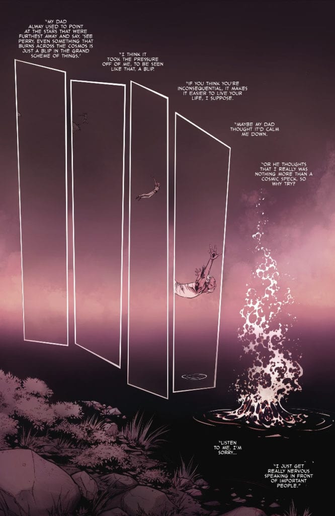
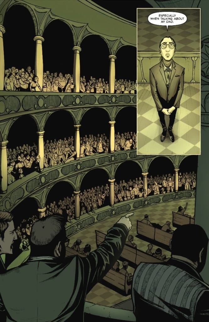
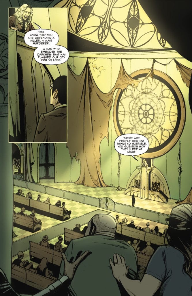
Sean Lewis‘s script in “Bliss” #1 inspires sympathy and moral conflict in the central character and his actions. This comic is set as a frame narrative, meaning that it is a story inside of a story. The main story is about Benton Ohara’s attempt to keep his son alive by becoming a hitman and being allowed to forget his actions. The frame story is a flash-forward and defense of this man’s actions before a tribunal (the identity of Benton’s defender may be a bit of a spoiler). The issue takes place over a span of several years, from the beginning of Benton and his girlfriend Mabel’s new life in Feral City and through the hardships of poverty and illness that led him to become a hitman. This first issue does a brilliant job of setting up the tragedy of Benton’s circumstances, while still acknowledging the fact that many people have been lost or hurt by his actions. The pacing and handling of detail in this issue are stellar, as Lewis utilizes the storytelling capacity of a single comic book to its fullest. He packs this world full of unusual details and mythos without ever stooping to explaining everything. The mystery he creates surrounding the three old crime bosses/gods and the effects of Bliss by themselves are a reason to pick up the following issues. The fact that this is such a character-centered and emotionally effective story, however, is what could end up making this comic a serious hit.
Art Direction
A comic consisting of human sentimentality and mysterious fantasy like “Bliss” #1 needs some stellar visuals to sell the experience. Fortunately, Caitlin Yarsky is on hand, and she delivers in kind. The Coyotes artist draws an immense amount of detail in both her characters and environments, engaging the reader fully in both the plot and setting this comic takes place in. Each individual character looks completely unique and the human characters look plainly, well, human. They aren’t drawn with the sometimes “too perfect to be real” aesthetic comics sometimes have. They look like folks you may see just walking around from the day-to-day. This is combined with the scuzzy, almost neo-futuristic design of Feral City and the fantastical elements within that really define this comic’s gorgeously unique aesthetic. The detritus and decay of dim neon highlight the impoverished status of Benton and Mabel, as well as those living around them. Much of the setting is either desolate or run-down to signify their circumstances, as well as contrast heavily with the appearance of the 3 gods. Their outlandish alien design, like a mix of Alice in Wonderland and Star Wars, is mixed with a lavish setting that is directly opposed to the squalor just outside their door. The color contrasts from scene to scene have a massive effect on the environmental changes as well. Each new area, from the hospital to the gods’ den, is draped in a distinctive hue to match the tone of what is occurring. The visual direction of this comic is wondrously alluring for each and every page and is perfect for this story’s concept.
“Bliss” #1 reads like the love child of Sandman and 100 Bullets. Sean Lewis’s script is emotionally impactful and brilliantly weird. Caitlin Yarsky crafts a visual experience through her detailed pencils and focused panel framing to bring this unique experience to life. If this comic can stay as consistent as this first issue, then Image has another phenomenon on their hands. Be sure to pick up “Bliss’ #1 from your local comic shop on 7/22!
Sleeping Beauties #1 out this week from IDW is based on the horror novel by Stephen King and Owen King and adapted by Rio Youers and Alison Sampson.
Sleeping Beauties #1 Has a Decent Outline
Sleeping Beauties is a project the Kings are investing a lot into as advisors. Stephen in particular seems to have some enthusiasm towards comics, having co-created an X-Men villain and co-writing the first American Vampire issues with Scott Snyder. His son Owen meanwhile is a fan of award-winning thriller novelist Rio Youers. Combine all of this with a plot about a pandemic that induces outrage; this sounds like a best-selling formula, especially with these events happening in real-time with Covid-19 and nationwide protests. However, good concepts need just as good or better execution.
Unfortunately, Youers’ writing feels out of place throughout Sleeping Beauties #1. The opening pages are somewhat confusing; some captions would’ve significantly benefitted this piece. To Youers’ credit, he sets up the plot, primary setting, and half of the conflict. Every other action that happens in the plot happens just to move the plot rather than provide an explanation. That being said, seeing the outbreak disease affect one of the main characters does look troubling. Especially considering the reader learns about the full context near the end. One that could have dire ramifications down the road.
Art
Sleeping Beauties #1 has the artwork of Hit-Girl artist Alison Sampson. Sampson’s art at its best gives off a surreal atmosphere from just its opening. When it comes to character designs, however, most of them look emotionally stilted. When the characters you’re supposed to be rooting for have decent family downtime, it’s a little hard to relate to them, especially when the only character to show any other emotion cuts loose and commits gleeful mayhem.
Tríona Farrell, one of Sampson’s regular collaborators, as the colorist is arguably the best part of Sleeping Beauties #1. The muted color she employs for most of the issue sets the dour tone. The blue butterflies are practically messengers of a calamity, all in contrast to the color’s historically calming properties especially when one of these calamities gets decorated in red splotches of blood.
As for Christa Miesner’s lettering, it’s rather confusing. Most of the word balloons are black with white letters. It might be a little better if the words are said with some aggression, like what Clint Norcross says under his breath in his first appearance. But when everybody does this, it just makes it sound like everybody’s grumpy. All except for when the homicidal woman converses with a rabbit through orange balloons. Which implies an otherworldly force behind the disease. As for the wordmarks, they range from being creative with how their color contrasts to the situations at hand to being in the wrong place. At least that’s the latter’s the case with Lila’s encounter with the homicidal woman when she breaks her car before the sound takes place.
Sleeping Beauties #1 Could Be Better
Sleeping Beauties #1 certainly displays the series potential. There’s a very real dour sense happening in the background, but it’s not properly communicated. At least as far as the writing and penciling are concerned. Sleeping Beauties as a whole might improve later on, but for now, people might want to consider watching Castle Rock to satisfy any Stephen King cravings.
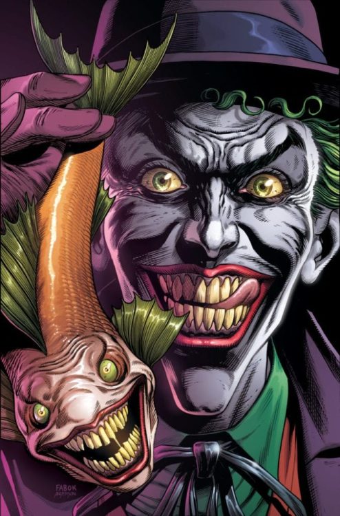
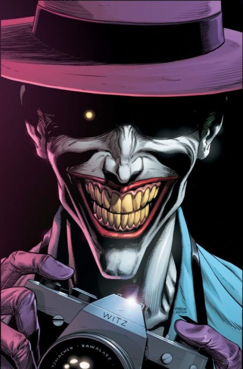
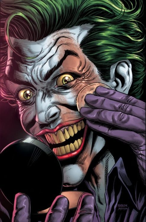
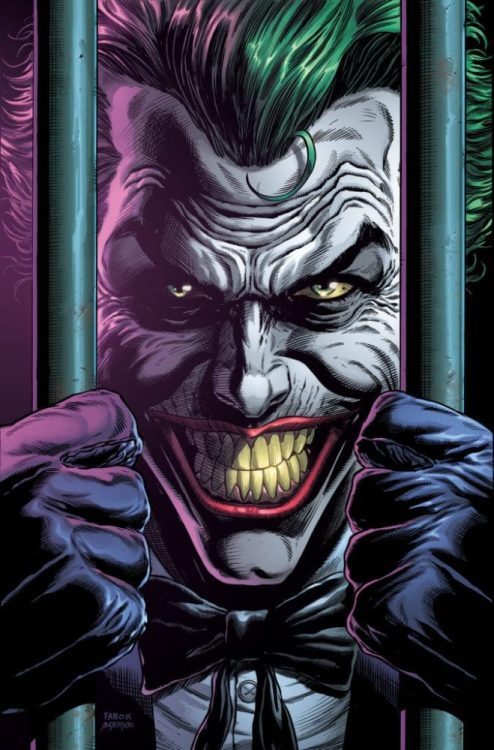
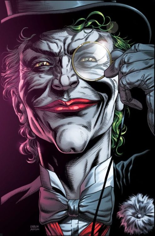
DC Comics continues to go all-in on the upcoming Batman:Three Jokers by Geoff Johns and Jason Fabok. Following the announcement of collectible playing cards comes word that the book will ship with a collection of variant covers (all by Fabok).
Here’s the official word and a look at six of the covers:
DC REVEALS PREMIUM VARIANT COVERS FOR BATMAN: THREE JOKERS BY SERIES ARTIST JASON FABOK
It’s one of the most anticipated comic book stories of the decade: Batman: Three Jokers by Geoff Johns and Jason Fabok! Debuting in August, this series delivers the payoff to the years-long mystery of why—and how—there are three Jokers, and what that revelation means to the eternal conflict between Batman, his allies, and the Clown Prince of Crime.
To commemorate this landmark series, DC will offer to participating retailers nine Premium Variant Covers for Batman: Three Jokers, each illustrated by series artist Jason Fabok. Along with the main cover and regular variant cover, each issue of Batman: Three Jokers will have three Premium Variant Covers, showcasing Fabok’s interpretation of a different face of The Joker’s madness throughout DC history. All nine of the Premium Variant Covers mirror Fabok’s main covers for the three-issue series, giving a close-up look at even more of The Joker’s terrifying incarnations.
The Premium Variant covers for issue #1, on sale August 25, are as follows:
Red Hood (Variant A)
Joker Fish (Variant B)
Joker Bomb (Variant C)
For issue #2, on sale September 29:
Joker Behind Bars (Variant D)
Death in the Family/Top Hat & Monocle (Variant E)
Joker Applying Makeup (Variant F)
And for the final issue #3, on sale October 27:
Batman: The Killing Joke Hawaiian shirt and camera (Variant G)
Diamond initiated the “Back The Comeback” campaign on May 13th as a series of activities designed to support comics publishers and retailers hit hard by the COVID-19 lockdowns. Phase 1 consisted largely of branding exercises in partnership with Alliance Game Distributors, Publishers willing to print the badge on select covers, and retailers opting to display the marketing materials.
Today, Diamond announced in a press release it will begin Phase 2 of the campaign with a series of auctions designed to raise money for charities that support comics retailers. Beginning July 4th and running for two weeks, the auctions will offer works from creators such as Frank Cho and unique items such as an original Magic: The Gathering card sheet, printed circa 1993. you can read the full description in the press release below, including links to the auction site.
Are you going to participate in the auctions? What other activities would you like to see out of the “Back The Comeback” campaign? Let us know in the Comments, and please share this on social media using the links below.
Diamond, Alliance Launch Charity Auction to Support Comic Book and Game Stores as Part of ‘Back The Comeback’ Campaign
(BALTIMORE, MD) — (June 25, 2020) — On May 13, Diamond Comic Distributors and Alliance Game Distributors, companies of Geppi Family Enterprises, partnered to launch the “Back The Comeback” campaign, a multi-phase initiative designed to support local comic book and game stores as they began to safely reopen, restart, and rebuild. Now, the campaign is entering its final two phases: a charity auction designed to raise relief funds for comic book and game stores and in-store retailer promotions.
Phase two of the Back the Comeback campaign includes the launch of an online auction hosted by Diamond International Galleries. The auction kicks off July 4 and runs through July 18 and features a wide range of items up for auction, generously donated by artists, publishers, game designers and friends of the industry. Steve Geppi has kicked off donations to the auction with items valued at approximately $50,000. One of the most anticipated original art pieces is an oil on canvas painting called, “The Ice Queen”, created by comic book art legend Frank Cho and published in his book “Drawing Beautiful Women.” Game-fanatics and Magic: The Gathering fans will be excited to find an uncut sheet of playing cards from the original Magic: The Gathering (circa 1993) on the list of biddable items. The full list of items will be available upon the launch of the auction Saturday, July 4, 2020. Interested bidders should visit DIGAuction.com to create a free account. Auction proceeds will go directly to charities that support comic and game retailers. Winning bidders can select which charity they wish to support from a list of options.
The third and final phase of the campaign is centered around in-store retailer support. Many comic publishers have supported the campaign by printing the Back the Comeback logo on the cover of their books. Marvel Comics was the most recent publisher to add the campaign logo to Empyre #1 variant cover. Other publishers offering the campaign logo on their covers include IDW Publishing, Image Comics, and AC Comics. Game stores can expect to see in-store promotions beginning July 6 to coincide with the launch of the auction. Alliance Game Distributors has planned 6-weeks of promotions; each promotion will start on a Monday and will run for 4-weeks. Participating gaming publishers include Alderac Entertainment Group, Smirk and Dagger Games, Renegade Game Studios, and WizKids to name a few.
Additional information on Back The Comeback can be found at backthecomeback.com.
DC Comics continues its outreach to younger readers, this time enlisting a famous name from outside comics — actress Mayim Bialik (best known today for The Big Bang Theory) —for the new book Flash Facts.
Check out the description and some preview art below:
DC TAPS BIG BANG THEORY STAR MAYIM BIALIK TO CURATE
FLASH FACTS
New Middle Grade Graphic Novel Anthology Features Short Stories by All-Star Writers
and Artists That Demonstrate S.T.E.M. Principles Through DC Super Heroes
Book Hits Stores February 2, 2021
Available to Preorder Now
Have you ever wondered what’s at the bottom of the sea? Why polar ice melts? Or which tools forensic scientists use to solve a crime?
Well, DC has great news! All these answers and more will be revealed in Flash Facts, a lighthearted middle grade graphic novel anthology set to debut February 2, 2021. Geared toward readers ages 8-12, this collection of short stories is curated by award-winning actress and author Mayim Bialik and aligns with Next Generation Science Standards, providing a helpful bridge between the S.T.E.M. (Science, Technology, Engineering, and Math) lessons taught inside the classroom and how these principles affect our everyday lives.
Under Bialik’s oversight, the short stories demonstrating various S.T.E.M. principles will star Batman, Superman, Wonder Woman, and more DC Super Heroes and will be written and drawn by some of the most popular writers and artists in middle grade and comics publishing, including New York Times bestselling author Michael Northrop (TombQuest, Dear Justice League), Dustin Hansen (Microsaurs, My Video Game Ate My Homework), Cecil Castellucci (Batgirl), Kirk Scroggs (Snoop Troop, The Secret Spiral of Swamp Kid), Corinna Bechko, Sholly Fisch, Amanda Deibert, Vita Ayala, Amy Chu, and more to be announced.
See below for the official description. The book is available to preorder now.
Contributors:New York Times bestselling author Michael Northrop (TombQuest, Dear Justice League), Dustin Hansen (Microsaurs, My Video Game Ate My Homework), Cecil Castellucci (Batgirl), Kirk Scroggs (Snoop Troop, The Secret Spiral of Swamp Kid), Corinna Bechko, Sholly Fisch, Amanda Deibert, Vita Ayala, Amy Chu, and more to be announced
Cover by Derek Charm
Preview Interior art revealed today by Dustin Hansen
On sale everywhere books are sold February 2, 2021
MSRP: $9.99
Have you ever wondered what’s at the bottom of the sea? Why polar ice melts? Or which tools forensic scientists use to solve a crime?
Well, look no further! Everyone’s favorite Scarlet Speedster is here to answer all your burning questions! Barry Allen, with the help of some of his close friends, will take readers on an exciting journey that examines everything from the vast expanse of our galaxy to the smallest living organism known to exist.
Curated by award-winning actress and author Mayim Bialik, PhD, and featuring stories created by an all-star cast of writers and illustrators, this anthology aligns with Next Generation Science Standards and provides a helpful bridge between the lessons taught inside the classroom and our everyday lives.
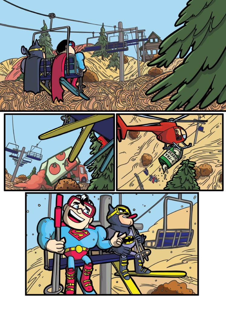
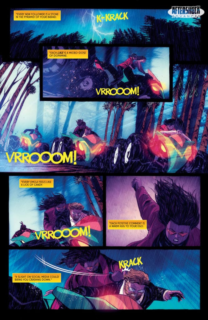
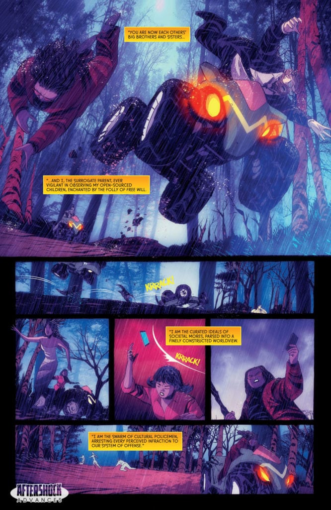
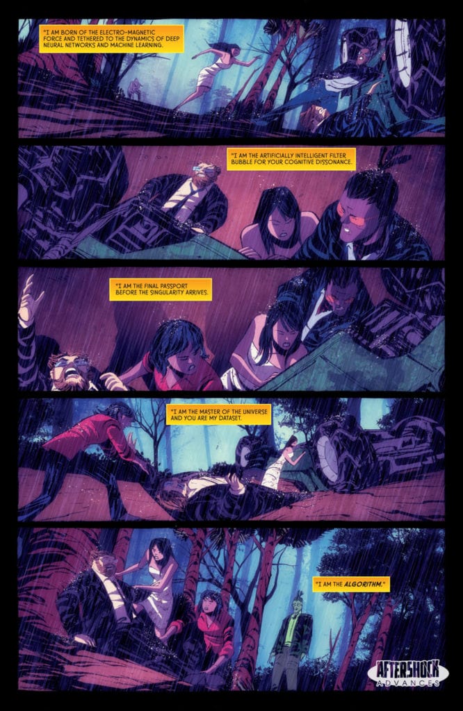
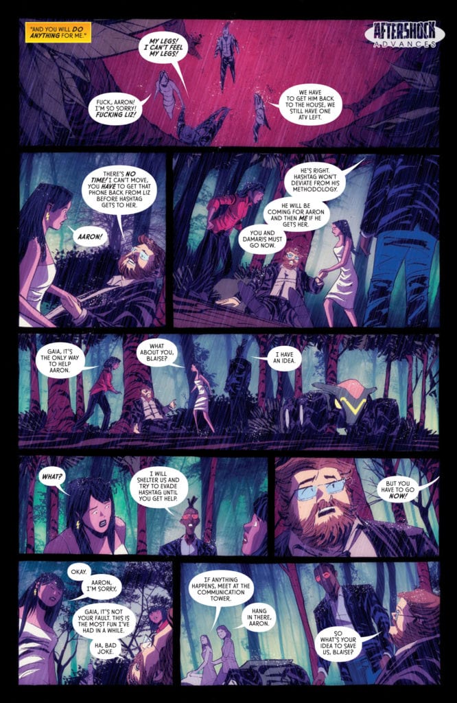
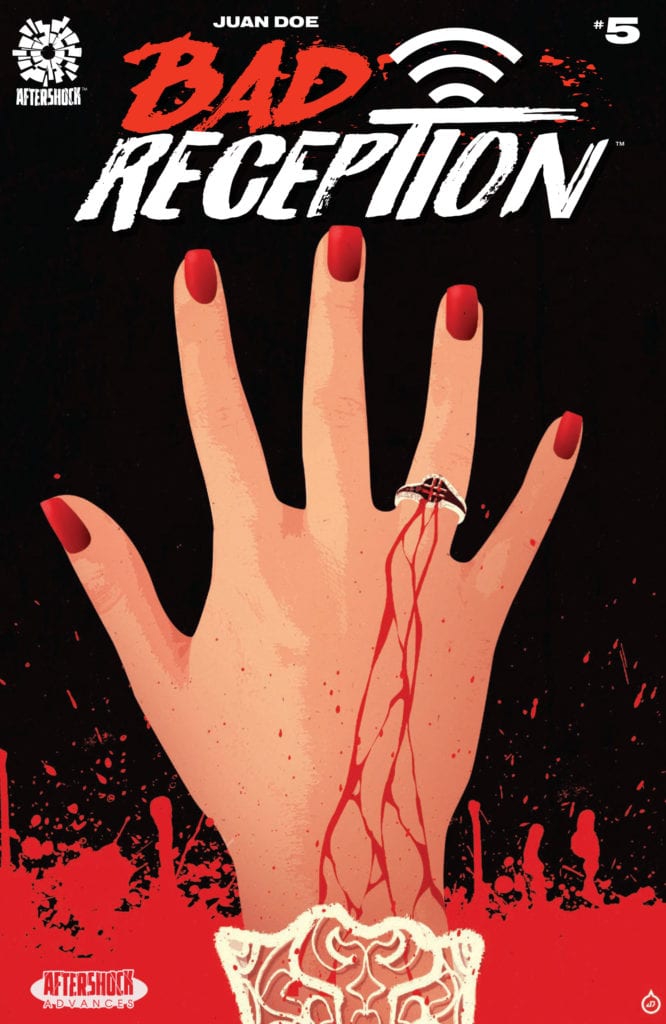
BAD RECEPTION #5 hits your local comic book store July 22nd, but thanks to AfterShock Comics, Monkeys Fighting Robots has an exclusive four-page preview for you.
About the issue: The last dance has finally arrived—but will it be for Hashtag, or for those who have survived this far? Join superstar creator Juan Doe for this finale as we bid farewell to everyone that attended this “off-the-grid” wedding extravaganza. We leave you with these parting words, the first day of the rest of your life may be your last.
BAD RECEPTION #5 is written, illustrated, and lettered all by series creator Juan Doe. Charles Pritchett is credited as production, and Mikes Marts is the series editor.
“A searing horror story that doubles as a topical, satirical critique on society’s obsession with technology, social media, and the cult of celebrity.”
Check out the BAD RECEPTION #5 preview below:
Have you been reading BAD RECEPTION from AfterShock? What are your thoughts heading into the finale? Sound off in the comments!
Director Andy Palmer went from small-town actor to editor and director of many feature films, including the recent horror films Camp Cold Brook starring Chad Michael Murray (One Tree Hill) and Danielle Harris (Halloween) and The Funhouse Massacre, which featured a cavalcade of cameos from familiar faces.
The Funhouse Massacre and Camp Cold Brook are both horror films. However, they could not be more different. Funhouse takes a more comedic approach and weaves in a bit of rom-com into things while delivering over-the-top death scenes and some deliciously gory practical effects. Meanwhile, Cold Brook crawls under viewers’ skin for the runtime. There’s a fraction of the gore or laughs, but the film is thick with the tension and terror.
PopAxiom spoke with Andy Palmer about editing, directing, Camp Cold Brook, indie filmmaking, and working with screen legend Robert Englund!
Miami Vice
Andy liked movies like any other kid, but becoming a filmmaker wasn’t his goal early on. “I wanted to be a cop when I was a little kid because I loved Miami Vice and thought Don Johnson was the coolest guy ever.”
A day out on the water with his dad changed the course of things. “I remember hanging out with my dad. We had this little sailboat. I told him I wanted to be a cop. He suggested I be an actor that way, I can play any part and not get shot. That sounded like a better deal.”
Andy grew up in a small town where he “… got into acting and did all sorts of plays and stuff.” After high school, he went into college as a theatre major. “I went to my first acting class and realized that I grew up in a town with like nine people, and I was the best actor in a town of nine people. But hanging out with these people who were amazing actors I realized ‘Oh, you’re terrible at this.’”
The would-be editor and director was still in love with the world of creating entertainment on film. “I started dabbling in writing and camera work. That morphed into wanting to be a director. I went to a school for editing.”
Why editing? “I’d done a short film in college that we shot weekend after weekend, not knowing a thing about editing. Once we edited it together, I realized we could’ve shot it in one weekend if I would’ve known what I wanted and how things cut together.”
Young Andy learned, “… the power of prep and the power of storytelling.” He credits being an editor as a significant influence on his skill as a director and storyteller. “That’s why I’m so grateful I came up in editing because editing is a form of storytelling that’s taking a story and crafting it to be the leanest and most effective story possible. That informs me as a writer and director because I know how things cut together.”
Indie Filmmaking
Filmmaking is never easy, and there’s an ever-present enemy looming. “… your biggest enemy is time. There’s never enough time or not enough days. We only have this actor for two days.”
Case in point, Robert Englund. The legendary actor who played Freddy Krueger appears in The Funhouse Massacre. “We only had him on set for two days. It’s only an extended cameo, but it’s still about 10 minutes of screen time in multiple locations.”
For fans of Englund who might be wondering, Andy says, “He’s just the kindest, warmest man. He’s so much fun to work with.”
Funhouse Massacre features cameos from Clint Howard (Star Trek, The Waterboy), Jere Burns (Burn Notice), and Courtney Gains (Children of the Corn). What’s key to working with young and veteran talent? “For actors, it’s important to establish trust so that they feel they’re in good hands.”
Veteran actors like Howard or England know their stuff and expect their director to know their stuff. Andy’s approach is to create trust. “As soon as we started our rhythm — block, light, last looks, shoot — everyone feels at ease.”
Reality Of Reality
Andy’s filmography includes editing a lot of reality television like Rock of Love with Bret Michaels and Flavor of Love with Flavor Flav! “I feel fortunate that I came up through reality television because it made me a better narrative filmmaker.”
But reality is a whole other world. “With reality, you have this whole mess of footage … you have a beat sheet. ‘Here’s the things we have to accomplish.’ You have to look at that footage and manipulate the footage to create that story.”
For Andy, those muscles flexed while editing reality television makes him look at filmmaking differently. “I don’t look at a film as what we have, but what could it be?”
The filmmaking process, they say, creates three films—the film that’s written, the film that’s shot, and the film that’s edited. “The most important thing is the tone. When I’m directing something or editing, you can sometimes play fast and loose with script elements as long as you don’t bone the tone. The tone is everything. How we get there is up to interpretation, but it needs to feel a certain way.”
Filmmaking requires creative, on-your-feet thinking, particularly when time and money are not plentiful. “With Camp Cold Brook, I had to deviate from the script purely out of financial reasons.” Andy explains, “In the original script, there was a big lake with all these underwater scenes with the ghost kids underwater. It was fucking amazing. But on our budget, I was never going to be able to pull that off.”
The solution is in the tone. “So, it was all about saying ‘Tonally, what are we trying to say here? How are we trying to convey this scare? How can we make it so that we can afford to do it? We don’t have a lake, but we have a creek and a spillway so let’s build the legend around that.’”
Like Spielberg compensating for when the shark didn’t want to work in Jaws, filmmakers must “… take what you have and figure out ways to make it work.”
Little Things
Andy’s decades of experience allow him to share some insight into being a better director. “Young directors when they’re coming up get so obsessed with shots. ‘Oh, I’m going to get this shot and this shot.’ I was very guilty of that on my first films. And they don’t take time to focus on blocking. If you take a look at Spielberg and Hitchcock, the way that they moved characters in the scene informed how the camera moved.”
Andy connects this advice with his own learning experience. “When my cinematographer, Filip Vandewal and I sat down for Funhouse, he made me switch my brain off from ‘This shot’s going to be cool, and this shot’s going to be cool’ to ‘What are these actors doing in a scene? How is that going to be interesting? How will that inform the camera? I took that to heart and became very passionate about it.”
That’s not to say there’s no room for some fun flare or “cool shots.” “There’s always a style shot, but if the characters are doing interesting things, then the actors get into it more, their performance feels more genuine, and then the whole movie feels better.”
Wrapping Up
There are many filmmakers to draw inspiration from, and Andy shares some who live in his creative DNA. “When I came up in film and fell in love with film, the guy I wanted to emulate was … Robert Rodriguez was the guy that made me flip that switch to wanting to be a director. I read Rebel Without A Crew in my freshman/sophomore year in college and thought, ‘We can do this!’ Rodriguez is probably the guy who propelled me the most to want to be a director. But I loved Kevin Smith (Dogma) for his writing. Edward Burns (Brothers McMullen). Those are the guys who I looked up to. They made these indie movies for nothing and got noticed then got to make a studio movie after. I love Peter Berg. He’s a versatile director. I love the style of his films and bridging raw action with a topical story. I thought Patriot’s Day was incredible. I love Ron Howard.”
In the age of remakes, Andy knows precisely what movie he’d love to reimagine for the 21st century. “My dream would be to remake The Cannonball Run. I love the Cannonball Run movies. They’re perfect movies to remake because they’re not maybe considered classics, but they’re super-fun. It’s not The Goonies. But with modern cameras and some cool CG plus a smorgasbord of cameos from A-list celebrities, I think Cannonball Run would be an awesome movie to remake.”
Funhouse Massacre and Camp Cold Brook are available on Amazon Prime Video. What’s next for Andy? “… another movie I directed called Witness Infection is in the middle of its festival run. It’s another horror-comedy. It’s got a ton of Funhouse alums in it. Carlos Alazraqui, one of the Funhouse DJs, wrote it and produced it. Robert Peters, the other DJ, is in it. Erick Chavarria, who played Machete [in Funhouse], is in it. It’s a zombie comedy about two mob families from New Jersey that get witness relocated to the same town, Lake Elsinore, California. Because they’re the only two Italian families in town, they’re always fighting with each other. They call a truce, and the son of one family is going to marry the daughter of the other, but he’s not in love with her. Amid this weird courtship, a zombie apocalypse breaks out. It’s a lot of fun.”
Andy’s films as a director make a few things clear. He loves horror, and he loves comedy, and he’s not shy about mixing the two. “With everything going on in the world, comedy is a good place to be. I’m working on a comedy — no horror this time — that we’re in the midst of casting.”
Are TheFunhouse Massacre or Camp Cold Brook on your watch list?
Thanks to Andy Palmer for making this interview possible.
Want to read more interviews like this? CLICK HERE.
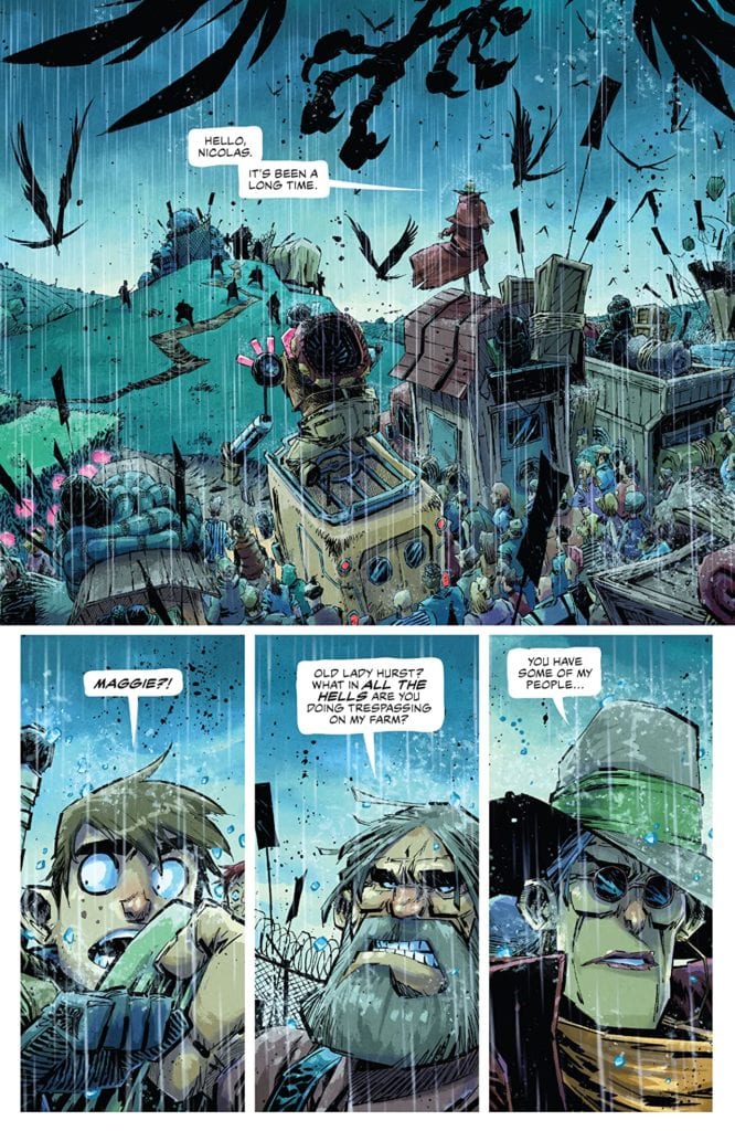
MIDDLEWEST #17, available in comic book stores on Wednesday, June 24th, ignites a flame of conflict between Raider Farms and the townspeople from Abel and Bobby’s village. Led by Maggie, the villagers are ready to destroy the Farms to save those Nicholas Raider has enslaved.
Story
It all comes down to this battle: On one end of the farm we see Raider, holding Abel in check, while the other end showcases Maggie, Fox, Jeb, and an army of ordinary townspeople. The scene set gives readers the feeling of the calm discussions that take place before chaotic battles in our favorite war movies.
As it turns out, Fox is the one to attack first, leading to a rage-filled Raider commanding his forces to kill every man, woman, and child. The chaos erupts, leaving our hero Abel feeling more hopeless than ever—that is until he gives into the rage, and there’s no telling what the consequences will be.
Skottie Young’s script gives readers a a look at all of the emotions wrapped up in war. We feel for our protagonists as they fight for their lives.
Artwork
The wonderful illustrations come from Jorge Corona’s penciling and ink work, Jean-Francois Beaulieu’s coloring, and Nate Piekos of Blambot’s lettering. Raider Farms’s fields are set ablaze with explosions full of vibrant reds and oranges. And in the midst of the chaos readers get glimpses of the terror chiseled onto Abel and Bobby’s faces as the fate of their future hangs in the balance. This is further complemented by effective font use of their exclamations of terror.
Conclusion
MIDDLEWEST #17’s story is the perfect setup for the concluding tale next issue. We’re anxiously awaiting the final conflict between Abel and the forces of rage that plague him.
Do you think Raider Farms will ever be taken down? Let us know in the comments below!
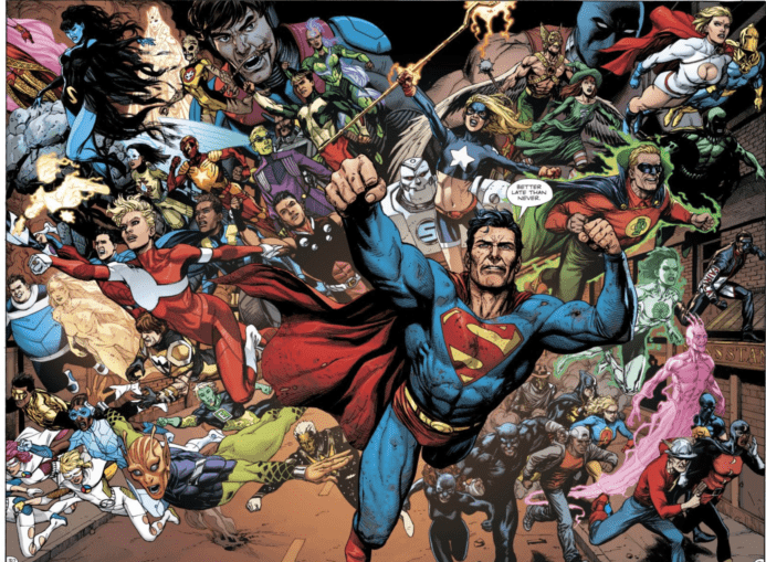
Continuing the trend of 80th-anniversary one-shots starring some of their iconic characters, DC Comics released its Green Lantern 80th Anniversary 100-Page Super Spectacular this week. Several popular Green Lantern writers are showcased in this issue, including Geoff Johns, Robert Venditti, and the late, great Denny O’Neil. Strangely absent is current The Green Lantern writer, Grant Morrison, but Liam Sharp does do the main cover for the book.
This issue also showcases stories drawn by a number of talented artists, including Gary Frank, Ivan Reiss, and Mike Grell. Several artists are also featured throughout the issue in various pin-ups. This accomplishes two things. It allows the issue to feature the work of other artists, such as Jamal Campbell, Joëlle Jones, and Bruce Timm, while also allowing for the appearances of various Green Lanterns who don’t have a story in this issue, such as Jo Mullein from Far Sector, Teen Lantern from Young Justice, and Tai Pham from Green Lantern: Legacy.
Writing
There are a number of stories worth commenting on in this issue, from Geoff Johns’s heartfelt tale about Hal Jordan (featuring a humorous twist ending) to Denny O’Neil’s final Green Lantern/Green Arrow tale. But I think there are two stories that deserve special attention, and they both bookend this issue. The first is James Tynion IV’s story about Alan Scott, drawn by Gary Frank. When DC Comics rebooted its universe with the New 52, the original Alan Scott disappeared and was replaced by a counterpart from Earth-2 who was gay. This was a departure from the Golden Age Green Lantern, who had two kids. This tale seems to bring the Earth-2 counterpart’s sexuality back into play for the classic Alan Scott. It will be interesting to see what this revelation will do for his character in the future and how it affects the existence of his children (Obsidian and Jade). I’m not the first to point this out, but whether DC decides to make him gay or bisexual, any stories told about him from the 1940s and 50s will certainly have a new layer of complexity, as Alan struggles to be a gay or bisexual man in an era when being so was unacceptable.
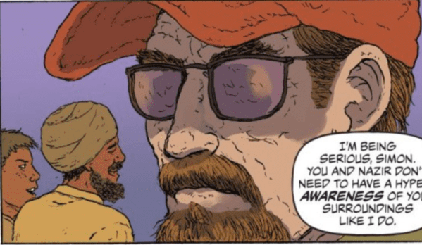
The second story is about Simon Baz, written by Sina Grace, and drawn by Ramon Villalobos. This is an important story for our times, highlighting the problems of racism, Islamophobia, and white terrorism. One problem I often find with Simon Baz stories, though, is that he can often get lost in the shuffle of Green Lanterns and hasn’t always been given a distinct voice. To some extent, that is true in this issue, too. Baz serves as a voice battling and speaking out against Islamophobia and white supremacy, but his words could just as easily have been spoken by any character. He more often than not, seems to serve as an empty signifier without a unique personality, into which people can say anti-Islamophobia things. This is certainly true in this story, and some of the dialogue screams, “Hey! I’m a Muslim. Get it?” Don’t get my wrong. I enjoyed this story, and I think Baz’s character is an important and necessary addition to DC’s roster. I, for one, appreciate the message of the story and the speech that Simon gives about his Islamic faith. I just think DC struggles to provide Baz with his own voice so that he is more than a mouthpiece for on-the-nose anti-Islamophobic dialogue and representation.
All of that said, I think both of these stories are important, and the fact that they bookend this issue is representative of the diversity of the Green Lantern franchise.
Art
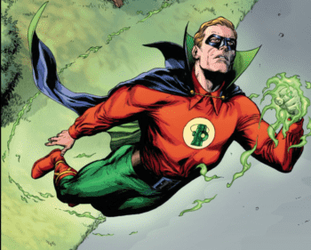
I’ve become a big Alan Scott fan over the last few years, and few things made me more excited than seeing Gary Frank draw him in Doomsday Clock #12.
Alan Scott (right), seen here only “sort of” being added back to continuity.
Throughout Tynion’s story, Frank (with colorist Steve Oliff) draws the characters beautifully, adding his signature lining and shading to the characters’ faces. The standout moment of this first story (besides its message) is when the reader turns to the last page and sees Scott’s Green Lantern take flight.
Frank was made to draw noble-looking superheroes! After so many years of waiting for the JSA to return and having Alan Scott teased in everything from Doomsday Clock to Wonder Woman’s own anniversary issue to the previews for Death Metal #2, it was great to see Alan explored in his own story. While short, I appreciated seeing all of the small character moments and conversations that made this tale work, and no one could’ve done it better than Gary Frank!
Villalobos’s art (with colorist Rico Renzi) on the Simon Baz story is reminiscent of Frank Quitely or Chris Burnham.
Villalobos really captures the look of white terrorism well.
Villalobos’s work, like Quitely and Burnham, is an acquired taste. I, personally, have always thought that Quitely’s line work (and here, Villalobos’s), makes every character’s face, and even every surface, look like a crinkled up sponge. But it’s grown on me. The coloring and line work are solid, and Villalobos and Renzi make every character “pop” and look distinct on the page.
This issue is a beautiful love letter to 80 years of Green Lantern. I do think it’s a little unfortunate that one of the younger lanterns, like Teen Lantern, didn’t have a feature (although she does have a pin-up). Still, I understand that choices had to be made and that the focus was put on the most historically popular lanterns. Again, it was good to see Denny O’Neil take one last swing at the Green Lantern/Green Arrow team-up that helped establish him as one of the most important comic book writers in DC’s history, and it was fun to see Guy Gardner’s strategy for distracting Sinestro.
Did you read the Green Lantern anniversary one-shot? Tell us your favorite story from it in the comments below.
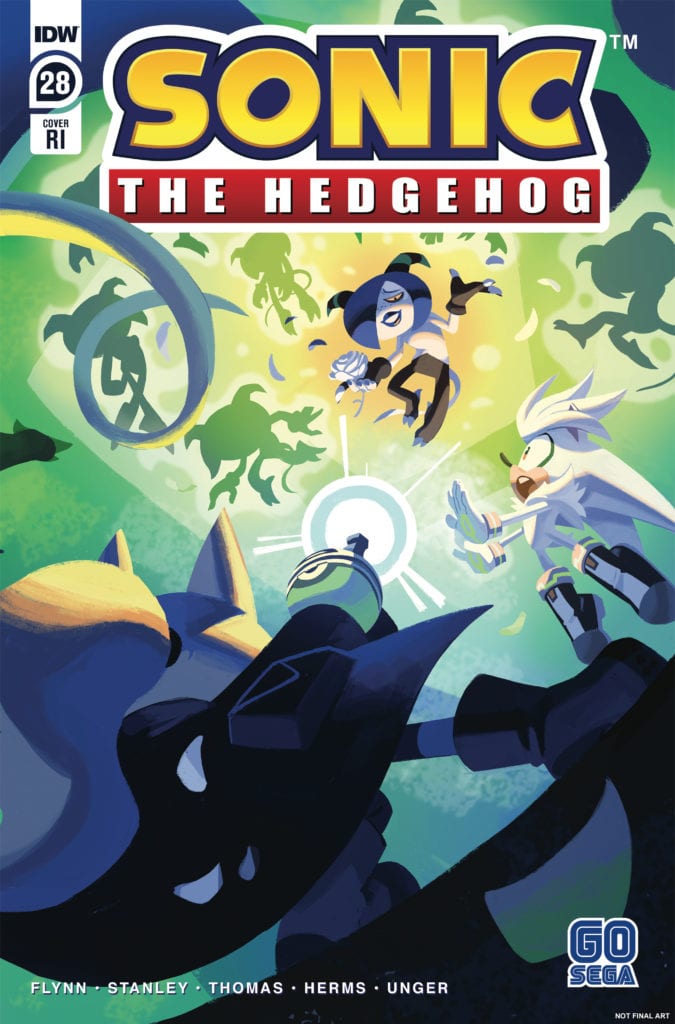
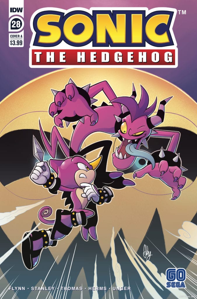
Sonic The Hedgehog #28 by Ian Flynn, Evan Stanley, Adam Bryce Thomas, Matt Herms, Elicia Unger, and Shawn Lee delivers the climax of the Zombat saga. This is the last issue before the final battle with Sonic and his friends facing off against an army of their former friends. It’s going to be hard to top the previous issue in emotion but this issue still achieves some impressive victories.
“All or Nothing,” Part Three! Sonic’s allies continue their missions against the Deadly Six, attempting to reclaim the Chaos Emeralds. Who will return from their final stands? And will they make it back before Sonic has to face Zavok?
Writing
Taking this issue by itself, the fights here seem a bit rushed. The previous issue’s battles were much more drawn out and emotional but here the opponents are beaten without any difficulty. Though it feels like the creators are in a hurry to get this story arc has been going on for over a year and it seems like an acceptable aspect to gloss over.
The writing by Ian Flynn is plotted well overall. The ploy to take the chaos emeralds was laid out in a previous issue so here it seems like just a natural continuation of what was set up. The issue also takes the time to touch on how Silver being from the future is the deciding factor to help turn the tide in the upcoming battle. It will be interesting to see how the story wraps up and what it will setup for future plotlines.
Artwork
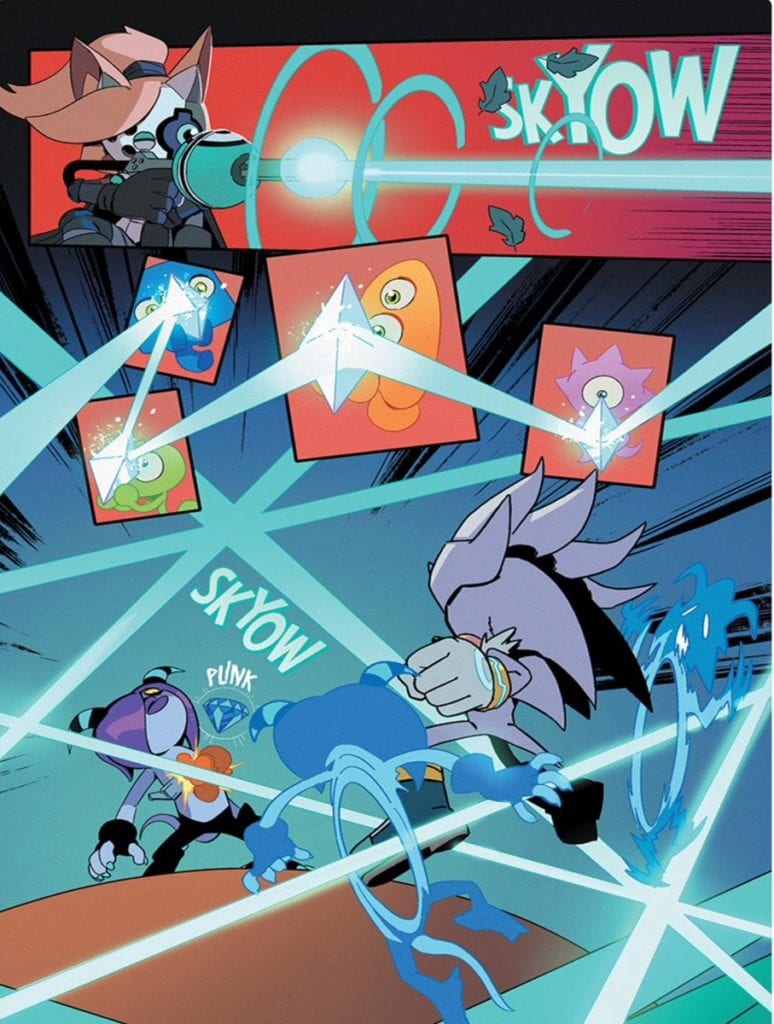
The artwork by Evan Stanley and Adam Bryce Thomas helps to sell just how intense the fight scenes are. One panel particular stands out where Whisper waits for her shot against Zor. It’s easy to feel how intensity from the look of concentration on her face as she knows she’s only going to have one opportunity to make her shot count.
The use of color by Matt Herms and Elicia Unger helps to add to the action elements of the issue. A prime example of this is when Whisper finally takes her shot on Zor (seen below). The use of color and direction helps to make the page feel alive with action.
The letter work by Shawn Lee makes sure to use the careful placement of effects to add to the scene without distracting from the action. The error of using large lettering effects in an effort to showcase intensity happens too easily and usually has the opposite effect of being more distracting than helping with the story. The lettering work by Lee makes sure to always have a focus on the characters and action and only add to the overall aspect of the reading experience.
Conclusion
Sonic the Hedgehog #28 feels like the creators are rushing to finish a bit and sadly lacks the emotional impact of the previous issue. Still, when looking at it as a whole storyline, this was only accomplished by proper setup and tight storytelling. While it lacks in-depth, it makes up for in solid plot development. Next time, the battle to end the Zombot plague will commence.