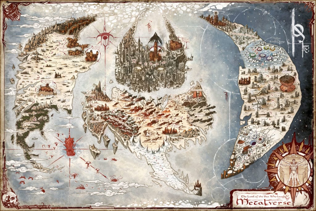
The Dark Nights: Death Metal hits keep coming from DC Comics. The publisher has released a new map (by artist Jared Blando) of the “Metalverse,” which ties in with the upcoming Death Metal Guidebook. How does this world differ from that of the regular DC Universe? Look for the clues and find out.
Check out the lay of the land below. You can also click over to the DC blog for a zoomable version.
Ahead of Dark Nights: Death Metal Guidebook, Explore the Metalverse!
Earth is turned upside down, shrouded in a realm of darkness after the Justice League’s defeat by the cosmic goddess Perpetua. Now the Batman Who Laughs and his army of Dark Knights rule the planet, wreaking havoc on humanity and raining destruction on the world.
Hover over the map of the Metalverse below to discover how the Batman Who Laughs has reshaped our world.
Corey Wallace is a former engineering student turned film and television composer whose work fills the sonic space in works that include NBC’s Siberia (now streaming on Tubi), the 2019 horror film Artik and award-winning animated shorts such as The Wishgranter and Dust Buddies to name a few. He also contributed to projects such as Blumhouse’s The First Purge and Marvel’s Agents of S.H.I.E.LD.
Artik made its world premiere at the Popcorn Frights in South Florida. It has since gone on to great success in the cinematic world. The film centers on a comic book obsessed serial killer who teaches his son how to get away with a series of brutal murders. However, things may unravel when the boy befriends a mysterious man.
PopAxiom took some time to speak with Corey about jazz, going from engineering to music-making, and the process of creating the sonic palette for Artik.
Trumpet & Jazz
Corey’s first “… musical step …” began with the trumpet. “I was playing the trumpet in a band … a lot of people start on piano, but I didn’t take piano lessons until college because it was a requirement …”
Corey, the student did well overall across the gamut of subjects but with minimal motivation. However, when it came to music, Corey says he “… became a nerd. I studied all the time and practiced all the time because I was fascinated by music theory and composition.”
In high school, Corey “… joined jazz combos … They allowed for members to make arrangements and create original music.”
Corey credits this time as a vital training ground for writing music. “On the technical side, writing jazz music is more straightforward than writing for symphonic orchestra. Essentially, you’re just writing some melody and chord changes and then letting the band fill in everything. That’s different than writing for a big band arrangement where you’re composing the notes for everyone to play.”
The freedom and experimentation of jazz were “… a great way to start writing music. That lead to writing more sophisticated stuff for jazz.”
No Berklee For You
For Corey, his love for creating music was undeniable. “I wanted to go to Berklee College of Music in Boston and study jazz performance. That was one of my dreams.”
However, the tragic truth comes to light. “But I was discouraged. I hate to put this stain on my parents’ record. They’ve always supported me. But this one time I came to them and said ‘I want to be a gigging jazz trumpet player,’ and they said it’s probably a better idea to go to school and get a degree and you can always make music on the side.”
Corey’s road of life steered toward another educational institution. “I ended up going to the University of Wisconsin … studying industrial engineering.”
Music Vs. Engineering
Not to be denied, Corey used a little advantage to satiate his music-creating cravings. Corey accrued enough credits to graduate sooner from the engineering program. Instead, he joined the school’s jazz band. “I would spend about a quarter of my time during the first semester working on music in addition to engineering.”
By his second semester, Corey was “… spending half my time on this music elective. At some point, it clicked. I’m spending so much time and energy on music because that’s what I love to do.”
By the end of his sophomore year, Corey decided to be a “… composition student full-time. By then it was too late for me to apply to the music school.”
Corey joined a study abroad program and ended up in “… Australia.” The journey kept him creating music, but he had to “… talk his way in …” since he arrived during their second semester. Corey had “… the same problem when I got back. I was accepted into the school, but I had already missed the first semester.”
Technological Leaps
Twenty-first-century technology includes digital libraries of sounds that make it generally easy to start composing. To emerging composers, he says, “You want to try and get your sound and do what you specifically want to do instead of what these pre-determined sounds are having you do.”
For ten years, Corey’s been making his own sounds. “It starts with recording things or taking old recordings and manipulating them in different ways using digital and analog techniques to turn something into something else. All of a sudden, you have a brand new sound to use. It’s a time-intensive project.”
Corey points to a scoring legend as an example. “If you look at a Hans Zimmer’s score, he’ll have like ten people in the music department in sample development. It’s a tedious process, but when you’re done, you have this palette of sounds.”
Corey jokes, “Now I have to score the movie.”
Imaginary Films
Creating sounds for a sonic palette doesn’t begin when Corey’s signed on to a new project. The composer devotes days off to recording and experimenting. “That’s the best way to do it. There’s a limited time when you’re on a movie. That’s not the time to start staring out the window. You have to jump right in. Do your homework and kind of score for imaginary films.”
Corey’s process includes a “… sounds diary. I date it, and a description of how I made the sound, what plug-ins I used or hardware I was using. It’s a technique-based diary. I put keywords and what kind of projects it might be good for so that it’s searchable. I can look for inspiration in there.”
About Artik
Corey’s connection to Artik came via a simple referral. “Artik came about because of The First Purge. [Director] Tom Botchii reached out to Kevin Lax [composer, The First Purge], who was unavailable and recommended me.”
The work for Artik was already underway before Corey. “Tom had a specific musical vision. When we got to talking, he was already working on the score with somebody else. Tom is a guitar player and played in experimental bands. He wanted this de-tuned, broken sound and wasn’t getting that. So that was one of our first conversations and how I would accomplish that.”
Corey was happy to let Tom know, “I’ve been working on these kinds of sounds for at least a decade. It was really exciting to do this.”
Typically discussions between composer and director include movie references. For Artik, the director referenced a specific aspect of a movie. “Tom referenced a trailer to the Joaquin Phoenix movie You Were Never Really Here. There’s a big hit in the middle of the trailer, and then the rest of the trailer has these dissonant sounds and big hits.”
Corey explains, “Tom wanted the movie and the music to feel like an 80-minute trailer. The first scene after the main titles is like a minute long and has like 32 cuts, so it hits in that minute. It’s emblematic of what he wanted. These dirty hits constantly.”
Creating the palette consisted of “… little plunks to giant metallic clanks. I just started forming this palette of hits.”
Wrapping Up
You won’t find many modern film composers who don’t love John Williams, and Corey is no different. He connects his early love for jazz to the legendary composer’s brilliance. “Jazz is essential to John Williams and the way he writes.”
In the hall of fame with Williams, Corey lists “Alan Silvestri, James Horner, Jerry Goldsmith, and Hans Zimmer. What they all have in common is this big, orchestral, blockbuster sound.”
Another prominent figure forming Corey’s creative DNA is Marco Beltrami. “When he was doing Scream, The Faculty, I, Robot, and Hellboy … that was impactful on me. I hadn’t heard scores like that before. It aligned with the kind of music I was writing in college. I wondered if there was a place for me in scoring with that sort of sound and I heard Marco and thought ‘Yes, there’s a place for me.’”
What movie would Corey love to score the remake? “NeverEnding Story. That was my favorite movie growing up. That music is so 80s, and I think you can do something great.”
Artik is available on-demand, so what’s next for Corey? “I’m pre-scoring Super-Cell from Jamie Winterstern, who is a photographer and an avid storm chaser. He’s making a movie based on that world.” We crack a few jokes about Twister and Sharknado. Corey asserts, “This ain’t your daddy’s tornado movie.”
Is Artik on your watch list?
Thanks to Corey Wallace and Impact24 PR
for making this interview possible.
Want to read more interviews like this? CLICK HERE.
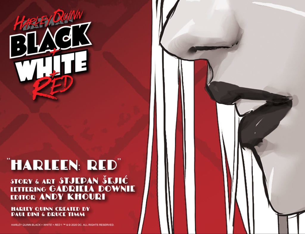
Harley Quinn: Black + White + Red is a new DC digital-first series that features the famous antihero depicted using only black, white, and red. The series will feature an all-star lineup of creator talent, and the first issue is sure to impress readers and leave them wanting more.
Written and illustrated by Stjepan Šejić, “Harleen: Red” is an astounding beginning to Harley Quinn: Black + White + Red, and is a great read. Anyone familiar with Harley Quinn as a character is sure to enjoy this story, and fans of Šejić’s Harleen limited series will love seeing that story continued.
“Harleen: Red” Story
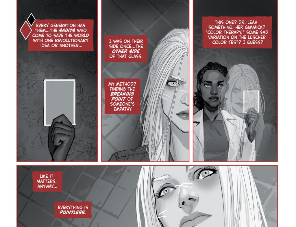
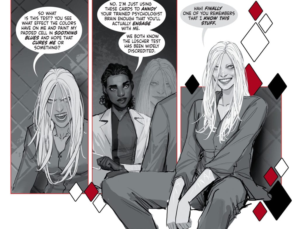
The first chapter of this new series is a continuation of the DC Black Label limited series Harleen, which depicted Harley Quinn’s descent into madness. “Harleen: Red” begins with Harley imprisoned in Arkham Asylum, running tests with a psychiatrist. This psychiatrist is performing a test involving colors, which we later discover is for a specific purpose. Harley continually calls out for the color “red” from her room, and no employee at Arkham understands the significance of this.
The story of “Harleen: Red” quickly engages readers from early on, and leaves them wondering what the significance of the color red could be. When this is finally revealed, the ending neatly wraps up the story and leaves the reader satisfied.
Art
The art in “Harleen: Red” is astonishing. Stjepan Šejić makes all of his characters have clear expressions, and his realistic art style is always a pleasure to look at. Šejić also frequently has characters going outside of panel borders, which can show how detached these characters are to the scenes around them, as well as provide visual diversity so that the pages look more appealing.
The color also plays a very important role in this story, and will most likely be heavily utilized in future stories in the series due to the limited color palette. Many techniques can be employed that are specific to the black and white medium, but by adding red Harley Quinn: Black + White + Red completely alters how stories can be told. Black and white causes the page to look completely unsaturated, so when red is used, it clearly stands out on the page. This is used effectively in “Harleen: Red” through the contrast of the cell at Arkham Asylum and Harley’s flashbacks to her times with the Joker. Red is used significantly less when focusing on Arkham, indicating that these scenes are more bland and insignificant to Harley.
In “Harleen: Red,” the meaning of the color red to Harley is discussed and attributed to things such as the color she and the Joker painted the town on their nights together. The color is also used as the border for many panels, causing them to pop out towards the reader significantly more than they would have. This is used to stress an importance on these panels, as well as show a rise in tension in various scenes.
Conclusion
Stjepan Šejić provides us with a riveting beginning to this new series. The use of the color red to make certain panels stand out is incredibly effective, and the story is precise and has a satisfying ending. “Harleen: Red” promises great things for Harley Quinn: Black + White + Red, and if the quality continues, the series will be one to remember.
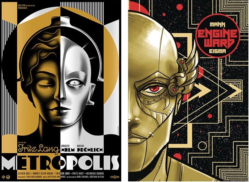
ENGINEWARD #1, available on July 15th from Vault Comics, introduces a post-apocalyptic society where new gods rule over an increasingly barren world, one whose citizens struggle to survive against giant beasts, water shortages, and an uncertain future. It’s the latest sci-fi/fantasy series from George Mann and Joe Eisma.
Cover
Joe Eisma’s cover art is both beautiful and familiar. It’s a portrait of Cancer, one of the new gods from the inaugural issue, but the background style and asymmetry of the shot hearken back to the art of Fritz Lang’s Metropolis (1927). Eisma’s art deco style in the background, coupled with the metallic face, seems at least inspired by the film’s poster. It will be interesting to see if the similarities are coincidental or if there’s a sly hint to the story’s future plot.
Writing
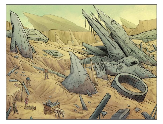
ENGINEWARD #1 is not a comic you read once, understand it perfectly, and then move on to something else. It takes multiple readings to get what’s going on with George Mann’s story. Mann’s narration makes references to ancient wars and civilizations that may or may not have existed in real life. To be frank, it’s not clear if ENGINEWARD takes place on Earth at all, future, or past.
Without spoiling anything, denizens of a dying world are living under the (possibly) oppressive rule of zodiac-inspired gods. Water and resources are in short supply, and the population has to scavenge to survive. Mann’s creation feels a lot like The Road Warrior (1981) world wrapped in Pseudo-Greek mythology, so just like the cover art, it’s both original and familiar.
That wholly original mashup is why it takes multiple readings to get through. Mann packs in so many little nuggets of lore from disparate cultures, I found myself performing various Google searches to figure out the references. It may be unintentional, but the first issue was a solid read that turned into a fun Easter Egg hunt.
Pencils/Inks
Joe Eisma’s art is clean and bright. A story about future versions of zodiac gods needs to have a fresh take on the character designs, and it works really well here. When the gods are assembled around their council table, you can instantly tell which god represents their sign with ease. Eisma especially impresses by using cybernetic accessories to distinguish esoteric gods such as Gemini without resorting to shortcuts like tattoos or two-tone clothing.
It’s only the first issue, so it’s not quite clear how the characters align themselves in the context of the overall story, but there’s definitely an element of class struggle: the gods rule and the lowly mortals struggle. Eisma’s art plays up this dichotomy of class separation in the settings between the different groups. Joss’ town is as dry, dusty, and ramshackle as any shantytown you could possibly imagine. The buildings look held together with scraps of metal and good intentions.
In perfect contrast, the gods’ headquarters is gleaming and architecturally graceful, a reflection of the gods’ aristocracy and insistence on pristine perfection. Eisma’s rendering of two extreme settings provides another layer of conflict between the two groups. By the art of the settings alone, you can clearly see where the antagonists and protagonists are coming from culturally and how their differences set up the conflict to come. In many ways, the art aesthetically reminds me of a SyFy television series called Defiance. Recommend you check out that show if you get a chance.
Coloring
Michael Garland’s colors are bright and light, casting the entire book in a pall of unrelenting sunlight. The palette choice matches well with a world that’s parched and baking into oblivion. Garland’s choice of muted pallet also works to add to the dry atmosphere of a world suffering from water shortages. That said, it would work a little better if the colors weren’t quite so clean. This is a dry and dusty world, so you would expect to see the characters look a little more dirty and worn.
Lettering
Hassan Otsmane-Elhaou’s lettering is well-paced for a story that mostly hinges on exposition. As already pointed out, there’s plenty of lore nuggets peppered throughout the story, so it would be easy to miss a crucial point if the lettering didn’t emphasize the right word or if word bubbles were overstuffed into a wall of text. Otsmane-Elhaou’s lettering also makes good use of alternate font colors within the same word balloon (something you rarely see) to indicate changes in voice tone. Nice work by the Otsmane-Elhaou here.
Conclusion
ENGINEWARD #1, available on July 15th from Vault Comics, is a healthy blend of future dystopia with ancient myth. The story is both new and loaded with deep cuts that will keep you thinking long after you finish reading. Check it out.
Author’s Note: Local Comic Shops (LCS) are going through a tough time right now with the pandemic outbreak of COVID-19. Comics fans of every flavor that care about his or her LCS should try to do what they can. So, here’s my part:
If you’re in Northern Delaware, South East Pennsylvania, or Southern New Jersey area, please take a moment to visit Captain Blue Hen Comics in Newark, DE. Say ‘hi,’ pick up a book, order a book (they’re on Comichub.com), and let them know you support them.
If you’re nowhere near that area, please find YOUR LCS using Comic Shop Locator and lend your support.
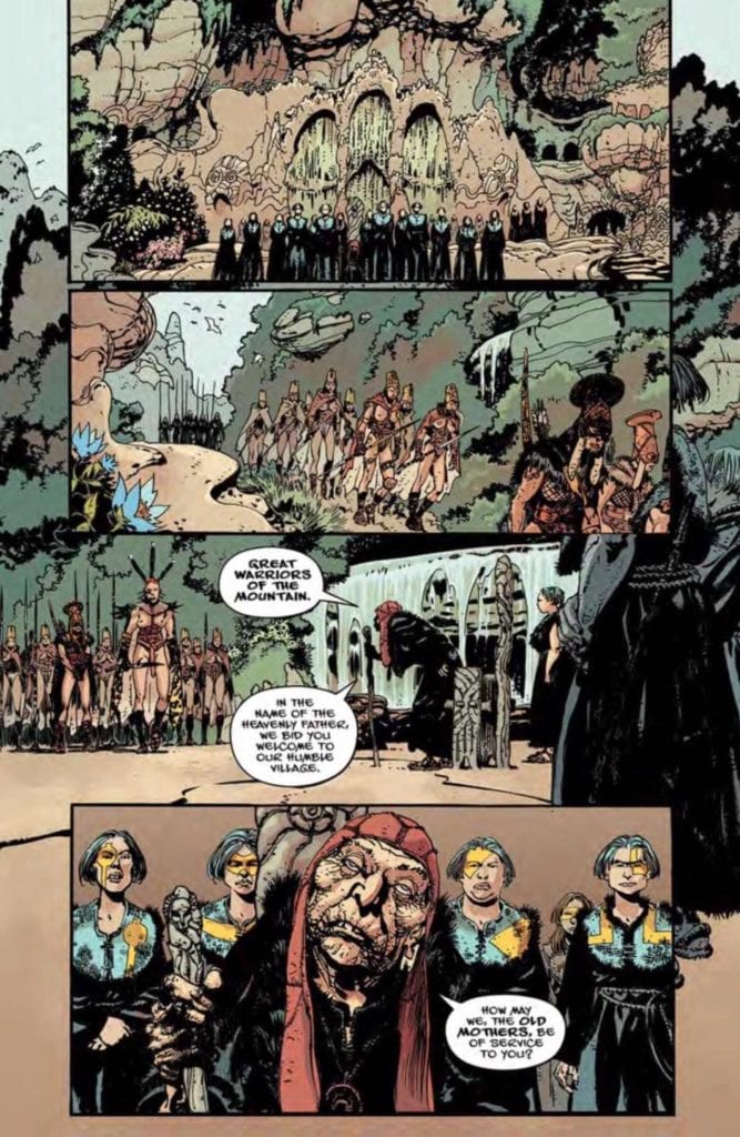
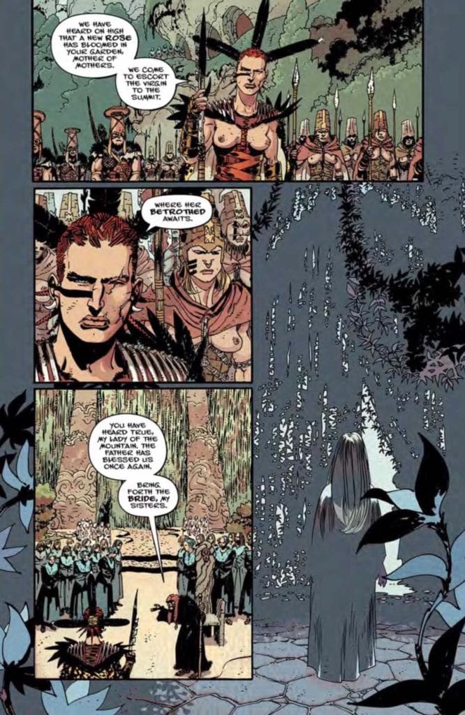
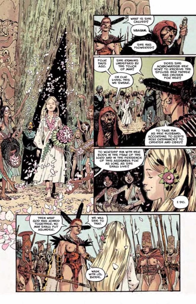
Writer Jason Aaron and artist R.M. Guera return with the sequel to their acclaimed mini-series “The Goddamned” with “The Goddamned: Virgin Brides” #1. Along with colorist Giulia Brusco and letters from Jared Fletcher, this first issue offers every bit of the unflinching brutality of its predecessor – while perhaps starting out a bit smarter. With an intense, gripping narrative and fantastic artwork, “Virgin Brides” #1 is a worthy pickup for both fans of the first series and newcomers.
“…the sons of God came in unto the daughters of men. And they bore children to them…”In the time before the Great Flood, the world of man is a place of wanton violence and unbridled depravity. But hidden high atop a mountain, there is a very different sort of world. One without men. Here, the holy sisters at a secret nunnery live in paradise, a new Eden, rearing their flock of orphaned girls to embrace their future as blessed Brides of the Sons of God. But when Sharri and Jael, two girls on the cusp of flowering, uncover what it truly means to become a Bride, they realize there’s only one way to escape the bonds of matrimony: run like hell.
Writing & Plot
Jason Aaron ( Scalped, Thor) mixes a tight narrative voice with rough, stilted dialogue and a suspense-laden plot in “Goddamned: Virgin Brides” #1. The driving mystery surrounding what happens to the young brides at the top of their sacred mountain is handled with deft pacing and foreshadowing. Ev after all of the images of horror in dream sequences and characters quietly speculating, nothing can actually prepare you for what is really happening on that mountain. The overlying narrative voice offers vague but knowing words to amplify the suspense. It is also written in elegant prose as if a god of some kind of offering sage wisdom over the chaos happening on this earth. The character dialogue itself is likely where this comic may lose some people. Much like the original “Goddamned” series, the dialogue is spoken in haphazard phrasing and awkward swearing that can make for a rough reading experience. In Aaron’s defense, this could be a mixture of two things: the first being that the dialogue here is spoken chiefly by frightened preteen girls, and secondly that the dialogue can be seen as a rough translation of whatever language the characters are actually speaking. Remember that this story is pre-flood, so logically English wasn’t around yet. This could be overthinking the script, but it is something to keep in mind. It’s hard not to sympathize with these young girls who have no knowledge of the situation they’re in, and it’s here alongside the suspense that Aaron really hooks the audience. Even if the dialogue style turns you off, every other written aspect fires on all cylinders in this brutal and bloody script.
Art Direction
R.M. Guera‘s prior works with Aaron (“The Goddamned: Before the Flood” and Scalped) have already showcased his immense talent in working with the author. His talents are still on full display here in “The Goddamned: Virgin Brides” #1. His elaborate and immensely detailed pencils excel due to his varied linework. Both the human and environmental detail is crafted by a mixture of thick and thin pen lines, as well as small cuts and dashes to indicate wear and dimension. The vast and intricate landscape art is rife with tiny detail that actually makes the land itself look sinister. No two characters look alike either, with Guera using a vast array of physiques, facial features, outfits, and even hairstyles. His nightmarish creations are nothing to scoff at either, as they are most often grotesque perversions of things the characters – and ourselves, honestly – hold dear. His presentation of the plot’s monstrous twists are executed in slow panel-by-panel reveals that make the absolute most out of the comic’s horror. Guera’s pencils are brought into grimy existence with Giulia Brusco’s muddy color palette. The watercolor-esque tones are given an almost dust-covered aesthetic that matches the rocky and grim setting. No area of color within the linework is just a solid color either, as there’s a subtle variation in the shades that give objects and people dimension. Jared Fletcher’s letters use an unusual jagged font with frequent variation in bolds, italics, and style changes based on context and they are perfect for the dialogue and narration of this unrelenting story.
“The Goddamned: The Virgin Brides” #1 is an unsettling and grotesque start to this sequel-series. Instead of the wanton slaughter of “Before the Flood,” this issue focuses more on horror by way of perverting concepts considered almost sacred to reality. Jason Aaron’s script mixes taut pacing, elegant narrative voice, and gruff dialogue to build this comic’s reading experience. The visual work of artist R.M. Guera, colorist Giulia Brusco, and letterer Jared Fletcher craft this world and its narrative with immense detail and craft a perfect aesthetic for this pre-biblical nightmare story. If you were a fan of the first series or this kind of brutal read is up your alley, be sure to grab a copy from your local comic shop on 7/1!
RED SONJA VOL. 3 #16, available from Dynamite on July 1st, tracks Sonja’s first task of leading child soldiers into war for the glory of Khitai. Instead of reveling in war for drama and excitement, Mark Russell’s story and Bob Q’s art paint the picture of a leader who views his people as disposable commodities. Sonja’s promise to serve him in exchange for saving her people, which quickly comes back to haunt her.
Cover Art
Jae Lee’s cover serves as a poignant encapsulation of this issue’s central theme. In the painting, Sonja is restrained from moving and speaking by the visage of death. Likewise, in the main story, Sonja feels powerless against the impending death of so many innocent lives as she’s bound by her oath to follow Jo’Qhan’s orders. It’s a beautiful painting, chock full of symbolism that pairs well with the story.
Writing
To this point, Mark Russell’s story arc has focused less on the adventurous aspects of Sonja’s life and more on the costs of leadership. Consistent with that theme, this issue de-glamorizes war and turns a glaring spotlight on the price of conquest, especially the price paid by innocent youth. It’s a strong message that, to Russell’s credit, isn’t preachy or heavy-handed.
In this issue, Sonja is commanded to annex a neighboring kingdom using a newly trained infantry. To her shock, Sonja discovers the soldier are little more than children conscripted in service to Jo’Qhan; a common practice within the kingdom. Sonja’s outrage is palpable, and yet, there are no easy answers as breaking her service to Jo’Qhan jeopardizes the lives of her starving people back home (see our review of issue #15 here).
The dilemma is thought-provoking, the dialog is organic, and the setup for the next issue is tailor-made for high drama.
Pencils/Inks
Bob Q’s art is in this issue is deceptive. The lines are clean, and the renderings are basic to the point of simplicity, but the simplicity in the backgrounds and character anatomy intuitively draws the reader to the character’s faces. Every face is painstakingly drawn to push the full range of emotion that’s going on within each panel.
There’s a lot of upset, angst, horror, and dismay going on in this issue, and you see it in full on Sonja’s face. When Sonja is presented with the “child” army, her eyes widen in shock. When Sonja discusses the hypocrisy of the kingdom’s traditions, here brow furrows in outrage. And when Zo’ran recalls how he was conscripted as a boy, his face sinks at the thought of a painful past. Bob Q’s face work carries this issue.
Coloring
Dearbhla Kelly’s coloring seems a little bolder in this issue than the previous issues. The child soldiers’ uniforms stand out in bright blue, directly contrasting with the impending doom of their situation. Kelly’s use of bright blue is complemented by brief punctuation of bright red in Sonja’s hair and Queen Phatmos’ robe. It’s a clever use of color that forms a link to the two characters that, so far, have not yet met.
Lettering
Hassan Otsmane-Elhaou’s lettering is outstanding for the use of selective bolding and font size changes within single word balloons. It’s common for a letterer to resort to scream bubbles to indicate raised voice or shouting, but Otsmane-Elhaou’s use of larger fonts provides a strong sense of speech emphasis on specific words. It’s a lettering style that feels more like natural speech, which helps the flow and pace of each panel—great work by Otsmane-Elhaou.
Conclusion
RED SONJA VOL. 3 #16, available from Dynamite on July 1st, takes a pulpy character and turns in a thoughtful story on the war’s impact on innocent children. The writing is well-balanced for the subject, and the art is deceptively emotional. Great job all the way around by the creative team.
ROGUE PLANET #2, available from Oni Press on June 24th, follows the Salvage Team as they navigate through alien “scarecrows” back to a ship with its own horrors. Written by Cullen Bunn and drawn by Andy MacDonald, ROGUE PLANET #2 is an effective cross between Event Horizon (1997) and Aliens (1987), with a dash of zombies thrown in for good measure.
Cover Art
Andy MacDonald and James Harren’s cover is a strong partner to the internal art and the overall design of the “scarecrows.” It’s not entirely clear what the creatures are…other than they “occupy” spacesuits of previous, and presumably deceased, visitors to Lonely Orphan. The perspective angle of the “scarecrow” is unsettling, and the body horror aesthetic elicits a heavy amount of gross-out cringe. If the cover is intended to unnerve you, it works.
Writing
Cullen Bunn’s story is straight-up sci-fi horror at its most cinematic. The entire team is on edge after Jimmy’s death, so Bunn hits you with tight, anxious dialog to keep the tension up when minimal action is happening. The team’s actions waffle between “run for your life” and “shoot first, ask questions later,” but the slowed pace doesn’t drag at all. If anything, Bunn keeps the reader walking on eggshells the entire time.
Meanwhile, the onboard crew faces a new threat from within their ranks. Without spoiling it, there’s more than one kind of alien threat on Lonely Orphan, and it’s taking out the entire crew one-by-one. If this issue could be summed up in one word, it’s “tension.” Bunn does a masterful job keeping the reader wound tight as you anticipate the unknown to suddenly snatch up the next villain.
Pencils/inks
Andy MacDonald’s art is the highlight of this issue for pushing the concept of alien further than you would expect. The “scarecrows” are tangible, but their design makes little sense in a way that’s wholly disorienting. Their forms look like messy, disembodied organs that you can picture as writhing and pulsing with malevolent life. The designs are both gross and horrifying.
Further props go to MacDonald for the bloody and claustrophobic scenes aboard the salvage ship. When one of the crew is attacked, you feel every invading wound like the worst case of nails on a chalkboard every conceived. MacDonald’s art is stomach-turning in all the best ways to compliment Bunn’s story.
Coloring
Nick Filardi’s coloring helps to emphasize the gross-out factor in this issue. The heads(?) of the “scarecrows” are bulging masses that read as weird intestines or organs of some type. What sells that look and feel is the spectrum of pinks, purples, and mauves Filardi uses to give the alien heads the look of intestines or at least something that doesn’t belong on the outside of a body.
Lettering
CRANK!’s lettering helps to navigate the reader by showing the dialog when the panel is NOT focused on the characters doing the talking. For example, the salvage crew is laser-focused on the “scarecrows” for the slightest sign of aggression. When the panel transition to the team’s point of view, CRANK!’s lettering effectively places the word bubbles to put you in the team’s perspective without breaking the flow of the conversation and keeping the pace up.
Conclusion
ROGUE PLANET #2, available from Oni Press on June 24th, is a compelling horror chapter in the spirit of John Carpenter and David Cronenberg. The writing is atmospheric, and the art is mind-bendingly gross. Get your sci-fi horror fix with this issue.
STAR TREK: YEAR FIVE #12, available from IDW on July 1st, finds Kirk willing to sacrifice himself, and the Enterprise, in a desperate bid to save the life of his crew from Gary Seven’s plans. Jackson Lanzing and Collin Kelly’s story does what Star Trek does best, show Captain Kirk finding a way to snatch Life from the jaws of Death. It’s a thrilling, albeit flawed, issue to cap off the current arc.
Cover Art
Stephen Thompson’s cover hits hard with its cliffhanger composition. You see the shadow of Kirk’s head, a pistol aimed squarely at the back, and a splash of blood on the wall. Thompson put all those elements together to evoke huge amounts of curiosity for what’s to come inside. This a prime example of a cover doing its job to maximum effect.
Writing
Lanzing and Kelly’s story picks up immediately after the end of issue #11 (read our review of #11 here) with Kirk and Seven locked in hand-to-hand combat for control of Enterprise. Meanwhile, Spock and the crew are scrambling to organize themselves on the planet surface below when they come under attack.
The story is simple and straightforward, almost to a fault. Lanzing and Kelly do a great job of setting up the conflicts among the different parties. It’s always fun to see Kirk get into pulpy fisticuffs, and watching Spock and Scotty work out a technical miracle to save the day plucks all the right nostalgia heartstrings.
It’s a classic Star Trek episode come to life, but it slightly suffers due to the lack of resolution and its utter predictability. Kirk and crew save the day (no surprise), but you learn nothing of Gary Seven’s plan or why destroying the Enterprise was so critical, so the ending is less satisfying than it could be.
Pencils/Inks
When you look at the credits, you see there were six artists and colorists in total. It’s possible the COVID-19 lockdown forced a shift in the art team midway through production, so the rest of the review will focus on the collective result rather than the individual contributions from Kieran McKeowan, Silvia Calafano, and Stephen Thompson.
The art works best during the action scenes throughout the issue. In particular, the perspective angles used in panels where you’re looking down Kirk’s arm as he reaches for a weapon, or you see somebody’s face coming at you after taking a punch to the jaw, are really effective. The artists display a solid command of anatomy and perspective to make the action feel like it’s coming at you.
What keeps the art from rising above average, is the lack of accuracy on the faces. A high point of the previous issue is the accurate rendering of the entire crew, so imminently recognizable in today’s culture. Here, the faces are not as realistic, and in a few panels, a bit rough looking. Again, this may be due to the shift in the art team, but the art seems rushed.
Coloring
Thomas Deer, John-Paul Bove, and Charlie Kirchoff worked together to capture a powerfully dramatic level of shading on the Enterprise’s bridge as Kirk says his last words. Spock and the crew’s phaser battle on the lifeless planet are blanketed with alien hues of Circe V. The red shirts (the characters always destined for death on any Star Trek episode) are just the right shade of red, but with enough gradient to give each (disposable) character’s uniform a healthy dose of texture. Excellent work by the colorist team.
Lettering
Neil Uyetake’s lettering does a great job keeping the reader’s eye moving along in a relatively fast-paced story. There’s not a lot of exposition, so there are very few caption boxes. It’s almost all dialog and quite a bit on some of the panels. Spock and Kirk both give fairly extensive speeches to their respective audiences, and Uyetake keeps the word bubbles tight and flowing with the action to keep the pace level up.
Conclusion
STAR TREK: YEAR FIVE #12, available from IDW on July 1st, is a strong finish to the Gary Seven invasion story. The admittedly predictable ending wraps up the plot neatly and sets up the conflict to come. The passable art is buoyed by great coloring and an expert lettering job.
Olympia #5 (of 5) out this week from Image Comics is the end of the road for the passion project from Curt Pires and his late father, Tony Pires.
Recap
Olympia #5 finishes the story of comic fan Elon, who encounters his favorite superhero Olympian. However, things aren’t quite right with Olympian, which leads to an invasion by the villain, Vilayne.
Olympia #5 Greater Story
It is best to read Olympia as a trade due to previous issues putting forth character development and artwork improvements for this finale. Olympia as a whole is a passion project by Curt Pires and his father Tony, who was battling cancer as he worked on it. These two, in turn, reflect the primary characters of Elon and comic creator Kirby Spiegelman. Elon finds solace in his lonely life through the Olympian comics created by Kirby. Kirby however already felt dead from life’s misfortune including a divorce. With Olympian’s appearance, the conversation between creators and fans take form.
Kirby starts to take the effect Olympian has on others a little more seriously. This gives him a greater appreciation for his creation in Olympia #5 to the point of calling him a son. Even if Olympian can seem a little dull when executing his plan to stop Vilayne. Elon, in response, takes the inspirations from Olympian and Kirby to become a better person ready to face hardships. It’s a pretty standard sappy story, but a wholesome one nonetheless between a father and son.
Art of Passion
Throughout the series, Alex Diotto’s pencils and ink develop and improve with each issue. This finale comes with a greater variety of shorthand detail and expression. Every wrinkle, angle, and panel feels carefully crafted to fit the setting. Not to mention the cinematic styles of momentum of the page’s panels. In one page, is the use of repeating panels with subtle changes to display the changes Kirby goes through and contrasting that are the action scenes where the inconsistent panels reflect the chaotic situations. Where the iconic Kirby Krackle fits perfectly.
The colors by Dee Cunniffe look deceptively simple in Olympia #5 when it comes to characters and architecture. Unlike the sky, which features a watercolor-like appearance that highlights the atmosphere of the setting. Yet it’s the amount of those simple colors that really strikes at the reader—especially when the lighter and darker colors reveal detail in close-ups.
The lettering by Micah Myers comes to show how the characters reach out to one another. The word balloons are completely contained in panels, never going out of bounds. This makes the words spoken by characters feel like they are directly talking to the reader. Shouting, continuing on from the first issue, meanwhile is trying to reach out to someone else in the story. Which more often than not allows characters to speak in the same panel, offering them equal ground.
Olympia #5 Ends One Story For A New One
Olympia #5 marks the end of a project where a father and son share what they love. Curt Pires is already pushing himself to new ideas with the likes of Youth. But before he joins the ranks of legends, don’t forget about the series where Pires and the artists show why they love comics. Between the critical moments in time, it’s best to enjoy the moments and what each brings to an even greater narrative.
What do you all think? Is Olympia #5 the finale the series deserved? Leave your thoughts in the comments.
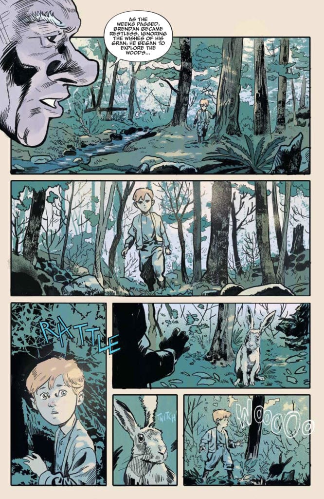
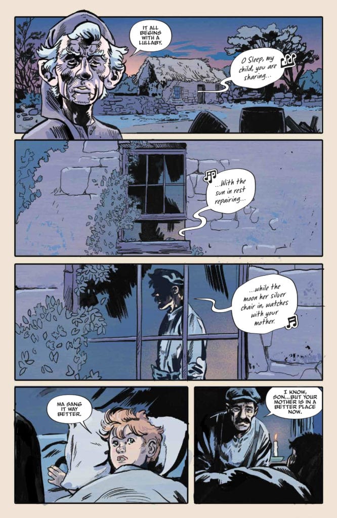
JIM HENSON’S THE STORYTELLER: GHOSTS #3, available from BOOM! Studios on July 1st, is a spooky tale about a young boy, still grieving the death of his mother, who encounters a dark spirit in the woods. Michael Walsh takes on the admirable task of writing, drawing, and coloring this simple and slightly gruesome, ghost story that follows an old Irish legend.
Cover Art
Despite Jim Henson’s name on this series, the story and art might be a little too intense for small children. Walsh’s cover does a great job of letting you know the story is spooky and macabre, and it sets up the tone of the internal pages perfectly. As an adult and lover of all things horror, this is right up my alley. That said, parents should review the issue first before handing it off to their youngsters.
Writing
Walsh’s story is a 100% pure, classic, campfire ghost story. A young boy, still grieving his mother’s death, hears the Banshee’s call and assumes it portends the death of another relative. In traditional Irish folklore, the Banshee portends a relative’s death, but it also grants a wish if you’re brave enough to catch it. As with all great ghost stories, the young boy finds the courage to get his wish but with horrifying consequences.
Walsh’s story is simple and effective, told almost exclusively from the boy’s point of view. There’s not a lot of complexity to the plot, and the dialog is sparse. Walsh wisely uses words only when necessary, and lets the art tell the story.
Pencils/Inks
Walsh’s art is well-suited for the story he tells. Every panel is saturated in moonlit blues, and the heavy use of shadow practically weighs down every page with sorrow and dread. The Banshee’s design is, also, suitably off-putting to emphasize how much courage the boy needs to “catch” it. Only a boy with true grit and determination would have the nerve to approach such a figure in the woods.
The slightly surprising part of the art is the mild shocks of gore for the Banshee and her “replacement” – eyes are bleeding, organs are hanging out, limbs are missing. It’s not a gratuitous amount of gore, but it’s enough to warrant consideration before giving this book to a young child. Occasional points of gore aside, the art is all atmosphere and very well done.
Coloring
Walsh uses a very narrow range of blues to set the tone of loneliness and dread lit by moonlight. It generally works, but it could use a little more contrast during the daylight hours to ratchet up the tension when nightfall comes. Outside the range of blues, there’s an occasional pop of red when blood is present to draw your attention. In short, great job by Walsh effectively using blues for shades and hues to push mood, but it tended to drift towards drab due to lack of contrast.
Lettering
Jim Campbell’s lettering hits the bullseye for its depiction of melodious speech. The Father sings a lullaby, the Banshee sings a different kind of lullaby and wails in the still of night, and the Banshee’s “replacement” sings the same ominous tune. It’s a lot of singing that needed to be lettered carefully to give both the impression of otherworldly voices and melodic speech at the same time. Since there’s not a lot of captions or narration, the brief bits of dialog and singing keeps the stories pace flowing at a brisk pace that still feels ethereal.
Conclusion
JIM HENSON’S THE STORYTELLER: GHOSTS #3, available from BOOM! Studios on July 1st, is a tight mix of campfire ghost stories and Irish folklore. The writing is gloomy in all the right ways, the art is creepy, and the monkey’s paw twist lands a punch. I highly recommend this book.