

ENGINEWARD #1, available on July 15th from Vault Comics, introduces a post-apocalyptic society where new gods rule over an increasingly barren world, one whose citizens struggle to survive against giant beasts, water shortages, and an uncertain future. It’s the latest sci-fi/fantasy series from George Mann and Joe Eisma.
Cover
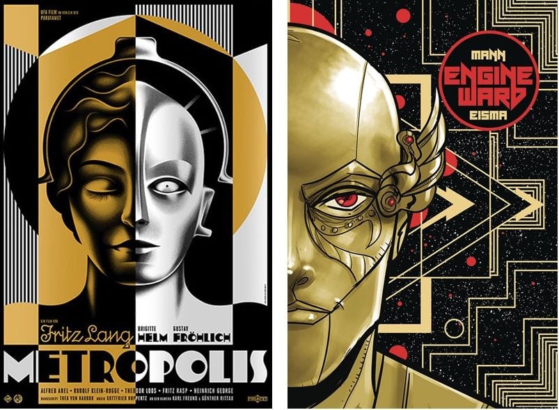
Joe Eisma’s cover art is both beautiful and familiar. It’s a portrait of Cancer, one of the new gods from the inaugural issue, but the background style and asymmetry of the shot hearken back to the art of Fritz Lang’s Metropolis (1927). Eisma’s art deco style in the background, coupled with the metallic face, seems at least inspired by the film’s poster. It will be interesting to see if the similarities are coincidental or if there’s a sly hint to the story’s future plot.
Writing
ENGINEWARD #1 is not a comic you read once, understand it perfectly, and then move on to something else. It takes multiple readings to get what’s going on with George Mann’s story. Mann’s narration makes references to ancient wars and civilizations that may or may not have existed in real life. To be frank, it’s not clear if ENGINEWARD takes place on Earth at all, future, or past.
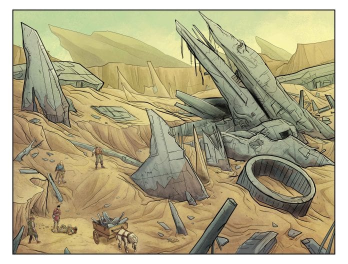
Without spoiling anything, denizens of a dying world are living under the (possibly) oppressive rule of zodiac-inspired gods. Water and resources are in short supply, and the population has to scavenge to survive. Mann’s creation feels a lot like The Road Warrior (1981) world wrapped in Pseudo-Greek mythology, so just like the cover art, it’s both original and familiar.
That wholly original mashup is why it takes multiple readings to get through. Mann packs in so many little nuggets of lore from disparate cultures, I found myself performing various Google searches to figure out the references. It may be unintentional, but the first issue was a solid read that turned into a fun Easter Egg hunt.
Pencils/Inks
Joe Eisma’s art is clean and bright. A story about future versions of zodiac gods needs to have a fresh take on the character designs, and it works really well here. When the gods are assembled around their council table, you can instantly tell which god represents their sign with ease. Eisma especially impresses by using cybernetic accessories to distinguish esoteric gods such as Gemini without resorting to shortcuts like tattoos or two-tone clothing.
It’s only the first issue, so it’s not quite clear how the characters align themselves in the context of the overall story, but there’s definitely an element of class struggle: the gods rule and the lowly mortals struggle. Eisma’s art plays up this dichotomy of class separation in the settings between the different groups. Joss’ town is as dry, dusty, and ramshackle as any shantytown you could possibly imagine. The buildings look held together with scraps of metal and good intentions.
In perfect contrast, the gods’ headquarters is gleaming and architecturally graceful, a reflection of the gods’ aristocracy and insistence on pristine perfection. Eisma’s rendering of two extreme settings provides another layer of conflict between the two groups. By the art of the settings alone, you can clearly see where the antagonists and protagonists are coming from culturally and how their differences set up the conflict to come. In many ways, the art aesthetically reminds me of a SyFy television series called Defiance. Recommend you check out that show if you get a chance.
Coloring
Michael Garland’s colors are bright and light, casting the entire book in a pall of unrelenting sunlight. The palette choice matches well with a world that’s parched and baking into oblivion. Garland’s choice of muted pallet also works to add to the dry atmosphere of a world suffering from water shortages. That said, it would work a little better if the colors weren’t quite so clean. This is a dry and dusty world, so you would expect to see the characters look a little more dirty and worn.
Lettering
Hassan Otsmane-Elhaou’s lettering is well-paced for a story that mostly hinges on exposition. As already pointed out, there’s plenty of lore nuggets peppered throughout the story, so it would be easy to miss a crucial point if the lettering didn’t emphasize the right word or if word bubbles were overstuffed into a wall of text. Otsmane-Elhaou’s lettering also makes good use of alternate font colors within the same word balloon (something you rarely see) to indicate changes in voice tone. Nice work by the Otsmane-Elhaou here.
Conclusion
ENGINEWARD #1, available on July 15th from Vault Comics, is a healthy blend of future dystopia with ancient myth. The story is both new and loaded with deep cuts that will keep you thinking long after you finish reading. Check it out.
Author’s Note: Local Comic Shops (LCS) are going through a tough time right now with the pandemic outbreak of COVID-19. Comics fans of every flavor that care about his or her LCS should try to do what they can. So, here’s my part:
If you’re in Northern Delaware, South East Pennsylvania, or Southern New Jersey area, please take a moment to visit Captain Blue Hen Comics in Newark, DE. Say ‘hi,’ pick up a book, order a book (they’re on Comichub.com), and let them know you support them.
If you’re nowhere near that area, please find YOUR LCS using Comic Shop Locator and lend your support.
Thanks, and stay safe.