

Harley Quinn: Black + White + Red is a new DC digital-first series that features the famous antihero depicted using only black, white, and red. The series will feature an all-star lineup of creator talent, and the first issue is sure to impress readers and leave them wanting more.
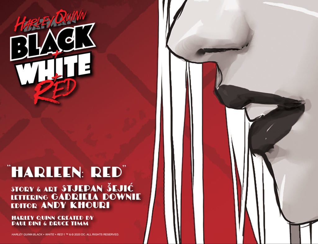
Written and illustrated by Stjepan Šejić, “Harleen: Red” is an astounding beginning to Harley Quinn: Black + White + Red, and is a great read. Anyone familiar with Harley Quinn as a character is sure to enjoy this story, and fans of Šejić’s Harleen limited series will love seeing that story continued.
“Harleen: Red” Story
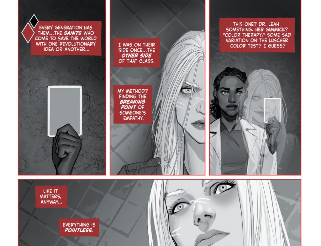
The first chapter of this new series is a continuation of the DC Black Label limited series Harleen, which depicted Harley Quinn’s descent into madness. “Harleen: Red” begins with Harley imprisoned in Arkham Asylum, running tests with a psychiatrist. This psychiatrist is performing a test involving colors, which we later discover is for a specific purpose. Harley continually calls out for the color “red” from her room, and no employee at Arkham understands the significance of this.
The story of “Harleen: Red” quickly engages readers from early on, and leaves them wondering what the significance of the color red could be. When this is finally revealed, the ending neatly wraps up the story and leaves the reader satisfied.
Art
The art in “Harleen: Red” is astonishing. Stjepan Šejić makes all of his characters have clear expressions, and his realistic art style is always a pleasure to look at. Šejić also frequently has characters going outside of panel borders, which can show how detached these characters are to the scenes around them, as well as provide visual diversity so that the pages look more appealing.
The color also plays a very important role in this story, and will most likely be heavily utilized in future stories in the series due to the limited color palette. Many techniques can be employed that are specific to the black and white medium, but by adding red Harley Quinn: Black + White + Red completely alters how stories can be told. Black and white causes the page to look completely unsaturated, so when red is used, it clearly stands out on the page. This is used effectively in “Harleen: Red” through the contrast of the cell at Arkham Asylum and Harley’s flashbacks to her times with the Joker. Red is used significantly less when focusing on Arkham, indicating that these scenes are more bland and insignificant to Harley.
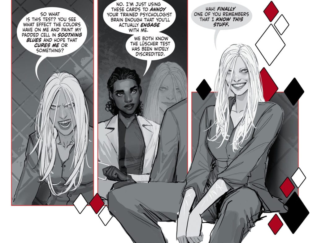
In “Harleen: Red,” the meaning of the color red to Harley is discussed and attributed to things such as the color she and the Joker painted the town on their nights together. The color is also used as the border for many panels, causing them to pop out towards the reader significantly more than they would have. This is used to stress an importance on these panels, as well as show a rise in tension in various scenes.
Conclusion
Stjepan Šejić provides us with a riveting beginning to this new series. The use of the color red to make certain panels stand out is incredibly effective, and the story is precise and has a satisfying ending. “Harleen: Red” promises great things for Harley Quinn: Black + White + Red, and if the quality continues, the series will be one to remember.