Home Blog Page 289

STRANGE ADVENTURES #3: Things Get Cut-Throat and Political

Strange Adventures Doc Shaner DC Comics

There’s a beautiful rhythm to DC Comics’ Strange Adventures. Like watching a tennis match, the issues play off of one another. Writer Tom King, artists Mitch Gerads and Evan “Doc” Shaner, and letterer Clayton Cowles focus back in on Adam Strange in this issue. Again, this issue of Strange Adventures tells two stories. Stories that work off of one another to paint a disturbing image of how Adam sees himself, while commenting on who he actually is. And it’s not long before we’re all wondering, what the hell are Alanna and Adam hiding?

Adam Strange: Savior / Alanna Strange: Proud Wife

Writing

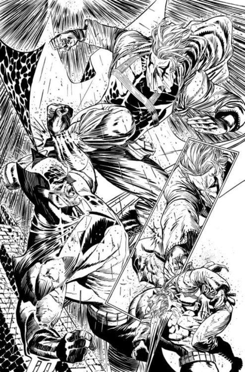
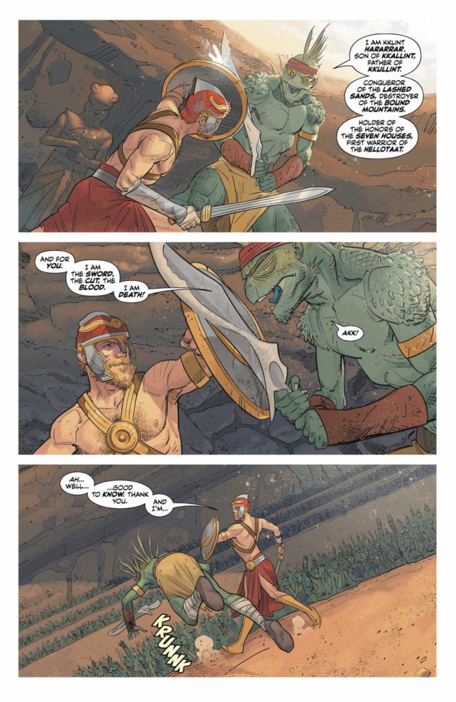
When describing the events of Adam’s autobiography, Strange Adventures, King is speaking in Adam’s voice. The things Adam says or does are things he wrote down and edited, for release to the general public. It doesn’t take that much skepticism to think of these moments as airbrushed and deceptive. What’s interesting in this chapter, though, is how much we see Adam was willing to reveal about his time on Rann in the pages of Strange Adventures. In a ceremonial fight before the Hellotaat, a group of aliens brushed off as “other” and therefore lacking true human qualities, Adam becomes nearly deranged as he kills his adversary.

Alanna seems completely unmoved by the whole thing. She had faith that Adam would be the winner. It never occurred to her he would lose. And so, as Adam stands over his bloody rival, Alanna’s next line is nonchalant. “Ah. The ceremony is done.” It feels as though this is a proud moment in this couple’s history. Alanna’s unwavering nature. But the tendrils of truth are beginning to sneak their way into the cracks of this story. We are beginning to see the sheer power of two people who simply think they’re the heroes, and therefore, whoever should oppose them must be in the wrong.

Art

Shaner’s art is always so crisp and clean. It’s in the Gerads panels that we see distortions and blurs, until now. With every issue, the impression these artists are making on each other is becoming clearer and clearer. Not only are they pushing each other to new heights, but they’re adopting each others’ storytelling techniques. And so, as Adam succumbs to a poisoned blade, the blurred outline of his approaching enemy seems very un-Shaner. But it works as a method of showing the hints of reality in Adam’s Strange Adventures autobiography.

Similarly, as Adam brings his helmet down on his enemy’s neck, over and over, his face is wild. It’s not the smiling, adventurer we’ve seen in the last two issues. He’s not clean. He’s not even clean-shaven. Instead, he has crazy hair and a wild beard. His eyes look animalistic. And as Shaner zooms closer in on Adam’s face, we lose the outline of his face. The details are obscured in lines over the page and the overlapping lines of his features. This only serves to further underline Alanna’s indifference. We see her in the next panel and she looks calm. We can barely tell if her eyes are open, her face looks so relaxed and unmoved. The juxtaposition is haunting.

Coloring

Shaner dirties his colors in this issue. What once was a world of purely solid colors has become speckled with dirt. Even before Adam throws down with the Hellotaat warrior, the air is filled with specks of dust. The light catches them in the darkness and give the room a sense of physicality. As the issue progresses, these “corruptions” of the color palette continue. Adam’s helmet gets its paint chipped; we see the grey metal beneath the red. But Adam paints the helmet again, giving it a new coat of red. The red of his enemy’s blood as he holds his helmet over his head and is himself engulfed in the murderous rage of red on the page. It’s all a clear stylistic shift in Shaner’s work, and it’s a beautiful physical representation of the progression of the plot.

Lettering

Cowles’ lettering in this section is not as simple as it may seem. The first sound effect Cowles gives us is in small but fat block letters with a black outline. It’s the sound of Adam tripping his opponent. When his opponent swings back at him, the sound of the sword has no outline to its lettering. It makes the sound feel both smaller and more dangerous. It’s this small, almost innocuous noise that begins the evolution. Soon Adam is screaming in large red lettering, which breaks past the bounds of his word balloon. As the scene progresses, sound effects lose their black outline. When the outline is present it’s cracked, like the sounds are refusing to be contained. It all ends in the large white lettering of Adam screaming. Lettering that refuses to even be contained by the page.

Adam Strange: Coward / Alanna Strange: Lady Macbeth

Gerads DC Comics Strange Adventures

Writing

King sure knows how to make you doubt everything he’s told you. As Terrific begins his investigation, we see the immediate panic in Adam and Alanna. Panic that is so based in reassuring themselves, and even fighting back, it’s clear they’re harboring a secret together. In the last issue, we learned that Terrific is convinced that Strange’s daughter never died. Whatever else that is all tied to can’t be good. Adam immediately jumps to legal action. Should he sue the Justice League to get them off his back? Through this King opens up a brilliant grey area: can the Justice League even be sued? And while Adam certainly seems guilty of something, is it not still wrong that the JL could be above the law?

There’s something gorgeous that follows. An interview Adam and Alanna give on TV about the investigation. Adam stumbles over his defense, but soon he shuts up. King gives Alanna all the lines. She comes to her husband’s aid; she protects him as a proud wife. As we see Alanna watching the interview later that night (or an alternate version of Alanna watching it live?? It does say “live” in the corner of the screen, after all… It might just be a recording she’s watching, but let me first say here that she might by a Pykkt clone.) she puffs on a cigarette and simply says, “Boom.” Her support suddenly feels calculated and cold. The whole thing suddenly feels wrong.
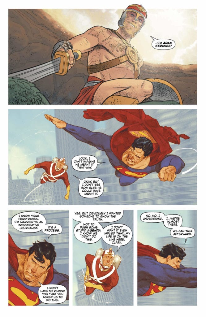
Art

Gerads art also takes some pages out of Shaner’s book, just as Shaner borrowed from Gerads. Some scenes feel strangely simple for a Mitch Gerads panel. Hawkman’s mace has a clearer outline. Superman and Adam Strange fly through the air, looking a little less fuzzy than is typical of Gerads. It gives us the feeling that these are the elements of the story that just make sense. They’re simple. And so, the gospel of Gerads begins to become the gospel of Shaner. Where once Shaner was saying “nothing to see here!” he is now sprinkling in red flags. And Gerads’ panels, chock full of worry and woe, are now full of clean smiles and clear action sequences.

In the world of acting, actors are often told to “play against a scene.” If it’s a sad scene, hold back the tears, if it’s an angry scene, try and keep your shit together. Holding back, or even pushing firmly into denial, elicits a stronger response from viewers. If you cry, you cry so the viewer doesn’t have to. If you don’t, then they may cry on your behalf. Gerads is doing this here. Pushing into “everything is Hunky Dory” so strongly, that we’re becoming more and more convinced of the opposite. Alanna and Adam’s brave faces, their big smiles, feel like masks over a sea of worry. Even their framing as they sit on their bed. With Alanna in the foreground looking much bigger and more confident, Gerads communicates who wears the pants in the relationship brilliantly. And it’s the very fact that they’re so desperately trying to hide all their angst makes us truly scared of what’s really going on.

Coloring

While there is certainly an element of clarity in these pages, solid colors in Superman and Adam’s suits and the like, Gerads’ doesn’t sacrifice all of his style in this narrative shift. We still get the variance in textures and color that make his pages pop so vividly. But some of the most splendid examples are the shift from one to the other. Superman’s flight with Adam is colored rather simply. The tone is very bright. But they fly around the corner of a building and are suddenly head to head with a giant alien spaceship. Red covers the top half of the page; distortions radiate out along with the alien tentacles.

It’s this shift that gives that moment weight. For Superman and Adam Strange, this is just a Saturday. Life is normal, the end of the world on the horizon is nothing they’re not used to. The bottom half of the page maintains the color scheme of the previous page. Superman and Adam won’t let this alien baddie spoil their bright and pleasant day. And in the final scene, Gerads swerves in the opposite direction. As Alanna gets out of the pool after a late-night swim, the page is colored in beautiful blues and greens. It’s menacing and spooky, while beautiful at the same time. It gives her all the class and allure of a Bond villain. The brightly lit news channel that recounts this late-night swim and chat makes it feel as though her sinister plans are making it out into the everyday world.

Lettering

As has so far been the case, Cowles goes out of his way to stay incredibly restrained in the Gerads scenes. The opportunities for sound effects are endless. Adam Strange wears a jetpack for Pete’s sake. But there are no whooshing noises. Hawkman even smashes a robot in the face, and no “boom” or “wham” accompanies the art. Similarly Cowles does the same with emphasizing words in dialogue. Very few words are bolded, especially when compared to the dialogue in the Shaner scenes. All of this is to focus readers on the deeply important things. Only the most important words are bolded, one or two for every few pages. We have to know what it sounds like when Alanna says Terrific’s name. And the only sound effect that shows up is the snapping of a camera. Cowles needs us to know Batman was caught talking with Alanna late at night. And so he makes sure he only puts the one sound effect in. It’s small, but it carries incredible weight.


Strange Adventures has an immense range from the swashbuckling adventures of faraway planets to the cut-throat politics of book tours. This creative team is working with each other, but also against each other, to produce some of the most breathtaking work to hit DC Comics. Pick up Strange Adventures #3 from DC Comics on July 14th!

Monkeys Fighting Robots Youtube

Assassin’s Creed Valhalla Prequel Comic In The Works From Dark Horse

Assassin's Creed Valhalla Prequel, cover

In anticipation of Ubisoft Montreal’s next Assassin’s Creed game, Assassin’s Creed Valhalla, Dark Horse Comics will be releasing a prequel comics series entitled Assassin’s Creed Valhalla: Song of Glory. The three issue series will be available in shops on October 21, 2020, prior to the game’s expected release some time in December.

Written by Cavan Scott and drawn by Martin Tunica, Song Of Glory follows a 9th-Century Viking as she contends with the fallout of a raid on a nearby village. You can read all about it in the full press release below.

Are you looking forward to the new Assassin’s Creed game? Does this prequel comic add to the anticipation? Let us know what you think in the Comments section, and please share this post on social media using the links below.

MILWAUKIE, Ore., (July 13, 2020)—Blades clash in this prequel to Ubisoft’s next hit video game, Assassin’s Creed Valhalla. Written by Cavan Scott (Star Wars Adventures, Vikings), illustrated by Martin Tunica, and colored by Michael Atiyeh (The Orville, Dragon Age: Blue Wraith), Assassin’s Creed Valhalla: Song of Glory takes readers back to a Mid-9thCentury Norway.

Eivor, a Viking warrior, observes a village raided by a neighboring kingdom. Bloodshed and mayhem erupt as she seizes the attack in her own favor—but will her victory be a blessing to her clan or a terrible curse? Elsewhere, another Viking searches for a different kind of prize, one of crucible steel . . .

Assassin’s Creed Valhalla: Song of Glory #1 (of three) will be in comic shops on October 21, 2020. It is available for pre-order at your local comic shop.

Be sure to check out The Art of Assassin’s Creed Valhalla and The Art of Assassin’s Creed Valhalla Deluxe Edition, which will be hitting shelves later this year timed with the release of the game. The books are available for pre-order on AmazonBarnes & NobleTFAW, and at your local comic shop.

Monkeys Fighting Robots Youtube

Inside The Box: Defining The Use Of Captions In Blade Runner Adaptation

Blade Runner cover
Blade Runner #2 Cover Credit: Marvel Comics

Just like any medium there are a number of elements that make up a comic. Some are essential; some relate only to the comics medium; some are artist extravagance. Elements fall in and out of favour and others are more suited to a particular genre.

When the modern American comic first became popular there was an element that most readers would recognise: The Caption Box. The Caption was most often used to provide the narration for the story, a voice-over or, on occasion, an inner monologue. Pick up any genre of comic in the 1940’s and 50’s and the Caption would have been readily used. Everything from pulp fictions, through horror and romance titles, and on into the superhero comic, Captions were a mainstay of comic book storytelling.

These days the Caption is less widely used and its purpose changes depending on the genre of comic. More weight is given to the art on a page that the need for a narrator has diminished greatly. You only need to look at the modern Superhero comic to see how Captions have changed. Once they were descriptive, telling the reader what was happening. These days they are mostly inner thoughts or emotional reactions of a character.

The use of Captions depends on a number of factors, including but not limited to, genre, storytelling, artistic style. Over the last 100 years the reliance on Captions has diminished. To truly appreciate this you have to understand the uses in the first place, and recognise the differences between narrative and emotive scripting.

Blade Runner Comic
Blade Runner Adaptation Credit: Marvel Comics

Blade Runner

Before I start to look at the use of the Caption within the Blade Runner comic I am going to define their purposes with the help of the movie. Or to be more precise, the movie’s original theatrical release.

After Ridley Scott delivered the movie to the studio, a poor test audience reaction resulted in the inclusion of a post production voice-over recorded by the star, Harrison Ford. The following two scenes are of significance and, in a way, illustrate the points I am going to make later on.

The first scene involves Deckard hunting down the Replicant Leon. He is travelling in his squad car, listening to an interview where the killer reveals his home address. Cut scene to Deckard and Gaff entering a hotel room. The voice-over states:

“I didn’t know whether Leon gave Holden a legit address. But it was the only lead I had, so I checked it out.”

The next scene I want to look at is at the very end of the movie. Deckard and Rachel have left his apartment to run away together, away from the city and away from the Blade Runners. As Deckard heads towards the elevator he discovers a small origami unicorn on the floor. Picking it up he remembers the words Gaff, who has been making origami creatures throughout the film, spoke to him in the previous scene, ‘It’s too bad she won’t live’. As Deckard and Rachel drive away into the idyllic countryside the voice-over informs the viewers:

“Gaff had been there, and let her live. Four years, he figured. He was wrong. Tyrell had told me Rachel was special: no termination date.”

The voice-over for both of these scenes does essentially the same thing and is unnecessary in both cases. In scene one Deckard is telling the audience what is currently happening, they are entering Leon’s home, but this was already established at the end of the previous scene. In fact the previous scene exists as a transition into the hotel investigation. In the second scene Deckard is informing us what has just happened, confirming that Gaff left the unicorn after having been at the apartment. Again this is unnecessary because the act of picking the origami unicorn up, mixed with the flashback of Gaff’s voice, gives the audience all of the information they need to work out what happened.

Both instances, and in fact the majority of the voice-overs in the film, serve no purpose other than to explain what is going on in the visual element of the movie. There is no stylistic or narrative enhancements provided by Ford’s halfhearted tones and pointless words. They belittle the visual storytelling and assume the audience doesn’t understand what they are seeing. It’s inclusion in the film illustrates a poor misunderstanding of the target audience and in the end makes the final product less than what it is.

And that leads us into the use of Captions with a Comic Book

Blade Runner
Blade Runner Adaptation Credit: Marvel Comics

Comic/Movie Comparison

In the 1982 Marvel Comic adaptation of the movie, written by Archie Goodwin and pencilled by Al Williamson and Carlos Garzon, the two scenes mentioned above are quite different. The comic itself contains considerably more voice-over and this primarily takes the form of Captions, filling the pages. Every detail of Deckard’s thought process is brought out via his inner monologue, displayed in the caption boxes.

In the first scene example, the monologue in the comic leads the reader across the bottom of the page, relaying the information that Deckard has received in order to find Leon. It acts partially like the computer recording in the movie version but also expresses the differences between the rich, powerful Tyrell Corporation and the destitute living conditions of the poor workers. The images in the panels do not reflect the rich/poor divide as clearly as they could, instead focusing on the cinematic visuals from Scott’s movie vision. However, the panels don’t need to carry this weight because the narration does.

After the page turn, the voice-over continues but instead of just telling the reader what is happening, as in the movie version, it gives us more detail. It includes character development, with it’s mention of Gaff, and sets a more detailed scene. It expands on the images that the panels portray to create a fuller experience.

The Captions have more of a narrative function than the voice-over in the film. You just need to look at the final page of the comic to see this. Deckard’s final words are an expansion of his character and how far he has travelled through the story. His relationship with Rachel and his outlook on life itself has been affected and this comes out through his thoughts. It goes way beyond explaining what the audience is looking at or what it means. In fact, it only hints at and insinuates what happened at the end, outside Deckard’s apartment.

This ending displays another purpose of Captions: a reflection of style. Blade Runner is seen as a neo- noir movie and links are made to classic pulp fiction films and novels of the 1940/50’s. However, the film, especially in it’s Directors cut version, leans more towards a science fiction thriller rather than a detective mystery. Although the elements of a Raymond Chandler novel are there, this isn’t a Philip Marlowe hard-boiled adventure. The comic, however, leans much further into this kind of narrative. It sets a tone more in line with a classic private eye tale, creating claustrophobic inner city scenes of deprivation and hopelessness. J F Sebastian’s apartment feels much smaller in the comic compared to the vast floor space depicted in the film. Even the interior of the Tyrell Corporation is scaled down to produce more intimate confrontations.

In short, Deckard’s inner monologue, lettered beautifully throughout by Ed King, fits with the stylistic visual choices made by the artists. The aesthetics, the pace, and ultimately the narrative, is more akin to a Chandler or Hammett novel. The movie is a visual treat but the comic really works the narrative gears.

Blade Runner
Blade Runner Adaptation Credit: Marvel Comics

Narrative Versus Style

Within the pages of the Blade Runner comic adaptation, Captions are used to tell the story and enhance the themes and style of the overall comic. Everything you need to know about the use of Captions in comics can be found in these pages, especially when compared to the movie version. There are elements of narrative progression, atmospheric setting, and stylistic interpretation. This 1984 comic bridges the gap between the more functional use of Captions in the 1940s and 50s and the stylistic approach of modern comics.

An array of comics have used Captions for different purposes but ultimately they come down to one of two main functions: Style and Narrative. They either set the mood for the reader or help to move the narrative forward. Genres such as Crime and Suspense are more inclined towards the use of Captions but the technique is still widely used, albeit with a different intent to those early American comics published by the likes of EC Comics.

Monkeys Fighting Robots Youtube

SQUADRON SUPREME: In The Shadows Of Watchmen

Squadron Supreme is a maxi-series detailing the year-long endeavors of superheroes in the real world. Its release in 1985, put it in direct competition with Watchmen. Watchmen‘s publisher DC Comics enjoyed a time of great sales with the title and The Dark Knight Returns. Squadron Supreme‘s publishing by DC’s rival Marvel Comics does not receive the same attention. But maybe the comparisons to Watchmen are what limit this series.

Background

The Squadron Supreme is a superhero team created at Marvel by Roy Thomas and John Buscema back in 1971 featuring pastiches of DC’s Justice League. There’s a whole mess of history including a similar supervillain team, the Squadron Sinister, but it’s not that important. Their entire creation is mainly so that the Avengers could fight the Justice League without legal restrictions. In any case, their clashes with the Avengers are mainly from being mind-controlled. And it’s one of those mind control situations that leads to the plot by Mark Gruenwald. Minor spoilers ahead.

SQUADRON SUPREME: In The Shadows Of Watchmen
Art by Bob Hall

Squadron Supreme: The Imperfect Humanity

After a mind control situation leaves their planet in a broken state, the Squadron Supreme decides to change tactics. Originally they are the only superhero team of their Earth, to the point of being a special military branch of the USA. Now with the planet in shambles, the squadron becomes more proactive by taking a yearlong control of the government. Everything from hunger, poverty, crime, and disease goes under their jurisdiction. Using their home cultures as a basis and their advanced technology, the Squadron set out their Utopia program.

Unfortunately there comes the hard questions like how a perfect society can form from imperfect people. Despite the squadron being the best and brightest of their Earth, they are far from infallible. The first comes from how even the team’s genius Tom Thumb can’t find the cure for cancer. A fate that Tom himself suffers from, likely from nuclear radiation exposure by one of his teammates, Nuke. Nuke in turn goes on a rampage as he caused his parent’s cancer and put all his hopes on Tom, only to be let down. A fight with one of his teammates, Dr. Spectrum, even results in Nuke’s accidental death after Nuke vaporizes his air supply. An act that haunts Spectrum for the rest of the series.

SQUADRON SUPREME: In The Shadows Of Watchmen
Art by Paul Ryan

How Dictatorships Warp People

What’s worse however comes from how no one in Squadron Supreme considers the long-term consequences. Tom Thumb and team magic-user Arcanna actually conceal their vulnerabilities rather than share to keep up appearances of strength. This need for physical perfection is actually a factor for dictatorships’ legitimacy. This refusal to show any vulnerability or helplessness puts these heroes and the people they try to help in compromising positions.

The biggest piece is the Behavior Modification machines to remove criminal intent. Just the concept alone feels like a human rights violation as tampering with people’s minds even psychopaths can leave them vulnerable to other acts. One such character Ape X after her brainwashing couldn’t even tell the squadron about a conspiracy as the conspirators use a loophole. And that’s after one of the Squadron Supreme members, Golden Archer uses the same machine to brainwash another teammate into loving him. Despite such a critical flaw, the Squadron plays it off as a minor statistic.

SQUADRON SUPREME: In The Shadows Of Watchmen
Art by John Buscema

Art

Squadron Supreme‘s one issue stories feature rotating artists who display the comic industry’s changes in art styles. Veteran Bob Hall pencils the first half of the series giving it a distinct design similar to the Silver Age’s surreal but thematic illustrations. All while Sam de la Rossa provides ink to further the consistency and dynamics of the action sequences. When John Buscema temporarily takes pencil control, he demonstrates Bronze Age style depth and focus, with emphasis on closeups. This provides a cinematic take focusing on the emotions going through characters as they make decisions. Jackson Guice providing just the right detail into people’s expressions. Paul Ryan continues the trend of cinematic styles by adding more photorealistic imagery. It’s a sign of changing times in comics in both style and tone.

Do Not Neglect Squadron Supreme

Squadron Supreme is a series about changes happening in the long-term. Unlike Watchmen which features stories within stories with consistent yet experimental artwork; Squadron Supreme is a transitionary piece about bringing Silver Age heroism to a realistic world and how it actually interacts with it. Thus a change in art style and tone as things become more serious. Each issue is a story of its own, but how one issue goes into another is a grand experience. So if you have a chance, this series will be well worth your time.

Monkeys Fighting Robots Youtube

Review: RED SONJA: AGE OF CHAOS #5 Gushes With Vampire Mayhem

Red Sonja Age of Chaos #5, Parrillo cover

RED SONJA: AGE OF CHAOS #5, available from Dynamite comics on July 15th, continues Red Sonja and Chastity’s race to the temple of resurrection before Purgatori beats them to it. Erik Burnham’s story and Jonathan Lau’s art ratchet up the action from the previous issue (read out review of issue #4 here) by shifting the one-on-one battles to an all-out war.

Cover Art

Lucio Parrillo’s cover is gorgeous, as always. Red Sonja stands triumphant in battle as she prepares to deliver the masterstroke. Strong and feminine all at once, Parrillo consistently paints covers that are worthy of framing on any comics fan’s wall.

Writing

Burnham sets the tone with a key word in the third panel on Page One: Urgency. Red Sonja and Chastity are racing to the temple ahead of the competition. The duo urgently battles Jade’s vampire horde before they lose ground. And Red Sonja must quickly defeat Purgatori to gain control of the amulet. It’s race after race after urgent battle. This is edge-of-your-seat action storytelling at its finest.

What makes Burnham’s writing even better is the attention to separate voices with this plethora of characters. If there were no panels and you were just given the dialog, it would be easy to tell which phrase was spoken by Chastity versus Evil Ernie, as an example. Keeping unique voices separate and distinct breathes life into the characters, and Burnham does it expertly.

Pencils/Inks

Again, I’m struck by the texture and depth of Jonathan Lau in this series. Lau’s work is exceptionally detailed to the point of being photogenic. Reminds me of the early days of Image Comics BUT with less anatomical exaggeration and propensity for hero poses, a stronger sense of movement and power with the characters moving in their surroundings.

On a small note, this issue has the coolest fight scene decapitation I’ve seen on print or film in a very long time. It’s a, quite frankly, badass move, and I hope to see more cool choreography like this in the future. Speaks to Lau’s gift for rendering action and fight scene choreography.

Coloring

Andrew Dalhouse’s coloring is on fire in this issue…literally. Through the first third of the issue, the duo is riding horses at full speed, and as night falls, the torches come out. Dalhouse punches up the night scenes by incorporating the fire glow into the battle to give it huge amounts of visual interest to break up the wave of vampire thralls on the attack. At one point, Dalhouse blends the torch fire with the redness of Sonja’s hair to almost imply her hair is burning with battle fury. It may have been unintended, but it works.

Lettering

Carlos M. Mangual has demonstrated he can letter sword slashes perfectly. With so much swordplay going on, Mangual’s sound lettering makes it easy to pick out which weapon is delivering the key stroke when and where it happens. A great example of using sound effects to not only add to the art but to direct the reader’s eye to help tell the story.

Conclusion

RED SONJA: AGE OF CHAOS #5, available from Dynamite comics on July 15th, is my weekly top pick for the second issue in a row. The story practically drips with adrenaline, the art is exciting. Don’t sleep on this book.


Monkeys Fighting Robots Youtube

The God Of Symbiotes Invades The Marvel Universe This December

Marvel's King In Black, cover

This December, Knull will invade the Marvel Universe with Donny Cates and Ryan Stegman’s next installment of their take on Venom, KING IN BLACK. This next chapter promises an epic showdown between a devastating enemy and the likes of the Avengers, the X-Men and the current Venom, Eddie Brock.

According to Venom series writer Donny Cates, “As far as event books go, this is the coolest, darkest, most heavy metal, Cthulhu dark horror thing I’ve ever been able to do.” It’s no surprise Cates would invoke the phrase “heavy metal” given the explosive momentum Marvel competitor, DC Comics, has been able to leverage coming out of the Coronavirus lockdown with their event – DARK KNIGHTS: DEATH METAL. A momentum Marvel has so far been unable to match with it’s current releases. Perhaps KING IN BLACK  will give Marvel just the boost it needs.

Check out the full press release and preview trailer from Marvel below.

The Venom series has been very popular under Cates and Stegman. Are you excited for this new villain to arrive on the Marvel stage? Are you keeping up on the current Venom run? Let us know what you think in the Comments section, and please share this post on social media.

THE NEXT SHOCKING CHAPTER IN DONNY CATES AND RYAN STEGMAN’S VENOM SAGA REVEALED

KING IN BLACK CONQUERS THE MARVEL UNIVERSE THIS DECEMBER!


New York, NY— July 10, 2020 — This December, the entire Marvel Universe braces itself for KING IN BLACK, the latest installment in writer Donny Cates and artist Ryan Stegman’s revolutionary take on the Venom mythos. Knull is coming, and when he arrives, everyone from the Avengers to the X-Men will learn just how unprepared they are to face off against the God of the Symbiotes. Everything in Cates and Stegman’s landmark run on VENOM has led up to this monumental story, and readers will finally witness Eddie Brock’s climatic standoff with one of Marvel’s most terrifying villains.

With each mind-bending twist and turn, the stakes will be raised like never before as KING IN BLACK flips everything you thought you knew about Venom and the world of the symbiotes upside down and inside out. Learn more in a special video announcement from the mastermind creative team, and stay tuned for more news about what to expect when KING IN BLACK lands later this year!

“As far as event books go, this is the coolest, darkest, most heavy metal, Cthulhu dark horror thing I’ve ever been able to do,” promises Cates. “I still can’t believe that Marvel is letting us go as dark and scary as we’re going.”

“One of the things I’m most proud of in this series… is the creation of the character Knull,” Stegman says. “We have some new designs that we’ll be unveiling throughout the series that are really cool and really creepy.”

Ready or not, don’t miss KING IN BLACK #1 when it hits stands this December!

Monkeys Fighting Robots Youtube

Review: KILLADELPHIA VOL 1 Gives New Life To An Old Enemy

Killadelphia Issue #1 Cover

Killadelphia Vol 1 is a beautifully drawn horror comic book published by Image Comics that breathes new life into the age-old enemy of vampires by presenting them in a realistic modern-day setting.

About the book:
When small-town beat cop Jimmy Sangster returns to his Philadelphia roots to bury his murdered father, he stumbles into a mystery that will lead him down a path of horrors and shake his beliefs to their core. The city that was once the symbol of liberty and freedom has fallen prey to corruption, poverty, unemployment, brutality…and vampires.There’s a reason they say you can’t go home again. Welcome to Killadelphia.

Through the writing of Rodney Barnes, the art of Jason Shawn Alexander, the coloring of Luis NCT, and the lettering of Marshall Dillon, Killadelphia comes together to be an incredibly enjoyable vampire tale.

Vampires attacking a subway

Killadelphia Story

Killadelphia vol 1 does not spend much time developing the characters before the action begins, but this surprisingly has little impact on whether the readers care about the characters. The book has a clear emphasis on action, and this is wonderfully supported by the artwork, so it is alright that the characters’ stories take a step back. Killadelphia makes up for this light characterization by having the stories of many of the characters be familiar. James Sangster Sr. is a police detective that cares about seeing justice in his city, James Sangster Jr. suffered from an emotionally distant father, and one character is deeply affected by the passing of his grandmother. All of these are character traits that we are familiar with through other media or possibly our own lives. This gives us an emotional connection to these characters before we’ve even had the chance to get to know them, and we can enjoy the characters surviving through the horrors without dwelling on characterization that can be developed more later.

Killadelphia with Dark Color Scheme

Art

The art of Jason Shawn Alexander is enough reason alone to pick up a copy of Killadelphia Vol 1. The semi-realistic art style gives the horror story a more serious tone and is simply a pleasure to look at. The ultra-violent scenes also have a much more lasting impact when the characters look real and are more prone to shock readers than a different art style.

Luis NCT used a limited color palette for most of Killadelphia, which helped set the tone of the volume. The use of dark and dirty colors and textures made the characters, clothes, and city seem more realistic and is a refreshing change from most of the comic books on shelves today. In scenes featuring blood and violence, different shades of red almost completely overtake the scene, which causes panels to boldly stand out from the rest of the scenes, and highlights the viciousness of what is occurring on panel.

Killadelphia Violent Scene

Marshall Dillon picks his moment to stand out in volume one of Killadelphia. When the vampires begin to attack, the lettering plays a significant role in terms of sound captions. Onomatopoeias such as the “Skreee” of a shrieking vampire written in blood red and an entirely different font helps to highlight the inhumane nature of the creatures and is a wonderful instance of how important lettering can be. No sound or a less energetic font could have completely slowed the energy of the scene, and ruined the fast-paced action of the scene. There are several other instances where sound captions are used, and Dillon does an amazing job so that each of these has an impact on the reader.

Conclusion

Killadelphia Vol 1 is, without a doubt, something to check out. It’s vampires brought into the modern-day, complemented by fantastic art, coloring, and lettering. The action scenes flow so smoothly and are visually stunning in so many ways. Barnes, Alexander, NCT, and Dillon absolutely knocked it out of the park with this first story arc, and it will be exciting to see the path the story continues to take.

Monkeys Fighting Robots Youtube

DC Cover Reveal: “Joker War” Finale In BATMAN And DETECTIVE

Detective cover reveal

October may bring the conclusion of “Joker War,” but that doesn’t mean things in Gotham City will suddenly be calm and peaceful. Check out DC’s cover reveal for Batman issues #100 and #101, along with Detective Comics #1028:

This October, there’s more trials and tribulations than tricks and treats in store for Batman and Gotham City! As his ferocious battle with the Clown Prince of Crime comes to an end, there are more questions than answers ahead for Gotham’s guardian (including a completely unexpected guest star)!

Here’s an early reveal of covers and art from some must-have Bat-books coming your way in October!


BATMAN #100

Written by JAMES TYNION IV

Art and wraparound cover by JORGE JIMENEZ, GUILLEM MARCH, CARLO PAGULAYAN and DANNY MIKI

Card stock variant cover by FRANCESCO MATTINA

1:25 card stock variant cover by JORGE JIMENEZ

On sale OCTOBER 6, 2020

In this extra-sized finale issue, “The Joker War” comes to a city-shattering conclusion as Batman battles The Joker in a brutal, no-holds-barred final duel! This is a fight 80 years in the making, and its outcome won’t just change Batman’s life—it will change Gotham City for years to come!


DETECTIVE COMICS #1028

Written by PETER J. TOMASI

Art by NICOLA SCOTT

Cover by KENNETH ROCAFORT

Card stock variant cover by LEE BERMEJO

On sale OCTOBER 13, 2020

Spinning out of the events of “The Joker War” and Detective Comics #1027 comes a tale of the beginning of the end for Gotham City’s status quo. With tensions flaring and a new mayoral candidate making his anti-masked hero agenda known to the city, Batman and his allies are stretched thin to keep the peace. But just as things couldn’t look any worse, a string of gruesome murders has left a trail of the most corrupt in Gotham City losing their heads…literally. If Batman doesn’t quickly find the killer— the Dark Knight will be next.


BATMAN #101

Written by JAMES TYNION IV

Art and cover by GUILLEM MARCH

Batman/Grifter card stock variant cover by FRANCESCO MATTINA

1:25 Grifter card stock variant cover by JORGE JIMENEZ

On sale OCTOBER 20, 2020

A new day dawns in Gotham City, and the horrific aftermath of “The Joker War” is only starting to unfold…how has The Joker’s rampage affected the citizens of the city? What legacy did the Clown Prince of Crime leave, and how it will hit the Dark Knight? And why does Cole Cash—a.k.a.—Grifter, now work for Lucius Fox?!

Monkeys Fighting Robots Youtube

New Preview For HARLEY QUINN BLACK+WHITE+RED CH. 3: “Get Yer Story Straight”

Harley Quinn Black+White+Red, cover

The next weekly installment of DC Comics digital series, HARLEY QUINN BLACK+WHITE+RED, is out with Chapter Three. The chapter, entitled “Get Yer Story Straight,” tells the story of three thieves who stole the wrong item from the wrong person, leading to a whole lot of problems for the thieving trio.

Penned by Eisner Award-winner Saladin Ahmed and drawn by artist Javier Rodriguez, the chapter is now available on participating digital platforms. You can check out the full press release, and a preview of the chapter, below.

Have you been enjoying this series so far? Let us know what you think in the Comments section, and please share this post on social media using the links below.

We told you that each chapter of the new anthology series Harley Quinn: Black + White + Red would be unique, and we meant it! Saladin Ahmed and Javier Rodriguez, the team behind Exiles, have delivered the today’s chapter of DC’s Digital First smash hit series with their signature style…and plenty of classic Harley Quinn red all throughout!

For immediate release: https://www.dccomics.com/blog/2020/07/10/harley-quinn-black-white-red-chapter-three-get-yer-story-straight

Harley Quinn Black + White + Red Chapter Three:

“Get Yer Story Straight”

Announced just two weeks ago and hammering fans weekly with Harley Quinn stories in the vein of Batman: Black & White, the third chapter of Harley Quinn: Black + White + Red has arrived! Eisner Award-winner Saladin Ahmed and Javier Rodriguez’ take on DC’s Clown Princess of Crime is now available on participating digital platforms, including readdc.com, Comixology, Amazon Kindle, Apple Books, and more!

In Ahmed and Rodriguez’ story, three crooks just managed to do the unthinkable: they stole something invaluable from Harley Quinn herself! But as they compare notes on how the job went down, they start to notice some…discrepancies in what they saw…

Harley Quinn Black + White + Red Chapter Three by Saladin Ahmed and Javier Rodriguez, lettered by Clayton Cowles, is available now, along with previous chapters by Stjepan Šejić and Mirka AndolfoTim Seeley and Juan Ferreyra’s chapter—“Who Diss?”—will publish next Friday July 17.

Harley Quinn: Black + White + Red promo art is by Jorge Jiménez.

DC’s comics are available on participating digital platforms seven days a week, including readdc.com, Comixology, Amazon Kindle, Apple Books, DC UNIVERSE, and more.

Monkeys Fighting Robots Youtube

Review: THE OLD GUARD VOL. 1 – OPENING FIRE – Do You Want to Live Forever?

With Netflix releasing a movie based on the original story by writer Greg Rucka and artist Leandro Fernandez on July 10, 2020, it is worth taking a look back at The Old Guard Vol. 1 – Opening Fire. Joined by colorist Daniela Miwa and letterer Jodi Wynne, Rucka and Fernandez’s story is an action-filled tale taking on themes that are as old as humanity: death and the hope of immortality.

Writing

The strength of Rucka’s writing has always been the grounded characters he places in his stories. In this case, soldiers Andy, Booker, Joe, Nicky, and newcomer Nile, a group of nigh-immortal humans and guns for high. When they are betrayed by their business associate Copley (and later we find out, one of their own) to the villainous Steve Merrick, a self-described ruthless big pharma businessman who hopes to unlock the secret of immortality by kidnapping these soldiers, they all figure out exactly what it is that they’re living for.

Honestly, the villain of this story is pretty forgettable. Think of Merrick as any douchey, ‘roided up Vin Diesel antagonist. He’s a pretty two-dimensional villain, but this story isn’t about a compelling villain, but the struggle with immortality for those for whom life has ceased to be meaningful. As time marches on and loved ones pass on, what is left but their fading memories, followed by more of the same? This is what makes Rucka’s tale compelling, learning to live, and find meaning in a world that one has grown tired of.

Art

Fernandez’s art is serviceable for the story. He certainly never shies away from blood, but he doesn’t distract from the thematic heart of the story by overemphasizing the gory parts of the story. A story like this, with a bunch of nigh-immortals who easily heal from their injuries, particularly lends itself to highlighting the wounds and injuries of the protagonists. However, while Fernandez doesn’t shy away from portraying the injuries of the story’s protagonists, he relies on the use of blood splatter and shading that communicates the extent of the injuries without focusing an undue amount of attention on them.

It’s not that the grotesqueness of their injuries are never shown, but for such an action-heavy comic, Fernandez’s portrayal of the violence inherent in the story is pleasantly restrained in a way that services the story.

Coloring

Miwa relies on a muted color palette, which fits the tone of the story. Old Guard is about a world that has “lost its shine” for its protagonists. They’ve lived long enough to long for the endless cycle of life to end. Of course, Miwa, along with Fernandez, should be credited with the restraint they show in portraying the violence in this comic. Rather than highlight every bit of brain and viscera that the protagonists’ injuries lend themselves to, they opt for something that services the story in a modest way.

Lettering

The lettering in this issue is great. Wynne doesn’t add any flourishes to necessarily distinguish one character’s dialogue from the other, but whether she’s lettering dialogue in person, over the radio, or narrated voice-over, she keeps the story moving.

One part of the lettering I particularly enjoyed was the sound effects. There is a memorable scene where Andy and Booker get into a fight and start shooting each other. Nile, in her frustration, decides to put an end to the fight.

I may have laughed out loud when I flipped the page to this scene! Great use of sound effects here, and again, while I don’t show it here, Andy’s and Booker’s injuries aren’t shown in overly graphic detail.

Conclusion

As a long-time fan of Rucka’s work at DC, it was a pleasure to read some of his creator-owned material. While dealing with extraordinary circumstances and weighty themes, Rucka keeps the story grounded in the lives of his characters. I will say, per my comments about Merrick earlier, that I am afraid that Old Guard will receive the Bloodshot treatment in its film debut. Bloodshot was certainly a serviceable film, but still a relatively shallow Vin Diesel action flick. My fear is that the thematic richness of the story will be lost in a film adaptation, but we’ll have to wait and see.

What did you think of The Old Guard Vol. 1 – Opening Fire? What did you think of the Netflix movie? Tell us in the comment below!

Monkeys Fighting Robots Youtube