Home Blog Page 267

DOCTOR TOMORROW #5: The End Of The Hero’s Journey Cycle

Doctor Tomorrow #5 Cover

Doctor Tomorrow #5 is this week’s finale to Valiant Entertainment’s short but sweet series by writer Alejandro Arbona, artist Jim Towe, colorist Kelly Fitzpatrick, and letterer Clayton Cowles.

Recap

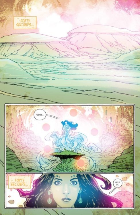
Doctor Tomorrow follows Bart Simms, a teenager who encounters his alternate superhero self who recruits him to fight a supervillain. After some breakneck battles and revelations, Doctor Tomorrow comes full circle in Bart’s journey.

Doctor Tomorrow #5: The End of The Circle

Doctor Tomorrow #5 completes the series by reflecting situations from previous issues. From confronting the antagonist to making amends with past friends, Arbona uses subtlety for new audiences. This series’ main flaw comes from an MFR interview with Arbona, how some slightly important details rush for the story’s sake. Continuing on the Hero’s Journey formula, this return phase is an accomplishment for the entire series. Especially since Bart makes important interactions that resolve some internal and external conflicts he has. Although on its own, this issue feels like it’s completing a checklist.

Art

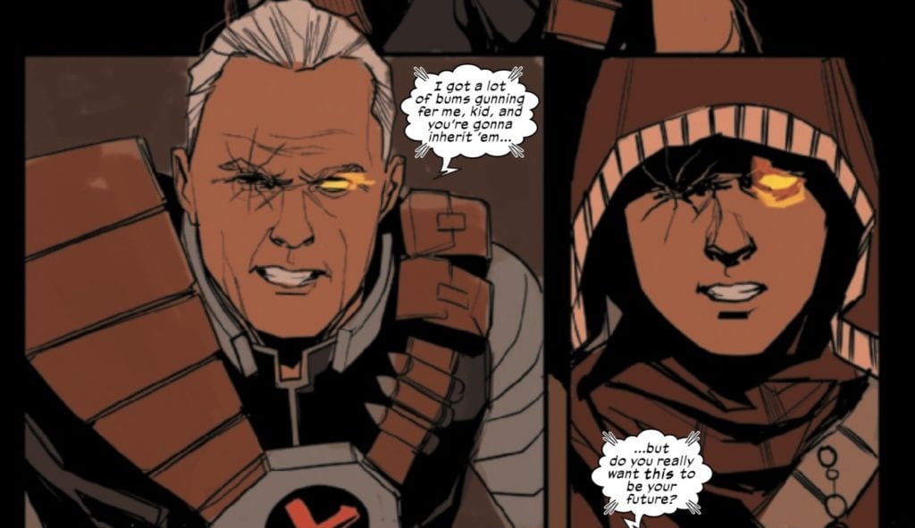
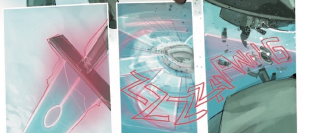
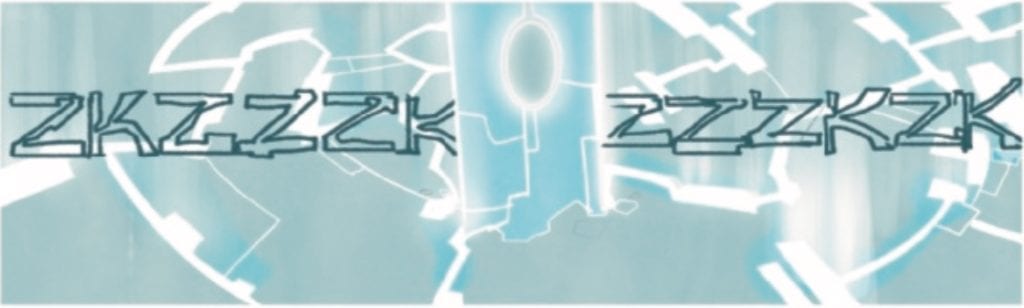
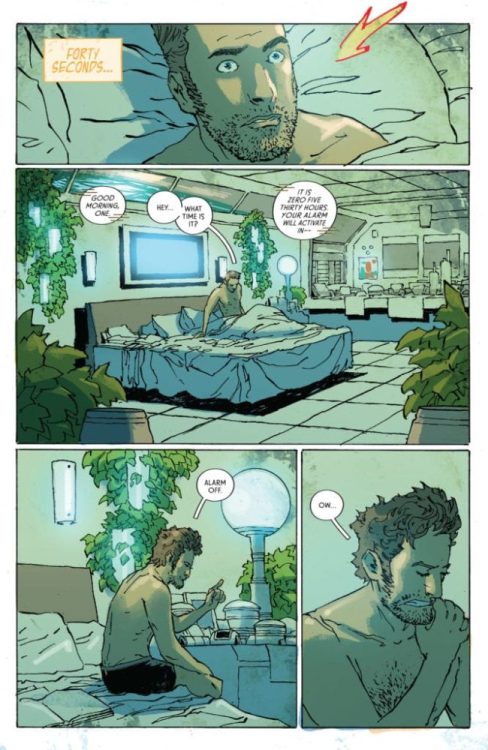
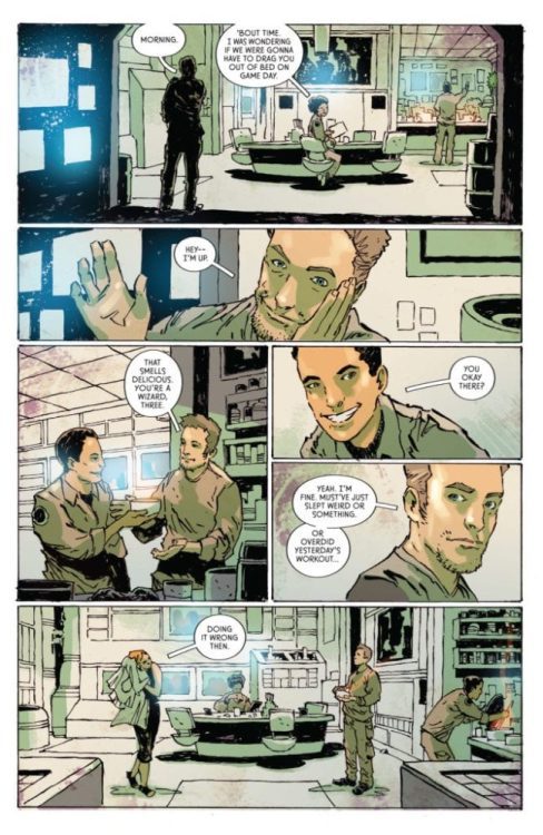
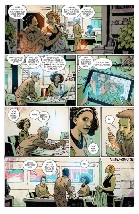
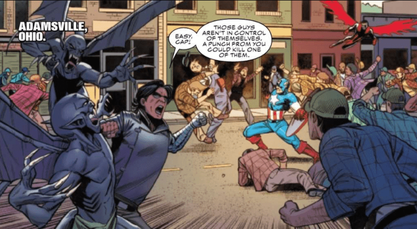
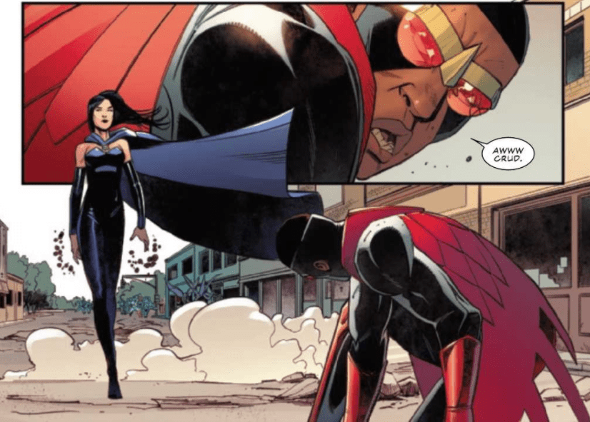
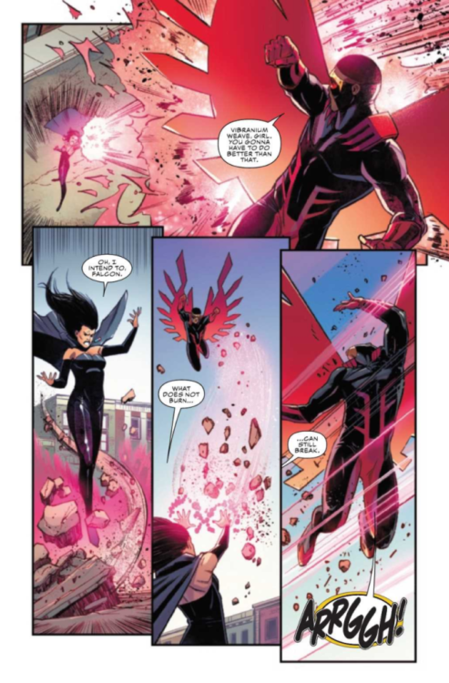
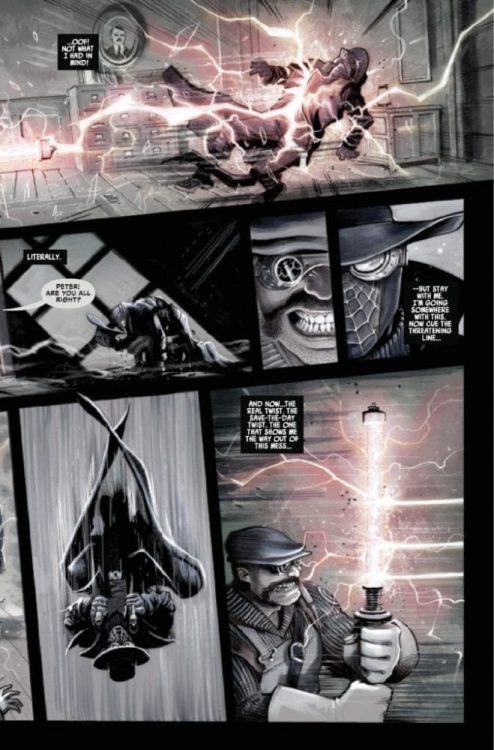
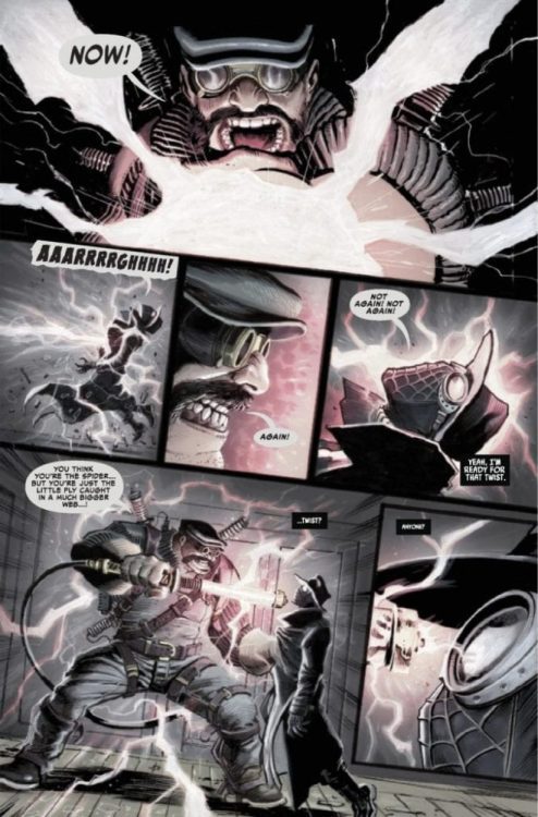
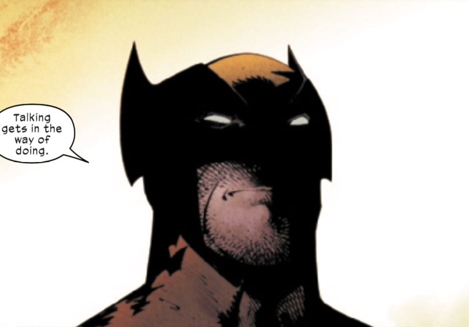
Towe’s artwork benefits from subtleties, similar to the story. The facial differences between the adult Bart and Doctor Tomorrow display their characters. Doctor Tomorrow has scars he couldn’t prevent while Bart, despite being the same age, has a cleaner maturity. Which is more than the fight between them can attest to. The fight is bland with the superpower blows barely appearing to make an impact, even with Doctor Tomorrow’s defeat. Their last conversation with the small changes in facial features holds more weight between them. In fact the baseball sessions between Bart and his friend Gretchen are a better display of Bart’s powers. It’s also what gives Doctor Tomorrow #5 more power to it as a sign of growth in comparison to the first issue.

Fitzpatrick’s coloring at least gives the powers on display their desired effect of impact. A glowing fist from Doctor Tomorrow can serve as a warning for Bart about a powerful blow. Even interactions between them with the sun shining in the background give weight to their conversations. It’s practically highlighting crucial moments in their interactions.

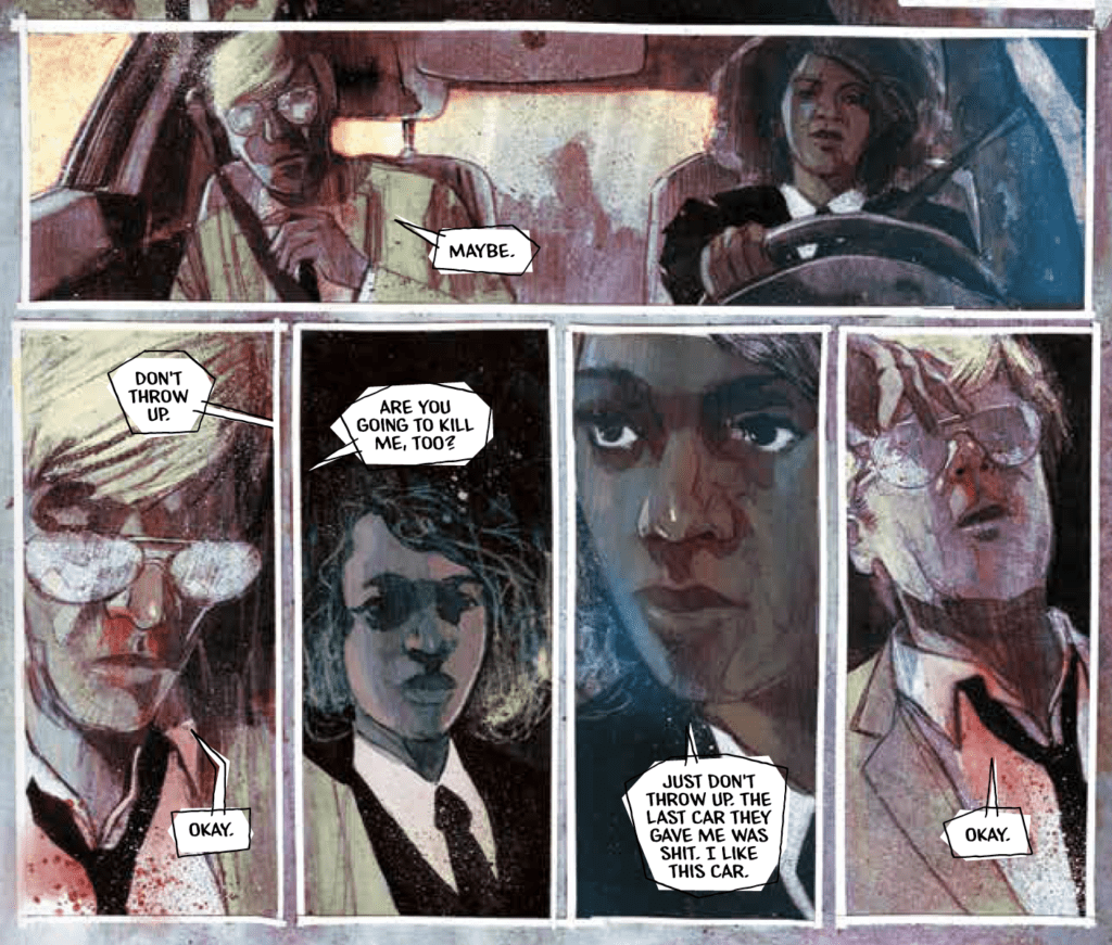
Cowles continues to provide generally good coordination with both word balloons and wordmarks. Even when word balloons don’t leave their panels, they follow a pattern concurrent with neighboring panels. It keeps the actions in a distinct rhythm that doesn’t overlap. The wordmarks follow this like when a fall occurs in one panel, and the neighboring one with a wordmark drives home the impact.

Finish With Doctor Tomorrow #5

Doctor Tomorrow #5 is the weakest issue in an overall decent story. Although reading the prior four issues is required to fully appreciate this one, it’s only because that’s what allows readers to see Bart’s growth into a hero. One that opens up potential new developments in the Valiant Universe. So it’s best to catch this character where he begins before all that happens.

Monkeys Fighting Robots Youtube

Review: WOLVERINE #4 – Don’t Let Down Your Guard!

On August 19, Marvel Comics released Wolverine #4. Writer Benjamin Percy, artist Viktor Bogdanovic, colorist Matthew Wilson, and letterer VC’s Cory Petit take Wolverine to the cold north for a cold drink, but he finds more than he bargained for when Percy throughs the kitchen sink at him.

Writing

If you read X-Force #11, you may have noticed two things: 1) the absence of Wolverine, and 2) Omega Red’s presence on the cover but not in the book. Considering that Percy is writing both books, it’s not hard to imagine that he’s probably interweaving his tale between both books (although Omega Red’s presence on the X-Force cover is still a mystery).

After readers discover that Wolverine peed in Magneto’s helmet, Logan goes through a private gate to a bar in the frozen north, where he comes into conflict with a group of humans who are part of an anti-mutant trauma group, when they throw Wolverine into a frozen lake, Omega Red attacks, with an army of vampires behind him.

Readers have known that Omega Red was a Krakoan traitor, and while his overt betrayal may not have been expected this quickly, it will be interesting to see what the Krakoan response will be.

There is a slight “hat on a hat” element happening here in the writing. To have Wolverine be ambushed by Omega Red is one thing. To have him captured by an anti-mutant group is another. To put them both together and have one baddie taken out by another makes Wolverine’s world feel a bit small. It does show that mutants are surrounded by threats everywhere, both from within and without, and talking with the anti-mutant group does serve as a moment of reflection for Wolverine. It does seem like some of the X-books are forsaking earned conflicts and stakes and just escalating the threats in each issue with a sort of “and then this bad thing happens, and then this bad thing happens” logic.

It’s still a decent issue, and Percy’s X-books are still some of the best, but there is a sense that the X-books are stalling a bit, possibly waiting for the other shoe to drop in Hickman and company’s mega X-saga.

Art & Colors

Bogdanovic’s art is solid in this issue. His style is somewhat reminiscent of Patrick Gleason (who does a variant cover for this issue) and Greg Capullo.

Bogdanovic gives his figures a bit more shading and coarseness, but those eyes are definitely Gleason-like! The whole issue has the look of an artist born if Greg Capullo and Patrick Gleason had a baby together (which isn’t a bad thing).

See? Don’t you almost expect the Batman Who Laughs to be under that hood?

Even in the picture below, doesn’t this look like Wolverine if Capullo designed him?

Meanwhile, Bogdanovic’s art is perfectly complemented by Wilson’s colors. There is some cartoony whimsy in some of the writing and tone of this issue, but that is undercut by the shading of the colors and the coarse texture that they’re given. One almost thinks about the whimsy yet sinister underbelly and darkness of a Tim Burton cartoon, and given the horror that this issue ends with, that description may be fitting.

Lettering

Petit’s lettering is always fantastic and complements the story well. The goal for any letterer should be to complement the visuals in the story without distracting and overcrowding. This should especially be the case in a Wolverine comic where readers want to see, among other things, a fair share of visceral action and violence, which this issue does have. The sound effects blend into the visuals they are placed within, and the dialogue and narration keep the story moving forward.

There are two prose sections that are worth mentioning. These prose sections in the Hickman era have pros and cons. They can serve to fill in background information that keeps the story moving without having to devote entire issues to setting up certain plot elements. Still, in 20+ page comics, every page counts, and sometimes the prose has been excessive. That’s not necessarily the case in this book, although the prose page talking about Wolverine’s private gate probably could’ve been illustrated, while the page about the anti-mutant trauma group serves its purpose in filling in the background motivations of the humans who attack Logan.

Conclusion 

Wolverine continues to be an interesting series, and it’s great getting into the head of Marvel’s favorite-although-sometimes-over-exposed mutant. It is interesting seeing how Wolverine has changed since the Dawn of X, where he could be seen laughing and playing with children on Krakoa. Now, he is a bit more reticent.

Readers may still be getting used to the rhythm of this book. After his first arc, Wolverine seeks some catharsis in a bar, only to find plenty of other threats waiting for him to kickstart his next arc. This series is still young, so despite some criticisms, I think it is one of the more visceral X-books published right now.

What did you think of Wolverine #4? Tell us in the comments below!

Monkeys Fighting Robots Youtube

DC News: John Ridley Penning Alternate BATMAN Series, Confirmed For January 2021

Batman by Ridley (Ladronn art)

There’s been some speculation about DC Comics’ plans with famed screenwriter John Ridley on Batman. In an official press release, DC has confirmed John Ridley will be penning a four-issue miniseries scheduled for January 2021 featuring art by Nick Derington.

Ridley confirmed in a recent conversation with Jim Lee that this Batman definitely
will not be Bruce Wayne: “I think it’s a pretty safe bet that if I’m writing Batman, it’s probably a little better than a 47% chance he’s going to be a person of color.”

You can check out the first piece of art from the miniseries and read the official DC press release below.

Are you ready for a new take on the classic hero? Let us know what you think in the Comments section, and please share this post on social media using the links below.

DC CONFIRMS BATMAN LIMITED SERIES WRITTEN BY AWARD-WINNING SCREENWRITER JOHN RIDLEY

Four-Issue Miniseries Scheduled for January 2021 Featuring Art by Nick Derington

“Better Than A 47% Chance This Batman is a Person of Color,” Says Ridley

Today’s Legacy of the Bat panel in DC FanDome’s Hall of Heroes contained great topics and panelists in a celebration of the Dark Knight’s heritage and the impact he’s had on his allies as they continue to do their part to protect Gotham City.

In addition to lively discussions spotlighting Talent and creators from popular DC shows such as Batwoman and Titans, as well as from Warner Bros. Games Montréal, DC also ended months of speculation regarding Batman’s upcoming comic book adventures, confirming that award-winning screenwriter John Ridley (12

Years a Slave, Guerrilla, American Crime) and artist Nick Derington (Doom Patrol, Batman Universe, Mister Miracle) will team up for a four-issue miniseries scheduled for January 2021, featuring a version of the Caped Crusader different from what many fans know and existing alongside the current Batman run by James Tynion IV and Jorge Jimenez.

During his conversation with DC Publisher and Chief Creative Officer Jim Lee, Ridley revealed a breathtaking piece of key art for his version of Batman by artist LADRÖNN. The writer also provided further credence to fan speculation that this Batman definitely will not be Bruce Wayne: “I think it’s a pretty safe bet that if I’m writing Batman, it’s probably a little better than a 47% chance he’s going to be a person of color,” said Ridley.

In addition, Ridley raised additional curiosity when he revealed his series will focus on the family of Lucius Fox, head of Wayne Enterprises. “But he [Fox] has a family and this is a family that has secrets, has kept secrets from one another,” said Ridley. “It’s a little bit different dynamic than the Batman that we’ve always seen.”

While this will be the first time Ridley has written a series featuring Batman, he’s no stranger to comic book writing, nor to DC. In 2004, he wrote The Authority: Human on the Inside (with artist Ben Oliver) and contributed an arc to the 2005 series,The Razor’s Edge: Warblade (with legendary artist Simon Bisley). Most recently, Ridley also collaborated with artist Georges Jeanty on the groundbreaking limited series The American Way (2006) and its sequel, The American Way: Those Above and Those Below (2017).

Fans interested in learning more about Ridley’s plans for this series should check out the Batman: The Joker War panel at DC FanDome: Explore the Multiverse, Saturday, September 12 at 10amPT/1pmET. Ridley is writing a short story (with art by Olivier Coipel) for the Batman: Joker War Zone one-shot anthology that may provide drop additional hints at his plans for the January miniseries.

For the latest news on DC FanDome, make sure to check out The Daily Star, the official blog of DC Fandome, at www.dccomics.com/dcfandome.

Batman by Ridley (Ladronn art)

Monkeys Fighting Robots Youtube

Review: CABLE #3 – Visiting the King…of Staten Island.

Marvel Comics released Cable #3 on August 19. Writer Gerry Duggan, artist Phil Noto, and letterer VC’s Joe Sabino continue the tale of Cable’s conflict with the Space Knights, the exploits of future Cable, and the missing mutant child, all while bringing young Cable face to face with an old friend.

Writing

What started as a story about a search for a missing mutant child continues to evolve into something crazy and whacky. When Cable bargains with the Space Knights to keep the Sword of Galador in exchange for a time machine that can send them back to save their planet, Cable, Esme, and the Knights go on a search for “old Cable’s” body, which has been confiscated by everyone’s favorite Merc’ with a Mouth and King of Staten Island.

Duggan writes with a lot of wit and charm. While there are a lot of random elements in this issue (Space Knights, time travel, a missing child…Deadpool), it comes together well, while continuing to tease a possible reunion between young Cable and old Cable.

Art

Noto’s art is gorgeous in this issue. The character design and the colors are beautifully done, and this may be one of the best looking X-books currently in print.

One particularly effective element of the art continues to be the way that Noto distinguishes between scenes with old and young Cable through coloring, shading, and styles.

Scene with “old” Cable.
Scene with young Cable.

There isn’t so much a change in art style as there is a type of coloring, with “young” Cable’s scenes given more of a watercolor look while “old” Cable’s scenes have an almost colored pencil look to them. This is effective for providing each Cable’s story a unique look that keeps the dual narratives straight since they appear to be coming to an eventual head if old Cable’s letter at the end of the issue is any indication.

Lettering

Sabino’s lettering is a beautiful complement to this issue. His sound effects, in particular, look great, and the wording, through its color and style, is “wrapped into” the action it describes.

Above is an excellent example of the lettering serving the story and its visual sequences well.

Also, worthy of note is the prose letters between old Cable and Deadpool at the end of the issue. Prose sections in a comic can be tricky. Still, they work with both of these letters, as Cable’s style and words capture his pragmatic and sometimes rough exterior, with Wade’s written in a whimsical, faux-Romantic fashion, whose look adds to the humor of the issue.

Conclusion

Cable #3 is an excellent continuation of the series, which seems to wrap of the Space Knights conflict with a minimum of action, all while setting up a possible future conflict between two Cables. Meanwhile, we’ll have to wait and see until next issue how the investigation of the missing mutant children progresses.

What did you think of Cable #3? Tell us in the comments below!

Monkeys Fighting Robots Youtube

Advance Review: THE DEPARTMENT OF TRUTH #1 — Uncomfortably Good

The Department of Truth #1 Cover

The Department Of Truth #1 hits your local comic book shop on September 30, but thanks to Image Comics, Monkeys Fighting Robots has an advance review for our readers.

Wow, it must be the pandemic or 2020 in general, but The Department Of Truth was so intense it felt like someone was going to drive a nail through my hand as I read the book. Martin Simmonds art is so gorgeously disturbing that, if it were a film, it would be the scariest movie ever. The jitteriness of Aditya Bidikar’s letter work is going to have me questioning reality for the next week. When you add this to James Tynion IV’s slow burn of a story, it makes for a blockbuster of a comic book.

Tynion IV takes all the best parts of Fight Club, X-Files, Dark City, The Thirteenth Floor, Netflix’s Mindhunter, and The Matrix and delivers a disturbing tale with such detail that, when combined with Simmonds’ art, you can smell the world from within the comic book. Tynion IV worldbuilds at a tremendous pace and also creates a vast mystery at the same time. The Department Of Truth #1 is like a great magic trick with illusion and sleight of hand, and the last page will compel you to read the next issue.

Advance Review: THE DEPARTMENT OF TRUTH #1 - Uncomfortably Good

When filmmaker David Fincher dreams at night, he sees the world as a Simmonds-drawn comic book. The splatters, scratchiness, and double exposures get under your skin, but there is also something about Simmonds’ art that is organic and familiar that draws you and creates added tension. The angles Simmonds uses in the above set of panels is a prime example of intensity and movement. If you’ve ever been car sick before, you understand the main character Cole Turner’s pain. You can feel Cole’s sway across the page, and everything is directed at the one clear shot of eyes in those five panels creating an intense confrontation between characters. The angles on the four bottom panels also take you up and down and you start to feel car sick yourself the more you look at it.

Bidikar’s letter work in the first issue is so amazing that he deserves an Eisner. The design of the word balloons and narration boxes adds so much to the story. The tension that he creates is like bamboo shoots under the fingernails! The style shouldn’t work, it’s stylistically unfinished, but it works so well. Bidikar’s letter work enforces the tension and lack of trust. As an added bonus, I became uncomfortable with myself because I was comfortable with Bidikar’s style by the end of the issue.

The Department Of Truth #1 is everything great about comic books right now. It has a big-budget film quality with independent ideas. Tynion IV, Simmonds, and Bidikar take risks, and it pays off with a fantastic first issue, and it will be something Monkeys Fighting Robots will talk about when “Best of 2020” comes around.


Do you have The Department Of Truth on your pull list? Comment below with your thoughts.

Monkeys Fighting Robots Youtube

10 Reasons Why Martin Scorsese’s CASINO is a Classic

10 Reasons Why Martin Scorsese's CASINO is a Classic

When it comes to making movies about people involved in violent or shady business, Martin Scorsese has no equal. The corrupt Wall Street financiers, Chicago mobsters, a deranged would-be assassin – the subjects explored by Scorsese through his movies are quite diverse.

Thanks to its long association with organized crime, the Vegas gambling business makes the perfect backdrop for a Scorsese movie. When it was released in 1995, Casino was both a critical and commercial success. It continues to enthrall us today as one of the finest movies set in Sin City. Here are a few reasons why Casino is such a beloved classic:

1. It is based on real people

All the main characters are based on individuals who lived and worked in the Vegas casino industry in the 1970s and 80s. Frank Rosenthal, a manager at three different Vegas casinos, is the inspiration for De Niro’s Sam Rothstein. The notorious Nicky Santoro (Joe Pesci) is based on real-life mobster Anthony Spilotro, and Ginger McKenna (Sharon Stone) was Geri McGee, a Vegas socialite.

2. It captures the essence of Vegas 

No other movie has done such an excellent job of portraying what Las Vegas is all about. They barely scratch the surface, only showing the “good” side of partying and weekend getaways. But Casino digs deep, laying bare the origins of the city and its past ties with organized crime while at the same time showing the opulence, neon signs, and gamblers having fun at cards and slots.

3. It was one of De Niro’s finest performances 

There is a reason why De Niro and Scorsese have done nine epic movies together. They are both icons in their respective fields. De Niro’s portrayal of Sam Rothstein is perhaps the last role in his career where he was allowed to flex his considerable acting chops to the fullest. A Jewish gambling expert working for the Italian mob makes for a fascinating character study indeed.

4. It had a stellar cast with Pesci and Stone

De Niro is not the only great thing about the Casino cast. In fact, Sharon Stone probably eclipsed all others with her stunning portrayal of the blonde hustler Ginger McKenna. The ever-reliable Joe Pesci adds tension to every scene, portraying a man whose menace far exceeds his short and stocky frame. His Santoro’s dynamic with the more refined Sam Rothstein makes the three-hour-long movie a compelling watch throughout.

5. It was shot in a real casino

The movie was not shot in a Hollywood replica of a casino. All the indoor shots were filmed inside the Riviera in Vegas. The grand old casino had a history dating back to 1955, making it the ideal backdrop for this movie. The crew shot the scenes after midnight, to avoid causing too much disruption to clients. The extras in these scenes are all real casino dealers, pit bosses, and players, all adding to the realism and authenticity of the movie.

If you are missing visiting a real casino in these days of partial lockdown, you should try at least play at a live casino, like the recommended ones found here – http://www.nodepositworld.com/.

6. The violence depicted actually happened 

In many ways, Casino is Scorsese’s most violent movie. Scenes involving the torture of a man using a vice, the attempted murder of De Niro using a car bomb, the death by overdose of Stone’s character, and the murder of Joe Pesci’s character (buried alive in a cornfield) are all over the top in many ways. But the shocking thing is – they all happened to these character’s real-life counterparts. Scorsese did not use violence purely for shock value or style. He was just faithfully portraying the reality.

7. It is based on excellent investigative reporting

Unlike other epic crime dramas, Casino is more like a documentary in many ways. It lays bare the intricate web of corruption that was centered in Las Vegas, with tendrils reaching out to politicians, Teamsters unions, Chicago mob, and the Midwest mafia based out of Kansas City. The movie is based on the investigative non-fiction work Casino: Love and Honor in Las Vegas. Its author, Nicholas Pileggi, co-wrote the screenplay for the Casino movie with the director.

8. The movie holds your attention from beginning to the end

At almost three hours, Casino is one of the longest movies from Martin Scorsese. Yet it never lags in the middle or runs out of steam by the end. From its shocking opening scene with the car bomb, Casino is riveting till the end. With masterful editing and taut narration, Casino manages to stay a lean, mean thriller throughout. For a movie depicting the excesses and lavishness of Vegas, the director remains in control till the end.

9. It makes you feel and care for the characters

There are no good guys in a movie like Casino. With greed and corruption as the central theme, there is no space for heroes and heroines. Every key character is mired in violence, treachery, and avarice. Yet when these characters get their comeuppance in the end, we do feel sorry for them in some ways. This is especially true in the case of Sharon Stone’s Ginger. Casino is a very convincing and touching depiction of human tragedy.

10. It is truly an epic movie with a massive scope

While Scorsese does focus on three key characters, the story of Casino unfolding in the background has massive implications. It explains how the mafia lost control of a city that was basically minting money in the billions. We see how huge gambling corporations took over the desert city. It shows how Vegas continues to reinvent itself. In many ways, Casino is an epic history lesson about Vegas.

Monkeys Fighting Robots Youtube

ComiXology Originals Preview: 40 SECONDS To The End Of The Universe

40 Seconds #1, Mitten cover

ComiXology Originals has released preview images for their upcoming title, 40 SECONDS, available on ComiXology on August 25th. 40 SECONDS #1 follows a ship of space explorers racing to answer a distress call on the other side of the universe. What they encounter along the way promises to surprise you.

Written by Jeremy Haun and drawn by Chris Mitten, ComiXology describes 40 SECONDS as “an epic, 5-issue mini-series that spans the universe, featuring amazing creatures, epic vistas, character drama, and just a bit of horror.”

You can check out a selection of preview pages, and read the full ComiXology press release below.

Are you looking forward to a colorful sci-fi comic? Let us know what you think onf the preview in the Comments section, and please share this post on social media using the links below.

ComiXology Originals Presents 40 Seconds, a Widescreen Sci-Fi Adventure Comic Book Series Written by Jeremy Haun with Art by Chris Mitten

August 20, 2020 – New York, NY— Grab some popcorn and a soda and prepare to be transported across the galaxy with 40Seconds, a widescreen, sci-fi adventure available from comiXology Originals. Writer Jeremy Haun (Red Mother), acclaimed artist Chris Mitten (Witchfinder: The Reign of Darkness), colorist Brett Weldele, and letterer and designer Thomas Mauer have created an epic, 5-issue mini-series that spans the universe, featuring amazing creatures, epic vistas, character drama, and just a bit of horror. Part of the comiXology Originals line of exclusive, creator-owned content, 40 Seconds debuts August 25th with issue #1.

When a team of science explorers set out to answer a distress call a galaxy away, they have no idea what they’re in for. Their mission: make it to Terminus. Tasked with investigating what happened to the previous team and gathering data, they find themselves traveling through a series of alien gateways, jumping across the universe through strange and beautiful landscapes only to be hunted by a vast inexplicably unstoppable horde. Truths lie at the final gate. If only they can make it in time.

“Chris Mitten and I had been planning on doing a project together for…ever,” says Haun. “When the stars aligned and we were both available to do something, I asked what he wanted to draw and he said ‘big sci-fi fantasy’. I had just the thing. And 40 Seconds was born. Chris Mitten is brilliant at everything he does, but when he draws science fiction fantasy it’s just… perfect.”

Perhaps best known for illustrating Hellboy stories, 40 Seconds marks Mitten’s return to sci-fi.  “Summer is about big, blockbuster storytelling and, with 40 Seconds, the chance to zip around the universe is just a click away,” said Mitten.

“I love the big weird sci-fi comics from the 1950’s, the wild science fiction of the ‘70’s and the blockbusters of the ‘80s,” said Haun. “More than ever we need big fun escapist stories. We can’t really get that in the theater right now. We can’t quite go on grand adventures. With a comic story like 40 Seconds, we can bring an epic, world-hopping adventure straight to readers.”

Part of the comiXology Originals line of exclusive content, 40 Seconds #1 will be available upon release August 25, 2020 at no additional cost, for members of Amazon Prime, Kindle Unlimited, and comiXology Unlimited, and for purchase on Kindle and comiXology. Prime Reading offers all Amazon Prime members a rotating selection of thousands of top Kindle books, magazines, short works, comic books, children’s books, and more – all at no additional cost. Kindle Unlimited offers over 1 million titles, thousands of audiobooks, and select current issues of popular magazines for just $9.99 a month with a 30-day free trial at amazon.com/kindleunlimited. ComiXology Unlimited now offers over 25,000 comics, graphic novels and manga for just $5.99 a month with a 30-day free trial at comixology.com/unlimited.

For more updates on comiXology Originals, check out http://comixologyoriginals.com.

About the Creators

Jeremy Haun is currently writing 40 Seconds from comiXology as well as Red Mother from BOOM! Studios. He is the artist on Final Witness from Valiant. Jeremy is also the artist and creator on The Realm and The Beauty, from Image Comics. Other projects include Batwoman, Constantine, and Wolf Moon. Jeremy has worked for nearly every publisher in the industry as well as doing self-publishing via Kickstarter. Jeremy resides in a crumbling mansion in Joplin, Missouri with his wife and two superheroes-in-training.

Christopher Mitten is originally from the cow-dappled expanse of southern Wisconsin, he now spends his time roaming the misty wilds of suburban Chicago, drawing little people in little boxes. Christopher is best known for his work on Hellboy: The Return of Saturn, Witchfinder: The Reign Of Darkness, Rise of the Black Flame, Rasputin: The Voice of the Dragon, Wasteland, and Criminal Macabre. He can be found online at www.ChristopherMitten.com and on Instagram  @Chris_Mitten.

Monkeys Fighting Robots Youtube

Review: CAPTAIN AMERICA #22 — A Stunning Battle

Captain America #22 Cover

Captain America #22, published by Marvel Comics this week, is the third part in the “All Die Young” arc and features Captain America fighting Selene from the Power Elite for a fragment of Sharon Carter’s soul. The epic battle comprises most of the issue and builds up to a stunning conclusion.

Captain America #22 Battle

About the book:
A new threat called the Power Elite framed and imprisoned Steve Rogers for the murder of Thunderbolt Ross. He was later freed by Sharon Carter and the Daughters of Liberty. After finding out that Selene from the Power Elite stole a bit of Sharon Carter’s soul, Captain America, along with Falcon and the Winter Soldier, went undercover in the town of Adamsville, Ohio, where Selene is currently based. Eventually, Captain America and his allies broke their cover to stop Selene. She, in turn, dropped her own disguise and set a mob of controlled men against them…

With writing by Ta-Nehisi Coates, art by Bob Quinn, colors by Matt Milla, and lettering by VC’s Joe Caramagna, Captain America #22 is built to be a thrilling, action-packed issue. The battle between Selene and Captain America’s team has begun by the time we start the issue, so we have an entire comic to enjoy the epic battle.

Captain America #22 Story

Captain America #22 is split between two main scenes: one where Captain America is fighting Selene, and another where Sharon Carter is talking with Thunderbolt Ross and colleagues of hers. The issue changes back and forth between these two settings multiple times, and Coates uses captions to further the sense that these scenes are happening concurrently. Dialogue from a previous scene will overlap actions happening in another, which helps the reader to understand that these scenes are occurring at the same time and not one after another. Time is important because characters in one scene only have a small space to act, and captions are an incredibly effective way to drive this point across.

Falcon Fighting Selene

This issue of Captain America focused mainly on action, which allowed for some stunning art, but the story lacked slightly in substance. While the arc itself may be an exciting story, this particular issue seemed to do little more than build up to a reveal that will have consequences in the following issues. The reveal itself was exciting and motivates the reader to continue following the arc, but the rest of the comic seemed somewhat dull.

Art

The art of Quinn allows the story to flow easily and also provides incredibly expressive characters. The forms are always dynamic, creating some profoundly stunning action scenes. Much of the issue focused on the battle between Captain America and his crew against Selene and her controlled goons, so the fantastic work of Quinn stood out.

Milla’s use of color in Captain America #22 adds much to the issue. Many explosions, costumes, and backgrounds are quite striking. An interesting aspect of the coloring appeared in some action panels, where a background was omitted so that the reader could easily focus on those fighting. Milla chose bright background colors for these panels that did not match any of the items in the setting. By doing this, not only does it give energy to these combat-focused-panels, but it also provides a stark contrast to the main focus of the panel. This causes the characters to pop out even more than they would have with just a plain, single-colored background.

Captain America #22 Color Example

Captain America #22 was lettered by Caramagna, who does a spectacular job; the dialogue goes along with the flow of the story. The most interesting technique done by Caramagna in this issue was to have words expand past the borders of their word bubble. This was done whenever a character was screaming in agony and was incredibly effective. The words exceeding the space in the balloon gives the impression that the noise made was both loud and difficult to contain. This makes sense because this technique was used only when characters made an involuntary shriek of pain.

Conclusion

Captain America #22 is a beautifully put together issue that lacks slightly in terms of story. It is much stronger when looking at it as a piece of the arc being told, but standing alone isn’t very substantial in terms of story. However, the art of Quinn and colors of Milla more than makes up for any lack in story, and certainly make the issue worth purchasing, especially if you have been following along with the arc. It would be difficult to read this issue and not be excited about what is to come, and the ending is sure to excite many readers.

Monkeys Fighting Robots Youtube

BATMAN #99 Preview: Dick Grayson Joins “Joker War”

Batman 99 cover

The finale of “Joker War” is coming up fast, and DC Comics has revealed a preview of September’s Batman #99. Batman’s oldest partner returns for the fifth part of the epic showdown.

Check out the preview art and covers for #99 below:

The Joker has Gotham City in a complete state of chaos as his war against Batman careens headlong into a final showdown against The Dark Knight. But before Batman squares off against the Clown Prince of Crime, he’s going to need the help of all of his allies to regain control of the city!

This issue has everything! Clownhunter, dishing out his own brand of justice! The return of Dick Grayson! Punchline! Harley Quinn!

And remember that shiny Batman costume from issue #95? Well, [REDACTED] and it will set up a finale you won’t believe.

Here’s your first look!

Batman #99

Written by JAMES TYNION IV

Art and cover by JORGE JIMENEZ

Ghost-Hunter card stock variant cover by DERRICK CHEW

1:25 card stock Nightwing variant cover by JORGE JIMENEZ

On Sale 09/15/20

$3.99 US | 32 PAGES | FC | DC

CARD STOCK VARIANT COVERS $4.99 US

“The Joker War” part five of six! Things have changed, as Batman realizes he can’t fight this war alone. He’s going to need help. Before he faces down The Joker, he must call up his trusty partner Dick Grayson! But can Dick reclaim his lost memories in time to join the battle?

Monkeys Fighting Robots Youtube

Marvel Comics Exclusive Preview: SPIDER-MAN NOIR #3 – Electro’s Sting!

Marvel Comics Exclusive Preview: SPIDER-MAN NOIR #3

Spider-Man Noir #3 (of 5) hits your local comic book store next week, but thanks to Marvel Comics, Monkeys Fighting Robots has an exclusive four-page preview for our readers.


About the issue:
A murder investigation may have led Spider-Man a thousand miles from home, but DANGER is close behind! And as the specter of war looms in Europe, a dangerous operative shrouded in mystery has designs of his own, with ELECTRO leading the charge!


Spider-Man Noir #3 is written by Margaret Stohl, with art by Juan Ferreyra, you will read Travis Lanham’s letter work, and Dave Rapoza is the cover artist.

CHECK OUT THE PREVIEW BELOW

Are you reading Spider-Man Noir? Comment below with your thoughts.

Monkeys Fighting Robots Youtube