Home Blog Page 256

Review: AN UNKINDNESS OF RAVENS #1 – The Ancestors of the Witches They Couldn’t Kill, All At the Same High School In

Take The Craft, mix it up with a Riverdale and a John Hughes movie, and you’ve got a good idea of what “An Unkindness of Ravens” #1, from writer Dan Panosian and artist Marianna Ignazzi, looks like. Where Dan Panosian’s script isn’t exactly original, it manages to stay entertaining thanks to this first issue’s promise of mystery, and fun YA high school dialogue. Ignazzi, with help from colorist Fabiana Mascolo, cultivates a fitting aesthetic for this comic, making this an enticing and entertaining opening chapter for fans of both Young Adult fiction and tales of witchcraft.

“Not all the witches burned during the Salem Witch Trials—and the ones that survived did so together, protecting the ancient secrets entrusted to them for generations. They call themselves the Ravens. Wilma is the new girl in school, and she plans to go completely unnoticed—except that she bears an eerie resemblance to the Raven member Waverly, who just went missing. The truth behind Waverly’s disappearance will put the entire coven in danger—and Wilma will have to rely on power she never knew she had if she wants to save her new friends.”
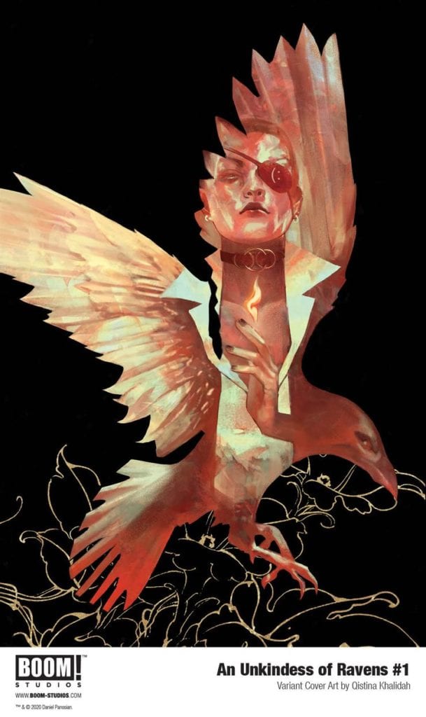
Writing & Plot

What writer Dan Panosian‘s script for “An Unkindness of Ravens” #1 lacks in originality, it makes up for it in its steady pacing, solid character writing, and intriguing world-building. There’s a constant feeling that something is lurking just outside of what we can see in the story, something that’s cautiously waiting for Wilma’s greater understanding of the world she has stepped into. Panosian’s withholding of information in favor of mystery is felt in how he gives the audience tidbits of relevant background story in the introduction, then dances around the subject for the rest of the issue. There’s a sense of dark grandeur following the plot as we follow Wilma through her High School halls. Hiding realms magic behind standard high school tropes would be annoying if it weren’t for Panosian’s decision to avoid many of these tropes in favor of building mystery around the school’s social groups. This is a clever twist on an old cliche that is (again) not new, but it’s handled with a practiced sensibility that adds to the growing mystique in the rest of the issue. The dialogue and character writing is succinct and naturalistic as well, with narration that offers just enough to keep the audience informed of need-to-know character backstory and personality moments. The lead characters we’re introduced to in this first issue are presented in an engaging enough manner to want to see where this trail leads. All in all, Panosian produces a solid script that takes advantage of its familiar setting and divulges just enough backstory to keep the audience intrigued.
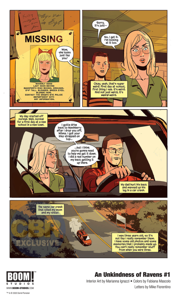
Art Direction

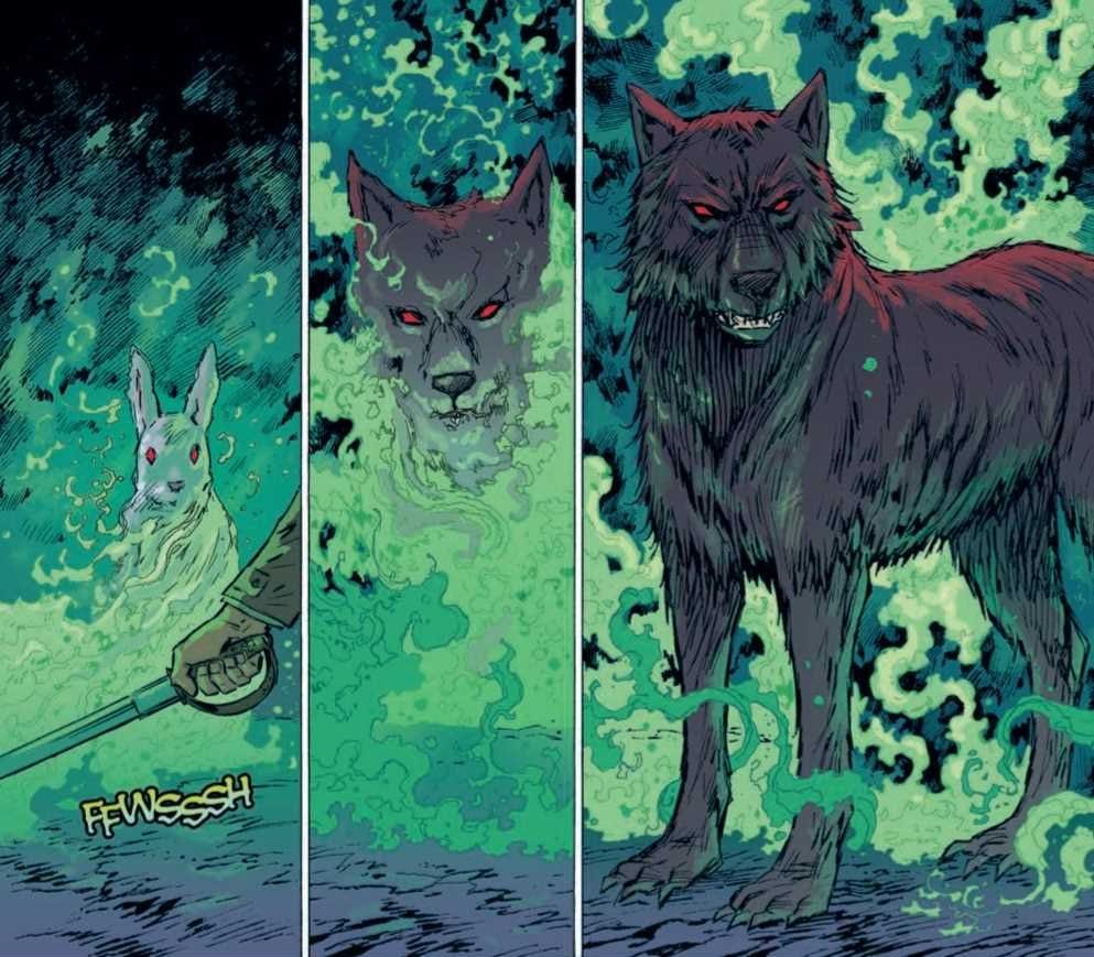
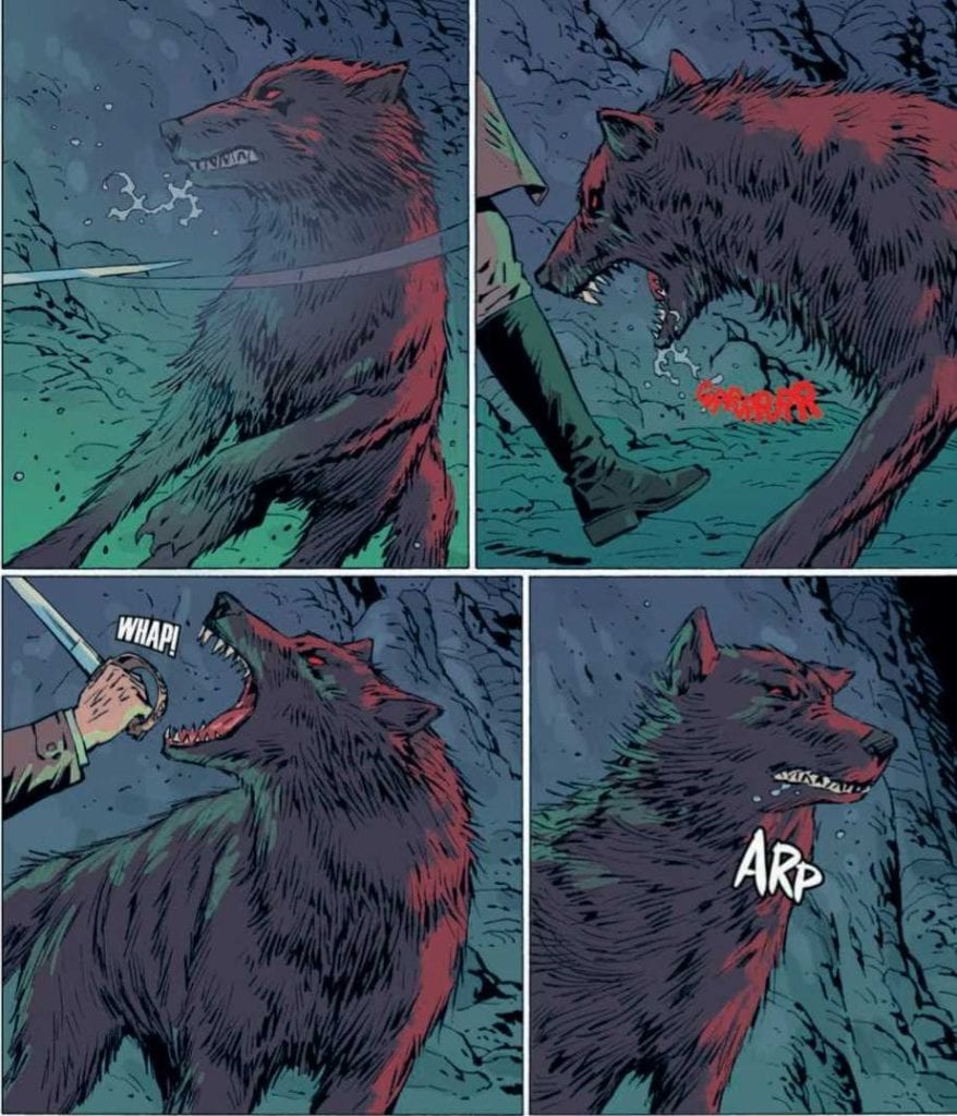
The simplistic but effective visual style of “An Unkindness of Ravens” #1 is due to the talents of artist Marianna Ignazzi and colorist Fabiana Mascolo. The visual focus here is not on overwhelming detail, but instead on crafting scenes that are focused around the characters in them. Ignazzi draws characters that sometimes overlap with facial models that look a bit *too” much like one another, but she makes up for it in not only minor-details and visual cues, but how she constructs a scene panel by panel. The mysterious tension I spoke of earlier is largely due to how Ignazzi frames her focus on characters on in and out of the panel’s focus. The way she introduces new faces leaves a lasting impression that makes up for any kind of accidental similarity they have with one another. The atmosphere created by Mascolo’s color palette is a massive contributor to what makes this comic work. Her use of plain, funny-paper style colors that transform into pallid green hues and then into mystic foggy violets is a subtle but jarring effect that drags the audience into the ever-growing mystique around Wilma and this high school gang of supposed witches. Mike Fiorentino uses a slim font that is easy to read, and keeps his lines dynamic with shifting italics and bolds/size changes to make the actual reading experience seamless, while also adding to the comic’s shifting tones.

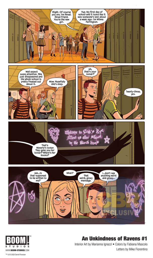
“An Unkindness of Ravens” #1 is an engaging read that follows familiar trends while still offering up enough mystique to stay refreshing. Dan Panosian’s script offers familiar territory delivered in a sharp and suspenseful manner that hides the plot’s lack of uniqueness under solid character writing and growing unease. Marianna Ignazzi and Fabiana Mascolo’s visual work is full of smooth panel direction and a continually changing color palette that work superbly for this comic. If this kind of witchcraft seems up your alley, grab up this debut issue from your local comic shop on 9/23!

Monkeys Fighting Robots Youtube

Marvel Preview: The King In Black Rises From The Depths In ATLANTIS ATTACKS #5

Atlantis Attacks #5, PAGULAYAN cover

With hype building for the much anticipated King In Black event due out this December, Marvel Comics has decided to give readers a dark taste of what’s to come. In the upcoming ATLANTIS ATTACKS #5, available through retailers in December, the King In Black will emerge during the final battle between “the Atlanteans, the Sirenas, and the interdimensional Pan.”

Written by Greg Pak, Marvel describes the King’s arrival as a “shroud” over the Marvel Universe. “And when the dust of one war settles, a new enemy will emerge from the depths…” You can check out the cover for ATLANTIS ATTACKS #5 and read the full Marvel press release below.

Are you more excited for the Atlantis Attacks finale or a glimpse of the King In Black before the main event? Let us know what you think in the Comments section, and please share this post on social media using the links below.

KING IN BLACK EMERGES IN ATLANTIS ATTACKS #5!

New York, NY— September 9, 2020 — Writer Greg Pak and artist Ario Anindio bring the war between the Agents of Atlas and the armies of Atlantis to a startling conclusion this December in ATLANTIS ATTACKS #5. With the fate of the world hanging in the balance, all will be revealed in this titanic tale of love and betrayal featuring Namor, Shang-Chi, Silk, Wave, and more. And when the dust of one war settles, a new enemy will emerge from the depths…

“It blows my mind that we’re now capping off our third big miniseries for the new Agents of Atlas,” Pak said. “Huge thanks to all the readers and retailers who have made this all possible with their huge support for this team. We’re pulling out all the stops with huge payoffs and turning points for key characters—dontcha dare miss it!”

Amidst this epic clash between the Atlanteans, the Sirenas, and the interdimensional Pan will be a tantalizing tease of Marvel’s upcoming event, KING IN BLACK. Knull, the God of the Symbiotes, has arrived to forever shroud the Marvel Universe in his unflinching darkness. Check out the brand-new main cover by acclaimed artist Carlo Pagulayan (Incredible Hulk) and don’t miss this surprising chapter in Donny Cates and Ryan Stegman’s monumental Venom event when ATLANTIS ATTACKS #5 hits stands this December!

ATLANTIS ATTACKS #5 (of 5)

Written by GREG PAK

Art by ARIO ANINDITO

Cover by CARLO PAGULAYAN

Atlantis Attacks #5, PAGULAYAN cover

Monkeys Fighting Robots Youtube

Review: SHARK OF WAR #2 Is Filled To The Gills With Campy Violence

Shark of War #2 Cover

The first issue of SHARK OF WAR is chock full of campy sci-fi and excessive violence, great for fans of those straight-to-video science fiction/horror movies. Now the USS Gnasher (the titular shark of war) is back to take a bigger bite out of the evil that lurks in the murky depths of the ocean.  

Written and illustrated by Ben Lacy, with lettering by Nikki Powers, Shark of War #2: A Parade of Piranha is now available to support on Kickstarter. 

Story 

In issue 1, The New King of The Sea, we learned his origin and how he came to take on everything bad happening on the Eastern Seaboard. In issue 2, A Parade of Piranha, the bad strikes back. They’ve hired one of his creators to make creatures even deadlier than he, piranha who’ve been modified just as he has. But there are hundreds of them. 

What stands out most in the writing is the humor. Lacy doesn’t take his story too seriously. Just read the title – Shark of War. You can’t help but smirk at the daffy concept. From the cover to the very last panel, Lacy jumps the shark (don’t forgive the pun) every chance he can. There’s also the humorous dialogue, particularly the interactions between the Gnasher and its on-board artificial intelligence. In short, just go in expecting some cheese and laughter, and have some fun with it. 

Shark of War #2 Page Sample

Art 

Again, Lacy’s artwork is a unique, computer generated style in Shark of War #2. It looks like as if it were rendered in a Sims game. This style helps enhance the campiness of the concept, crafting this b-horror world akin to Sharknado or The Meg. If you’re looking for artwork filled to the gills with blood, gore, explosions, and aquatic creatures equipped with military-grade weaponry, this is the book for you. 

Conclusion 

This is b-movie horror/sci-fi in comic book form. It’s filled to the gills with blood, gore, explosions, and aquatic creatures equipped with military-grade weaponry. In short, just go in expecting some cheese and laughter, and have some fun with it.

Show your love for indie comics by helping fund Shark of War #2 on Kickstarter. You can also follow Biting Comics on Facebook for updates and extra tidbits. 

Are you an indie comics creator with a recently published comic book, or one that you’re about to put up for crowdfunding? Let us know! 
Monkeys Fighting Robots Youtube

Review: THE AMAZING SPIDER-MAN #48 – A Heart-Wrenching Dilemma

Amazing Spider-Man #48 Cover

As the Sin-Eater continues to create chaos in Spider-Man’s life, the web-slinger faces a deeply emotional dilemma in The Amazing Spider-Man #48, out this week from Marvel Comics.

Amazing Spider-Man #48 Sin-Eater

About the book:
The Sin-Eater has been recruiting anyone who wants to help him bring “justice” to “sinners,” and an overwhelming amount of people have signed up for his cause. Now, Spider-Man has to deal with a mob of hate-filled followers while also questioning whether he should save the Sin-Eater’s next target, Norman Osborn. Spider-Man enlists the help of several other heroes with spider-powers to not only support him as he fights off Sin-Eater’s followers but also emotionally as he decides whether to save one of the worst people he has ever known.

The Amazing Spider-Man #48 Story

Nick Spencer does a perfect job of inspiring emotion in the reader in The Amazing Spider-Man #48. The choice that Spider-Man is faced with is difficult to make with any villain, especially when the Sin-Eater isn’t killing them. By “cleansing” villains, it isn’t apparent that the Sin-Eater is doing anything wrong, but Spider-Man knows there will be unforeseen consequences in the future. By having the villain in question be Norman Osborn, the decision of whether to save him or not becomes so much harder. Miles Morales had the Spider-Man of his world killed by the Green Goblin. Gwen Stacy died because of the Green Goblin. If he continues to live, he will kill again. Having the decision Spider-Man has to make, be about Norman was such a fantastic choice, and bringing in other heroes to help him choose brought out all the emotion attached to the decision, and made the issue an utter pleasure to read. The conversations in the issue pulled easily at heart-strings since they were all based around deep history related to the characters, and the issue continued to build until the shocking conclusion that leaves you with a jaw-dropping cliffhanger.

Amazing Spider-Man #48 City

Art

The pencils of Mark Bagely and the inks of John Dell once again come together to give us some astonishing art in The Amazing Spider-Man #48. The city contains so many beautiful buildings in the background, action sequences have so many dynamic poses and motion lines that they come to life on the page, and figures and objects often overlap the edges of panels, which causes them to stand out. Every page is a pleasure to look at, but perhaps the most important thing that Bagely and Dell are able to do in this issue is give the characters expressive faces. With so much of the issue focusing on the internal conflict of Spider-Man, it’s important to show it through facial expressions, and Ferreira and Poggi are able to do just that.

David Curiel does some great work in The Amazing Spider-Man #48, with many uses of vibrant colors that bring so much life to the page. The establishing shots of the city are particularly stunning, with a wide variety of colors being showcased. The use of bright colors in action scenes increases the energy of the scenes and the bright-colored backgrounds that Curiel chooses let characters pop out while they are performing certain actions.

Amazing Spider-Man #48 Fighting

The lettering of VC’s Joe Caramagna does an excellent job of presenting the dialogue in a way so that the story flows naturally. This is especially important for emotional scenes, such as the ones in The Amazing Spider-Man #48. Caramagna also provides many different colored sound effects during fight sequences, which highlight just how much fighting Spider-Man and his friends have to do to ward off Sin-Eater’s followers.

Conclusion

The Amazing Spider-Man #48 is one of the best issues to come out of the Sins Rising event, and that says a lot when you compare it to the quality of the other issues. The story is captivating throughout every page, and the art complements it all so well. By the end, this issue leaves you with your heart aching from the emotional conversations Spider-Man has with other spider-powered people and your jaw open from the awe-inspiring cliffhanger.

Monkeys Fighting Robots Youtube

USAGI YOJIMBO COLOR CLASSICS #7: A Colorful Renewed Ending

Usagi Yojimbo Color Classics #7

Usagi Yojimbo Color Classics #7 is this week’s finale to IDW’s republishing of the very beginning of the franchise, as Stan Sakai’s original story gets a dynamic recontextualization with Ronda Pattison’s colors.

Usagi Yojimbo Color Classics #7 On Pacing

Unlike the last issue where two separate stories are necessary for the reader to get an idea, this time, only one is okay. Featuring the debut of semi-regular character Tomoe and her lord Noriyuki, their appearance at an attack shows how dire this issue is unlike others. This fast pace is to the point of being in the background where some villagers don’t even notice the fleeing pair. Fortunately, their encounter with Miyamoto Usagi allows them levity. When Tomoe takes the time to explain their circumstances to Usagi after attacking him, it’s an expert use of slowing the pace to care about these characters. Not to mention when Usagi helps Tomoe and Noriyuki out, the reader sees his motivations considering who wants to kill Noriyuki, the killer of Usagi’s own master, Lord Hikiji.

Art

Stan Sakai certainly presents himself as a highly capable storyteller in Usagi Yojimbo Color Classics #7. In addition to his above writing, his artwork, when it comes to action sequences, is of high quality. There’s a genuine sense of both movement and point-of-view throughout the pages. Thanks to great use of both panels and layouts, there is consistency in how the characters interact. Despite the moving panels, it doesn’t feel like a camera is switching from one point to the next. Rather the changes feel natural as they represent where a character is standing. Even when another panel comes up, it feels like the characters did not move. Not to mention the action sequences have a real sense of speed and weight, as shown when Usagi swings his swords.

Ronda Pattison, meanwhile using coloring to make some of these actions have even more weight. The usually stilted faces of Stan Sakai’s early artwork designs are given more definition thanks to this. This allows them to look more expressive than they normally are. Another appears in a crucial battle; the background features a gradient that changes from a calming blue to an alarming yellow to signify a higher intensity. Still, when it comes to the lettering, the colored wordmarks can blend in without the outlines.

Usagi Yojimbo Color Classics #7 Is Kurosawa-Style Cinematics

Usagi Yojimbo Color Classics #7 retains its sense of urgency in pacing with an enhancement in action. This issue lives up to its name of “Classics” by ensuring its sense of urgency with color to further express this. Readers might look a little disappointed by a different art style, unlike the cover, but they’ll still get something out a samurai story evoking the classics like Akira Kurosawa – one that will leave audiences satisfied for future stories in IDW.

Monkeys Fighting Robots Youtube

Review: TEENAGE MUTANT NINJA TURTLES #109 Shows How Prejudice Harms Marginalized Groups

Issue #109 of TEENAGE MUTANT NINJA TURTLES hits stores on Wednesday, September 9th, bringing readers to the heart of Mutant Town—the freshly irradiated suburb of New York. As its citizens begin to cope with their predicament, multiple outside pressures make their lives even more difficult. What unfolds is a social commentary on our culture’s negative attitudes toward marginalized groups.

Story

Writer Sophie Campbell, with consulting by Kevin Eastman and Tom Waltz, set up this issue with multiple plots, each focusing on various characters in Mutant Town. Readers find that even though the mutants have their own community, it’s severely impoverished. What’s more, the media and public at large is circulating hyperbolic myths about this marginalized group—much like certain outlets in our own world.

This tendency to mischaracterize affects Michelangelo and Lita directly when a reporter attempts to get a story out of them. Rather than listening to their perspectives, she seeks to confirm preconceived narratives.

Readers will find prejudices within the mutant society as well. A killer whale humanoid attacks Donatello and Mona, and later readers find that Jenny, solely out of fear, escalates a situation with a former villain. It becomes clear that even within groups on the edges of society, prevailing attitudes of prejudice linger still.

This issue portrays the mutant society’s oppression with a realism one finds in our own world. We clearly see how prejudices can hit a marginalized community from all sides.

Artwork

Jodi Nishijima’s penciling and ink work, Ronda Pattison’s coloring, and Shawn Lee’s lettering crafted beautiful artwork for this issue. The mutant characters are full of personality and life, which is contrasted by the slum-like buildings that surround them. This helps to juxtapose the unique beauty of their new forms with the poor conditions they’ve been forced into. In addition, the lettering boxes help frame each important feature of the panels, helping to tell the story without taking way from the illustrations.

Conclusion

TEENAGE MUTANT NINJA TURTLES #109 provides readers with a unique perspective on mutant society. Seeing the differences between their living conditions with those of the rest of the city is a good wake-up call.

Do you think Mutant Town will ever find peace? Let us know in the comments below!

Monkeys Fighting Robots Youtube

Review: GI JOE, A REAL AMERICAN HERO #274 Is Pure Adrenaline

GI Joe #274, Atkins cover

GI JOE, A REAL AMERICAN HERO #274, available from IDW Publishing on September 2nd, kicks off the final confrontation between the Joes and Cobra in the underground tunnels of Springfield. Larry Hama’s second to last issue in the Snake Hunt arc is filled with firefights and explosions to rival the best action movie you can imagine.

Cover Art

Robert Atkins’ cover leaps out you like the best Hasbro action figure packaging when the GI Joe toys were re-introduced with the cartoon in the 1980s. The colors are bold and bright. The characters are practically pulsing with adrenaline. It’s pure fan service to make a cover look this good, and it brings up all the best memories of playing with those action figures as a kid.

Writing

Hama’s story is as straight as it gets. The Joe’s have infiltrated the underground Cobra lair to rescue Snake Eyes. Outmanned and outgunned, the Joes have to fight their way out below while their support teams defend against overwhelming odds on the streets above.


GI JOE, A REAL AMERICAN HERO #274, is a “pure good guys versus bad guys” action comic that’s sole purpose is to keep you entertained. You can turn your mind off and soak it in, and I sincerely wish more comics would take the same approach of entertainment as the top priority.

That said, don’t mistake simplicity for lack of writing. Hama crafted great action sequences, a riveting escape sequence, believable (and sometimes quippy) dialog that works. Hama is firing on all cylinders here.

Pencils/Inks

Let’s be honest. Some of the costumes from the original designs are ridiculous, but honestly, I didn’t care. That’s because Netho Diaz pulls it off in two ways.

First, every panel is focused on the action. A firefight is in progress, or tanks are battling it out, or explosions are collapsing secret tunnels, or super slick ninja fights are playing out. There’s something cool to catch your eye in every panel.

Second, although the costumes can be somewhat ridiculous, Diaz plays it straight by avoiding having the characters do too much hero posing and by slimming the bulkier costume bits to look more ceremonial than cheesy.

Diaz brings all the nostalgia to life and big credit to Thiago Gomes and Maria Keane for the excellent inking work. A lot of the scenes take place in shady tunnels, and the hatching work here is excellent. It’s clean, sharp, and balanced between bold and subtle in all the right spots.

Colors

As much as I credit Diaz for the art, part of that credit also belongs to J. Brown’s colorwork. Both the Joes and Cobra have costumes that reflect nearly every color of the rainbow, depending on which squad is central to any given panel. The costumes reflect who they are and their team, so it’s essential that soldiers within a group look similar, but the group should be distinctive enough from other groups to stand apart. Brown’s colorwork is bold and eye-catching, yet not so bold as to be obnoxiously garish. The colors are pure eye candy to an already exciting issue.

GI Joe #274, coloring sample

Lettering

Neil Uyetake’s lettering amps up the intensity with big, loud sound effects on every page. Explosions swell with a gigantic WHOMP. Uzi’s spit bullets rapid-fire with streams of BRRAAPP’s. What makes the lettering so great is how the shape and direction of the placement for each sound effect become part of the visual by directing your eye towards the direction of the energy—great work here by Uyetake.

GI Joe #274, lettering sample

Conclusion

GI JOE, A REAL AMERICAN HERO #274, available from IDW Publishing on September 2nd, is everything you love about afternoon action cartoons brought to life in a comic. The writing is heart-pumping, and the art is eye candy overload. I can’t wait for the final issue of this arc.


Monkeys Fighting Robots Youtube

Review: WELLINGTON #5 Blends Stage Plays With Victorian Horror

Wellington #5, Kowalski cover

WELLINGTON #5, available from IDW Publishing on September 2nd, drops the Duke of Wellington into a mine where he confronts the shape-shifting Barghest for a deadly showdown. Written by Aaron Mahnke and Delilah S. Dawson, this final issue in the arc feels like a modern take on the classic Penny Dreadfuls or a 19th-century stage play brought to graphic life.

Cover Art

Piotr Kowalski’s cover contributes to the distinctly 19th-century charm of the issue. A figure in silhouette stands out against the backlit cave as Wellington faces off with weapons in hand. I’m reminded of a classic Universal monster movie poster, and there’s just enough hidden to leave some surprises inside.

Writing

Mahnke and Dawson have written what comes across as a horror play you’d find on a small stage in the heart of London during the time of Sherlock Holmes and Jack the Ripper. Nearly the entire issue is taken up with the Duke of Wellington sparring (physically and verbally) with the Barghest. The story feels very intimate in scope and outcome. I appreciated that the battle was as much a test of wills and wits more than weaponry.

Overall, there’s a quaint tone about this story that’s entertaining because of its old fashioned-ness and not despite it. This is a very different horror comic than anything out on the market right now, and I enjoyed it.

Pencils/Inks

Kowalski’s art throughout the issue jam-packed with mood. The cave/mine scenes feel claustrophobic in how Kowalski keeps the backgrounds close to and on top of the characters. Long shadows permeate every panel to portray a feeling of malevolence and death. It’s almost as if you feel stuck in a primal trap with the Barghest, which makes the issue feel more dangerous.

Props to Kowalski for the sheer volume of characters to render. The shape-shifting Barghest cycles through a menagerie of animals and humans to act to taunt Wellington into making a fatal mistake. Of the group, two designs stand out. The wolf looks near photo-realistic but altered just enough to personify the malignance of night creatures from ancient legends. Very effective. Second, the final form of the Barghest is a genuinely terrifying take on Spring-heeled Jack. It’s “costume” looks a bit absurd, like some centuries-old Halloween costume, but like the wolf, it’s altered enough to project dangerous evil.

For such a small story, Kowalski pack in a lot of creepy mood and visual interest that’s quite effective.

Wellington #4, art sample

Coloring

Bard Simpson’s colors add to the creepy mood with outstanding use of shading to portray different types of light. The cave/mine walls flow in a kaleidoscope of torchlight hues. The Barghest melts and forms through sickly green ghost light. The final Barghest form blinds our hero with lightning blue fire. Simpson makes excellent use of muted color to amplify the mood and instill more energy into the infrequent bits of action.

Lettering

Valeria Lopez makes some tremendous creative choices by switching up the lettering for Barghest as it cycles through each form. Overall, Lopez’s lettering is subtle, but each shape has its own distinctive voice. The subtlety of the wolf’s growl makes the character feel more controlled, which leaves the impression that something more powerful lies underneath its form. Likewise, the more humanoid Barhest forms are lettered and colored to seem otherwordly in their speech. I can imagine sound modulators being used on the stage in just the same way, adding to the stage play feel of the entire issue. This is an excellent example of adjusting the lettering to match the story’s tone.

Wellington #4, lettering sample

Conclusion

WELLINGTON #5, available from IDW Publishing on September 2nd, is an intimate, Victorian play filled with genuine creepiness and interesting character designs. The story works as a definite end to the current arc and does a great job setting up the monster hunt to come. It is highly recommended for fans of Victorian horror.

Monkeys Fighting Robots Youtube

Review: REAVER #11 Ends One World And Starts Another

Reaver #11, Cloonan cover

REAVER #11, available from Image Comics on September 9th, pits Rekala and Breaker against Stagger for the lives of his prisoners. Justin Jordan’s story connects all the dots to bring this arc to a satisfying and violent conclusion.

Cover Art

Becky Cloonan’s cover stands out for the copious and layered use of red. Red denotes anger. Red represents blood and violence. Red indicates death and rebirth. This issue contains all those aspects of red and more.

Writing [No Spoilers]

Jordan’s story cuts right to the flashback that explains the surprise reveal at the end of the last issue: Stagger’s identity. Once Stagger’s motives are made clear, Rekala’s role as skin eater is fully activated, and the climactic battle begins.  Throughout this series, you could make the case that Breaker and Rekala are unrealistically unbreakable, but here, they’re pushed to their limit, and that makes them more relatable. Their heroism is not fully realized until they have to overcome enemies truly stronger than them, and Jordan wisely makes sure they take a fair bit of damage.

Since I’ve started reviewing this series, Rekala has quickly become my favorite breakout character, and Jordan keeps up her appeal with witty jibes and vicious attacks. The end of this arc is not the end of the duo’s story, but I’m looking forward to seeing more of the sharp-toothed imp’s exploits.

Pencils/Inks

Niko Henrichon’s art stands out for his grounded take on hand-to-hand combat. Bones snap at gut-cringing angles. Blades slice flesh at searing angles. There’s nothing “clean” about Henrichon’s fights, as it should be, to match the story. You feel grimy after this issue, and that’s precisely the effect Henrichon was going for.

One small observation, Henrichon excels at making characters with crazy eyes. The making potion is a sort of hyper steroid that gives the consumer berzerker strength for a short time. It adds to the element of danger when Stagger’s men take the potion, and they come at Rekala, and Breaker amped up to 11. When you see the men coming, you can’t help but think: “It’s about to get nasty.”

Coloring

Henrichon’s colors shine best when the scenes move from outside to inside. The warm yellows and oranges glow from torchlight inside, giving the fight scenes the effect of watching Vikings battling in a longhouse. Just from color alone, Henrichon makes you believe you’re watching the scenes unfold through the lens of looking into the past.

Lettering

Clayton Cowles’ lettering adds to the ancient setting with a font choice that barely hints at Nordic lettering, again alluding to a Viking motif. Also, there’s more than a little exposition going on to tie up the story, and the Cowle’s lettering breaks up the sometimes lengthy dialog into just the right chunks to make the reading easy and keep the pace up.

Conclusion

REAVER #11, available from Image Comics on September 9th, wraps up the latest arc, answers all the questions, and leaves you wanting more. The main characters have taken a big step toward embracing their place in the world, and the art is gritty bloody fun. I highly recommend REAVER #11.

Monkeys Fighting Robots Youtube

INTERVIEW: Editor Shawn Paper Discusses The Broken Hearts Gallery

From executive producer Selena Gomez, the film The Broken Hearts Gallery follows the story film of a young woman navigating the art world in New York City. Emmy-nominated editor Shawn Paper, ACE (VEEP, What We Do in The Shadows) ensured that the magic in the script and on set successfully made it to the screen.

The Broken Hearts Gallery comes from writer/director Natalie Krinsky, best known for her work as a writer and story editor on Gossip Girl. The film stars Geraldine Viswanathan (Bad Education)as Lucy Gulliver, a New York art gallery assistant who turns heartbreak into art by creating an exhibit of souvenirs from past relationships.

In The Broken Hearts Gallery, Lucy is all about speaking her truth, letting it all hang out, regardless of the consequences. But she’s also an emotional hoarder, holding things neurotically close. While her friends and lovers find this paradox both endearing and maddening, it’s one that Lucy must reconcile to find happiness — and one that Shawn had to convey on screen in a way that was both crystal clear and nuanced.

PopAxiom spent time talking with Shawn about this and other editing challenges, as well as the critical role editing plays in the final product. With over two decades in the film and television industry, Shawn’s credits include Girls, Parks and Recreation, Flight of The Conchords, Ugly Betty, and films such as That Awkward Moment.

broken heartss gallery-veep-director

Salute

How did he get his start? “What landed me in Hollywood was the US Navy, back in 1991” Shawn says. A Navy reservist while studying theater and literature at Bennington College in Vermont, Shawn got activated for Operation Desert Storm soon after he graduated, with pre-deployment exercises taking place in the scorching California desert. There, he and his fellow reservists, in full military gear, simulated chemical warfare conditions in preparation for Saddam Hussein’s Iraq.

Because the ground war to liberate Kuwait lasted just four days, Shawn’s deployment was canceled as he and his battalion stood on the military airport tarmac, preparing to ship out. Friends in Los Angeles urged Shawn to hang out for a while before going back East to pursue an acting career in New York City.

One thing led to another, and he ended up sticking around. Shawn’s first gig landed him right back in the California desert, as a PA on a Carole King video. “I worked in every department, did every job, including being Carole’s driver,” he says. “It was surreal to be back in the desert, this time on a set, where a totally different simulation was happening, compared with my Navy Ops. The PA job was a lot of work, but also a lot of fun.”

It was also Shawn’s first exposure to editing. During post-production, he was allowed into the editing room where, he recalls, “I saw how the editor was assembling the footage and thought, ‘This is where the magic happens!’”

broken hearts gallery-taika waititi-editor

Button By Button

But magic takes work. It’s the kind of work Shawn took to immediately. “Editing is putting a puzzle together. You make creative decisions to pull together tight stories from hours of footage and solve problems like an off performance or a narrative blindspot.”

Still, how was he to land a job in that profession when he had no prior editing experience? Thanks to his time in the Navy’s Seabees, where his detachment built airstrips and other Naval infrastructure in mere days, Shawn knew how to learn on the fly. He landed himself an interview at Warner Brothers, talking his way into a job. “I told them, ‘Well, I’m good with computers,’ and next thing I knew I was working as an assistant editor for Fred W. Berger,” the first president of American Cinema Editors (ACE), known for his work on hit shows such as Gunsmoke and MASH.

Shawn says that Fred hired him “to be his hands” for several Dallas reunion movies-of-the-week. “A legend in the business, Fred was 82 years old when I met him,” recalls Shawn. “Digital editing software was brand new at that time. Until then, everybody was still literally cutting and splicing film.” Rather than fuss with learning to use a keyboard and mouse, Fred guided Shawn through his editing decisions, button by button.

“It was a priceless apprenticeship,” Shawn says. “No editor wants to be just a button pusher, but for me, as a beginner, the opportunity was second to none.”

Fred not only told Shawn where and how to cut, but also why he was making those cuts. “He was a true mentor to me,” says Shawn. “Being Fred’s hands, while also gleaning 60 years of history of film and television from him, was my film school.”

The importance of that mentorship experience has informed Shawn’s own approach to working with assistants. He says that “I bring my assistants into the room and have conversations with them about the cut, as well as give them a first pass at cutting scenes.” Shawn adds that this kind of mentorship approach is consistent with the original aims of the Motion Picture Editors Guild, which he wants to uphold.

broken hearts gallery-shawn paper-editor

About The Broken Hearts Gallery

How did he become part of the Broken Hearts team? “I loved the script and the casting.” Broken Hearts’ character diversity is consistent with Shawn’s long history of working on productions featuring female protagonists, people of color, and LGBTQ characters. “The show Flight of the Conchords being an exception, stories with straight white guys at their center generally don’t interest me,” Shawn says. “The Broken Hearts Gallery is about a woman who curates her life as much as she curates art. She self-creates, rather than conforms to society’s expectations about how a woman should look and behave.”

This nonconformist ethos is practically a litmus test for the projects Shawn chooses to work on, ranging from Ugly Betty, a dramedy featuring an awkward NYC fashion editorial assistant who succeeds despite ridicule, to What We Do in the Shadows, a mockumentary about pansexual Old World vampires living in high gothic style on today’s Staten Island.

Wrapping Up

Shawn’s influences are varied. They include Robert Wise, an editor-turned-director. Shawn remembers watching Wise’s West Side Story again while editing a sendup of a gang fight for Flight of the Conchords. “I was blown away by the cinematic angles Wise chose, how perfectly he synced them to the music and action.”

Shawn says he appreciates “directors who make deliberate choices like that.” Sidney Lumet is another such director who Shawn admires for his deliberateness. “Lumet came out of theater and then went to live television. Twelve Angry Men was originally released as a teleplay. How do you make two hours that take place in one room so riveting? It’s all in the cinematic language of acting, camera movement, composition and a good edit.

“Another great inspiration to me is Carol Littleton. It wasn’t until after I knew the body of her work, editing for directors like Jonathan Demme and Lawrence Kasdan, that I looked back on one of her first films. E.T. the Extraterrestrial (Steven Spielberg) was a film that inspired me to work in cinema. It was one of the first films Carol edited, and remains to me an editorial feat. The main character was a puppet, which you could easily see – but she found the takes, found the moments when this puppet moved just right and she edited it just so – to make it convincing. She’d jumped the Uncanny Valley, and we the audience feared for, wept for, and cheered for the kids getting the alien puppet back home.“

There’s a scene early on in the film where Elliot first encounters E.T. He’s searching through a cornfield and the creature is just a shadow in the stalks. “I was completely terrified as a kid at that moment when Elliot is overwhelmed, in short visceral jump cuts, by the terror of the unknown. That was in no small part to her editing choices.”

“Since then, I always keep in mind when I’m cutting whether the audience is following the plot or is ahead of it. If the audience has already figured out where we’re going, and not viscerally caught up in the moment, then as a storyteller, I’ve got to figure out a way to keep them engaged.”

When asked what remake he would love to be a part of, Shawn points to one that’s already in progress. “Taika Waititi is doing Time Bandits as a series. That’s two great tastes that go great together, Taika and Terry Gilliam. I would love to join the fun at some point, if the moons align.”

The Broken Hearts Gallery comes out on September 11. So, what’s next for Shawn? A new TV series called Sweet Tooth, created by Jim Mickle and produced by Robert Downey, Jr’s company, ramps up production in New Zealand this month. “It’s an adaptation of a DC comic book series,” explains Shawn, “with a timely plot and message. Much as I love editing comedy, after half-year of sheltering in place, I’m really excited to work on an action adventure show. That said, my first social outing in ages was attending the drive-in premiere of The Broken Hearts Gallery last week, and it was a blast.”

Is The Broken Hearts Gallery on your watch list?

Thanks to Shawn Paper and Backlight Public Relations
for making this interview possible.

Want to read more interviews? CLICK HERE.

Monkeys Fighting Robots Youtube