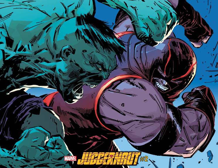
When the strongest Avenger collides with the unstoppable Juggernaut, it’s safe to say they’re going to make a mess. Marvel Comics invites you to take a front row seat at the strong man battle of the year between the Hulk and the Juggernaut in JUGGERNAUT #2, available to retailers on September 28th.
Says Marvel of the upcoming issue: “it’s Juggernaut VS Hulk in an epic clash that will shake the Marvel Universe to its core—literally!” You can check out an exclusive preview image and read the full Marvel press release below.
Can you think of a better matchup? Let us know what you think in the Comments section, and please share this post on social media using the links below.
THE UNSTOPPABLE GOES UP AGAINST THE STRONGEST THERE IS IN JUGGERNAUT #2
New York, NY— September 24, 2020 — Renowned X-Men writer Fabian Nicieza (X-Force, Deadpool) and celebrated artist Ron Garney (Captain America, Daredevil) are taking the unstoppable Juggernaut in a bold new direction with a brand-new series! JUGGERNAUT #1 hit stands yesterday, and fans learned that Cain Marko’s new path is as full of destruction and mayhem as ever before. The action continues next month when a matchup that True Believers have debated about for decades comes to life. That’s right —it’s Juggernaut VS Hulk in an epic clash that will shake the Marvel Universe to its core—literally! Get an exclusive look at this legendary battle now by visiting Marvel.com.
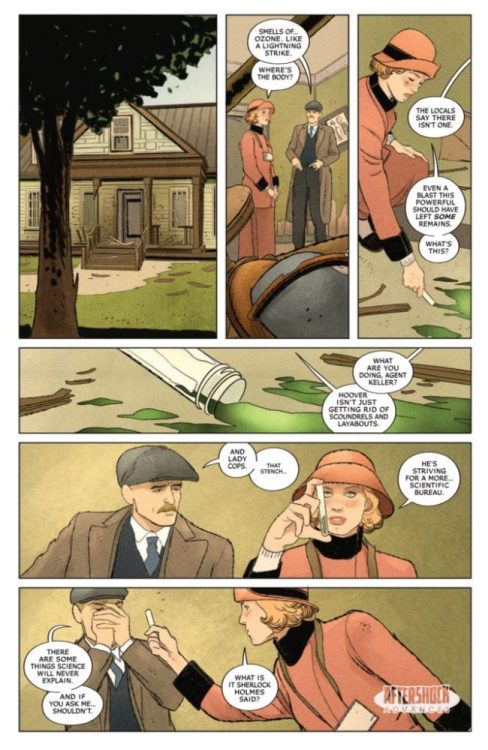
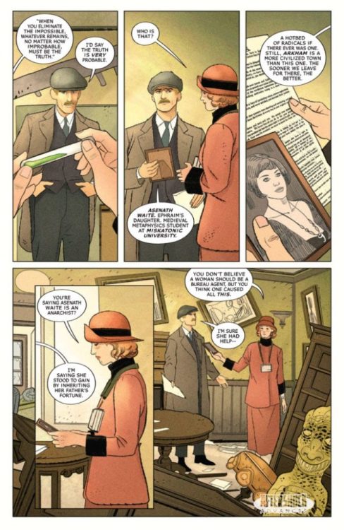
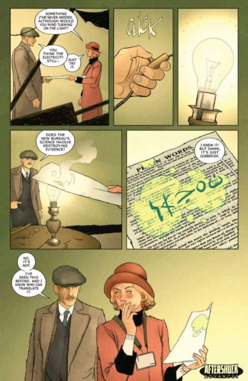
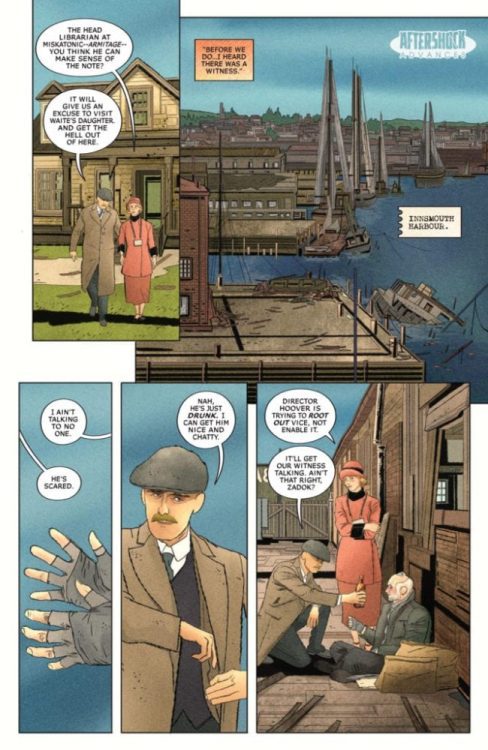
MISKATONIC #1 hits your local comic book shop on November 11, but thanks to AfterShock Comics, Monkey Fighting Robots has an exclusive four-page preview of the Lovecraftian-horror thriller.
The book is written by Mark Sable, with art by Giorgio Pontrelli, Pippa Bowland drops the colors, and you will read Thomas Mauer’s letter work. Jeremy Haun and Nick Filardi worked on the main cover, with Tyler Crook creating the incentive cover.
About MISKATONIC #1: Miskatonic Valley holds many mysteries – cultists worshipping old gods, a doctor deadset on resurrecting the recently deceased, a house overrun by rats in the walls – but none more recent than a series of bombings targeting the Valley’s elite.
These horrors reach a breaking point when the brilliant, hard-nosed investigator Miranda Keller is sent to stop the bombings. To J. Edgar Hoover, there can be no other explanation than those responsible for similar actions during the Red Scare of the 1920s…but when Miranda digs too deep; she uncovers an unimaginable occult conspiracy, one that may cost Miranda her job – and her sanity.
Enjoy the preview below:
What AfterShock Comics are you reading? Comment below with your thoughts.
Javier Garrón is a Marvel Comics artist from Barcelona, Spain, and he was part of Marvel Comics’ YOUNG GUNS for 2018-19. Garrón has worked on Ant-Man and the Wasp, Miles Morales: Spider-Man, and now the Avengers. Monkeys Fighting Robots was able to talk with him about Avengers #35 from an artist’s perspective.
(Avengers #35 was written by Jason Aaron, with art by Javier Garrón, Jason Keith is the color artist, and you will read Cory Petit’s letter work.)
MFR: Can you talk about your relationship with Jason Aaron? Are his scripts tight, or does he give you room to flex your artistic muscle?
Garrón: He’s the most awesome team member you could have by your side. He’s extremely supportive and encouraging of collaboration. We recently had to design quite a big batch of characters, and that was a truly fun and productive team effort. You know, I was already a massive, huge fan of his work prior to landing on the Avengers title. When I was offered the project, I was ecstatic. He’s as big a star in comics as you could get. But when it comes to day to day work, he’s just Jason, and he’s here to build something together. His texts are detailed but not ironclad with lots of suggestive, evocative parts that are solely crafted to help push the artist’s imagination further.
Image courtesy of Marvel Comics.
MFR: How much fun is it drawing the Ghost Rider on a wooly mammoth?!
Garrón:Oh, wow, that was bonkers! I’ve never drawn the character before (maybe in a couple of con sketches but never on an official page, I believe), and it’s so much fun. We take a couple of concept swings with the character during the Khonshu arc, and each one is crazier and more fun to approach visually. The fire really gives you a lot of room for kinetic effects, bringing so much more energy to the panels.
I won’t lie; I was scared for the mammoth part. I’ve never drawn one! Not even an elephant! Yes, it’s a challenge, and that’s how you grow as an artist, that’s true. But on the other hand, it’s more pressure. I was reading the Aaron run on the series since the beginning, so I know how true titans as McGuinness or Pichelli draw it. I’m aware of how high the bar is set, and these are the moments when you realize it when you face something you’ve never set yourself against. I was also trying a new approach on these pages.
Covid19 had already hit hard here in Spain where I live, and we were in quarantine when I was drawing this issue. I do most of my page work in traditional media (with a variable amount of digital and post-work depending on the page), but since I keep hearing every artist say digital is better and makes you go faster, I decided this was the moment to try it. I didn’t know how long the quarantine could take, and I could probably run out of paper, so the moment was never going to be better. I was not only facing new challenges in terms of characters but also going through the learning curve of trying to fully draw pages digitally. I was nervous about being the weakest link in the series’ quite stellar line of artists.
Image courtesy of Marvel Comics.
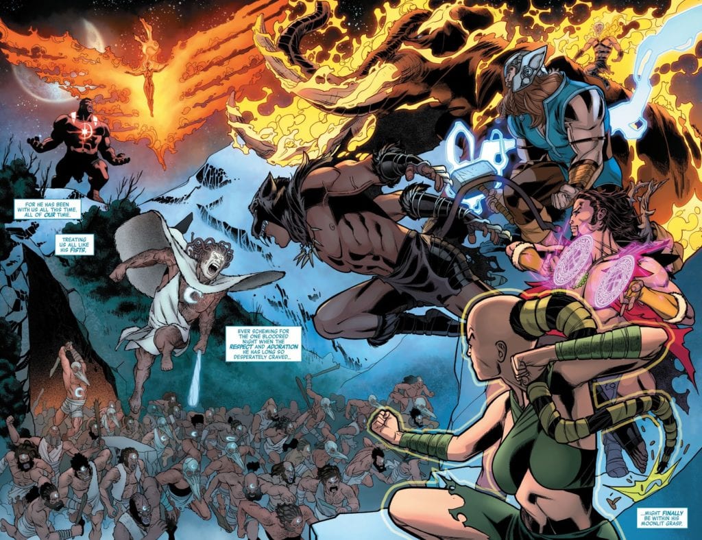
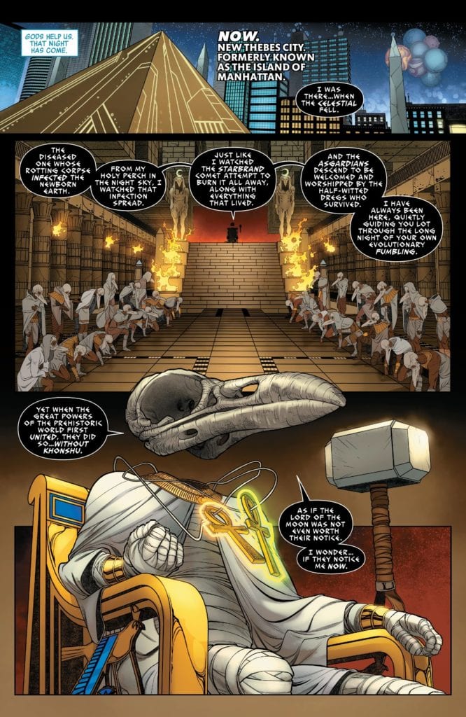
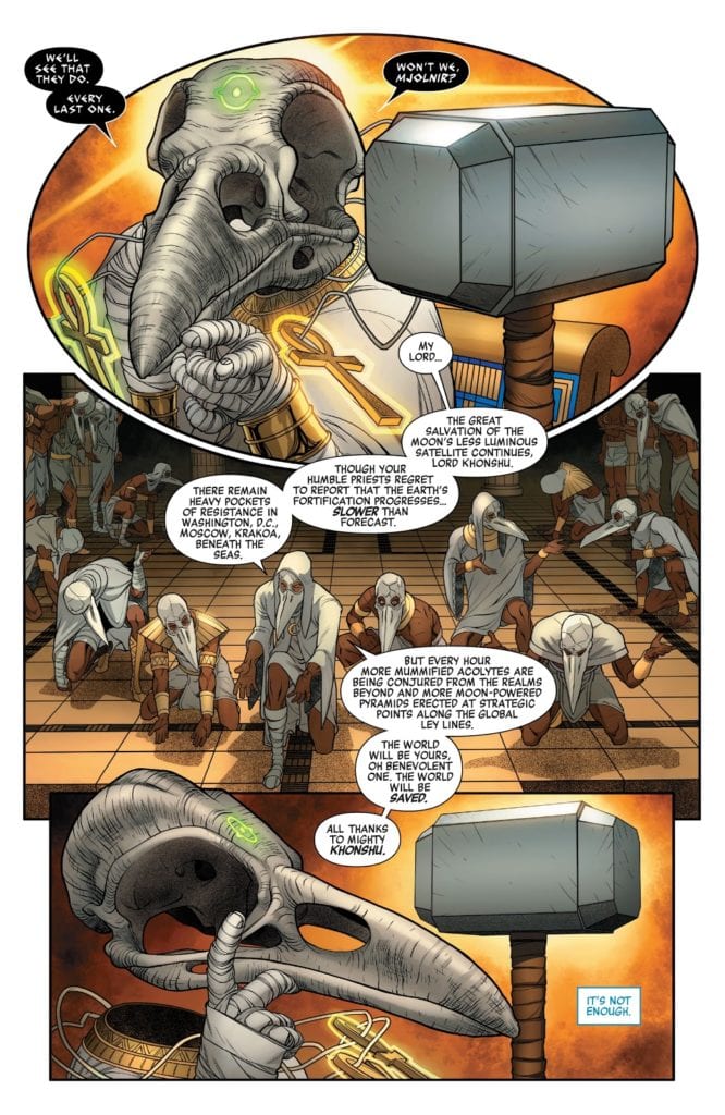
MFR: Avengers #35 has several floating elements, from Mjölnir to Khonshu’s head. How do you work with colorist Jason Keith to give these elements movement?
Garrón:The work rhythm in a monthly title is very intense, and deadlines are always looming, so there’s not much time to prepare things in advance, and most of the talk is usually done on the go. At least that’s my experience so far. I respect the process of the colorists tremendously and don’t like to meddle. I trust the gut instinct of every artist I work with the same way I like to be trusted. You usually should follow your artistic instincts. If I have any specific thought or suggestion about any particular subject, I leave notes inside the file I send to editorial. We’ve aimed for bright and dazzling coloring of energy, blurs, and kinetic lines for objects in movement and depth of field through line hierarchy (width of line in the inking process: things closest to the camera have thicker lines and it becomes thinner as we move away) and lighting/effects (shadows, smoke, graded or colored lines…).
Image courtesy of Marvel Comics.
MFR: On page 5 or Avengers #35, the oval panel has an optical illusion element as Mjölnir lifts off the page. Can you explain your panel layout for page 5?
Garrón:One of the things I try to keep in mind when planning a page is making them different from the previous one in terms of panel composition. Unless, of course, it’s something I’m specifically looking for as a narrative device. Otherwise, and making more specifically a superhero comic, I want the comic to be as dynamic as possible, and that means not only not repeating a page layout but also, when the scripted moment calls for it, making itself the money shot.
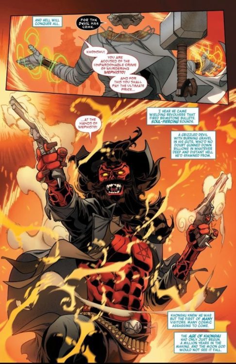
In the previous page, we revealed (SPOILER) that Khonshu, the Moon God, is in possession of the Mjolnir. We also see his high priests gathered around the throne. And in that page, we establish Khonshu’s power and dominance over the situation with a symmetry axis. He is at the left of it, the hammer in his right (or her right? Not sure if Khonshu is gender-neutral, I should ask Jason!), and his army deploys symmetrically at his feet. We repeat this rigid, strict structure in page 5, but we add an extra reveal: you may not have paid much attention to the two glowing ankhs hanging from his neck, but that means he has their power. And on page 5, panel 1, we see the Eye of Agamotto on Khnoshu’s forehead. So the page is almost symmetrical to continue the visual narrative established in the prior page, but to highlight the reveal (and also make the page more visually attractive and distinctive), I shaped the first panel almost like the Eye of Agamotto itself.
Image courtesy of Marvel Comics.
MFR: Avengers #35 features a western gunslinging Mephisto; what was the process like bringing this character to life?
Garrón:That was so much fun! It’s what I love from Aaron’s Avengers run, the crazy amalgam and remix of Marvel’s mythos, characters, and genres bringing such a fresh take to the series. While also keeping the scope of the main story epic and in the widest possible frame.
Some elements were already pointed out in the script. He was described as a Wild West version of Mephisto, with a beard, a black cowboy hat, and a pentagram on his chest instead of a lawman’s star. Oh, and also firing black magic revolvers.
What I usually do when approaching a character design is taking a deep dive and researching it. But being on a deadline, you have to ration your time and efforts. I knew from reading the script he wouldn’t be appearing much. In page 7 and maybe a glimpse of him on the final page of the issue. So it wouldn’t be wise to spend much time here when you need to keep the pages being done, and there are far more relevant things to design, story-wise. So I did some online research on cowboy costume design, fantasy westerns, and Mephisto representation throughout the years. I put it all in the mixer inside my head and pressed the “on” button. I wanted him to have several layers in his upper body, so he has a shirt and jacket, but open so we could see the inverted star in his chest. And also give a sense of looseness and chaos. The wild beard, the buckle with his initial (as an ego move) and little spikes here and there (the belt, the guns) making him more dangerous-looking.
Image courtesy of Marvel Comics.
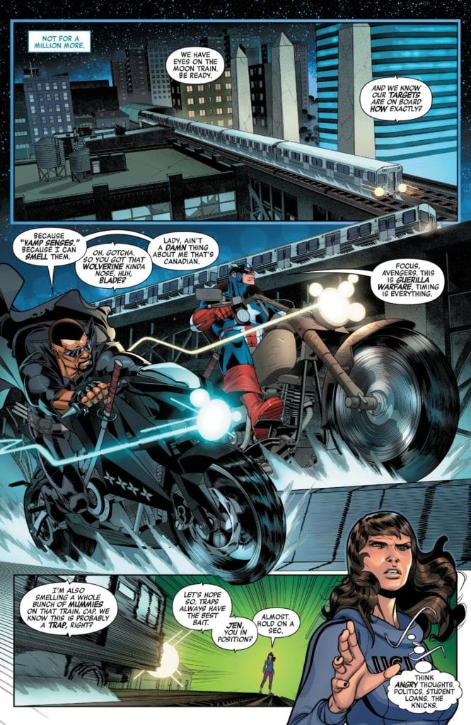
MFR: In Avengers #35, Captain America and Blade are fighting side by side. They are similar in build and size; artistically, how do you give them personality to differentiate the two?
Garrón: It’s a matter of body language for me. Captain is more analytic and avoids confrontation as much as possible. Blade is more temperamental and jumps into a fight more easily. We don’t see them much in this issue, and most of the time is battling mummies, so I had to establish this visually from the get-go. Page 8, panel 2, we see them riding their motorcycles, and the script just gave me the key. The differences between their bikes tell a lot about them. Blade’s bike is slick and black, a sleek street bike, with swords sheathed on it and shurikens fitted on the side. Cap’s bike is older, bigger, a bit clunkier. Like an old WWII Army bike. So we would have Blade leaning forward in his bike and Cap more seated straight. And that body position echoes through the battle sequences: Blade jumps head first, almost like a bull charging the enemy, with his swords ready to cut through the enemy without a second thought: and Cap uses his shield, uses his legs to kick his enemies out of his way, and generally approaches the combat more strategically. Blade showing his vampire fangs, raging in the battle, Cap serious and frowned. It’s all in the body language.
Image courtesy of Marvel Comics.
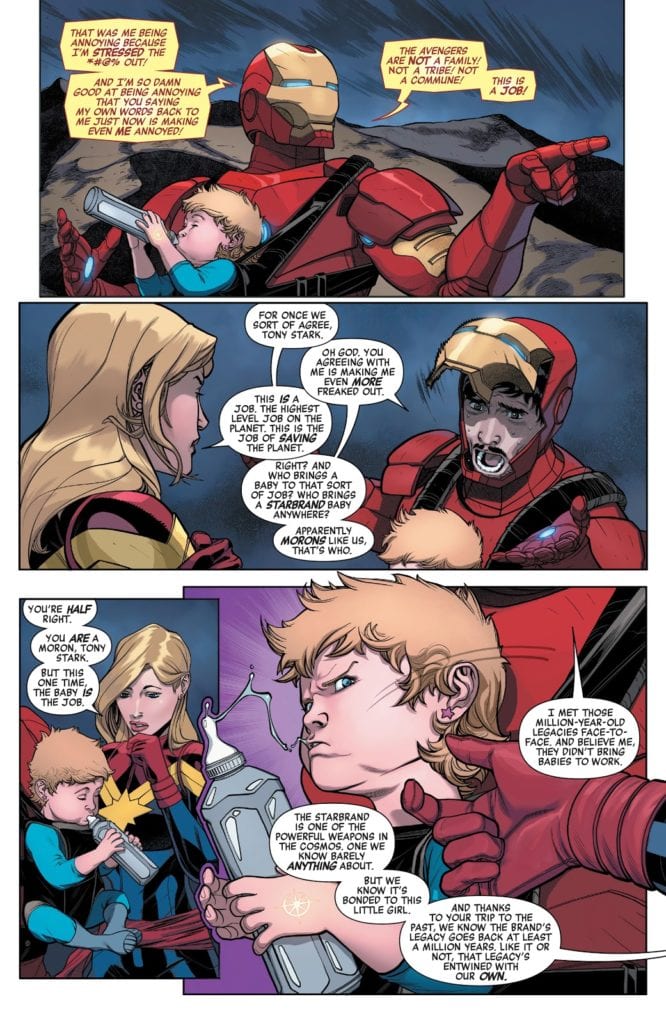
MFR: Later in Avengers #35, Captain Marvel and Iron Man are having a conversation, and Tony Stark lifts up his face shield during the conversation. Was that in the script? Also, do you draw Tony’s face first and then put the armor around him, or do you draw the armor first and then fit his face in?
Garrón:It was definitely specified in the script very clearly. Iron Man’s faceplate pops up, showing the surprise and worry on his face, as Carol agrees with him, looking stern and serious.
In terms of drawing the character, well, it was a bit of a struggle. I previously drew Iron Man for a video comic, a Marvel project for Disney XD (you can easily find it in Youtube). But that was like two or three years ago, and I didn’t remember how I approached it. Should the armor come first? Or Tony Stark? I experimented a bit with 3D models to help me achieve a higher level of detail and speed things up. But didn’t quite like the results. So, in the end, I opted for layouting the figure, the body volume, set the proportions, and then detail the armor on top of it. And I felt way more comfortable this way. At first, not being familiar with the armor design I had to draw, I still used some visual reference, but it’s way more comfortable to just go with your instinct (again here referenced) and do your thing, your way.
Image courtesy of Marvel Comics.
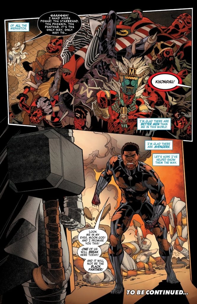
MFR: Javier, talk about the final page of Avengers #35. You have a giant pile of dead Mephistos and then a beaten down Black Panther is storming through the doorway. Why did you use the visual angle you did on this page?
Garrón:For the pile of Mephitos, I just thought the high-angle shot would make the reader understand the scene and appreciate better the details of the bodies. It also gives a better sense of scale when you use the architecture of the temple, its lines as visual guides for the eye with the tiny Khonshu at the bottom of it.
For Black Panther, I preferred to place the camera at a low angle, behind Khonshu, to reflect the surprise of the hero’s appearance from his perspective. Also, showing the hammer forefront you say that even though Black Panther showing up is an unexpected surprise, Khonshu is extremely well prepared and in full possession of massive power to confront it. This point of view also provides a nice shot of the destruction and knocked out priests Panther has left on his way to confront the Moon God.
We see Khonshu’s triumphs in the first panel, the highs, and then his threats and quite possibly defeat, his lows, in the second panel. All told through the position of the camera.
MFR: Javier, thank you for your time, and best of luck with Avengers!
Garrón:Thank you for inviting me to do the interview! It’s been so much fun! Hope I provided enough interesting insight into the making of process, and both you and the readers have a good time with it! And of course, hope you all are enjoying our Avengers run! I’m extraordinarily proud of it, and I think, as a fan myself, when I go through my first reading of the script, that it’s a ton of fun. Hope you have a blast too!
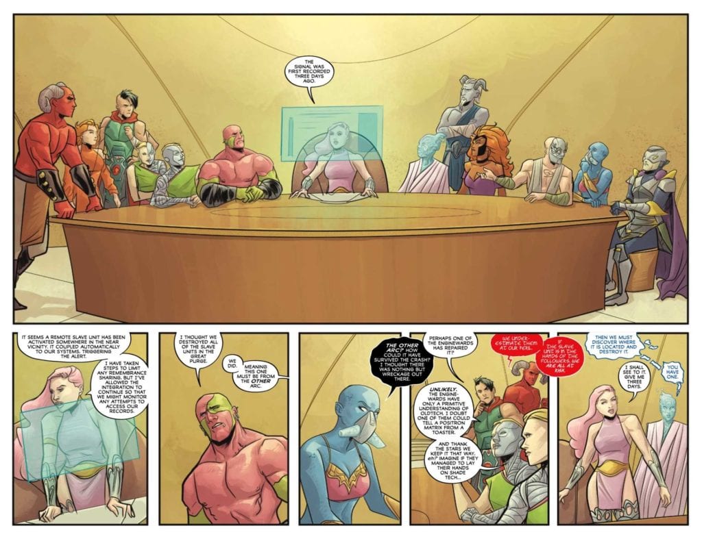
Released by Marvel Comics on September 23, X of Swords – Creation #1 kicks off the next big X-Men event that the X-titles have been setting up for months! Writers Jonathan Hickman and Tini Howard, artist Pepe Larraz, color artist Marte Gracia, and letter VC’s Clayton Cowles inaugurate the next era in the Dawn of X in this 67-page issue.
Writing
Hickman and Howard weave a high sci-fi/fantasy tale intrigue, conflict, and betrayal. Both writers had a lot on their plate in this issue, to surprise readers, make the stakes clear, and set up coherent ground rules for what is a massively sprawling tale seven prose section (more than half of which are diagrams).
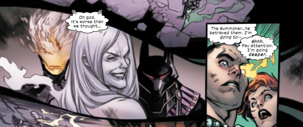
Some of the story beats are predictable. Given what we know of Apocalypse’s own “survival of the fittest” philosophy when readers discover that the ones attacking Otherworld are his children, it is evident that his peaceful greeting to them will end will betrayal and violence.
What is a bit surprising is that Apocalypse’s grandchild, the Summoner, is in on the betrayal, which Rachel Summers and Cable discover when they probe Banshee’s mind on Krakoa (and a page after the Summoner stabs Apocalypse in the back). We discover that just as Apocalypse sought to reclaim Arrako and join it to Krakoa, so his children want to reclaim Krakoa (which spells death and violence for its current inhabitants…all but the fittest of course).
Art & Colors
Larraz does a lot of good work on this issue. There’s a real cinematic quality to the pages where Apocalypse is approaching his children, and Cable and Rachel are probing Banshee’s mind. As the story moves back and forth between these settings, one can almost hear the dramatic music building in one’s mind, increasing the tension and letting readers/viewers know that something is about to go down.
Then, of course, comes the moment when the Summoner betrays Apocalypse, and the scene shifts back one final time to Cable and Rachel’s mind probe, where we see the devilish grin of betrayal on the Summoner’s face.
Larraz does an excellent job capturing the fiendish look on the Summoner’s face, which is nicely juxtaposed with the look of shock on Rachel and Cable’s faces.
Gracia’s colors in this sequence are great, and provide a nice contrast between the images from the Summers’ mind probe, with the grayish-purple, and the bright colors of the waking world. Overall, this is a book with a diverse color pallet, and Gracia does a great job giving each scene its individual hues, adding to the overall fantasy atmosphere of the story.
Letters
This event has a lot going on. It would be very easy for many of the pages to become swamped in word balloons. Thankfully, Cowles is able to avoid this pitfall. The word balloons in this issue are detailed, but not overwhelming nor clunky, and the prose sections, which sometimes suffer in the X-books because they can be superfluous or tell what should be shown, actually provide a nice supplement to the regular panels.
Conclusion
After months of waiting, X of Swords has arrived. This issue raises the stakes, puts all the players in motion, and promises to be the type of giant, comic book spectacle that X-fans and fans of Hickman’s previous work should love.
Are you excited for X of Swords? What did you think of X of Swords – Creation #1? Tell us in the comments below!
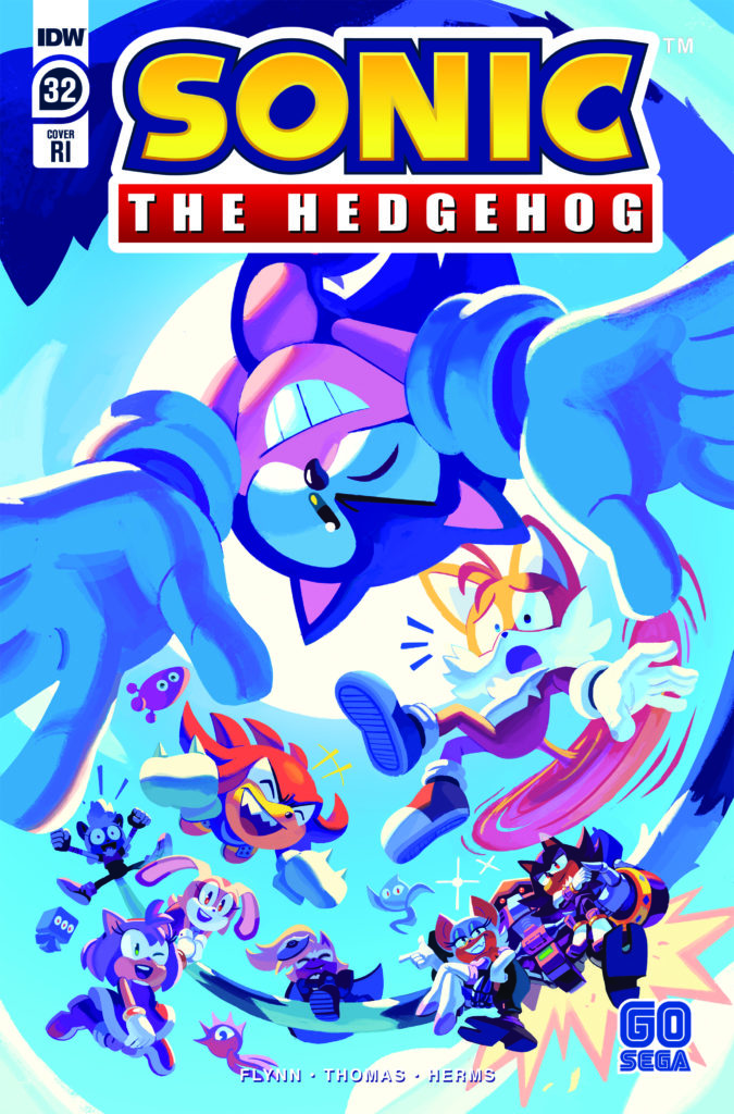
Sonic The Hedgehog #32 from IDW Publishing is out this week and marks the end of Ian Flynn’s run as writer for the series. Flynn had been onboard since the series was relaunched by IDW back in 2018 and has helped the comic reach a lot of positive acclaim with this new run. Joining Flynn is Adam Bryce Thomas (pencils and inks), Matt Herms (colors), and Shawn Lee (lettering).
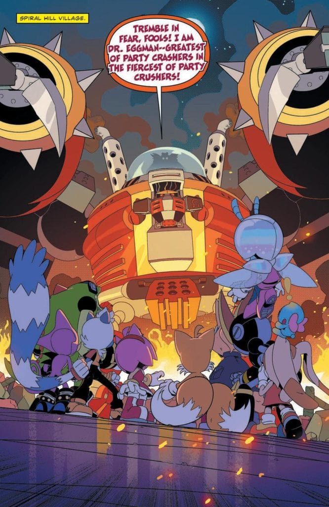
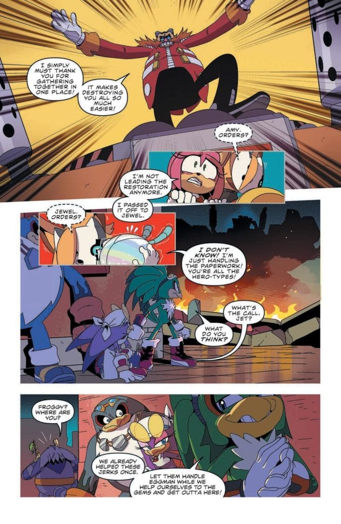
The second half of the Metal Virus Saga epilogue. With all the chaos of the recent past still fresh in everyone’s minds, Dr. Eggman launches a new assault—determined to take down his enemies once and for all.
Writing
As Dr. Eggman decides to crash the victory party, it’s surprising how the entire cast seems to have difficulty repelling his attack. Tails, Rogue, Amy, and the Chaotix are all present and Dr. Eggman still seems to have the upper hand. It does serve as a great setup though to allow for Blaze to offer some assistance in a very special way.
Ian Flynn takes the time to make sure the characters are in a better place when everything is said and done. The overall story isn’t as incredible as the more over the top aspects which came during the Metal Virus storyline but its still an entertaining issue. The run since the series arrived at IDW comics has been on a high level of quality and the creative team should be proud of what they have created.
Artwork
The art by Adam Bryce Thomas focuses on making sure the battle against Dr. Eggman comes off as epic and intense. Two great full-page splashes are used in the issue. One showcases the colossal scale of Dr. Eggman’s weapon and the other has Tails and the gang working to thwarting his efforts.
The colorwork by Matt Herms makes the action scenes more extreme. The best example of the impact comes as Blaze uses the power of the Sol Emeralds. By tapping into their power, energy radiates around her and allows her to perform a miracle.
The lettering by Shawn Lee helps guide the flow of the narrative from panel to panel. This allows for the action to unfold much smoother. As always Lee knows how to make sure the sound effects add to the panel’s presentation instead of becoming distracting.
Conclusion
Thought Sonic the Hedgehog #32 may be the end of Ian Flynn’s run as writer of the series, it doesn’t mark the end of Flynn’s involvement with the franchise. A miniseries titled Sonic The Hedgehog: Bad Guys is coming soon and is written by Flynn. With Flynn’s departure, it will be interesting to see where writer Evan Stanley takes the series moving forward.
Spiral, not Chris Rock’s delayed SAW film, but Shudder’s latest addition, examines the horrors of being different in today’s society. The film follows very familiar beats, but still manages to get under your skin. A film that explores what it’s like to be gay in America, and how acceptance from everyone is impossible.
While hate crimes and riots continue in America, Spiral arrives at the perfect time. In fact, glimpses of an old hate crime are showcased multiple times throughout the film. This is done in order to highlight that a lot of people will not change, they will just get better at hiding their hatred. Of course, it is also a plot device used for one of our main characters. Directed by Kurtis David Harder, and written by John Poliquin and Colin Minihan. Spiral follows a same-sex couple, who move to a small town in order to raise their 16-year-old daughter with better social values. Sadly, this town isn’t as accepting as it appears and the neighbors are far from inclusive.
Jeffrey Bowyer-Chapman as Malik in Spiral
The film stars Jeffrey Bowyer-Chapman, Ari Cohen, Jennifer Laporte, and Lochlyn Munro. Spiral starts off very promising, but when the twists are exposed, you might be a bit confused. Exploring cults is always fun with the horror genre, but it takes a more sinister turn here. Malik (Chapman) and Aaron (Cohen) are our two male leads, who move to this new town and are just looking for a fresh start. Malik is the one to look out for, as he was involved with the hate crime that the film will revisit. Overall, the writing from Poliquin and Minihan is fine, but there’s not enough done with Aaron’s character.
Aaron is white, and homosexual, so he doesn’t really suspect much from his new neighbors. However, Malik is not only homosexual but black as well. He instantly begins to feel like the odd one out, while Aaron doesn’t suspect a thing. If Aaron’s past had been explored like Malik’s, it would have made the film that much better. Once the town’s secrets are revealed, the narrative raises a couple of questions. In fact, a lot is left up in the air. Spiral misses a few marks due to a mixed bag reveal but thrives in addressing social horrors.
Malik and Aaron in Spiral
Chapman and Cohen are terrific in their roles, but Chapman steals the show as Malik. At first, Malik is thrilled to get settled in, but then one strange occurrence after the other changes the entire mood. The way Chapman captures Malik’s emotions are amazing and it helps the viewer connect with the character. Again, Cohen is great as Aaron, but his character isn’t developed much. Viewers will instantly connect with Malik and while clearly done on purpose, knowing the background of Aaron too would have been a nice touch.
Harder takes you on a very uncomfortable journey that many will compare to Jordan Peele’s Get Out. There’s tension, dread, and it just progresses as Malik and Aaron realize their error in moving to this new town. It really is unfortunate that the reveals weren’t more fleshed out. Once Malik finds out what’s going on, all of the unease that has been built up flat lines a bit. Still, Spiral is an effective social horror film overall, and it features solid performances from everyone. Also, Avery Kentis’ score during this film is magnificent and will keep you on the edge. Honestly, it is the only thing that helps maintain the tension once the reveals start happening.
Ari Cohen as Aaron in Spiral
Spiral wants to be like Get Out but stumbles slightly with its underwhelming finale. Despite all of its writing mishaps, this is a worthy addition to the list of social horrors. It is refreshing to see LGBTQ representation in this genre, and Harder will have you feeling uncomfortable from start to finish. Spiral effectively helps remind society that some people really only get better at hiding the hatred within them.
ENGINEWARD #3, available from Vault Comics on September 23rd, sees Joss and her friends embark on a mission to find the seed that could save their world. George Mann’s story takes a step back from the world-building and firmly pushes forward into the hero’s journey.
Cover Art
Joe Eisma’s cover art continues to impress with an original and modern take on the zodiac god, Virgo. As the zodiac sign implies, Virgo’s face is perfect. Symmetrical, exacting, precise. It’s a fine example of interpreting personality through art.
Writing
Mann’s writing takes a tonal shift in this issue from prior ones to get right into the here and now of the mission for Joss. There are less exposition and world-building, and more focus on preparing the antagonists and protagonists for the coming adventure.
Mann’s tonal shift simplifies the readability of the issue, which is made richer by the mythology and backstory introduced in the first two books. In all, ENGINEWARD #3 was a faster read. The story was more straight forward. And the progression of the plot was significantly smoother since you didn’t have to regularly pause to cross-check what the characters were talking about regarding the origins of the town, the gods, the crashed ship, and the ghoulem.
Pencils/Inks
Joe Eisma’s art complemented Mann’s story well, but there was a bit of a step back in terms of the energy and pace in each panel. The character designs are wholly original, and the facial expressions of the characters adequately matched the emotion of each scene.
That said, most of the camera angles were flat and straight at eye level, lacking much visual interest. The characters expressed enough emotion to carry each scene, but just barely. The artwork is adequate to tell the story, but it lacks energy.
Coloring
Michael Garland’s coloring works exceptionally well for blanketing every scene in dry, dusty desert tones while still adding enough contrasting colors to help the characters stand out in their surroundings. It’s a colorful issue that uses pastels and soft tones very effectively.
Lettering
Hassan Otsmane-Elhaou’s lettering expertly uses word balloon coloring to express shouts or exclamations with a simple red border to maximize the emotion of the characters’ speech, using as little real estate as possible. This is an excellent strategic choice because many of the pages range from six to eight panels. This is smart and effective lettering from Otsmane-Elhaou.
Conclusion
ENGINEWARD #3, available from Vault Comics on September 23rd, builds on the world-building from the previous issues and finally launches into the main adventure. The story is a clear and breezy read, and the art accentuates the hot desert venue nicely.
WYND #4, available from BOOM! Studios on September 23rd, find the fleeing quartet desperately trying to get to Northport with the Bandaged man hot on their heels. Written by James Tynion IV with art by Michael Dialynas, Wynd’s latest chapter captures the spirit of a frantic chase and adds in plenty of revelations.
Cover Art
Dialynas’ cover captures the spirit and tone of the issue perfectly. It’s equal parts determination, and fear as the four main characters charge forward into the unknown. Dialynas also handles the internal pages, so the art style is seamless from outside to in, and the emotional expression of the character’s faces add plenty of punch to the gravity of the scene.
Writing
Tynion’s latest chapter follows Wynd and the group as they escape the underground refuge and into the wild. Finally, the questions asked about the nature of magic, and the weirdbloods gets long-awaited answers. Tynion handles those answers in a very natural and organic way for the story.
This issue has a little bit of everything: heroism, relationship drama, a mild allusion to romance, and fantasy elements. In a nutshell, Tynion’s series has a little something for everyone but presented in a (mostly) family-friendly way without sacrificing the action or dramatic tension.
Pencils/Inks
Dialynas’ art is as responsible for the friendliness of the story as Tynion’s writing by creating weird and yet accessible characters. Finally reaching the woods, Dialynas has the opportunity to spread some creative wings by designing a host of magical creatures, unlike anything this reviewer has seen in recent memory.
In particular, the design of Lady Gwendolyn is frightening but somehow possesses a kindness in her character that makes her instantly likable. I’m looking forward to seeing what magical creations Dialynas comes up with in the next issue.
Coloring
Dialynas’ coloring work adds to the magic of this comic book and sets it apart from the previous three. The people and setting of Pipetown have primarily been depicted in earthy tones of soil and rust. Now that the group has entered the woods, the rainbow of nature’s colors explodes like fireworks on every page in stark contrast to what came before. It’s through this shocking change in color palettes that Dialynas helps the reader feel like they’ve entered a new world.
Lettering
Aditya Bidikar’s lettering consistently helps keep the tone safe with the use of softly rounded fonts. With the arrival of magical creatures, Bidikar adds an element of visual interest by matching the word balloon colors to the general’s mystical eye color. It’s a nice touch that further increases the magical feel of the issue.
Conclusion
WYND #4 takes Wynd and his allies into a whole new world of magic and color that infuses the familiar chase story with elements of wonder. The story has a little something for everyone, and the artwork is whimsical and exciting. I recommend this issue as the strongest of the series so far.
After much hinting and suggesting, Marvel Comics has finally revealed the new X-title this December from writer Al Ewing and artist Valerio Schiti, and it’s S.W.O.R.D. #1. Following the events of X Of Swords, Abigail Brand is relaunching S.W.O.R.D with a collection of mutants to defend the Earth against extraterrestrial threats.
Says Marvel about the new series: “The events of S.W.O.R.D. will have a tremendous impact not only on the X-Men’s world, but the Marvel Universe as a whole, as the mutants of S.W.O.R.D. warp the cosmic landscape forever.” You can check out the stunning first issue cover and read the full Marvel press release below.
Are you excited to see what a new S.W.O.R.D. series will bring the Marvel landscape? Let us know what you think in the Comments section, and please share this post on social media using the links below.
AL EWING TAKES MUTANTKIND BEYOND THE STARS IN S.W.O.R.D. #1
The new X-Men title by Al Ewing and Valerio Schiti arrives this December
New York, NY— September 23, 2020 — ONE GIANT LEAP FOR MUTANTKIND! This December, writer Al Ewing (Immortal Hulk) and artist Valerio Schiti (Empyre) bring fans the newest X-Men title, S.W.O.R.D.! In last year’s groundbreaking HOUSE OF X, the mutant nation of Krakoa was founded and quickly became a major force on the world stage. Now, Jonathan Hickman’s grand new vision for mutantkind continues as the X-Men look to do for the galaxy what Krakoa did for the planet.
In the startling aftermath of X OF SWORDS, mutantkind will take the bold next step in claiming their destiny by relaunching the Sentient World Observation & Response Directorate to deal with all things extra-terrestrial on behalf of Earth. The events of S.W.O.R.D. will have a tremendous impact not only on the X-Men’s world, but the Marvel Universe as a whole, as the mutants of S.W.O.R.D. warp the cosmic landscape forever. The stellar cast includes Magneto, Abigail Brand, Cable, Frenzy, Wiz Kid, Fabian Cortez, former Avenger Manifold, and many other fan-favorite mutants who will be stepping into the spotlight in a major way.
Known for his critically acclaimed and thought-provoking work on IMMORTAL HULK, Ewing is now ready to take the X-Men where no one in the Marvel Universe has gone before.
“It’s an absolute blast to be working with the X-team, and to bring Marvel’s merry mutants into the new Age of Space – and introduce space to the new age of Krakoa!” Ewing said. “And it’s not just X-readers and space explorers who get what they want—fans of my more cosmic Marvel work will have plenty to digest as well, as mutantkind thinks even bigger and takes it even further, into realms I’m almost surprised they let me get away with. After conquering death, what’s next – and will we survive the experience?”
S.W.O.R.D. will reunite Ewing with superstar artist Valerio Schiti. The pair previously joined forces on Marvel’s cosmic epic, Empyre.
“I really love Al’s books, so I’m very happy to have the chance to be on his side in this new adventure. We already had the chance to work together, a few years ago on Mighty Avengers and more recently on Empyre, so now we trust each other and we can use a more ‘flexible’ working method. He can switch from full script to ‘Marvel style’ when needed, and I can change panels or layouts when I think that could work better. This is definitely one the best working partnerships I’ve ever had,” Schiti said. “I can’t say much about what S.W.O.R.D. does, but I can say that every team member will have a peculiar role to play. That’s why I designed their uniforms with technical clothing, urban outfits, and even ceremonial uniforms: every role needed a different reference and a different starting point. The space outfits are inspired by trekking or hiking clothes, far from the typical space suit because these characters are explorers, not astronauts.”
Head over to Marvel.com for more information, including a look at some of Schiti’s character design sheets, and prepare for the latest evolution in the ongoing saga of mutantkind when S.W.O.R.D. launches this December.
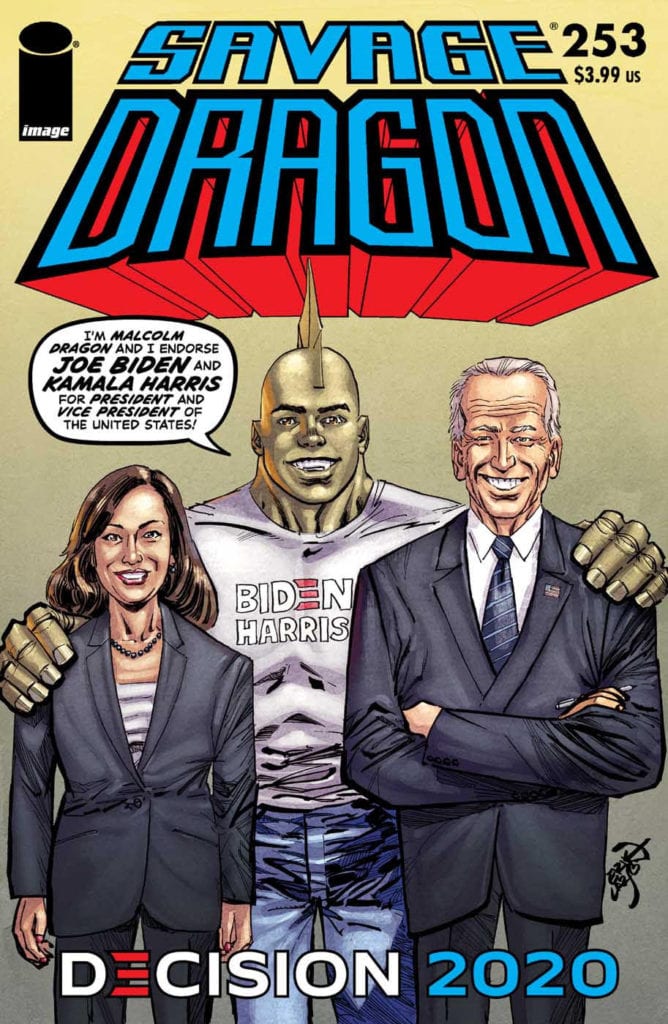
Wednesday afternoon, Image Comics announced a Biden/Harris variant cover for Erik Larsen’s Savage Dragon #253 (Diamond Code AUG208695) that will hit your local comic book store before Election Day on Wednesday, October 21.
The press release states, Image Comics partner and CFO Erik Larsen is voting for Joe Biden and Kamala Harris in this year’s election.
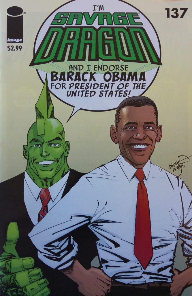
“This is an important election. They always say that but with America literally on fire and an ineptly handled pandemic it feels especially so,” said Larsen. “Twelve years ago SAVAGE DRAGON endorsed BARACK OBAMA and history was made. Savage Dragon #137 was the first comic book to feature the then-candidate Obama on its cover and it became a global sensation. It’s time to take a stance once more and help make the country, and the world, a better place!”
Savage Dragon #137 featuring Barack Obama sold out and went back to press four times. A CGC 9.8 graded first print edition goes for more than $750 on eBay right now.
Will you order a copy of Savage Dragon #253? Comment below with your thoughts.