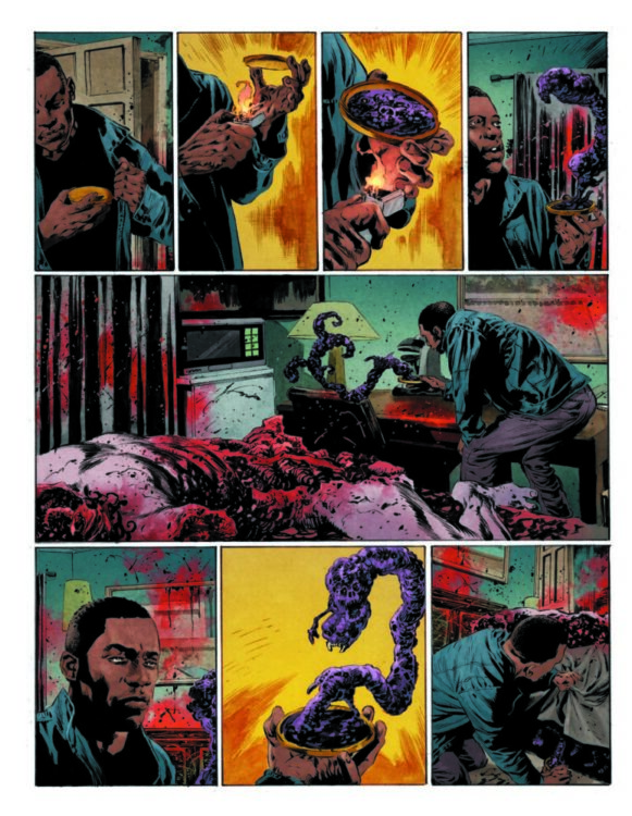
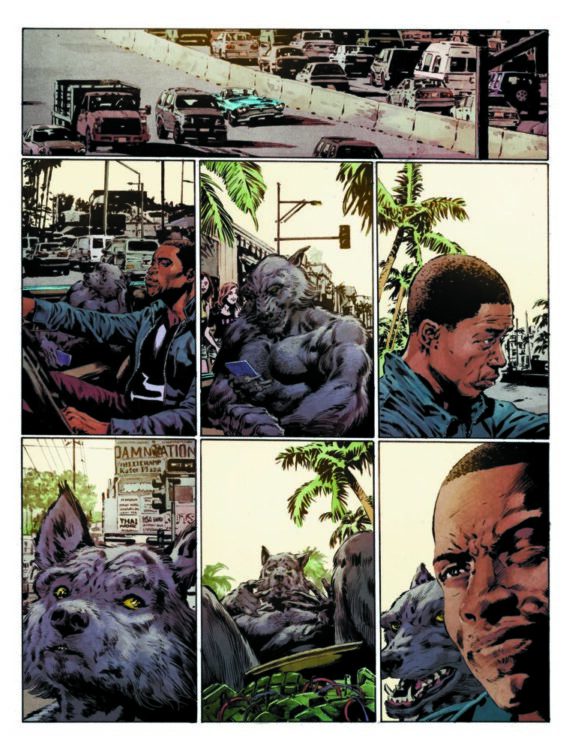
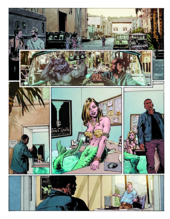
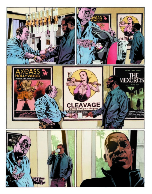
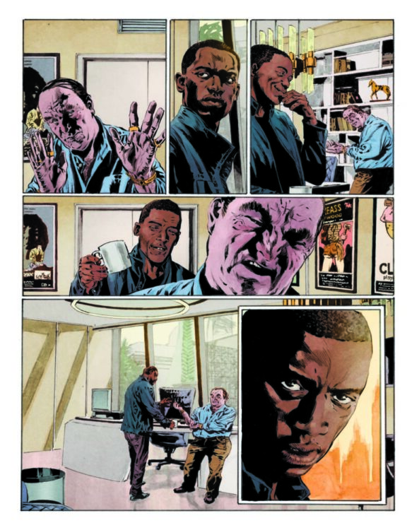
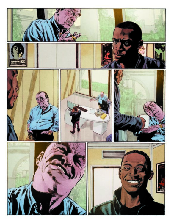
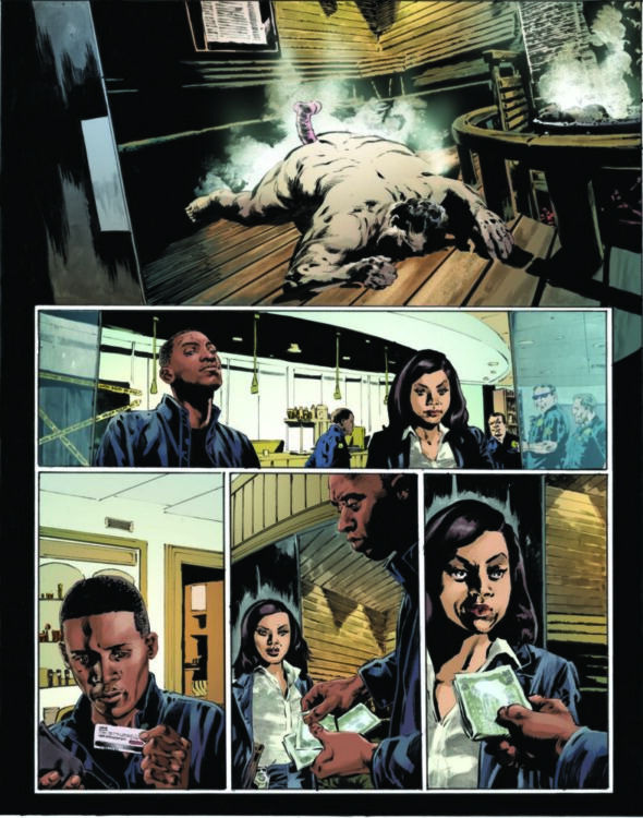
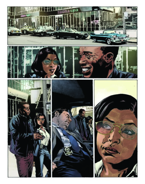
WHITE BOAT #1 is out March 27th, and thanks to DSTLRY, Monkeys Fighting Robots has an exclusive first-look at artist Ryan Stegman’s variant cover for the book!
About WHITE BOAT #1: From the acclaimed team behind Detective Comics and Night of the Ghoul comes a modern horror classic! White Boats are the mega-yachts that the super-rich use to traverse the globe—floating islands where your every desire can be fulfilled. And getting invited on board one should be a dream come true…that is until the crew traps and transports you to a remote island where secret cults have existed for millennia, working on something called “The Human Project.” Does the White Boat ship you to paradise or sink you into hell on earth?
WHITE BOAT reunites Scott Snyder, the visionary writer who redefined comic book dread with Wytches and introduced Batman into a terrifying, cerebral era, with modern noir master Francesco Francavilla for a white-knuckle descent into Lovecraftian maritime madness!
As stated in the solicit, the series is by Scott Snyder and Francesco Francavilla.
DSTLRY is a new publisher, having launched last year with THE DEVIL’S CUT one-shot. Creators not only own their own work published through DSTLRY, but they also own a piece of the company itself. The publisher also allows readers to resell their digital copies on the DSTLRY marketplace. You can read more about DSTLRY and what sets them apart from other publishers here.
Get your first look at Stegman’s cover for WHITE BOAT #1 right here:
Are you picking up WHITE BOAT #1 when it hits shelves? What’s been your favorite book from DSTLRY so far? Sound off in the comments!
Marvel Comics’ Avengers: Twilight isn’t just an exciting concept; it’s a complex and nuanced exploration of the times we live in. Writer Chip Zdarsky, artist Daniel Acuña, and letterer Cory Petit bring us yet another flawless, destined-to-be-classic issue in Avengers: Twilight #2. This is an issue that’s full of characters who are trying to convince themselves they can live life like they’re in a simple, straight-forward comic book world. But that’s not the world they live in now, and try as they might, things aren’t as simple as just hitting a reset button. This creative team dives deeper into their themes of nostalgia, control, and rebellion.
Writing
Zdarsky’s script continues to feel as multi-layered as real life. No one is fully right, no one is completely wrong — with perhaps only one exception (you’ll have to read it to see who I mean). The last issue showed us what it’s like for Steve Rogers to live and age — without the help of his Super Soldier serum — under an oppressive government. In Avengers: Twilight #1‘s final moments, he found a way to get his powers back, and joined the Defenders, a clandestine group of freedom fighters who rally under Luke Cage’s leadership. And while characters like Luke Cage and Steve Rogers seem to be paragons of virtue, Zdarsky shows us that their singlemindedness is not only naïve, but it fails to see what their war will cost other people.
Yes, they’re fighting a fascist government that’s brutally keeping its populace in line. And yet, after the events of Heroes’ Day, it makes an awful kind of sense that the nation would have to use extreme methods to keep its most powerful citizens in check. As we dive deeper into this story, we see that every character seems to believe they know what’s best for everyone, and all of them are wrong in some ways. Zdarsky’s world of Avengers: Twilight isn’t a world of primary colors and flashy action sequences. This is a world where moral stances lead to collateral damage. This is a world where fear radicalizes even the most well-meaning. This is a world where the wealthy elite dictate what the media puts out, and no one knows where to get trustworthy information. Avengers: Twilight is full of colors that have faded with time. Nothing is black and white. Everything is grey.
Art
There’s another reason that Avengers: Twilight feels so real, and it’s Acuña’s stunning artwork. Acuña straddles the line of detailed realism and stylistic minimalism with unmatched grace. At times, we see every wrinkle, scar, and mole. Acuña populates many of his backgrounds with meticulously rendered characters — who you have no trouble believing have full lives outside of their one panel. Other times, buildings, people, articles of clothing, or even details on someone’s face, are presented as a block of color. It gives this work an incredible dynamism and also shows us that the details that are there are there for a reason.
There’s a few places where it seems like Acuña has certain people in mind as he draws. Steve often looks like a haggard Robert Redford. Jarvis’ jowls and chin make him look a bit like Marlon Brando. Luke Cage gives us that same tired expression we see from Danny Glover. What this does, though, is it makes each character look distinct. And hopefully, somewhere out there, a Marvel exec will wonder if this would be a good movie. (Hint, hint. It would be perfect!)
Coloring
Acuña’s use of colors is impeccable. As you might expect, there are lots of reds and blues in this issue. In many ways, it comes to represent the resistance fighters. Their base is often shown in varying hues of crimson and cerulean. It’s in the glow of their screens and the gleam of their dull fluorescent lights. It shows up in their uniforms and battle plans. Their confrontations with others Acuña also colors this way. The brightness of the page accentuates the sudden influx of danger.
Yet, when we see the rest of the world, outside of the resistance’s hideouts and skirmishes, there’s not nearly as many primary colors. Instead, we see a lot of browns, greens, greys, and blacks. Maybe Acuña is suggesting that Steve, Luke, and the rebels are longing for a world that doesn’t exist anymore. They want to go back to the simplicity of the good old days. But simple isn’t the same as good. The intricate, gorgeous work that is Avengers: Twilight is surely proof of that.
Lettering
There’s so much to love about the lettering of this issue. Acuña seems to work a lot of the sound effects into the artwork himself. The CRACKs, POPs, THUDs and BLAMs of the issue all blend seamlessly into each panel. (If this is Petit’s work, that’s even more impressive! He compliments Acuña’s style perfectly.)
Petit’s work with the dialogue and captions is fantastic. Everything from character’s whispering in smaller font to their cries of surprise leaping out past the bounds of their word balloons. There are two points that Petit pushes the story forward perfectly, though. At one point, one character is faced with the fact that they could be doing more. They have their eyes closed, but their face is directed down and towards the words that beg for their help. Petit makes this connection between what we see and what the character hears by making it look like even they can’t bear to read those words on the page. Later, Petit gives us the sense that someone who is speaking through multiple mediums is everywhere. We see them say their first few lines with a word balloon coming from their mouth, but as they go on the balloons are instead coming out of screens elsewhere in the panel. It’s a brilliant way to drive home the point of that moment.
Conclusion
The first issue of this series flawlessly introduced us to a new world. Avengers: Twilight #2 picks it up from there and shows us that these characters want their old world back. Zdarsky, Acuña, and Petit leave us wondering if it’s really as uncomplicated as all that. You do not want to miss this issue, out from Marvel Comics now at a comic store near you!
The announcement of a new Dick Tracy comic coming out from Mad Cave Studios is an exciting one, especially for me. I’m a big fan of the Dick Tracy property, and the general scarcity of material fuels that obsession more than dampens it. When out in old book shops or antique stores, my eyes are constantly peeled for anything Dick Tracy related. It’s not often that you find something, but—occasionally—a sweet little gem shines from behind a mountain of old steel and chipped glassware. Is that a die cast 1990s scale model of the Dick Tracy movie car? Don’t mind if I do. Is that Dick Tracy Volume 1:The Collins Case Files hidden on a shelf of Marvel Essentials books? I think we’ll liberate that.
In essence, I look for Tracy everywhere. (Phew, managed to avoid a double entendre there.)
The problem, from a fan perspective, is that there has been very little new product featuring the American Detective. A new daily comic strip is still there, available to read. The current storyline involves a murderous magician with a cast of extras all apparently named after Doctor Who actors. But new comics, books, or other media are few and far between. The thought of an actual brand new comic is exciting, especially as the talent involved, and the preview material currently doing the rounds, appears to embrace the Dick Tracy look and tone.
There have been a couple of comics over the last few years, starting with Dick Tracy: Dead or Alive written by Michael and Lee Allred and drawn by Rich Tommaso. The colouring by Laura Allred was possibly the most interesting part of the comic, as the style and the tone of the comic seemed to stray too far from what makes Dick Tracy exciting. It’s important to experiment with a format, to push boundaries and try new things with old characters, but the flip side of experimentation is that not everything works. In my opinion, Dead or Alive was one of those that failed.
Dick Tracy Forever #4 Published by IDW Publishing
This was followed up by Dick Tracy Forever published by IDW, and written and illustrated by Michael Avon Oeming. Favouring a more traditional Tracy style story and presentation, Dick Tracy Forever had a very nostalgic feel to it. Each issue was packed with little extras that added a fun dynamic to the comic while also setting the tone. Ultimately, the mini-series ran out of steam, and the denouement was quirky but unsatisfying. Oeming, however, did demonstrate a love of the character and an understanding of the long history of the comic strip.
And then there was the Archie Comics Dick Tracy reboot written by Alex Segura and Michael Moreci. Except there wasn’t. A new monthly series from the writer of Roche Limit and due to be illustrated by Thomas Pitilli was devised and even announced but never saw the light of day, thanks largely to a legal dispute between the Tribune Company, home of the Dick Tracy comic strip, and Warren Beatty, who shouldn’t need an introduction. The court case ruled in Beatty’s favour, putting a stop to a whole host of Tracy related plans.
One of the reasons that I am such a fan of Chester Gould’s creation is that, despite the limited amount of material available, there is still a wide range of products to get your teeth into. The original comic strip started in 1931 and is still going, having been helmed by a number of different writers and artists, each giving their own stamp to the comic. Several film versions and a number of comics add to the stack of interpretations that you can digest and discuss. So, with that in mind, here are five things that I love about Dick Tracy. After all, everyone loves a listicle, don’t they?**
Painting of the Dick Tracy Rogues Gallery from the late 1940’s
The 40s Villains
When Chester Gould first created the comic strip, originally named Plainclothes Tracy, it was a little rough and ready. The story elements were there from the very beginning, as were a number of the characters who barely changed over the decades. However, the art and the storytelling was inconsistent, and some of the stories lacked momentum, which is especially noticeable when reading in a collected format. One strip per day over several months might have managed to hide some of these initial teething problems.
However, when Gould found his stride, the stories were magnificent. He created a wonderful cast to keep Detective Tracy company, and the villains… oh the villains. The last 90+ years of comic strips has produced the best rogues gallery of any comic, better than any superhero you care to mention. And it was in the 1940s where Gould’s brilliance for creating villains really came into its own. Most of the adversaries that people will know, and who appeared in the 1990 movie, came from this decade of the comic strip. Nicknamed “the grotesques,” the characters’ physical attributes mirrored their crimes or elements of their characteristics. This gave birth to a host of putrid, perfectly designed characters who chewed the panels up better than any hammy actor. Their appearances were disturbing but also compelling. It’s difficult to pick a favourite as they all have something going for them, either in design or narrative. However, if pushed, my personal favourites are Flattop, BB Eyes, Littleface Finney, the Mole, Crewy Lou (technically from the 50s). And we can’t forget Mumbles, a character designed not to be understood but given long conversations on a small, three panel comic strip. The audacity.
If you want to read Chester Gould at his best, read a chunk of the strips from the 1940s. You won’t be disappointed.
Dick Tracy (1990) Movie poster
The Best Comic Movie Ever
If you’ve read many of my previous posts, you may have come across some of my writing on adaptations, especially comic-to-film adaptations. And while everyone is talking about superheroes and anime, I will argue that 1990’s Dick Tracy is the best comic book adaptation. While others may translate the narrative of a comic to film more faithfully, the Warren Beatty Dick Tracy movie adapts the formal qualities of the medium from page to screen in a compelling, almost beautiful, way. The outcome is a movie that employs the properties of a comic while still maintaining the aspect of cinema.
Most movies try to provide the audience with a recognisable interpretation of reality. The images are based in photography, capturing the world as it is. Comics are based on reduction. The images are distilled and reduced to the bare minimum to tell the story. Every line matters, and nothing is superfluous. This is especially true of the comic strip where space is limited. What Warren Beatty does is take that limited space, that reduction of image, and create a cinematic version of it. Situated cameras that don’t move, limited colour sets and props, and a distinct lack of detail in the scenery. All of these things are inspired by the comic strip. Beatty bends over backwards to give the audience the experience of reading a comic.
For some, the film is a failure. They become hung up on the simple, fast-paced plot and seeming lack of character, but they miss out on the true spectacle of the movie. The attention to detail in the presentation and the design work on the sets, props, and make up is outstanding. The music is excellent and the actors are loving the opportunity to ham it up. Al Pacino is in his element, as are Beatty and Madonna. The cast list is superb, playing their parts as comic strip characters. I mean, one of the central characters, played by Dustin Hoffman, is designed not to be understood and he is given the talkative part of stool pigeon, ratting out the rest of the criminal organisation to the hard working police department. The audacity.
Max Allan Collins
Max Allan Collins
In the late 1970s, when Chester Gould decided to retire from writing and drawing the Dick Tracy comic strip, he passed the duties on to his then-assistant, Max Allan Collins. Collins immediately made the strip his own. He returned it to its heyday ethos of character-driven violence and adventure. He removed the links to Gould’s experimental space-age narrative in a single swift, brutal, strike: killing off Moon Maid, Tracy Junior’s wife, and daughter to the moon people’s Governor. This allowed Collins to write out the off-worlders, never to mention them again.
From there, Collins delved into the history of the comic strip, bringing back those villains who managed to avoid a violent death, or family members of the deceased, out for revenge. He streamlined the cast and put right the narrative mistakes of Gould’s later years.
Although the strips are harder to come by (here’s hoping that IDW can come to some sort of arrangement for publishing the Collins Years) they are worth finding. But, if you can’t, there are a number of other Collins scripted comics and novels worth reading. Any of the Road to Perdition comics or books are a must, and his collaborations with Mickey Spillane are wonderful.
Dick Tracy introduced me to Max Allan Collins, and for that I am eternally grateful.
A Script for the long running Dick Tracy Radio Play
A Face for Radio
I’m a fan of radio drama, and the blame for that rests with The Hitchhiker’s Guide to the Galaxy. But of course, over the years, I’ve listened to—and enjoyed—the Dick Tracy Radio Show. The ability to capture the flair and spectacle of a visual medium like comics purely with sound is fascinating to me. There is something in the way that the visual characteristics are transformed into audible ones, and the reduction of the image translated into limited sound, that makes the adaption of a comic strip to radio intriguing and almost a natural step. Even more so than film or television, which is a strange thing to say. The two mediums complement each other and there is little concern for visual fidelity, which often hampers movies.
I don’t think that it is a coincidence that most of my favourite comics are just one part of a multimedia franchise. Planet of the Apes, Tales from the Crypt, Doctor Who, and of course Dick Tracy, all spread their wings across multimedia, transforming and growing with each iteration, The flow is very often never one way either, like with superhero comics, but each version feeds off the others, with design, narrative, and stylistic choices influencing future projects. There is one big, melting pot of a franchise where no part is more important than another. I rub my hands in excitement just at the thought of it all.
A Young Ned Flanders making friends in The Simpsons
My Favourite Simpsons Gag
In one of the earlier series of the hit cartoon The Simpsons, there is an episode that examines Ned Flanders’ childhood. The audience are introduced to Ned’s hopeless, beatnik parents who can’t bring themselves to discipline their child, who in turn runs riotous rings around them. In one scene a video is playing, it shows a young Ned run into a room and start to beat up the other kids, who were quietly playing:
“Whee! I’m Dick Tracy. Bam! Take that, Pruneface. Now I’m Pruneface. Take that, Dick Tracy. Now I’m Prune Tracy. Take that Di-”
The simple ones are the best.
New Dick Tracy from Mad Cave Studios
The Purpose
Anyway, the purpose of this post, and the impetus behind it, is that Mad Cave Studios are putting out a new Dick Tracy comic later this year. And from what has been released so far, it looks magnificent. Another spoke in the wheel that is Dick Tracy, and one that I can’t wait for.
*The article title is a quote from Now I’m Following You by Madonna
**No. No they don’t. Listicles are a lazy internet gimmick used to hide bad journalism behind click counts.
SENSATIONAL SHE-HULK #5 hits your local comic book store on February 7th, but thanks to Marvel Comics, Monkeys Fighting Robots has an exclusive three-page preview for you!
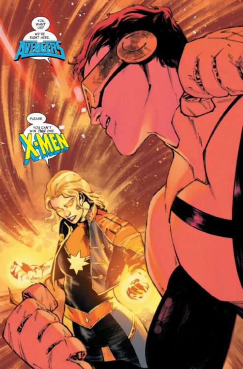
About the issue: She-Hulk, Hell-Cat and CAPTAIN MARVEL were supposed to have a nice night out at Hell-Cat’s favorite bar… …but it’s the Marvel Universe and in the Marvel Universe, we can’t have nice things. With their very souls at stake, Captain Marvel asks She-Hulk a question that could have absolutely HUGE consequences.
The issue is by writer Rainbow Rowell and artist Ig Guara, with colors by Dee Cunniffe, and letters by Joe Caramagna. The main cover is by Jen Bartel.
Check out our SENSATIONAL SHE-HULK #5 preview below:
Are you reading Marvel’s SENSATIONAL SHE-HULK? Sound off in the comments!
From writers Tim Daniel & David Andry and artist Marco Finnegan comes a cosmic sci-fi mystery with family at the center in Morning Star #1. Featuring color art by Jason Wordie and lettering from Justin Birch, this opening issue focuses on setting up a strange science fiction puzzle around the deep woods of Montana – with a bereaved family trying to put pieces back together after a devastating loss. With a sharp, confident script and stellar genre-specific art, Morning Star is off to a very strong start.
“1956. Kootenai National Forest, Montana. When smokejumper Nathan Garrett perishes in a raging wildfire, his surviving family’s hopes and happiness turn to ashes. Now, one year following Nathan’s death, wife, and mother of two, Jolene Garrett, takes her crumbling family to the Morning Star lookout seeking solace through closure–to scatter her husband’s remains. But something far beyond the reach of their wildest imaginings awaits the Garrett family in the Montana wilderness–something more powerful than their anguish and torment. Something that transcends space and time. No telephones. No electricity. No transportation. No escape.”
Writing & Plot
Tim Daniel and David Andry make a smart decision with Morning Star #1 by presenting the sci-fi element of the story in a vague manner, while focusing on the family connection in the story. The issue opens with Nathan Garrett trying to survive a wildfire, only to discover the strange fate that has befallen the rest of his crew. Some unnatural entity has fallen on Kootenai National Forest, and it claims the lives of Nathan and his crew in an unspeakable manner. Some time later, Jolene Garrett, Nathan’s wife, takes their two children on a camping trip to the same forest to try and get some closure. On their first night out there, weird things begin to happen right on time to take us into the second issue. The horror and mystery of what’s happened and is still happening to the Garretts is fascinating due to how little is given about it. Even visually the reader cannot really tell what is happening to Nathan and his crew, only that they have died(?) in some inexplicable way. The cosmic element is actually more hinted at through the eyes of Nathan and Jolene’s youngest son. This quiet kid is enamored by the Silver Age sci-fi of his day, and constantly daydreams about fighting giant monsters and exploring distant planets. While Jolene and the older daughter are relatively well written, we only get surface level examinations of their characters compared to the son. They’re still all compelling though, with their grieving process and their decision to stay in their home and remember their husband and father their own way being relatable. The son having zero dialogue in favor of just his unique, very much childlike view of the world and how he escapes into fiction just makes him the best character in the story thus far. There’s a sense of classic wonder to this issue, with tonal influences coming from 80’s Spielberg genre films and classic science fiction comics alike.
Art Direction
Much of the comic influence of Morning Star #1 comes from the style used by penciler Marco Finnegan. His thin linework and detailed character design is reminiscent of what you found in the Silver Age comics this story is so influenced by, but with modern touches. The simple but strange visual approach to the phenomenon that killed Nathan and his partners is frightening, but doesn’t rely too much on body horror or gore. Again, there’s the spirit of 80’s PG genre movies that people of all ages could be thrilled and frightened by. Finnegan’s sequential direction evokes the feeling of suspense as those films do, along with the character-driven story elements. We care about the human characters in these stories because we get to see them living like we do – and handling stress and loss just like us. Finnegan’s character work and direction in this regard is great, but it’s the daydream sequence that is Morning Star’s real visual treat. The illustrations of giant sea beasts and visiting aliens come across as pure comics magic, bringing to life the imagination of a young boy and his comic books. Jason Wordie’s color art nails down the rest of the visual experience, with a period-focused use of flats that mimic comics of the time period. There’s a sort of pop art filter over the entire book that plants the reader into the era and tone that Morning Star is paying homage to. The whole reading experience is topped off by Justin Birch’s lettering, which also emulates that Silver Age approach. The hand drawn, slightly italicized font appears more modern thanks to digital aids, but has the reflexive changes and bolds that place the reader in the headspace of each speaking character. Overall, Morning Star is a very thoughtful example of visual storytelling that pays homage to a certain era and genre while staying original.
Verdict
Morning Star #1 is a fantastic opening chapter to this mysterious science fiction series from Mad Cave Studios. Tim Daniel and David Andry only hint at the cosmic forces at work here in this first issue, choosing instead to focus on the human characters and make the audience care about the people involved – and they succeed in spades. The visual work of Marco Finnegan and Jason Wordie pays homage to the Silver Age comics this story’s time period takes place in while still utilizing their own unique, modern style. Be sure to grab this first issue when it hits shelves on March 27th!
MFR got the chance to sit down with Ron Marz, writer of the earth-shattering “Emerald Twilight” event that turned Green Lantern Hal Jordan into the villain Parallax. Marz talks about what it takes to give a story stakes, why Hal Jordan was the perfect character for such an event, and how he thinks Parallax isn’t really a villain. We talk about everything that went into creating a character like Kyle Rayner, and which other superhero Ron would pick to give the Parallax treatment to.
COUNT CROWLEY: MEDIOCRE MIDNIGHT MONSTER HUNTER #2 hits your local comic book store on February 7th, but thanks to Dark Horse Comics, Monkeys Fighting Robots has an exclusive five-page preview for you!
About the issue: In spite of her rising popularity as a horror host, Jerri Bartman is trying to resurrect her career as a legit journalist. Meanwhile, a local scientist is trying to resurrect the dead through some less-than-ethical methods. One of these people is getting results and it sure isn’t Jerri. Meanwhile a creepy spook in an old truck is handing out free Halloween disguises to children in Beloit. Remember, kids, never take candy (or a mask!) from strangers!
The issue is by writer David Dastmalchian and artist Lukas Ketner, with colors by Lauren Affe, and letters by Frank Cvetkovic. The main cover is by Ketner, and the variant cover is by Christine Larsen.
MIGUEL O’HARA: SPIDER-MAN 2099 #4 hits your local comic book store on January 24th, but thanks to Marvel Comics, Monkeys Fighting Robots has an exclusive four-page preview for you!
About the issue: BEWARE – TOMORROW’S TERROR INCORPORTED! TERROR returns to his horrific roots! SPIDER-MAN must go up against THE NEW TERROR INC. – body parts will fly! Can SPIDER-MAN get TERROR to finally change his ways?
The issue is by writer Steve Orlando and artist Chris Campana, with inks by Jonas Trindade, colors by Jim Campbell, and letters by Cory Petit. The main cover is by Nick Bradshaw and Rachelle Rosenberg.
Check out our MIGUEL O’HARA: SPIDER-MAN 2099 #4 preview below:
Are you reading MIGUEL O’HARA: SPIDER-MAN 2099? Sound off in the comments!
COBRA COMMANDER #1 hits your local comic book shop today from Skybound and Image Comics. The book is written by Joshua Williamson, with art by Andrea Milana, Annalisa Leoni drops the colors, and you will read Rus Wooton’s letter work.
Check out my full review below:
About the mini-series: The Rise of Cobra begins here. In a world where the Cobra organization hasn’t formed, one man’s sinister plans to utilize the mysterious alien substance known as Energon sends shockwaves across the globe. Who is Cobra Commander? Where does he come from? And what horrors is he planning to unleash that will rock the world-and maybe the universe-to its core? Red-Hot writer Joshua Williamson (Superman, Duke) and artist Andrea Milana (Impact Winter: Rook) kick off the second of four action-packed miniseries that will introduce the best and worst humanity has to offer in the Energon Universe.
Three pages into Marvel Comics’ Avengers: Twilight #1, you’ll realize something: You’re watching comic book history as it’s being made. Writer Chip Zdarsky, artist Daniel Acuña, and letterer Cory Petit pull us into the tired, old future of the Marvel Universe. Something about it all feels startlingly real. While we get glimpses of things we’re familiar with, Avengers: Twilight‘s stomping ground is almost entirely new. Zdarsky, Acuña, and Petit are boldly original in their worldbuilding, and beautifully understated in their storytelling. They’ve created an unassuming masterpiece that is sure to be an instant classic.
Variant cover with art by Daniel Acuña and design by Chip Zdarsky
Writing
It’s so tempting to go into the details of what makes this story so compelling. Zdarsky’s use of the Marvel mythos is masterful yet restrained. But to talk about these things would be to rob readers of the quiet realizations and connections that pop up in these pages. What I can say, is that Zdarsky’s sense of rhythm here is unparalleled. As we follow an old, retired Steve Rogers, he takes on life with gusto and energy. The panels are filled with caption boxes and word balloons, showing how much he’s trying to engage with an environment that mostly seems to have left him behind. But when he’s hit with a wave of nostalgia, in all its guilt-tinged glory, the panels empty out of thoughts and words. Zdarsky leaves Steve in the heavy silence, free of any welcome distractions.
Every character feels like a full-fledged human being. When Steve debates a younger man — who at first seems entirely cruel and self-serving — you want to be on Steve’s side. But the young man’s final words leave you with a lump in your belly and the quiet realization that he actually makes a valid point. And yet Steve also isn’t just an old man who’s refusing to accept that times have changed. He’s trying his darnedest to be a good man in a world that feels more and more foreign to him. His pals who don’t want to move on from the glory days aren’t curmudgeons either. They’re trying desperately to hold onto their morals, and doing their best to stave off bitterness and fear. At one point, enraged by a TV special, Steve says, “Nobody cares about the truth anymore…” As we read on, it becomes clear that Steve is wrong about that. People do still care. They’re just too overwhelmed with information to know what is true anymore. It’s moments like these that we see that Zdarsky’ is writing about more than just superheroes. He’s writing about us.
Artist
It feels like an incredibly daunting task to talk about Acuña’s art. The painted texture of it, the lighting, the colors, the acting of the characters… it’s all spellbinding. In every panel, Acuña has added to the story with wonderful details and flourishes. Steve Rogers’ world is dull and grey compared to the brightly colored image of his younger self. The brave face he puts on for everyone else seems to be one of tempered rage. His brow is forever bunched up into a knot and his mouth is in a permanent scowl. It’s the defensive wall he puts up, though we occasionally see through some of its cracks. When we do, Steve limps along with a worn out gait and a subtle expression of sad capitulation.
So much of the worldbuilding happens through Acuña’s colors. When Steve walks down the street, he’s surrounded by fluorescent, futuristic billboards that hover about the place. He and his pals choose to meet up in Central Park, bringing us back to a more natural color scheme that is only occasionally interrupted by the garish stain of consumerism. With this simple choice, Acuña tells us volumes about these old souls. Wherever they can, they try to find oases from the luminescent hell that seems to have become mundane to everyone else. At the end of the day, they seem like they just want a break from it all.
Of course, Acuña’s work goes well beyond these few things. His artwork is simply some of the most astonishing work you’ll ever see in comics. It’s moody, stylish, and atmospheric. But it’s also clearly driven by the story itself, expertly drawing out each beat of the script in stunning ways.
Variant cover by Frank Miller
Lettering
Petit’s lettering blends into the panels of this comic so seamlessly. As you read, you feel you’re experiencing each scene with the characters, rather than reading about it on a page. There are little moments that stand out as ingenious details that help you to really hear the words. When Steve is in his debate, the young man interrupts him with a word balloon that has smaller a font to it. The quiet, impatient exasperation is immediately obvious. When they next interrupt, any feigned politeness is gone. Their words are just as big as Steve’s as they wrest control of the conversation from him, leading him to yell back in big, bold font. Petit shows us each step of this argument escalating, but in such low-key ways that he doesn’t break your attention away from what’s happening. Petit’s work is subdued and serves the story brilliantly.
Variant cover by Felipe Massafera
Conclusion
This isn’t just a fantastic new comic. This is the next Kingdom Come. It’s Watchmen. It’s The Dark Knight Returns. This is the first issue of a comic that we’ll be talking about for decades to come. It’s the start of a ground-breaking new move in superhero comics, and Marvel won’t be the same when it’s over.
Zdarsky, Acuña, and Petit have taken our modern anxieties and infused them with a mythological grandeur. When you read Avengers: Twilight #1, you’re quite simply reading the next step in the evolution of superhero comics. Avengers: Twilight #1 is out today from Marvel Comics, and you certainly don’t want to miss it!