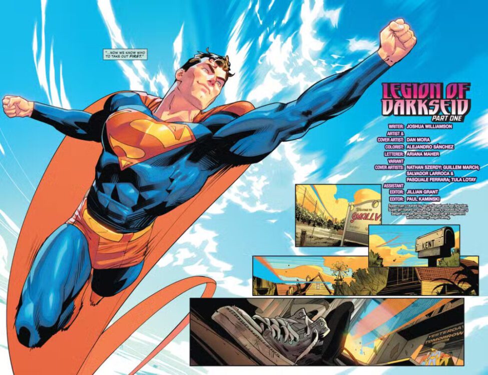
Superman #28 is the book that leads us into DC’s summer event this year. Its job is to make sense of the pieces put out for us back in DC’s All-In Special released in late 2024, and while it doesn’t necessarily succeed at that here, it does bring us closer to understanding what’s going on. Writer Joshua Williamson, artist Dan Mora, colorist Alejandro Sánchez, and letterer Ariana Maher set up an interesting story with what they’ve been given, and they form a path for us to see what DC has in store in the months ahead.
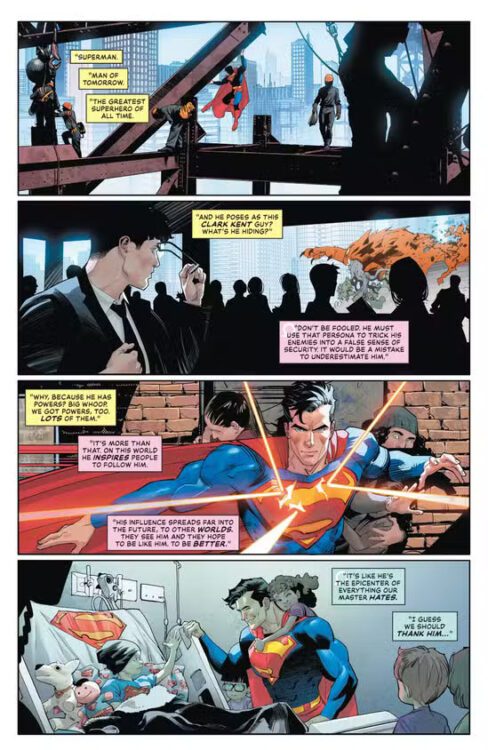
The issue starts with members of Darkseid’s Legion discussing Superman, as we see panels and images of him doing what he’s famous for. They decide that he has to be the first one taken out in order for their mysterious plan to be carried out properly. After this, the issue pivots to Clark and Ma Kent talking in their Smallville home. Their conversation essentially recaps the events of Absolute Power, the All-In Special, and the Summer of Superman Special. After this, Clark flies off. He’s met with a version of Saturn Girl from Darkseid’s Legion, and she’s nothing like the one that he remembers. From there, things escalate.
Darkseid’s Legion watches Superman.
WRITING
Williamson’s job here is mostly setup, and he succeeds at that. The issue is a good recap for readers who may have missed anything, but a lot of the story that touches on the Legion kind of loses you when you remember that you don’t really know anything about them. All we’ve really been told up until this point is that Darkseid has control of a Legion and that he’s now beginning to execute his plan. One would’ve assumed that Williamson would’ve dived a little deeper into that here, but he just doesn’t. It’s not that he doesn’t have time to later, it’s just that he really dives right in with them here and it’s a little jarring to keep up with. It doesn’t even really seem as though Saturn Girl is there to taunt or observe Superman. She seems like she’s more just there to let him know that he’s pointless? It’s unclear what the goal is with most of the interaction, but it does end in an interesting way. Again, it’s a pretty solid recap issue of what we already know while also displaying how Superman is already outmatched by this new Legion, but it just doesn’t take any extra steps to raise the stakes.
Superman flies home.
ART
Mora is, as always, fantastic. He really has a strong grip on these characters and what they represent, and is constantly able to show that through his art, whether it be in single panels or huge spreads. Some individual panels of Superman look a little funky, but Mora’s actual paneling this issue is some of his best. There’s this great spread where many events of Superman’s life are shown, and he walks through them with Saturn Girl as though those events make up the floor and walls around him. There’s a really special spread where Superman uppercuts another character, and all the panels around him almost move with him and form around him. They’re all near the bottom of the page signifying the speed at which Superman is rising, but they’re also all slanted and angled towards the punch. It gives each panel depth and really allows us to feel the weight and force of Superman’s attack. Really impressive paneling from Mora this time around.
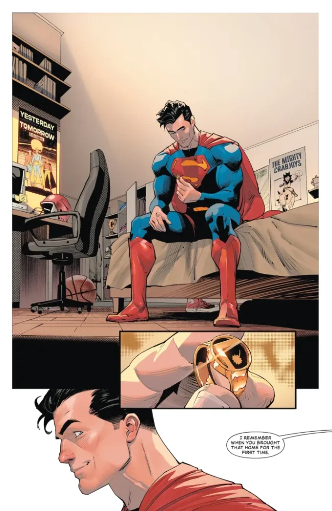
Superman sits on his childhood bed.
COLORS
Sánchez’s work is always one of the most exciting things that these issues have to offer. He really works well with lightning characters and making everyone pop with bright colors illuminating them. When two Legionnaires are seen floating in space, they’re lit by the light of the Justice League Watchtower, and that light completely shines on them from the front, giving them a really strong silhouette. Later in the issue, Superman teleports away at a certain point, and his colors become less dynamic and flat in the panel before he fades away completely. It kind of plays like Dragon Ball’s instant transmission, with us seeing the teleportation happening for just half a second. It gives it a lot of personality.
LETTERS
There’s a lot of exposition and explanations in this issue, and Maher spaces out all the dialogue really well. Especially in those double-page spreads, Maher follows each character and gives them room to breath while also not covering any important pieces of art. Every bubble is placed carefully, and it really allows us to soak it all in. Something cool from the end of the issue is when Darkseid contacts Saturn Girl. His words aren’t bound by any box or bubble. It’s almost like they rumble through the very Earth she’s standing on. It’s free text on the page with a font that makes it seem like it’s a higher calling than what we’re used to. It’s immediate and omnipresent, and very striking.
CONCLUSION
Overall, Superman #28 is a solid issue that this team has given us. Williamson, Mora, Sánchez, and Maher all do their best to catch us up. While that does come with some drawbacks, their execution is very good for the most part. We’re immediately given a feel for these characters and the situation that Clark finds himself in, and this threat already seems larger than life. It’s an issue with a hard job, and it does succeed in having us eager for another issue to answer more burning questions as we move into this new era of DC.
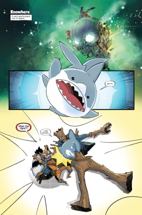
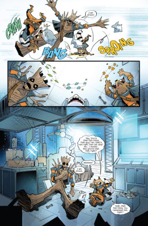
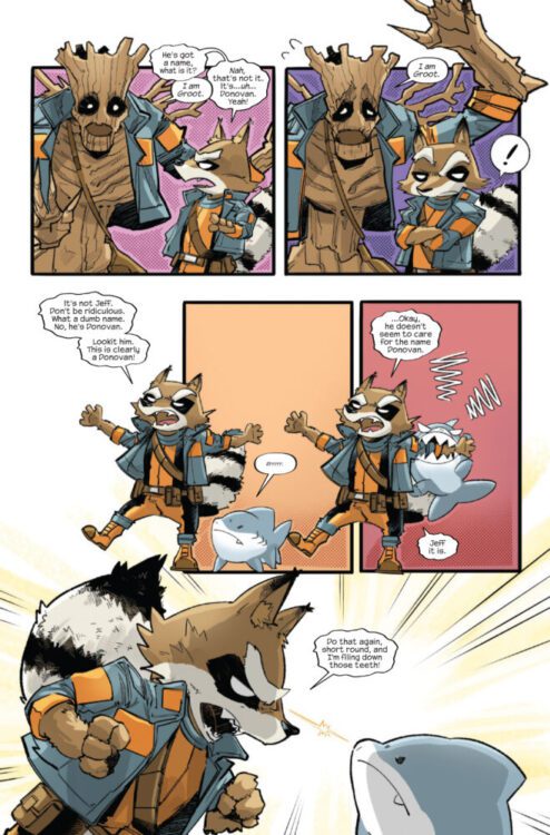
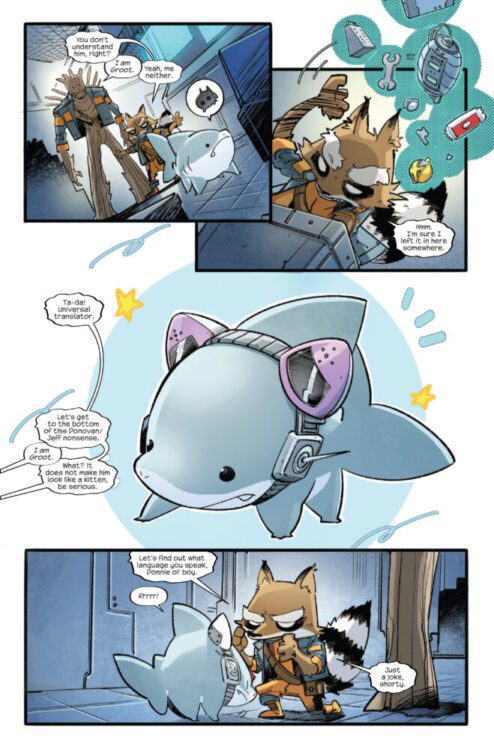
JEFF THE LAND SHARK #2 hits your local comic book store on July 23rd, but thanks to Marvel Comics, Monkeys Fighting Robots has an exclusive four-page preview for you!
About the issue: AFRAID OF A SHADOW?
A malevolent force has been set upon the world – a being of pure darkness who wants nothing more than evil and destruction, darkness that lurks in the most seemingly innocent and sunny of places. Beware the evil known as…SHADOW JEFF!
The issue is by writer Kelly Thompson and artist Tokitokoro, with colors by Jim Campbell, and letters by Joe Caramagna. The main cover is by Gurihiru.
Check out our JEFF THE LAND SHARK #2 preview below:
Did you pick up the first issue of JEFF THE LAND SHARK? Sound off in the comments!
Absolute Batman #10 is an absolute masterclass work. It’s impressive in every aspect; you can tell the team worked really hard to put this together and make it perfect. From the cover to the last page of the book, it just doesn’t let up once. Writer Scott Snyder, artist Nick Dragotta, colorist Frank Martin, and letterer Clayton Cowles bring us this issue that feels like our introduction to the Court of Owls all over again, only much scarier this time around.
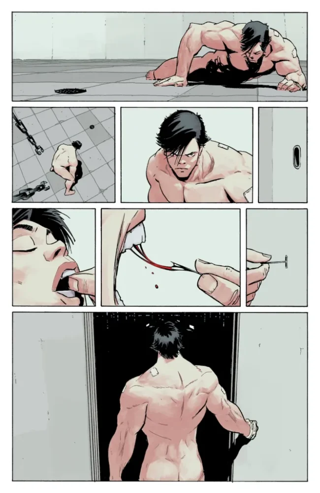
The issue begins with a worried Martha Wayne talking to Jim Gordon. They’re talking about the disappearance of Bruce. We then see Bruce waking up on the floor in a white room, completely naked with bandages all over his body. He wakes up and attempts to escape, being caught by the horrors ingrained into the maze every time.
Bruce Wayne wakes up on the floor.
WRITING
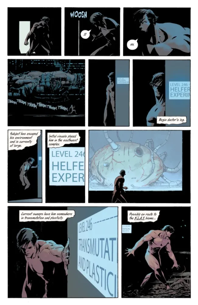
Snyder returns to his Batman roots with this one. It really does almost feel like you’re reading The Court of Owls again for the first time. Bruce trapped in a maze, constantly being bested by Bane, while also being disgusted by what he finds in the labyrinth. Snyder dials the body horror to 11 in this one. Faces and body parts are part of the walls and floors outside of Bruce’s room, with Bane ruling over them.
Since the start of this run, Snyder’s motto has been “bigger.” While that works very well literally through the hulking masses that are Bane, Batman, and the Batmobile, Snyder’s really pushing that term figuratively as well. This shares a lot with Court of Owls, but again feels bigger. Not only is Bruce trapped with nowhere to go, constantly ending up in the same place, but the world around him is full of horrors. Other trapped beings and the walls around him come into contact with him, all orchestrated by Bane. It’s a gauntlet for Bruce. He constantly attempts to fight his way out in creative ways, trying a different plan each time as he’s just ending up right back where he’s started, only more damaged. There’s an emotional core to this too, with Brace looking for his friend Waylon. It mixes themes of friendship in with the horror and action, and Snyder navigates that spectacularly.
Credits over a large mass of flesh.
ART It’s really hard to point out just one thing that Dragotta does well this issue, because every little thing that he touches is near perfect. It’s easy to stare at each page for minutes on end just admiring every little detail he presents us with. Starting with Bruce’s room, it’s arguably the most simple aspect of the entire issue. It’s all white and gray with some chains hanging from the ceiling and a small lock on the door. One of the first things we see Bruce do is remove a small piece of metal from his teeth, using it to pick that lock. The blood dripping off it and hanging onto it while he pulls it out is just such a nice detail.
Dragotta also draws a very detailed human body. Bruce is naked for most of the issue, and Dragotta works to make sure you can see every muscle on his torso and how it moves and flexes depending on how Bruce is moving. It’s a great understanding of the human body and kind of simplifies it for us. It’s a great contrast to later when you see Bane’s massive, unnatural body standing over a floor of loose flesh with mangled faces and arms coming from the floor. Another thing Dragotta does spectacularly well is show the passage of time. Every time we see Bruce break out from his room, he looks just a little different. He becomes bearded and disheveled slowly, giving context to just how long he’s been in there.
Later on, Bruce is in his room with his empty batsuit hanging from the ceiling. Bruce is going insane. He’s holding himself and staring at the ground hauntingly, as though he hasn’t blinked. There’s this great page where the suit is almost haunting Bruce. He looks over at it and it almost looks back at Bruce, despite being unworn. It’s calling on him to perform his duty, like Bane is taunting him with it. Which then leads into one of the best Batman pages of the entire run so far. You really don’t want to miss how stellar the art in this issue is.
Bruce escapes his room.
COLORS Whenever Bruce is in his own room, he’s completely covered in a bright white light from almost every angle. When he leaves his room, Martin has him faced with darkness. It makes you feel like that while Bruce is in his own room being studied, the second he walks out he tries to return to the shadows that care comfortable to him. Bruce has been stripped of everything in his own room, Bane knowing how to already take everything away from him. It’s a really nice contrast on Martin’s part.
Later, when Bruce gets far enough in, he’s faced with these rooms that have blood in the air. A red tint covers everything as Bruce is beaten by Bane. He looks at the floors of people’s bodies, all red and covered with dry blood. Later, when Bruce attempts another escape, doctors enter his room. His room changes from white to red as he beats them mercilessly, mirroring the rage that he feels. When it’s over, the room returns to white.
Going back to the one page of the unworn batsuit discussed earlier, Martin’s work on that page is incredible. The room has shadows now, and they’re practically emanating from the suit. The completely black eyes and mouth call to Bruce. The suit isn’t empty, Bruce just isn’t wearing it yet.
Bruce enters a different room with screens.
LETTERS
Most of this issue’s narration comes from a doctor watching Bruce. Cowles makes it so every box of text that isn’t dialogue is handwritten, also making it look like it’s a torn passage from a notebook. This makes the entire issue feel like Bruce is being studied. He’s being monitored and every little thing he does is being written down, whether he’s in his own room or not. Something interesting is that we mostly get these boxes when Bruce is in his room, almost like this is when the doctor is able to collect her thoughts. Anywhere else, the text is still there but it doesn’t take up as much of each panel, almost like she’s observing. Cowles does a fantastic job setting the tone for pretty much the entire issue here, and is really consistent with it throughout.
CONCLUSION
Absolute Batman #10 is a dive into Bruce’s mind that showcases him constantly being pushed to his own limits. Snyder, Dragotta, Martin, and Cowles all fabulously tell this story of a trapped Bruce Wayne and this demented world that he’s in. It’s the freakiest issue of the run by far with body horror galore, but it may also just flat out be one of the best. The entire team gives it their all and it shows with every single page. If this is the consistent quality of DC’s Absolute Universe, then it should last forever.
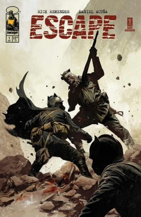
From acclaimed comics writer Rick Remender (Uncanny X-Force, F.E.A.R. Agent) and powerhouse artist Daniel Acuna (Avengers, X-Men) comes the most unique and brutal war comic since Ennis’s Marvel MAX work in Escape #1. Featuring letters by Rus Wooton, this anthropomorphic war story manages to slip past its odd appearance to make for a war comic that questions the morality of combat better than most stories like it is recent memory. With a tense, powerful script and absolutely phenomenal visual work, this is one of the best debut comic issues of the year so far.
“Milton Shaw is a battle-hardened bomber pilot, flying missions over a war-torn world ruled by a ruthless empire. But when his plane is shot out of the sky, Milton wakes up behind enemy lines—in the smoldering ruins of a city he helped burn. And in less than 24 hours, his own side is dropping the big one to finish the job.
Now, injured, unarmed, and being hunted through enemy streets, Milton’s only shot at escape comes from the unlikeliest place: a grieving father and his son—civilians shattered by the same fascist regime that rules this land with an iron claw. Enemies by blood. Allies by circumstance. Together, they’ll have to fight their way out before the bomb drops and erases everything…and everyone.”
Writing & Plot
There aren’t many writers who could come up with an anthropomorphic World War II comic that brings the morality of combat into question and play it dead serious. Rick Remender happens to be one of the few, and this is exactly what he does with Escape #1. From the opening pages, Remender pens a war story that is as brutal as it is morally complicated – and it takes no time at all to get used to the fact that the main character is a talking bear. The concept of the war is basically the Bats (Germany) waging a brutal campaign against other species (the Allies). It only takes a few lines of dialogue to completely overlook the fact these are sentient animals and instead focus on the complicated morality of being a bomber crew. A huge focus from this opening chapter is the cost in collateral damage, and if the lives of countless civilians are worth ending a war. All of this is handled with Remender’s phenomenal naturalistic dialogue and narration, giving the comic a realistic yet pulpy reading tone. The grim subject matter and the brutality of loss make this one of the heaviest war comics to come out in years, and Remender’s characterization makes the story deeply compelling. Each character, even if they only have a couple of lines, feels like a fleshed out person due to their part in the opening conversation. As the combat opens up and the main chunk of the story going forward begins, the impact of loss and the stakes at hand hit the reader and drag them forward into the chaos. Escape is my favorite piece of Remender’s writing since F.E.A.R. Agent, and I cannot wait to see where the series goes next.
Art Direction
A concept such as what is offered in Escape #1 works so well due to Daniel Acuna’s phenomenal visual work. His heavily shaded and detailed work makes the comic feel like an old pulp war issue, but with modern visual touches. The sheer amount of detail work in Acuna’s work here is staggering. The facial animations of each character are brilliantly life-like, making all of their demeanors and personalities shine even when not considering their animal features. Acuna’s style makes the anthropomorphized world work seamlessly, matching Remender’s writing approach perfectly. The environmental details are also intricate, from the WWII bomber crew uniforms to the lights and gauges of the instrument clusters. The more fictionalized design elements – the Bats’ planes, for example – fit beautifully into this take on World War II; as if Wolfenstein took place in the Zootopia universe. Acuna’s sequential direction is another huge reason each character feels like a fleshed-out crewmember, as well as why the book feels so intense. Reaction shots are captured in small panels often in a backdrop of the chaos of the crew delivering their payload amidst antiair fire. Impacts and losses are given gravity amidst the bloody, explosive action, and each decision is focused on to make the weight of what this crew is doing felt by the reader. Acuna’s heavily shaded pencils are given life by his staggering colors, giving this comic a wholly unique visual approach. Every surface looks like its covered in oil and black powder, refining the wartime/industrial aesthetic that is often associated with WWII. The way Acuna lights up scenes with explosions and alarms is genius as well, creating some of the most memorable panels we’ve gotten in comics this year. Rus Wooton’s lettering fits into the visual style spectacularly well, especially his approach to SFX lettering. His hollowed-out SFX work blends in to the panel, highlighting the explosive chaos and mechanical clicking of the action in the bomber. The visual team is on an artistic tear with this opening issue, and it’s one of the best looking comics of 2025 thus far.
Verdict
Escape #1 is a brutal and brilliant war comic that just happens to have anthropomorphic animals. Rick Remender’s script is a brutal, morally complex snapshot of a fictional version of Word War II that is oddly full of humanity due to his stellar sense of characterization. The visuals from Daniel Acuna are absolutely staggering, with his unique visual approach making for one of the best looking comics of the year. Be sure to grab this debut issue when it hits shelves on August 20th!
NEW AVENGERS #2 hits your local comic book store on July 16th, but thanks to Marvel Comics, Monkeys Fighting Robots has an exclusive three-page preview for you!
About the issue: SEEING DOUBLE!
Deranged duplicates of the Illuminati attack the New Thunderbolts, prompting a surprise visit from Clea Strange! But even with the help of the Sorcerer Supreme of the Dark Dimension, several of the doubles are too powerful to contain. To understand how to stop them, the team needs a genius, one who wasn’t connected to the original Illuminati. But their best candidate is big, green and very, very angry…
The issue is by writer Sam Humphries and artist Ton Lima, with colors by Rain Beredo. and letters by Joe Sabino. The main cover is by Stephen Segovia and Beredo.
Check out our NEW AVENGERS #2 preview below:
Did you pick up the first issue of Marvel’s NEW AVENGERS? Sound off in the comments!
I know, “Hollywood Hell” is a bit of a stupid title for an article, but when in doubt: alliterate! At least that’s always been my rule of thumb. But all the writing cliches I have in my toolbelt just couldn’t prepare me for Image Comics’ The Knives — yet another brilliant entry into the Criminal canon by writer Ed Brubaker, artist Sean Phillips, and colorist Jacob Phillips. The Knives, like so many of their other works, feels too personal—and too powerful—to be covered in a simple run-of-the-mill review. This creative team, yet again, has me sitting in front of my laptop and staring at a blinking cursor, at a loss for how to begin.
You see, there’s something that happens when you write a review — when you experience a work of art that makes you feel a certain way. Someway, somehow, you want to transfer that feeling to the readers of your analysis. But then, of course, there are still plenty of boxes that you need to check if you’re doing your job half right. Every aspect of this vibrant, brilliant creative team needs to be discussed at length. They are all part of the final product, and artists, colorists, and letterers in particular are often left out in the cold when their works are reviewed. The publishers, the formatting, the search engine optimization of it all, it’s all got to fit into what you’re going to say.
Yet, by the time you’ve checked all the boxes, at least in my own case, I often find I’m left with yet another run-of-the-mill review. I wax eloquent where I can. There are fleeting traces of what it feels like to actually read the work I’m discussing. But only traces.
WRITING
It might seem like I have completely lost the plot here. Specifically, the plot of The Knives, which is what I’m supposed to be telling you about. Somehow, this is a little of what the book feels like, though. It feels like it’s a comic about comics, and art in general. Brubaker weaves two stories together: the story of Jacob Kurtz coming to Hollywood, and the story of Angie losing her adoptive father. But there’s a realness beneath the surface of it all. Brubaker isn’t talking to us from Jacob or Angie’s perspective, he’s talking to us from his own. It’s his own pain, frustration, and experiences that pen each word written on the page. Some of what drives Brubaker to these places is obvious, but other things only become apparent when you read his afterword to the book.
Amazon’s Criminal adaptation, for instance, casts a large shadow over The Knives. As Jacob Kurtz’s strength is sapped by working amongst phony Hollywood execs — all of whom consider themselves experts in storytelling because they read Save the Cat in college — you can’t help but picture Brubaker doing this same dance. Could he have watched in quiet frustration as he saw his characters being misunderstood, or perhaps this is just his way of processing his terror of what the adaptation could have become in some nightmarish version of events? Either way, there’s a real fear of losing one’s self that drives this plot forward. Jacob seems confused in whether he wants to fit in with the vapidly self-satisfied or whether he’s glad he’s different to them.
And yet the whole thing begs the question: is Jacob simply self-satisfied in his own way? Are these questions Brubaker had to answer for himself when he sat in a writer’s room? Was he wrestling his own ego and trying to figure out which battles to fight to protect his work? Was he trying to distinguish between his integrity and his pride? The sheer rawness of The Knives leaves you desperate for answers to these questions. Of course, there’s plenty more going on in this book than Brubaker’s own soul-searching. Once Angie — a down-on-her-luck orphan who has taken to cat burgling to make ends meet — shows up, Jacob’s life gets a lot more complicated. All the action, crime, and drama you want from a Criminal book still finds its way into this story in spades.
ART
I always struggle to put words to the art of a comic. I can tell you all about Sean Phillips’ inking — which somehow feels haphazard and precise at the same time — but you won’t know what I mean until you see the scribbled details of a face which, when brought together, create an expression that you can really feel. Or maybe you will know what I mean, and then that’s all you’ll see when you look at each page. You see, I can tell you about the dramatic faces of the Hollywood residents, and how that perfectly juxtaposes itself to Jacob Kurtz’s almost constant look of quiet concentration, but sometimes, it feels like I’m drawing the curtain back on something that was supposed to stay hidden. It feels like I’m taking a beautiful piece of artwork and analyzing it into oblivion. It’s as though the entire process has to occur as an autopsy — in order for me to be able to pick it apart, I have to kill some of the magic first. Because the beauty of Sean Phillips’ work is that it lures you in without you knowing it. And Jacob Phillips too, for that matter!
I hadn’t noticed at first that the colors in so many of the scenes amongst the Hollywood elite were really affected. They were seen as though through a painted lens. The deep purples, warm oranges, clear blues all dominate each panel, while Jacob Kurtz’s times over at his aunt’s house are realistic and simply colored. I couldn’t have told you this on my initial read — though I marveled at the beauty of the dramatic hues. I just knew that when the chapter was done that it felt like the only moments that were really real were when he went away to see his aunt. The idea had been placed in my head by the Phillipses, without me even noticing the two of them were creeping around up there. They put their work right under your nose, and yet you don’t see it. You don’t see the brushstrokes, the colors, the forms — you’re there in the page, experiencing the lives of their characters firsthand. At least that’s how it should be. But in pointing out their strategies as artists, I feel as though I’ve tainted their work. I experienced what they were doing on my first read. Now, with the curtain drawn back and the autopsy completed, it all risks becoming an exercise for your mind rather than an affair of the heart. But at the same time, their work is so brilliant, no matter how hard you try to look at it analytically, it’s bound to pull you in regardless.
Sean Phillips’ lettering is similarly a kind of covert operation. He has a toolbox that he returns to, and for good reason. His word balloons always look the same, so do his caption boxes and sound effects. But that’s so that the sound effects, bits of dialogue, and captions that need to stand out can. A truly brutal smack over someone’s head is written in large, scratchy block letters that fill the background of a panel. The quiet whisper of something under someone’s breath is miniscule compared to their usual words. It’s all invisible parts of the story until it’s not supposed to be. You notice the things Sean Phillips wants you to notice. The rest simply sneaks in through your eyes.
CONCLUSION
This was a book I truly loved to read. And yet the more that I put words to the brilliance I see within these pages, the more I wish I could just reach through your screen to you and place the book on your lap. Still, I hope there’s something here that pulls you in, like The Knives did me. When it comes right down to it, I still face the same problem. Brubaker, and Sean and Jacob Phillips have created a work that speaks for itself so powerfully, it’s hard to add anything to the conversation except that you should go read it. So if you take nothing else from me, take that.
The Knives: A Criminal Book arrives from Image Comics in comics stores on August 27th.
Like so many beloved ’80s properties (Robocop, Rambo, and of course, Teenage Mutant Ninja Turtles), The Toxic Avenger managed to mutate from its origins as a cult and violent property into something more mainstream. There were comics, there were toys, and there was a cartoon. And like those other aforementioned properties, Toxi e always kept his fans. Pulitzer Prize-winning cartoonist Matt Bors (The Nib)was one of those fans, and along with artist Fred Harper, recently completed an excellent The Toxic Avenger mini-series from Ahoy Comics. The series was such a hit that Ahoy is launching a new ongoing, Toxic Avenger Comics, as well as a Toxic Crusaders mini-series, with Matt writing both. Matt was awesome enough to give us some time and talk to us at Monkeys Fighting Robots. Check it out below.
Monkeys Fighting Robots: Matt, thank you for taking the time. Let’s start at the beginning. What’s your comic book origin story? Why comics? When did you decide it was something you wanted to do and be a part of? Matt Bors:I have never wanted to do anything but work in comics. I’ve drawn them since I could hold a pencil and I’ve been lucky enough to work in comics my entire adult life. Plan is, do them until I’m dead.
MFR: And how did you discover The Toxic Avenger? Because there’s ALWAYS a story there. For me, I saw it way too early on a weekend rental, along with Robocop! That was a life-changing weekend! MB:What an epic weekend! I had a similar life growing up, renting whatever cool and violent movies jumped out from the rental store rack. The Toxic Avenger’s illustrated cover drew attention to itself and carried the promise of gory revelation. I can’t remember if I saw the movie or cartoon first; I can’t remember having ever not seen it. I was that young.
MFR: What’s your favorite Toxic Avenger movie? And what’s your favorite moment in the movies? MB:The first movie might be the best, but my favorite moment was in the third movie where Toxie takes someone’s fingers and sticks them into a VHS rewinder where the apparently industrial-strength gears stretch and rip off his fingers like cheap, blood-filled rubber tubes. It stuck in my mind over the years and made me wary of “be kind, please rewind.”
MFR: Toxie is such a unique character in pop culture. It started as a very adult satire, and somehow, years later, we ended up with a cartoon series, toy lines, comics, and even an upcoming video game. What is it about Toxie that makes him such an enduring, endearing, and surprisingly malleable? MB:I think in all iterations, Toxie is a charming underdog and superhero parody. He’s dumb fun—he means well, often gets things wrong, and as long as you are not robbing a store with an Uzi, he is not going to crush your skull and scoop out your brains.
MFR: Did you ever get into Marvel’s short-lived Toxic Avenger series? Or their Toxic Crusaders comic that tied into the cartoon? MB:I only went back and read the Marvel work recently, but I was a big fan of the Toxic Crusaders cartoon and toys. That, along with Teenage Mutant Ninja Turtles, cemented my lifelong love of off-putting mutants. If you’re familiar with the underlying premise of the cartoon, you’ll see I worked a lot of into the story we are telling in our series.
MFR: How did Toxie come to have a home at Ahoy Comics? Were you involved from the beginning? MB:I had some ideas in mind for the Toxic Avenger for years. As I was wrapping up my time running The Nib, I approached Lloyd Kaufman at Comic-Con and pitched him. Then I went to Ahoy and asked if they’d be up for publishing it. I had a multi-year plan in mind and, surprisingly, no one blinked. It all came together much more easily than these things tend to.
MFR: How is it working with Troma and Lloyd Kaufman? How involved have they been in the creative process? MB: They’ve been great! Everyone at Troma has been very supportive and I am truly grateful for the runway they are giving me to spin out a new version of Toxie in comics.
MFR: We also have Macon Blair’s upcoming Toxic Avenger remake on the horizon. Was there any involvement there? MB:No, I’m doing something different with my story but the movie sure looks cool. It’s coincidence more than anything, but I’m so glad this appears to be the year of Toxie with more awareness and nostalgia for the guy than there has been in ages.
MFR: For those unlucky non-mutated folks who haven’t had the pleasure of reading your Toxic Avenger limited series, can you briefly sum up your take on old Melvin and his Tromaville adventures? MB:A train derailment causes a massive toxic waste spill in a small town, transforming Melvin Junko and his sadistic bullies into mutants. As the Toxic Avenger, he must free the town from the corporate control of Biohazard Solutions while uncovering a massive conspiracy.
MFR: Will the new ongoing pick up where the limited series ended? Is there a new setup? MB:The story picks up right where we left off, with Tromaville being freed from the quarantine of Biohazard Solutions. Now Toxie has to deal with the aftermath, as new criminals, mutants, and cults emerge from the neglected town. It’s all working toward a big story beginning in issue #6 where Toxie will go to Washington, DC, to plead for federal help for Tromaville, and things will get more insane than you could ever imagine.
MFR: Fred Harper is coming back as the artist on the ToxicAvenger Comics. What makes Fred the perfect artist for Toxie? What’s it like working with him? What’s the process you guys use? MB:We talk on the phone a lot. I write full scripts, but we riff too. Sometimes I start with imagery and draw something specific. Other times, I’m loose and toss it to him. Fred has this beautiful command of anatomy and texture that makes him perfect for Toxie. He’s sculpted him a chiseled physique and crooked face—equal parts alluring and revolting. Part of that, I think, comes from Fred’s own devotion to the gym, and the rest is from his devotion to the page. Fred got all his reps in on other books over the decades and is now doing the best work of his career. I load up all the plates for him—mutations, satire, gore—and watch him press it like a piston.
MFR: Aside from Toxie, do you have a favorite supporting character to write?
MB:Yvonne, for sure. She’s Toxie’s girlfriend and probably the main supporting character. If Toxie is naive and earnest, she’s cynical and sarcastic, and she’s a non-mutant with a lot of vision problems so I like writing how she navigates around those limitations.
MFR: Ahoy Comics recently announced a Toxic Crusaders series. Can you tell us a bit about it, how it came to be? Does it connect to Toxic Avenger at all, or is it its own thing? What’s the setup there? MB:The Toxic Crusaders is a mutant team book, relishing in the weird, and for fans of X-Men and Doom Patrol. It mainly deals with the environmental threat posed by Mr. K, the villain from the initial series, who we now know is an alien intending to terraform the earth. My plan from the initial pitch was to revive the Crusaders and split the books into two concurrent series. The artist, Tristan Wright, is just killing these pages. I think it’s career-making work that people will make people take notice. You can see his first swing at these characters in Toxic Avenger Comics #3, which features the Crusaders being pursued by a eugenicist robot.
MFR: Do you have a favorite Toxic Crusader? MB: I’m going to say Fungirl, our new character. She’s the only character who willfully became a mutant and has a—let’s say, unique view on humanity along with very cool powers. Her origin story is part of Toxic Avenger Comics #2.
MFR: In either book, will you be introducing new mutants? MB:Constantly. New mutants, new villains—aliens, robots, cults, monsters. There is an outrageous new character debuting in every issue of both series!
MFR: What do you hope readers take away with both The Toxic Avenger and Toxic Crusaders when they read them? MB:I know they’ll take away some sick kills and satire. There are some other things I’m going for, some obvious and some less so, but rather than prime people for messaging, I’d rather they read it themselves and chew it over.
MFR: Any final words, hints, or barrels full of toxic waste you wanna leave with our readers? MB:Grab the issues that come with the trading cards. I’ll be drawing every Crusader myself and a lot of other great artists are contributing to create the villains and other important main characters, like the mop.
Toxic Avenger Comics #1 releases on July 9, 2025, from Ahoy Comics.
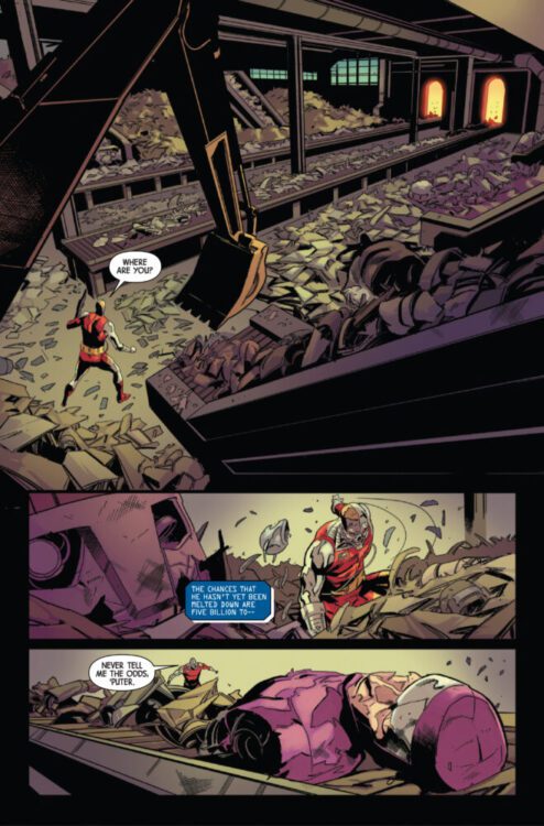
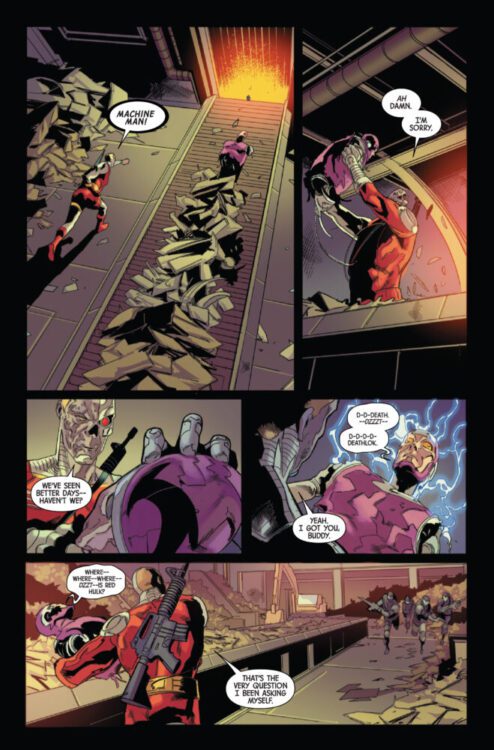
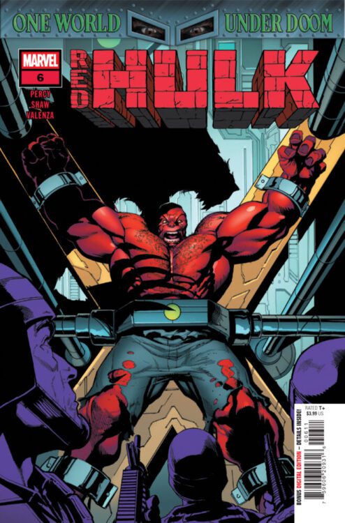
RED HULK #6 hits your local comic book store on July 9th, but thanks to Marvel Comics, Monkeys Fighting Robots has an exclusive four-page preview for you!
About the issue: RED HULK VS. WAR-WOLF!
THUNDERBOLT ROSS is back on U.S. soil – not as a hero, but as a war criminal accused of violating the international treaty with DOCTOR DOOM after bringing down a nuclear warhead on LATVERIA. But this is no ordinary prison he finds himself trapped inside. Instead, it’s a top-secret, gamma-research facility run by none other than…THE WAR-WOLF!
The issue is by writer Benjamin Percy and artist Geoff Shaw, with colors by Bryan Valenza, and letters by Cory Petit. The main cover is by Shaw and Marte Gracia.
Check out our RED HULK #6 preview below:
Are you reading Marvel’s RED HULK? Sound off in the comments!
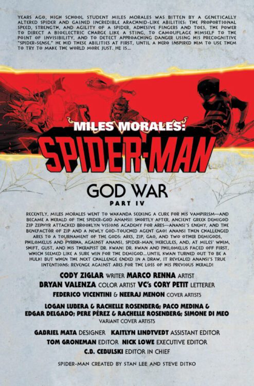
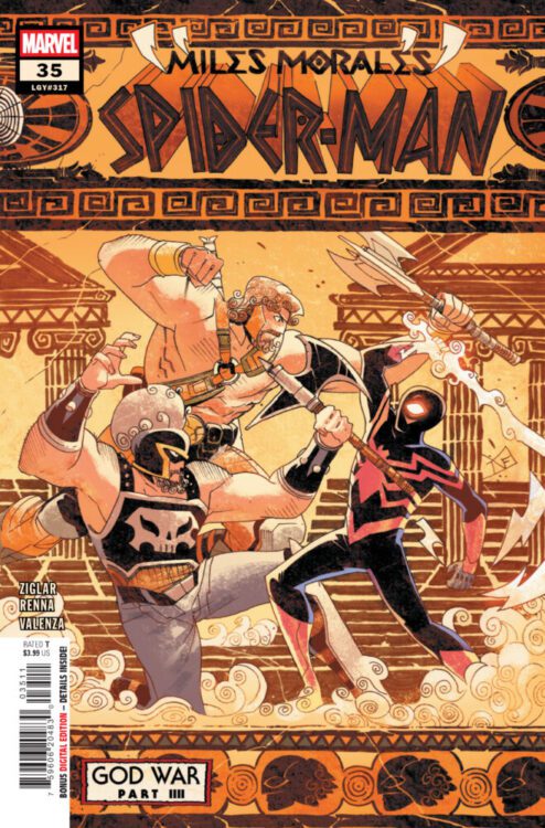
MILES MORALES: SPIDER-MAN #35 hits your local comic book store on July 9th, but thanks to Marvel Comics, Monkeys Fighting Robots has an exclusive three-page preview for you!
About the issue: GOD WAR’S (ANCIENT) SECRETS REVEALED!
The flames of the GOD WAR engulf Brooklyn – and Miles Morales rallies his band of demigods, misfits and (one) Hulk (?) to save New York from Ares’ destructive onslaught! But Spider-God Anansi’s deceived even his own champion by keeping the true cause of this primordial blood feud under wraps – UNTIL NOW!
The issue is by writer Cody Ziglar and artist Marco Renna, with colors by Bryan Valenza, and letters by Cory Petit. The main cover is by Federico Vicentini and Neeraj Menon.
Check out our MILES MORALES: SPIDER-MAN #35 preview below:
Are you reading MILES MORALES: SPIDER-MAN? Sound off in the comments!
"Dr. Werthless" Cover Art
Credit: Dark Horse Comics
From the creative team behind Did You Hear What Eddie Gein Done? and Dark Horse Publishers comes a new, in-depth study of one of comics biggest villains: Dr. Fredric Wertham. Taking its title from a Mad Magazine cartoon by Wally Wood, Dr. Werthless is part social history, part critical examination, and part biography. The graphic novel format allows the creators, Harold Schechter and Eric Powell, to tell a complex story that covers several decades in an easy-to-digest product that is far beyond the throwaway pamphlets that helped make Dr. Wertham a household name.
The book has been years in the making, and Dark Horse originally announced in January 2024 that the book would get a July 2024 release. Despite the delay, the creators and publisher have not waned in their excitement for the book. In an interview with the website Daily Dead, Powell expressed his interest in the idea from the very beginning, saying “I think we both knew immediately that [Dr. Werthless] would be the next project.” (1) Schechter had already completed some research into Dr. Wertham’s life for several of his other projects, but there is always more to learn, and the research aspect was key in making this book authentic.
“Dr. Werthless” Interior Art Credit: Dark Horse Comics
Running at just under 200 pages, Dr. Werthless is a hardcover book that is just smaller than the average North American comic. It has a sleek dust cover, and the interior design work has a modern art feel to it, with each chapter page containing a cubist illustration of a character relevant to that chapter. The style of the product is important, even before we come to the contents of the story, and this is because this book wants to be taken seriously. A large portion of the narrative deals with the concepts of “high and low art,” contrasting this with behavioural psychology and the real diverging lifestyles of the characters. This is a biographical graphic novel and needs to portray the image of authenticity so that the reader can accept the truth of the events. This is aided by the way the story is told, but, like all books/comics, first impressions count, and books/comics are judged by their covers and their physicality. If this had been released in monthly instalments in the standard sized floppy, it would lose some of its gravitas and probably not even reach the hands of its intended audience.
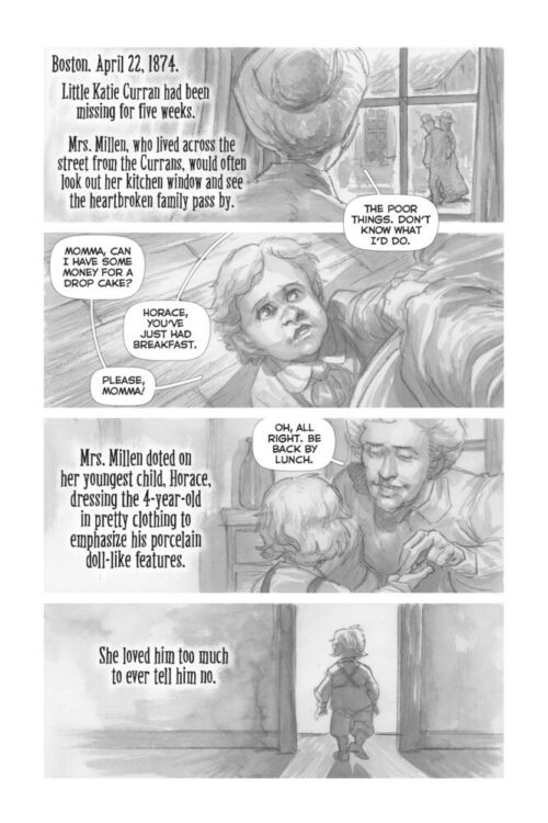
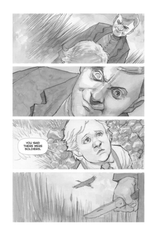
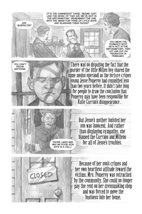
The story opens with a prologue of brutality and juvenile crime, set in Boston 1874. 20+ years before Dr. Wertham was born, the prologue briefly lays out the case of Jesse Pomeroy, a cruel boy who kidnapped, tortured, and killed several younger children. It reads like a true crime comic, unearthing clues and secrets with the flick of a page and then examines the consequences, making reference to a newspaper article in the Boston Globe that put part of the blame for Pomeroy’s cruelty at the foot of the Dime Novels, which were popular amongst the youth at the time. This is obviously setting the scene for Dr. Wertham’s life story and his crusade against the evils of comic book reading. However, the life of Dr. Wertham isn’t as straightforward as people might think, and just because he has become a “villain” in comics fandom does not mean that he is a two-dimensional comic book character.
“Dr. Werthless” Interior Art Credit: Dark Horse Comics
The script for Dr. Werthless is conversational in tone, which helps the shift from the historical essay captions to the characters’ speech. It also means that the character interactions feel less out of place amongst the critical writing. For the narrative, this similarity in tone helps the comic but it does, on occasion, start to undermine some of the biographical information. The conversational nature of the script sometimes borders on the realms of a fictional story rather than a historical one, which can often be the case with true life crime novels, comics, and podcasts. The narrator becomes unreliable the more they become engrossed in the compelling details, picking out the shocking and disturbing, and focusing not on the story but on the presentation of it. This is a method that Alan Moore uses, and abuses, in his semi-fictional work From Hell. He shifts the emphasis away from merely looking at the facts to focus on heightened emotional content generated from fear, terror, and arousal. Schechter and Powell do not go that far in Dr. Wertham, but there are elements of the unreliable narrator seeping through the text. This isn’t helped by the choice of typeface used for the narration. The lettering for the characters’ speech is very well handled, especially on pages where there is a lot of speech to fit in. All of the documents, letters and forms, etc, that are illustrated also have appropriate typefaces to distinguish these elements from other parts of the page and artwork. However, the narration has a very bold and stylistic look that separates it from the rest of the work, and is almost ostentatious in its presentation. It succeeds in separating the critical, biographical element from the classic comic book representations, but it works almost too well. There are several pages which have a large amount of text, and it is on these pages that the book becomes an illustrated essay instead of a biographical graphic novel. The format is lost beneath the overtly present lettering that dominates the page, drowning out the artwork.
Which is a shame because the artwork is superb. The decision to avoid caricature creates a more authentic look for the narrative, and the choice of black and white artwork is a no-brainer. Powell’s sturdy line work and ink washes produce engaging characters and engrossing scenes. The few architectural scene setters are rendered so beautifully that a single panel is all that is needed to imprint the image in the reader’s mind. This in turn allows Powell to focus his artistic attention on the characters who all look like they’ve stepped straight out of a 1950s Hollywood noir movie. There is an emotional intensity to his figures—their actions and facial features—that do most of the heavy lifting when it comes to character in the comic. The script is, by design, often sterile as it focuses on wider issues than the characters, but any deficiency is filled by Powell’s artwork. At times it feels a shame that there isn’t more work for Powell to do, but the book has such a wide focus, well beyond Dr. Wertham’s life, that it would need to be twice as long to capture all of the information in pictorial form.
Therein lies the essence of this book, its successes and its failures. In order to paint a fully rounded image of Dr. Wertham and his life, without becoming too much of a dry essay, the writers have adopted the style of a true crime novel. The surrounding society, which is important to Dr. Wertham’s story, becomes a big part of the book and large sections of the book is allocated to other characters, the criminals that orbited Dr. Wertham’s life. The cruelty and brutality of these criminals provides the backdrop for Dr. Wertham’s argument about the evils of society. Schechter and Powell show the reader the horrors of the world at the time and contrasts this against the life of Dr. Wertham, a respected, but not overly liked, medical practitioner who found that he could make a name for himself speaking out against elements of popular culture. Dr. Wertham loved and coveted the limelight, as demonstrated in the book by the publication of Dark Legend and the subsequent disappointing stage adaptation. Schechter and Powell aim to bring the society to life, and show how someone like Dr. Wertham could become swept up by everything that was going happening in the world. Within his story, Dr. Wertham wasn’t a villain (no one is in their own story), but he believed he was a hero. His fight was just and he went to the places where he could be heard, newspapers and magazines, and to the people who wanted to hear him.
“Dr. Werthless” Interior Art Credit: Dark Horse Comics
When the book does eventually come around to the most famous part of Dr. Wertham’s life, it is very careful in its portrayal. Large sections of text explain the history of EC Comics, followed by visual representations of Dr. Wertham’s writing in The Seduction of the Innocent. This flips what you might expect from the book, switching the textual and visual media to illustrate the difference between them. The EC comics become literate, something worth studying, while Dr. Wertham’s book becomes gaudy and cartoon-ish. What Schechter and Powell are doing, and do so well throughout a lot of Dr. Werthless, makes the reader question what they think they understand. The creators want you to look at everything from a different perspective. And this leads into the main problem I have with this book: I don’t know if it succeeds at what it is trying to do.
The name Fredric Wertham is abhorrent to a lot of comic book fans. He is placed high on a pedestal as a villain, as the man who “nearly killed the comics industry.” In an essay entitled The Doctor versus the Dagger, the author, Christopher Pizzino, argues that Dr. Wertham cannot be blamed for the ‘purge’ on comic books that happened in the 1950s and demonstrates that the fanzines of the 1960s simplified the environment and looked for a scapegoat (2). In Comics and Graphic Novels, published by Bloomsbury, the writers highlight the works of other comic detractors who question the integrity of comics at the time. People like Geoffrey Wagner, Gershon Legman, and the Ladies Home Journal who were publishing articles speaking out against comics as early as 1909 (3). And who can forget the expert views of Sterling North, who wrote in The Chicago Daily News in 1940, “Virtually every child in America is reading color ‘comic’ magazines – a poisonous mushroom growth of the last two years. Ten million copies of these sex-horror serials are sold every month. One million dollars are taken from the pockets of America’s children in exchange for graphic insanity.” (4)
With a wealth, and history, of anti-comics writing, and the fact that the people running the United States Senate Subcommittee into Juvenile Delinquency didn’t hold Dr. Wertham in high regard (see my previous post regarding EC Comics), it seems disproportionate to hold Dr. Wertham accountable for everything that happened to comics in the 1950s. And, my hope when this book was announced, was that Dr. Werthless would help to set the balance straight. But I’m not sure if it does. Because the book is obsessed with extremes of violence and insanity, while juxtaposing the ups and downs of Dr. Wertham’s life, it becomes difficult to tell if the narrative is positively or negatively in favour of the psychologist’s views. In fact, it is not clear what the doctor’s views are for most of the book. The crime novel element detracts from the biographical element. Too much time is spent on the criminals that Wertham came into contact with throughout his life and not enough on the larger picture surrounding his views and the part he played, or didn’t, in the demise of comics in the 1950s.
“Dr. Werthless” Interior Art Credit: Dark Horse Comics
Dr. Werthless is an exceptionally illustrated book. It looks wonderful and feels sturdy in your hands as you plough your way through the pages. The stories inside are compelling, and the conversational style to the biographical essay makes it easy to read. The only drawback is that it lacks the focal point that you would expect this book to have. For a man who nearly killed comics, the life portrayed in this book doesn’t seem to have much interaction with the comic industry. Or, maybe, that’s the point. Maybe, the one thing that everyone knows about Fredric Wertham, the one thing that has turned him into a figure of hate in comics fandom, wasn’t actually that big a part of his life. He was a difficult man to get on with, but he was a respected doctor and he opened up a clinic in Harlem to provide psychotherapy to the black community despite being unable to raise any funds. Dr. Werthless displays the complexity of this man’s life and the horrific nature of the crimes dominating society at the time. It is a compelling must-read, if unsatisfactory when it comes to comic book history.