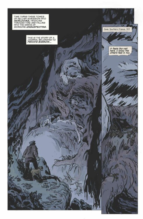
Home Blog Page 23

Review: AVENGERS: TWILIGHT #1 is Destined to be a Classic

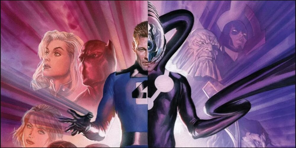
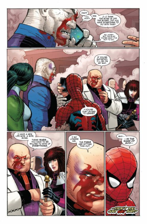
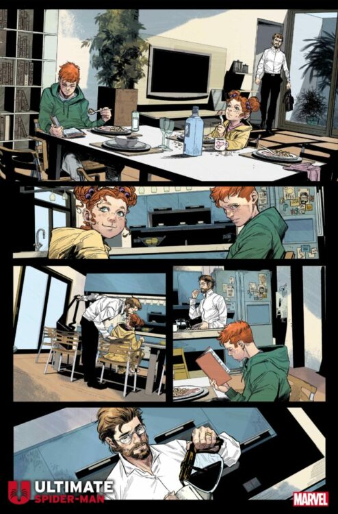
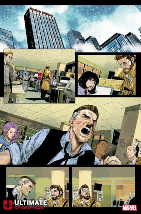
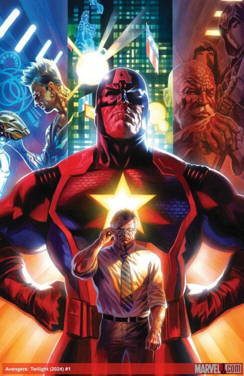
Three pages into Marvel Comics’ Avengers: Twilight #1, you’ll realize something: You’re watching comic book history as it’s being made. Writer Chip Zdarsky, artist Daniel Acuña, and letterer Cory Petit pull us into the tired, old future of the Marvel Universe. Something about it all feels startlingly real. While we get glimpses of things we’re familiar with, Avengers: Twilight‘s stomping ground is almost entirely new. Zdarsky, Acuña, and Petit are boldly original in their worldbuilding, and beautifully understated in their storytelling. They’ve created an unassuming masterpiece that is sure to be an instant classic.

Variant cover with art by Daniel Acuña and design by Chip Zdarsky

Writing

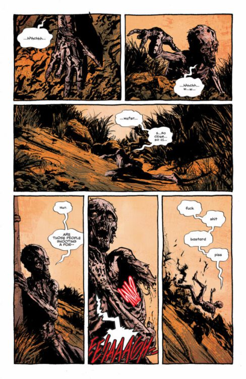
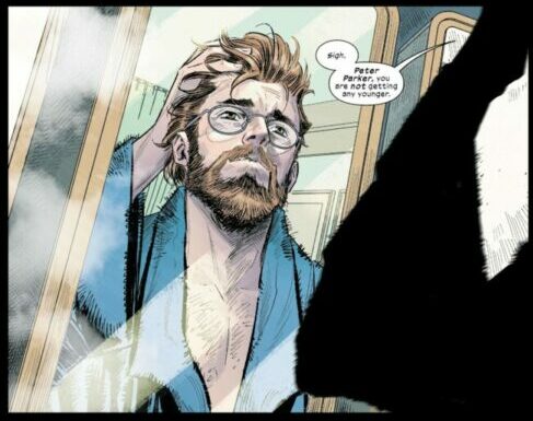
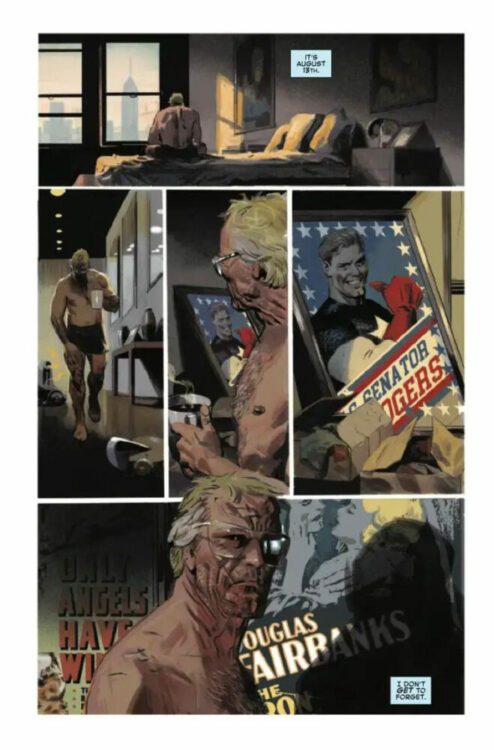
It’s so tempting to go into the details of what makes this story so compelling. Zdarsky’s use of the Marvel mythos is masterful yet restrained. But to talk about these things would be to rob readers of the quiet realizations and connections that pop up in these pages. What I can say, is that Zdarsky’s sense of rhythm here is unparalleled. As we follow an old, retired Steve Rogers, he takes on life with gusto and energy. The panels are filled with caption boxes and word balloons, showing how much he’s trying to engage with an environment that mostly seems to have left him behind. But when he’s hit with a wave of nostalgia, in all its guilt-tinged glory, the panels empty out of thoughts and words. Zdarsky leaves Steve in the heavy silence, free of any welcome distractions.

Every character feels like a full-fledged human being. When Steve debates a younger man — who at first seems entirely cruel and self-serving — you want to be on Steve’s side. But the young man’s final words leave you with a lump in your belly and the quiet realization that he actually makes a valid point. And yet Steve also isn’t just an old man who’s refusing to accept that times have changed. He’s trying his darnedest to be a good man in a world that feels more and more foreign to him. His pals who don’t want to move on from the glory days aren’t curmudgeons either. They’re trying desperately to hold onto their morals, and doing their best to stave off bitterness and fear. At one point, enraged by a TV special, Steve says, “Nobody cares about the truth anymore…” As we read on, it becomes clear that Steve is wrong about that. People do still care. They’re just too overwhelmed with information to know what is true anymore. It’s moments like these that we see that Zdarsky’ is writing about more than just superheroes. He’s writing about us.

Artist

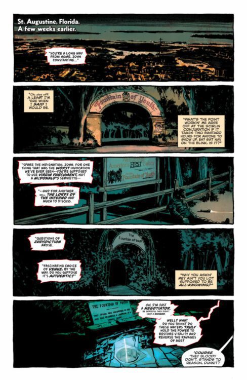
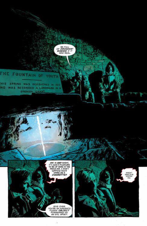
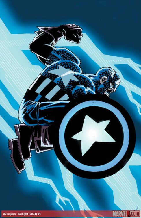
It feels like an incredibly daunting task to talk about Acuña’s art. The painted texture of it, the lighting, the colors, the acting of the characters… it’s all spellbinding. In every panel, Acuña has added to the story with wonderful details and flourishes. Steve Rogers’ world is dull and grey compared to the brightly colored image of his younger self. The brave face he puts on for everyone else seems to be one of tempered rage. His brow is forever bunched up into a knot and his mouth is in a permanent scowl. It’s the defensive wall he puts up, though we occasionally see through some of its cracks. When we do, Steve limps along with a worn out gait and a subtle expression of sad capitulation.

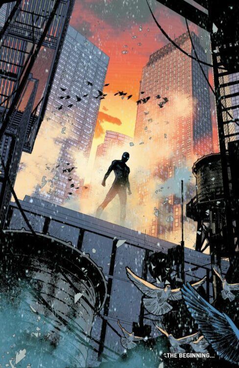
So much of the worldbuilding happens through Acuña’s colors. When Steve walks down the street, he’s surrounded by fluorescent, futuristic billboards that hover about the place. He and his pals choose to meet up in Central Park, bringing us back to a more natural color scheme that is only occasionally interrupted by the garish stain of consumerism. With this simple choice, Acuña tells us volumes about these old souls. Wherever they can, they try to find oases from the luminescent hell that seems to have become mundane to everyone else. At the end of the day, they seem like they just want a break from it all.

Of course, Acuña’s work goes well beyond these few things. His artwork is simply some of the most astonishing work you’ll ever see in comics. It’s moody, stylish, and atmospheric. But it’s also clearly driven by the story itself, expertly drawing out each beat of the script in stunning ways.

Variant cover by Frank Miller

Lettering

Petit’s lettering blends into the panels of this comic so seamlessly. As you read, you feel you’re experiencing each scene with the characters, rather than reading about it on a page. There are little moments that stand out as ingenious details that help you to really hear the words. When Steve is in his debate, the young man interrupts him with a word balloon that has smaller a font to it. The quiet, impatient exasperation is immediately obvious. When they next interrupt, any feigned politeness is gone. Their words are just as big as Steve’s as they wrest control of the conversation from him, leading him to yell back in big, bold font. Petit shows us each step of this argument escalating, but in such low-key ways that he doesn’t break your attention away from what’s happening. Petit’s work is subdued and serves the story brilliantly.

Variant cover by Felipe Massafera

Conclusion

This isn’t just a fantastic new comic. This is the next Kingdom Come. It’s Watchmen. It’s The Dark Knight Returns. This is the first issue of a comic that we’ll be talking about for decades to come. It’s the start of a ground-breaking new move in superhero comics, and Marvel won’t be the same when it’s over.

Zdarsky, Acuña, and Petit have taken our modern anxieties and infused them with a mythological grandeur. When you read Avengers: Twilight #1, you’re quite simply reading the next step in the evolution of superhero comics. Avengers: Twilight #1 is out today from Marvel Comics, and you certainly don’t want to miss it!

Monkeys Fighting Robots Youtube

Review: Adult Horror With HELLBLAZER: DEAD IN AMERICA #1

Hellblazer: Dead In America #1 Credit: DC Comics

Wanted for all kinds of wrongdoing, on the run with his son Noah and his bodyguard Nat, and a prime candidate for a remake of The Walking Dead, John Constantine finds himself in desperate need of help. And where does a cantankerous, walking corpse like Constantine go when he needs help? America, of course, where the magic goes to die. John Constantine, Hellblazer: Dead in America #1 is out today from DC Comics.

In 2019, Simon Spurrier and Aaron Campbell launched a new Hellblazer series for DC’s Black Label imprint. It was instantly obvious why the series was released on that imprint, because of the darker tone of the comic, the language used, and the grotesque images dripping with blood and gore. This second mini-series is no different, jumping straight into the horror on page 1, followed quickly by cheeky quips and bad language. There is even some slapstick thrown in. This is the only possible way that this creative team could bring back everyone’s favorite anti-hero.

John Constantine Hellblazer: Dead In America #1
Credit: DC Comics

Dead In America follows John Constantine as he searches for a way to absolve his son and free Noah from the same fate as himself. He also wants to clear their names of a murder charge and, if possible, find a cure for his current state of death. Being the living dead is not his cup of tea, and Spurrier fills the pages with jokes and asides letting the reader know this. In fact, one of the stand-out elements of this comic is the constant humour. There are plenty of jokes, but in true British fashion, they are not necessarily to everybody’s taste. Dad jokes, bad puns, and play-on-word gags spill from the mouths of the characters throughout, breathing an air of relief into what would otherwise be a deeply dark tale. Spurrier does not hold back on his criticisms of certain sections of American life, starting difficult conversations with sequences such as a gun-happy policeman who admits to stopping a vehicle because the driver was black. To be fair to Spurrier, he did this in the last run, tearing into England and its own screwed up politics—however we English are more used to openly criticising our country. There isn’t quite the same level of national pride that is often associated with America, so it is possible that this kind of lambasting may meet with a sterner audience now that the location has changed. Although, the readers who pick up a Hellblazer comic should know what to expect.

This opening issue has a number of guest appearances. Some new characters, hinting at the larger world that Constantine inhabits, and some more familiar faces, although you may not instantly recognise them. This linking in with the greater Sandman Universe not only allows for the use of other characters, but also gives Campbell a chance to play with the layouts, bringing a different visual magic to the comic. His characters inhabit the space on the page but not always the locations within the panels. They are larger than life and have the air of myth or legend about them. Because of this, Campbell treats their representation in a similar manner, glorifying their appearances while maintaining the horror themes that are the backbone of the story.

John Constantine Hellblazer: Dead In America #1
Credit: DC Comics

One of the ways that the horror aesthetic is retained is through the gorgeous colour work by Jordie Bellaire. The opening pages have a dry, burnt orange colouring, making the locations uncomfortable, despite the obvious humour. Throughout the comic, the colours shift to create the atmospheres for each scene, but there is a darkness to them all, shadows that push against the panel borders and occasionally fill the gutters. The same sense of dark humour that dwells in the speech is present in the colours. The Cookie-girl, a character who clearly has significance for the future, is surrounded by swirling pink lights but it’s not comforting or pleasant. The way that Bellaire applies the colour is somehow sinister and disturbing.

There is a lot of character in Dead in America. This comes through in the script, and through Campbell’s rough, expression-driven figure work. But one of the strongest assets of this comic is the lettering. Aditya Bidikar’s exhausting attention to detail is an absolute joy. His work, not just here but across his comics career, is sublime. One of the first rules of lettering is that lettering shouldn’t be noticed, but in Dead in America, it leaps from the page. The variety in speech balloons, the intensity of the outlines, and constant changing of font size, all create the sense of character that comics like this need. Every nuance of the speech is captured in the way that Bidikar visualises it on the page. Often you can take the lettering away and still have some idea of how a character is feeling. Here, the reverse is true. You can instantly tell the volume, the tone, and the inflections of each word as if you had heard it spoken. If the rest of the comic was garbage (which it isn’t) it would still be worth reading just to see the lettering.

John Constantine Hellblazer: Dead In America #1
Credit: DC Comics

There is something about this creative team working on this comic that seems to gel. It’s as if they are made for each other—a well-oiled team working on their favourite property to produce the best work that they can. And yet, it’s easy to see why some may not like it: the casual dropping of the C-Bomb, the harsh realities of racism, the not subtle attacks on national pride… The creators’ politics are built into the story and it shows through the narrative and the design work. If you are looking for politics-free comics, you’ll have to look elsewhere. Although, I am not sure where you can look.

Dead in America is a resounding success as a Hellblazer comic. It captures the early spirit of the comic, back when it seemed punk and outrageous, a real slap in the face for bright coloured superhero comics. Although the current market has much more diversity, and the ability to shock or standout has greatly diminished, this iteration of Hellblazer still has something to say and is going to do so in a combative, full frontal way.

Constantine is dead; he has nothing to lose. And this comic carries that attitude with glee.

Monkeys Fighting Robots Youtube

Review: HOUND Explores The Beasts In War

Hound Cover Credit: Mad Cave Studios

There are many stories about the First World War. Narratives filled with soldiers marching, fighting, dying. And every genre has been mixed into the war story over time, in order to give different accounts of one of the worst periods in human history. It’s difficult to believe that there are still new stories to tell. But of course there are, and—as the new graphic novel Hound from Mad Cave Studios demonstrates—there are still some very powerful tales to draw from the horrific conflict.

So, sit back, put on some haunting music, possibly by the late great Ennio Morricone, and fall into the unnerving and moving world of Hound. It’s not what you expect it to be.

Hound Interior Art
Credit: Mad Cave Studios

In 1917, a fresh faced young Private named Barrow is enlisted to join a select team of soldiers because of his unique work experience in the sewers of London. The elite squad, known as The Hounds, work in the worst parts of the battlefields, separate from the army and surrounded by the empty, poisonous gas ravaged wastelands. Once away from the commanders, in isolation, Barrow begins to learn that war can change a person. What is accepted as normal behaviour no longer applies and the distinction between Man and Beast becomes hazy and almost lost.

One of the first things that you notice about the comic is Rodrigo Vasquez’ art style. The cartoon characters, with their exaggerated features, inhabit expressionistic worlds made of colour and shapes. The sets are built from these shapes, locations indicated at by the colours. The depth of a forest is symbolised by the density and shade of greens just as the violent battlefields are illustrated by the darkening purples and misty greys. As the comic progresses, the atmosphere is created by the shifts in colour, the locations become dangerous because of the darkness or the uncomfortable shapes of red and purple.

Vasquez’ style is very European, and the images in the panels resemble a classic Bande Dessinee such as The Adventures of Tintin and the work of French cartoonist Tignous, whose illustrations for the card game The Grizzled have a very similar aesthetic. The characters have exaggerated features making them instantly recognisable from page to page, but the beauty of Vasquez’ work is that even as the characters change, they retain an element of themselves. For example, when we are introduced to the young Barrow in a flashback, he is instantly recognisable on the page, before any of the text is read.

Hound Interior Art
Credit: Mad Cave Studios

Another aspect of the art work that lends itself to this particular comic is the emotions that Vasquez builds into each of the characters and their physical appearances. This allows the emotional aspects of the narrative to be more impactful. As a reader, you are pulled into this disturbing and desolate world of war along with Barrow, feeling the fear that he feels—the revulsion and the trauma. Barrow’s experiences are life changing and the impact is portrayed on the page. The impact of the narrative is so strong, I audibly gasped at several points while reading.

Hound has a powerful voice, one that unravels through the narrative but is visualised by letterer Justin Birch. The lettering is an important element of any comic, but Birch goes above and beyond here. The diary entries have a large part to play, and they look and read like handwritten words. They create a connection between character and reader, one that heightens the emotional bond that you have with Barrow. But this is just one element of the lettering. The sound effects, the guttural screams, and the different languages and accents are all treated with the same care and precision as the diary entries. When a character whispers, you can tell they are whispering, when they scream, their voice shrieks from the page.

Hound Interior Art
Credit: Mad Cave Studios

Writers Sam Freeman and Sam Romesburg have between them captured a disturbing impression of war and laid it at the readers feet, warts and all. They show the horrible effects that conflict can have on people, innocent and guilty alike. Every character suffers in this comic and this makes the poignant moments even more moving. It is a tragedy written in poetic language, like a description of a dying flower. The horror makes the moments of beauty more memorable and the central character’s journey of self discovery is as enriching as it is disturbing.

The title, the cover, and even several moments in the comic, lead the reader to expect a certain plot twist, an emergence of a supernatural element. But the twist, if that’s what it can be called, is so much more delicious than expected. It is more disturbing and the rest of the story is better because of it. The reader’s expectations are warped and suddenly your understanding of the comic has changed. It is no longer safe, no longer predictable. You enter real horror territory.

I do not have enough praise for this book. I picked it up on a whim, planning to skip through the first few pages, but became enraptured by the story, the art, and the sheer beauty of the storytelling. The pacing throughout is perfect with each page acting as a stanza in a war poem. Some of the highlights of the comic are the silent sequences, devoid of text and speech but as powerful as any of the words. It is a magnificent comic, and one that is dying to be read.

Hound from Mad Cave Studios is due for release in comic shops on February 28th, 2024.

Monkeys Fighting Robots Youtube

The New Ultimate Universe: The Almost But Not Quite

Marvel’s original Ultimate Universe (Universe 1610) had a very simple premise to it: “turn our middle-aging heroes back into teens.” It was a storytelling and marketing decision that some have credited with saving Marvel Comics as a publisher. As this universe of stories was coming to a close, it was writer and story architect Jonathan Hickman who wrote its days of Armageddon. Secret Wars, the event book that killed 1610, is still a much beloved and highly celebrated comic, 8 years after its conclusion. So, it’s interesting then that it’s also Hickman who is breathing new life into the shattered remains of this once vibrant world. Or is that just what he wants us to think? Spoilers for Ultimate InvasionUltimate Universe, and Ultimate Spider-Man #1 ahead!

spoilers ahead

How We Got Here

Those who have read Ultimate Invasion and the succeeding Ultimate Universe one-shot know that this new Ultimate Universe (designated 6160) is “Ultimate” in name only. There are little to no similarities between it and its predecessor. In fact, Hickman’s every storytelling choice feels not only unexpected, but like it’s happening in reaction to what we’re expecting. For the folks who are just joining us, here’s a little summary:

In Ultimate Invasion, The Maker — the evil Reed Richards who was born in 1610 — gathered up equipment from the main Marvel Universe (Earth-616) to jump start his own reality. Being in 6160 from its conception, and knowing everything there is to know about the heroes who were destined to pop up over time, The Maker manipulated events to prevent certain superheroes from ever existing. Ultimate Invasion #1, for instance, ends with him stopping a radioactive spider from biting a young Peter Parker.

After decades — or perhaps longer, as we’re never overtly told — of invisibly ruling 6160 with the help of a cabal of world leaders who did his bidding, The Maker felt he had achieved peace on Earth, though at the cost of Earth’s freedom. Howard Stark fought the evil Richards to put an end to his machinations, setting 6160 on a journey of righting the path that The Maker had lured them all off of.

Why The Maker?

So, let’s talk about all of the pieces of this new Ultimate Universe that make it so interesting. First, the use of The Maker gives us an interesting window into what it was about 1610 that Hickman liked enough to “reboot.” While 1610’s initial premise was to simply revert our middle-aged heroes back into teenagers and set them in a modern landscape, that’s not all that it did. As time went on, the characters began to differ more and more from their 616 counterparts, and no one so much as Reed Richards. In 616, Reed was one of the catalysts for the “Age of Marvel.” He was the leader of the Fantastic Four, Marvel’s “First Family.” However, in 1610, Reed Richards was a twisted, jealous, manipulative man who went on to become that universe’s greatest villain — eclipsing even Thanos and Doctor Doom. Just like the Ultimate Universes in question, these Reed Richardses are only the same in name. By using The Maker as the catalyst for his new Ultimate Universe, Hickman shows that his interest in 1610 wasn’t the things that made it like 616, but the things that made it different. 6160, therefore, pushes those changes to even greater heights.

Opposites at Heart

marvel comics exclusive preview ultimate invasion hickman

Howard Stark, the original Iron Man in 6160, is a man who craves his son Tony’s approval — a brilliant flipping of the 616 dynamic we’re familiar with. Inspired by his father’s actions, Tony begins his quest to right The Maker’s wrongs as the hero Kang. He’s aided by 6160’s Doctor Doom, who is also known as Reed Richards. Yep, that’s right, 6160 has its own Reed, and The Maker had him enslaved as one of his scientists, forcing him to work in a metal mask out of some strange vendetta. The Hulk is a meditative leader of a religious nation-state, and Captain Britain (now Captain Europe) is a Frenchman who is drunk on power. Tony is Kang, Reed is Doom, Howard is Iron Man, The Hulk is a guru, and none of them are the characters we think we know. In fact, they’re almost all opposites of their counterparts.

But they’re not opposites in a superficial “good version and bad version” sense. In fact, many of these characters are on the same side, morally speaking. They’re opposites in what makes each character who they are at their core. Hickman flips around their deepest motivations in a way that not only introduces us to a new set of characters, but helps us understand the original characters by this brilliant contrast. Reed Richards is not a handsome, rich scientist driven by a thirst for discovery; he’s a tortured and disfigured slave who is intent on stopping anyone from having to suffer a similar fate. Tony Stark isn’t a man whose inner child is wishing he had gotten his father’s approval; he’s a hero who understands sacrifice and hopes to live up to his dad’s inspiration. Which brings us back to Peter Parker and this week’s Ultimate Spider-Man #1.

With No Power Comes… What Exactly?

Ultimate Spider-Man #1 by Hickman and artist Marco Checchetto is masterful and subtle. In the same way that Hickman has flipped the characters on their heads, here he flips the premise of the original Ultimate Universe on its head. Instead of resetting a middle-aged hero to his teenage years, we get to see what it would be like if Peter didn’t get his powers until he was middle-aged. The opening page hammers this point home, as Peter looks himself in the mirror, running his hands through his hair and saying “you are not getting any younger.”

Hickman couldn’t be more obvious about how different his Ultimate Universe is than if he said so with neon lights and flashing signs. When Peter exits his room, he sees his wife Mary Jane and their two kids. Though this isn’t how things are in 616 — much to many fans’ chagrin — we’ve seen MJ before, and even their daughter in some continuities. Peter then goes to work at The Daily Planet, another of his typical haunts. And as he enters the building, good ol’ J. Jonah Jameson goes off like a starter pistol, “PARKER!” Ah, so really nothing is all that different except that Peter is older and without his powers. 

“Oh, hey there, Peter,” Jonah says, before continuing his tirade, which is obviously being directed at a different Parker. That’s when Hickman and Checchetto drop the bomb. Sitting in his office, patiently waiting for Jonah to cool down, is the Managing Editor of The Daily Planet: Peter’s uncle Ben. In the rest of this issue, Peter and Ben talk about Aunt May’s death, which tragically occurred as a result of the events of Ultimate Universe #1. As they talk, Hickman and Checchetto help us to see what an amazing presence Ben has been in Peter’s life. He’s tough as nails, full of moral fiber, and stern yet supportive of his nephew.

And so now, we’re left with a very simple question, “Who is this Peter Parker?” All of the things that drove him in almost every other iteration are missing here. He hasn’t had to figure out his powers from a young age. He hasn’t had to live with the guilt of his uncle’s murder. He hasn’t had to grapple much with power or responsibility — at least not in the same way. All he knows, thanks in no small part to a holographic message from Tony Stark, is that there’s something missing in his life and he was always destined for greatness. The final page sees Peter donning his costume and accepting his powers.

But Why?

As I’ve hopefully established by now, it seems like Hickman isn’t actually building a new Ultimate Universe — at least not one like that of the 2000’s. Instead of making the middle-aged heroes into teens again, he has Peter first becoming Spider-Man at the age of 35. Instead of giving us rebooted versions of 616 characters, he’s changing each of them at their core. In fact, it looks like Hickman is building the opposite of the original Ultimate Universe. Is it then possible that his purpose, his “why” for doing it, is also the opposite of 1610’s raison d’etre? Maybe, Hickman isn’t making comics that are designed to be accessible to teenagers, but instead accessible to adults — not in the surface level “let’s add some sex and gore” kind of way, but by crafting a world that’s quieter, more philosophical, and is driven more by the subtle motivations of each person rather than the splashy action of big battles.

Ultimate Spider-Man #1 certainly seems to hint at that. In the 44 pages of this issue, there are maybe 5 pages that have any kind of superhero costume featured. There’s very little in terms of action and the plot mostly focuses on the vulnerable interactions of the people on the page. Peter is worried about Uncle Ben dealing with the loss of Aunt May. MJ is trying to be a supportive wife on a day that she knows is also really hard for her husband, though he tries to hide it. When Peter talks to her about things that are going on in his head, it becomes clear he’s a man who has never felt like he was enough. And when Peter decides to accept his powers, it feels like the mature version of his origin story. Instead of being thrust into the life of being a webslinger, he chooses the responsibility knowing that it will cost him. This comic feels grounded, grown up, and full of emotional depth.

The End of the Preface

Universe 6160 is something entirely new, and Hickman is as devious and masterful as The Maker. He uses familiar faces and snippets of lore we recognize to build a universe from the ground up. Almost every character is driven by a motivation that’s miles apart from what drives their counterpart in the main Marvel Universe. It seems like this new Ultimate Universe might just be the exact opposite of what we expect, and that Hickman is setting the stage for mature, philosophical stories that have just as much to say about real life as they do about capes and tights. Ultimate Spider-Man #1 is by Hickman and Checchetto, with colors by Matthew Wilson, and letters by Cory Petit and is out this week from Marvel Comics. It’s a must-read and what feels like the end of a slow start towards something incredible.

Monkeys Fighting Robots Youtube

Marvel Comics Exclusive Preview: AMAZING SPIDER-MAN #42

marvel comics exclusive preview amazing spider-man gang war

AMAZING SPIDER-MAN #42 hits your local comic book store on January 17th, but thanks to Marvel Comics, Monkeys Fighting Robots has an exclusive four-page preview for you!

About the issue:
GANG WAR CONTINUES! The Beetle has stepped up in her father’s absence, and she’s become a very different Janice Lincoln. She’s smart, dangerous and ready to take the big chair. With Spider-Man and others distracted by Kingpin, she just might do it.

The issue is by writer Zeb Wells and artist John Romita Jr., with inks by Scott Hanna, colors by Marcio Menyz, and letters by Joe Caramagna. The main cover is by Romita, Hanna, and Menyz.

Check out our AMAZING SPIDER-MAN #42 preview below:

marvel comics exclusive preview amazing spider-man gang war

marvel comics exclusive preview amazing spider-man gang war

marvel comics exclusive preview amazing spider-man gang war

marvel comics exclusive preview amazing spider-man gang war

marvel comics exclusive preview amazing spider-man gang war


Have you been reading AMAZING SPIDER-MAN’s “Gang War”? Sound off in the comments!

Monkeys Fighting Robots Youtube

Spoiler-Free Review: ULTIMATE SPIDER-MAN #1 Feels Familiar Yet Exciting

marvel comics ultimate spider-man review hickman checchetto

Marvel’s new Ultimate Universe is in full swing (pun intended) with Ultimate Spider-Man #1, out today.

The series is by writer (and orchestrator of this new Ultimate Universe) Jonathan Hickman and artist Marco Checchetto, with colors by Matthew Wilson, and letters by Cory Petit.

Ultimate Spider-Man is the first ongoing series set on Earth-6160, picking up directly after the events of November’s Ultimate Universe one-shot. Peter Parker is not a superhero—thanks to The Maker’s meddling—but a 35-year old husband and father of two. Peter is not unhappy with his life, but for as long as he can remember, he’s felt like something is wrong with him, like he’s not who he’s supposed to be.

Fans were elated when Ultimate Spider-Man was announced, because it promised a new status quo for the webhead, and a fresh start for readers. Most excitingly, Peter was going to be a family man, something people had been clamoring for since 2007. The new world looked like it would be familiar and give fans what they’ve been looking for, and it does, but maybe not exactly how you expect it to.

marvel comics ultimate spider-man review hickman checchetto

Yes, Peter and Mary Jane are married with children, but this book’s success goes so much deeper than that. As mentioned, Peter is no superhero in this universe, so it should go as no surprise that there’s no web-slinging happening in this debut issue. This is a book about people—about Peter navigating life’s complications with his friends and family. It’s about Peter exploring who he is and what he wants out of life, with the help and support of those friends and family. The best Spider-Man books put the characters and their relationships first and the superheroics second, and Hickman seems to understand that. We care about Peter, MJ, and the rest, not just because they’re already familiar to us from another universe, but because Hickman writes them to be likable and sympathetic. When Peter is down and questioning himself, MJ is there to reassure and support him. The human element is front-and-center.

To be clear, and without spoiling anything, this is not the world of Spider-Man that you’re used to. It’s not like Hickman and Checchetto just carbon copied Earth-616 and reinstated Peter and MJ’s marriage. Some of these relationships are different than readers are used to. There are plenty of changes and surprises to keep this new world interesting and exciting for fans, while keeping the heart of Spider-Man intact.

marvel comics ultimate spider-man review hickman checchetto

Which brings us to the other, more “grand scale” purpose of this book: establishing the new Ultimate Universe. This is our first real look at Earth-6160 from ground level. Hickman focuses on Peter and his supporting cast, obviously, but we get a look at the larger picture as well and how the citizens of this universe go about their lives—including some familiar faces. It’s world-building, and world-building is what Hickman does best.

Establishing the new status quo here never feels forced or over-expository. None of the charts or graphs that Hickman has become known for are present here. All of the world-building is done naturally through character interactions, and any necessary information is provided so that this book is accessible even if you missed Hickman’s previous Ultimate books. There is one scene towards the end that could be viewed as an exposition dump, but even that is woven into the narrative pretty seamlessly. Exposition in this script never disrupts the flow of the story; you’re given exactly what you need when you need it, with plenty more to still be learned through experience.

With all that out of the way, let’s talk a bit about how incredible it is to have Marco Checchetto on this book. I have personally gushed about Checchetto previously regarding his work on Daredevil, and I specifically stated that, whatever the artist did next, I hoped it was a Spider-Man book. My prayers were answered.

Checchetto, joining forces once again with his Daredevil colorist Matthew Wilson, is one of the top artists working on superhero books today. There is a grit and an edge to his work that makes the world feel real, and yet there’s a softness to his characters that never lets you forget the humanity at the core of this book. His is a style that helped set DD apart from all of Marvel’s other titles at the time, and it’s a style that’s helping establish this new Ultimate Universe as its own entity, independent from both the Ultimate Universe that preceded it, as well as the mainline Earth-616. Ultimate Spider-Man #1 is light on action, which means you really get to see Checchetto’s strength in storytelling. You’re pulled into the conversations within these pages, fully immersed, and that’s because Checchetto knows the angles, beats, and character acting needed to keep readers invested. His character designs are pretty similar to what fans are used to, which helps maintain a sense of familiarity and emotional attachment in this new world. Just wait until the web-slinging starts and the artist gets to fully let loose.

marvel comics ultimate spider-man review hickman checchetto

Wilson’s color palette here is more muted than his work on Young Avengers or The Mighty Thor; it’s more in line with his aforementioned work on Daredevil, which helps ground this book in realism. His NYC feels cold and isolating, mirroring how Peter is feeling inside, right up to the final page which suggests a warmer, more inviting day is coming. Wilson’s been one of comics’ top colorists for years now, so it’s no surprise how masterfully done this book is.

Cory Petit, similarly, is a veteran letterer himself, and no stranger to Spider-Man books. He had his work cut out for him with this script—again, it’s establishing a new universe and it’s fairly dialogue-heavy. But at no point does the reading feel like a chore, and Petit keeps the flow of the narrative strong while conveying all of the information Hickman wants to get across. With Checchetto, Wilson, and Petit all working in unison, this is an issue that you’ll be glad to read again after you’ve turned the last page.

What more can be said? Ultimate Spider-Man is giving fans some of what they wanted, and even more that they didn’t even know they wanted. If you’re a Spider-Man fan, you need to call your local comic shop and have them add this to your pull-list, because you’re going to want to see where this goes next. As familiar as this world feels, something tells me we have more than a few surprises coming our way.

Monkeys Fighting Robots Youtube

Review: DOCTOR WHO – THE CHURCH ON RUBY ROAD

“The Church of Ruby Road” is the first Doctor Who Christmas Special since 2017 and offers a new Doctor/Companion pairing.

Ruby Sunday (Millie Gibson) was abandoned at a church when she was a baby. 19 years later, she sets out to find her birth parents, but she ends up being the target for alien goblins who constantly play tricks on the young woman. She also meets a man who warns Ruby that her recent bad luck has a more sinister undercurrent.

On Christmas Eve, Ruby’s adoptive mother Carla (Michelle Greenidge) is asked to foster a newborn baby which is abducted by the Goblins. Ruby and The Doctor are forced to work together to rescue the baby.

The 2023 specials aimed to be a celebration of Doctor Who’s history, since they brought back two popular characters and made a lot of reference to previous events. “The Church of Ruby Road” was a fresh start for the show. There’s a new Doctor and companion, and they had the best chance to make an impression since the Christmas Special can reach a wider audience. They’re often made to be broader so new viewers can be hooked in.  As a light adventure, “The Church of Ruby Road” was a fun romp.

“The Church of Ruby Road” introduced a load of new characters and they were a solid bunch. Ncuti Gatwa is already at ease in the role and conveying a personality that pulls viewers in. He was funny, quick-witted, and caring, all the attributes that fans would want from The Doctor. He was a sharp dresser and brought a bit of youthful vigor to the show. Gatwa is only 31 and he’s most famous for playing Eric in Sex Education, a teenage character. He wasn’t an old man trapped in a young body like Matt Smith’s version of the Doctor.

Gibson made an impression as Ruby, the teenager who’s roped into the Doctor’s world. She’s the youngest actress to play the companion in the modern era. Ruby was shown to be a caring teenager who was close to her adoptive mother and grandmother and helped look after foster children. Yet Ruby was willing to throw herself into danger when Lulu was taken, and she was able to deduce The Doctor was a time traveler. Russell T. Davies seemed like he took some writing tips from Steven Moffat due to the scene of Ruby being left at the church had a fairy tale feel and set up a mystery about her parentage. It was like Amy Pond, The Girl Who Waited, and Clara Oswald, The Impossible Girl.

“The Church of Ruby Road” also introduced Ruby’s family, Carla, and her grandmother, Cherry (Angela Wynter). At first, it seemed like Davies was repeating what he did with Rose Tyler since she was a 19-year-old girl who traveled with The Doctor whilst her brassy mother was a supporting character in the show. This was just a surface similarity since Carla had a different personality from Jackie Tyler since she was calmer, and she devoted herself to looking after children. Carla took a photograph of every child she had ever fostered. “The Church of Ruby Road” briefly showed an alternative reality where Carla’s life could have gone in a sadder direction. Cherry was someone who had a spark to her even though she was ill and being looked after by her family. The reactionary crowd on YouTube and Twitter will complain that Doctor Who has gone ‘woke’ but the real aim was to show families can come in all shapes and sizes.

“The Church of Ruby Road” set itself to be a light-hearted episode and there was a breezy, casual tone to the episode. The Goblins were initially shown to be a mischievous nuisance who did small things to ruin Ruby’s Day and when The Doctor and Ruby went on the Goblins’ ship there was a swashbuckling nature to it. “The Church of Ruby Road” was the best pirate episode in Doctor Who’s modern era, but that wasn’t hard considering the previous pirate episodes were “The Curse of the Black Spot” and “Legend of the Sea Devils.”

Whilst “The Church of Ruby Road” was a light episode, there was a dark undercurrent. The episode started with a baby being abandoned, and the Goblins were planning on eating a baby. This juxtaposition was shown when the Goblins sing an upbeat song about them feeding a baby to their king. It was annoyingly catchy and felt like the modernized version of “Goblin Town” from the first Hobbit movie. The Doctor did see a dark timeline that added a bit of pathos to the episode and showed how much of an impact Ruby had on The Doctor and Carla.

“The Church of Ruby Road” references a controversial event from the Chris Chibnall/Jodie Whittaker era. The Doctor mentioned he found out he was an orphan, which was a reference to the Timeless Child reveal. It meant any hopes that Davies would retcon that even have been dashed. The oddest moment in the episode came right at the end when there was a fourth wall break, which was a bit too much.

“The Church of Ruby Road” was a great start for the Gatwa/Gibson era. They show they are a likable pairing and have an entertaining, straightforward adventure. Hopefully, this is the start of more exciting adventures for the pair.

Monkeys Fighting Robots Youtube

Review: DOCTOR WHO – THE GIGGLE

“The Giggle” is the third and final Doctor Who Special to feature The Fourteenth Doctor and Donna Noble, and sees The Doctor face up against an old and powerful enemy.

The Doctor and Donna arrive back in London when the whole world becomes aggressive and crazy. The Doctor and UNIT discover this global outbreak of rage is linked to the first ever TV broadcast in 1925. The Doctor and Donna travel back in time and are confronted by a mysterious German man who is revealed to be The Toymaker (Neil Patrick Harris).

“The Giggle” aimed to be the big send-off for David Tennant and Catherine Tate. They are loved by the audience and arguably the most popular characters during the modern era of Doctor Who. “The Giggle” had many tropes of the show, like a major Earth-ending threat, energic technobabble and exposition, and having a powerful villain. Two-thirds of “The Giggle” were fantastic.

This special brought in Neil Patrick Harris, and that’s a big coup for Doctor Who. He’s a big-name actor in Hollywood and Broadway, and has often played larger-than-life characters. Harris brought a lot of energy to the role like he was an evil version of Q from Star Trek: The Next Generation. The Toymaker was a being with God-like powers, traps The Doctor and Donna in a dimension he controls, and he taunted The Doctor about the fates of his previous companions, the ones that accompanied the Eleventh and Twelve Doctors. Harris made his version of The Toymaker a memorable character due to his dress sense and cartoony German accent. The scene where The Toymaker makes a big and brash announcement where he dances to “Spice Up Your Live” was a piece of camp genius. Due to the German accent and his ownership of a puppet shop, I was reminded of Franz Gutentag/Franz Schlechtnacht in the Family Guy episode “German Guy.”

The Toymaker was playful, but he was also a big threat not to be underestimated. He could control reality in his dimension, and  he was still able to alter reality at a whim in The Doctor’s world. He was a puppet master when he separated The Doctor from Donna and his puppet show was a terrific sequence. During the first game between The Toymaker and The Doctor, The Toymaker revealed he had captured The Master. There was a creepy nature to The Toymaker’s dimension since it was inhabited by puppets. Like with the first Special, “The Star Beast,” “The Giggle” set up the wider storyline, by mentioning a villain that even The Toymaker was afraid of.


Where “The Giggle” faltered was during its final third. “The Giggle” was the episode that introduced Ncuti Gatwa as The Fifteenth Doctor. This was meant to be a big event, but Gatwa was given a disservice, because of the introduction of the Bigeneration. The Fourteenth and Fifteenth Doctors split into two bodies and worked together to defeat The Toymaster. It was fan service, but it forced Gatwa to already be in the shadow of Tennant. It seems to be done so the show could have Tennant and Tate in the background and ready to appear in future stories. This effort to keep The Fourteenth Doctor around was to give Donna a happy ending, but it was similar to what happened at the end of Series Four where The Doctor used his regeneration energy to make a copy of himself and the copy lived with Rose in another universe.

Doctor Who has always had loose writing where nearly anything’s possible, but there have been some rules regarding the show’s lore, like regeneration. However, in recent years Doctor Who has been breaking its own rules. Chris Chibnall brought in The Timeless Child where it was revealed that The Doctor was the source of regeneration and had more iterations than first thought, and Davies brought back a previous actor to play the Doctor. The specials didn’t answer the question of why the Doctor regenerated with the Tenth Doctor’s face and the show adds another mystery on top of that.

“The Giggle” was an incredibly entertaining episode for the most part due to The Toymaker and the threat he posed. It was a shame that was brought down at the end by the Bigeneration.

Monkeys Fighting Robots Youtube

Review: DOCTOR WHO – WILD BLUE YONDER

“Wild Blue Yonder” was the second Doctor Who special of 2023 and it was the boldest episode of the Fourteenth Doctor’s adventure.

The Doctor and Donna have been travelling across time and space with the TARDIS going haywire. The time machine leaves the Doctor and Donna on a spaceship at the edge of the universe, because of its defense mechanism. They must discover what the danger on the ship is and defeat it so the TARDIS can return.

During Russell T. Davies’ original run as Doctor Who’s showrunner, he was able to produce some experimental episodes. Some were great, like “Blink” and “Turn Left,” others were not so well received, i.e. “Love and Monsters” and “Sleep No More.”  “Wild Blue Yonder” was a minimalist episode, because of its setting and only having four characters. This made the episode more unique and concentrated.

“Wild Blue Yonder” was an episode of two halves: the first was the mystery around what happened to the spaceship, and the second was about the Doctor and Donna stopping the universe-ending threat from escaping the spaceship. It was a simple premise that was done effectively. It shows how less is more.

“Wild Blue Yonder” did bear some similarities to other Doctor Who episodes from the Russell and Moffat eras. The abandoned spaceship that has a monster on it was like “The Girl in the Fireplace,” with the TARDIS trying to escape a threat was like “Utopia,” the need to prevent a monster from reaching a populated planet was like “The Waters of Mars,” and the feature of doppelgangers where characters didn’t know who was the original or the copy. There was also a bit of The Thing since the classic sci-fi horror film was about a remote scientific outpost needing to stop an alien entity from reaching civilization. All of these similarities risked making “Wild Blue Yonder” feel derivative, but the special was able to repackage these ideas, so they felt fresh.

One of the strengths of the small cast was that it resulted in the special being a more character-driven episode, since the Doctor and Donna bonded and had a heart-to-heart as they tried to figure out a way to defeat the aliens. Both characters had scars and worries, especially the Doctor. Russell continued his ideas from his original tenure on Doctor Who as shown when Donna asked if he missed his home world and he didn’t answer. The villains needed to spend more time with Doctor and Donna so they could copy them better.

“Wild Blue Yonder” was a special that embraced its horror nature. Exploring the abandoned spaceship had a haunting quality, especially when The Doctor and Donna see the pilot’s body orbiting the ship. This part of the Special felt like it was influenced by H.P. Lovecraft’s work and Event Horizon. When the doppelgangers malfunctioned, they were monstrous when they were distorted, and they moved inhumanly. The Doctor’s doppelganger did a backward spider walk like Regan in the director’s cut of The Exorcist.

Whilst “Wild Blue Yonder” was a smaller-scale story, the showrunners flexed their special effects budget. There were big CGI sequences and landscapes when The Doctor and Donna journey up the spaceship. The creatives had ambition, but Doctor Who was a British production with limitations. Scenes of the spaceship changing its configuration looked like a video game. Doctor Who can get away with hokey special effects since this has always been a part of the show’s nature.

“Wild Blue Yonder” was an effective horror story in the Doctor Who canon. It was a small-scale character-driven story that had some big special effects and the standard Doctor Who universe ending threat.

Monkeys Fighting Robots Youtube

Review: Marvel’s BEWARE THE PLANET OF THE APES #1 (2024)

marvel comics beware the planet of the apes #1 review

Comics often come with a past. Even new “number ones,” featuring new characters, are often laden with the baggage of the creators, artists, and even the publishers working on them. One has a certain expectation from a comic written by someone like Frank Miller, or published by Image Comics. Add to that the complicated narrative and publication history of a franchise like Planet of the Apes, and you know that nothing is going to be straight forward.

With that said, the new Beware the Planet of the Apes from Marvel Comics — by writer Marc Guggenheim and artist Alvaro Lopez, with colors by Alex Guimaraes and letters by Joe Caramagna — manages to avoid a lot of that history. In fact, with the exception of the original movie, you don’t really need to know anything about the franchise, which is no mean feat considering the 55 years of media the franchise has produced. If you want to know how this new comic fits into established (and non-established) canon: it’s set just before Taylor crashes back to Earth in the first movie. Everything else is irrelevant, probably.

Beware The Planet Of The Apes #1
Credit: Marvel Comics

The opening two pages are beautiful replications of Marvel’s original Apes comics, and they establish the style and presentation of the 50-year-old stories. It’s a clever trick to remind readers that Apes comics started their life at Marvel. (Well, if you ignore all of those other adaptations that came first, but no one remembers them and it was Marvel that made the Apes comics huge. They published superb adaptations of the original movies as well as ongoing original stories that were as outrageous as the cinematic versions.)

After a little scene setting, the comic begins its difficult task of re-introducing the characters and making them relevant. Guggenheim does this primarily by building on the idiosyncrasies of the actors playing the parts in the movie. These are Kim Hunter, Roddy McDowall, and Linda Harrison, all playing their famous roles, not modern reinterpretations of them. Fans of the movie will hear the actors’ voices oozing from the page: Cornelius’ gentle tones, Zira’s curt quips, and the authoritative abruptness of Doctor Zaius. Guggenheim’s grasp of the characters is perfect and, coupled with the visual renderings, it is easy to sink into this movie prequel and lose yourself in a strange world created in the 1960s. The colouring by Guimaraes captures the palette of the movie, making it feel like a part of the franchise, much more so than Marvel’s other recent foray into the Planet of the Apes.

Lopez draws magnificently detailed images which extract every nuance of the characters and settings. There is a strong sense of location in this comic, with the scenes creating a specific atmosphere—partially of wonder, but also of the impending doom that hangs over the narrative. Everyone knows what is coming; if you’ve picked up this comic, then you’ve probably seen the movies. Instead of shying away from this, the narrative actively embraces it, using flashes of the future. Brief panel sequences act as flash forwards, emphasising a moment in the current narrative while placing it in a larger story. An added touch to this is that they use panels from the original adaptation written by Doug Moench and drawn by George Tuska, yet again reminding readers of the heritage without breaking the narrative flow. When Lucius sounds out his name for the as yet unnamed Nova, there is an out of sequence flash of Taylor sounding out Nova’s name in the same manner. A little treat for fans but also an intriguing moment of comic book storytelling.

Beware The Planet Of The Apes #1
Credit: Marvel Comics

When approaching any franchise with this kind of pedigree, you have to don two separate hats: the Fan Hat and the Critic Hat. Something of this nature could be instantly recommendable simply because it’s a new Apes comic set in the original timeline, but that does not mean that it is automatically a great, or even good comic. To make it truly worthwhile as a must have comic, it must be more than the sum of its parts.

With a Fan Hat on, this is undoubtedly an easy recommendation. Do you collect Apes-related comics? Have you read the vast array of tie-in media from the BOOM! Studios comic series to Titan Books’ movie continuations? Have you seen the original movie more than once? If you would answer “yes” to any or all of these questions, then buy this comic. It is a faithful and enjoyable recreation of the original movie aesthetic with some of the early themes of the film series woven into the emerging storyline. Oppressive hierarchical councils and brutish policing spur the heroes to rebel and venture out into the harsh unknown to learn more about the world and themselves. Innocence is contrasted with stark inbred hatred, and the old ways of thinking clash with the younger, more curious minds.

And you may have noticed how the Fan Hat has already started to slip, exposing the Critic hat beneath. This is because there is something inherently fascinating about Planet of the Apes and it is difficult to produce any content that doesn’t have a deeper meaning. On the surface it makes great, enjoyable, science fiction, but because the original film built so much social commentary into its aesthetic, and the narrative was fueled by political undertones, it is almost impossible to escape from that without dispensing with what makes Planet of the Apes what it is.

Doctor Zaius represents the closed-minded religious figure and the hypocritical council member, using well-practiced rhetoric to hide his own fears. The charming relationship between Zira and Cornelius is a metaphor for the struggles within the scientific world—a battle between putting the good of the nation before scientific truth. And then there is the inherent racism that comes from the different aspects of Ape society: the chimpanzee, the orangutan, and the gorilla. The remake movie franchise has lost this aspect, but with the original series, it’s almost impossible to escape. It has to be addressed, and there are moments in Beware where you can see the creators acknowledging the issue.

Alongside the narrative and the wonderful rendering of the characters and locations, there is some amazing comic book design. The layouts change to suit the scene, switching from multiple rows and columns for interior conversations to letterbox panels for panoramic views. The slight difference in art-style between the present of Beware and the future flashes make those moments stick in the reader’s mind and emphasize the connection between present and future. These moments draw attention to the unknown consequences of characters actions and the art style highlights this in an effective way that doesn’t break the reading flow.

There are also some wonderful panels that create so much depth of character. Similar images that are repeated at different points to compare the relationships between the characters. For example, at one point Doctor Zaius denies a request made by Zira and the final panel of the page loses the background, it simply shows Cornelius, Zira, and the firmly closed door. The image unites the two apes as they are both shut out by Zaius and left in this empty, hopeless space. On the next page, there is a moment where Zira shuts Cornelius out in a similar sequence with the door slamming behind her as she leaves, except the background is still present. Cornelius isn’t left in a cold, empty place. This panel may seem the same as the previous one, but it doesn’t have the same hopelessness as the pure white background, and therefore doesn’t feel as serious. These little moments of brilliance elevate this comic from simple entertainment to engrossing Comics with a capital C, allowing the reader to pick apart what they are reading to find hidden depths.

This comic looks and feels like Planet of the Apes. It’s lazy Sunday afternoon viewing. It’s late at night, can’t sleep, indulgence. It’s holding a mirror to the world and asking “is this what you expected?” It’s everything that you could want from the franchise which, if I’m being honest, is a surprise from current Marvel. Their last Apes comic lacked grace and subtlety. It seemed to be an excuse to draw apes on a rampage, whereas Beware is the opposite. It is a thoughtful, beautifully drawn comic, with continuity indulgences that have relevance to the narrative. It is charming, probing, and intriguing. And all of that is down to the creators, clearly loving the franchise and wanting to tell the best story that they can.

Monkeys Fighting Robots Youtube