They say that ‘Silence is golden’.
It is also a powerful tool for creating drama and expressing emotion.
Imagine, you are watching a larger than life action movie at the cinema. Everything is explosions and noise. Then suddenly, all of the sound disappears, no incidental music, no speech, nothing exploding. As a member of the audience you are forced to focus 100% on the images passing across the screen, the information they relay are undisturbed by anything else. Your attention is honed, fixated on a world where less is suddenly more.
This is a clever technique for grabbing the audience’s attention and is also something used to great effect in comic books. There have been a few examples from the last month which have used ‘silence’ in magnificent ways.

Quiet Heart Break
My first example juxtaposes panels of silence against conversational panels to enhance the interaction of the characters and illustrate emotional connections.
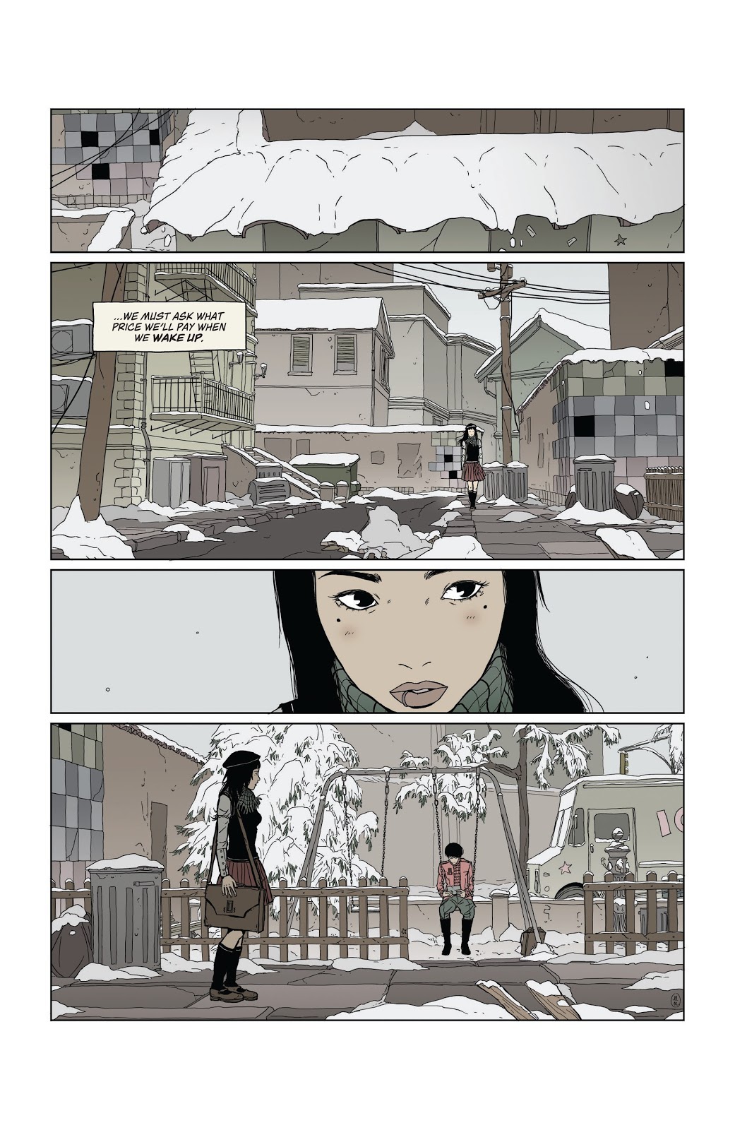
In issue 3 of Heartbeat, published by BOOM! Studios and written/drawn by Maria Llovet, the opening sequence has two of the central characters reminisce about their past and their friend who died in a previous issue.
From the moment that Eva first sees Mack in the playground the reader instantly knows that there is distance in the relationship. On the final panel of page 2 (see above), Eva is standing in the foreground looking across the panel to Mack in the background. There is a van passing behind them and previous panels have established they are on an inner city street, however the panel is left without sound effects; no noise of any kind.
The lack of sound helps to establish the mood, as much as the pale colouring or the blanket of snow. There is no communication between the two characters and you get the impression that Eva is waiting, building up courage to talk to her friend. The entire lack of sound establishes Eva’s fixation on Mack. Her place in the foreground makes her the centre of attention and we assimilate everything else in the image in relation to her, therefore the lack of sound insinuates a focus, in this case Eva’s undivided attention on Mack in the background.
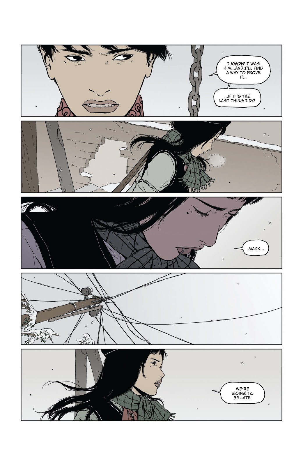
As the scene progresses the two characters have an awkward conversation about their childhood. Llovet breaks up the back and forth, often not showing the speaker in the panel, instead the lettering by Andworld Design uses an inverted tail on the speech balloons giving the scene a broken, disjointed look. This coldness between the characters is emphasised on page 5 (below) when the conversation is broken with a silent panel.

The top three panels in the stack build the tension between Eva and Mack. It starts with a view of the photo of them as children, followed by an angry shot of Mack and then a pleading shot of Eva. Each panel has dialogue that helps to read the image. The fourth panel however lacks dialogue. As it is the only panel on the page that doesn’t have any text, it stands out, draws your eye. The intensity of Mack’s stare is enhanced by the silence, it illustrates the waves of emotion flowing through him. It’s not just anger, like in the previous panel where the letterer gives the speech punch by bolding one of the words. It is also not just the nostalgia and sense of loss that the first panel on this page represents.
That silent stare draws the reader into Mack’s mind, taking a moment to contemplate the characters next actions. It creates a significant pause in the narrative flow, after drawing your attention in the first place. You start this page knowing that this panel is important and when you get to it you are forced to read more into the image that Llovet is giving you.
This idea of making the reader focus on the imagery by drawing your attention to it by removing any other stimuli, is used to greater effect on the next page. In this sequence of five stacked panels, Llovet has created a rhythm with the speech. The panels with speech are the quick beats while the two silent panels are slower as you take in the image, rather than the words. The beat for the page is quick, slow, quick, slow, quick. A threat followed by a moment of contemplation. The start of an appeal followed by an abstract cut away and finished with a change to the conversation.

In these quiet panels you are forced to look closer at the images. The lack of speech gives you the impression that there is something else you should be looking at. In panel two Eva is half turned away, not entirely closed off to what Mack is saying, just as there is a hole in the wall behind her, a sign that the barrier between them isn’t completely built. It’s a small hope in a cold scene.
Panel four serves a similar purpose. The silence draws your attention to the network of telephone wires strung out across the street. In a scene where two characters are having trouble communicating with each other, the Phone lines can be seen as an image of hope. The lines of communication are still there, they haven’t been severed completely. Although there is silence at the moment it does not mean that they are entirely cut off.
Llovet uses silent panels to emphasise something within the image, whether it is as straightforward as illustrating a strong emotional reaction or something more abstract, like a metaphor for communication. Heartbeat is an emotional narrative that combines quick beats with slow, contemplative moments. The silent panel allows Llovet to stop the narrative flow, for a brief time, and focus the reader on the image she is presenting.

Soundless Action
Ed Brubaker and Sean Phillips use silence in a slightly different way in the final issue of Criminal, released by Image Comics in January 2020. In the final part to the Cruel Summer story-line, there are two extended scenes where there is no speech, and in one case not even the voice over that runs heavily throughout the Criminal series.
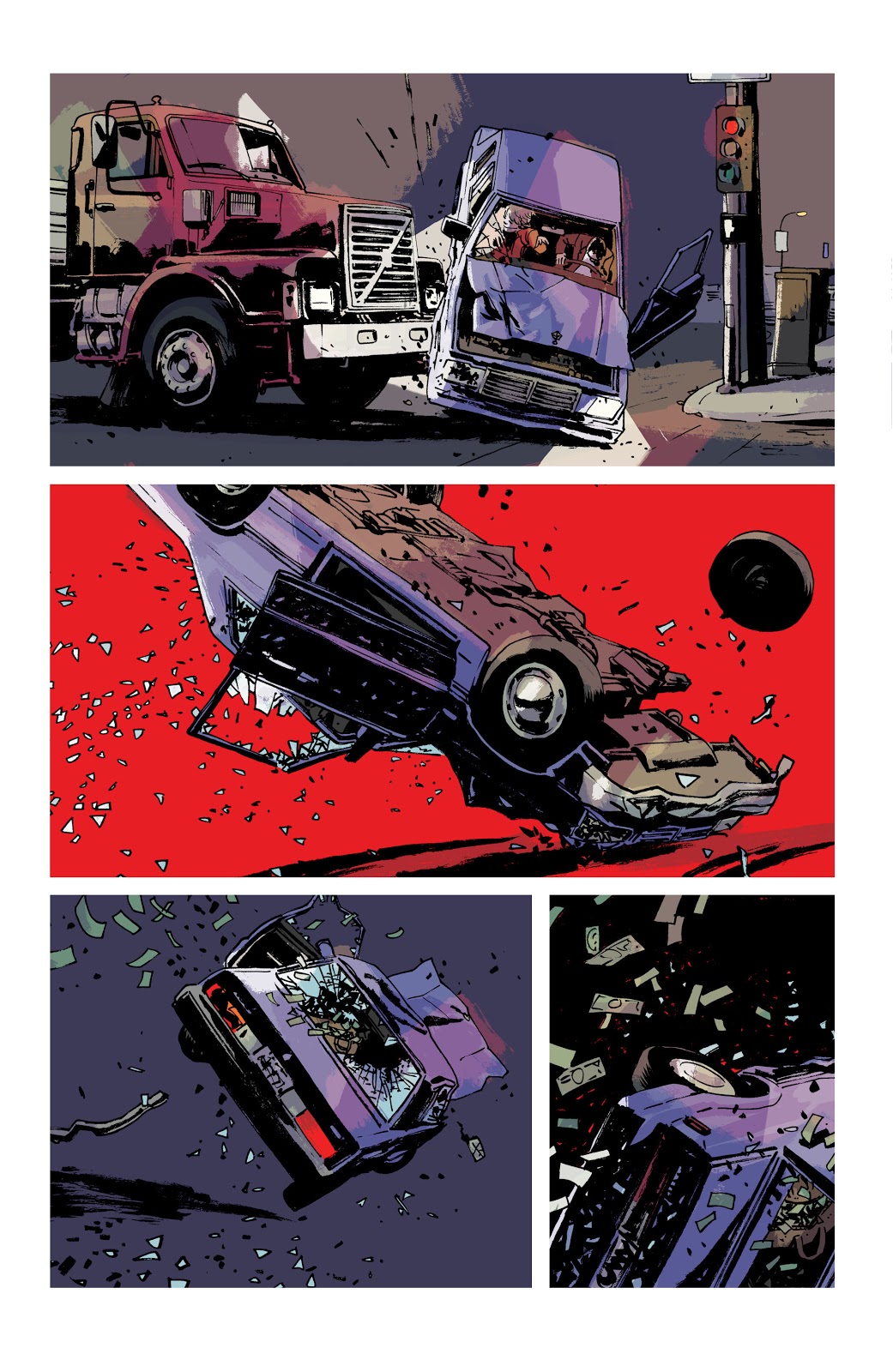
The first, a three page sequence, is one of the more explosive moments in the comic, if not the run itself. After forcibly being taken from a Motel room she was sharing with Teeg, the central character in the story, Jane fights with her kidnapper. The struggle ends badly and, as Teeg watches helplessly as the car Jane is in is side swiped by a lorry and flipped over, and over (see image above).
Throughout the comic, up to that point, there is a lot of text: speech balloons and Caption Boxes. The dialogue is mixed with pulp fiction prose that tells the story, with the visuals adding additional context. Fairly standard, although superbly executed. The car accident changes the dynamic between the text and the art. The reader is suddenly confronted with a distinct and deliberate soundless vacuum. You become riveted to the accident as it plays out, in slow motion, before your eyes. Without sound effects or a monologue of any kind, you are forced to look, really hard, at the car as it is crushed beneath the lorry.
In the second panel on page 10, the background falls away and is replaced with a solid block of red. This strong, visual image tells the reader everything they need to know about the occupants in the car. No sound is necessary, in fact the lack of any noise makes the moment more upsetting. The image implies the fate of the driver and his victim; you imagine characters distress, cries of pain, and like any good horror, Brubaker and Phillips make you imagine their horrific fate. Less is more.

The silence on these few pages enhances the traumatic incident. There is even a moment at the bottom of page 12 (see above) where a character screams, soundlessly, into the air. It’s a powerful image, and a powerful sequence, that stands out in the narrative because it lacks the one thing that Brubaker and Phillips are known for: the pulpy voice over.
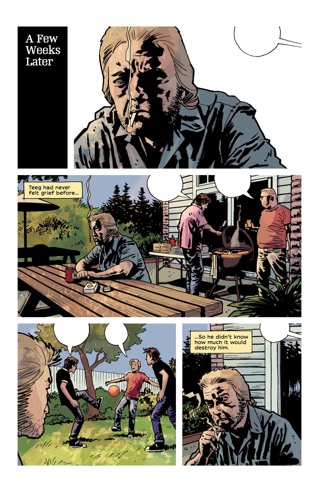
Page 14 (image below) of this issue uses the lack of speech in another way, different from the examples I have already mentioned. The narrative caption boxes are back and there are even some speech balloons but the balloons are empty.
A few weeks have passed since the car crash incident and Teeg is grieving. He is at a Bar-B-Que with his friends but mentally, he is somewhere else. The captions inform the reader that Teeg has been affected badly but it is the empty speech balloons that really get the message across. Here is a situation where a number of characters share a page but the creators want you to focus solely on one of them.

As you move from panel to panel, you become as detached from the surroundings as Teeg because there is something missing. This page could have been drawn with no speech balloons and still had some effect. However, it is those empty balloons, hanging in the air, that really make this page so wonderful. You want to be a part of the BBQ, playing football with the young boys but you’re uncontrollably locked out. If this page, with its depiction of life just out of reach, isn’t a perfect representation of a character suffering from depression, I don’t know what is.
Teeg feels as though he has lost everything and this page of art both illustrates that he hasn’t but also that he is too detached to realise it.
The partial silence, the switching off of sound, enhances the narrative voice and distances the central character further and further away. The third panel, in the centre of the page, has Teeg sharing space equally with two of his friends yet the impression is that he couldn’t be more alone. It is a masterpiece of imagery and a heartbreaking page.
Better Left Unsaid
Comics don’t have actual sound but they do have a lot of speech and a lot of sound effects. Some comics are packed with a collection of strange onomatopoeic words or conversations long enough to keep Quentin Tarantino happy. However, just like film, sometimes silences are louder than the noise. A well placed soundless panel or sequence can really attune the audience, forcing the reader to concentrate on exactly what the creators want you to see. They can slow down the story, break the narrative flow, or even enhance the emotional punch of a moment.
Silence is indeed golden and is also a wonderful tool for any comic creator to keep in their box.
There are a number of comics out there that use this technique, and I didn’t even talk about Black Bolt! Why not let us know in the comments below of any good examples that you find.

